Post Syndicated from Luis Gerardo Baeza original https://aws.amazon.com/blogs/big-data/power-operational-insights-with-amazon-quicksight/
Organizations need a consolidated view of their applications, but typically application health status is siloed: end-users complain on social media platforms, operational data coming from application logs is stored on complex monitoring tools, formal ticketing systems track reported issues, and synthetic monitoring data is only available for the tool administrators.
In this post, we show how to use Amazon QuickSight, AWS’ fully managed, cloud-native Business Intelligence service to quickly build a dashboard that consolidates:
- Operational data from application logs coming from Amazon CloudWatch.
- Issues reported on Jira software as a service (SaaS) edition.
- Public posts on Twitter.
- Synthetic monitoring performed using a CloudWatch Synthetics canary.
This dashboard can provide a holistic view of the health status of a workload, for example, you can:
- Trace end-users complaining on Twitter or creating issues on Jira back to the application logs where the error occurred.
- Identify when customers are complaining about system performance or availability on social media.
- Corelate reports with monitoring metrics (such as availability and latency).
- Track down errors in application code using log information.
- Prioritize issues already being addressed based on Jira information.
Solution overview
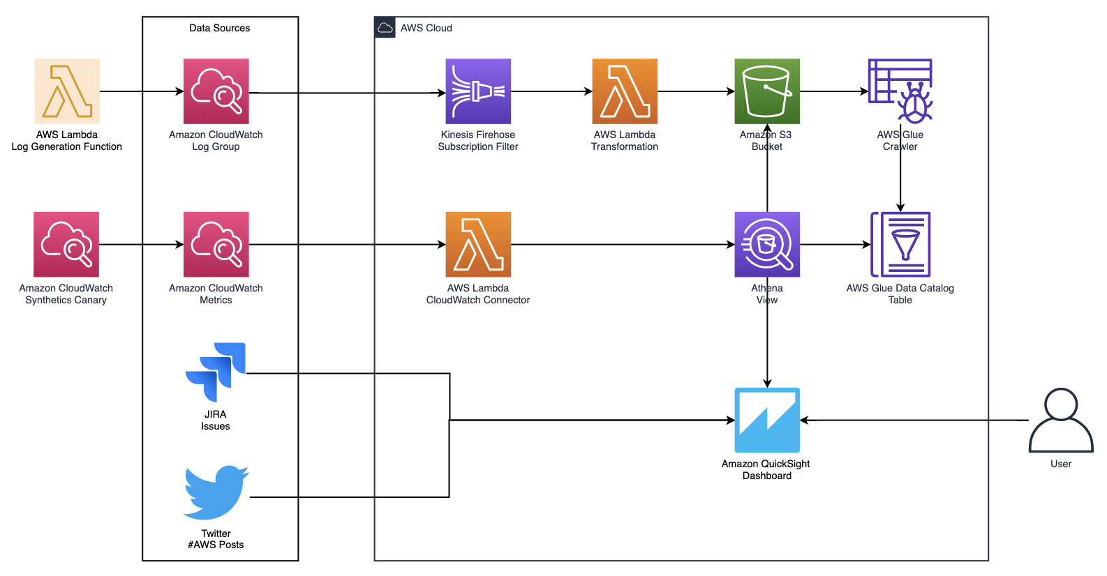
The following architecture for the solution consists of a subscription filter for CloudWatch Logs to continuously send the application logs to an Amazon Simple Storage Service (Amazon S3) bucket, an AWS Glue crawler to update Amazon S3 log table metadata, a view on Amazon Athena that formats the data on the bucket, and three QuickSight datasets: Athena, Jira, and Twitter.
To implement this solution, complete the following steps:
- Set up CloudWatch and AWS Glue resources.
- Set up a QuickSight dataset for Athena.
- Set up a QuickSight dataset for CloudWatch Synthetics.
- Set up a QuickSight dataset for Twitter.
- Set up a QuickSight dataset for Jira.
- Create a QuickSight overview analysis.
- Create a QuickSight detailed analysis.
- Publish your QuickSight dashboard.
Prerequisites
To get started, make sure you make the following prerequisites:
- An AWS account.
- Previous experience working with the AWS Management Console.
- A Twitter account.
- A Jira SaaS account. Make sure that the DNS name of your Jira Cloud is accessible to QuickSight.
- Access to the Athena engine v2.
Set up CloudWatch and AWS Glue resources
Start by deploying a Lambda transformation function to use with your Amazon Kinesis Data Firehose delivery stream:
- On the Lambda console, launch a new function using the kinesis-firehose-cloudwatch-logs-processor blueprint.
- Enter a function name and choose Create function.
- Modify the
transformLogEventfunction in the Lambda code:
- Choose Deploy to update the function.
As part of these steps, you create a new AWS Identity and Access Management (IAM) role with basic permissions and will attach an IAM policy created by AWS CloudFormation later.
- Choose Copy ARN and save the ARN temporarily for later use.
To create the sample resources, complete the following steps:
- Choose Launch Stack:
![]()
- Choose Next.
- Enter a stack name.
- For TransformationLambdaArn, enter the function ARN you copied earlier.
- Choose Next twice, then acknowledge the message about IAM capabilities.
- Choose Create stack.
By default, when you launch the template, you’re taken to the AWS CloudFormation Events page. After 5 minutes, the stack launch is complete.
Test the Lambda function
We can test the function to write sample logs into the log group.
- On the Resources page of the AWS CloudFormation console search for
LogGenerator. - Choose the physical ID of the Lambda function.
- On the Lambda console, choose the function you created.
- Choose Test, enter
samplefor the Event name and leave the other configurations at their default. - Choose Create.
- Choose Test again and you should receive the message “Logs generated.”
- On the Functions page of the Lambda console, choose the transformation function you created.

Change the AWS Lambda function configuration
- On the Configuration tab, choose General configuration.
- Choose Edit.
- For Memory, set to 256 MB.
- For Timeout, increase to 5 minutes.
- Choose Save.
- Choose Permissions, then choose the role name ID to open the IAM console.
- Choose Attach policies.
- Search for and select
InsightsTransformationFunctionPolicy. - Choose Attach policy.
The policy you attached allows your Lambda transformation function to put records into your Kinesis Data Firehose delivery stream.
Partitioning has emerged as an important technique for organizing datasets so that they can be queried efficiently by a variety of big data systems. Data is organized in a hierarchical directory structure based on the distinct values of one or more columns. The Firehose delivery stream automatically partitions data by date.
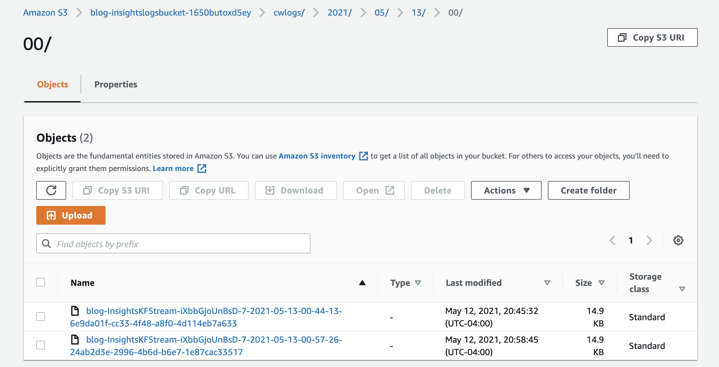
- On the Amazon S3 console, locate and choose the bucket
insightlogsbucket. - Choose the
cwlogsprefix and navigate through the partitions created by Kinesis Data Firehose (year/month/day/hour).
Make sure the bucket contains at least one file. (It may take up to 5 minutes to show because Kinesis Data Firehose buffers the data by default.)
To optimize the log storage, you can later enable record transformation to Parquet, a columnar data format. For more information, see Converting Input Record Format (Console).
Run the AWS Glue crawler
To complete this section, run the AWS Glue crawler to discover bucket metadata:
- On the AWS Glue console, choose Crawlers.
- Select the crawler
InsightsLogCrawlerand choose Run crawler.

- Wait for the crawler to complete, then choose Tables.
- Choose the filter bar and choose the resource attribute Database.
- Enter
insightsdband choose Enter. - You should see a table with a CSV classification.
- On the Athena console, enter the following into the query editor:
- Choose Run query.
You should see a table like the following screenshot.

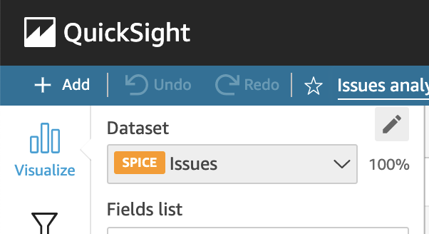
Set up a QuickSight dataset for Athena
If you haven’t signed up for a QuickSight subscription, do so before creating your dataset.
To use the table created in the AWS Glue Data Catalog, you have to authorize connections to Athena.
- On the QuickSight console, choose your QuickSight username and choose Manage QuickSight.
- Choose Security & permissions in the navigation pane.
- Choose Add or remove to set up access to Amazon S3.

- Choose your S3 bucket
insightslosbucketcreated by the CloudFormation template to allow QuickSight to access it. - Choose the QuickSight logo to exit the management screen.
Add the Athena dataset
Now we can set up the Athena dataset.
- On the QuickSight console, choose Datasets in the navigation pane, then choose New dataset.
- Choose Athena from the available options.
- For Data source name, enter
cwlogs. - Leave the default workgroup selected (primary).
- Choose Create data source.
- Open the list of databases and choose insightsdb.
- Choose the
cwlogstable and choose Use custom SQL. - Replace New custom SQL with
cwlogsand enter the following SQL code:
- Choose Confirm query.
You receive a confirmation of the dataset creation.
- Choose Edit/Preview Data.
- For Dataset name, enter
cwlogs.
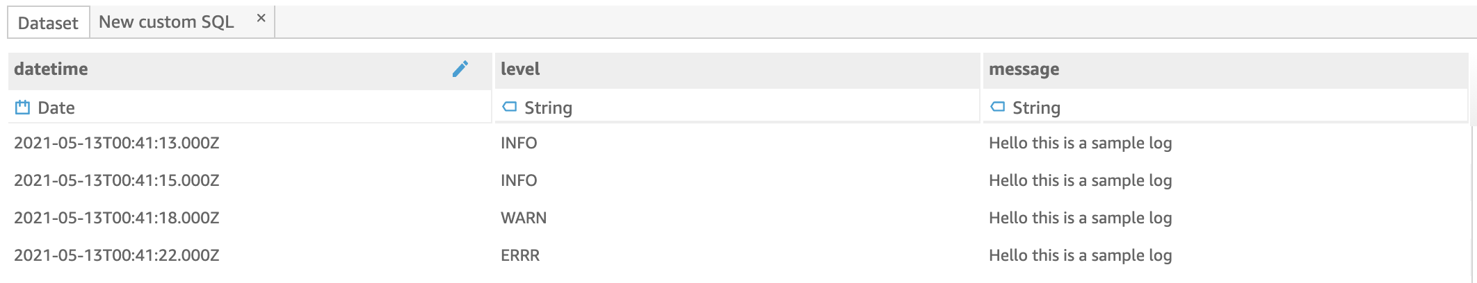
Separate severity levels
The logs contain a severity level (INFO, WARN, ERRR) embedded into the message, to enable analysis of the logs based on this value, you separate the severity level from the message using QuickSight calculated fields.
- Choose Dataset below the query editor and choose the datetime
- Change the type to Date

- Open the Fields panel on the left and choose Add calculated field.
- For Add name, enter
level. - Enter the following code:
- Choose Save.
- Choose Add calculated field.
- For Add name, enter
message. - Enter the following code:
- Choose Save.
- Choose the options icon (three dots) next to the
logmessagefield and choose Exclude field.
The final dataset should be similar to the following screenshot.
- Choose Save.
Set up a QuickSight dataset for CloudWatch Synthetics
You add Synthetics monitoring metrics to our QuickSight dashboard to have visibility into the availability of your website. For this, you use the Athena CloudWatch connector.
Create a CloudWatch Synthetics canary
To create a CloudWatch Synthetics canary that monitors your website using heartbeats (sample requests) to test availability, complete the following steps:
- On the CloudWatch Synthetics console, choose Create canary.
- Make sure the blueprint Heartbeat monitoring is selected.
- For Name, enter
webstatus. - For Application or endpoint URL, enter your website’s URL.
- Under Schedule, enter a frequency that works best for you (1–60 minutes).
The default setup is every 5 minutes.
- Enter an S3 location to store artifacts.
- Choose Create canary.

Set up the Athena CloudWatch connector
CloudWatch Synthetics sends availability data from the canary to CloudWatch Metrics. To query the metrics, you can use the Athena CloudWatch Metrics connector.
- On the Athena console, choose Data sources.
- Choose Connect data source and choose Query a data source.
- Choose Amazon CloudWatch Metrics and choose Next.
- Choose Configure new AWS Lambda function.
A new tab opens in the browser, which you return to after deploying the Lambda function.
- For SpillBucket, enter the name of your S3 bucket
insightslobsbucketcreated by the CloudFormation template you deployed. - For AthenaCatalogName, enter
cwmetrics. - Select I acknowledge that this app creates custom IAM roles.
- Choose Deploy.
- Close the browser tab and go to the Athena tab you were on before.
- Refresh the list of Lambda functions by choosing the refresh icon.
- Under Lambda function, choose the Lambda function you just created.
- For Catalog name, enter
cwmetrics. - Choose Connect.

Set up permissions for QuickSight to use the connector
The CloudWatch connector runs on Lambda, which uses a spill bucket to handle large queries, so QuickSight needs permission to invoke the Lambda function and write to the spill bucket. For more information, see the GitHub repo. Let’s set up permission to allow QuickSight use the CloudWatch connector.
- On the QuickSight console admin page, choose Security & permissions.
- Choose Add or remove.
- Choose Athena.
- On the S3 tab, specify write permissions for your
insightslogsbucketS3 bucket - On the Lambda tab, choose your Lambda function
cwmetrics.

Create the new QuickSight dataset
Now we set up the QuickSight dataset for CloudWatch Synthetics.
- On the QuickSight console, choose Datasets.
- Choose New dataset and choose Athena.
- For Data source name, enter
cwmetrics. - Choose Create data source.
- Open the list of catalogs and choose cwmetrics.
- Choose the
metric_samplestable and choose Use custom SQL. - For New custom SQL field, enter
cwmetrics. - Enter the following SQL code:
- Choose Confirm query.
You receive a confirmation of the dataset creation.
- Choose Edit/Preview data.
- Choose Dataset below the query editor and choose the timestamp field.
- Change the type to Date.
- Choose Save.
Set up a QuickSight dataset for Twitter
To set up the Twitter dataset, complete the following steps:
- On the QuickSight console, create a new dataset with Twitter as the source.
- For Data source name, enter
twitterds. - For Query, enter a hashtag or keyword to analyze from Twitter posts.
- Choose Create data source.
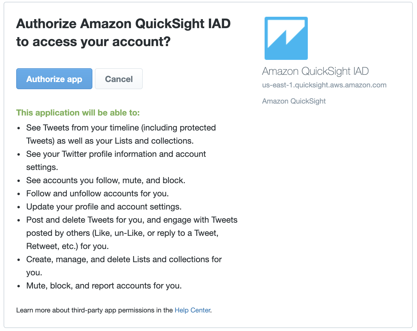
A new window opens requesting you to give QuickSight OAuth authorization for Twitter.
- Sign in to Twitter and choose Authorize application.
- Choose the table
Twitt, then choose Edit/Preview data.
It might take a couple of minutes for the records to be imported into SPICE, the QuickSight Super-fast, Parallel, In-memory Calculation Engine. It’s engineered to rapidly perform advanced calculations and serve data. You can continue with the tutorial while SPICE finishes in the background.
Let’s create a calculated field that classifies tweets as a Good experience or Bad experience by searching for the words “error,” “problem,” or “expensive.” You can choose other words that fit your use case.
- For Dataset name, enter
twitterds. - Choose Add calculated field.
- For Add name, enter
Experience. - Enter the following code:
- Choose Save and then choose Save & visualize.
The Twitter Standard Search API returns data for 7 days only. For more information, see Supported Data Sources.
Set up a QuickSight dataset for Jira Cloud
QuickSight can connect to SaaS data sources, including Jira Cloud. To set up the Jira dataset, complete the following steps:
- To create an API token, open the Jira website within an authenticated browser.
- Choose Create API token.
- For Label, enter
QuickSight. - Choose Create.

- Create a new dataset in QuickSight and choose Jira as the data source.
- For Data source name, enter
jirads. - For Site base URL, enter the URL you use to access Jira.
- For Username, enter your Jira username.
- For API token or password, enter the token you created.
- Choose Create and choose the
Issuestable. - Choose Select and then choose Visualize.
You’re redirected to a newly created QuickSight analysis.
Create a QuickSight overview analysis
We use the previously created analysis as a starting point for our overview analysis.
- Choose the Edit data icon (pencil).
- Choose Add dataset.
- Choose the
Issuesdataset and choose Select. - Repeat the steps for the
twitterds,cwlogsandcwmetrics
You should see the four datasets added to the QuickSight visual.

In the navigation pane, you can find the available fields for the selected dataset and on the right, the visuals. Each visual is tied to a particular dataset. When the tutorial instructs you to create a new visual from a dataset, you must choose the dataset from the list first, then choose + Add.
- Choose the visual, then the options icon (three dots).
- Choose Delete.

- Update the QuickSight analysis name to
Operational Dashboard.
Add a visual for the Twitter dataset
To add your first visual, complete the following steps:
- Add a new visual from the Twitter dataset.
- Change the visual type to KPI.
- Choose the field
RetweetCount. - Name the visual
Bad experience retweet count. - Use the resize button to set the size to a fourth of the screen width.

- In the navigation pane, choose Filter and then choose Create one.
- Choose the Created field and then choose the filter.
- Change the filter type to relative dates and choose
- Choose Last N hours and enter
24for Number of hours. - Choose
This filter allows us to see only the most up-to-date information from the last 24 hours.

- Add a second filter and choose the Experience
- Leave BAD selected marked and choose Apply.

Now you only see information about Twitter customers with a bad experience.
Add a visual for CloudWatch metrics
Next, we add a new visual for our CloudWatch metrics.
- Choose Visualize and then choose the
cwmetrics - Add a new gauge chart.
- Choose Field wells to open the visual field configuration.
- Choose Value and change Aggregate to Average.

- Drag and drop the value field from the field list into Target value and change the aggregate to
- Name the visual
System health status.
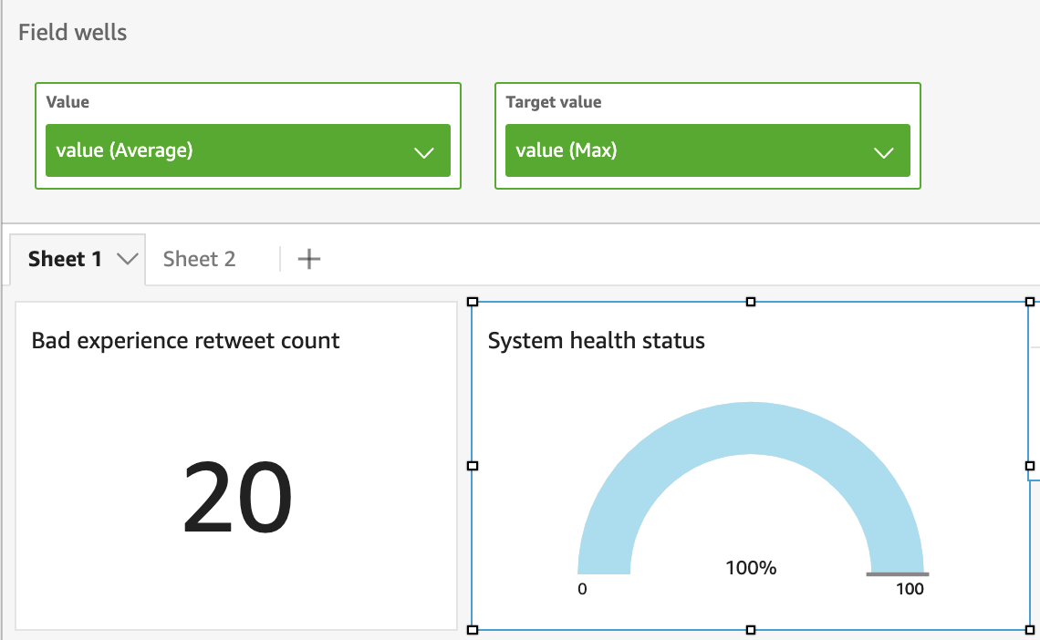
- Similar to what you did on the previous visual, add a filter to include only the last 24 hours based on the
timestampfield.
Add a visual for CloudWatch error logs
Next, we create a visual for our CloudWatch logs dataset.
- Choose the
cwlogsdataset and add a new KPI visual. - Drag and drop the
messagefield into the Value - Name the visual
Error log count. - Create a filter using the
levelfield and from the list of values. - Deselect all but ERRR.
- Choose Apply.

This filters only logs where there was an error found.
- Create a filter for the last 24 hours.
Add a visual for Jira issues
Now we add a visual for open Jira issues.
- Choose the
Issuesdataset. - Create a KPI visual using the
Idfield for Value. - Add a filter for issues of type
bug.- Use the
IssueType_Namefield and select only the records with value Error.
- Use the
- Add a filter for issues open.
- Use the
Status_Namefield and select only the records with the value On-going or To-do.
- Use the
- Add a filter for the last 24 hours using the Date_Created
- Name the filter
Bug Issues open. - Resize the visuals and organize them as needed.

Complete the oversight dashboard
We’re almost done with our oversight dashboard.
- Create four new visuals as specified in the following table.
| Dataset | Visual type | Field on X-axis | Field on Value | Field on Color |
twitterds |
Stacked line chart | Created (aggregate: hour) |
RetweetCount (aggregate: sum) |
– |
cwmetrics |
Stacked line chart | timestamp (aggregate: hour) |
Value (aggregate: avg) |
– |
cwlogs |
Stacked line chart | datetime (aggregate: hour) |
message (aggregate: count) |
– |
Issues |
Vertical stacked bar | Date_Created (aggregate: hour) |
Id (aggregate: count) |
Status_Name |
- Modify every filter you created to apply them to all the visuals.

- Choose the tab Sheet 1 twice to edit it.
- Enter Overview.
- Choose Enter.
The overview analysis of our application health dashboard is complete.

QuickSight provides a drill-up and drill-down feature to view data at different levels of a hierarchy; the feature is added automatically for date fields. For more information, see Adding Drill-Downs to Visual Data in Amazon QuickSight.
In the previous step, you applied a drill-down when you changed the aggregation to hour.
Create a QuickSight detailed analysis
To create a detailed analysis, we create new tabs for CloudWatch logs, Tweets, and Jira issues.
Create a tab for CloudWatch logs
To create a tab to analyze our CloudWatch logs, complete the following steps:
- Choose the add icon next to the Overview tab and name it
Logs. - Create three visuals from the
cwlogsdataset :- Donut chart with the level field for Group/Color and
message(count) for Value. - Stacked combo bar with the
datetime(aggregate: hour) field for X axis box,level(count) for Bars, andlevelfor Group/Color for bars. - Table with the fields
level,message, anddatetimefor Value.
- Donut chart with the level field for Group/Color and
To improve the analysis of log data, format the level field based on its content using QuickSight conditional formatting: red for ERRR and Green for DEBG.
- Choose the table visual and choose on the visual options icon (three dots), then choose Conditional formatting.
- Choose the add icon and select the
levelfield, then choose Add Text color. - For Value, enter
ERRR. - For Color, choose red.
- Choose Add condition.
- For Value, enter DEBG.
- For Color, choose green.
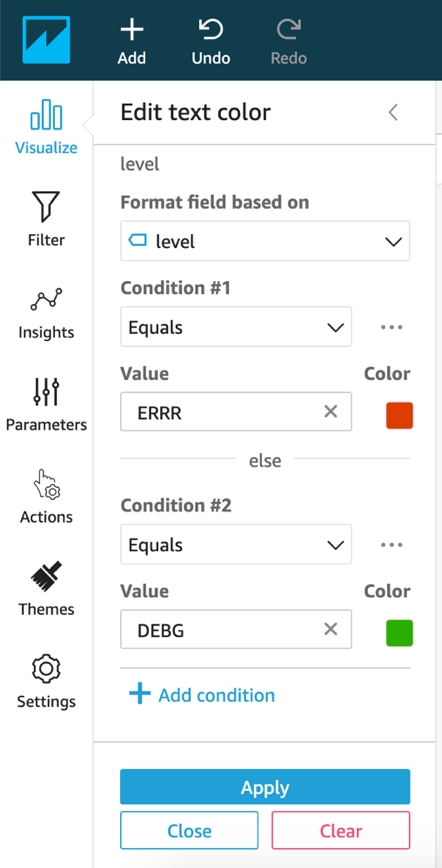
- Choose Apply.
- Resize the visuals and update their titles as needed.

To enable data exploration, let’s set up an action on the Logs tab.
- Choose the Top Logs visual and choose Actions.
- Choose Filter same-sheet visuals.
- Choose ERRR on the donut chart.
The Latest Logs table filters only the DEBG level rows.
- Create a filter for the last 24 hours applicable to all visuals from the dataset.
Create a tab for Tweets
To create a tab for Twitter analysis and add visuals, complete the following steps:
- Choose the add icon next to the Logs tab and name the new tab
Tweets. - Delete the visual added and create a new donut chart from the
twitterdsdataset. - Choose the field Source and name the visual
Twit Source. - Create a new word cloud visual and choose the Username
With QuickSight, you can exclude visual elements to focus the analysis on certain data. If you see a big “Other” username on the word cloud, choose it and then choose Hide “other” categories.
- To narrow down the elements on the word cloud to the top 50, choose the mesh icon.
- Under the Group by panel, enter
50for Number of words. - Choose the mesh icon again and choose Allow vertical words.
- Name the visual
Top 50 Users.
Let’s create a table with the Twitter details.
- Add a new table visual.
- Drag and drop the field
Textinto the Group by box andRetweetCountinto Value. - Name the visual
Top Retweet. - Resize the columns on the table using the headers border as needed.
- To sort the table from the top retweeted posts, choose the header of the field
RetweetCountand choose the sort descending icon.

Let’s add a color and an icon based on number of retweets.
- Choose the configuration icon (three dots) and choose conditional formatting.
- Choose the
RetweetCountfield, then choose the add icon and choose the three bars icon set.

- Choose the Custom conditions option and enter the Value field as follows:
- Condition #1 – Value:
10000; color: red - Condition #2 – Start Value:
2000; End Value:10000; color: orange - Condition #3 – Value:
2000; color: keep the default
- Condition #1 – Value:
Now you can see the field RetweetCount formatted with an icon and color based on the value.

Now we add the user location to the analysis.
- Add a new horizontal bar chart visual.
- Use the
UserLocationfield for Y axis and theRetweetCountas Value. - Sort descending by
RetweetCount. - Choose the mesh icon to expand the Y-axis panel and enter
10for Number of data points to show. - If you see an
emptycountry, choose it and choose Exclude empty. - Name the visual
Top 10Locations.
To complete this tab of your analysis, resize the visuals and organize them as follows.

- Similarly, as you did before, choose every visual and add the action Filter same-sheet visuals, which allows you to explore your data.
For example, you can choose one location or source and the Top users and Retweet tables are filtered.
- Create a filter for the last 24 hours applicable to all visuals from the dataset.
Create a tab for Jira issues
Finally, we create a tab for Jira issue analysis.
- Choose the add icon next to the Tweets tab and name the new tab
Issues. - Delete the visual created and create a new horizontal stacked 100% bar chart visual from the
Issuesdataset. - Drag and drop the fields as follows (because this dataset has many fields, you can find them using the Field list search bar):
- Y-axis –
Status_Name - Value –
Id (count) - Group/Color –
Assigne_DisplayName
- Y-axis –
This visual shows you how issues have progressed among assignee name.
- Add a new area line chart visual with the field
Date_Updatedfor X axis andTimeEstimatefor Value. - Add another word cloud visual to find out who the top issue reporters are; use
Reporter_DisplayNamefor Group by andId (count)for Size. - The last visual you add for this tab is a table, include all the necessary fields on the Value box to be able to investigate. I suggest you include
Id, Key, Summary, Votes, WatchCount, Priority,andReporter_DisplayName. - Resize and rearrange the visuals as needed.

- As you did before, choose every visual and add the action Filter same-sheet visuals, which allows you to explore your data.
For example, you can choose one reporter display name or a status and the other visuals are filtered.
- Create the filter for the last 24 hours applicable to all visuals from the dataset.
Publish your QuickSight dashboard
The analysis that you’ve been working on is automatically saved. To enable other people to view your findings with read-only capabilities, publish your analysis as a dashboard.
- Choose Share and choose Publish dashboard.
- Enter a name for your dashboard, such as holistic health status, and choose Publish dashboard.
- Optionally, select a person or group to share the dashboard with by entering a name in the search bar.
- Choose Share.

Your dashboard is now published and ready to use. You can easily correlate errors in application logs with posts on Twitter and availability data from your website, and quickly identify which errors are being already addressed based on Jira bug issues open.
By default, this dashboard can only be accessed by you, but you can share your dashboard with other people in your QuickSight account.
When you created the QuickSight datasets for Twitter and Jira, the data was automatically imported into SPICE, accelerating the time to query. You can also set up SPICE for other dataset types. Remember that data is imported into SPICE and must be refreshed.
Conclusion
In this post, you created a dashboard with a holistic view of your workload health status, including application logs, issue tracking on Jira, social media comments on Twitter, and monitoring data from CloudWatch Synthetics. To expand on this solution, you can include data from Amazon CloudFront logs or Application Load Balancer access logs so you can have a complete view of your application. Also, you could easily embed your dashboard into a custom application.
You can also use machine learning to discover hidden data trends, saving hours of manual analysis with QuickSight ML Insights, or use QuickSight Q to power data discovery using natural language questions on your dashboards. Both features are ready to use in QuickSight without machine learning experience required.
About the author
 Luis Gerardo Baeza is an Amazon Web Services solutions architect with 10 years of experience in business process transformation, enterprise architecture, agile methodologies adoption, and cloud technologies integration. Luis has worked with education, healthcare, and financial companies in México and Chile.