Post Syndicated from Brent Nowak original https://www.backblaze.com/blog/network-stats-for-q2-2026-all-eyes-on-neocloud-traffic-variance/
Welcome to the Q2 2026 Network Stats report. While we’ve been tracking trends since December 2023, this is the third quarter since we operationalized the dataset and re-launched the series, allowing ourselves to make direct, quarter-over-quarter comparisons. Why? Because AI workloads were changing traffic patterns across Backblaze’s network, and reshaping the internet.
With three quarters of historical data now available, we’re moving beyond measuring traffic volumes. We’ve been able to spot trends and start drawing conclusions—how predictable or unpredictable those workloads really are, and what that means for infrastructure that supports the next generation of AI applications.
Check out past Network Stats reports
If you’re interested in some of the trends we’ve spotted in previous reports, you can review the past reports here:
Q1 2026
Q4 2025
Q3 2025
Previous analysis has been based on the amount of network traffic in bits flowing across in or out of our network, the number of bits and participants per TCP session (our coined “magnitude” metric), and regional geographic trends. In this report, you’ll find charts and heatmaps for the metrics that we’ve been reporting on over the past year, but we’re also going to use statistical analysis to answer a practical question: What kinds of traffic patterns do AI workloads create, and how should infrastructure evolve to support them?
Traffic from neocloud and hyperscaler networks are proving to be very dynamic in nature, and that’s what we’re going to explore in this quarterly report: variance.
Join the webinar
Can’t make it live? Register anyway and we’ll send you the recording.

Why look at variance?
Variance is a deep topic to explore, which involves modeling our traffic patterns against a known baseline. To analyze variance, we built a new time-series dataset using 10-minute traffic samples and modeled traffic behavior against statistical baselines. This lets us distinguish stable, predictable traffic from highly volatile workloads that demand different infrastructure planning.
I refreshed my statistics knowledge, created a new database to hold a timeseries dataset, and spent a few nights experimenting with the SciPy Python library in order to not only produce pretty graphs, but to generate a signal for us to interpret.
The types of questions that we’re interested in answering from the variance signals that affect our business include:
- How quickly are AI workloads changing capacity requirements?
- Which traffic patterns require different network architecture? And does our current architecture support what we’re growth modeling into the future?
- Which signals represent lasting trends versus temporary spikes?
These are big questions! And exciting ones as Backblaze looks to support today and tomorrow’s workflows.
With that, let’s refresh our existing charts with this quarter’s data before diving into the new analysis on variance.
Summer heat-up
The stacked area graph below shows total traffic by network type over time updated with the most current data.

- CDN traffic: New baseline of activity with a 66% increase from last year.
- Hosting traffic: The hosting category (the light orange layer right above CDN) has remained incredibly rigid. Unlike neocloud or hyperscalers, which expand and contract elastically, hosting traffic has maintained a nearly identical bandwidth footprint for over a year.
- Hyperscaler traffic: Hyperscaler traffic also followed the neocloud pattern, with the lowest amount of activity in January and remaining steady into June. Internal data sources show new workloads across all of the major hyperscalers in the past quarter.
- Neocloud traffic: After a low point of activity in January, activity increased rapidly into March and has remained high until June. Internal telemetry shows that not only the amount of neocloud traffic increased in Q1 into Q2, but the number of neoclouds that we are interacting with has increased.
- ISP-regional traffic: This was the dominant driver of the massive traffic spike in October 2025. While it dropped significantly into January 2026, it has aggressively rebounded through Q2 2026 and is currently the largest single driver of volume alongside neocloud.
- Migration traffic: This traffic includes one way migrations into our environment, primarily serviced by partners such as Flexify.IO. We have migrations running all the time, but we can visually see large amounts around November 2025 and March of 2026.
Over the entire one-year graph range, Backblaze’s total platform traffic experienced volatility, peaking in October 2025 before seeing a multi-tier contraction down to a January 2026 winter baseline. Following this, in both Q1 and Q2 of 2026 we’ve observed an increase of activity led by a rebound in ISP-regional and AI-focused neocloud traffic. An additional standout is CDN traffic, which achieved a permanent and substantial new activity baseline, growing roughly 66% year-over-year.
Heatmaps: How and where data moves
To better understand our network activity, we isolated variables like region and types of provider. Here are the standard definitions we use each report:
- Total traffic volume: Where did we send and receive the most traffic?
- Magnitude: Where were the data transfers with the most bits per unique IP address?
- Uniqueness: What does the number of distinct IP addresses look like?
Quick terminology refresher
Regions
US-West: Our largest and longest-running region
US-East: Region with the most observed proximity to neocloud infrastructure
CA-East: Our newest region in Canada.
EU-Central: Our EU region.
Network Types
CDN: Networks that use Backblaze as an origin store for content delivery.
Hosting: Traditional hosting providers that runs workloads like physical or virtual servers for web, database, or application tasks.
Hyperscaler: Large, traditional cloud providers.
ISP-regional: Local or regional ISPs; think of these as the “last mile” paths as these networks are very close to customer equipment and efficient.
ISP Tier1: National or international ISPs that carry our traffic long distances.
Neocloud: AI-focused compute networks.
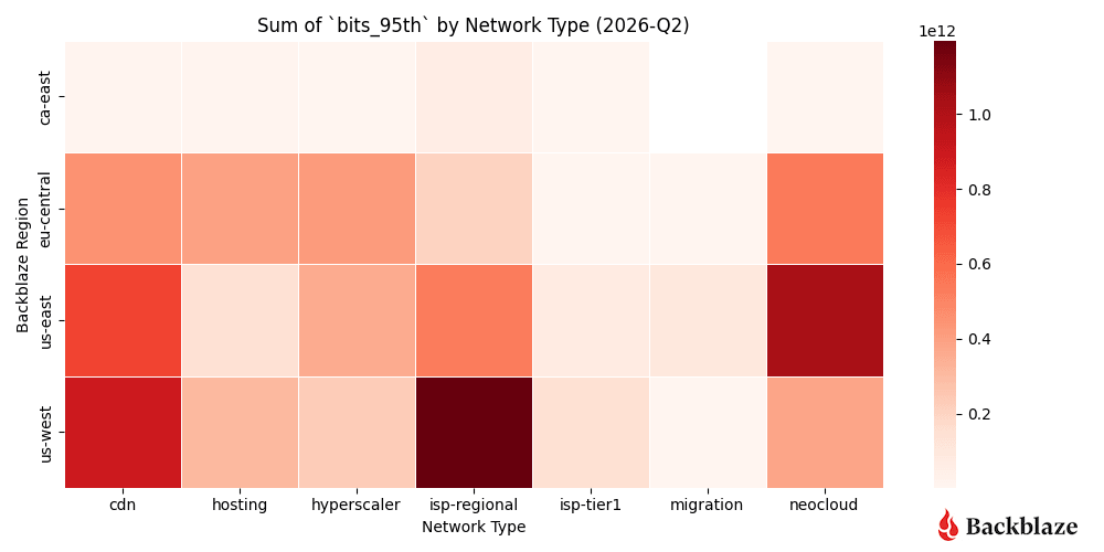
Heatmap #1: Where did we send and receive the most traffic?
ISP-regional traffic is a hotspot for US-West, as expected. This region has the largest internet exchange (IX) and server footprint behind it. Neocloud traffic remains concentrated in the US-East, but for this quarter traffic increased in the US-West and EU-Central regions. Another standout this quarter is more hyperscaler activity in EU-Central than the previous quarter.
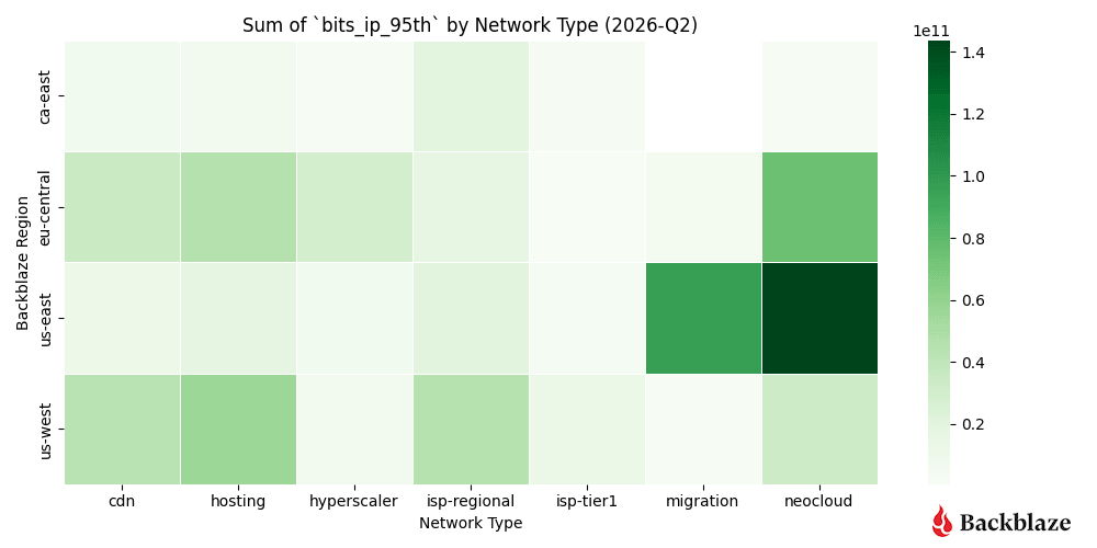
Heatmap #2: Where were the data transfers with the most magnitude (bits per IP address)?
Another metric we record is bits per IP or what we term “magnitude.” This combination of the amount of traffic transferred with how many actors are involved per network is a good proxy to measure how heavy or impactful individual data flows are. In short:
- High volume, many IPs: Easier to distribute and load-balance across infrastructure. And many source and destination pairs means that we can traffic engineer at the WAN layer, sending some traffic over one provider and some over another.
- High volume, few IPs: More difficult, but more interesting, from a NetEng perspective.
Traffic magnitude is currently a driver of decisions for capacity and growth plans. Our US-East region continues to have a high concentration of high bandwidth transfers between a small number of hosts. New for this quarter is an uptick in traffic magnitude in our EU-Central region.
This could be an indication of more geographic spread of AI related workflows as for every quarter that we’ve reported on the metric value, we have seen more diversity into US-West and EU-Central outside of the concentration in US-East. We will continue to watch this trend.
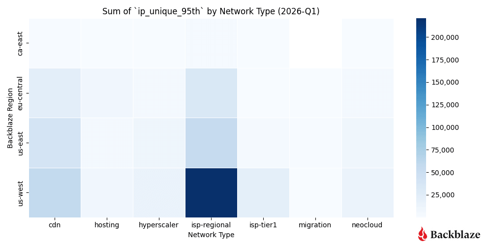
Heatmap #3: How many unique addresses do we interact with?
Not every graph or heatmap has to show something dramatic. Sometimes it’s good to see exactly what you expect quarter over quarter in a data series. This is especially true for our uniqueness metric, measuring the number of distinct IP addresses per network time.
We interact with the most number of parties out of our US-West region. It’s the most mature and serves a large amount of ISP-regional consumers, so the consistency of the uniqueness metric is a good sanity check on our dataset.
- US-West shows the highest overall uniqueness, driven by its larger number of data centers and mix of workloads.
- Neocloud traffic, by contrast, tends to involve fewer, more persistent endpoints, consistent with AI pipelines that rely on stable, long-standing connections between storage and compute.
Neocloud and hyperscaler traffic vs predictive patterns
This next set of charts shows a deeper dive into the metrics associated with neocloud and hyperscalers over time. The contrast between a more “traditional” workload (e.g., CDN, hosting, and ISP regional traffic) and emerging trends with neoclouds and hyperscalers is the easiest place to see the shift in network traffic profiles. The latter represents bursty, high magnitude traffic that reshapes conversations around network planning.
Chart #1: What’s the magnitude of neocloud and hyperscaler traffic over time?
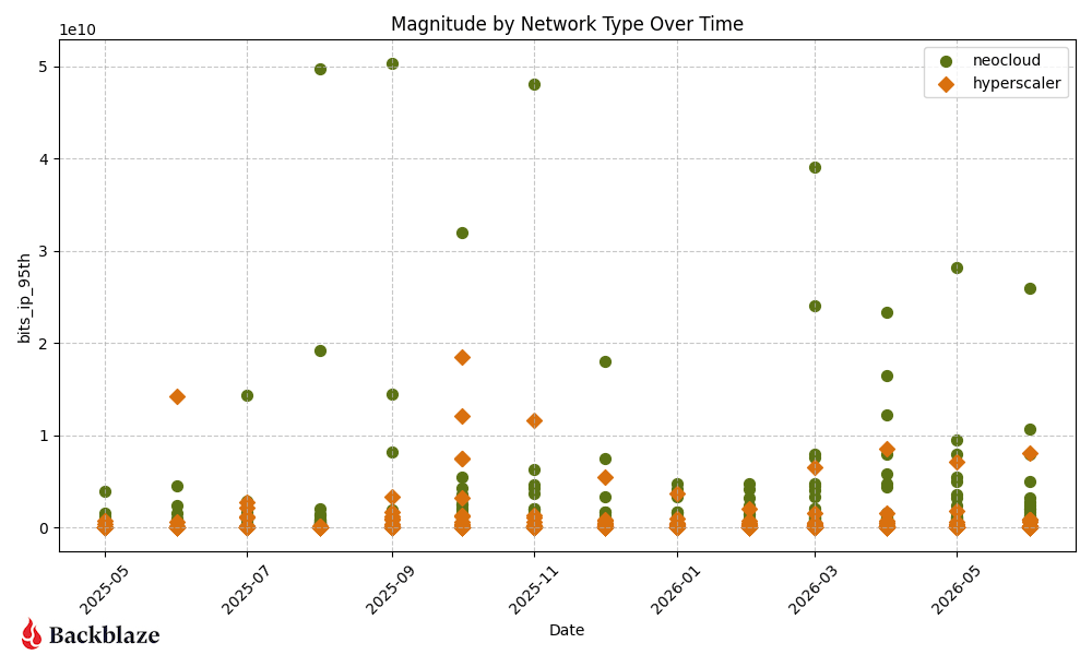
Following a highly concentrated, low-magnitude baseline for both categories in January and February 2026, Q1 closed with a dramatic March surge where several individual neocloud networks spiked massively.
Moving into Q2 2026 (April through June), while the absolute highest neocloud peaks compressed slightly downward compared to that March anomaly, the overall volume of high-magnitude neocloud workflows multiplied significantly, resulting in a much denser cluster of active endpoints staying consistently high quarter-over-quarter.
Hyperscaler endpoints experienced a steady and noticeable upward move over the course of Q2, with multiple data points breaking out of their typical floor by May and June.
Ultimately, neocloud retained its dominant, high-magnitude presence across both Q1 and Q2 quarters, while hyperscalers saw a distinct and steady escalation in individual workload sizes.
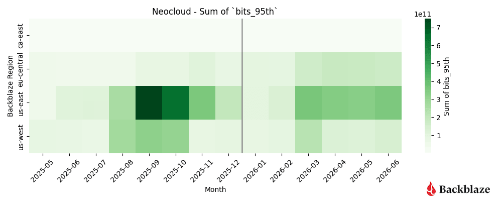
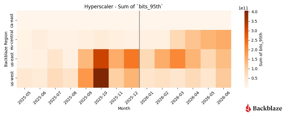
Heatmap #1 and #2: How dynamic are neocloud and hyperscaler traffic patterns?
Neocloud related traffic continues to show strong concentrations in our US-East region with recent growth March into June. Hyperscaler traffic is the most variable when we compare it to last quarter’s heatmap. There is a new, more distributed concentration across all our three largest regions—US-East, US-West, and EU-Central.
Together with the trends we’ve reported over the past year, these results suggest AI workloads on the Backblaze network are becoming geographically more distributed rather than remaining concentrated in a single region. Note the caveat: it’s possible, even probable, that there’s a macro trend about geographical dispersion of AI data, but it’s important also that Backblaze has become increasingly known as a trusted infrastructure provider specifically in this space.
Layer on the fact that AI workloads can be reflective of fewer players with more data (see also: magnitude or elephant workflows), and what you have is difficulty understanding whether this is a macro trend, or Backblaze specific. We’ll keep our eyes on the data as it develops.
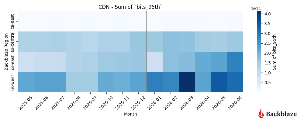
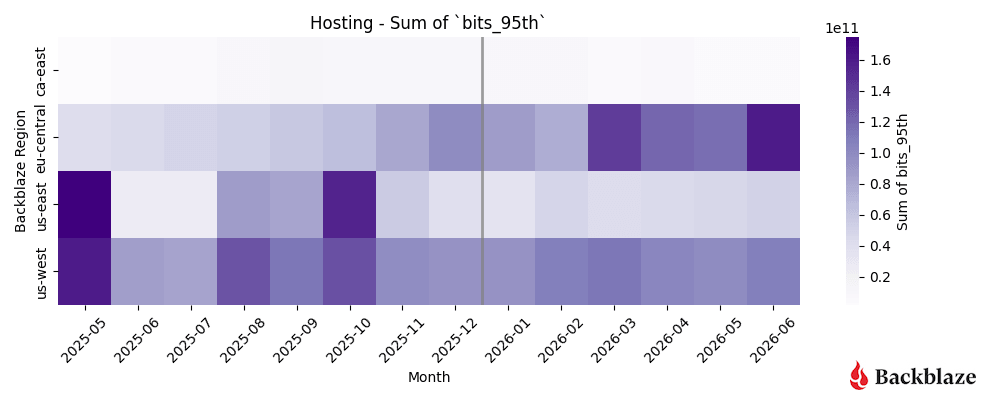
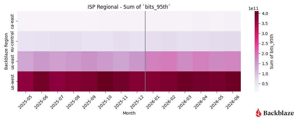
Heatmap #3, #4, and #5: How dynamic are CDN, hosting, and ISP-regional traffic patterns?
We’re grouping CDN, hosting, and ISP regional types together because they represent a “steady-state” for us as network operators. These patterns are predictable, spread out over time, and generally do not change month-to-month.
For Q2, we saw the concentration of CDN in US-West remain steady with traffic growth in our US-East region. Hosting traffic is showing a new pattern, with more activity in our EU-Central region starting in April into June.
Variance study methodology
For our new variance study we needed more granular traffic sampling data than aggregated weekly or monthly totals. Ten minute sample data gave us a balance between sampling fidelity, data warehousing storage, and query time when iterating on the project idea.
Here’s a sample of anonymized data in one region, for one hour, for one ASN (network), with ingress and egress 95th bitrate percentage values:
Anonymized Timeseries Sample Example
| datetime | region | asn | ingress | egress |
|---|---|---|---|---|
| 2026-05-01T00:00:00 | us-east | asn-number | 4408643576.86 | 72810025561.08 |
| 2026-05-01T00:10:00 | us-east | asn-number | 4202884722.26 | 72153643081.09 |
| 2026-05-01T00:20:00 | us-east | asn-number | 4282470297.97 | 72840197796.70 |
| 2026-05-01T00:30:00 | us-east | asn-number | 4462602109.34 | 74194149854.89 |
| 2026-05-01T00:40:00 | us-east | asn-number | 4011477298.04 | 73431072317.13 |
| 2026-05-01T00:50:00 | us-east | asn-number | 3919542094.52 | 71051545108.21 |
Understanding the use of variance
Raw traffic metrics (total gigabits per second) tell us how much data is moving. Variance tells us how consistently it moves.
Stable traffic is easier to plan for. Highly variable traffic requires more flexible network design and additional capacity planning—it reflects the bursty nature of AI training and inference workflows, where compute clusters can scale rapidly and move enormous datasets over short periods.
Here’s how to read the analysis:
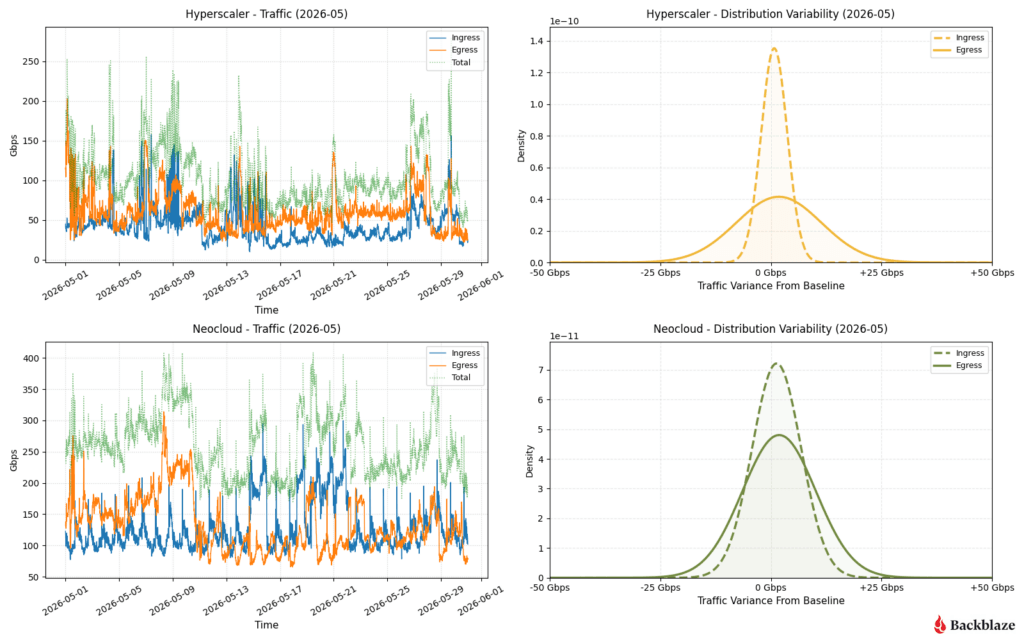
- The shape of the bell curves (right column): A very tall, narrow peak indicates low variance. This means the traffic behaves predictably and stays clustered close to its baseline average. A short, wide, flattened curve indicates high variance, meaning the traffic is highly volatile, subject to massive sudden swings, and much harder to provision for.
- The interplay of ingress vs. egress (left column): By overlaying both metrics, we can immediately spot structural imbalances. For instance, if one direction has a sharp spike (low variance) while the other is flat and wide (high variance), it signals that asymmetric network events are dominating that infrastructure type.
Below is a sampling of network data in one point in our network over the month of May 2026, with the traffic pattern graphed on the left side and variance on the right side. Immediately we can see different groupings of patterns. For readability and grouping, we’ve separated the types of networks into two categories: the dramatic and the reliable.
Bringing the drama: Hyperscaler and neoclouds
AI infrastructure behaves differently than traditional internet infrastructure. The following comparisons illustrate why.
So, what can we learn from this? Let’s examine it by network type.
Hyperscaler: High egress volatility with balanced ingress
Ingress traffic remains tightly controlled around the baseline (sharp dashed peak). However, egress traffic (solid line) shows a flattened, high-variance spread.
The time-series chart reveals constant, jagged fluctuations between 50 Gbps and 150 Gbps, indicating highly bursty customer data retrieval patterns throughout the month.
Neocloud: Synchronized, moderate volatility
Both ingress and egress display structurally similar, moderately wide bell curves. This reflects a well-proportioned network footprint where data-in and data-out scale together.
The time series demonstrates sustained high baseline volumes (Total traffic consistently tracking between 200 Gbps and 350 Gbps) with continuous business-hour cyclical wave patterns.
As network operators we’re using this type of real-world data to help drive our connectivity footprint decisions. Large, bursty traffic patterns are best served by PNI network connections. PNIs allow us to isolate workflows to a distinct physical egress/ingress path in our network, which enables us to be able to more easily route, load-balance, and support these higher performance profiles. That translates into more predictable performance for customers running bandwidth-intensive AI workloads.
We have a high interest in connectivity to partners in our US-East location, as it is located in the Ashburn-Reston datacenter corridor near a lot of existing datacenter campuses. This one again reinforces the notion that geography plays an important role in where entities are placing their data and compute engines rather than the nondescript “cloud”.
If you’re interested in learning more about the geography of neocloud traffic, visit the Q1 2026 report and review the “Where in the world is the neocloud?” section.
Let’s switch over to our three other major network types that we also want to profile for capacity, performance, and scalability considerations.
Bringing the predictability: CDN, hosting, and ISPs
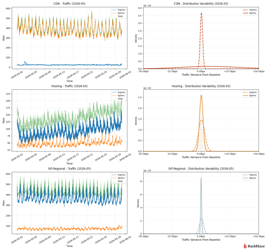
CDN: Extreme ingress stability vs. massive egress spread
The ingress curve is a razor-thin needle at 0 Gbps variance, proving inbound management traffic is perfectly flat. Conversely, the egress curve is completely flattened across the entire -50 to +50 Gbps spectrum.
This is textbook CDN behavior: steady, quiet ingest lines paired with massive, erratic client-side distribution demands peaking near 600Gbps.
Hosting: Highly predictable footprint with asymmetric egress stability
Inbound traffic displays a slightly wider variance profile, while outbound traffic (egress) forms a remarkably sharp, low-variance peak.
The time series shows a tight, rhythmic diurnal cycle for egress down near 25Gbps, while ingress experiences a steady climb over the course of May, rising from a 75Gbps baseline up past 125Gbps.
ISP regional: Extremely rigid inbound predictability
Regional consumer traffic demonstrates an ultra-low variance spike on egress, maintaining a very steady floor near 75Gbps. Ingress traffic carries slightly higher variance but remains highly constrained to predictable diurnal rhythms.
This represents localized residential/commercial end-user ingress cycles, peaking consistently between 400 and 500 Gbps every single day.
Signals in the noise
This far into Network Stats, the biggest takeaway isn’t simply that there is more traffic because of AI. It’s that AI traffic has different—and still emerging—patterns compared with traditional cloud workloads. It’s more bursty, more geographically concentrated, and less predictable. Understanding those patterns helps us decide where to add capacity, when to upgrade interconnects, and how to design a network that can support tomorrow’s AI applications—not just today’s.
As our dataset continues to grow, we’ll keep refining these models and sharing what we learn. Each quarter gives us a clearer picture of how AI infrastructure is evolving, and how cloud storage networks must evolve alongside it. Let us know what resonates, what questions you have, and what patterns you’re seeing in the comments section.
And, if you want to stay connected to this and other kinds of technical reporting from Backblaze, check out our Developer Newsletter.
The post Network Stats for Q2 2026: All Eyes on Neocloud Traffic Variance appeared first on Backblaze Blog | Cloud Storage & Cloud Backup