All posts by Brent Nowak

Network Stats for Q2 2026: All Eyes on Neocloud Traffic Variance

Post Syndicated from Brent Nowak original https://www.backblaze.com/blog/network-stats-for-q2-2026-all-eyes-on-neocloud-traffic-variance/
An image with a textured background and the words Q2 2026 Network Stats.

Welcome to the Q2 2026 Network Stats report. While we’ve been tracking trends since December 2023, this is the third quarter since we operationalized the dataset and re-launched the series, allowing ourselves to make direct, quarter-over-quarter comparisons.  Why? Because AI workloads were changing traffic patterns across Backblaze’s network, and reshaping the internet. 

With three quarters of historical data now available, we’re moving beyond measuring traffic volumes. We’ve been able to spot trends and start drawing conclusions—how predictable or unpredictable those workloads really are, and what that means for infrastructure that supports the next generation of AI applications.

Check out past Network Stats reports

If you’re interested in some of the trends we’ve spotted in previous reports, you can review the past reports here:
Q1 2026 
Q4 2025 
Q3 2025

Previous analysis has been based on the amount of network traffic in bits flowing across in or out of our network, the number of bits and participants per TCP session (our coined “magnitude” metric), and regional geographic trends. In this report, you’ll find charts and heatmaps for the metrics that we’ve been reporting on over the past year, but we’re also going to use statistical analysis to answer a practical question: What kinds of traffic patterns do AI workloads create, and how should infrastructure evolve to support them? 

Traffic from neocloud and hyperscaler networks are proving to be very dynamic in nature, and that’s what we’re going to explore in this quarterly report: variance.

Join the webinar

Want to hear more? Join Brent Nowak, Manager, Network Engineering, and Stephanie Doyle, Sr. Manager, Market Intelligence and Keeper of Stats, live on Tuesday, July 28, 2026 at 11:30 a.m. PT / 2:30 p.m. ET to walk through the data and spot the latest trends. 

Can’t make it live? Register anyway and we’ll send you the recording.

See You There

Why look at variance?

Variance is a deep topic to explore, which involves modeling our traffic patterns against a known baseline. To analyze variance, we built a new time-series dataset using 10-minute traffic samples and modeled traffic behavior against statistical baselines. This lets us distinguish stable, predictable traffic from highly volatile workloads that demand different infrastructure planning. 

I refreshed my statistics knowledge, created a new database to hold a timeseries dataset, and spent a few nights experimenting with the SciPy Python library in order to not only produce pretty graphs, but to generate a signal for us to interpret. 

The types of questions that we’re interested in answering from the variance signals that affect our business include:

  • How quickly are AI workloads changing capacity requirements? 
  • Which traffic patterns require different network architecture? And does our current architecture support what we’re growth modeling into the future? 
  • Which signals represent lasting trends versus temporary spikes?

These are big questions! And exciting ones as Backblaze looks to support today and tomorrow’s workflows. 

With that, let’s refresh our existing charts with this quarter’s data before diving into the new analysis on variance. 

Summer heat-up

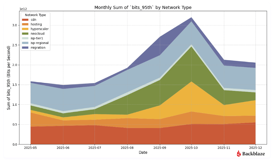
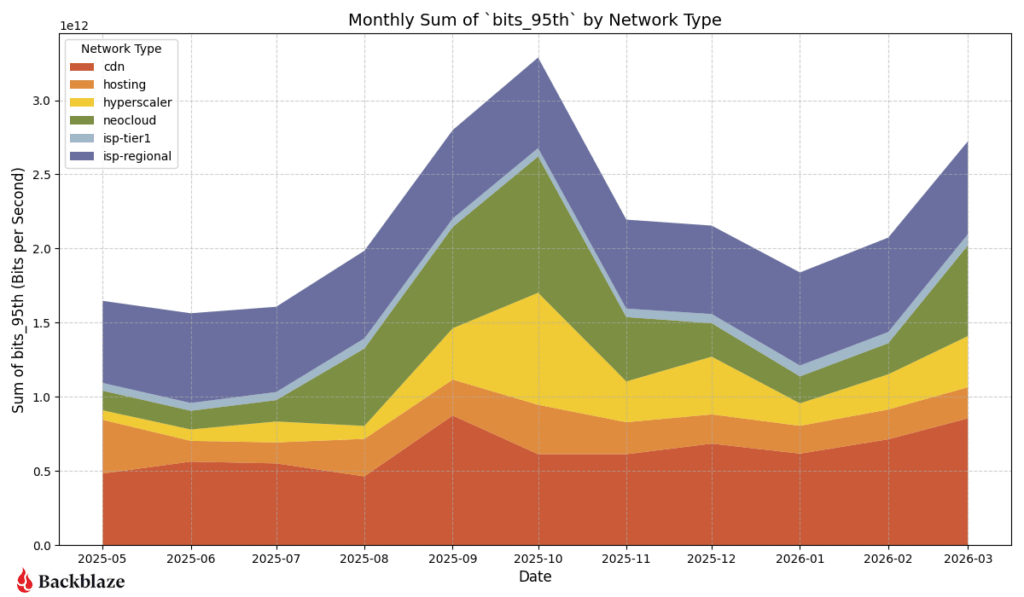
The stacked area graph below shows total traffic by network type over time updated with the most current data.

  • CDN traffic: New baseline of activity with a 66% increase from last year.
  • Hosting traffic: The hosting category (the light orange layer right above CDN) has remained incredibly rigid. Unlike neocloud or hyperscalers, which expand and contract elastically, hosting traffic has maintained a nearly identical bandwidth footprint for over a year.
  • Hyperscaler traffic: Hyperscaler traffic also followed the neocloud pattern, with the lowest amount of activity in January and remaining steady into June. Internal data sources show new workloads across all of the major hyperscalers in the past quarter.
  • Neocloud traffic: After a low point of activity in January, activity increased rapidly into March and has remained high until June. Internal telemetry shows that not only the amount of neocloud traffic increased in Q1 into Q2, but the number of neoclouds that we are interacting with has increased.
  • ISP-regional traffic: This was the dominant driver of the massive traffic spike in October 2025. While it dropped significantly into January 2026, it has aggressively rebounded through Q2 2026 and is currently the largest single driver of volume alongside neocloud.
  • Migration traffic: This traffic includes one way migrations into our environment, primarily serviced by partners such as Flexify.IO. We have migrations running all the time, but we can visually see large amounts around November 2025 and March of 2026.

Over the entire one-year graph range, Backblaze’s total platform traffic experienced volatility, peaking in October 2025 before seeing a multi-tier contraction down to a January 2026 winter baseline. Following this, in both Q1 and Q2 of 2026 we’ve observed an increase of activity led by a rebound in ISP-regional and AI-focused neocloud traffic. An additional standout is CDN traffic, which achieved a permanent and substantial new activity baseline, growing roughly 66% year-over-year.

Heatmaps: How and where data moves

To better understand our network activity, we isolated variables like region and types of provider. Here are the standard definitions we use each report: 

  1. Total traffic volume: Where did we send and receive the most traffic? 
  2. Magnitude: Where were the data transfers with the most bits per unique IP address?
  3. Uniqueness: What does the number of distinct IP addresses look like? 

Quick terminology refresher

Regions
US-West: Our largest and longest-running region
US-East: Region with the most observed proximity to neocloud infrastructure
CA-East: Our newest region in Canada. 
EU-Central: Our EU region. 

Network Types
CDN: Networks that use Backblaze as an origin store for content delivery. 
Hosting: Traditional hosting providers that runs workloads like physical or virtual servers for web, database, or application tasks.
Hyperscaler: Large, traditional cloud providers.
ISP-regional: Local or regional ISPs; think of these as the “last mile” paths as these networks are very close to customer equipment and efficient. 
ISP Tier1: National or international ISPs that carry our traffic long distances.
Neocloud: AI-focused compute networks.

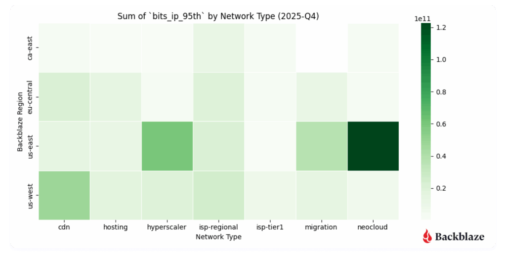
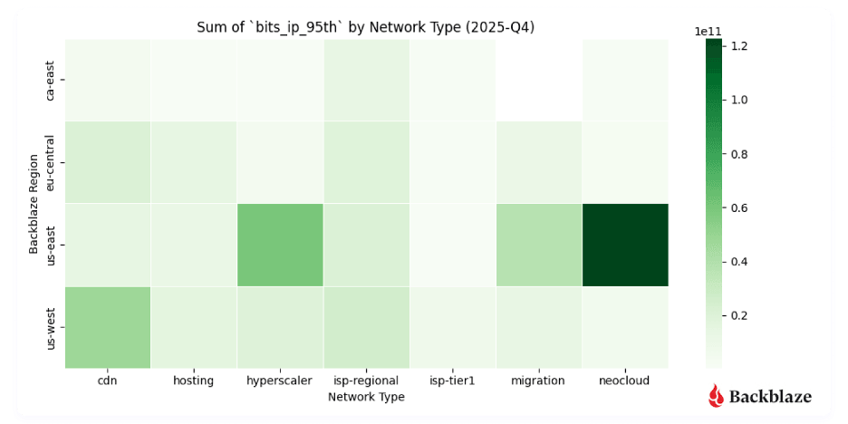
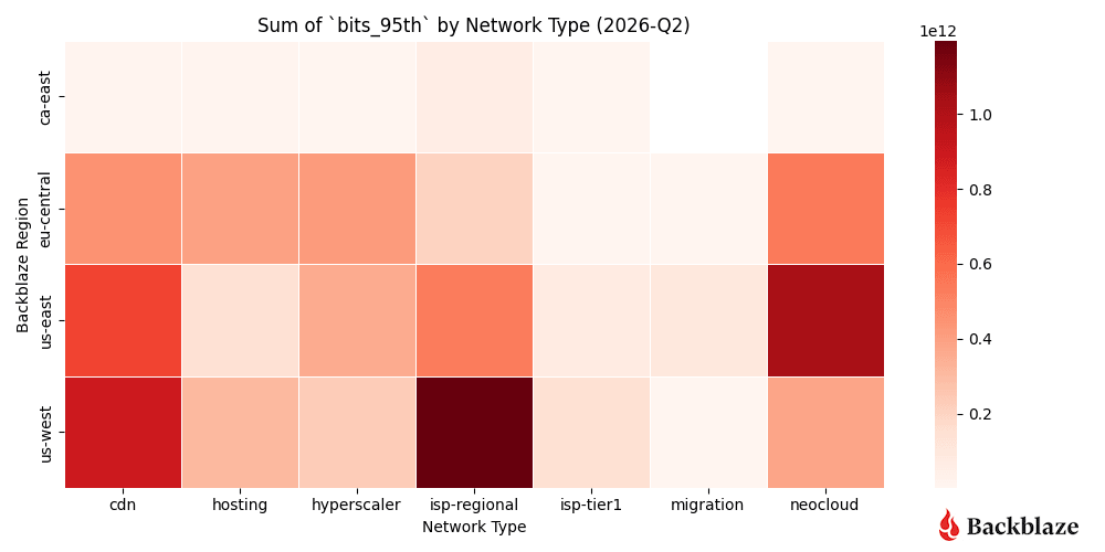
Heatmap #1: Where did we send and receive the most traffic?

ISP-regional traffic is a hotspot for US-West, as expected. This region has the largest internet exchange (IX) and server footprint behind it. Neocloud traffic remains concentrated in the US-East, but for this quarter traffic increased in the US-West and EU-Central regions. Another standout this quarter is more hyperscaler activity in EU-Central than the previous quarter. 
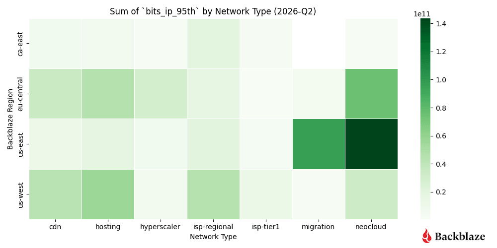
Heatmap #2: Where were the data transfers with the most magnitude (bits per IP address)?

Another metric we record is bits per IP or what we term “magnitude.” This combination of the amount of traffic transferred with how many actors are involved per network is a good proxy to measure how heavy or impactful individual data flows are. In short:

  • High volume, many IPs: Easier to distribute and load-balance across infrastructure. And many source and destination pairs means that we can traffic engineer at the WAN layer, sending some traffic over one provider and some over another.
  • High volume, few IPs: More difficult, but more interesting, from a NetEng perspective.

Traffic magnitude is currently a driver of decisions for capacity and growth plans. Our US-East region continues to have a high concentration of high bandwidth transfers between a small number of hosts. New for this quarter is an uptick in traffic magnitude in our EU-Central region. 

This could be an indication of more geographic spread of AI related workflows as for every quarter that we’ve reported on the metric value, we have seen more diversity into US-West and EU-Central outside of the concentration in US-East. We will continue to watch this trend.
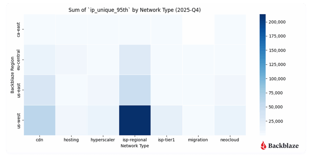
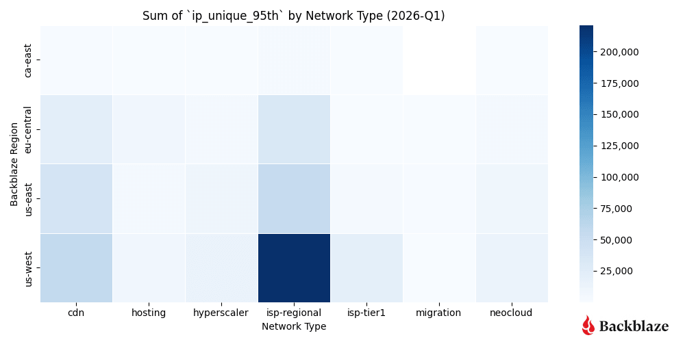
Heatmap #3: How many unique addresses do we interact with?

Not every graph or heatmap has to show something dramatic. Sometimes it’s good to see exactly what you expect quarter over quarter in a data series. This is especially true for our uniqueness metric, measuring the number of distinct IP addresses per network time. 

We interact with the most number of parties out of our US-West region. It’s the most mature and serves a large amount of ISP-regional consumers, so the consistency of the uniqueness metric is a good sanity check on our dataset. 

  • US-West shows the highest overall uniqueness, driven by its larger number of data centers and mix of workloads.
  • Neocloud traffic, by contrast, tends to involve fewer, more persistent endpoints, consistent with AI pipelines that rely on stable, long-standing connections between storage and compute.
Neocloud and hyperscaler traffic vs predictive patterns

This next set of charts shows a deeper dive into the metrics associated with neocloud and hyperscalers over time. The contrast between a more “traditional” workload (e.g., CDN, hosting, and ISP regional traffic) and emerging trends with neoclouds and hyperscalers is the easiest place to see the shift in network traffic profiles. The latter represents bursty, high magnitude traffic that reshapes conversations around network planning.  

Chart #1: What’s the magnitude of neocloud and hyperscaler traffic over time?
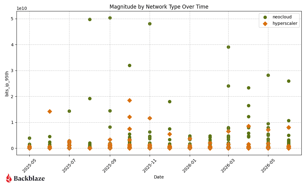
Following a highly concentrated, low-magnitude baseline for both categories in January and February 2026, Q1 closed with a dramatic March surge where several individual neocloud networks spiked massively.

Moving into Q2 2026 (April through June), while the absolute highest neocloud peaks compressed slightly downward compared to that March anomaly, the overall volume of high-magnitude neocloud workflows multiplied significantly, resulting in a much denser cluster of active endpoints staying consistently high quarter-over-quarter. 

Hyperscaler endpoints experienced a steady and noticeable upward move over the course of Q2, with multiple data points breaking out of their typical floor by May and June. 

Ultimately, neocloud retained its dominant, high-magnitude presence across both Q1 and Q2 quarters, while hyperscalers saw a distinct and steady escalation in individual workload sizes.

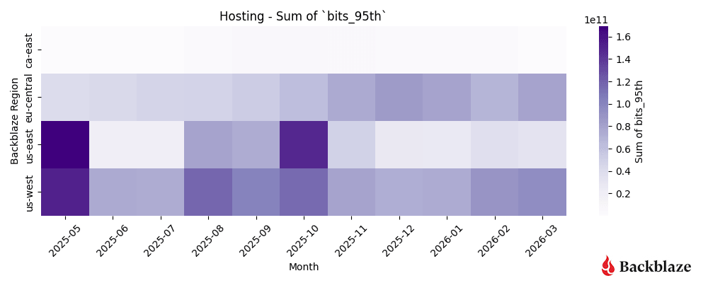
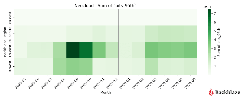
Heatmap #1 and #2: How dynamic are neocloud and hyperscaler traffic patterns?

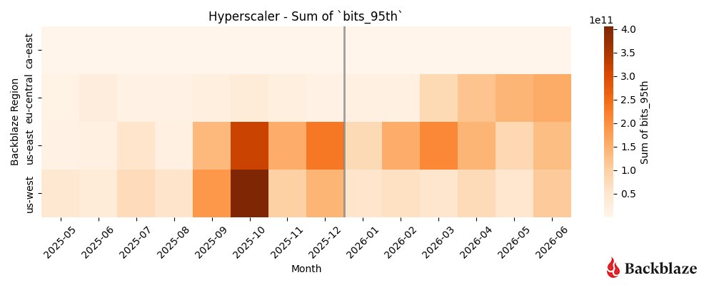
Neocloud related traffic continues to show strong concentrations in our US-East region with recent growth March into June. Hyperscaler traffic is the most variable when we compare it to last quarter’s heatmap. There is a new, more distributed concentration across all our three largest regions—US-East, US-West, and EU-Central. 

Together with the trends we’ve reported over the past year, these results suggest AI workloads on the Backblaze network are becoming geographically more distributed rather than remaining concentrated in a single region. Note the caveat: it’s possible, even probable, that there’s a macro trend about geographical dispersion of AI data, but it’s important also that Backblaze has become increasingly known as a trusted infrastructure provider specifically in this space. 

Layer on the fact that AI workloads can be reflective of fewer players with more data (see also: magnitude or elephant workflows), and what you have is difficulty understanding whether this is a macro trend, or Backblaze specific. We’ll keep our eyes on the data as it develops. 
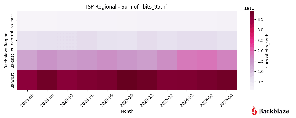
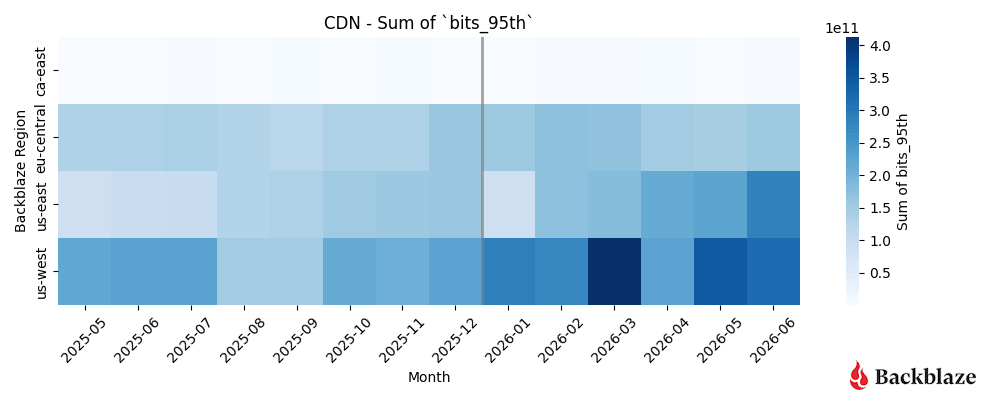
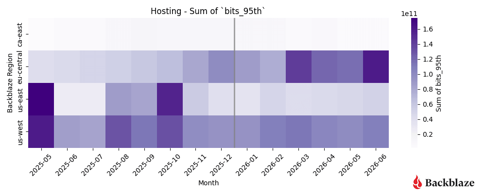
Heatmap #3, #4, and #5: How dynamic are CDN, hosting, and ISP-regional traffic patterns?

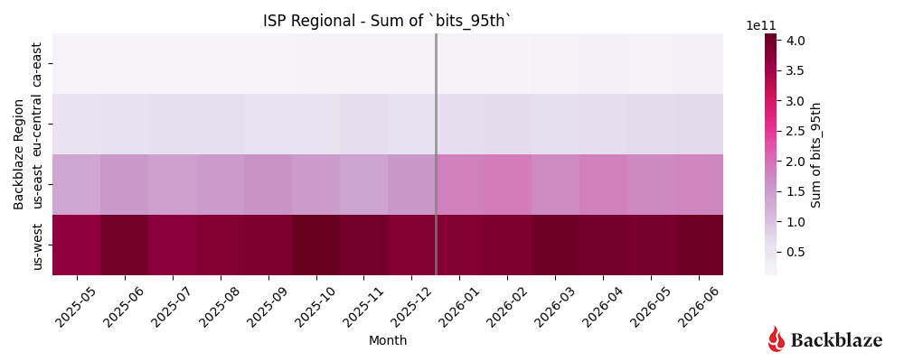
We’re grouping CDN, hosting, and ISP regional types together because they represent a “steady-state” for us as network operators. These patterns are predictable, spread out over time, and generally do not change month-to-month.

For Q2, we saw the concentration of CDN in US-West remain steady with traffic growth in our US-East region. Hosting traffic is showing a new pattern, with more activity in our EU-Central region starting in April into June.
Variance study methodology

For our new variance study we needed more granular traffic sampling data than aggregated weekly or monthly totals. Ten minute sample data gave us a balance between sampling fidelity, data warehousing storage, and query time when iterating on the project idea. 

Here’s a sample of anonymized data in one region, for one hour, for one ASN (network), with ingress and egress 95th bitrate percentage values:

Anonymized Timeseries Sample Example

datetime region asn ingress egress
2026-05-01T00:00:00 us-east asn-number 4408643576.86 72810025561.08
2026-05-01T00:10:00 us-east asn-number 4202884722.26 72153643081.09
2026-05-01T00:20:00 us-east asn-number 4282470297.97 72840197796.70
2026-05-01T00:30:00 us-east asn-number 4462602109.34 74194149854.89
2026-05-01T00:40:00 us-east asn-number 4011477298.04 73431072317.13
2026-05-01T00:50:00 us-east asn-number 3919542094.52 71051545108.21

Understanding the use of variance

Raw traffic metrics (total gigabits per second) tell us how much data is moving. Variance tells us how consistently it moves. 

Stable traffic is easier to plan for. Highly variable traffic requires more flexible network design and additional capacity planning—it reflects the bursty nature of AI training and inference workflows, where compute clusters can scale rapidly and move enormous datasets over short periods. 

Here’s how to read the analysis:

  • The shape of the bell curves (right column): A very tall, narrow peak indicates low variance. This means the traffic behaves predictably and stays clustered close to its baseline average. A short, wide, flattened curve indicates high variance, meaning the traffic is highly volatile, subject to massive sudden swings, and much harder to provision for.
  • The interplay of ingress vs. egress (left column): By overlaying both metrics, we can immediately spot structural imbalances. For instance, if one direction has a sharp spike (low variance) while the other is flat and wide (high variance), it signals that asymmetric network events are dominating that infrastructure type.

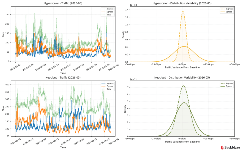
Below is a sampling of network data in one point in our network over the month of May 2026, with the traffic pattern graphed on the left side and variance on the right side. Immediately we can see different groupings of patterns. For readability and grouping, we’ve separated the types of networks into two categories: the dramatic and the reliable.

Bringing the drama: Hyperscaler and neoclouds

AI infrastructure behaves differently than traditional internet infrastructure. The following comparisons illustrate why.
So, what can we learn from this? Let’s examine it by network type. 

Hyperscaler: High egress volatility with balanced ingress

Ingress traffic remains tightly controlled around the baseline (sharp dashed peak). However, egress traffic (solid line) shows a flattened, high-variance spread. 

The time-series chart reveals constant, jagged fluctuations between 50 Gbps and 150 Gbps, indicating highly bursty customer data retrieval patterns throughout the month.

Neocloud: Synchronized, moderate volatility

Both ingress and egress display structurally similar, moderately wide bell curves. This reflects a well-proportioned network footprint where data-in and data-out scale together. 

The time series demonstrates sustained high baseline volumes (Total traffic consistently tracking between 200 Gbps and 350 Gbps) with continuous business-hour cyclical wave patterns.

As network operators we’re using this type of real-world data to help drive our connectivity footprint decisions. Large, bursty traffic patterns are best served by PNI network connections. PNIs allow us to isolate workflows to a distinct physical egress/ingress path in our network, which enables us to be able to more easily route, load-balance, and support these higher performance profiles. That translates into more predictable performance for customers running bandwidth-intensive AI workloads. 

We have a high interest in connectivity to partners in our US-East location, as it is located in the Ashburn-Reston datacenter corridor near a lot of existing datacenter campuses. This one again reinforces the notion that geography plays an important role in where entities are placing their data and compute engines rather than the nondescript “cloud”.

If you’re interested in learning more about the geography of neocloud traffic, visit the Q1 2026 report and review the “Where in the world is the neocloud?” section.

Let’s switch over to our three other major network types that we also want to profile for capacity, performance, and scalability considerations.

Bringing the predictability: CDN, hosting, and ISPs
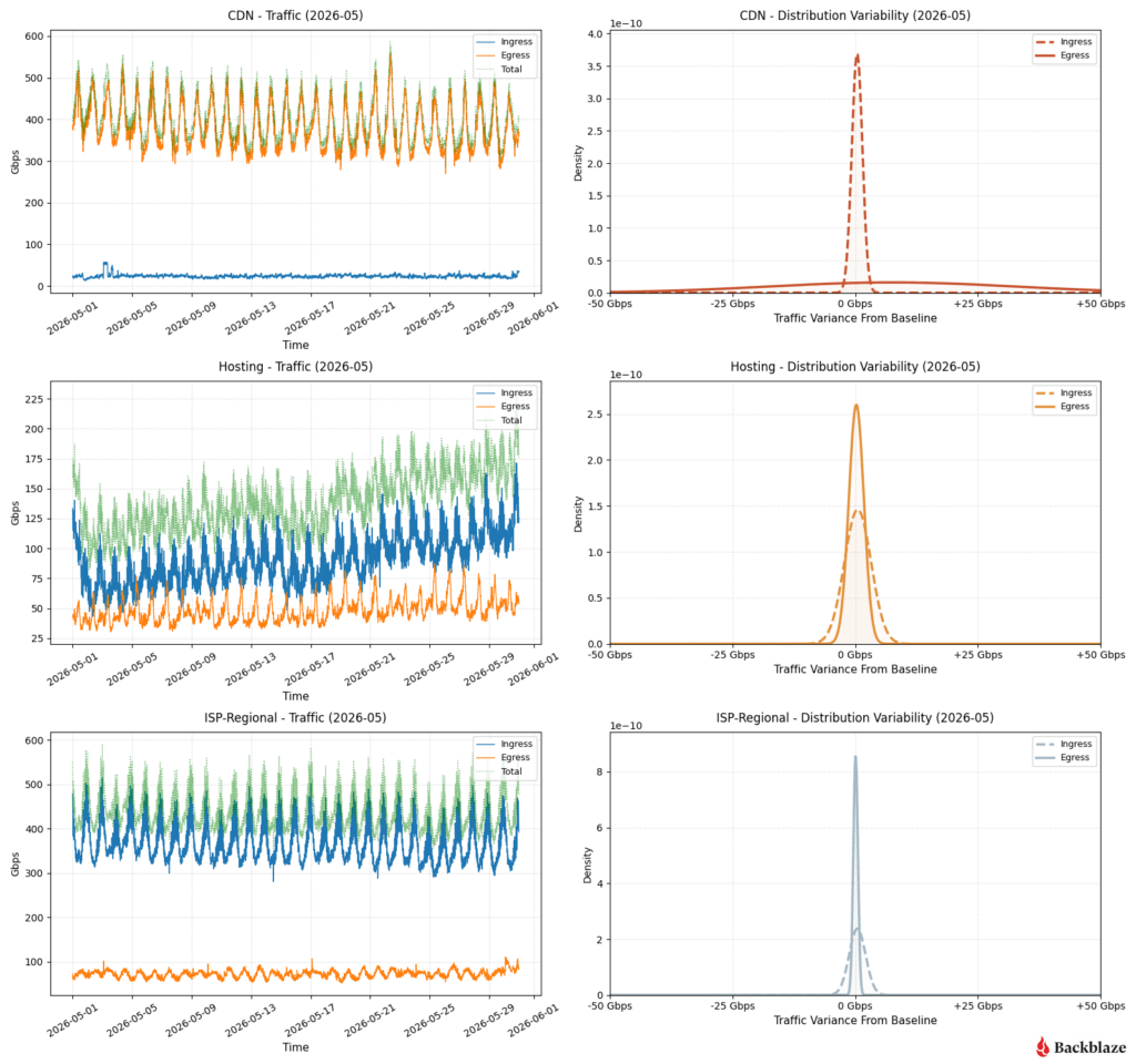
CDN: Extreme ingress stability vs. massive egress spread

The ingress curve is a razor-thin needle at 0 Gbps variance, proving inbound management traffic is perfectly flat. Conversely, the egress curve is completely flattened across the entire -50 to +50 Gbps spectrum. 

This is textbook CDN behavior: steady, quiet ingest lines paired with massive, erratic client-side distribution demands peaking near 600Gbps.

Hosting: Highly predictable footprint with asymmetric egress stability

Inbound traffic displays a slightly wider variance profile, while outbound traffic (egress) forms a remarkably sharp, low-variance peak. 

The time series shows a tight, rhythmic diurnal cycle for egress down near 25Gbps, while ingress experiences a steady climb over the course of May, rising from a 75Gbps baseline up past 125Gbps.

ISP regional: Extremely rigid inbound predictability

Regional consumer traffic demonstrates an ultra-low variance spike on egress, maintaining a very steady floor near 75Gbps. Ingress traffic carries slightly higher variance but remains highly constrained to predictable diurnal rhythms. 

This represents localized residential/commercial end-user ingress cycles, peaking consistently between 400 and 500 Gbps every single day.

Signals in the noise

This far into Network Stats, the biggest takeaway isn’t simply that there is more traffic because of AI. It’s that AI traffic has different—and still emerging—patterns compared with traditional cloud workloads. It’s more bursty, more geographically concentrated, and less predictable. Understanding those patterns helps us decide where to add capacity, when to upgrade interconnects, and how to design a network that can support tomorrow’s AI applications—not just today’s. 

As our dataset continues to grow, we’ll keep refining these models and sharing what we learn. Each quarter gives us a clearer picture of how AI infrastructure is evolving, and how cloud storage networks must evolve alongside it. Let us know what resonates, what questions you have, and what patterns you’re seeing in the comments section.

And, if you want to stay connected to this and other kinds of technical reporting from Backblaze, check out our Developer Newsletter.

The post Network Stats for Q2 2026: All Eyes on Neocloud Traffic Variance appeared first on Backblaze Blog | Cloud Storage & Cloud Backup
Network Stats for Q1 2026: Neocloud Traffic Trends

Post Syndicated from Brent Nowak original https://www.backblaze.com/blog/network-stats-for-q1-2026-neocloud-traffic-trends/

A decorative image with the words Q1 2026 Network Stats.

Welcome to our second quarterly Network Stats report covering Q1 of 2026. Along with Drive Stats and Performance Stats, Network Stats pulls back the curtain on real-world infrastructure data, particularly how network-level analytics reflect emerging AI industry trends and usage patterns. 

Get more Network Stats (and the details of the dataset)

If you are curious about what metrics we’re recording and how we classify data in this series, check out the details outlined in our Q3 2025 Network Stats  and Q4 2025 Network Stats report.

One of the roles of the Network Engineering (NetEng) team at Backblaze is to monitor how traffic moves into, out of, and across our platform—not just day-to-day, but over time as customer behavior and industry dynamics evolve. Right now, few forces are reshaping networks faster than AI. 

With the launch of B2 Overdrive in April 2025, we built a direct, high-performance path between our storage layers and neoclouds where processing, inference, and modeling take place. It has given us a front-row seat to the impact of AI and how network behavior is changing with it. This quarter, in addition to our regular data analysis, we’ve added some geographic heatmaps to understand where and how data is moving. 

Join us live for the webinar

Join us live for the Q1 2026 Network Stats webinarMonday, May 4, 2026 at 11:30 a.m. PT / 2:30 p.m. PT. We’ll explore where AI traffic concentrates, how high-magnitude data flows behave, and what early indicators suggest about the future of AI-native infrastructure design.

Can’t make it live, or reading this article after-the-fact? Sign up anyway and catch the recording on demand.

Get Inside Real AI Network Flows

AI: The elephant in the room

AI workflows don’t just need a place to store data, they need to be able to move it quickly, easily, and nearly constantly for short bursts. Large, multi-petabyte datasets are ingested, transformed, exported for training, pulled back for evaluation, and periodically refreshed as models evolve.  

Backblaze plays a key role at both ends of that lifecycle. We serve as a durable storage layer for the initial data ingestion, and as the high-throughput source feeding model training, evaluation, and validation to whatever best neocloud is suitable at the moment. Once that model has been trained, it needs to be stored, served, and periodically retrained, where we serve as the storage medium.

From a network perspective, this represents a meaningful shift from diffuse, internet-style traffic patterns to large, high-bandwidth flows between a smaller set of endpoints typical of AI-centric infrastructure.

Trends and spring renewal

The defining theme of the quarter is “winter freeze” as we observed what looks to be a quiet period of Neocloud and hyperscaler traffic over the winter months with an uptick in March. 

The stacked area graph below shows total traffic by network type over time updated with the most current data. Hosting and internet service provider (ISP) traffic stayed largely within historical norms reflecting steady-state usage patterns. Three slices stand out this quarter:

  • CDN traffic: Increase in CDN traffic over the winter months.
  • Neocloud traffic: After the October 2025 peak, we saw a decline in neocloud traffic heading into January. The winter months were a low volume period with an upward trend observed February into March 2026.
  • Hyperscaler traffic: Hyperscaler traffic also followed the Neocloud pattern of a low period during winter with an upward trend in March 2026.

With more than three quarters of data at our disposal, we can now start to see some trends over time. What do we think is happening? 

This could be an indication of the human element where the business cycle has a lot of downtime in the winter months—all of our code, infrastructure, computing jobs, and new innovations involve people somewhere along the chain and we all (hopefully) tend to take more time off in the winter months.

Another hypothesis is that our numbers only show bits transferred over our network links over time. If a large dataset has been stored with us, there may not need to be an update to the large stored dataset for a number of months as code and models are refined, and then suddenly a large amount of new data makes its way over our network links. Perhaps a combination of both—human and training lifecycle?

We’ll be tracking these metrics and updating in future reports, so this high-level view of network traffic segmented by network type will be interesting to watch.

Chart overview

Now let’s take a deep dive into our data and answer these questions:

Quarter over quarter heatmaps: How and where data moves

To better understand our network activity, we isolated variables like region and types of provider. Let’s look at the following dimensions: 

  1. Total traffic volume: Where did we send and receive the most traffic? 
  2. Magnitude: Where were the data transfers with the most bits per unique IP address?
  3. Uniqueness: What does the number of distinct IP addresses look like? 

Quick terminology refresher

  • Regions
    • US-West: Our largest and longest-running region
    • US-East: Region with the most observed proximity to neocloud infrastructure
    • CA-East: Our newest region in Canada. 
  • Network Types
    • CDN: Networks that use Backblaze as an origin store for content delivery 
    • Hosting: Traditional hosting providers that runs workloads like physical or virtual servers for web, database, or application tasks
    • Hyperscaler: Large, traditional cloud providers
    • ISP Regional: Local or regional ISPs, think of these as the “last mile” paths as these networks are very close to customer equipment and efficient 
    • ISP Tier1: National or international ISPs that carry our traffic long distances
    • Neocloud: AI -focused compute networks

Heatmap #1: Where did we send and receive the most traffic?

US-West ↔ ISP-Regional traffic continues to be a hotspot on the heatmap, as expected. This region has the largest footprint behind it and connections to internet exchanges (IX). This quarter, with a lull in neocloud and hyperscaler traffic over the winter period, we saw an increase in traffic to our CDN partners. The amount of traffic to CDN networks in the US-West, US-East, and EU-Central regions all increased quarter over quarter.

Heatmap #2: Where were the data transfers with the most magnitude (bits per IP address)?

Another metric we record is bits per IP or what we term “magnitude.” This combination of the amount of traffic transferred with how many actors are involved per network is a good proxy to measure how heavy or impactful individual data flows are. In short:

  • High volume, many IPs: Easier to distribute and load-balance across infrastructure. And many source and destination pairs means that we can traffic engineer at the WAN layer, sending some traffic over one provider and some over another.
  • High volume, few IPs: More difficult, but more interesting, from a NetEng perspective. 

Despite the total amount of traffic decreasing over the winter months for neocloud traffic, the magnitude of neocloud transfers still remains high. This speaks to the nature of the traffic pattern—when a GPU/compute cluster is ingesting or producing data, it does so at a high bitrate with just a few number of unique endpoints talking to each other.

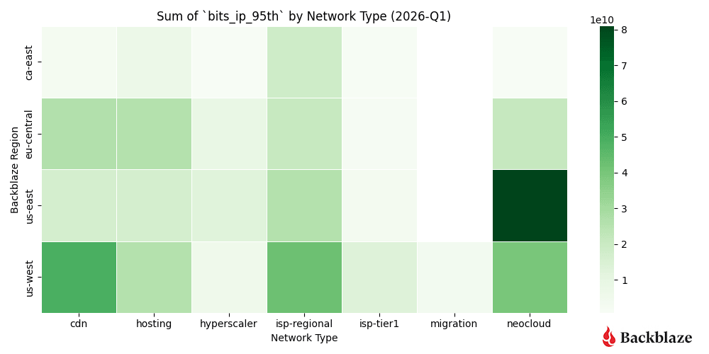
As expected, the concentration of our magnitude metric is high for our US-East cluster, with an uptick in concentration in US-West and EU-Central. Where specifically is this new concentration in these regions? Spoiler: We explore neocloud traffic later in the report with geographical data!

As with last quarter, we see a high concentration of neoclouds in US-East, but our new heatmap also shows a rising activity in US-West and EU-Central. We also see more distribution in other use cases. 

Heatmap #3: How many unique addresses do we interact with?

Uniqueness—measured by the number of distinct IP addresses per network type—adds another dimension to the story. Unsurprisingly, the quarter over quarter heatmap looks almost identical. This is expected with our US-West region being the most mature and serving a large amount of ISP Regional consumers and is a good sanity check on our dataset.

  • US-West shows the highest overall uniqueness, driven by its larger number of data centers and mix of workloads.
  • Neocloud traffic, by contrast, tends to involve fewer, more persistent endpoints, consistent with AI pipelines that rely on stable, long-standing connections between storage and compute. 

This is where we can clearly see those AI networking elephant flows showing up in the data.

Summary: Seasonal change in traffic flows

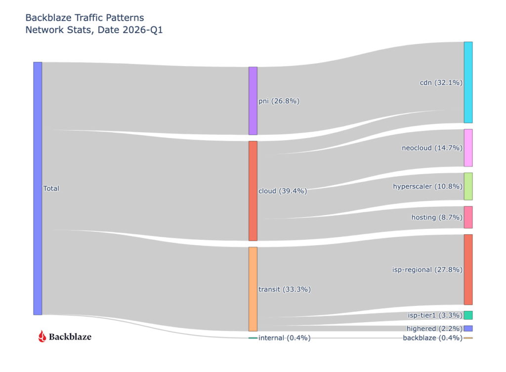
With a lull in bits transferred as noted in our top level graph, we can see what other networks by percentage took over. CDN traffic increased from around 20% to 32% of our total traffic, localized ISP regional traffic also increased 21.5% to 27.8%. Neocloud and hyperscaler traffic reduced from 36.4% in Q4 2025 to 25.5% in Q1 2026. 

Quarter over quarter data

We’re tracking our usual metrics here, and we gave you both this quarter and last quarter’s charts so you can easily spot potential trends.  

First let’s take a look at where all our traffic goes from a global perspective with an updated view of last quarter.

Next, let’s take a look at the geography of our network traffic. As we’ve already seen in previous heatmaps, data gravity is concentrating traffic into specific locations.

Where in the world is the neocloud?

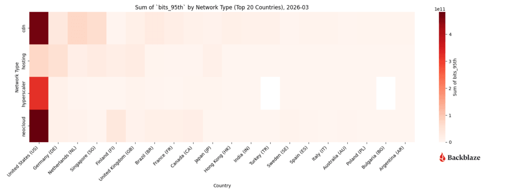
New for March 2026, we’ve added geographic information to our dataset, allowing us to take a look at the concentration of traffic based on network types. We’re taking a look into the following locational slices:

  1. Countries
  2. Countries excluding the United States
  3. U.S. states

Heatmap #1: What countries show the highest concentration of traffic by network type?

Neocloud, hyperscaler, and CDN traffic in our dataset all show high concentrations in the United States. Is this due to our US-West and US-East regions being the largest of our deployments or is it related to how certain traffic types are present in the emerging AI market? A quick search shows that the U.S. contains around 40-45% of all data centers globally, so it’s likely the sheer deployment size and scope of US sites aligns with what we’re seeing at the network level.

That said, excluding outliers can show us additional geographic trends, which leads to our next heatmap.

Heatmap #2: If we exclude the U.S., what countries show the highest concentration of traffic by network type?

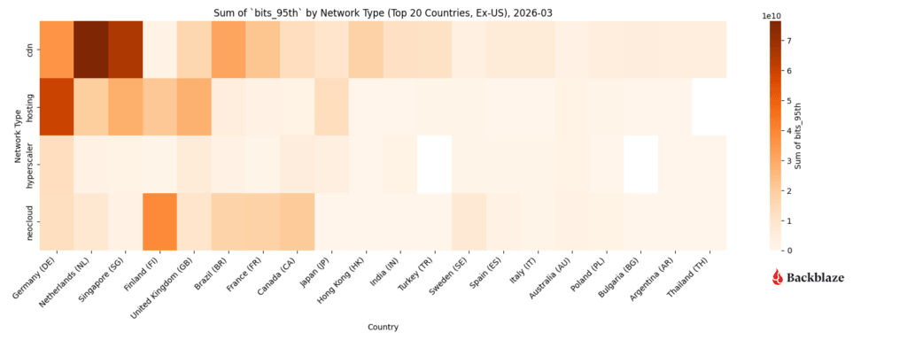
Since the United States numbers highly skew the heatmap concentration, below is a heatmap without the US to give us better fidelity on ex-US datapoints. Interesting to note that we deliver a large amount of traffic to CDN entities in the Netherlands. This is due in part to our connectivity to AMS-IX (Amsterdam Internet Exchange). 

The network posture of Europe differs from the United States to where local IX networks are preferred over larger Tier1 ISP networks for transit (politically, cost, and preference wise). Second up is Singapore for CDN content and hosting activity in Germany. The next standout is a concentration of neocloud related activity in Finland, Brazil, France, and Canada.

Heatmap #3: What U.S. States show the highest concentration of traffic by network type?

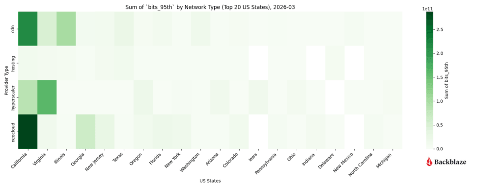
If we dive into just the U.S. States, we can see the heavily weighted concentration of neocloud traffic to and from California. Hyperscaler activity matching up with our expectations as California and Virginia (specifically the Ashburn and Reston corridor) have a high concentration of partner networks. CDN traffic for us concentrates more for Backblaze specifically since the US-West region is our largest cluster footprint and longest running sites, so naturally the data being served out of these sites is more long-lived content lifecycle wise.

These insights into data geography help us understand, plan, and modify our growth trajectory. I say “help,” because we’re also discovering that neocloud and hyperscaler activity is very bursty and has a high magnitude of traffic flow below. From a planning perspective, understanding whether those bursts translate to a higher baseline for increased demand—and how to support bursts when they happen—is a different conversation than the predictable network trends of years past. 

Neocloud and hyperscaler traffic vs predictive patterns

This quarter we’re sharing a deeper dive into the metrics associated with neocloud and hyperscalers over time. These two traffic types are driving innovation at Backblaze and are interesting to share to the larger industry. While CDN, hosting, and ISP regional traffic patterns are easy for us to model and account for as we manage our network infrastructure, neocloud and hyperscalers growth profiling are a challenge! As we said above, they are bursty and have a high magnitude (bits per associated IP address).

And, in the spirit of that conversation, we have several new views to share:

  • Neocloud and hyperscaler magnitude (bits per IP address) over time
  • Heatmaps over time
    • Neocloud
    • Hyperscaler
    • CDN
    • Hosting
    • ISP regional

Chart #1: What’s the magnitude of neocloud and hyperscaler traffic over time?

Matching our earlier charts, we saw a burst of activity from August to December of last year with a resurgence of high magnitude neocloud traffic in March of 2026.

Heatmap #1 and #2: How dynamic are neocloud and hyperscaler traffic patterns?

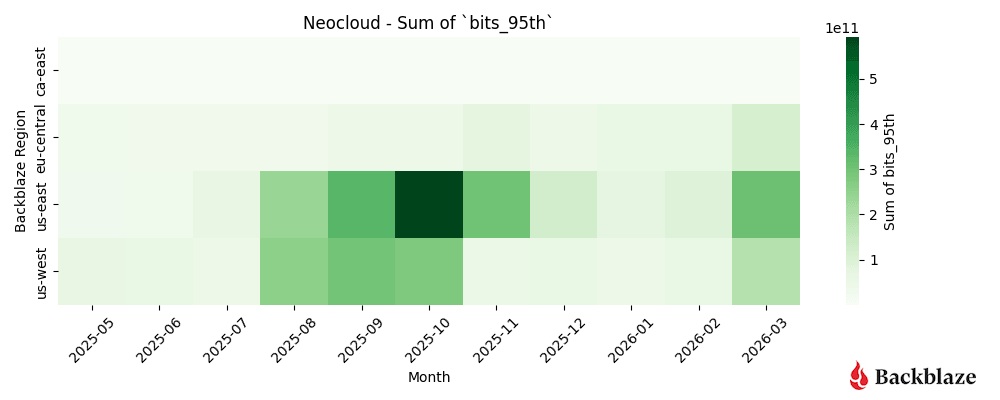
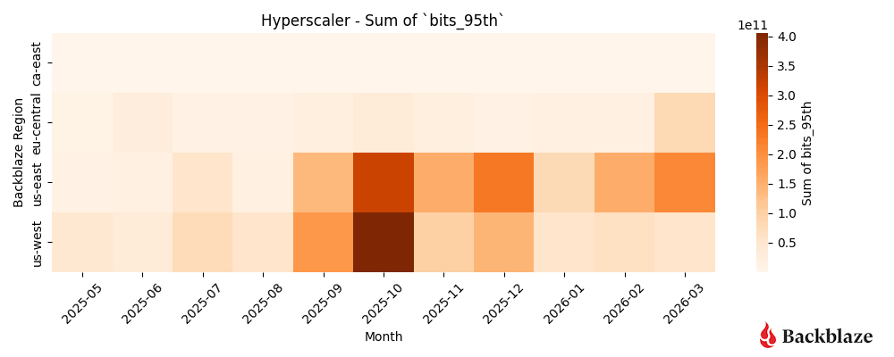
Neocloud and hyperscaler traffic patterns are the most impactful to our operations due to the magnitude of their data flows. Below is a more detailed look at these concentrations over time, with a burst of activity from August to November for Neoclouds, a quiet period over the winter months, and a pickup again in March. 

As expected our US-East region remains a hotspot of Neocloud related activity. One standout from this analysis is that the Neocloud activity in March is more spread out over our US-West, US-East, and EU-Central regions. It will be interesting to see if this spread grows or contracts over time.

Over the winter months, there was a noticeable decrease in activity for hyperscale related traffic, most notable in January, but when compared to neocloud traffic, the month-over-month traffic patterns remained strongly visible in our US-East region.

Heatmap #3, #4, and #5: How dynamic are CDN, hosting, and ISP regional traffic patterns?

We’re grouping CDN, hosting, and ISP regional types together because they represent a “steady-state” for us as network operators. These patterns are predictable, spread out over time, and generally do not change month-to-month. We do see visible bursts of traffic, like with a heavy blue tile for CDN in September and a few areas of hosting related traffic in May and October of 2025, but overall these are less impactful to our operations because the magnitude (bits per unique IP address) is lower—many sources are talking to many destinations, which as operators is easy to load balance.

The most striking example of this predictability is, unsurprisingly, ISP regional traffic. This represents your more consumer driven workflows and use cases.

Neocloud business cycle and geography

We can draw a conclusion from all these charts: neocloud and hyperscaler are both different traffic patterns and far more dynamic than CDN, hosting, and ISP regional traffic. For our Network Engineering group, this means we have two different stylistic approaches towards managing our network. 

First, when planning for the neocloud and hyperscaler traffic, our solutions entail adding large amounts of additional bandwidth in increments of 100G and often 400G ports to handle burst rates, ensuring that our inter-switch links inside our datacenter can also handle bursts of traffic, and reaching out to select partners to establish private network-to-network interface (PNI) connections where appropriate for zero-settlement transit. 

Our steady state growth patterns stem from CDN, hosting, and ISP regional traffic with easy to model growth curves. Looking over monthly numbers indicates a clear pattern for us, and that’s easy to plan for.

The last factor that we’re placing more emphasis on is the geographical location of our network interconnections. We’re seeing a high concentration of demand located in the United States, specifically in regions like California, Virginia, Illinois, and Georgia.

With more datapoints, we can clearly see the magnitude of the neocloud and hyperscaler transfers when compared to other network types. As above, it’s a bit early to claim concrete quarter over quarter patterns, but we’ll keep monitoring and updating the dataset. 

What’s next?

Anything specific you want to see? Let us know in the comments or reach out to the Network Stats team. Or, keep up-to-date with the latest technical content with our Developer Newsletter. 

The post Network Stats for Q1 2026: Neocloud Traffic Trends appeared first on Backblaze Blog | Cloud Storage & Cloud Backup
Point-to-Point at 100Gbps: What AI-Grade Infrastructure Actually Requires

Post Syndicated from Brent Nowak original https://www.backblaze.com/blog/point-to-point-at-100gbps-what-ai-grade-infrastructure-actually-requires/

A decorative image that shows several cubes on a background.

Bandwidth purchased for data center connectivity surged by nearly 330% between 2020 and 2024, driven primarily by AI workloads. And in 2024, just 10 buyers accounted for nearly 62% of all purchases, according to Zayo’s Bandwidth Report. That concentration is a structural feature of how AI moves data.

Every training run that pulls data from Backblaze storage to a neocloud passes through our network, and our telemetry captures what those flows look like in real time. Our Q4 2025 Network Stats report covers a full quarter of that data. It shows AI workloads producing a distinct network signature: sustained, high-volume transfers between a small number of endpoints, with infrastructure requirements specific enough to be worth examining in detail.

This piece walks through what that signature looks like and what it means for the infrastructure decisions teams are making right now.

The AI model lifecycle and how it moves data

AI model development is a cycle. Large datasets are ingested and consolidated, exported to compute for training, pulled back for evaluation, then pushed out again as models are refined, retrained, and updated with new data. Each stage requires moving substantial volumes of data between storage and compute, repeatedly, over the life of a model.

That structure produces a specific kind of network traffic. AI training moves petabyte-scale data between storage and compute nodes in sustained, long-lived flows—what network engineers call elephant flows—with training jobs running for hours or days under continuous network load. Add frequent checkpointing, model updates, and periodic data refreshes, and the result is traffic that is high in volume and persistent across the entire training run.

This shows up clearly in the Q4 2025 Network Stats data. Neocloud traffic spiked sharply from July through November, peaking in October, then settled into a higher baseline heading into the new year. One interpretation of that shape is the AI lifecycle playing out across a concentration of large training cycles: ingestion, training egress, then a new steady state as stored models get served and periodically retrained. As we accumulate more quarters of data across a broader customer mix, we’ll be better positioned to distinguish that pattern from seasonal budget cycles or customer-specific factors.

Also visible in the Q4 data is where this traffic is going. Cloud-to-cloud traffic grew from 36.2% to 49.6% quarter-over-quarter, with hyperscaler destinations rising from 3.5% to 18%. As the report notes, it’s too early to call these statistically significant trends; the dataset reflects Backblaze’s specific customer mix and covers a single quarter. The direction is consistent with how AI teams operate in practice: moving workloads across neoclouds and hyperscalers depending on price, availability, and job requirements. The storage layer is what persists across those compute environments, which has direct implications for how it needs to be designed.

What elephant flows require from a network

Traditional cloud infrastructure is designed around a specific traffic profile: many clients, many sessions, many discrete transactions. Routing, load balancing, and edge capacity are all optimized for that pattern, distributing load broadly and handling high volumes of short-lived connections efficiently.

Elephant flows don’t fit that profile. AI training establishes persistent, high-volume connections between client and storage that sustain continuous data movement for hours or days at a time. These connections are stickier than typical cloud traffic, particularly on peered networks, and the strain they produce is concentrated rather than distributed—showing up primarily at the edge, where routers handle sustained throughput at scale. Most traditional cloud infrastructure wasn’t provisioned for that kind of sustained pressure at the edge, because most workloads don’t produce it. Internal to the network, depending on a myriad of things—object size, concurrent threads, hardware, internal routing logic—your network path being sticky doesn’t reduce the number of I/O operations for servers, and often that becomes one of the biggest bottlenecks. 

The stakes make this consequential. Training the most advanced models now costs hundreds of millions of dollars, according to Epoch AI—though we also know this is a new technology, and therefore likely the compute will get more efficient over time. That said, the storage is still storage: Data has to live somewhere.  

Infrastructure that can’t sustain throughput under continuous load doesn’t just slow training down; it adds cost to every run. The practical answer is building throughput capacity at the connection points between storage infrastructure and the internet or peer network, sized for sustained flows rather than peak bursts.

That’s what AI-grade storage infrastructure is designed around: sustained throughput to a small number of destinations, at 100Gbps to 1Tbps per transfer for the largest AI workflows. Achieving that in practice means rethinking how a network is designed, routed, and scaled. We’ve written separately about what that looked like for Backblaze’s own infrastructure. Latency matters here for a specific reason: on long-distance transfers, higher latency directly limits achievable sustained throughput, which is one reason why geographic proximity to compute infrastructure affects real-world performance. 

The Q4 Network Stats heatmaps show this pattern from two angles. The magnitude heatmap, measuring bits transferred per unique IP address, shows high-magnitude neocloud flows clustering clearly in regions serving AI-heavy compute endpoints. The uniqueness heatmap shows neocloud traffic involving fewer, more persistent endpoints than CDN or ISP traffic, consistent with AI pipelines that rely on stable, long-standing connections between storage and compute.

The geography of AI infrastructure

The heatmaps show where AI traffic concentrates geographically today. Neocloud activity in the Q4 dataset clusters in Chicago, Dallas-Houston, Denver, New York, the Northern Virginia Reston/Ashburn corridor, and Atlanta, with a clear skew toward the East Coast. This reflects where AI compute infrastructure was built first and remains densest. Keeping latency low between storage and compute is a prerequisite for sustaining the high throughput rates AI workflows require, and that constraint has historically made East Coast proximity an advantage.

That concentration is consistent with broader infrastructure dynamics. AI training workloads are driving demand for regions with available power, fiber density, and compute infrastructure, and power constraints in preferred markets are already forcing operators to explore secondary locations and invest in custom power infrastructure. Demand in markets outside traditional data center hubs is growing rapidly as a result: Metro bandwidth in Memphis grew from 0.3 terabits to 13.2 terabits between 2023 and 2024. On the flip side, building out cabling to those traditionally under-utilized locations is expensive, often adding thousands of dollars per month to data center economics. High-capacity interconnects are central to making those secondary locations viable; without them, the compute investment is stranded. 

The scale of what’s being built reflects the trajectory of the workload. AI training infrastructure is projected to grow at a 22% compound annual growth rate (CAGR) through 2030, reaching more than 60GW of capacity, while inference infrastructure is expected to grow faster still at 35% CAGR, reaching more than 90GW, according to McKinsey. Training and inference have different geographic requirements: training tolerates latency and can sit in power-rich remote locations, while inference needs to be close to users, which means the buildout will be distributed across both dense metro markets and secondary locations connected by high-capacity fiber.

Backblaze’s own infrastructure decisions reflect this pattern directly. The East Coast concentration drove the decision to double Backblaze’s US-East footprint. At 100Gbps and above, proximity to where AI compute is actually running is a determining factor in storage performance.

What AI-ready storage infrastructure actually means

Storage has traditionally been sized for capacity and evaluated on cost per terabyte. AI workflows change the calculus. When a training run is pulling petabytes of data from object storage to flash storage at sustained 100Gbps rates, the storage layer is as much a performance determinant as the compute layer. A storage system that can’t sustain those throughput rates creates a bottleneck that no amount of GPU capacity can compensate for.

Throughput capability is one requirement. Portability is the other. The multi-cloud behavior visible in the Q4 data reflects how AI teams actually operate: moving workloads to whichever compute provider offers the best price-performance for a given job. Storage that is tightly coupled to one cloud provider is structurally incompatible with that workflow. Data that can’t move freely across cloud environments becomes a constraint on the model development process.

This is the infrastructure problem Backblaze B2 Overdrive is designed to address. By building a direct, high-performance path between Backblaze’s storage layer and the neoclouds where AI processing takes place, it provides the sustained throughput that training workflows require alongside the portability to move data as compute requirements change. The connections between Backblaze and neocloud endpoints visible in the Q4 heatmaps represent that architecture in practice.

The point extends beyond any single product. As AI workloads become a larger share of overall data center activity, the criteria for evaluating storage infrastructure are shifting. Capacity and cost per terabyte remain relevant, but sustained throughput capability, interoperability with compute providers, and network proximity to AI infrastructure are becoming equally important factors. Teams that treat storage as a passive component in AI pipeline design are likely to find it becomes the active constraint.

Early signal, long trend

The Q4 2025 Network Stats data is one quarter of observations from one storage provider’s network. The patterns it shows—high-magnitude flows to a small number of endpoints, East Coast geographic concentration, rising cloud-to-cloud traffic, a higher baseline heading into the new year—are consistent with what the broader industry understands about how AI moves data. What’s new is that they’re visible in real network telemetry rather than modeled projections.

We’ll be watching how neocloud traffic concentration evolves regionally, how the training-to-inference ratio shifts as inference infrastructure scales, and whether the cloud-to-cloud growth visible this quarter continues.

The full dataset, methodology, and visualizations are in the Q4 2025 Network Stats report. For background on how we classify and measure network traffic, the Q3 2025 report covers the dataset in detail, and you can follow the whole series here.

The post Point-to-Point at 100Gbps: What AI-Grade Infrastructure Actually Requires appeared first on Backblaze Blog | Cloud Storage & Cloud Backup

Network Stats for Q4 2025: Neocloud Traffic Trends

Post Syndicated from Brent Nowak original https://www.backblaze.com/blog/network-stats-for-q4-2025-neocloud-traffic-trends/

A decorative image with the text Q4 2025 Network Stats.

Welcome to our second quarterly Network Stats report covering Q4 of 2025. Along with Drive Stats and Performance Stats, Network Stats pulls back the curtain on real-world infrastructure data, particularly how network-level analytics reflect emerging AI industry trends and usage patterns.

Get more Network Stats (and the details of the dataset)

If you are curious about what metrics we’re recording and how we classify data in this series, check out the details outlined in our Q3 2025 Network Stats  report.

One of the roles of the Network Engineering (NetEng) team at Backblaze is to monitor how traffic moves into, out of, and across our platform—not just day-to-day, but over time as customer behavior and industry dynamics evolve. Right now, few forces are reshaping networks faster than AI. 

With the launch of B2 Overdrive in April 2025, we built a direct, high-performance path between our storage layers and neoclouds where processing, inference, and modeling take place. It has given us a front-row seat to the impact of AI and how network behavior is changing with it. This quarter, in addition to our regular data analysis, I’ll walk through where AI-driven traffic is concentrated, how ingress and egress patterns showed up, and what the findings say about where AI infrastructure might be headed next. 

Continue the conversation

Join us live for the Q4 2025 Network Stats webinar Wednesday, February 4, 2025 at 10:00 a.m. PT / 1:00 p.m. ET. We’ll explore where AI traffic concentrates, how high-magnitude data flows behave, and what early indicators suggest about the future of AI-native infrastructure design.

Can’t make it live, or reading this article after-the-fact? Sign up anyway and catch the recording on demand.

Get Inside Real AI Network Flows

Brave new market

AI workflows don’t just need a place to store data, they need to be able to move it quickly, easily, and nearly constantly for short bursts. Large, multi-petabyte datasets are ingested, transformed, exported for training, pulled back for evaluation, and periodically refreshed as models evolve.  

Backblaze plays a key role at both ends of that lifecycle. We serve as a durable storage layer for the initial data ingestion, and as the high-throughput source feeding model training, evaluation, and validation to whatever best neocloud is suitable at the moment. Once that model has been trained, it needs to be stored, served, and periodically retrained, where we serve as the storage medium.

This quarter, we saw a large amount of traffic between Backblaze, neoclouds, and traditional hyperscalers for processing concentrated across the months of June to November. This reflects large-scale ingestion events followed by intensive data manipulation and model-related egress. 

From a network perspective, this represents a meaningful shift from diffuse, internet-style traffic patterns to large, high-bandwidth flows between a smaller set of endpoints typical of AI-centric infrastructure.

The neocloud slice

The defining theme of the quarter is “new:” new AI-oriented workflows, new traffic patterns, and leading indicators of new infrastructure trends. 

The stacked area graph below shows total traffic by network type over time. While content delivery network (CDN), hosting, and internet service provider (ISP) traffic stayed largely within historical norms reflecting steady-state usage patterns like content delivery, web hosting, and traditional backup workflows, two slices stand out:

  • Migration traffic: We saw a notable increase in migration traffic from August through October.  This classification reflects an influx of data into our network over fiber connections we have in the data centers to cost effectively migrate large amounts of data over private links, not using the public Internet.
  • Neocloud traffic: We saw a sharp increase in July through November, peaking in October.

What do we think is happening? Taken together, these patterns suggest a familiar AI lifecycle:  large datasets consisting of assets like images, videos, and metadata are ingested and consolidated then exported for training and experimentation. Now, those assets can be periodically updated as new assets are added and generated models and stored. We see that heading into the new year, the overall baseline has increased indicating a new normal.

Quick terminology refresher

  • Regions
    • US-West: Our largest and longest-running region
    • US-East: Region with the most observed proximity to neocloud infrastructure
    • CA-East: Our newest region in Canada. 
  • Network Types
    • CDN: Networks that use Backblaze as an origin store for content delivery 
    • Hosting: Traditional hosting providers that runs workloads like physical or virtual servers for web, database, or application tasks
    • Hyperscaler: Large, traditional cloud providers
    • ISP Regional: Local or regional ISPs, think of these as the “last mile” paths as these networks are very close to customer equipment and efficient 
    • ISP Tier1: National or international ISPs that carry our traffic long distances
    • Neocloud: AI -focused compute networks
    • Migration: Network links that we use for large-scale data onboarding

Heatmaps: Where AI traffic concentrates

To better understand where AI activity is happening, we thought it would be interesting to isolate the different Backblaze regions and to view concentrations of metrics visualized through heatmaps. We’re going to look at the following three dimensions: 

  1. Total traffic volume: Where did we send and receive the most traffic? 
  2. Magnitude: Where were the data transfers with the most bits per unique IP address?
  3. Uniqueness: What does the number of distinct IP addresses look like? 

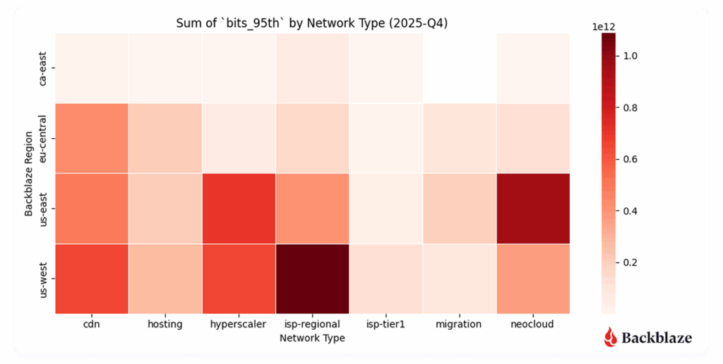
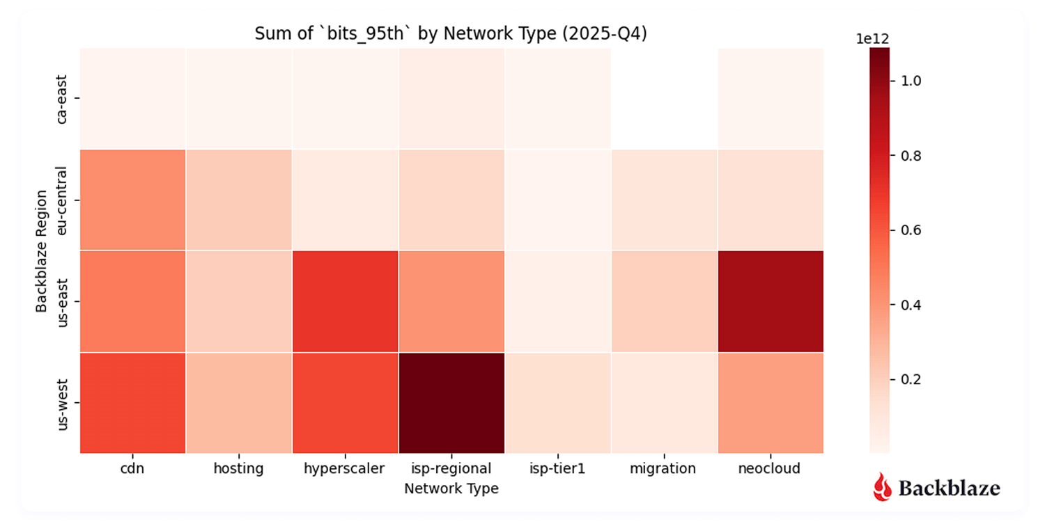
Heatmap #1: Where did we send and receive the most traffic?

Unsurprisingly, US-West ↔ ISP-Regional traffic dominates in total traffic volume. This region has the largest data center footprint behind it, with connectivity to internet exchanges (IX) such as Equinix-IX that were brought online in 2023. Internet exchanges bring us closer to consumer networks, where we can deliver traffic with lower latency.

More interesting, however, is the US-East ↔ neocloud concentration. Our flow data shows neocloud activity clustering in regions including Chicago, Dallas-Houston, Denver, New York, Northern Virginia (Reston/Ashburn corridor), and Atlanta—skewed more towards the East Coast where there’s dense AI compute availability. 

From a performance standpoint, this makes sense. It’s important to keep latency (the time between the source and destination) lower to achieve consistent high bandwidth rates for AI data transfers. For now, that gravity is pulling activity towards the East coast. 

Will neocloud traffic concentrations shift over time? Since this is our first quarter with a full dataset, it’s a bit early to draw long-term conclusions. But this is exactly the kind of trend we’ll be tracking. Stay tuned for future Network Stats reports.

Heatmap #2: Where were the data transfers with the most magnitude (bits per IP address)?

Another metric we record is bits per IP or what we termed in our last report “magnitude.” This combination of the amount of traffic transferred with how many actors are involved per network is a good proxy to measure how heavy or impactful individual data flows are. In short:

  • High volume, many IPs: Easier to distribute and load-balance across infrastructure. And many source and destination pairs means that we can traffic engineer at the WAN layer, sending some traffic over one provider and some over another.
  • High volume, few IPs: More difficult, but more interesting, from a NetEng perspective. 

With B2 Overdrive, we routinely support client transfers starting at 100Gbps up to 1Tbps of throughput.These high-magnitude flows show up clearly in the data, especially in regions serving AI-heavy neocloud endpoints. Seeing these patterns emerge in the data validates that customers are actively using the platform the way it was designed.

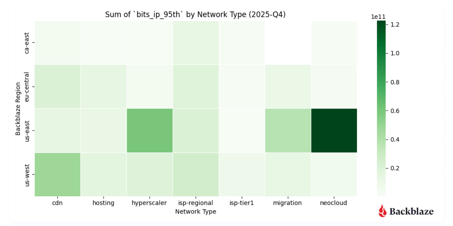
Heatmap #3: How many unique addresses do we interact with?

Uniqueness—measured by the number of distinct IP addresses per network type—adds another dimension to the story. 

  • US-West shows the highest overall uniqueness, driven by its larger number of data centers and mix of workloads.
  • Neocloud traffic, by contrast, tends to involve fewer, more persistent endpoints, consistent with AI pipelines that rely on stable, long-standing connections between storage and compute. 

This contrast reveals a broader trend: AI networking is less about many-to-many communication and more about sustained high-throughput relationships between specialized systems.

A chart showing the number of unique IP addresses that sent or received data to the Backblaze networks by region.
Communication uniqueness across our regions to each network type

Summary: Early indicators of an AI-native network era

This quarter represents an early but important snapshot of how AI is reshaping network behavior:

  • AI-driven traffic is concentrated and heavy (not groundbreaking news by any means, but interesting to see it played out on a network).
  • Neocloud connectivity is a defining feature of data movement today.
  • Data gravity is pulling storage, compute, and network design into tighter alignment.

This is our first look at these patterns specifically. As we gather more quarters of data, we’ll be watching closely to see how cyclical neocloud activity becomes, how regional concentrations shift, and how the growing ecosystem of AI-focused ISVs continues to change the shape of the network.

Quarter over quarter data

Last quarter we started capturing data and metrics that we were interested in tracking over time. This represents our first full quarter of data as we only started tracking in August of 2025, so it’s still early to start to see trends, but we’re including the visualizations for fidelity. 

First let’s take a look at where all our traffic goes from a global perspective with an updated view of last quarter.

A Sankey diagram that tracks total data traffic flow between Backblaze and different types providers for Q4 2025.
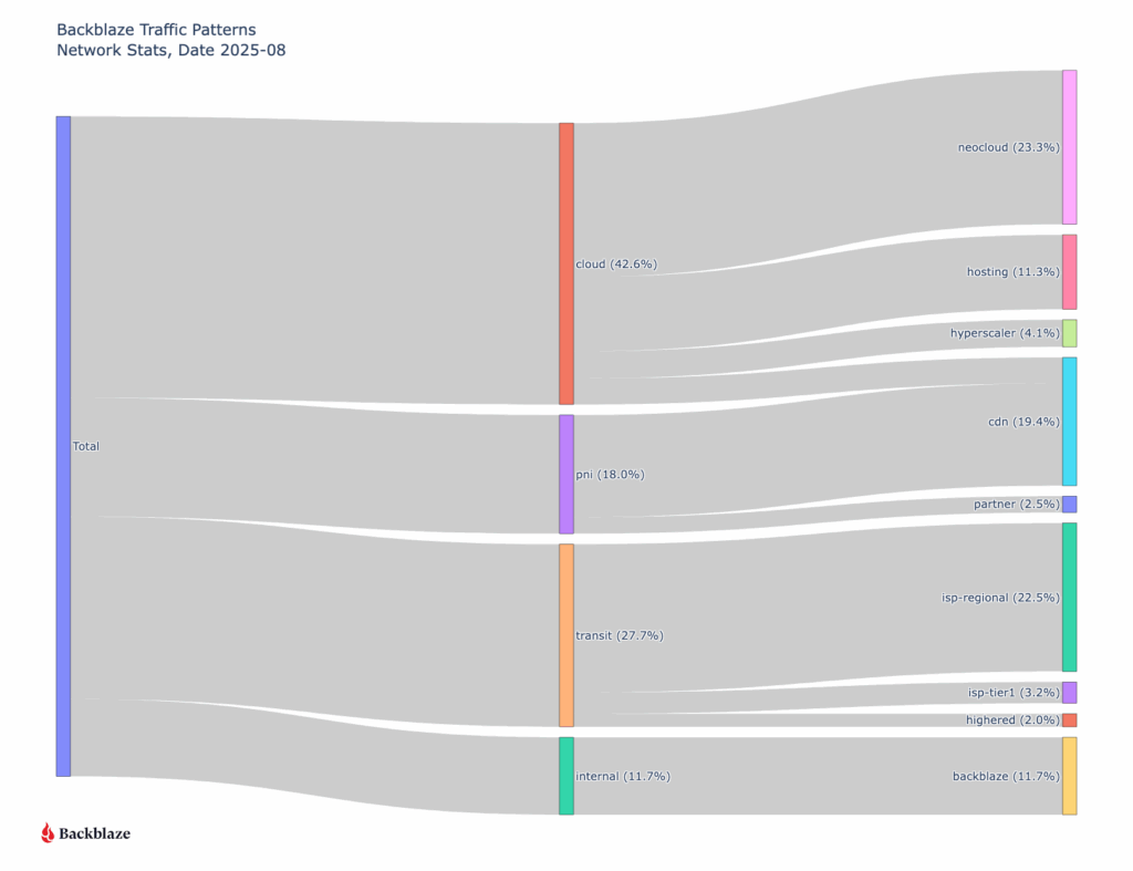
Sankey diagram of all August ingress and egress traffic grouped by type of network

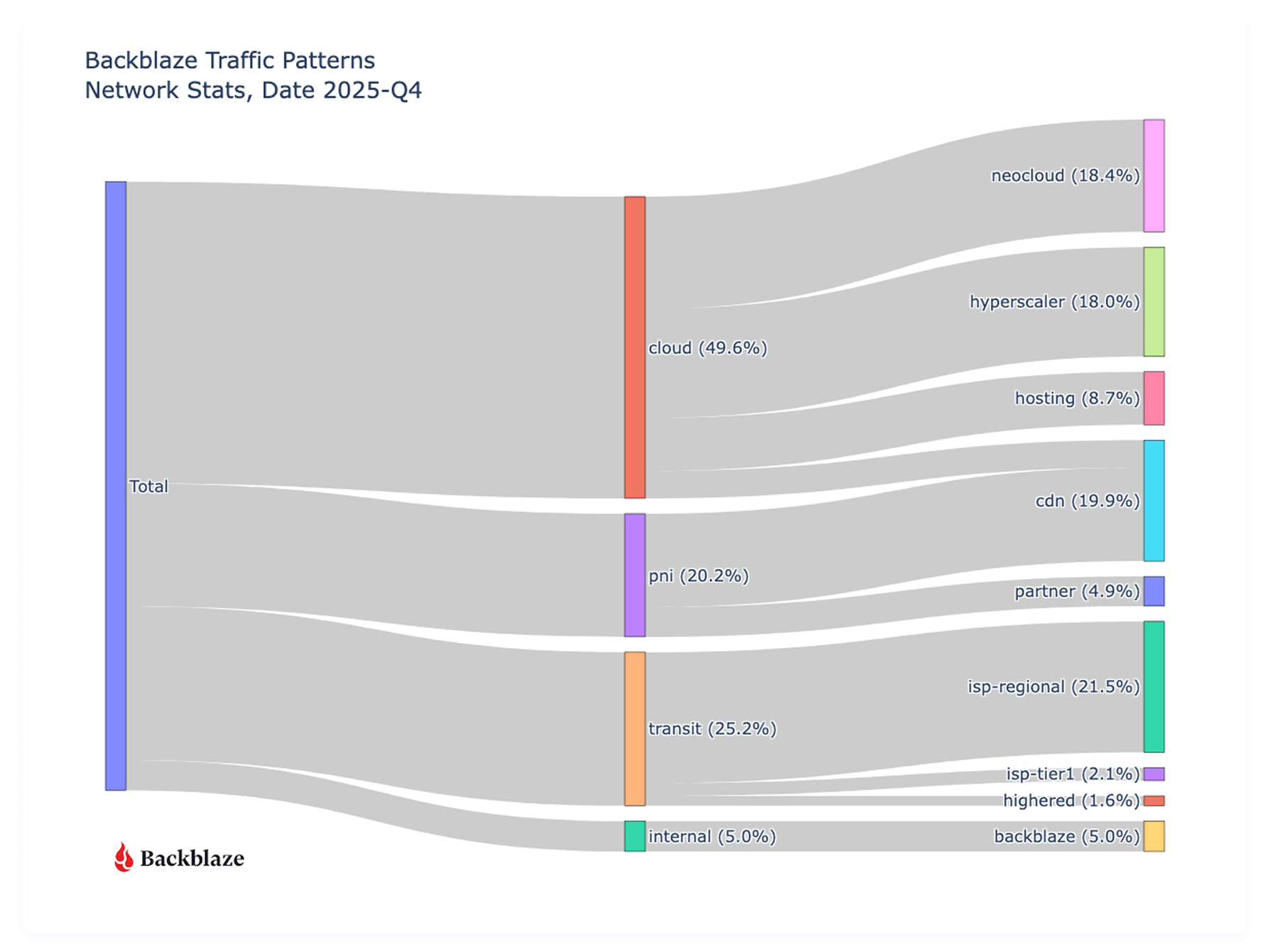
Traffic to other clouds has increased (36.2% to 49.6%) since we last reported in August of 2025, with a slight decrease (19.8% to 18.4%) in Neocloud destinations, but a large increase (3.5% to 18%) to hyperscalers. It’s too early to call these things statistically significant trends or patterns that impact the cloud storage industry broadly, because they’re reflective of what types of customers Backblaze specifically has and our sampling range is only a quarter. That said, we do see an overall increase in cloud to cloud traffic, but the higher percentage to the type of clouds rotated from last quarter.

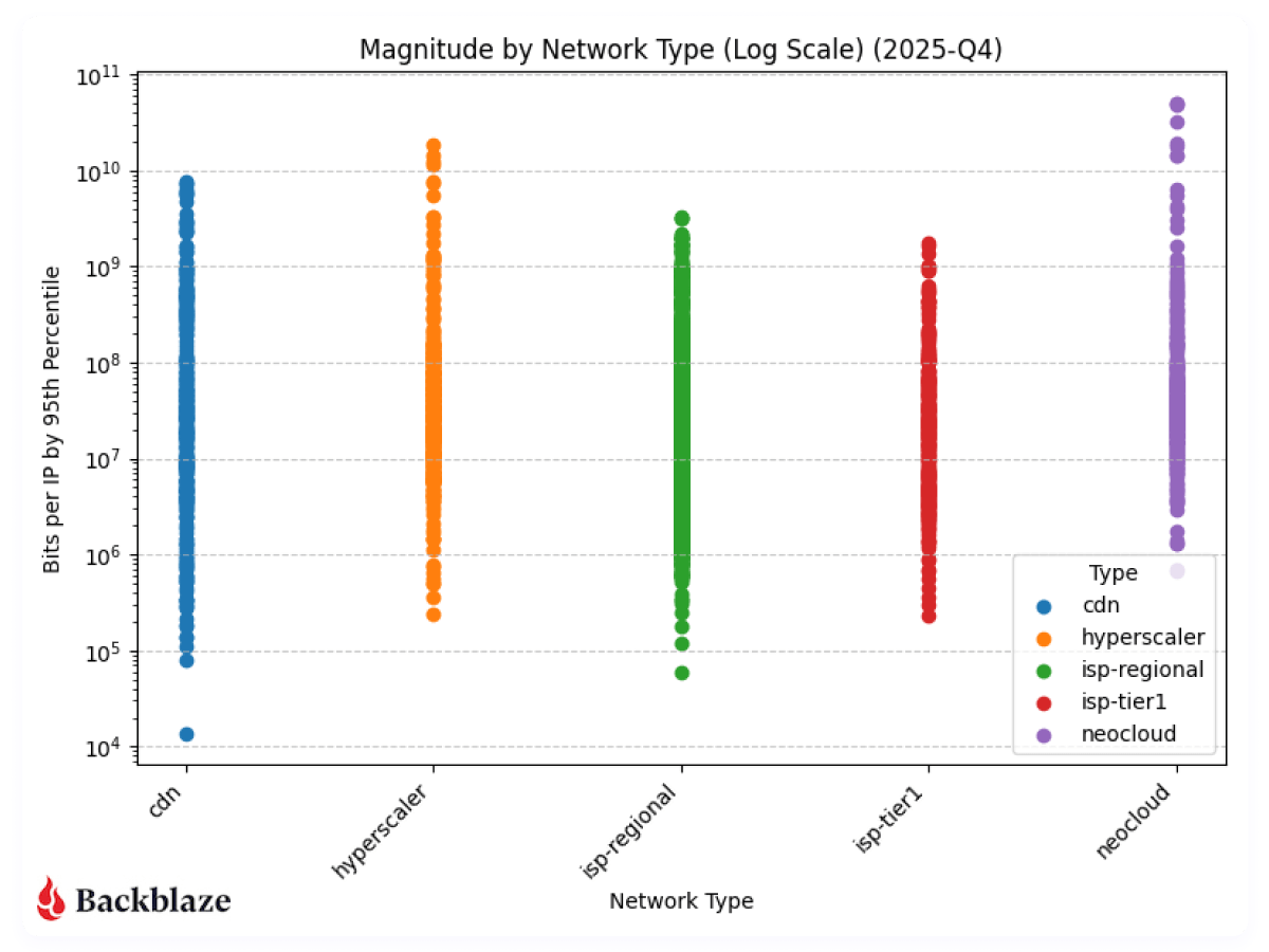
Next, let’s look at the magnitude of our network traffic based on the category of the traffic destination. As a reminder, magnitude represents the amount of traffic transferred with how many actors are involved per network. 

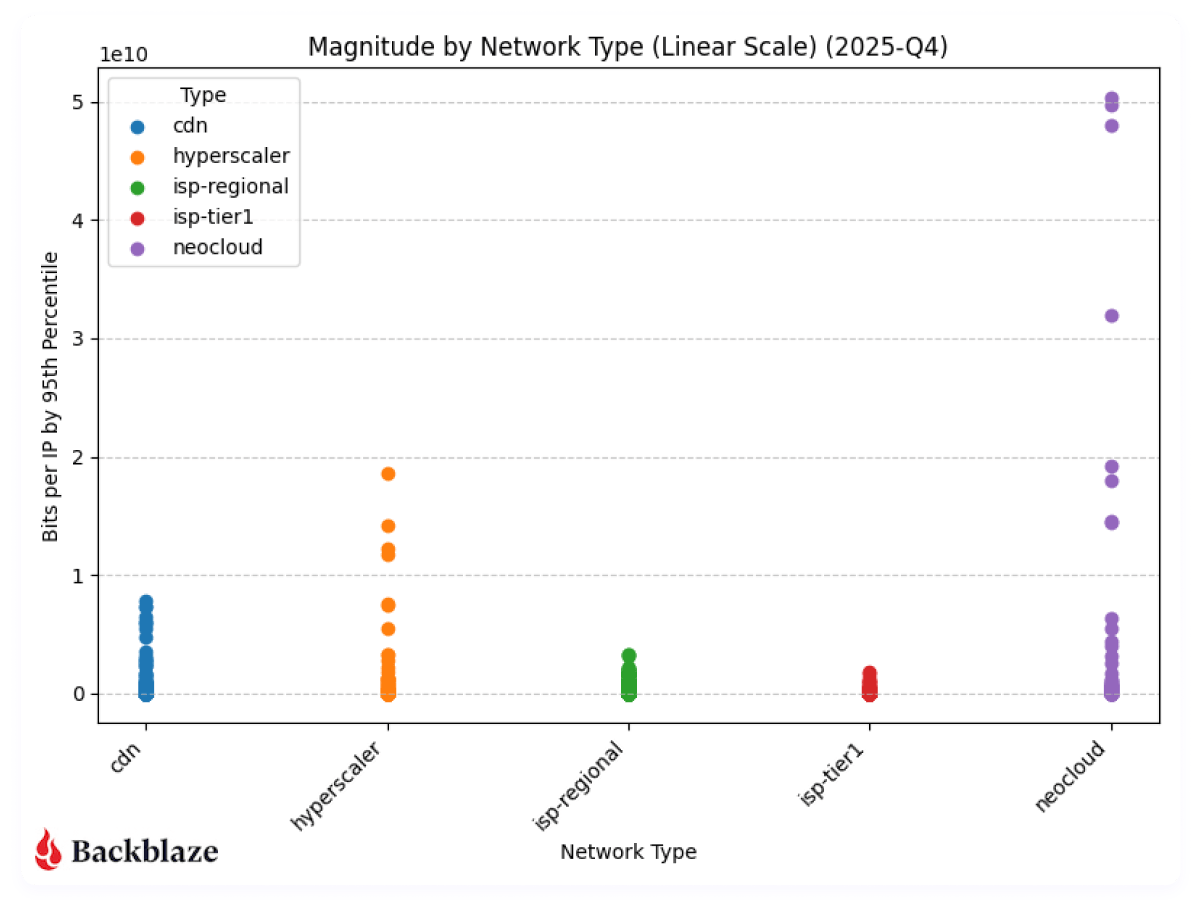
Next, to be consistent with our previous report, we’ll look at magnitude on a linear scale. 

With more datapoints, we can clearly see the magnitude of the neocloud and hyperscaler transfers when compared to other network types. As above, it’s a bit early to claim concrete quarter over quarter patterns, but we’ll keep monitoring and updating the dataset. 

What’s next?

Next quarter will be the first where we have true quarter over quarter data to analyze, and we’ll be back with more on how AI-driven flows change quarter over quarter. And as we get more data, we’re interested in looking at other trends like IPv4 vs. IPv6 traffic, cross-cloud connectivity trends, and revisiting the concentration analysis we did this quarter. 
Anything specific you want to see? Let us know in the comments or reach out to our Evangelism team. Or, keep up-to-date with the latest technical content with our Developer Newsletter. 

The post Network Stats for Q4 2025: Neocloud Traffic Trends appeared first on Backblaze Blog | Cloud Storage & Cloud Backup

Network Stats for Q3 2025: The Magnitude of AI Workflows

Post Syndicated from Brent Nowak original https://www.backblaze.com/blog/network-stats-for-q3-2025-the-magnitude-of-ai-workflows/

A textured background with the words Network Stats overlaid.

The way data moves is changing in the age of AI. As AI training, model tuning, and inferencing accelerate massive, unpredictable flows of data across clouds, our network telemetry here at Backblaze offers a real-world view into the AI data gravity shift: where data lives, how it moves, and what it takes to keep it accessible and affordable.

Over the past couple of years, we’ve shared Network Stats snapshots that shed light on how data moves across Backblaze’s storage cloud. This quarter, we’re taking that foundation further, and evolving this series into a full-fledged transparency report that stands alongside Drive Stats with regular quarterly reporting and stats you can analyze for yourself.

This report isn’t just about traffic patterns. It’s a look at how data movement is changing in the age of AI and what those shifts reveal about performance, cost, and resilience at scale. 

Tune in live for The Stats Lab webinar

Drive Stats was the beginning. Want to see the evolution? Check out the Backblaze Stats Lab webinar, bringing together content from all of our Stats articles. We’re going to chat about all things Backblaze and beyond—by the numbers.

Save My Seat

In this first report, we’re going to outline the fundamentals of our dataset, highlight standout examples for AI related traffic, and lay the foundation to start sharing our quarter-over-quarter metrics.

Dataset details 

Our internal tools allow us to capture network flow data, meaning transmission control protocol (TCP) conversations between parties on our network. Along with basic information such as who is talking and how many bits are being exchanged, we have the ability to record additional pieces of anonymized information like what country, what ISP, or if we’ve seen a particular IP address before. And for each of these metrics, we have numbers for the average, 95th percentile, and maximum values.
Let’s talk about the three elements that make up our dataset: time, values, and metadata.

1. Monthly time slices

For every month, for every region, and for each direction (egress and ingress), we are data warehousing the following metrics. We plan on either using month-by-month numbers, or rolling up into a quarterly value for Network Stats reports going forward.

Item Detail
Date range Every month
Location scope Every region (eg US-West, EU-Central)
Network traffic direction Ingress, egress

2. Metric values

For each monthly snapshot, we’re recording the following details in our data warehouse. Capturing the average, 95th weighted value, and the maximum allows us enough information to profile our traffic. 

The 95th value (discarding the highest 5% bursts) gives us a good profile for daily operations and the maximum helps profile bust traffic. 

The most interesting metrics that I’m excited to explore are the “bits per IP” values. This combination of “amount of traffic” transferred with “how many actors are involved” per network is a good proxy for what I’m calling the “magnitude” of the network flow. We’re exploring the first insight into this metric below in our chart section.

Defining the Network Stats Quarterly Data

Item Field(s) Detail
Name name
asn
Common name and BGP ASN of the network
Bits bits_avg
bits_95th
bits_max
Number of bits/second
Packets packets_avg
packets_95th
packets_max
Number of packets/second
Flows flow_avg
flow_95th
flow_max
Number of TCP flows
IPs ip_unique_avg
ip_unique_95th
ip_unique_max
Number of unique IP addresses
Bits per IP bits_ip_avg
bits_ip_95th
bits_ip_max
Number of bits per IP address
Protocol v4
v6
Amount of traffic using IPv4 vs IPv6

3. Additional metadata

One of the first custom additions to our dataset is a category field. This helps us define the BGP ASNs (Autonomous System Number), basically the organizations common name associated with a range of IP addresses, that we talk to and group them into categories such as neocloud, hyperscaler, CDN, or general ISP.

Additional Network Stats Metadata

Item Field Detail
category group The class of network carrying the traffic (Cloud, PNI, traditional Internet Transit, or Internal Backblaze-Backblaze)
category type The type of network receiving the traffic (Neocloud, Hosting/Compute provider, Hyperscaler, CDN, Regional ISP, more localised ISP, etc)

The global picture

We started capturing this dataset in August of 2025, so we don’t yet have a good amount of data to pull out quarter over quarter trends. But what we can do for now is take a look into some standout metrics for the month of August that we’re interested in tracking over time.

First let’s take a look at where all our traffic goes from a global perspective.

When we look at the data, one pattern stands out immediately: traffic associated with neocloud networks—cloud providers offering compute, GPU, or other AI-related services—already represents nearly a quarter of total ingress and egress across Backblaze’s network. That’s a meaningful signal. Historically CDN traffic has been the majority of our traffic as our B2 Object Storage has been growing. Now, we’re seeing clear evidence of a new class of workload emerging, and it’s AI-shaped.

Neocloud network behavior

Let’s look at the magnitude of our network traffic based on the category of the traffic destination. To help quantify our data set, we interact with around 123,000 unique IP addresses every month. 

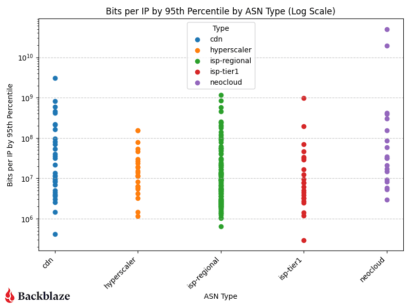
CDN, hyperscaler, isp-regional, and isp-tier one traffic cluster in the same general range of bits per IP, but neoclouds have a couple outliers—the two purple data points in the upper right corner of the log scale graph. 

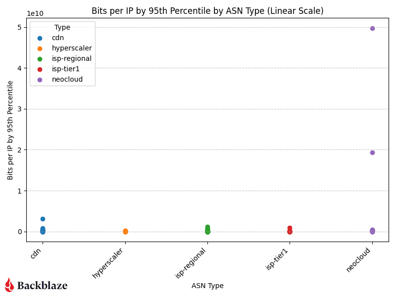
If we change the scale to linear (chart below), now we can see how much of an outlier the AI related traffic is in our sample range.

The “magnitude” (as we’re calling it) of the transfers we’re servicing for AI related flows to neoclouds is an order of magnitude greater than all our traffic patterns. This means that there are only a few unique IP addresses that we’re interacting with transferring large amounts of data in their flows.

The rise of AI-driven data movement

Over the past year, AI training and inference have transformed global data flows. Where traditional workloads move steadily, AI workloads move in bursts—rapid retrievals of massive datasets, short high-volume transfers for model training or tuning, and sustained outbound throughput for inferencing pipelines. The magnitude metric we’re introducing (bits per IP address) captures this shift. 

As shown in the charts above, AI-related traffic to neoclouds isn’t just heavier, it’s denser. Those purple data points represent a small number of IPs exchanging a disproportionate amount of data. That concentration of flow is a hallmark of AI compute pipelines, where a few high-bandwidth endpoints (often GPU clusters) interact with object storage to repeatedly feed and retrieve training data. 

In other words:

  • Fewer talkers, bigger flows. AI systems operate in fewer, more intense network sessions than traditional applications.
  • Shorter duration, higher peaks. Transfer patterns spike sharply, often corresponding to dataset replication or model checkpointing cycles.
  • Cross-cloud mobility. Much of this traffic routes between Backblaze and external compute platforms (classified as neoclouds) showing the rise of multi-cloud AI architectures.

The macro trend: The AI data gravity shift

This pattern reflects a broader macro trend in the cloud ecosystem: AI data gravity is pulling more storage and compute closer together. As AI models grow larger and datasets become more complex, organizations are rethinking where data “lives.” Instead of centralizing everything in one hyperscaler like AWS or Google Cloud Platform, they’re increasingly using cost-efficient, high-throughput storage clouds like Backblaze connected to specialized GPU clouds for compute (case in point: Why CoreWeave’s Object Storage Launch is Good for AI—and Everyone Building It).

This architectural shift explains the outlier traffic patterns we’re seeing on our network. Data isn’t just moving more—it’s moving smarter, following cost, performance, and regional availability cues. 

Why it matters

Tracking this kind of data movement and magnitude helps us, and more importantly our customers, understand a few key things:

  • Operational readiness for AI workloads: How our network scales under bursty, compute-linked demands. (For more on this check out Making the Backblaze Network AI Ready)
  • Cost predictability: Where and when ingress or egress volume spikes may occur.
  • Industry evolution: How AI is reshaping the underlying patterns of internet traffic.

What’s next?

This is just the first glimpse of that industry evolution. As our dataset matures, we’ll be able to watch these AI-linked flows change quarter over quarter, offering not just transparency, but a longitudinal view of how the data backbone of the AI economy takes shape. 

We’re planning to look at quarter over quarter number tracking for network types, IPv4 traffic vs IPv6 traffic, AI related workflows, cross-cloud connectivity trends, and more. We’re also planning to release the raw data quarterly going forward.

Anything specific you want to see? Let us know in the comments or reach out to our Evangelism team. 

We’re excited to share these insights from our network telemetry, the patterns we’re seeing, and what they mean for the broader data economy. This is the stuff we stay up at night studying, and sharing it publicly means we can all better understand the forces shaping digital infrastructure and build with greater confidence and foresight. 

The post Network Stats for Q3 2025: The Magnitude of AI Workflows appeared first on Backblaze Blog | Cloud Storage & Cloud Backup

Making the Backblaze Network AI Ready

Post Syndicated from Brent Nowak original https://www.backblaze.com/blog/making-the-backblaze-network-ai-ready/

An illustration of a chip with AI written on it.

AI isn’t just reshaping how data is processed—it’s rewriting how data moves. Behind every training run or inference pipeline is a torrent of data, and how efficiently (or not) that data travels through networks (and whether it’s an AI-ready network) can make or break performance. 

Data workloads have massively evolved over the 18 years we’ve been in business from computer backups to exabyte-scale storage to AI data pipelines. And that has implications for not just our storage hardware, but our network. 

What started as a single ISP serving a few racks in the early days has grown into a global, multi-terabit backbone connecting customers, compute, and storage in real time via multiple Tier 1 carriers, Internet Exchanges, and PNI links. 

So why talk about it now? Because AI is testing the limits of every part of the infrastructure stack—and the network is where those limits are most visible. Running an AI-ready network means rethinking how you design, route, and scale traffic to handle not just more data, but faster, more synchronized, and more resilient data movement than ever before.

In this post, I’m talking about how our network has evolved to support AI workflows, including what’s changed under the hood, how we’re adapting our hardware and architecture, and what that means for the way data moves through Backblaze today.

Go with the flow

The Network Engineering (NetEng) group at Backblaze is responsible for the design, implementation, and support of our physical network—everything from the physical copper and fiber cables inside our datacenters to the routers and switches that connect our storage to the world.

When we talk about network traffic, we often refer to a “flow”—a stream of information sent between two or more parties. Downloading a file? That’s a flow between your computer and the server offering the file. Multiple small requests loading a website (text, formatting code, animation code, etc.)? Those are known as “mouse” flows. Massive dataset transfers that sustain hundreds of gigabits per second? Those are “elephant” flows. 

The elephant in the room

AI workloads are the largest “elephant” flows our network has ever sustained. These aren’t just big files, they’re ecosystems of data: multi-petabyte datasets, hundreds of thousands of objects ranging from a single megabyte to hundreds of megabytes per object, and thousands of simultaneous connections working in parallel.

Moving these data sets around is no small task. It means engineering for sustained, lossless throughput. It’s cutting edge, using many machines to perform parallel operations, all at large transfer rates. Let’s say we’re the source of a dataset that is being transferred to a neocloud for processing, the processing layers (often GPUs) want a continuous stream of high bandwidth with no loss. And a single dropped packet in a training pipeline can trigger expensive re-requests, idle GPUs, and cascading slowdowns. 

With that in mind, we’ve evolved our infrastructure from traditional cloud networking—designed for smaller flows—to handle the relentless firehose of AI data.

Traditional cloud vs AI cloud

AI changes everything about traffic behavior. It doesn’t just mean that our total capacity is bigger, but also that our considerations for how we design, support, and scale our infrastructure morphed along with our capacity upgrades.

Here’s a quick overview of the former challenges and the new ones we’re engineering to serve our AI workflows.

Traditional Cloud Network AI Cloud Network
Small to large flow sizes (megabits to, gigabits) Very large flows (multi-gigabit to terabit)
High entropy flows (many sources and destinations) Low entropy flows (consistent source/destination pairs)
Predictable usage patterns Burst traffic patterns
Tolerant to failures Sensitive to faults, buffering, congestion

In short: AI traffic is heavier, stickier, and far less forgiving. So the goal is to design networks that can transfer 100Gbps, 200Gbps, and up to 1,000 Gbps (1 Terabit) a second with a low latency, low jitter, and a zero loss profile. Simple right? 

Hardware network upgrades

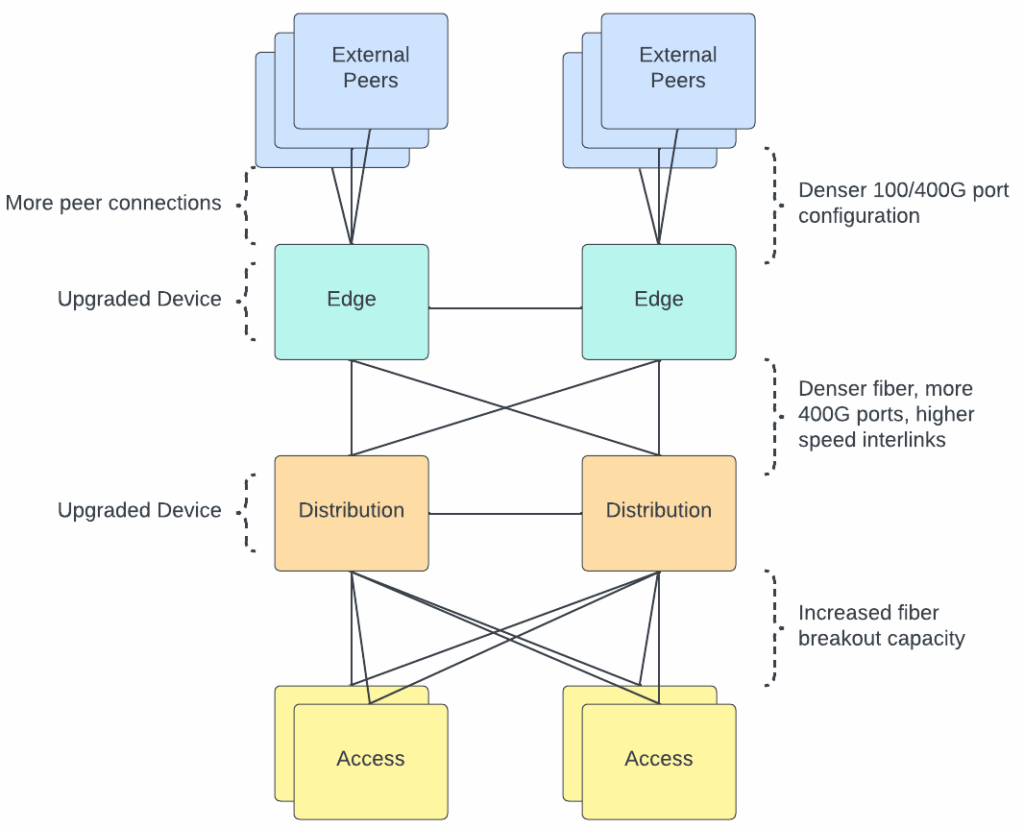
To meet these new demands of AI workflows, we’ve upgraded nearly every layer of our physical infrastructure. We needed to increase the density of our networking hardware, deploy denser fiber optic solutions, and upgrade the capacity of our edge network.

What technologies are we deploying?

1. Transitioning from NRZ to PAM4 Optics

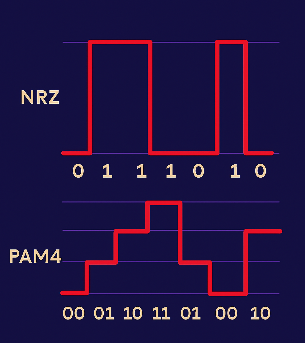
The fiber optic modules that are used to connect all our infrastructure hardware (servers, switches, routers) have been transitioned to modules that support a denser encoding method. Both NRZ and PAM4 are technologies used to modulate signals. Think of NRZ as a one-lane highway with one passenger per car. PAM4 adds three more passengers per car, doubling the rate without doubling lanes and with controllable cons such as increased noise sensitivity. By using four voltage levels instead of two, PAM4 transmits twice the information per signal change, effectively doubling bandwidth per fiber strand.
2. MTP-8 and MTP-16 Fiber

MTP is a fiber connector type and the number after denotes the number of fiber optic strands contained within the cable. The higher the number, the more fiber pairs in the cable. We’ve used MTP-8 for years (four pairs of fiber), but to handle AI-scale traffic, we’re now deploying MTP-16 for higher-density connections. That means where we once ran 100G links, we now run 400G—and can scale up to multiple 100G paths as workloads grow (4x100G, 8x100G, etc).

3. Expanding edge and core capacity

We’ve refreshed routers and switches to handle higher port speeds and density—moving from 100G to 400G interfaces across our interconnects. The result: higher aggregate throughput and better fault isolation for massive parallel transfers.

Visualizing an AI workflow

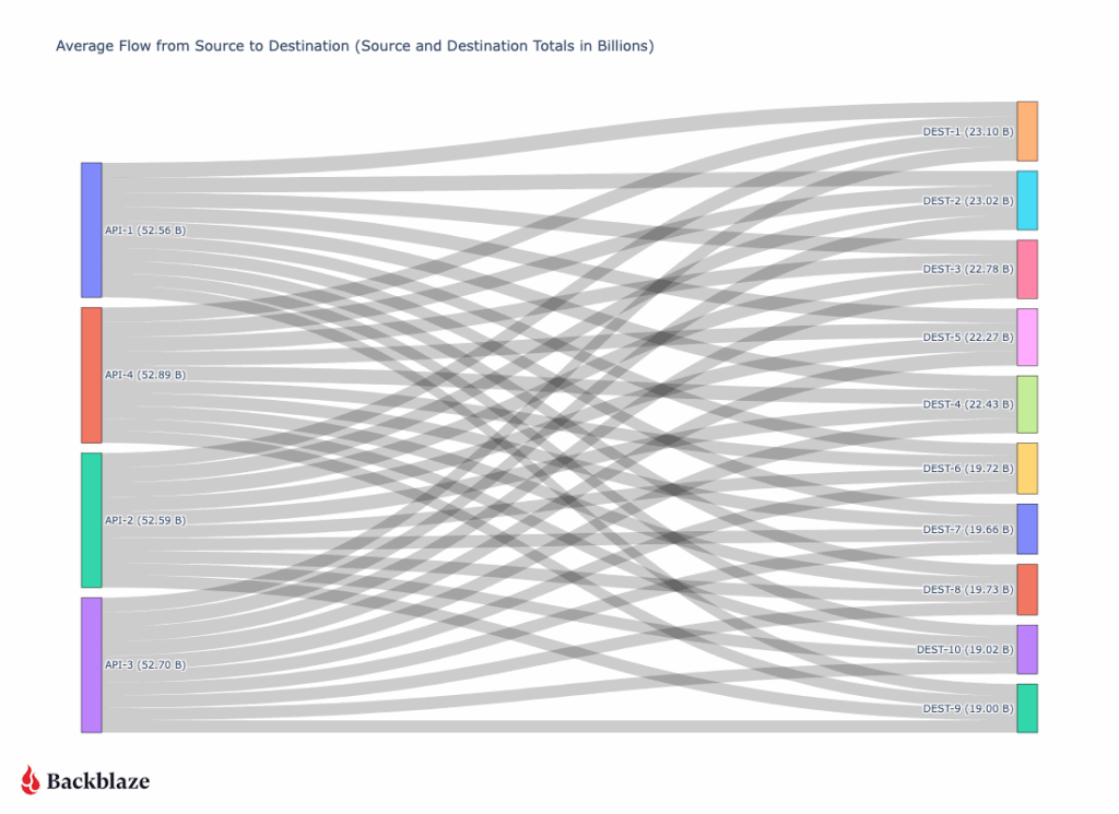
Our monitoring tools track network flows (TCP conversations) in real time, giving us visibility into how large AI workflows move across the infrastructure. We use this type of information to monitor and make sure that large workflows are distributed across our physical infrastructure to allow for traffic balancing.

So, what does a large “AI workflow” look like? It’s not one device talking to one device at a high rate, but rather a collection of actors all working together.

On our side, our API layer speaks to our storage layer, requesting the files. Once the files are retrieved from our storage layer, they flow through our API servers and are then sent to a destination. In order to achieve a high throughput, many API servers talk to many destination servers. 

A typical 200+ Gbps transfer (diagrammed below) might involve four API virtual IPs (VIPs), each hosted on multiple backend servers sending 5–7 Gbps to ten destination nodes for a total output of 52Gbps from each API server. On the receiving side, each destination server might be ingesting 20Gbps across multiple streams.

The key insight: AI data transfer isn’t one big pipe—it’s a distributed mesh of many coordinated streams. Our design scales linearly—add more API servers, add more destination nodes, and the flow grows predictably without congestion or packet loss.

Conclusion 

AI workflows have redefined what “fast” means on the network. At Backblaze, we’ve evolved from a single-ISP startup to an AI-scale infrastructure provider by continuously pushing the boundaries of connectivity, throughput, and reliability.

As our customers push the frontiers of AI, we’ll keep tuning the invisible layer that makes it possible: the AI-ready network.

The post Making the Backblaze Network AI Ready appeared first on Backblaze Blog | Cloud Storage & Cloud Backup

Network Stats: Launching the CA-East Region in Canada

Post Syndicated from Brent Nowak original https://www.backblaze.com/blog/network-stats-launching-the-ca-east-region-in-canada/

A decorative image showing the globe with cloud icons over the Backblaze data center locations.

Over the past few years, Backblaze has expanded our regional footprint, adding capacity in the US-West region, growing in our EU-Central locale, opening a new US-East presence, and, most recently, moving into Canada with CA-East with an initial storage capacity of just under 60PB. 

We approached our most recent expansion into Canada a bit differently, and today, I want to cover some of the new processes and efficiencies that we adopted for this project and how we’re well positioned to serve the Canadian market based on our network connections.

A photograph showing a sculpture of the the Toronto airport code, YYZ.
Backblaze deployment team lands in Toronto.

Scaling infrastructure and calling in the reinforcements

The CA-East data region deployment was our fastest to date, cutting the deployment life cycle (“the ink is signed” to a live production system) down in time by 50%. In this deployment cycle we worked with a third party integrator to help us streamline the process and also leveled up our automation procedures for installing operating systems and our storage software stack. 

Historically we’ve drop-shipped all our equipment such as the networking gear, servers, hard drives, cables, and tools to the destination site for our deployment team to inventory, unbox, and physically install. It’s fun. It’s controlled chaos (if you like that sort of thing)—but for this build cycle we wanted to iterate our process further to ease and enable future growth in a more predictable and scalable fashion by working with a third party to assist with the initial physical build of the racked equipment.

On our end, there’s up-front engineering time documenting how all the fiber, copper, and power cables are organized. We have a cable map for every device, every cable, and every location as well as how it should be connected. It’s heavy on the paperwork side, but it’s time well spent. It allows us to template and stamp out future cabinets with ease. When we need more storage-focused cabinets to deploy additional storage, that’s a cabinet standard. If we need more compute, that’s also a cabinet that can be easily built out from a template. 

The workload on the third party integrator side consists of taking our directions and performing all the physical racking and wiring. Handling all of these tasks takes time. You wouldn’t believe the amount of cardboard and packaging material that you need to process! Unboxing over a hundred servers, thousands of hard drives, and hundreds of fiber and copper cables is no small feat. (Apologies in hindsight for not giving you a marathon unboxing video.) They received all our packaging, then racked and cabled up everything according to our specifications. After inspection and quality control, everything was securely sealed in crates and shipped off to Canada.

A photograph showing several Backblaze servers.
Initial setup and bootstrapping of CA-East cluster at the integrator site.
A photo of Backblaze storage cabinets.
Almost ready for QA and final inspection before shipping to the data center.

Automate all the things

Perform a process once? Sure. Have to do it more than twice? Automate it!

Before shipment out to the data center location, we sent a small team to the integrator site to perform a physical quality assessment of the build and set up remote access, which allowed us to bootstrap the platform as we had access to power and an internet connection. 

Internally, we have a system that has a record of machine serial numbers and their roles (e.g., storage, api, database, etc). When a new machine boots up for the first time on our network, it gets a vanilla operating system installed via our PXE services. This is all parallelized, meaning that we were able to have systems to log in to within a few hours for the entire server set. 

It’s a lot of fun toggling the power buttons one-by-one on over 90 servers, the PXE server network link running hot, and having an entire fleet of servers automatically install an operating system and be ready for further administration within minutes. Quite different from my days of performing floppy disk installs of Windows 95!

With a final inspection and software pass, everything was approved for shipment. The integrators securely boxed up our cabinets and they were on their way to Canada.

CA-East setup

Arriving at the destination site, everything was brought to the data center floor, bolted down, grounded, and energized. Within four hours we had network connectivity with our internet carriers and had set up our secure connections back to our production network to start our Backblaze software installation with our various internal teams. Within a few days, we had around 90 servers running and ready for our Quality Assurance team to start running tests to simulate client activity.

We partnered with Cologix, a leading network-neutral interconnection and hyperscale edge data center provider in North America, as our Canadian data center facility operator for this deployment. Cologix’s digital edge data center is a 20,000-square-foot, Tier III facility with two megawatts of power. It is a highly secure and efficient colocation and interconnection hub that features industry leading cooling designs, robust 24/7 security with biometric dual authentication access, and compliance with SOC 1, SOC 2, HIPAA and PCI-DSS as well as ISO 27001 certification by Schellman.

A photo of Backblaze Storage Pods.
Storage Pods with a few compute servers at the top of each cabinet.
A photo of Backblaze Storage Pods.
CA-East: Network and compute cabinets with room to grow.

Connectivity

Our standard connectivity posture is to connect to three global carriers for the most expansive reach to every network possible, and also to join a local internet exchange (IX) for exchanging traffic between other IX members locally within the same data center or metro region for low-latency efficiency. Additionally, for this site, we also are connected to a large Canadian regional carrier to bring us in close proximity to Canadian-sourced traffic.

With low-latency and diverse dark fiber connectivity between Cologix’s data centers, including Canada’s largest and most important carrier hotel, the facility offers access to 160+ networks, TORIX, and 50+ cloud providers. 

Overall that makes our CA-East connectivity map look like this.

A diagram showing how Backblaze's network traffic is routed through global carriers, regional carriers, and the local level.
Option 1: Global Carriers. Option 2: Regional ISP. Option 3: IX Traffic.

Joining TorIX

The local internet exchange for this site is Toronto Internet Exchange (TorIX),  the leading Canadian internet exchange point (IXP) and one of the largest in the world. At the time of this post, more than 250 organizations exchange on average over 1.3 Terabits per second (Tbit/s) of traffic every day between each other locally.

Connecting to TorIX allows low latency transit between us and internet service providers (ISPs), other clouds, partner content delivery networks (CDNs), other enterprise networks, and hosting providers that provide compute services.

Go live

I’ve been at Backblaze for four years now and have been able to participate on builds to expand our US-West, US-East, and now CA-East regions. Turning on the metaphoric “switch” to make the site live is a little anticlimactic—from a network point of view, the only traffic we see at the start of a new region is our monitoring, internal jobs, and some soft-launched testing or proof of concept (PoC) accounts.

Here’s a sample of the network traffic from when we brought up peering with our carriers and soft launched the data region for our internal QA teams.

A chart showing Backblaze network ingress traffic after the data center was live.
Initial traffic into CA-East at time of launch.

Where is the initial network traffic coming from? With our network telemetry monitoring, we’re able to see the flows in traffic in and out of our network. That network traffic information is enriched with data that adds context to allow us to see how much traffic is coming to or from a particular upstream provider or geographical region.

Here’s a Sankey diagram that shows a snapshot of current traffic from Canadian provinces over different service providers to the Backblaze network, where the larger lines mean more traffic is seen from that particular province or network. Expectedly, Ontario and British Columbia are the two largest sources of traffic. 

A diagram showing network traffic by province and carrier network.
Ingress traffic by province and carrier networks to Backblaze network (BGP AS40401).

Canada is open for business

As the months progress, and as more customers create their accounts in this new data region and point their workloads at this location, we’ll see more traffic. We’ll be excited to see what fun insights we can glean, which we’ll keep you updated on in our Network Stats series. 

As Backblaze continues to grow its network, we’re excited to continue to iterate on our buildouts to make them more efficient. Ultimately, it lets us be more responsive to customer needs quickly. Same great network—just more locations.  

We’re excited to have a footprint in Canada and welcome your storage needs! If you’re interested in learning more about storing your data in Canada, you can read the go-live announcement here.

Ready to store data in CA East?

The new data region is available to customers now, and you can create an account there by selecting “CA East” in the region drop-down when creating a Backblaze account. Already storing data with Backblaze and want to keep a Canadian copy? Leverage our Cloud Replication feature and diversify your storage.

The post Network Stats: Launching the CA-East Region in Canada appeared first on Backblaze Blog | Cloud Storage & Cloud Backup

Backblaze Network Stats: Ingress Trends and What They Tell Us About Backup Behaviors

Post Syndicated from Brent Nowak original https://www.backblaze.com/blog/backblaze-network-stats-ingress-trends-and-what-they-tell-us-about-backup-behaviors/

An image with a background pattern of trend lines and the words "Network Stats Ingress rends and what they tell us"

Every day, thousands of Backblaze customers create and update files. These changes make their way into our system to be securely stored. Sometimes they are sent to us immediately, while other times the differentials are batched up into a job that runs at a scheduled time. 

In this post, I’m sampling three points in our network where we take in a lot of ingress traffic off of the internet, and we’re going to explore some of the trends that we see. 

Reading the ingress tea leaves

So, why do we care about ingress trends? In short, it helps us with capacity planning, and it also tells us a lot about how people use cloud storage. We often think of planning in longer terms—weeks, months, or years. Here I wanted to focus on some of the patterns that we see during a shorter period; for example, a single day or a significant date, like the end of the calendar month. There are some interesting patterns we see in our client behavior that keep us on our toes when we are performing capacity planning.

We currently have two product offerings that have different usage and traffic patterns:

  • Backblaze B2 Cloud Storage: Ingress and egress, high variance in traffic levels throughout the day, hour, and at the start of month. 
  • Backblaze Computer Backup: Heavy ingress, with a small variance in traffic levels during the business day or weekday vs. weekend.

Since humans are using our system, we see very human quirks in our traffic profiles. For example, we humans like round numbers! We notice that a lot of backup jobs kick off at midnight local or UTC, or fire off at the top of the hour, or trigger on the first of the month. This means we see spikes of network traffic during these periods. Additionally, a lot of new content gets created during the day and then queued up to be uploaded to us in an overnight backup job.

Scope and terms

Today we’re going to look at ingress traffic, which means we’re monitoring uploads from both Backblaze Computer Backup and Backblaze B2 into our environment. We’ll save downloads, traffic coming out of Backblaze, for analysis in future posts.

One common term that you’ll see on our graphs in the 95th percentile. The 95th percentile number is a point where 95% of all measurements are under and only 5% are over. This is a very typical method to use for monitoring, billing, and trend analysis in the telecom industry. It maps to a standard bell curve, and tells you that you’re capturing the vast majority of usage for planning purposes.

A chart displaying a bell curve and percentiles
A standard bell curve. Source.

In one of our monitoring systems, we are sampling and recording the utilization on our network links and computing a 95th percentile over a five minute period.

With these items defined, let’s get into the data with some charts!

Sample 1: One-month trend

In this first sample, we see that the majority of our daily traffic falls within a nice range. What stands out here is the clock tick over from February to March, where we see a spike of ingress traffic that is outside the expected daily range.

A chart displaying a sample of ingress trends over one month.

Taking that same dataset, let’s take a closer look at the end of the month and zoom in on the calendar change into March.

Adding a vertical red line on 00:00 UTC where the month changes over, we see that there must be a lot of automated jobs that kick in right at the clock changeover into the new month.

A chart showing ingress trends over 7 days.

Sample 2: Top of the hour

Taking a look at another traffic sample from another point in our network, we see very distinct traffic patterns on the top of almost every hour.

A chart showing ingress trends over 24 hours

Sample 3: Pacific Time Zone working hours

Here’s a sample of traffic in our US-West region. During the business day on the West Coast, we see a lull in traffic, with a pickup after the business day is done. This makes sense to us as there are jobs that backup daily content that start to send traffic to us overnight.

A chart showing ingress trends over three days.

What does this mean for you?

It’s very interesting to see the impact of humans in our network traffic and the patterns that emerge. Generally we humans create and modify things during the day, and we like to back them up over night for safekeeping. And we also like round numbers—people tend to send data at the top of the hour, midnight, or end of the month. 

All of these elements are very important in how we, at Backblaze, capacity plan and balance traffic over transit links. We do a lot of work to make sure that no matter what time of day or day of the month, you can reliably get your data into Backblaze.

But, you might also look at this data and take away a meaningful conclusion: Much like choosing to go to the grocery store at 10:30 a.m. on a Tuesday versus fighting the after-work rush at 6:00 p.m., scheduling jobs on the 15, 30, or 45 minute mark or mid-month instead of at the end of the month would mean you’re up against less traffic, which is never a bad thing (and it also smooths out our ingress, which we wouldn’t be mad about either).

At the end of the day, however you choose to schedule your jobs works for us. We’re just glad we’re able to store and protect our customers’ data reliably and affordably, and we’re happy to pass along any tips and trips for a better, less congested, backup experience as well.   

Thanks for reading, and stay tuned for more graphs and commentary on how we strive to build a reliable, scalable, and forward looking network to serve our customer’s needs.

The post Backblaze Network Stats: Ingress Trends and What They Tell Us About Backup Behaviors appeared first on Backblaze Blog | Cloud Storage & Cloud Backup

Backblaze Plugs In to Internet2

Post Syndicated from Brent Nowak original https://www.backblaze.com/blog/backblaze-plugs-into-internet2/

A decorative images showing the Internet2 logo.

Who doesn’t love a sequel? From Star Wars to the Godfather, some of the best moments in storytelling have been part twos. (Let’s not talk about some of those part threes though.) And, if you were to write a sequel to The Internet, you couldn’t look for a better second chapter than a mission to support the technical and networking needs of leading academic and research organizations.  

Well, Internet2 is not actually a sequel, and it’s not a new version of the internet we all use every day. It’s an organization dedicated to delivering technical solutions and dedicated, high speed connectivity to institutions—ranging from the Smithsonian to Harvard and 330 other colleges, universities, regional research and education networks, nonprofit and government organizations, and more—who are working to solve today’s most pressing issues.

And today, Backblaze joined the Internet2 community to help further their mission. Here’s what that means:

  • First and foremost, the Backblaze Storage Cloud now connects to Internet2’s network as part of the Internet2 Peer Exchange (I2PX) program. This means that members of Internet2 can now move data into and out of Backblaze’s US-West and US-East regions at incredibly high speeds.
  • Second, Backblaze also completed the Internet2 Cloud Scorecard to offer research and educational institutions relevant details about Backblaze’s security, compliance, and technology specifications, making it easier to assess and procure our solutions.

Hundreds of institutions in the higher education and research space already use Backblaze for storing and using their data and protecting their endpoints. However, many others require data transmission via Internet2 for new cloud solutions. For these folks, Backblaze’s participation in Internet2’s community and I2PX program provides secure data storage with less latency and a lower cost for their data needs.

What type of data are we talking about? Think genetic sequencing records, billions of vector data points to help model and forecast weather events, or images of particle collisions at the subatomic level! 

The Backblaze team is incredibly excited to take this step forward in serving the different use cases that Internet2 supports. And of course, in addition to being a part of the Internet2 community, we’re always excited to add more high-quality peering relationships to our wider network (and to share some stats about it, too) . 

How big is the Internet2 network? Take a look below.

Now, let’s dig into how Internet2 creates high speed data transfer pathways, and how it will impact traffic here at Backblaze.

Our Connection

The diagram below gives you an idea of what the data path looks like for someone on the left with direct connectivity to Internet2 or access via a regional provider reaching the Backblaze US-West or US-East regions.

The entities on the left could exist locally in California or as far as the U.S. East Coast. At any source location, the traffic will transport the Internet2 network and then enter our network in our common peering points in San Jose, CA and Reston, VA.

Turning Up The Peering Session

Below is a chart of ingress traffic that was once reaching us over the public internet and is now taking the preferred path over Internet2. As soon as we established peering we started to receive a few gigabits per second of traffic, with large spikes occurring overnight.

Whenever we add a new service or peer, the flow of information in our network changes. This latest addition creates more interesting traffic patterns for our Network Engineering team to profile, monitor, and capacity plan for.

An Example of How that Speed Is Used: Moving Scientific Data

If you’re a scientist in Texas and want to send your 50TB research set quickly and reliably to a partner in California, you might only have a commercial connection to the internet. This could be a 1Gbps or smaller connection, and even that could have data transfer limits on each month—not ideal. Our 50TB example dataset would take over 4.6 days to complete and use 100% of the available bandwidth if we were limited to 1Gbps (assuming perfect conditions and no latency).

The Internet2 network is built with capacity in mind. With backbone links up to 400Gbps, our example dataset would transfer in 16.7 minutes. Now, there are other limitations that will impede you from being able to reach that rate (hard drive read speed, local Internet2 connection speed, and distance/latency factors), but this example gives you an idea of how much faster the Internet2 network can be over vanilla commercial connections that might be available to a local university, college, or other research institution.

Conclusion

We’re very excited to be joining the Internet2 community and network, supporting industry best practices and enabling better connectivity to our storage platform. Hopefully, the next scientific breakthrough is sitting encrypted on our hard drives, and we can be part of the many, many people, tools, and organizations who helped it on its way from research to reality.  

For more information about Backblaze and Internet2, you can read our press release or check out the Internet2 member directory.  

The post Backblaze Plugs In to Internet2 appeared first on Backblaze Blog | Cloud Storage & Cloud Backup

Backblaze Network Stats: Real-World Measurements from the Backblaze US-West Region

Post Syndicated from Brent Nowak original https://backblazeprod.wpenginepowered.com/blog/backblaze-network-stats-real-world-measurements-from-the-backblaze-us-west-region/

A decorative image with a title that says Network Stats: Network Latency Study on US-West.

As you’re sitting down to watch yet another episode of “Mystery Science Theater 3000” (Anyone else? Just me?), you might be thinking about how you’re receiving more than 16 billion signals over your home internet connection that need to be interpreted and sent to decoding software in order to be viewed on a screen as images. (Anyone else? Just me?)

In telecommunications, we study how signals (electrical and optical) propagate in a medium (copper wires, optical fiber, or through the air). Signals bounce off objects, degrade as they travel, and arrive at the receiving end (hopefully) intact enough to be interpreted as a binary 0 or 1, eventually to be decoded to form images that we see on our screens.

Today in the latest installment of Network Stats, I’m going to talk about one of the most important things that I’ve learned about the application of telecommunication to computer networks: the study of how long operations take. It’s a complicated process, but that doesn’t make buffering any less annoying, am I right? And if you’re using cloud storage in any way, you rely on signals to run applications, back up your data, and maybe even stream out those movies yourself. 

So, let’s get into how we measure data transmission, what things we can do to improve transmission time, and some real-world measurements from the Backblaze US-West region.

Networking and Nanoseconds: A Primer

At the risk of being too basic, when we study network communication, we’re measuring how long signals take to get from point A to point B, which implies that there is some amount of distance between them. This is also known as latency. As networks have evolved, the time it takes to get from point A to point B has gone from being measured in hours to being measured in fractions of a second. Since we live in more human relatable terms like minutes, hours, and days, it can be hard for us to understand concepts like nanoseconds (a billionth of a second). 

Here’s a breakdown of how many milli, micro, and nanoseconds are in one second.

Time Symbol Number in 1 Second
1 second 1
1 millisecond ms 1,000
1 microsecond μs 1,000,000
1 nanosecond ns 1,000,000,000

For reference, taking a deep breath takes approximately one second. When you’re watching TV, you start to notice audio delays at approximately 10–20ms, and if your cat pushes your pen off your desk, it will hit the ground in approximately 400ms.

Nanosecond Wire: Making Nanoseconds Real

In the 1960s, Grace Murray Hopper (1906–1992) explained computer operations and what a nanosecond means in a succinct, tangible fashion. An early computer scientist who also served in the U.S. Navy, Hopper was often asked by folks like generals and admirals why it took so long for signals to reach satellites. So, Hopper had pieces of wire cut to 30cm (11.8in) in length, which is the distance that it takes light to travel in perfect conditions—that is, a vacuum—in one nanosecond. (Remember: we humans express speed as distance over time.) 

You could touch the wire, feel the distance from point A to point B, and see what a nanosecond in light-time meant. Put a bunch of them together, and you’d see what that looks like on a human scale. In literal terms, she was forcing people to measure the distance to a satellite (anywhere between 160–35,786 km) in terms of the long side of a piece of printer paper. (Rough math: it’s about 741,058,823 to 1,657,529,411,764 pieces of paper end-to-end.) That’ll definitely make you realize that there are a lot of nanoseconds between you and the next city over or a satellite in space.

A fun side note: if we go up a factor from a nanosecond to a microsecond, the wire would be almost 300 meters (984 feet)—which is the height of the Eiffel Tower, minus the broadcast antennae. It gets even more fun to think about because we still have to scale up to two more orders of magnitude to get to a millisecond, and then again to get a second. 

I love when a difficult topic can be grasped with an elegant explanation. It’s one of the skills that I strive to develop as an engineer—how can I relate a complicated concept to a larger audience that doesn’t have years of study in my field, and make it easily digestible and memorable?

Added Application Time

We don’t live in an ideal, perfect vacuum where signals can propagate in a line-of-sight fashion and travel in an optimal path. We have wires in buildings and in the ground that wind around metro regions, follow long-haul railroad tracks as they curve, and have to pass over hills and along mountainous terrain that add elevation to the wire length, all adding light-time. 

These physical factors are not the only component in the way of receiving your data. There are computer operations that add time to our transactions. We have to send a “hello” message to the server and wait for an acknowledgement, negotiate our security protocols so that we can transmit data without anyone snooping in on the conversation, spend time receiving the bytes that make up our file, and acknowledge chunks of information as received so the server can send more.

How much do geography and software operations add to the time it takes to get a file? That’s what we’re going to explore here. So, if we’re requesting a file that’s stored on Backblaze’s servers in the US-West region, what does that look like if we are delivering the file to different locations across the continental U.S.? How long does it take?

Building a Latency Test

Today we’re going to focus on network statistics for our US-West location and how the performance profile looks as we travel east and the various components that contribute to the change in translation time.

Below we’re going to compare theoretical best case numbers to the real world. There are three categories in our analysis that contribute to the total time it takes to get a request from a person in Los Angeles, Chicago, or New York, to our servers in the US-West region. Let’s take a look at each one:

  1. Ideal Line: Let’s draw an imaginary line between our US-West location and each major city in our testing sample. Then we can calculate the time it takes light to be sent and received as RTT (Round Trip Time) one time between the two points. This number gives us the Ideal Line time, or the time it takes for a light signal to travel between two points in a perfect line, in vacuum conditions, with no obstructions. Hardly how we live, so we have to add a few other data points!
  2. Fiber: Fiber optics in the real world have to pass through optical equipment, connect to aerial fiber on telephone poles where ground access is limited, route around pesky obstructions like mountains or municipal services, and sometimes travel along non-ideal paths to reach major connection points where long-haul fiber providers have offices to improve and reamplify the signal. This RTT number is taken from testing services that we have running across the country.
  3. Software: This measurement shows the time spent in Software tasks (as opposed to Setup or Download tasks, as defined by Google) that are required to initiate network connections, negotiate mutual settings between sender and receiver, wait for data to start to be received, and encrypt/decrypt messages. We’re also getting this number from our testing services and will explore all the inner workings of the Software components a little later on.
  4. Total: The interesting part! Real world RTT for retrieving a sample file from various locations.

Fun fact: You don’t need any monitoring infrastructure in order to take a deeper dive—every Chrome web browser has the ability to show load times for all the elements that are needed to present a website.

Do note that test results may vary based on your ISP connectivity, hardware capabilities, software stack, or improvements Backblaze makes over time.

To show more detailed information, open Chrome:

  • Go to Chrome Options > More Tools > Developer Tools 
  • Select Network Tab
  • Browse to a website to see results sourced from your machine

A deeper dive into this can be found on Google’s developer.chrome.com website.

If you wish to run agent based tests, you can start with Google’s Chromium Project, as it offers a free and open source method to simulate and perform profiling.

Here are the results from just one test we ran:

A chart showing round trip trip time from US-West.
Round Trip Times (RTT) for various categories to our US-West location.

It’s important, at this stage, to caveat these numbers with a few things. First, they include a decent amount of overhead from being within our (or any) infrastructure, which can be affected by things like your browser, security, and lookup time needed to connect to a server infrastructure. And, if a user is running a different browser, has different layers of security, and so on, those things can affect RTT results. 

Second, they don’t accurately talk about performance without context. Every type of application has its own requirements for what is a “good” or “bad” RTT time, and these numbers can change based on how you store your data; where you store, access, and serve your data; if you use a content delivery network (CDN); and more. As with anything related to performance in cloud storage, your use case determines your cloud storage strategy, not the other way around.

Unpacking the Software Measurement

In addition to the Chrome tools we talk about above, we have access to agents running in various geographical locations across the world that run periodic tests to our services. These agents can simulate client activity and record metrics for us that we use for alerting and trend analysis. Simulating client operations helps alert our operations teams to potential issues, helping us to better support our clients and be more proactive.

With this type of agent based testing, we have greater insight into the network that lets us break down the Software step and observe if any one step in the transfer pipeline is underperforming. We’re not only looking at the entire round trip time of downloading a file, but also including all the browser, security, and lookup time needed to connect to our server infrastructure. And, as always, the biggest addition in time it takes to deliver files is often distance-based latency, or the fact that even with ideal conditions, the further away an end user is, the longer it takes to transport data across networks. 

Unpacking Software Results

The below chart shows how long in milliseconds it takes to get a sample file from our US-West cluster from agents running in different locations across the U.S. and all the Software steps involved.

Test transaction times for a 78kb test file.
Chromium application profile of loading a sample 78kb test file from various locations.

You can find definitions for all these terms in the Chromium dev docs, but here’s a cheat sheet for our purposes: 

  • Queueing: Browser queues up connection.
  • DNS Lookup: Resolving the request’s IP address.
  • SSL: Time spent negotiating a secure session.
  • Initial Connection: TCP handshake.
  • Request Sent: This is pretty self explanatory—the request is sent to the server. 
  • TTFB (Time to First Byte): Waiting for the first byte of a response. Includes one round trip of latency and the time the server took to prepare the response.
  • Content Download: Total amount of time receiving the requested file.

Pie Slices

Let’s zoom in on the Los Angeles and New York tests and group just the Download (Content Download) and all the other Setup items (Queueing, DNS Lookup, SSL, Initial Connection, TTFB) and see if they differ drastically. 

A pie a chart comparing download and setup times while sending a file from an origin point to Los Angeles.
A pie a chart comparing download and setup times while sending a file from origin to New York.

In the Los Angeles test, which is the closest geographical test to the US-West cluster, the total transaction time is 71ms. It takes our storage system 23.8ms to start to send the file, and we’re spending 47ms (66%) of the total time in setup. 

If we go further east to New York, we can see how much more time it takes to retrieve our test file from the West (71ms vs 470ms), but the ratio between download and setup doesn’t differ all that drastically. This is because all of our operations are the same, but we’re spending more sending each file over the network, so it all scales up.

Note that no matter where the client request is coming from, the data center is doing the same amount of work to serve up the file.

Customer Considerations: The Importance of Location in Data Storage

Latency is certainly a factor to consider when you choose where to store your data, especially if you are running extremely time sensitive processes like content delivery—as we’ve noted here and elsewhere, the closer you are to your end user, the greater the speed of delivery. Content delivery networks (CDNs) can offer one way to layer your network capabilities for greater speed of delivery, and Backblaze offers completely free egress through many CDN partners. (This is in addition to our normal amount of free egress, which is up to 3x the data stored and includes the vast majority of use cases.) 

There are other reasons to consider different regions for storage as well, such as compliance and disaster resilience. Our EU datacenter, for instance, helps to support GDPR compliance. Also, if you’re storing data in only one location, you’re more vulnerable to natural disasters. Redundancy is key to a good disaster recovery or business continuity plan, and you want to make sure to consider power regions in that analysis. In short, as with all things in storage optimization, considering your use case is key to balancing performance and cost.

Milliseconds Matter

I started this article talking about Grace Murray Hopper demonstrating nanoseconds with pieces of wire, and we’re concluding what can be considered light years (ha) away from that point. The biggest thing to remember, as a network engineering team, is that even though approximately 600ms from the US-West to the US-East regions seems miniscule, the amount of times we travel that distance very quickly takes us up those orders of magnitude from milliseconds to seconds. And, when you, the user, are choosing where to store your data—knowing that we register audio lag at as little as 10ms—those inconsequential numbers start to get to human relative terms very, very quickly. 

So, when we find that peering shaves a few milliseconds off of a file delivery time, that’s a big, human-sized win. You can see some of the ways we’re optimizing our network in the first article of this series, and the types of tests we’re running above give us good insights—and inspiration—for more, better, and ongoing improvements. We’ll keep sharing what we’re measuring and how we’re improving, and we’re looking forward to seeing you all in the comments.

The post Backblaze Network Stats: Real-World Measurements from the Backblaze US-West Region appeared first on Backblaze Blog | Cloud Storage & Cloud Backup.

Backblaze Commits to Routing Security With MANRS Participation

Post Syndicated from Brent Nowak original https://www.backblaze.com/blog/backblaze-commits-to-routing-security-with-manrs-participation/

A decorative image displaying the MANRS logo.

They say good manners are better than good looks. When it comes to being a good internet citizen, we have to agree. And when someone else tells you that you have good manners (or MANRS in this case), even better. 

If you hold your cloud partners to a higher standard, and if you think it’s not asking too much that they make the internet a better, safer place for everyone, then you’ll be happy to know that Backblaze is now recognized as a Mutually Agreed Norms for Routing Security (MANRS) participant (aka MANRS Compliant). 

What Is MANRS?

MANRS is a global initiative with over 1,095 participants that are enacting network policies and controls to help reduce the most common routing threats. At a high level, we’re setting up filters to check that network routing information we receive for peers is valid, ensuring that the networks we advertise to the greater internet are marked as owned by Backblaze, and making sure that data that gets out of our network is legitimate and can’t be spoofed.

You can view a full list of MANRS participants here.

What Our (Good) MANRS Mean For You

The biggest benefit for customers is that network traffic to and from Backblaze’s connection points where we exchange traffic with our peering partners is more secure and more trustworthy. All of the changes that we’ve implemented (which we get into below) are on our side—so, no action is necessary from Backblaze partners or users—and will be transparent for our customers. Our Network Engineering team has done the heavy lifting. 

MANRS Actions

Backblaze falls under the MANRS category of CDN and Cloud Providers, and as such, we’ve implemented solutions or processes for each of the five actions stipulated by MANRS:

  1. Prevent propagation of incorrect routing information: Ensure that traffic we receive is coming from known networks.
  2. Prevent traffic of illegitimate source IP addresses: Prevent malicious traffic coming out of our network.
  3. Facilitate global operational communication and coordination: Keep our records with 3rd party sites like Peeringdb.com up to date as other operators use this to validate our connectivity details.
  4. Facilitate validation of routing information on a global scale: Digitally sign our network objects using the Resource Public Key Infrastructure (RPKI) standard.
  5. Encourage MANRS adoption: By telling the world, just like in this post!

Digging Deeper Into Filtering and RPKI

Let’s go over the filtering and RPKI details, since they are very valuable to ensuring the security and validity of our network traffic.

Filtering: Sorting Out the Good Networks From the Bad

One major action for MANRS compliance is to validate that the networks we receive from peers are valid. When we connect to other networks, we each tell each other about our networks in order to build a routing table that lets us know the optimal path to send traffic.

We can blindly trust what the other party is telling us, or we can reach out to an external source to validate. We’ve implemented automated internal processes to help us apply these filters to our edge routers (the devices that connect us externally to other networks).

If you’re a more visual learner, like me, here’s a quick conversational bubble diagram of what we have in place.

Externally verifying routing information we receive.

Every edge device that connects to an external peer now has validation steps to ensure that the networks we receive and use to send out traffic are valid. We have automated processes that periodically check and deploy for updates to any lists.

What Is RPKI?

RPKI is a public key infrastructure framework designed to secure the internet’s routing infrastructure, specifically the Border Gateway Protocol (BGP). RPKI provides a way to connect internet number resource information (such as IP addresses) to a trust anchor. In layman’s terms, RPKI allows us, as a network operator, to securely identify whether other networks that interact with ours are legitimate or malicious.

RPKI: Signing Our Paperwork

Much like going to a notary and validating a form, we can perform the same action digitally with the list of networks that we advertise to the greater internet. The RPKI framework allows us to stamp our networks as owned by us.

It also allows us to digitally sign records of our networks that we own, allowing external parties to confirm that the networks that they see from us are valid. If another party comes along and tries to claim to be us, by using RPKI our peering partner will deny using that network to send data to a false Backblaze network.

You can check the status of our RPKI signed route objects on the MANRS statistics website.

What does the process of peering and advertising networks look like without RPKI validation?

A diagram that imagines IP address requests for ownership without RPKI standards. Bad actors would be able to claim traffic directed towards IP addresses that they don't own.
Bad actor claiming to be a Backblaze network without RPKI validation.

Now, with RPKI, we’ve dotted our I’s and crossed our T’s. A third party certificate holder serves as a validator for the digital certificates that we used to sign our network objects. If anyone else claims to be us, they will be marked as invalid and the peer will not accept the routing information, as you can see in the diagram below.

A diagram that imagines networking requests for ownership with RPKI standards properly applied. Bad actors would attempt to claim traffic towards an owned or valid IP address, but be prevented because they don't have the correct credentials.
With RPKI validation, the bad actor is denied the ability to claim to be a Backblaze network.

Mind Your MANRS

Our first value as a company is to be fair and good. It reads: “Be good. Trust is paramount. Build a good product. Charge fairly. Be open, honest, and accepting with customers and each other.” Almost sounds like Emily Post wrote it—that’s why our MANRS participation fits right in with the way we do business. We believe in an open internet, and participating in MANRS is just one way that we can contribute to a community that is working towards good for all.

The post Backblaze Commits to Routing Security With MANRS Participation appeared first on Backblaze Blog | Cloud Storage & Cloud Backup.

Backblaze Network Stats

Post Syndicated from Brent Nowak original https://www.backblaze.com/blog/backblaze-network-stats/

A decorative image displaying the headline Welcome to Network Stats.

At the end of Q3 2023, Backblaze was monitoring 263,992 hard disk drives (HDDs) and solid state drives (SSDs) in our data centers around the world. We’ve reported on those drives for many years. But, all the data on those drives needs to somehow get from your devices to our storage servers. You might be wondering, “How does that happen?” and “Where does that happen?” Or, more likely, “How fast does that happen?”

These are all questions we want to start to answer.

Welcome to our new Backblaze Network Stats series, where we’ll explore the world of network connectivity and how we better serve our customers, partners, and the internet community at large. We hope to share our challenges, initiatives, and engineering perspective as we build the open cloud with our Partners.

In this first post, we will explore two issues: how we connect our network with the internet and the distribution of our peering traffic. As we expand this series, we hope to capture and share more metrics and insights.

Nice to Meet You; I’m Brent

Since this is the first time you’re hearing from me, I thought I should introduce myself. I’m a Senior Network Engineer here at Backblaze. The Network Engineering group is responsible for ensuring the reliability, capacity, and security of network traffic. 

My interest in computer networking began in my childhood when I first persuaded my father to upgrade our analog modem to a ISDN line by providing a financial comparison of time sink due to large download times I was conducting (nothing like using all the family dial-up time to download multi-megabyte SimCity 2000 and Doom customizations). Needless to say, I’m still interested in those same types of networking metrics, and that’s why I’m here sharing them with you at Backblaze.

First, Some Networking Basics

If you’ve ever heard folks joke about the internet being a series of tubes, well, it may be widely mocked, but it’s not entirely wrong. The internet as we know it is fundamentally a complex network of all the computers on the planet. Whenever we’re typing in an internet address into a web browser, we’re basically giving our computer the address of a computer (or server, etc.) to locate, and that computer will hopefully display data to you that it’s storing. 

Of course, it’s not a free-for-all. Internet protocols like TLS/SSL are the boundaries that set the rules for how computers communicate, and networks allow different levels of access to outsiders. Internet service providers (ISPs) are defined and regulated, and we’ll outline some of those roles and how Backblaze interacts with them below. But, all that communication between computers has to be powered by hardware, which is why, at one point, we actually had to solve the problem of sharks attacking the internet. Good news: since 2006, sharks have accounted for less than one percent of fiber optic cable attacks. 

Wireless internet has largely made this connectivity invisible to consumers, but the job of Wi-Fi is to broadcast a short-range network that connects you to this series of cables and “tubes.” That’s why when you’re transmitting or storing larger amounts of data, you typically get better speeds when you use a wired connection. (A good consumer example: setting up NAS devices works better with an ethernet cable.)

When you’re talking about storing and serving petabytes of data for a myriad of use cases, then you have to create and use different networks to connect to the internet effectively. Think of it like water: both a fire hose and your faucet are connected to utility lines, but they have to move different amounts of water, so they have different kinds of connections to the main utility.   

And, that brings us to peering, the different levels of internet service providers, and many, many more things that Backblaze Network Engineers deal with from both a hardware and a software perspective on a regular basis. 

What Is Peering?

Peering on the internet is akin to building direct express lanes between neighborhoods. Instead of all data (residents) relying on crowded highways (public internet), networks (neighborhoods) establish peering connections—dedicated pathways connecting them directly. This allows data to travel faster and more efficiently, reducing congestion and delays. Peering is like having exclusive lanes, streamlining communication between networks and enhancing the overall performance of the internet “transportation” system. 

We connect to various types of networks to help move your data. I’ll explain the different types below.

The Bit Exchange

Every day we move multiple petabytes of traffic between our internet connectivity points and our scalable data center fabric layer to be delivered to either our SSD caching layer (what we call a “shard stash”) or spinning hard drives for storage.

Our data centers are connected to the world in three different ways.

1. Direct Internet Access (DIA)

The most common way we reach everyone is via a DIA connection with a Tier 1 internet service provider. These connections give us access to long-haul, high-capacity fiber infrastructure that spans continents and oceans. Connecting to a Tier 1 ISP has the advantage of scale and reach, but this scale comes at a cost—we may not have the best path to our customers. 

If we draw out the hierarchy of networks that we have to traverse to reach you, it would look like a series of geographic levels (Global, Regional, and Local). The Tier 1 ISPs would be positioned at the top, leasing bandwidth on their networks to smaller Tier 2 and Tier 3 networks, which are closer to our customer’s home and office networks.

A chart showing an example of network and ISP reroutes between Backblaze and a customer.
How we get from B to C (Backblaze to customer).

Since our connections to the Tier 1 ISPs are based on leased bandwidth, we pay based on how much data we transfer. The bill grows the more we transfer. There are commitments and overage charges, and the relationship is more formal since a Tier 1 ISP is a for-profit company. Sometimes you just want unlimited bandwidth, and that’s where the role of the internet exchange (IX) helps us.

2. Internet Exchange (IX)

We always want to be as close to the client as possible and our next connectivity option allows us to join a community of peers that exchange traffic more locally. Peering with an IX means that network traffic doesn’t have to bubble up to a Tier 1 National ISP to eventually reach a regional network. If we are on an advantageous IX, we transfer data locally inside a data center or within the same data center campus, thus reducing latency and improving the overall experience.

Benefits of an IX, aka the “Unlimited Plan,” include:

  • Paying a flat rate per month to get a fiber connection to the IX equipment versus paying based on how much data we transfer.
  • No price negotiation based on bandwidth transfer rates.
  • No overage charges.
  • Connectivity to lower tiered networks that are closer to consumer and business networks.
  • Participation helps build a more egalitarian internet.

In short, we pay a small fee to help the IX remain financially stable, and then we can exchange as much or as little traffic as we want.

Our network connectivity standard is to connect to multiple Tier 1 ISPs and a localized IX at every location to give us the best of both solutions. Every time we have to traverse a network, we’re adding latency and increasing the total amount of time for a file to upload or download. Internet routing prefers the shortest path, so if we have a shorter (faster) way to reach you, we will talk over the IX versus the Tier 1 network.

A decorative image showing two possible paths to serve data from Backblaze to the customer.
Less is more—the fewer networks between us and you, the better.

3. Private Network Interconnect (PNI)

The most direct and lowest latency way for us to exchange traffic is with a PNI. This option is used for direct fiber connections within the same data center or metro region to some of our specific partners like Fastly and Cloudflare. Our edge routing equipment—that is, the appliances that allow us to connect our internal network to external networks—is connected directly to our partner’s edge routing equipment. To go back to our neighborhood analogy, this would be if you and your friend put a gate in the fences that connect your backyards. With a PNI, the logical routing distance between us and our partners is the best it can be. 

IX Participation

Personally, the internet exchange path is the most exciting for me as a network engineer. It harkens back to the days of the early internet (IX points began as Network Access Points and were a key component of Al Gore’s National Information Infrastructure (NII) plan way back in 1991), and the growth of an IX feels communal, as people are joining to help the greater whole. When we add our traffic to an IX as a new peer, it increases participation, further strengthening the advantage of contributing to the local IX and encouraging more organizations to join.

Backblaze Joins the Equinix Silicon Valley (SV1) Internet Exchange

Our San Jose data center is a major point of presence (PoP) (that is, a point where a network connects to the internet) for Backblaze, with the site connecting us in the Silicon Valley region to many major peering networks.

In November, we brought up connectivity to Equinix IX peering exchange in San Jose, bringing us closer to 278 peering networks at the time of publishing. Many of the networks that participate on this IX are very logically close to our customers. The participants are some of the well known ISPs that serve homes, offices, and business in the region, including Comcast, Google Fiber, Sprint, and Verizon.

Now, for the Stats

As soon as we turned up the connection, 26% inbound traffic that was being sent to our DIA connections shifted to the local Equinix IX, as shown in the pie chart below.

Two side by side pie charts comparing traffic on the different types of network connections.
Before: 98% direct internet access (DIA); 2% private network interconnect (PNI). After: 72% DIA; 2% PNI; 26% internet exchange (IX).

The below graph shows our peering traffic load over the edge router and how immediately the traffic pattern changed as soon as we brought up the peer. Green indicates inbound traffic, while yellow shows outbound traffic. It’s always exciting to see a project go live with such an immediate reaction!

A graph showing networking uploads and downloads increasing as Backblaze brought networks up to peer.

To give you an idea of what we mean by better network proximity, let’s take a look at our improved connectivity to Google Fiber. Here’s a diagram of the three pathways that our edge routers see that show how to get to Google Fiber. With the new IX connection, we see a more advantageous path and pick that as our method to exchange traffic. We no longer have to send traffic to the Tier 1 providers and can use them as backup paths.

A graph showing possible network paths now that peering is enabled.
Taking faster local roads.

What Does This Mean for You?

We here at Backblaze are always trying to improve the performance and reliability of our storage platform while scaling up. We monitor our systems for inefficiencies, and improving the network components is one way that we can deliver a better experience. 

By joining the Equinix SV1 peering exchange, we shorten the number of network hops that we have to transit to communicate with you. And that reduces latency, speeding up your backup job upload, allowing for faster image download, or supporting Partners

Cheers from the NetEng team! We’re excited to start this series and bring you more content as our solutions evolve and grow. Some of the coverage we hope to share in the future includes analyzing our proximity to our peers and Partners, how we can improve those connections further, and stats to show the amount of bits per second that we process in our data centers to ensure that we not only have a file, but all the related redundancy shard components related to it. So, stay tuned!

The post Backblaze Network Stats appeared first on Backblaze Blog | Cloud Storage & Cloud Backup.