All posts by Tobias Ahlin

Making GitHub’s new homepage fast and performant

Post Syndicated from Tobias Ahlin original https://github.blog/2021-01-29-making-githubs-new-homepage-fast-and-performant/

This post is the third installment of our five-part series on building GitHub’s new homepage:

  1. How our globe is built
  2. How we collect and use the data behind the globe
  3. How we made the page fast and performant
  4. How we illustrate at GitHub
  5. How we designed the homepage and wrote the narrative

Creating a page full of product shots, animations, and videos that still loads fast and performs well can be tricky. Throughout the process of building GitHub’s new homepage, we’ve used the Core Web Vitals as one of our North Stars and measuring sticks. There are many different ways of optimizing for these metrics, and we’ve already written about how we optimized our WebGL globe. We’re going to take a deep-dive here into two of the strategies that produced the overall biggest performance impact for us: crafting high performance animations and serving the perfect image.

High performance animation and interactivity

As you scroll down the GitHub homepage, we animate in certain elements to bring your attention to them:

Traditionally, a typical way of building this relied on listening to the scroll event, calculating the visibility of all elements that you’re tracking, and triggering animations depending on the elements’ position in the viewport:

// Old-school scroll event listening (avoid)
window.addEventListener('scroll', () => checkForVisibility)
window.addEventListener('resize', () => checkForVisibility)

function checkForVisibility() {
  animatedElements.map(element => {
    const distTop = element.getBoundingClientRect().top
    const distBottom = element.getBoundingClientRect().bottom
    const distPercentTop = Math.round((distTop / window.innerHeight) * 100)
    const distPercentBottom = Math.round((distBottom / window.innerHeight) * 100)
    // Based on this position, animate element accordingly
  }
}

There’s at least one big problem with an approach like this: calls to getBoundingClientRect() will trigger reflows, and utilizing this technique might quickly create a performance bottleneck.

Luckily, IntersectionObservers are supported in all modern browsers, and they can be set up to notify you of an element’s position in the viewport, without ever listening to scroll events, or without calling getBoundingClientRect.  An IntersectionObserver can be set up in just a few lines of code to track if an element is shown in the viewport, and trigger animations depending on its state, using each entry’s isIntersecting method:

// Create an intersection observer with default options, that 
// triggers a class on/off depending on an element’s visibility 
// in the viewport
const animationObserver = new IntersectionObserver((entries, observer) => {
  for (const entry of entries) {
    entry.target.classList.toggle('build-in-animate', entry.isIntersecting)
  }
});

// Use that IntersectionObserver to observe the visibility
// of some elements
for (const element of querySelectorAll('.js-build-in')) {
  animationObserver.observe(element);
}

Avoiding animation pollution

As we moved over to IntersectionObservers for our animations, we also went through all of our animations and doubled down on one of the core tenets of optimizing animations: only animate the transform and opacity properties, since these properties are easier for browsers to animate (generally computationally less expensive). We thought we did a fairly good job of following this principle already, but we discovered that in some circumstances we did not, because unexpected properties were bleeding into our transitions and polluting them as elements changed state.

One might think a reasonable implementation of the “only animate transform and opacity” principle might be to define a transition in CSS like so:

// Don’t do this
.animated {
  opacity: 0;
  transform: translateY(10px);
  transition: * 0.6s ease;
}

.animated:hover {
  opacity: 1;
  transform: translateY(0);
}

In other words, we’re only explicitly changing opacity and transform, but we’re defining the transition to animate all changed properties. These transitions can lead to poor performance since other property changes can pollute the transition (you may have a global style that changes the text color on hover, for example), which can cause unnecessary style and layout calculations. To avoid this kind of animation pollution, we moved to always explicitly defining only opacity and transform as animatable:

// Be explicit about what can animate (and not)
.animated {
  opacity: 0;
  transform: translateY(10px);
  transition: opacity 0.6s ease, transform 0.6s ease;
}

.animated:hover {
  opacity: 0;
  transform: translateY(0);
}

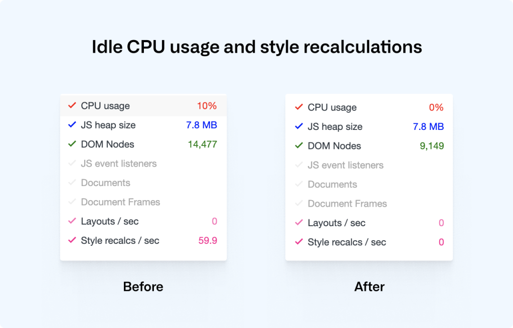
As we rebuilt all of our animations to be triggered through IntersectionObservers and to explicitly specify only opacity and transform as animatable, we saw a drastic decrease in CPU usage and style recalculations, helping to improve our Cumulative Layout Shift score:

Lazy-loading videos with IntersectionObservers

If you’re powering any animations through video elements, you likely want to do two things: only play the video while it’s visible in the viewport, and lazy-load the video when it’s needed. Sadly, the lazy load attribute doesn’t work on videos, but if we use IntersectionObservers to play videos as they appear in the viewport, we can get both of these features in one go:

<!-- HTML: A video that plays inline, muted, w/o autoplay & preload -->
<video loop muted playsinline preload="none" class="js-viewport-aware-video" poster="video-first-frame.jpg">
  <source type="video/mp4" src="video.h264.mp4">
</video>

// JS: Play videos while they are visible in the viewport
const videoObserver = new IntersectionObserver((entries, observer) => {
  for (const entry of entries) entry.isIntersecting ? video.play() : video.pause();
});

for (const element of querySelectorAll('.js-viewport-aware-video')) {
  videoObserver.observe(element);
}

Together with setting preload to none, this simple observer setup saves us several megabytes on each page load.

Serving the perfect image

We visit web pages with a myriad of different devices, screens and browsers, and something simple as displaying an image is becoming increasingly complex if you want to cover all bases. Our particular illustration style also happens to fall between all of the classic JPG, PNG or SVG formats. Take this illustration, for example, that we use to transition from the main narrative to the footer:

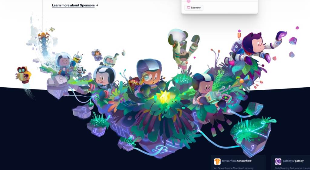
To render this illustration, we would ideally need the transparency from PNGs but combine it with the compression from JPGs, as saving an illustration like this as a PNG would weigh in at several megabytes. Luckily, WebP is, as of iOS 14 and macOS Big Sur, supported in Safari on both desktops and phones, which brings browser support up to a solid +90%. WebP does in fact give us the best of both worlds: we can create compressed, lossy images with transparency. What about support for older browsers? Even a new Mac running the latest version of Safari on macOS Catalina can’t render WebP images, so we have to do something.

This challenge eventually led us to develop a somewhat obscure solution: two JPGs embedded in an SVG (one for the image data and one for the mask), embedded as base64 data—essentially creating a transparent JPG with one single HTTP request. Take a look at this image. Download it, open it up, and inspect it. Yes, it’s a JPG with transparency, encoded in base64, wrapped in an SVG.

Part of the SVG specification is the mask element. With it, you can mask out parts of an SVG. If we embed an SVG in a document, we can use the mask element in tandem with the image element to render an image with transparency:

<svg viewBox="0 0 300 300">
  <defs>
    <mask id="mask">
      <image width="300" height="300" href="mask.jpg"></image>
    </mask>
  </defs>
  <image mask="url(#mask)" width="300" height="300" href="image.jpg"></image>
</svg>

This is great, but it won’t work as a fallback for WebP. Since the paths for these images are dynamic (see href in the example above), the SVG needs to be embedded inside the document. If we instead save this SVG in a file and set it as the src of a regular img, the images won’t be loaded, and we’ll see nothing.

We can work around this limitation by embedding the image data inside the SVG as base64. There are services online where you can convert an image to base64, but if you’re on a Mac, base64 is available by default in your Terminal, and you can use it like so:

base64 -i <in-file> -o <outfile>

Where the in-file is your image of choice, the outfile is a text file where you’ll save the base64 data. With this technique, we can embed the images inside of the SVG and use the SVG as a src on a regular image.

These are the two images that we’re using to construct the footer illustration—one for the image data and one for the mask (black is completely transparent and white is fully opaque):

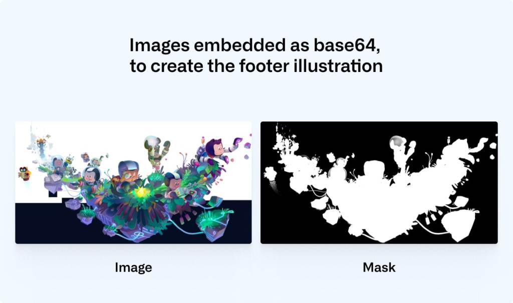
We convert the mask and the image to base64 using the Terminal command and then paste the data into the SVG:

<svg xmlns="http://www.w3.org/2000/svg" viewBox="0 0 2900 1494">
  <defs>
    <mask id="mask">
      <image width="300" height="300" href="data:image/png;base64,/* your image in base64 */”></image>
    </mask>
  </defs>
  <image mask="url(#mask)" width="300" height="300" href="data:image/jpeg;base64,/* your image in base64 */”></image>
</svg>

You can save that SVG and use it like any regular image. We can then safely use WebP with lazy loading and a solid fallback that works in all browsers:

<picture>
  <source srcset="compressed-transparent-image.webp" type="image/webp">
  <img src="compressed-transparent-image.svg" loading="lazy">
</picture>

This somewhat obscure SVG hack saves us hundreds of kilobytes on each page load, and it enables us to utilize the latest technologies for the browsers and operating systems that support them.

Towards a faster web

We’re working throughout the company to create a faster and more reliable GitHub, and these are some of the techniques that we’re utilizing. We still have a long way to go, and if you’d like to be part of that journey, check out our careers page.


How we built the GitHub globe

Post Syndicated from Tobias Ahlin original https://github.blog/2020-12-21-how-we-built-the-github-globe/

GitHub is where the world builds software. More than 56 million developers around the world build and work together on GitHub. With our new homepage, we wanted to show how open source development transcends the borders we’re living in and to tell our product story through the lens of a developer’s journey.

Now that it’s live, we would love to share how we built the homepage-directly from the voices of our designers and developers. In this five-part series, we’ll discuss:

  1. How our globe is built
  2. How we collect and use the data behind the globe
  3. How we made the page fast and performant
  4. How our illustrators work with designers and engineers
  5. How we designed the homepage and wrote the narrative

At Satellite in 2019, our CEO Nat showed off a visualization of open source activity on GitHub over a 30-day span. The sheer volume and global reach was astonishing, and we knew we wanted to build on that story.


 The main goals we set out to achieve in the design and development of the globe were:

  • An interconnected community. We explored many different options, but ultimately landed on pull requests. It turned out to be a beautiful visualization of pull requests being opened in one part of the world and closed in another.
  • A showcase of real work happening now. We started by simply showing the pull requests’ arcs and spires, but quickly realized that we needed “proof of life.” The arcs could quite as easily just be design animations instead of real work. We iterated on ways to provide more detail and found most resonance with clear hover states that showed the pull request, repo, timestamp, language, and locations. Nat had the idea of making each line clickable, which really upleveled the experience and made it much more immersive. Read more here.
  • Attention to detail and performance. It was extremely important to us that the globe not only looked inspiring and beautiful, but that it performed well on all devices. We went through many, many iterations of refinement, and there’s still more work to be done.

Rendering the globe with WebGL

At the most fundamental level, the globe runs in a WebGL context powered by three.js. We feed it data of recent pull requests that have been created and merged around the world through a JSON file. The scene is made up of five layers: a halo, a globe, the Earth’s regions, blue spikes for open pull requests, and pink arcs for merged pull requests. We don’t use any textures: we point four lights at a sphere, use about 12,000 five-sided circles to render the Earth’s regions, and draw a halo with a simple custom shader on the backside of a sphere.

To draw the Earth’s regions, we start by defining the desired density of circles (this will vary depending on the performance of your machine—more on that later), and loop through longitudes and latitudes in a nested for-loop. We start at the south pole and go upwards, calculate the circumference for each latitude, and distribute circles evenly along that line, wrapping around the sphere:

for (let lat = -90; lat <= 90; lat += 180/rows) {
  const radius = Math.cos(Math.abs(lat) * DEG2RAD) * GLOBE_RADIUS;
  const circumference = radius * Math.PI * 2;
  const dotsForLat = circumference * dotDensity;
  for (let x = 0; x < dotsForLat; x++) {
    const long = -180 + x*360/dotsForLat;
    if (!this.visibilityForCoordinate(long, lat)) continue;

    // Setup and save circle matrix data
  }
}

To determine if a circle should be visible or not (is it water or land?) we load a small PNG containing a map of the world, parse its image data through canvas’s context.getImageData(), and map each circle to a pixel on the map through the visibilityForCoordinate(long, lat) method. If that pixel’s alpha is at least 90 (out of 255), we draw the circle; if not, we skip to the next one.

After collecting all the data we need to visualize the Earth’s regions through these small circles, we create an instance of CircleBufferGeometry and use an InstancedMesh to render all the geometry.

Making sure that you can see your own location

As you enter the new GitHub homepage, we want to make sure that you can see your own location as the globe appears, which means that we need to figure where on Earth that you are. We wanted to achieve this effect without delaying the first render behind an IP look-up, so we set the globe’s starting angle to center over Greenwich, look at your device’s timezone offset, and convert that offset to a rotation around the globe’s own axis (in radians):

const date = new Date();
const timeZoneOffset = date.getTimezoneOffset() || 0;
const timeZoneMaxOffset = 60*12;
rotationOffset.y = ROTATION_OFFSET.y + Math.PI * (timeZoneOffset / timeZoneMaxOffset);

It’s not an exact measurement of your location, but it’s quick, and does the job.

Visualizing pull requests

The main act of the globe is, of course, visualizing all of the pull requests that are being opened and merged around the world. The data engineering that makes this possible is a different topic in and of itself, and we’ll be sharing how we make that happen in an upcoming post. Here we want to give you an overview of how we’re visualizing all your pull requests.


Let’s focus on pull requests being merged (the pink arcs), as they are a bit more interesting. Every merged pull request entry comes with two locations: where it was opened, and where it was merged. We map these locations to our globe, and draw a bezier curve between these two locations:

const curve = new CubicBezierCurve3(startLocation, ctrl1, ctrl2, endLocation);

We have three different orbits for these curves, and the longer the two points are apart, the further out we’ll pull out any specific arc into space. We then use instances of TubeBufferGeometry to generate geometry along these paths, so that we can use setDrawRange() to animate the lines as they appear and disappear.

As each line animates in and reaches its merge location, we generate and animate in one solid circle that stays put while the line is present, and one ring that scales up and immediately fades out. The ease out easings for these animations are created by multiplying a speed (here 0.06) with the difference between the target (1) and the current value (animated.dot.scale.x), and adding that to the existing scale value. In other words, for every frame we step 6% closer to the target, and as we’re coming closer to that target, the animation will naturally slow down.

// The solid circle
const scale = animated.dot.scale.x + (1 - animated.dot.scale.x) * 0.06;
animated.dot.scale.set(scale, scale, 1);

// The landing effect that fades out
const scaleUpFade = animated.dotFade.scale.x + (1 - animated.dotFade.scale.x) * 0.06;
animated.dotFade.scale.set(scaleUpFade, scaleUpFade, 1);
animated.dotFade.material.opacity = 1 - scaleUpFade;

Creative constraints from performance optimizations

The homepage and the globe needs to perform well on a variety of devices and platforms, which early on created some creative restrictions for us, and made us focus extensively on creating a well-optimized page. Although some modern computers and tablets could render the globe at 60 FPS with antialias turned on, that’s not the case for all devices, and we decided early on to leave antialias turned off and optimize for performance. This left us with a sharp and pixelated line running along the top left edge of the globe, as the globe’s highlighted edge met the darker color of the background:

This encouraged us to explore a halo effect that could hide that pixelated edge. We created one by using a custom shader to draw a gradient on the backside of a sphere that’s slightly larger than the globe, placed it behind the globe, and tilted it slightly on its side to emphasize the effect in the top left corner:

const halo = new Mesh(haloGeometry, haloMaterial);
halo.scale.multiplyScalar(1.15);
halo.rotateX(Math.PI*0.03);
halo.rotateY(Math.PI*0.03);
this.haloContainer.add(halo);

This smoothed out the sharp edge, while being a much more performant operation than turning on antialias. Unfortunately, leaving antialias off also produced a fairly prominent moiré effect as all the circles making up the world came closer and closer to each other as they neared the edges of the globe. We reduced this effect and simulated the look of a thicker atmosphere by using a fragment shader for the circles where each circle’s alpha is a function of its distance from the camera, fading out every individual circle as it moves further away:

if (gl_FragCoord.z > fadeThreshold) {
  gl_FragColor.a = 1.0 + (fadeThreshold - gl_FragCoord.z ) * alphaFallOff;
}

Improving perceived speed

We don’t know how quickly (or slowly) the globe is going to load on a particular device, but we wanted to make sure that the header composition on the homepage is always balanced, and that you got the impression that the globe loads quickly even if there’s a slight delay before we can render the first frame.

We created a bare version of the globe using only gradients in Figma and exported it as an SVG. Embedding this SVG in the HTML document adds little overhead, but makes sure that something is immediately visible as the page loads. As soon as we’re ready to render the first frame of the globe, we transition between the SVG and the canvas element by crossfading between and scaling up both elements using the Web Animations API. Using the Web Animations API enables us to not touch the DOM at all during the transition, ensuring that it’s as stutter-free as possible.

const keyframesIn = [
      { opacity: 0, transform: 'scale(0.8)' },
      { opacity: 1, transform: 'scale(1)' }
    ];
const keyframesOut = [
      { opacity: 1, transform: 'scale(0.8)' },
      { opacity: 0, transform: 'scale(1)' }
    ];
const options = { fill: 'both', duration: 600, easing: 'ease' };

this.renderer.domElement.animate(keyframesIn, options);
const placeHolderAnim = placeholder.animate(keyframesOut, options);
placeHolderAnim.addEventListener('finish', () => {
  placeholder.remove();
});

Graceful degradation with quality tiers

We aim at maintaining 60 FPS while rendering an as beautiful globe as we can, but finding that balance is tricky—there are thousands of devices out there, all performing differently depending on the browser they’re running and their mood. We constantly monitor the achieved FPS, and if we fail to maintain 55.5 FPS over the last 50 frames we start to degrade the quality of the scene.


There are four quality tiers, and for every degradation we reduce the amount of expensive calculations. This includes reducing the pixel density, how often we raycast (figure out what your cursor is hovering in the scene), and the amount of geometry that’s drawn on screen—which brings us back to the circles that make up the Earth’s regions. As we traverse down the quality tiers, we reduce the desired circle density and rebuild the Earth’s regions, here going from the original ~12 000 circles to ~8 000:

// Reduce pixel density to 1.5 (down from 2.0)
this.renderer.setPixelRatio(Math.min(AppProps.pixelRatio, 1.5));
// Reduce the amount of PRs visualized at any given time
this.indexIncrementSpeed = VISIBLE_INCREMENT_SPEED / 3 * 2;
// Raycast less often (wait for 4 additional frames)
this.raycastTrigger = RAYCAST_TRIGGER + 4;
// Draw less geometry for the Earth’s regions
this.worldDotDensity = WORLD_DOT_DENSITY * 0.65;
// Remove the world
this.resetWorldMap();
// Generate world anew from new settings
this.buildWorldGeometry();

A small part of a wide-ranging effort

These are some of the techniques that we use to render the globe, but the creation of the globe and the new homepage is part of a longer story, spanning multiple teams, disciplines, and departments, including design, brand, engineering, product, and communications. We’ll continue the deep-dive in this 5-part series, so come back soon or follow us on Twitter @GitHub for all the latest updates on this project and more.

Next up: how we collect and use the data behind the globe.

In the meantime, don’t miss out on the new GitHub globe wallpapers from the GitHub Illustration Team to enjoy the globe from your desktop or mobile device:


Love the new GitHub homepage or any of the work you see here? Join our team