Tag Archives: analytics-engineering

Part 3: A Survey of Analytics Engineering Work at Netflix

Post Syndicated from Netflix Technology Blog original https://netflixtechblog.com/part-3-a-survey-of-analytics-engineering-work-at-netflix-e67f0aa82183

This article is the last in a multi-part series sharing a breadth of Analytics Engineering work at Netflix, recently presented as part of our annual internal Analytics Engineering conference. Need to catch up? Check out Part 1, which detailed how we’re empowering Netflix to efficiently produce and effectively deliver high quality, actionable analytic insights across the company and Part 2, which stepped through a few exciting business applications for Analytics Engineering. This post will go into aspects of technical craft.

Dashboard Design Tips

Rina Chang, Susie Lu

What is design, and why does it matter? Often people think design is about how things look, but design is actually about how things work. Everything is designed, because we’re all making choices about how things work, but not everything is designed well. Good design doesn’t waste time or mental energy; instead, it helps the user achieve their goals.

When applying this to a dashboard application, the easiest way to use design effectively is to leverage existing patterns. (For example, people have learned that blue underlined text on a website means it’s a clickable link.) So knowing the arsenal of available patterns and what they imply is useful when making the choice of when to use which pattern.

First, to design a dashboard well, you need to understand your user.

  • Talk to your users throughout the entire product lifecycle. Talk to them early and often, through whatever means you can.
  • Understand their needs, ask why, then ask why again. Separate symptoms from problems from solutions.
  • Prioritize and clarify — less is more! Distill what you can build that’s differentiated and provides the most value to your user.

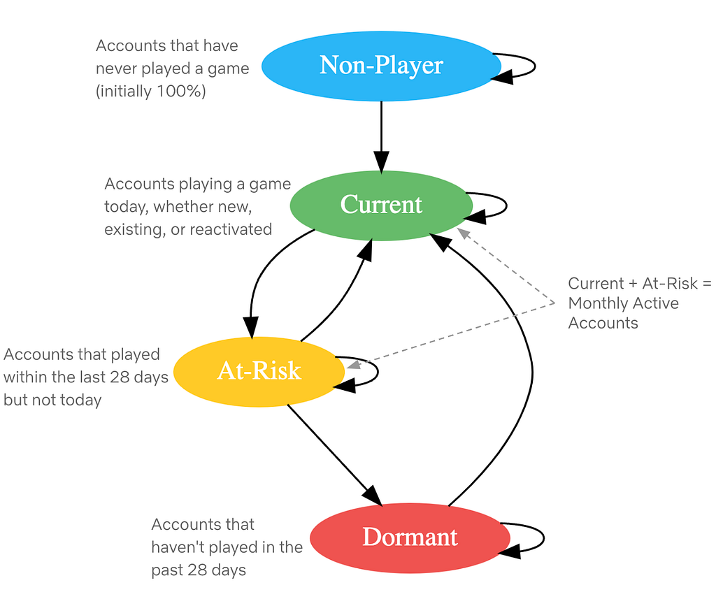
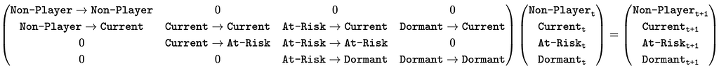
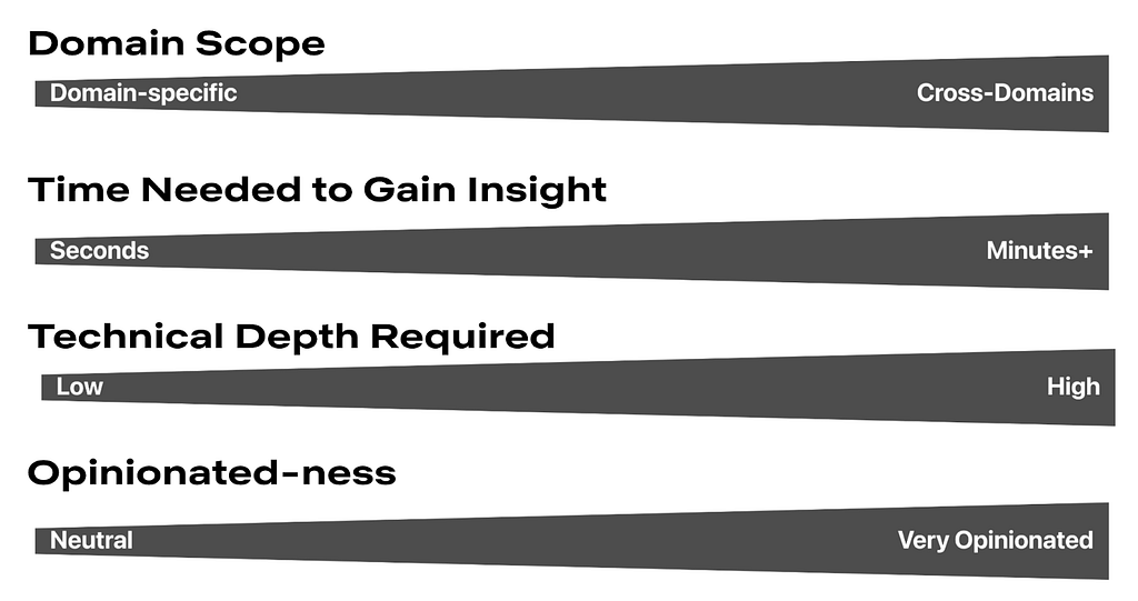
Here is a framework for thinking about what your users are trying to achieve. Where do your users fall on these axes? Don’t solve for multiple positions across these axes in a given view; if that exists, then create different views or potentially different dashboards.

Second, understanding your users’ mental models will allow you to choose how to structure your app to match. A few questions to ask yourself when considering the information architecture of your app include:

  • Do you have different user groups trying to accomplish different things? Split them into different apps or different views.
  • What should go together on a single page? All the information needed for a single user type to accomplish their “job.” If there are multiple jobs to be done, split each out onto its own page.
  • What should go together within a single section on a page? All the information needed to answer a single question.
  • Does your dashboard feel too difficult to use? You probably have too much information! When in doubt, keep it simple. If needed, hide complexity under an “Advanced” section.

Here are some general guidelines for page layouts:

  • Choose infinite scrolling vs. clicking through multiple pages depending on which option suits your users’ expectations better
  • Lead with the most-used information first, above the fold
  • Create signposts that cue the user to where they are by labeling pages, sections, and links
  • Use cards or borders to visually group related items together
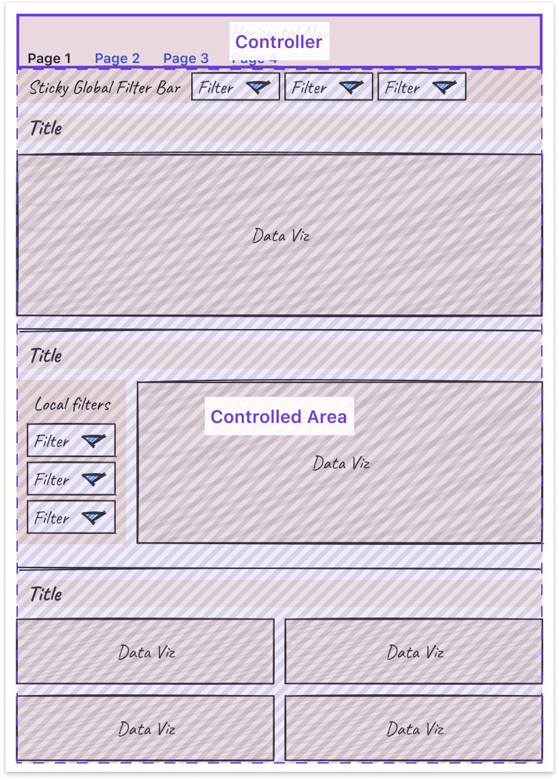
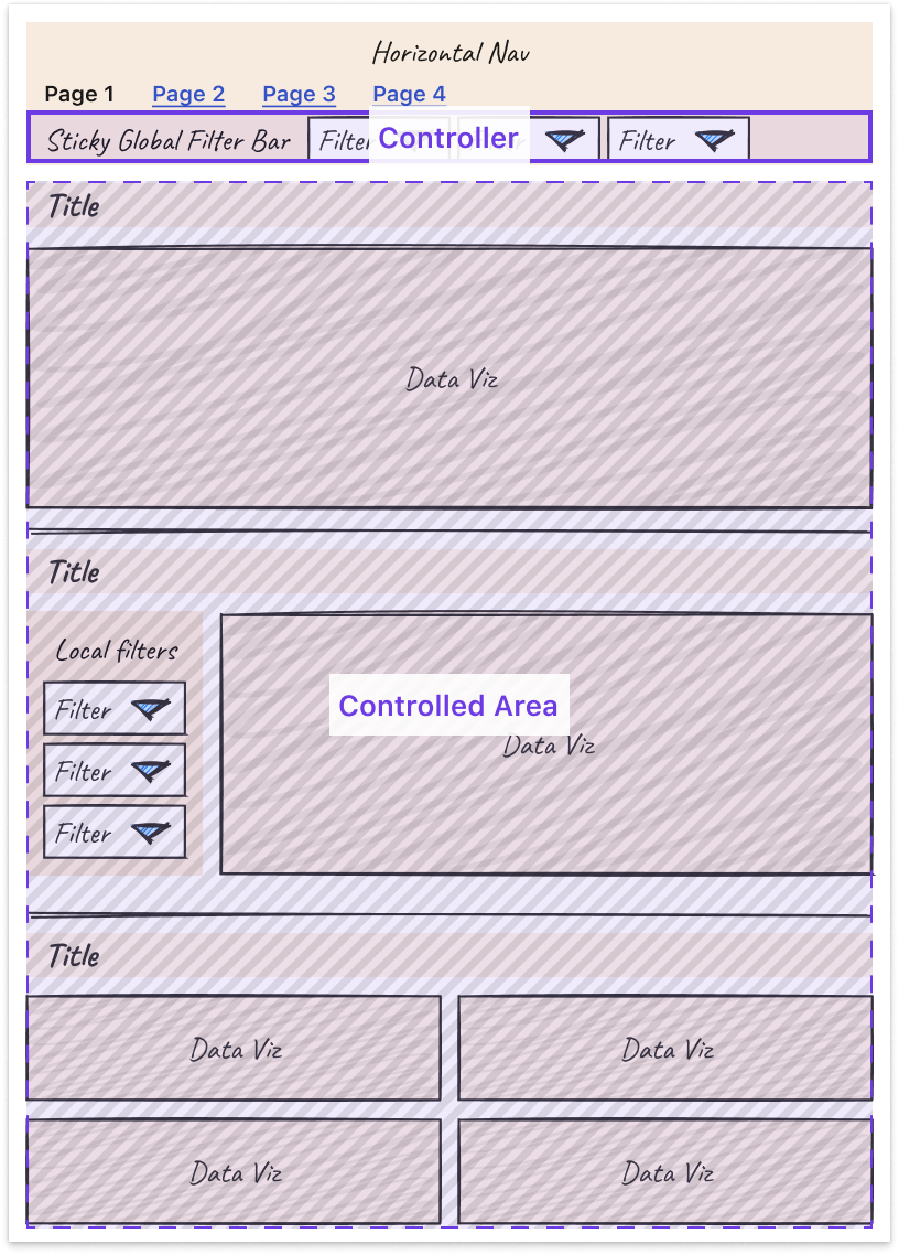
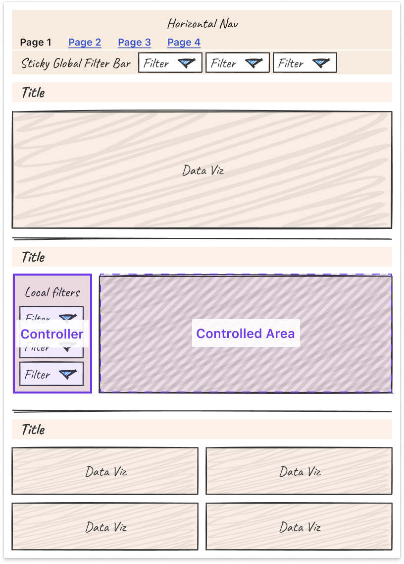
  • Leverage nesting to create well-understood “scopes of control.” Specifically, users expect a controller object to affect children either: Below it (if horizontal) or To the right of it (if vertical)

Third, some tips and tricks can help you more easily tackle the unique design challenges that come with making interactive charts.

  • Titles: Make sure filters are represented in the title or subtitle of the chart for easy scannability and screenshot-ability.
  • Tooltips: Core details should be on the page, while the context in the tooltip is for deeper information. Annotate multiple points when there are only a handful of lines.
  • Annotations: Provide annotations on charts to explain shifts in values so all users can access that context.
  • Color: Limit the number of colors you use. Be consistent in how you use colors. Otherwise, colors lose meaning.
  • Onboarding: Separate out onboarding to your dashboard from routine usage.

Finally, it is important to note that these are general guidelines, but there is always room for interpretation and/or the use of good judgment to adapt them to suit your own product and use cases. At the end of the day, the most important thing is that a user can leverage the data insights provided by your dashboard to perform their work, and good design is a means to that end.

Learnings from Deploying an Analytics API at Netflix

Devin Carullo

At Netflix Studio, we operate at the intersection of art and science. Data is a tool that enhances decision-making, complementing the deep expertise and industry knowledge of our creative professionals.

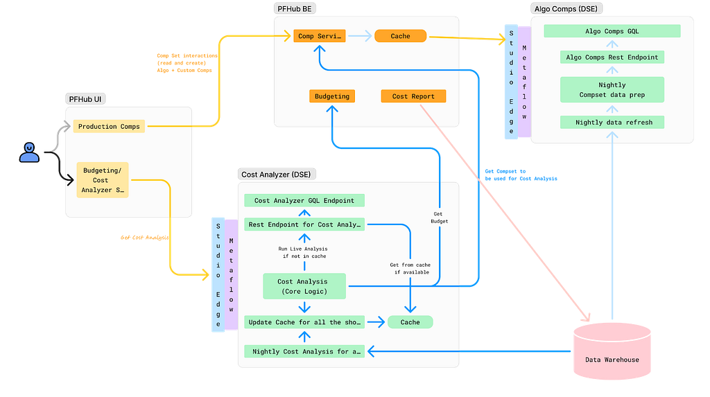
One example is in production budgeting — namely, determining how much we should spend to produce a given show or movie. Although there was already a process for creating and comparing budgets for new productions against similar past projects, it was highly manual. We developed a tool that automatically selects and compares similar Netflix productions, flagging any anomalies for Production Finance to review.

To ensure success, it was essential that results be delivered in real-time and integrated seamlessly into existing tools. This required close collaboration among product teams, DSE, and front-end and back-end developers. We developed a GraphQL endpoint using Metaflow, integrating it into the existing budgeting product. This solution enabled data to be used more effectively for real-time decision-making.

We recently launched our MVP and continue to iterate on the product. Reflecting on our journey, the path to launch was complex and filled with unexpected challenges. As an analytics engineer accustomed to crafting quick solutions, I underestimated the effort required to deploy a production-grade analytics API.

Fig 1. My vague idea of how my API would work
Fig 2: Our actual solution

With hindsight, below are my key learnings.

Measure Impact and Necessity of Real-Time Results

Before implementing real-time analytics, assess whether real-time results are truly necessary for your use case. This can significantly impact the complexity and cost of your solution. Batch processing data may provide a similar impact and take significantly less time. It’s easier to develop and maintain, and tends to be more familiar for analytics engineers, data scientists, and data engineers.

Additionally, if you are developing a proof of concept, the upfront investment may not be worth it. Scrappy solutions can often be the best choice for analytics work.

Explore All Available Solutions

At Netflix, there were multiple established methods for creating an API, but none perfectly suited our specific use case. Metaflow, a tool developed at Netflix for data science projects, already supported REST APIs. However, this approach did not align with the preferred workflow of our engineering partners. Although they could integrate with REST endpoints, this solution presented inherent limitations. Large response sizes rendered the API/front-end integration unreliable, necessitating the addition of filter parameters to reduce the response size.

Additionally, the product we were integrating into was using GraphQL, and deviating from this established engineering approach was not ideal. Lastly, given our goal to overlay results throughout the product, GraphQL features, such as federation, proved to be particularly advantageous.

After realizing there wasn’t an existing solution at Netflix for deploying python endpoints with GraphQL, we worked with the Metaflow team to build this feature. This allowed us to continue developing via Metaflow and allowed our engineering partners to stay on their paved path.

Align on Performance Expectations

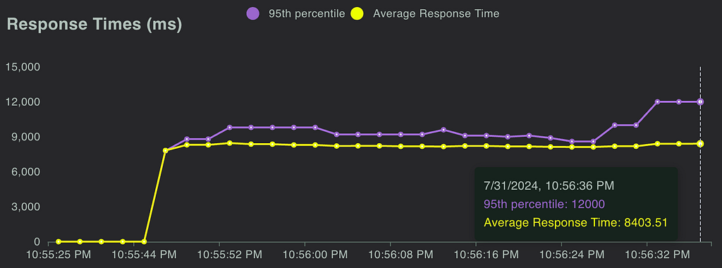
A major challenge during development was managing API latency. Much of this could have been mitigated by aligning on performance expectations from the outset. Initially, we operated under our assumptions of what constituted an acceptable response time, which differed greatly from the actual needs of our users and our engineering partners.

Understanding user expectations is key to designing an effective solution. Our methodology resulted in a full budget analysis taking, on average, 7 seconds. Users were willing to wait for an analysis when they modified a budget, but not every time they accessed one. To address this, we implemented caching using Metaflow, reducing the API response time to approximately 1 second for cached results. Additionally, we set up a nightly batch job to pre-cache results.

While users were generally okay with waiting for analysis during changes, we had to be mindful of GraphQL’s 30-second limit. This highlighted the importance of continuously monitoring the impact of changes on response times, leading us to our next key learning: rigorous testing.

Real-Time Analysis Requires Rigorous Testing

Load Testing: We leveraged Locust to measure the response time of our endpoint and assess how the endpoint responded to reasonable and elevated loads. We were able to use FullStory, which was already being used in the product, to estimate expected calls per minute.

Fig 3. Locust allows us to simulate concurrent calls and measure response time

Unit Tests & Integration Tests: Code testing is always a good idea, but it can often be overlooked in analytics. It is especially important when you are delivering live analysis to circumvent end users from being the first to see an error or incorrect information. We implemented unit testing and full integration tests, ensuring that our analysis would return correct results.

The Importance of Aligning Workflows and Collaboration

This project marked the first time our team collaborated directly with our engineering partners to integrate a DSE API into their product. Throughout the process, we discovered significant gaps in our understanding of each other’s workflows. Assumptions about each other’s knowledge and processes led to misunderstandings and delays.

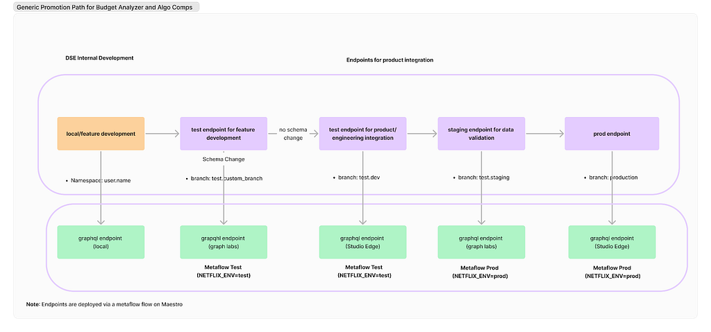
Deployment Paths: Our engineering partners followed a strict deployment path, whereas our approach on the DSE side was more flexible. We typically tested our work on feature branches using Metaflow projects and then pushed results to production. However, this lack of control led to issues, such as inadvertently deploying changes to production before the corresponding product updates were ready and difficulties in managing a test endpoint. Ultimately, we deferred to our engineering partners to establish a deployment path and collaborated with the Metaflow team and data engineers to implement it effectively.

Fig 4. Our current deployment path

Work Planning: While the engineering team operated on sprints, our DSE team planned by quarters. This misalignment in planning cycles is an ongoing challenge that we are actively working to resolve.

Looking ahead, our team is committed to continuing this partnership with our engineering colleagues. Both teams have invested significant time in building this relationship, and we are optimistic that it will yield substantial benefits in future projects.

External Speaker: Benn Stancil

In addition to the above presentations, we kicked off our Analytics Summit with a keynote talk from Benn Stancil, Founder of Mode Analytics. Benn stepped through a history of the modern data stack, and the group discussed ideas on the future of analytics.

Analytics Engineering is a key contributor to building our deep data culture at Netflix, and we are proud to have a large group of stunning colleagues that are not only applying but advancing our analytical capabilities at Netflix. The 2024 Analytics Summit continued to be a wonderful way to give visibility to one another on work across business verticals, celebrate our collective impact, and highlight what’s to come in analytics practice at Netflix.

To learn more, follow the Netflix Research Site, and if you are also interested in entertaining the world, have a look at our open roles!


Part 3: A Survey of Analytics Engineering Work at Netflix was originally published in Netflix TechBlog on Medium, where people are continuing the conversation by highlighting and responding to this story.

Part 2: A Survey of Analytics Engineering Work at Netflix

Post Syndicated from Netflix Technology Blog original https://netflixtechblog.com/part-2-a-survey-of-analytics-engineering-work-at-netflix-4f1f53b4ab0f

This article is the second in a multi-part series sharing a breadth of Analytics Engineering work at Netflix, recently presented as part of our annual internal Analytics Engineering conference. Need to catch up? Check out Part 1. In this article, we highlight a few exciting analytic business applications, and in our final article we’ll go into aspects of the technical craft.

Game Analytics

Yimeng Tang, Claire Willeck, Sagar Palao

User Acquisition Incrementality for Netflix Games

Netflix has been launching games for the past three years, during which it has initiated various marketing efforts, including User Acquisition (UA) campaigns, to promote these games across different countries. These UA campaigns typically feature static creatives, launch trailers, and game review videos on platforms like Google, Meta, and TikTok. The primary goals of these campaigns are to encourage more people to install and play the games, making incremental installs and engagement crucial metrics for evaluating their effectiveness.

Most UA campaigns are conducted at the country level, meaning that everyone in the targeted countries can see the ads. However, due to the absence of a control group in these countries, we adopt a synthetic control framework (blog post) to estimate the counterfactual scenario. This involves creating a weighted combination of countries not exposed to the UA campaign to serve as a counterfactual for the treated countries. To facilitate easier access to incrementality results, we have developed an interactive tool powered by this framework. This tool allows users to directly obtain the lift in game installs and engagement, view plots for both the treated country and the synthetic control unit, and assess the p-value from placebo tests.

To better guide the design and budgeting of future campaigns, we are developing an Incremental Return on Investment model. This model incorporates factors such as the incremental impact, the value of the incremental engagement and incremental signups, and the cost of running the campaign. In addition to using the causal inference framework mentioned earlier to estimate incrementality, we also leverage other frameworks, such as Incremental Account Lifetime Valuation (blog post), to assign value to the incremental engagement and signups resulting from the campaigns.

Measuring and Validating Incremental Signups for Netflix Games

Netflix is a subscription service meaning members buy subscriptions which include games but not the individual games themselves. This makes it difficult to measure the impact of different game launches on acquisition. We only observe signups, not why members signed up.

This means we need to estimate incremental signups. We adopt an approach developed at Netflix to estimate incremental acquisition (technical paper). This approach uses simple assumptions to estimate a counterfactual for the rate that new members start playing the game.

Because games differ from series/films, it’s crucial to validate this estimation method for games. Ideally, we would have causal estimates from an A/B test to use for validation, but since that is not available, we use another causal inference design as one of our ensemble of validation approaches. This causal inference design involves a systematic framework we designed to measure game events that relies on synthetic control (blog post).

As we mentioned above, we have been launching User Acquisition (UA) campaigns in select countries to boost game engagement and new memberships. We can use this cross-country variation to form a synthetic control and measure the incremental signups due to the UA campaign. The incremental signups from UA campaigns differ from those attributed to a game, but they should be similar. When our estimated incremental acquisition numbers over a campaign period are similar to the incremental acquisition numbers calculated using synthetic control, we feel more confident in our approach to measuring incremental signups for games.

Netflix Games Players’ Adventure: Modeled using State Machine

At Netflix Games, we aim to have a high number of members engaging with games each month, referred to as Monthly Active Accounts (MAA). To evaluate our progress toward this objective and to find areas to boost our MAA, we modeled the Netflix players’ journey as a state machine.

We track a daily state machine showing the probability of account transitions between states.

Fig: Netflix Players’ Journey as State machine

Modeling the players’ journey as a state machine allows us to simulate future states and assess progress toward engagement goals. The most basic operation involves multiplying the daily state-transition matrix with the current state values to determine the next day’s state values.

This basic operation allows us to explore various scenarios:

  • Constant Trends: If transition rates stay constant, we can predict future states by repeatedly multiplying the daily state-transition matrix to new state values, helping us assess progress towards annual goals under unchanged conditions.
  • Dynamic Scenarios: By modifying transition rates, we can simulate complex scenarios. For instance, mimicking past changes in transition rates from a game launch allows us to predict the impact of similar future launches by altering the transition rate for a specific period.
  • Steady State: We can calculate the steady state of the state-transition matrix (excluding new players) to estimate the MAA once all accounts have tried Netflix games and understand long-term retention and reactivation effects.

Beyond predicting future states, we use the state machine for sensitivity analysis to find which transition rates most impact MAA. By making small changes to each transition rate we calculate the resulting MAA and measure its impact. This guides us in prioritizing efforts on top-of-funnel improvements, member retention, or reactivation.

Content Cash Modeling

Alex Diamond

At Netflix we produce a variety of entertainment: movies, series, documentaries, stand-up specials, and more. Each format has a different production process and different patterns of cash spend, called our “Content Forecast”. Looking into the future, Netflix keeps a plan of how many titles we intend to produce, what kinds, and when. Because we don’t yet know what specific titles that content will eventually become, these generic placeholders are called “TBD Slots.” A sizable portion of our Content Forecast is represented by TBD Slots.

Almost all businesses have a cash forecasting process informing how much cash they need in a given time period to continue executing on their plans. As plans change, the cash forecast will change. Netflix has a cash forecast that projects our cash needs to produce the titles we plan to make. This presents the question: how can we optimally forecast cash needs for TBD Slots, given we don’t have details on what real titles they will become?

The large majority of our titles are funded throughout the production process — starting from when we begin developing the title to shooting the actual shows and movies to launch on our Netflix service.

Since cash spend is driven by what is happening on a production, we model it by breaking down into these three steps:

  1. Determine estimated production phase durations using historical actuals
  2. Determine estimated percent of cash spent in each production phase
  3. Model the shape of cash spend within each phase

Putting these three pieces together allows us to generate a generic estimation of cash spend per day leading up to and beyond a title’s launch date (a proxy for “completion”). We could distribute this spend linearly across each phase, but this approach allows us to capture nuance around patterns of spend that ramp up slowly, or are concentrated at the start and taper off throughout.

Before starting any math, we need to ensure a high quality historical dataset. Data quality plays a huge role in this work. For example, if we see 80% of our cash spent before production even started, it might be safe to say that either the production dates (which are manually captured) are incorrect or that title had a unique spending pattern that we don’t want to anticipate our future titles will follow.

For the first two steps, finding the estimated phase durations and cash percent per phase, we’ve found that simple math works best, for interpretability and consistency. We use a weighted average across our “clean” historical actuals to produce these estimated assumptions.

For modeling the shape of spend throughout each phase, we perform constrained optimization to fit a 3rd degree polynomial function. The constraints include:

  1. Must pass through the points (0,0) and (1,1). This ensures that 0% through the phase, 0% of that phase’s cash has been spent. Similarly, 100% through the phase, 100% of that phase’s cash has been spent.
  2. The derivative must be non-negative. This ensures that the function is monotonically increasing, avoiding counterintuitively forecasting any negative spend.

The optimization’s objective function minimizes the sum of squared residuals and returns the coefficients of the polynomial that will guide the shape of cash spend through each phase.

Once we have these coefficients, we can evaluate this polynomial at each day of the expected phase duration, and then multiply the result by the expected cash per phase. With some additional data processing, this yields an expected percent of cash spend each day leading up to and beyond the launch date, which we can base our forecasts on.

Assistive Speech Recognition in Dubbing Workflows at Netflix

Tanguy Cornau

Great stories can come from anywhere and be loved everywhere. At Netflix, we strive to make our titles accessible to a global audience, transcending language barriers to connect with viewers worldwide. One of the key ways we achieve this is through creating dubs in many languages.

From the transcription of the original titles all the way to the delivery of the dub audio, we blend innovation with human expertise to preserve the original creative intent.

Leveraging technologies like Assistive Speech Recognition (ASR), we seek to make the transcription part of the process more efficient for our linguists. Transcription, in our context, involves creating a verbatim script of the spoken dialogue, along with precise timing information to perfectly align the text with the original video. With ASR, instead of starting the transcription from scratch, linguists get a pre-generated starting point which they can use and edit for complete accuracy.

This efficiency enables linguists to focus more on other creative tasks, such as adding cultural annotations and references, which are crucial for downstream dubbing.

With ASR, and other new and enhanced technologies we introduce, rigorous analytics and measurement are essential to their success. To effectively evaluate our ASR system, we’ve established a multi-layered measurement framework that provides comprehensive insights into its performance across many dimensions (for example, the accuracy of the text and timing predictions), offline and online.

ASR is expected to perform differently for various languages; therefore, at a high level, we track metrics by original language of the show, allowing us to assess overall ASR effectiveness and identify trends across different linguistic contexts. We further break down performance by various dimensions, e.g. content type, genre, etc… to help us pinpoint specific areas where the ASR system may encounter difficulties. Furthermore, our framework allows us to conduct in-depth analyses of individual titles’ transcription, focusing on critical quality dimensions around text and timing accuracy of ASR suggestions. By zooming in on where the system falls short, we gain valuable insights into specific challenges, enabling us to further refine our understanding of ASR performance.

These measurement layers collectively empower us to continuously monitor, identify improvement areas, and implement targeted enhancements, ensuring that our ASR technology gets more and more accurate, effective, and helpful to linguists across diverse content types and languages. By refining our dubbing workflows through these innovations, we aim to keep improving the quality of our dubs to help great stories travel across the globe and bring joy to our members.

Analytics Engineering is a key contributor to building our deep data culture at Netflix, and we are proud to have a large group of stunning colleagues that are not only applying but advancing our analytical capabilities at Netflix. The 2024 Analytics Summit continued to be a wonderful way to give visibility to one another on work across business verticals, celebrate our collective impact, and highlight what’s to come in analytics practice at Netflix.

To learn more, follow the Netflix Research Site, and if you are also interested in entertaining the world, have a look at our open roles!


Part 2: A Survey of Analytics Engineering Work at Netflix was originally published in Netflix TechBlog on Medium, where people are continuing the conversation by highlighting and responding to this story.

Part 1: A Survey of Analytics Engineering Work at Netflix

Post Syndicated from Netflix Technology Blog original https://netflixtechblog.com/part-1-a-survey-of-analytics-engineering-work-at-netflix-d761cfd551ee

This article is the first in a multi-part series sharing a breadth of Analytics Engineering work at Netflix, recently presented as part of our annual internal Analytics Engineering conference. We kick off with a few topics focused on how we’re empowering Netflix to efficiently produce and effectively deliver high quality, actionable analytic insights across the company. Subsequent posts will detail examples of exciting analytic engineering domain applications and aspects of the technical craft.

At Netflix, we seek to entertain the world by ensuring our members find the shows and movies that will thrill them. Analytics at Netflix powers everything from understanding what content will excite and bring members back for more to how we should produce and distribute a content slate that maximizes member joy. Analytics Engineers deliver these insights by establishing deep business and product partnerships; translating business challenges into solutions that unblock critical decisions; and designing, building, and maintaining end-to-end analytical systems.

Each year, we bring the Analytics Engineering community together for an Analytics Summit — a 3-day internal conference to share analytical deliverables across Netflix, discuss analytic practice, and build relationships within the community. We covered a broad array of exciting topics and wanted to spotlight a few to give you a taste of what we’re working on across Analytics Engineering at Netflix!

DataJunction: Unifying Experimentation and Analytics

Yian Shang, Anh Le

At Netflix, like in many organizations, creating and using metrics is often more complex than it should be. Metric definitions are often scattered across various databases, documentation sites, and code repositories, making it difficult for analysts and data scientists to find reliable information quickly. This fragmentation leads to inconsistencies and wastes valuable time as teams end up reinventing metrics or seeking clarification on definitions that should be standardized and readily accessible.

Enter DataJunction (DJ). DJ acts as a central store where metric definitions can live and evolve. Once a metric owner has registered a metric into DJ, metric consumers throughout the organization can apply that same metric definition to a set of filtered records and aggregate to any dimensional grain.

As an example, imagine an analyst wanting to create a “Total Streaming Hours” metric. To add this metric to DJ, they need to provide two pieces of information:

  • The fact table that the metric comes from:

SELECT
account_id, country_iso_code, streaming_hours
FROM streaming_fact_table

  • The metric expression:

`SUM(streaming_hours)`

Then metric consumers throughout the organization can call DJ to request either the SQL or the resulting data. For example,

  • total_streaming_hours of each account:

dj.sql(metrics=[“total_streaming_hours”], dimensions=[“account_id”]))

  • total_streaming_hours of each country:

dj.sql(metrics=[“total_streaming_hours”], dimensions=[“country_iso_code”]))

  • total_streaming_hours of each account in the US:

dj.sql(metrics=[“total_streaming_hours”], dimensions=[“country_iso_code”], filters=[“country_iso_code = ‘US’”]))

The key here is that DJ can perform the dimensional join on users’ behalf. If country_iso_code doesn’t already exist in the fact table, the metric owner only needs to tell DJ that account_id is the foreign key to an `users_dimension_table` (we call this process “dimension linking”). DJ then can perform the joins to bring in any requested dimensions from `users_dimension_table`.

The Netflix Experimentation Platform heavily leverages this feature today by treating cell assignment as just another dimension that it asks DJ to bring in. For example, to compare the average streaming hours in cell A vs cell B, the Experimentation Platform relies on DJ to bring in “cell_assignment” as a user’s dimension (no different from country_iso_code). A metric can therefore be defined once in DJ and be made available across analytics dashboards and experimentation analysis.

DJ has a strong pedigree–there are several prior semantic layers in the industry (e.g. Minerva at Airbnb; dbt Transform, Looker, and AtScale as paid solutions). DJ stands out as an open source solution that is actively developed and stress-tested at Netflix. We’d love to see DJ easing your metric creation and consumption pain points!

LORE: How we’re democratizing analytics at Netflix

Apurva Kansara

At Netflix, we rely on data and analytics to inform critical business decisions. Over time, this has resulted in large numbers of dashboard products. While such analytics products are tremendously useful, we noticed a few trends:

  1. A large portion of such products have less than 5 MAU (monthly active users)
  2. We spend a tremendous amount of time building and maintaining business metrics and dimensions
  3. We see inconsistencies in how a particular metric is calculated, presented, and maintained across the Data & Insights organization.
  4. It is challenging to scale such bespoke solutions to ever-changing and increasingly complex business needs.

Analytics Enablement is a collection of initiatives across Data & Insights all focused on empowering Netflix analytic practitioners to efficiently produce and effectively deliver high-quality, actionable insights.

Specifically, these initiatives are focused on enabling analytics rather than on the activities that produce analytics (e.g., dashboarding, analysis, research, etc.).

As part of broad analytics enablement across all business domains, we invested in a chatbot to provide real insights to our end users using the power of LLM. One reason LLMs are well suited for such problems is that they tie the versatility of natural language with the power of data query to enable our business users to query data that would otherwise require sophisticated knowledge of underlying data models.

Besides providing the end user with an instant answer in a preferred data visualization, LORE instantly learns from the user’s feedback. This allows us to teach LLM a context-rich understanding of internal business metrics that were previously locked in custom code for each of the dashboard products.

Some of the challenges we run into:

  • Gaining user trust: To gain our end users’ trust, we focused on our model’s explainability. For example, LORE provides human-readable reasoning on how it arrived at the answer that users can cross-verify. LORE also provides a confidence score to our end users based on its grounding in the domain space.
  • Training: We created easy-to-provide feedback using 👍 and 👎 with a fully integrated fine-tuning loop to allow end-users to teach new domains and questions around it effectively. This allowed us to bootstrap LORE across several domains within Netflix.

Democratizing analytics can unlock the tremendous potential of data for everyone within the company. With Analytics enablement and LORE, we’ve enabled our business users to truly have a conversation with the data.

Leveraging Foundational Platform Data to enable Cloud Efficiency Analytics

J Han, Pallavi Phadnis

At Netflix, we use Amazon Web Services (AWS) for our cloud infrastructure needs, such as compute, storage, and networking to build and run the streaming platform that we love. Our ecosystem enables engineering teams to run applications and services at scale, utilizing a mix of open-source and proprietary solutions. In order to understand how efficiently we operate in this diverse technological landscape, the Data & Insights organization partners closely with our engineering teams to share key efficiency metrics, empowering internal stakeholders to make informed business decisions.

This is where our team, Platform DSE (Data Science Engineering), comes in to enable our engineering partners to understand what resources they’re using, how effectively they utilize those resources, and the cost associated with their resource usage. By creating curated datasets and democratizing access via a custom insights app and various integration points, downstream users can gain granular insights essential for making data-driven, cost-effective decisions for the business.

To address the numerous analytic needs in a scalable way, we’ve developed a two-component solution:

  1. Foundational Platform Data (FPD): This component provides a centralized data layer for all platform data, featuring a consistent data model and standardized data processing methodology. We work with different platform data providers to get inventory, ownership, and usage data for the respective platforms they own.
  2. Cloud Efficiency Analytics (CEA): Built on top of FPD, this component offers an analytics data layer that provides time series efficiency metrics across various business use cases. Once the foundational data is ready, CEA consumes inventory, ownership, and usage data and applies the appropriate business logic to produce cost and ownership attribution at various granularities.

As the source of truth for efficiency metrics, our team’s tenants are to provide accurate, reliable, and accessible data, comprehensive documentation to navigate the complexity of the efficiency space, and well-defined Service Level Agreements (SLAs) to set expectations with downstream consumers during delays, outages, or changes.

Looking ahead, we aim to continue onboarding platforms, striving for nearly complete cost insight coverage. We’re also exploring new use cases, such as tailored reports for platforms, predictive analytics for optimizing usage and detecting anomalies in cost, and a root cause analysis tool using LLMs.

Ultimately, our goal is to enable our engineering organization to make efficiency-conscious decisions when building and maintaining the myriad of services that allows us to enjoy Netflix as a streaming service. For more detail on our modeling approach and principles, check out this post!

Analytics Engineering is a key contributor to building our deep data culture at Netflix, and we are proud to have a large group of stunning colleagues that are not only applying but advancing our analytical capabilities at Netflix. The 2024 Analytics Summit continued to be a wonderful way to give visibility to one another on work across business verticals, celebrate our collective impact, and highlight what’s to come in analytics practice at Netflix.

To learn more, follow the Netflix Research Site, and if you are also interested in entertaining the world, have a look at our open roles!


Part 1: A Survey of Analytics Engineering Work at Netflix was originally published in Netflix TechBlog on Medium, where people are continuing the conversation by highlighting and responding to this story.