Post Syndicated from Nick Tran original https://www.backblaze.com/blog/the-rebrand-reveal/
Notice something different on our website? It’s not just you. If you check out our homepage, the Backblaze B2 Cloud Storage page, or the Backblaze Computer Backup page, you’ll experience a different look and feel than you’re used to.
After 14 years, a lot has changed at Backblaze. We started out in 2007 as a consumer cloud backup company. Today, we’re a leader in the cloud storage industry with over an exabyte of data under management and we serve a wide variety of use cases for customers ranging from developers, to IT pros, to media-heavy businesses, and many more.
In all that time, we haven’t needed to change the brand. Like the services we provide, our brand was easy, trusted, and affordable.
And while those core principles haven’t changed, we realized that an update to our website and other communications tools could make the experience on our platforms clearer, more frictionless, and just plain blazier. With that in mind, we hunkered down to deliver a rebrand that would achieve all of this and more.
The Backblaze Rebrand
I won’t bore you with stories about the months of color wheels; name association and SWOT exercises; comparisons to other brands; and the blood, sweat, and tears our Creative and Front End Engineering teams poured into what went live today. All that and more contributed to this effort, but I do want to share some explanations relevant to you: What we changed, what we will change, and what we definitely won’t change.
What Did We Change?
Here are a few of the primary changes we’ve made as part of the rebranding process:
New(ish) Logo
The first thing many of you will notice is an updated logo. You can’t help but love our little flame that never stops burning—it’s a symbol of the blazing fast backup service we launched with, and today also serves as a representation of how we help our customers blaze forward with their businesses. For reference, here’s our old logo:
![]()
But you’ll notice below that our new logo features an update to the typeface and the color. We’ll talk about the updated color later, but the updated typeface is pretty straightforward. In its time, an all-caps name definitely worked, but today it feels a little “shouty”—we wanted a look and feel that says, we’re here to help you blaze on with whatever project comes next. We’re supportive and uncomplicated, if maybe a little irreverent. A side bonus is that we’d like the reporters of the world to know once and for all, there’s only one uppercase letter in our name… Here’s the new logo:
Changes to the User Experience
The overall user experience on the website has been updated to provide more ease for viewing on desktop or mobile. The navigation has been thoughtfully reorganized to make it easier to find the value each user needs within the site, especially within the robust footer we’ve added.
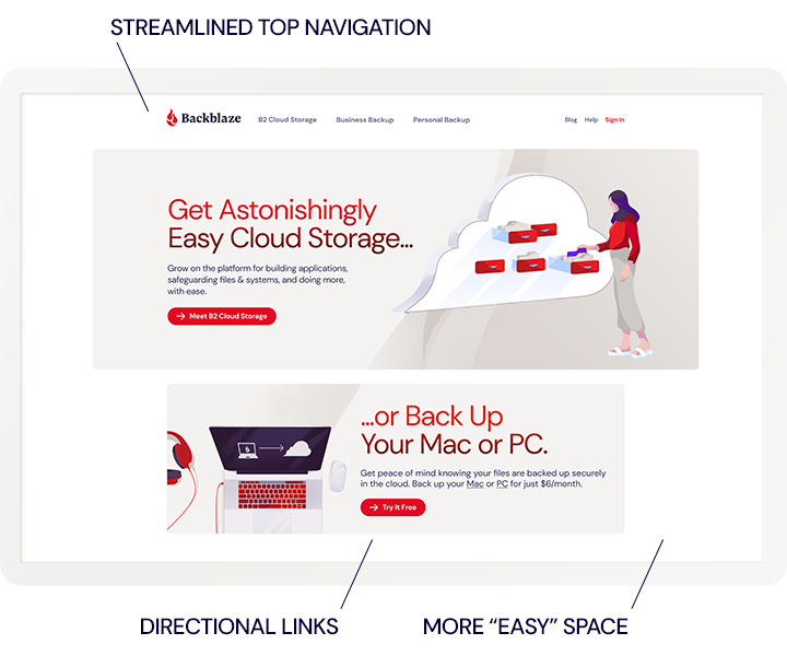
The design brings in more space (or padding) around and between content to allow for greater flow. And in many places, full-width sections have become islands to help you focus on key content, along with directional links to move you through the site.
Colors
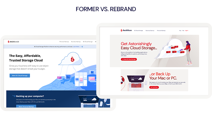
If you head over to the Wayback Machine, or check the screenshots below, you’ll notice that our color palette is brighter, and, well, more “red” than before. Simply put, for the same reasons we doubled down on our blazing logo, we also doubled down on red. When you look around the cloud services space, it’s a sea of quiet blues. Feels a little cold.
We decided to own the heat: Whether you think of us as a catalyst, accelerant, or jet fuel, we’re here to help you blaze forward with whatever you’re trying to achieve—whether that’s a new app, business, or just backing up your precious data—we’ll keep you warm.
What We Will Change…
You don’t have to look farther than our familiar blog layout to see that this rebrand hasn’t touched the whole website, yet. We’re working through the remainder of our pages and assets over the rest of this year, but all of the changes to come will by and large just carry forward the new look and feel we’ve shared today.
…And What We Won’t Change
This rebrand covers a number of subtle and not-so-subtle changes, but an important thing to emphasize is that the substance of Backblaze won’t be changing. From day one, we’ve focused on being easy, affordable, and trusted for our customers. With the commitment to stick to those values in mind, the first thing we did in our rebrand was to reaffirm what exactly our foundation is, and I thought it would be good to share it with you today:
We hope this message comes through loud and clear in the new experience we’ve built for you.
Tell Us What You Think
As we work to continually serve our customers more effectively, we’ll keep improving the way you experience Backblaze products and services—hearing what works and what doesn’t from you is central to that improvement. So, let us know what you think if you have a chance. For a little incentive, we’re sending out some swag to the first 10 of you who respond to this post or share it on social media, so don’t be shy.
The post The Rebrand Reveal appeared first on Backblaze Blog | Cloud Storage & Cloud Backup.