Post Syndicated from Bhupinder Chadha original https://aws.amazon.com/blogs/big-data/new-additions-to-line-charts-in-amazon-quicksight/
Amazon QuickSight is a fully-managed, cloud-native business intelligence (BI) service that makes it easy to create and deliver insights to everyone in your organization or even with your customers and partners. You can make your data come to life with rich interactive charts and create beautiful dashboards to be shared with thousands of users, either directly within the QuickSight application, or embedded in web apps and portals.
Line charts are ubiquitous to the world of data visualization and are used to visualize change in data over a dimension. They are a great way to analyze trends and patterns where data points are connected with a straight line to visualize the overall trend. In this post, we look at some of the new improvements to our line charts:
- Support for missing data points for line and area charts
- Improved performance and increased data limit to 10,000 data points
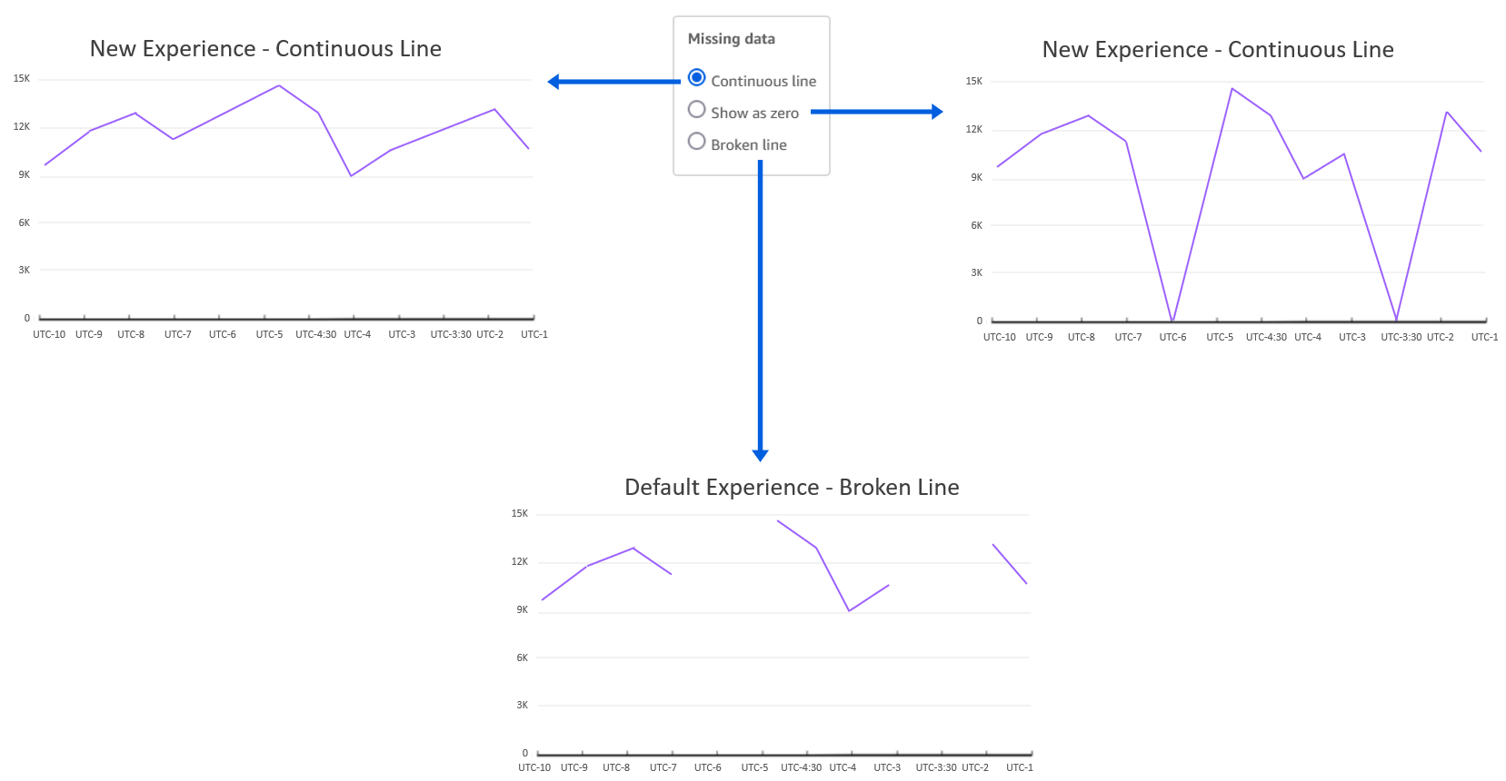
Missing data points
Line charts in QuickSight expect you to have data for each X axis item. If data is missing for any X axis item, it can lead to broken lines (default behavior) because there is no line drawn connecting the missing data points.
Drawing lines with points of missing data could be misleading because it would represent incorrect data, and there are valid use cases to do so. For example, imagine a scenario of a retail sales report for a given time period where data is recorded during days of operation (Monday through Saturday). In such cases, instead of displaying a broken line chart that skips Sunday, you may want to show a continuous trend by directly connecting Saturday to Monday, hiding the fact that Sunday isn’t operational. Alternatively, you may want to view store traffic for Sunday as 0 instead of displaying a broken line.
Previously, line charts only supported treating missing data for date/time fields. Now, we have added support for categorical data for both line and area charts. The following are the different line treatment options:
- Continuous line – Display continuous lines by directly connecting the line to the next available data point in the series
- Show as zero – Interpolate the missing values with zero and display a continuous line
- Broken line – Retain the default experience to display disjointed lines over missing values
The following diagram illustrates a line chart using each option.
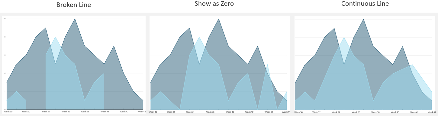
This new feature applies for both categorical and time series data on area charts as well, as shown in the following graphs.
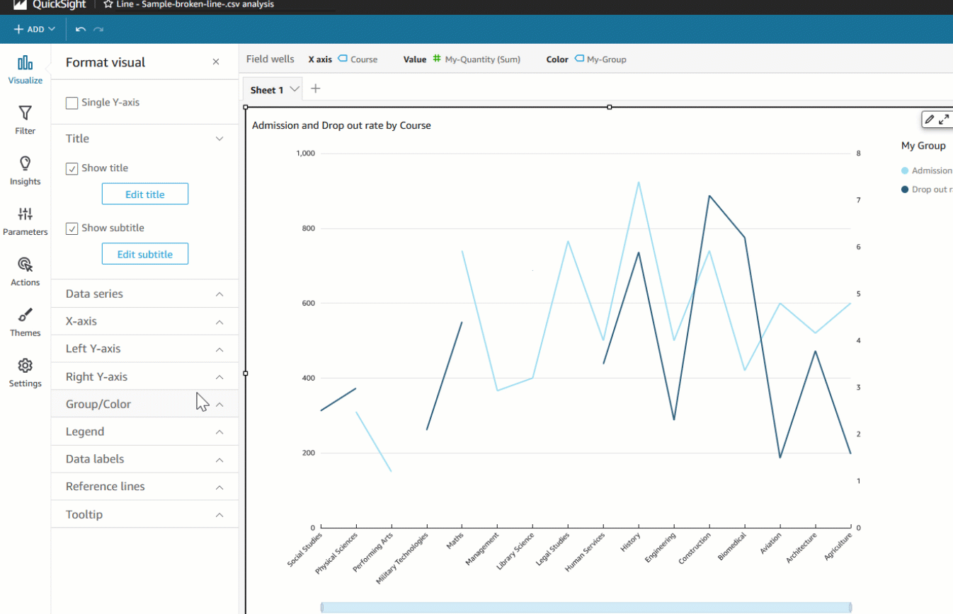
Authors can also configure different data treatments for the left and right Y axis for dual axis charts, as shown in the following example.
Increased data limit for line charts
With the recent update, we have improved line chart performance to support a maximum of 10,000 data points instead of the previous 2,500 data point limit. This also increases the limit for more line series created by the Color by field, which is also bound by the total data limit. For example, if the line chart has 1,000 data points for each series, you could display up to 10 unique colored series.
This update enables use cases where authors want to show a higher number of data points, such as hourly trends or daily trends for a year (365 data points) for multiple groups. This update doesn’t change the default limits of the Color by field (25) and X axis data point limit (100) that exist today to be compatible with existing dashboards and analysis, until authors choose to customize the limits.
Summary
In this post, we looked at how to treat missing data for line charts, where instead of viewing broken lines, you can display continuous lines. This helps you customize how you want to visualize overall trends and variations depending on the business context. Additionally, we looked at the new data handling limit for line charts, which supports 10,000 data points—four times more data than before. To learn more refer customizing missing data control.
Try out the new feature and share your feedback and questions in the comments section.
About the author
 Bhupinder Chadha is a senior product manager for Amazon QuickSight focused on visualization and front end experiences. He is passionate about BI, data visualization and low-code/no-code experiences. Prior to QuickSight he was the lead product manager for Inforiver, responsible for building a enterprise BI product from ground up. Bhupinder started his career in presales, followed by a small gig in consulting and then PM for xViz, an add on visualization product.