All posts by Bhupinder Chadha

Introducing field-based coloring experience for Amazon QuickSight

Post Syndicated from Bhupinder Chadha original https://aws.amazon.com/blogs/big-data/introducing-field-based-coloring-experience-for-amazon-quicksight/

Color plays a crucial role in visualizations. It conveys meaning, captures attention, and enhances aesthetics. You can quickly grasp important information when key insights and data points pop with color. However, it’s important to use color judiciously to enhance readability and ensure correct interpretation. Color should also be accessible and consistent to enable users to establish visual patterns and comprehend data effectively.

In line with data visualization best practices, Amazon QuickSight is announcing the launch of field-based coloring options, which provides a fresh approach to configuring colors across visuals in addition to the visual-level color settings. With field-based colors, you can now enjoy the following benefits:

  • Consistent coloring across visuals using the same Color field
  • The ability to assign custom colors to dimension values at the field level
  • The ability to persist default color consistency during visual interactions, such as filtering and sorting

Consistent coloring experience across visuals

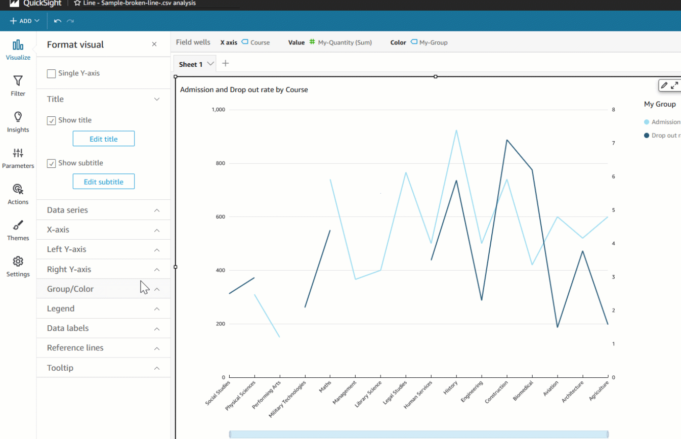
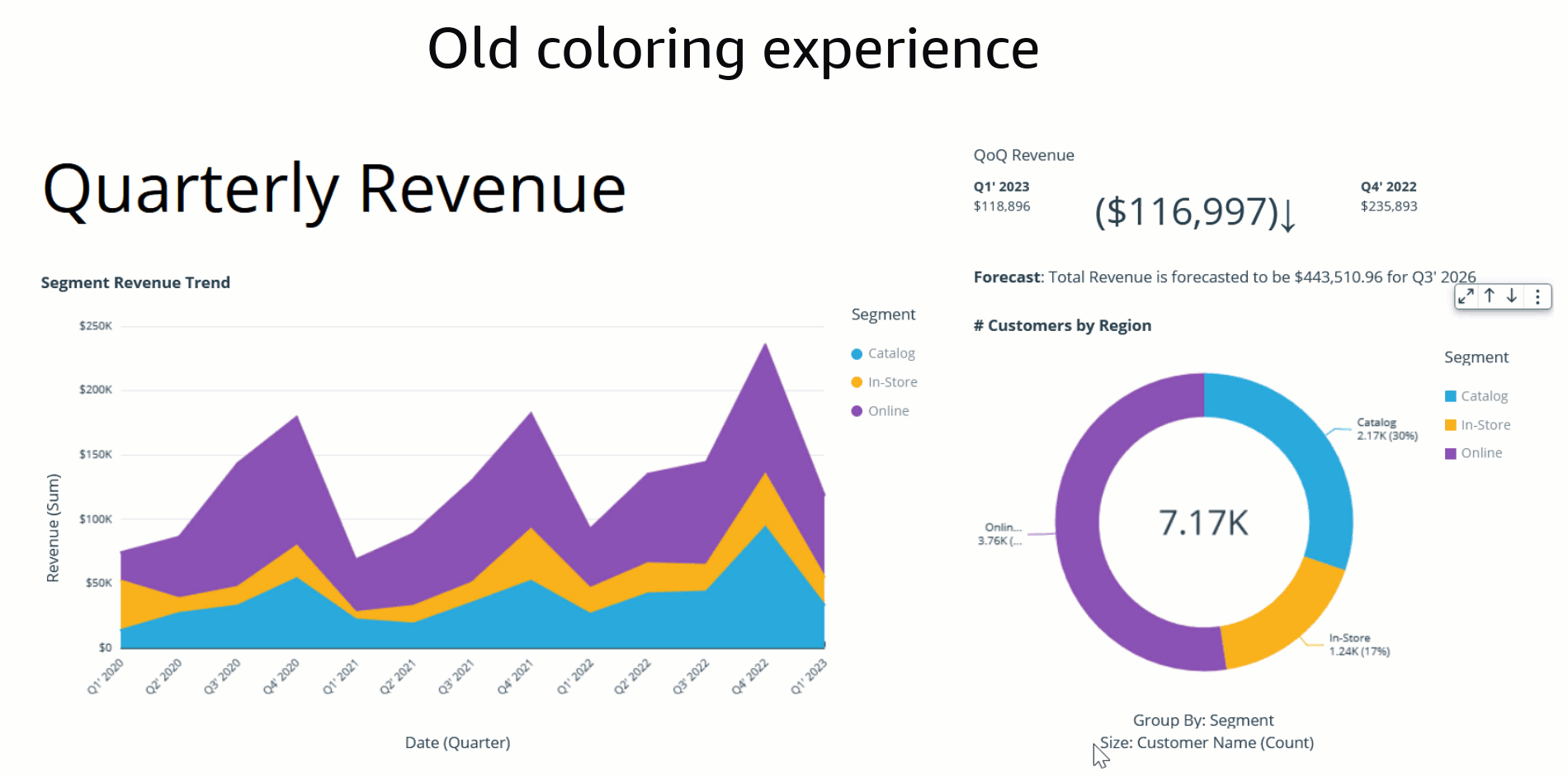
At present, users in QuickSight can either assign colors to their charts using themes or the on-visual menu. In addition to these options, the launch of field-based coloring allows authors to specify colors on a per-field basis, simplifying the process of setting colors and ensuring consistency across all visuals that use the same field. The following example shows that, before this feature was available, both charts using the color field Ship region displayed different colors across the field values.

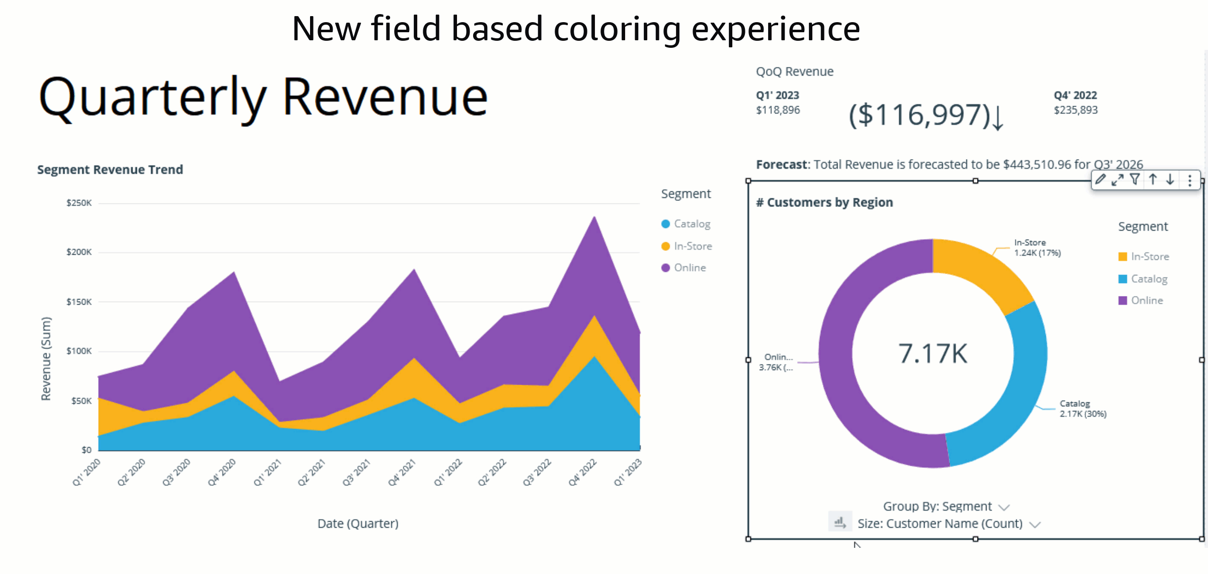
With the implementation of field colors, authors now have the capability to maintain consistent color schemes across visuals that utilize the same field. This is achieved by defining distinct colors for each field value, which ensures uniformity throughout. In contrast to the previous example, both charts now showcase consistent colors for the Ship region field.

Consistent coloring experience with visual interaction

In the past, the default coloring logic used to be based on the sorting order, which means that colors would stay the same for a given sort order. However, this caused inconsistency because the same values could display different colors when the sorting order changed or when they were filtered. The following example shows that the colors for each segment field (Online, In-Store, and Catalog) on the donut chart differ from the colors on the bar chart after sorting.

The assigned colors persist and remain unchanged during any visual interaction, such as sorting or filtering, by defining field-based colors. Notice that, after sorting the donut chart another way, the legend order changes, but the colors remain the same.

How to customize field colors

In this section, we demonstrate the various ways you can customize field colors.

Edit field color

There are two ways to add or edit field-based color:

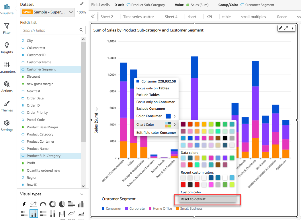
  • Fields list pane – Select the field in your analysis and choose Edit field colors from the context menu. This allows you to choose your own colors for each value.
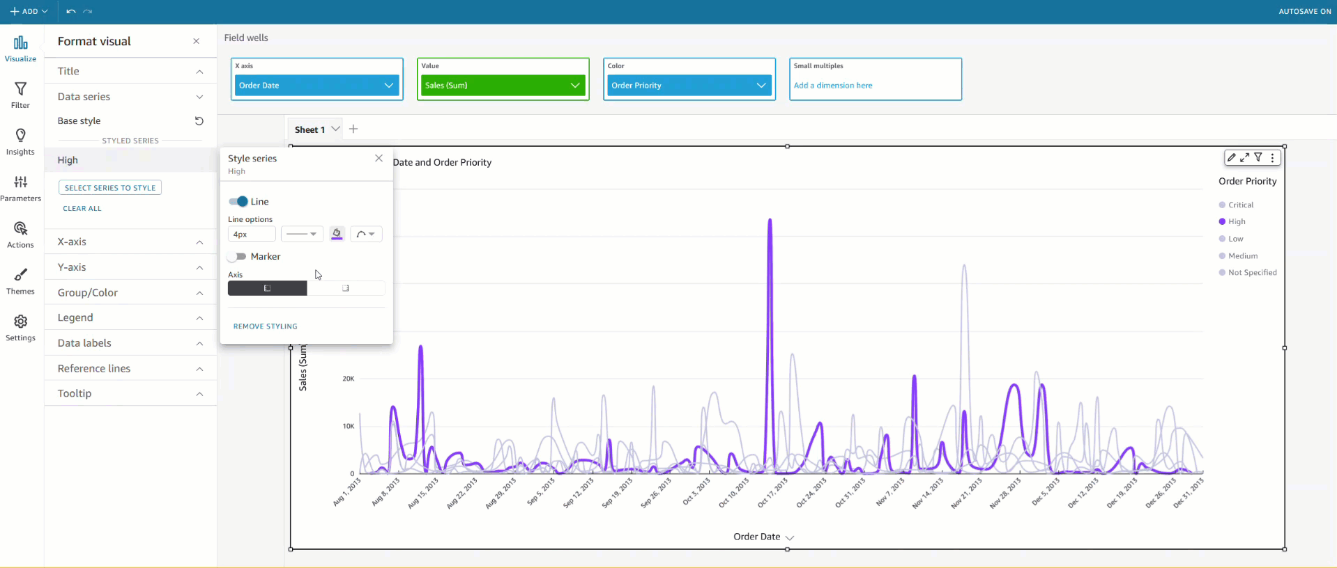
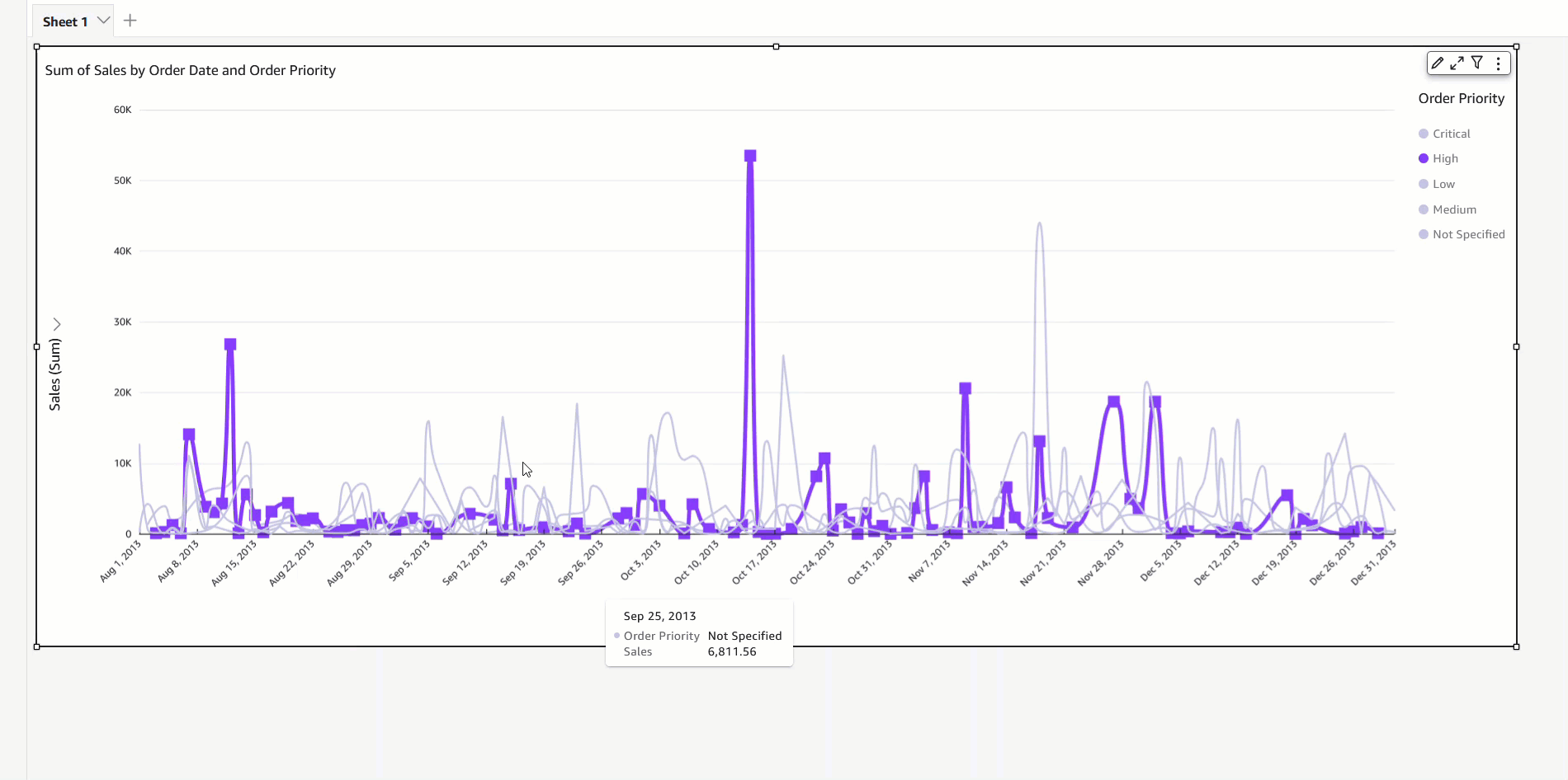
  • On-visual menu – To define or modify colors another way, you can simply select the legend or the desired data point. Access the context menu and choose Edit field colors. This opens the Edit field colors pane, which is filtered to display the selected value and allows for easy and convenient color customization.

Note the following considerations:

  • Colors defined at a visual level override field-based colors.
  • You can assign colors to a maximum of 50 values per field. If you want more than 50, you’ll need to reset a previously assigned color to continue.

Reset visual color

If your visuals have colors assigned through the on-visual menu, the field-based colors aren’t visible. This is because on-visual colors take precedence over the field-based color settings. However, you can easily reset the visual-based colors to reveal the underlying field-based colors in such cases.

Reset field colors

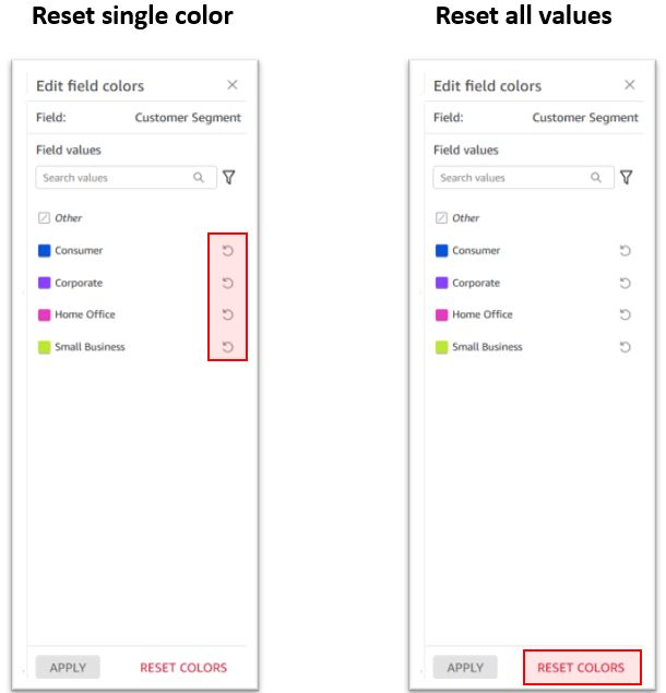
If you want to change the color of a specific value, simply choose the reset icon next to the edited color. Alternatively, if you want to reset all colors, choose Reset colors at the bottom. This restores all edited values to their default color assignment.

Unused color (stale color assignment)

When values that you’ve assigned colors to no longer appear in data, QuickSight labels the values as unused. You can view the unused color assignments and choose to delete them if you’d like.

Conclusion

Field-based coloring options in QuickSight simplify the process of achieving consistent and visually appealing visuals. The persistence of default colors during interactions, such as filtering and sorting, enhances the user experience. Start using field-based coloring today for consistent coloring experience and to enable better comparisons and pattern recognition for effective data interpretation and decision-making.


About the author

Bhupinder Chadha is a senior product manager for Amazon QuickSight focused on visualization and front end experiences. He is passionate about BI, data visualization and low-code/no-code experiences. Prior to QuickSight he was the lead product manager for Inforiver, responsible for building a enterprise BI product from ground up. Bhupinder started his career in presales, followed by a small gig in consulting and then PM for xViz, an add on visualization product.

Improve table readability and identify outliers with data bars in Amazon QuickSight

Post Syndicated from Bhupinder Chadha original https://aws.amazon.com/blogs/big-data/improve-table-readability-and-identify-outliers-with-data-bars-in-amazon-quicksight/

Amazon QuickSight is a scalable, serverless, machine learning (ML)-powered business intelligence (BI) solution that makes it simple to connect to your data, create interactive dashboards, get access to ML-enabled insights, enable natural language querying of your data, and share visuals and dashboards with tens of thousands of internal and external users, either within QuickSight itself or embedded into any application.

Recently, we launched some new features for tables and pivot tables in QuickSight centered around interactivity and performance. These new features enabled users to alter field visibility, load tables faster, and build consistency across different interactions. In the continuous streak of providing rich user experiences and readability, QuickSight is now introducing data bars for table visual.

In this post, we demonstrate how to use data bars to improve table readability and identify outliers.

Introduction to data bars

Tables are a popular way of organizing and presenting data, but it could be difficult for reading and understanding data, especially in large datasets. One way to make table presentation effective is to provide a visual representation with data bars.

Data bars are essentially bar charts displayed for a given column, where the length of the bar represents each cell value relative to the range of values within the same column. Data bars are very efficient in enabling user focus on outliers and emerging data patterns or trends, especially when dealing with large volumes of data. Data bars improve the readability and navigation of complex tables by integrating tabular data with visualizations. Their visual nature enables quick comprehension and understanding, making them a popular choice for displaying and analyzing data. With QuickSight, you can now use data bars on numeric fields and adjust your color scheme for both positive and negative values individually.

Solution overview

Our use case focuses on AnyHealth Inc., a large hospital corporation in the US. They manage different hospitals across different regions of the country. As part of their analytics requirements, they want to be able to quickly find outliers and determine health economics outcomes. They use QuickSight for their visualizations. With the recent addition of data bars to the available table visuals, AnyHealth can get these insights with ease. Not only that, they can also get the information by reading through the cells. With data bars, they are instantly able to identify the outliers visually, identify values that significantly deviate from rest of the data, and monitor emerging trends. With data bars, understanding and reading the tables has been a breeze.

In the following sections, we examine two use cases using data bars in QuickSight.

Identify outliers with data bars visually

To add a table visual to the analysis with data bars, we create a table visual with at least one metric in the Values field well. In this example, we create a table to load profits across various hospitals and categories. The following screenshot shows our initial data.

Complete the following steps to configure a visualization:

  1. On the table visual, choose the pencil icon to open the Format visual navigation pane.
  2. In the navigation pane, expand the Visuals drop-down menu and choose ADD DATA BARS.
  3. For Value field, choose Profit. By default, data bars are configured for two colors: green for positive values and red for negative values.

Note: Data bars are applicable only on the Values field of the visual.

  1. To further configure these colors, choose the paint bucket icon and choose your preferred color.
  2. Close the Data bars menu.

The data bars visualization now appears in the table and an instant outlier can be identified at South Hospital in Ante/Post Partum category.

Display various metrics on the same scale

AnyHealth often has several metrics that they want to visualize and compare side by side, sliced by a single dimension on a same metric scale. For this use case, they want to visualize revenue, profit, and price sliced by the Hospital dimension. Having all these metrics on the same scale is challenging because the numbers vary greatly. With data bars, AnyHealth was able to achieve this in a very simple and clean way, which enabled them to show their data without additional calculations.

The following screenshot shows the example implementation.

Conclusion

In this post, we looked at the data bars feature in QuickSight, its various use cases, and how to configure them. With data bars, you can analyze and quickly scan a table to see the values of a cell. Furthermore, you can use data bars to identify outliers visually that deviate from the rest of the data. Data bars can be very powerful when it comes to understanding and reading data in tables. Start using data bars to enrich your dashboards’ current visualization and unlock new business use cases today!

If you have any questions or feedback, please leave a comment.

For additional discussions and help getting answers to your questions, check out the QuickSight Community.


About the authors

Bhupinder Chadha is a senior product manager for Amazon QuickSight focused on visualization and front end experiences. He is passionate about BI, data visualization and low-code/no-code experiences. Prior to QuickSight he was the lead product manager for Inforiver, responsible for building a enterprise BI product from ground up. Bhupinder started his career in presales, followed by a small gig in consulting and then PM for xViz, an add on visualization product.

Raji Sivasubramaniam is a Sr. Solutions Architect at AWS, focusing on Analytics. Raji is specialized in architecting end-to-end Enterprise Data Management, Business Intelligence and Analytics solutions for Fortune 500 and Fortune 100 companies across the globe. She has in-depth experience in integrated healthcare data and analytics with wide variety of healthcare datasets including managed market, physician targeting and patient analytics.

Srikanth Baheti is a Specialized World Wide Principal Solution Architect for Amazon QuickSight. He started his career as a consultant and worked for multiple private and government organizations. Later he worked for PerkinElmer Health and Sciences & eResearch Technology Inc, where he was responsible for designing and developing high traffic web applications, highly scalable and maintainable data pipelines for reporting platforms using AWS services and Serverless computing.

New scatter plot options in Amazon QuickSight to visualize your data

Post Syndicated from Bhupinder Chadha original https://aws.amazon.com/blogs/big-data/new-scatter-plot-options-in-amazon-quicksight-to-visualize-your-data/

Are you looking to understand the relationships between two numerical variables? Scatter plots are a powerful visual type that allow you to identify patterns, outliers, and strength of relationships between variables. In this post, we walk you through the newly launched scatter plot features in Amazon QuickSight, which will help you take your correlation analysis to the next level.

Feature overview

The scatter plot is undoubtedly one of the most effective visualizations for correlation analysis, helping to identify patterns, outliers, and the strength of the relationship between two or three variables (using a bubble chart). We have improved the performance and versatility of our scatter plots, supporting five additional use cases. The following functionalities have been added in this release:

  • Display unaggregated values – Previously, when there was no field placed on Color, QuickSight displayed unaggregated values, and when a field was placed on Color, the metrics would be aggregated and grouped by that dimension. Now, you can choose to plot unaggregated values even if you’re using a field on Color by using the new aggregate option called None from the field menu, in addition to aggregation options like Sum, Min, and Max. If one value is set to be aggregated, the other value will be automatically set as aggregated, and the same applies to unaggregated scenarios. Mixed aggregation scenarios are not supported, meaning that one value can’t be set as aggregated while the other is unaggregated. It’s worth noting that the unaggregated scenario (the None option) is only supported for numerical values, whereas categorical values (like dates and dimensions) will only display aggregate values such as Count and Count distinct.
  • Support for an additional Label field – We’re introducing a new field well called Label alongside the existing Color field. This will allow you to color by one field and label by another, providing more flexibility in data visualization.
  • Faster load time – The load time is up to six times faster, which impacts both new and existing use cases. Upon launch, you’ll notice that scatter plots render noticeably faster, especially when dealing with larger datasets.

Explore advanced scatter plot use cases

You can choose to set both X and Y values to either aggregated or unaggregated (the None option) from the X and Y axis field menus. This will define if values will be aggregated by dimensions in the Color and Label field wells or not. To get started, add the required fields and choose the appropriate aggregation based on your use case.

Unaggregated use cases

The following screenshot shows an example of unaggregated X and Y value with Color.

The following screenshot shows an example of unaggregated X and Y with Label.

The following screenshot shows an example of unaggregated X and Y with Color and Label.

Aggregated use cases

The following screenshot shows an example of X and Y aggregated by Color.

The following screenshot shows an example of X and Y aggregated by Label.

The following screenshot shows an example of X and Y aggregated by Color and Label.

Conclusion

In summary, our enhanced scatter plots offer users greater performance and versatility, catering to a wider range of use cases than before. The ability to display unaggregated values and support for additional label fields gives users the flexibility they need to visualize the data they want. For further details, refer to Amazon QuickSight Scatterplot. Try out the new scatter plot updates and let us know your feedback in the comments section.


About the authors

Bhupinder Chadha is a senior product manager for Amazon QuickSight focused on visualization and front end experiences. He is passionate about BI, data visualization and low-code/no-code experiences. Prior to QuickSight he was the lead product manager for Inforiver, responsible for building a enterprise BI product from ground up. Bhupinder started his career in presales, followed by a small gig in consulting and then PM for xViz, an add on visualization product.

Visualize multivariate data using a radar chart in Amazon QuickSight

Post Syndicated from Bhupinder Chadha original https://aws.amazon.com/blogs/big-data/visualize-multivariate-data-using-a-radar-chart-in-amazon-quicksight/

At AWS re:Invent 2022, we announced the general availability of two new Amazon QuickSight visuals: small multiples and text boxes. We are excited to add another new visual to QuickSight: radar charts. With radar charts, you can compare two or more items across multiple variables in QuickSight.

In this post, we explore radar charts, its use cases, and how to configure one.

What is a radar chart?

Radar charts (also known as spider charts, polar charts, web charts, or star plots) are a way to visualize multivariate data similar to a parallel coordinates chart. They are used to plot one or more groups of values over multiple common variables. They do this by providing an axis for each variable, and these axes are arranged radially around a central point and spaced equally. The center of the chart represents the minimum value, and the edges represent the maximum value on the axis. The data from a single observation is plotted along each axis and connected to form a polygon. Multiple observations can be placed in a single chart by displaying multiple polygons.

For example, consider HR wanting to comparing the employee satisfaction score for different departments like sales, marketing, and finance against various metrics such as work/life balance, diversity, inclusiveness, growth opportunities, and wages. As shown in the following radar chart, each employee metric forms the axis with each department being represented by individual series.

Another effective way of comparing radar charts is to compare a given department against the average or baseline value. For instance, the sales department feels less compensated compared to the baseline, but ranks high on work/life balance.

When to use radar charts

Radar charts are a great option when space is a constraint and you want to compare multiple groups in a compact space. Radar charts are best used for the following:

  • Visualizing multivariate data, such as comparing cars across different stats like mileage, max speed, engine power, and driving pleasure
  • Comparative analysis (comparing two or more items across a list of common variables)
  • Spot outliers and commonality

Compared to parallel coordinates, radar charts are ideal when there are a few groups of items to be compared. You should also be mindful of not displaying too many variables, which can make the chart look cluttered and difficult to read.

Radar chart use cases

Radar charts have a wide variety of industry use cases, some of which are as follows:

  • Sports analytics – Compare athlete performance across different performance parameters for selection criteria
  • Strategy – Compare and measure different technology costs between various parameters, such as contact center, claims, massive claims, and others
  • Sales – Compare performance of sales reps across different parameters like deals closed, average deal size, net new customer wins, total revenue, and deals in the pipeline
  • Call centers – Compare call center staff performance against the staff average across different dimensions
  • HR – Compare company scores in terms of diversity, work/life balance, benefits, and more
  • User research and customer success – Compare customer satisfaction scores across different parts of the product

Different radar chart configurations

Let’s use an example of visualizing staff performance within a team, using the following sample data. The goal is to compare employee performance based on various qualities like communication, work quality, productivity, creativity, dependability, punctuality, and technical skills, ranging between a score of 0–10.

To add a radar chart to your analysis, choose the radar chart icon from the visual selector.

Depending on your use case and how the data is structured, you can configure radar charts in different ways.

Value as axis (UC1 and 2 tab from the dataset)

In this scenario, all qualities (communication, dependability, and so on) are defined as measures, and the employee is defined as a dimension in the dataset.

To visualize this data in a radar chart, drag all the variables to the Values field well and the Employee field to the Color field well.

Category as axis (UC1 and 2 tab from the dataset)

Another way to visualize the same data is to reverse the series and axis configuration, where each quality is displayed as a series and employees are displayed on the axis. For this, drag the Employee field to the Category field well and all the qualities to the Value field well.

Category as axis with color (UC3 tab from the dataset)

We can visualize the same use case with a different data structure, where all the qualities and employees are defined as a dimension and scores as values.

To achieve this use case, drag the field that you want to visualize as the axis to the Category field and individual series to the Color field. In our case, we chose Qualities as our axis, added Score to the Value field well, and visualized the values for each employee by adding Employee to the Color field well.

Styling radar charts

You can customize your radar charts with the following formatting options:

  • Series style – You can choose to display the chart as either a line (default) or area series

  • Start angle – By default, this is set to 90 degrees, but you can choose a different angle if you want to rotate the radar chart to better utilize the available real estate

  • Fill area – This option applies odd/even coloring for the plot area

  • Grid shape – Choose between circle or polygon for grid shape

Summary

In this post, we looked at how radar charts can help you visualize and compare items across different variables. We also learned about the different configurations supported by radar charts and styling options to help you customize its look and feel.

We encourage you to explore radar charts and leave a comment with your feedback.


About the author

Bhupinder Chadha is a senior product manager for Amazon QuickSight focused on visualization and front end experiences. He is passionate about BI, data visualization and low-code/no-code experiences. Prior to QuickSight he was the lead product manager for Inforiver, responsible for building a enterprise BI product from ground up. Bhupinder started his career in presales, followed by a small gig in consulting and then PM for xViz, an add on visualization product.

Super-charged pivot tables in Amazon QuickSight

Post Syndicated from Bhupinder Chadha original https://aws.amazon.com/blogs/big-data/super-charged-pivot-tables-in-amazon-quicksight/

Amazon QuickSight is a fast and cloud-powered business intelligence (BI) service that makes it easy to create and deliver insights to everyone in your organization without any servers or infrastructure. QuickSight dashboards can also be embedded into applications and portals to deliver insights to external stakeholders. Additionally, with Amazon QuickSight Q, end-users can simply ask questions in natural language to get machine learning (ML)-powered visual responses to their questions.

Recently, Amazon FinTech migrated all their financial reporting to QuickSight. This involved migrating complex tables and pivot tables, helping them slice and dice large datasets and deliver pixel-perfect views of their data to their stakeholders. Amazon FinTech, like all QuickSight customers, needs fast performance on very large pivot tables in order to drive adoption of their dashboards. We have specifically launched two new features focused on scaling our pivot tables with the following improvements:

  • Faster loading of pivot tables during expand and collapse operations
  • Increased field limits for rows, columns, and values

In this post, we discuss these improvements to pivot tables in QuickSight.

Blazing fast pivot tables during expand and collapse operations

Today, QuickSight pivot tables work as an infinite load. As users scroll vertically or horizontally on the visual, new queries are run to fetch additional rows and columns of data with fixed row and column configurations for every query request.

For example, in the following table, we would load all carrier/city combinations nested under Dec 7, 2014 before we can continue querying the next date. Let’s say we have more than 500 carrier/city rows for a specific date; this will take more than a single query to get to the next date. The count of queries run depends on the cardinality of the dimension used in the pivot table.

In the following example of a collapsed pivot table, since the reader doesn’t see anything beyond the flight dates, having all carrier/city rows doesn’t change what is actively displayed on the pivot table. Even though individual SQL queries can be fast, users can perceive this table to load slowly due to the sheer number of queries being fired to load the hidden (collapsed) data. Therefore, loading every single row up to the Destination City field isn’t very useful when the pivot table in the collapsed state.

Therefore, to make our pivot tables load faster, we now only fetch the data for visible fields (expanded fields) along with a small subset of values under the collapsed field. This makes sure that data fetched in every new query is used to render new values that can be displayed immediately. We have seen customers improve their load time from 2–10 times faster depending on the complexity of their dataset.

This new behavior is automatically enabled, without requiring users to do anything on their side. Please note that while we plan to support all kinds of pivot tables to use this optimization, our current rollout only includes pivot tables with only row or only column fields not sorted by any metric.

Increased field limits for pivot tables

With the ever-growing depth and granularity of data being collected, our customers asked us to increase the number of fields and data points they can display in their visuals. We have been actively listening to your needs, and just like supporting more data points in line charts, we now are increasing our field limits for pivot tables.

The value field well limits have been increased from 20 to 40, and rows and columns have been increased from 20 each to a combined limit of 40. For example, if the user has 34 fields in rows, then they can add up to 6 fields to the column field well.

This will help unblock use cases requiring increased limits such as:

  • Metrics reporting – Monthly and weekly business reporting often requires having dozens of metrics presented in tabular formats. With the updated limits, you can display detailed, robust financial reports in a single pivot table rather than having to split it across multiple pivot tables.
  • Migration from legacy BI and reporting tools – Existing reports in these legacy systems require displaying and slicing across a large number of row hierarchies, for example a cost center expense analysis.
  • Custom use cases – These are specific industry and organization use cases where you can add dozens of values and row fields to display additional attributes. For example, a customer 360 report sliced by different regions.

As soon as you hit the limit, you receive an error message to indicate that the limit has been reached for that field well. For more details, refer to here.

Get started and stay updated!

Learn more about our new features in our newly launched QuickSight community’s Announcement section and supercharge your dashboards with the latest features from QuickSight!


About the authors

Bhupinder Chadha is a senior product manager for Amazon QuickSight focused on visualization and front end experiences. He is passionate about BI, data visualization and low-code/no-code experiences. Prior to QuickSight he was the lead product manager for Inforiver, responsible for building a enterprise BI product from ground up. Bhupinder started his career in presales, followed by a small gig in consulting and then PM for xViz, an add on visualization product.

Igal Mizrahi is a Senior Software Engineer for AWS QuickSight Charting team. He has been part of the team for the past 3 years, and previously worked on Amazon’s mobile shopping application for 4 years.

Create small multiples in Amazon QuickSight

Post Syndicated from Bhupinder Chadha original https://aws.amazon.com/blogs/big-data/create-small-multiples-in-amazon-quicksight/

We’re excited to announce the launch of small multiples in Amazon QuickSight at AWS re:Invent 2022! Small multiples is one of the most powerful data visualization features when it comes to comparative analysis. Previously, you had to either use a filter or create multiple visuals side by side to analyze multiples slices of the same data. With the launch of small multiples, authors can simply add a dimension to the Small multiples field well to create multiple variations of the same chart.

In this post, we explore this new feature and its benefits.

What are Small Multiples?

Small multiples (aka trellis, facet, lattice, grid, or panel charts) allows you to compare data across many values for a given dimension. It splits a base visual into multiple versions of itself, presented side by side, with its data partitioned across these versions by a dimension. It provides an easier way to get a holistic view of your business instead of looking at data in silos. For example, you can view how your business is doing in each state without needing to create over 50 different visuals. Instead, you can see one visual with multiple small charts inside of it, as shown in the following screenshot.

Common use cases for small multiples

The small multiples feature provides the following benefits to your use cases:

  • Comparative analysis with easy pattern recognition – You can use small multiples to compare different subsets (categories) of the same dataset. Compared to animation, small multiples presents all of the data at once, making it easier for viewers to naturally compare each chart with others, instead of trying to flip back and forth between views.
  • Clean and digestible data – Trying to display multiple variables in a single chart can lead to overplotting and obscure readers, which can be overcome using small multiples(refer below example). Also, once the reader understands the design of one chart, they can apply this knowledge as they scan the rest of the charts. This shifts the reader’s effort from understanding how the chart works to what the data says, which makes decoding the chart lot easier.
  • Storytelling – Small multiples is a great tool often used by newspapers to depict a story and allow customers to view changes in patterns (for example, consider the following Washington Post article).
  • Track or view multiple slices of data at once – You can monitor multiple resources at once without generating multiple visualizations or filtering to slice and dice the data.

Create your own small multiples in QuickSight

Currently, you can create small multiples on vertical bar, clustered bar, line, dual axis line, and pie charts. To get started, create one of the supported visuals and drag the field by which you want to partition the data to the Small multiples field well. This creates multiples of the chart split by the dimension assigned in a grid fashion.

For charts supporting axes like line and bar, the X-axis is made common across charts. This provides a cleaner look to easily spot trends and identify the pain points or contributing factors. The axis display settings and axis titles are controlled by the individual chart settings. The following screenshot shows an example.

Styling small multiples

You can customize the style of small multiples in the following ways:

  • Choose a layout – For ease of use, small multiples by default chooses the best possible panel layout depending on the cardinality of the field. You can also adjust the number of rows and columns up to a max of 10 rows per column and 64 panels. Any multiples that don’t fit in the layout are loaded as you scroll vertically. In the following example, we have selected two rows and three columns as our layout. This means you only see six panels at a time; the rest can be accessed via vertical scroll.
  • Limit panels – You can define the maximum number of panels to be displayed based on the sort order applied on the field in your Small multiples field well.
  • Format panel titles – Panel titles add context to the multiples being viewed. You can add rich text formatting like font styling and alignment options.
  • Customize panel styling – You can further customize the small multiples look and feel by playing around with the panel border styling options, adjusting the panel spacing, and adding panel background color.

Interacting with the data

  • Sorting– Depending on the chart type, you can sort by axis, value, and small multiples fields in ascending or descending order.
  • Filtering experience- You can also set filter actions in same way you set for other charts. Filtering on small multiples will pass both the small multiples and axis (in case of line or bar charts) or group (pie charts) context.

More to come

We’re excited about our launch, and we have lots more planned for small multiples. In upcoming releases, we will tackle the current limitations:

  • Drill-down is currently not supported for small multiples.
  • Reference lines have been disabled for now.
  • Show Other small multiples panel is not supported.
  • Small multiples isn’t supported when the primary category is sorted by a field that has the distinct count aggregation function.
  • Small multiples doesn’t support calculated values with table calculation.
  • Data zoom on the X axis for line and bar charts is disabled for now.
  • Panel title is not displayed in the tooltip by default. To see it, you have to manually customize the tooltip and add a Small multiples field in it.

Summary

In this post, we looked at the small multiples features, and learned about its various use cases and how to configure them in QuickSight. You can analyze data by multiple dimension attributes in an easy-to-understand and easy-to-maintain way. With small multiples, readers can quickly see which categories are most important, and spot trends and insights. Start using small multiples to enrich your dashboards’ current visualization and unlock new business use cases today!


About the Author

Bhupinder Chadha is a senior product manager for Amazon QuickSight focused on visualization and front end experiences. He is passionate about BI, data visualization and low-code/no-code experiences. Prior to QuickSight he was the lead product manager for Inforiver, responsible for building a enterprise BI product from ground up. Bhupinder started his career in presales, followed by a small gig in consulting and then PM for xViz, an add on visualization product.

Add text boxes to your Amazon QuickSight analysis

Post Syndicated from Bhupinder Chadha original https://aws.amazon.com/blogs/big-data/add-text-boxes-to-your-amazon-quicksight-analysis/

We are excited to announce the launch of text boxes in Amazon QuickSight. Now you can add text for common use cases, including but not limited to titles, subtitles, annotations, adding additional information for KPIs etc has been simplified than ever before with the new text box. You can reposition, resize, and make your text stand out with various rich text formatting options like font styling, text alignment, and text box styling. You can also add dynamic text values with the help of user-defined parameters and system-defined parameters like date and page number.

In this post, we explore the new text box feature and its benefits.

Solution overview

The new text box feature may feel like an overlap with narrative insight capabilities, which is focused on advance use cases where a text box is lightweight, focused on simplified textual content, and doesn’t need any data assignment. You can add text boxes without being restricted by the total visual limit because it’s not counted towards the sheet visual limit.

You can do the following with a text box in QuickSight:

  • Add freehand text and display dynamic text values with the help of parameters
  • Support reporting use cases with system-defined parameters like date and page count
  • Perform rich text editing with font styling options, alignment options, and bulleting
  • Add an image to your text box, such as displaying your company logo with the analysis title text
  • Hyperlink your text to navigate to a different sheet or external URLs
  • Style your text box with background color and border styling options

Add a text box to an analysis sheet

  1. To add a text box to your analysis, you can either choose Add on the drop-down menu or choose the text box icon from the visual selector. Note that unlike other visuals, you can’t convert a text box to another visual, or vice versa.
  2. You now have an empty text box on the sheet. To position the text box, select the box and drag it from the borders. To resize the text box, select and drag any of the outline handles.
  3. Now you can add text and format it by using the various formatting options, such as:
    • Font styling, including font style, color, and size
    • Typographical emphasis, such as bold, italics, underline, and strikethrough
    • Alignment options and bulleting

  4. You can hyperlink text or add a static or dynamic URL by choosing the URL icon.
  5. Just like adding parameters to titles and subtitles, you can display parameter values in a text box as well. Choose from a list of parameters available in the analysis from the parameter drop-down menu.
  6. Along with text, you can add images as well inside the text box by clicking the image icon.
  7. Apart from text formatting you can also format background and border color.

When you’ve finished editing the text box, click on the blank space on the sheet.

Add a text box to a reporting sheet

Although the steps to add a text box to a reporting sheet remain the same as that of an analysis sheet, you have two new system parameter options while adding the text box to the header or footer of your reporting sheet:

  • Date parameter – Add the print date and time to your report by choosing the date parameter (AWS:printTime) and selecting from a list of date formats. If your organization uses a different date format, you can customize it by choosing the added date and selecting from the list of supported date formats.
  • Page parameter – Display the current page number (AWS:pageNumber), total number of pages (AWS:pageCount), or a combination of both by choosing the page parameter.

Summary

In this post, we looked at how the new text box feature in QuickSight provides a great way to add text and format it with rich text capabilities and provide parameter support, URLs, and images. The new text box is now generally available in all supported QuickSight Regions.

Give the text box a try and let us know about your experience in the comments section.


About the author

Bhupinder Chadha is a senior product manager for Amazon QuickSight focused on visualization and front end experiences. He is passionate about BI, data visualization and low-code/no-code experiences. Prior to QuickSight he was the lead product manager for Inforiver, responsible for building a enterprise BI product from ground up. Bhupinder started his career in presales, followed by a small gig in consulting and then PM for xViz, an add on visualization product.

New line chart customization options in Amazon QuickSight

Post Syndicated from Bhupinder Chadha original https://aws.amazon.com/blogs/big-data/new-line-chart-customization-options-in-amazon-quicksight/

Amazon QuickSight is a serverless, cloud-based business intelligence (BI) service that brings data insights to your teams and end-users through machine learning (ML)-powered dashboards and data visualizations that can be accessed via QuickSight or embedded in apps and portals that your users access.

Line charts in QuickSight have undergone a major overhaul this year, starting with an increased limit on the number of data points that can be rendered in a single chart from 2,500 to 10,000 points, followed by missing data treatment, and finally ending this year with line and marker customization options.

With the new styling options, you can make line charts more readable and drive readers’ attention towards the line series you want to emphasize. Although colors help convey meaning, in certain cases choosing different line patterns could help differentiate between lines for people with color blindness, and making lines bold could make them stand out from the rest. Some enhancements like step line interpolation are more than a styling feature, where you can display step lines for data that changes at a specific point in time and at irregular intervals. For example, if you were to build a chart of postage stamp prices in the US, a step line would be preferred than a slope to indicate change in price. The line between the dates would remain flat until the next price change is observed.

In this post, we discuss the updates to the line chart customization options and their benefits.

Line chart format pane updates

The data series section under the format pane has been updated with a new flyout menu consisting of line styling, marker customization, and axis settings. Authors can choose to set a base style, which is a common style across all series, and also customize individual series by either choosing Select Series to Style or by directly selecting the series on the line chart on the sheet. Previously, the long list of series names made it difficult to track series where the axis setting was changed. This has been updated to only display individually styled series. Also, you can remove and reset to default styling if you wish to go back to the previous style.

The following figure compares the old and new experience.

Line styling

The data series tab, where users adjust axis placement (left and right Y axis), now also includes options to style individual series or all series in the line chart and change presentation options. For example, you can create a dot plot chart in QuickSight by hiding the line series and displaying only markers.

Let’s look at the recently added line styling options:

  1. Line interpolation – Allow authors to choose between linear, smooth, and stepped line interpolation options:
    1. Linear – The most commonly used line interpolation for trend analysis.
    2. Smooth – A variation of line charts, which connects the data points using smooth curves instead of straight lines. Apart from the aesthetic aspect, these charts are preferred for displaying a gradual change in trends and where data accuracy isn’t critical.
    3. Stepped – A specialized version of the traditional line charts, where the data points are connected via step-like progressions instead of straight lines. You can use stepped lines to view sudden and exact time of changes in the data, where the vertical lines represent the magnitude of the changes and the horizontal lines represent periods of time where data is constant. You can also use this approach to create bump charts, which are commonly used to visualize changes in rank over time.

  2. Line style – Another way to make your line charts more accessible and printer friendly is to define line styles to differentiate between series. A classic example would be visualizing actual and target values across a given time period. You can choose between solid, dotted, and dash line style.
  3. Color customization – Colors play an important role in conveying meaning and driving user attention. Although defining a distinct color for each series helps distinguish between the different series, doing the same for a large number of series could add visual clutter. As part of best practices in such cases, highlighting certain series makes it easier for readers to focus on the important information, especially while viewing a large number of line series.
  4. Line width – You can choose from predefined line widths to easily differentiate between line series and let important values stick out to drive reader focus. In the following example, we’re interested in showing the seasonality trends for gardening and home decor in relation to other parts of the business. To do that, instead of assigning each series a different color, we might only adjust color and increase thickness for gardening and home decor and keep other series as grey and thin. This way, reader attention is easily drawn towards the thicker, colored lines.

Marker customization

Data markers help draw attention to the data points along a line. They also come in handy when showing which data points are covered by your data in case your line chart contains missing data points. Data markers can be enabled for all series or individual series. When enabling data markers for all series, you should be judicious to avoid visual clutter and draw attention to too many elements.

These new customizations enable new use cases such as dot plot charts (hide line series and display only markers) and slope graphs. Data point markers will only show up for data points where data exists and not for interpolated values using the missing data control. The following are the marker properties:

  1. Shape – Choose from a predefined list of marker shapes like circle, diamond, or square.
  2. Size – Define a size for the marker. Note that the marker size should be greater than the line width to be visible.
  3. Color – By default, markers are assigned the same color as individual series. However, this can be changed as desired.

How to style lines and markers

Create or choose a line chart that you want to style and choose the pencil icon to open the Format visual pane. Navigate to the data series section and select the base style to apply common styling options to all series—color toned down to light grey and line interpolation as smooth.

  • Line styling – To style a specific series, select the series to style on the drop-down menu and set the desired line styling options. In our example, the high series line width has been increased to 4px and the color is set to purple.
  • Marker styling – Turn the marker styling toggle on to customize markers and choose marker styling options. Select your desired marker shape and size.
  • Axis placement – You can change the series axis from left to right and convert it into a dual axis chart.
  • Remove styling – If you want to reset to the default styling, choose Remove styling for an individual series and choose the reset icon for the base style.
  • Visual ingress – Apart from using the format pane for styling, authors can also style a series directly by selecting the series on the visual.

Summary

In this post, we looked at the new line and marker styling options for line charts and how you can apply a common style across all series as well as style each series individually. We also looked at the different ingress and Y axis placement options. Learn more on how to use small multiples in QuickSight To learn more, click here

We look forward to learning more about your interesting use cases and feedback on how we can better serve you! Follow the QuickSight Community to stay up to date with new feature announcement, events, learning center, and questions and answers.


About the author

Bhupinder Chadha is a senior product manager for Amazon QuickSight focused on visualization and front end experiences. He is passionate about BI, data visualization and low-code/no-code experiences. Prior to QuickSight he was the lead product manager for Inforiver, responsible for building a enterprise BI product from ground up. Bhupinder started his career in presales, followed by a small gig in consulting and then PM for xViz, an add on visualization product.

New additions to line charts in Amazon QuickSight

Post Syndicated from Bhupinder Chadha original https://aws.amazon.com/blogs/big-data/new-additions-to-line-charts-in-amazon-quicksight/

Amazon QuickSight is a fully-managed, cloud-native business intelligence (BI) service that makes it easy to create and deliver insights to everyone in your organization or even with your customers and partners. You can make your data come to life with rich interactive charts and create beautiful dashboards to be shared with thousands of users, either directly within the QuickSight application, or embedded in web apps and portals.

Line charts are ubiquitous to the world of data visualization and are used to visualize change in data over a dimension. They are a great way to analyze trends and patterns where data points are connected with a straight line to visualize the overall trend. In this post, we look at some of the new improvements to our line charts:

  • Support for missing data points for line and area charts
  • Improved performance and increased data limit to 10,000 data points

Missing data points

Line charts in QuickSight expect you to have data for each X axis item. If data is missing for any X axis item, it can lead to broken lines (default behavior) because there is no line drawn connecting the missing data points.

Drawing lines with points of missing data could be misleading because it would represent incorrect data, and there are valid use cases to do so. For example, imagine a scenario of a retail sales report for a given time period where data is recorded during days of operation (Monday through Saturday). In such cases, instead of displaying a broken line chart that skips Sunday, you may want to show a continuous trend by directly connecting Saturday to Monday, hiding the fact that Sunday isn’t operational. Alternatively, you may want to view store traffic for Sunday as 0 instead of displaying a broken line.

Previously, line charts only supported treating missing data for date/time fields. Now, we have added support for categorical data for both line and area charts. The following are the different line treatment options:

  1. Continuous line – Display continuous lines by directly connecting the line to the next available data point in the series
  2. Show as zero – Interpolate the missing values with zero and display a continuous line
  3. Broken line – Retain the default experience to display disjointed lines over missing values

The following diagram illustrates a line chart using each option.

This new feature applies for both categorical and time series data on area charts as well, as shown in the following graphs.

Authors can also configure different data treatments for the left and right Y axis for dual axis charts, as shown in the following example.

Increased data limit for line charts

With the recent update, we have improved line chart performance to support a maximum of 10,000 data points instead of the previous 2,500 data point limit. This also increases the limit for more line series created by the Color by field, which is also bound by the total data limit. For example, if the line chart has 1,000 data points for each series, you could display up to 10 unique colored series.

This update enables use cases where authors want to show a higher number of data points, such as hourly trends or daily trends for a year (365 data points) for multiple groups. This update doesn’t change the default limits of the Color by field (25) and X axis data point limit (100) that exist today to be compatible with existing dashboards and analysis, until authors choose to customize the limits.

Summary

In this post, we looked at how to treat missing data for line charts, where instead of viewing broken lines, you can display continuous lines. This helps you customize how you want to visualize overall trends and variations depending on the business context. Additionally, we looked at the new data handling limit for line charts, which supports 10,000 data points—four times more data than before. To learn more refer customizing missing data control.

Try out the new feature and share your feedback and questions in the comments section.


About the author

Bhupinder Chadha is a senior product manager for Amazon QuickSight focused on visualization and front end experiences. He is passionate about BI, data visualization and low-code/no-code experiences. Prior to QuickSight he was the lead product manager for Inforiver, responsible for building a enterprise BI product from ground up. Bhupinder started his career in presales, followed by a small gig in consulting and then PM for xViz, an add on visualization product.

New row and column interactivity options for tables and pivot tables in Amazon QuickSight – Part 2

Post Syndicated from Bhupinder Chadha original https://aws.amazon.com/blogs/big-data/part-2-new-row-and-column-interactivity-options-for-tables-and-pivot-tables-in-amazon-quicksight/

Amazon QuickSight is a fully-managed, cloud-native business intelligence (BI) service that makes it easy to create and deliver insights to everyone in your organization or even with your customers and partners. You can make your data come to life with rich interactive charts and create beautiful dashboards to share with thousands of users, either directly within a QuickSight application or embedded in web apps and portals.

In the previous post in this two-part series, we discussed drag handlers to alter height and width for rows, columns, and table headers. Now, let’s look at some of the new interactivity options for rows and columns for tables and pivot tables.

Hide or show fields for authors

Previously, authors could only hide fields in tables. Now we’re extending this feature to pivot tables as well. Authors can hide rows, columns, and values from either the field wells or from the column or row field headers in pivot tables. For easier identification, hidden fields are indicated with a cross eye icon; you can revert them back to visible using the Show all hidden fields option.

Let’s look at some of the use cases where this could be helpful:

  • Define actions on a pivot table and hide fields to save real estate – Sometimes, you may want to hide fields in a pivot table whose sole purpose is to enable actions, like opening another webpage and pass this hidden field as a parameter.
  • Use hidden fields to define a custom sort order – You can define a custom sort order for your pivot table using hidden fields, for example, defining a specific order for your PNL reports.
  • Display two tables side by side as a single visual – In the following example, we show sales by country, where table 1 displays the last 4 weeks of data and table 2 displays monthly data from the last 4 weeks.
  • Create butterfly tables – Another variation of displaying tables side by side is to create butterfly tables where values are displayed on both sides of the dimension. This is a great way to compare two sets of values. For example, you can compare the current month vs. a full year of data.

Export hidden fields for authors and readers

Not only can authors hide fields, they can also control the ability for readers to export data including the hidden fields or without them. When publishing the analysis, authors have the new option Enable export of hidden fields on supported visuals. When you select this option, readers are able to include hidden fields when exporting their data. The default setting is to keep this disabled and only allow readers to export visible data.

Based on the different scenarios, the following options show up for exporting data to CSV and Excel from tables and pivot tables.

Summary

In this post, we looked at the new capability of toggling row, column, and value field visibility on tables and pivot tables. We also discussed the various use cases for hiding fields and the new exporting options associated with field visibility, which can be controlled by authors. To learn more about table and pivot table formatting options, refer to Formatting tables and pivot tables in Amazon QuickSight.

Try out the new feature and share your feedback and questions in the comments section below.


About the author

Bhupinder Chadha is a senior product manager for Amazon QuickSight focused on visualization and front end experiences. He is passionate about BI, data visualization and low-code/no-code experiences. Prior to QuickSight he was the lead product manager for Inforiver, responsible for building a enterprise BI product from ground up. Bhupinder started his career in presales, followed by a small gig in consulting and then PM for xViz, an add on visualization product.

New row and column interactivity options for tables and pivot tables in Amazon QuickSight – Part 1

Post Syndicated from Bhupinder Chadha original https://aws.amazon.com/blogs/big-data/part-1-new-row-and-column-interactivity-options-for-tables-and-pivot-tables-in-amazon-quicksight/

Amazon QuickSight is a fully-managed, cloud-native business intelligence (BI) service that makes it easy to create and deliver insights to everyone in your organization. You can make your data come to life with rich interactive charts and create beautiful dashboards to share with thousands of users, either directly within a QuickSight application, or embedded in web apps and portals.

In 2021, as part of table and pivot table customization, we launched the ability for authors to resize row height in tables and pivot tables. Now, we are extending this capability to readers, along with other row and column interactions, such as altering column width and header height for both tables and pivot tables using a drag handler, for consistency between row and column interactions and an improved user experience. Apart from the format pane settings, authors can make quick changes to column, row, and header width for both parent and child nodes by simply dragging the cell, column, or row to the desired setting using the drag handler.

The following are the different interactions that both readers and authors can perform, some of which were already available for tables.

Modify row height

You can modify row height using the drag handler for cells, row headers, or column headers.

The following screenshot illustrates how to alter the row height by dragging from any cell in the table or pivot table.

For row headers, you can only resize row height by dragging the last element (child node), which gets aggregated to define the row height for the parent node.

You can resize the height of the column headers at any level such that you can have different heights at each level for better aesthetics.

Modify column width

You can also use the drag handler to modify column width for row headers, column headers, or cells.

You can alter column width for any field assigned to rows, as shown in the following screenshot.

You can alter column width for column dimension members both from the parent or leaf node in the case of hierarchy, or column field or values headers in the absence of a column hierarchy.

You now have complete flexibility to resize column width from cells. Depending on which cell, the corresponding column width is adjusted.

Considerations

A few things to note about this new feature:

  • Drag handlers are available for both web and embedded use cases
  • Row height is set in common for all rows and not specific to a particular row

Summary

With the introduction of a drag handler, authors and readers can now quickly alter column width, row height, and header height for tables and pivot tables. This provides a consistent behavior and improved user interaction for both the personas and visuals. To learn more about table and pivot table formatting options, refer to Formatting tables and pivot tables in Amazon QuickSight.

Try out the new feature and share your feedback and questions in the comments section.


About the author

Bhupinder Chadha is a senior product manager for Amazon QuickSight focused on visualization and front end experiences. He is passionate about BI, data visualization and low-code/no-code experiences. Prior to QuickSight he was the lead product manager for Inforiver, responsible for building a enterprise BI product from ground up. Bhupinder started his career in presales, followed by a small gig in consulting and then PM for xViz, an add on visualization product.