Post Syndicated from Bhupinder Chadha original https://aws.amazon.com/blogs/big-data/create-small-multiples-in-amazon-quicksight/
We’re excited to announce the launch of small multiples in Amazon QuickSight at AWS re:Invent 2022! Small multiples is one of the most powerful data visualization features when it comes to comparative analysis. Previously, you had to either use a filter or create multiple visuals side by side to analyze multiples slices of the same data. With the launch of small multiples, authors can simply add a dimension to the Small multiples field well to create multiple variations of the same chart.
In this post, we explore this new feature and its benefits.
What are Small Multiples?
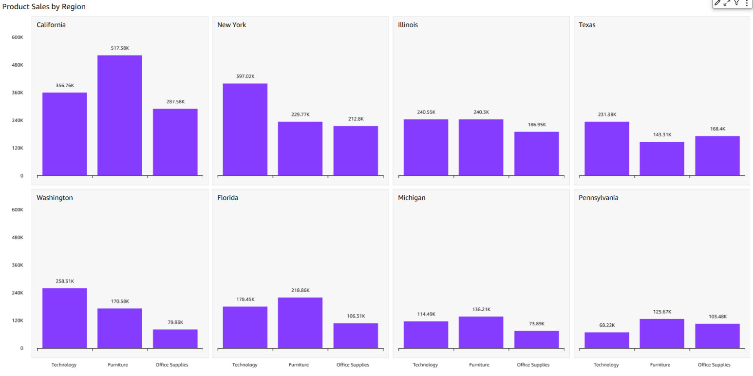
Small multiples (aka trellis, facet, lattice, grid, or panel charts) allows you to compare data across many values for a given dimension. It splits a base visual into multiple versions of itself, presented side by side, with its data partitioned across these versions by a dimension. It provides an easier way to get a holistic view of your business instead of looking at data in silos. For example, you can view how your business is doing in each state without needing to create over 50 different visuals. Instead, you can see one visual with multiple small charts inside of it, as shown in the following screenshot.
Common use cases for small multiples
The small multiples feature provides the following benefits to your use cases:
- Comparative analysis with easy pattern recognition – You can use small multiples to compare different subsets (categories) of the same dataset. Compared to animation, small multiples presents all of the data at once, making it easier for viewers to naturally compare each chart with others, instead of trying to flip back and forth between views.
- Clean and digestible data – Trying to display multiple variables in a single chart can lead to overplotting and obscure readers, which can be overcome using small multiples(refer below example). Also, once the reader understands the design of one chart, they can apply this knowledge as they scan the rest of the charts. This shifts the reader’s effort from understanding how the chart works to what the data says, which makes decoding the chart lot easier.

- Storytelling – Small multiples is a great tool often used by newspapers to depict a story and allow customers to view changes in patterns (for example, consider the following Washington Post article).

- Track or view multiple slices of data at once – You can monitor multiple resources at once without generating multiple visualizations or filtering to slice and dice the data.


Create your own small multiples in QuickSight
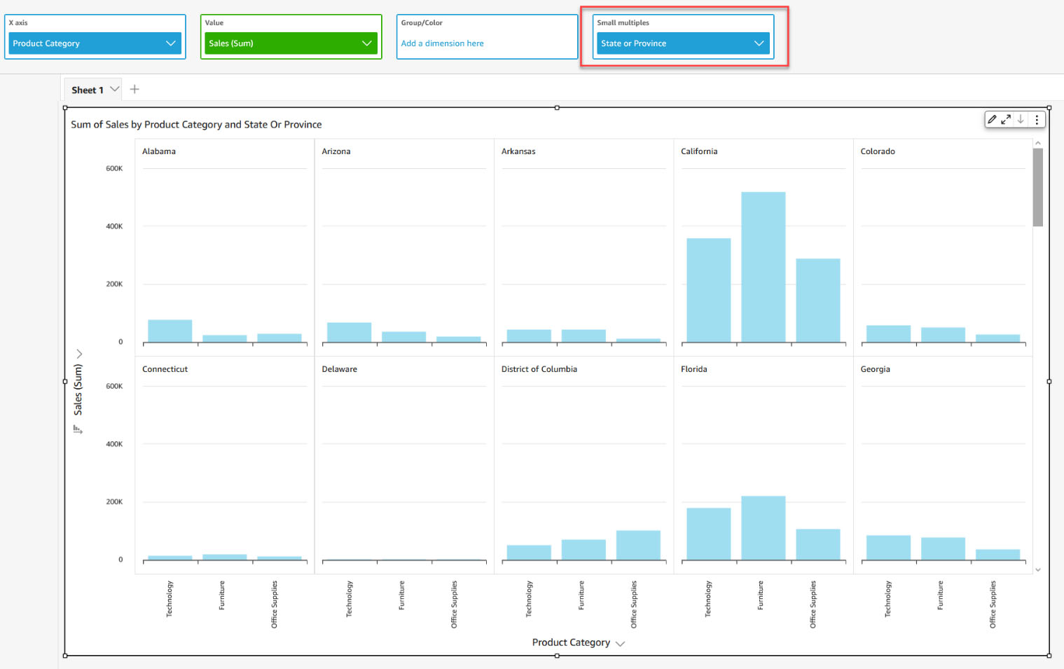
Currently, you can create small multiples on vertical bar, clustered bar, line, dual axis line, and pie charts. To get started, create one of the supported visuals and drag the field by which you want to partition the data to the Small multiples field well. This creates multiples of the chart split by the dimension assigned in a grid fashion.
For charts supporting axes like line and bar, the X-axis is made common across charts. This provides a cleaner look to easily spot trends and identify the pain points or contributing factors. The axis display settings and axis titles are controlled by the individual chart settings. The following screenshot shows an example.
Styling small multiples
You can customize the style of small multiples in the following ways:
- Choose a layout – For ease of use, small multiples by default chooses the best possible panel layout depending on the cardinality of the field. You can also adjust the number of rows and columns up to a max of 10 rows per column and 64 panels. Any multiples that don’t fit in the layout are loaded as you scroll vertically. In the following example, we have selected two rows and three columns as our layout. This means you only see six panels at a time; the rest can be accessed via vertical scroll.

- Limit panels – You can define the maximum number of panels to be displayed based on the sort order applied on the field in your Small multiples field well.

- Format panel titles – Panel titles add context to the multiples being viewed. You can add rich text formatting like font styling and alignment options.

- Customize panel styling – You can further customize the small multiples look and feel by playing around with the panel border styling options, adjusting the panel spacing, and adding panel background color.


Interacting with the data
- Sorting– Depending on the chart type, you can sort by axis, value, and small multiples fields in ascending or descending order.
- Filtering experience- You can also set filter actions in same way you set for other charts. Filtering on small multiples will pass both the small multiples and axis (in case of line or bar charts) or group (pie charts) context.
More to come
We’re excited about our launch, and we have lots more planned for small multiples. In upcoming releases, we will tackle the current limitations:
- Drill-down is currently not supported for small multiples.
- Reference lines have been disabled for now.
- Show Other small multiples panel is not supported.
- Small multiples isn’t supported when the primary category is sorted by a field that has the distinct count aggregation function.
- Small multiples doesn’t support calculated values with table calculation.
- Data zoom on the X axis for line and bar charts is disabled for now.
- Panel title is not displayed in the tooltip by default. To see it, you have to manually customize the tooltip and add a Small multiples field in it.
Summary
In this post, we looked at the small multiples features, and learned about its various use cases and how to configure them in QuickSight. You can analyze data by multiple dimension attributes in an easy-to-understand and easy-to-maintain way. With small multiples, readers can quickly see which categories are most important, and spot trends and insights. Start using small multiples to enrich your dashboards’ current visualization and unlock new business use cases today!
About the Author
 Bhupinder Chadha is a senior product manager for Amazon QuickSight focused on visualization and front end experiences. He is passionate about BI, data visualization and low-code/no-code experiences. Prior to QuickSight he was the lead product manager for Inforiver, responsible for building a enterprise BI product from ground up. Bhupinder started his career in presales, followed by a small gig in consulting and then PM for xViz, an add on visualization product.