Post Syndicated from Bhupinder Chadha original https://aws.amazon.com/blogs/big-data/visualize-multivariate-data-using-a-radar-chart-in-amazon-quicksight/
At AWS re:Invent 2022, we announced the general availability of two new Amazon QuickSight visuals: small multiples and text boxes. We are excited to add another new visual to QuickSight: radar charts. With radar charts, you can compare two or more items across multiple variables in QuickSight.
In this post, we explore radar charts, its use cases, and how to configure one.
What is a radar chart?
Radar charts (also known as spider charts, polar charts, web charts, or star plots) are a way to visualize multivariate data similar to a parallel coordinates chart. They are used to plot one or more groups of values over multiple common variables. They do this by providing an axis for each variable, and these axes are arranged radially around a central point and spaced equally. The center of the chart represents the minimum value, and the edges represent the maximum value on the axis. The data from a single observation is plotted along each axis and connected to form a polygon. Multiple observations can be placed in a single chart by displaying multiple polygons.
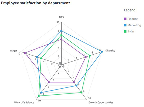
For example, consider HR wanting to comparing the employee satisfaction score for different departments like sales, marketing, and finance against various metrics such as work/life balance, diversity, inclusiveness, growth opportunities, and wages. As shown in the following radar chart, each employee metric forms the axis with each department being represented by individual series.
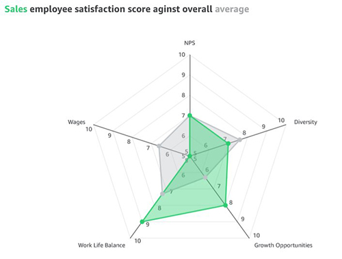
Another effective way of comparing radar charts is to compare a given department against the average or baseline value. For instance, the sales department feels less compensated compared to the baseline, but ranks high on work/life balance.
When to use radar charts
Radar charts are a great option when space is a constraint and you want to compare multiple groups in a compact space. Radar charts are best used for the following:
- Visualizing multivariate data, such as comparing cars across different stats like mileage, max speed, engine power, and driving pleasure
- Comparative analysis (comparing two or more items across a list of common variables)
- Spot outliers and commonality
Compared to parallel coordinates, radar charts are ideal when there are a few groups of items to be compared. You should also be mindful of not displaying too many variables, which can make the chart look cluttered and difficult to read.
Radar chart use cases
Radar charts have a wide variety of industry use cases, some of which are as follows:
- Sports analytics – Compare athlete performance across different performance parameters for selection criteria
- Strategy – Compare and measure different technology costs between various parameters, such as contact center, claims, massive claims, and others
- Sales – Compare performance of sales reps across different parameters like deals closed, average deal size, net new customer wins, total revenue, and deals in the pipeline
- Call centers – Compare call center staff performance against the staff average across different dimensions
- HR – Compare company scores in terms of diversity, work/life balance, benefits, and more
- User research and customer success – Compare customer satisfaction scores across different parts of the product
Different radar chart configurations
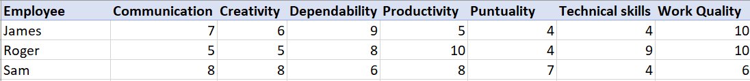
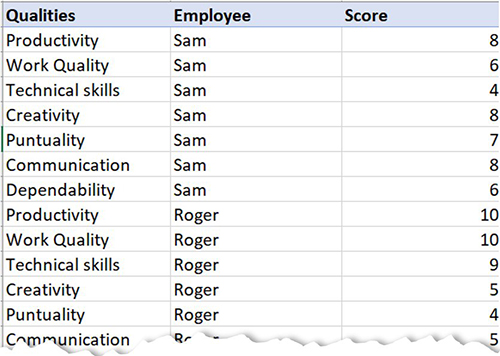
Let’s use an example of visualizing staff performance within a team, using the following sample data. The goal is to compare employee performance based on various qualities like communication, work quality, productivity, creativity, dependability, punctuality, and technical skills, ranging between a score of 0–10.
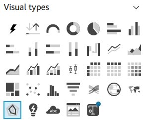
To add a radar chart to your analysis, choose the radar chart icon from the visual selector.
Depending on your use case and how the data is structured, you can configure radar charts in different ways.
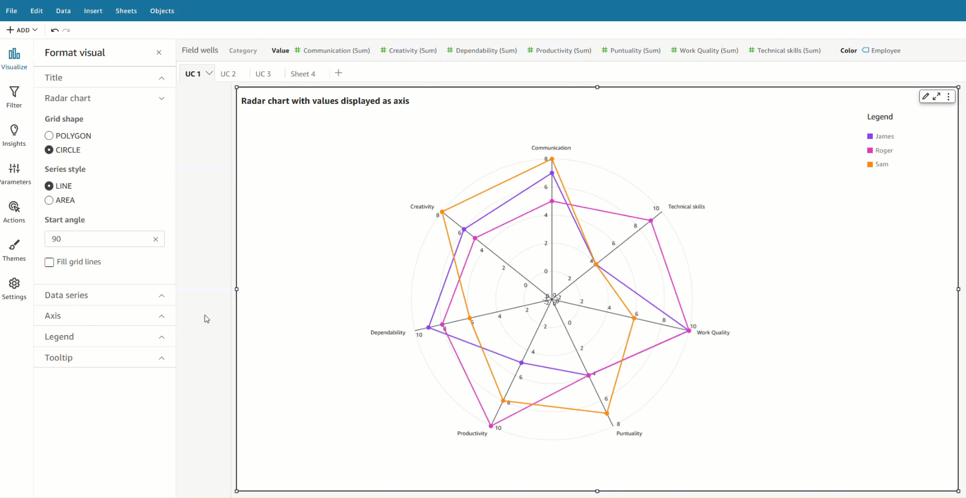
Value as axis (UC1 and 2 tab from the dataset)
In this scenario, all qualities (communication, dependability, and so on) are defined as measures, and the employee is defined as a dimension in the dataset.
To visualize this data in a radar chart, drag all the variables to the Values field well and the Employee field to the Color field well.

Category as axis (UC1 and 2 tab from the dataset)
Another way to visualize the same data is to reverse the series and axis configuration, where each quality is displayed as a series and employees are displayed on the axis. For this, drag the Employee field to the Category field well and all the qualities to the Value field well.

Category as axis with color (UC3 tab from the dataset)
We can visualize the same use case with a different data structure, where all the qualities and employees are defined as a dimension and scores as values.
To achieve this use case, drag the field that you want to visualize as the axis to the Category field and individual series to the Color field. In our case, we chose Qualities as our axis, added Score to the Value field well, and visualized the values for each employee by adding Employee to the Color field well.

Styling radar charts
You can customize your radar charts with the following formatting options:
- Series style – You can choose to display the chart as either a line (default) or area series

- Start angle – By default, this is set to 90 degrees, but you can choose a different angle if you want to rotate the radar chart to better utilize the available real estate
- Fill area – This option applies odd/even coloring for the plot area

- Grid shape – Choose between circle or polygon for grid shape

Summary
In this post, we looked at how radar charts can help you visualize and compare items across different variables. We also learned about the different configurations supported by radar charts and styling options to help you customize its look and feel.
We encourage you to explore radar charts and leave a comment with your feedback.
About the author
 Bhupinder Chadha is a senior product manager for Amazon QuickSight focused on visualization and front end experiences. He is passionate about BI, data visualization and low-code/no-code experiences. Prior to QuickSight he was the lead product manager for Inforiver, responsible for building a enterprise BI product from ground up. Bhupinder started his career in presales, followed by a small gig in consulting and then PM for xViz, an add on visualization product.