Post Syndicated from Amy Laresch original https://aws.amazon.com/blogs/big-data/best-practices-for-enabling-business-users-to-answer-questions-about-data-using-natural-language-in-amazon-quicksight/
In this post, we explain how you can enable business users to ask and answer questions about data using their everyday business language by using the Amazon QuickSight natural language query function, Amazon QuickSight Q.
QuickSight is a unified BI service providing modern interactive dashboards, natural language querying, paginated reports, machine learning (ML) insights, and embedded analytics at scale. Powered by ML, Q uses natural language processing (NLP) to answer your business questions quickly. Q empowers any user in an organization to start asking questions using their own language. Q uses the same QuickSight datasets you use for your dashboards and reports so your data is governed and secured. Just as data is prepared visually using dashboards and reports, it can be readied for language-based interactions using a topic. Topics are collections of one or more datasets that represent a subject area that your business users can ask questions about. To learn how to create a topic, refer to Creating Amazon QuickSight Q topics.
With automated data preparation in QuickSight Q, the model will do a lot of the topic setup for you, but there is some context that is specific to your business that you need to provide. To learn more about the initial setup work that Q does behind the scenes, check out New – Announcing Automated Data Preparation for Amazon QuickSight Q.
Business users can access Q from the QuickSight console or embedded in your website or application. To learn how to embed the Q bar, refer to Embedding the Amazon QuickSight Q search bar for registered users or anonymous (unregistered) users. To see examples of embedded dashboards with Q, refer to the QuickSight DemoCentral.
Once you have a topic shared with your business users, they can ask their own questions and save questions to their pinboard as seen in GIF 1.

QuickSight authors can also add their Q visuals straight to an analysis to speed up dashboard creation, as seen in GIF 2.

This post assumes you’re familiar with building visual analytics in dashboards or reports, and shares new and different strategies needed to build natural language interfaces that are simple to use.
In this post, we discuss the following:
- The importance of starting with a narrow and focused use case
- Why and how to teach the system your unique business language
- How to get success by providing support and having a feedback loop
If you don’t have Q enabled yet, refer to Getting started with Amazon QuickSight Q or watch the following video.
Follow along
In the following examples, we often refer to two out-of-the-box sample topics, Product Sales and Student Enrollment Statistics, so you can follow along as you go. We recommend creating the topics now before continuing with this post, because they take a few minutes to be ready.
Understand your users
Before we jump into solutions, let’s talk about when natural language query (NLQ) capabilities are right for your use case. NLQ is a fast way for a business user who is an expert in their business area to flexibly answer a large variety of questions from a scoped data domain. NLQ doesn’t replace the need for dashboards. Instead, when designed to augment a dashboard or reporting use case, NLQ helps business users get customized answers about specific details without asking a business analyst for help.
It’s critical to have a well-understood use case because language is inherently complex. There are many ways to refer to the same concept. For example, a university might refer to “classes” several ways, such as “courses,” “programs,” or “enrollments.” Language also has inherent ambiguity—“top students” might mean by highest GPA to one person and highest number of extracurriculars to another. By understanding the use case up front, you can uncover areas of potential ambiguity and build that knowledge directly into the topic.
For example, the AWS Analytics sales leadership team uses QuickSight and Q to track key metrics for their region as part of their monthly business review. When I worked with the sales leaders, I learned their preferred terminology and business language through our usability sessions. One observation I made was that they referred to the data field Sales Amortized Revenue as “adrr”. With these learnings, I could easily add this context to the topic using synonyms, which I cover in detail below. One of the sales leaders shared, “This will be awesome for next month when I write my MBR. What previously took a couple of hours, I can now do in a few minutes. Now I can spend more time working to deliver my customer’s outcomes.” If the sales leader asked a question about “adrr” but that connection was not included in their Q topic, then the leader would feel misunderstood and revert back to their original, but slower, ways of finding the answer. Check out more QuickSight use cases and success stories on the AWS Big Data Blog.
Start small
In this section, we share a few common challenges and considerations when getting started with Q.
Data can contain overlapping words
One pitfall to look out for is any fields with long strings, like survey write-in responses, product descriptions, and so on. This type of data introduces additional lexical complexity for readers to navigate. In other words, when an end-user asks a question, there is a higher chance that a word in one of the strings will overlap with other relevant fields, such as a survey write-in that mentions a product name in your Product field. Other non-descriptor fields can also contain overlaps. You can have two or more field names with lexical overlap, and the same across values, and even between fields and values. For example, let’s say you have a topic with a Product Order Status field with the values Open and Closed and a Customer Complaint Status field also with the values Open and Closed. To help avoid this overlap, consider alternate names that would be natural to your end-users to avoid the potential ambiguity. In our example, I’d keep the Product Order Status values and change the Customer Complaint Status to Resolved and Unresolved.
Avoid including aggregation names in your fields and values
Another common pitfall that introduces unnecessary ambiguity is including calculated fields for basic aggregations that Q can do on the fly. For example, business users might track average clickthrough rates for a website or month-to-date free to paid conversions. Although these types of calculations are necessary in a dashboard, with Q, these calculated fields are not needed. Q can aggregate metrics using natural language, like simply asking “year over year sales” or “top customers by sales” or “average product discount,” as you can see in Figure 1. Defining a field with the name YoY Sales adds an additional potential answer choice to your topic, leaving end-users to select between the pre-defined YoY Sales field, or using Q’s built-in YoY aggregation capability, whereas you may already know which of these choices is likely to bring them the best outcome. If you have complex business logic built into calculated fields, those are still relevant to include (and if you create the topic from your existing analysis, then Q will bring them over.)

Figure 1: Q visual showing MoM sales for EMEA
Start with a single use case
For this post, we recommend defining a use case as a well-defined set of questions that actual business users will ask. Q gives the ability to answer questions not already answered in dashboards and reports, so simply having a dashboard or a dataset doesn’t mean you necessarily have a Q-ready use case. These questions are the real words and phrases used by business users, like “how are my customers performing?” where the word “performing” might map in the data to “sales amortized revenue,” but a business user might not ask questions using the precise data names.
Start with a single use case and the minimum number of fields to meet it. Then incrementally layer in more as needed. It’s better to introduce a topic with, for example, 10 fields and a 100% success rate of answering questions as expected vs. starting with 30 fields and a 70% success rate to help users feel confident.
To help you start small, Q enables you to create your topic in one click from your existing analysis (Figure 2).

Figure 2: Enable a Q topic from a QuickSight analysis
Q will scan the underlying metadata in your analysis and automatically select high-value columns based on how they are used in the analysis. You’ll also get all your existing calculated fields ported over to the new topic so you don’t have to re-create them.
Add lexical context
Q knows English well. It understands a variety of phrases and different forms of the same word. What it doesn’t know is the unique terms from your business, and only you can teach it.
There are some key ways to provide Q this context, including adding synonyms, semantic types, default aggregations, primary date, named filters, and named entities. If you created your Q topic as described in the previous section, you will be a few steps ahead, but it’s always good to check the model’s work.
Add synonyms
In a dashboard, authors use visual titles, text boxes, and filter names to help business users navigate and find their answers. With NLQ, language is the interface. NLQ empowers business users to ask their questions in their own words. The author needs to make those business lexicon connections for Q using synonyms. Your business users might refer to revenue as “gross sales,” “amortized revenue,” or any number of terms specific to your business. From the topic authoring page, you can add relevant terms (Figure 3).

Figure 3: Adding relevant synonyms
If your business users refer to the data values in multiple ways, you can use value synonyms to create those connections for Q (Figure 4). For example, in the Student Enrollment topic, let’s say your business users sometimes use First Years to map to Freshmen and so on for each classification type. If you don’t have that data directly in your dataset, you can create those mappings using value synonyms (Figure 5).

Figure 4: Configure field value synonyms

Figure 5: Example value synonyms for Student Enrollment topic
Check semantic types
When you create a topic using automatic data prep, Q will automatically select relevant semantic types that it can detect. Q uses semantic types to understand which specific fields to use to answer vague question like who, where, when, and how many. For example, in the student enrollment statistics example, Q already set Home of Origin as Location so if someone asks “where,” Q knows to use this field (Figure 6). Another example is adding Person for the Student Name and Professor fields so Q knows what fields to use when your business users ask for “who.”

Figure 6: Semantic Type set to “Location”
Another important semantic type is the Identifier. This tells Q what to count when your business users ask questions like “How many were enrolled in biology in 2021?” (Figure 7). In this example, Student ID is set as the Identifier.

Figure 7: Q visual showing a “how many” question
Here is a list of semantic types that map to implicit question phrases:
Location: Where?PersonorOrganization: Who?- If there are no person or organization fields, then Q will use the identifier
Identifier: How many? What is the number of?Duration: How long?Date Part: When?Age: How old?Distance: How far?
Semantic types also help the model in several other ways, including mapping terms like “most expensive” or “cheapest” to Currency. There is not always a relevant semantic type, so it’s okay to leave those empty.
Set default aggregations
Q will always aggregate measure values a business user asks for, so it’s important to use measures that retain their meaning when brought together with other values. As of this writing, Q works best with underlying data that is summative, for example, a currency value or a count. Examples of metrics that are not summative are percentages, percentiles, and medians. Measures of this type can produce misleading or statistically inaccurate results when added with one another. Q can be used to produce averages, percentiles, and medians by end-users without first performing those calculations in underlying data.
Help Q understand the business logic behind your data by setting default aggregations. For example, in the Student Enrollment topic, we have student test scores for every course, which should be averaged and not summed, because it’s a percentage. Therefore, we set Average as the default and set Sum as a not allowed aggregation type (Figure 8).

Figure 8: Setting “Sum” as a “Not allowed aggregation” for a percentage data field
To ensure end-users get a correct count, consider whether the default aggregation type for each dimensional field should be Distinct Count or Count and set accordingly. For example, if we wanted to ask “how many courses do we offer,” we would want to set Courses to Distinct Count because the underlying data contains multiple records for the same course to track each student enrolled.
If we have a count, we get over 6,000 courses, which is a count of all rows that have data in the Courses field, covering every student in the dataset (Figure 9).

Figure 9: Q visual showing a count of courses
If we set the default aggregation to Distinct Count, we get the count of unique course names, which is more likely to be what the end-user expects (Figure 10).

Figure 10: Q visual showing the unique count of courses
Review the primary date field
Q will automatically select a primary date field for answering time related questions like “when” or “yoy”. If your data includes more than one date field, you may want to choose a different date than Q’s default choice. End-users can also ask about additional date fields by explicitly naming them (Figure 12). You can always specify a different date if you’d like. To review or change the primary date, go to the topic page, navigate to the Data section, and choose the Datasets tab. Expand the dataset and review the value for Default date (Figure 11).

Figure 11: Reviewing the default date
You can change the date as needed.

Figure 12: Asking about non-default dates
Add named filters
In a dashboard, filters are critical to allow users to focus in on their area of interest. With Q, traditional filters aren’t required because users can automatically ask to filter any field values included in the Q topic. For example, you could ask “What were sales last week for Acme Inc. for returning shoppers?” Instead of building the filters in a dashboard (date, customer name, and returning vs. new customer), Q does the filtering on the fly to instantly provide the answer.
With Q, a filter is a specific word or phrase your business users will use to instruct Q to filter returned results. For example, you have student test scores but you want a way for your users to ask about failing test scores. You can set up a filter for “Failing” defined as test scores less than 70% (Figure 13).

Figure 13: Filter configuration example using a measure
Additionally, maybe you have a field for Student Classification, which includes Freshmen, Sophomore, Junior, Senior, and Graduate, and you want to let users ask about “undergrads” vs. “graduates” (Figure 14). You can make a filter that includes the relevant values.

Figure 14: Filter configuration example using a dimension
Add named entities
Named entities are a way to get Q to return a set of fields as a table visual when a user asks for a specific word or phrase. If someone wanted to know “sales for retail december” and they get a KPI saying $6,169 without any extra context, it is hard to understand all data this number includes (Figure 15).

Figure 15: A Q visual showing “sales for retail december”
By presenting the KPI in a table view with other relevant dimensions, the data includes additional context making it easier to understand meaning (Figure 16).

Figure 16: A Q visual showing “sales details for retail december”
By building these table views, you can happily surprise your business users by anticipating the information they want to see without having to explicitly ask for each piece of data. The best part is your business users can easily filter the table using language to answer their own data questions. For example, in the Student Enrollment topic, we created a Student information named entity with some important student details like their name, major, email, and test scores per course.

Figure 17: Named entity example
If a university administrator wanted to reach out to students who are failing biology, they can simply ask for “student information for failing biology majors.” In one step, they get a filtered list that already includes their emails and test scores so they can reach out (Figure 18).

Figure 18: Filtering a named entity
If the university administrator wanted to also see the phone numbers of the students to send texts offering free tutoring, they could simply ask Q “Student information for failing biology majors with phone numbers.” Now, Mobile is added as the first column (Figure 19).

Figure 19: Adding a column to a named entity
Entities can also be referenced using synonyms in order to capture all the ways your business users might refer to this group of data. In our example, we could also add “student contact info” and “academic details” based on the common terminology the university admins use.
Besides looking for patterns in the data fields, ask yourself about what your business users care about. For example, let’s assume we have data for our HR specialists, and we know they care about job postings, candidates, and recruiters. Each author might think of the groups slightly differently, but as long as it’s rooted in your business jobs to be done, then your groupings are providing value. With those three groups in mind, we can sort all the data into one of those buckets. For this use case, our Candidate bucket is pretty large, with about 20 fields. We can scan the list and notice that we track information for rejected and accepted candidates, so we start splitting the metrics into two groups: Successful Candidates and Rejected Candidates. Now information like Offer Letter Date, Accept Date, and Final Salary are all in the Successful Candidate group, and related fields about Rejected Candidates are clearly grouped together.
If you’re curious about strategies for how to create entities, check out card sorting techniques.
In the Product Sales sample topic, after scanning the data, we would start with Sales, Product, and Customer as three key groupings of information to analyze. Try out the exercise on your own data and feel free to ask any questions on the QuickSight Community. To learn how to create named entities, refer to Adding named entities to a topic dataset.
Drive NLQ adoption
After you have refined your topic, tested it out with some readers, and made it available for a larger audience, it’s important to follow two strategies to drive adoption.
First, provide your business users with support. Support might look like a short tutorial video or newsletter announcement. Consider keeping an open channel like a Slack or Teams chat where active users can post questions or enhancements.
Here at Amazon, the Prime team has a dedicated Product Manager (PM) for their embedded Q application that they call PrimeQ. The PM hosts regular demo and training sessions where the Prime team can ask them any questions and get ideas about what types of answers they can get. The PM also sends out a monthly newsletter to announce the availability of new data and topics along with sample questions, FAQs, and quotes from Prime team members who get value out of Q. The PM also has an active Slack channel where every single question gets answered within 24 hours, either by the PM or a data engineer on the Prime team.
Pro tip: Make sure your business users know who they can reach out to if they get stuck. Avoid the black box of “reach out to your author” so readers feel confident their questions will be answered by a known person. For embedded applications, be sure to build an easy way to get support.
Second, maintain a healthy feedback loop. Look at the usage data directly in the product and schedule 1-on-1 sessions with your readers. Use the usage data to track adoption and identify readers who are asking unanswerable questions (Figure 20). Engage with both your successful and struggling readers to learn how to continue to iterate and improve the experience. Talking to business users is especially important to uncover the implicit ambiguity of language.
Another example here at Amazon, after first launching the Revenue Insights topic for the AWS Analytics sales team, a QuickSight Solution Architect (SA) and myself checked the usage tab on a daily basis to track unanswerable questions and directly reach out to the sales team member to let them know how to adjust their question or that we made a change so their question would now work. For example, we initially had a field turned off for Market Segment and noticed a question from a sales leader asking about sales by segment. We turned the field on and let him know those questions would now work. The SA and I have a Slack channel with other stakeholders so we can troubleshoot asynchronously with ease. Now that the topic has been available for several months, we check the usage tab on a weekly basis.

Figure 20: User Activity tab in Q
Conclusion
In this post, we discussed how language is inherently complex and what context you need to provide Q to teach the system about your unique business language. Q’s automated data prep will get you started, but you need to add the context that is specific to your business user’s language. As we mentioned at the start of the post, consider the following:
- Start with a narrow and focused use case
- Teach the system your unique business language
- Get success by providing support and having a feedback loop
Follow this post to enable your business users to answer questions of data using natural language in QuickSight.
Ready to get started with Q? Watch our quick tutorial on enabling QuickSight Q.
Want some tutorial videos to share with your team? Check out the following:
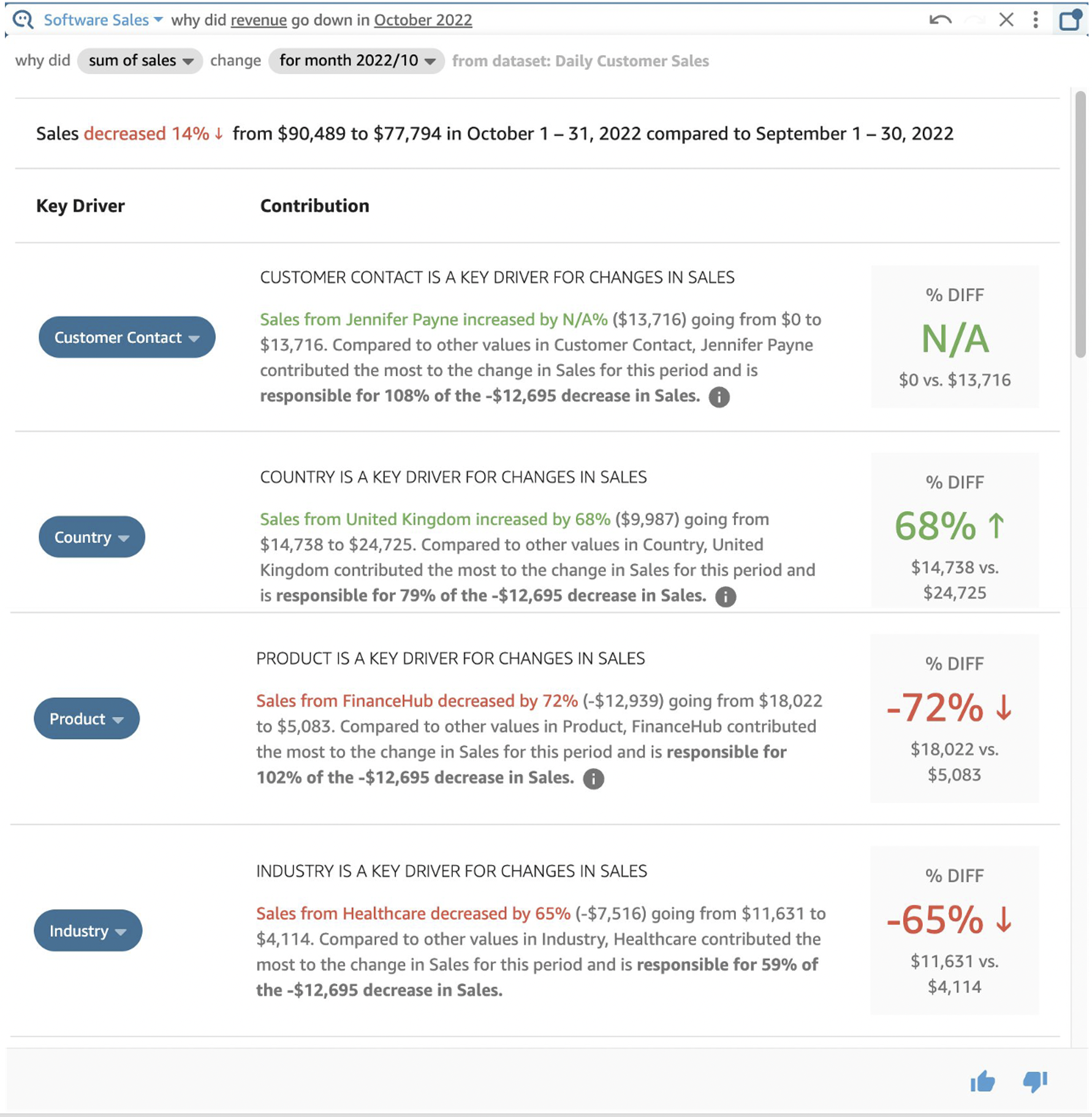
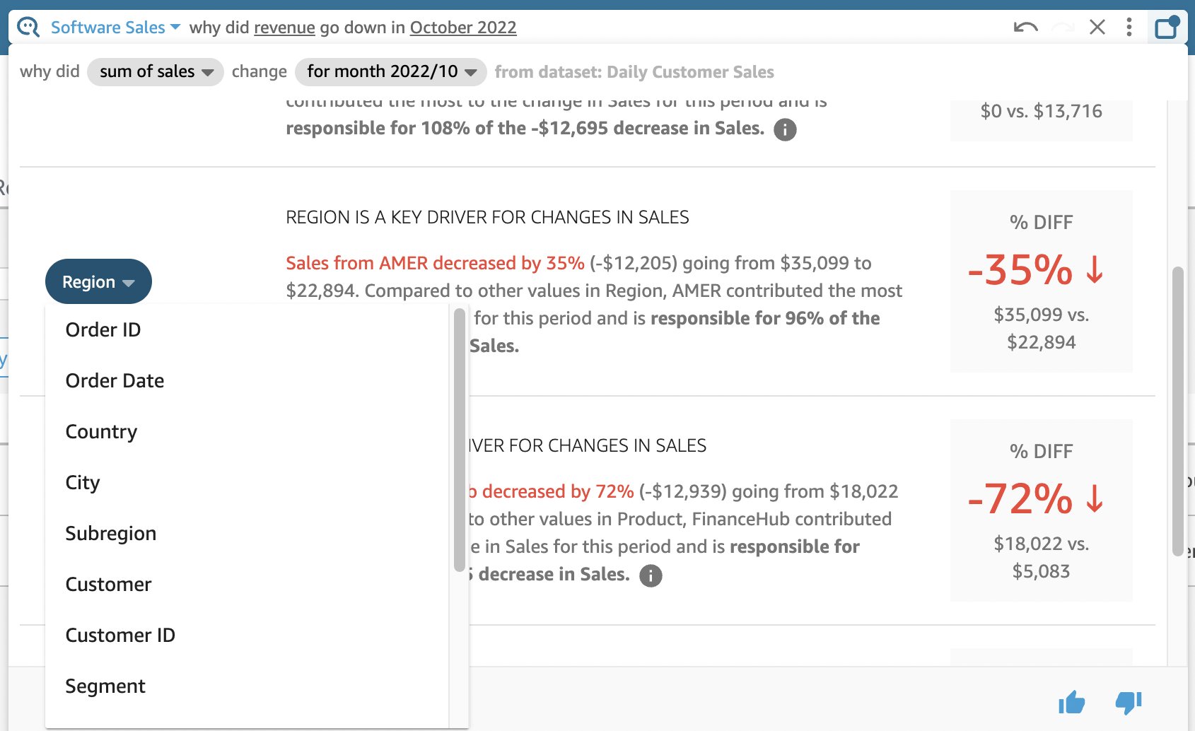
To see how Q can answer the “Why” behind data changes and forecast future business performance, refer to New analytical questions available in Amazon QuickSight Q: “Why” and “Forecast”.
About the Author
 Amy Laresch is a product manager for Amazon QuickSight Q. She is passionate about analytics and is focused on delivering the best experience for every QuickSight Q reader. Check out her videos on the @AmazonQuickSight YouTube channel for best practices and to see what’s new for QuickSight Q.