Post Syndicated from Gregory Knowles original https://aws.amazon.com/blogs/big-data/secure-generative-sql-with-amazon-q/
Amazon Q generative SQL brings generative AI capabilities to help speed up deriving insights from your Amazon Redshift data warehouses and AWS Glue Data Catalog, generating SQL for Amazon Redshift or Amazon Athena. With Amazon Q, you get SQL commands generated with your context. This means you can focus on deriving insights faster, rather than having to first learn potentially complex schemas. Without generative SQL, your data analysts might have to frequently switch between different types of SQL, which can further slow analysis down. Amazon Q generative SQL can help by generating SQL statements from natural language and speeding up development. This can help onboard analysts faster and improve analyst productivity. The generative SQL experience is available through Amazon SageMaker Unified Studio and Amazon Redshift Query Editor v2.
To scale the use of generative SQL in production scenarios, you need to consider how relevant and accurate SQL is generated. In doing so, it’s important to understand what data is used and how your information is protected. Amazon Q generative SQL is designed to keep your data secure and private. Your queries, data, and database schemas are not used to train generative AI foundation models (FMs). For more information, see Considerations when interacting with Amazon Q generative SQL.
In the post Write queries faster with Amazon Q generative SQL for Amazon Redshift, we provided general advice around getting started with generative SQL. In this post, we discuss the design and security controls in place when using generative SQL and its use in both SageMaker Unified Studio and Amazon Redshift Query Editor v2.
Solution overview
Generating relevant SQL requires context from your data warehouse or data catalog schemas. Your analysts can ask free text or natural language questions in the Amazon Q chat window and have SQL statements returned that reference your tables and columns. It’s important that the generated SQL is consistent with your schema so that it can find the most relevant fields to answer questions and generate queries that accurately reference data. In SageMaker Unified Studio or Amazon Redshift Query Editor v2, when the Amazon Q chat window is open, database metadata that is viewable under the connection context is made available to Amazon Q for SQL generation. This means that only the schema information that the connecting user can access is used. Tables or database objects the user doesn’t have access to are excluded.
When a user submits questions in the Amazon Q chat window, a search algorithm is used to find the most relevant context from the available database schema metadata information. This context is combined with the user’s question and used as a prompt to a large language model (LLM) to generate a SQL statement. The supporting information is cached so that your data source doesn’t need to be queried every time a user initiates SQL generation. Instead, data source metadata will be periodically refreshed if it remains in use, or you can trigger a manual refresh. If the data is not being used, Amazon Q will automatically delete it. Where applicable, the information used to support SQL generation is encrypted with an AWS Key Management Service (AWS KMS) customer managed KMS key where one has been specified in the SageMaker Unified Studio or Amazon Redshift Query Editor v2 settings. Otherwise, an AWS managed key is used. Your information is encrypted in transit and at rest.
The following diagram shows the process flow for SQL generation when using SageMaker Unified Studio or the Amazon Redshift Query Editor and using Amazon Redshift or Data Catalog source data.
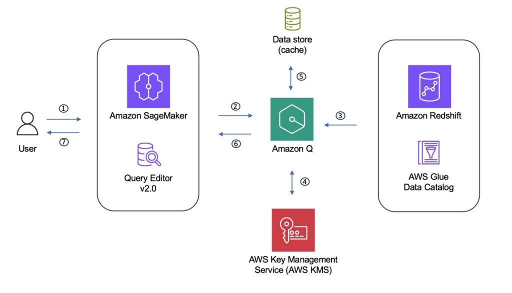
The Amazon Q generative SQL process can be summarized as the following steps:
- A user interacts with the Amazon Q chat pane through SageMaker Unified Studio or the Amazon Redshift Query Editor.
- The SQL chat frontend sends the prompt along with the connection configuration to Amazon Q.
- Amazon Q uses the connection context to retrieve information that will support SQL generation if this data is not already available.
- Amazon Q encrypts the retrieved information under the appropriate AWS managed or customer managed KMS key. The information is subsequently decrypted on retrieval.
- The information is stored along with custom context information, if this has been provided.
- Relevant context from the combined information is selected and added to the user’s questions and sent to an LLM to generate a SQL statement, which is returned to the user.
- The user can decide whether to run the statement and can provide feedback on usefulness and accuracy.
Additional context to enhance SQL generation
You can provide further context to supplement the database schema information, which can help improve the accuracy and relevancy of the generated SQL.
One option is to provide custom context. Custom context gives the option to specify instructions and extra information, such as descriptions of tables and columns. These descriptions can then be used to help the selection of relevant tables and attributes when generating SQL statements. This is particularly relevant when your schema uses more obscure naming that might not directly relate to business terms or uses non-standard abbreviations. For example, consider a table called sls_r1_2024. With custom context, you can add a table description specifying that, for example, the table includes sales information across stores in the US region for the calendar year 2024. This information can help the LLM generate SQL referencing the correct tables. The same approach can be applied to columns within the table. Your custom context is encrypted using a customer managed KMS key if one has been specified (during Amazon Redshift Query Editor account creation or SageMaker Unified Studio project creation) or an AWS managed key otherwise.
You can also introduce constraints using custom context. For example, you can explicitly include or exclude specific schemas, tables, or columns from SQL query generation. Similarly, specific topics can also be disallowed, such as not generating SQL statements to support financial reporting. For more details about the information that can be supplied, refer to Custom context.
Another option is to grant SQL query history access to the user establishing the connection. This information is then also made available to enhance SQL generation and to provide the LLM with examples of relevant queries. Be aware that granting wider SQL query history access to the connecting user, and therefore also the generative SQL workflow, allows viewing of queries over tables or objects the user might not have access to. Furthermore, string literals might be present in historic statements that might contain sensitive information. To help mitigate this risk, you could instead use the CuratedQueries section of custom context to provide predefined question and answer examples, without exposing all user queries.
Generated statement response
Before a SQL statement is returned to the user, Amazon Q tries to detect syntax issues. This step helps improve the likelihood that only valid SQL syntax is returned. Amazon Q will use the available information for the user to return statements that align with user permissions, to reduce scenarios where users can’t run generated statements. For example, if you have given access to SQL query history information, then the SQL generation step might produce a query statement referencing a table that the user asking the question doesn’t have access to. Amazon Q minimizes the occurrence of this scenario by assessing if the generated SQL aligns with user permissions and updating the statement if not. User permissions are not bypassed through the use of Amazon Q generative SQL. If a statement was returned referencing a table the user doesn’t have access to, the authorization applied to the user will enforce access control when the statement is executed.
Statements generated by Amazon Q that could potentially change your database, such as DML or DDL statements, are returned with a warning. The warning highlights to the user that running the statement could potentially modify the database. Again, these statements are only executable if the user has the required permissions.
Prerequisites
Amazon Q generative SQL works with your Redshift data warehouses and Data Catalog tables. To get started, you should have data available in either or both of these environments. To use Amazon Q generative SQL with your AWS Glue tables, you need a SageMaker Unified Studio domain. Within your domain, you can use the Amazon Q chat integration to ask questions of your data and have SQL generated. This also works for Amazon Redshift data sources available in the domain. You can use Amazon Q generative SQL without a SageMaker Unified Studio domain using the Amazon Redshift Query Editor. Access to the editor enables Amazon Q chat integration against your Amazon Redshift data sources.
Enable Amazon Q generative SQL
You can control access to generative SQL at the account-Region level in the Amazon Redshift Query Editor or at the SageMaker Unified Studio domain level. To enable this feature, an account admin must explicitly turn on Amazon Q generative SQL. By default, the feature is not accessible to your users. Administrators that have permission for the sqlworkbench:UpdateAccountQSqlSettings AWS Identity and Access Management (IAM) action can turn the Amazon Q generation SQL feature on or off through the admin window, as illustrated in the following sections. When turned off, this will restrict users from opening the Amazon Q chat pane and help prevent interaction with generative SQL.
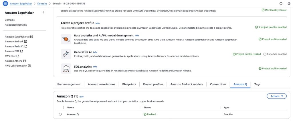
Enable Amazon Q in your SageMaker domain
To enable Amazon Q in your SageMaker domain, you can navigate to the Amazon Q tab on the domain settings page and choose to enable the service. For more information, see Amazon Q in Amazon SageMaker Unified Studio.
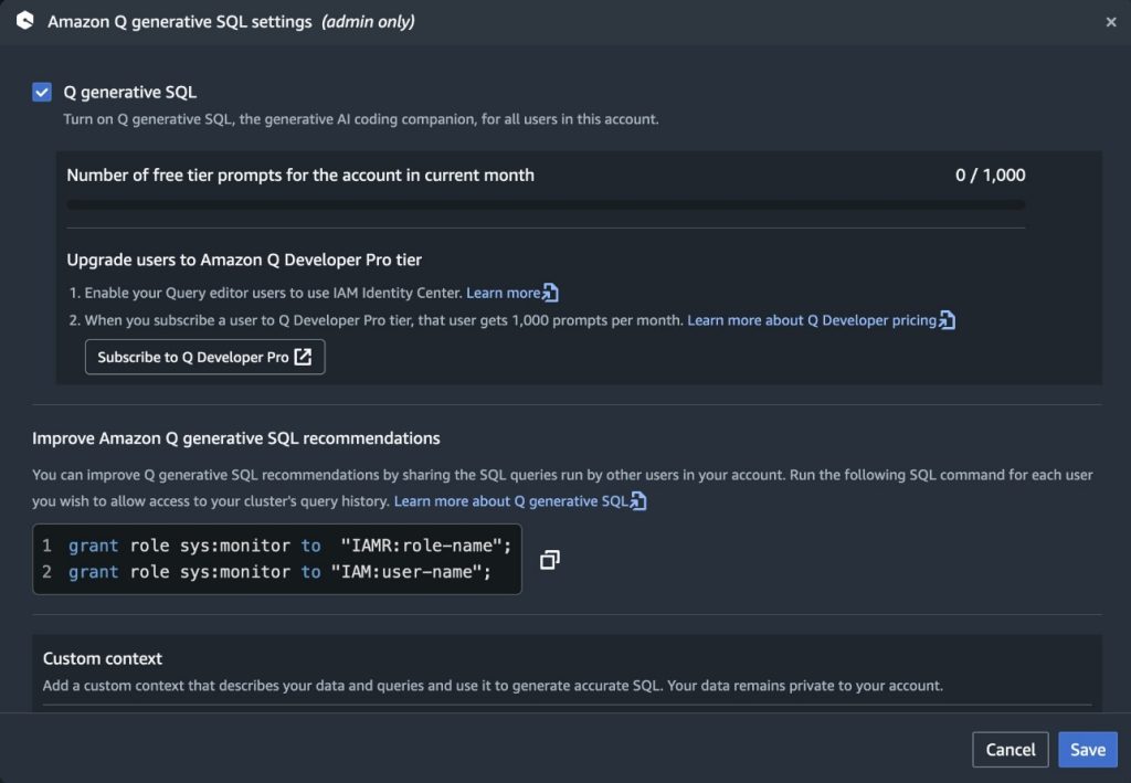
Enable Amazon Q in Amazon Redshift
To enable Amazon Q generative SQL from the Amazon Redshift Query Editor, access the Amazon Q generative SQL settings. This requires the administrator to have the sqlworkbench:UpdateAccountQSqlSettings permission in their IAM policy. For more information, see Updating generative SQL settings as an administrator.
With generative SQL enabled at the account-Region level, you can restrict access to specific users with IAM controls. IAM administrators can build IAM policies that allow or deny access to the action sqlworkbench:GetQSqlRecommendations. For more information, refer to Actions, resources, and condition keys for AWS SQL Workbench. Policies can then be associated with IAM users or roles to control access to SQL generation at a more granular level. An appropriately scoped service control policy (SCP) can be used to limit access to SQL generation to specific accounts within your organization if required.
The following is an example policy denying access to use SQL generation:
Cross-Region inference
Amazon Q Developer uses cross-Region inference to distribute traffic across different AWS Regions, which provides increased throughput and resilience during high demand periods, improved performance, and access to the latest Amazon Q Developer capabilities.
When a request is made from an Amazon Q Developer profile, it is kept within the Regions in the same geography as the original data. Although this doesn’t change where the data is stored, the requests and output results might move across Regions during the inference process. Data is encrypted when transmitted across Amazon’s network. For more information on cross-Region inference, see Cross-region processing in Amazon Q Developer.
Monitoring
To monitor which IAM users or roles are interacting with generative SQL, you can use AWS CloudTrail. CloudTrail monitors API calls and logs which identities have performed particular actions. When a user first asks a question, a CloudTrail event is emitted called IngestQSqlMetadata. This is a result of Amazon Q starting the metadata ingest process. Ingestion is an asynchronous operation, so there might be a series of GetQSqlMetadataStatus events. This is due to the workflow checking the ingestion process status.
After the workflow has completed successfully, each question sees a GetQSqlRecommendation event. This is the result of users submitting questions and triggering generation of SQL statements. The following is an example CloudTrail event for GetQSqlRecommendation. In this example, Amazon Q emits detailed CloudTrail events highlighting the warehouse being queried, IAM principal calling Amazon Q, and the entire response structure from Amazon Q in responseElements:
Conclusion
In this post, we discussed the Amazon Q generative SQL workflow. We highlighted the process around using your schema context alongside metadata such as historic SQL queries and custom context. Using this metadata allows the generation of relevant SQL that helps accelerate your analyst’s productivity. Although it’s important to assist analysts, it’s also imperative to make sure data remains secure and protected. To support this, generative SQL uses only the data the connected user has access to. This helps prevent exposure to information beyond their authorization.When you’re looking to increase the relevance of generated SQL through sharing additional query history, it’s important to consider the trade-off of exposing additional information to the user. Deciding your approach here should take into account the domain context of the data and the possible exposure of metadata the user doesn’t have access to, or potentially sensitive information that might appear in query strings. Keeping these considerations in mind can help you achieve the appropriate security posture for your workloads.
To get started with Amazon Q generative SQL, see Write queries faster with Amazon Q generative SQL for Amazon Redshift and Interacting with Amazon Q generative SQL.
About the authors
 Gregory Knowles is a data and AI specialist solution architect at AWS, focusing on the UK public sector. With extensive experience in cloud-based architectures, Greg guides public sector customers in implementing modern data solutions. His expertise spans governance, analytics, and AI/ML. Greg’s passion lies in accelerating transformation and innovation to improve productivity and outcomes. He has successfully led projects that moved data systems into the cloud, adopted new data architectures, and implemented AI at scale in production.
 Abhinav Tripathy is a Software Engineer and Security Guardian at AWS, where he develops Amazon Q generative SQL by combining machine learning, databases, and web systems. Abhinav is passionate about building scalable web systems from scratch that solve real customer challenges. Outside of work, he enjoys traveling, watching soccer, and playing badminton.
 Erol Murtezaoglu is a Technical Product Manager at AWS, is an inquisitive and enthusiastic thinker with a drive for self-improvement and learning. He has a strong and proven technical background in software development and architecture, balanced with a drive to deliver commercially successful products. Erol highly values the process of understanding customer needs and problems, in order to deliver solutions that exceed expectations.


 Amy Laresch is a product manager for Amazon QuickSight Q. She is passionate about analytics and is focused on delivering the best experience for every QuickSight Q reader. Check out her videos on the @AmazonQuickSight YouTube channel for best practices and to see what’s new for QuickSight Q.


 Ravi Kiran Nidadavolu is a Software Development Manager with Fulfillment by Amazon.


 Ying Wang is a Manager of Software Development Engineer. She has 12 years of expertise in data analytics and science. She assisted customers with enterprise data architecture solutions to scale their data analytics in the cloud during her time as a data architect. Currently, she helps customer to unlock the power of Data with QuickSight from engineering by delivering new features.
 Ian Liao is a Senior Data Visualization Architect at AWS Professional Services. Before AWS, Ian spent years building startups in data and analytics. Now he enjoys helping customer to scale their data application on the cloud.
 Maitri Brahmbhatt is a Business Intelligence Engineer at AWS. She helps customers and partners leverage their data to gain insights into their business and make data driven decisions by developing QuickSight dashboards.