Rapid7 is investing heavily in the reporting and dashboard capabilities of InsightVM. In 2021 alone, we launched the ability to filter dashboards via single query, a new report creation wizard powered by our query builder, several use-case-driven dashboard templates, and most recently, the ability to distribute reports via email. This allows users to easily and quickly distribute reports to users who may not have access to InsightVM.
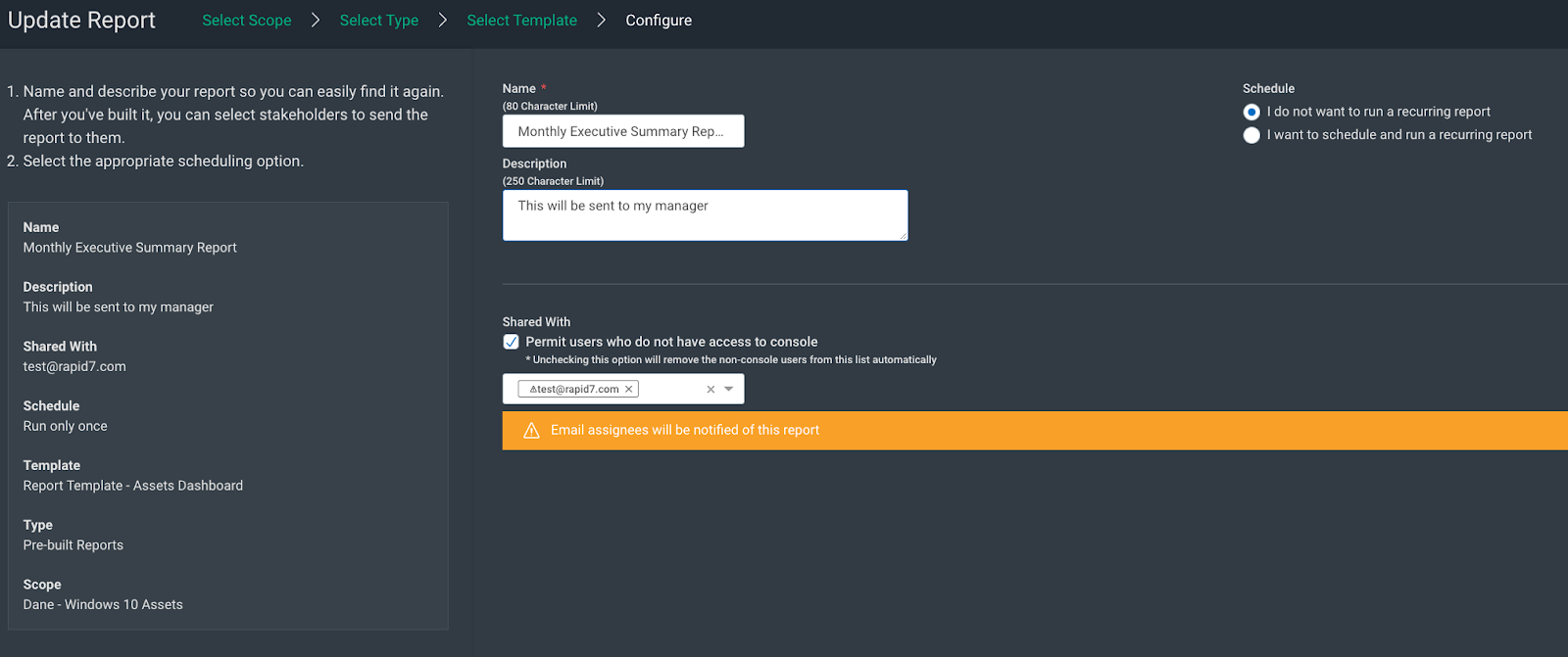
For example, let’s say Theresa is tasked with giving her manager a copy of our Patch Tuesday dashboard as a PDF at the end of every month. Previously, she had to go to the Reports Management page in InsightVM, download the PDF, create an email, and send this to her manager — who does not have an InsightVM account.
Now, she can either create this report via the query builder or edit the existing report, then check the checkbox labeled “Permit users who do not have access to console” under the “Shared with” section, and enter her manager’s email address. InsightVM will automatically send a link to an encrypted and password-protected PDF of the report and another email that contains the password.
This additional security feature was included because of the increased threat surrounding proprietary information. For example, say Theresa creates an Assets report that is delivered every Friday to a colleague, and that colleague accidentally forwards the email with the PDF link to an unattended party. While the recipient could download the PDF, they’re blocked from viewing the contents because they don’t have the password.
This is an example of our evolution to more powerful features in the SaaS version of InsightVM, and our intention here is to reduce the burden of reporting to various stakeholders so that they can get back to what they do best: securing their environments.
We are excited to bring this functionality to our users. Please read our help documents for more information.
InsightVM users have been able to create dashboards, add different visualizations in the form of cards and apply filters to these cards. Rapid7 also provided dashboard templates which enabled users to create views focusing on scenarios such as Microsoft’s Patch Tuesday, identifying and assessing Remote assets, highlighting changes in their environment in the last 30 days and many more.
Before today, you would have to apply queries to individual cards to focus these visualizations on particular assets or vulnerabilities — like focusing all of the cards in a dashboard on servers running Ubuntu. InsightVM provides an easy and powerful means to create these filters, but this was cumbersome if a dashboard contained numerous cards.
This is why we’re happy to announce the release of the ability to apply a query to a dashboard and all of the cards will now adjust the results accordingly. To illustrate this, let’s consider a hypothetical InsightVM user named Dana.
Dana is a security engineer at a rapidly expanding, global organization. This company regularly adds new offices around the world. Every office requires new servers and networks, and these assets need to be secured.
Dana’s first task when a new office is acquired is to create a dashboard for each new location using the Significant Changes in the Past 30 Days template. She finds this helps her keep up with changes in the risk posture of their environments. However, every time she creates one of these dashboards, she needs to add a filter to each of the 14 cards to focus on the office for which it’s intended. This task can take up to an hour, which is time she would rather spend on securing her environment.
This release allows Dana to build a query that filters assets for the new office, create the dashboard from the template, and apply the query to the dashboard. All of the cards will focus on the intended location. This whole process takes about five minutes as opposed to 30 minutes and she is now free to turn their attention back to remediating vulnerabilities.
It’s worth noting that Dana is still able to filter cards, but the introduction of global dashboard filtering creates a situation where drilling into specific view is shaped by the filters applied in subsequent views. One can think of this as nested scoping of views within InsightVM.
Nested scoping
Let’s lean on our previous example with Dana. She wants to create a view that accounts for all of the Windows 10 assets in their environment.
She creates a new dashboard using the Significant Changes in the Last 30 Days template and applies a dashboard query that filters for all Windows 10 assets. All of the cards in that dashboard will now reflect the results from that query.
Dana then navigates to the expanded view of the Total Asset Trends card. The results here would be filtered by the card query introduced by the template and the dashboard filter introduced by the user.
This view can further be refined by loading a query at the card level. In this example, let’s suppose Dana is interested in ICMP vulnerabilities and loads a query that filters for this.
When Dana navigates to one of the assets listed in this view, the result will respect all subsequent filters. In this example, that would include: the dashboard template filter, the dashboard filter and the card query — that is, the ICMP vulnerabilities on a Windows 10 asset added within the last 30 days.
You can see that these changes provide the ability to greatly focus views into your environment.
Changes in the Dashboard Card Filtering Experience
Readers familiar with the previous card filtering experience will notice that we loaded a query into this example, but there was no in-card query builder. The addition of nested scoping complicates the filtering experience and as Spiderman’s Uncle Ben once said, “With great power comes great responsibility.”
We’ve changed the experience to allow customers to create and save queries in the query builder and load those into the cards as opposed to creating ad hoc queries because we found this created confusion in further refining a scope to several previous scope constraints.
While we understand that this change will require some adjustments to your workflows, we are confident that the additional functionality of globally filtered dashboards are well worth the effort.
Organizations are in a constant struggle to identify and reduce risks in their constantly changing environments. These changes may manifest by several means and can be recurring events.
For example:
Laptops and other devices are commissioned or decommissioned due to changes in the workforce.
Your security tool discovers that assets in your environment contain several vulnerabilities recently discovered by researchers.
New software or services are deployed to your organization that introduce new risk via new vulnerabilities.
Your IT team deployed a round of patches to local assets, which significantly decreased the number of vulnerabilities in your environment.
The obvious challenge here is that these changes create moving targets and security teams need to quickly identify, prioritize and remediate risk as it’s introduced. We developed our Significant Changes in the Last 30 Days dashboard in InsightVM in order to provide a lens through which we can highlight the differences in your environment from the past 30 days to present day, as well as the ability to pivot the findings into a Remediation Project directly from the dashboard.
Users may easily create this dashboard by selecting the template titled “Significant Changes in the Last 30 days.” This action will create a local copy of the dashboard for you and save three new asset queries in your query library. These queries are:
Assets Discovered in the Last 30 Days,
Critical Vulnerabilities Discovered in the Last 30 Days
Vulnerabilities Discovered in the Last 30 Days
These queries all filter the cards on the dashboard, and we’ve added the ability to view the queries applied to this Dashboard, which will allow you to further focus the finding on the dashboard.
Users are completely able to add and remove cards as they wish. However, the following cards are included in the template:
Total Asset Trends
This card shows the total number of assets in your environment, as well as the total number of new assets in the past 30 days and the total percentage of increase.
Number of Critical Vulnerabilities Found in the Last 30 Days
These are the total number of vulnerabilities with a severity of “critical” found within the last 30 days of the current date.
Number of Exploitable Critical Vulnerabilities Found in the Last 30 Days
This card shows all vulnerabilities with a severity of critical and known exploits. These provide a powerful view into vulnerabilities attackers could easily exploit.
New vs. Remediated Vulnerabilities
This card shows the number and percentage of new, remediated, and unchanged vulnerability findings. This is powerful in showing which vulns in your environment have been addressed, which are new, and which have remained static.
Assets by Risk and Vulnerabilities Found in the Last 30 Days
This visualization helps you identify the riskiest assets in your environment based on the number of vulnerabilities and the associated risk score. The size of the bubbles indicates how many assets exist for a given vulnerability count and risk score range.
Vulnerabilities by CVSS Score
This card shows the vulnerabilities found in your environment in the past 30 days grouped by CVSS score range (e.g., CVSS 7.0–10).
Newly Discovered Vulnerabilities by Total Risk Score
This card allows users to leverage our Real Risk score in order to identify and prioritize vulnerabilities discovered in the past 30 days.
Assets With Actively Targeted Vulnerabilities
This card is intended to enable users to identify vulnerabilities that are actively being targeted in the wild, and therefore presenting a great degree of risk.
Assets by Number of Running Containers
This card is intended to identify risk exposure by showing container hosts and the total number of containers running on these.
Top Riskiest Assets
This card lists the riskiest assets discovered in the past 30 days, allowing teams to prioritize remediations that will help reduce risk quickly.
Most Common Software
This card shows the software most commonly used in their environment, allowing teams to prioritize their efforts at those items with the greatest surface area.
Most Common Services
This card shows the services most commonly deployed in their environment, giving them insight into what could be of the most importance.
New Vulnerability Findings
This card shows the total number of vulnerability findings discovered in the past 30 days, and expanding this view shows a list of these. This allows teams to identify recent vulnerabilities and prioritize those accordingly.
Remediated Vulnerability Findings
Finally, some positive news. This card demonstrates remediated vulnerabilities in the past 30 days, and this allows teams to demonstrate their progress on a monthly basis.
Per usual, users are able to arrange cards per their desires as well as share these with team members. We think this dashboard has the potential to provide deep visibility into changes in their environments and we hope this will help drive customers to a safer state.
Not an InsightVM customer? Watch this on-demand demo to see our vulnerability risk management solution in action.
To provide the best experiences, we use technologies like cookies to store and/or access device information. Consenting to these technologies will allow us to process data such as browsing behavior or unique IDs on this site. Not consenting or withdrawing consent, may adversely affect certain features and functions.
Functional
Always active
The technical storage or access is strictly necessary for the legitimate purpose of enabling the use of a specific service explicitly requested by the subscriber or user, or for the sole purpose of carrying out the transmission of a communication over an electronic communications network.
Preferences
The technical storage or access is necessary for the legitimate purpose of storing preferences that are not requested by the subscriber or user.
Statistics
The technical storage or access that is used exclusively for statistical purposes.The technical storage or access that is used exclusively for anonymous statistical purposes. Without a subpoena, voluntary compliance on the part of your Internet Service Provider, or additional records from a third party, information stored or retrieved for this purpose alone cannot usually be used to identify you.
Marketing
The technical storage or access is required to create user profiles to send advertising, or to track the user on a website or across several websites for similar marketing purposes.