All posts by Sabina Zejnilovic

Total eclipse of the Internet: traffic impacts in Iceland, Spain, and Portugal

Post Syndicated from Sabina Zejnilovic original https://blog.cloudflare.com/total-eclipse-internet-traffic-iceland-spain-portugal/

At a time when looking down at our devices is a ritual in daily life, a natural phenomenon that demands our attention communally upward is a welcome event. On Wednesday, August 12, a total solar eclipse swept from the North Atlantic across Europe, moving over Iceland and northern Spain and Portugal, with a deep partial eclipse over the rest of Western Europe, all near local sunset. This was the first total solar eclipse to cross mainland Europe in twenty years, and it drew millions outdoors to witness the moon pass between Earth and the sun. 

As we saw during the 2026 World Cup and the last total eclipse in 2024, online behavior is noticeably affected when an event at this scale takes place. In this blog post, we’ll use data from Cloudflare Radar to examine how Internet traffic shifted alongside the moon and the sun.  

Internet traffic dips align precisely with maximum obscuration

In the figure above, we measured HTTP request volume in five-minute buckets across the affected countries on eclipse day, and compared it to a normal-day baseline. Each row is a country (except for Alaska) and each column is a five-minute slice of August 12, the day of the eclipse. The countries appear above in the order in which they saw the eclipse.

The black diamonds mark the moment of maximum eclipse and the color shows the percent change in HTTP traffic versus the baseline (red = below normal, blue = above). We can see very clearly that the black diamonds overlay the darkest red, almost perfectly, signaling that as the eclipse deepened, Internet traffic decreased. The decrease was most significant along the path of totality and in countries that saw the deepest partial eclipse (Iceland, Ireland, the UK, France, Spain and Portugal) and all but absent where the sun was barely obscured (Sweden, Denmark, Poland, Switzerland). 

Where the eclipse was deep, the red color and black diamonds mirror each other: traffic falls into a trough that sits directly beneath the peak of obscuration and rebounds as the sun reappears, typically within minutes of maximum coverage as people return to their screens.

The scatter plot above suggests that these decreases are not due to random chance. Each point represents the peak solar obscuration of an individual country (x-axis), against the region's traffic dip (y-axis). The traffic dip is measured as the average percentage change versus baseline in the 15-minute window surrounding maximum eclipse. The downward trend of the dotted line following the dots demonstrates that regions along the path of totality saw traffic fall by roughly 15% to 30%, whereas areas experiencing only a shallow partial eclipse dipped far less or not at all. While local variables like population density, time of day, and cloud cover account for scatter at any given coverage level, the overall direction remains consistent. Paired with the precise timing of the drops, the trend of the data demonstrates that the eclipse itself was the primary driver of the decline.

Iceland, Spain and Portugal saw the biggest decreases in traffic  

The figure above shows trend lines for each individual country. The gray triangles represent the progression of the eclipse obscuration, while the red line tracks the amount of traffic changed from its usual baseline. In almost all the countries and regions impacted in the course of the eclipse, traffic made noteworthy changes ranging from 9.3 to -46.7%. 

The right-hand numbers on the “y2”-axis are the obscuration, calculated using precise sun and moon positions. For each location we found the apparent angular sizes of the sun and moon and how far apart they are in the sky, then calculated the fraction of the sun's disk covered by the moon every 5 minutes via the geometric overlap of two circles. That gave each place both its peak obscuration (how deep the eclipse got, 0–100%) and its moment of maximum eclipse. We then summed all regions in each country for the traffic total, and took the average obscuration across a country's regions to place its national max-eclipse time.

To differentiate the eclipse from a typical Wednesday evening, we compared eclipse day against the same weekday: the median of the three previous Wednesdays, matched slot-by-slot on time-of-day. Using the median keeps one odd week from skewing the comparison. Every number is then reported as percent change vs. baseline. When looking at the percentage on the left-hand y-axis, 0% means "totally normal" and negative means "less active than usual."

We can see the changes in traffic beginning in Alaska around 15:35 UTC, where the eclipse began its pathway. Iceland, Spain, and Portugal experienced the most dramatic drops in traffic, whereas Poland and Denmark quickly returned to pre-eclipse levels. Norway and Sweden actually saw slight traffic increases above baseline, while Denmark recorded the least overall change.

Ultimately, these findings reveal a clear correlation between the path of the eclipse and human behavior online. While the severity and duration of traffic drops varied by region, Radar’s HTTP traffic data demonstrates how a shared physical event can temporarily reshape digital activity across an entire continent.

Track the impact of world events on Cloudflare Radar

Major events in the physical world remind us that digital traffic is, at its core, a direct reflection of human attention. When the moon obscured the sun across Europe, the Internet slowed down not because of network failures, but because people paused their online activity to watch. As network patterns quickly normalized post-eclipse, the data left behind offers a fascinating snapshot of how a cosmic event can momentarily realign our online world.

To explore more interactive traffic insights and track how major worldwide events shape internet activity every day, visit Cloudflare Radar or follow us on social media at @CloudflareRadar (X), https://noc.social/@cloudflareradar (Mastodon), and @radar.cloudflare.com (Bluesky).

How the 2026 World Cup affected Internet traffic

Post Syndicated from Sabina Zejnilovic original https://blog.cloudflare.com/2026-world-cup-internet-traffic/

For 96 years, the World Cup has been a global phenomenon, uniting nations and communities through a shared love of sportsmanship. While its popularity is nothing new, what is novel today is how rare a truly collective global experience has become. In an era defined by microtrends and algorithmic bubbles, it is increasingly uncommon for people across most countries to engage in the exact same event. 

That is precisely the unifying power of the World Cup. Fans from all over the globe reshape their daily routines around these once-in-a-lifetime matchups and storylines — and because Cloudflare operates a global network with 330+ points of presence worldwide, we are in a unique position to see exactly how this global ritual reshaped the world’s online activity throughout June and July 2026. 

Cloudflare Radar tracks HTTP traffic, DNS, security, and more to highlight global Internet trends. In this blog post we’ll use that data to explore how the World Cup impacted global traffic patterns throughout the tournament’s run. 

How did the World Cup change our behavior online? 

To understand how traffic changes throughout a match, we had to establish what it is “normally.” One way to do this is by looking at raw request volumes, or the amount of traffic we see on our network per country. But these amounts vary per country (the amount of daily traffic in the United States is always a larger number than the traffic in Portugal), which makes it difficult to establish a globally applicable baseline. Instead, we defined "normal" using the median traffic of the four preceding weeks: a month-long window that provided a stable, per-minute reference and smoothed out day-to-day noise.

We also wanted to know whether traffic rose or fell relative to that baseline, but a plain difference wouldn't let us compare a high-volume country against a low-volume one. Instead, we used the ratio of current to baseline traffic, expressed as a log₂ value: the log makes increases and decreases symmetric around zero (+1 = twice normal, −1 = half). In other words, a score of zero means traffic is perfectly normal, a positive number shows a spike, and a negative number shows a drop.

Whether you’re staying up late or waking up early, kickoff time impacts traffic

One factor shaping how traffic changes is simply what time the match kicks off locally. The largest changes in activity happen when a match is played in the overnight and early-morning hours — roughly midnight to 8am local time. These are the hours when very few people are normally online, so fans staying up (or waking early) to watch push traffic well above its usual level, more than doubling it in some cases. As the graph shows, this is where the deviation peaks on both workdays and weekends.

By contrast, matches played during normal daytime and working hours — around 9 a.m. to mid-afternoon —  don’t show such an impact: traffic stays close to its usual level, likely because the people watching would already have been online anyway. In the early evening there's a smaller, second lift, most visible on weekdays, as a match keeps people connected at a time when usage would normally start to wind down. Weekends follow a similar shape, with the strong early-morning rise but a gentler evening bump.

The impact of kickoff time is easiest to see when comparing matches within a single country that take place at very different hours. Bosnia and Herzegovina provides a clear example. As seen in the graph shown above, when Bosnia played at 2 a.m. local time, people stayed awake to watch and traffic during the game jumped to well above its normal level, at times more than doubling. When Bosnia played in the evening, the opposite happened: traffic dipped below normal (falling to about 70% of typical value), as people put their devices aside and focused on the match itself.

When Brazil played Japan in the Round of 32 (Brazil won 2–1 on June 29, 2026), the two countries watched the very same game 12 hours apart: kickoff in Brasília (GMT−3) fell during normal waking hours in Rio de Janeiro (GMT−3), while in Tokyo (GMT+9) it landed in the dead of night.

The result is two nearly parallel curves for the same 90 minutes: one higher than normal, one lower. Japan's traffic (red) sits well above normal, around +1, roughly double its usual level, because the match aired in the small hours, when almost no one would ordinarily be online. Brazil's traffic (green), by contrast, runs below normal, around −0.4, as the game fell in the middle of an ordinary active day. In this case, watching the match pulled people away from their usual browsing rather than adding to it. 

Which matches moved the Internet most? 

One of the most compelling aspects of the World Cup is seeing which storylines and teams capture the attention of fans across the world. We’ve discussed how regional traffic patterns change as a result of matches. But who are they watching? Which matches made the most impact on Internet traffic? 

Here's how we calculated this: for each match, we took the two-hour window after kickoff and, for every country with enough baseline traffic to give stable measurements (small, noisy markets are excluded), computed how far traffic strayed from normal. We then took the absolute value of each country's deviation, so we're measuring how much traffic changed, not in which direction (a surge and a drop both count as impact), and for each match we took the median of those absolute deviations across all countries. Because several group-stage matches were played simultaneously, making it impossible to attribute a country's traffic swing to one game or the other, we dropped those concurrent matches to avoid ambiguity.

The result is this ranking of the matches that moved the Internet most, worldwide. And there's a surprise: the very top spot wasn’t snagged by a final or semifinal. It was Argentina vs. Switzerland on July 11, a quarterfinal that saw Argentina win 3-1 — and that moved Internet traffic by a factor of about 1.26. That put it ahead of the France vs. Spain semifinal, which had a factor of 1.21. The rest of the top matches were a mix of quarterfinals, round-of-16 and even round-of-32 ties. 

The teams that moved the Internet: Argentina, followed by France and Norway 

To decide which team the world watched most, we looked at each team's matches and aggregated the median worldwide impact across all countries. In other words, when a given team took the field, how much did the typical country's traffic move away from normal? Not surprisingly, Argentina topped the list at 1.17x, meaning that when Argentina played, the typical country's traffic swung about 17% away from its normal level, the strongest global pull of any team. This comes as no surprise, since they were the defending champions and each knockout game could have been Lionel Messi's last dance for his national team. Love them or hate them, people were watching them.

Not far behind were nations packed with superstars such as France, Brazil, Portugal, Morocco, Spain — and Norway, fueled by the Erling Haaland phenomenon. Haiti and Iraq appear in the top as outliers due to their high deviation scores relative to their typical traffic, suggesting matches against major teams drove disproportionate engagement.

Sharp increase in traffic to sports betting sites 

Compared to HTTP request data in the month preceding the World Cup, there was an overall increase in requests to gambling industry websites since the opening game. Additionally, whereas pre-tournament traffic followed a clear weekly pattern, after the Cup’s opening game, the trend flattened into a more constant profile, likely a consequence of the high, near-daily regularity of matches.

Divergent Behavior: Why Traffic Patterns Varied by Country. 

Because Cloudflare is present in 120+ countries and handles traffic from Internet users worldwide, we can see distinct behavioral patterns across the globe. For example, when examining the deviation trends during the Algeria vs. Austria group stage game on June 28, we noticed something peculiar: Austria’s traffic (in red) increased during halftime, while Algeria's (in green) decreased. The former follows the pattern described above of people spending more time online while not watching the game, while Algeria’s is the complete opposite — and they’re not the only ones. 

Algeria, in green and denoted as DZ, saw a much higher uptick in Internet traffic during the match than Austria, in red.

Countries clustered by behavior 

To understand patterns in behavior across countries we grouped every country's match-day behavior by the shape of its traffic curve and let the patterns cluster together. 

Grouping match-day traffic shapes this way, three distinct patterns emerge. The largest group (44 countries playing 101 matches) shows Internet usage rising during hydration breaks and halftime, the natural pauses in play, as people reach for their phones. A second, smaller group (8 countries playing 18 matches)) is its near mirror image: traffic falls at exactly those same moments, dipping during the breaks instead of climbing. The third group is a clear outlier, made up entirely of Iran's three matches. The explanation is simple: the May baseline was measured while Iran was still coming back online after the shutdown, so its match-day traffic sits far above that depressed reference, producing a deviation unlike any other country's. You can read more about Iran’s Internet shutdowns and partial restoration throughout 2026 on our blog

Streaming makes some countries appear more online 

To better understand the second cluster, which included Algeria, Tunisia, Jordan, Egypt and DR Congo, we looked more closely at the traffic mix for these countries. We broke down traffic patterns by Multipurpose Internet Mail Extensions, or MIME type, and grouped it in families to easily distinguish clusters of content types. MIME types act like digital labels that tell browsers exactly what kind of file they are receiving, whether it's an HTML page, a JPEG image, or an MP4 video stream. By tracking these labels, we can infer what kinds of content users are consuming. 

Our hypothesis was that this behavior could be explained by a disproportionate amount of people watching the games via streaming in those countries. To test this, we compared traffic pattern distribution in games with teams of both clusters. In the following example, we see traffic distribution of Algeria and Austria respectively in the match between both countries.

In Algeria, traffic was far above normal, then dipped at halftime. Note the large increase in streaming traffic, in orange.

In Austria, where streaming services were used less, Internet traffic increased at halftime.

In the Algeria graph above, we can see that the bulk of the increase during the match window indeed was driven by requests to multimedia and streaming services. This supports our hypothesis that the traffic trendlines correlate with use of streaming to watch the match.

In Algeria, traffic rose sharply at kickoff, dropped during half-time, and returned to elevated levels once the second half began. Hydration breaks, by contrast, had little to no visible effect, which suggests that viewers don't meaningfully change their Internet or social behavior for short, in-play pauses, but do so during the longer halftime interval. Other countries in this cluster show similar behavior. This might be because a viewer is unlikely to close a stream for a three-minute cooling break, but a fifteen-minute halftime is long enough to close the stream and step away. 

What do people do during halftime? 

A minority of countries, including Tunisia and Algeria, disconnect during halftime, with traffic dropping below its in-play level (the blue boxes, sitting under the 1.0 line). The majority of countries go the other way: traffic rises during the break as people pick up their phones the moment play stops, then settles again when the second half begins. Croatia and Bosnia and Herzegovina show this most strongly, with halftime traffic running well above their in-play baseline.

And hydration breaks? 

Halftime is a long, familiar pause, but what about the much shorter hydration breaks? These last only about three minutes, taken midway through each half. Is three minutes really enough to change how people behave online? It turns out it is. Just as at halftime, the moment play briefly stops, traffic in most countries ticks up before falling again when the game resumes.

We measured this by taking, for each match, the peak number of requests in a window around the middle of each half (where the hydration break falls) and comparing it to the five minutes immediately before the break. The pattern lines up with everything we've seen so far: the same audiences that surge at halftime also spike during these brief pauses, while the few countries that tend to disconnect during breaks show little or no lift. Even a three-minute gap in play is enough for a large share of viewers to glance back at their phones.

The final matches 

At the scale of Radar’s global HTTP requests, it is genuinely hard for any single event to leave a visible mark. Even so, the 2026 World Cup Final, which pitted Europe’s and American football champions against each other, had enough social impact to affect the Internet’s footprint. When looking at the volume of HTTP bytes from June 20 to June 22 we can immediately identify the final match kicking off at 21:00 UTC on June 19, as well as England vs. France for the Bronze medal at 23:00 UTC on June 18.

During the final match, Argentina and Spain's traffic volume increased up to 20 percentage points when compared to a similar period. The bronze medal match also coincided with a traffic increase, although at a smaller scale.

HTTP request volume during the final match also appeared correlated not only with the timeline of the game, but with each individual stage as well. Looking at the graph, we can roughly pinpoint moments such as the kickoff, halftime break, hydration breaks, as well as the final whistle.

Keep up with world events on Cloudflare Radar

Across every time zone, match, and goal, Cloudflare Radar provides a front-row seat to how the world connects during landmark cultural moments. To explore more interactive traffic insights and track how major worldwide events shape internet activity every day, visit Cloudflare Radar or follow us on social media at @CloudflareRadar (X), https://noc.social/@cloudflareradar (Mastodon), and radar.cloudflare.com (Bluesky).


Measuring the Internet’s pulse: trending domains now on Cloudflare Radar

Post Syndicated from Sabina Zejnilovic original http://blog.cloudflare.com/radar-trending-domains/

Measuring the Internet's pulse: trending domains now on Cloudflare Radar

Measuring the Internet's pulse: trending domains now on Cloudflare Radar

In 2022, we launched the Radar Domain Rankings, with top lists of the most popular domains based on how people use the Internet globally. The lists are calculated using a machine learning model that uses aggregated 1.1.1.1 resolver data that is anonymized in accordance with our privacy commitments. While the top 100 list is updated daily for each location, typically the first results of that list are stable over time, with the big names such as Google, Facebook, Apple, Microsoft and TikTok leading. Additionally, these global big names appear for the majority of locations.

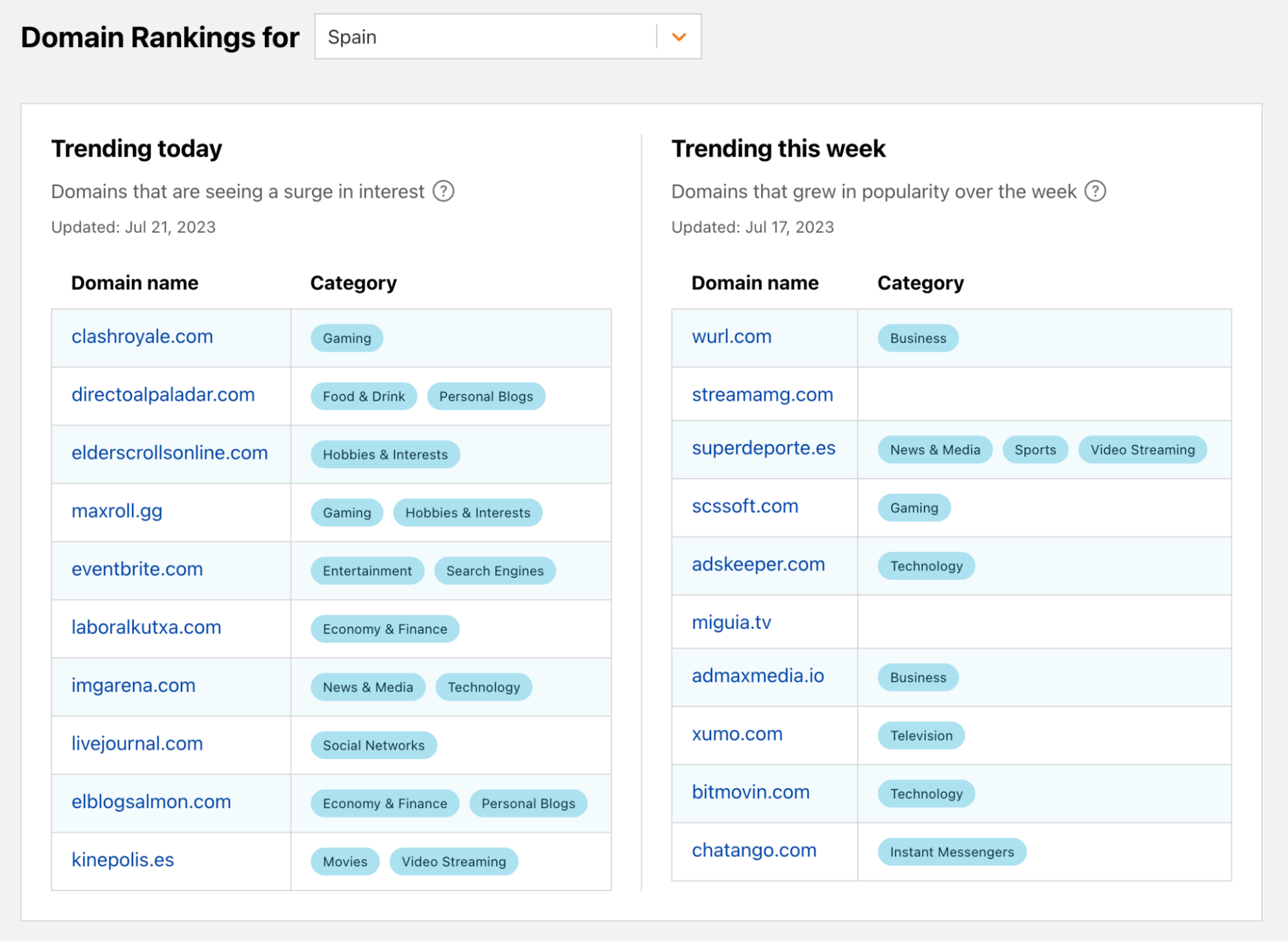
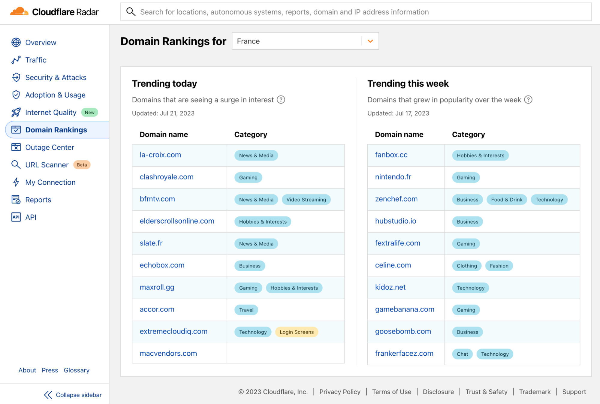
Today, we are improving our Domain Rankings page and adding Trending Domains lists. The new data shows which domains are currently experiencing an increase in popularity. Hence, while with the top popular domains we aim to show domains of broad appeal and of interest to many Internet users, with the trending domains we want to show domains that are generating a surge in interest.

Measuring the Internet's pulse: trending domains now on Cloudflare Radar

When we started looking at the best way to generate a list of trending domains, we needed to answer the following questions:

  • What type of popularity changes do we want to capture?
  • What should we use as a baseline to calculate the change?
  • And how do we quantify it?

We soon realized that we needed two lists. One reflecting sudden increased interest related to a particular event or a topic, showing spikes in popularity in domains that jump in the ranking from one day to the next, and another one reflecting steady growth in popularity, showing domains that are increasing their user base over a longer period.

For this reason, we are launching both the Trending Today and Trending This Week top 10 lists to capture the two different types of popularity increase.

To select the baseline for calculating the increase in popularity, we analyzed the volatility of the Radar Domain Ranking list for different top list sizes. The advantage of starting with the Radar Ranking lists is that they already incorporate a good popularity metric that quantifies the estimated relative size of the user population that accesses a domain over some period of time. You can read more about how we define popularity in our “Goodbye, Alexa. Hello, Cloudflare Radar Domain Rankings” blog.

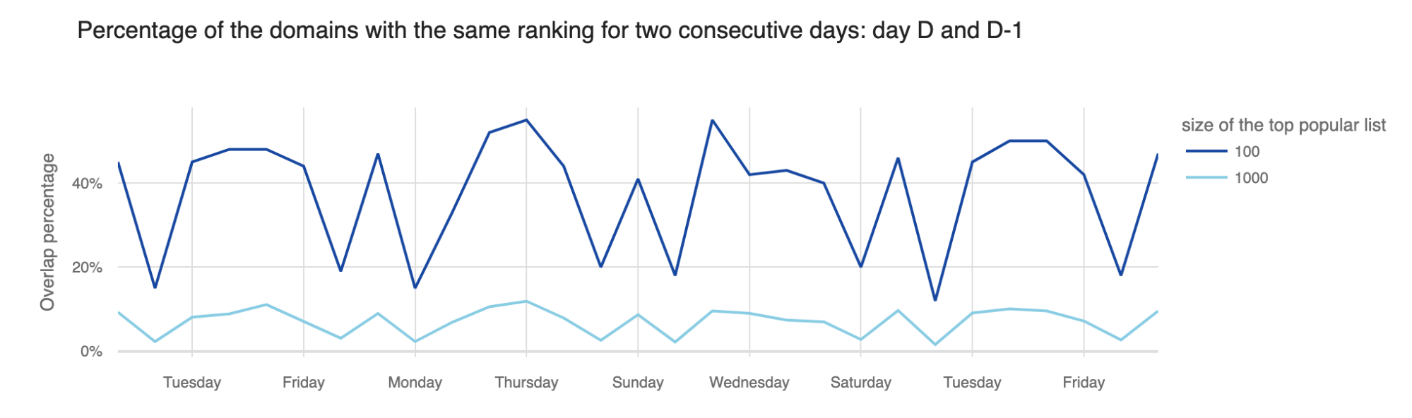
As expected, smaller list sizes were more stable, meaning the percentage of domains in the top 100 that changed the ranking from one day to the next was much lower than the percentage of domains that changed in the top 10,000. Hence, to have a dynamic daily list of trending domains, we had to look beyond the top 100 most popular domains.

However, we did not want to go all the way to the long tail of the list, as we already know that the ranks there are based on “significantly smaller and hence less reliable numbers” (see the paper "A Long Way to the Top: Significance, Structure, and Stability of Internet Top Lists"). Hence, we selected an appropriate list size for each location, based on the distribution of the number of DNS queries per domain. For example, for the Worldwide trending list we analyzed the top 20,000 most popular domains, for Brazil we looked at the top 10,000, Angola 5,000 and for the Faroe Islands top 500.

We then evaluated how much the domains change rank from one day to the next.

Measuring the Internet's pulse: trending domains now on Cloudflare Radar

We saw that on average, the biggest changes in the top lists, from one day to the next, happen from Fridays to Saturdays and from Sundays to Mondays, and hence on Saturdays and Mondays the lists have the least overlap with the lists of the previous day. We also compared the rank changes from one day to the next corresponding weekday, say from one Monday to the next and saw that on average, rankings on Mondays typically have more overlap with the rankings of the previous Mondays, than with the rankings of Sunday. From this we decided that in order to capture which domains are trending due to the weekend effect, we needed to compare the domain's daily rank to the rank of the previous day(s), and not of the corresponding weekday.

However, we also did not want to show as trending those domains that highly oscillate in the rankings, jumping up and down from one day to the next, showing up as trending every few days. Hence, we could not simply compare the daily rank with the rank from the day before. Instead, as a compromise between capturing the most recent trends, including the weekend trends, but still filtering out the domains whose ranking oscillates over a short period of time, we decided to compare the domain's daily rank with its best rank of the previous four days.

Then, to calculate the increase in popularity, we simply calculate the percentage change in the current rank compared to the best rank of the previous four days.

For calculating the domains steadily growing over the week, we used a slightly different approach.

Measuring the Internet's pulse: trending domains now on Cloudflare Radar

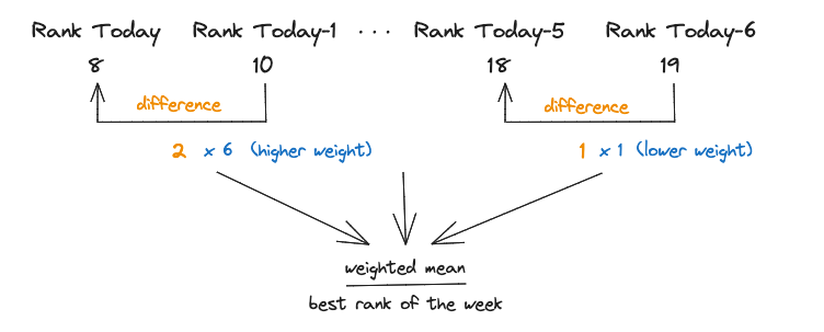
We want to highlight domains that keep improving their rank day by day and especially those that have been really trending in the most recent days. Therefore, we decided not to directly compare the current rank with the best rank during the previous week. Instead, we looked at the weighted average per day rank improvement and compared it with the best rank of the previous six days, with more recent days being given more weight.

What do these lists look like at the end? We compiled the lists for the eventful days of June 21 to 24.

On June 22, nba.com was trending in 28 locations, shown in the table below, the United States, as expected, but also Austria, Australia and Japan, to name a few, reflecting the interest in the events of NBA Draft 2023.

Trending Today data from Friday, June 23, 2023:

Location Trending rank Domain
Albania 5 nba.com
Argentina 9 nba.com
Australia 1 nba.com
Austria 9 nba.com
Belgium 5 nba.com
Canada 5 nba.com
Chile 6 nba.com
Colombia 3 nba.com
Dominican Republic 5 nba.com
Greece 2 nba.com
Honduras 6 nba.com
Hong Kong 1 nba.com
India 7 nba.com
Indonesia 4 nba.com
Ireland 3 nba.com
Japan 9 nba.com
Mexico 2 nba.com
New Zealand 1 nba.com
Norway 1 nba.com
Philippines 1 nba.com
Poland 9 nba.com
Serbia 2 nba.com
South Korea 3 nba.com
Taiwan 1 nba.com
Thailand 1 nba.com
Ukraine 1 nba.com
United States 6 nba.com
Venezuela 4 nba.com

Two domains trending in multiple locations on Saturday, June 24, were: rt.com, a Russian news site in English, and liveuamap.com, a site with interactive map of Ukraine. These are probably the effects of the events related to the Wagner group on June 23 and 24. Related to the same events, domain jetphotos.com was trending on the same day in Russia, Norway and Albania.

Trending Today data from Saturday, June 24, 2023:

Location Trending rank Domain
Armenia 4 rt.com
Australia 5 rt.com
Belgium 2 rt.com
Bulgaria 9 rt.com
Canada 6 rt.com
Denmark 6 rt.com
Greece 6 rt.com
Italy 2 rt.com
Kazakhstan 8 rt.com
Lebanon 4 rt.com
Netherlands 8 rt.com
Papua New Guinea 9 rt.com
Singapore 2 rt.com
Spain 6 rt.com
Turkey 4 rt.com
United Kingdom 5 rt.com
United States 3 rt.com
Uzbekistan 2 rt.com

Other domains trending in various locations on Friday and Saturday were different Gaming and Video Streaming domains such as roblox.com, twitch.tv and callofduty.com, showing an increased interest in gaming activities as the weekend approaches.

Yet another interesting effect of the weekend was the presence of five weather forecast sites on the top 10 trending sites on Friday, in Croatia, showing preoccupation with the summer weekend plans.

Trending Today in Croatia (data from Friday, June 23, 2023)

Trending rank Domain Category
1 lightningmaps.org Weather; Education
2 freemeteo.com.hr Weather
3 Vrijeme.hr
(Croatian Meteorological and Hydrological Service)
Politics, Advocacy, and Government-Related
4 arso.gov.si
5 rain-alarm.com Weather; News & Media
6 sorbs.net Information Security
7 neverin.hr Information Technology
8 meteo.hr
(Croatian Meteorological and Hydrological Service)
Business
9 gamespot.com Gaming; Video Streaming
10 grad.hr Business

These were all examples of daily trending domains, but what domains have steadily grown in popularity that week?

In multiple countries we had travel sites trending that week, sites such as booking.com, rentcars.com and amadeus.com, as many people were making their summer vacation plans. Weather forecast, specifically windy.com domain, was also trending the whole week in locations such as the Dominican Republic, Saint Lucia and Reunion, which was not surprising as the hurricane season began.

Trending This Week (Week June 17 -23, 2023)

Dominican Republic Reunion Saint Lucia
cecomsa.com atera.com adition.com
blur.io sharethis.com windy.com
pxfuel.com windy.com bbc.co.uk
windy.com baidu.com ampproject.org
mihoyo.com inmobi.com aniview.com

Final words

Both Trending Today and Trending This Week top 10 lists are now available on Radar starting today and on Radar API. Feel free to explore them and see what is trending on the Internet.

Measuring the Internet's pulse: trending domains now on Cloudflare Radar

Visit Cloudflare Radar for additional insights around (Internet disruptions, routing issues, Internet traffic trends, attacks, Internet quality, etc.). Follow us on social media at @CloudflareRadar (Twitter), cloudflare.social/@radar (Mastodon), and radar.cloudflare.com (Bluesky), or contact us via e-mail.

Popular domains are domains of broad appeal based on how people use the Internet. Trending domains are domains that are generating a surge in interest.