Post Syndicated from Garrett Galow original https://blog.cloudflare.com/dark-mode/

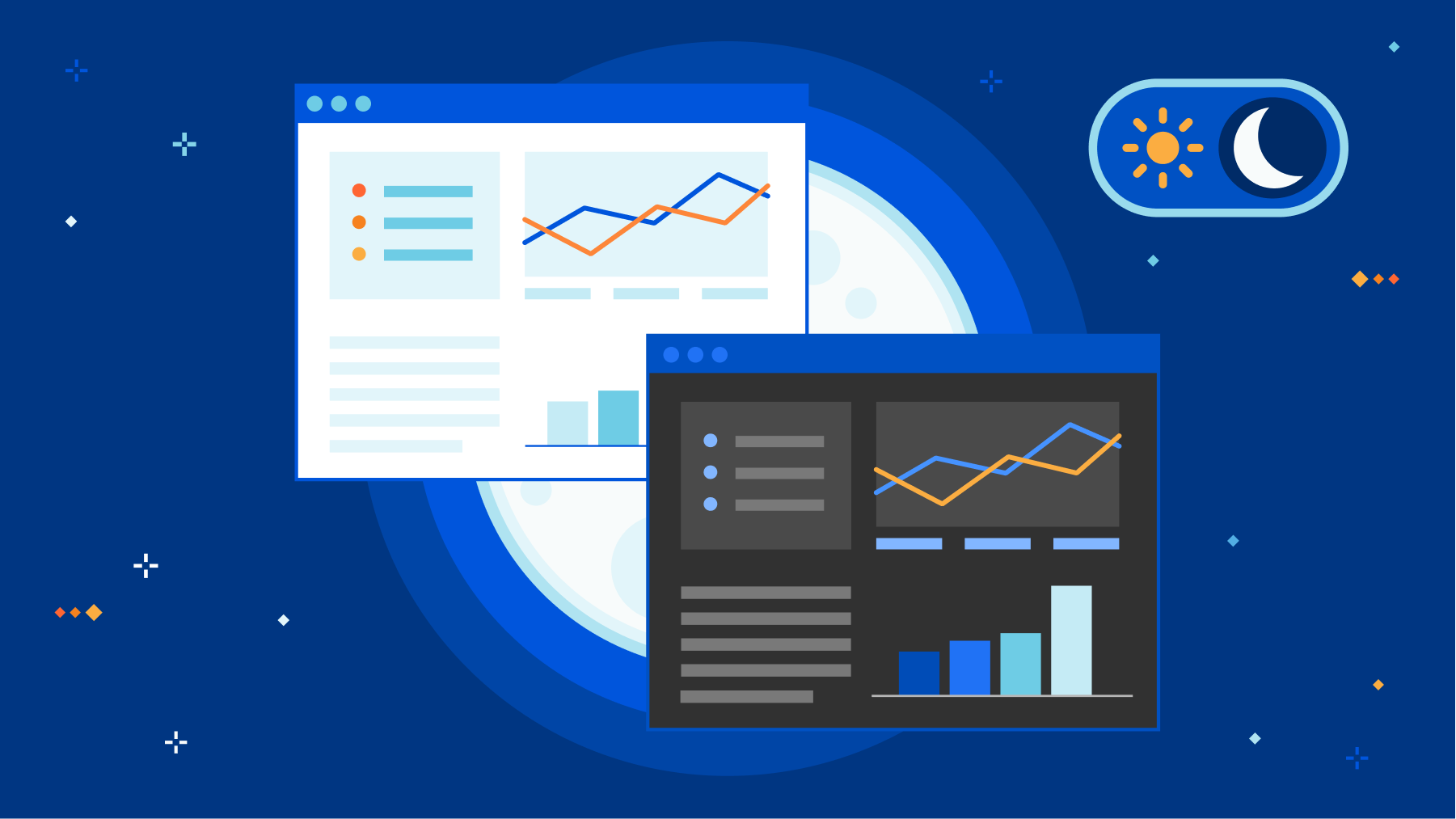
Today, dark mode is available for the Cloudflare Dashboard in beta! From your user profile, you can configure the Cloudflare Dashboard in light mode, dark mode, or match it to your system settings.
For those unfamiliar, dark mode, or light on dark color schemes, uses light text on dark backgrounds instead of the typical dark text on light (usually white) backgrounds. In low-light environments, this can help reduce eyestrain and actually reduce power consumption on OLED screens. For many though, dark mode is simply a preference supported widely by applications and devices.
How to enable dark mode
- Log into Cloudflare.
- Go to your user profile.
- Under Appearance, select an option: Light, Dark, or Use system setting. For the time being, your choice is saved into local storage.

There are many primers and how-tos on implementing dark mode, and you can find articles talking about the general complications of implementing a dark mode including this straightforward explanation. Instead, we will talk about what enabled us to be able to implement dark mode in only a matter of weeks.
Cloudflare’s Design System – Our Secret Weapon
Before getting into the specifics of how we implemented dark mode, it helps to understand the system that underpins all product design and UI work at Cloudflare – the Cloudflare Design System.
Cloudflare’s Design System defines and documents the interface elements and patterns used to build products at Cloudflare. The system can be used to efficiently build consistent experiences for Cloudflare customers. In practice, the Design System defines primitives like typography, color, layout, and icons in a clear and standard fashion. What this means is that anytime a new interface is designed, or new UI code is written, an easily referenceable, highly detailed set of documentation is available to ensure that the work matches previous work. This increases productivity, especially for new employees, and prevents repetitious discussions about style choices and interaction design.
Built on top of these design primitives, we also have our own component library. This is a set of ready to use components that designers and engineers can combine to form the products our customers use every day. They adhere to the design system, are battle tested in terms of code quality, and enhance the user experience by providing consistent implementations of common UI components. Any button, table, or chart you see looks and works the same because it is the same underlying code with the relevant data changed for the specific use case.
So, what does all of this have to do with dark mode? Everything, it turns out. Due to the widespread adoption of the design system across the dashboard, changing a set of variables like background color and text color in a specific way and seeing the change applied nearly everywhere at once becomes much easier. Let’s take a closer look at how we did that.
Turning Out the Lights
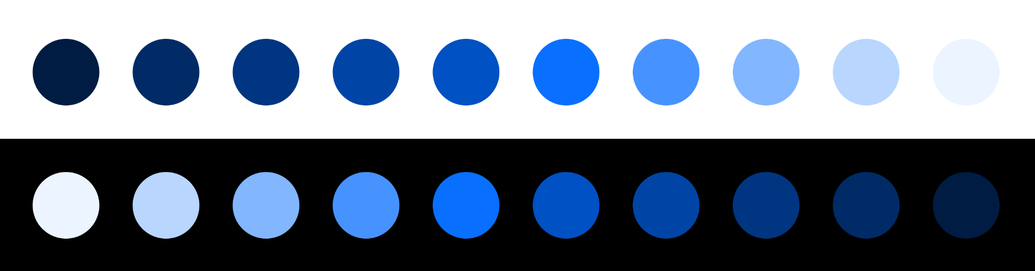
The use of color at Cloudflare has a well documented history. When we originally set out to build our color system, the tools we built and the extensive research we performed resulted in a ten-hue, ten-luminosity set of colors that can be used to build digital products. These colors were built to be accessible — not just in terms of internal use, but for our customers. Take our blue hue scale, for example.
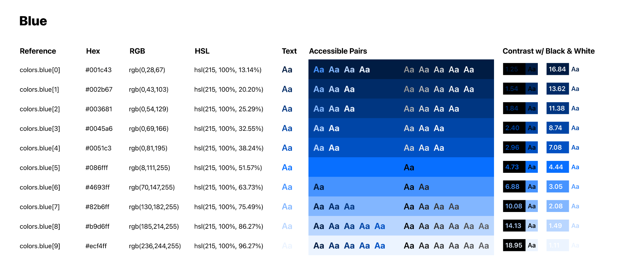
Each hue in our color scale contains ten colors, ordered by luminosity in ten increasing increments from low luminosity to high luminosity. This color scale allows us to filter down the choice of color from the 16,777,216 hex codes available on the web to a much simpler choice of just hue and brightness. As a result, we now have a methodology where designers know the first five steps in a scale have sufficient color contrast with white or lighter text, and the last five steps in a scale have sufficient contrast with black or darker text.
Color scales also allow us to make changes while designing in a far more fluid fashion. If a piece of text is too bright relative to its surroundings, drop down a step on the scale. If an element is too visually heavy, take a step-up. With the Design System and these color scales in place, we’ve been able to design and ship products at a rapid rate.
So, with this color system in place, how do we begin to ship a dark mode? It turns out there’s a simple solution to this, and it’s built into the JS standard library. We call reverse() and flip the luminosity scales.
By performing this small change within our dashboard’s React codebase and shipping a production preview deploy, we were able to see the Cloudflare Dashboard in dark mode with a whole new set of colors in a matter of minutes.
While not perfect, this brief prototype gave us an incredibly solid baseline and validated the approach with a number of benefits.
Every product built using the Cloudflare Design System now had a dark mode theme built in for free, with no additional work required by teams.
Our color contrast principles remain sound — just as the first five colors in a scale would be accessible with light text, when flipped, the first five colors in the scale are accessible with dark text. Our scales aren’t perfectly symmetrical, but when using white and black, the principle still holds.
In a traditional approach of “inverting” colors, we face the issue of a color’s hue being changed too. When a color is broken down into its constituent hue, saturation, and luminosity values, inverting it would mean a vibrant light blue would become a dull dark orange. Our approach of just inverting the luminosity of a color means that we retain the saturation and hue of a color, meaning we retain Cloudflare’s brand aesthetic and the associated meaning of each hue (blue buttons as calls-to-action, and so on).
Of course, shipping a dark mode for a product as complex as the Cloudflare Dashboard can’t just be done in a matter of minutes.
Not Quite Just Turning the Lights Off
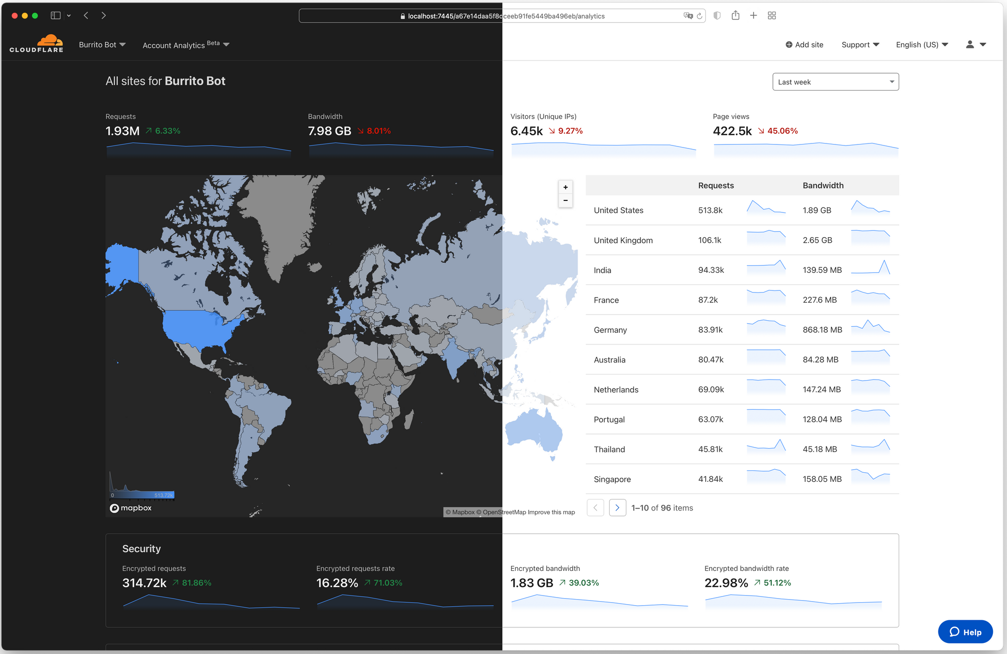
Although our prototype did meet our initial requirements of facilitating the dashboard in a dark theme, some details just weren’t quite right. The data visualization and mapping libraries we use, our icons, text, and various button and link states all had to be audited and required further iterations. One of the most obvious and prominent examples was the page background color. Our prototype had simply changed the background color from white (#FFFFFF) to black (#000000). It quickly became apparent that black wasn’t appropriate. We received feedback that it was “too intense” and “harsh.” We instead opted for off black, specifically what we refer to as “gray.0” or #1D1D1D. The difference may not seem noticeable, but at larger dimensions, the gray background is much less distracting.
Here is what it looks like in our design system:


And here is a more realistic example:
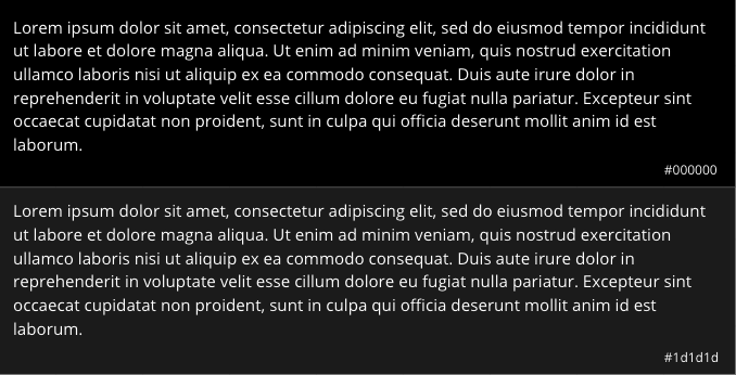
The numbers at the end of each row represent the contrast of the text color on the background. According to the Web Content Accessibility Guidelines (WCAG), the standard contrast ratio for text should be at least 4.5:1. In our case, while both of the above examples exceed the standard, the gray background ends up being less harsh to use across an entire application. This is not the case with light mode as dark text on white (#FFFFFF) background works well.
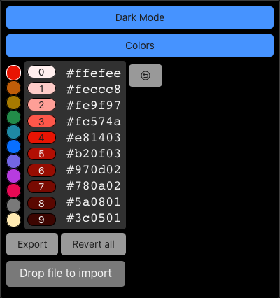
Our technique during the prototyping stage involved flipping our color scale; however, we additionally created a tool to let us replace any color within the scale arbitrarily. As the dashboard is made up of charts, icons, links, shadows, buttons and certainly other components, we needed to be able to see how they reacted in their various possible states. Importantly, we also wanted to improve the accessibility of these components and pay particular attention to color contrast.
For example, a button is made up of four distinct states:
1) Default
2) Focus
3) Hover
4) Active
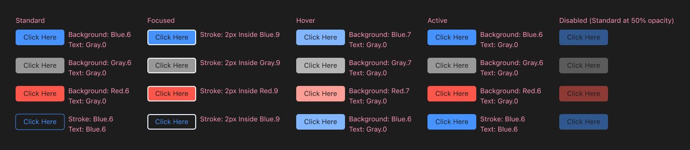
We wanted to ensure that each of these states would be at least compliant with the AA accessibility standards according to the WCAG. Using a combination of our design systems documentation and a prioritized list of components and pages based on occurrence and visits, we meticulously reviewed each state of our components to ensure their compliance.
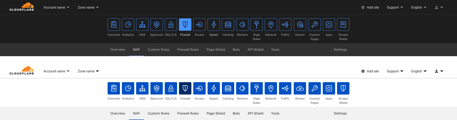
The navigation bar used to select between the different applications was a component we wanted to treat differently compared to light mode. In light mode, the app icons are a solid blue with an outline of the icon; it’s a distinct look and certainly one that grabs your attention. However, for dark mode, the consensus was that it was too bright and distracting for the overall desired experience. We wanted the overall aesthetic of dark mode to be subtle, but it’s important to not conflate aesthetic with poor usability. With that in mind, we made the decision for the navigation bar to use outlines around each icon, instead of being filled in. Only the selected application has a filled state. By using outlines, we are able to create sufficient contrast between the current active application and the rest. Additionally, this provided a visually distinct way to present hover states, by displaying a filled state.
After applying the same methodology as described to other components like charts, icons, and links, we end up with a nicely tailored experience without requiring a substantial overhaul of our codebase. For any new UI that teams at Cloudflare build going forward, they will not have to worry about extra work to support dark mode. This means we get an improved customer experience without any impact to our long term ability to keep delivering amazing new capabilities — that’s a win-win!
Welcome to the Dark Side
We know many of you have been asking for this, and we are excited to bring dark mode to all. Without the investment into our design system by many folks at Cloudflare, dark mode would not have seen the light of day. You can enable dark mode on the Appearance card in your user profile. You can give feedback to shape the future of the dark theme with the feedback form in the card.
If you find these types of problems interesting, come help us tackle them! We are hiring across product, design, and engineering!