Post Syndicated from Chris Draper original https://blog.cloudflare.com/AI-troubleshoot-warp-and-network-connectivity-issues/
Monitoring a corporate network and troubleshooting any performance issues across that network is a hard problem, and it has become increasingly complex over time. Imagine that you’re maintaining a corporate network, and you get the dreaded IT ticket. An executive is having a performance issue with an application, and they want you to look into it. The ticket doesn’t have a lot of details. It simply says: “Our internal documentation is taking forever to load. PLS FIX NOW”.
In the early days of IT, a corporate network was built on-premises. It provided network connectivity between employees that worked in person and a variety of corporate applications that were hosted locally.
The shift to cloud environments, the rise of SaaS applications, and a “work from anywhere” model has made IT environments significantly more complex in the past few years. Today, it’s hard to know if a performance issue is the result of:
-
An employee’s device
-
Their home or corporate wifi
-
The corporate network
-
A cloud network hosting a SaaS app
-
An intermediary ISP
A performance ticket submitted by an employee might even be a combination of multiple performance issues all wrapped together into one nasty problem.
Cloudflare built Cloudflare One, our Secure Access Service Edge (SASE) platform, to protect enterprise applications, users, devices, and networks. In particular, this platform relies on two capabilities to simplify troubleshooting performance issues:
-
Cloudflare’s Zero Trust client, also known as WARP, forwards and encrypts traffic from devices to Cloudflare edge.
-
Digital Experience Monitoring (DEX) works alongside WARP to monitor device, network, and application performance.
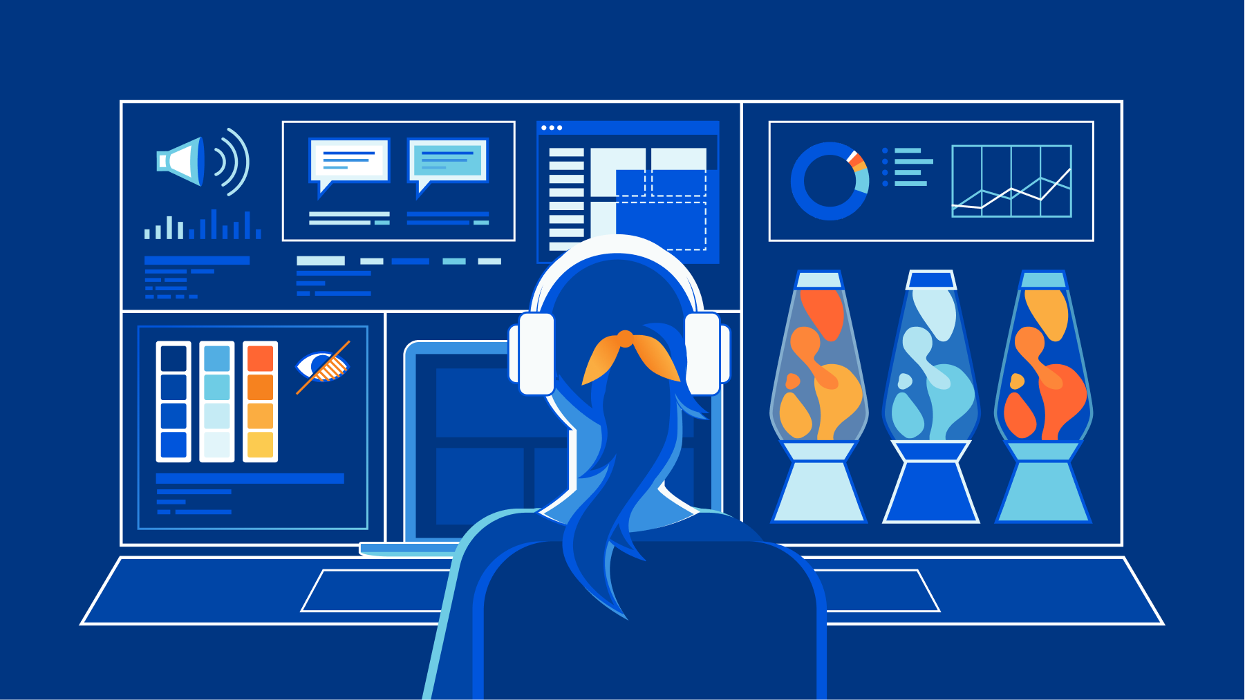
We’re excited to announce two new AI-powered tools that will make it easier to troubleshoot WARP client connectivity and performance issues. We’re releasing a new WARP diagnostic analyzer in the Zero Trust dashboard and a MCP (Model Context Protocol) server for DEX. Today, every Cloudflare One customer has free access to both of these new features by default.
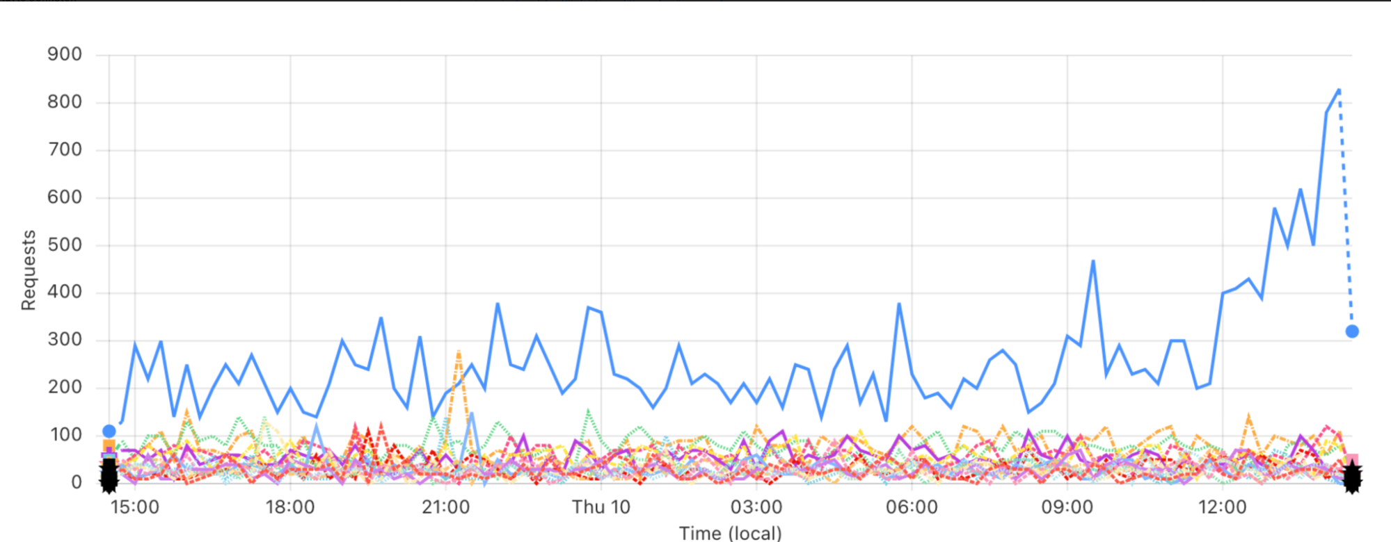
The WARP client provides diagnostic logs that can be used to troubleshoot connectivity issues on a device. For desktop clients, the most common issues can be investigated with the information captured in logs called WARP diagnostic. Each WARP diagnostic log contains an extensive amount of information spanning days of captured events occurring on the client. It takes expertise to manually go through all of this information and understand the full picture of what is occurring on a client that is having issues. In the past, we’ve advised customers having issues to send their WARP diagnostic log straight to us so that our trained support experts can do a root cause analysis for them. While this is effective, we want to give our customers the tools to take control of deciphering common troubleshooting issues for even quicker resolution.
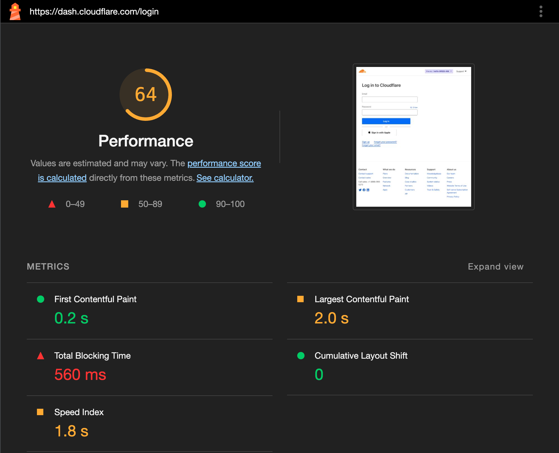
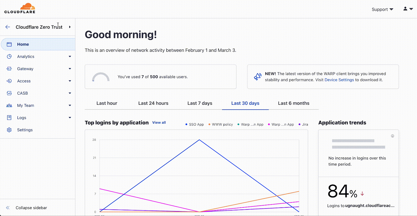
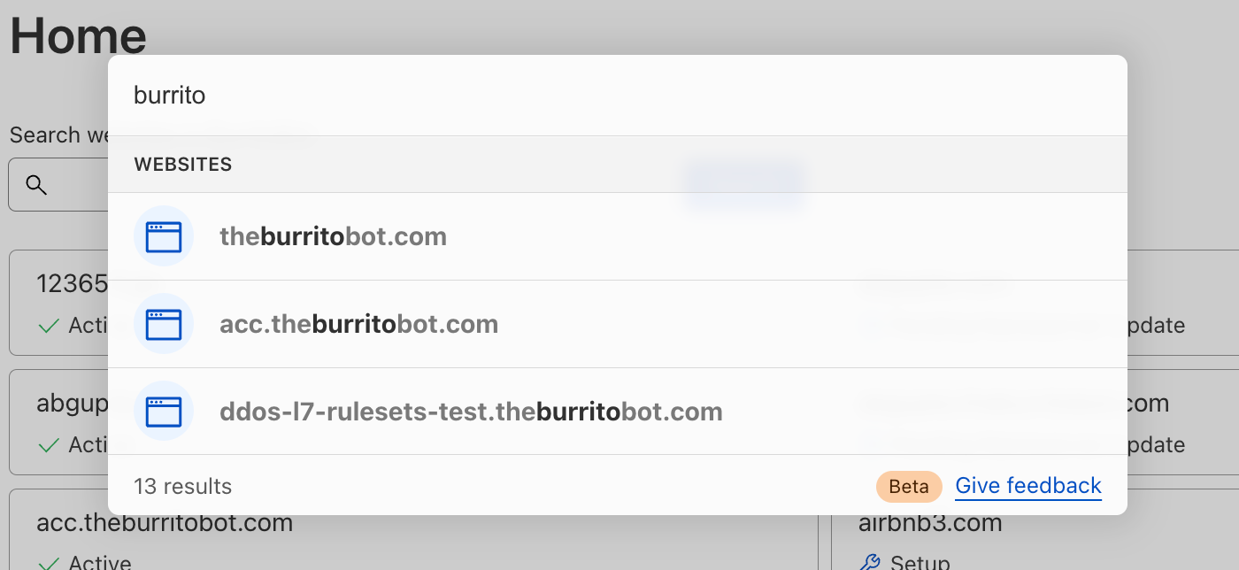
Enter the WARP diagnostic analyzer, a new AI available for free in the Cloudflare One dashboard as of today! This AI demystifies information in the WARP diagnostic log so you can better understand events impacting the performance of your clients and network connectivity. Now, when you run a remote capture for WARP diagnostics in the Cloudflare One dashboard, you can generate an AI analysis of the WARP diagnostic file. Simply go to your organization’s Zero Trust dashboard and select DEX > Remote Captures from the side navigation bar. After you successfully run diagnostics and produce a WARP diagnostic file, you can open the status details and select View WARP Diag to generate your AI analysis.

In the WARP Diag analysis, you will find a Cloudy summary of events that we recommend a deeper dive into.

Below this summary is an events section, where the analyzer highlights occurrences of events commonly occurring when there are client and connectivity issues.

Expanding on any of the events detected will reveal a detailed page explaining the event, recommended resources to help troubleshoot, and a list of time stamped recent occurrences of the event on the device.

To further help with trouble shooting we’ve added a Device and WARP details section at the bottom of this page with a quick view of the device specifications and WARP configurations such as Operating system, WARP version, and the device profile ID.

Finally, we’ve made it easy to take all the information created in your AI summary with you by navigating to the JSON file tab and copying the contents. Your WARP Diag file is also available to download from this screen for any further analysis.

Alongside the new WARP Diagnostic Analyzer, we’re excited to announce that all Cloudflare One customers have access to a MCP (Model Context Protocol) server for our Digital Experience Monitoring (DEX) product. Let’s dive into how this will save our customers time and money.
Cloudflare One customers use Digital Experience Monitoring (DEX) to monitor devices across their employee network and troubleshoot any connectivity or performance issues. Like many products at Cloudflare, every data point generated by DEX is available to customers via Cloudflare’s API or log ingestion. DEX API and log data is valuable because it enables Enterprises to create custom analytics for their devices’ connectivity and performance in a SIEM (Security Information and Event Management). Building new data pipelines and various dashboards can take a lot of time and can be expensive. Some of Cloudflare One customers aren’t able to dedicate the engineering time to build custom analytics: whether it’s due to budget, resource constraints, time constraints, or other factors.
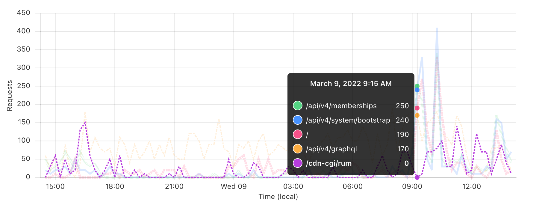
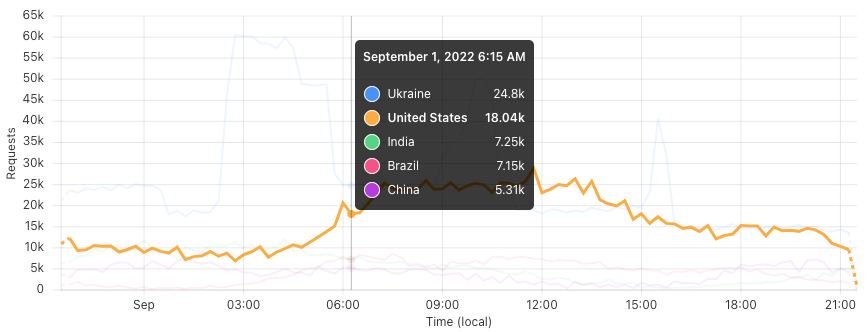
Model Context Protocol (MCP) is an AI standardization that allows AI to connect to other applications. In this instance, using MCP together with DEX gives users a custom analytics experience — without all the work of integrating log data into a SIEM. Network security practitioners can type out a question (like “Show me the performance data for [email protected]’s device in a few graphs”), and an MCP server will answer that question with a customized graph on Alice’s device data from the DEX API.
Any IT admin, security engineer, or network engineer can ask the MCP server a question like: “I received an IT ticket from [email protected] who is an enterprise employee. He is complaining about the performance of his device. Can you investigate this for me?”.
After you submit this question, the DEX MCP server will start by reviewing the device’s overall health.
Overall Device Health:
✅ Connection Status: Consistently connected for the past 24 hours with 100% availability
✅ WARP Mode: Running in optimal "warp+doh" (WARP + DNS over HTTPS) mode
✅ Client Version: Up-to-date with version 2025.1.7.2
So far, the device’s health looks great. Next, the DEX MCP server will begin analyzing the results of the performance tests that are configured on Bob’s device.
📊 Performance Metrics Analysis

HTTP Response Times:
Google.com test: Average 247ms (Range: 81-649ms)
  • Shows significant improvement throughout the day: Started at ~317ms, dropped to ~211ms by evening
Wiki.internal.acme.com: Average 1,374ms (Range: 877-2,431ms)
  • This is notably high and could be the source of performance complaints
  • DNS resolution particularly slow: Average 616ms with spikes up to 1,600ms
Now we’re making progress in our troubleshooting effort. The DEX MCP server identified that the HTTP GET test for wiki.internal.acme.com has a high average resource fetch time when compared to other websites (like google.com). In particular, high resource fetch time is the result of slow DNS resolution. Now, the DEX MCP server will summarize its findings.
🚨 Performance Issues Identified
Extremely Slow DNS Resolution:
  • Average DNS response time of 616ms is significantly high
  • Normal DNS should be <50ms for good performance
High Resource Fetch Times on wiki.internal.acme.com:
   • 1.3+ second response times indicate potential application-level issues
   • Could be related to DNS performance or server-side delays
HTTP Status Code Issues:
        • wiki.internal.acme.com is showing consistent HTTP 400 errors
        • This suggests potential configuration or routing issues
Now, we’ve successfully identified that Bob’s slow wiki performance is the result of a high average DNS response time. Slow DNS resolution increases the average resource fetch time, and also generates HTTP 400 errors for Enterprise employees that are attempting to access wiki.internal.acme.com. Notably, it’s likely that if the wiki is seeing slow DNS response times, other internal applications are experiencing performance issues as well.
We can ask the DEX MCP server to suggest potential solutions that would fix this wider DNS performance issue.
🔧 DNS Optimization Strategies

Check WARP DNS configuration and settings
  • Since the device is using WARP+DoH mode, you can optimize the DNS settings
Implement or improve local DNS caching
  • Implement or improve local DNS caching to reduce repeated lookups
Network stack tuning
• Optimize TCP / UDP settings for DNSAny Cloudflare One customer with a Free, PayGo, or ENT plan can start using the DEX MCP server in less than one minute. The fastest and easiest way to try out the DEX MCP server is to visit playground.ai.cloudflare.com. There are five steps to get started:
-
Copy the URL for the DEX MCP server: https://dex.mcp.cloudflare.com/sse
-
Open playground.ai.cloudflare.com in a browser
-
Find the section in the left side bar titled MCP Servers
-
Paste the URL for the DEX MCP server into the URL input box and click Connect
-
Authenticate your Cloudflare account, and then start asking questions to the DEX MCP server
It’s worth noting that end users will need to ask specific and explicit questions to the DEX MCP server to get a response. For example, you may need to say, “Set my production account as the active account”, and then give the separate command, “Fetch the DEX test results for the user [email protected] over the past 24 hours”.
Customers will get a more flexible prompt experience by configuring the DEX MCP server with their preferred AI assistant (Claude, Gemini, ChatGPT, etc.) that has MCP server support. MCP server support may require a subscription for some AI assistants. You can read the Digital Experience Monitoring – MCP server documentation for step by step instructions on how to get set up with each of the major AI assistants that are available today.
As an example, you can configure the DEX MCP server in Claude by downloading the Claude Desktop client, then selecting Claude Code > Developer > Edit Config. You will be prompted to open “claude_desktop_config.json” in a code editor of your choice. Simply add the following JSON configuration, and you’re ready to use Claude to call the DEX MCP server.
{
  "globalShortcut": "",
  "mcpServers": {
    "cloudflare-dex-analysis": {
      "command": "npx",
      "args": [
        "mcp-remote",
        "https://dex.mcp.cloudflare.com/sse"
      ]
    }
  }
}Are you ready to secure your Internet traffic, employee devices, and private resources without compromising speed? You can get started with our new Cloudflare One AI powered tools today.
The WARP diagnostic analyzer and the DEX MCP server are generally available to all customers. Head to the Zero Trust dashboard to run a WARP diagnostic and learn more about your client’s connectivity with the WARP diagnostic analyzer. You can test out the new DEX MCP server (https://dex.mcp.cloudflare.com/sse) in less than one minute at playground.ai.cloudflare.com, and you can also configure an AI assistant like Claude to use the new DEX MCP server.
If you don’t have a Cloudflare account, and you want to try these new features, you can create a free account for up to 50 users. If you’re an Enterprise customer, and you’d like a demo of these new Cloudflare One AI features, you can reach out to your account team to set up a demo anytime.
You can stay up to date on latest feature releases across the Cloudflare One platform by following the Cloudflare One changelogs and joining the conversation in the Cloudflare community hub or on our Discord Server.


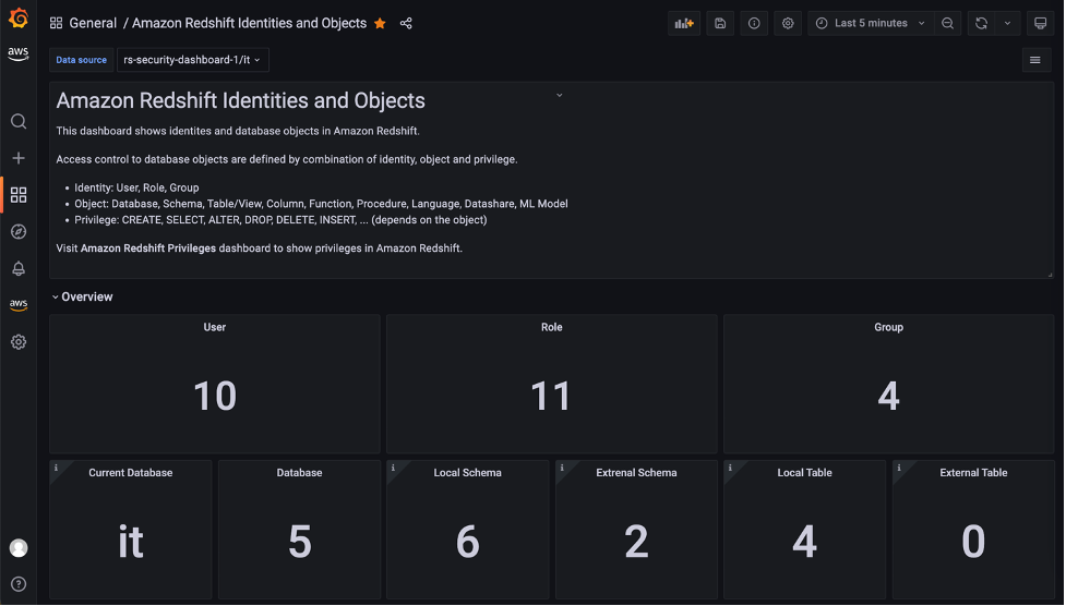


 Milind Oke is a Data Warehouse Specialist Solutions Architect based out of New York. He has been building data warehouse solutions for over 15 years and specializes in Amazon Redshift.


 Once you create the data source Quicksight lists all the views and tables available under the specified database (in our case it is:- due_eventdb). Select the email_all_events view as data source.
 Select the event data location for analysis. There are mainly two options available which are a/ Import to Spice quicker analysis b/ Directly query your data. Please select the preferred options and then click on “visualize the data”.
 Now that you have selected a data source, you will be taken to a blank quick sight canvas (Blank analysis page) as shown in the following Image, please drag and drop what
  As part of this blog, we have displayed how to create some simple analysis graphs to visualize the engagement events.
 Select all the event dimensions that you want to put it as part of the Table in X axis. Amazon Quicksight table can be extended to show as many as tables columns, this completely depends upon the business requirement how much data marketers want to visualize.
 To create a Quicksight dashboards from the Quicksight analysis click Share menu option at the top right corner then select publish dashboard”. Provide required dashboard name while publishing the dashboard”. Same dashboard can be shared with multiple audiences in the Organization.
 Following is the final version of the dashboard. As mentioned above Quicksight dashboards can be shared with other stakeholders and also complete dashboard can be exported as excel sheet.