Post Syndicated from Alice Bracchi original https://blog.cloudflare.com/the-teams-dashboard-finding-a-product-voice/

My name is Alice Bracchi, and I’m the technical and UX writer for Cloudflare for Teams, Cloudflare’s Zero Trust and Secure Web Gateway solution.
Today I want to talk about product voice — what it is, why it matters, and how I set out to find a product voice for Cloudflare for Teams.
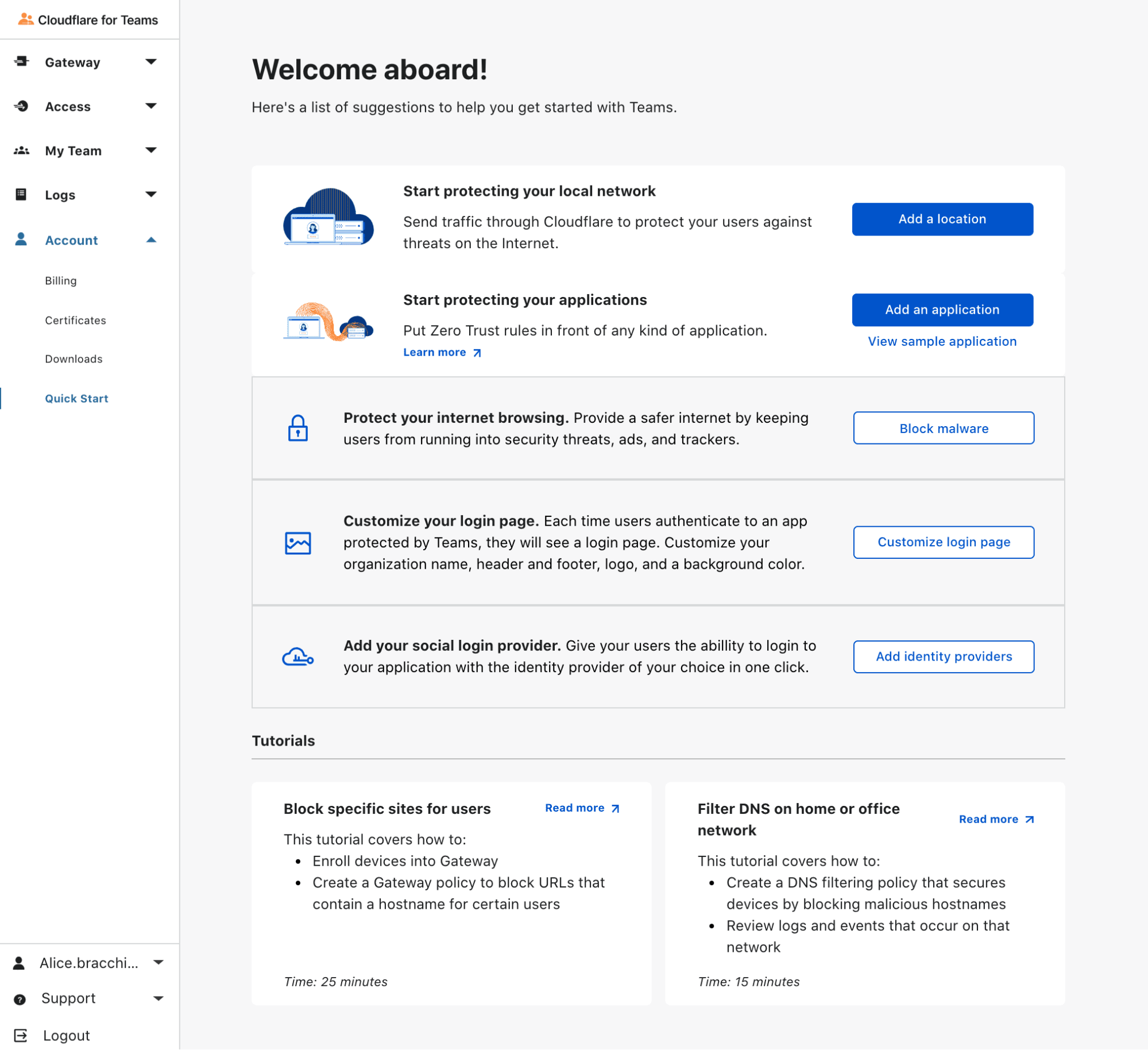
On the Cloudflare for Teams Dashboard (or as we informally call it, “the Teams Dash”), our customers have full control over the security of their network. Administrators can replace their VPN with a solution that runs on Zero Trust rules, turning Cloudflare’s network into their secure corporate network. Customers can secure all traffic by configuring L7 firewall rules and DNS filtering policies, and organizations have the ability to isolate web browsing to suspicious sites.
All in one place.
As you can see, a lot of action takes place on the Teams Dash. As an interface, it grows and changes at a rapid pace. This poses a lot of interesting challenges from a design point of view — in our early days, because we were focused on solving problems fast, many of our experiences ended up feeling a bit disjointed. Sure, users were able to follow paths within any given feature, but those features did not always work across the Dash in a seamless way.
Early this week we talked about how we’re leaving our “solution pollution” days behind and moving towards a design-led approach. To me, as the writer on the team, this means it’s time to step up our UX writing game and find our own product voice — a unique voice that reflects our product identity and speaks to our users in a recognizable “Teams way”.
But what exactly is a product voice?
As users, we love experiences and products we recognize. We’re loyal to them. It’s all about consistency, and the sense of familiarity that comes with it. When design and copy work hand in hand to convey a consistent feel, we soon learn to recognize the personality of an interface. Because every little detail has been curated for us, we’re rarely caught by surprise — our experience just feels smooth.
Think about it in terms of human interactions. When picking up a call from a friend, we immediately recognize their voice. We don’t think about the why or how — we just unconsciously do, and start chatting away. However, imagine that friend suddenly uttered a sentence in a completely different voiceprint (spooky, right?). Imagine they started using words or expressions that never belonged in their vocabulary. We would notice right away.
Interactions through UX writing work in a similar way. Users notice right away when a piece of copy doesn’t sound as it should. So when working on copy for our interface, we need a consistent, recognizable product voice. A product voice is a set of principles and guidelines that standardize how we sound to our users. It will determine whether we put exclamation marks in our greetings (“Welcome!”), whether we include interjections in our error messages (“Uh-oh!”), whether we address the user with “you” or prefer a more impersonal approach. It will show our personality and shape what users can expect from us.
And the Teams dashboard needed just that — to find its own voice.

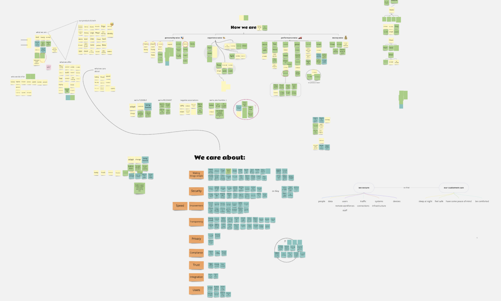
Hundreds of sticky notes
A voice isn’t going to be very successful for a product if it only sounds right to the writer crafting it, I reasoned. It needs to ring true to the people who build and breathe the product every day — our product managers, our designers, our engineers. In the end, a product voice will truly shine only if it’s aligned with product principles. And as a product team, we’d been so caught up shipping features and solving problems that we’d never sat down to brainstorm on our principles.
So the path was clear to me.
- First, we needed to define our product principles.
- From our principles, we would derive a product voice that matched our core values.
- Last but not least, we would draft UX writing guidelines on how to write in our newly found product voice.
My idea was for this process to be as collaborative as possible, so I set up a series of brainstorming sessions with my teammates. I met with the product managers first, then with designers, engineers, and finally the marketing/go-to-market team. Each group gathered around a virtual board, and received the same prompts from me. I asked participants to focus on the ideal product they wanted Teams to grow into. Everyone worked independently on their own corner of the board — I was interested in every participant’s uninfluenced inputs.
Here are the prompts I gave:
- List all the words you associate with Teams.
We called this question the “brain dump.” I gave people two minutes and a half to be instinctive, creative, and give me all the words they could think of. - Teams helps users by _______.
With this question, I wanted people to focus on our everyday life. What do we do for our customers? Which problems are we trying to solve? - In terms of experience, I’d love users to associate Teams with ____ (brand).
Again, I was after instinctive associations. Ideally, I wanted a list of websites I could later explore to see whether we could draw inspiration from them in terms of content. - Teams is unique because [it’s] ________.
I asked people to focus on the qualities that set us apart in the market. What makes the product stand out?
Once I had all the answers, I classified sticky notes by lexical and conceptual association. Some patterns emerged. We had sticky notes describing who we are, who we’re not, what we do, our features, our technology, and what we care about. Once every sticky note had been grouped, I had a pretty good idea of the themes I could work with to draft our product principles.
The words behind our product principles
I labeled each theme/principle with an adjective that could represent it and that could answer the question: what kind of product do we want to be for our users?
- Reassuring. This was the first principle I worked on. Semantically, it reflects the core purpose of Teams — we’re a network security product, so our job is to protect. Under this principle I gathered all the words pertaining to the concepts of security, protection, and reassurance. People even used metaphors to express this concept: we’re a bodyguard. An armored truck.
- Transparent. Another popular theme was our extensive analytics features, and the visibility they give to our admin users. This principle groups words whose root is in one way or another connected to the sense of sight: observing, monitoring, visibility, keeping an eye on. Interestingly enough, other words were more oriented towards the semantics of forensics: investigate, find, detect. For the main descriptor, I finally settled on transparent, because our product is a pane of glass (another metaphor that was used) that the admin can see through and know instantly whether something needs investigating.
- Easy to use. This is a very ambitious principle for us. Network security is not an easy topic — it is our job to make it easy. All groups I brainstormed with gave huge importance to simplicity in one shape or another. Many stated our interface needs to be clean, accessible, approachable, digestible, direct. But we also vow to be inclusive, helpful and guiding, and never to assume knowledge.
- Trailblazing. There was a clear theme around Teams being new on the market, but already showing the way. Modern recurred in most brainstorming sessions. Closely related descriptors, but stronger, were visionary and trailblazing, which I ended up choosing as the title of this principle, because it conveys the energy of a product that’s energetic and fresh.
- Frictionless. This principle is all about a product that just works. Some words I’ve grouped under this principle describe two ways in which Teams aims at removing friction. First, Teams should aim at integrating with other systems. Second, Teams should be invisible. Our product is designed to be hardly noticeable by end users, and works behind the scenes.
- Adaptive. This principle has two sides to it. The first is represented by resilience and Teams’ ability to adapt to circumstances (think concepts like adaptable, ready to change, and built in 2020). The second side is more about our ability to adapt to user needs. Here’s where our user-centered nature comes out: we let user needs shape our evolution as a product.
What about our voice?
I went back to my sticky notes, this time to find and group words that could help us define the product’s personality, or more specifically, its attitude towards communication. Out of those groups, I chose five descriptors:
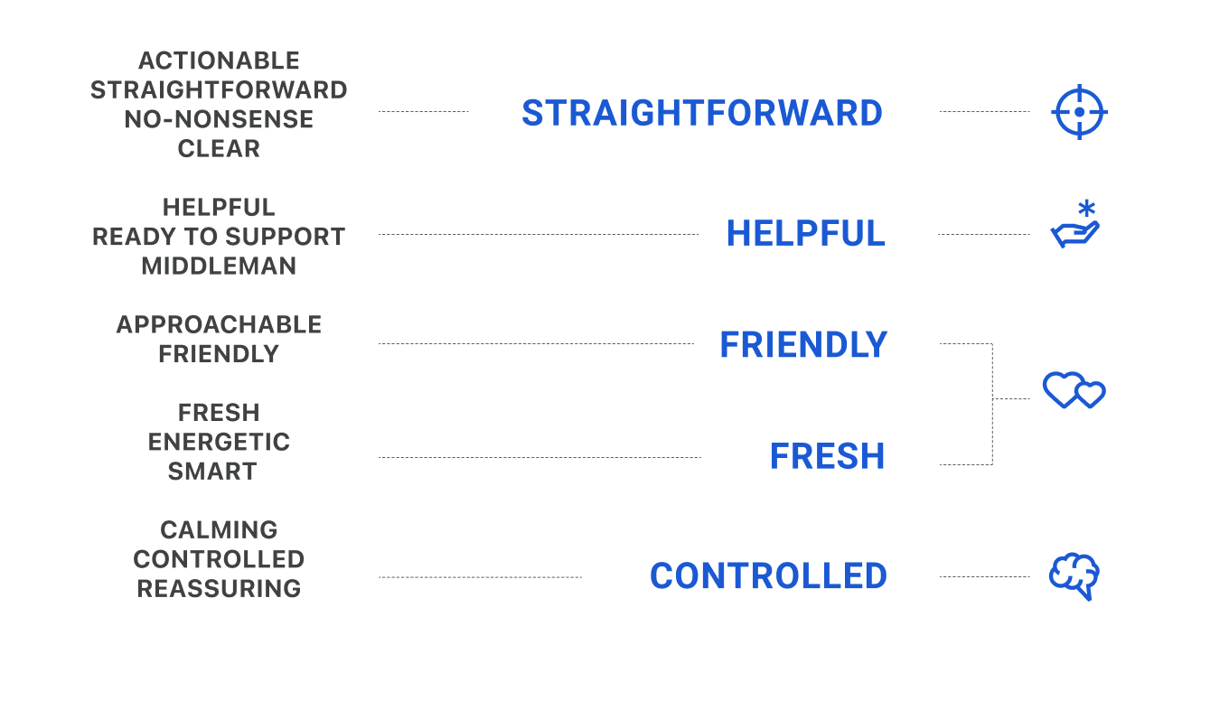
- Straightforward. We know the value of effective and concise language. We give the right amount of information at the right time.
- Helpful. We offer tips and guidance, and we ensure users are never left to figure things out by themselves.
- Friendly. We’re happy our users are around. We empathize with them. We’re the warm and welcoming ones.
- Fresh. We’re a new, informal, geeky product. We address the user as if they were sitting beside us. We’re like a nerdy friend offering to fix your computer.
- Controlled. We’re in control. No panic, no crazy excitement. We do not overreact.
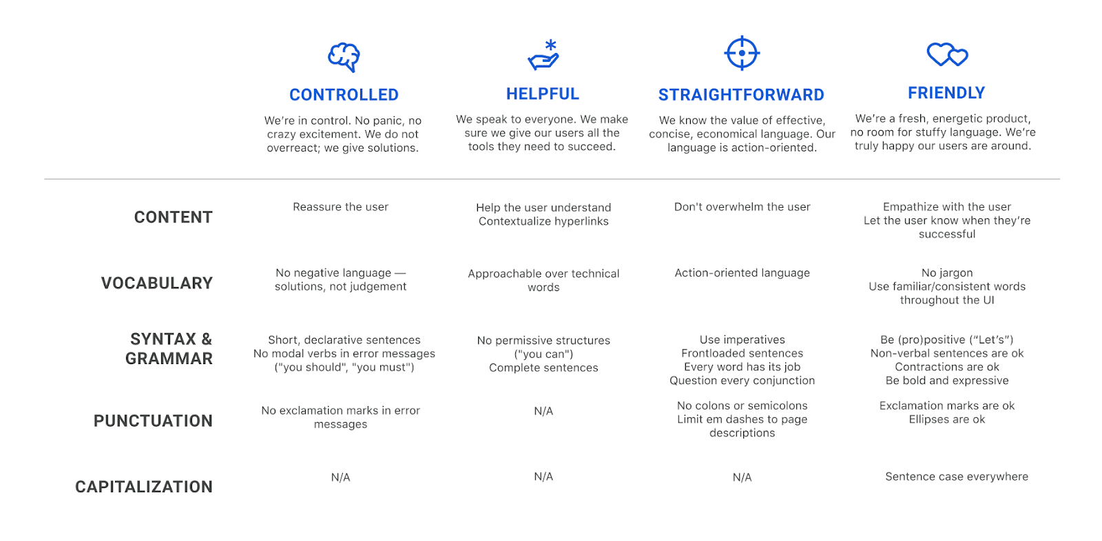
As a next step, I crafted a voice matrix, slightly adapting Torrey Podmajersky’s approach in Strategic Writing for UX. I assigned a column to each voice trait and defined what each of them entails in terms of content, vocabulary, syntax, grammar, punctuation, and capitalization choices. This voice matrix summarizes the dos and don’ts of UX writing for the Teams Dashboard.
As I was filling out this chart, I noticed that most guidelines I came up with for the friendly trait also worked well for the fresh voice trait. Ultimately, I thought, it all boils down to a certain feeling of warmth in our communication — a feeling made possible both by our friendly nature and by our fresh, informal approach. In the end, I decided to merge those traits into the friendly principle.
What I learned
This project has been an incredible journey to the heart of the product. I cherish the many creative conversations I had with my teammates about Teams. It was a chance for us to hit pause for a second, forget about deadlines and our everyday tasks, take a step back and focus on why we’re building what we’re building. It feels really good to have our principles written down, and we want to publish them soon on our product page for you to explore them.
Naturally, the project has also helped my writing tremendously. Every time I sit down to write a line of UX copy, I don’t just refer back to these four voice descriptors and their guidelines — I also write with the six product principles firmly in the back of my mind.
I’ve bookmarked the board with our sticky notes in my browser. It’s always there for me, and it contains the raw material I fall back on whenever I need inspiration.

What’s next
This is just the beginning and the high-level structure of our strategy. In time and with iteration, we’ll build out these principles to become full-fledged UX writing guidelines, as well as a set of patterns that will allow us to achieve true consistency throughout the Teams Dashboard. Keep an eye on copy changes and see if you can hear our new voice take shape.
Next week we’ll introduce our Design team and their vision. Stay tuned!