Tag Archives: product design

A new WAF experience

Post Syndicated from Zhiyuan Zheng original https://blog.cloudflare.com/new-waf-experience/

A new WAF experience

A new WAF experience

Around three years ago, we brought multiple features into the Firewall tab in our dashboard navigation, with the motivation “to make our products and services intuitive.” With our hard work in expanding capabilities offerings in the past three years, we want to take another opportunity to evaluate the intuitiveness of Cloudflare WAF (Web Application Firewall).

Our customers lead the way to new WAF

The security landscape is moving fast; types of web applications are growing rapidly; and within the industry there are various approaches to what a WAF includes and can offer. Cloudflare not only proxies enterprise applications, but also millions of personal blogs, community sites, and small businesses stores. The diversity of use cases are covered by various products we offer; however, these products are currently scattered and that makes visibility of active protection rules unclear. This pushes us to reflect on how we can best support our customers in getting the most value out of WAF by providing a clearer offering that meets expectations.

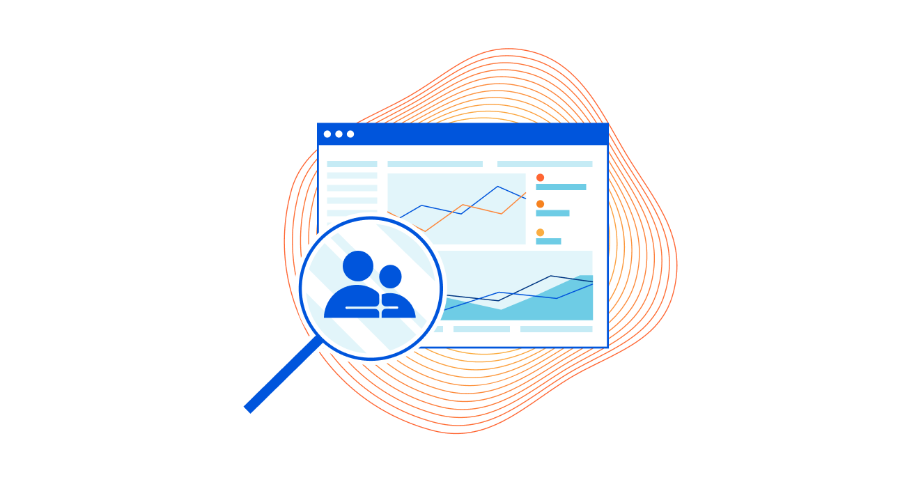
A few months ago, we reached out to our customers to answer a simple question: what do you consider to be part of WAF? We employed a range of user research methods including card sorting, tree testing, design evaluation, and surveys to help with this. The results of this research illustrated how our customers think about WAF, what it means to them, and how it supports their use cases. This inspired the product team to expand scope and contemplate what (Web Application) Security means, beyond merely the WAF.

Based on what hundreds of customers told us, our user research and product design teams collaborated with product management to rethink the security experience. We examined our assumptions and assessed the effectiveness of design concepts to create a structure (or information architecture) that reflected our customers’ mental models.

This new structure consolidates firewall rules, managed rules, and rate limiting rules to become a part of WAF. The new WAF strives to be the one-stop shop for web application security as it pertains to differentiating malicious from clean traffic.

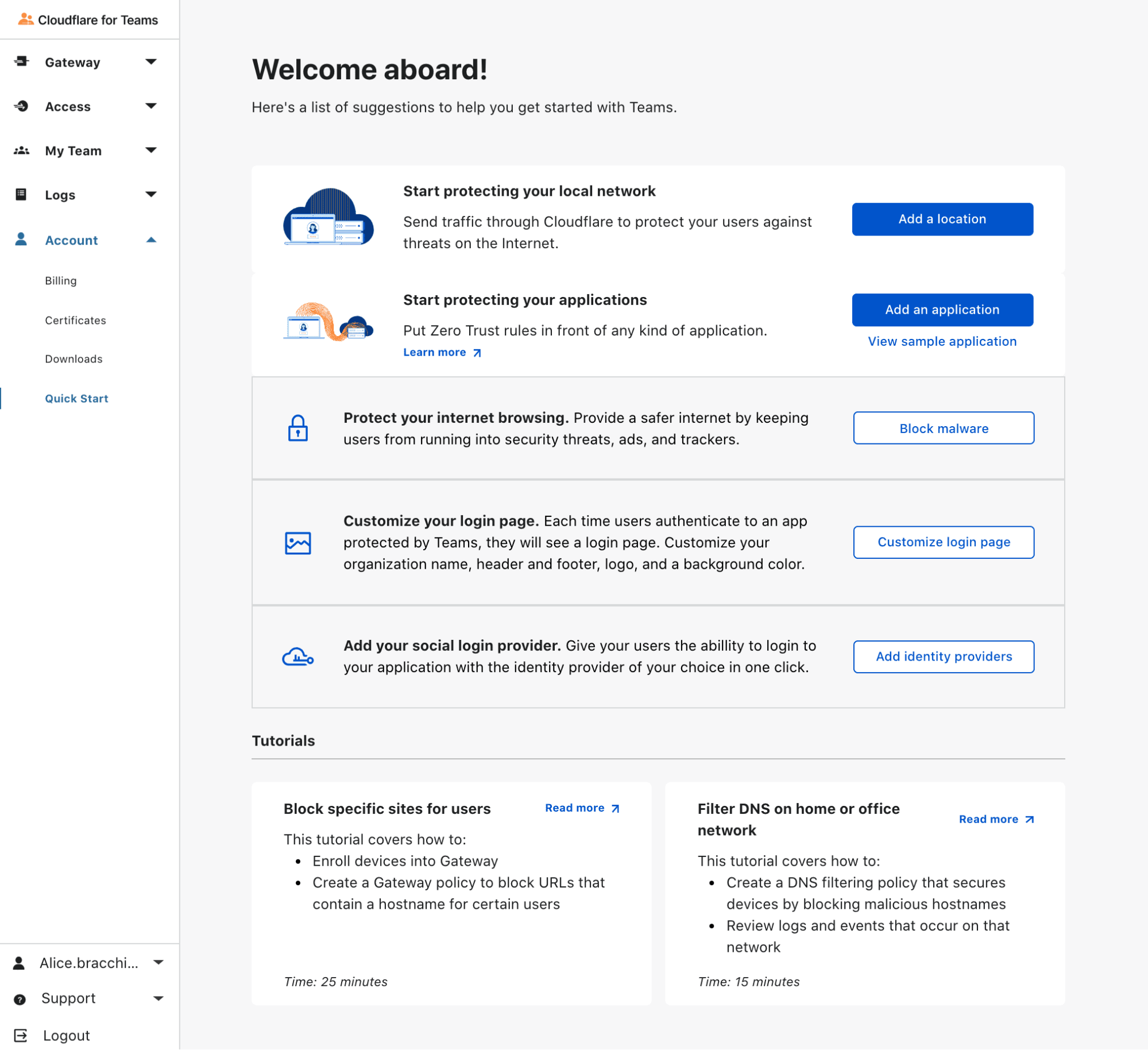
As of today, you will see the following changes to our navigation:

  1. Firewall is being renamed to Security.
  2. Under Security, you will now find WAF.
  3. Firewall rules, managed rules, and rate limiting rules will now appear under WAF.

From now on, when we refer to WAF, we will be referring to above three features.

Further, some important updates are coming for these features. Advanced rate limiting rules will be launched as part of Security Week, and every customer will also get a free set of managed rules to protect all traffic from high profile vulnerabilities. And finally, in the next few months, firewall rules will move to the Ruleset Engine, adding more powerful capabilities thanks to the new Ruleset API. Feeling excited?

How customers shaped the future of WAF

Almost 500 customers participated in this user research study that helped us learn about needs and context of use. We employed four research methods, all of which were conducted in an unmoderated manner; this meant people around the world could participate remotely at a time and place of their choosing.

  • Card sorting involved participants grouping navigational elements into categories that made sense to them.
  • Tree testing assessed how well or poorly a proposed navigational structure performed for our target audience.
  • Design evaluation involved a task-based approach to measure effectiveness and utility of design concepts.
  • Survey questions helped us dive deeper into results, as well as painting a picture of our participants.

Results of this four-pronged study informed changes to both WAF and Security that are detailed below.

The new WAF experience

The final result reveals the WAF as part of a broader Security category, which also includes Bots, DDoS, API Shield and Page Shield. This destination enables you to create your rules (a.k.a. firewall rules), deploy Cloudflare managed rules, set rate limit conditions, and includes handy tools to protect your web applications.

All customers across all plans will now see the WAF products organized as below:

A new WAF experience
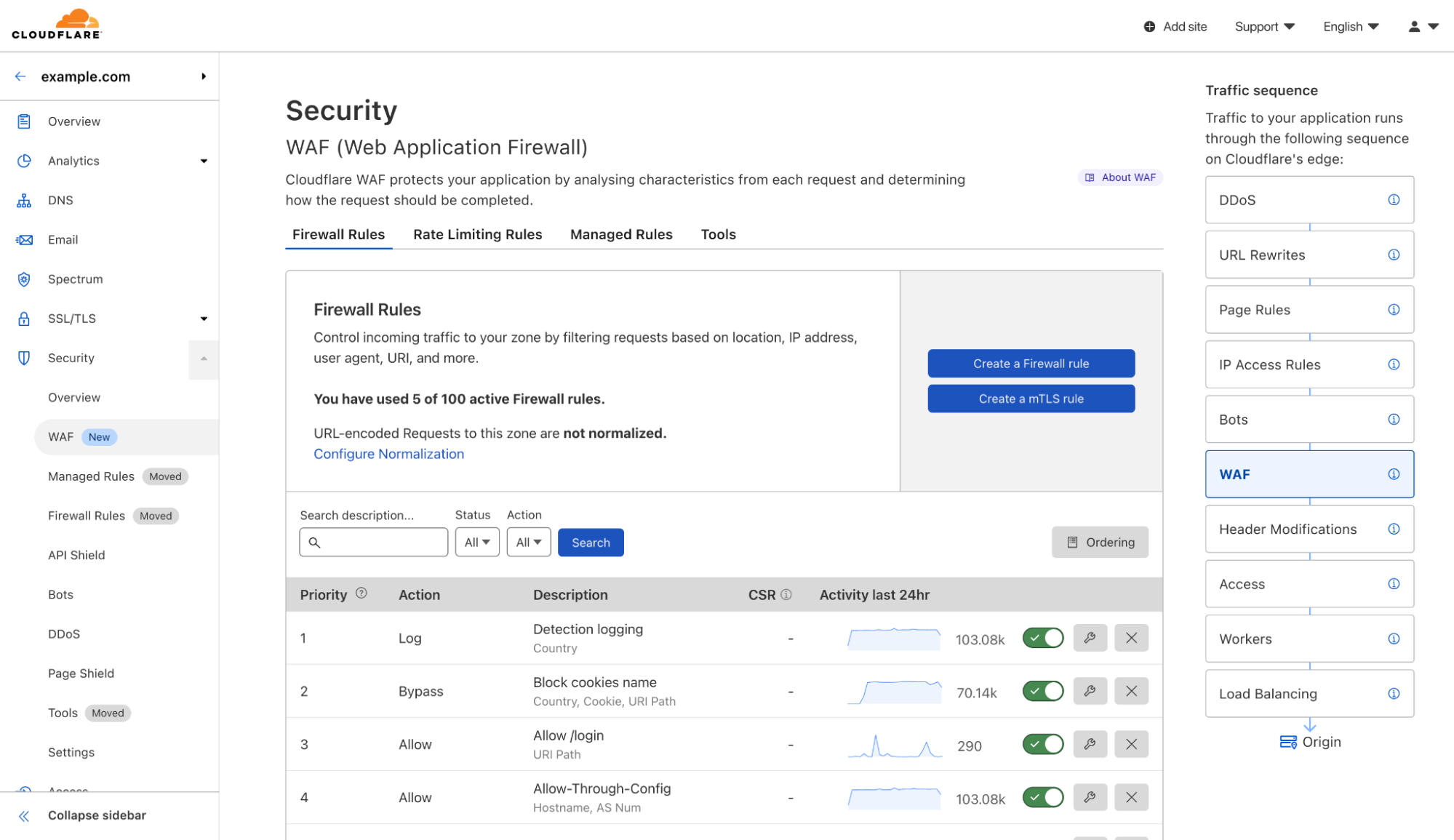
  1. Firewall rules allow you to create custom, user-defined logic by blocking or allowing traffic that leverages all the components of the HTTP requests and dynamic fields computed by Cloudflare, such as Bot score.
  2. Rate limiting rules include the traditional IP-based product we launched back in 2018 and the newer Advanced Rate Limiting for ENT customers on the Advanced plan (coming soon).
  3. Managed rules allows customers to deploy sets of rules managed by the Cloudflare analyst team. These rulesets include a “Cloudflare Free Managed Ruleset” currently being rolled out for all plans including FREE, as well as Cloudflare Managed, OWASP implementation, and Exposed Credentials Check for all paying plans.
  4. Tools give access to IP Access Rules, Zone Lockdown and User Agent Blocking. Although still actively supported, these products cover specific use cases that can be covered using firewall rules. However, they remain a part of the WAF toolbox for convenience.

Redesigning the WAF experience

Gestalt design principles suggest that “elements which are close in proximity to each other are perceived to share similar functionality or traits.” This principle in addition to the input from our customers informed our design decisions.

After reviewing the responses of the study, we understood the importance of making it easy to find the security products in the Dashboard, and the need to make it clear how particular products were related to or worked together with each other.

Crucially, the page needed to:

  • Display each type of rule we support, i.e. firewall rules, rate limiting rules and managed rules
  • Show the usage amount of each type
  • Give the customer the ability to add a new rule and manage existing rules
  • Allow the customer to reprioritise rules using the existing drag and drop behavior
  • Be flexible enough to accommodate future additions and consolidations of WAF features

We iterated on multiple options, including predominantly vertical page layouts, table based page layouts, and even accordion based page layouts. Each of these options, however, would force us to replicate buttons of similar functionality on the page. With the risk of causing additional confusion, we abandoned these options in favor of a horizontal, tabbed page layout.

How can I get it?

As of today, we are launching this new design of WAF to everyone! In the meantime, we are updating documentation to walk you through how to maximize the power of Cloudflare WAF.

Looking forward

This is a starting point of our journey to make Cloudflare WAF not only powerful but also easy to adapt to your needs. We are evaluating approaches to empower your decision-making process when protecting your web applications. Among growing intel information and more rules creation possibilities, we want to shorten your path from a possible threat detection (such as by security overview) to setting up the right rule to mitigate such threat. Stay tuned!

The Teams Dashboard: Behind the Scenes

Post Syndicated from Abe Carryl original https://blog.cloudflare.com/the-teams-dashboard-behind-the-scenes/

The Teams Dashboard: Behind the Scenes

The Teams Dashboard: Behind the Scenes

Back in 2010, Cloudflare was introduced at TechCrunch Disrupt as a security and performance solution that took the tools of the biggest service providers and made them available to anyone online. But simply replicating these tools wasn’t enough — we needed to make them ridiculously easy to use.

When we launched Cloudflare for Teams almost ten years later, the vision was very much the same — build a secure and powerful Zero Trust solution that is ridiculously easy to use. However, while we talk about what we’re building with a regular cadence, we often gloss over how we are designing Cloudflare for Teams to make it simple and easy to use.

In this blog post we’ll do just that — if that sounds like your jam, keep scrolling.

Building a house

First, let’s back up a bit and introduce Cloudflare for Teams.

We launched Cloudflare for Teams in January, 2020. With Teams, we wanted to alleviate the burden Cloudflare customers were feeling when trying to protect themselves and their infrastructure from threats online. We knew that continuing to rely on expensive hardware would be difficult to maintain and impractical to scale.

At its core, Teams joins two products together — Access and Gateway. On the one hand, Access acts as a bouncer at the door of all your applications, checking the identity of everyone who wants in. It’s a Zero Trust solution that secures inbound connections. On the other hand, Gateway is a Secure Web Gateway solution that acts as your organization’s bodyguard — it secures your users as they set out to navigate the Internet.

Over the past year, we’ve been rapidly shipping features to help our customers face the new and daunting challenges 2020 brought around. However, that velocity often took a toll on the intentionality of how we design the Teams Dashboard, and resulted in a myriad of unintended consequences. This is often referred to as a “Feature Shop” dilemma, where Product and Design only think about what they’re building and become too resource-constrained to consider why they’re building it.

In an interface, this pattern often manifests itself through siloed functionality and fractured experiences. And admittedly, when we first began building the Teams Dashboard, many of our experiences felt this way. Users were able to take singular features from inception to fruition, but were limited in their ability to thread these experiences together in a seamless fashion across the Dashboard.

The duplex problem

Here’s an example. In the early days of Cloudflare for Teams, we wanted to provide users with a single pane of glass to manage their security policies. In order to do so, users would need to onboard to both Access and Gateway. Only one problem, we didn’t have an onboarding pathway for Cloudflare Access. The obvious question became “What do we need?”. Inherently, the answer was an onboarding flow for Cloudflare Access.

Just like that, we were off to the races.

In retrospect, what we should have been asking instead was “Why do users need onboarding flow?” By focusing on what, we polluted our own ability to build the right solution for this problem. Instead of providing a seamless entryway to our dashboard, we created a fork-in-the-road decision point and siloed our customers into two separate paths that did not make it easy for them to approach our dashboard.

From an experiential perspective, we later equated this to inviting our users to a party. We give them an address, but when they show up at the doorstep, they realize the house is actually a duplex. Which doorbell are they supposed to ring? Where’s the party? What will they find if they walk into the wrong unit?

The Teams Dashboard: Behind the Scenes

Leading with Design

That’s where Design fits in. Our design team is hyper-obsessed with asking why. Why are we throwing a party? Why should anyone come? Why should they stay? By challenging our team to lead with design, we take a questioning attitude to each of the features we contemplate building. With this approach, we do not assume a feature is valuable, intuitive, or even required. We assume nothing.

During our “Feature Shop” days, we had a bad habit of providing “bad mockups” or outlining a solution for Design to prototype. This is often referred to as “solution pollution”. For example, if I tell you I need a fast car, you’re probably going to start designing a car. However, if instead I tell you I need to get from point A to point B as quick as possible, you may end up designing a bike, scooter, car, or something entirely new and novel. Design thrives in this balance.

Now, we begin at the beginning and gather contextual data which drove us toward a given feature hypothesis. Together, Product and Design then research the problem alongside the users it may impact. More importantly, once the problem space has been validated, we partner on the solution itself.

With this new approach in mind, we revisited our onboarding experience, and this time, the solution we arrived at was quite different from our initial prototypes. Instead of creating two divergent pathways we now proposed a single Cloudflare for Teams onboarding flow. This solved the duplex problem.

The Teams Dashboard: Behind the Scenes

This flow prioritized two key elements; preparing users for success and emphasizing time-to-value. During initial research, Design was able to identify that users often felt overwhelmed and underprepared for the configuration required during an early onboarding. Additionally, due to this sentiment, users failed to reach an initial “Aha!” moment until much later than anticipated in their user journey. To address these concerns, we truncated the onboarding process to just three simple steps:

  • Welcome to Teams
  • Create a Team Name
  • Pick a Plan

As simple as that. Then, we created a Quick Start guide which users land on after onboarding. Let’s call this our inboarding flow. Next, we created a variety of “Starter Packs” within the guide which automate much the laborious configuration for users so they can start realizing value from Cloudflare for Teams almost instantly:

The Teams Dashboard: Behind the Scenes

What’s next

Moving forward, we will continue to expand on the Quick Start guide adding more robust starter packs and enhancing the opportunities for continuous learning. We’re also looking to incorporate intelligent recommendations based on your environment. We’ll also be releasing other improvements this quarter which apply the same underlying concepts found in our Quick Start guide to other areas of the UI such as our Empty States and Overview pages.

Perhaps most importantly, by leading with Design we’re able to foster healthy debate early and often for the products and features we consider releasing within the UI. These relationships drive us to map risks to controls and force us to build with care and intentionality. After all, we all have the same mission: to help build a better Internet.

If you’re interested in learning more about the Cloudflare for Teams design lifecycle, stay tuned. We have three upcoming blog releases which will walk you through our product content strategy, our design vision, and an exciting new feature release where you can see this partnership in action.