GZDoom is the fanciest way to play Doom. Unfortunately, it has also historically been difficult to recommend to newcomers, because its default settings are… questionable.
Conspicuously, for over a decade, it defaulted to traditional Doom movement keys (no WASD) and no mouselook. I am overjoyed to discover that this is no longer the case, and it plays like a god damn FPS out of the box, but there are still a few twiddles that need twiddling. Mostly the texture filtering. Christ, the texture filtering.
Anyway GZDoom has a lot of options, so here is a handy list of the important ones. There are fewer than I expected, which is good.
Note that the routes given to the various settings are for the full options menu. Out of the box, GZDoom shows a reduced options menu, because it has a lot of options. You can get to the full menu from Full options menu near the bottom, and from there turn off the simple menu (if you want). If you get lost, you can also use the option search.
Also, virtually every setting in GZDoom takes effect instantly, even while the menu is still visible. (That’s why there are no screenshots here! Just try stuff out yourself.) It remembers where your cursor was, too, so you can exit the menu to try stuff out, then bring it back up and mash Enter a few times to get back to where you were.
By default, GZDoom uses linear upscaling on all sprites and textures, turning them into a blurry mess. This is objectively ludicrous, since the sprites and textures are pixel art.
None restores the crispy aesthetic that God intended — and when I say God, I of course mean John Carmack. No, wait, maybe I mean Adrian Carmack?
The “linear mipmap” bit means that GZDoom will still use linear downscaling, so that distant textures still somewhat resemble the actual texture and do not simply collapse into a pixel of arbitrary color. If you find this objectionable, you may of course simply set it to None.
GZDoom defaults to rendering spectres (the harder-to-see variants of the pink demons) with a sort of translucent effect, which is easier to see, which sort of defeats the purpose of making them harder to see.
This will emulate the appearance of the original game, scaled up to big chunky pixels. I actually prefer Smooth fuzz, which fits better at high resolutions and still looks like a rendering error, but pretty much anything is better than the Shadow default.
For testing purposes, it may help to pop open the console with the backtick key (top left) and type summon spectre to… well, summon a spectre.
And if all you want is something that looks kinda like Doom, you’re done! Feel free to stop reading here.
I just feel better with a little symbol in the middle of the screen. I’m holding all my guns at chest height, for some reason, so the sights on those are useless.
By default the crosshair is humongous, though, hence the scaling.
Speaking of which, fix the HUD scale.
HUD options > Scaling options > User interface scale: 3
The automatic setting is okay (and better than it used to be), but still leaves some things like pickup messages and the console as microscopic. I play in a 1080p window on a 1440p monitor, and this seems nice for me. Adjust as desired.
Use the alternative HUD.
HUD options > Alternative HUD > Enable alternative HUD: On
You’ll need to press + until the status bar disappears to actually see it.
The alternative HUD shows you everything you need to know about the state of the game, while consuming minimal space and still letting you see the weapon sprites in their full glory. It also shows you a count of kills and secrets, so you have some idea of the progress you’ve made. And it tells you a few things that you had to keep track of yourself in vanilla Doom, like what color of armor you have and whether you have the berserk fist.
(This replaces a stock fullscreen-with-info HUD that didn’t exist in vanilla Doom, but which only shows you health, armor, keys, and ammo for your current weapon. Note that if you play a WAD that heavily alters the game, there’s a chance it will add custom stuff to the stock HUD, and that stuff will not appear on the alternative HUD. It’s explicitly not moddable.)
Doom has static lighting that affects the walls and floor equally, so the transition from wall to floor/ceiling is pretty flat. A little AO helps that stand out, even if ambient occlusion is a fake idea.
Fix fake contrast.
Display options > Use fake contrast: Smooth
“Fake contrast” refers to a clever trick in the Doom engine wherein horizontal (as seen on the automap) walls draw darker than the room, and vertical walls draw lighter. In rectangular rooms, this helps avoid the “flat” feeling mentioned previously.
Unfortunately, with complex geometry — as you see frequently in modern maps, but also occasionally in the original ones — this can backfire. I’ve been fooled into thinking one particular wall in a curved hallway is a secret, just because it happened to be vertical and appeared lighter than its neighbors. Meanwhile, rooms at a slant don’t benefit at all.
Smooth preserves the effect, but gradually transitions between the original effect for orthogonal walls and normal lighting for walls at a 45° angle. (That is, a wall at a 22.5° angle will have half the fake contrast effect.)
The default particles are linear filtered, which looks awful, but I don’t think anything uses particles by default so you’d never notice. You can also set them to Square, but I think having a single pixel floating in the air looks a bit silly.
Adding particles to blood splatters and bullet puffs just looks nice. I replace the rocket trails entirely because the original Doom rocket cloud is just kinda big and clumsy and ugly.
Enable dynamic lighting.
This is on by default… sort of. GZDoom needs to be able to find the lights.pk3 and brightmaps.pk3 files bundled with it, but if it runs at all, it probably knows where they are.
So all you have to do is check Load lights and Load brightmaps in the little dialog you get when launching the game.
Probably. See, for some reason, those checkboxes are only there on Windows — in fact, I didn’t know they existed at all until two minutes ago. Even though they set a config setting, they aren’t accessible via the options menu. So if that doesn’t work for you for whatever reason, try popping open the console and doing:
autoloadlights true

autoloadbrightmaps true
Then restart the game. Glowing objects should now cast (fairly subtle!) light on nearby walls. You can see this immediately in Doom II’s first map — there should be a green glow on the floor underneath the armor bonus in the far right corner of the room. Or for a more dramatic demonstration, IDKFA and fire a rocket.
It’s just a nice touch. And unlike many attempts to add dynamic lighting to Doom, it’s not so over-the-top as to be distracting.
At the other end of the scale, there are those who want an experience as close as possible to vanilla Doom. Those people might just want to use a port closer to vanilla, like a PRBoom variant or even Chocolate Doom, but GZDoom is willing to do its best:
Quantize light levels.
Display options > Hardware renderer > Banded SW lightmode: On
Doom maps support light levels from 0 to 255, but in practice, Doom only understood… 16, I think? That’s because it was a paletted game, and it needed a colormap telling it how to darken each color while still sticking to the palette. The game only shipped with 15 such mappings, probably because 255 of them would have been ludicrous, and thus there are only 16 light levels in practice.
GZDoom’s hardware renderer isn’t bound by a palette, so it happily supports all 256 light levels. If you can’t stand this, well, it can simulate 16 for you.
Disable the hardware renderer altogether.
Set video mode > Render mode: True color SW renderer
If the very notion of accelerated rendering offends you, the original core of Doom’s renderer is still in there, just waiting for you. All you need do is turn it on. Note that this will severely restrict your ability to mouselook and will draw without vertical perspective, as the Doom renderer was designed around drawing vertical lines.
What’s that? Even true color is too much? You need the paletted glory that was the best a 386 could do? Well, Doom software renderer is also an option.
Disable mouselook.
Mouse options > Always mouselook: Off
Doom didn’t support looking up and down. Why should you?
Despite the name, this still allows you to look around horizontally. I guess technically that’s turning, not looking. Also, moving the mouse up and down will now move you (slowly) forwards or backwards.
Disable WASD.
Customize controls > Preferred keyboard layout: Classic ZDoom, then Reset to defaults
Okay now you have gone too far. This restores the very keyboard bindings I wanted to rally against — arrow keys to move, turning by default, Alt to strafe…
Disable teleporter zoom.
Display options > Teleporter zoom: Off
GZDoom does a brief zoom-in effect on your field of view after (non-silent) teleporting. Looks sick. If you hate it, here’s how to turn it off.
Restore the vanilla lite-amp goggles.
Display options > Hardware renderer > Enhanced night vision mode: Off
In vanilla Doom, the lite-amp goggles simply make the entire world render as fullbright, which looks fucking terrible. GZDoom defaults to a “night vision goggles” sort of effect that also highlights objects, but if you really can’t stand that, this twiddle is here for you.
Enable randomized pitch on sound effects.
Sound options > Randomize pitches: On
For the very ornery, I believe this behavior was in the original release of Doom but (accidentally?) broken in Doom 1.2 and all later versions. It’s really weird, but it’s the intended behavior, I guess!
Restore Doom’s automap colors.
Automap options > Map color set: Traditional Doom
This will change the automap back to its red-and-yellow-on-black glory.
It will also remove the colors that tell you where locked doors and the exit are. You might argue that those are cheating. I argue that they are the entire point of a map.
You can also turn off the automap’s monster and secret counts here if you truly wish to be as lost as possible.
Twiddle with compatibility settings.
Compatibility options > Compatibility mode: ?
You might want Doom (strict) for the closest vanilla experience that GZDoom can provide. Might. The most notable effects are:
Monsters will wake up when seeing a player with a blur sphere. By default, they usually won’t, a behavior inherited from Hexen.
Arch-viles can resurrect crushed corpses as “ghosts” that cannot be shot, only harmed by splash damage from rockets.
Pain elementals will be unable to spawn new lost souls if there are at least 21 already present in the level.
Monsters can’t be knocked off of high ledges.
You will be unable to crowdsurf, meaning you will be blocked both by imps at the foot of a cliff below you, and by cacodemons flying above you.
You can also toggle these on or off individually at your leisure.
Welcome to part 1 of this narrative series about writing a complete video game from scratch, using the PICO-8. This is actually the second part, because in this house (unlike Lua) we index from 0, so if you’re new here you may want to consult the introductory stuff and table of contents in part zero.
If you’ve been following along, welcome back, and let’s dive right in!
So far, I have… this. Which is something, and certainly much more than nothing, but all told not a lot.
Most conspicuously, this is going to be a platformer, so I need gravity. The problem with gravity is that it means things are always moving downwards, and if there’s nothing to stop them, they will continue off indefinitely into the void.
What I am trying to say here is that I feel the looming spectre of collision detection hanging over me. I’m going to need it, and I’m going to need it real soon.
And, hey, that sucks. Collision detection is a real big pain in the ass to write, so needing it this early is a hell of a big spike in the learning curve. Luckily for you, someone else has already written it: me!
Before I can get to that, though, I need to add some structure to the code I have so far. Everything I’ve written is designed to work for Star Anise and only Star Anise. That’s perfectly fine when he’s the only thing in the game, but I don’t expect he’ll stay alone for long! Collision detection in particular is a pretty major component of a platformer, so I definitely want to be able to reuse it for other things in the game. Also, collision detection is a big fucking hairy mess, so I definitely want to be able to shove it in a corner somewhere I’ll never have to look at it again.
A good start would be to build towards having a corner to shove it into.
As of where I left off last time, my special _update() and _draw() functions are mostly full of code for updating and drawing Star Anise. That doesn’t really sit right with me; as the main entry points, they should be about updating and drawing the game itself. Star Anise is part of the game, but he isn’t the whole game. All that code that’s specific to him should be put off in a little box somewhere. Cats love to be in little boxes, you see.
This raises the question of how I want to structure this project in general. And, I note: structuring a software project is hard, and you only really get a good sense of how to do it from experience. I’m still not sure I have a good sense of how to do it. Hell, I’m not convinced anyone has a good sense of how to do it.
Thankfully, this is a game, so it’s pretty obvious how to break it into pieces. (The tradeoff is that everything in a game ends up entangled with everything else no matter how you structure it, alas.) Star Anise is a separate thing in the game, so he might as well be a separate thing in the code. Later on I’ll need some more abstract structuring, but as an extremely rough guideline: if I can give it a name, it’s a good candidate to be made into a thing.
But what, exactly, is a thing in code? Most commonly (but not always), a thing is implemented with what’s called an object — a little bundle of data (what it is) with code (what it can do). I already have both of these parts for Star Anise: he has data like his position and which way he’s facing, and he has code for doing things like updating or drawing himself. A great first step would be to extract that stuff into an object, after which some other structure might reveal itself.
I do need to do one thing before I can turn get to that, though. You see, Lua is one of the few languages in common use today that doesn’t quite have built-in support for objects. Instead, it has all the building blocks you need to craft your own system for making objects. On the one hand, the way it does that is very slick and clever. On the other hand, it means you can’t write much Lua without cobbling together some arcane nonsense first, and also no one’s code quite works the same way.
Which brings me to the following magnificent monstrosity:
functionnop(...)return...end---------------------------------- simple object typelocalobj={init=nop}obj.__index=objfunctionobj:__call(...)localo=setmetatable({},self)returno,o:init(...)end-- subclassingfunctionobj:extend(proto)proto=protoor{}-- copy meta values, since lua doesn't walk the prototype chain to find themfork,vinpairs(self)doifsub(k,1,2)=="__"thenproto[k]=vendendproto.__index=protoproto.__super=selfreturnsetmetatable(proto,self)end
How does this work? What does this mean? What is a prototype chain, anyway? Dearest reader: it extremely does not matter. No one cares. I would have to stare at this for ten minutes to even begin to explain it. Every line is oozing with subtlety. To be honest, even though I describe this series as “from scratch”, this is one of the very few things that I copy/pasted wholesale from an earlier game. I know this does the bare minimum I need and I absolutely do not want to waste time reinventing it incorrectly. To drive that point home: I wrote collision detection from scratch, but I copy/pasted this. (But if you really want to know, I’ll explain it in an appendix.)
Feel free to copy/paste mine, if you like. You can also find a number of tiny Lua object systems floating around online, but with tokens at a premium, I wanted something microscopic. This basically does constructors, inheritance, and nothing else.
(Oh, I don’t think I mentioned, but the -- prefix indicates a Lua comment. Comments are ignored by the computer and tend to contain notes that are helpful for humans to follow. They don’t count against the PICO-8 token limit, but they do count against the total size limit, alas.)
The upshot is that I can now write stuff like this:
This creates a… well, terminology is tricky, but I’ll call it a type while doing air-quotes and glancing behind me to see if any Haskell programmers are listening. (It’s not much like the notion of a type in many other languages, but it’s the closest I’m going to get.) Now I can combine an x- and y-coordinate together as a single object, a single thing, without having to juggle them separately. I’m calling that kind of thing a vec, short for vector, the name mathematicians give to a set of coordinates. (More or less. That’s not quite right, but don’t worry about it yet.)
After the above incantation, I can create avec by calling it like a function. Note that the arguments ultimately arrive in vec:init, loosely called a constructor, which stores them in self.x and self.y — where self is the vec being created.
1
2
3
-- this is example code, not part of the gamelocala=vec(1,2)print("x = ",a.x," y = ",a.y)-- x = 1 y = 2
That iadd thing is a method, a special function that I can call on a vec. It’s like every vec carries around its own little bag of functions anywhere it appears — and since they’re specific to vec, I don’t have to worry about reusing names. (In fact, reusing names can be very helpful, as we’ll see later!)
The name iadd is (very!) short for “in-place add”, suggesting that the first vector adds the second vector to itself rather than creating a new third vector. That’s something I expect to be doing a lot, and making a method for it saves me some precious tokens.
1
2
3
4
5
-- example codelocalv=vec(1,2)localw=vec(3,4)v:iadd(w)print("x = ",v.x," y = ",v.y)-- x = 4 y = 6
Finally, those funny __add and __sub methods are special to Lua (if enchanted correctly, which is part of what the obj gobbledygook does) — they let me use + and - on my vecs just like they were numbers.
1
2
3
4
5
-- example codelocalq=vec(1,2)localr=vec(3,4)locals=q+rprint("x = ",s.x," y = ",s.y)-- x = 4 y = 6
This is the core idea of objects. A vec has some data — x and y — and some code — for adding another vec to itself. If I later discover some new thing I want a vec to be able to do, I can add another method here, and it’ll be available on every vec throughout my game. I can repeat myself a little bit less, and I can keep these related ideas together, separate from everything else.
Get the basic jist? I hope so, because I’ve really gotta get a move on here.
What a mouthful! But for the most part, this is the same code as before, just rearranged. For example, the new anise:draw() method has basically been cut and pasted from my old _draw() — all except the cls() call, since that has nothing to do with drawing Star Anise.
I’ve combined the px and py variables into a single vector, pos (short for “position”), which I now have to refer to as self.pos — that’s so PICO-8 knows whose pos I’m talking about. After all, it’s theoretically possible for me to create more than one Star Anise now. I won’t, but PICO-8 doesn’t know that!
A Star Anise object is created and assigned to player when the game starts, and then _update() calls player:update() and _draw() calls player:draw() to get the same effects as before.
I did make one moderately dramatic change in this code. The wordy code I had for reading buttons has become much more compact and inscrutable, and the moving variable is gone. A big part of the reason for this is that I consider Star Anise’s movement to be part of himself, but reading input to be part of the game, so I wanted to split them up. That means moving is a bit awkward, since I previously updated it as part of reading input. Instead, I’ve turned Star Anise’s movement into another vector, which I set in _update() using this mouthful:
1
2
3
4
5
6
7
8
9
-- top-levelfunctionb2n(b)returnband1or0end-- in _update()player.move=vec(b2n(btn(➡️))-b2n(btn(⬅️)),b2n(btn(⬇️))-b2n(btn(⬆️)))
The b2n() function turns a button into a number, and I only use it here. It turns true into 1 and false into 0. Think of it as measuring “how much” the button is held down, from 0 to 1, except of course there can’t be any answer in the middle.
Unpacking that a bit further, b2n(btn(➡️)) - b2n(btn(⬅️)) means “how much we’re holding right, minus how much we’re holding left”. If the player is only holding the right button, that’s 1 – 0 = 1. If they’re only holding the left button, that’s 0 – 1 = -1. If they’re holding both or neither, that’s 0. The results are the same as before, but the code is smaller.
Once Star Anise’s move is set, the rest works similarly to before: I update left based on horizontal movement (but leave it alone when there isn’t anyway), I alter his position (now using :iadd()), and I use the walk animation when he’s moving at all. And that’s it!
I like to use the term “actor” to refer to a distinct thing in the game world; it conjures a charming and concrete image of various characters performing on a stage. I think I picked it up from the Doom source code. “Entity” is more common and is used heavily in Unity, but can be confused with an “entity–component–system” setup, which Unity also supports. And then there are heretics who refer to game things as “objects” even though that’s also a programming term.
This code is a fine start, but it’s not quite what I want. There’s nothing here actually called an actor, for starters. My setup still only works for Star Anise!
I’d better fix that. The notion of an “actor” is pretty vague, so a generic actor won’t do much by itself, but it’s nice to define one as a template for how I expect real actors to work.
How does a blank actor update or draw itself? By doing nothing.
(I do assume that every actor has a position; this may not necessarily be the case in games with very broad ideas about what an “actor” is, but it’s reasonable enough for my purposes.)
Now, to link this with Star Anise, I’ll have aniseinherit from actor. That means he’ll become a specialized kind of actor, and in particular, all the methods on actor will also appear on anise. You may notice that anise was previously a specialized kind of obj (like actor and vec) — in fact, the only reason I can call vec(x, y) like a function is that it inherits some magic stuff from obj. Surprise!
1
localanise=actor:extend{
I can now delete anise:init(), since it’s identical to actor:init(). I still have anise:update() and anise:draw(), which override the methods on actor, so those don’t need changing.
Everything still only works for Star Anise, but I’m getting closer! I only need one more change. Instead of having only player, I will make a list of actors.
-- at the toplocalactors={}function_init()player=anise(vec(64,64))add(actors,player)endfunction_update()-- ...mostly same as before...foractorinall(actors)doactor:update()endendfunction_draw()cls()foractorinall(actors)doactor:draw()endend
This does pretty much what it reads like. The add() function, specific to PICO-8, adds an item to the end of a list. The all() function, also specific to PICO-8, helps go through a list. And the for blocks mean, for each thing in this list, run this code.
Now, at last, I have something that could work for actors other than Star Anise. All I need to do is define them and add them to the actors list, and they’ll automatically be updated and drawn, just like him!
Admittedly, this hasn’t gotten me anywhere concrete. The game still plays exactly the same as it did when I started. I’m betting that I’ll eventually have more than one actor, though, so I might as well lay the groundwork for that now while it’s easy. It doesn’t take much effort, and I find that if I give myself little early inroads like this, it feels like less of a slog to later come back and expand on the ideas. This is the sort of thing I meant by more structure revealing itself — once I have one actor, a natural next step is to allow for several actors.
I’ve put it off long enough. I can’t avoid it any longer. But it’s complicated enough to deserve its own post, so I don’t quite want to do it yet.
Instead, I’ll write as much code as possible except for the actual collision detection. There’s a bit more work to do to plug it in.
For example: what am I going to collide with? The only thing in the universe, currently, is Star Anise himself. It would be nice to have, say, some ground. And that’s a great excuse to toodle around a bit in the sprite editor.
I went through several iterations before landing on this. Star Anise lives on a moon, so that was my guiding principle. The moon is gray and dusty and pitted, so at first I tried drawing a tile with tiny craters in it. Unfortunately, that was a busy mess to look at when tiled, and I didn’t think I’d have enough tile space for having different variants of tiles. I’m already using 9 tiles here just to have neat edges.
And so I landed on this simple pattern with just enough texture to be reminiscent of something, which is all you really need with low-res sprite art. It worked out well enough to survive, nearly unchanged, all the way to the final game. It was inspired by a vague memory of Starbound’s moondust tiles, which I was pretty sure had diagonal striping, though I didn’t actually look at them to be sure.
You may notice I drew these on the second tab of sprites. I want to be able to find tiles quickly when drawing maps, so I thought I’d put “terrain” on a dedicated tab and reserve the first one for Star Anise, other actors, special effects, and other less-common tiles. That turned out to be a good idea.
You may also notice that one of those dots on the middle right is lit up. How mysterious! We’ll get to that next time.
With a few simple tiles drawn, I can sprinkle a couple in the map tab. I know I want Metroid-style discrete screens, so I’m not worried about camera scrolling yet; the top-left corner (16×16 tiles) is enough to play with for now.
I draw two rows of tiles at the bottom of that screen. It’s a little hard to gauge since the toolbar and status bar get in the way, but the bottom row of the screen will be at y = 15. You can also hold Spacebar to get a grid, with squares indicating every half-screen.
Finally, to make this appear in the game, I need only ask PICO-8 to draw the map before I draw actors on top of it.
The PICO-8 map() function takes (at least) six arguments: the top-left corner of the map to start drawing from, measured in tiles; the top-left corner on the screen to draw to, measured in pixels; and the width/height of the rectangle to draw from the map, measured in tiles. This will draw a 32×32 block of tiles from the top-left corner of the map to the top-left corner of the screen.
Of course, with no collision detection, those tiles are nothing more than background pixels, and the game treats them as such.
I’m not going into collision detection yet, but I can give you a taste, to give you an idea of the goals.
The core of it comes down to this line, from the end of anise:update().
1
self.pos:iadd(self.move)
That moves Star Anise by one pixel in each direction the player is holding. What I want to do is stop him when he hits something solid.
Hm, sounds hard. Let’s think for a moment about a simpler problem: how can I stop him falling through the ground, in the dumbest way possible?
The ground is flat, and it takes up the bottow two rows of tiles. That means its top edge is 14 tiles, or 112 pixels, below the top of the screen. Thus, Star Anise should not be able to move below that line.
But wait! Star Anise’s position is a single point at his top left, not even inside his helmet. What I really want is for his feet to not pass below that line, and the bottom of his feet is three tiles (24 pixels) below his position. Thus, his position should not pass below y = 112 – 24 = 88.
This isn’t going to get us very far, of course. He still walks through the air, he can still walk off the screen, and if I change the terrain then the code won’t be right any more. I’m also pretty sure I didn’t actually write this in practice. But hopefully it gives you the teeniest idea of the problem we’re going to solve next time.
Really, really, really quickly, here’s how that obj snippet works.
Lua’s primary data structure is the table. It can be used to make ordered lists of things, as I did above with actors, but it can also be used for arbitrary mappings. I can assign some value to a particular key, then quickly look that key up again later. Kind of like a Rolodex.
1
2
3
4
5
locallunekos={anise="star anise is the best",purrl="purrl is very lovely",}print(lunekos['anise'])
Note that the values (and keys!) don’t have to be strings; they can be anything you like, even other tables. But for string keys, you can do something special:
1
print(lunekos.anise)-- same as above
Everywhere you see a dot (or colon) used in Lua, that’s actually looking up a string in a table.
With me so far? Hope so.
Any Lua table can also be assigned a metatable, which is another table full of various magic stuff that affects the first table’s behavior. Most of the magic stuff takes the form of a special key, starting with two underscores, whose value is a function that will be called in particular circumstances. That function is then called a metamethod. (There’s a whole section on this in the Lua book, and a summary of metamethods on the Lua wiki.)
One common use for metamethods is to make normal Lua operators work on tables. For example, you can make a table that can be called like a function by providing the __call metamethod.
 1
 2
 3
 4
 5
 6
 7
 8
 9
10
11
12
13
localt={stuff=5678,}localmeta={-- this is just a regular table key with a function for its value__call=function(tbl)print("my stuff is",tbl['stuff'])end,}setmetatable(t,meta)t()-- my stuff is 5678t['stuff']="yoinky"t()-- my stuff is yoinky
One especially useful metamethod is __index, which is called when you try to read a key from the table, but the key doesn’t exist.
Instead of a function, __index can also be another (third!) table, in which case the key will be looked up in that table instead. And if that table has a metatable with an __index, Lua will follow that too, and keep on going until it gets an answer.
This is essentially what’s called prototypical inheritance, as seen in JavaScript (and more subtly in Python): an object consists of its own values plus a prototype, and if code tries to fetch something from the object that doesn’t exist, the prototype is checked instead. Since the prototype might have its own prototype, the whole sequence is called the prototype chain.
That’s all you need to know to follow the obj snippet, so here it is again.
functionnop(...)return...endlocalobj={init=nop}obj.__index=objfunctionobj:__call(...)localo=setmetatable({},self)returno,o:init(...)end-- subclassingfunctionobj:extend(proto)proto=protoor{}-- copy meta values, since lua doesn't walk the prototype chain to find themfork,vinpairs(self)doifsub(k,1,2)=="__"thenproto[k]=vendendproto.__index=protoproto.__super=selfreturnsetmetatable(proto,self)end
The idea is that types are used both as metatables and prototypes — they are always their own __index. At first, we have only obj, which looks like this:
Now we use obj:extend{} to create a new type. Follow along and see what happens. Lua only looks for metamethods like __call directly in the metatable and ignores __index, so I copy them into the new prototype. Then I make the prototype its own __index, as with obj, and also remember the “superclass” as __super (though I never end up using it). Finally I set the “superclass” as the prototype’s metatable.
(Oh, by the way: in Lua, if you call a function with only a single table or string literal as its argument, you can leave off the parentheses. So foo{} just means foo({}).)
That produces something like the following, noting that this is not quite real Lua syntax:
Now for the magic part. When I call vec(), Lua checks the metatable. (The __call in the main table does nothing!) The metatable is obj, which does have a __call, so Lua calls that function and inserts vec as the first argument. Then obj.__call creates an empty table, assigns self (which is the first argument, so vec) as the empty table’s metatable, and calls the new table’s init method.
Ah, but the new table is empty, so it doesn’t have an init method. No problem: it has a metatable with an __index, so Lua consults that instead. The metatable’s __index is vec, and vecdoes contain an init, so that’s what gets called. (If there were no vec.init, then Lua would see that vec also has a metatable with an __index, and continued along. That’s why I didn’t need an anise.init.)
That’s also why defining vec:__add works — it puts the __add metamethod into vec, which becomes the metatable for all vector objects, thus automatically making + work on them.
That’s all there is to it. It’s possible to get much more elaborate with this in a number of ways, but this is the bare minimum — and it could still be trimmed down further.
Note that you can’t actually call obj itself. Pop quiz: why not?
Whoops! I meant to write about this when it originally came out, in April, but never quite got around to collecting my thoughts. Here is a very rushed subset of them.
The game is extremely NSFW, but the commentary below is not.
I like the game. It’s essentially a visual novel, but disguised.
I’ve played a decent number of visual novels, and I’ve thought a lot about them and their role as kind-of-games, and I’ve noticed the thorny bits that I don’t like. And my thoughts have circled around the notion of player agency.
Agency is what makes a game feel like a game. You have input, in a broad sense. You can do something to the game, and it will react appropriately (fingers crossed).
This theory explains the awkward position of visual novels. The bulk of the experience is reading a passage, pressing spacebar, and GOTO 10. You don’t have meaningful input; pressing spacebar isn’t a decision, it’s scrolling.
When you do have input, it generally comes in the form of a menu. But this doesn’t feel like you’re making a choice; it feels like one is being extracted from you in the middle of an otherwise passive reading experience. The base form of the game is reading, and that has been interrupted at a predetermined point to demand something of you. You often don’t have enough information to make a meaningful choice, either, so this becomes a game of saving at each branch and performing an exhaustive depth-first search of the story. As time goes on, you end up skipping through more and more of the early parts, and may hit a point where you go down a decision branch not even remembering what form the story took before you got there.
This is a weird experience.
I wanted to try to improve the feeling of a VN without altering the substance, so this one is disguised as an RPG. I mean, not really an RPG, but that brand of top-down “walk around and interact with stuff” framing.
You play as Cerise, and the entire game takes place in her shop. At any given time, zero or more customers are present, and you can either twiddle your thumbs at the counter or talk to one of them. Whatever you do will generally advance time by an hour, which may change the set of customers; some folks left or arrived while you were busy doing something else. And different folks have different reactions to being ignored, so the whole game becomes one large meta scheduling puzzle.
The thing is, this could’ve been done just as well with a menu at the start of each hour, asking who you want to talk to. The gameplay would’ve been functionally identical. But this scheme feels completely different (at least to me) for several reasons:
Instead of choices being “on top of” the prose, the prose is on top of the choices. It feels like the choices you make cause the prose to happen, rather than being forks in the middle of a river you can’t escape. You can wander around the shop as long as you like, taking breathers, and time will not pass until you, the human at the controls, cause something to happen. (You could say the same about a menu in a VN, but there you can’t do anything else either; the entire game is frozen until you interact with this modal dialog.)
You can do other things. Not many, granted, but you can examine every single object in the shop, and they all have different descriptions (even if they look identical). A typical visual novel doesn’t give you the opportunity to go on frivolous tangents, but I think a big part of games is being able to forget about the progression for a minute and fuck around with something that looks interesting. Stop and smell the roses, in this case literally.
A menu spells out all possible options with equal priority. They’re just items in a list, after all. A physical world, on the other hand, can add subtle differences — choices may be more or less obvious, more or less compelling, or be presented in some way that adds to the narrative. For example, while customers tend to show up at arbitrary spots throughout the shop, your girlfriend Lexy will wait for you right behind the counter, suggesting a more personal relationship even if you don’t yet know who she is. Or consider the ubiquitous option of ignoring everyone in the shop and passing time at the counter instead. That would usually be pointless, so it would be obnoxious to list in every single menu, but having it as an option in-world makes it less obvious… which is perfect puzzle fodder. Just saying.
As an added bonus, every character in the game has a “happiness” rating from -3 to 3. If you can help them with their problems, their happiness will increase. The numbers are largely arbitrary, but you do get a final score tally at the end, and that gives some sense of measured accomplishment that’s more nuanced than a mere good/bad ending. You can ignore it altogether and be happy with the story you got, or you can go down the rabbit hole and try to find the unique path through the game that will make everyone happy and get you a perfect score.
These feel like really subtle design decisions that have an equally subtle impact on the experience. I don’t know what impact it had on anyone else, but I really liked the results. I didn’t mind playing through the game a gazillion times while I was developing it, because it’s just nice to play. The story isn’t especially deep, but it has a lot of little lighthearted interactions with a variety of characters, and sometimes different threads impact each other in really subtle ways. Sometimes I ran across an interaction I’d forgotten I’d written! It feels like the kind of story game that you can’t merely grind every ending out of, one that always has a chance to surprise you a little.
I still have other ideas for making narrative games that feel more player-controlled, so fingers crossed that I can pull them off.
This is the first game I’ve put on Steam, a platform I’ve long had mixed feelings about. On the one hand, it’s cool that video games have something like a package repository. On the other hand, that package repository is owned and controlled by a single company that sits back and rakes in billions (30% off of every sale!) from a glorified FTP server, something that Linux distributions do for free. And it’s normalized casual DRM, which I do not enjoy. (If I did it right, then manually running Cherry Kisses while Steam is closed should simply run the game without interacting with Steam at all.)
On the other hand, I can’t deny the impact. The Steam release earned more in its first two weeks than the itch release did in more than a year.
…okay, that isn’t an entirely fair comparison. The itch release also had a free “demo” version that was exactly like the “real” version, only with lower-resolution artwork. Loads of people played that (almost 20k downloads as of now), and in retrospect we may have shot ourselves in the foot a bit by offering a free version. But I do like when people can play my games, and releasing anything only in a paid form feels like extorting people out of their money.
I am not good at business. It mostly feels bad.
Despite that, the game has somehow grossed a bit over $10k in the last eight months (which shrinks to $6k net after the Steam tax, VAT, and refunds). That’s not a windfall, but it’s far more than I ever expected to earn on the back of a month-long jam game, and it all went to paying our 2019 taxes so it’s like nothing ever happened. It certainly makes me optimistic about selling something meatier.
We did update the game somewhat for Steam, a process that ended up consuming almost a month somehow and still didn’t cover everything we wanted. The most obvious in-game things were the addition of character profiles, an image gallery, and an options menu — which is to say, all UI things, which I had to build in LÖVE, by hand, which was an incredible pain in the ass. But it works, somehow.
Of course I also added a bunch of Steam achievements, which were kinda fun to decide upon. It’s a story game, so they’re mostly of the form “encounter this bit of the story”, but that’s fine?
But oh boy, the thing that really took the longest time was linking to Steam at all. You get a DLL/SO, some header files, and some hit-or-miss documentation, and the rest is up to you.
The library is, of course, designed for C++.
I am not using C++. I am using Lua.
This posed something of a problem.
I prefer not to touch C++ with a ten-foot pole, so writing some glue on the C++ side did not sound appetizing. (That would’ve also left me with the difficult problem of compiling that code for platforms I do not own or develop on.) That left me with binding to the Steam API from the Lua side.
After several days of Googling, finding years-old projects that promised to do this, and completely failing to get anywhere at all with them, I resigned myself to writing something from scratch. LÖVE uses LuaJIT, which comes with the excellent FFI library, meaning I could bind to C with nothing more than a header file.
The Steam APIdoes have a C compatibility layer, but it is basically not documented, so I had to do some guesswork to get from the documentation to the parts I actually needed. Also, the core of the Steam API is this hokey async messaging system built out of macros and C++ metaprogramming, so I had to do a clumsier polling thing using disparate parts of the C API instead. I finally discovered that there’s example code in a big honking comment in the headers themselves, except the example code is wrong, so I had to fix that as well. Plus all the obtuse bugs like with padding on different platforms which for some reason is baked into the messages that Steam sends because C programmers don’t know how to actually fucking serialize anything. It was an adventure!!
But after all that, I managed to get achievements working, and also leaderboards. Neat, cool, etc.
The game does leak coroutines indefinitely if it’s run through Steam but can’t connect, though. Sorry.
Man. The Steam website has so many features, and the documentation explains them all in one succinct list, but fuck me if I can actually find any of them. So many things are not linked from obvious places; there have been many times I knew a particular page existed but could not figure out how to get there, and ultimately I started relying on address bar history instead of trying to navigate this website.
And so many features are awkwardly built on top of older features that are actually something completely different. Like we have a “developer” page on Steam, but the only part of it we can really control is a single line of plain text at the top. If you go to the “about” tab, it just shows you that line again! That’s all we can put there! You have to click “visit group page” (why would you do that??) in the sidebar of that page to actually get to something we can control.
In stark contrast to itch, Steam really wants your store page to look like a Steam store page and not like a your-game store page. Your artwork (and there is so much artwork) has to be manually approved by a human, and along the way I discovered some extremely unintuitive rules, like that the library header has to be SFW even though it’s only visible to people who already own the game. Store pages also have a “legal” section, but I couldn’t list open source libraries I used (and their licenses) in that section, because I’m not allowed to have links. Like, at all. They really don’t want you to have links. Games exist independently of the humans that made them in the world of Steam; they are isolated jewels floating in a vast space that is linked directly to gaben’s bank account.
I cannot comprehend how weirdly low-key hostile the whole experience felt. All so they could take a third of my money.
Oh, and there’s no Mac release, because I do not have a Mac on which to sign Mac software and do not wish to pay Apple for the privilege, and Mac software does not run any more if it’s not signed. Sorry. Yes, I fucking know about fucking right-click open, please stop fucking telling me about that, that is not useful for software that is run from someone else’s launcher.
People seem to like it?? I mean, I’ve had a dozen or so people tell me to my face that they had an especially good experience with it, that it was cozy and upbeat and just nice. For a few of them, it apparently helped ease some aversion they’d had to sex, simply by showing it playing out well.
It’s funny that I thought so hard about the general design and how agency worked and all that, but 99% of the feedback has been about the feeling of the prose itself — something that just kinda fell out of my fingers. I guess I’m not surprised — after all, if these players thought as hard about game design as I do, they’d probably be designing games.
As of this writing, there have been 19.5k downloads on itch and 1750 sales on Steam. Of the Steam sales, a hair under 80% of the people who own the game have actually played it, so if I extrapolate wildly, maybe 17,000 people have played it.
But I don’t see anyone talk about it outside of my immediate circles, which feels a bit weird. Maybe? I’m not sure what the “normal” amount of conversation about an admittedly niche game is. I don’t know how things really spread by word of mouth, and I thought this might be an opportunity to gleam some insight about that, but it has not visibly materialized even though the game is being bought by people I don’t personally know.
On the one hand, it’s a sex game, so many folks are less likely to talk about it. (A couple people even specifically asked if Steam has a way to hide what game you’re playing from your friends — and, alas, it does not.) On the other hand, it’s a furry sex game, and furries are traditionally not so tight-lipped.
Maybe there’s not that much to say; the impact it’s had on people I know has been fairly personal, and if it didn’t have that kind of impact then it’s just a cute little story game.
I have no idea. There are so many confounding factors here that I don’t know how to conclude anything.
I guess I’m pleasantly surprised by how many people bought a fairly short game for $7. As it turns out, people will give you money for a thing if you ask for it? That’s nice to know.
Releasing on Steam is such a huge pain in the ass lol.
Sales spiked right at the beginning and then flattened fairly quickly, but it still sells a few copies a week, so it looks like it’ll be a little trickle of income for a while. It’d be cool to get a few medium-sized games on Steam as an extra source of income. I suspect porn games have a bit more staying power, too.
Writing UI by hand sucks ass. I gotta switch to Godot asap.
You may recall that I once had the ambitious idea to write a book on game development, walking the reader through making simple games from scratch in a variety of different environments, starting from simple level editors and culminating in some “real” engine.
That never quite materialized. As it turns out, writing a book is a huge slog, publishers want almost all of the proceeds, and LaTeX is an endless rabbit hole of distractions that probably consumed more time than actually writing. Also, a book about programming with no copy/paste or animations or hyperlinks kind of sucks.
I thus present to you Plan B: a series of blog posts. This is a narrative reconstruction of a small game I made recently, Star Anise Chronicles: Oh No Wheres Twig??. It took me less than two weeks and I kept quite a few snapshots of the game’s progress, so you’ll get to see a somewhat realistic jaunt through the process of creating a small game from very nearly nothing.
And unlike your typical programming tutorial, I can guarantee that this won’t get you as far as a half-assed Mario clone and then abruptly end. The game has original art and sound, a title screen, an ending, cutscenes, dialogue, UI, and more — so this series will necessarily cover how all of that came about. I will tell you why I made particular decisions, mention planned features I cut, show you the tradeoffs I made, and confess when I made life harder for myself. You know, all the stuff you actually go through when doing game development (or, frankly, any kind of software development).
The target audience is (ideally) anyone who knows what a computer is, so hopefully you can follow along no matter what your experience level. Enjoy!
This is part zero, and it’s mostly introductory stuff. Please don’t skip it! I promise there’s some meat in the latter half.
Here’s what you have to look forward to (though it is of course a WIP until the series is done). Occasionally there’ll be a snapshot of the game, but these were made on a whim during development and aren’t particularly meaningful as milestones.
For reference, I started working on the game the morning of April 29, and I released it the night of May 10, for a total of twelve days.
Part 0 (you are here): introduction, tour of PICO-8, putting something on the screen, moving around, measuring time, simple sprite animation
This is not a tutorial. Please set your expectations accordingly. Honestly, I don’t even like tutorials — too many of them are framed as something that will teach you a skill, but then only tell you what buttons to press to recreate what the author already made, with no insight as to why they made their decisions or even why they pressed those particular buttons. They often leave you hanging, with no clear next steps, no explanation of what to adjust to get different results.
I’ve never seen a platformer tutorial that actually produced a finished game. Most of them give you just enough to have a stock sprite (poorly) jump around on the screen, perhaps collect some coins, and that’s it. How do you fix the controls, add cutscenes, even make a damn title screen? That’s all left up to you.
This is something much better than a tutorial: a story. I made a video game — a real, complete video game — and I will tell you everything I can remember doing and thinking along the way. Every careful decision, every rushed tradeoff, every boneheaded mistake, every weird diversion. I don’t guarantee that anything I did is necessarily a good idea, but everything I did is an idea, and sometimes that’s all you need to get the gears turning.
If you’re interested in making a video games, I don’t promise that this series will teach you anything. But with a little effort, you can probably learn something. And to be frank, if you’re starting with zero knowledge but still manage to muddle through the whole series, you’ve got more than enough curiosity and determination to succeed at whatever you feel like doing.
The game in question is Star Anise Chronicles: Oh No Wheres Twig??, which I made with the PICO-8. (If you are from the future, I specifically used version 0.2.0i; later versions may have added conveniences I’m not using.) This is not a whizbang fully-featured game engine like Godot or Unity. If I want to draw something, I have to draw it myself. If I want physics, I have to write them myself. If I want shaders… well, that’s not going to happen, but a little ingenuity can still go a long way.
And that kind of ingenuity is what makes game development appealing to me in the first place. It’s one big puzzle: given the tools I have, what’s the most interesting thing I can make with the least amount of hapless flailing? That question will come up a number of times in this series.
If any of this sounds appealing to you, keep reading! Follow along if you can. You can get the PICO-8 (tragically not open source) for $15, and chances are you already own it — it was in the itch.io BLM bundle, so if you bought that, you’re free to download it whenever you want.
In order to replicate the experience of reading the book, I’m porting these little “admonition” boxes from what I’d started. I have a somewhat meandering writing style, and hopefully these will help get tangents out of the main text, while also better highlighting warnings and gotchas.
Here they are, in no particular order:
I reserve the right to invent more, if they’re needed and/or funny.
Game development is about a lot more than programming, but this will contain an awful lot of programming. The PICO-8 in particular tends to blur the lines between code and assets if you want to do anything fancy.
That puts me in a tricky position as an author. I want this to be accessible to people with little or no programming experience, but I can’t realistically explain every single line of code I write, or this series will never end (and will be more noise than signal for intermediate programmers).
Thus, I’m trusting you to look up basic concepts on your own if you need to. I’m writing this to fill a perceived gap, so I’ll try to focus on the gaps — finding resources on from-scratch collision detection is a crapshoot, but the web is awash in explanations of what a “variable” is. PICO-8 uses a programming language called Lua which is pretty simple and easy to pick up, so if you’re having trouble, maybe thumb through the Programming in Lua book a bit too.
Of course, if you’re just here for the ride and not too worried about writing your own game, you can skip ahead whenever you like. I’m not your mom.
(Oh, and if you’ve used Lua before, you should know that PICO-8’s Lua has been modified from stock Lua. The precise list of changes would be a big block of stuff in the middle of this already too long intro, so I’ve put it at the bottom. The upshot is: numbers are fixed-point instead of floating-point, you can use compound assignment, and the standard library is almost completely different.)
That’s probably enough words with no pictures. Time to get started.
As mentioned, this is a game built with the PICO-8. I promised I’d tell you a story, but I can’t even explain why I chose PICO-8 if you don’t know what the thing is.
PICO-8 is a “fantasy console” — a genre that it pioneered. It has a fixed screen size, its own palette, its own font, a little chiptune synthesizer, its own idea of what buttons the player can press, and so on. It’s like an emulator for an 8-bit handheld that doesn’t actually exist, plus a bunch of relatively friendly tools for making cartridges for that handheld. It even has some arbitrary limitations to preserve that aesthetic. (I carefully avoid calling them artificial limitations, because there are some technical reasons for them, and a lot of programmers do a thing with their face if you say “artificial” to them. Like you’ve just spat in their lunch.)
If you’ve got PICO-8 open, you can type splore at this little command prompt to open the cartridge explorer, which lets you download and play cartridges that have been posted to the PICO-8 BBS (forum). You might want to try a few to get a sense of what the PICO-8 can do, though bear in mind that some of the best games are incredible feats of ingenuity and not representative. A good place to start is the “featured” tab, which lists games that… I believe have been hand-picked as high-quality? Some suggestions:
Star Anise Chronicles: Oh No Wheres Twig is in there, as is our older (and first!) game Under Construction.
The original PICO-8 version of Celeste, if you weren’t aware of its origins.
Dusk Child, one of the earliest games I played and a big inspiration — it’s pretty and expansive, but doesn’t do anything I couldn’t figure out.
Just One Boss, which is just so damn crisp.
Dank Tomb, a dungeon crawler with absolutely beautiful lighting effects.
PicoHot, which is absolute fucking nonsense how dare you.
Note that when playing most games, the PICO-8 functions as though it only had six buttons: a directional pad bound to the arrow keys, and “O” and “X” buttons bound to the Z and X keys. Most games refer to those buttons by name (the PICO-8 font has built-in symbols for them) rather than keyboard key, since you might be playing on a controller or with some other bindings. You can always press Esc for the built-in menu.
…
Had fun? Great! Pressing Esc takes you back to the prompt. From there, you can press Esc again to switch to the editor (and vice versa).
Now, this is not a PICO-8 tutorial. But the PICO-8’s design and constraints immensely impact how much I could do and how I planned to do it, so I can’t very well explain my thought process without that context. Luckily, all the code and assets for the last game you played stay loaded, so I might as well give you the whirlwind tour. Even if you’re not following along with an actual copy of PICO-8, you should keep reading so you understand what I’ve got to work with.
This is the code editor, a very tiny text editor. If you’ve loaded Under Construction, feel free to page through and see what I did. (Keyboard shortcuts help a lot; see the manual for a full list of them. There are also some cheat sheets floating around, though they focus more on programming capabilities.)
You may have noticed the ominous 7695/8192 in the bottom right. That’s hinting at one of the PICO-8’s limitations: the token count. A cartridge’s source code cannot exceed 8192 tokens, or it will not run at all. A “token” is, in general terms, a single “word” of code — a number like 133, a name like animframedelay, an operator like +, a keyword like function, and so on. The term “token” is borrowed from the field of parsing, which is an entire tangent you are free to look up yourself.
The PICO-8’s definition of “token” is slightly different from its typical usage and includes a few exceptions. The common Lua keywords local and end don’t count at all; nor do commas, periods, semicolons, or comments. A string of any length is one token. A pair of parentheses, brackets, or braces only counts as one token. Negative literal numbers (e.g., -25) are one token.
The token limit is the most oppressive of the limits on your code, but there are two others. The full size of your code cannot exceed 64KiB, though in practice I’ve never come anywhere near that size and I think you’d only approach it if you were committing some serious shenanigans. More of concern, the compressed size of your code cannot exceed 15,616 bytes. I do wind up battling that one near the end of this project (as I did with Under Construction), and it can be extra frustrating since it’s hard to gauge exactly what impact any particular change will have on compression. Thankfully, and unlike with the token limit, the PICO-8 will still run a game that’s over the compressed size; it just physically cannot export it to a cartridge.
Incidentally, you can use Alt and an arrow key to move between the editors.
Here we have a tiny pixel art editor. As you might have guessed, the “native” size for a tile is 8 × 8 pixels, though you can use the bottom of the two sliders to edit bigger blocks of tiles at a time. (The screen is 128 × 128 pixels, or 16 × 16 tiles.) You have at your disposal a spritesheet of 256 such tiles, which are arranged at the bottom of the screen in four tabs of 64 tiles each. 001 here is the tile number. Each tile has its own set of 8 flags you can toggle on and off, which are represented by the eight circles just above the tabs; here, all the flags are off. The flags do nothing by themselves, but you can use them for whatever you like, and they turn out to be pretty handy.
The palette is 16 colors, as shown. There are 16 more colors on the “secret palette” which I’ll be dipping into later, but you can only swap them in; you can never have more than 16 distinct colors on screen at the same time. This is reminiscent of how some early systems actually worked.
The map editor edits the map. You only get one; if you want to carve it up somehow, that’s up to you. It’s extremely simple: you have a grid of 128 × 64 tiles (that’s 8 × 4 screenfuls), and you can pick which tile goes in each cell. No layers, no stacking, no two things in the same cell. You can pan around with the middle mouse button and zoom with the mouse wheel (or check the manual for the keyboard equivalents).
The especially nice thing about the map is that you can draw entire blocks of it with the built-in map function, which saves a whole lot of tokens over drawing a bunch of tiles by hand. Even if you’re making a game that doesn’t have a literal map, it’s a convenient way to define and draw blocks of multiple tiles.
The catch is that the bottom half of the spritesheet and the bottom half of the map are shared, so you can’t actually have a full map and a full set of tiles in the same cartridge. You could have a full 8 × 4 map and 128 tiles, or you could have a full set of 256 tiles but only an 8 × 2 map, or you can split the space up somehow, but you can’t have the maximum of both. Drawing in the bottom half of one will immediately update the other with garbage. It’s beautiful, actually, if you’re into the aesthetic of arbitrary memory being drawn as tiles.
If you have a cartridge open, you can see this yourself: check out the bottom half of the map (it helps to use Tab or the buttons in the upper left to hide the tile palette) and tabs 2 and 3 of the sprite editor. If they’re not both completely empty, something will be full of garbage. Try drawing in one or the other, if you like, and you’ll see the other update with junk. That’s the memory layout of pixel data being interpreted as map data, or vice versa. Cool, right?
The sound editor (or SFX editor) does a lot, despite being very simple conceptually, and it can be a little intimidating if you’ve never worked with sound or music before. These screenshots are the two display modes, “pitch mode” and “tracker mode” — allegedly pitch mode is more suitable for sound effects and tracker mode is more suitable for music, but I honestly have no idea how anyone does anything in pitch mode, and I use tracker mode for both. Your mileage may vary. As with the map editor, use Tab or the buttons in the top-left to switch views.
There are 64 sound effects to work with, each consisting of 32 notes played by a little chiptune synth. Notes consist of a pitch (i.e., the actual note being played), an instrument, the volume, and an optional effect.
I could say an awful lot about sound and chiptunes and what any of this means, but this is not a chiptuning tutorial, so I’ll save that for when I actually made some sounds for the game. Do feel free to mess around here, though.
There’s also a music editor, but all it does is arrange several sound effects to play at the same time, so it’s not especially interesting.
And that’s everything at my disposal! I guess that means it’s time to get started, for real. Go back to the command prompt and use reboot to get a fresh blank cartridge, if you’re planning on following along.
The first step to making a game is having a game you want to make.
I started on this at the end of April, after a very rushed month spent preparing the Steam release of Cherry Kisses. I was pretty pumped about having just published something in a very visible place for the first time, and I wanted to keep that energy going, but I didn’t want to immediately jump into an even larger thing. I wanted to make something small, something self-contained, something I could do entirely on my own. (My spouse is the better artist by far, and they did all the art for Cherry Kisses.)
The PICO-8 came to mind as the obvious platform to use. For one, the limitations make it very difficult for a game’s scope to balloon very far; you will simply run out of space and have to cut some ideas. For two, the art and audio are fairly low-resolution, so I wouldn’t have much opportunity to endlessly fuss over trying to make them perfect. For three, it runs in a browser, even on phones, so the resulting game would be easy for anyone to play. (Having to download a thing will discourage a surprising amount of casual passersby, especially if the thing is fairly small and thus low-reward.)
I also just find the PICO-8 endlessly charming, and I hadn’t touched it in a couple years and was curious how it had improved in the interim. It’s great for a game started on a whim, too, since I can jump in and start slapping stuff on the screen without worrying that my ADHD brain will start fretting over how everything should be organized.
That only left the question of what to make.
Two and a half years prior — almost three, now — I’d started on a platformer where you played as Star Anise, my cat’s fursona. It was intended to be a goofy Metroidvania where you collected cat-themed powers, ran around defeating little monsters, collected useless garbage, and generally left a trail of minor mayhem in your wake. Sadly, it was interrupted by real-life events and we haven’t touched it since.
I loved how this game was shaping up! It was so goofy, but its goofiness really opened up the design. Star Anise is great to build a game around. I can give him all manner of strong yet absurd motivations, and as long as I tie them to something vaguely cat-themed, they’ll be memorable and feel sensible. I can load him up with goofy cat-themed powers without needing any kind of justification, because he’s a cat, and everyone knows cats are basically magic anyway. He has a group of friends already built in: other cats. And most importantly, he’s just fun to play as, because everything he does is ridiculous and overboard, but you never have to feel guilty about his mischief because he’s a cat.
It’s such a good hook. I’ve wanted to make a whole series of little Star Anise games, but the furthest I’d gotten so far was Star Anise Chronicles: Escape from the Chamber of Despair — which is good, but is also a text adventure, one of the most impenetrable genres imaginable.
So why not take another crack at it? I couldn’t fit the entire original vision into a PICO-8 game, but surely I’d have enough room for Star Anise, a few of the abilities we’d come up with, and some things to interact with. At long last, a Star Anise platformer.
You could say the stars aligned. The stars. Get it? Like Star Anise. Okay.
Before I could do anything, I needed some art. Okay, that’s not true; I could have boxes moving around on the screen, but I’ve done this enough that I am beyond tired of boxes. If I’m gonna make a Star Anise game then I want to have Star Anise on the damn screen right from the start.
And right away I had to make some decisions. I wanted this to be a little bit Metroidvania style, where Star Anise gained his handful of powers throughout the game and could then explore new areas.
That meant I wanted as much map space as humanly possible, so from the very beginning I knew the sprite/map split I wanted: all map. 32 screens, but only 128 sprites.
And that made several other decisions, automatically. I probably wouldn’t have enough sprite space to include a gun and enemies and whatnot, but a puzzler would let me skip all of that.
This is why I chose PICO-8! The game basically decided its own design with only minimal input from me. Puzzle platformer with some powerups.
Now, to draw Star Anise, which meant deciding how big he should be. A very conspicuous part of his design is his huge helmet, which wouldn’t fit especially well in a single 8×8 tile, or even in two of them stacked. I decided to go one bigger and make a 2×3 block.
This wasn’t especially complicated to draw. At this size, it feels like a lot of the sprites draw themselves, too. It did help that I’d already seen my spouse’s interpretation of Star Anise from the prototype game above, but I think the general lesson there is to look at existing art that’s similar to what you want to draw and reverse-engineer the bits that make it work. Here, I made a big circle, squeezed in the narrowest possible face — a pixel each for the eyes, then three pixels for spacing — and gave him a rectangle for his body. Toss a couple stars into the inside of the helmet and, presto, that’s Star Anise.
You might be wondering about those weird extra tiles on the side! I’ll get to those in a moment.
With Star Anise drawn, the obvious first thing is to put him on the dang screen.
Some explanation may be in order. For starters, a “function” is a block of code that can be used repeatedly. (But then, this is not a programming tutorial.) These particular functions are special to the PICO-8: _init runs when the cartridge starts, _update runs every frame, and _draw also runs every frame.
What’s a frame, you ask? Well, you know how movies aren’t really showing movement, but are more like a very fast slideshow? Real life is “continuous” — that is, events occur smoothly over time, so when an object moves, it goes through every point between where it started and where it ends up. But we have no way to record that motion in full, becuase that would be an infinite amount of information! The best we can do is take a lot of snapshots very close together. And it turns out our eyes also work with snapshots (more or less), so it works well enough.
Likewise, simulating continuous behavior is extremely difficult, so video games tend to cheat the same way. We slice time into thin chunks — also called frames — and during each one, we move everything in the world ahead by that amount of time. If frames are short enough, you get the illusion that the world is behaving smoothly. Surprise! It’s all fake.
Modern games can (or should) deal with a varying frame rate, where each frame is a slightly (or greatly) different duration for any of myriad reasons. Since the PICO-8 is a faux-retro console, I’ll be using the retro term tic. It means the same thing, but it’s sometimes used for older systems where the framerate is reliably fixed, usually because it’s tied to (or even enforced by) hardware somewhere. Here it’s just emulated, but, you know, close enough.
Right, so, back to the PICO-8 itself. Every tic (of which there are 30 per second), the PICO-8 does two things: it calls _update to advance the game, then it calls _draw to draw the new state of the game to the screen. You might immediately wonder: why have these be separate if they happen one after the other anyway? Great question! The answer is that the PICO-8 does something clever — if it notices that the _update + _draw combination is taking longer than one tic (and the game is thus starting to lag), it will automatically drop down to 15 FPS. In this mode, it will call _updatetwice and then call _draw. Here is a terrible ASCII diagram.
As you can see, the game still updates twice in the same amount of time, so it still runs at the same speed, but it only draws half as often. With any luck, that saves enough effort that the game can keep running at the intended speed.
All of that is to say: the _draw function draws to the screen.
The first thing you (usually) want to do in _draw is clear the screen, which is accomplished by the charmingly terse cls(). If you don’t do this, your game will merrily draw right on top of whatever was on the screen previously: the prompt, a previous game, even the code editor.
After that, I called spr() to draw Star Anise. The usual arguments are spr(n, x, y), where n is the sprite number (visible near the middle of the screen in the sprite editor) and x, y say where to place him. He’s made up of six tiles, and you might think that drawing six tiles would thus require calling spr() six times, but it helpfully takes two more optional arguments: how many tiles to draw, as a single rectangle taken from the spritesheet. The above code thus draws a 2-by-3 block of tiles, starting from tile 1, at the coordinates (64, 64) — the center of the screen.
As is programming tradition, sprites are drawn from their top-left corner, so the initial tile is the top-left of the rectangle that gets drawn, and the coordinates are where the top-left of the drawn rectangle appears on screen. Thus, Star Anise appears with his top left “corner” in the middle of the screen.
There he is! How immensely satisfying. I always try to get something “real” drawing as early as humanly possible. It helps me feel like I’ve made some progress, like I’m working on a specific game and have made steps towards making it exist. This is already, quite clearly, a Star Anise game, but that wouldn’t be obvious if I’d started out with rectangles.
Now what? A good start would be to have him move around a bit. That’s easy enough if I introduce some state.
I do need to check what buttons the player is pressing, which I can do with btn(b), where b is the button… number. Left is button 0, right is button 1, up is button 2… but that makes for some unreadable garbage, so instead, let’s use a recently-introduced shortcut. If you hold Shift and press U, D, L, R, O, or X, the PICO-8 will insert a symbol representing that button. (I will be representing those symbols as ⬆️⬇️⬅️➡️🅾️❎, which is how the PICO-8 stores them on disk.)
Here I’ve put his position (still anchored at his top-left) into some variables, and during _update() I update them. (If you’re familiar with Lua, you may balk at += and -= — these are extensions added by PICO-8, and they save enough space that they’re definitely worth it.)
This is already halfway to being a game — it does something when I press buttons! Excellent. But also weird. This doesn’t look like Star Anise is walking around; it looks like he’s a static image being dragged by an invisible cursor or something. A very easy aesthetic improvement would be to make him not moonwalk when moving left.
That’s easy enough; the spr() function takes two more optional arguments, indicating whether to flip the sprite horizontally and/or vertically. I can just slap those in when he’s moving left. Or, well, not quite — I want to flip him when the last direction he moved was left. If he moves left and then stops, or moves left and then up and down, he should still be facing left.
Making progress, but obviously he’d look a lot better if he were animated, right?
Which, finally, brings us back to those extra tiles I drew. They’re copies of Star Anise’s legs and antenna, lightly edited to look like he’s in mid-step. The legs are sticking out all the way, and the antenna is adjusted to be… positioned slightly differently, since it’s bouncy. It’s a bit rough, but I can touch it up later.
Note that I’ve crammed as much movement into as little space as possible here. This is only a two-frame animation, so the leg movement is exaggerated to get the most bang for my buck. I don’t even duplicate the entirety of Star Anise for the other frame; instead, I only copied the tiles that change. That’ll make him more complicated to draw, but it does save me sprite space — remember, I only have 127 tiles available, and 9 of them is already 7% gone. (Writing more code to save on limited asset space is, in my experience, a pretty common PICO-8 tactic.)
Unfortunately, this makes flipping his sprite somewhat more complicated. I can’t just use that argument to spr(), because— well, I’ll get to that in a second. Here’s the updated code.
That sure got longer in a hurry! A quick overview:
I’ve introduced a global called t to act as a clock. I intend to use this for animation and other global cycles, so I don’t care about the actual time — that’s why I take it mod 120.
If you’re not familiar, the % (or “modulus”) operator gives you the remainder after division. It’s super duper useful and I wish we taught it as a primitive math operation! You can think of it like “clock arithmetic” — if it’s 9 o’clock and you wait 4 hours, it becomes 1 o’clock, which is the remainder when you divide 9 + 4 by 12. Or you can think of it as removing all chunks of something — to convert the 24-hour “13 o’clock” to 12-hour, you remove all the 12s, leaving just 1 behind. Or you can think of it as coiling the entire number line into a circle, so after 11 you wrap around to 0 and start over. (That’s not quite how clocks work, but using 0–11 turns out to be much simpler than using 1–12.)
The upshot here is that t will hit 119 and then wrap back around to zero, which is important because PICO-8 numbers can’t go any higher than 32767. If I left it to its own devices, it would still wrap around, but to the more cumbersome -32768. I don’t want a negative clock!
But why 120? Because I want to be able to divide the clock cycle into smaller animation cycles, and I can only do that evenly if the whole clock’s length is a multiple of the smaller cycle’s length. (On a more powerful system, I’d have a more elaborate animation setup, but that would cost more space and code than I’m willing to spend here.) Consider if I had a clock that wrapped around at 10, and I wanted an animation 3 tics long. I would use modulo 3 to shrink the clock, resulting in:
Whoops! Frame 0 will show twice in a row, intermittently, even seemingly at random. That’s not great. For the best chance of avoiding that problem without having to think too hard about it, I want a clock whose length is divisible by as much stuff as possible — a highly composite number. And, of course, 120 is one such number.
Next, I track whether Star Anise is moving at all, so I know whether to play the walk animation. Note that I always assume he isn’t moving, and then correct myself if it turns out he is; otherwise, the new value of moving would persist into future tics and he’d never stop.
That brings me to the new drawing code, which is a little tricky, so here it is a bit at a time:
1
2
3
4
5
6
7
8
9
-- top of the filelocalanise_stand={1,2,17,18,33,34}localanise_jump={3,2,17,18,19,35}-- in _draw()localpose=anise_standifmovingandt%8<4thenpose=anise_jumpend
This decides which tiles I’m going to draw. I can’t draw the walking part (which I’ve called “jump” because it does look like a jump in isolation, and I’ll be reusing them for that later) as a single block with spr() like before, and I’d like to share the code, so both frames are now assembled from individual tiles.
Note that tiles 1, 2, 17, 18, 33, and 34 are exactly the ones I was drawing in a single spr() call before. (The numbers increase by 16 when jumping to the next row, which makes sense, because each row has 16 tiles in it.) The other set is similar, but it has the alternate tiles substituted in.
I only want to use the jump tiles if Star Anise is moving, and if t % 8 < 4. That % turns my 120-tic clock into an 8-tic clock, then checks if we’re in the first half of it. Essentially: if it’s before noon, show the alternate frame; otherwise, show the normal standing frame.
The use of a global timer does have some subtle drawbacks here. If I tap an arrow key to move Star Anise only very briefly, then he may or may not animate, depending on whether the tap happens to be during the “stand” or “jump” intervals. A more powerful system, where every animation kept track of its own time, would always briefly show him moving. (On the other hand, this is an interesting aesthetic in its own right that kinda complements the very low-res and exaggerated animation.)
Next I need to draw the tiles, but we’ve come to the catch I mentioned before. When I draw Star Anise flipped, I’m now drawing him as a bunch of separate tiles. If I drew them in the same left-to-right order, then his left side would be flipped, and his right side would be flipped, but the whole image wouldn’t be. Er, just look at this picture.
See? The tiles are arranged the same way, but each one is individually flipped, and the result is… not what I want. I’ll need to also draw the columns in reverse order. And that’s exactly what I do:
Here I’m determining the start point and how far apart the tiles are. The variable names are fairly terse, for a couple of reasons: one, the PICO-8 screen is not very wide, so long variable names make code much harder to read; but also, math code tends to be easier to follow with shorter names anyway. I’ve even taken the naming conventions from math — the initial state of a variable is often written with a subscript zero (\(x_0\)) and a change is written with the Greek letter delta (\(\Delta x\)), so I’ve used the ASCII equivalents of those, x0 and dx.
I’m starting from Star Anise’s position, of course, and then each tile is 8 pixels right of the previous one… if he’s not flipped. If he is flipped, I want to move left, which will draw the tiles in reverse order. But that would change where he draws from, so to compensate, I also start drawing 8 pixels right of where I usually would. (Try to convince yourself that this is correct; on a flipped Star Anise, tile number 1 should draw 8 pixels left from his upper-left corner.)
All that’s left to do is the drawing itself. For each tile in the pose list, I draw that tile. Each row is two tiles wide, so after every second tile, I reset the horizontal “cursor” (x) back to where it started and move down by one row’s worth of pixels. For any other tile, I just move horizontally by dx.
The results are basically magic.
And that’s a good place to pause for now. Yes, I know, we didn’t get very far, but this is part zero! It’s mostly a test of this series and its tone for me, and a test of fortitude for you. I hope you could follow along with the minor mathematical hijinks above, because next time it gets much worse — before I can do anything else at all, I have to write collision detection. Oh boy! Stay tuned! And always feel free to ask questions, of me or anyone else!
Here are all the modifications PICO-8 has made to the language (based on Lua 5.2). If you’ve never used Lua, keep in mind that these won’t carry over if you try to write Lua anywhere else. Some of these are advanced features, so if you have no idea what something means, that’s probably fine.
Spoilers: it’s mostly that the standard library has changed.
Numbers are signed 15.16 fixed-point, rather than stock Lua’s 64-bit floating point. That means fractions can only be represented in increments of 0.0000152587890625 (= \(2^{-16}\), a cumbersome number I refer to as the “Planck size”), and numbers can’t exceed ±32768.
Compound assignment is supported: a += b works as in a = a + b in stock Lua, where + can be replaced with any binary operator.
!= is allowed as an alias for ~=.
if (foo) bar = 1 is shorthand for if foo then bar = 1 end. The parentheses are required, and the condition ends at the end of the line. (I strongly advise against using this unless you’re very desperate for space; it scans poorly and doesn’t even save tokens.)
The new @, %, and $ unary prefix operators read 1, 2, or 4 bytes from a memory address. (PICO-8’s memory, not system RAM!)
The ? unary prefix operator is equivalent to print. (I’ve never used it, and it’s not even directly documented.)
The built-in functions collectgarbage, dofile, error, pcall, require, select, and xpcall are not available (though the lack of select might be a bug).
The built-in variables _G and _VERSION are not available.
load has been replaced with a function that loads PICO-8 carts from files.
print has been replaced with a drawing function, which prints a single string at a position on screen.
tonumber and tostring have been replaced with tonum and tostr, which behave slightly differently (but tostr does still respect the __tostring metatable field).
(assert, getmetatable, ipairs, next, pairs, rawequal, rawget, rawlen, rawset, setmetatable, and type still exist and work as in stock Lua.)
The coroutine library is not available, but most of its contents are exposed directly as cocreate, coresume, costatus, and yield. There is no equivalent for coroutine.running or coroutine.wrap.
The require function and package library are not available, though the #include syntax can be used to textually substitute the contents of a Lua file.
The string library is not available. Replacement string functions are: chr, ord, split, and sub.
The table library is not available. Replacement table functions are: add, del, deli, count, all, foreach. There is no built-in way to concatenate or sort a list.
The math library is not available. Replacement math functions are: max, min, mid, flr, ceil, sin, cos, atan2, sqrt, abs, rnd, srand. There is also an integer division operator, \.
The bit32 library is not available, but bitwise operations are available as both functions — band, bor, bxor, bnot, shl, shr, lshr, rotl, rotr — and operators — &, |, ^^, ~, <<, >>, >>>, <<>, >><.
The io library is not available. Running PICO-8 cartridges have no notion of a filesystem.
The os library is not available. Running PICO-8 cartridges have no direct access to the underlying operating system. (Some facilities are exposed through the “syscall” function stat, such as accessing the current UTC or local time.)
The debug library is not available.
A number of other new functions were added, though I won’t list them all here; they’re generally for drawing, working with assets, or interacting with the PICO-8’s faux hardware.
I wrote the original game (very slightly NSFW) for my own “horny” game jam, Strawberry Jam (more likely to be NSFW), way back in February 2017.
You play as Lexy, my shameless Floraverse self-insert, who owns an enchanted collar that (among other things) makes her basically indestructible and allows her to easy to transform into… whatever, given some kind of sensible trigger. And then you do some puzzle-platforming to collect “strawberry hearts” and gain access to new areas, much of which (surprise!) involves getting turned into things.
For example, this chain-link fence blocks you:
But if you let that green blob in the grass turn you into slime, you can walk right through it.
There are also spikes, which you get stuck on if you land on them… but slime can walk right through them, glass can stand on top of them, and stone outright destroys them. And so on. As a jam game, it’s not very expansive, but many of the puzzle elements interact differently with many of the handful of Lexy variants, which provided enough potential to make eight levels.
The jam game was rough, but I really liked the concept and wanted to expand on it. I spent a good chunk of the summer of 2017 on it, but it was a struggle. I was still fairly new to pretty much every aspect of actually creating a game — I’d only been drawing for two years, I’d sometimes hit big gaps in the design with no idea how to fill them, and I wasn’t yet entirely comfortable with complex physics or shaders. The art in particular was a huge problem; it took me a long time to produce sprites that I was only passably happy with. My spouse Ash is an artist, and we’ve made several games together where they produced all the art, but this was my idea and I was determined to draw it myself.
Then 2018 hit, which was a whole entire mess, and I didn’t really touch fox flux at all for over a year. I made a couple of other games with Ash, some finished, some not, and kept drawing intermittently.
I returned to fox flux for the middle of 2019, and decided… I’m not sure what I decided, exactly. I guess I’d gotten better at all the things that had been difficult for me before, so I set about trying to improve every aspect of the game at once.
I realized the (many, many) improved sprites I’d drawn in 2017 were not actually very good, and drew a new Lexy design from scratch that absolutely blew me away… which meant throwing away all the existing art.
I’d come up with a few new things for Lexy to turn into, each of which altered her behavior pretty significantly, and her code was becoming a spaghetti disaster. So I spent some time completely refactoring actors into bags of components, which I was unsure about until very recently and which ended up breaking pretty much every single object in the game, sometimes in subtle ways.
I decided to add water, which unraveled into a whole pile of decisions and problems.
I tried to make consistent or interesting physics for pushing things (e.g. wooden crates), and that became a nightmare. I easily spent weeks on this, trapped in a cycle of finding some edge case that couldn’t be fixed without considerably expanding what I was simulating, struggling to do that expansion while keeping all the basic stuff working, and then finding a new and different edge case.
Did I mention that I tried to do all of these things at the same time, while also trying to nail down the design of a game that’s naturally prone to a combinatoric explosion of interactions?
At a certain point it just felt hopeless. I’d poured easily over a year into this game, and all I had to show for it was a jumbled pile of stuff that didn’t work, strewn about a couple test maps that didn’t even contain any puzzles.
I don’t know what happened, exactly. I’d given up on the heavily-simulated push physics last year, at least, so that wasn’t so much of a concern any more. But I still had a mess. I’d long since written git status off as unusable.
Until this past month, when I sat down and just started powering through the mess. One by one, I fixed the serious breakages that the component refactor had caused. I dedicated a day or two just to figuring out water physics, put a little more thought into it, and ended up with something that looks and plays quite nicely. I finished redrawing basic Lexy, and even added frames I hadn’t had before.
I think the difference was… fear. I’d previously hesitated so much, both in the art and the gnarlier code. It was such a struggle to get something working at all that changing it in any way was terrifying — what if I broke it and couldn’t even get it back to how it’d been?
I don’t know how to describe exactly how this felt, and I also don’t know how to explain what changed. It was like a switch flipped. I think it started when I drew new dirt tiles, and it didn’t even take that long, and I loved them. I’ve always had a hard time drawing terrain, and for once I just sat down and did it and it came out well and it looked like mine, like my style, which was a thing I hadn’t even really grasped I have before. After that I just cranked out a mountain of new sprite art, faster and better than anything I’d done before. Like I’d been accumulating XP over the past few years and just now decided to spend it all on levelling up.
Over the past six weeks, I have:
Redesigned the terrain
Vastly improved the palette
Completely finished redrawing Lexy
Redesigned the HUD
Mocked up a new dialogue layout
Drawn a new font
Drawn and implemented new consistent level entrances
Animated a treasure chest opening cutscene
Animated getting a key
Added a completely new tally at the end of a level
Added transitions for entering and leaving levels
Added swimming behavior
Redrawn the old gecko as a much more visible bananalizard
Animated the hearts and several other pickups
Ported the original forest levels to use all the new stuff
I don’t even know there has been just so much
Just look at the style evolution! God damn.
Here’s that same level from above:
A lot of the last few weeks went towards level transitions, which previously… kind of worked. They were always a hasty jam hack that I never liked; there was a quick screen fade when going through a door, there was barely any notion of being “in a level” vs not, and the game even counted the fucking hearts in a level on the fly the first time you entered it. It was all very silly.
But now (please pardon the occasional frame drops from my screen recorder):
I finally feel like I’m making some real progress. I finally feel like this could be something I take seriously, that it could be a real game, something more than half an hour long. At some point it just became an absolute joy to look at and run around in.
The basic concept is the same, but I want to add some structure to it. The jam game was four single-room levels you could tackle in any order without much guidance, then another set of the same. Which is fine, but doesn’t give me much wiggle room in the design.
In the full game, levels will contain not just hearts, but also a treasure (a la Wario Land 3), some amount of candy (usable at the shop to buy things of some description), and an explicit exit. The overworld will function a bit more like a world map, and though you’ll still need to collect N hearts to get to the next zone, there may sometimes be obstacles that can only be overcome by finding the right treasure in a level.
I also intend to give Lexy some active abilities, for example this blown kiss (recorded with older art) that can toggle pink objects between two states:
I even have a plot in mind! The jam game had only a teeny tiny one.
Ash is currently busy with their own game, so I think this is gonna be The Thing I Do for a while. To that end, I’m in the middle of setting up some infrastructure:
Also, I recently created a secret Discord channel on the same server, where I intend to do planning and design work that I’m not ready to make public yet! Spoilers will abound, but if you’re interested and okay with that, you can get in by pledging at least $4 on Patreon and letting me know to give you the role. (I don’t use Patreon’s native Discord integration because it does rude things like forcibly rejoin you to the server even if you manually leave.)
I’d like to finish porting the old levels over to new artwork, the new level infrastructure, etc. It’d make for a nice little Patreon demo or something, it gives me a milestone with pretty clear goals, and it’ll leave me with at least a small palette of puzzle elements that I know work correctly.
I’d like to write about what I’m doing sometimes on this dang blog. I’ve found that structured writing is really, really, really hard when my head is a mess, and it has been extremely a mess for the last two and a half years (sorry), but jotting down what I’m already doing should be much easier than the more elaborate posts I’ve written, which need research and tooling and whatnot.
I have a good handful of puzzle elements — some of which even work — and a bunch of ideas for more, but I haven’t actually tried building levels since I made the original game! That’s kind of the important part, so I’d love to do some of it now that the dust is finally settling.
I still have some design decisions to make, though they’re getting trickier since I’ve already decided all the easy stuff. But I’ll save that for the generous folks who give me four dollars, I guess.
So. As I mentioned at the beginning, this game was originally made for a “horny” game jam. Given that it’s mostly platforming, you might be wondering why that is. I already feel like I’m crossing the streams somehow by even mentioning this on this blog, so I’ll try very hard not to get TMI here.
I have a foot in “TF” (transformation) kink circles, and one thing that’s always struck me about that subculture is how much of it is completely non-sexual. You can find no end of artwork of, say, someone being turned into one of those inflatable pooltoys — where both the artist and the audience are obviously having a good time with it — yet with no hint of sexual elements whatsoever. It’s a form of sexuality that doesn’t need to be sexual at all.
I started Strawberry Jam because I wanted to see some adult games that were more creative with their gameplay. Much of the genre consists of otherwise regular games that occasionally show you some explicit artwork, and while that’s a perfectly fine way to design a game, I felt that the medium surely had more potential. It turns out that a non-sexual fantasy kink works wonders as a gameplay element; rather than just giving you a picture, the game takes a concept and has you experience it yourself, even figure out by experimentation how it’s altered the way you interact with the world.
This puts me in a slightly awkward position. I do, genuinely and platonically, love these kinds of gameplay themes! I adore changes in how you perceive or interact with a world — the dark world in Metroid Prime 2, the time reversal in Braid, the “dimension” swapping in Quantum Conundrum, etc. I think this is a great concept that anyone can have a good time with, and I feel like this game is a love letter to the Wario Land series.
At the same time, I do also appreciate the kink inspiration. Even Lexy’s collar was originally conceived as a gimmick I could use for drawing adult artwork. The jam game contains a lot of suggestive dialogue, since Lexy herself also appreciates the kink aspect. And that was a lot of fun to write, and I’m sure it enhanced the experience for other folks with similar leanings.
But this is such a good concept that I want it to be playable as just a regular puzzle-platformer as well. I think it would have fairly broad appeal, and I don’t want to hamstring myself by totally fucking weirding people out when it dawns on them that “oh the dev is kinda Into This huh”. And yet I don’t want to completely sterilize the game, either, because… well, ultimately, it’s my game and I like the suggestive parts.
This is a tough line to draw, and I’m not yet sure how to do it. I’ve considered just making alternative dialogue that you can opt into when you start the game, but given that Lexy already speaks differently depending on what form she’s in, I have no idea how feasible that is.
I don’t know how to gauge this. I’ve always been up to my armpits in the side of the internet that just posts porn and talks about sexuality casually, whereas I’m dimly aware that most people see sexuality as this completely distinct part of life that you hide in a small box, far away from the eyes of polite society. But maybe I’m overestimating that? Does anyone actually care if the protagonist of a game comments “hey this is hot” about something weird but innocuous?
Or maybe that’s exactly where the line is. I remember Nier: Automata, a game that is all too happy to show off the protagonist’s immaculately-rendered ass, which is clearly meant for the enjoyment of both the creator and the players. But nobody comments on it within the game, which makes it seem incidental, somehow. I can’t explain why that is, and it feels slightly dishonest to me.
Am I overthinking this? If you’re not involved in any kind of kink circles and played the original jam game, I’m curious to hear how it read to you. Was it at all uncomfortable, like perhaps the game was expecting you to heavily empathize with a feeling you don’t share at all? Or does putting that feeling on a character, rather than aiming it at the human player, make it something you can easily shrug off? The full game will have more stuff going on, so there should be lots more dialogue that isn’t solely about Lexy’s feelings, if that helps.
Hm, I thought I would have more to say here! I have a lot of ideas, but only a handful of them are implemented yet, and I guess it’s hard to show what a game will be like before most of it works.
I hope this is enough to whet some appetites, at least! I haven’t been excited like this about anything in far too long.
I first got into web design/development in the late 90s, and only as I type this sentence do I realize how long ago that was.
And boy, it was horrendous. I mean, being able to make stuff and put it online where other people could see it was pretty slick, but we did not have very much to work with.
I’ve been taking for granted that most folks doing web stuff still remember those days, or at least the decade that followed, but I think that assumption might be a wee bit out of date. Some time ago I encountered a tweet marvelling at what we had to do without border-radius. I still remember waiting with bated breath for it to be unprefixed!
But then, I suspect I also know a number of folks who only tried web design in the old days, and assume nothing about it has changed since.
I’m here to tell all of you to get off my lawn. Here’s a history of CSS and web design, as I remember it.
(Please bear in mind that this post is a fine blend of memory and research, so I can’t guarantee any of it is actually correct, especially the bits about causality. You may want to try the W3C’s history of CSS, which is considerably shorter, has a better chance of matching reality, and contains significantly less swearing.)
(Also, this would benefit greatly from more diagrams, but it took long enough just to write.)
My favorite artifact of this era is the book that taught me HTML: O’Reilly’s HTML: The Definitive Guide, published in several editions in the mid to late 90s. The book was indeed about HTML, with no mention of CSS at all. I don’t have it any more and can’t readily find screenshots online, but here’s a page from HTML&XHTML: The Definitive Guide, which seems to be a revision (I’ll get to XHTML later) with much the same style. Here, then, is the cutting-edge web design advice of 199X:
“Clearly delineate headers and footers with horizontal rules.”
No, that’s not a border-top. That’s an <hr>. The page title is almost certainly centered with, well, <center>.
The page uses the default text color, background, and font. Partly because this is a guidebook introducing concepts one at a time; partly because the book was printed in black and white; and partly, I’m sure, because it reflected the reality that coloring anything was a huge pain in the ass.
Let’s say you wanted all your <h1>s to be red, across your entire site. You had to do this:
1
<H1><FONTCOLOR=red>...</FONT></H1>
…every single goddamn time. Hope you never decide to switch to blue!
Oh, and everyone wrote HTML tags in all caps. I don’t remember why we all thought that was a good idea. Maybe this was before syntax highlighting in text editors was very common (read: I was 12 and using Notepad), and uppercase tags were easier to distinguish from body text.
Keeping your site consistent was thus something of a nightmare. One solution was to simply not style anything, which a lot of folks did. This was nice, in some ways, since browsers let you change those defaults, so you could read the Web how you wanted.
A clever alternate solution, which I remember showing up in a lot of Geocities sites, was to simply give every page a completely different visual style. Fuck it, right? Just do whatever you want on each new page.
That trend was quite possibly the height of web design.
Damn, I miss those days. There were no big walled gardens, no Twitter or Facebook. If you had anything to say to anyone, you had to put together your own website. It was amazing. No one knew what they were doing; I’d wager that the vast majority of web designers at the time were clueless hobbyist tweens (like me) all copying from other clueless hobbyist tweens. Half the Web was fan portals about Animorphs, with inexplicable splash pages warning you that their site worked best if you had a 640×480 screen. (Any 12-year-old with insufficient resolution should, presumably, buy a new monitor with their allowance.) Everyone who was cool and in the know used Internet Explorer 3, the most advanced browser, but some losers still used Netscape Navigator so you had to put a “Best in IE” animated GIF on your splash page too.
This was also the era of “web-safe colors” — a palette of 216 colors, where every channel was one of 00, 33, 66, 99, cc, or ff — which existed because some people still had 256-color monitors! The things we take for granted now, like 24-bit color.
In fact, a lot of stuff we take for granted now was still a strange and untamed problem space. You want to have the same navigation on every page on your website? Okay, no problem: copy/paste it onto each page. When you update it, be sure to update every page — but most likely you’ll forget some, and your whole site will become an archaeological dig into itself, with strata of increasingly bitrotted pages.
Much easier was to use frames, meaning the browser window is split into a grid and a different page loads in each section… but then people would get confused if they landed on an individual page without the frames, as was common when coming from a search engine like AltaVista. (I can’t believe I’m explaining frames, but no one has used them since like 2001. You know iframes? The “i” is for inline, to distinguish them from regular frames, which take up the entire viewport.)
PHP wasn’t even called that yet, and nobody had heard of it. This weird “Perl” and “CGI” thing was really strange and hard to understand, and it didn’t work on your own computer, and the errors were hard to find and diagnose, and anyway Geocities didn’t support it. If you were really lucky and smart, your web host used Apache, and you could use its “server side include” syntax to do something like this:
Mwah. Beautiful. Apache would see the special comments, paste in the contents of the referenced files, and you’re off to the races. The downside was that when you wanted to work on your site, all the navigation was missing, because you were doing it on your regular computer without Apache, and your web browser thought those were just regular HTML comments. It was impossible to install Apache, of course, because you had a computer, not a server.
Sadly, that’s all gone now — paved over by homogenous timelines where anything that wasn’t made this week is old news and long forgotten. The web was supposed to make information eternal, but instead, so much of it became ephemeral. I miss when virtually everyone I knew had their own website. Having a Twitter and an Instagram as your entire online presence is a poor substitute.
Space Jam, if you’re not aware, is the greatest movie of all time. It documents Bugs Bunny’s extremely short-lived basketball career, playing alongside a live action Michael Jordan to save the planet from aliens for some reason. It was followed by a series of very successful and critically acclaimed RPG spinoffs, which describe the fallout of the Space Jam and are extremely canon.
And we are truly blessed, for 24 years after it came out, its website is STILLUP. We can explore the pinnacle of 1996 web design, right here, right now.
First, notice that every page of this site is a static page. Not only that, but it’s a static page ending in .htm rather than .html, because people on Windows versions before 95 were still beholden to 8.3 filenames. Not sure why that mattered in a URL, as if you were going to run Windows 3.11 on a Web server, but there you go.
Haha, just kidding! What the fuck is CSS? Space Jam predates it by a month. (I do see a single line in the page source, but I’m pretty sure that was added much later to style some legally obligatory policy links.)
Notice the extremely precise positioning of these navigation links. This feat was accomplished the same way everyone did everything in 1996: with tables.
In fact, tables have one functional advantage over CSS for layout, which was very important in those days, and not only because CSS didn’t exist yet. You see, you can ctrl-click to select a table cell and even drag around to select all of them, which shows you how the cells are arranged and functions as a super retro layout debugger. This was great because the first meaningful web debug tool, Firebug, wasn’t released until 2006 — a whole decade later!
The markup for this table is overflowing with inexplicable blank lines, but with those removed, it looks like this:
That’s the first two rows, including the logo. You get the idea. Everything is laid out with align and valign on table cells; rowspans and colspans are used frequently; and there are some <br>s thrown in for good measure, to adjust vertical positioning by one line-height at a time.
Other fantastic artifacts to be found on this page include this header, which contains Apache SSI syntax! This must’ve quietly broken when the site was moved over the years; it’s currently hosted on Amazon S3. You know, Amazon? The bookstore?
Okay, let’s check out jam central. I’ve used my browser dev tools to reduce the viewport to 640×480 for the authentic experience (although I’d also have lost some vertical space to the title bar, taskbar, and five or six IE toolbars).
Note the frames: the logo in the top left leads back to the landing page, cleverly saving screen space on repeating all that navigation, and the top right is a fucking ad banner which has been blocked like seven different ways. All three parts are separate pages.
Note also the utterly unreadable red text on a textured background, one of the truest hallmarks of 90s web design. “Why not put that block of text on an easier-to-read background?” you might ask. You imbecile. How would I possibly do that? Only the <body> has a background attribute! I could use a table, but tables only support solid background colors, and that would look so boring!
But wait, what is this new navigation widget? How are the links all misaligned like that? Is this yet another table? Well, no, although filling a table with chunks of a sliced-up image wasn’t uncommon. But this is an imagemap, a long-forgotten HTML feature. I’ll just show you the source:
I assume this is more or less self-explanatory. The usemap attribute attaches an image map, which is defined as a bunch of clickable areas, beautifully encoded as inscrutable lists of coordinates or something.
And this stuff still works! This is in HTML! You could use it right now! Probably don’t though!
They did an important thing here: since they specified a background image (which is opaque), they also specified a background color. Without it, if the background image failed to load, the page would be white text on the default white background, which would be unreadable.
(That’s still an important thing to keep in mind. I feel like modern web development tends to assume everything will load, or sees loading as some sort of inconvenience to be worked around, but not everyone is working on a wired connection in a San Francisco office twenty feet away from a backbone.)
But about the page itself. Thumbnail grids are a classic problem of web design, dating all the way back to… er… well, at least as far back as Space Jam. The main issue is that you want to put things next to each other, whereas HTML defaults to stacking everything in one big column. You could put all the thumbnails inline, in a single row of (wrapping) text, but that wouldn’t be much of a grid — and you usually want each one to have some sort of caption.
Space Jam’s approach was to use the only real tool anyone had in their toolbox at the time: a table. It’s structured like this:
A 3×3 grid of thumbnails, left to the browser to arrange. (The last image, on a row of its own, isn’t actually part of the table.) This can’t scale to fit your screen, but everyone’s screen was pretty tiny back then, so that was slightly less of a concern. They didn’t add captions here, but since every thumbnail is wrapped in a table cell, they easily could have.
This was the state of the art in thumbnail grids in 1996. We’ll be revisiting this little UI puzzle a few times; you can see live examples (and view source for sample markup) on a separate page.
But let’s take a moment to appreciate the size of the “full-size, full-color, internet-quality” movie screenshots on my current monitor.
Hey, though, they’re less than 16 KB! That’ll only take nine seconds to download.
(I’m reminded of the problem of embedded video, which wasn’t solved until HTML5’s <video> tag some years later. Until then, you had to use a binary plugin, and all of them were terrible.)
(Oh, by the way: images within links, by default, have a link-colored border around them. Image links are usually self-evident, so this was largely annoying, and until CSS you had to disable them for every single image with <img border=0>.)
So that’s where we started, and it sucked. If you wanted any kind of consistency on more than a handful of pages, your options were very limited, and they were pretty much limited to a whole lot of copying and pasting. The Space Jam website opted to, for the most part, not bother at all — as did many others.
Then CSS came along, it was a fucking miracle. All that inline repetition went away. You want all your top-level headings to be a particular color? No problem:
123
H1{color:#FF0000;}
Bam! You’re done. No matter how many <h1>s you have in your document, every single one of them will be eye-searing red, and you never have to think about it again. Even better, you can put that snippet in its own file and have that questionable aesthetic choice applied to every page of your whole site with almost no effort! The same applied to your gorgeous tiling background image, the colors of your links, and the size of the font in your tables.
(Just remember to wrap the contents of your <style> tags in HTML comments, or old browsers without CSS support will display them as text.)
You weren’t limited to styling tags en masse, either. CSS introduced “classes” and “IDs” to target only specifically flagged elements. A selector like P.important would only affect <P CLASS="important">, and #header would only affect <H1 ID="header">. (The difference is that IDs are intended to be unique in a document, whereas classes can be used any number of times.) With these tools, you could effectively invent your own tags, giving you a customized version of HTML specific to your website!
This was a huge leap forward, but at the time, no one (probably?) was thinking of using CSS to actually arrange the page. When CSS 1 was made a recommendation in December ‘96, it barely addressed layout at all. All it did was divorce HTML’s existing abilities from the tags they were attached to. We had font colors and backgrounds because<FONT COLOR> and <BODY BACKGROUND> existed. The only feature that even remotely affected where things were positioned was the float property, the equivalent to <IMG ALIGN>, which pulled an image to the side and let text flow around it, like in a magazine article. Hardly whelming.
This wasn’t too surprising. HTML hadn’t had any real answers for layout besides tables, and the table properties were too complicated to generalize in CSS and too entangled with the tag structure, so there was nothing for CSS 1 to inherit. It merely reduced the repetition in what we were already doing with e.g. <FONT> tags — making Web design less tedious, less error-prone, less full of noise, and much more maintainable. A pretty good step forward, and everyone happily adopted it for that, but tables remained king for arranging your page.
That was okay, though; all your blog really needed was a header and a sidebar, which tables could do just fine, and it wasn’t like you were going to overhaul that basic structure very often. Copy/pasting a few lines of <TABLE BORDER=0> and <TD WIDTH=20%> wasn’t nearly as big a deal.
For some span of time — I want to say a couple years, but time passes more slowly when you’re a kid — this was the state of the Web. Tables for layout, CSS for… well, style. Colors, sizes, bold, underline. There was even this sick trick you could do with links where they’d only be underlined when the mouse was pointing at them. Tubular!
(Fun fact: HTMLemail is still basically trapped in this era.)
(And here’s about where I come in, at the ripe old age of 11, with no clue what I was doing and mostly learning from other 11-year-olds who also had no clue what they were doing. But that was fine; a huge chunk of the Web was 11-year-olds making their own websites, and it was beautiful. Why would you go to a business website when you can take a peek into the very specific hobbies of someone on the other side of the planet?)
A year and a half later, in mid ‘98, we were gifted CSS 2. (I love the background on this page, by the way.) This was a modest upgrade that addressed a few deficiencies in various areas, but most interesting was the addition of a couple positioning primitives: the position property, which let you place elements at precise coordinates, and the inline-block display mode, which let you stick an element in a line of text like you could do with images.
Such tantalizing fruit, just out of reach! Using position seemed nice, but pixel-perfect positioning was at serious odds with the fluid design of HTML, and it was difficult to make much of anything that didn’t fall apart on other screen sizes or have other serious drawbacks. This humble inline-block thing seemed interesting enough; after all, it solved the core problem of HTML layout, which is putting things next to each other. But at least for the moment, no browser implemented it, and it was largely ignored.
I can’t say for sure if it was the introduction of positioning or some other factor, but something around this time inspired folks to try doing layout in CSS. Ideally, you would completely divorce the structure of your page from its appearance. A website even came along to take this principle to the extreme — CSS Zen Garden is still around, and showcases the same HTML being radically transformed into completely different designs by applying different stylesheets.
Trouble was, early CSS support was buggy as hell. In retrospect, I suspect browser vendors merely plucked the behavior off of HTML tags and called it a day. I’m delighted to say that RichInStyle still has an extensive list of early browser CSS bugs up; here are some of my favorites:
IE 3 would ignore all but the last <style> tag in a document.
IE 3 ignored pseudo-classes, so a:hover would be treated as a.
IE 3 and IE 4 treated auto margins as zero. Actually, I think this one might’ve persisted all the way to IE 6. But that was okay, because IE 6 also incorrectly applied text-align: center to block elements.
If you set a background image to an absolute URL, IE 3 would try to open the image in a local program, as though you’d downloaded it.
Netscape 4 understood an ID selector like #id, but ignored h1#id as invalid.
Netscape 4 didn’t inherit properties — including font and text color! — into table cells.
Netscape 4 applied properties on <li> to the list marker, rather than the contents.
If the same element has both float and clear (not unreasonable), Netscape 4 for Mac crashes.
This is what we had to work with. And folks wanted to use CSS to lay out an entire page? Ha.
Yet the idea grew in popularity. It even became a sort of elitist rallying cry, a best practice used to beat other folks over the head. Tables for layout are just plain bad, you’d hear! They confuse screenreaders, they’re semantically incorrect, they interact poorly with CSS positioning! All of which is true, but it was a much tougher pill to swallow when the alternative was—
Well, we’ll get to that in a moment. First, some background on the Web landscape circa 2000.
The short version is: this company Netscape had been selling its Navigator browser (to businesses; it was free for personal use), and then Microsoft entered the market with its completely free Internet Explorer browser, and then Microsoft had the audacity to bundle IE with Windows. Can you imagine? An operating system that comes with a browser? This was a whole big thing, Microsoft was sued over it, and they lost, and the consequence was basically nothing.
But it wouldn’t have mattered either way, because they’d still done it, and it had worked. IE pretty much annihilated Netscape’s market share. Both browsers were buggy as hell, and differently buggy as hell, so a site built exclusively against one was likely to be a big mess when viewed in the other — this meant that when Netscape’s market share dropped, web designers paid less and less attention to it, and less of the Web worked in it, and its market share dropped further.
Sucks for you if you don’t use Windows, I guess. Which is funny, because there was an IE for Mac 5.5, and it was generally less buggy than IE 6. (Incidentally, Bill Gates wasn’t so much a brilliant nerd as an aggressive and ruthless businessman who made his fortune by deliberately striving to annihilate any competition standing in his way and making computing worse overall as a result, just saying.)
By the time Windows XP shipped in mid 2001, with Internet Explorer 6 built in, Netscape had gone from a juggernaut to a tiny niche player.
And then, having completely and utterly dominated, Microsoft stopped. Internet Explorer had seen a release every year or so since its inception, but IE 6 was the last release for more than five years. It was still buggy, but that was less noticeable when there was no competition, and it was good enough. Windows XP, likewise, was good enough to take over the desktop, and there wouldn’t be another Windows for just as long.
The W3C, the group who write the standards (not to be confused with W3Schools, who are shady SEO leeches), also stopped. HTML had seen several revisions throughout the mid 90s, and then froze as HTML 4. CSS had gotten an update in only a year and a half, and then no more; the minor update CSS 2.1 wouldn’t hit Candidate Recommendation status until early 2004, and took another seven years to be finalized.
With IE 6’s dominance, it was as if the entire Web was frozen in time. Standards didn’t matter, because there was effectively only one browser, and whatever it did became the de facto standard. As the Web grew in popularity, IE’s stranglehold also made it difficult to use any platform other than Windows, since IE was Windows-only and it was a coin flip whether a website would actually work with any other browser.
(One begins to suspect that monopolies are bad. There oughta be a law!)
In the meantime, Netscape had put themselves in an even worse position by deciding to do a massive rewrite of their browser engine, culminating in the vastly more standards-compliant Netscape 6 — at the cost of several years away from the market while IE was kicking their ass. It never broke 10% market share, while IE’s would peak at 96%. On the other hand, the new engine was open sourced as the Mozilla Application Suite, which would be important in a few years.
Before we get to that, some other things were also happening.
All early CSS implementations were riddled with bugs, but one in particular is perhaps the most infamous CSS bug of all time: the box model bug.
You see, a box (the rectangular space taken up by an element) has several measurements: its own width and height, then surrounding whitespace called padding, then an optional border, then a margin separating it from neighboring boxes. CSS specifies that these properties are all additive. A box with these styles:
123
width:100px;padding:10px;border:2pxsolidblack;
…would thus be 124 pixels wide, from border to border.
IE 4 and Netscape 4, on the other hand, took a different approach: they treated width and height as measuring from border to border, and they subtracted the border and padding to get the width of the element itself. The same box in those browsers would be 100 pixels wide from border to border, with 76 pixels remaining for the content.
This conflict with the spec was not ideal, and IE 6 set out to fix it. Unfortunately, simply making the change would mean completely breaking the design of a whole lot of websites that had previously worked in bothIE and Netscape.
So the IE team came up with a very strange compromise: they declared the old behavior (along with several other major bugs) as “quirks mode” and made it the default. The new “strict mode” or “standards mode” had to be opted into, by placing a “doctype” at the beginning of your document, before the <html> tag. It would look something like this:
1
<!DOCTYPE html PUBLIC "-//W3C//DTD HTML 4.01//EN" "http://www.w3.org/TR/html4/strict.dtd">
Everyone had to paste this damn mess of a line at the top of every single HTML document for years. (HTML5 would later simplify it to <!DOCTYPE html>.) In retrospect, it’s a really strange way to opt into correct CSS behavior; doctypes had been part of the HTML spec since way back when it was an RFC. I’m guessing the idea was that, since nobody bothered actually including one, it was a convenient way to allow opting in without requiring proprietary extensions just to avoid behavior that had been wrong in the first place. Good for the IE team!
The funny thing is, quirks mode still exists and is still the default in all browsers, twenty years later! The exact quirks have varied over time, and in particular neither Chrome nor Firefox use the IE box model even in quirks mode, but there are still quite a few other emulated bugs.
Modern browsers also have “almost standards” mode, which emulates only a single quirk, perhaps the second most infamous one: if a table cell contains only a single image, the space under the baseline is removed. Under normal CSS rules, the image is sitting within a line of (otherwise empty) text, which requires some space reserved underneath for descenders — the tails on letters like y. Early browsers didn’t handle this correctly, and some otherwise strict-mode websites from circa 2000 rely on it — e.g., by cutting up a large image and arranging the chunks in table cells, expecting them to display flush against each other — hence the intermediate mode to keep them limping along.
But getting back to the past: while this was certainly a win for standards (and thus interop), it created a new problem. Since IE 6 dominated, and doctypes were optional, there was little compelling reason to bother with strict mode. Other browsers ended up emulating it, and the non-standard behavior became its own de facto standard. Web designers who cared about this sort of thing (and to our credit, there were a lot of us) made a rallying cry out of enabling strict mode, since it was the absolute barest minimum step towards ensuring compatibility with other browsers.
Meanwhile, the W3C had lost interest in HTML in favor of developing XHTML, an attempt to redesign HTML with the syntax of XML rather than SGML.
(What on Earth is SGML, you ask? I don’t know. Nobody knows. It’s the grammar HTML was built on, and that’s the only reason anyone has heard of it.)
To their credit, there were some good reasons to do this at the time. HTML was generally hand-written (as it still is now), and anything hand-written is likely to have the occasional bugs. Browsers weren’t in the habit of rejecting buggy HTML outright, so they had various error-correction techniques — and, as with everything else, different browsers handled errors differently. Slightly malformed HTML might appear to work fine in IE 6 (where “work fine” means “does what you hoped for”), but turn into a horrible mess in anything else.
The W3C’s solution was XML, because their solution to fucking everything in the early 2000s was XML. If you’re not aware, XML takes a much more explicit and aggressive approach to error handling — if your document contains a parse error, the entire document is invalid. That means if you bank on XHTML and make a single typo somewhere, nothing at all renders. Just an error.
This sucked. It sounds okay on the face of things, but consider: generic XML is usually assembled dynamically with libraries that treat a document as a tree you manipulate, then turn it all into text when you’re done. That’s great for the common use of XML as data serialization, where your data is already a tree and much of the XML structure is simple and repetitive and easy to squirrel away in functions.
HTML is not like that. An HTML document has little reliable repeating structure; even this blog post, constructed mostly from <p> tags, also contains surprise <em>s within body text and the occasional <h2> between paragraphs. That’s not fun to express as a tree. And this is a big deal, because server-side rendering was becoming popular around the same time, and generated HTML was — still is! — put together with templates that treat it as a text stream.
If HTML were only written as complete static documents, then XHTML might have worked out — you write a document, you see it in your browser, you know it works, no problem. But generating it dynamically and risking that particular edge cases might replace your entire site with an unintelligible browser error? That sucks.
It certainly didn’t help that we were just starting to hear about this newfangled Unicode thing around this time, and it was still not always clear how exactly to make that work, and one bad UTF-8 sequence is enough for an entire XML document to be considered malformed!
And so, after some dabbling, XHTML was largely forgotten. Its legacy lives on in two ways:
It got us all to stop using uppercase tag names! So long <BODY>, hello <body>. XML is case-sensitive, you see, and all the XHTML tags were defined in lowercase, so uppercase tags simply would not work. (Fun fact: to this day, JavaScript APIs report HTML tag names in uppercase.) The increased popularity of syntax highlighting probably also had something to do with this; we weren’t all still using Notepad as we had been in 1997.
A bunch of folks still think self-closing tags are necessary. You see, HTML has two kinds of tags: containers like <p>...</p> and markers like <br>. Since a <br> can’t possibly contain anything, there’s no such thing as </br>. XML, as a generic grammar, doesn’t have this distinction; every tag must be closed, but as a shortcut, you can write <br/> to mean <br></br>.
XHTML has been dead for years, but for some reason, I still see folks write <br/> in regular HTML documents. Outside of XML, that slash doesn’t do anything; HTML5 has defined it for compatibility reasons, but it’s silently ignored. It’s even actively harmful, since it might lead you to believe that <script/> is an empty <script> tag — but in HTML, it definitely is not!
I do miss one thing about XHTML. You could combine it with XSLT, the XML templating meta-language, to do in-browser templating (i.e., slot page-specific contents into your overall site layout) with no scripting required. It’s the only way that’s ever been possible, and it was cool as all hell when it worked, but the drawbacks were too severe when it didn’t. Also, XSLT is totally fucking incomprehensible.
You’re an aspiring web designer. For whatever reason, you want to try using this CSS thing to lay out your whole page, even though it was clearly intended just for colors and stuff. What do you do?
As I mentioned before, your core problem is putting things next to each other. Putting things on top of each other is a non-problem — that’s the normal behavior of HTML. The whole reason everyone uses tables is that you can slop stuff into table cells and have it laid out side-by-side, in columns.
Well, tables seem to be out. CSS 2 had added some element display modes that corresponded to the parts of a table, but to use them, you’d have to have the same three levels of nesting as real tables: the table itself, then a row, then a cell. That doesn’t seem like a huge step up, and anyway, IE won’t support them until the distant future.
There’s that position thing, but it seems to make things overlap more often than not. Hmm.
What does that leave?
Only one tool, really: float.
I said that float was intended for magazine-style “pull” images, which is true, but CSS had defined it fairly generically. In principle, it could be applied to any element. If you wanted a sidebar, you could tell it to float to the left and be 20% the width of the page, and you’d get something like this:
1234
+---------+
| sidebar | Hello, and welcome to my website!
|         |
+---------+
Alas! Floating has the secondary behavior that text wraps around it. If your page text was ever longer than your sidebar, it would wrap around underneath the sidebar, and the illusion would shatter. But hey, no problem. CSS specified that floats don’t wrap around each other, so all you needed to do was float the body as well!
1234567
+---------++-----------------------------------+| sidebar | | Hello, and welcome to my website! || | | |+---------+ | Here's a longer paragraph to show | | that my galaxy brain CSS float | | nonsense prevents text wrap. |+-----------------------------------+
This approach worked, but its limitations were much more obvious than those of tables. If you added a footer, for example, then it would try to fit to the right of the body text — remember, all of that is “pull” floats, so as far as the browser is concerned, the “cursor” is still at the top. So now you need to use clear, which bumps an element down below all floats, to fix that. And if you made the sidebar 20% wide and the body 80% wide, then any margin between them would add to that 100%, making the page wider than the viewport, so now you have an ugly horizontal scrollbar, so you have to do some goofy math to fix that as well. If you have borders or backgrounds on either part, then it was a little conspicuous that they were different heights, so now you have to do some truly grotesque stuff to fix that. And the more conscientious authors noticed that screenreaders would read the entire sidebar before getting to the body text, which is a pretty rude thing to subject blind visitors to, so they came up with yet more elaborate setups to have a three-column layout with the middle column appearing first in the HTML.
The result was a design that looked nice and worked well and scaled correctly, but backed by a weird mess of CSS. None of what you were writing actually corresponded to what you wanted — these are major parts of your design, not one-off pull quotes! It was difficult to understand the relationship between the layout-related CSS and what appeared on the screen, and that would get much worse before it got better.
Armed with a new toy, we can improve that thumbnail grid. The original table-based layout was, even if you don’t care about tag semantics, incredibly tedious. Now we can do better!
This is the dream of CSS: your HTML contains the page data in some sensible form, and then CSS describes how it actually looks.
Unfortunately, with float as the only tool available to us, the results are a bit rough. This new version does adapt better to various screen sizes, but it requires some hacks: the cells have to be a fixed height, centering the whole grid is fairly complicated, and the grid effect falls apart entirely with wider elements. It’s becoming clear that what we wanted is something more like a table, but with a flexible number of columns. This is just faking it.
You also need this weird “clearfix” thing, an incantation that would become infamous during this era. Remember that a float doesn’t move the “cursor” — a fake idea I’m using, but close enough. That means that this <ul>, which is full only of floated elements, has no height at all. It ends exactly where it begins, with all the floated thumbnails spilling out below it. Worse, because any subsequent elements don’t have any floated siblings, they’ll ignore the thumbnails entirely and render normally from just below the empty “grid” — producing an overlapping mess!
The solution is to add a dummy element at the end of the list which takes up no space, but has the CSSclear: both — bumping it down below all floats. That effectively pushes the bottom of the <ul> under all the individual thumbnails, so it fits snugly around them.
Browsers would later support the ::before and ::after“generated content” pseudo-elements, which let us avoid the dummy element entirely. Stylesheets from the mid-00s were often littered with stuff like this:
As a quick aside into the world of JavaScript, the newfangled position property did give us the ability to do some layout things dynamically. I heartily oppose such heresy, not least because no one has ever actually done it right, but it was nice for some toys.
Thus began the era of “dynamic HTML” — i.e., HTML affected by JavaScript, a term that has fallen entirely out of favor because we can’t even make a fucking static blog without JavaScript any more. In the early days it was much more innocuous, with teenagers putting sparkles that trailed behind your mouse cursor or little analog clocks that ticked by in real time.
The most popular source of these things was Dynamic Drive, a site that miraculously still exists and probably has a bunch of toys not updated since the early 00s.
But if you don’t like digging, here’s an example: every year (except this year when I forgot oops), I like to add confetti and other nonsense to my blog on my birthday. I’m very lazy so I started this tradition by using this script I found somewhere, originally intended for snowflakes. It works by placing a bunch of images on the page, giving them position: absolute, and meticulously altering their coordinates over and over.
Contrast this with the version I wrote from scratch a couple years ago, which has only a tiny bit of JS to set up the images, then lets the browser animate them with CSS. It’s slightly less featureful, but lets the browser do all the work, possibly even with hardware acceleration. How far we’ve come.
Dark times can’t last forever. A combination of factors dragged us towards the light.
One of the biggest was Firefox — or, if you were cool, originally Phoenix and then Firebird — which hit 1.0 in Nov ‘04 and went on to take a serious bite out of IE. That rewritten Netscape 6 browser core, the heart of the Mozilla Suite, had been extracted into a standalone browser. It was quick, it was simple, it was much more standard-compliant, and absolutely none of that mattered.
No, Firefox really got a foothold because it had tabs. IE 6 did not have tabs; if you wanted to open a second webpage, you opened another window. It fucking sucked, man. Firefox was a miracle.
Firefox wasn’t the first tabbed browser, of course; the full Mozilla Suite’s browser had them, and the obscure (but scrappy!) Opera had had them for ages. But it was Firefox that took off, for various reasons, not least of which was that it didn’t have a giant fucking ad bar at the top like Opera did.
Designers did push for Firefox on standards grounds, of course; it’s just that that angle primarily appealed to other designers, not so much to their parents. One of the most popular and spectacular demonstrations was the Acid2 test, intended to test a variety of features of then-modern Web standards. It had the advantage of producing a cute smiley face when rendered correctly, and a fucking nightmare hellscape in IE 6. Early Firefox wasn’t perfect, but it was certainly much closer, and you could see it make progress until it fully passed with the release of Firefox 3.
It also helped that Firefox had a faster JavaScript engine, even before JIT caught on. Much, much faster. Like, as I recall, IE 6 implemented getElementById by iterating over the entire document, even though IDs are unique. Glance at some old jQuery release announcements; they usually have some performance charts, and everything else absolutely dwarfsIE 6 through 8.
Oh, and there was that whole thing where IE 6 was a giant walking security hole, especially with its native support for arbitrary binary components that only needed a “yes” click on an arcane dialog to get full and unrestricted access to your system. Probably didn’t help its reputation.
Anyway, with something other than IE taking over serious market share, even the most ornery designers couldn’t just target IE 6 and call it a day any more. Now there was a reason to use strict mode, a reason to care about compatibility and standards — which Firefox was making a constant effort to follow better, while IE 6 remained stagnant.
(I’d argue that this effect opened the door for OS X to make some inroads, and also for the iPhone to exist at all. I’m not kidding! Think about it; if the iPhone browser hadn’t actually worked with anything because everyone was still targeting IE 6, it’d basically have been a more expensive Palm. Remember, at first Apple didn’t even want native apps; it bet on the Web.)
(Speaking of which, Safari was released in Jan ‘03, based on a fork of the KHTML engine used in KDE’s Konqueror browser. I think I was using KDE at the time, so this was very exciting, but no one else really cared about OS X and its 2% market share.)
Another major factor appeared on April Fools’ Day, 2004, when Google announced Gmail. Ha, ha! A funny joke. Webmail that isn’t terrible? That’s a good one, Google.
Oh. Oh, fuck. Oh they’re not kidding. How the fuck does this even work
The answer, as every web dev now knows, is XMLHttpRequest — named for the fact that nobody has ever once used it to request XML. Apparently it was invented by Microsoft for use with Exchange, then cloned early on by Mozilla, but I’m just reading this from Wikipedia and you can do that yourself.
The important thing is, it lets you make an HTTP request from JavaScript. You could now update only part a page with new data, completely in the background, without reloading. Nobody had heard of this thing before, so when Google dropped an entire email client based on it, it was like fucking magic.
Arguably the whole thing was a mistake and has led to a hell future where static pages load three paragraphs of text in the background using XHR for no goddamn reason, but that’s a different post.
Along similar lines, August 2006 saw the release of jQuery, a similar miracle. Not only did it paper over the differences between IE’s “JScript” APIs and the standard approaches taken by everyone else (which had been done before by other libraries), but it made it very easy to work with whole groups of elements at a time, something that had historically been a huge pain in the ass. Now you could fairly easily apply CSS all over the place from JavaScript! Which is a bad idea! But everything was so bad that we did it anyway!
Hold on, I hear you cry. These things are about JavaScript! Isn’t this a post about CSS?
You’re absolutely right! I mention the rise of JavaScript because I think it led directly to the modern state of CSS, thanks to an increase in one big factor:
Firefox showed us that we could have browsers that actually, like, improve — every new improvement on Acid2 was exciting. Gmail showed us that the Web could do more than show plain text with snowflakes in front.
And folks started itching to get fancy.
The problem was, browsers hadn’t really gotten any better yet. Firefox was faster in some respects, and it adhered more closely to the CSS spec, but it didn’t fundamentally do anything that browsers weren’t supposed to be able to do already. Only the tooling had improved, and that mostly affected JavaScript. CSS was a static language, so you couldn’t write a library to make it better. Generating CSS with JavaScript was a possibility, but boy oh boy is that ever a bad idea.
Another problem was that CSS 2 was only really good at styling rectangles. That was fine in the 90s, when every OS had the aesthetic of rectangles containing more rectangles. But now we were in the days of Windows XP and OS X, where everything was shiny and glossy and made of curvy plastic. It was a little embarrassing to have rounded corners and neatly shaded swooshes in your file browser and nowhere on the Web.
Designers wanted a lot of things that CSS just could not offer.
Round corners were a big one. Square corners had fallen out of vogue, and now everyone wanted buttons with round corners, since they were The Future. (Native buttons also went out of vogue, for some reason.) Alas, CSS had no way to do this. Your options were:
Make a fixed-size background image of a rounded rectangle and put it on a fixed-size button. Maybe drop the text altogether and just make the whole thing an image. Eugh.
Make a generic background image and scale it to fit. More clever, but the corners might end up not round.
Make the rounded rectangle, cut out the corner and edges, and put them in a 3×3 table with the button label in the middle. Even better, use JavaScript to do this on the fly.
Fuck it, make your entire website one big Flash app lol
Another problem was that IE 6 didn’t understand PNGs with 8-bit alpha; it could only correctly display PNGs with 1-bit alpha, i.e. every pixel is either fully opaque or fully transparent, like GIFs. You had to settle for jagged edges, bake a solid background color into the image, or apply various fixes that centered around this fucking garbage nonsense:
Along similar lines: gradients and drop shadows! You can’t have fancy plastic buttons without those. But here you were basically stuck with making images again.
Translucency was a bit of a mess. Most browsers supported the CSS 3 opacity property since very early on… except IE, which needed another wacky Microsoft-specific filter thing. And if you wanted only the background translucent, you’d need a translucent PNG, which… well, you know.
Since the beginning, jQuery shipped with built-in animated effects like fadeIn, and they started popping up all over the place. It was kind of like the Web equivalent of how every Linux user in the mid-00s (and I include myself in this) used that fucking Compiz cube effect.
Obviously you need JavaScript to trigger an element’s disappearance in most interesting cases, but using it to control the actual animation was a bit heavy-handed and put a strain on browsers. Tabbed browsing compounded this, since browsers were largely single-threaded, and for various reasons, every open page ran in the same thread.
Oh! Alternating background colors on table rows. This has since gone out of style, but I think that’s a shame, because man did it make tables easier to read. But CSS had no answer for this, so you had to either give every other row a class like <tr class="odd"> (hope the table’s generated with code!) or do some jQuery nonsense.
CSS 2 introduced the > child selector, so you could write stuff like ul.foo > li to style special lists without messing up nested lists, and IE 6! Didn’t! Fucking! Support! It!
All those are merely aesthetic concerns, though. If you were interested in layout, well, the rise of Firefox had made your life at once much easier and much harder.
Remember inline-block? Firefox 2 actually supported it! It was buggy and hidden behind a vendor prefix, but it more or less worked, which let designers start playing with it. And then Firefox 3 supported it more or less fully, which felt miraculous. Version 3 of our thumbnail grid is as simple as a width and inline-block:
The general idea of inline-block is that the inside acts like a block, but the block itself is placed in regular flowing text, like an image. Each thumbnail is thus contained in a box, but the boxes all lie next to each other, and because of their equal widths, they flow into a grid. And since it’s functionally a line of text, you don’t have to work around any weird impact on the rest of the page like you had to do with floats.
Sure, this had some drawbacks. You couldn’t do anything with the leftover space, for example, so there was a risk of a big empty void on the right with pathological screen sizes. You still had the problem of breaking the grid with a wide cell. But at least it’s not floats.
One teeny problem: IE 6. It did technically support inline-block, but only on elements that were naturally inline — ones like <b> and <i>, not <li>. So, not ones you’d actually want (or think) to use inline-block on. Sigh.
Lucky for us, at some point an absolute genius discovered hasLayout, an internal optimization in IE that marks whether an element… uh… has… layout. Look, I don’t know. Basically it changes the rendering path for an element — making it differently buggy, like quirks mode on a per-element basis! The upshot is that the above works in IE 6 if you add a couple lines:
The leading asterisks make the property invalid, so browsers should ignore the whole line… but for some reason I cannot begin to fathom, IE 6 ignores the asterisks and accepts the rest of the rule. (Almost any punctuation worked, including a hyphen or — my personal favorite — an underscore.) The zoom property is a Microsoft extension that scales stuff, with the side effect that it grants the mystical property of “layout” to the element as well. And display: inlineshould make each element spill its contents into one big line of text, but IE treats an inline element that has “layout” roughly like an inline-block.
And here we saw the true potential of CSS messes. Browser-specific rules, with deliberate bad syntax that one browser would ignore, to replicate an effect that still isn’t clearly described by what you’re writing. Entire tutorials written to explain how to accomplish something simple, like a grid, but have it actually work on most people’s browsers. You’d also see * html, html > /**/ body, and all kinds of other nonsense. Here’s a full list! And remember that “clearfix” hack from before? The full version, compatible with every browser, is a bit worse:
Is it any wonder folks started groaning about CSS?
This was an era of blind copy/pasting in the frustrated hopes of making the damn thing work. Case in point: someone (I dug the original source up once but can’t find it now) had the bone-headed idea of always setting body { font-size: 62.5% } due to a combination of “relative units are good” and wanting to override the seemingly massive default browser font size of 16px (which, it turns out, is correct) and dealing with IE bugs. He walked it back a short time later, but the damage had been done, and now thousands of websites start off that way as a “best practice”. Which means if you want to change your browser’s default font size in either direction, you’re screwed — scale it down and a bunch of the Web becomes microscopic, scale it up and everything will still be much smaller than you’ve asked for, scale it up more to compensate and everything that actually respects your decision will be ginormous. At least we have better page zoom now, I guess.
Oh, and do remember: Stack Overflow didn’t exist yet. This stuff was passed around purely by word of mouth. If you were lucky, you knew about some of the websites about websites, like quirks mode and Eric Meyer’s website.
In fact, check out Meyer’s css/edge site for some wild examples of stuff folks were doing, even with just CSS 1, as far back as 2002. I still think complexspiral is pure genius, even though you could do it nowadays with opacity and just one image. The approach in raggedfloat wouldn’t get native support in CSS until a few years ago, with shape-outside! He also brought us CSS reset, eliminating differences between browsers’ default styles.
(I cannot understate how much of a CSSpioneer Eric Meyer is. When his young daughter Rebecca died six years ago, she was uniquely immortalized with her own CSS color name, rebeccapurple. That’s how highly the Web community thinks of him. Also I have to go cry a bit over that story now.)
Designers and developers were pushing the bounds of what browsers were capable of. Browsers were handling it all somewhat poorly. All the fixes and workarounds and libraries were arcane, brittle, error-prone, and/or heavy.
Clearly, browsers needed some new functionality. But just slopping something in wouldn’t help; Microsoft had done plenty of that, and it had mostly made a mess.
Several struggling attempts began. With the W3C’s head still squarely up its own ass — even explicitly rejecting proposed enhancements to HTML, in favor of snorting XML — some folks from (active) browser vendors Apple, Mozilla, and Opera decided to make their own clubhouse. WHATWG came into existence in June 2004, and they began work on HTML5. (It would end up defining error-handling very explicitly, which completely obviated the need for XHTML and eliminated a number of security concerns when working with arbitrary HTML. Also it gave us some new goodies, like native audio, video, and form controls for dates and colors and other stuff that had been clumsily handled by JavaScript-powered custom controls. And, um, still often are.)
Then there was CSS 3. I’m not sure when it started to exist. It emerged slowly, struggling, like a chick hatching from an egg and taking its damn sweet fucking time to actually get implemented anywhere.
I’m having to do a lot of educated guessing here, but I think it began with border-radius. Specifically, with -moz-border-radius. I don’t know when it was first introduced, but the Mozilla bug tracker has mentions of it as far back as 1999.
See, Firefox’s own UI is rendered with CSS. If Mozilla wanted to do something that couldn’t be done with CSS, they added a property of their own, prefixed with -moz- to indicate it was their own invention. And when there’s no real harm in doing so, they leave the property accessible to websites as well.
My guess, then, is that the push for CSS 3 really began when Firefox took off and designers discovered -moz-border-radius. Suddenly, built-in rounded corners were available! No more fucking around in Photoshop; you only needed to write a single line! Practically overnight, everything everywhere had its corners filed down.
And from there, things snowballed. Common problems were addressed one at a time by new CSS features, which were clustered together into a new CSS version: CSS 3. The big ones were solutions to the design problems mentioned before:
Rounded corners, provided by border-radius.
Gradients, provided by linear-gradient() and friends.
Multiple backgrounds, which weren’t exactly a pressing concern, but which turned out to make some other stuff easier.
Translucency, provided by opacity and colors with an alpha channel.
Box shadows.
Text shadows, which had been in CSS 2 but dropped in 2.1 and never implemented anyway.
Border images, so you could do even fancier things than mere rounded borders.
Transitions and animations, now doable with ease without needing jQuery (or any JS at all).
:nth-child(), which solved the alternating rows problem with pure CSS.
Transformations. Wait, what? This kinda leaked in from SVG, which browsers were also being expected to implement, and which is built heavily around transforms. The code was already there, so, hey, now we can rotate stuff with CSS! Couldn’t do that before. Cool.
Web fonts, which had been in CSS for some time but only ever implemented in IE and only with some goofy DRM-laden font format. Now we weren’t limited to the four bad fonts that ship with Windows and that no one else has!
These were pretty great! They didn’t solve any layout problems, but they did address aesthetic issues that designers had been clumsily working around by using loads of images and/or JavaScript. That meant less stuff to download and more text used instead of images, both of which were pretty good for the Web.
The grand irony is that all the stuff you could do with these features went out of style almost immediately, and now we’re back to flat rectangles again.
Several of these new gizmos were, I believe, initially developed by browser vendors and prefixed. Some later ones were designed by the CSS committee but implemented by browsers while the design was still in flux, and thus also prefixed.
So began prefix hell, which continues to this day.
Mozilla had -moz-border-radius, so when Safari implemented it, it was named -webkit-border-radius (“WebKit” being the name of Apple’s KHTML fork). Then the CSS 3 spec standardized it and called it just border-radius. That meant that if you wanted to use rounded borders, you actually needed to give three rules:
The first two made the effect actually work in current browsers, and the last one was future-proofing: when browsers implemented the real rule and dropped the prefixed ones, it would take over.
You had to do this every fucking time, since CSS isn’t a programming language and has no macros or functions or the like. Sometimes Opera and IE would have their own implementations with -o- and -ms- prefixes, bringing the total to five copies. It got much worse with gradients; the syntax went through a number of major incompatible revisions, so you couldn’t even rely on copy/pasting and changing the property name!
And plenty of folks, well, fucked it up. I can’t blame them too much; I mean, this sucks. But enough pages used only the prefixed forms, and not the final form, that browsers had to keep supporting the prefixed form for longer than they would’ve liked to avoid breaking stuff. And if the prefixed form still works and it’s what you’re used to writing, then maybe you still won’t bother with the unprefixed one.
Worse, some people would only use the form that worked in their pet choice of browser. This got especially bad with the rise of mobile web browsers. The built-in browsers on iOS and Android are Safari (WebKit) and Chrome (originally WebKit, now a fork), so you only “needed” to use the -webkit- properties. Which made things difficult for Mozilla when it released Firefox for Android.
Hey, remember that whole debacle with IE 6? Here we are again! It was bad enough that Mozilla eventually decided to implement a number of -webkit- properties, which remain supported even in desktop Firefox to this day. The situation is goofy enough that Firefox now supports some effects only via these properties, like -webkit-text-stroke, which isn’t being standardized.
Even better, Chrome’s current forked engine is called Blink, so technically it shouldn’t be using -webkit- properties either. And yet, here we are. At least it’s not as bad as the user agent string mess.
Browser vendors have pretty much abandoned prefixing, now; instead they hide experimental features behind flags (so they’ll only work on the developer’s machine), and new features are theoretically designed to be smaller and easier to stabilize.
This mess was probably a huge motivating factor for the development of Sass and LESS, two languages that produce CSS. Or… two CSS preprocessors, maybe. They have very similar goals: both add variables, functions, and some form of macros to CSS, allowing you to eliminate a lot of the repetition and browser hacks and other nonsense from your stylesheets. Hell, this blog still uses SCSS, though its use has gradually decreased over time.
But then, like an angel descending from heaven… flexbox.
Flexbox has been around for a long time — allegedly it had partial support in Firefox 2, back in 2006! It went through several incompatible revisions and took ages to stabilize. Then IE took ages to implement it, and you don’t really want to rely on layout tools that only work for half your audience. It’s only relatively recently (2015? Later?) that flexbox has had sufficiently broad support to use safely. And I could swear I still run into folks whose current Safari doesn’t recognize it at all without prefixing, even though Safari supposedly dropped the prefixes five years ago…
Anyway, flexbox is a CSS implementation of a pretty common GUI layout tool: you have a parent with some children, and the parent has some amount of space available, and it gets divided automatically between the children. You know, it puts things next to each other.
The general idea is that the browser computes how much space the parent has available and the “initial size” of each child, figures out how much extra space there is, and distributes it according to the flexibleness of each child. Think of a toolbar: you might want each button to have a fixed size (a flex of 0), but want to add spacers that share any leftover space equally, so you’d give them a flex of 1.
Once that’s done, you have a number of quality-of-life options at your disposal, too: you can distribute the extra space between the children instead, you can tell the children to stretch to the same height or align them in various ways, and you can even have them wrap into multiple rows if they won’t all fit!
With this, we can take yet another crack at that thumbnail grid:
This is miraculous. I forgot all about inline-block overnight and mostly salivated over this until it was universally supported. It even expresses very clearly what I want.
…almost. It still has the problem that too-wide cells will break the grid, since it’s still a horizontal row wrapped onto several independent lines. It’s pretty damn cool, though, and solves a number of other layout problems. Surely this is good enough. Unless…?
I’d say mass adoption of flexbox marked the beginning of the modern era of CSS. But there was one lingering problem…
IE 6 took a long, long, long time to go away. It didn’t drop below 10% market share (still a huge chunk) until early 2010 or so.
Firefox hit 1.0 at the end of 2004. IE 7 wasn’t released until two years later, it offered only modest improvements, it suffered from compatibility problems with stuff built for IE 6, and the IE 6 holdouts (many of whom were not Computer People) generally saw no reason to upgrade. Vista shipped with IE 7, but Vista was kind of a flop — I don’t believe it ever came close to overtaking XP, not in its entire lifetime.
Other factors included corporate IT policies, which often take the form of “never upgrade anything ever” — and often for good reason, as I heard endless tales of internal apps that only worked in IE 6 for all manner of horrifying reasons. Then there was the entirety of South Korea, which was legally required to use IE 6 because they’d enshrined in law some security requirements that could only be implemented with an IE 6 ActiveX control.
So if you maintained a website that was used — or worse, required — by people who worked for businesses or lived in other countries, you were pretty much stuck supporting IE 6. Folks making little personal tools and websites abandoned IE 6 compatibility early on and plastered their sites with increasingly obnoxious banners taunting anyone who dared show up using it… but if you were someone’s boss, why would you tell them it’s okay to drop 20% of your potential audience? Just work harder!
The tension grew over the years, as CSS became more capable and IE 6 remained an anchor. It still didn’t even understand PNG alpha without workarounds, and meanwhile we were starting to get more critical features like native video in HTML5. The workarounds grew messier, and the list of features you basically just couldn’t use grew longer. (I’d show you what my blog looks like in IE 6, but I don’t think it can even connect — the TLS stuff it supports is so ancient and broken that it’s been disabled on most servers!)
Shoutouts, by the way, to some folks on the YouTube team, who in July 2009 added a warning banner imploring IE 6 users to switch to anything else — without asking anyone for approval. “Within one month… over 10 percent of global IE6 traffic had dropped off.” Not all heroes wear capes.
I’d mark the beginning of the end as the day YouTube actually dropped IE 6 support — March 13, 2010, almost nine years after its release. I don’t know how much of a direct impact YouTube has on corporate users or the South Korean government, but a massive web company dropping an entire browser sends a pretty strong message.
There were other versions of IE, of course, and many of them were messy headaches in their own right. But each subsequent one became less of a pain, and nowadays you don’t even have to think too much about testing in IE (now Edge). Just in time for Microsoft to scrap their own rendering engine and turn their browser into a Chrome clone.
CSS is pretty great now. You don’t need weird fucking hacks just to put things next to each other. Browser dev tools are built in, now, and are fucking amazing — Firefox has started specifically warning you when some CSS properties won’t take effect because of the values of others! Obscure implicit side effects like “stacking contexts” (whatever those are) can now be set explicitly, with properties like isolation: isolate.
In fact, let me just list everything that I can think of that you can do in CSS now. This isn’t a guide to all possible uses of styling, but if your CSS knowledge hasn’t been updated since 2008, I hope this whets your appetite. And this stuff is just CSS! So many things that used to be impossible or painful or require clumsy plugins are now natively supported — audio, video, custom drawing, 3D rendering… not to mention the vast ergonomic improvements to JavaScript.
A grid container can do pretty much anything tables can do, and more, including automatically determining how many columns will fit. It’s fucking amazing. More on that below.
A flexbox container lays out its children in a row or column, allowing each child to declare its “default” size and what proportion of leftover space it wants to consume. Flexboxes can wrap, rearrange children without changing source order, and align children in a number of ways.
Columns will pour text into, well, multiple columns.
The box-sizing property lets you opt into the IE box model on a per-element basis, for when you need an entire element to take up a fixed amount of space and need padding/borders to subtract from that.
display: contents dumps an element’s contents out into its parent, as if it weren’t there at all. display: flow-root is basically an automatic clearfix, only a decade too late.
width can now be set to min-content, max-content, or the fit-content() function for more flexible behavior.
white-space: pre-wrap preserves whitespace, but breaks lines where necessary to avoid overflow. Also useful is pre-line, which collapses sequences of spaces down to a single space, but preserves literal newlines.
text-overflow cuts off overflowing text with an ellipsis (or custom character) when it would overflow, rather than simply truncating it. Also specced is the ability to fade out the text, but this is as yet unimplemented.
shape-outside alters the shape used when wrapping text around a float. It can even use the alpha channel of an image as the shape.
resize gives an arbitrary element a resize handle (as long as it has overflow).
writing-mode sets the direction that text flows. If your design needs to work for multiple writing modes, a number of CSS properties that mention left/right/top/bottom have alternatives that describe directions in terms of the writing mode: inset-block and inset-inline for position, block-size and inline-size for width/height, border-block and border-inline for borders, and similar for padding and margins.
Transitions smoothly interpolate a value whenever it changes, whether due to an effect like :hover or e.g. a class being added from JavaScript. Animations are similar, but play a predefined animation automatically. Both can use a number of different easing functions.
border-radius rounds off the corners of a box. The corners can all be different sizes, and can be circular or elliptical. The curve also applies to the border, background, and any box shadows.
Box shadows can be used for the obvious effect of casting a drop shadow. You can also use multiple shadows and inset shadows for a variety of clever effects.
text-shadow does what it says on the tin, though you can also stack several of them for a rough approximation of a text outline.
transform lets you apply an arbitrary matrix transformation to an element — that is, you can scale, rotate, skew, translate, and/or do perspective transform, all without affecting layout.
filter (distinct from the IE 6 one) offers a handful of specific visual filters you can apply to an element. Most of them affect color, but there’s also a blur() and a drop-shadow() (which, unlike box-shadow, applies to an element’s appearance rather than its containing box).
linear-gradient(), radial-gradient(), the new and less-supported conic-gradient(), and their repeating-* variants all produce gradient images and can be used anywhere in CSS that an image is expected, most commonly as a background-image.
scrollbar-color changes the scrollbar color, with the downside of reducing the scrollbar to a very simple thumb-and-track in current browsers.
background-size: cover and contain will scale a background image proportionally, either big enough to completely cover the element (even if cropped) or small enough to exactly fit inside it (even if it doesn’t cover the entire background).
object-fit is a similar idea but for non-background media, like <img>s. The related object-position is like background-position.
Multiple backgrounds are possible, which is especially useful with gradients — you can stack multiple gradients, other background images, and a solid color on the bottom.
text-decoration is fancier than it used to be; you can now set the color of the line and use several different kinds of lines, including dashed, dotted, and wavy.
CSS counters can be used to number arbitrary elements in an arbitrary way, exposing the counting ability of <ol> to any set of elements you want.
The ::marker pseudo-element allows you to style a list item’s marker box, or even replace it outright with a custom counter. Browser support is spotty, but improving. Similarly, the @counter-style at-rule implements an entirely new counter style (like 1 2 3, i ii iii, A B C, etc.) which you can then use anywhere, though only Firefox supports it so far.
image-set() provides a list of candidate images and lets the browser choose the most appropriate one based on the pixel density of the user’s screen.
@font-face defines a font that can be downloaded, though you can avoid figuring out how to use it correctly by using Google Fonts.
pointer-events: none makes an element ignore the mouse entirely; it can’t be hovered, and clicks will go straight through it to the element below.
image-rendering can force an image to be resized nearest-neighbor rather than interpolated, though browser support is still spotty and you may need to also include some vendor-specific properties.
clip-path crops an element to an arbitrary shape. There’s also mask for arbitrary alpha masking, but browser support is spotty and hoo boy is this one complicated.
@supports lets you explicitly write different CSS depending on what the browser supports, though it’s nowhere near as useful nowadays as it would’ve been in 2004.
A > B selects immediate children. A ~ B selects siblings. A + B selects immediate (element) siblings. Square brackets can do a bunch of stuff to select based on attributes; most obvious is input[type=checkbox], though you can also do interesting things with matching parts of <a href>.
:not() inverts a selector. :empty selects elements with no children and no text. :target selects the element jumped to with a URL fragment (e.g. if the address bar shows index.html#foo, this selects the element whose ID is foo).
::before and ::after should have two colons now, to indicate that they create pseudo-elements rather than merely scoping the selector they’re attached to. ::selection customizes how selected text appears; ::placeholder customizes how placeholder text (in text fields) appears.
Media queries do just a whole bunch of stuff so your page can adapt based on how it’s being viewed. The prefers-color-scheme media query tells you if the user’s system is set to a light or dark theme, so you can adjust accordingly without having to ask.
You can write translucent colors as #rrggbbaa or #rgba, as well as using the rgba() and hsla() functions.
Angles can be described as fractions of a full circle with the turn unit. Of course, deg and rad (and grad) are also available.
CSS variables (officially, “custom properties”) let you specify arbitrary named values that can be used anywhere a value would appear. You can use this to reduce the amount of CSS fiddling needs doing in JavaScript (e.g., recolor a complex part of a page by setting a CSS variable instead of manually adjusting a number of properties), or have a generic component that reacts to variables set by an ancestor.
calc() computes an arbitrary expression and updates automatically (though it’s somewhat obviated by box-sizing).
The vw, vh, vmin, and vmax units let you specify lengths as a fraction of the viewport’s width or height, or whichever of the two is bigger/smaller.
Phew! I’m sure I’m forgetting plenty and folks will have even longer lists of interesting tidbits in the comments. Thanks for saving me some effort! Now I can stop browsing MDN and do this final fun part.
At long last, we arrive at the final and objectively correct way to construct a thumbnail grid: using CSS grid. You can tell this is the right thing to use because it has “grid” in the name. Modern CSS features are pretty great about letting you say the thing you want and having it happen, rather than trying to coax it into happening implicitly via voodoo.
Done! That gives you a grid. You have myriad other twiddles to play with, just as with flexbox, but that’s the basic idea. You don’t even need to style the elements themselves; most of the layout work is done in the container.
The grid shorthand property looks a little intimidating, but only because it’s so flexible. It’s saying: fill the grid one row at a time, generating as many rows as necessary; make as many 250px columns as will fit, and share any leftover space between them equally.
CSS grids are also handy for laying out <dl>s, something that’s historically been a massive pain to make work — a <dl> contains any number of <dt>s followed by any number of <dd>s (including zero), and the only way to style this until grid was to float the <dt>s, which meant they had to have a fixed width. Now you can just tell the <dt>s to go in the first column and <dd>s to go in the second, and grid will take care of the rest.
And laying out your page? That whole sidebar thing? Check out how easy that is:
The web is still a little bit of a disaster. A lot of folks don’t even know that flexbox and grid are supported almost universally now; but given how long it took to get from early spec work to broad implementation, I can’t really blame them. I saw a brand new little site just yesterday that consisted mostly of a huge list of “thumbnails” of various widths, and it used floats! Not even inline-block! I don’t know how we managed to teach everyone about all the hacks required to make that work, but somehow haven’t gotten the word out about flexbox.
But far worse than that: I still regularly encounter sites that do their entire page layout with JavaScript. If you use uMatrix, your first experience is with a pile of text overlapping a pile of other text. Surely this is a step backwards? What are you possibly doing that your header and sidebar can only be laid out correctly by executing code? It’s not like the page loads with noCSS — nothing in plain HTML will overlap by default! You have to tell it to do that!
And then there’s the mobile web, which despite everyone’s good intentions, has kind of turned out to be a failure. The idea was that you could use CSS media queries to fit your normal site on a phone screen, but instead, most major sites have entirely separate mobile versions. Which means that either the mobile site is missing a bunch of important features and I’ll have to awkwardly navigate that on my phone anyway, or the desktop site is full of crap that nobody actually needs.
(Meanwhile, Google’s own Android versions of Docs/Sheets/etc. have, like, 5% of the features of the Web versions? Not sure what to make of that.)
Hmm. Strongly considering writing something that goes more into detail about improvements to CSS since the Firefox 3 era, similar to the one I wrote for JavaScript. But this post is long enough.
I don’t know what’s coming next in CSS, especially now that flexbox and grid have solved all our problems. I’m vaguely aware of some work being done on more extensive math support, and possibly some functions for altering colors like in Sass. There’s a painting API that lets you generate backgrounds on the fly with JavaScript using the canvas API, which is… quite something. Apparently it’s now in spec that you can use attr() (which evaluates to the value of an HTML attribute) as the value for any property, which seems cool and might even let you implement HTML tables entirely in CSS, but you could do the same thing with variables. I mean, um, custom properties. I’m more excited about :is(), which matches any of a list of selectors, and subgrid, which lets you add some nesting to a grid but keep grandchildren still aligned to it.
Much easier is to list some things that were the future, but fizzled out.
display: run-in has been part of CSS since version 2 (way back in ‘98), but it’s basically unsupported. The idea is that a “run-in” box is inserted, inline, into the next block, so this:
And, ah, hm, I’m starting to see why it’s unsupported. It used to exist in WebKit, but was apparently so unworkable as to be removed six years ago.
“Alternate stylesheets” were popular in the early 00s, at least on a few of my friends’ websites. The idea was that you could list more than one stylesheet for your site (presumably for different themes), and the browser would give the user a list of them. Alas, that list was always squirrelled away in a menu with no obvious indication of when it was actually populated, so in the end, everyone who wanted multiple themes just implemented an in-page theme switcher themselves.
This feature is still supported, but apparently Chrome never bothered implementing it, so it’s effectively dead.
More generally, the original CSS spec clearly expects users to be able to write their own CSS for a website — right in paragraph 2 it says
…the reader may have a personal style sheet to adjust for human or technological handicaps.
Hey, that sounds cool. But it never materialized as a browser feature. Firefox has userContent.css and some URL selectors for writing per-site rules, but that’s relatively obscure.
A common problem (well, for me) is that of styling the label for a checkbox, depending on its state. Styling the checkbox itself is easy enough with the :checked pseudo-selector. But if you arrange a checkbox and its label in the obvious way:
1
<label><inputtype="checkbox"> Description of what this does</label>
…then CSS has no way to target either the <label> element or the text node. jQuery’s (originally custom) selector engine offered a custom :has() pseudo-class, which could be used to express this:
1234
/* checkbox label turns bold when checked */label:has(input:checked){font-weight:bold;}
Early CSS 3 selector discussions seemingly wanted to avoid this, I guess for performance reasons? The somewhat novel alternative was to write out the entire selector, but be able to alter which part of it the rules affected with a “subject” indicator. At first this was a pseudo-class:
123
label:subjectinput:checked{font-weight:bold;}
Then later, they introduced a ! prefix instead:
123
!labelinput:checked{font-weight:bold;}
Thankfully, this was decided to be a bad idea, so the current specced way to do this is… :has()! Unfortunately, it’s only allowed when querying from JavaScript, not in a live stylesheet, and nothing implements it anyway. 20 years and I’m still waiting for a way to style checkbox labels.
<style scoped> was an attribute that would’ve made a <style> element’s CSS rules only apply to other elements within its immediate parent, meaning you could drop in arbitrary (possibly user-written) CSS without any risk of affecting the rest of the page. Alas, this was quietly dropped some time ago, with shadow DOM suggested as a wildly inappropriate replacement.
I seem to recall that when I first heard about Web components, they were templates you could use to reduce duplication in pure HTML? But I can’t find any trace of that concept now, and the current implementations require JavaScript to define them, so there’s nothing declarative linking a new tag to its implementation. Which makes them completely unusable for anything that doesn’t have a compelling reason to rely on JS. Alas.
<blink> and <marquee>. RIP. Though both can be easily replicated with CSS animations.
And maybe push back against Blink monoculture and use Firefox, including on your phone, unless for some reason you use an iPhone, which forbids other browser engines, which is far worse than anything Microsoft ever did, but we just kinda accept it for some reason.
For December, I had the absolutely ludicrous idea to do an advent calendar, whereupon I would make and release a thing every day until Christmas.
It didn’t go quite as planned! But some pretty good stuff still came out of it.
Day 1: I started out well enough with the Doom text generator (and accompanying release post), which does something simple that I’ve wanted for a long time but never seen anywhere: generate text using the Doom font. Most of the effort here was just in hunting down the fonts and figuring out how they worked; the rest was gluing them together with the canvas API. It could be improved further, but it’s pretty solid and useful as-is!
Day 2: I tried another thing I’d always wanted: making a crossword! (Solve interactively on squares.io!) I didn’t expect it to take all day, but it did, and even then I found a typo that I didn’t have time to fix, and I had to rush with the clues. All in all, an entertaining but way too difficult first attempt. I’d love to try doing this more, though.
Day 3: I’ve made a couple SVG visualizations before — most notably in my post on Perlin noise — and decided to take another crack at it. The result was a visualization of all six modern trig functions, showing the relationships between them in two different ways. I’m pretty happy with how this turned out, and delighted that I learned some relationships I didn’t know about before, either! I do wish I’d drawn some of the similar triangles to make the relationships more explicit, but I ran out of time — just orienting the text correctly took ages, especially since a lot of it needed different placement in all four quadrants. I vaguely intended to get around to doing a couple more of these, but it didn’t end up happening.
Days 4 and 7: I love the PICO-8‘s built-in tracker, which makes way more sense to me than any “real” tracker, and set out to replicate it for the web. The result is PICOtracker! Unfortunately, this one didn’t get fully finished (yet) — it can play back sounds and music from the hardcoded Under Construction cart, but doesn’t support editing yet. Most of my time went to figuring out the Web Audio API, figuring out what the knobs in the PICO-8 tracker actually do (and shoutout to picolove for acting as source code reference), and figuring out how to weld the two together. I definitely want to revisit this in the near future!
Day 5: I’d been recently streaming Eternal Doom III and was almost done, and I keep being really lazy about putting Doom streams on YouTube, so I finished up the game (which took far, far longer than I expected) and posted the whole thing as a playlist. It spans like 24 hours. Good if you, uh, just want some Doom noise to listen to in the background.
Day 6: I’d expected Eternal Doom to be a quick day so I could have a break, and it was not. So I took an explicit day off.
Days 8 and 13: I made flathack, a web roguelike with only one floor! The idea came from having played NetHack a great many times, and having seen the first floor much more than any other part of the dungeon — so why not make that the whole game? It needs a lot more work, but I’m happy to have finally published a roguelike, and I think it already serves its intended purpose at least a little bit: it’s a cute little timewaster that doesn’t keep killing you.
Days 9–12: I got food poisoning. It sucked. A lot.
Days 14–20: Fresh off of making flathack in only two days, I got a bit too big for my britches and decided to try writing an interactive fiction game. In one day. Spoilers: it took more than one day. But I think the result is pretty charming: Star Anise Chronicles: Escape from the Chamber of Despair, a game about being a cat and causing wanton destruction, and also the first Star Anise Chronicles game to actually be published. A good chunk of the time was spent just drawing illustrations for it, which weren’t strictly necessary, but they add a lot to the game and they did get me back in an art mood.
Day 21: I feel like I’ve been scared of color for a long time, and that’s no good, so I drew and colored something.
Day 22: I drew some weird porn, and colored it too! Porn is just a blast to draw, and it’d been a while. I’ll let you find the link on the calendar if you really want it.
Day 23: Did not exist, due to becoming nocturnal.
Day 24–28: I started a big reference of a bunch of my Flora characters way back in November 2018, but I tried to paint it when I didn’t know what I wanted in a painting style, and eventually I gave up. Flat colors are better for references anyway, so I tried again, and this time I finished! I’m really happy with how it came out — I feel like I’m finally starting to get the hang of art, maybe, just as I hit five years of trying. Again, it’s wildly NSFW, but the link is on the calendar.
All told, I didn’t quite end up with 25 distinct things, but I did make some interesting stuff — some of which I’d been thinking about for a long time — and I’ll call that a success.
I’d love to get flathack to the point that it’s worth playing repeatedly, make more crosswords, and finish PICOtracker — but those will have to wait, since my GAMESMADEQUICK??? FOUR jam is coming up in a few days!
And speaking of which, I need to put a bunch of this stuff on Itch!
The collective thoughts of the interwebz
Manage Consent
To provide the best experiences, we use technologies like cookies to store and/or access device information. Consenting to these technologies will allow us to process data such as browsing behavior or unique IDs on this site. Not consenting or withdrawing consent, may adversely affect certain features and functions.
Functional
Always active
The technical storage or access is strictly necessary for the legitimate purpose of enabling the use of a specific service explicitly requested by the subscriber or user, or for the sole purpose of carrying out the transmission of a communication over an electronic communications network.
Preferences
The technical storage or access is necessary for the legitimate purpose of storing preferences that are not requested by the subscriber or user.
Statistics
The technical storage or access that is used exclusively for statistical purposes.The technical storage or access that is used exclusively for anonymous statistical purposes. Without a subpoena, voluntary compliance on the part of your Internet Service Provider, or additional records from a third party, information stored or retrieved for this purpose alone cannot usually be used to identify you.
Marketing
The technical storage or access is required to create user profiles to send advertising, or to track the user on a website or across several websites for similar marketing purposes.
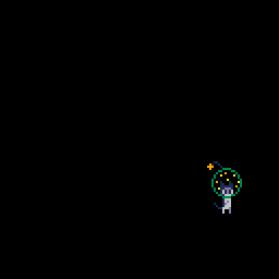
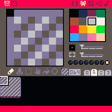
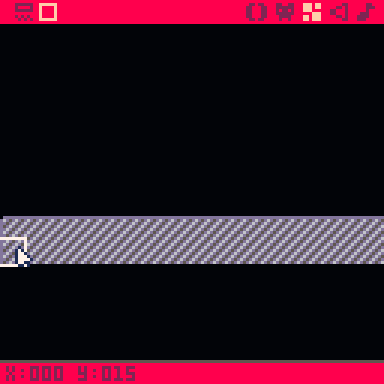
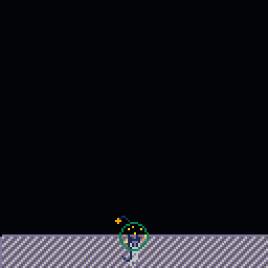
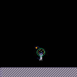

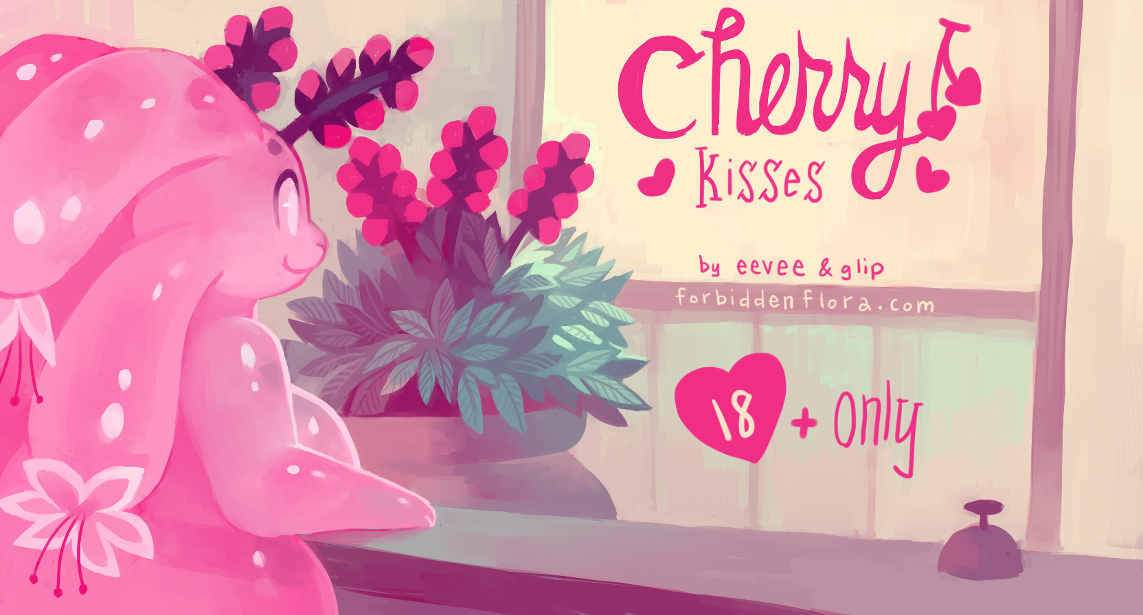
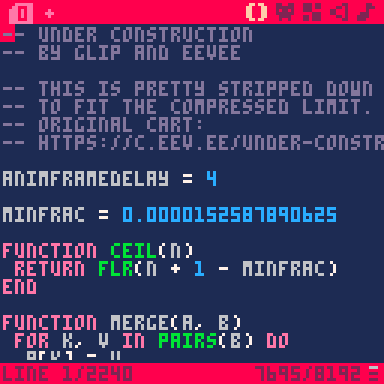
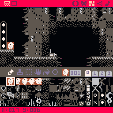

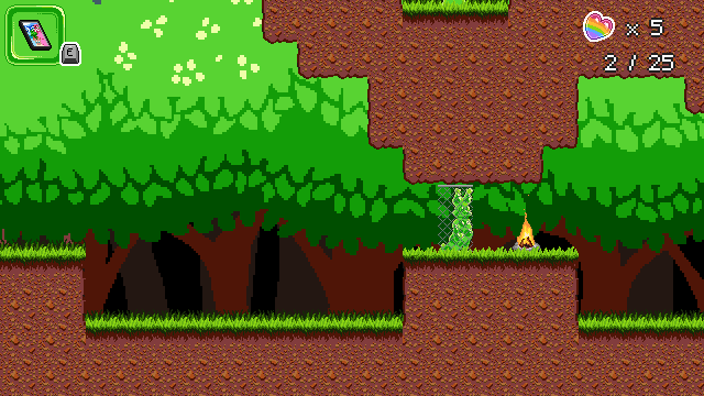
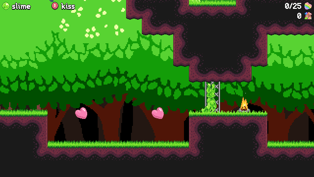
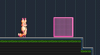
