Post Syndicated from Lindsey Wild original https://github.blog/2022-12-13-creating-an-accessible-search-experience-with-the-querybuilder-component/
Overview
Throughout the GitHub User Interface (UI), there are complex search inputs that allow you to narrow the results you see based on different filters. For example, for repositories with GitHub Discussions, you can narrow the results to only show open discussions that you created. This is completed with the search bar and the use of defined filters. The current implementation of this input has accessibility considerations that need to be examined at a deeper level, from the styled search input to the way items are grouped, that aren’t natively accessible, so we had to take some creative approaches. This led us to creating the QueryBuilder component, which is a fully accessible component designed for these types of situations.
As we rethought this core pattern within GitHub, we knew we needed to make search experiences accessible so everyone can successfully use them. GitHub is the home for all developers, including those with disabilities. We don’t want to stop at making GitHub accessible; we want to empower other developers to make a similar pattern accessible, which is why we’ll be open sourcing this component!
Process
GitHub is a very large organization with many moving pieces. Making sure that accessibility is considered in every step of the process is important. Our process looked a little something like this:
The first step was that we, the Accessibility Team at GitHub, worked closely with the designers and feature teams to design and build the QueryBuilder component. We wanted to understand the intent of the component and what the user should be able to accomplish. We used this information to help construct the product requirements.
Our designers and accessibility experts worked together on several iterations of what this experience would look like and annotated how it should function. Once everyone agreed on a path forward, it was time to build a proof of concept!
The proof of concept helped to work out some of the trickier parts of the implementation, which we will get to in the following Accessibility Considerations section. An accessibility expert review was conducted at multiple points throughout the process.
The Accessibility Team built the reusable component in collaboration with the Primer Team (GitHub’s Design System), and then collaborated with the GitHub Discussions Team on what it’d take to integrate the component. At this point in time, we have a fully accessible MVP component that can be seen on any GitHub.com Discussions landing page.
Introducing the QueryBuilder component
The main purpose of the QueryBuilder is to allow a user to enter a query that will narrow their results or complete a search. When a user types, a list of suggestions appears based on their input. This is a common pattern on web, which doesn’t sound too complicated, until you start to consider these desired features:
- The input should contain visual styling that shows a user if they’ve typed valid input.
- When a suggestion is selected, it can either take a user somewhere else (“Jump to”) or append the selection to the input (“Autocomplete”).
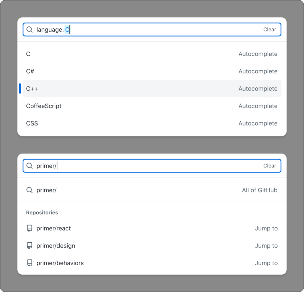
- The set of suggestions should change based on the entered input.
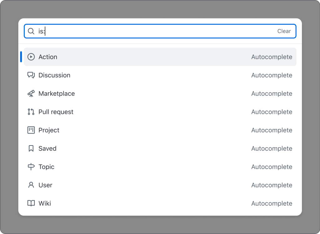
- There should be groups of suggestions within the suggestion box.
Okay, now we’re starting to get more complicated. Let’s break these features down from an accessibility perspective.
Accessibility considerations
Note: these considerations are not comprehensive to every accessibility requirement for the new component. We wanted to highlight the trickier-to-solve issues that may not have been addressed before.
Semantics
We talked about this component needing to take a user’s input and provide suggestions that a user can select from in a listbox. We are using the Combobox pattern, which does exactly this.
Styled input
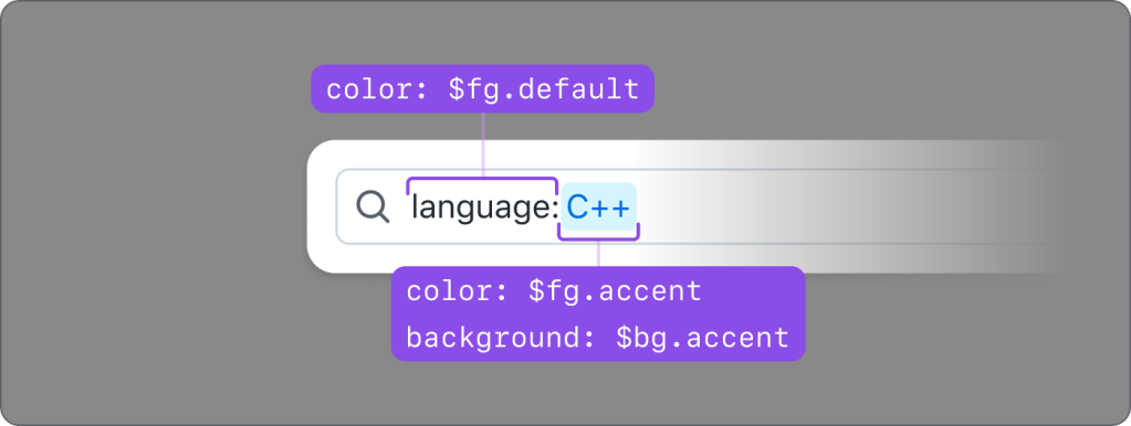
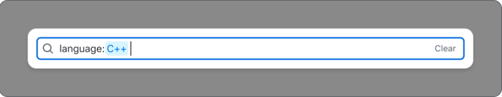
Natively, HTML inputs do not allow specific styling for individual characters, unless you use contenteditable. We didn’t consider this to be an accessible pattern; even basic mark-up can disrupt the expected keyboard cursor movement and contenteditable’s support for ARIA attributes is widely inconsistent. To achieve the desired styling, we have a styled element – a <div aria-hidden="true"> with <span> elements inside—that is behind the real <input> element that a user interacts with. It is perfectly lined up visually so all of the keyboard functionality works as expected, the cursor position is retained, input text is duplicated inside, and we can individually style characters within the input. We also tested this at high Zoom levels to make sure that everything scaled correctly. color: transparent was added to the real input’s text, so sighted users will see the styled text from the <div>.
While the styled input adds some context for sighted users, we also explored whether we could make this apparent for people relying on a screen reader. Our research led us to create a proof of concept with live-region-based announcements as the cursor was moved through the text. However, based on testing, the screen reader feedback proved to be quite overwhelming and occasionally flaky, and it would be a large effort to accurately detect and manage the cursor position and keyboard functionality for all types of assistive technology users. Particularly when internationalization was taken into account, we decided that this would not be overly helpful or provide good return on investment.
Items with different actions
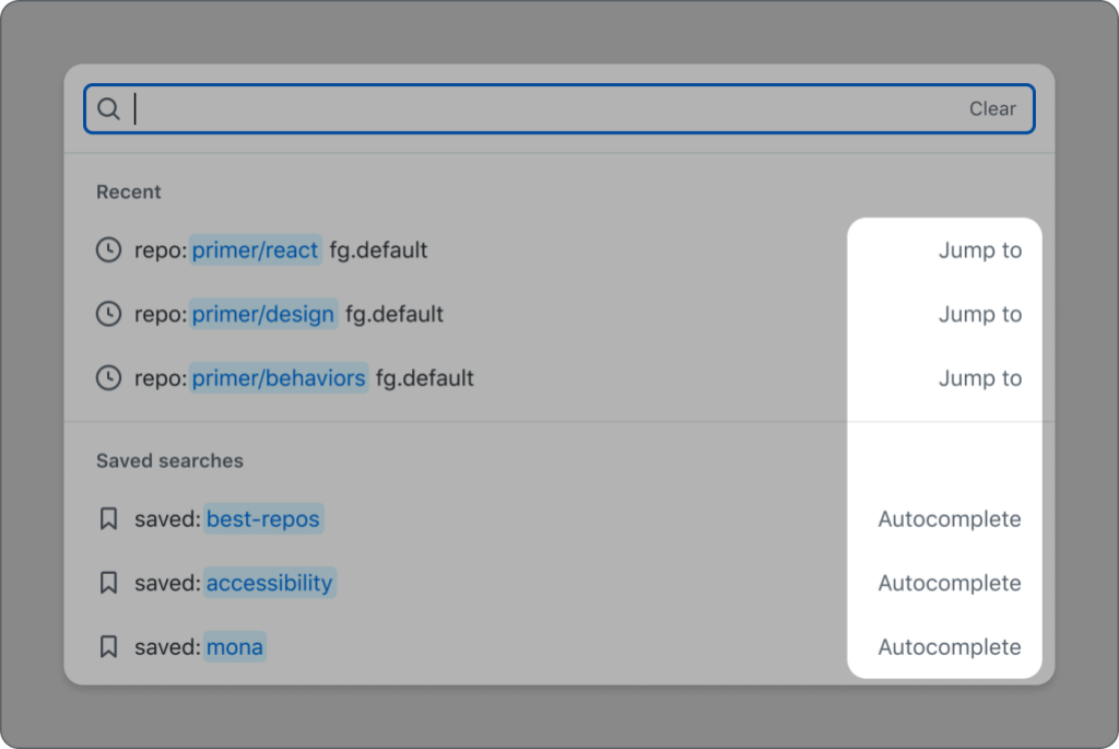
Typical listbox items in a combobox pattern only have one action–and that is to append the selected option’s value to the input. However, we needed something more. We wanted some selected option values to be appended to the input, but others to take you to a different page, such as search results.
For options that will append their values to the input when selected, there is no additional screen reader feedback since this is the default behavior of a listbox option. These options don’t have any visual indication (color, underline, etc.) that they will do anything other than append the selection to the input.
When an option will take a user to a new location, we’ve added an aria-label to that option explaining the behavior. For example, an option with the title README.md and description primer/react that takes you directly to https://github.com/primer/react/blob/main/README.md will have aria-label=”README.md, primer/react, jump to this file”. This explains the file (README.md), description/location of the file (primer/react), action (jump to), and type (this file). Since this is acting as a link, it will have visual text after the value stating the action. Since options may have two different actions, having a visual indicator is important so that a user knows what will happen when they make a selection.
Group support
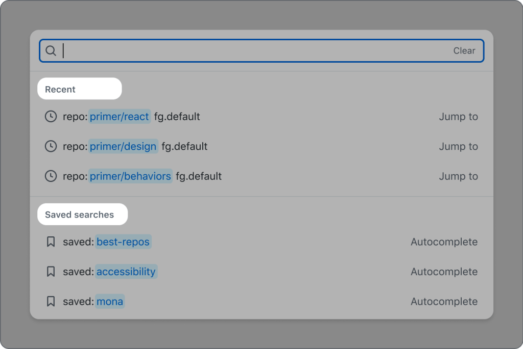
Groups are fully supported in an accessible way. role="group" is not widely supported inside of listbox for all assistive technologies, so our approach conveys the intent of grouped items to each user, but in different ways.
For sighted users, there is a visual header and separator for each group of items. The header is not focusable, and it has role="presentation" so that it’s hidden from screen reader users because this information is presented in a different way to them (which is described later in this blog). The wrapping <ul> and <li> elements are also given role="presentation" since a listbox is traditionally a list of <li> items inside of one parent <ul>.
For screen reader users, the grouped options are denoted by an aria-label with the content of each list item and the addition of the type of list item. This is the same aria-label as described in the previous section about items with different actions. An example aria-label for a list item with the value primer/react that takes you to the Primer React repository when chosen is “primer/react, jump to this repository.” In this example, adding “repository” to the aria-label gives the context that the item is part of the “Repository” group, the same way the visual heading helps sighted users determine the groups. We chose to add the item type at the end of the aria-label so that screen reader users hear the name of the item first and can navigate through the suggestions quicker. Since the aria-label is different from the visible label, it has to contain the visible label’s text at the beginning for voice recognition software users.
Screen reader feedback
By default, there is no indication to a screen reader user how many suggestions are displayed or if the input is successfully cleared via the optional clear button.
To address this, we added an aria-live region that updates the text whenever the suggestions change or the input is cleared. A screen reader will receive feedback when they press the “Clear” button that the input has been cleared, focus is restored to the input, and how many suggestions are currently visible.
While testing the aria-live updates, we noticed something interesting; if the same number of results are displayed as a user continues typing, the aria-live region will not update. For example, if a user types “zzz” and there are 0 results, and then they add an additional “z” to their query (still 0 results), the screen reader will not re-read “0 results” since the aria-live API did not detect a change in the text. To address this, we are adding and removing a character if the previous aria-live message is the same as the new aria-live message. The will cause the aria-live API to detect a change and the screen reader will re-read the text without an audible indication that a space was added.
Recap
In conclusion, this was a tremendous effort with a lot of teams involved. Thank you to the many Hubbers who collaborated on this effort, and to our accessibility friends at Prime Access Consulting (PAC). We are excited for users to get their hands on this new experience and really accelerate their efficiency in complex searches. This component is currently in production in a repository with GitHub Discussions enabled, and it will be rolling out to more parts of the UI. Stay tuned for updates about the progress of the component being open sourced.
What’s next
We will integrate this component into additional parts of GitHub’s UI, such as the new global search experience so all users can benefit from this accessible, advanced searching capability. We will continue to add the component to other areas of the GitHub UI and address any bugs or feedback we receive.
As mentioned in the beginning of this post, it will be open sourced in Primer ViewComponents and Primer React along with clear guidelines on how to use this component. The base of the component is a Web Component which allows us to share the functionality between ViewComponents and React. This will allow developers to easily create an advanced, accessible, custom search component without spending time researching how to make this pattern accessible or functional, since we’ve already done that work! It can work with any source of data as long as it’s in the expected format.
Many teams throughout GitHub are constantly working on accessibility improvements to GitHub.com. For more on our vision for accessibility at GitHub, visit accessibility.github.com.