Post Syndicated from Paulo R. Deolindo Jr. original https://blog.zabbix.com/file-integrity-monitoring-with-zabbix/29460/
We have often seen Zabbix used as a simple tool for monitoring network assets as well as Information and Communication Technology (ICT) infrastructure. While this concept is not incorrect, it is equally important to understand that with the advancement of Zabbix versions, more and more functionalities have been made available for other types of monitoring, enabling advanced data analysis and stunning visualizations through new and modern widgets in the frontend layer.
In this short blog post, we will explore some of the existing yet under-discussed features of Zabbix that contribute to the maturity of the cybersecurity discipline within organizations — a topic that is becoming increasingly critical in the corporate environment.
Table of Contents
FIM – File Integrity Monitoring
FIM is a very common concept among information security tools, specifically in tools like SIEM/XDR (Security Information Event Management/Extended Detection and Response). The name is quite suggestive of its usability, but while some tools highlight this feature as one of their main functionalities, it is also available for those who use Zabbix – just not explicitly labeled under this name.
Here, we will approach FIM as a concept rather than just a functionality. This is because we aim to achieve a result, not merely have a menu with a name to claim compliance while using our tool. In fact, the outcome needs to be more important than mere “marketing.”
What should we expect from FIM?
Imagine that your servers have certain directories and/or files so critical that you cannot afford to neglect monitoring them for changes, insertions, or deletions. Additionally, these files may have owners and properties that must not be altered – otherwise, the systems that depend on them might lose the ability to read or execute their functions. This, at a minimum, is what we expect from FIM as a functionality.
To illustrate this a bit further, consider a database service like MariaDB:
# ls -lR /etc/mysql/
/etc/mysql/:
total 24
drwxr-xr-x 2 root root 4096 Jun 25 18:40 conf.d
-rwxr-xr-x 1 root root 1740 Nov 30 2023 debian-start
-rw------- 1 root root 544 Jun 25 18:43 debian.cnf
-rw-r--r-- 1 root root 1126 Nov 30 2023 mariadb.cnf
drwxr-xr-x 2 root root 4096 Sep 30 16:36 mariadb.conf.d
lrwxrwxrwx 1 root root 24 Oct 20 2020 my.cnf -> /etc/alternatives/my.cnf
-rw-r--r-- 1 root root 839 Oct 20 2020 my.cnf.fallback

/etc/mysql/conf.d:
total 8
-rw-r--r-- 1 root root 8 Oct 20 2020 mysql.cnf
-rw-r--r-- 1 root root 55 Oct 20 2020 mysqldump.cnf

/etc/mysql/mariadb.conf.d:
total 40
-rw-r--r-- 1 root root 575 Nov 30 2023 50-client.cnf
-rw-r--r-- 1 root root 231 Nov 30 2023 50-mysql-clients.cnf
-rw-r--r-- 1 root root 927 Nov 30 2023 50-mysqld_safe.cnf
-rw-r--r-- 1 root root 3795 Sep 30 16:36 50-server.cnf
-rw-r--r-- 1 root root 570 Nov 30 2023 60-galera.cnf
-rw-r--r-- 1 root root 76 Nov 8 2023 provider_bzip2.cnf
-rw-r--r-- 1 root root 72 Nov 8 2023 provider_lz4.cnf
-rw-r--r-- 1 root root 74 Nov 8 2023 provider_lzma.cnf
-rw-r--r-- 1 root root 72 Nov 8 2023 provider_lzo.cnf
-rw-r--r-- 1 root root 78 Nov 8 2023 provider_snappy.cnf
All the files, directories, and subdirectories listed above have already been configured, and the system (whatever it may be) is functioning perfectly. However, if someone suddenly decides to alter a configuration in the file /etc/mysql/mariadb.conf.d/50-server.cnf, this could be disastrous for the service. Regardless, the important thing to do is to monitor this scope and notify the relevant stakeholders so that an appropriate analysis can be conducted.
Zabbix can help with that. Let’s see how.
Zabbix and File Integrity Monitoring functions
Consider that the Zabbix agent is installed on the server to be monitored:
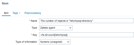
vfs.dir.count[/etc/mysql]
With this key, we can count the objects present within the /etc/mysql directory. Subsequently, we can create a trigger to be activated if there is any change related to the initial collection count, such as someone deleting or adding a file or directory in this location.
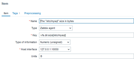
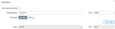
vfs.dir.size[/etc/mysql]
With this key, we can determine the total size in bytes used by the directories and configuration files. In the future, we can create a trigger that activates when this size changes, indicating the deletion or addition of a file.
vfs.file.exists[/etc/mysql/mariadb.conf.d/50-server.cnf]
Among several important files, we may have a greater interest in some configuration files, and we can validate their existence by creating a trigger that activates when such a file ceases to exist. This will clearly indicate that something important has disappeared.
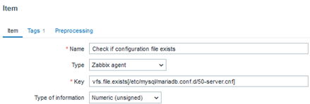
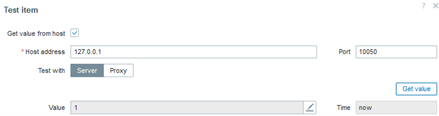
In this case, the value “1” represents “OK” for the existence of the file.
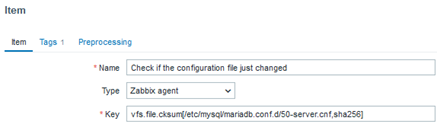
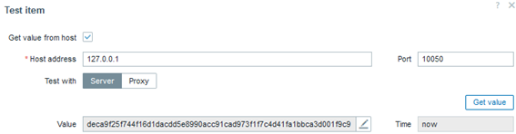
vfs.file.cksum[/etc/mysql/mariadb.conf.d/50-server.cnf,sha256]
In addition to verifying the existence of the configuration file we consider important, we need to be informed if anything in it changes. This key handles that by generating a hash in a variety of possible formats, allowing a trigger to be activated in case of a hash change, which would reflect a file modification (unfortunately, we won’t know what exactly was altered).
vfs.file.regmatch[/etc/mysql/mariadb.conf.d/50-server.cnf,^max_connections\s+=\s+(\d+)]
We might have a specific parameter of interest – for example, the maximum number of connections allowed to the database. Monitoring this is important because if the configuration is set to the default value, it means that no “tuning” has been applied to the database. Alternatively, it could mean that someone simply deleted or commented out this line, causing it to be ignored by the system. Therefore, verifying whether the parameter exists and is properly configured is crucial.
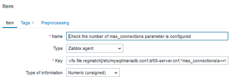
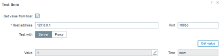
In this case, the value “1” indicates that the regular expression was successfully found, meaning that the configuration or parameter we need to exist is indeed present.
vfs.file.regexp[/etc/mysql/mariadb.conf.d/50-server.cnf,^max_connections\s+=\s+(\d+),,,,\1]
Beyond verifying the existence and integrity of the file, it is also possible to determine what was changed within it. However, we would need to specify the configuration of interest using a regular expression. For example, considering that the maximum number of connections allowed by the database system is “x,” we can be alerted by a trigger if it changes to “y,” “z,” or any other value different from “x.” This setup allows us to monitor the parameter of interest with precision. This logic can be applied to any other parameter you consider important. Of course, there is another way to automate this process, but we will not cover that automation here.
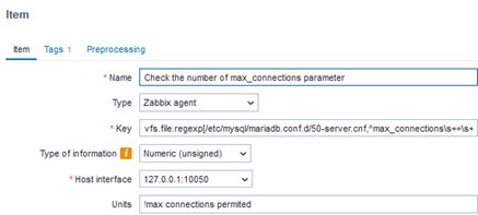
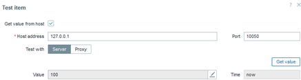
In this case, the parameter defining the maximum number of connections is not only present, but we also know the exact number of connections. This way, we will have a history of the applied parameterization in case it is changed at any point.
vfs.file.owner[/etc/mysql/mariadb.conf.d/50-server.cnf]
vfs.file.owner[/etc/mysql/mariadb.conf.d/50-server.cnf,group]
The two keys above allow us to determine the owner of a file and (in the case of a Linux system) the owning group. We can also choose to monitor the user’s name or their UID in the system. Naturally, a trigger can be activated to alert us in case of an ownership change, indicating that someone might be “taking over” an important file in the system.
vfs.file.permissions[/etc/mysql/mariadb.conf.d/50-server.cnf]
The key above allows us to determine a file’s permissions—read, write, read and write, execution, or a special permission bit. Naturally, a trigger can be activated to alert us if there is any permission change in the file.
vfs.file.attr[/etc/mysql/mariadb.conf.d/50-server.cnf]
The key above does not exist by default. It was created with a UserParameter, which is a customization for verifying a command that, in this case, checks the attributes of a specific file. Consider the following command executed directly in your system’s terminal:
# lsattr /etc/mysql/mariadb.conf.d/50-server.cnf
--------------e------- /etc/mysql/mariadb.conf.d/50-server.cnf
What interests us are the attributes:
--------------e-------
If someone who invades the system modifies the attribute of a file (for example) using this command…
# chattr +A /etc/mysql/mariadb.conf.d/50-server.cnf
# lsattr /etc/mysql/mariadb.conf.d/50-server.cnf
-------A------e------- /etc/mysql/mariadb.conf.d/50-server.cnf
…it could mean that someone does not want the system to log when this file was accessed (refer to the chattr command manual). Additionally, any other attribute can be added or removed, which poses a risk to the system because these attributes can alter how files are accessed, stored on disk, and later read. Therefore, we can create a UserParameter as follows:
# cd /etc/zabbix/zabbix_agent2.d/
# echo "UserParameter=vfs.file.attr[*],lsattr \$1 | cut -d\" \" -f1" > attr.conf
# zabbix_agent2 -R userparameter_reload
Finally, we can test the reading of attributes directly from the terminal:
# zabbix_agent2 -t vfs.file.attr[/etc/mysql/mariadb.conf.d/50-server.cnf]
vfs.file.attr[/etc/mysql/mariadb.conf.d/50-server.cnf][s|-------A------e-------]
You can also try this now through the frontend.
When creating the item, don’t forget to create the trigger that should be activated in case there is a change in the attribute of a file, whatever it may be.
Paying attention to file access and modification times
To delve a bit deeper into the concept of FIM, we should ask ourselves if we are monitoring file access and modifications concerning their timestamps. In a way, if we have implemented everything proposed above, the answer is yes.
That said, there is an easier way to keep track of all the things we’ve discussed. It involves using this key:
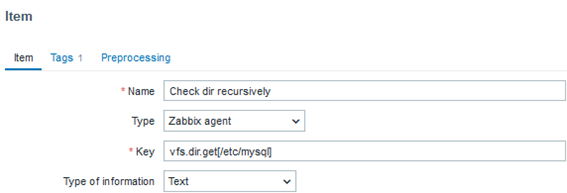
vfs.dir.get[/etc/mysql]
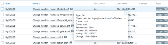
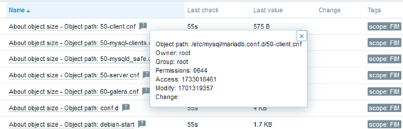
When creating an item with this key, we will recursively obtain all its objects, such as subdirectories and files. The output format will be a JSON, which allows us to create LLD (Low-level Discovery) rules to automate FIM. Below is a small snippet of the monitoring output:
{
"basename": "mariadb.cnf",
"pathname": "/etc/mysql/mariadb.cnf",
"dirname": "/etc/mysql",
"type": "file",
"user": "root",
"group": "root",
"permissions": "0644",
"uid": 0,
"gid": 0,
"size": 1126,
"time": {
"access": "2024-11-30T23:01:01-0300",
"modify": "2023-11-30T01:42:37-0300",
"change": "2024-06-25T18:41:01-0300"
},
"timestamp": {
"access": 1733018461,
"modify": 1701319357,
"change": 1719351661
}
...
Considering that the output includes all objects from the main directory, this would be the most sensible approach to configure our FIM. However, it is necessary to create the LLD and prototypes. We will not cover this in detail in this article, but this is the path I recommend you follow.
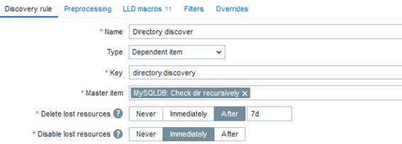
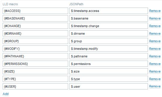
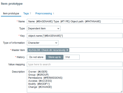
Below is a “blueprint” for an LLD to create automated File Integrity Monitoring:
The “Master item”:
The “Dependent rule”:
The LLD Macro:
The item prototypes:

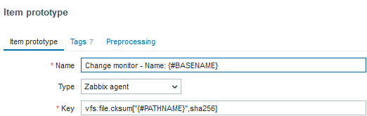
Below are the components of a trigger prototype (I created just one to symbolize a type of alert for file modification):
Name: Object: {#BASENAME} just changed

Event name: Object: {#BASENAME} just changed. Last hash: {ITEM.VALUE} The previous one: {?last(/MySQLDB/vfs.file.cksum["{#PATHNAME}",sha256],#2)} Object: {#BASENAME} just changed. Last hash: {ITEM.VALUE} The previous one: {?last(/MySQLDB/vfs.file.cksum["{#PATHNAME}",sha256],#2)}

Severity: Warning

Expression: last(/MySQLDB/vfs.file.cksum["{#PATHNAME}",sha256],#1)<>last(/MySQLDB/vfs.file.cksum["{#PATHNAME}",sha256],#2)
And then, some results:
Conclusion
The implementation of a robust File Integrity Monitoring system helps to ensure the security of IT infrastructure. Detecting unauthorized changes in critical files helps prevent attacks, identify security breaches, and ensure the integrity and availability of systems. With Zabbix, we have an effective solution to implement FIM, enabling process automation and the real-time visualization of changes. This monitoring not only reinforces protection against intrusions but also facilitates auditing and compliance with regulatory standards.
The main benefits of integrating File Integrity Monitoring with Zabbix include:
1. Early detection of changes in critical files, enabling quick responses.
2. Enhanced compliance with security regulations and internal policies.
3. Protection against malware and ransomware by identifying changes in essential files.
4. Ease of auditing with automated reports and modification histories.
5. Greater visibility and control over the integrity of data and systems in real time.
6. Operational efficiency through the automation of alerts and reports.
7. Improved proactive security, helping prevent attacks before they become critical.
By using Zabbix, organizations can strengthen their security posture and optimize risk management, ensuring that any unauthorized changes are detected and promptly corrected.
The post File Integrity Monitoring with Zabbix appeared first on Zabbix Blog.


