Post Syndicated from Grab Tech original https://engineering.grab.com/real-time-data-quality-monitoring
Introduction
In today’s data-driven landscape, monitoring data quality has become a critical need for ensuring reliable and efficient data usage across domains. High-quality data is the backbone of AI innovation, driving efficiency and unlocking new opportunities. As decentralized data ownership grows, the ability to effectively monitor data quality is essential for maintaining reliability in data systems.
Kafka streams, as a vital component of real-time data processing, play a significant role in this ecosystem. However, unreliable data within Kafka streams can lead to errors and inefficiencies for downstream users, and monitoring the quality of data within these streams has always been a challenge. This blog introduces a solution that empowers stream users to define a data contract, specifying the rules that Kafka stream data must adhere to. By leveraging this user-defined data contract, the solution performs automated real-time data quality checks, identifies problematic data as it occurs, and promptly notifies stream owners. This ensures timely action, enabling effective monitoring and management of Kafka stream data quality while supporting the broader goals of data mesh and AI-driven innovation.
Problem statement
In the past, monitoring Kafka stream data processing lacked an effective solution for data quality validation. This limitation made it challenging to identify bad data, notify users in a timely manner, and prevent the cascading impact on downstream users from further escalating.
Challenges in syntactic and semantic issue identification:
- Syntactic issues: Refers to schema mismatches between producers and consumers, which can lead to deserialization errors. While schema backward compatibility can be validated upon schema evolution, there are scenarios where the actual data in the Kafka topic does not align with the defined schema. For example, this can occur when a rogue Kafka producer is not using the expected schema for a given Kafka topic. Identifying the specific fields causing these syntactic issues is a typical challenge.
- Semantic issues: Refers to inconsistencies or misalignments between producers and consumers about the expected pattern or significance of each field. Unlike Kafka stream schemas, which act as a data structure contract between producers and consumers, there is no existing framework for stakeholders to define and enforce field-level semantic rules, for example, the expected length or pattern of an identifier.
Timeliness challenge in data quality monitoring: There is no real-time mechanism to automatically validate data against predefined rules, timely identify quality issues, and promptly alert stream stakeholders. Without real-time stream validation, data quality issues can sometimes persist for periods of time, impacting various online and offline downstream systems before being discovered.
Observability challenge for troubleshooting bad data: Even when problematic data is identified, stream users face difficulties in pinpointing the exact “poison data” and understanding which fields are incompatible with the schema or violate semantic rules. This lack of visibility complicates Root Cause Analysis and resolution efforts.
Solution
Our Coban platform offers a standardized data quality test and observability solution at the platform level, consisting of the following components:
- Data Contract Definition: Enables Kafka stream stakeholders to define contracts that include schema agreements, semantic rules that Kafka topic data must comply with, and Kafka stream ownership details for alerting and notifications.
- Automated Test Execution: Provides a long running Test Runner to automatically execute real-time tests based on the defined contract.
- Real-time Data Quality Issue Identification: Detects data issues at both syntactic and semantic levels in real-time.
- Alerts and Result Observability: Alerts users, simplifying observation of data quality issues via the platform.
Architecture details
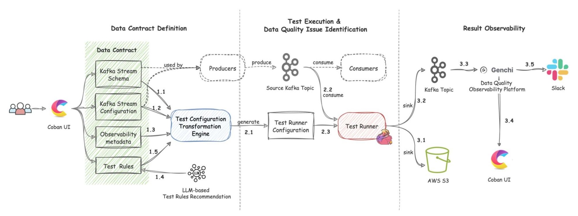
The solution includes three components: Data Contract Definition, Test Execution & Data Quality Issue Identification, and Result Observability as shown in the architecture diagram in figure 1. All mentions of “Flow” from here onwards refer to the corresponding processes illustrated in figure 1.
Data Contract Definition
The Coban Platform streamlines the process of defining Kafka stream data contracts, serving as a formal agreement among Kafka stream stakeholders. This includes the following components:
- Kafka Stream Schema: Represents the schema used by the Kafka topic under test and helps the Test Runner to validate schema compatibility across data streams (Flow 1.1).
- Kafka Stream Configuration: Encompasses essential configurations such as the endpoint and topic name, which the platform automatically populates (Flow 1.2).
- Observability Metadata: Provides contact information for notifying Kafka stream stakeholders about data quality issues and includes alert configurations for monitoring (Flow 1.3).
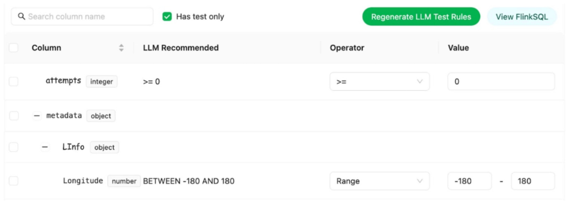
- Kafka Stream Semantic Test Rules: Empowers users to define intuitive semantic test rules at the field level. These rules include checks for string patterns, number ranges, constant values, etc. (Flow 1.5).
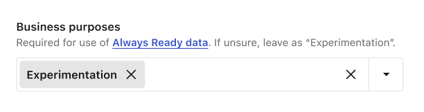
- LLM-Based Semantic Test Rules Recommendation: Defining dozens if not hundreds of field-specific test rules can overwhelm users. To simplify this process, the Coban Platform uses LLM-based recommendations to predict semantic test rules using provided Kafka stream schemas and anonymized sample data (Flow 1.4). This feature helps users set up semantic rules efficiently, as demonstrated in the sample UI in figure 2.
Data Contract Transformation
Once defined, the Coban Platform’s transformation engine converts the data contract into configurations that the Test Runner can interpret (Flow 2.1). This transformation process includes:
- Kafka Stream Schema: Translates the schema defined in the data contract into a schema reference that the Test Runner can parse.
- Kafka Stream Configuration: Sets up the Kafka stream as a source for the Test Runner.
- Observability metadata: Sets contact information as configurations of the Test Runner.
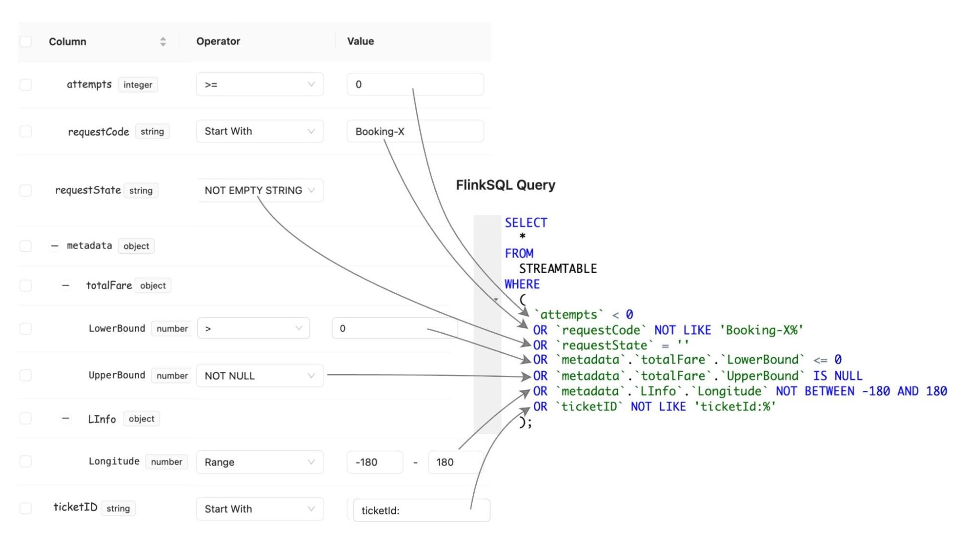
- Kafka Stream Semantic Test Rules: Transforms human-readable semantic test rules into an inverse SQL query to capture the data that violates the defined rules.
Test Execution & Data Quality Issue Identification
Once the Test Configuration Transformation Engine generates the Test Runner configuration (Flow 2.1), the platform automatically deploys the Test Runner.
Test Runner
The Test Runner utilises FlinkSQL as the compute engine to execute the tests. FlinkSQL was selected for its flexibility in defining test rules as straightforward SQL statements, enabling our platform to efficiently convert data contracts into enforceable rules.
Test Execution Workflow And Problematic Data Identification
FlinkSQL consumes data from the Kafka topic under test (Flow 2.2) using its own consumer group, ensuring it doesn’t impact other consumers. It runs the inverse SQL query (Flow 2.3) to identify any data that violates the semantic rules or that is syntactically incorrect in the first place. Test Runner captures such data, packages it into a data quality issue event enriched with a test summary, the total count of bad records, and sample bad data, and publishes it to a dedicated Kafka topic (Flow 3.2). Additionally, the platform sinks all such data quality events to an AWS S3 bucket (Flow 3.1) to enable deeper observability and analysis.
Result Observability
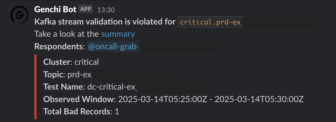
Grab’s in-house data quality observability platform, Genchi, consumes problematic data captured by the Test Runner (Flow 3.3).
Alerting
Genchi sends Slack notifications (Flow 3.5) to stream owners specified in the data contract observability metadata. These notifications include detailed information about stream issues, such as links to sample data in Coban UI, observed windows, counts of bad records, and other relevant details.
Observability
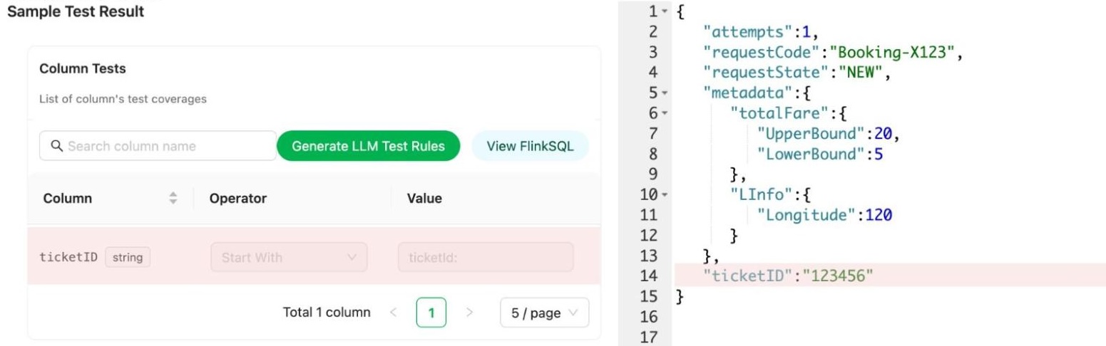
Users can access the Coban UI (Flow 3.4), displaying Kafka stream test rules and sample bad records, highlighting fields and values that violate rules.
Impact
Since its deployment earlier this year, the solution has enabled Kafka stream users to define contracts with syntactic and semantic rules, automate test execution, and alert users when problematic data is detected, prompting timely action. It has been actively monitoring data quality across 100+ critical Kafka topics. The solution offers the capability to immediately identify and halt the propagation of invalid data across multiple streams.
Conclusion
We implemented and rolled out a solution to assist Grab engineers in effectively monitoring data quality in their Kafka streams. This solution empowers them to establish syntactic and semantic tests for their data. Our platform’s automatic testing feature enables real-time tracking of data quality, with instant alerts for any discrepancies. Additionally, we provide detailed visibility into test results, facilitating the easy identification of specific data fields that violate the rules. This accelerates the process of diagnosing and resolving issues, allowing users to swiftly address production data challenges.
What’s next
While our current solution emphasizes monitoring the quality of Kafka streaming data, further exploration will focus on tracing producers to pinpoint the origin of problematic data, as well as enabling more advanced semantic tests such as cross-field validations. Additionally, we aim to expand monitoring capabilities to cover broader aspects like data completeness and freshness, and integrate with Gable AI to detect Data Transfer Object (DTO) changes and semantic regressions in Go producers upon committing code to the Git repository. These enhancements will pave the way for a more robust, multidimensional data quality testing solution across a wider range.
References
Driving Data Quality with Data Contracts: A Comprehensive Guide to Building Reliable, Trusted, and Effective Data Platforms by Andrew Jones
Join us
Grab is a leading superapp in Southeast Asia, operating across the deliveries, mobility and digital financial services sectors. Serving over 800 cities in eight Southeast Asian countries, Grab enables millions of people everyday to order food or groceries, send packages, hail a ride or taxi, pay for online purchases or access services such as lending and insurance, all through a single app. Grab was founded in 2012 with the mission to drive Southeast Asia forward by creating economic empowerment for everyone. Grab strives to serve a triple bottom line – we aim to simultaneously deliver financial performance for our shareholders and have a positive social impact, which includes economic empowerment for millions of people in the region, while mitigating our environmental footprint.
Powered by technology and driven by heart, our mission is to drive Southeast Asia forward by creating economic empowerment for everyone. If this mission speaks to you, join our team today!