Tag Archives: code view

Accessibility considerations behind code search and code view

Post Syndicated from milemons original https://github.blog/2023-07-06-accessibility-considerations-behind-code-search-and-code-view/

GitHub prides itself on being the home for all developers, including developers with disabilities. Accessibility is a core priority for all new projects at GitHub, so it was top of mind when we started our project to rework code search and the code view at GitHub. With the old code view, some developers preferred to look at raw code rather than code view due to accessibility barriers, and that’s what we set out to fix. This blog post will shed light on our process and three major tasks that required thoughtful design and implementation—code search and query builder, the file tree, and navigating code by keyboard.

Process

We worked with a team of experts at GitHub dedicated to accessibility, since while we are confident in our development skills, accessibility has many nuances and requires a large depth of knowledge to get right. This team helped us immensely in three main ways:

  1. External auditing
    In this project, we performed accessibility auditing on all of our features. This meant that another team of auditors reviewed our webpage with all the changes implemented to find accessibility errors. They used tools including screen readers, color contrast tools, and more, to identify areas that users with disabilities may find hard to use. Once those issues were identified, the accessibility team would take a look at those issues and suggest a proper solution to the problem. Then, it was up to us to implement the solution and collaborate with the team where we needed additional assistance.
  2. Design reviews
    The user interface for code search and code view were both entirely redesigned to support our new goals—to allow users to search, navigate, and understand code in a way they weren’t able to before. As a part of the design process, a team of accessibility designers reviewed the Figma mockups to determine proper HTML markup and tab order. Then, they included detailed explanations of what interactions should look like in order to meet our accessibility goals.
  3. Office hours
    The accessibility team at GitHub hosts weekly meetings where engineers can sign up and discuss how to solve problems with their features with the team and a consultant. The consultant is incredibly helpful and knowledgeable about how to properly address issues because he has lived experience with screen readers and accessibility.During these meetings, we were able to discuss complicated issues, such as the following: proper filtering for code search, making an accessible file tree, and navigating code on a keyboard, along with other issues like tab order, and focus management across the whole feature.

Implementation details

This has been written about frequently on our blog—from one post on the details of QueryBuilder, our implementation of an accessible finder component to details about what navigating code search accessibly looks like. Those two posts are great reads and I strongly recommend checking them out, but they’re not the only thing that we’ve worked on. Thanks to @lindseywild, @smockle, @kendallgassner, @owenniblock, and @khiga8 for their guidance and help resolving issues with code search. This is still a work in progress, especially in areas like the filtering behavior on the search pages.

Two areas that also required careful consideration were managing focus after changing the sort order of search results and how to announce the result of the search for screen reader users.

Changing sort—changing focus?

When we first implemented this sort dropdown for non-code search types, if you navigated to it with your keyboard and then selected a different sort option, the whole page would reload and your focus moved back to the header. Our preferred, accessible behavior is that, when a dropdown menu is closed, focus returns to the button that opened the menu. However, our problem was that the “Sort” dropdown didn’t merely perform client-side operations like most dropdowns where you select an option. In this case, once a user selects an option, we do a full page navigation to perform the new search with the sort order added. This meant that the focus was being placed back on the header by default after the page navigation, instead of returning to the sort dropdown. For sighted mouse users, this is a nonissue; for sighted keyboard users, it is unexpected and annoying; for blind users, this is confusing and makes the product hard to use. To fix this, we had to make sure we returned focus to the dropdown after reloading the page.
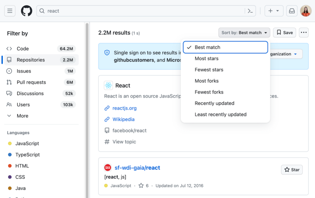
Screenshot of search results. I have searched “react” and the “Repositories” filter by item is selected. There are 2.2M results, found in 1 second. The "Sort By" dropdown is open with “Best match” selected. The other options are “Most stars”, “Fewest stars”, “Most forks”, “Fewest forks”, “Recently updated”, and “Least recently updated”.

Announcing search results

When a sighted user types in the search bar and presses ‘Enter’ they quickly receive feedback that the search has completed and whether or not they found any results by looking at the page. For screen reader users, though, how to give the feedback that there were results, how many, or if there was an error requires more thought. One solution could be to place focus on the first result. That has a number of problems though.

  1. The user will not receive feedback about the number of search results and may think there’s only one.
  2. The user may miss important context like the Single sign on banner.
  3. The user will have to tab through more elements if they want to get back.

Another solution could be to use aria-live announcements to read out the number of results and success. This has its own problems.

  1. We already have an announcement on page navigation to read out the new title and these two announcements would compete or cause a race condition.
  2. There isn’t a way to programmatically force announcements to be read in order on page load.
  3. Some screen reader users have aria-live announcements turned off since they can be annoying.

After some discussion, we decided to focus and read out the header with the number of search results after a search and allow users to explore for errors, banners, or results on their own once they know how many results they received.
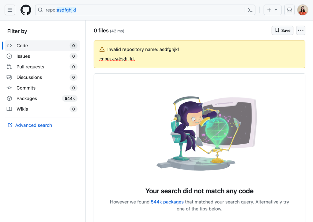
A screenshot of search results showing 0 results and an error message saying, “Invalid repository name.” I have searched “repo:asdfghijkl." The “Code” filter item is selected. There is also some help text on the page that says “Your search did not match any code. However, we found 544k packages that matched your search query. Alternatively, try one of the tips below.

Tree navigation

We knew when redesigning the code viewing experience that we wanted to include the tree panel to allow users to quickly switch between folders or files, because understanding code often requires looking in multiple places. We started the project by making our own tree to the aria spec, but it was too verbose. To fix this, our accessibility and design teams created the TreeView, which is open source. This was implemented to support various generic list elements and use proper HTML structure to make navigating through the tree a breeze, including typeahead (the ability to type a bit and have focus move to the first matching element), proper announcements for asynchronous loading of deeply nested items, and proper IDs for all elements that are guaranteed to be unique (that is, not constructed from their contents which may be the same). The valid markup for a tree view is very specific and developing it requires careful reviews for common issues, like invalid child item types under a role="group" element or using nested list elements without considering screen reader support, which is unlike most TreeView implementations on the internet. For more information about the design details for the tree view, check out the markdown documentation. Thanks to @colebemis, @mperrotti, and @ericwbailey for the work on this.

Reading and navigating code by keyboard

Before the new code view, reading code on GitHub wasn’t a great experience for screen reader users. The old experience presented code as a table—a hidden detail for sighted users but a major hurdle for screen readers, since code isn’t a table, and the semantics didn’t make sense in that context. For example, in code, whitespace has meaning. Whether stylistic or functional, that whitespace gets lost for screen reader users when the code is presented as a table. In addition, table semantics force users into line-by-line navigation, instead of character-by-character or word-by-word navigation. For many users, these hurdles meant that they mostly used GitHub just enough to be able to access the raw code or use a code editor for reading code. Since we want to support all our users, we knew we needed to totally rethink the way we structured code in the DOM.

This problem became even more complicated when we introduced symbols and the symbols panel. Mouse users are able to click on a “symbol” in the code—a special code element, like a function name—to see extra details about it, including references and definitions, in the symbol panel. They can then explore the code more deeply, navigating between lines of code where that symbol is found to investigate and understand the code better. This ability to dive deep has been game changing for many developers. However, for keyboard users, it doesn’t work. At best, a keyboard user can use the “Open symbols panel” button in the code header and then filter all symbol definitions for one they are interested in, but this doesn’t allow users to access symbol references when no definitions are found in a file. In addition, this flow really isn’t the same—if we want to support all developers, then we need to offer keyboard users a way to navigate through the code and select symbols they are interested in.

In addition, for many performance reasons mentioned in the post “Crafting a better, faster code view,” we introduced virtualization to the code viewer which created its own accessibility problems—not having all elements in the DOM can interfere with screen readers and overriding the cmd / ctrl + f shortcut is generally bad practice for screen readers as well. In addition, virtualization posed a problem for selecting text outside of the virtualization window.

This is when we came up with the solution of using a cursor from a <textarea> or a <div> that has the property contentEditable. This solution is modeled after Monaco, the text editor that powers VS Code. <textarea> elements, when not marked as readOnly, and contentEditiable<div> elements have a built in cursor that allows screen reader users to navigate code in their preferred manner using their built in screen reader settings. While a contentEditiable <div> would support syntax highlighting and the deep interactions we needed, screen readers don’t support them well1 which defeats the purpose of the cursor. As a result, we decided to go with the <textarea> However, <textarea> elements do not support syntax highlighting or deeper interactions like selecting symbols, which meant we needed to use both the <textarea> as a hidden element and syntax highlighted elements aligned perfectly above. Since we hide the text element, we need to add a visual “fake” cursor to show and keep it in sync with the “real” <textarea> cursor.

While the <textarea> and cursor help with our goals of allowing screen reader users and keyboard users to navigate code and symbols easily, they also ended up helping us with some of the problems we had run into with virtualization. One example of this was the cmd + f problem that we talk about more in depth in the blog post here. Another problem this solved was the drag and select behavior (or select all) for long files. Since the <textarea> is just one DOM node, we are able to load the whole file contents and select the contents directly from the <textarea> instead of the virtualized syntax highlighted version.

Unfortunately, while the <textarea> solved many problems we had, it also introduced a few other tricky ones. Since we have two layers of text, one hidden unless selected and one visual, we need to make sure that the scroll states are aligned. To do this, we have written observers to watch when one scrolls and mimic the scroll on the other. In addition, we often need to override the default <textarea> behaviors for some events—such as the middle click on mouse which was taking users all the way to the bottom of the code. Along with that issue, different browsers handle <textarea>s differently and making sure our solution behaves properly on all browsers has proven to be time intensive to say the least. In addition, we found that some browsers, like Firefox, allow users to customize their font size using Text zoom, which would apply to the formatted text but not the <textarea>. This led to “ghost text” issues with selection. We were able to resolve that by measuring the height of the text that is rendered and passing that to the <textarea>, though there are still some issues with certain plugins that modify text. We are still working to resolve these specific issues as well. In addition, the <textarea> currently does not work with our Wrap lines view option, which we are working to fix. Thanks especially to @joycezhu, @andrialexandrou, @adamshwert, and @jbrown1618 who put in a ton of work here.

Always iterating

We have taken huge strides to improve accessibility for all developers, but we recognize that we aren’t all the way there. It can be challenging to accommodate all developers, but we are committed to improving and iterating on what we have until we get it right. We want our tools to support everyone to access and explore code. We still have work—a lot of work—to do across GitHub, but we are excited for this journey.

To learn more about accessibility at GitHub, go to accessibility.github.com.


  1. For more information about contentEditable and screen readers, see this article written by @joycezhu from our Accessibility Engineering team. 

Crafting a better, faster code view

Post Syndicated from Joshua Brown original https://github.blog/2023-06-21-crafting-a-better-faster-code-view/

Reading code is not as simple as reading the text of a file end-to-end. It is a non-linear, sometimes chaotic process of jumping between files to follow a trail, building a mental picture of how code relates to its surrounding context. GitHub’s mission is to be the home for all developers, and reading code is one of the core experiences we offer. Every day, millions of users use GitHub to view and interact with code. So, about a year ago we set out to create a new code view that supports the entire code reading experience with features like a file tree, symbol navigation, code search integration, sticky lines, and code section folding. The new code view is powerful, intelligent, and interactive, but it is not an attempt to turn the repository browsing experience into an IDE.

While building the new code view, our team had a few guiding principles on which we refused to compromise:

  • It must add these powerful new features to transform how users read code on GitHub.
  • It must be intuitive and easy to use for all of GitHub’s millions of users.
  • It must be fast.

Initial efforts

The first step was to build out the features we wanted in a natural, straightforward way, taking the advice that “premature optimization is the root of all evil.”1 After all, if simple code satisfactorily solves our problems, then we should stop there. We knew we wanted to build a highly interactive and stateful code viewing experience, so we decided to use React to enable us to iterate more quickly on the user interface. Our initial implementation for the code blob was dead-simple: our syntax highlighting service converted the raw file contents to a list of HTML strings corresponding to the lines of the file, and each of these lines was added to the document.

There was one key problem: our performance scaled badly with the number of lines in the file. In particular, our LCP and TTI times measurably increased at around 500 lines, and this increase became noticeable at around 2,000 lines. Around those same thresholds, interactions like highlighting a line or collapsing a code section became similarly sluggish. We take these performance metrics seriously for a number of reasons. Most importantly, they are user-centric—that is, they are meant to measure aspects of the quality of a user’s experience on the page. On top of that, they are also part of how search engines like Google determine where to rank pages in their search results; fast pages get shown first, and the code view is one of the many ways GitHub’s users can show their work to the world.

As we dug in, we discovered that there were a few things at play:

  • When there are many DOM nodes on the page, style calculations and paints take longer.
  • When there are many DOM nodes on the page, DOM queries take longer, and the results can have a significant memory footprint.
  • When there are many React nodes on the page, renders and DOM reconciliation both take longer.

It’s worth noting that none of these are problems with React specifically; any page with a very large DOM would experience the first two problems, and any solution where a large DOM is created and managed by JavaScript would experience the third.

We mitigated these problems considerably by ensuring that we were not running these expensive operations more than necessary. Typical React optimization techniques like memoization and debouncing user input, as well as some less common solutions like pulling in an observer pattern went a long way toward ensuring that React state updates, and therefore DOM updates, only occurred as needed.

Mitigating the problem, however, is not solving the problem. Even with all of these optimizations in place, the initial render of the page remained a fundamentally expensive operation for large files. In the repository that builds GitHub.com, for example, we have a CODEOWNERS file that is about 18,000 lines long, and pushes the 2MB size limit for displaying files in the UI. With no optimizations besides the ones described above, React’s first pass at building the DOM for this page takes nearly 27 seconds.2 Considering more than half of users will abandon a page if it loads for more than three seconds, there was obviously lots of work left to do.

A promising but incomplete solution

Enter virtualization. Virtualization is a performance optimization technique that examines the scroll state of the page to determine what content to include in the DOM. For example, if we are viewing a 10,000 line file but only about 75 lines fit on the screen at a time, we can save lots of time by only rendering the lines that fit in the viewport. As the user scrolls, we add any lines that need to appear, and remove any lines that can disappear, as illustrated by this demo.3

This satisfies the most basic requirements of the page with flying colors. It loads on average more quickly than the existing experience, and the experience of scrolling through the file is nearly indistinguishable from the non-virtualized case. Remember that 27 second initial render? Virtualizing the file content gets that time down to under a second, and that number does not increase substantially even if we artificially remove our file size limit and pull in hundreds of megabytes of text.

Unfortunately, virtualization is not a cure-all. While our initial implementation added features to the page at the expense of performance, naïvely virtualizing the code lines delivers a fast experience at the expense of vital functionality. The biggest problem was that without the entire text of the file on the page at once, the browser’s built-in find-in-file only surfaced results that are visible in the viewport. Breaking users’ ability to find text on the page breaks our hard requirement that the page remain intuitive and easy to use. Before we could ship any of this to real users, we had to ensure that this use case would be covered.

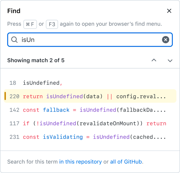
The immediate solution was to implement our own version of find-in-file by implementing a custom handler for the Ctrl+F shortcut (⌘+F on Mac). We added a new piece of UI in the sidebar to show results as part of our integration with symbol navigation and code search.

Screenshot of the "find" sidebar, showing a search bar with the term "isUn" and a list offive lines of code from the current file that contain that string, the second of which is highlighted as selected.

There is precedent for overriding this native browser feature to allow users to find text in virtualized code lines. Monaco, the text editor behind VS Code, does exactly this to solve the same problem, as do many other online code editors, including Repl.it and CodePen. Some other editors like the official Ruby playground ignore the problem altogether and accept that Ctrl+F will be partially broken within their virtualized editor.

At the time, we felt confident leaning on this precedent. These examples are applications that run in a browser window, and as users, we expect applications to implement their own controls. Writing our own way to find text on the page was a step toward making GitHub’s Code View less of a web page and more of a web application.

When we released the new code view experience as a private beta at GitHub Universe, we received clear feedback that our users think of GitHub as a page, not as an app. We tried to rework the experience to be as similar as possible to the native implementation, both in terms of user experience and performance. But ultimately, there are plenty of good reasons not to override this kind of native browser behavior.

  • Users of assistive technologies often use Ctrl+F to locate elements on a page, so restricting the scope to the contents of the file broke these workflows.
  • Users rely heavily on specific muscle memory for common actions, and we followed a deep rabbit hole to get the custom control to support all of the shortcuts used by various browsers.
  • Finally, the native browser implementation is simply faster.

Despite plenty of precedent for an overridden find experience, this user feedback drove us to dig deeper into how we could lean on the browser for something it already does well.

Virtualization has an important role to play in our final product, but it is only one piece of the puzzle.

How the pieces fit together

Our complete solution for the code view features two pieces:

  1. A textarea that contains the entire text of the raw file. The contents are accessible, keyboard-navigable, copyable, and findable, yet invisible.
  2. A virtualized, syntax-highlighted overlay. The contents are visible, yet hidden from both mouse events and the browser’s find.

Together, these pieces deliver a code view that supports the complete code reading experience with many new features. Despite the added complexity, this new experience is faster to render than the static HTML page that has displayed code on GitHub for more than a decade.

A textarea and a read-only cursor

The first half of this solution came to us from an unexpected angle.

Beyond adding functionality to the code view, we wanted to improve the code reading experience for users of assistive technologies like screen readers. The previous code view was minimally accessible; a code document was displayed as a table, which created a very surprising experience for screen reader users. A code document is not a table, but likewise it is not a paragraph of text. To support a familiar interface for interacting with the code on the page, we added an invisible textarea underneath the virtualized, syntax-highlighted code lines so that users can move through the code with the keyboard in a familiar way. And for the browser, rendering a textarea is much simpler than using JavaScript to insert syntax-highlighted HTML. Browsers can render megabytes of text in a textarea with ease.

Since this textarea contains the entire text of the raw file, it is not just an accessibility feature, but an opportunity to remove our custom implementation of Ctrl+F in favor of native browser implementations.

Hiding text from Ctrl+F

With the addition of the textarea, we now have two copies of every line that is visible in the viewport: one in the textarea, and another in the virtualized, syntax-highlighted overlay. In this state, searching for text yields duplicated results, which is more confusing than a slow or unfamiliar experience.

The question, then, is how to expose only one copy of the text to the browser’s native Ctrl+F. That brings us to the next key part of our solution: how we hid the syntax-highlighted overlay from find.

For a code snippet like this line of Python:

print("Hello!")

the old code view created a bit of HTML that looks like this:

<span class="pl-en">print</span>(<span class="pl-s">"Hello!"</span>)

But the text nodes containing print, (,"Hello!", and ) are all findable. It took two iterations to arrive at a format that looks identical but is consistently hidden fromCtrl+F on all major browsers. And as it turns out, this is not a question that is very easy to research!

The first approach we tried relied on the fact that :before pseudoelements are not part of the DOM, and therefore do not appear in find results. With a bit of a change to our HTML format that moves all text into a data- attribute, we can use CSS to inject the code text into the page without any findable text nodes.

HTML

<span class="pl-en" data-code-text="print"></span>
<span data-code-text="("></span>
<span class="pl-s" data-code-text=""Hello!""></span>
<span data-code-text=")"></span>

CSS

[data-code-text]:before {
   content: attr(data-code-text);
}

But that’s not the end of the story, because the major browsers do not agree on whether text in :before pseudoelements should be findable; Firefox in particular has a powerful Ctrl+F implementation that is not fooled by our first trick.

Our second attempt relied on a fact on which all browsers seem to agree: that text in adjacent pseudoelements is not treated as a contiguous block of text.4 So, even though Firefox would find print in the first example, it would not find print(. The solution, then, is to break up the text character-by-character:

<span class="pl-en">
   <span data-code-text="p"></span>
   <span data-code-text="r"></span>
   <span data-code-text="i"></span>
   <span data-code-text="n"></span>
   <span data-code-text="t"></span>
</span>
<span data-code-text="("></span>
<span class="pl-s">
   <span data-code-text="""></span>
   <span data-code-text="H"></span>
   <span data-code-text="e"></span>
   <span data-code-text="l"></span>
   <span data-code-text="l"></span>
   <span data-code-text="o"></span>
   <span data-code-text="!"></span>
   <span data-code-text="""></span>
</span>
<span data-code-text=")"></span>

At first glance, this might seem to complicate the DOM so much that it might outweigh the performance gains for which we worked so hard. But since these lines are virtualized, we create this overlay for at most a few hundred lines at a time.

Syntax highlighting in a compact format

The path we took to build a faster code view with more features was, like the path one might follow when reading code in a new repository, highly non-linear. Performance optimizations led us to fix behaviors which were not quite right, and those behavior fixes led us to need further performance optimizations. Knowing how we wanted the HTML for the syntax-highlighted overlay to look, we had a few options for how to make it happen. After a number of experiments, we completed our puzzle with a performance optimization that ended this cycle without causing any behavior changes.

Our syntax-highlighting service previously gave us a list of HTML strings, one for each line of code:

[
   "<span class=\"pl-en\">print</span>(<span class=\"pl-s\">"Hello!"</span>)"
]

In order to display code in a different format, we introduced a new format that simply gives the locations and css classes of highlighted segments:

[
   [
       {"start": 0, "end": 5, "cssClass": "pl-en"},
       {"start": 6, "end": 14, "cssClass": "pl-s"}
   ]
]

From here, we can easily generate whatever HTML we want. And that brings us to our final optimization:

within our syntax-highlighted overlay, we save React the trouble of managing the code lines by generating the HTML strings ourselves. This can deliver a surprisingly large performance boost in certain cases, like scrolling all the way through the 18,000-line CODEOWNERS file mentioned earlier. With React managing the entire DOM, we hit the “end” key to move all the way to the end of the file, and it takes the browser 870 milliseconds to finish handling the “keyup” event, followed by 3,700 milliseconds of JavaScript blocking the main thread. When we generate the code lines as HTML strings, handling the “keyup” event takes only 80 milliseconds, followed by about 700 milliseconds of blocking JavaScript.5

In summary

GitHub’s mission is to be the home for all developers. Developers spend a substantial amount of their time reading code, and reading code is hard! We spent the past year building a new code view that supports the entire code reading experience because we are passionate about bringing great tools to the developers of the world to make their lives a bit easier.

After a lot of difficult work, we have created a code view that introduces tons of new features for understanding code in context, and those features can be used by anyone. And we did it all while also making the page faster!

We’re proud of what we built, and we would love for everyone to try it out and send us feedback!

Notes


  1. This quote, popularized by and often attributed to Donald Knuth, was first said by Sir Tony Hoare, the developer of the quicksort algorithm. 
  2. All performance metrics generated for this post use a development build of React in order to better compare apples to apples. 
  3. Check out the source code for this virtualization demo here! 
  4. The fact that browsers do not treat adjacent :before elements as part of the same block of text also introduces another complication: it resets the tab stop location for each node, which means that tabs are not rendered with the correct width! We need the syntax-highlighted overlay to align exactly with the text content underneath because any discrepancy creates a highly confusing user experience. Luckily, since the overlay is neither findable nor copyable, we can modify it however we like. The tab width problem is solved neatly by converting tabs to the appropriate number of spaces in the overlay. 
  5. Although code on GitHub is often nested deeply, the syntax information for a line of code can still be described linearly much of the time—we have a keyword followed by some plain text and then a string literal, etc. But sometimes it is not so simple—we might have a Markdown document with a code section. That code section might be an HTML document with a script tag. That script tag might contain JavaScript. That JavaScript might contain doc comments on a function. Those doc comments might contain @param tags which are rendered as keywords. We can handle this kind of arbitrarily nested syntax tree with a recursive React component. But that means the shape of our tree of React nodes, and therefore the amount of time it takes to perform DOM reconciliation, is determined by the code our users have chosen to write. On top of that, React adds DOM nodes one-at-a-time, and our overlay uses one DOM node per character of code. These are the main reasons that sidestepping React for this part of the page gives us such a dramatic performance boost.