Tag Archives: performance engineering

The uphill climb of making diff lines performant

Post Syndicated from Luke Ghenco original https://github.blog/engineering/architecture-optimization/the-uphill-climb-of-making-diff-lines-performant/


Pull requests are the beating heart of GitHub. As engineers, this is where we spend a good portion of our time. And at GitHub’s scale—where pull requests can range from tiny one-line fixes to changes spanning thousands of files and millions of lines—the pull request review experience has to stay fast and responsive.

We recently shipped the new React-based experience for the Files changed tab (now the default experience for all users). One of our main goals was to ensure a more performant experience across the board, especially for large pull requests. That meant investing in, and consistently prioritizing, the hard problems like optimized rendering, interaction latency, and memory consumption.

For most users before optimization, the experience was fast and responsive. But when viewing large pull requests, performance would noticeably decline. For example, we observed that in extreme cases, the JavaScript heap could exceed 1 GB, DOM node counts surpassed 400,000, and page interactions became extremely sluggish or even unusable. Interaction to Next Paint (INP) scores (a key metric in determining responsiveness) were above acceptable levels, resulting in an experience where users could quantifiably feel the input lag.

Our recent improvements to the Files changed tab have meaningfully improved some of these core performance metrics. While we covered several of these changes briefly in a recent changelog, we’re going to cover them in more detail here. Read on for why they mattered, what we measured, and how those updates improved responsiveness and memory pressure across the board and especially in large pull requests.

Performance improvements by pull request size and complexity

As we started to investigate and plan our next steps for improving these performance issues, it became clear early on that there wouldn’t be one silver bullet. Techniques that preserve every feature and browser-native behavior can still hit a ceiling at the extreme end. Meanwhile, mitigations designed to keep the worst-case from tipping over can be the wrong tradeoff for everyday reviews.

Instead of looking for a single solution, we began developing a set of strategies. We selected multiple targeted approaches, each designed to address a specific pull request size and complexity.

Those strategies focused on the following themes:

  • Focused optimizations for diff-line components. Make the primary diff experience efficient for most pull requests. Medium and large reviews stay fast without sacrificing expected behavior, like native find-in-page.
  • Gracefully degrade with virtualization. Keep the experience usable for the largest pull requests. Prioritize responsiveness and stability by limiting what is rendered at any moment.
  • Invest in foundational components and rendering improvements. These compound across every pull request size, regardless of which mode a user ends up in.

With these strategies in mind, let’s explore the specific steps we took to address these challenges and how our initial iterations set the stage for the improvements that followed.

First steps: Optimizing diff lines

With our team’s goal of improving pull request performance, we had three main objectives:

  1. Reduce memory and JavaScript heap size.
  2. Reduce the DOM node count.
  3. Reduce our average INP and significantly improve our p95 and p99 measurements

To hit these goals, we focused on simplification: less state, fewer elements, less JavaScript, and fewer React components. Before we look at the results and new architecture, let’s take a step back and look at where we started.

What worked and what didn’t with v1

In v1, each diff line was expensive to render. In unified view, a single line required roughly 10 DOM elements; in split view, closer to 15. That’s before syntax highlighting, which adds many more <span> tags and drives the DOM count even higher.

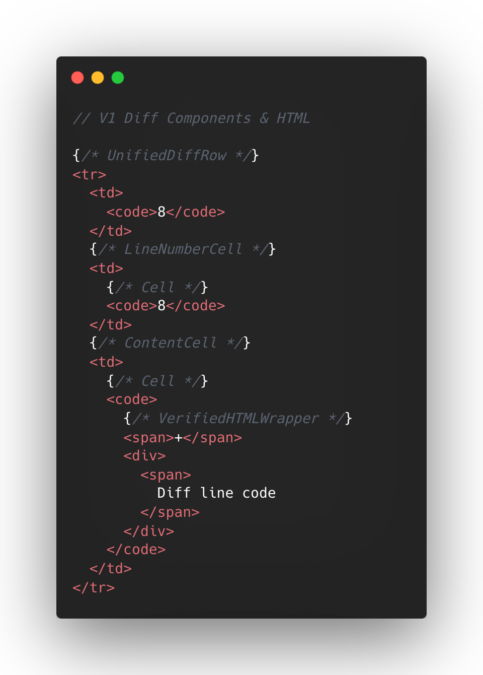
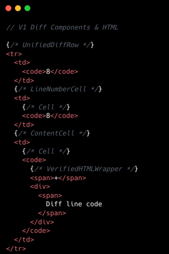
The following is a simplified visual of the React Component structure mixed with the DOM tree elements for v1 diffs.

V1 Diff Components and HTML. We had 8 react components for a single diff line.

At the React layer, unified diffs typically contain at least eight components per line, while the split view contain a minimum of 13. And these numbers represent baseline counts; extra UI states like comments, hover, and focus could add more components on top.

This approach made sense to us in v1, when we first ported the diff lines to React from our classic Rails view. Our original plan centered around lots of small reusable React components and maintaining DOM tree structure.

But we also ended up attaching a lot of React event handlers in our small components, often five to six per component. On a small scale, that was fine, but on a large scale that compounded quickly. A single diff line could carry 20+ event handlers multiplied across thousands of lines.

Beyond performance impact, it also increased complexity for developers. This is a familiar scenario where you implement an initial design, only to discover later its limitations when faced with the demands of unbounded data.

To summarize, for every v1 diff line there would be:

  • Minimum of 10-15 DOM tree elements
  • Minimum of 8-13 React Components
  • Minimum of 20 React Event Handlers
  • Lots of small re-usable React Components

This v1 strategy proved unsustainable for our largest pull requests, as we consistently observed that larger pull request sizes directly led to slower INP and increased JavaScript heap usage. We needed to determine the best path for improving this setup.

Small changes make a large impact: v2

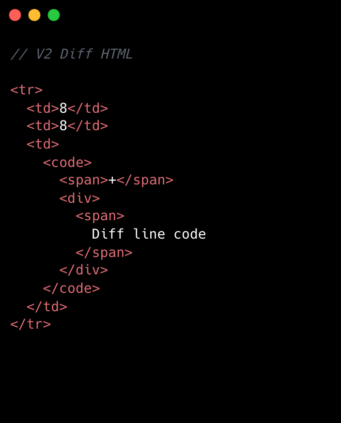
No change is too small when it comes to performance, especially at scale. For example, we removed unnecessary <code> tags from our line number cells. While dropping two DOM nodes per diff line might appear minor, across 10,000 lines, that’s 20,000 fewer nodes in the DOM. These kinds of targeted, incremental optimizations, no matter how small, compound to create a much faster and more efficient experience. By not overlooking these details, we ensured that every opportunity for improvement was captured, amplifying the overall impact on our largest pull requests.

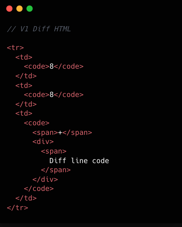
Refer to the images below to see how v1 looks compared to v2.

V1 HTML DOM structure. It is a typical HTML table structure with <tr> elements and <td> elements.
V2 HTML DOM structure. It is a typical HTML table structure with <tr> elements and <td> elements. The difference between V1 and V2 is the lack of <code> tags in the diff line number elements.

This becomes clearer if we look at the component structure behind this HTML:

V1 Diff Components and HTML. We had 8 react components for a single diff line.
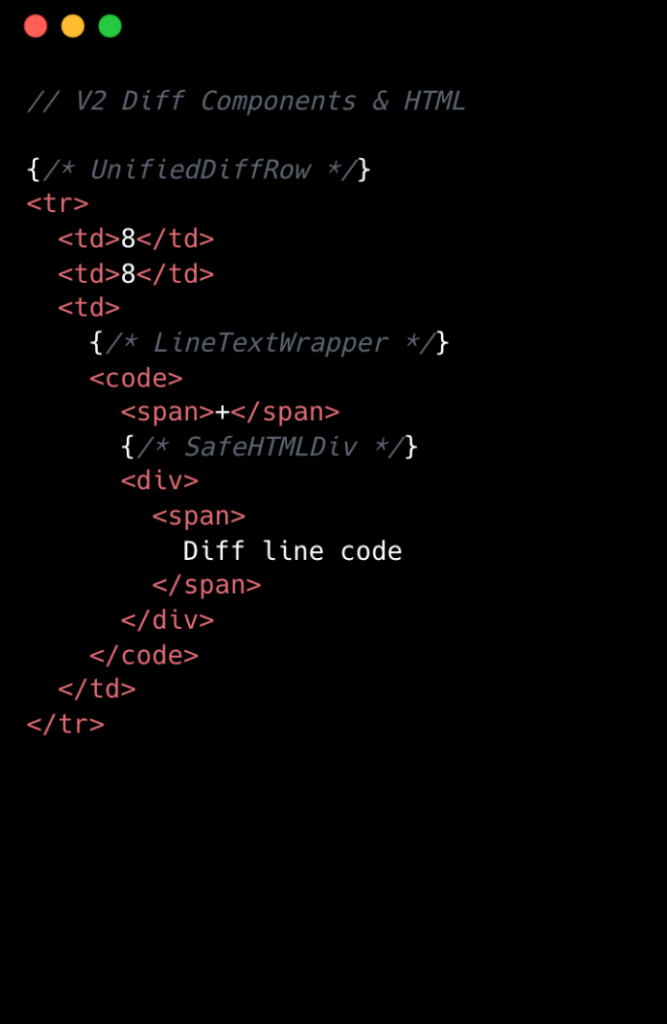
V2 Diff Components and HTML. We had 3 react components for a single diff line.

We went from eight components per diff line to two. Most of the v1 components were thin wrappers that let us share code between Split and Unified views. But that abstraction had a cost: each wrapper carried logic for both views, even though only one rendered at a time. In v2, we gave each view its own dedicated component. Some code is duplicated, but the result is simpler and faster.

Simplifying the component tree

For v2, we removed deeply nested component trees, opting for dedicated components for each split and unified diff line. While this led to some code duplication, it simplified data access and reduced complexity.

Event handling is now managed by a single top-level handler using data-attribute values. So, for instance, when you click and drag to select multiple diff lines, the handler checks each event’s data-attribute to determine which lines to highlight, instead of each line having its own mouse enter function. This approach streamlines both code and improves performance.

Moving complex state to conditionally rendered child components

The most impactful change from v1 to v2 was moving app state for commenting and context menus into their respective components. Given GitHub’s scale, where some pull requests exceed thousands of lines of code, it isn’t practical for every line to carry complex commenting state when only a small subset of lines will ever have comments or menus open. By moving the commenting state into the nested components for each diff line, we ensured that the diff-line component’s main responsibility is just rendering code—aligning more closely with the Single Responsibility Principle.

O(1) data access and less “useEffect” hooks

In v1, we gradually accumulated a lot of O(n) lookups across shared data stores and component state. We also introduced extra re-rendering through useEffect hooks scattered throughout the diff-line component tree.

To address this in v2, we adopted a two-part strategy. First, we restricted useEffect usage strictly to the top level of diff files. We also established linting rules to prevent the introduction of useEffect hooks in line-wrapping React components. This approach enables accurate memoization of diff line components and ensures reliable, predictable behavior.

Next, we redesigned our global and diff state machines to utilize O(1) constant time lookups by employing JavaScript Map. This let us build fast, consistent selectors for common operations throughout our codebase, such as line selection and comment management. These changes have enhanced code quality, improved performance, and reduced complexity by maintaining flattened, mapped data structures.

Now, any given diff line simply checks a map by passing the file path and the line number to determine whether or not there are comments on that line. An access might look like: commentsMap[‘path/to/file.tsx’][‘L8’]

Did it work?

Definitely. The page runs faster than it ever did, and JavaScript heap and INP numbers are massively reduced. For a numeric look, check out the results below. These metrics were evaluated on a pull request using a split diff setting with 10,000 line changes in the diff comparison.

Metric v1 v2 Improvement 
Total lines of code  2,800 2,000  27% less 
Total unique component types  19 10  47% fewer 
Total components rendered  ~183,504 ~50,004  74% fewer 
Total DOM nodes  ~200,000 ~180,000  10% fewer 
Total memory usage  ~150-250 MB ~80-120 MB  ~50% less 
INP on a large pull request using m1 MacBook pro with 4x slowdown:  ~450 ms ~100 ms  ~78% faster 

As you can see, this effort had a massive impact, but the improvements didn’t end there.

Virtualization for our largest pull requests

When you’re working with massive pull requests—p95+ (those with over 10,000 diff lines and surrounding context lines)—the usual performance tricks just don’t cut it. Even the most efficient components will struggle if we try to render tens of thousands of them at once. That’s where window virtualization steps in.

In front-end development, window virtualization is a technique that keeps only the visible portion of a large list or dataset in the DOM at any given time. Instead of loading everything (which would crush memory and slow things to a crawl), it dynamically renders just what you see on screen, and swaps in new elements as you scroll. This approach is like having a moving “window” over your data, so your browser isn’t bogged down by off-screen content.

To make this happen, we integrated TanStack Virtual into our diff view, ensuring that only the visible portion of the diff list is present in the DOM at any time. The impact was huge: we saw a 10X reduction in JavaScript heap usage and DOM nodes for p95+ pull requests. INP fell from 275–700+ milliseconds (ms) to just 40–80 ms for those big pull requests. By only showing what’s needed, the experience is much faster.

Further performance optimizations

To push performance even further, we tackled several major areas across our stack, each delivering meaningful wins for speed and responsiveness. By focusing on trimming unnecessary React re-renders and honing our state management, we cut down wasted computation, making UI updates noticeably faster and interactions smoother.

On the styling front, we swapped out heavy CSS selectors (e.g. :has(...)) and re-engineered drag and resize handling with GPU transforms, eliminating forced layouts and sluggishness and giving users a crisp, efficient interface for complex actions.

We also stepped up our monitoring game with interaction-level INP tracking, diff-size segmentation, and memory tagging, all surfaced in a Datadog dashboard. This continues to give our developers real-time, actionable metrics to spot and squash bottlenecks before they become issues.

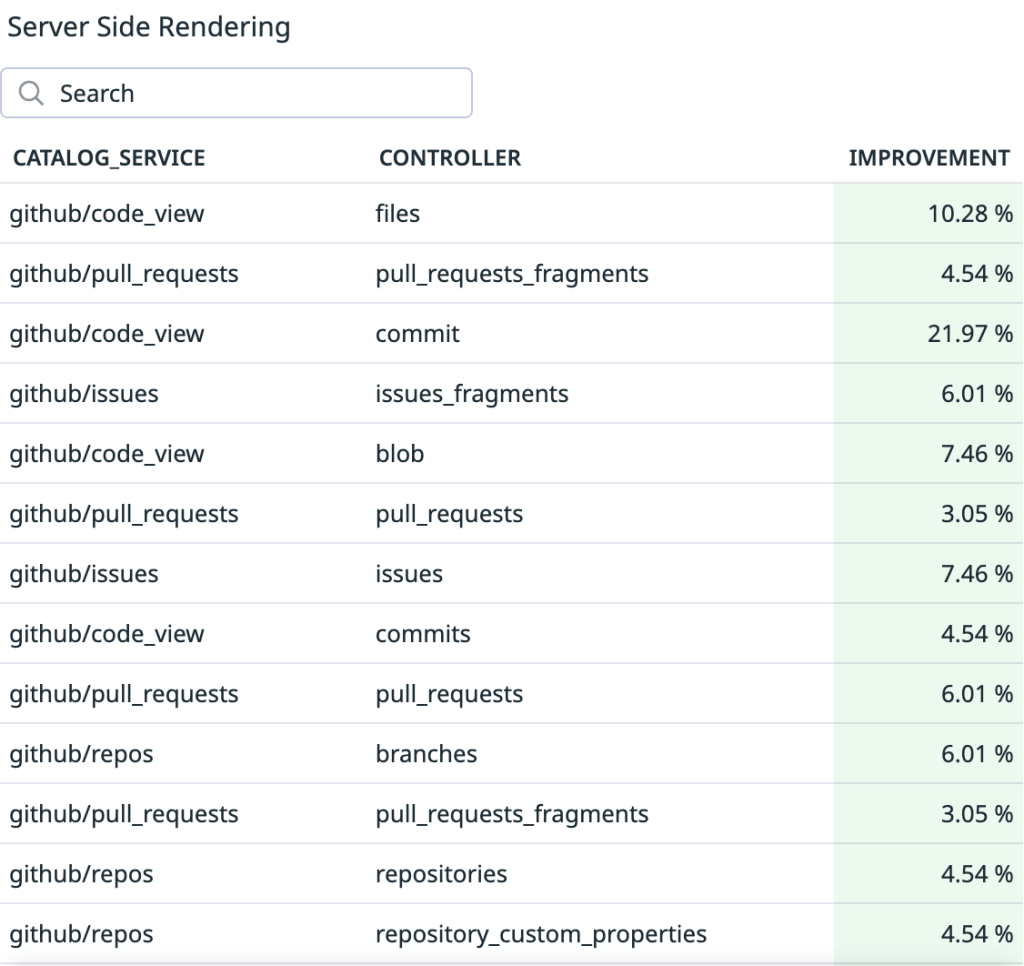
On the server side, we optimized rendering to hydrate only visible diff lines. This slashed our time-to-interactive and keeps memory usage in check, ensuring that even huge pull requests feel fast and responsive on load.

Finally, with progressive diff loading and smart background fetches, users are now able to see and interact with content sooner. No more waiting for a massive number of diffs to finish loading.

All together, these targeted optimizations made our UI feel lighter, faster, and ready for anything our users throw at it.

Diff-initely better: The power of streamlined performance

This exciting journey to streamline the diff line architecture yielded substantial improvements in performance, efficiency and maintainability. By reducing unnecessary DOM nodes, simplifying our React component tree, and relocating complex state to conditionally rendered child components, we achieved faster rendering times and lower memory consumption. The adoption of more O(1) data access patterns and stricter rules for state management further optimized performance. This made our UI more responsive (faster INP!) and easier to reason with.

These measurable gains demonstrate that targeted refactoring, even within our large and mature codebase, can deliver meaningful benefits to all users—and that sometimes focusing on small, simple improvements can have the largest impact. To see the performance gains in action, go check out your open pull requests.

The post The uphill climb of making diff lines performant appeared first on The GitHub Blog.
Breaking down CPU speed: How utilization impacts performance

Post Syndicated from Andreas Strikos original https://github.blog/engineering/architecture-optimization/breaking-down-cpu-speed-how-utilization-impacts-performance/


Introduction ⛵

The GitHub Performance Engineering team regularly conducts experiments to observe how our systems perform under varying load conditions. A consistent pattern in these experiments is the significant impact of CPU utilization on system performance. We’ve observed that as CPU utilization rises, it can lead to increased latency, which provides an opportunity to optimize system efficiency. Addressing this challenge allows us to maintain performance levels while reducing the need for additional machines, ultimately preventing inefficiencies.

Although we recognized the correlation between higher CPU utilization and increased latency, we saw an opportunity to explore the specific thresholds and impacts at various stages in greater detail. With a diverse set of instance types powered by different CPU families, we focused on understanding the unique performance characteristics of each CPU model. This deeper insight empowered us to make smarter, data-driven decisions, enabling us to provision our infrastructure with greater efficiency and confidence.

With these goals in mind, we embarked on a new journey of exploration and experimentation to uncover these insights.

Experiment setup 🧰

Collecting accurate data for this type of experiment was no easy feat. We needed to gather data from workloads that were as close to our production as possible, while also capturing how the system behaves under different phases of load. Since CPU usage patterns vary across workloads, we focused primarily on our flagship workloads. However, increasing the load could introduce small performance discrepancies, so our goal was to minimize disruption for our users.

Fortunately, a year ago, the Performance Engineering team developed an environment designed to meet these requirements, codenamed Large Unicorn Collider (LUC). This environment operates within a small portion of our Kubernetes clusters, mirroring the same architecture and configuration as our flagship workloads. It also has the flexibility to be hosted on dedicated machines, preventing interference from or with other workloads. Typically, the LUC environment remains idle, but when needed, we can direct a small, adjustable amount of traffic towards it. Activating or deactivating this traffic takes only seconds, allowing us to react quickly if performance concerns arise.

To accurately assess the impact of CPU utilization, we first established a baseline by sending moderate production traffic to a LUC Kubernetes pod hosted on one of its dedicated machines. This provided us with a benchmark for comparison. Importantly, the number of requests handled by the LUC pods remained constant throughout the experiment, ensuring consistent CPU load over time.

Once the baseline was set, we gradually increased CPU utilization using a tool called “stress,” which artificially occupies a specified number of CPU cores by running random processing tasks. Each instance type has a different number of CPU cores, so we adjusted the steps accordingly. However, the common factor across all instances was the total CPU utilization.

Note: It’s important to recognize that this is not a direct 1:1 comparison to the load generated by actual production workloads. The stress tool continuously runs mathematical operations, while our production workloads involve I/O operations and interrupts, which place different demands on system resources. Nevertheless, this approach still offers valuable insights into how our CPUs perform under load.

With the environment set up and our plan in place, we proceeded to collect as much data as possible to analyze the impact.

Results 📃

With our experiment setup finalized, let’s examine the data we gathered. As previously mentioned, we repeated the process across different instance types. Each instance type showed unique behavior and varying thresholds where performance started to decline.

As anticipated, CPU time increased for all instance types as CPU utilization rose. The graph below illustrates the CPU time per request as CPU utilization increases.

CPU time per request vs CPU utilization

The latency differences between instance types are expected due to the variations in CPU models. Focusing on the percentage increase in latency may provide more meaningful insights.

Latency percentage increase vs CPU utilization

In both graphs, one line stands out by deviating more than the others. We’ll examine this case in detail shortly.

Turbo Boost effect

An interesting observation is how CPU frequency changes as utilization increases, which can be attributed to Intel’s Turbo Boost Technology. Since all the instances we used are equipped with Intel CPUs, the impact of Turbo Boost is noticeable across all of them. In the graph below, you can see how the CPU frequency decreases as the CPU utilization increases. The red arrows are showing the CPU utilization level.

CPU Cores Frequency
CPU Cores Frequency

When CPU utilization remains at lower levels (around 30% or below), we benefit from increased core frequencies, leading to faster CPU times and, consequently, lower overall latency. However, as the demand for more CPU cores rises and utilization increases, we are likely to reach the CPU’s thermal and power limits, causing frequencies to decrease. In essence, lower CPU utilization results in better performance, while higher utilization leads to a decline in performance. For instance, a workload running on a specific node with approximately 30% CPU utilization will report faster response times compared to the same workload on the same VM when CPU utilization exceeds 50%.

Hyper-Threading

Variations in CPU frequency are not the only factors influencing performance changes. All our nodes have Hyper-Threading enabled, an Intel technology that allows a single physical CPU core to operate as two virtual cores. Although there is only one physical core, the Linux kernel recognizes it as two virtual CPU cores. The kernel attempts to distribute the CPU load across these cores, aiming to keep only one hardware thread (virtual core) busy per physical core. This approach is effective until we reach a certain level of CPU utilization. Beyond this threshold, we cannot fully utilize both virtual CPU cores, resulting in reduced performance compared to normal operation.

Finding the “Golden Ratio” of CPU utilization

Underutilized nodes lead to wasted resources, power, and space in our data centers, while nodes that are excessively utilized also create inefficiencies. As noted, higher CPU utilization results in decreased performance, which can give a misleading impression that additional resources are necessary, resulting in a cycle of over-provisioning. This issue is particularly pronounced with blocking workloads that do not follow an asynchronous model. As CPU performance deteriorates, each process can manage fewer tasks per second, making existing capacity inadequate. To achieve the optimal balance—the “Golden Ratio” of CPU utilization—we must identify a threshold where CPU utilization is sufficiently high to ensure efficiency without significantly impairing performance. Striving to keep our nodes near this threshold will enable us to utilize our current hardware more effectively alongside our existing software.

Since we already have experimental data demonstrating how CPU time increases with rising utilization, we can develop a mathematical model to identify this threshold. First, we need to determine what percentage of CPU time degradation is acceptable for our specific use case. This may depend on user expectations or performance Service Level Agreements (SLAs). Once we establish this threshold, it will help us select a level of CPU utilization that remains within acceptable limits.

We can plot the CPU utilization vs. CPU time (latency) and find the point where:

  • CPU utilization is high enough to avoid resource underutilization.
  • CPU time degradation does not exceed your acceptable limit.

A specific example derived from the data above can be illustrated in the following graph.

Percentage Increase in P50 Latency vs CPU Utilization

In this example, we aim to achieve less than 40% CPU time degradation, which would correspond to a CPU utilization of 61% on the specific instance.

Outlier case

As previously mentioned, there was a specific instance that displayed some outlying data points. Our experiment confirmed an already recognized issue where certain instances were not achieving their advertised maximum Turbo Boost CPU frequency. Instead, we observed steady CPU frequencies that fell below the maximum advertised value under low CPU utilization. In the example below, you can see an instance from a CPU family that advertises Turbo Boost frequencies above 3 GHz, but it is only reporting a maximum CPU frequency of 2.8 GHz.

CPU cores frequency
CPU cores frequency

This issue turned out to be caused by a disabled CPU C-state, which prevented the CPU cores from halting even when they were not in use. As a result, these cores were perceived as “busy” by the turbo driver, limiting our ability to take advantage of Turbo Boost benefits with higher CPU frequencies. By enabling the C-state and allowing for optimization and power reduction during idle mode, we observed the expected Turbo Boost behavior. This change had an immediate impact on the CPU time spent by our test workloads. The images below illustrate the prompt changes in CPU frequencies and latency reported following the C-state adjustment.

CPU cores frequency
CPU cores frequency
P50 CPU time on a request

Upon re-evaluating the percentage change in CPU time, we now observe similar behavior across all instances.

Percentage Increase in P50 Latency vs CPU Utilization

Wrap-up

As we anticipated many of these insights, our objective was to validate our theories using data from our complex system. While we confirmed that performance lowers as CPU utilization increases across different CPU families, by identifying optimal CPU utilization thresholds, we can achieve a better balance between performance and efficiency, ensuring that our infrastructure remains both cost-effective and high performing. Going forward, these insights will inform us of our resource provisioning strategies and help us maximize the effectiveness of our hardware investments.


Thank you for sticking with us until the end!! A special shout-out to @adrmike, @schlubbi, @terrorobe, the @github/compute-platform and finally the @github/performance-engineering team for their invaluable assistance throughout these experiments, data analysis, and for reviewing the content for accuracy and consistency. ❤️

The post Breaking down CPU speed: How utilization impacts performance appeared first on The GitHub Blog.