Post Syndicated from Ashley Whittaker original https://www.raspberrypi.org/blog/raspberry-pi-pico-balloon-tracker/
Dave Akerman of High Altitude Ballooning came up with a stratospherically cool application for Raspberry Pi Pico. In this guest blog, he shows you how to build and code a weather balloon tracker.
Balloon tracking
My main hobby is flying weather balloons, using GPS/radio trackers to relay their position to the ground, so they can be tracked and hopefully recovered. Trackers minimally consist of a GPS receiver feeding the current position to a small computer, which in turn controls a radio transmitter to send that position to the ground. That position is then fed to a live map to aid chasing and recovering the flight.

This essential role of the tracker computer is thus a simple one, and those making their own trackers can choose from a variety of microcontrollers chips and boards, for example Arduino boards, PIC microcontrollers or the BBC Microbit. Anything with a modest amount of code memory, data memory, processor power and I/O (serial, SPI etc depending on choice of GPS and radio) will do. A popular choice is Raspberry Pi, which, whilst a sledgehammer to crack a nut for tracking, does make it easy to add a camera.
Raspberry Pi Pico

When I see a new type of processor board, I feel duty bound to make it into a balloon tracker, so when I was asked to help test the new Raspberry Pi Pico, doing so was my first thought. It has plenty of I/O – SPI ports, I2C and serial all available – plus a unique ability (not that I need it for now) to add extra peripherals using the programmable PIO modules, so there was no doubt that it would be very usable. Also, having much more memory than typical microcontrollers, it offers the ability to add functions that would normally need a full Raspberry Pi board – for example on-board landing prediction. More on that later.
Tracker components
So a basic tracker has a GPS receiver and radio transmitter. To connect these to the Raspberry Pi Pico, I used a prototyping board where I mounted a UBlox GPS receiver, LoRa radio transmitter, and sockets for the Pico itself.
I don’t use breadboards as they are prone to intermittent connections that then waste programming time chasing a “bug” that’s actually a hardware problem. Besides, trackers need to be robust so I would need to solder one together eventually anyway.

The particular UBlox GPS module I had handy only has a serial port brought out, so I couldn’t use I2C. No matter because, unlike most Arduino boards, the Raspberry Pi Pico isn’t limited to a single serial port.
The LoRa module connects via SPI and a single GPIO pin which the module uses to send its status (e.g. packet sent – ready to send next packet) to the Raspberry Pi Pico.
Finally, with the tracker working, I added an I2C environmental sensor to the board via a pin header, so the sensor can be placed in free air outside the tracker.
Finally, with the tracker working, I added an I2C environmental sensor to the board via a pin header, so the sensor can be placed in free air outside the tracker.
Development setup
I decided to use C for my tracker rather than Python, for a variety of reasons. The main one is that I have plenty of existing C tracker code to work from, for Arduino and Raspberry Pi, but not so much Python. Secondly, I figured that most of the testers would be using Python so there might be more of a need to test the C toolchain.
The easiest route to getting the C/C++ toolchain working is to install on a Raspberry Pi 4. I couldn’t quite get the VSCode integration working (finger trouble I think) but anyway I’m quite happy to code with an editor and separate build window. So what I ended up with was Notepadd++ on my Windows PC to edit the code, with the source on a Raspberry Pi 4. I then had an ssh window open to run the compile/link steps, and a separate one running the debugger. The debugger downloads the binary to the Raspberry Pi Pico via the latter’s debug port.
For regular debug output from the program I connected a Raspberry Pi Pico serial port to an FTDI USB Serial TTL adapter connected back to my PC – see the image below.

At some point I’ll revisit this setup. First, it’s now possible to printf to a virtual USB serial port, so that frees up that Raspberry Pi Pico serial port. Secondly, I need to get that VSCode integration working.
Tracker code
My Raspberry Pi and Arduino tracker programs work slightly differently. On the Raspberry Pi, to separate the code for the different functions (GPS, radio, sensors etc) I use a separate thread for each. That allows for example a new packet to be sent to the radio transmitter without delay, even if a slow operation is running concurrently elsewhere.
On the Arduino, with no threads available, the code is still split into separate modules but each one is coded to run quickly without waiting in a loop for a peripheral to respond. For example some temperature sensors can take a second or so to take a measurement, and it’s vital not to sit in a loop waiting for the result.
The C toolchain for Raspberry Pi Pico doesn’t, by default, support threaded code unfortunately. Rather than rebuild it with support added, I opted for the approach I use with Arduino. So the main code starts with initialising each module individually, and then sits in a tight loop calling each module once per loop. It’s then up to each module to return control swiftly so that the loop keeps running quickly and no module is kept waiting for long.
Code modules
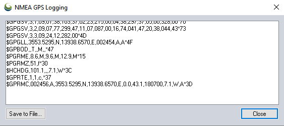
The GPS code uses a serial port to receive NMEA data from the GPS. NMEA is the standard ASCII protocol used by pretty much every GPS module that exists, and includes the current date, time, latitude, longitude, altitude and other data. All we need to do is confirm that the data is valid, then read and store these key values. The other important function is to ensure that the GPS module is in the correct “flight mode” so that it works at high altitude – without this then it will stop providing new positions about 18km altitude.
The LoRa radio code checks to see when the module is not transmitting, then builds a new telemetry message containing the above GPS data plus the name of the balloon, any other sensor data, and the landing prediction (see later).
This message is passed to the LoRa chip via SPI, then the chip switches on its radio and modulates the radio signal with the telemetry data. Once the message has been sent then the chip switches on its DIO0 output which is connected to the Raspberry Pi Pico so it knows when it can send another message.
All messages are received on the ground (in this case by a Pi LoRa receiver) and then uploaded to an internet database that in turn drives a live Google map (see image below).

Sensors
Usefully for balloon trackers, the Raspberry Pi Pico can be powered directly from battery via an on-board buck-boost converter.
The input voltage connects through a potential divider to an analog sense input (ADC3) to allow for easy measurement of the battery voltage. Note that the ADC reference voltage is the 3.3V rail, which is noisy especially when used to power external devices such as the GPS and LoRa both of which have rather spiky power consumption requirements, so the code averages out many measurements.
An alternative would be to add a precise reference voltage to the ADC but I went for the zero cost software option.

The board temperature can also be measured, this time using ADC4. That’s less useful though for a tracker than an external temperature measurement, so I added a BME280 device for that. The Raspberry Pi Pico samples include code for the BME connected via SPI, but I chose I2C so I needed to replace the SPI calls with I2C calls. Pretty easy. The BME280 returns pressure – probably the most interesting environmental measurement for a balloon tracker – and humidity too.
Landing prediction
So far, everything I’ve done could also be done on a basic AVR chip e.g. the Arduino Mini Pro, with some spare room. However, one very useful extra is to add a prediction of the landing point.
We use online flight prediction prior to launch, to determine roughly where the balloon will land (within a few miles) so we know it’s safe to launch without landing near a city for example. This uses a global wind prediction database plus some flight parameters (e.g. ascent rate and burst altitude) to predict the path of the balloon from launch to landing. It can be very accurate if those parameters are followed through on the flight itself.

Of course the actual flight never quite follows the plan – for example the launch might be later than planned, and in changing wind conditions that itself can move the landing point by miles. So it’s useful to have a live prediction during that flight, and indeed we have that, using the same wind database.
However, since it’s online, and 3G/4G can be patchy when chasing a balloon, it’s useful to have an independent landing prediction. This can be done in the tracker itself, by storing the wind speed and direction (deduced from GPS positions) on the way up, measuring the descent rate after burst, applying that to an atmospheric density model to plot the future descent rate to the ground, and then calculating the effect of the wind during descent and finally producing a landing position.
Typical Arduino boards don’t have enough memory to store the measured wind data, but the Raspberry Pi Pico has more than enough. I ported my existing code which:
- During ascent, it splits the vertical range into 100 metres sections, into which it stores the latitude and longitude deltas as degrees per second.
- Every few seconds, it runs a prediction of the landing position based on the current position, the data in that array, and an estimated descent profile that uses a simple atmospheric model plus default values for payload weight and parachute effectiveness.
- During descent, the parachute effectiveness is measured, and the actual figure is used in the above calculation in (2).
- Calculates the time it will spend within each 100m section of air, then multiplies that by the stored wind speed to calculate the horizontal distance and direction it is expected to travel in that section.
- Adds all those sectional movements together, adds those to the current position, and produces the landing prediction.
- Sends that position down to the ground with the rest of the telemetry.
Phew. Now we know pretty much everything about how balloon trackers work. Thanks Dave! Also, if you want to go on your own near-space flight, check out High Altitude Ballooning.
The post Raspberry Pi Pico balloon tracker appeared first on Raspberry Pi.