(I originally drafted this just after publishing the game, but then decided to start a whole series about its development and wasn’t sure what to do with this! But it’s solid and serves a different purpose, so here it is.)
It’s been a while, but I made another PICO-8 game! It’s a little platformer with light puzzling, where you help Star Anise find his best friend Branch Commander Twig. It’s only half an hour long at worst, and it’s even playable on a phone!
This is the one-and-a-halfth entry in the Star Anise Chronicles series, which after several false starts, finally kicked off over Christmas with a… uh… interactive fiction game. Expect the series to continue with even more whiplash-inducing theme shifts.
More technical considerations will go in the “gamedev from scratch” series, but read on for some overall thoughts on the design. Both contain spoilers, of course, so I do urge you to play the game first.
The first attempt at a Star Anise game was two years ago, in early 2018. The idea was to make a Metroidvania where Star Anise had a bunch of guns that shot cat-themed projectiles, obtained a couple other cat-themed powers, and made a total mess of a serious plot happening in the background while he ran around collecting garbage.
After finishing up the Steam release of Cherry Kisses last month, we decided that our next game should be that one, which would now be Star Anise 2 (since i’d already released a Star Anise 1 some months ago). We have, uh, already altered these plans, but that’s the background.
I don’t really know why I started on this game. I guess there’s some element of stress to working on a project with someone, even if that someone is Ash (my spouse), and especially if I’m supposed to be driving it forward. I have to tell someone what to do, and then if I don’t like the result I have to ask them to fix it, and a lot of tiny design questions are out of my control anyway, and all of this is happening on someone else’s schedule, and I have to convey all the project state that’s in my head in a complicated non-verbal form, and… all of those things are a constant low-level source of stress.
So I guess we’d just finished a game that I’d designed, and it was looking like we were about to start a sizable project where I was the design lead again, and I wanted to make something I could finish by myself as an interlude.
And so I sat down with a teeny tiny tool to make a teeny tiny version of what I expected would be our next game.
The basics were obvious: run, jump, land. I gave Star Anise little landing particles early on — they’re in the bigger prototype, I love landing puffs in general, and having them be stars adds so much silly personality.
I knew I wanted to have multiple abilities you collect, since that’s the heart of Metroidventures. I briefly considered giving Star Anise a gun, as in the prototype, but gave up on that pretty early. I would’ve had to sprite a gun, a projectile, a projectile explosion, enemies, enemy attacks, enemy death frames…
Don’t get me wrong; I have no problem with drawing all of that. The concern was that PICO-8 has a very limited amount of space for sprites — in the configuration I was using, 128 sprites of 8×8 pixels each. Star Anise himself takes up 9, even with some clever reuse for his walking animation. The star puff takes 4. The common world tile, plus versions for edges and corners, takes up 9. That’s 22 sprites already, more than 17% of the space I have, for absolutely nothing besides jumping around on solid ground. I would have to keep it simple.
That led me to the first two powers, both borrowed from the prototype:
AOWR starts conversation with NPCs and opens doors. I can’t really take any creative credit here, since these are both things Anise attempts to do with aowrs in real life.
Papping activates levers and knocks over glasses of liquid. Anise only does one of those in real life. (In the prototype, this is a gun — which shoots pawprint-shaped projectiles — but I’d already been thinking about making it a “melee” ability first.)
I adore both of these abilities. I think they both turn some common UI tropes on their heads. NPCs, doors, and levers are all things you usually interact with by pressing some generic “interact” button, but hitting a lever (and meowing at a door) adds some physicality to the action — you’re actually doing something, not just making it go.
And pressing A to talk to an NPC doesn’t really make any sense at all! Consider: almost universally, even in games where the player character speaks, pressing A to start a conversation leads off with the NPC talking. So what the hell did you actually do? What does pressing A represent actually doing that results in someone else casually starting a conversation with you, seemingly unprompted? I have no idea! It’s nonsense! But Anise meows at me all the time and I always respond to him, which is perfectly sensible.
The third power, telepawt, is a little newer. We’d conceived a cat teleporting power pretty recently, but it was more involved and required some big environmental props. I realized pretty quickly that I couldn’t possibly do much of interest on the tiny PICO-8 screen (16 × 16 tiles), but I do like teleporting abilities! I briefly considered ripping off Axiom Verge, but I’ve already done that in fox flux, and the physics are a little involved… and then, lo, inspiration! Combine the two ideas: teleport great distances, but in a controlled and predictable way, by teleporting to the point on the opposite side of the screen. It felt like a very 8-bit kind of power, and I could already imagine a few ways to hide stuff with it, so off I went.
And that seemed like a reasonable progression. A way to talk (and progress through doors), a way to interact with objects, and a way to move around. I decided about halfway through development to make jumping a faux powerup as well; it stretches out the progression a bit more by making you walk past potential jumps and then come back to them later, which is important when I don’t have much map space to work with.
I’d originally planned for items to be separate from abilities, but ran into a couple problems, the worst of which was that I really didn’t have much screen space for sprinkling more items around. I ended up turning items into abilities in their own right, which I think was an improvement overall; now you can crinkle the plastic bag wherever you want, for example.
The game deliberately doesn’t try to explain itself; PICO-8 only has six buttons, and four of them are a d-pad, so I figured button-mashing (as in ye olde NES days) would get everyone through. Still, several players were confused about how to jump (and possibly gave up before even acquiring jump?), and one didn’t realize you could switch abilities, despite the up/down arrowheads on the ability box. Not sure what to learn from this.
I struggled a bit with the map. PICO-8 has a built-in map editor with enough space for 32 screen-sized rooms (arranged in an 8 × 4 grid), which it turns out is not very many. I also very much did not want the game space to be confined to exactly that size of rectangle, so I knew I’d have to do some funky stuff with room connections. (Armed with that power, I ended up making loops and other kinds of non-Euclidean geometry, but hey that’s plenty appropriate for an imaginary moon.)
The bigger problem was designing the rooms outside of the PICO-8 map editor. I tried sketching in Krita, and then on paper, but kept running into the same two problems: it was tedious to rearrange rooms, and I didn’t have a good sense of how much space was available per room.
I found a novel solution: I wrote a Python script to export the map to a PNG, opened it in Aseprite, and edited it there — with each pixel representing a tile and the grid size set to 16. Now I knew exactly how much space I had, and rearranging rooms was easy: double-clicking a cell selects it, and holding Alt while dragging a selection snaps it to the grid. Here’s the beginning part of the game, screenshotted directly from Aseprite at 400% zoom:
When it came time to pack it all back into a rectangle, I copied the whole map, rearranged the rooms, and numbered them all so I could keep track of connections. Surprisingly, it wasn’t that bad a workflow.
The non-Euclidean map connections came in handy for packing secrets in more efficiently; most of the secret stars are off-screen, making them harder to find, but I couldn’t really afford to have a dedicated treasure room for every single one. So I crammed two treasures into the same room a few times, even though the two routes you’d take to get there are generally nowhere near each other.
Doors helped stretch the map out, too. It’s probably obvious if you think about it in the slightest, but doors don’t lead to different rooms; they reuse the same room. But some tiles only appear in the overworld, some tiles only appear in cave world, and actors (besides doors) don’t spawn in caves. That seemingly small difference was enough to make rooms vastly different in the two worlds; the most extreme case is a “crossroads” room, which you traverse vertically in the overworld but horizontally in cave world. (Honestly, I wish I’d done a bit more of this, but it works best in rooms that only have two overworld exits, and there ended up not being too many of those. Also, caves are restricted to basically just platforming, so there’s only so much variety I can squeeze out of them.)
Designing caves was a little trickier than you might think, since the PICO-8 map has no layers! If something needed to occupy a tile in the overworld, then I could not put something in the same place in cave world. Along with the design nightmare that is telepawt, this gave me a couple headaches.
I do like the cave concept a lot, though. I love parallel versions of places in games, and I have an unfinished PICO-8 game that’s centered around that idea taken to extremes. It’s also kind of a nod to my LÖVE games, all the way back to Neon Phase, where going indoors didn’t load another map — rooms were just another layer.
Originally, PICO-8 had a fixed palette of 16 colors. You could do palette swaps of various sorts, but you can’t actually change any of the colors.
But since I last used it, PICO-8 gained a “secret palette” — an extra 16 colors that you can request. You can’t have more than 16 colors on the screen at a time, but you can replace one of the existing colors with a “secret” color. There’s also an obscure way to tell PICO-8 to preserve the screen palette when the game finishes, which means I could effectively change the palette in the sprite editor. Hooray!
I didn’t want to completely change the palette, so I tried to keep the alterations minor. For the most part, I gave up reds and pinks for a better spread of greens, purples, and yellows. Here’s the core PICO-8 palette, the secret PICO-8 palette, and the game’s palette, respectively:
I think I did a decent job of preserving the overall color aesthetic while softening the harsh contrasts of the original palette, and the cool colors really helped the mood.
Note that I changed the background color (color 0 isn’t drawn when it appears in a sprite) to navy and promoted black to a foreground color, which helped black stand out more when used as an outline or whatever. Probably the best example of this is in the logo, traced from the vector logo I made for the first Star Anise game.
Hmm, what else. The tiles themselves felt almost forced, if that makes sense? Like I could only draw them one way. PICO-8 tiles are a rinky-dink 8 pixels, and boy that is not much to work with. If I had a lot of sprite space, I could make bigger metatiles, but… I don’t, so I couldn’t. I tried a lot of variations of tiles, and what I ended up with were pretty much the only things that worked.
I love how the emoting came out. I knew I didn’t have nearly enough room for facial expressions for everyone, but I wanted to give them some kind of visual way to express mood, and the tiny overlays kinda fell naturally out of that. I think they add a ton of personality, especially in how everyone uses them differently.
I’m pretty happy with the sound design, as well. I’m an extremely amateur composer, and I wrote 90% of the music in a few hours on the start of the last day, but I actually like how it came out and I like going back to listen to it. The sound effects are, with some mild exceptions, pretty much excellent — the aowr is incredible, it has fooled other folks in the house more than once, and I knew I had it right when I had a blast just running around mashing the meow button.
I’m also happy with the dialogue, and hope it conveys the lunekos’ personalities in just these few interactions.
While writing the ending, I had to stop in mid-draft to go cry. Then I cried again when I finished it a few days later. I’ll miss you forever, Branch Commander Twig.
I first got into web design/development in the late 90s, and only as I type this sentence do I realize how long ago that was.
And boy, it was horrendous. I mean, being able to make stuff and put it online where other people could see it was pretty slick, but we did not have very much to work with.
I’ve been taking for granted that most folks doing web stuff still remember those days, or at least the decade that followed, but I think that assumption might be a wee bit out of date. Some time ago I encountered a tweet marvelling at what we had to do without border-radius. I still remember waiting with bated breath for it to be unprefixed!
But then, I suspect I also know a number of folks who only tried web design in the old days, and assume nothing about it has changed since.
I’m here to tell all of you to get off my lawn. Here’s a history of CSS and web design, as I remember it.
(Please bear in mind that this post is a fine blend of memory and research, so I can’t guarantee any of it is actually correct, especially the bits about causality. You may want to try the W3C’s history of CSS, which is considerably shorter, has a better chance of matching reality, and contains significantly less swearing.)
(Also, this would benefit greatly from more diagrams, but it took long enough just to write.)
My favorite artifact of this era is the book that taught me HTML: O’Reilly’s HTML: The Definitive Guide, published in several editions in the mid to late 90s. The book was indeed about HTML, with no mention of CSS at all. I don’t have it any more and can’t readily find screenshots online, but here’s a page from HTML&XHTML: The Definitive Guide, which seems to be a revision (I’ll get to XHTML later) with much the same style. Here, then, is the cutting-edge web design advice of 199X:
“Clearly delineate headers and footers with horizontal rules.”
No, that’s not a border-top. That’s an <hr>. The page title is almost certainly centered with, well, <center>.
The page uses the default text color, background, and font. Partly because this is a guidebook introducing concepts one at a time; partly because the book was printed in black and white; and partly, I’m sure, because it reflected the reality that coloring anything was a huge pain in the ass.
Let’s say you wanted all your <h1>s to be red, across your entire site. You had to do this:
1
<H1><FONTCOLOR=red>...</FONT></H1>
…every single goddamn time. Hope you never decide to switch to blue!
Oh, and everyone wrote HTML tags in all caps. I don’t remember why we all thought that was a good idea. Maybe this was before syntax highlighting in text editors was very common (read: I was 12 and using Notepad), and uppercase tags were easier to distinguish from body text.
Keeping your site consistent was thus something of a nightmare. One solution was to simply not style anything, which a lot of folks did. This was nice, in some ways, since browsers let you change those defaults, so you could read the Web how you wanted.
A clever alternate solution, which I remember showing up in a lot of Geocities sites, was to simply give every page a completely different visual style. Fuck it, right? Just do whatever you want on each new page.
That trend was quite possibly the height of web design.
Damn, I miss those days. There were no big walled gardens, no Twitter or Facebook. If you had anything to say to anyone, you had to put together your own website. It was amazing. No one knew what they were doing; I’d wager that the vast majority of web designers at the time were clueless hobbyist tweens (like me) all copying from other clueless hobbyist tweens. Half the Web was fan portals about Animorphs, with inexplicable splash pages warning you that their site worked best if you had a 640×480 screen. (Any 12-year-old with insufficient resolution should, presumably, buy a new monitor with their allowance.) Everyone who was cool and in the know used Internet Explorer 3, the most advanced browser, but some losers still used Netscape Navigator so you had to put a “Best in IE” animated GIF on your splash page too.
This was also the era of “web-safe colors” — a palette of 216 colors, where every channel was one of 00, 33, 66, 99, cc, or ff — which existed because some people still had 256-color monitors! The things we take for granted now, like 24-bit color.
In fact, a lot of stuff we take for granted now was still a strange and untamed problem space. You want to have the same navigation on every page on your website? Okay, no problem: copy/paste it onto each page. When you update it, be sure to update every page — but most likely you’ll forget some, and your whole site will become an archaeological dig into itself, with strata of increasingly bitrotted pages.
Much easier was to use frames, meaning the browser window is split into a grid and a different page loads in each section… but then people would get confused if they landed on an individual page without the frames, as was common when coming from a search engine like AltaVista. (I can’t believe I’m explaining frames, but no one has used them since like 2001. You know iframes? The “i” is for inline, to distinguish them from regular frames, which take up the entire viewport.)
PHP wasn’t even called that yet, and nobody had heard of it. This weird “Perl” and “CGI” thing was really strange and hard to understand, and it didn’t work on your own computer, and the errors were hard to find and diagnose, and anyway Geocities didn’t support it. If you were really lucky and smart, your web host used Apache, and you could use its “server side include” syntax to do something like this:
Mwah. Beautiful. Apache would see the special comments, paste in the contents of the referenced files, and you’re off to the races. The downside was that when you wanted to work on your site, all the navigation was missing, because you were doing it on your regular computer without Apache, and your web browser thought those were just regular HTML comments. It was impossible to install Apache, of course, because you had a computer, not a server.
Sadly, that’s all gone now — paved over by homogenous timelines where anything that wasn’t made this week is old news and long forgotten. The web was supposed to make information eternal, but instead, so much of it became ephemeral. I miss when virtually everyone I knew had their own website. Having a Twitter and an Instagram as your entire online presence is a poor substitute.
Space Jam, if you’re not aware, is the greatest movie of all time. It documents Bugs Bunny’s extremely short-lived basketball career, playing alongside a live action Michael Jordan to save the planet from aliens for some reason. It was followed by a series of very successful and critically acclaimed RPG spinoffs, which describe the fallout of the Space Jam and are extremely canon.
And we are truly blessed, for 24 years after it came out, its website is STILLUP. We can explore the pinnacle of 1996 web design, right here, right now.
First, notice that every page of this site is a static page. Not only that, but it’s a static page ending in .htm rather than .html, because people on Windows versions before 95 were still beholden to 8.3 filenames. Not sure why that mattered in a URL, as if you were going to run Windows 3.11 on a Web server, but there you go.
Haha, just kidding! What the fuck is CSS? Space Jam predates it by a month. (I do see a single line in the page source, but I’m pretty sure that was added much later to style some legally obligatory policy links.)
Notice the extremely precise positioning of these navigation links. This feat was accomplished the same way everyone did everything in 1996: with tables.
In fact, tables have one functional advantage over CSS for layout, which was very important in those days, and not only because CSS didn’t exist yet. You see, you can ctrl-click to select a table cell and even drag around to select all of them, which shows you how the cells are arranged and functions as a super retro layout debugger. This was great because the first meaningful web debug tool, Firebug, wasn’t released until 2006 — a whole decade later!
The markup for this table is overflowing with inexplicable blank lines, but with those removed, it looks like this:
That’s the first two rows, including the logo. You get the idea. Everything is laid out with align and valign on table cells; rowspans and colspans are used frequently; and there are some <br>s thrown in for good measure, to adjust vertical positioning by one line-height at a time.
Other fantastic artifacts to be found on this page include this header, which contains Apache SSI syntax! This must’ve quietly broken when the site was moved over the years; it’s currently hosted on Amazon S3. You know, Amazon? The bookstore?
Okay, let’s check out jam central. I’ve used my browser dev tools to reduce the viewport to 640×480 for the authentic experience (although I’d also have lost some vertical space to the title bar, taskbar, and five or six IE toolbars).
Note the frames: the logo in the top left leads back to the landing page, cleverly saving screen space on repeating all that navigation, and the top right is a fucking ad banner which has been blocked like seven different ways. All three parts are separate pages.
Note also the utterly unreadable red text on a textured background, one of the truest hallmarks of 90s web design. “Why not put that block of text on an easier-to-read background?” you might ask. You imbecile. How would I possibly do that? Only the <body> has a background attribute! I could use a table, but tables only support solid background colors, and that would look so boring!
But wait, what is this new navigation widget? How are the links all misaligned like that? Is this yet another table? Well, no, although filling a table with chunks of a sliced-up image wasn’t uncommon. But this is an imagemap, a long-forgotten HTML feature. I’ll just show you the source:
I assume this is more or less self-explanatory. The usemap attribute attaches an image map, which is defined as a bunch of clickable areas, beautifully encoded as inscrutable lists of coordinates or something.
And this stuff still works! This is in HTML! You could use it right now! Probably don’t though!
They did an important thing here: since they specified a background image (which is opaque), they also specified a background color. Without it, if the background image failed to load, the page would be white text on the default white background, which would be unreadable.
(That’s still an important thing to keep in mind. I feel like modern web development tends to assume everything will load, or sees loading as some sort of inconvenience to be worked around, but not everyone is working on a wired connection in a San Francisco office twenty feet away from a backbone.)
But about the page itself. Thumbnail grids are a classic problem of web design, dating all the way back to… er… well, at least as far back as Space Jam. The main issue is that you want to put things next to each other, whereas HTML defaults to stacking everything in one big column. You could put all the thumbnails inline, in a single row of (wrapping) text, but that wouldn’t be much of a grid — and you usually want each one to have some sort of caption.
Space Jam’s approach was to use the only real tool anyone had in their toolbox at the time: a table. It’s structured like this:
A 3×3 grid of thumbnails, left to the browser to arrange. (The last image, on a row of its own, isn’t actually part of the table.) This can’t scale to fit your screen, but everyone’s screen was pretty tiny back then, so that was slightly less of a concern. They didn’t add captions here, but since every thumbnail is wrapped in a table cell, they easily could have.
This was the state of the art in thumbnail grids in 1996. We’ll be revisiting this little UI puzzle a few times; you can see live examples (and view source for sample markup) on a separate page.
But let’s take a moment to appreciate the size of the “full-size, full-color, internet-quality” movie screenshots on my current monitor.
Hey, though, they’re less than 16 KB! That’ll only take nine seconds to download.
(I’m reminded of the problem of embedded video, which wasn’t solved until HTML5’s <video> tag some years later. Until then, you had to use a binary plugin, and all of them were terrible.)
(Oh, by the way: images within links, by default, have a link-colored border around them. Image links are usually self-evident, so this was largely annoying, and until CSS you had to disable them for every single image with <img border=0>.)
So that’s where we started, and it sucked. If you wanted any kind of consistency on more than a handful of pages, your options were very limited, and they were pretty much limited to a whole lot of copying and pasting. The Space Jam website opted to, for the most part, not bother at all — as did many others.
Then CSS came along, it was a fucking miracle. All that inline repetition went away. You want all your top-level headings to be a particular color? No problem:
123
H1{color:#FF0000;}
Bam! You’re done. No matter how many <h1>s you have in your document, every single one of them will be eye-searing red, and you never have to think about it again. Even better, you can put that snippet in its own file and have that questionable aesthetic choice applied to every page of your whole site with almost no effort! The same applied to your gorgeous tiling background image, the colors of your links, and the size of the font in your tables.
(Just remember to wrap the contents of your <style> tags in HTML comments, or old browsers without CSS support will display them as text.)
You weren’t limited to styling tags en masse, either. CSS introduced “classes” and “IDs” to target only specifically flagged elements. A selector like P.important would only affect <P CLASS="important">, and #header would only affect <H1 ID="header">. (The difference is that IDs are intended to be unique in a document, whereas classes can be used any number of times.) With these tools, you could effectively invent your own tags, giving you a customized version of HTML specific to your website!
This was a huge leap forward, but at the time, no one (probably?) was thinking of using CSS to actually arrange the page. When CSS 1 was made a recommendation in December ‘96, it barely addressed layout at all. All it did was divorce HTML’s existing abilities from the tags they were attached to. We had font colors and backgrounds because<FONT COLOR> and <BODY BACKGROUND> existed. The only feature that even remotely affected where things were positioned was the float property, the equivalent to <IMG ALIGN>, which pulled an image to the side and let text flow around it, like in a magazine article. Hardly whelming.
This wasn’t too surprising. HTML hadn’t had any real answers for layout besides tables, and the table properties were too complicated to generalize in CSS and too entangled with the tag structure, so there was nothing for CSS 1 to inherit. It merely reduced the repetition in what we were already doing with e.g. <FONT> tags — making Web design less tedious, less error-prone, less full of noise, and much more maintainable. A pretty good step forward, and everyone happily adopted it for that, but tables remained king for arranging your page.
That was okay, though; all your blog really needed was a header and a sidebar, which tables could do just fine, and it wasn’t like you were going to overhaul that basic structure very often. Copy/pasting a few lines of <TABLE BORDER=0> and <TD WIDTH=20%> wasn’t nearly as big a deal.
For some span of time — I want to say a couple years, but time passes more slowly when you’re a kid — this was the state of the Web. Tables for layout, CSS for… well, style. Colors, sizes, bold, underline. There was even this sick trick you could do with links where they’d only be underlined when the mouse was pointing at them. Tubular!
(Fun fact: HTMLemail is still basically trapped in this era.)
(And here’s about where I come in, at the ripe old age of 11, with no clue what I was doing and mostly learning from other 11-year-olds who also had no clue what they were doing. But that was fine; a huge chunk of the Web was 11-year-olds making their own websites, and it was beautiful. Why would you go to a business website when you can take a peek into the very specific hobbies of someone on the other side of the planet?)
A year and a half later, in mid ‘98, we were gifted CSS 2. (I love the background on this page, by the way.) This was a modest upgrade that addressed a few deficiencies in various areas, but most interesting was the addition of a couple positioning primitives: the position property, which let you place elements at precise coordinates, and the inline-block display mode, which let you stick an element in a line of text like you could do with images.
Such tantalizing fruit, just out of reach! Using position seemed nice, but pixel-perfect positioning was at serious odds with the fluid design of HTML, and it was difficult to make much of anything that didn’t fall apart on other screen sizes or have other serious drawbacks. This humble inline-block thing seemed interesting enough; after all, it solved the core problem of HTML layout, which is putting things next to each other. But at least for the moment, no browser implemented it, and it was largely ignored.
I can’t say for sure if it was the introduction of positioning or some other factor, but something around this time inspired folks to try doing layout in CSS. Ideally, you would completely divorce the structure of your page from its appearance. A website even came along to take this principle to the extreme — CSS Zen Garden is still around, and showcases the same HTML being radically transformed into completely different designs by applying different stylesheets.
Trouble was, early CSS support was buggy as hell. In retrospect, I suspect browser vendors merely plucked the behavior off of HTML tags and called it a day. I’m delighted to say that RichInStyle still has an extensive list of early browser CSS bugs up; here are some of my favorites:
IE 3 would ignore all but the last <style> tag in a document.
IE 3 ignored pseudo-classes, so a:hover would be treated as a.
IE 3 and IE 4 treated auto margins as zero. Actually, I think this one might’ve persisted all the way to IE 6. But that was okay, because IE 6 also incorrectly applied text-align: center to block elements.
If you set a background image to an absolute URL, IE 3 would try to open the image in a local program, as though you’d downloaded it.
Netscape 4 understood an ID selector like #id, but ignored h1#id as invalid.
Netscape 4 didn’t inherit properties — including font and text color! — into table cells.
Netscape 4 applied properties on <li> to the list marker, rather than the contents.
If the same element has both float and clear (not unreasonable), Netscape 4 for Mac crashes.
This is what we had to work with. And folks wanted to use CSS to lay out an entire page? Ha.
Yet the idea grew in popularity. It even became a sort of elitist rallying cry, a best practice used to beat other folks over the head. Tables for layout are just plain bad, you’d hear! They confuse screenreaders, they’re semantically incorrect, they interact poorly with CSS positioning! All of which is true, but it was a much tougher pill to swallow when the alternative was—
Well, we’ll get to that in a moment. First, some background on the Web landscape circa 2000.
The short version is: this company Netscape had been selling its Navigator browser (to businesses; it was free for personal use), and then Microsoft entered the market with its completely free Internet Explorer browser, and then Microsoft had the audacity to bundle IE with Windows. Can you imagine? An operating system that comes with a browser? This was a whole big thing, Microsoft was sued over it, and they lost, and the consequence was basically nothing.
But it wouldn’t have mattered either way, because they’d still done it, and it had worked. IE pretty much annihilated Netscape’s market share. Both browsers were buggy as hell, and differently buggy as hell, so a site built exclusively against one was likely to be a big mess when viewed in the other — this meant that when Netscape’s market share dropped, web designers paid less and less attention to it, and less of the Web worked in it, and its market share dropped further.
Sucks for you if you don’t use Windows, I guess. Which is funny, because there was an IE for Mac 5.5, and it was generally less buggy than IE 6. (Incidentally, Bill Gates wasn’t so much a brilliant nerd as an aggressive and ruthless businessman who made his fortune by deliberately striving to annihilate any competition standing in his way and making computing worse overall as a result, just saying.)
By the time Windows XP shipped in mid 2001, with Internet Explorer 6 built in, Netscape had gone from a juggernaut to a tiny niche player.
And then, having completely and utterly dominated, Microsoft stopped. Internet Explorer had seen a release every year or so since its inception, but IE 6 was the last release for more than five years. It was still buggy, but that was less noticeable when there was no competition, and it was good enough. Windows XP, likewise, was good enough to take over the desktop, and there wouldn’t be another Windows for just as long.
The W3C, the group who write the standards (not to be confused with W3Schools, who are shady SEO leeches), also stopped. HTML had seen several revisions throughout the mid 90s, and then froze as HTML 4. CSS had gotten an update in only a year and a half, and then no more; the minor update CSS 2.1 wouldn’t hit Candidate Recommendation status until early 2004, and took another seven years to be finalized.
With IE 6’s dominance, it was as if the entire Web was frozen in time. Standards didn’t matter, because there was effectively only one browser, and whatever it did became the de facto standard. As the Web grew in popularity, IE’s stranglehold also made it difficult to use any platform other than Windows, since IE was Windows-only and it was a coin flip whether a website would actually work with any other browser.
(One begins to suspect that monopolies are bad. There oughta be a law!)
In the meantime, Netscape had put themselves in an even worse position by deciding to do a massive rewrite of their browser engine, culminating in the vastly more standards-compliant Netscape 6 — at the cost of several years away from the market while IE was kicking their ass. It never broke 10% market share, while IE’s would peak at 96%. On the other hand, the new engine was open sourced as the Mozilla Application Suite, which would be important in a few years.
Before we get to that, some other things were also happening.
All early CSS implementations were riddled with bugs, but one in particular is perhaps the most infamous CSS bug of all time: the box model bug.
You see, a box (the rectangular space taken up by an element) has several measurements: its own width and height, then surrounding whitespace called padding, then an optional border, then a margin separating it from neighboring boxes. CSS specifies that these properties are all additive. A box with these styles:
123
width:100px;padding:10px;border:2pxsolidblack;
…would thus be 124 pixels wide, from border to border.
IE 4 and Netscape 4, on the other hand, took a different approach: they treated width and height as measuring from border to border, and they subtracted the border and padding to get the width of the element itself. The same box in those browsers would be 100 pixels wide from border to border, with 76 pixels remaining for the content.
This conflict with the spec was not ideal, and IE 6 set out to fix it. Unfortunately, simply making the change would mean completely breaking the design of a whole lot of websites that had previously worked in bothIE and Netscape.
So the IE team came up with a very strange compromise: they declared the old behavior (along with several other major bugs) as “quirks mode” and made it the default. The new “strict mode” or “standards mode” had to be opted into, by placing a “doctype” at the beginning of your document, before the <html> tag. It would look something like this:
1
<!DOCTYPE html PUBLIC "-//W3C//DTD HTML 4.01//EN" "http://www.w3.org/TR/html4/strict.dtd">
Everyone had to paste this damn mess of a line at the top of every single HTML document for years. (HTML5 would later simplify it to <!DOCTYPE html>.) In retrospect, it’s a really strange way to opt into correct CSS behavior; doctypes had been part of the HTML spec since way back when it was an RFC. I’m guessing the idea was that, since nobody bothered actually including one, it was a convenient way to allow opting in without requiring proprietary extensions just to avoid behavior that had been wrong in the first place. Good for the IE team!
The funny thing is, quirks mode still exists and is still the default in all browsers, twenty years later! The exact quirks have varied over time, and in particular neither Chrome nor Firefox use the IE box model even in quirks mode, but there are still quite a few other emulated bugs.
Modern browsers also have “almost standards” mode, which emulates only a single quirk, perhaps the second most infamous one: if a table cell contains only a single image, the space under the baseline is removed. Under normal CSS rules, the image is sitting within a line of (otherwise empty) text, which requires some space reserved underneath for descenders — the tails on letters like y. Early browsers didn’t handle this correctly, and some otherwise strict-mode websites from circa 2000 rely on it — e.g., by cutting up a large image and arranging the chunks in table cells, expecting them to display flush against each other — hence the intermediate mode to keep them limping along.
But getting back to the past: while this was certainly a win for standards (and thus interop), it created a new problem. Since IE 6 dominated, and doctypes were optional, there was little compelling reason to bother with strict mode. Other browsers ended up emulating it, and the non-standard behavior became its own de facto standard. Web designers who cared about this sort of thing (and to our credit, there were a lot of us) made a rallying cry out of enabling strict mode, since it was the absolute barest minimum step towards ensuring compatibility with other browsers.
Meanwhile, the W3C had lost interest in HTML in favor of developing XHTML, an attempt to redesign HTML with the syntax of XML rather than SGML.
(What on Earth is SGML, you ask? I don’t know. Nobody knows. It’s the grammar HTML was built on, and that’s the only reason anyone has heard of it.)
To their credit, there were some good reasons to do this at the time. HTML was generally hand-written (as it still is now), and anything hand-written is likely to have the occasional bugs. Browsers weren’t in the habit of rejecting buggy HTML outright, so they had various error-correction techniques — and, as with everything else, different browsers handled errors differently. Slightly malformed HTML might appear to work fine in IE 6 (where “work fine” means “does what you hoped for”), but turn into a horrible mess in anything else.
The W3C’s solution was XML, because their solution to fucking everything in the early 2000s was XML. If you’re not aware, XML takes a much more explicit and aggressive approach to error handling — if your document contains a parse error, the entire document is invalid. That means if you bank on XHTML and make a single typo somewhere, nothing at all renders. Just an error.
This sucked. It sounds okay on the face of things, but consider: generic XML is usually assembled dynamically with libraries that treat a document as a tree you manipulate, then turn it all into text when you’re done. That’s great for the common use of XML as data serialization, where your data is already a tree and much of the XML structure is simple and repetitive and easy to squirrel away in functions.
HTML is not like that. An HTML document has little reliable repeating structure; even this blog post, constructed mostly from <p> tags, also contains surprise <em>s within body text and the occasional <h2> between paragraphs. That’s not fun to express as a tree. And this is a big deal, because server-side rendering was becoming popular around the same time, and generated HTML was — still is! — put together with templates that treat it as a text stream.
If HTML were only written as complete static documents, then XHTML might have worked out — you write a document, you see it in your browser, you know it works, no problem. But generating it dynamically and risking that particular edge cases might replace your entire site with an unintelligible browser error? That sucks.
It certainly didn’t help that we were just starting to hear about this newfangled Unicode thing around this time, and it was still not always clear how exactly to make that work, and one bad UTF-8 sequence is enough for an entire XML document to be considered malformed!
And so, after some dabbling, XHTML was largely forgotten. Its legacy lives on in two ways:
It got us all to stop using uppercase tag names! So long <BODY>, hello <body>. XML is case-sensitive, you see, and all the XHTML tags were defined in lowercase, so uppercase tags simply would not work. (Fun fact: to this day, JavaScript APIs report HTML tag names in uppercase.) The increased popularity of syntax highlighting probably also had something to do with this; we weren’t all still using Notepad as we had been in 1997.
A bunch of folks still think self-closing tags are necessary. You see, HTML has two kinds of tags: containers like <p>...</p> and markers like <br>. Since a <br> can’t possibly contain anything, there’s no such thing as </br>. XML, as a generic grammar, doesn’t have this distinction; every tag must be closed, but as a shortcut, you can write <br/> to mean <br></br>.
XHTML has been dead for years, but for some reason, I still see folks write <br/> in regular HTML documents. Outside of XML, that slash doesn’t do anything; HTML5 has defined it for compatibility reasons, but it’s silently ignored. It’s even actively harmful, since it might lead you to believe that <script/> is an empty <script> tag — but in HTML, it definitely is not!
I do miss one thing about XHTML. You could combine it with XSLT, the XML templating meta-language, to do in-browser templating (i.e., slot page-specific contents into your overall site layout) with no scripting required. It’s the only way that’s ever been possible, and it was cool as all hell when it worked, but the drawbacks were too severe when it didn’t. Also, XSLT is totally fucking incomprehensible.
You’re an aspiring web designer. For whatever reason, you want to try using this CSS thing to lay out your whole page, even though it was clearly intended just for colors and stuff. What do you do?
As I mentioned before, your core problem is putting things next to each other. Putting things on top of each other is a non-problem — that’s the normal behavior of HTML. The whole reason everyone uses tables is that you can slop stuff into table cells and have it laid out side-by-side, in columns.
Well, tables seem to be out. CSS 2 had added some element display modes that corresponded to the parts of a table, but to use them, you’d have to have the same three levels of nesting as real tables: the table itself, then a row, then a cell. That doesn’t seem like a huge step up, and anyway, IE won’t support them until the distant future.
There’s that position thing, but it seems to make things overlap more often than not. Hmm.
What does that leave?
Only one tool, really: float.
I said that float was intended for magazine-style “pull” images, which is true, but CSS had defined it fairly generically. In principle, it could be applied to any element. If you wanted a sidebar, you could tell it to float to the left and be 20% the width of the page, and you’d get something like this:
1234
+---------+
| sidebar | Hello, and welcome to my website!
|         |
+---------+
Alas! Floating has the secondary behavior that text wraps around it. If your page text was ever longer than your sidebar, it would wrap around underneath the sidebar, and the illusion would shatter. But hey, no problem. CSS specified that floats don’t wrap around each other, so all you needed to do was float the body as well!
1234567
+---------++-----------------------------------+| sidebar | | Hello, and welcome to my website! || | | |+---------+ | Here's a longer paragraph to show | | that my galaxy brain CSS float | | nonsense prevents text wrap. |+-----------------------------------+
This approach worked, but its limitations were much more obvious than those of tables. If you added a footer, for example, then it would try to fit to the right of the body text — remember, all of that is “pull” floats, so as far as the browser is concerned, the “cursor” is still at the top. So now you need to use clear, which bumps an element down below all floats, to fix that. And if you made the sidebar 20% wide and the body 80% wide, then any margin between them would add to that 100%, making the page wider than the viewport, so now you have an ugly horizontal scrollbar, so you have to do some goofy math to fix that as well. If you have borders or backgrounds on either part, then it was a little conspicuous that they were different heights, so now you have to do some truly grotesque stuff to fix that. And the more conscientious authors noticed that screenreaders would read the entire sidebar before getting to the body text, which is a pretty rude thing to subject blind visitors to, so they came up with yet more elaborate setups to have a three-column layout with the middle column appearing first in the HTML.
The result was a design that looked nice and worked well and scaled correctly, but backed by a weird mess of CSS. None of what you were writing actually corresponded to what you wanted — these are major parts of your design, not one-off pull quotes! It was difficult to understand the relationship between the layout-related CSS and what appeared on the screen, and that would get much worse before it got better.
Armed with a new toy, we can improve that thumbnail grid. The original table-based layout was, even if you don’t care about tag semantics, incredibly tedious. Now we can do better!
This is the dream of CSS: your HTML contains the page data in some sensible form, and then CSS describes how it actually looks.
Unfortunately, with float as the only tool available to us, the results are a bit rough. This new version does adapt better to various screen sizes, but it requires some hacks: the cells have to be a fixed height, centering the whole grid is fairly complicated, and the grid effect falls apart entirely with wider elements. It’s becoming clear that what we wanted is something more like a table, but with a flexible number of columns. This is just faking it.
You also need this weird “clearfix” thing, an incantation that would become infamous during this era. Remember that a float doesn’t move the “cursor” — a fake idea I’m using, but close enough. That means that this <ul>, which is full only of floated elements, has no height at all. It ends exactly where it begins, with all the floated thumbnails spilling out below it. Worse, because any subsequent elements don’t have any floated siblings, they’ll ignore the thumbnails entirely and render normally from just below the empty “grid” — producing an overlapping mess!
The solution is to add a dummy element at the end of the list which takes up no space, but has the CSSclear: both — bumping it down below all floats. That effectively pushes the bottom of the <ul> under all the individual thumbnails, so it fits snugly around them.
Browsers would later support the ::before and ::after“generated content” pseudo-elements, which let us avoid the dummy element entirely. Stylesheets from the mid-00s were often littered with stuff like this:
As a quick aside into the world of JavaScript, the newfangled position property did give us the ability to do some layout things dynamically. I heartily oppose such heresy, not least because no one has ever actually done it right, but it was nice for some toys.
Thus began the era of “dynamic HTML” — i.e., HTML affected by JavaScript, a term that has fallen entirely out of favor because we can’t even make a fucking static blog without JavaScript any more. In the early days it was much more innocuous, with teenagers putting sparkles that trailed behind your mouse cursor or little analog clocks that ticked by in real time.
The most popular source of these things was Dynamic Drive, a site that miraculously still exists and probably has a bunch of toys not updated since the early 00s.
But if you don’t like digging, here’s an example: every year (except this year when I forgot oops), I like to add confetti and other nonsense to my blog on my birthday. I’m very lazy so I started this tradition by using this script I found somewhere, originally intended for snowflakes. It works by placing a bunch of images on the page, giving them position: absolute, and meticulously altering their coordinates over and over.
Contrast this with the version I wrote from scratch a couple years ago, which has only a tiny bit of JS to set up the images, then lets the browser animate them with CSS. It’s slightly less featureful, but lets the browser do all the work, possibly even with hardware acceleration. How far we’ve come.
Dark times can’t last forever. A combination of factors dragged us towards the light.
One of the biggest was Firefox — or, if you were cool, originally Phoenix and then Firebird — which hit 1.0 in Nov ‘04 and went on to take a serious bite out of IE. That rewritten Netscape 6 browser core, the heart of the Mozilla Suite, had been extracted into a standalone browser. It was quick, it was simple, it was much more standard-compliant, and absolutely none of that mattered.
No, Firefox really got a foothold because it had tabs. IE 6 did not have tabs; if you wanted to open a second webpage, you opened another window. It fucking sucked, man. Firefox was a miracle.
Firefox wasn’t the first tabbed browser, of course; the full Mozilla Suite’s browser had them, and the obscure (but scrappy!) Opera had had them for ages. But it was Firefox that took off, for various reasons, not least of which was that it didn’t have a giant fucking ad bar at the top like Opera did.
Designers did push for Firefox on standards grounds, of course; it’s just that that angle primarily appealed to other designers, not so much to their parents. One of the most popular and spectacular demonstrations was the Acid2 test, intended to test a variety of features of then-modern Web standards. It had the advantage of producing a cute smiley face when rendered correctly, and a fucking nightmare hellscape in IE 6. Early Firefox wasn’t perfect, but it was certainly much closer, and you could see it make progress until it fully passed with the release of Firefox 3.
It also helped that Firefox had a faster JavaScript engine, even before JIT caught on. Much, much faster. Like, as I recall, IE 6 implemented getElementById by iterating over the entire document, even though IDs are unique. Glance at some old jQuery release announcements; they usually have some performance charts, and everything else absolutely dwarfsIE 6 through 8.
Oh, and there was that whole thing where IE 6 was a giant walking security hole, especially with its native support for arbitrary binary components that only needed a “yes” click on an arcane dialog to get full and unrestricted access to your system. Probably didn’t help its reputation.
Anyway, with something other than IE taking over serious market share, even the most ornery designers couldn’t just target IE 6 and call it a day any more. Now there was a reason to use strict mode, a reason to care about compatibility and standards — which Firefox was making a constant effort to follow better, while IE 6 remained stagnant.
(I’d argue that this effect opened the door for OS X to make some inroads, and also for the iPhone to exist at all. I’m not kidding! Think about it; if the iPhone browser hadn’t actually worked with anything because everyone was still targeting IE 6, it’d basically have been a more expensive Palm. Remember, at first Apple didn’t even want native apps; it bet on the Web.)
(Speaking of which, Safari was released in Jan ‘03, based on a fork of the KHTML engine used in KDE’s Konqueror browser. I think I was using KDE at the time, so this was very exciting, but no one else really cared about OS X and its 2% market share.)
Another major factor appeared on April Fools’ Day, 2004, when Google announced Gmail. Ha, ha! A funny joke. Webmail that isn’t terrible? That’s a good one, Google.
Oh. Oh, fuck. Oh they’re not kidding. How the fuck does this even work
The answer, as every web dev now knows, is XMLHttpRequest — named for the fact that nobody has ever once used it to request XML. Apparently it was invented by Microsoft for use with Exchange, then cloned early on by Mozilla, but I’m just reading this from Wikipedia and you can do that yourself.
The important thing is, it lets you make an HTTP request from JavaScript. You could now update only part a page with new data, completely in the background, without reloading. Nobody had heard of this thing before, so when Google dropped an entire email client based on it, it was like fucking magic.
Arguably the whole thing was a mistake and has led to a hell future where static pages load three paragraphs of text in the background using XHR for no goddamn reason, but that’s a different post.
Along similar lines, August 2006 saw the release of jQuery, a similar miracle. Not only did it paper over the differences between IE’s “JScript” APIs and the standard approaches taken by everyone else (which had been done before by other libraries), but it made it very easy to work with whole groups of elements at a time, something that had historically been a huge pain in the ass. Now you could fairly easily apply CSS all over the place from JavaScript! Which is a bad idea! But everything was so bad that we did it anyway!
Hold on, I hear you cry. These things are about JavaScript! Isn’t this a post about CSS?
You’re absolutely right! I mention the rise of JavaScript because I think it led directly to the modern state of CSS, thanks to an increase in one big factor:
Firefox showed us that we could have browsers that actually, like, improve — every new improvement on Acid2 was exciting. Gmail showed us that the Web could do more than show plain text with snowflakes in front.
And folks started itching to get fancy.
The problem was, browsers hadn’t really gotten any better yet. Firefox was faster in some respects, and it adhered more closely to the CSS spec, but it didn’t fundamentally do anything that browsers weren’t supposed to be able to do already. Only the tooling had improved, and that mostly affected JavaScript. CSS was a static language, so you couldn’t write a library to make it better. Generating CSS with JavaScript was a possibility, but boy oh boy is that ever a bad idea.
Another problem was that CSS 2 was only really good at styling rectangles. That was fine in the 90s, when every OS had the aesthetic of rectangles containing more rectangles. But now we were in the days of Windows XP and OS X, where everything was shiny and glossy and made of curvy plastic. It was a little embarrassing to have rounded corners and neatly shaded swooshes in your file browser and nowhere on the Web.
Designers wanted a lot of things that CSS just could not offer.
Round corners were a big one. Square corners had fallen out of vogue, and now everyone wanted buttons with round corners, since they were The Future. (Native buttons also went out of vogue, for some reason.) Alas, CSS had no way to do this. Your options were:
Make a fixed-size background image of a rounded rectangle and put it on a fixed-size button. Maybe drop the text altogether and just make the whole thing an image. Eugh.
Make a generic background image and scale it to fit. More clever, but the corners might end up not round.
Make the rounded rectangle, cut out the corner and edges, and put them in a 3×3 table with the button label in the middle. Even better, use JavaScript to do this on the fly.
Fuck it, make your entire website one big Flash app lol
Another problem was that IE 6 didn’t understand PNGs with 8-bit alpha; it could only correctly display PNGs with 1-bit alpha, i.e. every pixel is either fully opaque or fully transparent, like GIFs. You had to settle for jagged edges, bake a solid background color into the image, or apply various fixes that centered around this fucking garbage nonsense:
Along similar lines: gradients and drop shadows! You can’t have fancy plastic buttons without those. But here you were basically stuck with making images again.
Translucency was a bit of a mess. Most browsers supported the CSS 3 opacity property since very early on… except IE, which needed another wacky Microsoft-specific filter thing. And if you wanted only the background translucent, you’d need a translucent PNG, which… well, you know.
Since the beginning, jQuery shipped with built-in animated effects like fadeIn, and they started popping up all over the place. It was kind of like the Web equivalent of how every Linux user in the mid-00s (and I include myself in this) used that fucking Compiz cube effect.
Obviously you need JavaScript to trigger an element’s disappearance in most interesting cases, but using it to control the actual animation was a bit heavy-handed and put a strain on browsers. Tabbed browsing compounded this, since browsers were largely single-threaded, and for various reasons, every open page ran in the same thread.
Oh! Alternating background colors on table rows. This has since gone out of style, but I think that’s a shame, because man did it make tables easier to read. But CSS had no answer for this, so you had to either give every other row a class like <tr class="odd"> (hope the table’s generated with code!) or do some jQuery nonsense.
CSS 2 introduced the > child selector, so you could write stuff like ul.foo > li to style special lists without messing up nested lists, and IE 6! Didn’t! Fucking! Support! It!
All those are merely aesthetic concerns, though. If you were interested in layout, well, the rise of Firefox had made your life at once much easier and much harder.
Remember inline-block? Firefox 2 actually supported it! It was buggy and hidden behind a vendor prefix, but it more or less worked, which let designers start playing with it. And then Firefox 3 supported it more or less fully, which felt miraculous. Version 3 of our thumbnail grid is as simple as a width and inline-block:
The general idea of inline-block is that the inside acts like a block, but the block itself is placed in regular flowing text, like an image. Each thumbnail is thus contained in a box, but the boxes all lie next to each other, and because of their equal widths, they flow into a grid. And since it’s functionally a line of text, you don’t have to work around any weird impact on the rest of the page like you had to do with floats.
Sure, this had some drawbacks. You couldn’t do anything with the leftover space, for example, so there was a risk of a big empty void on the right with pathological screen sizes. You still had the problem of breaking the grid with a wide cell. But at least it’s not floats.
One teeny problem: IE 6. It did technically support inline-block, but only on elements that were naturally inline — ones like <b> and <i>, not <li>. So, not ones you’d actually want (or think) to use inline-block on. Sigh.
Lucky for us, at some point an absolute genius discovered hasLayout, an internal optimization in IE that marks whether an element… uh… has… layout. Look, I don’t know. Basically it changes the rendering path for an element — making it differently buggy, like quirks mode on a per-element basis! The upshot is that the above works in IE 6 if you add a couple lines:
The leading asterisks make the property invalid, so browsers should ignore the whole line… but for some reason I cannot begin to fathom, IE 6 ignores the asterisks and accepts the rest of the rule. (Almost any punctuation worked, including a hyphen or — my personal favorite — an underscore.) The zoom property is a Microsoft extension that scales stuff, with the side effect that it grants the mystical property of “layout” to the element as well. And display: inlineshould make each element spill its contents into one big line of text, but IE treats an inline element that has “layout” roughly like an inline-block.
And here we saw the true potential of CSS messes. Browser-specific rules, with deliberate bad syntax that one browser would ignore, to replicate an effect that still isn’t clearly described by what you’re writing. Entire tutorials written to explain how to accomplish something simple, like a grid, but have it actually work on most people’s browsers. You’d also see * html, html > /**/ body, and all kinds of other nonsense. Here’s a full list! And remember that “clearfix” hack from before? The full version, compatible with every browser, is a bit worse:
Is it any wonder folks started groaning about CSS?
This was an era of blind copy/pasting in the frustrated hopes of making the damn thing work. Case in point: someone (I dug the original source up once but can’t find it now) had the bone-headed idea of always setting body { font-size: 62.5% } due to a combination of “relative units are good” and wanting to override the seemingly massive default browser font size of 16px (which, it turns out, is correct) and dealing with IE bugs. He walked it back a short time later, but the damage had been done, and now thousands of websites start off that way as a “best practice”. Which means if you want to change your browser’s default font size in either direction, you’re screwed — scale it down and a bunch of the Web becomes microscopic, scale it up and everything will still be much smaller than you’ve asked for, scale it up more to compensate and everything that actually respects your decision will be ginormous. At least we have better page zoom now, I guess.
Oh, and do remember: Stack Overflow didn’t exist yet. This stuff was passed around purely by word of mouth. If you were lucky, you knew about some of the websites about websites, like quirks mode and Eric Meyer’s website.
In fact, check out Meyer’s css/edge site for some wild examples of stuff folks were doing, even with just CSS 1, as far back as 2002. I still think complexspiral is pure genius, even though you could do it nowadays with opacity and just one image. The approach in raggedfloat wouldn’t get native support in CSS until a few years ago, with shape-outside! He also brought us CSS reset, eliminating differences between browsers’ default styles.
(I cannot understate how much of a CSSpioneer Eric Meyer is. When his young daughter Rebecca died six years ago, she was uniquely immortalized with her own CSS color name, rebeccapurple. That’s how highly the Web community thinks of him. Also I have to go cry a bit over that story now.)
Designers and developers were pushing the bounds of what browsers were capable of. Browsers were handling it all somewhat poorly. All the fixes and workarounds and libraries were arcane, brittle, error-prone, and/or heavy.
Clearly, browsers needed some new functionality. But just slopping something in wouldn’t help; Microsoft had done plenty of that, and it had mostly made a mess.
Several struggling attempts began. With the W3C’s head still squarely up its own ass — even explicitly rejecting proposed enhancements to HTML, in favor of snorting XML — some folks from (active) browser vendors Apple, Mozilla, and Opera decided to make their own clubhouse. WHATWG came into existence in June 2004, and they began work on HTML5. (It would end up defining error-handling very explicitly, which completely obviated the need for XHTML and eliminated a number of security concerns when working with arbitrary HTML. Also it gave us some new goodies, like native audio, video, and form controls for dates and colors and other stuff that had been clumsily handled by JavaScript-powered custom controls. And, um, still often are.)
Then there was CSS 3. I’m not sure when it started to exist. It emerged slowly, struggling, like a chick hatching from an egg and taking its damn sweet fucking time to actually get implemented anywhere.
I’m having to do a lot of educated guessing here, but I think it began with border-radius. Specifically, with -moz-border-radius. I don’t know when it was first introduced, but the Mozilla bug tracker has mentions of it as far back as 1999.
See, Firefox’s own UI is rendered with CSS. If Mozilla wanted to do something that couldn’t be done with CSS, they added a property of their own, prefixed with -moz- to indicate it was their own invention. And when there’s no real harm in doing so, they leave the property accessible to websites as well.
My guess, then, is that the push for CSS 3 really began when Firefox took off and designers discovered -moz-border-radius. Suddenly, built-in rounded corners were available! No more fucking around in Photoshop; you only needed to write a single line! Practically overnight, everything everywhere had its corners filed down.
And from there, things snowballed. Common problems were addressed one at a time by new CSS features, which were clustered together into a new CSS version: CSS 3. The big ones were solutions to the design problems mentioned before:
Rounded corners, provided by border-radius.
Gradients, provided by linear-gradient() and friends.
Multiple backgrounds, which weren’t exactly a pressing concern, but which turned out to make some other stuff easier.
Translucency, provided by opacity and colors with an alpha channel.
Box shadows.
Text shadows, which had been in CSS 2 but dropped in 2.1 and never implemented anyway.
Border images, so you could do even fancier things than mere rounded borders.
Transitions and animations, now doable with ease without needing jQuery (or any JS at all).
:nth-child(), which solved the alternating rows problem with pure CSS.
Transformations. Wait, what? This kinda leaked in from SVG, which browsers were also being expected to implement, and which is built heavily around transforms. The code was already there, so, hey, now we can rotate stuff with CSS! Couldn’t do that before. Cool.
Web fonts, which had been in CSS for some time but only ever implemented in IE and only with some goofy DRM-laden font format. Now we weren’t limited to the four bad fonts that ship with Windows and that no one else has!
These were pretty great! They didn’t solve any layout problems, but they did address aesthetic issues that designers had been clumsily working around by using loads of images and/or JavaScript. That meant less stuff to download and more text used instead of images, both of which were pretty good for the Web.
The grand irony is that all the stuff you could do with these features went out of style almost immediately, and now we’re back to flat rectangles again.
Several of these new gizmos were, I believe, initially developed by browser vendors and prefixed. Some later ones were designed by the CSS committee but implemented by browsers while the design was still in flux, and thus also prefixed.
So began prefix hell, which continues to this day.
Mozilla had -moz-border-radius, so when Safari implemented it, it was named -webkit-border-radius (“WebKit” being the name of Apple’s KHTML fork). Then the CSS 3 spec standardized it and called it just border-radius. That meant that if you wanted to use rounded borders, you actually needed to give three rules:
The first two made the effect actually work in current browsers, and the last one was future-proofing: when browsers implemented the real rule and dropped the prefixed ones, it would take over.
You had to do this every fucking time, since CSS isn’t a programming language and has no macros or functions or the like. Sometimes Opera and IE would have their own implementations with -o- and -ms- prefixes, bringing the total to five copies. It got much worse with gradients; the syntax went through a number of major incompatible revisions, so you couldn’t even rely on copy/pasting and changing the property name!
And plenty of folks, well, fucked it up. I can’t blame them too much; I mean, this sucks. But enough pages used only the prefixed forms, and not the final form, that browsers had to keep supporting the prefixed form for longer than they would’ve liked to avoid breaking stuff. And if the prefixed form still works and it’s what you’re used to writing, then maybe you still won’t bother with the unprefixed one.
Worse, some people would only use the form that worked in their pet choice of browser. This got especially bad with the rise of mobile web browsers. The built-in browsers on iOS and Android are Safari (WebKit) and Chrome (originally WebKit, now a fork), so you only “needed” to use the -webkit- properties. Which made things difficult for Mozilla when it released Firefox for Android.
Hey, remember that whole debacle with IE 6? Here we are again! It was bad enough that Mozilla eventually decided to implement a number of -webkit- properties, which remain supported even in desktop Firefox to this day. The situation is goofy enough that Firefox now supports some effects only via these properties, like -webkit-text-stroke, which isn’t being standardized.
Even better, Chrome’s current forked engine is called Blink, so technically it shouldn’t be using -webkit- properties either. And yet, here we are. At least it’s not as bad as the user agent string mess.
Browser vendors have pretty much abandoned prefixing, now; instead they hide experimental features behind flags (so they’ll only work on the developer’s machine), and new features are theoretically designed to be smaller and easier to stabilize.
This mess was probably a huge motivating factor for the development of Sass and LESS, two languages that produce CSS. Or… two CSS preprocessors, maybe. They have very similar goals: both add variables, functions, and some form of macros to CSS, allowing you to eliminate a lot of the repetition and browser hacks and other nonsense from your stylesheets. Hell, this blog still uses SCSS, though its use has gradually decreased over time.
But then, like an angel descending from heaven… flexbox.
Flexbox has been around for a long time — allegedly it had partial support in Firefox 2, back in 2006! It went through several incompatible revisions and took ages to stabilize. Then IE took ages to implement it, and you don’t really want to rely on layout tools that only work for half your audience. It’s only relatively recently (2015? Later?) that flexbox has had sufficiently broad support to use safely. And I could swear I still run into folks whose current Safari doesn’t recognize it at all without prefixing, even though Safari supposedly dropped the prefixes five years ago…
Anyway, flexbox is a CSS implementation of a pretty common GUI layout tool: you have a parent with some children, and the parent has some amount of space available, and it gets divided automatically between the children. You know, it puts things next to each other.
The general idea is that the browser computes how much space the parent has available and the “initial size” of each child, figures out how much extra space there is, and distributes it according to the flexibleness of each child. Think of a toolbar: you might want each button to have a fixed size (a flex of 0), but want to add spacers that share any leftover space equally, so you’d give them a flex of 1.
Once that’s done, you have a number of quality-of-life options at your disposal, too: you can distribute the extra space between the children instead, you can tell the children to stretch to the same height or align them in various ways, and you can even have them wrap into multiple rows if they won’t all fit!
With this, we can take yet another crack at that thumbnail grid:
This is miraculous. I forgot all about inline-block overnight and mostly salivated over this until it was universally supported. It even expresses very clearly what I want.
…almost. It still has the problem that too-wide cells will break the grid, since it’s still a horizontal row wrapped onto several independent lines. It’s pretty damn cool, though, and solves a number of other layout problems. Surely this is good enough. Unless…?
I’d say mass adoption of flexbox marked the beginning of the modern era of CSS. But there was one lingering problem…
IE 6 took a long, long, long time to go away. It didn’t drop below 10% market share (still a huge chunk) until early 2010 or so.
Firefox hit 1.0 at the end of 2004. IE 7 wasn’t released until two years later, it offered only modest improvements, it suffered from compatibility problems with stuff built for IE 6, and the IE 6 holdouts (many of whom were not Computer People) generally saw no reason to upgrade. Vista shipped with IE 7, but Vista was kind of a flop — I don’t believe it ever came close to overtaking XP, not in its entire lifetime.
Other factors included corporate IT policies, which often take the form of “never upgrade anything ever” — and often for good reason, as I heard endless tales of internal apps that only worked in IE 6 for all manner of horrifying reasons. Then there was the entirety of South Korea, which was legally required to use IE 6 because they’d enshrined in law some security requirements that could only be implemented with an IE 6 ActiveX control.
So if you maintained a website that was used — or worse, required — by people who worked for businesses or lived in other countries, you were pretty much stuck supporting IE 6. Folks making little personal tools and websites abandoned IE 6 compatibility early on and plastered their sites with increasingly obnoxious banners taunting anyone who dared show up using it… but if you were someone’s boss, why would you tell them it’s okay to drop 20% of your potential audience? Just work harder!
The tension grew over the years, as CSS became more capable and IE 6 remained an anchor. It still didn’t even understand PNG alpha without workarounds, and meanwhile we were starting to get more critical features like native video in HTML5. The workarounds grew messier, and the list of features you basically just couldn’t use grew longer. (I’d show you what my blog looks like in IE 6, but I don’t think it can even connect — the TLS stuff it supports is so ancient and broken that it’s been disabled on most servers!)
Shoutouts, by the way, to some folks on the YouTube team, who in July 2009 added a warning banner imploring IE 6 users to switch to anything else — without asking anyone for approval. “Within one month… over 10 percent of global IE6 traffic had dropped off.” Not all heroes wear capes.
I’d mark the beginning of the end as the day YouTube actually dropped IE 6 support — March 13, 2010, almost nine years after its release. I don’t know how much of a direct impact YouTube has on corporate users or the South Korean government, but a massive web company dropping an entire browser sends a pretty strong message.
There were other versions of IE, of course, and many of them were messy headaches in their own right. But each subsequent one became less of a pain, and nowadays you don’t even have to think too much about testing in IE (now Edge). Just in time for Microsoft to scrap their own rendering engine and turn their browser into a Chrome clone.
CSS is pretty great now. You don’t need weird fucking hacks just to put things next to each other. Browser dev tools are built in, now, and are fucking amazing — Firefox has started specifically warning you when some CSS properties won’t take effect because of the values of others! Obscure implicit side effects like “stacking contexts” (whatever those are) can now be set explicitly, with properties like isolation: isolate.
In fact, let me just list everything that I can think of that you can do in CSS now. This isn’t a guide to all possible uses of styling, but if your CSS knowledge hasn’t been updated since 2008, I hope this whets your appetite. And this stuff is just CSS! So many things that used to be impossible or painful or require clumsy plugins are now natively supported — audio, video, custom drawing, 3D rendering… not to mention the vast ergonomic improvements to JavaScript.
A grid container can do pretty much anything tables can do, and more, including automatically determining how many columns will fit. It’s fucking amazing. More on that below.
A flexbox container lays out its children in a row or column, allowing each child to declare its “default” size and what proportion of leftover space it wants to consume. Flexboxes can wrap, rearrange children without changing source order, and align children in a number of ways.
Columns will pour text into, well, multiple columns.
The box-sizing property lets you opt into the IE box model on a per-element basis, for when you need an entire element to take up a fixed amount of space and need padding/borders to subtract from that.
display: contents dumps an element’s contents out into its parent, as if it weren’t there at all. display: flow-root is basically an automatic clearfix, only a decade too late.
width can now be set to min-content, max-content, or the fit-content() function for more flexible behavior.
white-space: pre-wrap preserves whitespace, but breaks lines where necessary to avoid overflow. Also useful is pre-line, which collapses sequences of spaces down to a single space, but preserves literal newlines.
text-overflow cuts off overflowing text with an ellipsis (or custom character) when it would overflow, rather than simply truncating it. Also specced is the ability to fade out the text, but this is as yet unimplemented.
shape-outside alters the shape used when wrapping text around a float. It can even use the alpha channel of an image as the shape.
resize gives an arbitrary element a resize handle (as long as it has overflow).
writing-mode sets the direction that text flows. If your design needs to work for multiple writing modes, a number of CSS properties that mention left/right/top/bottom have alternatives that describe directions in terms of the writing mode: inset-block and inset-inline for position, block-size and inline-size for width/height, border-block and border-inline for borders, and similar for padding and margins.
Transitions smoothly interpolate a value whenever it changes, whether due to an effect like :hover or e.g. a class being added from JavaScript. Animations are similar, but play a predefined animation automatically. Both can use a number of different easing functions.
border-radius rounds off the corners of a box. The corners can all be different sizes, and can be circular or elliptical. The curve also applies to the border, background, and any box shadows.
Box shadows can be used for the obvious effect of casting a drop shadow. You can also use multiple shadows and inset shadows for a variety of clever effects.
text-shadow does what it says on the tin, though you can also stack several of them for a rough approximation of a text outline.
transform lets you apply an arbitrary matrix transformation to an element — that is, you can scale, rotate, skew, translate, and/or do perspective transform, all without affecting layout.
filter (distinct from the IE 6 one) offers a handful of specific visual filters you can apply to an element. Most of them affect color, but there’s also a blur() and a drop-shadow() (which, unlike box-shadow, applies to an element’s appearance rather than its containing box).
linear-gradient(), radial-gradient(), the new and less-supported conic-gradient(), and their repeating-* variants all produce gradient images and can be used anywhere in CSS that an image is expected, most commonly as a background-image.
scrollbar-color changes the scrollbar color, with the downside of reducing the scrollbar to a very simple thumb-and-track in current browsers.
background-size: cover and contain will scale a background image proportionally, either big enough to completely cover the element (even if cropped) or small enough to exactly fit inside it (even if it doesn’t cover the entire background).
object-fit is a similar idea but for non-background media, like <img>s. The related object-position is like background-position.
Multiple backgrounds are possible, which is especially useful with gradients — you can stack multiple gradients, other background images, and a solid color on the bottom.
text-decoration is fancier than it used to be; you can now set the color of the line and use several different kinds of lines, including dashed, dotted, and wavy.
CSS counters can be used to number arbitrary elements in an arbitrary way, exposing the counting ability of <ol> to any set of elements you want.
The ::marker pseudo-element allows you to style a list item’s marker box, or even replace it outright with a custom counter. Browser support is spotty, but improving. Similarly, the @counter-style at-rule implements an entirely new counter style (like 1 2 3, i ii iii, A B C, etc.) which you can then use anywhere, though only Firefox supports it so far.
image-set() provides a list of candidate images and lets the browser choose the most appropriate one based on the pixel density of the user’s screen.
@font-face defines a font that can be downloaded, though you can avoid figuring out how to use it correctly by using Google Fonts.
pointer-events: none makes an element ignore the mouse entirely; it can’t be hovered, and clicks will go straight through it to the element below.
image-rendering can force an image to be resized nearest-neighbor rather than interpolated, though browser support is still spotty and you may need to also include some vendor-specific properties.
clip-path crops an element to an arbitrary shape. There’s also mask for arbitrary alpha masking, but browser support is spotty and hoo boy is this one complicated.
@supports lets you explicitly write different CSS depending on what the browser supports, though it’s nowhere near as useful nowadays as it would’ve been in 2004.
A > B selects immediate children. A ~ B selects siblings. A + B selects immediate (element) siblings. Square brackets can do a bunch of stuff to select based on attributes; most obvious is input[type=checkbox], though you can also do interesting things with matching parts of <a href>.
:not() inverts a selector. :empty selects elements with no children and no text. :target selects the element jumped to with a URL fragment (e.g. if the address bar shows index.html#foo, this selects the element whose ID is foo).
::before and ::after should have two colons now, to indicate that they create pseudo-elements rather than merely scoping the selector they’re attached to. ::selection customizes how selected text appears; ::placeholder customizes how placeholder text (in text fields) appears.
Media queries do just a whole bunch of stuff so your page can adapt based on how it’s being viewed. The prefers-color-scheme media query tells you if the user’s system is set to a light or dark theme, so you can adjust accordingly without having to ask.
You can write translucent colors as #rrggbbaa or #rgba, as well as using the rgba() and hsla() functions.
Angles can be described as fractions of a full circle with the turn unit. Of course, deg and rad (and grad) are also available.
CSS variables (officially, “custom properties”) let you specify arbitrary named values that can be used anywhere a value would appear. You can use this to reduce the amount of CSS fiddling needs doing in JavaScript (e.g., recolor a complex part of a page by setting a CSS variable instead of manually adjusting a number of properties), or have a generic component that reacts to variables set by an ancestor.
calc() computes an arbitrary expression and updates automatically (though it’s somewhat obviated by box-sizing).
The vw, vh, vmin, and vmax units let you specify lengths as a fraction of the viewport’s width or height, or whichever of the two is bigger/smaller.
Phew! I’m sure I’m forgetting plenty and folks will have even longer lists of interesting tidbits in the comments. Thanks for saving me some effort! Now I can stop browsing MDN and do this final fun part.
At long last, we arrive at the final and objectively correct way to construct a thumbnail grid: using CSS grid. You can tell this is the right thing to use because it has “grid” in the name. Modern CSS features are pretty great about letting you say the thing you want and having it happen, rather than trying to coax it into happening implicitly via voodoo.
Done! That gives you a grid. You have myriad other twiddles to play with, just as with flexbox, but that’s the basic idea. You don’t even need to style the elements themselves; most of the layout work is done in the container.
The grid shorthand property looks a little intimidating, but only because it’s so flexible. It’s saying: fill the grid one row at a time, generating as many rows as necessary; make as many 250px columns as will fit, and share any leftover space between them equally.
CSS grids are also handy for laying out <dl>s, something that’s historically been a massive pain to make work — a <dl> contains any number of <dt>s followed by any number of <dd>s (including zero), and the only way to style this until grid was to float the <dt>s, which meant they had to have a fixed width. Now you can just tell the <dt>s to go in the first column and <dd>s to go in the second, and grid will take care of the rest.
And laying out your page? That whole sidebar thing? Check out how easy that is:
The web is still a little bit of a disaster. A lot of folks don’t even know that flexbox and grid are supported almost universally now; but given how long it took to get from early spec work to broad implementation, I can’t really blame them. I saw a brand new little site just yesterday that consisted mostly of a huge list of “thumbnails” of various widths, and it used floats! Not even inline-block! I don’t know how we managed to teach everyone about all the hacks required to make that work, but somehow haven’t gotten the word out about flexbox.
But far worse than that: I still regularly encounter sites that do their entire page layout with JavaScript. If you use uMatrix, your first experience is with a pile of text overlapping a pile of other text. Surely this is a step backwards? What are you possibly doing that your header and sidebar can only be laid out correctly by executing code? It’s not like the page loads with noCSS — nothing in plain HTML will overlap by default! You have to tell it to do that!
And then there’s the mobile web, which despite everyone’s good intentions, has kind of turned out to be a failure. The idea was that you could use CSS media queries to fit your normal site on a phone screen, but instead, most major sites have entirely separate mobile versions. Which means that either the mobile site is missing a bunch of important features and I’ll have to awkwardly navigate that on my phone anyway, or the desktop site is full of crap that nobody actually needs.
(Meanwhile, Google’s own Android versions of Docs/Sheets/etc. have, like, 5% of the features of the Web versions? Not sure what to make of that.)
Hmm. Strongly considering writing something that goes more into detail about improvements to CSS since the Firefox 3 era, similar to the one I wrote for JavaScript. But this post is long enough.
I don’t know what’s coming next in CSS, especially now that flexbox and grid have solved all our problems. I’m vaguely aware of some work being done on more extensive math support, and possibly some functions for altering colors like in Sass. There’s a painting API that lets you generate backgrounds on the fly with JavaScript using the canvas API, which is… quite something. Apparently it’s now in spec that you can use attr() (which evaluates to the value of an HTML attribute) as the value for any property, which seems cool and might even let you implement HTML tables entirely in CSS, but you could do the same thing with variables. I mean, um, custom properties. I’m more excited about :is(), which matches any of a list of selectors, and subgrid, which lets you add some nesting to a grid but keep grandchildren still aligned to it.
Much easier is to list some things that were the future, but fizzled out.
display: run-in has been part of CSS since version 2 (way back in ‘98), but it’s basically unsupported. The idea is that a “run-in” box is inserted, inline, into the next block, so this:
And, ah, hm, I’m starting to see why it’s unsupported. It used to exist in WebKit, but was apparently so unworkable as to be removed six years ago.
“Alternate stylesheets” were popular in the early 00s, at least on a few of my friends’ websites. The idea was that you could list more than one stylesheet for your site (presumably for different themes), and the browser would give the user a list of them. Alas, that list was always squirrelled away in a menu with no obvious indication of when it was actually populated, so in the end, everyone who wanted multiple themes just implemented an in-page theme switcher themselves.
This feature is still supported, but apparently Chrome never bothered implementing it, so it’s effectively dead.
More generally, the original CSS spec clearly expects users to be able to write their own CSS for a website — right in paragraph 2 it says
…the reader may have a personal style sheet to adjust for human or technological handicaps.
Hey, that sounds cool. But it never materialized as a browser feature. Firefox has userContent.css and some URL selectors for writing per-site rules, but that’s relatively obscure.
A common problem (well, for me) is that of styling the label for a checkbox, depending on its state. Styling the checkbox itself is easy enough with the :checked pseudo-selector. But if you arrange a checkbox and its label in the obvious way:
1
<label><inputtype="checkbox"> Description of what this does</label>
…then CSS has no way to target either the <label> element or the text node. jQuery’s (originally custom) selector engine offered a custom :has() pseudo-class, which could be used to express this:
1234
/* checkbox label turns bold when checked */label:has(input:checked){font-weight:bold;}
Early CSS 3 selector discussions seemingly wanted to avoid this, I guess for performance reasons? The somewhat novel alternative was to write out the entire selector, but be able to alter which part of it the rules affected with a “subject” indicator. At first this was a pseudo-class:
123
label:subjectinput:checked{font-weight:bold;}
Then later, they introduced a ! prefix instead:
123
!labelinput:checked{font-weight:bold;}
Thankfully, this was decided to be a bad idea, so the current specced way to do this is… :has()! Unfortunately, it’s only allowed when querying from JavaScript, not in a live stylesheet, and nothing implements it anyway. 20 years and I’m still waiting for a way to style checkbox labels.
<style scoped> was an attribute that would’ve made a <style> element’s CSS rules only apply to other elements within its immediate parent, meaning you could drop in arbitrary (possibly user-written) CSS without any risk of affecting the rest of the page. Alas, this was quietly dropped some time ago, with shadow DOM suggested as a wildly inappropriate replacement.
I seem to recall that when I first heard about Web components, they were templates you could use to reduce duplication in pure HTML? But I can’t find any trace of that concept now, and the current implementations require JavaScript to define them, so there’s nothing declarative linking a new tag to its implementation. Which makes them completely unusable for anything that doesn’t have a compelling reason to rely on JS. Alas.
<blink> and <marquee>. RIP. Though both can be easily replicated with CSS animations.
And maybe push back against Blink monoculture and use Firefox, including on your phone, unless for some reason you use an iPhone, which forbids other browser engines, which is far worse than anything Microsoft ever did, but we just kinda accept it for some reason.
I had kind of a rough year. Between medication issues, a lot of interpersonal tangles, and discovering ancient trauma, it feels like my head is full of static a lot of the time, and I don’t know how to create when I’m in that state. I might be able to function, even do rote programming work, but I just can’t synthesize.
And that sucks. I miss it. I miss writing! I barely wrote anything here all year. I’ve had a half-finished post open for months and just haven’t been able to wrap it up and get it out.
I’m working on it. It’s just hard.
Ash and I made Cherry Kisses (nsfw), probably the best puzzle game I’ve designed and the most polished game we’ve released, so that was nice. I also made a particle wipe generator out of the screen wipe effect I used in the game.
I started on baz, a game creator meant to kinda blend the styles of MegaZeux and PuzzleScript and bitsy, but it’s yet to see the light of day.
I worked a lot on fox flux — adding water physics, redesigning the player sprite, inventing some new mechanics, adding a menu, refactoring to use an ECS-like approach, massively cleaning up my collision code, and whatnot. I also got stuck in a quagmire of trying to make push physics work how I want, but never actually got it working despite pouring weeks and weeks into it, and now the whole codebase is in a broken shambles. Kind of a mixed bag there.
I finally started on GLEAM, an editor for the VN engine I’ve used for Floraverse for many years now. It’s not quite ready for public use, but it’s far enough along that I can make VNs with it and only a little manual adjusting, which is cool.
I’ve been mad my entire life that one of these didn’t seem to exist. ZDoom can print arbitrary text, of course, but only if you fuck around writing and compiling an ACS script or whatever! There’s no console command for it! Outrageous!!!
So I finally made this. It took like ten hours, which I have to say, is fucking incredible.
I don’t want to make a whole blog post out of this (I mean it was only ten hours) but a few points of interest:
Probably most of the work was in getting stuff out of Doom and into a usable format. The end result is a thorny combination of three different file format parsers (half of which I threw away), manual extraction from game files via SLADE, both PyPNG and ImageMagick for some reason, and way too much JSON.
Did you know that the small Doom font’s | (pipe) character is inexplicably assigned to lowercase y? Neither did I! It’s the only lowercase letter in the font — it only supports uppercase.
I fucking love CSS grid.
The colors are done using ZDoom’s font color translation. I always thought those were palette remappings — which is what “translation” means elsewhere in ZDoom — but no! They actually use the perceptual brightness of the font, stretched to the full range, and then mapped to a color gradient. It’s not at all what I expected (which led me to some dead ends early on), but it’s kind of cool.
Implementing undocumented RLE is fun because if you’re off by even a byte somewhere you suddenly have either ten times more or ten times less data than you expected and it’s all complete garbage.
I haven’t put the source code up yet but will eventually. I want to put it on itch, too, but I have to put together a whole page and stuff and I’m very tired now.
Anyway now you can make your own cool in-game textures and other shenanigans, enjoy!
For December, I had the absolutely ludicrous idea to do an advent calendar, whereupon I would make and release a thing every day until Christmas.
It didn’t go quite as planned! But some pretty good stuff still came out of it.
Day 1: I started out well enough with the Doom text generator (and accompanying release post), which does something simple that I’ve wanted for a long time but never seen anywhere: generate text using the Doom font. Most of the effort here was just in hunting down the fonts and figuring out how they worked; the rest was gluing them together with the canvas API. It could be improved further, but it’s pretty solid and useful as-is!
Day 2: I tried another thing I’d always wanted: making a crossword! (Solve interactively on squares.io!) I didn’t expect it to take all day, but it did, and even then I found a typo that I didn’t have time to fix, and I had to rush with the clues. All in all, an entertaining but way too difficult first attempt. I’d love to try doing this more, though.
Day 3: I’ve made a couple SVG visualizations before — most notably in my post on Perlin noise — and decided to take another crack at it. The result was a visualization of all six modern trig functions, showing the relationships between them in two different ways. I’m pretty happy with how this turned out, and delighted that I learned some relationships I didn’t know about before, either! I do wish I’d drawn some of the similar triangles to make the relationships more explicit, but I ran out of time — just orienting the text correctly took ages, especially since a lot of it needed different placement in all four quadrants. I vaguely intended to get around to doing a couple more of these, but it didn’t end up happening.
Days 4 and 7: I love the PICO-8‘s built-in tracker, which makes way more sense to me than any “real” tracker, and set out to replicate it for the web. The result is PICOtracker! Unfortunately, this one didn’t get fully finished (yet) — it can play back sounds and music from the hardcoded Under Construction cart, but doesn’t support editing yet. Most of my time went to figuring out the Web Audio API, figuring out what the knobs in the PICO-8 tracker actually do (and shoutout to picolove for acting as source code reference), and figuring out how to weld the two together. I definitely want to revisit this in the near future!
Day 5: I’d been recently streaming Eternal Doom III and was almost done, and I keep being really lazy about putting Doom streams on YouTube, so I finished up the game (which took far, far longer than I expected) and posted the whole thing as a playlist. It spans like 24 hours. Good if you, uh, just want some Doom noise to listen to in the background.
Day 6: I’d expected Eternal Doom to be a quick day so I could have a break, and it was not. So I took an explicit day off.
Days 8 and 13: I made flathack, a web roguelike with only one floor! The idea came from having played NetHack a great many times, and having seen the first floor much more than any other part of the dungeon — so why not make that the whole game? It needs a lot more work, but I’m happy to have finally published a roguelike, and I think it already serves its intended purpose at least a little bit: it’s a cute little timewaster that doesn’t keep killing you.
Days 9–12: I got food poisoning. It sucked. A lot.
Days 14–20: Fresh off of making flathack in only two days, I got a bit too big for my britches and decided to try writing an interactive fiction game. In one day. Spoilers: it took more than one day. But I think the result is pretty charming: Star Anise Chronicles: Escape from the Chamber of Despair, a game about being a cat and causing wanton destruction, and also the first Star Anise Chronicles game to actually be published. A good chunk of the time was spent just drawing illustrations for it, which weren’t strictly necessary, but they add a lot to the game and they did get me back in an art mood.
Day 21: I feel like I’ve been scared of color for a long time, and that’s no good, so I drew and colored something.
Day 22: I drew some weird porn, and colored it too! Porn is just a blast to draw, and it’d been a while. I’ll let you find the link on the calendar if you really want it.
Day 23: Did not exist, due to becoming nocturnal.
Day 24–28: I started a big reference of a bunch of my Flora characters way back in November 2018, but I tried to paint it when I didn’t know what I wanted in a painting style, and eventually I gave up. Flat colors are better for references anyway, so I tried again, and this time I finished! I’m really happy with how it came out — I feel like I’m finally starting to get the hang of art, maybe, just as I hit five years of trying. Again, it’s wildly NSFW, but the link is on the calendar.
All told, I didn’t quite end up with 25 distinct things, but I did make some interesting stuff — some of which I’d been thinking about for a long time — and I’ll call that a success.
I’d love to get flathack to the point that it’s worth playing repeatedly, make more crosswords, and finish PICOtracker — but those will have to wait, since my GAMESMADEQUICK??? FOUR jam is coming up in a few days!
And speaking of which, I need to put a bunch of this stuff on Itch!
I did not expect my return to writing to be like this.
Twigs, our nine-year-old sphynx cat, has died.
He is survived by Pearl, his lovely niece; Anise, his best friend and sparring partner; Cheeseball, his wrestling protégé; and Napoleon, his oldest and dearest friend.
Twigs was Ash’s¹ cat, more than I have ever known anyone to be anyone’s cat. He loved them so much. No matter where in the house they went to sit or lie down, Twigs was practically guaranteed to appear a short time later to insert himself into their lap.
¹ For those who’ve been following along for some time, Ash used to go by Mel.
If there was no room for him, or Ash rebuffed him for whatever reason, or if he was just in the mood, his backup plan was to sit somewhere else and keep an eye on them. Sometimes I’d be talking to Ash and catch sight of Twigs behind them, staring at them. Just watching. I’d tell Ash, and they’d turn around and giggle at him, and he’d keep on staring. Sometimes they played hide-and-seek with him, ducking out of sight and then peeking back out at him; he might still be staring, or he might have trotted over to see where they went. Or they could call out to him, just say his name, and he’d acknowledge them with a little meow and come over. They could summon him silently, too, with nothing more than eye contact and a particular nod.
Sometimes we’d be sitting apart and Twigs would sit on me instead, laying chest-to-chest against me. He’d play this ridiculous game where he’d nuzzle my chin a few times, then look at Ash for a moment before doing it again. As if to say, hey, look what you’re missing out on. Or maybe just to say he hadn’t forgotten about them.
Twigs liked to sit at the top of the cat tree in our dining room, right in the path of a huge sunbeam for much of the day, where he could watch Ash at their desk and also see most of the house. We got a huge beanbag over the summer and put it behind Ash’s desk, and Twigs spent a lot of time there as well. He did his own thing at times, certainly, but it was rare for a day to go by without Twigs trying to be close to Ash.
If Ash was inaccessible — in someone else’s bedroom with the door closed, or in the backyard, or even in the bathroom for too long — Twigs would sit at the objectionable door and yell for them. I can’t think of many other cat meow I’d describe as a yell, but that’s definitively what Twigs did. MYAOOOW?MYEHHHH! When Ash was out of town, I’d often hear him trotting up and down the upstairs hallway, yelling for them — until he gave up looking for the moment and came to snuggle with me, just as intensely, like I were the one he’d been looking for all along.
His favorite thing in the world was bedtime, when Ash would finally not be distracted by anything else, and he could lay with them all night. All the cats sleep with us to varying degrees, but Twigs was usually the first to show up. His arrival was so distinct: the quiet footsteps, the weight on the bed, and then the purr would start up before we could even see him. He’d spend all night with us most nights, laying on Ash’s chest in the classic Sphinx pose or curled up behind their knees under the blanket.
I loved how frequently he showed up already purring, apparently anticipating how good of a time he was about to have. It came across as this comical overconfidence, like he took for granted that of course he would be involved in whatever Ash was doing. But his purr, as common and subdued as it was, was such a deep and full and genuine rumble. He made me feel like I’d earned it, like I must’ve done something truly admirable to earn this level of praise. I always called it regal. The purr of a king.
In the early morning hours of October 13, early enough that it was still the previous night, Twigs came downstairs and yelled. That wasn’t unusual; he’d yell for Ash’s attention all the time. But then he lay on his stomach, angled straight up like the actual Sphinx, a pose he exclusively reserved for comfy places like laps and cat beds.
Ash and I went over to check him out, but we couldn’t find any tender spots, injuries, or other obvious problems. My best guess was a stomachache, which wasn’t unheard of for Twigs; perhaps laying on his stomach helped settle it? The room was a little chilly and he wasn’t wearing a sweater, so Ash wrapped him in a blanket and set him on the beanbag he liked, in the path of a heat lamp.
We went to bed only an hour or so later, and Ash carried Twigs with them. Without the heat lamp on him, he was noticeably cold to the touch now, and starting to stumble. I didn’t think of it until later, but as cold as he was, he never shivered once.
We rushed him to a 24/7 emergency vet.
His temperature was 92 when we arrived. Normal body temperature for cats is around 100.
They set about warming him up, rushed through some authorizations, drew some blood, told us results would come in about thirty minutes.
Twigs didn’t make it that long. At 4:26 in the morning, cold and confused, somewhere in a sterile room apart from everyone he’d ever known and loved, his heart stopped.
Only three or four hours had passed since he first showed any signs of distress whatsoever, and Twigs was gone.
Twigs was so expressive! He had so much personality, and he showed all of it. Sphynxes seem a little easier to read than furred cats, but… well, Pearl is a little reserved, and Anise is downright incomprehensible. Twigs was an open book.
Photos don’t quite do him justice, since cats are easiest to photograph when they’re relaxing. All of his body language and facial expressions felt really crisp and distinct, like he wanted you to know what he was thinking, but didn’t want to ham it up. How do I even explain this? How would I explain the faces a human makes, even?
His “I love sitting on you” face, his “I want to eat that” face, his “this is a bit annoying but I’ll put up with it” face… they were all so clear and distinct, moreso than any of our other cats, moreso than any cat I’ve met. He’d even turn up the corners of his mouth when he was really happy, making a little cat smile.
His eyes were huge and beautiful, and we got to see them a lot while he played sentinel, perched somewhere with a good field of view. They were different colors, too! Only slightly, but in the right light, one was distinctly greener and the other distinctly bluer. It was obvious from a glance at his eyes whether he was staring into space, watching you, wanting something from you, or wanting to come over to you.
He was always, always delighted when someone would pet him. I don’t think Twigs ever acted solitary; he stands out as the most readily and consistently affectionate cat we’ve had. He even had a specific expression for when he was in a good mood and wanted someone to pet him, which I called “bedroom eyes” — both because he lidded his eyes a bit, and because he mostly did it when laying in bed with us. If he was especially happy, he’d come lie on your chest, scoot forwards as far as he possibly could, and give you super nuzzles all over your chin.
Twigs had a very pettable head, too. Broad, with his ears more to the sides. I always said he had a cheese head, because it reminded me of a cheese wedge? For some reason? He had a good cheese head, perfect for kissing (“kitten kisses”), which he seemed to understand was a sign of affection. He loved having his head pet so much that he’d keep tilting his head further and further back, ostensibly to press harder against your hand — but if he was perched on the top level of a cat tree, that made it harder to reach the top of his head, so you’d have to do this silly little negotiation with him. It made his smile all the easier to see, though.
He had some other quirky little “tells” that seemed subtle, but that gave away what he’d almost certainly do next: hesitating in a particular way before inexplicably dashing away, or looking up and around at the ceiling before doing a big meow.
His meows! Twigs had a huge vocabulary, and so much of it was for asking politely for things. His “yell” for when he wanted Ash was big and boisterous, with a little characteristic warble to it, and he opened his mouth comically wide when he did it. If he wanted Ash’s steak scraps (which he loved), he had a very reserved meow for asking for them. If he couldn’t get under a blanket, he had a different reserved meow for asking for help. He was the only cat who regularly did that funny chirpy meow at bugs on the wall, though we hadn’t heard that one since we left the Seattle area — Vegas didn’t have nearly as many bugs.
When Anise would roughhouse a bit too hard, Twigs had a distinct pained meow for “this is too much” that would bring one of us running. I didn’t hear it much after we got Cheeseball, who acts as a more eager sparring partner for Anise, until one day I heard a distorted version of it — and I found Twigs and Cheeseball happily wrestling! Twigs came up with a new meow, ending on a happy note rather than a painful one, just for when he was playing with this new giant kitten friend.
One of the most frustrating parts of this is that it’s so hard to capture a cat’s meows, or a lot of other subtleties. As vocal as Twigs was, he still only spoke when he had something to say, and that was rarely when he was in front of a camera. I remember them so clearly now, but how can I convey them in text? Myehhh doesn’t really cut it. (I’ve been sorting through old cat videos, but it’s slow going; I’ll throw some of them up somewhere in the near future.)
I don’t understand what happened.
The test results only showed that he was severely anemic — he had far too few red blood cells, so he couldn’t warm himself or get enough oxygen. They didn’t explain how he’d reached that point in a matter of hours without showing milder symptoms first.
The day had been entirely normal. Twigs had been happy and active earlier in the afternoon. He wasn’t in the habit of chewing or eating strange things. We keep all our cats indoors, and the others are still fine, so he couldn’t have picked up a communicable illness. If he’d ever shown any sign that anything was wrong, I know with absolute certainty that Ash would’ve noticed, just as I immediately noticed when my cat Styx had lost weight. But there was nothing.
What, then, actually happened to him? I don’t know. I’ll never know. I briefly thought to ask for an autopsy, but at the time, I couldn’t bear the thought of what that would… mean.
No explanation, no reason, nothing to blame. Twigs was his healthy happy self all day, all week, all month, all year. Right up until he wasn’t. And then he died.
Twigs was so friendly. Kind, even. He never hurt anyone; he rarely did anything unexpected or rambunctious. He rarely even messed with things he shouldn’t, in sharp contrast to Anise, who tries to push my phone off my desk anytime he wants my attention; the most Twigs would do was gingerly tap something with a paw to see if it would react, then move on.
(Well, with one exception. If he found an unguarded glass of water, but the water level was too low for him to reach it, he was smart enough to tip the whole glass over and douse everything on your desk. We switched to reusable water bottles years ago.)
I can’t think of a single time Twigs was mean or angry or even wanted to be alone. All the cats have times they’re comfortable and don’t want to be disturbed, or just aren’t in the mood, or whatever — except Twigs.
If Ash scolded him (“Twigs!”), he’d dash off to a cat tree and scrabble at it briefly, taking his frustrations out with a few quick scratches and this funny little shimmy of his hips, then forget all about it. In extreme cases, he might run upstairs to our empty bedroom, yell once or twice, then come back down. Or in milder cases, when he couldn’t get something he wanted, he’d snort audibly and that was that. It was so, so charming — if he was upset, all he needed to do was go somewhere to yell about it for a moment, and then he was fine.
He was so patient, too. Ash put little costumes on him a few times, which he took in stride — well, for a cat, at least. He was always happy to be picked up, wrapped in clothing or a blanket, and/or held in all manner of silly positions. You could check his teeth and he’d hardly mind at all. Play with his ears, shake his paw, squish his lip, whatever; he was content just to be interacted with. (I suspect there was some mutual reinforcement between Ash doing goofy things to Twigs, and Twigs laying in increasingly obnoxious ways on Ash.)
He didn’t much like having his claws trimmed, and when Ash would do it, he used to bite the squishy part of their thumb — but not bite down, only put his teeth around their hand. Enough to communicate “I don’t like this” without trying to hurt them. Ash eventually started bribing him with cat treats every few claws, and then he disliked the process a bit less.
His good nature extended to the other cats, as well. He befriended every cat we’ve ever had! I didn’t really think about it until after he died, but if I ever saw two or more cats hanging out together, Twigs was almost guaranteed to be one of them. He was the binding force of our little cat sitcom.
There was one brief exception, when Ash first adopted Pearl — the first new cat since Twigs that was 100% Ash’s. They kept Pearl with them all the time at first, and Twigs got so jealous. Very early on he made his feelings very clear: he stood on the other side of the room, stared right at Ash (and Pearl), and made a huge meow at them. Then after like three days he found out that he and Pearl could both fit in Ash’s lap and everything was fine.
He’d cozy up with Anise or Pearl for warmth, and we’d often see all three of them nestled together, as though Twigs’s soothing presence deterred Anise and Pearl from their usual squabbling. He had an awkward but friendly relationship with Napoleon, the most aloof of the cats by far, who doesn’t show much affection towards any of the others except Pearl. I remember Napoleon used to refuse to groom Twigs anywhere but on the backs of his ears (the only place he had fur!), but after some years together, we started to see Napoleon grooming Twigs’s face and neck as well. For Napoleon, that was a really close friendship.
Twigs was even friends with Apollo, the German shepherd we used to have, who was much bigger than this tiny bald cat. I have a video of Twigs and Apollo playing, where Apollo is gently nudging Twigs around with his nose and Twigs alternates between nuzzling and lightly smacking Apollo. What a sweetheart. I don’t think any other cat interacted with Apollo quite like that.
He had a somewhat more complicated dynamic with Anise, who’s a good bit rowdier and more… destructive. Anise liked to start little brawls a lot, which wasn’t quite Twigs’s usual style, but he’d play along until Anise got too rough. (It probably didn’t help that Twigs would often respond by grabbing Anise by the sweater, which allowed Anise to wriggle backwards out of it and unleash his full powers.)
It’s been funny looking at older photos; when we first got Anise, Twigs was pristine, with maybe a scar or two on his haunch somewhere. (And all down the top of his tail, which he liked to nibble with some intensity.) At the end of his life, Twigs was riddled with little round scars from where Anise had bitten his back, and even a conspicuous dark spot right on top of his head. Who bites someone’s head?
I don’t remember his relationship with Styx as clearly, but I have enough photo evidence of it. The two of them were very close and spent a lot of time snuggled together, whether sleeping or just hanging out. We even got them matching pink sweaters! I’d forgotten that was deliberate. They played together, too, though much less seriously than Anise and on more “even” terms.
Six and a half years ago, my own cat Styx died. He’d been my cat, the way Twigs was Ash’s cat, sticking to me like glue the whole time I had him. But then Styx contracted a cruel and incurable illness, one that can strike even indoor cats and prefers to take the young. He wasted away over the course of a month.
I’d like to think that, whatever it was that took Twigs from us, maybe this swift departure saved him from the kind of long and excruciating ordeal that Styx went through.
I wrote his eulogy the day after he died. I avoided looking at it for years, but finally went back and read it a few days ago. It seemed so short! Was that really all I had to say about him? I knew him for over a year, yet I feel like I barely got to know him — I think Cheeseball is already older than Styx was when he died, and Cheeseball’s personality is still rapidly developing.
I was more shocked to find my own tweets from soon after Styx’s death, saying I couldn’t even look at photos of him. How long did that last? I don’t remember.
It hurt too much, so I avoided his memory, and now so much of it is a fragmented blur. Watching him deterioriate was gut-wrenching, and the worst part of his life — but it’s what I spilled the most ink on, and the part I need the least help remembering. Why did I write so much about that month? None of it was important in the end, yet I liveblogged every gratuitous medical detail. I guess I didn’t know what else to do, watching Styx wither away in my arms, while I couldn’t do anything about it.
I still cry for him, sometimes. I get a little sad over something else, and I remember Styx, and I cry. No matter how many of the details fade, I know I had a little cat named Styx who I loved dearly, and he loved me back.
This feels like a second chance, though. I won’t make the same mistake again.
It was hard to grieve with Ash all those years ago, back when things were so awkward. Now we can mourn together, and thinking about Twigs doesn’t sting the way thinking about Styx used to. It finally feels okay to remember Styx, too, and I’ve been rediscovering some old moments as I’ve sorted through photos in search of Twigs.
We’ve been celebrating and filling our space with both of them — we printed out physical copies of our favorite photo of each and put them in little thematic frames. Their pawprint casts are together on a shelf behind Ash’s desk. Nearby is Twigs’s urn, and I’d like to put Styx’s humble grave marker next to it, once I figure out where I packed it. Ash is painting portraits of them.
At my suggestion, we threw Twigs a little goodbye party — I baked a pumpkin cake (in honor of his homemade pumpkin cat food and the one fall he loved a tiny pumpkin), Ash decorated it, and we talked about Twigs and all the things about him that we miss. I insisted we wear party hats.
I’ve been taking notes on his life ever since he died, all so I could write this eulogy for him. It’s intimidating and even more difficult than I expected, trying to capture a life that meant so much to us in only a few thousand words. I hope I’m doing him justice. I want everyone to know how good Twigs was, and how much we’ve lost.
Twigs had his sassy side, but it was always sweet and harmless. Less like typical cat aloofness, more like that charming confidence of showing up to cuddle with his purr already in full swing, completely taking for granted that he was welcome and was about to enjoy himself. Or the similar energy he put on display when you were on a couch and he wanted to sit on you: he’d identify the most Twigs-shaped nook on your body and wedge his butt backwards into it, sometimes even hoisting himself with his front legs a bit, like a human settling into a recliner.
For example: if Twigs tried to approach Ash but Ash pushed him away — e.g., because they were eating or painting or their lap was occupied — then Twigs would often do a complete circle around the table or part of the room, only to approach Ash again from the other direction. It was so comical! So gentle and friendly, but cheerfully defiant about being near Ash. As if he couldn’t even imagine that he was disallowed for the moment. The problem must have been with his approach. There’s just no other rational explanation.
Since living in Colorado, we’ve occasionally come home and opened the front door only for Twigs to immediately dart outside… just so he could cross the front porch, stop at the nearest blade of grass, and bite it. None of the other cats have ever shown any interest in grass, but every once in a great while, Twigs would just get a hankering, and it’s the only reason he’s ever so much as attempted to leave the house. (Thank goodness.)
The thing that hit hardest right after he died was the feeding routine. Several of the cats eat storebought food, kept out of reach in a big dog cage we bought for this purpose, while Pearl and Twigs share homemade food. For the last couple months, whenever I went to go open the cage to let the other cats in, Twigs would trot along with them! He wouldn’t actually go in the cage, and he’d even slow down before getting to it (so the others would get ahead and it’d be easy to keep him out), but he acted like he belonged inside. It was such a perfect reflection of his personality: he went after something he wanted, yet he stopped short of breaking the rules.
Twigs knew how to have a good time, too. He loved rollin’ around on carpet. He’d wriggle on his back, grab the carpet with his claws and pull himself along it, and clearly be having the time of his life. Our Vegas home didn’t have any carpeted floors, but we added a little carpeted platform to the stairs (so the cats wouldn’t fall off!) and he had just as good a time on that. Later we got some small cat trees with singular round platforms, and those had a carpet texture he loved as well.
Rollin’ around would put Twigs in a feisty mood, and he’d reach out to smack anyone — cat, dog, or human — who came nearby. Ash would make a game out of this: they’d tap the floor nearby or the edge of the platform, then try to pull their hand away before Twigs “got” them. Sometimes Twigs would make a very riled-up face but not try to get you, and you could wind him up a little more by performing the “cat pat” — lightly and repeatedly tapping his haunch with your fingertips. You could watch him get more rowdy in real time, and then the game was to stop before he suddenly rolled over and tried to grab your hand.
Our home near Seattle was just up the street from a big park, and on a couple occasions, Ash took Twigs out for a walk on a little leash. On one such walk, while I was holding Twigs’s leash, he suddenly darted straight away from me and towards some underbrush! The leash caught him, of course, but he was running so fast that it actually yanked him right off the ground and flipped him over. (He was fine, albeit just as surprised as we were!)
(On another walk, Twigs stood right in front of Ash and made a huge myeehhhh up at them, clearly indicating that he was Done With Outside For Now. Poor baby. Ash picked him up, wrapped him in their sweatshirt, and held him until we got home. He really knew how to say exactly what he was thinking.)
Twigs played the typical cat games as well, when he felt like it — he might join in when we were playing string with Pearl, or teleport into the room when the laser pointer came out. One of the last things Twigs played with was a tiny mouse toy, ripped and with its stuffing pouring out. He sometimes liked to carry them around, roll around on the floor fighting them, then carry them somewhere else and do it again. He had a surprising ferocity with toys at times: wild eyes and incredibly quick pounces! It made me appreciate all the more how gentle he was with cats and people.
Once in a great while he’d play fetch, repeatedly bringing the same toy (or twist-tie or something) back to Ash’s feet so they could toss it and he could pounce it again. I even have an old video of Twigs playing chase: Ash would dash down the hallway, Twigs would dart after them with an intensely serious expression, Ash would yelp that Twigs “caught” them, and then they’d run down the hallway the other way. I don’t think any other cat we’ve had has really done that! They’ll run away from us, but not try to chase us around.
(Ash put fantasy “Luneko” versions of all our cats in NEONPHASE, a little game we made a few years ago, and I was struck by how Branch Commander Twig’s personality was so serious, when Twigs struck me as mostly lighthearted and friendly. But then, I suppose Twigs was very serious — about being lighthearted and friendly.)
I can’t tell what effect this has had on the other cats. They were all friendly with Twigs. Do they wonder where he is? Do they, too, assume he’s out of sight somewhere? Are they grieving? Will they grieve later?
The other cats got to saw Styx’s body, but Twigs died elsewhere. We have no way to tell them what happened to him. They just have to… guess? After living their whole lives with him? That sucks.
I think they’ve been more affectionate over the past week or so. Or they might be cuddling more because it’s getting colder. Or I might be paying more attention to them. Hard to say.
They do seem to be expanding their roles to fill Twigs’s niche. Napoleon, best known for spending almost all his time alone, has come and hung out on the couch — virtually unheard of. Anise and Cheeseball are, well, fighting each other instead of both fighting Twigs — but they’re starting fewer fights with Pearl. Pearl, who has had absolutely no tolerance for Anise since we left Vegas, has spent whole nights asleep next to him without making a fuss.
I guess they learned a lot from him.
Twigs was also fiercely loyal, but thankfully only had to show it a couple times.
We spent last summer in Marl’s parents’ unused (finished) basement, where they kept four cats of their own. (For a total of nine. We had quite a time.) One of them, Seamus, kept antagonizing our only furry cat, Napoleon.
We aren’t really sure how or why this started, but every so often, Seamus would start chasing Napoleon around, and Napoleon would scream. I don’t know why Napoleon was so scared of him, or what Seamus thought he was doing, or why he couldn’t understand that Napoleon didn’t like it. It was a constant source of stress for everyone; Seamus did it infrequently but seemingly on a whim, and we didn’t have many options for segregating the cats outright.
The incredible thing was, every time Seamus would start chasing Napoleon… Twigs would start chasing Seamus. And then Pearl would chase along with Twigs. And this would often end with Twigs and Pearl facing Seamus down, with Twigs saying some very nasty things that I will not repeat here.
(Anise would often show up and also run around, but he didn’t seem to understand why everyone was making such a fuss. While Twigs and Pearl were cornering Seamus, Anise would be standing next to them while mostly looking confused. Hey guys I see we’re playing chase!! I love chase too!! Oh why’d we all stop?)
I wouldn’t say it helped matters much, but it was strangely heartwarming. Twigs considered Napoleon his friend and had no problem telling this strange bully cat, a Maine Coon twice his size, to fuck right off.
Oh, but that’s nothing.
Apollo, that German shepherd we used to have, once somehow managed to knock down a whole set of shelves in Ash’s room. Ash, of course, yelled his name in response. They must’ve sounded really mad, because Twigs appeared instantly. He stood right in front of Apollo (separating him from Ash), in a very aggressive stance, making some very threatening growls and meows.
And he chased Apollo out of the room and right down the hallway.
All Twigs knew was that Apollo had seriously upset Ash, and that was that. No questions asked. This tiny little cat stood up to a giant wolf, because he thought Ash needed defending. Twigs was never aggressive or mean towards Apollo any other time, before or since. This only happened once, once ever, when Twigs thought Ash was in danger.
What a brave cat! If Apollo had wished Ash (or Twigs) harm, well, I don’t like those odds. But Twigs didn’t even think twice. We’ve never stopped marvelling over it.
I say “brave” very deliberately, because Twigs while was not fearless, he stood up to his fears. The only one we really saw was a fear of, ah, foam strips. See, we used to have a tiny “gym” in the corner of the kitchen, and the equipment sat on a foam mat made out of tiles with jigsaw edges that could fit together. To give the assembled mat a smooth perimeter, the tiles also came with thin edge pieces.
Foot traffic (or cats) could knock one of the edge pieces loose, leaving a strip of black foam alone on the floor. Twigs found this highly alarming. He would crouch down and eye it very suspiciously, creep up to give it a light smack and then back off, and generally treat it like a live wire. We assume it looked like a snake to him, though no other cat took interest in the edge pieces except to play with them, and Twigs never reacted the same way to anything else snake-shaped.
But he didn’t run away. He investigated, to see if it was dangerous, see if there was a predator in his home. Even after we’d find him doing this and put the foam piece back, Twigs would creep around for a while, looking for possible snakes until he was convinced it was gone. He was clearly very wary, yet he never ran, never hid.
The only other times I recall seeing Twigs anything close to scared were when he encountered a couple of accessories that resembled large animals: a Lucario hat Ash bought many years ago, and one of those goofy horse masks. I’m not even sure if “scared” is even the right word; he looked more annoyed? He neither backed down nor tried to attack them. I only remember him standing his ground and hissing, warning them to leave him alone.
I never heard him hiss any other time.
(Ash did, though. Once as a tiny kitten, our late cat Granite sat on him. A big furry cat just sat his ass right down on this little kitten. Kitten Twigs hissed about this, but kittens aren’t very ferocious hissers, so it came out khh! khh!, which Granite ignored.Funnily enough, once Twigs grew up, he developed his own habit of sitting on furred cats!)
We haven’t had a death since Styx. Twigs’s best friend! I never once expected Twigs would be the next to go. Now Napoleon is the only one left of the original crew.
Ash moved in with me not long after adopting Twigs. I don’t think he was even a year old. I knew him his entire adult life! I lived with him longer than I’ve lived with anyone, save my parents as a kid.
For so many years, it’s been Ash and Twigs. The inseparable duo, joined at the hip. I knew it would end someday, but I was so sure that day was much further off. I thought he’d be around for another five years at least, and secretly hoped he’d make it another ten. But we only got half of that. He loved twice as hard, and his heart burned out far too early.
He had so much life left in him. He played, he ran around, he wrestled (or, at least, was wrestled upon). He was still growing, inventing new antics and new ways to interact with us.
It’s been a strange experience. I couldn’t even absorb the factual knowledge of his death at first, even as I spent much of the first few days crying. How could Twigs die? That doesn’t make any sense; I haven’t seen him yet today, but he’ll show up soon. But I feel really sad. Oh, right, that’s because Twigs died. Rinse, repeat, over and over.
We picked his ashes a few days later. It’s been nice to have him home again, and it helps to have something physical to look at, rather than just the lack of his presence. Ash intends to paint his urn.
It got easier much more quickly than I expected, and that’s been weird as well. I wanted to hold onto his memory and be happy for the time I got to spend with him, and then that actually happened. I think about him a lot (especially over the multiple days it’s taken to write this), and a lot of little things remind me of him, but they don’t make me break down in tears. Usually.
That feels a little bad. But I know that hurting less doesn’t mean I loved him any less. And I know the last thing Twigs would want is for us to be sad.
Twigs was the best. I miss so much about him. I miss the way his whole nose scrunched up when he did a big meow. I miss his distinct little trot as he came down the hallway to see you. I miss watching him do eager little circles on the floor as I got the food out. I miss how he’d smack his lips as he showed up, a distinct and inexplicable quirk I’ve never seen in any other cat, a good compliment to how long he’d spend licking his chops after eating. I miss his huge ears! I miss “savannah cat” — when he’d hook his paws over the edge of something he was lying on, like an arm or the edge of a cat bed or the corner of my computer tower. I miss what a serene and calming presence he was.
It’s funny how some of the most memorable moments are things he only did one time. He joined Ash in the bathtub once — they were reading a book and Twigs came in, hopped in the bath, and sat in water up to his neck, just to be with them. He often announced his presence with a questioning meow when coming into Ash’s Vegas room at night, and once he did this really funny “meow-ow!” kind of double meow, and we’ve repeated it to each other as a nod to Twigs ever since, even though he never did it again.
One fall, we got a tiny pumpkin — the size of a slightly disappointing donut — and Twigs was enamored with it. We’d roll it along its edge and he’d chase after it and keep biting it, and it was so cute. Another fall, we bought another one, and Twigs wasn’t interested in it at all. Very cutting-edge of him. Tiny pumpkin is so last year.
He used to be really interested in eggs, too. For a while, we couldn’t turn our backs on an egg on the counter, because Twigs would materialize and start gently batting it around. Then he lost interest.
I miss how he slept with me. He’d always slept either behind my knees or on top of the covers, but right towards the end of his life, he invented a new trick, just for me. I sleep on my side, so he couldn’t lay on my chest; instead, he went under the covers, poked his head out, and lay against my chest with his head on my pillow. Like a little person! It was so sweet. He’d then keep nuzzling my face with his cold wet nose, which was kind of annoying. I miss that, too.
Even the annoying things are conspicuously absent. He frequently stepped on my hair while I was in bed, trying to get around me to get to Ash, and wow that is painful. Twigs groomed his cat sweaters more intensely than any other cat, biting the fabric and pulling so hard that it stretched and made this horrible high-pitched squeak, like nails on a chalkboard. He loved to groom people, too — usually on the chin or upper chest, since that’s what was accessible when he lay on you. Somehow Ash got used to it (and learned to redirect him to their palm, which he’d lick for ages), but I could never bear more than a few seconds of his cheese grater tongue.
What a good cat.
I felt like I’d been waiting for this all year. I don’t want to go much into it, but death has felt like a looming spectre almost since we moved in. The pointlessness of doing things, the feeling that I’m just passing time waiting to die, the occasional intrusive thought about a tragic accident befalling one of us or one of the cats. Never Twigs, though.
Last year was harder on me than I thought. I fired on all cylinders, trying to get Ash back on their feet, and once that happened… I deflated and never quite recovered. I lost a lot of my drive, my spark, my voice. I got frustrated with difficult work much more easily. I stopped writing. I stopped interacting. I stopped trying.
I didn’t even realize. Even as I felt increasingly distant and detached from the universe, I still thought I’d been pretty normal all year with only a few rough patches. It’s been hard to compare the past to the present, separated as they are by a strange and tumultuous six months that changed almost everything. Then Ash commented that I’d seemed kind of down all year. What a jolt that was, and only a few days before Twigs died.
Twigs’s death feels like a kick in the ass. I’ve felt a lot of despair over the past year, but all of it has been tied to anxieties and what-ifs — imaginary things. But this is sad, which is very different. This carries a pain for something tangible, something real, something important, something I want to hold onto. How can any of my little fantasy fears matter, when the loss of a cat outweighs all of them combined?
I don’t want to waste any more time. I want to reflect what I admired about Twigs: kind, patient, confident, and loving. I want to make this mean something.
Twigs had a good life. He spent it around people and cats he loved dearly, and who loved him right back. He had friends when he was lonely and blankets when he was chilly.
Oh, did he ever love blankets. Sphynxes are naked and tend to seek out warmth, of course, but of the four we’ve had, Twigs was by far the one who treated heat sources like a passion rather than mere physical comfort. His ability to identify the most snuggly spot to back his ass into was nothing short of superfeline. Sometimes he’d toast himself so well that he turned a little pink! And he used to do this incredible display of cat paws, with all four paws, accompanied by the occasional meow — but only on a specific blanket that we’ve long since lost.
He was also the one who tolerated cat sweaters the best (despite inflicting the most destruction on them). Anise’s powers of antagonism are greatly reduced in a sweater, and he will run away if he sees you approaching him with one; Pearl still does a funny awkward walk with her back half lower to the ground, even after wearing them through half a dozen winters. But Twigs in a sweater just acted like Twigs.
And what a well-travelled cat! He lived in four states and drove through half a dozen others. That’s more of the world than a decent number of humans see. He got to meet and snuggle with all kinds of other cats, and even some sort of giant wolf-cat who tried to herd him occasionally. He got to see the great outdoors, then decided he didn’t like it and returned to the great indoors.
Twigs did spend a couple of his later years afflicted with “pillow paw” — his pawpads swelled up one day, for seemingly no reason. Our vet couldn’t find an underlying cause, and meanwhile it was uncomfortable for him to land on his feet from a height. Poor guy. I’m eternally grateful to the vet we found last summer, who finally solved the mystery and cured him. He got to spend his final year active and unhindered again.
Ash spent much of our last couple Vegas years secluded in their office, too, so Twigs didn’t get as much face time as I’m sure he would’ve liked. But in our new place, both of our desks are out in the open and right next to each other, so Twigs could see them whenever he wanted. Sometimes he lay on a cat bed on my desk watching them, or strolled back and forth between us both, purring up a storm.
It’s been a bit of a rollercoaster for all of us, but I think the last year was the best year of his life.
I miss Twigs, but I smile when I think about him. He made us so happy while he was here.
Twigs came into Ash’s life while they were somewhat adrift — no clear goals, no home of their own, resigned to an unhappy marriage. He stuck with them for nine whole years, unwavering in his affection. He followed them down into the darkness, down where they couldn’t feel love from anyone — anyone except Twigs.
Now Ash has work and a community they love. We have a home together, and it finally feels like one. And by sheer coincidence, Ash’s divorce was finalized mere days after Twigs died. His entire life was contained within that marriage, from birth to death.
(Oh, we’re married now. Hurrah.)
Ash adopted Twigs almost on a whim, and he left us just as abruptly. As though he’d only shown up in the first place to help Ash when they needed it, and with Marl finally out of our lives, his work here was done.
The last thing Twigs did, the night that he died, was tell us he loved us. Ash put him under the blanket to try warming him up, and at first he was by our feet… but then he crawled up to slump against me, similar to how he did when I was alone in bed, and then he climbed on Ash’s chest and lay on them for a moment. Right at the end, as cold and confused as he must’ve felt, all he wanted was to be with Ash, to be with both of us.
I don’t know where Twigs is, now. He might be nowhere. But the universe has consistently proven itself to be more baffling and beautiful than I expect, so I’ll hold out hope that he’s somewhere — somewhere he can once again see Styx, his (other) best friend in the whole wide world. Somewhere that we can see them both again, one day.
Goodbye, Twigs! We’ll always love you, and we’ll always miss you.
Hello!! This is just the year of endless interruptions. I switched medication and I’m functional, but I think I have withdrawal from going off the old stuff, so I’ve been a little spacey for about a week. Hoping it passes soon! Also some other distractions happened. But in the meantime I’ve been drawing a lot.
art: I’ve been joining Ash’s commission streams for the past week or so and mostly doodling porn, but after doing that for a while, I decided I should try coloring stuff again, so now I’m doing that also. Definitely need the practice, but really enjoying seeing myself produce more finished work again. I guess I could go put some of that work in the canonical place, too.
blog: I did a whole bunch of work on a blog post which is going to be preposterously long, but hey, what a way to come back. Hoping to finish it by the end of the month, if I can get my brain working again.
fox flux: I’ve been kind of taking a break from physics, but I did have some ideas about how extrinsic velocity could work, got them working for a conveyor belt, and then extended the same concept to a rough rework of pushing. It works surprisingly well given how little time I spent on it, so that’s very promising.
gleam: I put together the first production VN with it, and although I had to cheat and hand-edit a bit, GLEAM grew a bunch of useful stubs of features along the way! It’s getting there. Also I discovered a fascinating edge case in Firefox when you have 800 images visible but all but one of them have zero opacity.
fox flux: I wrote some push physics tests, now that it’s possible to do that. Removed some old obsolete garbage I’ve hated for like a year, hooray. And then I got stuck in a horrible loop of coming up with a new idea for how to do pushing, realizing it won’t work in some case, making a thousand notes, rinse and repeat.
I can’t even fall back to spriting, because my tablet broke! Argh.
doom: I made WasteNot, a ridiculous ZDoom mod that tracks how much ammo/health/armor you lose by grabbing items when you’re close to the max amount you can carry. Also I put some Doom stuff on Itch and the landing page here.
Very exciting week. I spent a lot of it exhausted, after rushing to invert my sleep schedule in not very much time.
The collective thoughts of the interwebz
Manage Consent
To provide the best experiences, we use technologies like cookies to store and/or access device information. Consenting to these technologies will allow us to process data such as browsing behavior or unique IDs on this site. Not consenting or withdrawing consent, may adversely affect certain features and functions.
Functional
Always active
The technical storage or access is strictly necessary for the legitimate purpose of enabling the use of a specific service explicitly requested by the subscriber or user, or for the sole purpose of carrying out the transmission of a communication over an electronic communications network.
Preferences
The technical storage or access is necessary for the legitimate purpose of storing preferences that are not requested by the subscriber or user.
Statistics
The technical storage or access that is used exclusively for statistical purposes.The technical storage or access that is used exclusively for anonymous statistical purposes. Without a subpoena, voluntary compliance on the part of your Internet Service Provider, or additional records from a third party, information stored or retrieved for this purpose alone cannot usually be used to identify you.
Marketing
The technical storage or access is required to create user profiles to send advertising, or to track the user on a website or across several websites for similar marketing purposes.
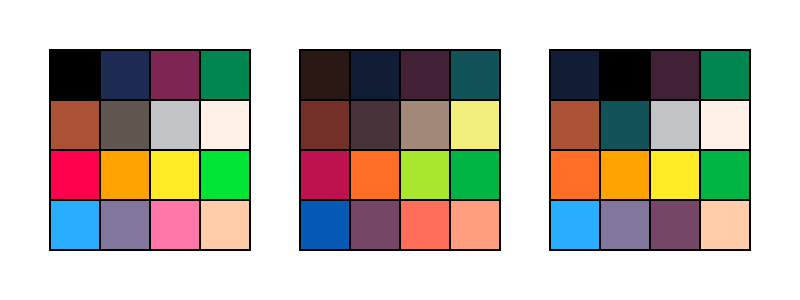
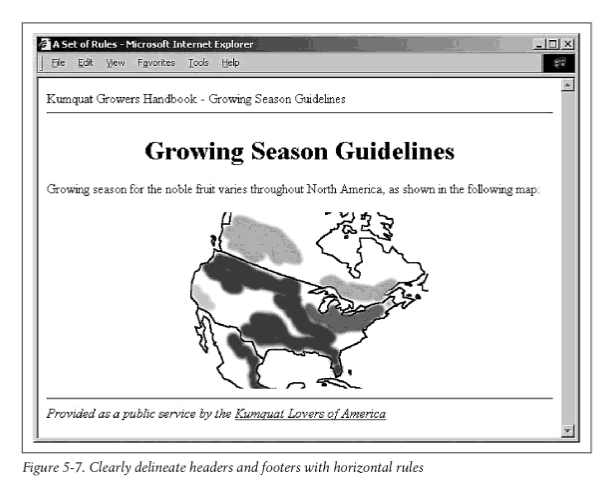
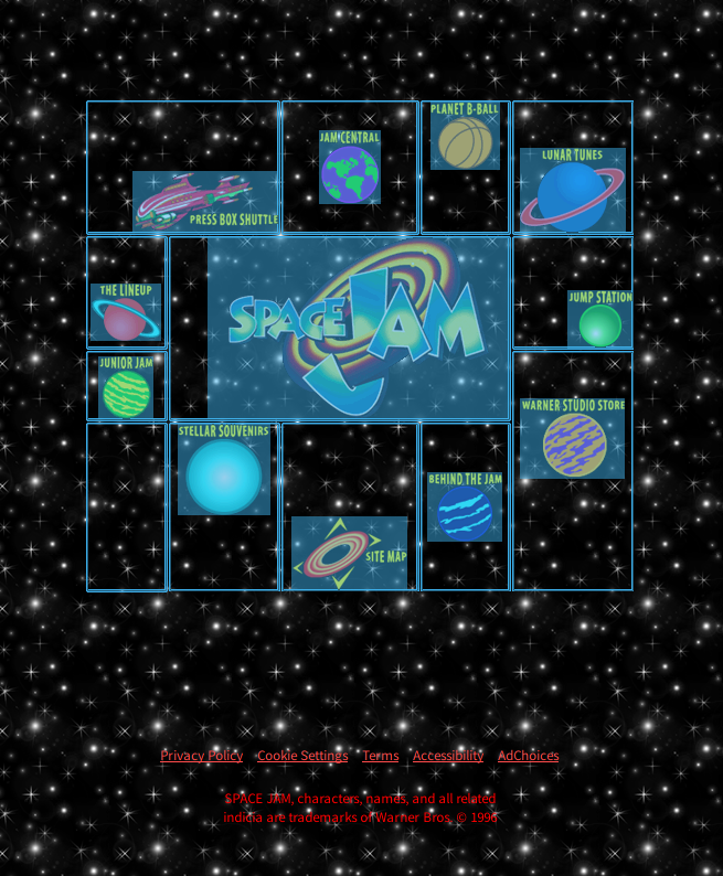
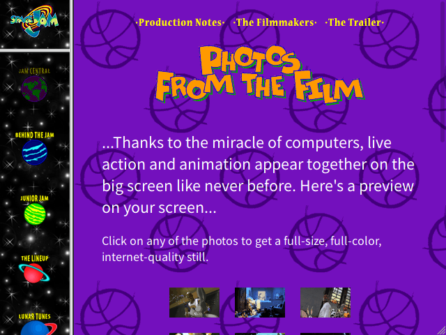
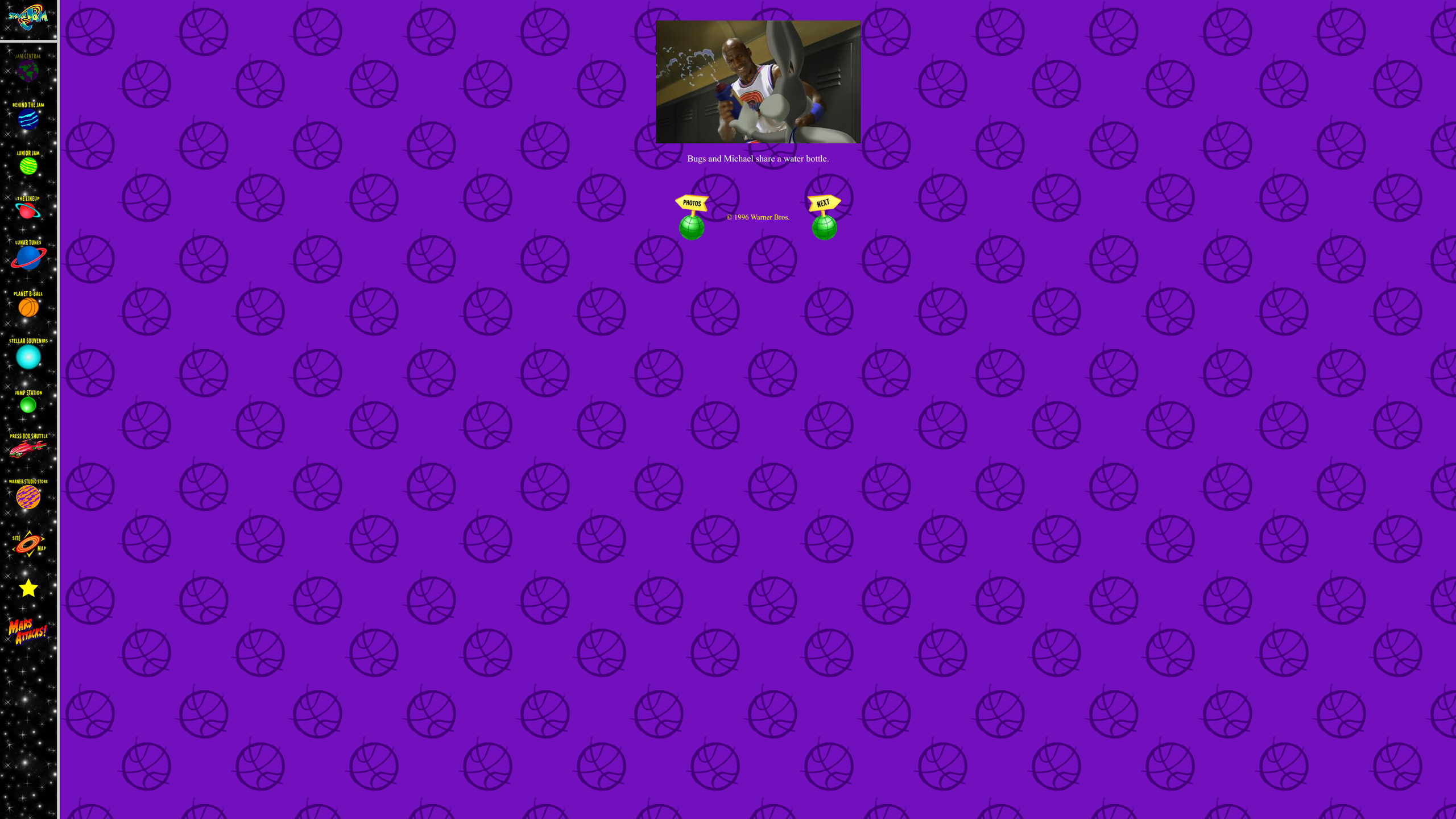


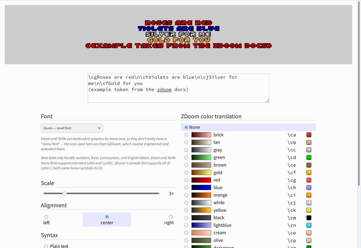


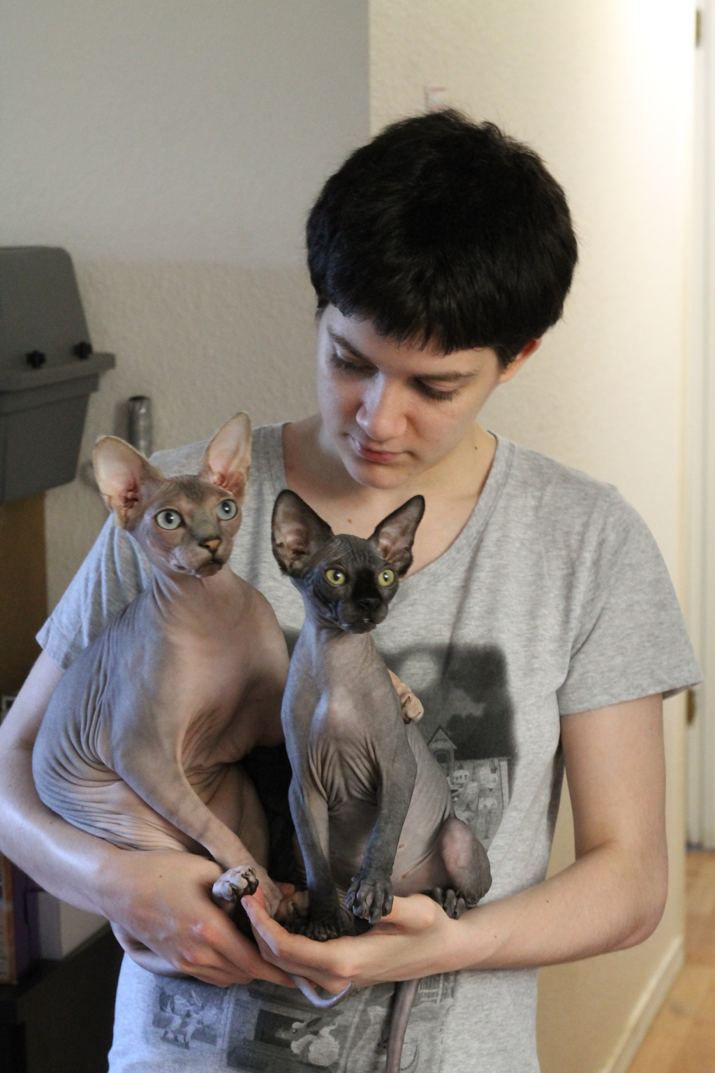
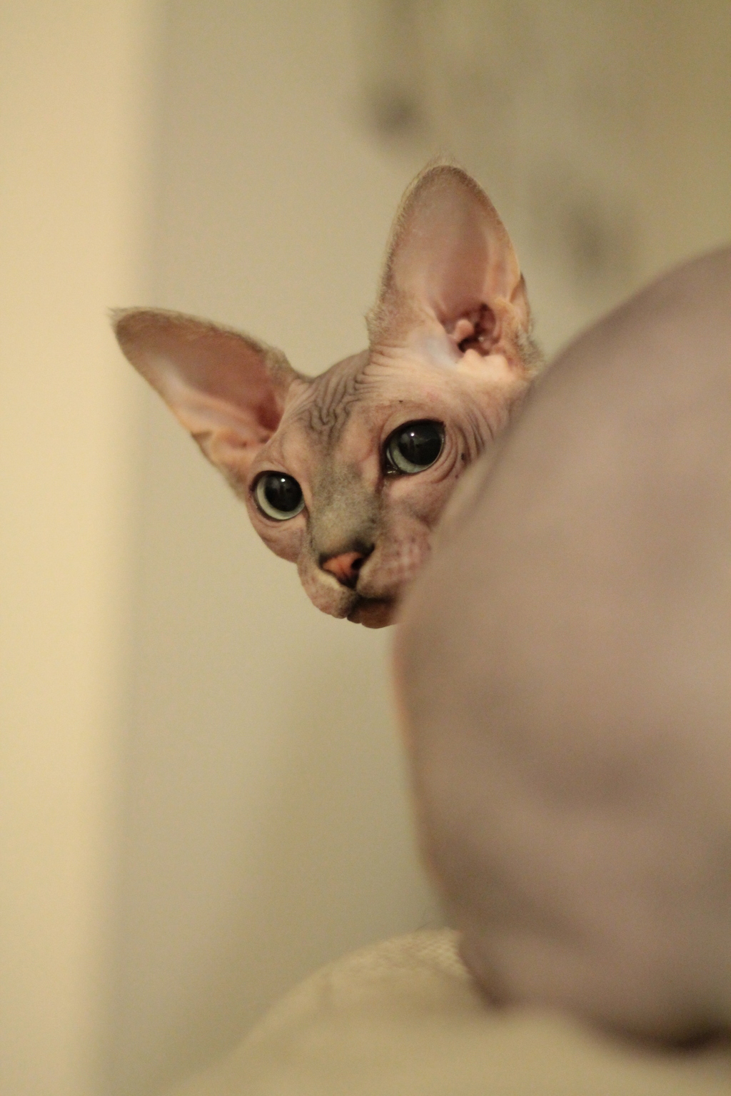

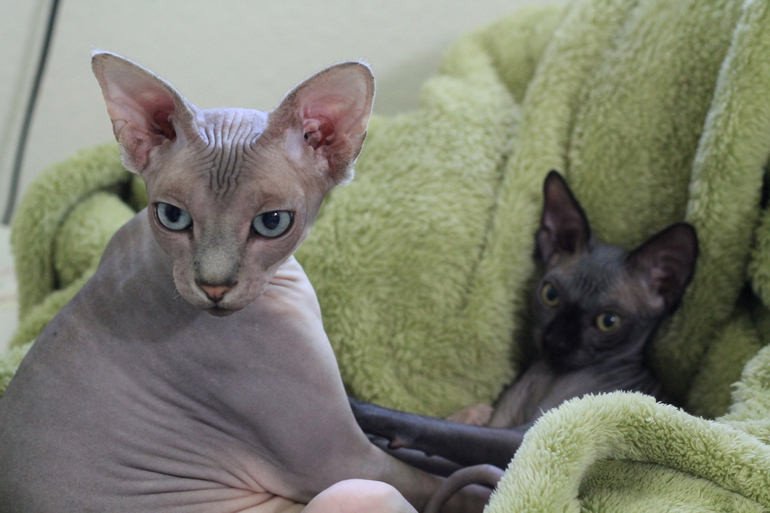
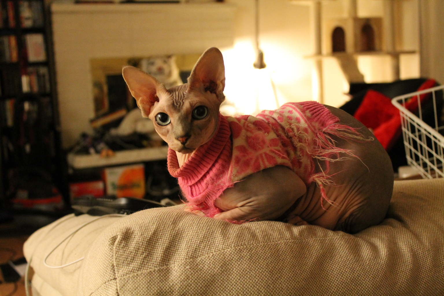
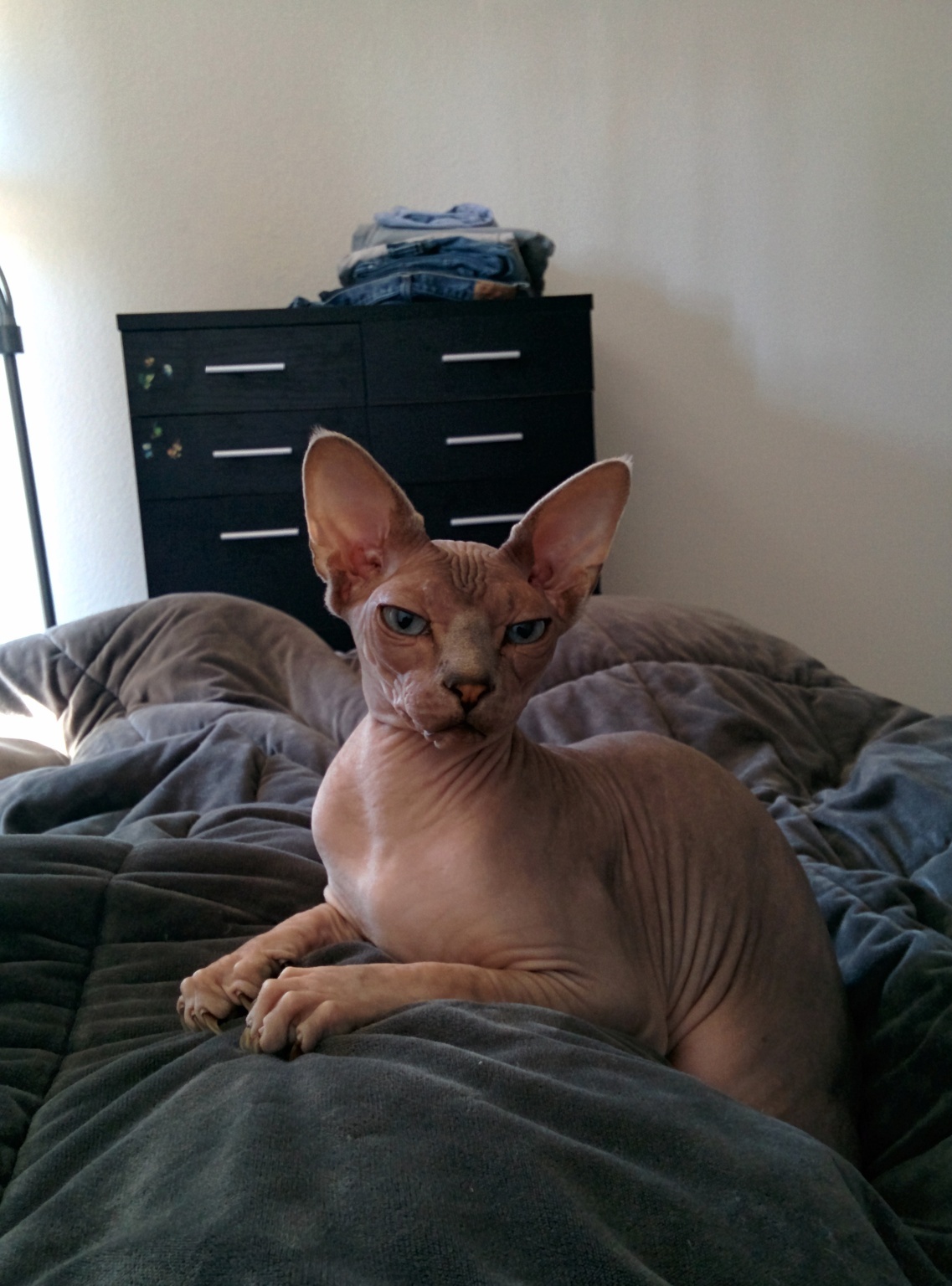
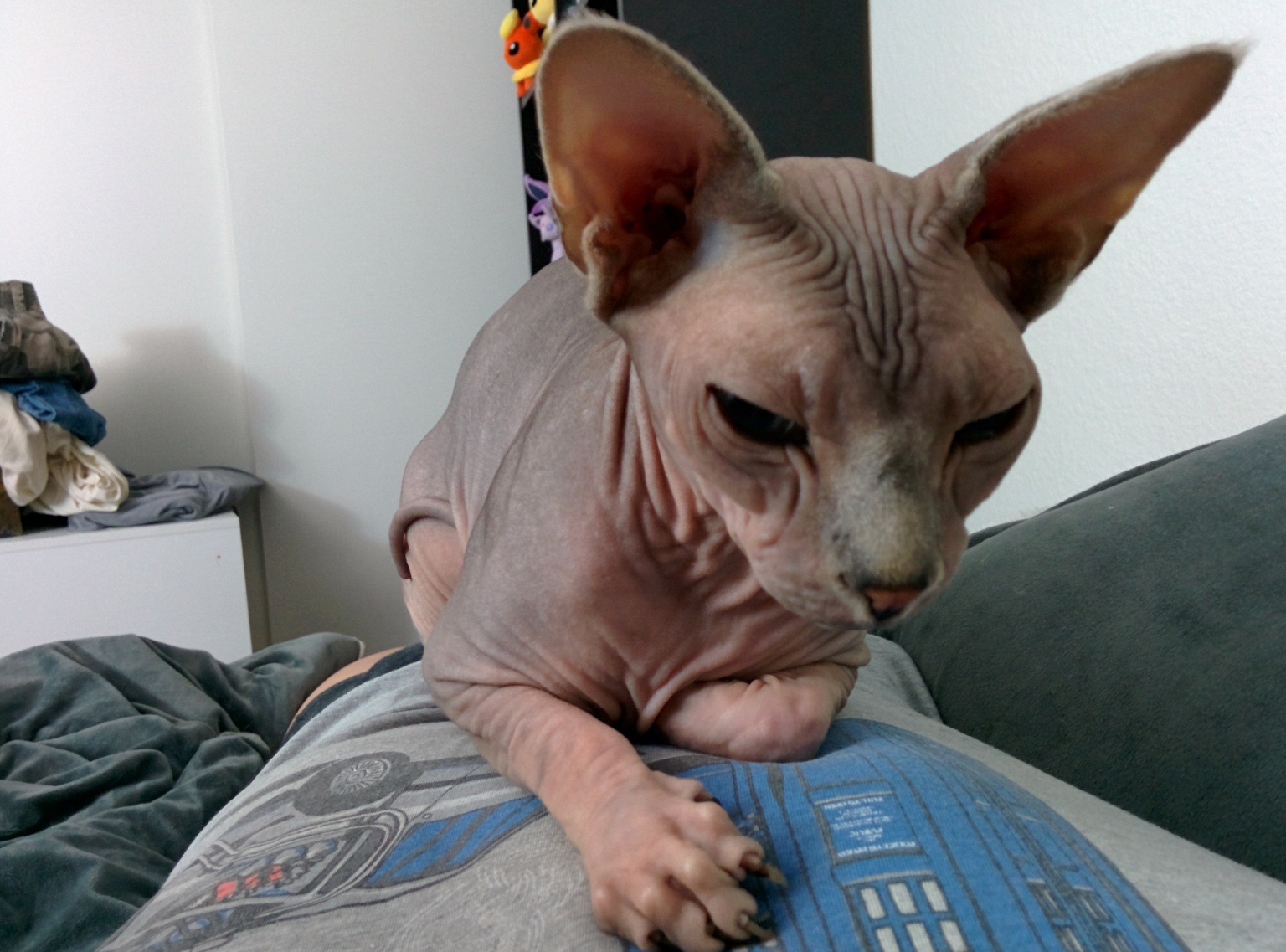
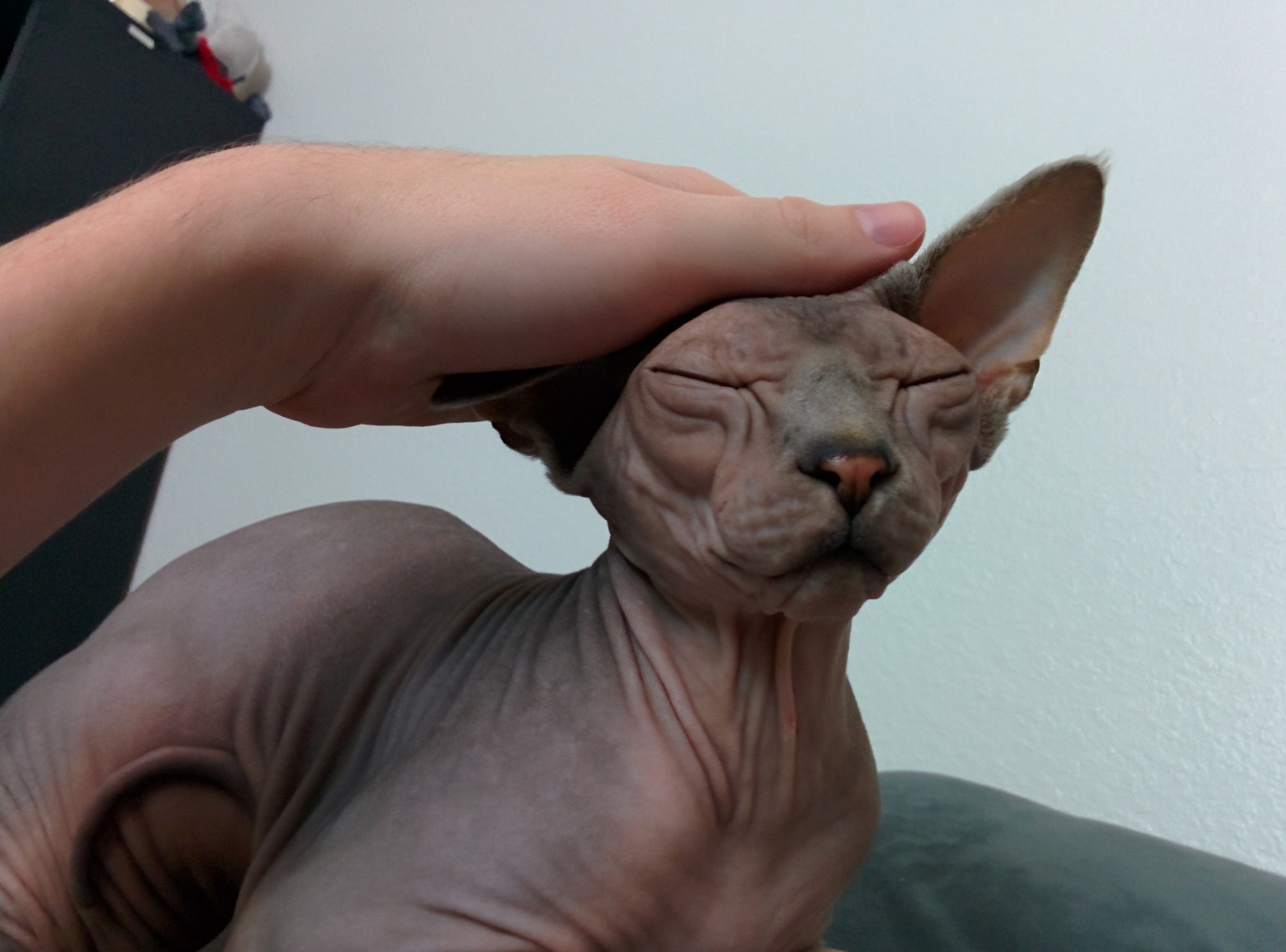
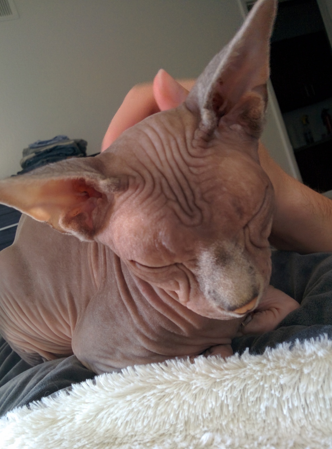


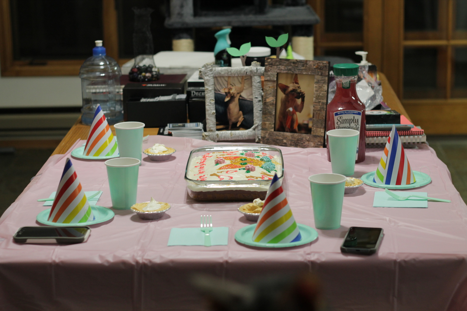


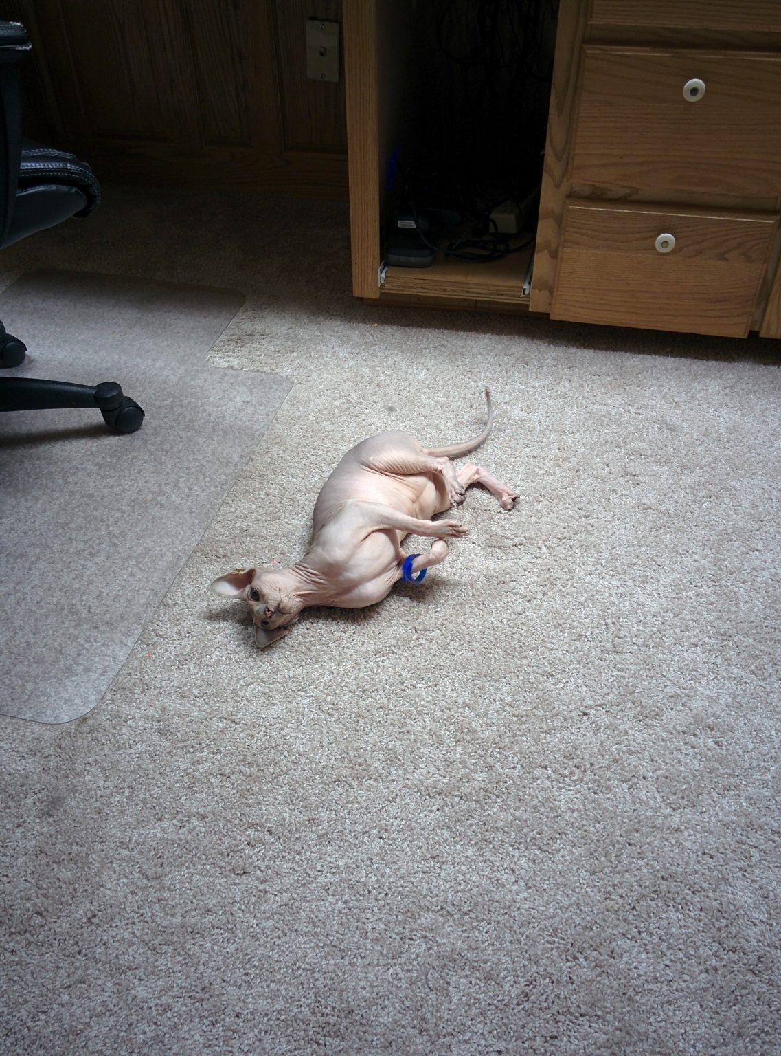


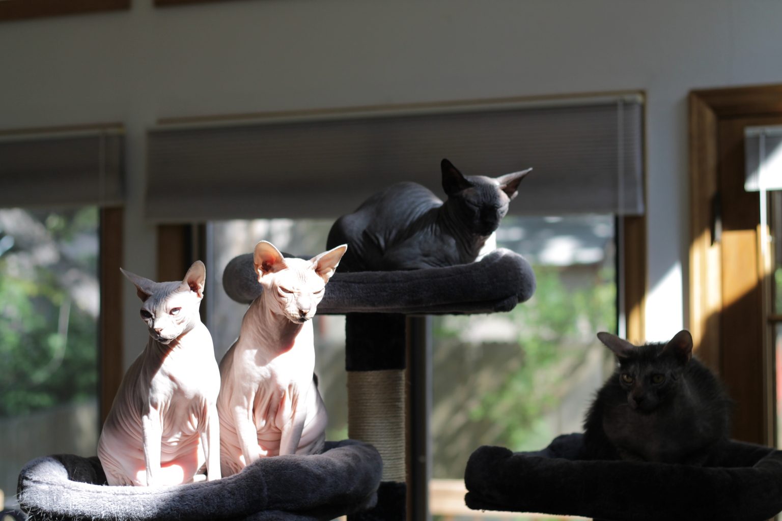
