Tag Archives: decision-making

Iris – Turning observations into actionable insights for enhanced decision making

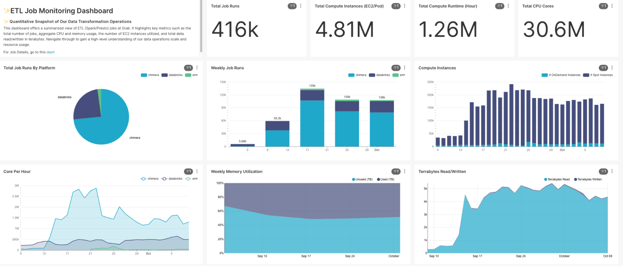
Post Syndicated from Grab Tech original https://engineering.grab.com/iris

Introduction

Iris (/ˈaɪrɪs/), a name inspired by the Olympian mythological figure who personified the rainbow and served as the messenger of the gods, is a comprehensive observability platform for Extract, Transform, Load (ETL) jobs. Just as the mythological Iris connected the gods to humanity, our Iris platform bridges the gap between raw data and meaningful insights, serving the needs of data-driven organisations. Specialising in meticulous monitoring and tracking of Spark and Presto jobs, Iris stands as a transformative tool for peak observability and effective decision-making.

  • Iris captures critical job metrics right at the Java Virtual Machine (JVM) level, including but not limited to runtime, CPU and memory utilisation rates, garbage collection statistics, stage and task execution details, and much more.
  • Iris not only regularly records these metrics but also supports real-time monitoring and offline analytics of metrics in the data lake. This gives you multi-faceted control and insights into the operational aspects of your workloads.
  • Iris gives you an overview of your jobs, predicts if your jobs are over or under-provisioned, and provides suggestions on how to optimise resource usage and save costs.

Understanding the needs

When examining ETL job monitoring across various platforms, a common deficiency became apparent. Existing tools could only provide CPU and memory usage data at the instance level, where an instance could refer to an EC2 unit or a Kubernetes pod with resources bound to the container level.

However, this CPU and memory usage data included usage from the operating system and other background tasks, making it difficult to isolate usage specific to Spark jobs (JVM level). A sizeable fraction of resource consumption, thus, could not be attributed directly to our ETL jobs. This lack of granularity posed significant challenges when trying to perform effective resource optimisation for individual jobs.

Gap between total instance and JVM provisioned resources

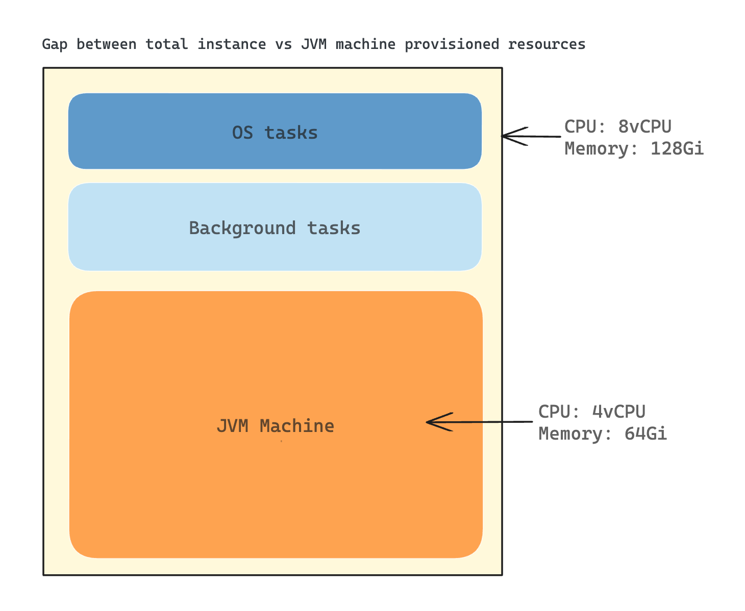
The situation was further complicated when compute instances were shared among various jobs. In such cases, determining the precise resource consumption for a specific job became nearly impossible. This made in-depth analysis and performance optimisation of specific jobs a complex and often ineffective process.

In the initial stages of my career in Spark, I took the reins of handling SEGP ETL jobs deployed in Chimera. Then, Chimera did not possess any tool for observing and understanding SEGP jobs. The lack of an efficient tool for close-to-real-time visualisation of Spark cluster/job metrics, profiling code class/function runtime durations, and investigating deep-level job metrics to assess CPU and memory usage, posed a significant challenge even back then.

In the quest for solutions within Grab, I found no tool that could fulfill all these needs. This prompted me to extend my search beyond the organisation, leading me to discover that Uber had an exceptional tool known as the JVM Profiler. This tool could collect JVM metrics and profile the job. Further research also led me to sparkMeasure, a standalone tool known for its ability to measure Spark metrics on-the-fly without any code changes.

This personal research and journey highlights the importance of a comprehensive, in-depth observability tool – emphasising the need that Iris aims to fulfill in the world of ETL job monitoring. Through this journey, Iris was ideated, named after the Greek deity, encapsulating the mission to bridge the gap between the realm of raw ETL job metrics and the world of actionable insights.

Observability with Iris

Platform architecture

Platform architecture of Iris

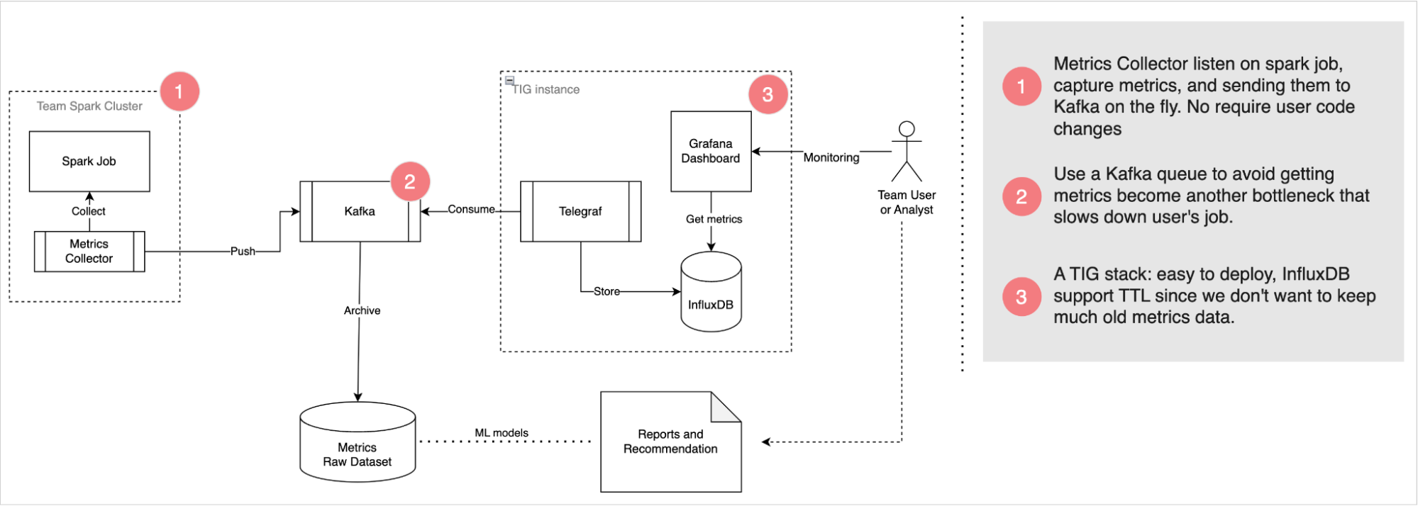
Iris’s robust architecture is designed to smartly deliver observability into Spark jobs with high reliability. It consists of three main modules: Metrics Collector, Kafka Queue, and Telegraf, InfluxDB, and Grafana (TIG) Stack.

Metrics Collector: This module listens to Spark jobs, collects metrics, and funnels them to the Kafka queue. What sets this apart is its unobstructive nature – there is no need for end-users to update their application code or notebook.

Kafka Queue: Serving as an asynchronous deliverer of metrics messages, Kafka is leveraged to prevent Iris from becoming another bottleneck slowing down user jobs. By functioning as a message queue, it enables the efficient processing of metric data.

TIG Stack: This component is utilised for real-time monitoring, making visualising performance metrics a cinch. The TIG stack proves to be an effective solution for real-time data visualisation.

For offline analytics, Iris pushes metrics data from Kafka into our data lake. This creates a wealth of historical data that can be utilised for future research, analysis, and predictions. The strategic combination of real-time monitoring and offline analysis forms the basis of Iris’s ability to provide valuable insights.

Next, we will delve into how Iris collects the metrics.

Data collection

Iris’s metrics is now primarily driven by two tools that operate under the Metrics Collector module: JVM Profiler and sparkMeasure.

JVM Profiler

As mentioned earlier, JVM Profiler is an exceptional tool that helps to collect and profile metrics at JVM level.

Java process for the JVM Profiler tool

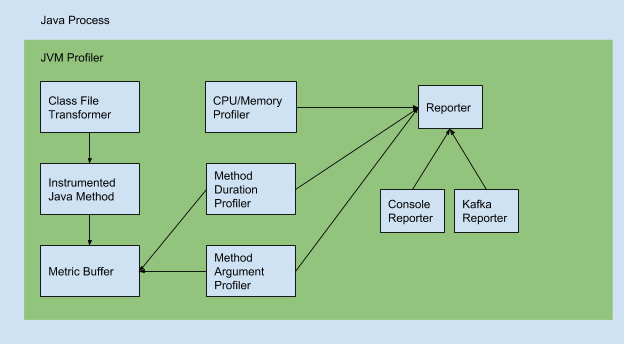
Uber JVM Profiler supports the following features:

  • Debug memory usage for all your Spark application executors, including java heap memory, non-heap memory, native memory (VmRSS, VmHWM), memory pool, and buffer pool (directed/mapped buffer).
  • Debug CPU usage, garbage collection time for all Spark executors.
  • Debug arbitrary Java class methods (how many times they run, how long they take), also called Duration Profiling.
  • Debug arbitrary Java class method call and trace its argument value, also known as Argument Profiling.
  • Do Stacktrack Profiling and generate flamegraph to visualise CPU time spent for the Spark application.
  • Debug I/O metrics (disk read/write bytes for the application, CPU iowait for the machine).
  • Debug JVM Thread Metrics like Count of Total Threads, Peak Threads, Live/Active Threads, and newThreads.

Example metrics (Source code)

{
        "nonHeapMemoryTotalUsed": 11890584.0,
        "bufferPools": [
                {
                        "totalCapacity": 0,
                        "name": "direct",
                        "count": 0,
                        "memoryUsed": 0
                },
                {
                        "totalCapacity": 0,
                        "name": "mapped",
                        "count": 0,
                        "memoryUsed": 0
                }
        ],
        "heapMemoryTotalUsed": 24330736.0,
        "epochMillis": 1515627003374,
        "nonHeapMemoryCommitted": 13565952.0,
        "heapMemoryCommitted": 257425408.0,
        "memoryPools": [
                {
                        "peakUsageMax": 251658240,
                        "usageMax": 251658240,
                        "peakUsageUsed": 1194496,
                        "name": "Code Cache",
                        "peakUsageCommitted": 2555904,
                        "usageUsed": 1173504,
                        "type": "Non-heap memory",
                        "usageCommitted": 2555904
                },
                {
                        "peakUsageMax": -1,
                        "usageMax": -1,
                        "peakUsageUsed": 9622920,
                        "name": "Metaspace",
                        "peakUsageCommitted": 9830400,
                        "usageUsed": 9622920,
                        "type": "Non-heap memory",
                        "usageCommitted": 9830400
                },
                {
                        "peakUsageMax": 1073741824,
                        "usageMax": 1073741824,
                        "peakUsageUsed": 1094160,
                        "name": "Compressed Class Space",
                        "peakUsageCommitted": 1179648,
                        "usageUsed": 1094160,
                        "type": "Non-heap memory",
                        "usageCommitted": 1179648
                },
                {
                        "peakUsageMax": 1409286144,
                        "usageMax": 1409286144,
                        "peakUsageUsed": 24330736,
                        "name": "PS Eden Space",
                        "peakUsageCommitted": 67108864,
                        "usageUsed": 24330736,
                        "type": "Heap memory",
                        "usageCommitted": 67108864
                },
                {
                        "peakUsageMax": 11010048,
                        "usageMax": 11010048,
                        "peakUsageUsed": 0,
                        "name": "PS Survivor Space",
                        "peakUsageCommitted": 11010048,
                        "usageUsed": 0,
                        "type": "Heap memory",
                        "usageCommitted": 11010048
                },
                {
                        "peakUsageMax": 2863661056,
                        "usageMax": 2863661056,
                        "peakUsageUsed": 0,
                        "name": "PS Old Gen",
                        "peakUsageCommitted": 179306496,
                        "usageUsed": 0,
                        "type": "Heap memory",
                        "usageCommitted": 179306496
                }
        ],
        "processCpuLoad": 0.0008024004394748531,
        "systemCpuLoad": 0.23138430784607697,
        "processCpuTime": 496918000,
        "appId": null,
        "name": "24103@machine01",
        "host": "machine01",
        "processUuid": "3c2ec835-749d-45ea-a7ec-e4b9fe17c23a",
        "tag": "mytag",
        "gc": [
                {
                        "collectionTime": 0,
                        "name": "PS Scavenge",
                        "collectionCount": 0
                },
                {
                        "collectionTime": 0,
                        "name": "PS MarkSweep",
                        "collectionCount": 0
                }
        ]
}

A list of all metrics and information corresponding to them can be found here.

sparkMeasure

Complementing the JVM Profiler is sparkMeasure, a standalone tool that was built to robustly capture Spark job-specific metrics.

Architecture of Spark Task Metrics, Listener Bus, and sparkMeasure (Source)

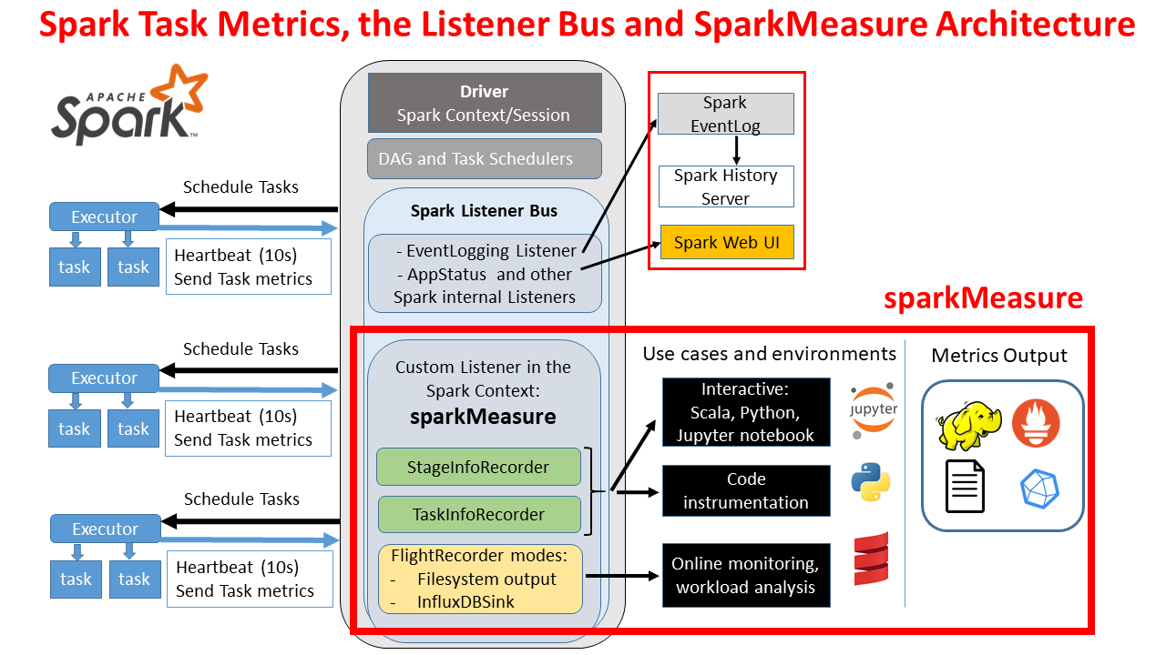
It is registered as a custom listener and operates by collection built-in metrics that Spark exchanges between the driver node and executor nodes. Its standout feature is the ability to collect all metrics supported by Spark, as defined in Spark’s official documentation here.

Example stage metrics collected by sparkMeasure (Source code)

Scheduling mode = FIFO

Spark Context default degree of parallelism = 8

Aggregated Spark stage metrics:

numStages => 3
numTasks => 17
elapsedTime => 1291 (1 s)
stageDuration => 1058 (1 s)
executorRunTime => 2774 (3 s)
executorCpuTime => 2004 (2 s)
executorDeserializeTime => 2868 (3 s)
executorDeserializeCpuTime => 1051 (1 s)
resultSerializationTime => 5 (5 ms)
jvmGCTime => 88 (88 ms)
shuffleFetchWaitTime => 0 (0 ms)
shuffleWriteTime => 16 (16 ms)
resultSize => 16091 (15.0 KB)
diskBytesSpilled => 0 (0 Bytes)
memoryBytesSpilled => 0 (0 Bytes)
peakExecutionMemory => 0
recordsRead => 2000
bytesRead => 0 (0 Bytes)
recordsWritten => 0
bytesWritten => 0 (0 Bytes)
shuffleRecordsRead => 8
shuffleTotalBlocksFetched => 8
shuffleLocalBlocksFetched => 8
shuffleRemoteBlocksFetched => 0
shuffleTotalBytesRead => 472 (472 Bytes)
shuffleLocalBytesRead => 472 (472 Bytes)
shuffleRemoteBytesRead => 0 (0 Bytes)
shuffleRemoteBytesReadToDisk => 0 (0 Bytes)
shuffleBytesWritten => 472 (472 Bytes)
shuffleRecordsWritten => 8

Stages and their duration:
Stage 0 duration => 593 (0.6 s)
Stage 1 duration => 416 (0.4 s)
Stage 3 duration => 49 (49 ms)

Data organisation

The architecture of Iris is designed to efficiently route metrics to two key destinations:

  • Real-time datasets: InfluxDB
  • Offline datasets: GrabTech Datalake in AWS

Real-time dataset

Freshness/latency: 5 to 10 seconds

All metrics flowing in through Kafka topics are instantly wired into InfluxDB. A crucial part of this process is accomplished by Telegraf, a plugin-driven server agent used for collecting and sending metrics. Acting as a Kafka consumer, Telegraf listens to each Kafka topic according to its corresponding metrics profiling. It parses the incoming JSON messages and extracts crucial data points (such as role, hostname, jobname, etc.). Once the data is processed, Telegraf writes it into the InfluxDB.

InfluxDB organises the stored data in what we call ‘measurements’, which could analogously be considered as tables in traditional relational databases.

In Iris’s context, we have structured our real-time data into the following crucial measurements:
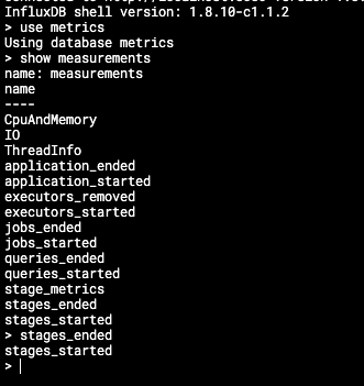
  1. CpuAndMemory: This measures CPU and memory-related metrics, giving us insights into resource utilisation by Spark jobs.
  2. I/O: This records input/output metrics, providing data on the reading and writing operations happening during the execution of jobs.
  3. ThreadInfo: This measurement holds data related to job threading, allowing us to monitor concurrency and synchronisation aspects.
  4. application_started and application_ended: These measurements allow us to track Spark application lifecycles, from initiation to completion.
  5. executors_started and executors_removed: These measurements give us a look at the executor dynamics during Spark application execution.

  1. jobs_started and jobs_ended: These provide vital data points relating to the lifecycle of individual Spark jobs within applications.
  2. queries_started and queries_ended: These measurements are designed to track the lifecycle of individual Spark SQL queries.
  3. stage_metrics, stages_started, and stages_ended: These measurements help monitor individual stages within Spark jobs, a valuable resource for tracking the job progress and identifying potential bottlenecks.

The real-time data collected in these measurements form the backbone of the monitoring capabilities of Iris, providing an accurate and current picture of Spark job performances.

Offline dataset

Freshness/latency: 1 hour

In addition to real-time data management with InfluxDB, Iris is also responsible for routing metrics to our offline data storage in the Grab Tech Datalake for long-term trend studies, pattern analysis, and anomaly detection.

The metrics from Kafka are periodically synchronised to the Amazon S3 tables under the iris schema in the Grab Tech AWS catalogue. This valuable historical data from Kafka is meticulously organised with a one-to-one mapping between the platform or Kafka topic to the table in the iris schema. For example: iris.chimera_jvmprofiler_cpuandmemory map with prd-iris-chimera-jvmprofiler-cpuandmemory Kafka topic.


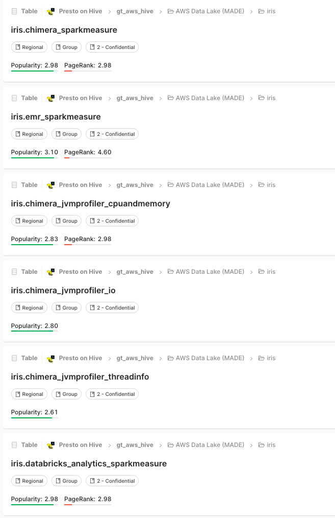
This streamlined organisation means you can write queries to retrieve information from the AWS dataset very similarly to how you would do it from InfluxDB. Whether it’s CPU and memory usage, I/O, thread info, or spark metrics, you can conveniently fetch historical data for your analysis.

Data visualisation

A well-designed visual representation makes it easier to see patterns, trends, and outliers in groups of data. Iris employs different visualisation tools based on whether the data is real-time or historical.

Real-Time data visualisation – Grafana

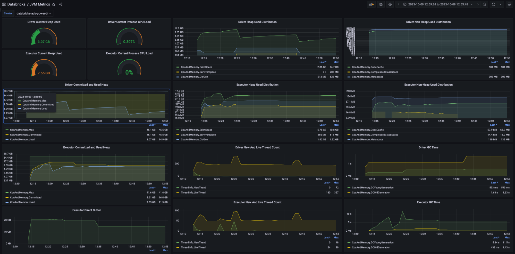
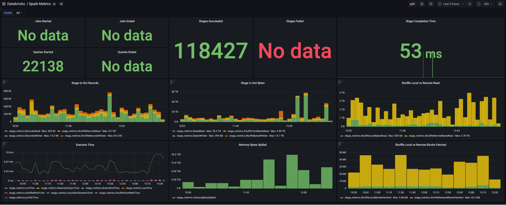
Iris uses Grafana for showcasing real-time data. For each platform, two primary dashboards have been set up: JVM metrics and Spark metrics.

JVM metrics dashboard: This dashboard is designed to display information related to the JVM.
Spark metrics dashboard: This dashboard primarily focuses on visualising Spark-specific elements.

Offline data visualisation

While real-time visualisation is crucial for immediate awareness and decision-making, visualising historical data provides invaluable insights about long-term trends, patterns, and anomalies. Developers can query the raw or aggregated data from the Iris tables for their specific analyses.

Moreover, to assist platform owners and end-users in obtaining a quick summary of their job data, we provide built-in dashboards with pre-aggregated visuals. These dashboards contain a wealth of information expressed in an easy-to-understand format. Key metrics include:

  • Total instances
  • Total CPU cores
  • Total memory
  • CPU and memory utilisation
  • Total machine runtimes

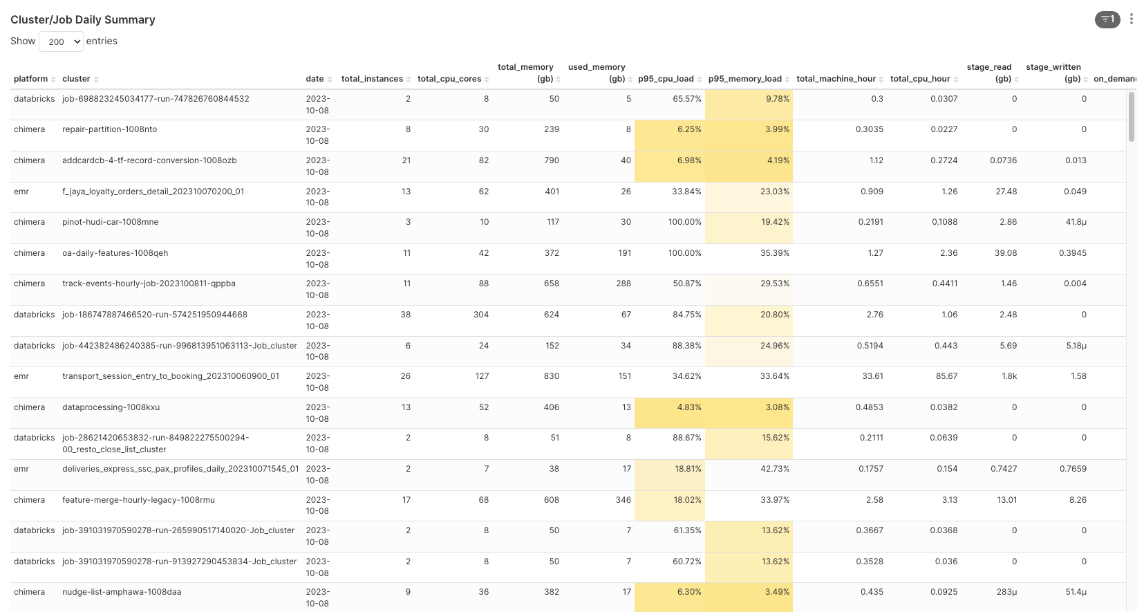
  • Besides visualisations for individual jobs, we have designed an overview dashboard providing a comprehensive summary of all resources consumed by all ETL jobs. This is particularly useful for platform owners and tech leads, allowing them to have an all-encompassing visibility of the performance and resource usage across the ETL jobs.

    Dashboard for monitoring ETL jobs

    These dashboards’ visuals effectively turn the historical metrics data into clear, comprehensible, and insightful information, guiding users towards objective-driven decision-making.

    Transforming observations into insights

    While our journey with Iris is just in the early stages, we’ve already begun harnessing its ability to transform raw data into concrete insights. The strength of Iris lies not just in its data collection capabilities but also in its potential to analyse and infer patterns from the collated data.

    Currently, we’re experimenting with a job classification model that aims to predict resource allocation efficiency (i.e. identifying jobs as over or under-provisioned). This information, once accurately predicted, can help optimise the usage of resources by fine-tuning the provisions for each job. While this model is still in its early stages of testing and lacks sufficient validation data, it exemplifies the direction we’re heading – integrating advanced analytics with operational observability.

    As we continue to refine Iris and develop more models, our aim is to empower users with deep insights into their Spark applications. These insights can potentially identify bottlenecks, optimise resource allocation and ultimately, enhance overall performance. In the long run, we see Iris evolving from being a data collection tool to a platform that can provide actionable recommendations and enable data-driven decision-making.

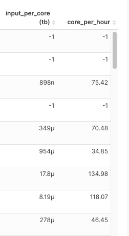
    Job classification feature set

    At the core of our job classification model, there are two carefully selected metrics:

    1. CPU cores per hour: This represents the number of tasks a job can handle concurrently in a given hour. A higher number would mean more tasks being processed simultaneously.

    2. Total Terabytes of data input per core: This considers only the input from the underlying HDFS/S3 input, excluding shuffle data. It represents the volume of data one CPU core needs to process. A larger input would mean more CPUs are required to complete the job in a reasonable timeframe.

    The choice of these two metrics for building feature sets is based on a nuanced understanding of Spark job dynamics:

  • Allocating the right CPU cores is crucial as a higher number of cores means more tasks being processed concurrently. This is especially important for jobs with larger input data and more partitioned files, as they often require more concurrent processing capacity, hence, more CPU cores.
  • The total data input helps to estimate the data processing load of a job. A job tasked with processing a high volume of input data but assigned low CPU cores might be under-provisioned and result in an extended runtime.

  • As for CPU and memory utilisation, while it could offer useful insights, we’ve found it may not always contribute to predicting if a job is over or under-provisioned because utilisation can vary run-to-run. Thus, to keep our feature set robust and consistent, we primarily focus on CPU cores per hour and total terabytes of input data.

    With these metrics as our foundation, we are developing models that can classify jobs into over-provisioned or under-provisioned, helping us optimise resource allocation and improve job performance in the long run.

    As always, treat any information related to our job classification feature set and the insights derived from it with utmost care for data confidentiality and integrity.

    We’d like to reiterate that these models are still in the early stages of testing and we are constantly working to enhance their predictive accuracy. The true value of this model will be unlocked as it is refined and as we gather more validation data.

    Model training and optimisation

    Choosing the right model is crucial for deriving meaningful insights from datasets. We decided to start with a simple, yet powerful algorithm – K-means clustering, for job classification. K-means is a type of unsupervised machine learning algorithm used to classify items into groups (or clusters) based on their features.

    Here is our process:

    1. Model exploration: We began by exploring the K-means algorithm using a small dataset for validation.
    2. Platform-specific cluster numbers: To account for the uniqueness of every platform, we ran a Score Test (an evaluation method to determine the optimal number of clusters) for each platform. The derived optimal number of clusters is then used in the monthly job for that respective platform’s data.
    3. Set up a scheduled job: After ensuring the code was functioning correctly, we set up a job to run the model on a monthly schedule. Monthly re-training was chosen to encapsulate possible changes in the data patterns over time.
    4. Model saving and utilisation: The trained model is saved to our S3 bucket and used to classify jobs as over-provisioned or under-provisioned based on the daily job runs.

    This iterative learning approach, through which our model learns from an ever-increasing pool of historical data, helps maintain its relevance and improve its accuracy over time.

    Here is an example output from Databricks train run:

  • Blue green group: Input per core is too large but the CPU per hour is small, so the job may take a lot of time to complete.
  • Purple group: Input per core is too small but the CPU per hour is too high. There may be a lot of wasted CPU here.
  • Yellow group: I think this is the ideal group where input per core and CPU per hour is not high.

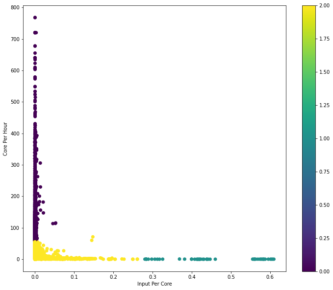
  • Keep in mind that classification insights provided by our K-means model are still in the experimental stage. As we continue to refine the approach, the reliability of these insights is expected to grow, providing increasingly valuable direction for resource allocation optimisation.

    Seeing Iris in action

    This section provides practical examples and real-case scenarios that demonstrate Iris’s capacity for delivering insights from ETL job observations.

    Case study 1: Spark benchmarking

    From August to September 2023, we carried out a Spark benchmarking exercise to measure and compare the cost and performance of Grab’s Spark platforms: Open Source Spark on Kubernetes (Chimera), Databricks and AWS EMR. Since each platform has its own way to measure a job’s performance and cost, Iris was used to collect the necessary Spark metrics in order to calculate the cost for each job. Furthermore, many other metrics were collected by Iris in order to compare the platforms’ performances like CPU and memory utilisation, runtime, etc.

    Case study 2: Improving Databricks Infra Cost Unit (DBIU) Accuracy with Iris

    Being able to accurately calculate and fairly distribute Databricks infrastructure costs has always been a challenge, primarily due to difficulties in distinguishing between on-demand and Spot instance usage. This was further complicated by two conditions:

    • Fallback to on-demand instances: Databricks has a feature that automatically falls back to on-demand instances when Spot instances are not readily available. While beneficial for job execution, this feature has traditionally made it difficult to accurately track per-job Spot vs. on-demand usage.
    • User configurable hybrid policy: Users can specify a mix of on-demand and Spot instances for their jobs. This flexible, hybrid approach often results in complex, non-uniform usage patterns, further complicating cost categorisation.

    Iris has made a key difference in resolving these dilemmas. By providing granular, instance-level metrics including whether each instance is on-demand or Spot, Iris has greatly improved our visibility into per-job instance usage.

    This precise data enables us to isolate the on-demand instance usage, which was previously bundled in the total cost calculation. Similarly, it allows us to accurately gauge and consider the usage ratio of on-demand instances in hybrid policy scenarios.

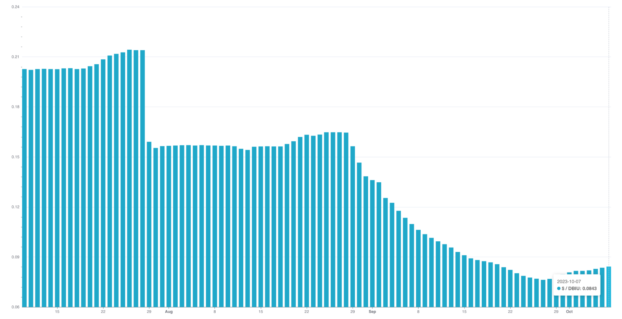
    The enhanced transparency provided by Iris metrics allows us to standardise DBIU cost calculations, making them fairer for users who majorly or only use Spot instances. In other words, users need to pay more if they intentionally choose or fall back to on-demand instances for their jobs.

    The practical application of Iris in enhancing DBIU accuracy illustrates its potential in driving data-informed decisions and fostering fairness in resource usage and cost distribution.

    Case study 3: Optimising job configuration for better performance and cost efficiency

    One of the key utilities of iris is its potential to assist with job optimisation. For instance, we have been able to pinpoint jobs that were consistently over-provisioned and work with end-users to tune their job configurations.

    Through this exercise and continuous monitoring, we’ve seen substantial results from the job optimisations:

  • Cost reductions ranging from 20% to 50% for most jobs.
  • Positive feedback from users about improvements in job performance and cost efficiency.

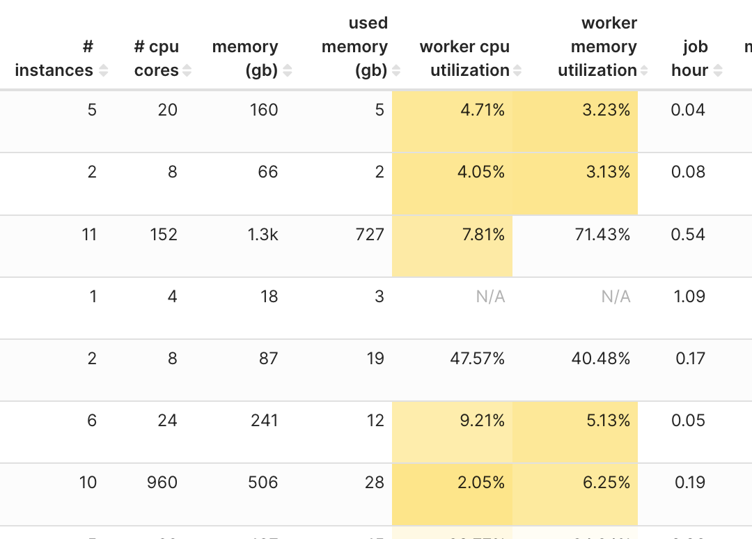
  • By the way, interestingly, our analysis led us to identify certain the following patterns. These patterns could be leveraged to widen the impact of our optimisation efforts across multiple use-cases in our platforms:

    Pattern Recommendation
  • Job duration < 20 minutes
  • Input per core < 1GB
  • Total used instance is 2x/3x of max worker nodes
  • Use fixed number of workers nodes potentially speeding up performance and certainly reducing costs.
  • CPU utilisation < 25%
  • Cut max worker in half. E.g: 10 to 5 workers
  • Downgrade instance size a half. E.g: 4xlarge -> 2xlarge
  • Job has much shuffle
  • Bump the instance size and reduce the number of workers. E.g. bump 2xlarge -> 4xlarge and reduce number of workers from 100 -> 50
  • However, we acknowledge that these findings may not apply uniformly to every instance. The optimisation recommendations derived from these patterns might not yield the desired outcomes in all cases.

    The future of Iris

    Building upon its firm foundation as a robust Spark observability tool, we envision a future for Iris wherein it not only monitors metrics but provides actionable insights, discerns usage patterns, and drives predictions.

    Our plans to make Iris more accessible include developing APIs endpoint for platform teams to query performance by job names. Another addition we’re aiming for is the ability for Iris to provide resource tuning recommendations. By making platform-specific and job-specific recommendations easily accessible, we hope to assist platform teams in making informed, data-driven decisions on resource allocation and cost efficiency.

    We’re also looking to expand Iris’s capabilities with the development of a listener for Presto jobs, similar to the sparkMeasure tool currently used for Spark jobs. The listener would provide valuable metrics and insights into the performance of Presto jobs, opening up new avenues for optimisation and cost management.

    Another major focus will be building a feedback loop for Iris to further enhance accuracy, continually refine its models, and improve insights provided. This effort would greatly benefit from the close collaboration and inputs from platform teams and other tech leads, as their expertise aids in interpreting Iris’s metrics and predictions and validating its meaningfulness.

    In conclusion, as Iris continues to develop and mature, we foresee it evolving into a crucial tool for data-driven decision-making and proactive management of Spark applications, playing a significant role in the efficient usage of cloud computing resources.

    Conclusion

    The role of Iris as an observability tool for Spark jobs in the world of Big Data is rapidly evolving. Iris has proven to be more than a simple data collection tool; it is a platform that integrates advanced analytics with operational observability.

    Even though Iris is in its early stages, it’s already been instrumental in creating detailed visualisations of both real-time and historical data from varied platforms. Besides that, Iris has started making strides in its journey towards using machine learning models like K-means clustering to classify jobs, demonstrating its potential in helping operators fine-tune resource allocation.

    Using instance-level metrics, Iris is helping improve cost distribution fairness and accuracy, making it a potent tool for resource optimisation. Furthermore, the successful case study of reducing job costs and enhancing performance through resource reallocation provides a promising outlook into Iris’s future applicability.

    With ongoing development plans, such as the Presto listener and the creation of endpoints for broader accessibility, Iris is poised to become an integral tool for data-informed decision-making. As we strive to enhance Iris, we will continue to collaborate with platform teams and tech leads whose feedback is invaluable in fulfilling Iris’s potential.

    Our journey with Iris is a testament to Grab’s commitment to creating a data-informed and efficient cloud computing environment. Iris, with its observed and planned capabilities, is on its way to revolutionising the way resource allocation is managed and optimised.

    Join us

    Grab is the leading superapp platform in Southeast Asia, providing everyday services that matter to consumers. More than just a ride-hailing and food delivery app, Grab offers a wide range of on-demand services in the region, including mobility, food, package and grocery delivery services, mobile payments, and financial services across 428 cities in eight countries.

    Powered by technology and driven by heart, our mission is to drive Southeast Asia forward by creating economic empowerment for everyone. If this mission speaks to you, join our team today!

    Netflix: A Culture of Learning

    Post Syndicated from Netflix Technology Blog original https://netflixtechblog.com/netflix-a-culture-of-learning-394bc7d0f94c

    Martin Tingley with Wenjing Zheng, Simon Ejdemyr, Stephanie Lane, Colin McFarland, Mihir Tendulkar, and Travis Brooks

    This is the last post in an overview series on experimentation at Netflix. Need to catch up? Earlier posts covered the basics of A/B tests (Part 1 and Part 2 ), core statistical concepts (Part 3 and Part 4), how to build confidence in a decision (Part 5), and the the role of Experimentation and A/B testing within the larger Data Science and Engineering organization at Netflix (Part 6).

    Earlier posts in this series covered the why, what and how of A/B testing, all of which are necessary to reap the benefits of experimentation for product development. But without a little magic, these basics are still not enough.

    The secret sauce that turns the raw ingredients of experimentation into supercharged product innovation is culture. There are never any shortcuts when developing and growing culture, and fostering a culture of experimentation is no exception. Building leadership buy-in for an approach to learning that emphasizes A/B testing, building trust in the results of tests, and building the technical capabilities to execute experiments at scale all take time — particularly within an organization that’s new to these ideas. But the pay-offs of using experimentation and the virtuous cycle of product development via the scientific method are well worth the effort. Our colleagues at Microsoft have shared thoughtful publications on how to Kickstart the Experimentation Flywheel and build a culture of experimentation, while their “Crawl, Walk, Run, Fly” model is a great tool for assessing the maturity of an experimentation practice.

    At Netflix, we’ve been leveraging experimentation and the scientific method for decades, and are fortunate to have a mature experimentation culture. There is broad buy-in across the company, including from the C-Suite, that, whenever possible, results from A/B tests or other causal inference approaches are near-requirements for decision making. We’ve also invested in education programs to up-level company-wide understanding of how we use A/B tests as a framework for product development. In fact, most of the material from this blog series has been adapted from our internal Experimentation 101 and 201 classes, which are open to anyone at Netflix.

    Netflix is organized to learn

    As a company, Netflix is organized to emphasize the importance of learning from data, including from A/B tests. Our Data and Insights organization has teams that partner with all corners of the company to deliver a better experience to our members, from understanding content preferences around the globe to delivering a seamless customer support experience. We use qualitative and quantitative consumer research, analytics, experimentation, predictive modeling, and other tools to develop a deep understanding of our members. And we own the data pipelines that power everything from executive-oriented dashboards to the personalization systems that help connect each Netflix member with content that will spark joy for them. This data-driven mindset is ubiquitous at all levels of the company, and the Data and Insights organization is represented at the highest echelon of Netflix Leadership.

    As discussed in Part 6, there are experimentation and causal inference focussed data scientists who collaborate with product innovation teams across Netflix. These data scientists design and execute tests to support learning agendas and contribute to decision making. By diving deep into the details of single test results, looking for patterns across tests, and exploring other data sources, these Netflix data scientists build up domain expertise about aspects of the Netflix experience and become valued partners to product managers and engineering leaders. Data scientists help shape the evolution of the Netflix product through opportunity sizing and identifying areas ripe for innovation, and frequently propose hypotheses that are subsequently tested.

    We’ve also invested in a broad and flexible experimentation platform that allows our experimentation program to scale with the ambitions of the company to learn more and better serve Netflix members. Just as the Netflix product itself has evolved over the years, our approach to developing technologies to support experimentation at scale continues to evolve. In fact, we’ve been working to improve experimentation platform solutions at Netflix for more than 20 years — our first investments in tooling to support A/B tests came way back in 2001.

    Early experimentation tooling at Netflix, from 2001.

    Learning and experimentation are ubiquitous across Netflix

    Netflix has a unique internal culture that reinforces the use of experimentation and the scientific method as a means to deliver more joy to all of our current and future members. As a company, we aim to be curious, and to truly and honestly understand our members around the world, and how we can better entertain them. We are also open minded, knowing that great ideas can come from unlikely sources. There’s no better way to learn and make great decisions than to confirm or falsify ideas and hypotheses using the power of rigorous testing. Openly and candidly sharing test results allows everyone at Netflix to develop intuition about our members and ideas for how we can deliver an ever better experience to them — and then the virtuous cycle starts again.

    In fact, Netflix has so many tests running on the product at any given time that a member may be simultaneously allocated to several tests. There is not one Netflix product: at any given time, we are testing out a large number of product variants, always seeking to learn more about how we can deliver more joy to our current members and attract new members. Some tests, such as the Top 10 list, are easy for users to notice, while others, such as changes to the personalization and search systems or how Netflix encodes and delivers streaming video, are less obvious.

    At Netflix, we are not afraid to test boldly, and to challenge fundamental or long-held assumptions. The Top 10 list is a great example of both: it’s a large and noticeable change that surfaces a new type of evidence on the Netflix product. Large tests like this can open up whole new areas for innovation, and are actively socialized and debated within the company (see below). On the other end of the spectrum, we also run tests on much smaller scales in order to optimize every aspect of the product. A great example is the testing we do to find just the right text copy for every aspect of the product. By the numbers, we run far more of these smaller and less noticeable tests, and we invest in end-to-end infrastructure that simplifies their execution, allowing product teams to rapidly go from hypothesis to test to roll out of the winning experience. As an example, the Shakespeare project provides an end-to-end solution for rapid text copy testing that integrates with the centralized Netflix experimentation platform. More generally, we are always on the lookout for new areas that can benefit from experimentation, or areas where additional methodology or tooling can produce new or faster learnings.

    Debating tests and the importance of humility

    Netflix has mature operating mechanisms to debate, make, and socialize product decisions. Netflix does not make decisions by committee or by seeking consensus. Instead, for every significant decision there is a single “Informed Captain” who is ultimately responsible for making a judgment call after digesting relevant data and input from colleagues (including dissenting perspectives). Wherever possible, A/B test results or causal inference studies are an expected input to this decision making process.

    In fact, not only are test results expected for product decisions — it’s expected that decisions on investment areas for innovation and testing, test plans for major innovations, and results of major tests are all summarized in memos, socialized broadly, and actively debated. The forums where these debates take place are broadly accessible, ensuring a diverse set of viewpoints provide feedback on test designs and results, and weigh in on decisions. Invites for these forums are open to anyone who is interested, and the price of admission is reading the memo. Despite strong executive attendance, there’s a notable lack of hierarchy in these forums, as we all seek to be led by the data.

    Netflix data scientists are active and valued participants in these forums. Data scientists are expected to speak for the data, both what can and what cannot be concluded from experimental results, the pros and cons of different experimental designs, and so forth. Although they are not informed captains on product decisions, data scientists, as interpreters of the data, are active contributors to key product decisions.

    Product evolution via experimentation can be a humbling experience. At Netflix, we have experts in every discipline required to develop and evolve the Netflix service (product managers, UI/UX designers, data scientists, engineers of all types, experts in recommendation systems and streaming video optimization — the list goes on), who are constantly coming up with novel hypotheses for how to improve Netflix. But only a small percentage of our ideas turn out to be winners in A/B tests. That’s right: despite our broad expertise, our members let us know, through their actions in A/B tests, that most of our ideas do not improve the service. We build and test hundreds of product variants each year, but only a small percentage end up in production and rolled out to the more than 200 million Netflix members around the world.

    The low win rate in our experimentation program is both humbling and empowering. It’s hard to maintain a big ego when anyone at the company can look at the data and see all the big ideas and investments that have ultimately not panned out. But nothing proves the value of decision making through experimentation like seeing ideas that all the experts were bullish on voted down by member actions in A/B tests — and seeing a minor tweak to a sign up flow turn out to be a massive revenue generator.

    At Netflix, we do not view tests that do not produce winning experience as “failures.” When our members vote down new product experiences with their actions, we still learn a lot about their preferences, what works (and does not work!) for different member cohorts, and where there may, or may not be, opportunities for innovation. Combining learnings from tests in a given innovation area, such as the Mobile UI experience, helps us paint a more complete picture of the types of experiences that do and do not resonate with our members, leading to new hypotheses, new tests, and, ultimately, a more joyful experience for our members. And as our member base continues to grow globally, and as consumer preferences and expectations continue to evolve, we also revisit ideas that were unsuccessful when originally tested. Sometimes there are signals from the original analysis that suggest now is a better time for that idea, or that it will provide value to some of our newer member cohorts.

    Because Netflix tests all ideas, and because most ideas are not winners, our culture of experimentation democratizes ideation. Product managers are always hungry for ideas, and are open to innovative suggestions coming from anyone in the company, regardless of seniority or expertise. After all, we’ll test anything before rolling it out to the member base, and even the experts have low success rates! We’ve seen time and time again at Netflix that product suggestions large and small that arise from engineers, data scientists, even our executives, can result in unexpected wins.

    (Left) Very few of our ideas are winners. (Right) Experimentation democratizes ideation. Because we test all ideas, and because most do not win, there’s an openness to product ideas coming from all corners of the business: anyone can raise their hand and make a suggestion.

    A culture of experimentation allows more voices to contribute to ideation, and far, far more voices to help inform decision making. It’s a way to get the best ideas from everyone working on the product, and to ensure that the innovations that are rolled out are vetted and approved by members.

    A better product for our members and an internal culture that is humble and values ideas and evidence: experimentation is a win-win proposition for Netflix.

    Emerging research areas

    Although Netflix has been running experiments for decades, we’ve only scratched the surface relative to what we want to learn and the capabilities we need to build to support those learning ambitions. There are open challenges and opportunities across experimentation and causal inference at Netflix: exploring and implementing new methodologies that allow us to learn faster and better; developing software solutions that support research; evolving our internal experimentation platform to better serve a growing user community and ever increasing size and throughput of experiments. And there’s a continuous focus on evolving and growing our experimentation culture through internal events and education programs, as well as external contributions. Here are a few themes that are on our radar:

    Increasing velocity: beyond fixed time horizon experimentation.

    This series has focused on fixed time horizon tests: sample sizes, the proportion of traffic allocated to each treatment experience, and the test duration are all fixed in advance. In principle, the data are examined only once, at the conclusion of the test. This ensures that the false positive rate (see Part 3) is not increased by peeking at the data numerous times. In practice, we’d like to be able to call tests early, or to adapt how incoming traffic is allocated as we learn incrementally about which treatments are successful and which are not, in a way that preserves the statistical properties described earlier in this series. To enable these benefits, Netflix is investing in sequential experimentation that permits for valid decision making at any time, versus waiting until a fixed time has passed. These methods are already being used to ensure safe deployment of Netflix client applications. We are also investing in support for experimental designs that adaptively allocate traffic throughout the test towards promising treatments. The goal of both these efforts is the same: more rapid identification of experiences that benefit members.

    Scaling support for quasi experimentation and causal inference.

    Netflix has learned an enormous amount, and dramatically improved almost every aspect of the product, using the classic online A/B tests, or randomized controlled trials, that have been the focus of this series. But not every business question is amenable to A/B testing, whether due to an inability to randomize at the individual level, or due to factors, such as spillover effects, that may violate key assumptions for valid causal inference. In these instances, we often rely on the rigorous evaluation of quasi-experiments, where units are not assigned to a treatment or control condition by a random process. But the term “quasi-experimentation” itself covers a broad category of experimental design and methodological approaches that differ between the myriad academic backgrounds represented by the Netflix data science community. How can we synthesize best practices across domains and scale our approach to enable more colleagues to leverage quasi-experimentation?

    Our early successes in this space have been driven by investments in knowledge sharing across business verticals, education, and enablement via tooling. Because quasi-experiment use cases span many domains at Netflix, identifying common patterns has been a powerful driver in developing shared libraries that scientists can use to evaluate individual quasi-experiments. And to support our continued scale, we’ve built internal tooling that coalesces data retrieval, design evaluation, analysis, and reproducible reporting, all with the goal to enable our scientists.

    We expect our investments in research, tooling, and education for quasi-experiments to grow over time. In success, we will enable both scientists and their cross functional partners to learn more about how to deliver more joy to current and future Netflix members.

    Experimentation Platform as a Product.

    We treat the Netflix Experimentation Platform as an internal product, complete with its own product manager and innovation roadmap. We aim to provide an end-to-end paved path for configuring, allocating, monitoring, reporting, storing and analyzing A/B tests, focusing on experimentation use cases that are optimized for simplicity and testing velocity. Our goal is to make experimentation a simple and integrated part of the product lifecycle, with little effort required on the part of engineers, data scientists, or PMs to create, analyze, and act on tests, with automation available wherever the test owner wants it.

    However, if the platform’s default paths don’t work for a specific use case, experimenters can leverage our democratized contribution model, or reuse pieces of the platform, to build out their own solutions. As experimenters innovate on the boundaries of what’s possible in measurement methodology, experimental design, and automation, the Experimentation Platform team partners to commoditize these innovations and make them available to the broader organization.

    Three core principles guide product development for our experimentation platform:

    • Complexities and nuances of testing such as allocations and methodologies should, typically, be abstracted away from the process of running a single test, with emphasis instead placed on opinionated defaults that are sensible for a set of use cases or testing areas.
    • Manual intervention at specific steps in the test execution should, typically, be optional, with emphasis instead on test owners being able to invest their attention where they feel it adds value and leave other areas to automation.
    • Designing, executing, reporting, deciding, and learning are all different phases of the experiment lifecycle that have differing needs and users, and each stage benefits from purpose built tooling for each use.

    Conclusion

    Netflix has a strong culture of experimentation, and results from A/B tests, or other applications of the scientific method, are generally expected to inform decisions about how to improve our product and deliver more joy to members. To support the current and future scale of experimentation required by the growing Netflix member base and the increasing complexity of our business, Netflix has invested in culture, people, infrastructure, and internal education to make A/B testing broadly accessible across the company.

    And we are continuing to evolve our culture of learning and experimentation to deliver more joy to Netflix members around the world. As our member base and business grows, smaller differences between treatment and control experiences become materially important. That’s also true for subsets of the population: with a growing member base, we can become more targeted and look to deliver positive experiences to cohorts of users, defined by geographical region, device type, etc. As our business grows and expands, we are looking for new places that could benefit from experimentation, ways to run more experiments and learn more with each, and ways to accelerate our experimentation program while making experimentation accessible to more of our colleagues.

    But the biggest opportunity is to deliver more joy to our members through the virtuous cycle of experimentation.

    Interested in learning more? Explore our research site.

    Interested in joining us? Explore our open roles.


    Netflix: A Culture of Learning was originally published in Netflix TechBlog on Medium, where people are continuing the conversation by highlighting and responding to this story.

    Experimentation is a major focus of Data Science across Netflix

    Post Syndicated from Netflix Technology Blog original https://netflixtechblog.com/experimentation-is-a-major-focus-of-data-science-across-netflix-f67923f8e985

    Martin Tingley with Wenjing Zheng, Simon Ejdemyr, Stephanie Lane, Colin McFarland, Andy Rhines, Sophia Liu, Mihir Tendulkar, Kevin Mercurio, Veronica Hannan, Ting-Po Lee

    Earlier posts in this series covered the basics of A/B tests (Part 1 and Part 2 ), core statistical concepts (Part 3 and Part 4), and how to build confidence in decisions based on A/B test results (Part 5). Here we describe the role of Experimentation and A/B testing within the larger Data Science and Engineering organization at Netflix, including how our platform investments support running tests at scale while enabling innovation. The subsequent and final post in this series will discuss the importance of the culture of experimentation within Netflix.

    Experimentation and causal inference is one of the primary focus areas within Netflix’s Data Science and Engineering organization. To directly support great decision-making throughout the company, there are a number of data science teams at Netflix that partner directly with Product Managers, engineering teams, and other business units to design, execute, and learn from experiments. To enable scale, we’ve built, and continue to invest in, an internal experimentation platform (XP for short). And we intentionally encourage collaboration between the centralized experimentation platform and the data science teams that partner directly with Netflix business units.

    Curious to learn more about other Data Science and Engineering functions at Netflix? To learn about Analytics and Viz Engineering, have a look at Analytics at Netflix: Who We Are and What We Do by Molly Jackman & Meghana Reddy and How Our Paths Brought Us to Data and Netflix by Julie Beckley & Chris Pham. Curious to learn about what it’s like to be a Data Engineer at Netflix? Hear directly from Samuel Setegne, Dhevi Rajendran, Kevin Wylie, and Pallavi Phadnis in our “Data Engineers of Netflix” interview series.

    Experimentation and causal inference data scientists who work directly with Netflix business units develop deep domain understanding and intuition about the business areas where they work. Data scientists in these roles apply the scientific method to improve the Netflix experience for current and future members, and are involved in the whole life cycle of experimentation: data exploration and ideation; designing and executing tests; analyzing results to help inform decisions on tests; synthesizing learnings from numerous tests (and other sources) to understand member behavior and identify opportunity areas for innovation. It’s a virtuous, scientifically rigorous cycle of testing specific hypotheses about member behaviors and preferences that are grounded in general principles (deduction), and generalizing learning from experiments to build up our conceptual understanding of our members (induction). In success, this cycle enables us to rapidly innovate on all aspects of the Netflix service, confident that we are delivering more joy to our members as our decisions are backed by empirical evidence.

    Curious to learn more? Have a look at “A Day in the Life of an Experimentation and Causal Inference Scientist @ Netflix” by Stephanie Lane, Wenjing Zheng, and Mihir Tendulkar.

    Success in these roles requires a broad technical skill set, a self-starter attitude, and a deep curiosity about the domain space. Netflix data scientists are relentless in their pursuit of knowledge from data, and constantly look to go the extra distance and ask one more question. “What more can we learn from this test, to inform the next one?” “What information can I synthesize from the last year of tests, to inform opportunity sizing for next year’s learning roadmap?” “What other data and intuition can I bring to the problem?” “Given my own experience with Netflix, where might there be opportunities to test and improve on the current experience?” We look to our data scientists to push the boundaries on both the design and analysis of experiments: what new approaches or methods may yield valuable insights, given the learning agenda in a particular part of the product? These data scientists are also sought after as trusted thought partners by their business partners, as they develop deep domain expertise about our members and the Netflix experience.

    Here are quick summaries of a few of the experimentation areas at Netflix and some of the innovative work that’s come out of each. This is not an exhaustive list, and we’ve focused on areas where opportunities to learn and deliver a better member experience through experimentation may be less obvious.

    A/B tests are used throughout Netflix to deliver more joy to current and future members.

    Growth Advertising

    At Netflix, we want to entertain the world! Our growth team advertises on social media platforms and other websites to share news about upcoming titles and new product features, with the ultimate goal of growing the number of Netflix members worldwide. Data Scientists play a vital role in building automated systems that leverage causal inference to decide how we spend our advertising budget.

    In advertising, the treatments (the ads that we purchase) have a direct monetary cost to Netflix. As a result, we are risk averse in decision making and actively mitigate the probability of purchasing ads that are not efficiently attracting new members. Abiding by this risk aversion is challenging in our domain because experiments generally have low power (see Part 4). For example we rely on difference-in-differences techniques for unbiased comparisons between the potentially different audiences experiencing each advertising treatment, and these approaches effectively reduce the sample size (more details for the very interested reader). One way to address these power reductions would be to simply run longer experiments — but that would slow down our overall pace of innovation.

    Here we highlight two related problems for experimentation in this domain and briefly describe how we address them while maintaining a high cadence of experimentation.

    Recall that Part 3 and Part 4 described two types of errors: false positives (or Type-I errors) and false negatives (Type-II errors). Particularly in regimes where experiments are low-powered, two other error types can occur with high probability, so are important to consider when acting upon a statistically significant test result:

    • A Type-S error occurs when, given that we observe a statistically-significant result, the estimated metric movement has the opposite sign relative to the truth.
    • A Type-M error occurs when, given that we observe a statistically-significant result, the size of the estimated metric movement is magnified (or exaggerated) relative to the truth.

    If we simply declare statistically significant test results (with positive metric movements) to be winners, a Type-S error would imply that we actually selected the wrong treatment to promote to production, and all our future advertising spend would be producing suboptimal results. A Type-M error means that we are over-estimating the impact of the treatment. In the short term, a Type-M error means we would overstate our result, and in the long-term it could lead to overestimating our optimal budget level, or even misprioritizing future research tracks.

    To reduce the impact of these errors, we take a Bayesian approach to experimentation in growth advertising. We’ve run many tests in this area and use the distribution of metric movements from past tests as an additional input to the analysis. Intuitively (and mathematically) this approach results in estimated metric movements that are smaller in magnitude and that feature narrower confidence intervals (Part 3). Combined, these two effects reduce the risk of Type-S and Type-M errors.

    As the benefits from ending suboptimal treatments early can be substantial, we would also like to be able to make informed, statistically-valid decisions to end experiments as quickly as possible.This is an active research area for the team, and we’ve investigated Group Sequential Testing and Bayesian Inference as methods to allow for optimal stopping (see below for more on both of those). The latter, when combined with decision theoretic concepts like expected loss (or risk) minimization, can be used to formally evaluate the impact of different decisions — including the decision to end the experiment early.

    Payments

    The payments team believes that the methods of payment (credit card, direct debit, mobile carrier billing, etc) that a future or current member has access to should never be a barrier to signing up for Netflix, or the reason that a member leaves Netflix. There are numerous touchpoints between a member and the payments team: we establish relationships between Netflix and new members, maintain those relationships with renewals, and (sadly!) see the end of those relationships when members elect to cancel.

    We innovate on methods of payment, authentication experiences, text copy and UI designs on the Netflix product, and any other place that we may smooth the payment experience for members. In all of these areas, we seek to improve the quality and velocity of our decision-making, guided by the testing principles laid out in this series.

    Decision quality doesn’t just mean telling people, “Ship it!” when the p-value (see Part 3) drops below 0.05. It starts with having a good hypothesis and a clear decision framework — especially one that judiciously balances between long-term objectives and getting a read in a pragmatic timeframe. We don’t have unlimited traffic or time, so sometimes we have to make hard choices. Are there metrics that can yield a signal faster? What’s the tradeoff of using those? What’s the expected loss of calling this test, versus the opportunity cost of running something else? These are fun problems to tackle, and we are always looking to improve.

    We also actively invest in increasing decision velocity, often in close partnership with the Experimentation Platform team. Over the past year, we’ve piloted models and workflows for three approaches to faster experimentation: Group Sequential Testing (GST), Gaussian Bayesian Inference, and Adaptive Testing. Any one of these techniques would enhance our experiment throughput on their own; together, they promise to alter the trajectory of payments experimentation velocity at Netflix.

    Partnerships

    We want all of our members to enjoy a high quality experience whenever and however they access Netflix. Our partnerships teams work to ensure that the Netflix app and our latest technologies are integrated on a wide variety of consumer products, and that Netflix is easy to discover and use on all of these devices. We also partner with mobile and PayTV operators to create bundled offerings to bring the value of Netflix to more future members.

    In the partnerships space, many experiences that we want to understand, such as partner-driven marketing campaigns, are not amenable to the A/B testing framework that has been the focus of this series. Sometimes, users self-select into the experience, or the new experience is rolled out to a large cluster of users all at once. This lack of randomization precludes the straightforward causal conclusions that follow from A/B tests. In these cases, we use quasi experimentation and observational causal inference techniques to infer the causal impact of the experience we are studying. A key aspect of a data scientist’s role in these analyses is to educate stakeholders on the caveats that come with these studies, while still providing rigorous evaluation and actionable insights, and providing structure to some otherwise ambiguous problems. Here are some of the challenges and opportunities in these analyses:

    Treatment selection confounding. When users self-select into the treatment or control experience (versus the random assignment discussed in Part 2), the probability that a user ends up in each experience may depend on their usage habits with Netflix. These baseline metrics are also naturally correlated with outcome metrics, such as member satisfaction, and therefore confound the effect of the observed treatment on our outcome metrics. The problem is exacerbated when the treatment choice or treatment uptake varies with time, which can lead to time varying confounding. To deal with these cases, we use methods such as inverse propensity scores, doubly robust estimators, difference-in-difference, or instrumental variables to extract actionable causal insights, with longitudinal analyses to account for the time dependence.

    Synthetic controls and structural models. Adjusting for confounding requires having pre-treatment covariates at the same level of aggregation as the response variable. However, sometimes we do not have access to that information at the level of individual Netflix members. In such cases, we analyze aggregate level data using synthetic controls and structural models.

    Sensitivity analysis. In the absence of true A/B testing, our analyses rely on using the available data to adjust away spurious correlations between the treatment and the outcome metrics. But how well we can do so depends on whether the available data is sufficient to account for all such correlations. To understand the validity of our causal claims, we perform sensitivity analyses to evaluate the robustness of our findings.

    Messaging

    At Netflix, we are always looking for ways to help our members choose content that’s great for them. We do this on the Netflix product through the personalized experience we provide to every member. But what about other ways we can help keep members informed about new or relevant content, so they’ve something great in mind when it’s time to relax at the end of a long day?

    Messaging, including emails and push notifications, is one of the key ways we keep our members in the loop. The messaging team at Netflix strives to provide members with joy beyond the time when they are actively watching content. What’s new or coming soon on Netflix? What’s the perfect piece of content that we can tell you about so you can plan “date time movie night” on the go? As a messaging team, we are also mindful of all the digital distractions in our members’ lives, so we work tirelessly to send just the right information to the right members at the right time.

    Data scientists in this space work closely with product managers and engineers to develop messaging solutions that maximize long term satisfaction for our members. For example, we are constantly working to deliver a better, more personalized messaging experience to our members. Each day, we predict how each candidate message would meet a members’ needs, given historical data, and the output informs what, if any, message they will receive. And to ensure that innovations on our personalized messaging approach result in a better experience for our members, we use A/B testing to learn and confirm our hypotheses.

    An exciting aspect of working as a data scientist on messaging at Netflix is that we are actively building and using sophisticated learning models to help us better serve our members. These models, based on the idea of bandits, continuously balance learning more about member messaging preferences with applying those learnings to deliver more satisfaction to our members. It’s like a continuous A/B test with new treatments deployed all the time. This framework allows us to conduct many exciting and challenging analyses without having to deploy new A/B tests every time.

    Evidence Selection

    When a member opens the Netflix application, our goal is to help them choose a title that is a great fit for them. One way we do this is through constantly improving the recommendation systems that produce a personalized home page experience for each of our members. And beyond title recommendations, we strive to select and present artwork, imagery and other visual “evidence” that is likewise personalized, and helps each member understand why a particular title is a great choice for them — particularly if the title is new to the service or unfamiliar to that member.

    Creative excellence and continuous improvements to evidence selection systems are both crucial in achieving this goal. Data scientists working in the space of evidence selection use online experiments and offline analysis to provide robust causal insights to power product decisions in both the creation of evidence assets, such as the images that appear on the Netflix homepage, and the development of models that pair members with evidence.

    Sitting at the intersection of content creation and product development, data scientists in this space face some unique challenges:

    Predicting evidence performance. Say we are developing a new way to generate a piece of evidence, such as a trailer. Ideally, we’d like to have some sense of the positive outcomes of the new evidence type prior to making a potentially large investment that will take time to pay off. Data scientists help inform investment decisions like these by developing causally valid predictive models.

    Matching members with the best evidence. High quality and properly selected evidence is key to a great Netflix experience for all of our members. While we test and learn about what types of evidence are most effective, and how to match members to the best evidence, we also work to minimize the potential downsides by investing in efficient approaches to A/B tests that allow us to rapidly stop suboptimal treatment experiences.

    Providing timely causal feedback on evidence development. Insights from data, including from A/B tests, are used extensively to fuel the creation of better artwork, trailers, and other types of evidence. In addition to A/B tests, we work on developing experimental design and analysis frameworks that provide fine-grained causal inference and can keep up with the scale of our learning agenda. We use contextual bandits that minimize regret in matching members to evidence, and through a collaboration with our Algorithms Engineering team, we’ve built the ability to log counterfactuals: what would a different selection policy have recommended? These data provide us with a platform to run rich offline experiments and derive causal inferences that meet our challenges and answer questions that may be slow to answer with A/B tests.

    Streaming

    Now that you’ve signed up for Netflix and found something exciting to watch, what happens when you press play? Behind the scenes, Netflix infrastructure has already kicked into gear, finding the fastest way to deliver your chosen content with great audio and video quality.

    The numerous engineering teams involved in delivering high quality audio and video use A/B tests to improve the experience we deliver to our members around the world. Innovation areas include the Netflix app itself (across thousands of types of devices), encoding algorithms, and ways to optimize the placement of content on our global Open Connect distribution network.

    Data science roles in this business area emphasize experimentation at scale and support for autonomous experimentation for engineering teams: how do we enable these teams to efficiently and confidently execute, analyze, and make decisions based on A/B tests? We’ll touch upon four ways that partnerships between data science and engineering teams have benefited this space.

    Automation. As streaming experiments are numerous (thousands per year) and tend to be short lived, we’ve invested in workflow automations. For example, we piggyback on Netflix’s amazing tools for safe deployment of the Netflix client by integrating the experimentation platform’s API directly with Spinnaker deployment pipelines. This allows engineers to set up, allocate, and analyze the effects of changes they’ve made using a single configuration file. Taking this model even further, users can even ‘automate the automation’ by running multiple rounds of an experiment to perform sequential optimizations.

    Beyond average treatment effects. As many important streaming video and audio metrics are not well approximated by a normal distribution, we’ve found it critical to look beyond average treatment effects. To surmount these challenges, we partnered with the experimentation platform to develop and integrate high-performance bootstrap methods for compressed data, making it fast to estimate distributions and quantile treatment effects for even the most pathological metrics. Visualizing quantiles leads to novel insights about treatment effects, and these plots, now produced as part of our automated reporting, are often used to directly support high-level product decisions.

    Alternatives to A/B testing. The Open Connect engineering team faces numerous measurement challenges. Congestion can cause interactions between treatment and control groups; in other cases we are unable to randomize due to the nature of our traffic steering algorithms. To address these and other challenges, we are investing heavily in quasi-experimentation methods. We use Metaflow to pair existing infrastructure for metric definitions and data collection from our Experimentation Platform with custom analysis methods that are based on a difference-in-difference approach. This workflow has allowed us to quickly deploy self-service tools to measure changes that cannot be measured with traditional A/B testing. Additionally, our modular approach has made it easy to scale quasi-experiments across Open Connect use cases, allowing us to swap out data sources or analysis methods depending on each team’s individual needs.

    Support for custom metrics and dimensions. Last, we’ve developed a (relatively) frictionless path that allows all experimenters (not just data scientists) to create custom metrics and dimensions in a snap when they are needed. Anything that can be logged can be quickly passed to the experimentation platform, analyzed, and visualized alongside the long-lived quality of experience metrics that we consider for all tests in this domain. This allows our engineers to use paved paths to ask and answer more precise questions, so they can spend less time head-scratching and more time testing out exciting ideas.

    Scaling experimentation and investing in infrastructure

    To support the scale and complexity of the experimentation program at Netflix, we’ve invested in building out our own experimentation platform (referred to as “XP” internally). Our XP provides robust and automated (or semi automated) solutions for the full lifecycle of experiments, from experience management through to analysis, and meets the data scale produced by a high throughput of large tests.

    Curious to learn more about XP, the Netflix Experimentation platform? Read about our Architecture and Allocation Strategy, how we’ve been Reimagining Experimentation, our Design Principles for Mathematical Engineering, and how we leverage Computational Causal Inference to support innovation and scale on our democratized platform.

    XP provides a framework that allows engineering teams to define sets of test treatment experiences in their code, and then use these to configure an experiment. The platform then randomly selects members (or other units we might experiment on, like playback sessions) to assign to experiments, before randomly assigning them to an experience within each experiment (control or one of the treatment experiences). Calls by Netflix services to XP then ensure that the correct experiences are delivered, based on which tests a member is part of, and which variants within those tests. Our data engineering systems collect these test metadata, and then join them with our core data sets: logs on how members and non members interact with the service, logs that track technical metrics on streaming video delivery, and so forth. These data then flow through automated analysis pipelines and are reported in ABlaze, the front end for reporting and configuring experiments at Netflix. Aligned with Netflix culture, results from tests are broadly accessible to everyone in the company, not limited to data scientists and decision makers.

    The Netflix XP balances execution of the current experimentation program with a focus on future-looking innovation. It’s a virtuous flywheel, as XP aims to take whatever is pushing the boundaries of our experimentation program this year and turn it into next year’s one-click solution. That may involve developing new solutions for allocating members (or other units) to experiments, new ways of tracking conflicts between tests, or new ways of designing, analyzing, and making decisions based on experiments. For example, XP partners closely with engineering teams on feature flagging and experience delivery. In success, these efforts provide a seamless experience for Netflix developers that fully integrates experimentation into the software development lifecycle.

    For analyzing experiments, we’ve built the Netflix XP to be both democratized and modular. By democratized, we mean that data scientists (and other users) can directly contribute metrics, causal inference methods for analyzing tests, and visualizations. Using these three modules, experimenters can compose flexible reports, tailored to their tests, that flow through to both our frontend UI and a notebook environment that supports ad hoc and exploratory analysis.

    This model supports rapid prototyping and innovation as we abstract away engineering concerns so that data scientists can contribute code directly to our production experimentation platform — without having to become software engineers themselves. To ensure that platform capabilities are able to support the required scale (number and size of tests) as analysis methods become more complex and computationally intensive, we’ve invested in developing expertise in performant and robust Computational Causal Inference software for test analysis.

    It takes a village to build an experimentation platform: software engineers to build and maintain the backend engineering infrastructure; UI engineers to build out the ABlaze front end that is used to manage and analyze experiments; data scientists with expertise in causal inference and numerical computing to develop, implement, scale, and socialize cutting edge methodologies; user experience designers who ensure our products are accessible to our stakeholders; and product managers who keep the platform itself innovating in the right direction. It’s an incredibly multidisciplinary endeavor, and positions on XP provide opportunities to develop broad skill sets that span disciplines. Because experimentation is so pervasive at Netflix, those working on XP are exposed to challenges, and get to collaborate with colleagues, from all corners of Netflix. It’s a great way to learn broadly about ‘how Netflix works’ from a variety of perspectives.

    Summary

    At Netflix, we’ve invested in data science teams that use A/B tests, other experimentation paradigms, and the scientific method more broadly, to support continuous innovation on our product offerings for current and future members. In tandem, we’ve invested in building out an internal experimentation platform (XP) that supports the scale and complexity of our experimentation and learning program.

    In practice, the dividing line between these two investments is blurred and we encourage collaboration between XP and business-oriented data scientists, including through internal events like A/B Experimentation Workshops and Causal Inference Summits. To ensure that experimentation capabilities at Netflix evolve to meet the on-the-ground needs of experimentation practitioners, we are intentional in ensuring that the development of new measurement and experiment management capabilities, and new software systems to both enable and scale research, is a collaborative partnership between XP and experimentation practitioners. In addition, our intentionally collaborative approach provides great opportunities for folks to lead and contribute to high-impact projects that deliver new capabilities, spanning engineering, measurement, and internal product development. And because of the strategic value Netflix places on experimentation, these collaborative efforts receive broad visibility, including from our executives.

    So far, this series has covered the why, what and how of A/B testing, all of which are necessary to reap the benefits of an experimentation-based approach to product development. But without a little magic, these basics are still not enough. That magic will be the focus of the next and final post in this series: the learning and experimentation culture that pervades Netflix. Follow the Netflix Tech Blog to stay up to date.


    Experimentation is a major focus of Data Science across Netflix was originally published in Netflix TechBlog on Medium, where people are continuing the conversation by highlighting and responding to this story.

    Building confidence in a decision

    Post Syndicated from Netflix Technology Blog original https://netflixtechblog.com/building-confidence-in-a-decision-8705834e6fd8

    Martin Tingley with Wenjing Zheng, Simon Ejdemyr, Stephanie Lane, Michael Lindon, and Colin McFarland

    This is the fifth post in a multi-part series on how Netflix uses A/B tests to inform decisions and continuously innovate on our products. Need to catch up? Have a look at Part 1 (Decision Making at Netflix), Part 2 (What is an A/B Test?), Part 3 (False positives and statistical significance), and Part 4 (False negatives and power). Subsequent posts will go into more details on experimentation across Netflix, how Netflix has invested in infrastructure to support and scale experimentation, and the importance of developing a culture of experimentation within an organization.

    In Parts 3 (False positives and statistical significance) and 4 (False negatives and power), we discussed the core statistical concepts that underpin A/B tests: false positives, statistical significance and p-values, as well as false negatives and power. Here, we’ll get to the hard part: how do we use test results to support decision making in a complex business environment?

    The unpleasant reality about A/B testing is that no test result is a certain reflection of the underlying truth. As we discussed in previous posts, good practice involves first setting and understanding the false positive rate, and then designing an experiment that is well powered so it is likely to detect true effects of reasonable and meaningful magnitudes. These concepts from statistics help us reduce and understand error rates and make good decisions in the face of uncertainty. But there is still no way to know whether the result of a specific experiment is a false positive or a false negative.

    Figure 1: Inspiration from Voltaire.

    In using A/B testing to evolve the Netflix member experience, we’ve found it critical to look beyond just the numbers, including the p-value, and to interpret results with strong and sensible judgment to decide if there’s compelling evidence that a new experience is a “win” for our members. These considerations are aligned with the American Statistical Association’s 2016 Statement on Statistical Significance and P-Values, where the following three direct quotes (bolded) all inform our experimentation practice.

    “Proper inference requires full reporting and transparency.” As discussed in Part 3: (False positives and statistical significance), by convention we run experiments at a 5% false positive rate. In practice, then, if we run twenty experiments (say to evaluate if each of twenty colors of jelly beans are linked to acne) we’d expect at least one significant result — even if, in truth, the null hypothesis is true in each case and there is no actual effect. This is the Multiple Comparisons Problem, and there are a number of approaches to controlling the overall false positive rate that we’ll not cover here. Of primary importance, though, is to report and track not only results from tests that yield significant results — but also those that do not.

    Figure 2: All you need to know about false positives, in cartoon form.

    “A p-value, or statistical significance, does not measure the size of an effect or the importance of a result.” In Part 4 (False negatives and power), we talked about the importance, in the experimental design phase, of powering A/B tests to have a high probability of detecting reasonable and meaningful metric movements. Similar considerations are relevant when interpreting results. Even if results are statistically significant (p-value < 0.05), the estimated metric movements may be so small that they are immaterial to the Netflix member experience, and we are better off investing our innovation efforts in other areas. Or the costs of scaling out a new feature may be so high relative to the benefits that we could better serve our members by not rolling out the feature and investing those funds in improving different areas of the product experience.

    “Scientific conclusions and business or policy decisions should not be based only on whether a p-value passes a specific threshold.” The remainder of this post gives insights into practices we use at Netflix to arrive at decisions, focusing on how we holistically evaluate evidence from an A/B test.

    Building a data-driven case

    One practical way to evaluate the evidence in support of a decision is to think in terms of constructing a legal case in favor of the new product experience: is there enough evidence to “convict” and conclude, beyond that 5% reasonable doubt, that there is a true effect that benefits our members? To help build that case, here are some helpful questions that we ask ourselves in interpreting test results:

    • Do the results align with the hypothesis? If the hypothesis was about optimizing compute resources for back-end infrastructure, and results showed a major and statistically significant increase in user satisfaction, we’d be skeptical. The result may be a false positive — or, more than likely, the result of a bug or error in the execution of the experiment (Twyman’s Law). Sometimes surprising results are correct, but more often than not they are either the result of implementation errors or false positives, motivating us to dig deep into the data to identify root causes.
    • Does the metric story hang together? In Part 2 (What is an A/B Test?), we talked about the importance of describing the causal mechanism through which a change made to the product impacts both secondary metrics and the primary decision metric specified for the test. In evaluating test results, it’s important to look at changes in these secondary metrics, which are often specific to a particular experiment, to assess if any changes in the primary metric follow the hypothesized causal chain. With the Top 10 experiment, for example, we’d check if inclusion in the Top 10 list increases title-level engagement, and if members are finding more of the titles they watch from the home page versus other areas of the product. Increased engagement with the Top 10 titles and more plays coming from the home page would help build our confidence that it is in fact the Top 10 list that is increasing overall member satisfaction. In contrast, if our primary member satisfaction metric was up in the Top 10 treatment group, but analysis of these secondary metrics showed no increase in engagement with titles included in the Top 10 list, we’d be skeptical. Maybe the Top 10 list isn’t a great experience for our members, and its presence drives more members off the home page, increasing engagement with the Netflix search experience — which is so amazing that the result is an increase in overall satisfaction. Or maybe it’s a false positive. In any case, movements in secondary metrics can cast sufficient doubt that, despite movement in the primary decision metric, we are unable to confidently conclude that the treatment is activating the hypothesized causal mechanism.
    • Is there additional supporting or refuting evidence, such as consistent patterns across similar variants of an experience? It’s common to test a number of variants of an idea within a single experiment. For example, with something like the Top 10 experience, we may test a number of design variants and a number of different ways to position the Top 10 row on the homepage. If the Top 10 experience is great for Netflix members, we’d expect to see similar gains in both primary and secondary metrics across many of these variants. Some designs may be better than others, but seeing broadly consistent results across the variants helps build that case in favor of the Top 10 experience. If, on the other hand, we test 20 design and positioning variants and only one yields a significant movement in the primary decision metric, we’d be much more skeptical. After all, with that 5% false positive rate, we expect on average one significant result from random chance alone.
    • Do results repeat? Finally, the surest way to build confidence in a result is to see if results repeat in a follow-up test. If results of an initial A/B test are suggestive but not conclusive, we’ll often run a follow-up test that hones in on the hypothesis based on learnings generated from the first test. With something like the Top 10 test, for example, we might observe that certain design and row positioning choices generally lead to positive metric movements, some of which are statistically significant. We’d then refine these most promising design and positioning variants, and run a new test. With fewer experiences to test, we can also increase the allocation size to gain more power. Another strategy, useful when the product changes are large, is to gradually roll out the winning treatment experience to the entire user or member based to confirm benefits seen in the A/B test, and to ensure there are no unexpected deleterious impacts. In this case, instead of rolling out the new experience to all users at once, we slowly ramp up the fraction of members receiving the new experience, and observe differences with respect to those still receiving the old experience.

    Connections with decision theory

    In practice, each person has a different framework for interpreting the results of a test and making a decision. Beyond the data, each individual brings, often implicitly, prior information based on their previous experiences with similar A/B tests, as well as a loss or utility function based on their assessment of the potential benefits and consequences of their decision. There are ways to formalize these human judgements about estimated risks and benefits using decision theory, including Bayesian decision theory. These approaches involve formally estimating the utility of making correct or incorrect decisions (e.g., the cost of rolling out a code change that doesn’t improve the member experience). If, at the end of the experiment, we can also estimate the probability of making each type of mistake for each treatment group, we can make a decision that maximizes the expected utility for our members.

    Decision theory couples statistical results with decision-making and is therefore a compelling alternative to p-value-based approaches to decision making. However, decision-theoretic approaches can be difficult to generalize across a broad range of experiment applications, due to the nuances of specifying utility functions. Although imperfect, the frequentist approach to hypothesis testing that we’ve outlined in this series, with its focus on p-values and statistical significance, is a broadly and readily applicable framework for interpreting test results.

    Another challenge in interpreting A/B test results is rationalizing through the movements of multiple metrics (primary decision metric and secondary metrics). A key challenge is that the metrics themselves are often not independent (i.e. metrics may generally move in the same direction, or in opposite directions). Here again, more advanced concepts from statistical inference and decision theory are applicable, and at Netflix we are engaged in research to bring more quantitative approaches to this multimetric interpretation problem. Our approach is to include in the analysis information about historical metric movements using Bayesian inference — more to follow!

    Finally, it’s worth noting that different types of experiments warrant different levels of human judgment in the decision making process. For example, Netflix employs a form of A/B testing to ensure safe deployment of new software versions into production. Prior to releasing the new version to all members, we first set up a small A/B test, with some members receiving the previous code version and some the new, to ensure there are no bugs or unexpected consequences that degrade the member experience or the performance of our infrastructure. For this use case, the goal is to automate the deployment process and, using frameworks like regret minimization, the test-based decision making as well. In success, we save our developers time by automatically passing the new build or flagging metric degradations to the developer.

    Summary

    Here we’ve described how to build the case for a product innovation through careful analysis of the experimental data, and noted that different types of tests warrant differing levels of human input to the decision process.

    Decision making under uncertainty, including acting on results from A/B tests, is difficult, and the tools we’ve described in this series of posts can be hard to apply correctly. But these tools, including the p-value, have withstood the test of time, as reinforced in 2021 by the American Statistical Association president’s task force statement on statistical significance and replicability: “the use of p-values and significance testing, properly applied and interpreted, are important tools that should not be abandoned. . . . [they] increase the rigor of the conclusions drawn from data.”

    The notion of publicly sharing and debating results of key product tests is ingrained in the Experimentation Culture at Netflix, which we’ll discuss in the last installment of this series. But up next, we’ll talk about the different areas of experimentation across Netflix, and the different roles that focus on experimentation. Follow the Netflix Tech Blog to stay up to date.


    Building confidence in a decision was originally published in Netflix TechBlog on Medium, where people are continuing the conversation by highlighting and responding to this story.

    Interpreting A/B test results: false negatives and power

    Post Syndicated from Netflix Technology Blog original https://netflixtechblog.com/interpreting-a-b-test-results-false-negatives-and-power-6943995cf3a8

    Martin Tingley with Wenjing Zheng, Simon Ejdemyr, Stephanie Lane, and Colin McFarland

    This is the fourth post in a multi-part series on how Netflix uses A/B tests to inform decisions and continuously innovate on our products. Need to catch up? Have a look at Part 1 (Decision Making at Netflix), Part 2 (What is an A/B Test?), Part 3 (False positives and statistical significance). Subsequent posts will go into more details on experimentation across Netflix, how Netflix has invested in infrastructure to support and scale experimentation, and the importance of the culture of experimentation within Netflix.

    In Part 3: False positives and statistical significance, we defined the two types of mistakes that can occur when interpreting test results: false positives and false negatives. We then used simple thought exercises based on flipping coins to build intuition around false positives and related concepts such as statistical significance, p-values, and confidence intervals. In this post, we’ll do the same for false negatives and the related concept of statistical power.

    Figure 1: As in Part 3, we’ll use thought exercises based on flipping coins, such as this one displaying Caesar Augustus, to build up intuition about core statistical concepts.

    False negatives and power

    A false negative occurs when the data do not indicate a meaningful difference between treatment and control, but in truth there is a difference. Continuing on an example from Part 3, a false negative corresponds to labeling the photo of the cat as a “not cat.” False negatives are closely related to the statistical concept of power, which gives the probability of a true positive given the experimental design and a true effect of a specific size. In fact, power is simply one minus the false negative rate.

    Power involves thinking about possible outcomes given a specific assumption about the actual state of the world — similar to how in Part 3 we defined significance by first assuming the null hypothesis is true. To build intuition about power, let’s go back to the same coin example from Part 3, where the goal is to decide if the coin is unfair using an experiment that calculates the fraction of heads in 100 flips. The distribution of outcomes under the null hypothesis that the coin is fair is shown in black in Figure 2. To make the diagram easier to interpret, we’ve smoothed over the tops of the histograms.

    What would happen in this experiment if the coin is not fair? To make the thought exercise more specific, let’s work through what happens when we have a coin where heads occurs, on average, 64% of the time (the choice of that peculiar number will become clear later on). Because there is uncertainty or noise in our experiment, we don’t expect to see exactly 64 heads in 100 flips. But as with the null hypothesis that the coin is fair, we can calculate all the possible outcomes if this specific alternative hypothesis is true. This distribution is shown with the red curve in Figure 2.

    Figure 2: Illustrating power using the example of flipping a coin 100 times and calculating the fraction of heads. The black and red dashed lines show, respectively, the distribution of outcomes assuming the probability of heads is 50% (null hypothesis) and 64% (specific value of the alternative hypothesis). Here, the power against this alternative is 80% (red shading).

    Visually, power is the fraction of this alternative (red) distribution that lies beyond the critical values under the null hypothesis (the blue lines and black curve; see Part 3). Here, 80% of the alternative distribution (red) falls to the right of the taller blue line that demarcates the critical value of the upper rejection region. Assuming that the truth about the coin is that the probability of heads is 64%, then the power of this test is 80%. To be complete, there is also a negligibly small part of the alternative (red) distribution that falls within the lower rejection region (to the left of the short blue line).

    The power of a test corresponds to a specific, postulated effect size. In our example, the test has 80% power to detect that a coin is unfair, if that unfair coin in truth has a probability of heads equal to 64%. The interpretation is as follows: if the coin has probability of heads equal to 64%, and we repeatedly run the experiment of flipping 100 times and making a decision at the 5% significance level, then we will correctly reject the null hypothesis that the coin is fair in about 4 out of every 5 experiments. And 20% of those repeated experiments will result in a false negative: we’ll not reject the null hypothesis that the coin is fair, even though it is unfair.

    Ways to increase power

    In designing an A/B test, we first fix the significance level (the convention is 5%: if there is no difference between treatment and control, we’ll see false positives 5% of the time), and then design the experiment to control false negatives. There are three primary levers we can pull to increase power and reduce the probability of false negatives:

    1. Effect size. Simply put, the larger the effect size — the difference in metric values between Groups A and B — the higher the probability that we’ll be able to correctly detect that difference. To build intuition, think about running an experiment to determine if a coin is unfair, where the data we collect is the fraction of heads in 100 flips. Now think of two scenarios. In the first scenario, the true probability of heads is 55%, and in the second it is 75%. Intuitively (and mathematically!) it is more likely that our experiment identifies the coin as unfair in the second scenario. The true probability of heads is further from the null value of 50%, so it’s more likely that an experiment will produce an outcome that falls in the rejection region. In the product development context, we can increase the expected magnitude of metric movements by being bold vs incremental with the hypotheses we test. Another strategy to increase effect sizes is to test in new areas of the product, where there may be room for larger improvements in member satisfaction. That said, one of the joys of learning through experimentation is the element of surprise: at times, seemingly small changes can have a major impact on top-line metrics.
    2. Sample size. The more units in the experiment, the higher the power and the easier it is to correctly identify smaller effects. To build intuition, think again about running an experiment to determine if a coin is unfair, where the data we collect is the fraction of heads in a fixed number of flips and the true probability of heads is 64%. Consider two scenarios: in the first, we flip the coin 20 times, and in the second, we flip the coin 100 times. Intuitively (and mathematically!), it is more likely that our experiment identifies the coin as unfair in the second scenario. With more data, the result from the experiment is going to be closer to the true rate of 64% heads, while the outcomes under the assumption of a fair coin concentrate around 0.50, causing the rejection region to encroach on the 50% value. These effects combine, so that with more data there is a greater probability that the result from the experiment with the unfair coin will fall in that rejection region, resulting in a true positive. In the product development context, we can increase the power by allocating more members (or other units) to the test or by reducing the number of test groups, though there is a tradeoff between the sample size in each test and the number of non-overlapping tests that can be run at the same time.
    3. The variability of the metric in the underlying population. The more homogenous the metric within the population we are testing on, the easier it is to correctly identify true effects. The intuition for this one is a bit trickier, and our simple coin examples finally break down. Say at Netflix that we run a test that aims to reduce some measure of latency, such as the delay between a member pressing play and video playback commencing. Given the variety of devices and internet connections that people use to access Netflix, there is a lot of natural variability in this metric across our users. As a result, if the test treatment results in a small reduction in the latency metric, it’s hard to successfully identify — the “noise” from the variability across members overwhelms the small signal. In contrast, if we ran the test on a set of members that used similar devices with similar web connections, then the small signal is easier to identify — there is less noise that might drown out the signal. We spend a lot of time at Netflix building statistical analysis models that exploit this intuition, and increase power by effectively lowering the variability; see here for a technical description of our approach.

    Powering for reasonable and meaningful effects

    Power and the false negative rate are functions of a postulated effect size. Much like how the 5% false positive rate is a widely-accepted convention, the rule of thumb with power is to aim for 80% power for a reasonable and meaningful effect size (we’ll get to each of those below). That is, we postulate an effect size and then design the experiment, primarily through setting the sample size, such that, if the true impact of the treatment experience is as we’ve postulated, the test will correctly identify that there is an effect 80% of the time. And 20% of the time the result from the test will be a false negative: in truth, there is an effect, but our observation from the test does not lie in the rejection region and we fail to conclude that there is an effect. That’s why the examples above used a 64% probability of heads: an experiment with 100 flips then has 80% power.

    What constitutes a reasonable effect size can be tricky, as tests can surprise us. But a mix of domain knowledge and common sense can generally provide solid estimates. In an area where testing has a long history, such as optimizing the recommendation systems that help Netflix members choose content that’s great for them, we have a solid idea about the effect sizes that our tests tend to produce (be they positive or negative). Given an understanding of past effect sizes, as well as the analysis strategy, we can set the sample size to ensure the test has 80% power for a reasonable metric movement.

    The second consideration, both in this experimental design phase and in deciding where to invest efforts, is to determine what constitutes a meaningful impact to the primary metrics used to decide the test. What is meaningful will depend on the impact area of the experiment (member satisfaction, playback latency, technical performance of back end systems, etc.), and potentially the effort or costs associated with the new product experience. As a hypothetical, say that, for effect sizes smaller than a 0.1% change in the primary metric, the cost of supporting the new product feature outweighs the benefits. In this case, there’s little point in powering a test to detect a 0.01% change in the metric, as successfully identifying an effect of that size won’t result in a meaningful change in decisions. Likewise, if the effect sizes seen in tests in a given innovation area are consistently immaterial to the user experience or the business, that’s a sign that experimentation resources can be more efficiently deployed elsewhere.

    Summary

    Parts 3 and 4 of this series have focussed on defining and building intuition around the core concepts used to analyze test results: false positives and negatives, statistical significance, p-values, and power.

    An uncomfortable truth about experimentation is that we can’t simultaneously minimize both false positives and false negatives. In fact, false positives and negatives trade off with one another. If we used a more stringent false positive rate, such as 0.01%, we’d reduce the number of false positives for tests where there is no difference between A and B — but we’d also reduce the power of the test, increasing the rate of false negatives, for those tests where there is a meaningful difference. Using a 5% false positive rate and targeting 80% power are well-established conventions that balance between limiting false discovery and enabling true discovery. However, in instances where a false positive (or false negative) poses a larger risk, researchers may deviate from these rules of thumb to minimize one type of uncertainty over another.

    Our goal is not to eliminate uncertainty, but to understand and quantify the uncertainty in order to make sound decisions. In many cases, results from A/B tests require nuanced interpretation, and in fact the test result itself is only one input into a business decision. In the next post, we’ll cover how to build confidence in a decision using test results. Follow the Netflix Tech Blog to stay up to date.


    Interpreting A/B test results: false negatives and power was originally published in Netflix TechBlog on Medium, where people are continuing the conversation by highlighting and responding to this story.

    Interpreting A/B test results: false positives and statistical significance

    Post Syndicated from Netflix Technology Blog original https://netflixtechblog.com/interpreting-a-b-test-results-false-positives-and-statistical-significance-c1522d0db27a

    Martin Tingley with Wenjing Zheng, Simon Ejdemyr, Stephanie Lane, and Colin McFarland

    This is the third post in a multi-part series on how Netflix uses A/B tests to inform decisions and continuously innovate on our products. Need to catch up? Have a look at Part 1 (Decision Making at Netflix) and Part 2 (What is an A/B Test?). Subsequent posts will go into more details on experimentation across Netflix, how Netflix has invested in infrastructure to support and scale experimentation, and the importance of the culture of experimentation within Netflix.

    In Part 2: What is an A/B Test we talked about testing the Top 10 lists on Netflix, and how the primary decision metric for this test was a measure of member satisfaction with Netflix. If a test like this shows a statistically significant improvement in the primary decision metric, the feature is a strong candidate for a roll out to all of our members. But how do we know if we’ve made the right decision, given the results of the test? It’s important to acknowledge that no approach to decision making can entirely eliminate uncertainty and the possibility of making mistakes. Using a framework based on hypothesis generation, A/B testing, and statistical analysis allows us to carefully quantify uncertainties, and understand the probabilities of making different types of mistakes.

    There are two types of mistakes we can make in acting on test results. A false positive (also called a Type I error) occurs when the data from the test indicates a meaningful difference between the control and treatment experiences, but in truth there is no difference. This scenario is like having a medical test come back as positive for a disease when you are healthy. The other error we can make in deciding on a test is a false negative (also called a Type II error), which occurs when the data do not indicate a meaningful difference between treatment and control, but in truth there is a difference. This scenario is like having a medical test come back negative — when you do indeed have the disease you are being tested for.

    As another way to build intuition, consider the real reason that the internet and machine learning exist: to label if images show cats. For a given image, there are two possible decisions (apply the label “cat” or “not cat”), and likewise there are two possible truths (the image either features a cat or it does not). This leads to a total of four possible outcomes, shown in Figure 1. The same is true with A/B tests: we make one of two decisions based on the data (“sufficient evidence to conclude that the Top 10 list affects member satisfaction” or “insufficient evidence”), and there are two possible truths, that we never get to know with complete uncertainty (“Top 10 list truly affects member satisfaction” or “it does not”).

    Figure 1: The four possible outcomes when labeling an image as either showing a cat or not.

    The uncomfortable truth about false positives and false negatives is that we can’t make them both go away. In fact, they trade off with one another. Designing experiments so that the rate of false positives is minuscule necessarily increases the false negative rate, and vice versa. In practice, we aim to quantify, understand, and control these two sources of error.

    In the remainder of this post, we’ll use simple examples to build up intuition around false positives and related statistical concepts; in the next post in this series, we’ll do the same for false negatives.

    False positives and statistical significance

    With a great hypothesis and a clear understanding of the primary decision metric, it’s time to turn to the statistical aspects of designing an A/B test. This process generally starts by fixing the acceptable false positive rate. By convention, this false positive rate is usually set to 5%: for tests where there is not a meaningful difference between treatment and control, we’ll falsely conclude that there is a “statistically significant” difference 5% of the time. Tests that are conducted with this 5% false positive rate are said to be run at the 5% significance level.

    Using the 5% significance level convention can feel uncomfortable. By following this convention, we are accepting that, in instances when the treatment and control experience are not meaningfully different for our members, we’ll make a mistake 5% of the time. We’ll label 5% of the non-cat photos as displaying cats.

    The false positive rate is closely associated with the “statistical significance” of the observed difference in metric values between the treatment and control groups, which we measure using the p-value. The p-value is the probability of seeing an outcome at least as extreme as our A/B test result, had there truly been no difference between the treatment and control experiences. An intuitive way to understand statistical significance and p-values, which have been confusing students of statistics for over a century (your authors included!), is in terms of simple games of chance where we can calculate and visualize all the relevant probabilities.

    Figure 2: Thinking about simple games of chance, such as flipping coins like this one displaying Julius Caesar, is a great way to build up intuition about statistics.

    Say we want to know if a coin is unfair, in the sense that the probability of heads is not 0.5 (or 50%). It may sound like a simple scenario, but it is directly relevant to many businesses, Netflix included, where the goal is to understand if a new product experience results in a different rate for some binary user activity, from clicking on a UI feature to retaining the Netflix service for another month. So any intuition we can build through simple games with coins maps directly to interpreting A/B tests.

    To decide if the coin is unfair, let’s run the following experiment: we’ll flip the coin 100 times and calculate the fraction of outcomes that are heads. Because of randomness, or “noise,” even if the coin were perfectly fair we wouldn’t expect exactly 50 heads and 50 tails — but how much of a deviation from 50 is “too much”? When do we have sufficient evidence to reject the baseline assertion that the coin is in fact fair? Would you be willing to conclude that the coin is unfair if 60 out of 100 flips were heads? 70? We need a way to align on a decision framework and understand the associated false positive rate.

    To build intuition, let’s run through a thought exercise. First, we’ll assume the coin is fair — this is our “null hypothesis,” which is always a statement of status quo or equality. We then seek compelling evidence against this null hypothesis from the data. To make a decision on what constitutes compelling evidence, we calculate the probability of every possible outcome, assuming that the null hypothesis is true. For the coin flipping example, that’s the probability of 100 flips yielding zero heads, one head, two heads, and so forth up to 100 heads — assuming that the coin is fair. Skipping over the math, each of these possible outcomes and their associated probabilities are shown with the black and blue bars in Figure 3 (ignore the colors for now).

    We can then compare this probability distribution of outcomes, calculated under the assumption that the coin is fair, to the data we’ve collected. Say we observe that 55% of 100 flips are heads (the solid red line in Figure 3). To quantify if this observation is compelling evidence that the coin is not fair, we count up the probabilities associated with every outcome that is less likely than our observation. Here, because we’ve made no assumptions about heads or tails being more likely, we sum up the probabilities of 55% or more of the flips coming up heads (the bars to the right of the solid red line) and the probabilities of 55% or more of the flips coming up tails (the bars to the left of the dashed red line).

    This is the mythical p-value: the probability of seeing a result as extreme as our observation, if the null hypothesis were true. In our case, the null hypothesis is that the coin is fair, the observation is 55% heads in 100 flips, and the p-value is about 0.32. The interpretation is as follows: were we to repeat, many times, the experiment of flipping a coin 100 times and calculating the fraction of heads, with a fair coin (the null hypothesis is true), in 32% of those experiments the outcome would feature at least 55% heads or at least 55% tails (results at least as unlikely as our actual observation).

    Figure 3: Flipping a fair coin 100 times, the probability of each outcome expressed as the fraction of heads.

    How do we use the p-value to decide if there is statistically significant evidence that the coin is unfair — or that our new product experience is an improvement on the status quo? It comes back to that 5% false positive rate that we agreed to accept at the beginning: we conclude that there is a statistically significant effect if the p-value is less than 0.05. This formalizes the intuition that we should reject the null hypothesis that the coin is fair if our result is sufficiently unlikely to occur under the assumption of a fair coin. In the example of observing 55 heads in 100 coin flips, we calculated a p-value of 0.32. Because the p-value is larger than the 0.05 significance level, we conclude that there is not statistically significant evidence that the coin is unfair.

    There are two conclusions that we can make from an experiment or A/B test: we either conclude there is an effect (“the coin is unfair”, “the Top 10 feature increases member satisfaction”) or we conclude that there is insufficient evidence to conclude there is an effect (“cannot conclude the coin is unfair,” “cannot conclude that the Top 10 row increases member satisfaction”). It’s a lot like a jury trial, where the two possible outcomes are “guilty” or “not guilty” — and “not guilty” is very different from “innocent.” Likewise, this (frequentist) approach to A/B testing does not allow us to make the conclusion that there is no effect — we never conclude the coin is fair, or that the new product feature has no impact on our members. We just conclude we’ve not collected enough evidence to reject the null assumption that there is no difference. In the coin example above, we observed 55% heads in 100 flips, and concluded we had insufficient evidence to label the coin as unfair. Critically, we did not conclude that the coin was fair — after all, if we gathered more evidence, say by flipping that same coin 1000 times, we might find sufficiently compelling evidence to reject the null hypothesis of fairness.

    ​​Rejection Regions and Confidence Intervals

    There are two other concepts in A/B testing that are closely related to p-values: the rejection region for a test, and the confidence interval for an observation. We cover them both in this section, building on the coin example from above.

    Rejection Regions. Another way to build a decision rule for a test is in terms of what’s called a “rejection region” — the set of values for which we’d conclude that the coin is unfair. To calculate the rejection region, we once more assume the null hypothesis is true (the coin is fair), and then define the rejection region as the set of least likely outcomes with probabilities that sum to no more than 0.05. The rejection region consists of the outcomes that are the most extreme, provided the null hypothesis is correct — the outcomes where the evidence against the null hypothesis is strongest. If an observation falls in the rejection region, we conclude that there is statistically significant evidence that the coin is not fair, and “reject” the null. In the case of the simple coin experiment, the rejection region corresponds to observing fewer than 40% or more than 60% heads (shown with blue shaded bars in Figure 3). We call the boundaries of the rejection region, here 40% and 60% heads, the critical values of the test.

    There is an equivalence between the rejection region and the p-value, and both lead to the same decision: the p-value is less than 0.05 if and only if the observation lies in the rejection region.

    Confidence Intervals. So far, we’ve approached building a decision rule by first starting with the null hypothesis, which is always a statement of no change or equivalence (“the coin is fair” or “the product innovation does not impact member satisfaction”). We then define possible outcomes under this null hypothesis and compare our observation to that distribution. To understand confidence intervals, it helps to flip the problem around to focus on the observation. We then go through a thought exercise: given the observation, what values of the null hypothesis would lead to a decision not to reject, assuming we specify a 5% false positive rate? For our coin flipping example, the observation is 55% heads in 100 flips and we do not reject the null of a fair coin. Nor would we reject the null hypothesis that the probability of heads was 47.5%, 50%, or 60%. There’s a whole range of values for which we would not reject the null, from about 45% to 65% probability of heads (Figure 4).

    This range of values is a confidence interval: the set of values under the null hypothesis that would not result in a rejection, given the data from the test. Because we’ve mapped out the interval using tests at the 5% significance level, we’ve created a 95% confidence interval. The interpretation is that, under repeated experiments, the confidence intervals will cover the true value (here, the actual probability of heads) 95% of the time.

    There is an equivalence between the confidence interval and the p-value, and both lead to the same decision: the 95% confidence interval does not cover the null value if and only if the p-value is less than 0.05, and in both cases we reject the null hypothesis of no effect.

    Figure 4: Building the confidence interval by mapping out the set of values that, when used to define a null hypothesis, would not result in rejection for a given observation.

    Summary

    Using a series of thought exercises based on flipping coins, we’ve built up intuition about false positives, statistical significance and p-values, rejection regions, confidence intervals, and the two decisions we can make based on test data. These core concepts and intuition map directly to comparing treatment and control experiences in an A/B test. We define a “null hypothesis” of no difference: the “B” experience does not alter affect member satisfaction. We then play the same thought experiment: what are the possible outcomes and their associated probabilities for the difference in metric values between the treatment and control groups, assuming there is no difference in member satisfaction? We can then compare the observation from the experiment to this distribution, just like with the coin example, calculate a p-value and make a conclusion about the test. And just like with the coin example, we can define rejection regions and calculate confidence intervals.

    But false positives are only of the two mistakes we can make when acting on test results. In the next post in this series, we’ll cover the other type of mistake, false negatives, and the closely related concept of statistical power. Follow the Netflix Tech Blog to stay up to date.


    Interpreting A/B test results: false positives and statistical significance was originally published in Netflix TechBlog on Medium, where people are continuing the conversation by highlighting and responding to this story.

    What is an A/B Test?

    Post Syndicated from Netflix Technology Blog original https://netflixtechblog.com/what-is-an-a-b-test-b08cc1b57962

    Martin Tingley with Wenjing Zheng, Simon Ejdemyr, Stephanie Lane, and Colin McFarland

    This is the second post in a multi-part series on how Netflix uses A/B tests to inform decisions and continuously innovate on our products. See here for Part 1: Decision Making at Netflix. Subsequent posts will go into more details on the statistics of A/B tests, experimentation across Netflix, how Netflix has invested in infrastructure to support and scale experimentation, and the importance of the culture of experimentation within Netflix.

    An A/B test is a simple controlled experiment. Let’s say — this is a hypothetical! — we want to learn if a new product experience that flips all of the boxart upside down in the TV UI is good for our members.

    Figure 1: How do we decide if Product Experience B, with the Upside Down box art, is a better experience for our members?

    To run the experiment, we take a subset of our members, usually a simple random sample, and then use random assignment to evenly split that sample into two groups. Group “A,” often called the “control group,” continues to receive the base Netflix UI experience, while Group “B,” often called the “treatment group”, receives a different experience, based on a specific hypothesis about improving the member experience (more on those hypotheses below). Here, Group B receives the Upside Down box art.

    We wait, and we then compare the values of a variety of metrics from Group A to those from Group B. Some metrics will be specific to the given hypothesis. For a UI experiment, we’ll look at engagement with different variants of the new feature. For an experiment that aims to deliver more relevant results in the search experience, we’ll measure if members are finding more things to watch through search. In other types of experiments, we might focus on more technical metrics, such as the time it takes the app to load, or the quality of video we are able to provide under different network conditions.

    Figure 2: A simple A/B test. We split a random sample of Netflix members into two groups using random assignment. Group “A” receives the current product experience, while Group “B” receives some change that we think is an improvement to the Netflix experience. Here, Group “B” receives the “Upside Down” product experience. We then compare metrics between the two groups. Critically, random assignment ensures that, on average, everything else is held constant between the two groups.

    With many experiments, including the Upside Down box art example, we need to think carefully about what our metrics are telling us. Suppose we look at the click through rate, measuring the fraction of members in each experience that clicked on a title. This metric alone may be a misleading measure of whether this new UI is a success, as members might click on a title in the Upside Down product experience only in order to read it more easily. In this case, we might also want to evaluate what fraction of members subsequently navigate away from that title versus proceeding to play it.

    In all cases, we also look at more general metrics that aim to capture the joy and satisfaction that Netflix is delivering to our members. These metrics include measures of member engagement with Netflix: are the ideas we are testing helping our members to choose Netflix as their entertainment destination on any given night?

    There’s a lot of statistics involved as well — how large a difference is considered significant? How many members do we need in a test in order to detect an effect of a given magnitude? How do we most efficiently analyze the data? We’ll cover some of those details in subsequent posts, focussing on the high level intuition.

    Holding everything else constant

    Because we create our control (“A”) and treatment (“B”) groups using random assignment, we can ensure that individuals in the two groups are, on average, balanced on all dimensions that may be meaningful to the test. Random assignment ensures, for example, that the average length of Netflix membership is not markedly different between the control and treatment groups, nor are content preferences, primary language selections, and so forth. The only remaining difference between the groups is the new experience we are testing, ensuring our estimate of the impact of the new experience is not biased in any way.

    To understand how important this is, let’s consider another way we could make decisions: we could roll out the new Upside Down box art experience (discussed above) to all Netflix members, and see if there’s a big change in one of our metrics. If there’s a positive change, or no evidence of any meaningful change, we’ll keep the new experience; if there’s evidence of a negative change, we’ll roll back to the prior product experience.

    Let’s say we did that (again — this is a hypothetical!), and flipped the switch to the Upside Down experience on the 16th day of a month. How would you act if we gathered the following data?

    Figure 3: Hypothetical data for the release of the new Upside Down box art product experience on Day 16.

    The data look good: we release a new product experience and member engagement goes way up! But if you had these data, plus the knowledge that Product B flips all the box art in the UI upside down, how confident would you be that the new product experience really is good for our members?

    Do we really know that the new product experience is what caused the increase in engagement? What other explanations are possible?

    What if you also knew that Netflix released a hit title, like a new season of Stranger Things or Bridgerton, or a hit movie like Army of the Dead, on the same day as the (hypothetical) roll out of the new Upside Down product experience? Now we have more than one possible explanation for the increase in engagement: it could be the new product experience, it could be the hit title that’s all over social media, it could be both. Or it could be something else entirely. The key point is that we don’t know if the new product experience caused the increase in engagement.

    What if instead we’d run an A/B test with the Upside Down box art product experience, with one group of members receiving the current product (“A”) and another group the Upside Down product (“B”) over the entire month, and gathered the following data:

    Figure 4: Hypothetical data for an A/B test of a new product experience.

    In this case, we are led to a different conclusion: the Upside Down product results in generally lower engagement (not surprisingly!), and both groups see an increase in engagement concurrent with the launch of the big title.

    A/B tests let us make causal statements. We’ve introduced the Upside Down product experience to Group B only, and because we’ve randomly assigned members to groups A and B, everything else is held constant between the two groups. We can therefore conclude with high probability (more on the details next time) that the Upside Down product caused the reduction in engagement.

    This hypothetical example is extreme, but the broad lesson is that there is always something we won’t be able to control. If we roll out an experience to everyone and simply measure a metric before and after the change, there can be relevant differences between the two time periods that prevent us from making a causal conclusion. Maybe it’s a new title that takes off. Maybe it’s a new product partnership that unlocks Netflix for more users to enjoy. There’s always something we won’t know about. Running A/B tests, where possible, allows us to substantiate causality and confidently make changes to the product knowing that our members have voted for them with their actions.

    It all starts with an idea

    An A/B test starts with an idea — some change we can make to the UI, the personalization systems that help members find content, the signup flow for new members, or any other part of the Netflix experience that we believe will produce a positive result for our members. Some ideas we test are incremental innovations, like ways to improve the text copy that appears in the Netflix product; some are more ambitious, like the test that led to “Top 10” lists that Netflix now shows in the UI.

    As with all innovations that are rolled out to Netflix members around the globe, Top 10 started as an idea that was turned into a testable hypothesis. Here, the core idea was that surfacing titles that are popular in each country would benefit our members in two ways. First, by surfacing what’s popular we can help members have shared experiences and connect with one another through conversations about popular titles. Second, we can help members choose some great content to watch by fulfilling the intrinsic human desire to be part of a shared conversation.

    Figure 5: An example of the Top 10 experience on the Web UI.

    We next turn this idea into a testable hypothesis, a statement of the form “If we make change X, it will improve the member experience in a way that makes metric Y improve.” With the Top 10 example, the hypothesis read: “Showing members the Top 10 experience will help them find something to watch, increasing member joy and satisfaction.” The primary decision metric for this test (and many others) is a measure of member engagement with Netflix: are the ideas we are testing helping our members to choose Netflix as their entertainment destination on any given night? Our research shows that this metric (details omitted) is correlated, in the long term, with the probability that members will retain their subscriptions. Other areas of the business in which we run tests, such as the signup page experience or server side infrastructure, make use of different primary decision metrics, though the principle is the same: what can we measure, during the test, that is aligned with delivering more value in the long-term to our members?

    Along with the primary decision metric for a test, we also consider a number of secondary metrics and how they will be impacted by the product feature we are testing. The goal here is to articulate the causal chain, from how user behavior will change in response to the new product experience to the change in our primary decision metric.

    Articulating the causal chain between the product change and changes in the primary decision metric, and monitoring secondary metrics along this chain, helps us build confidence that any movement in our primary metric is the result of the causal chain we are hypothesizing, and not the result of some unintended consequence of the new feature (or a false positive — much more on that in later posts!). For the Top 10 test, engagement is our primary decision metric — but we also look at metrics such as title-level viewing of those titles that appear in the Top 10 list, the fraction of viewing that originates from that row vs other parts of the UI, and so forth. If the Top 10 experience really is good for our members in accord with the hypothesis, we’d expect the treatment group to show an increase in viewing of titles that appear in the Top 10 list, and for generally strong engagement from that row.

    Finally, because not all of the ideas we test are winners with our members (and sometimes new features have bugs!) we also look at metrics that act as “guardrails.” Our goal is to limit any downside consequences and to ensure that the new product experience does not have unintended impacts on the member experience. For example, we might compare customer service contacts for the control and treatment groups, to check that the new feature is not increasing the contact rate, which may indicate member confusion or dissatisfaction.

    Summary

    This post has focused on building intuition: the basics of an A/B test, why it’s important to run an A/B test versus rolling out a feature and looking at metrics pre- and post- making a change, and how we turn an idea into a testable hypothesis. Next time, we’ll jump into the basic statistical concepts that we use when comparing metrics from the treatment and control experiences. Follow the Netflix Tech Blog to stay up to date.


    What is an A/B Test? was originally published in Netflix TechBlog on Medium, where people are continuing the conversation by highlighting and responding to this story.

    Decision Making at Netflix

    Post Syndicated from Netflix Technology Blog original https://netflixtechblog.com/decision-making-at-netflix-33065fa06481

    Martin Tingley with Wenjing Zheng, Simon Ejdemyr, Stephanie Lane, and Colin McFarland

    This introduction is the first in a multi-part series on how Netflix uses A/B tests to make decisions that continuously improve our products, so we can deliver more joy and satisfaction to our members. Subsequent posts will cover the basic statistical concepts underpinning A/B tests, the role of experimentation across Netflix, how Netflix has invested in infrastructure to support and scale experimentation, and the importance of the culture of experimentation within Netflix.

    Netflix was created with the idea of putting consumer choice and control at the center of the entertainment experience, and as a company we continuously evolve our product offerings to improve on that value proposition. For example, the Netflix UI has undergone a complete transformation over the last decade. Back in 2010, the UI was static, with limited navigation options and a presentation inspired by displays at a video rental store. Now, the UI is immersive and video-forward, the navigation options richer but less obtrusive, and the box art presentation takes greater advantage of the digital experience.

    Figure 1: The Netflix TVUI in 2010 (top) and in 2020 (bottom).

    Transitioning from that 2010 experience to what we have today required Netflix to make countless decisions. What’s the right balance between a large display area for a single title vs showing more titles? Are videos better than static images? How do we deliver a seamless video-forward experience on constrained networks? How do we select which titles to show? Where do the navigation menus belong and what should they contain? The list goes on.

    Making decisions is easy — what’s hard is making the right decisions. How can we be confident that our decisions are delivering a better product experience for current members and helping grow the business with new members? There are a number of ways Netflix could make decisions about how to evolve our product to deliver more joy to our members:

    • Let leadership make all the decisions.
    • Hire some experts in design, product management, UX, streaming delivery, and other disciplines — and then go with their best ideas.
    • Have an internal debate and let the viewpoints of our most charismatic colleagues carry the day.
    • Copy the competition.
    Figure 2: Different ways to make decisions. Clockwise from top left: leadership, internal experts, copy the competition, group debate.

    In each of these paradigms, a limited number of viewpoints and perspectives contribute to the decision. The leadership group is small, group debates can only be so big, and Netflix has only so many experts in each domain area where we need to make decisions. And there are maybe a few tens of streaming or related services that we could use as inspiration. Moreover, these paradigms don’t provide a systematic way to make decisions or resolve conflicting viewpoints.

    At Netflix, we believe there’s a better way to make decisions about how to improve the experience we deliver to our members: we use A/B tests. Experimentation scales. Instead of small groups of executives or experts contributing to a decision, experimentation gives all our members the opportunity to vote, with their actions, on how to continue to evolve their joyful Netflix experience.

    More broadly, A/B testing, along with other causal inference methods like quasi-experimentation are ways that Netflix uses the scientific method to inform decision making. We form hypotheses, gather empirical data, including from experiments, that provide evidence for or against our hypotheses, and then make conclusions and generate new hypotheses. As explained by my colleague Nirmal Govind, experimentation plays a critical role in the iterative cycle of deduction (drawing specific conclusions from a general principle) and induction (formulating a general principle from specific results and observations) that underpins the scientific method.

    Curious to learn more? Follow the Netflix Tech Blog for future posts that will dive into the details of A/B tests and how Netflix uses tests to inform decision making.


    Decision Making at Netflix was originally published in Netflix TechBlog on Medium, where people are continuing the conversation by highlighting and responding to this story.