Post Syndicated from Sanjeev Malladi original https://aws.amazon.com/blogs/compute/optimize-latency-sensitive-workloads-with-amazon-ec2-detailed-nvme-statistics/
Amazon Elastic Cloud Compute (Amazon EC2) instances with locally attached NVMe storage can provide the performance needed for workloads demanding ultra-low latency and high I/O throughput. High-performance workloads, from high-frequency trading applications and in-memory databases to real-time analytics engines and AI/ML inference, need comprehensive performance tracking. Operating system tools like iostat and sar provide valuable system-level insights, and Amazon CloudWatch offers important disk IOPs and throughput measurements, but high-performance workloads can benefit from even more detailed visibility into instance store performance.
For latency-sensitive applications where every millisecond counts, enhanced performance monitoring tools provide deep visibility into storage systems, so your teams can track and analyze behavior at a 1 second granularity. This detailed insight can help your organization detect bottlenecks quickly, fine-tune application performance, and deliver reliable service.
In this post, we discuss how you can use Amazon EC2 detailed performance statistics for instance store NVMe volumes, a set of new metrics that provide per-second granularity, to provide real-time visibility into your locally attached storage performance. These statistics are similar to the Amazon EBS detailed performance statistics, providing a consistent monitoring experience across both storage types. You can access these statistics directly from your NVMe devices attached to the Amazon EC2 instance using nvme-cli or using CloudWatch agent to monitor I/O performance at the storage level. We also provide examples of how to use these statistics to identify performance bottlenecks.
Feature overview
Amazon EC2 Nitro-based instances with locally attached NVMe instance storage now offer 11 comprehensive metrics at per-second granularity. These metrics, similar to EBS volume metrics, include queue length measurements, IOPS, throughput data, and IO latency histograms for the locally attached NVMe instance storage. Additionally, they also include IO size-specific latency histograms to provide even more detailed insights into performance patterns of the local NVMe instance storage. These metrics are collected and presented separately for each individual NVMe volume available on an instance.
The statistics are presented in three main formats:
-
- Cumulative counters that track IO operations, throughput, and read/write times
- Real-time queue length, displaying the current value at the time of your query
- Latency histograms visualizing the distribution of IO operations across different latency ranges by displaying both cumulative view and IO size-specific distributions
Prerequisites
To access detailed performance statistics for local instance storage, complete the following steps:
-
- Launch a new Amazon EC2 Nitro instance or use an existing one, then connect to it using SSH or your preferred connection method.
- Identify the NVMe device associated with the local storage to query for the performance statistics. For example, you can run the
nvme-clicommand in the CLI to output all NVMe devices on the instance.$ sudo nvme list.The following is an example output of the list command that lists the NVMe devices on the instance and their volume Serial Numbers (SN; masked in the below output for privacy). In this demonstration, consider that the local storage used by your application is
/dev/nvme1n1.
- If you are using Amazon Linux 2023 version 2023.8.20250915 (or later) or Amazon Linux 2 2.0.20251014.0 (or later) you can proceed to Step 4 because
nvme-cliwill use the latest version. If you are using an earlier Amazon Linux version, update thenvme-cliusing the following command, where2023.8.20250915can be replaced with the latest Amazon Linux 2023 version:$ sudo dnf upgrade --releasever=2023.8.20250915 - Run the
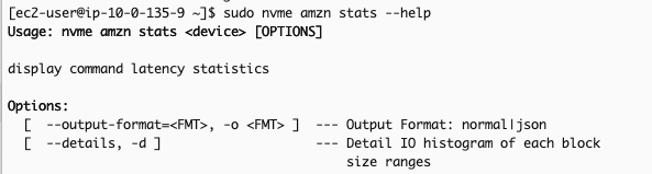
nvme-cli, with the correct permissions, and pass the device as a parameter. You can use--helpto get details on the command usage:$ sudo nvme amzn stats --helpExample output:

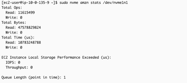
If you prefer output in a JSON format, you can provide the-o jsonparameter to the command.$ sudo nvme amzn stats /dev/nvme1n1 -o jsonThe following output (without the -o json parameter) shows cumulative read/write operations, read/write bytes, total processing time (read and write in microseconds), and duration (in microseconds) when application attempted to exceed the instance’s IOPS/throughput limits.

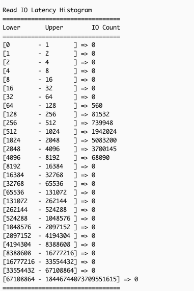
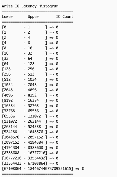
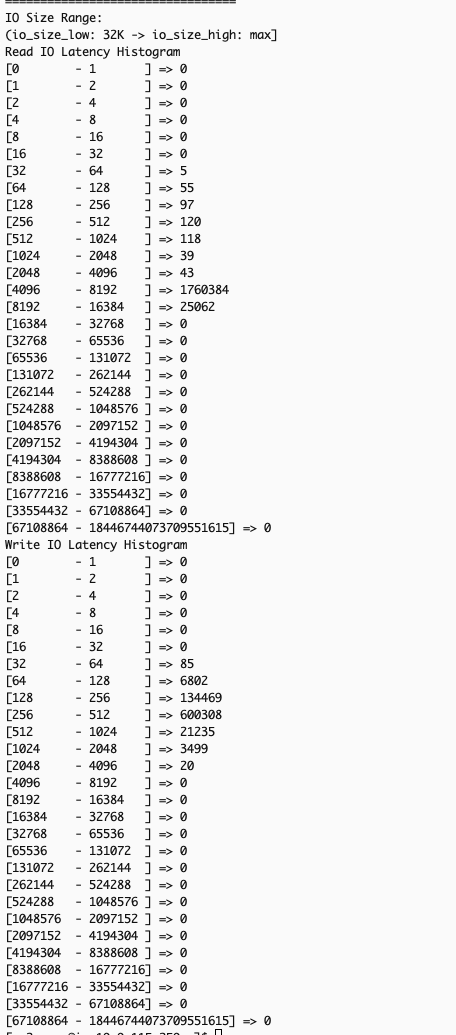
It also displays read/write I/O latency histograms, with each row representing completed I/O operations within a specific bin of time (in microseconds).


If you want to view the latency histograms across 5 different IO bands: (0, 512 Byte], (512B, 4KiB], (4KiB, 8KiB], (8KiB 32KiB], (32 KiB, MAX], you can provide--detailsor-dparameter to the command:$ sudo nvme amzn stats -d /dev/nvme1nThe following image is an excerpt of the above command’s output, showing the additional latency histograms (read and write) of the 5 different IO bands.

You can run the stats command at a per second granularity. You can also write scripts to pull the stats at a desired interval (every second or any other duration) with each subsequent output reflecting the updated cumulative totals for the metrics. Calculating the difference in the statistics across the last two outputs allows you to derive insight into the instance storage profile during the interval. Below is a sample script you can use to pull the stats at a default interval of 1 second or at your desired interval.
You can save this script, make it executable and run it at either the default 1-second interval or provide a custom interval when executing the script. For example, if you saved the script as nvme_stats.sh, you could use the following commands to make it executable and run to get the output at the default 1-second interval (assuming you are in the same directory as that of nvme_stats.sh).
If, for instance, you want to get the output at every 5 seconds, you can use the command below (after making the script executable)
You can also integrate with CloudWatch using CloudWatch agent to collect and publish these statistics for historical tracking, trend visualization through dashboards, and performance-based alerts to correlate with application metrics and automated notifications for performance issues.
Deriving insights from the Amazon EC2 instance store NVMe detailed performance statistics
Similar to EBS detailed performance statistics, you can use Amazon EC2 instance store NVMe statistics to troubleshoot various workload performance issues. As mentioned in the preceding section, you can also use the detailed statistics to view I/O latency histograms to observe the spread of I/O latency within the period. You can use the read/write operations and time spent statistics to calculate the average latency. The detailed statistics show the average latency at per-second granularity.
The next two example scenarios demonstrate key performance analysis using the statistics. In Scenario 1, we will use the EC2 Instance Local Storage Performance Exceeded (us) metric to check if I/O demands exceed instance storage capabilities, helping with instance right-sizing for sufficient I/O application performance. In Scenario 2, we will use IO-size specific histograms (using --details) to diagnose how large block writes affect subsequent read performance – an issue typically hidden by traditional monitoring tools’ aggregated metrics across all IO sizes.
Scenario 1: Identifying when applications exceed instance storage performance limits
Understanding whether your application’s I/O demands exceed your instance store volumes’ capabilities is important for performance troubleshooting. When applications generate I/O workloads that consistently attempt to exceed the IOPS and throughput limits of specific Amazon EC2 instance types, you’ll experience increased latency and degraded performance. The EC2 Instance Local Storage Performance Exceeded (us) metric helps identify these scenarios by showing the duration (in microseconds) when workloads exceeded supported instance performance. A non-zero value or increasing count between snapshots indicates your current instance size or type may not provide sufficient I/O performance for your application.
The following section shows how to identify if an application is sending more IOPS than the instance’s local storage can support.
The example scenario: An application on an i3en.xlarge instance shows elevated write latency of >1ms. You want to determine if the application’s workload is exceeding the instance’s NVMe volume supported performance.
-
- Select the Instance Storage NVMe device you want to analyze – Identify the instance you want to analyze for the application experiencing elevated latency.
- Identify the NVMe device – Use the following nvme-cli command, and identify the NVMe device associated with that instance storage.
Example scenario: We used the list and identified /dev/nvme1n1 as the NVMe device associated with the i3en.xlarge instance that is running the application which is currently seeing elevated write latency >1ms (while read latency is <50us as per normal conditions), so now we want to. analyze it.
- Collect statistics for the device at a single point in time or at desired intervals – Collect the detailed performance statistics using the nvme-cli command or use the sample script provided in previous section to capture statistics at the desired intervals, if needed.
Example scenario: We choose to collect the statistics only once after noticing elevated write latency of the application.
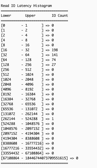
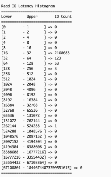
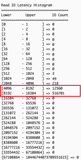
- Analyze the statistics to check if the application demands more than the supported performance of the instance storage – Confirm existence of overall I/O latency degradation by comparing two sets of read/write I/O latency histograms taken some time apart.Example scenario: The following output shows Read IO histogram of the NVMe local instance storage taken 40 seconds apart with no read IO latency issues (as normal read latency for this workload is < 50 us).
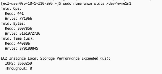
Metric captured at time T:

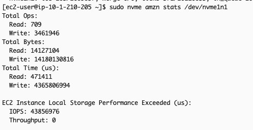
Metric captured at time T+40s:

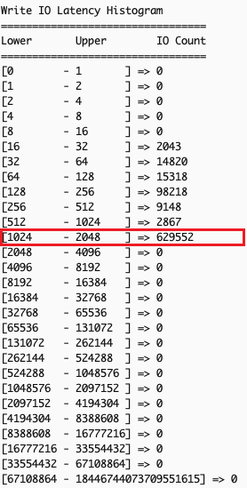
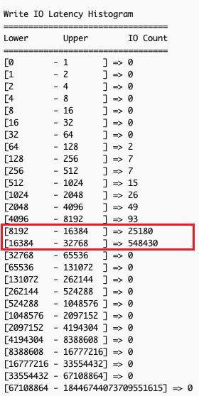
The following output shows Write IO histogram taken 40 seconds apart. We can discern that many write IOs fall into the 1ms – 2ms latency range, which is not expected for this application.
Metric captured at time T:

Metric captured at time T+40s:
- Analyze the EC2 Instance Local Storage Performance Exceeded (us) metric which shows total time (in microseconds) IOPS requests exceed volume limits. Ideally, the incremental count of this metric between two snapshot times should be minimal, as any value above 0 indicates that the workload demanded more IOPS than the volume could deliver.Example scenario: Comparing metrics 40 seconds apart shows that for more than 34 seconds, the application’s IOPS demands surpassed the IOPS supported by the local instance storage. This explains elevated write latency: excess IOPS above what the underlying storage can physically handle queue the operations, increasing wait times. This indicates that the i3en.xlarge instance chosen to run this application cannot meet the application’s performance requirements, suggesting either upgrading to a larger instance size or re-evaluating the instance type itself.
Metric captured at time T:

Metric captured at time T+40s:


It’s important to have the right instance size to avoid performance bottlenecks to your application. Refer to the Amazon EC2 instance documentation for more information on the different instances and their storage size.
Scenario 2: Identifying the block size causing elevated latency in your applications
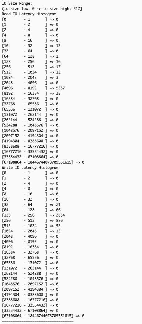
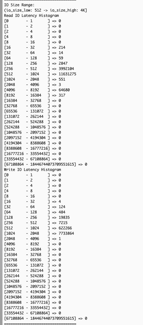
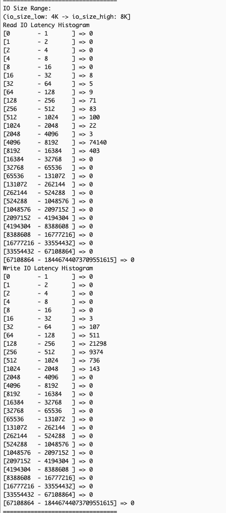
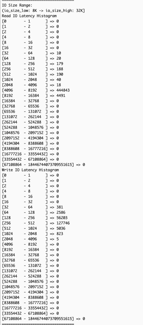
Many storage performance issues arise from complex interactions between read and write operations with different I/O sizes, which traditional system-level monitoring tools like iostat or sar cannot effectively diagnose due to their aggregated metrics across all I/O sizes. EC2 instance store NVMe detailed performance statistics solves this by providing I/O-size specific latency histograms through the --details option in NVMe CLI. These histograms show latency data for different I/O size ranges: (0, 512 Byte], (512B, 4KiB], (4KiB, 8KiB], (8KiB, 32KiB], (32KiB, MAX], for a more precise correlation between application workload patterns and I/O size-specific latency metrics for targeted optimizations.
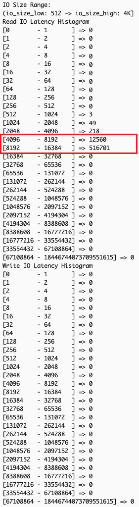
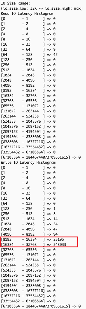
In this example scenario, your application performs small reads (typically <=4KiB, like metadata read) followed by large writes (>=32KiB) and shows unexpectedly high read latency. This common issue occurs when large writes impact subsequent read operations’ performance, creating a cascading effect on overall I/O performance.
-
- Gather read and write IO latency by size ranges – Use the NVMe CLI with the
--detailsoption to gather read and write IO latency by size ranges: - Confirm existence of overall IO latency degradation – In the example scenario, examining overall IO latency, both read (left) and write (right) operations are showing higher than expected latency.

- Examine the output for patterns across different IO size bands – Analyzing latency by operation sizes shows small read operations (512 bytes to 4K), typically fast, are experiencing unexpected latency spikes while large writes (32K+) show significant delays. Small reads should theoretically maintain good performance regardless of other I/O activities.


The observed pattern indicates that the backed-up large write operations create system-wide congestion, affecting all I/O operations of types and sizes. Despite the storage system’s capability to handle small reads efficiently, the queued large writes slow down both read and write operations at the application level.
- Gather read and write IO latency by size ranges – Use the NVMe CLI with the
Based on this analysis, we can implement several targeted optimizations to the application, like using smaller block sizes for write operations when possible, or batching smaller writes instead of performing large single writes.
Clean up
If you created an Amazon EC2 instance with NVMe volume for this exercise, then terminate and delete the appropriate instance to avoid future costs.
Conclusion
Amazon EC2 detailed performance statistics for instance store NVMe volumes provide real-time, sub-minute storage performance monitoring, similar to the detailed performance statistics available for Amazon EBS volumes. This offers consistent monitoring experience across both storage types, with additional IO-size based latency histograms for instance storage for better optimization of I/O patterns, and more effective troubleshooting.
To learn more about Amazon EC2 instance store NVMe volumes, optimization techniques for latency-sensitive workloads or other Amazon EC2 related topics, visit the Amazon EC2 documentation page or explore our other AWS Storage Blog posts on performance optimization.
We’d love to hear how you’re using these statistics to enhance your workloads, or if you have any questions, in the comments section below.


 Milind Oke is a Data Warehouse Specialist Solutions Architect based out of New York. He has been building data warehouse solutions for over 15 years and specializes in Amazon Redshift.