We’re excited to introduce starring, a new dashboard feature built to speed up your workflow. You can now “star” up to 10 of the websites and applications you have on Cloudflare for quicker access.
Star your websites or applications for more efficiency
We have heard from many of our users, particularly ones with tens to hundreds of websites and applications running on Cloudflare, about the need to “favorite” the ones they monitor or configure most often. For example, domains or subdomains that our users designate for development or staging may be accessed in the Cloudflare dashboard daily during a build, migration or a first-time configuration, but then rarely touched for months at a time; yet every time logging in, these users have had to go through multiple steps—searching and paging through results—to navigate to where they need to go. These users seek a more efficient workflow to get to their destination faster. Now, by starring your websites or applications, you can have easier access.
How to get started
Star a website or application
Today, you can star up to 10 items per account. Simply star a website or application you have added to Cloudflare from its Overview page. Once you have starred at least one item, you will then see these marked as “starred” in most places across the dashboard. Just look for the yellow star icon. You can always remove from starred by toggling the button.
Filter by starred
By starring a website or application, you can then filter your lists down to display starred items only. To do so, simply select the “starred” filter from the Home page or the site switcher from the sidebar navigation.
We're very excited to offer this new functionality for better organization of your Cloudflare experience, and about the many possibilities to mature this feature. After trying it out, give us a shout in the Cloudflare Community to let us know what improvements you’d like to see come next.
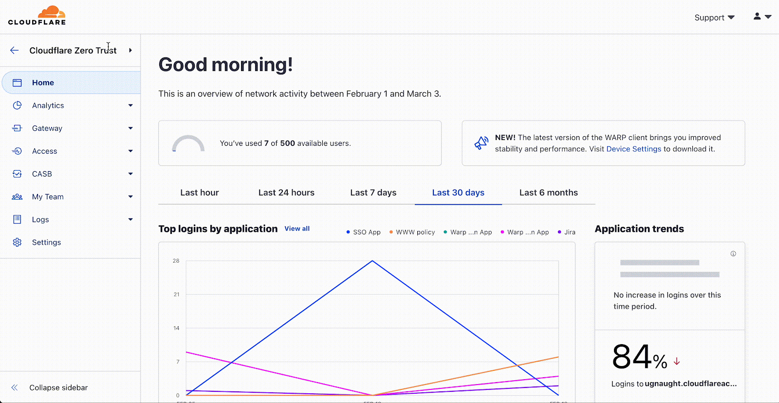
On March 20, 2023, we will be launching an updated navigation in the Zero Trust dashboard, offering all of our Zero Trust users a more seamless experience across Cloudflare as a whole. This change will allow you to more easily manage your Zero Trust organization alongside your application and network services, developer tools, and more.
As part of this upcoming release, you will see three key changes:
Quicker navigation
Instead of opening another window or typing in a URL, you can go back to the Cloudflare dashboard in one click.
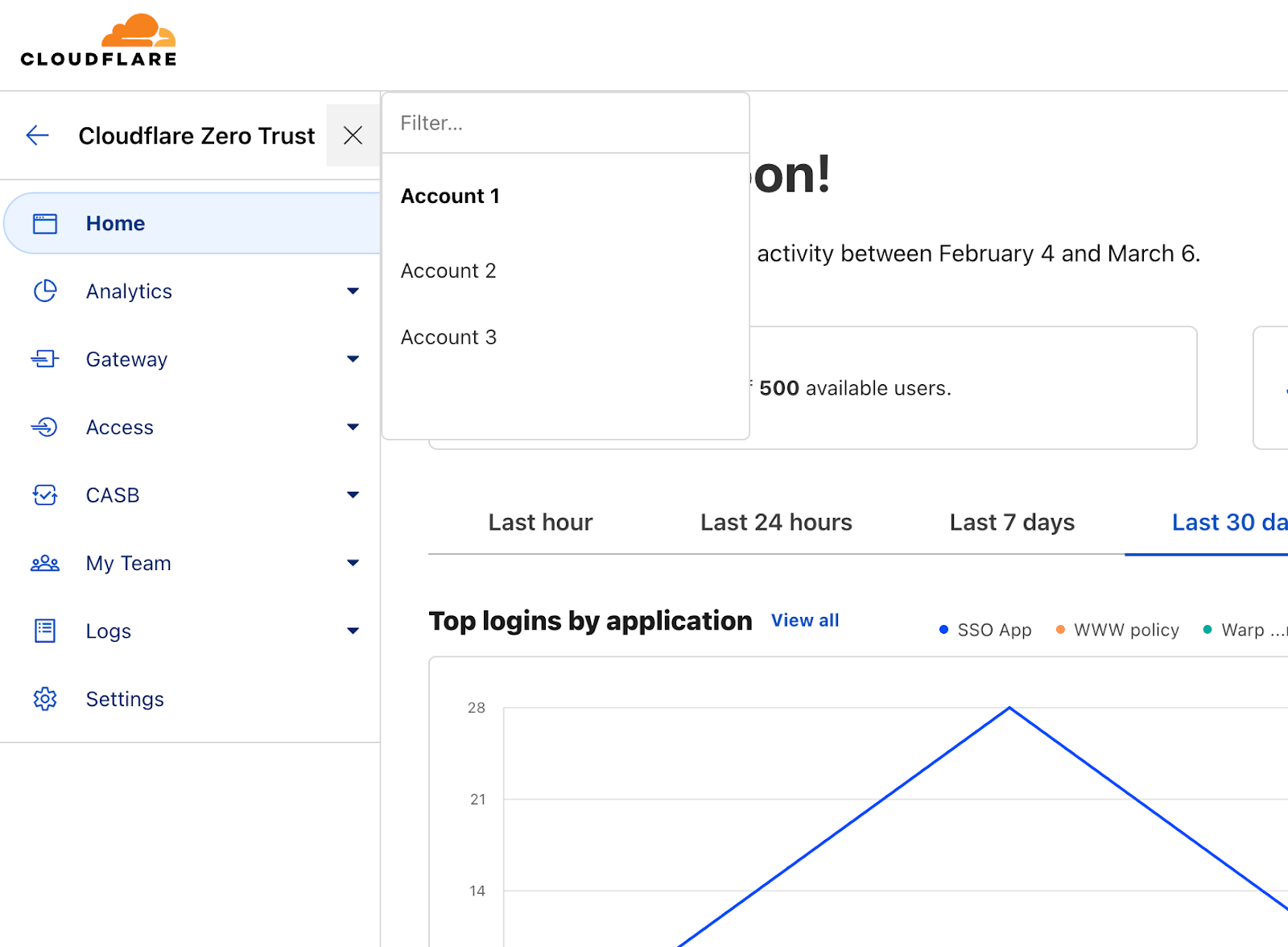
Switch accounts with ease
View and switch accounts at the top of your sidebar.
Resources and support
Find helpful links to our Community, developer documentation, and support team at the top of your navigation bar.
Why we’re updating the Zero Trust navigation
In 2020, Gateway was broadly released as the first Cloudflare product that didn’t require a site hosted on Cloudflare’s infrastructure. In other words, Gateway was unconstrained by the site-specific model most other Cloudflare products relied on at the time, while also used in close conjunction with Access. And so, the Cloudflare for Teams dashboard was built on a new model, designed from scratch, to give our customers a designated home—consolidated under a single roof—to manage their Teams products and accounts.
Fast forward to today and Zero Trust has grown tremendously, both in capability and reach. Many of our customers are using multiple Cloudflare products together, including Cloudflare One and Zero Trust products. Our home has grown, and this navigation change is one step toward expanding our roof to cover Cloudflare’s rapidly expanding footprint.
A focus on user experience
We have heard from many of you about the pains you experience when using multiple Cloudflare products, including Zero Trust. Your voice matters to us, and we’re invested in building a world-class user experience to make your time with Cloudflare an easy and enjoyable one. Our user experience improvements are based on three core principles: Consistency, Interconnectivity, and Discoverability.
We aim to offer a consistent and predictable user experience across the entire Cloudflare ecosystem so you never have to think twice about where you are in your journey, whether performing your familiar daily tasks or discovering our new ground-breaking products and features.
What else?
This navigation change we’re announcing today isn’t the only user experience improvement we’ve built! You may have noticed a few more optimizations recently:
User authorization and loading experience
Remember the days of the recurrent loading screen? Or perhaps when your Zero Trust account didn’t match the one you had logged in with to manage, say, your DNS? Those days are over! Our team has built a smarter, faster, and more seamless user and account authorization experience.
New tables
Tables are table stakes when it comes to presenting large quantities of data and information. (Yes, pun intended.) Tables are a common UI element across Cloudflare, and now Zero Trust uses the same tables UI as you will see when managing other products and features.
UI consistency
A slight change in color scheme and page layout brings the Zero Trust dashboard into the same visual family as the broader Cloudflare experience. Now, when you navigate to Zero Trust, we want you to know that you’re still under our one single Cloudflare roof.
We’re as excited about these improvements as you are! And we hope the upcoming navigation and page improvements come as a welcome addition to the changes noted above.
What’s next?
The user experience changes we’ve covered today go a long way toward creating a more consistent, seamless and user-friendly interface to make your work on Cloudflare as easy and efficient as possible. We know there’s always room for further improvement (we already have quite a few big improvements on our radar!).
To ensure we’re solving your biggest problems, we’d like to hear from you. Please consider filling out a short survey to share the most pressing user experience improvements you’d like to see next.
At Cloudflare, we believe the Internet should be accessible to everyone. And today, we’re happy to announce a more inclusive Cloudflare dashboard experience for our users with disabilities. Recent improvements mean our dashboard now adheres to industry accessibility standards, including Web Content Accessibility Guidelines (WCAG) 2.1 AA and Section 508 of the Rehabilitation Act.
Over the past several months, the Cloudflare team and our partners have been hard at work to make the Cloudflare dashboard1 as accessible as possible for every single one of our current and potential customers. This means incorporating accessibility features that comply with the latest Web Content Accessibility Guidelines (WCAG) and Section 508 of the US’s federal Rehabilitation Act. We are invested in working to meet or exceed these standards; to demonstrate that commitment and share openly about the state of accessibility on the Cloudflare dashboard, we have completed the Voluntary Product Accessibility Template (VPAT), a document used to evaluate our level of conformance today.
Conformance with a technical and legal spec is a bit abstract–but for us, accessibility simply means that as many people as possible can be successful users of the Cloudflare dashboard. This is important because each day, more and more individuals and businesses rely upon Cloudflare to administer and protect their websites.
For individuals with disabilities who work on technology, we believe that an accessible Cloudflare dashboard could mean improved economic and technical opportunities, safer websites, and equal access to tools that are shaping how we work and build on the Internet.
For designers and developers at Cloudflare, our accessibility remediation project has resulted in an overhaul of our component library. Our newly WCAG-compliant components expedite and simplify our work building accessible products. They make it possible for us to deliver on our commitment to an accessible dashboard going forward.
Our Journey to an Accessible Cloudflare Dashboard
In 2021, we initiated an audit with third party experts to identify accessibility challenges in the Cloudflare dashboard. This audit came back with a daunting 213-page document—a very, very long list of compliance gaps.
We learned from the audit that there were many users we had unintentionally failed to design and build for in Cloudflare dashboard user interfaces. Most especially, we had not done well accommodating keyboard users and screen reader users, who often rely upon these technologies because of a physical impairment. Those impairments include low vision or blindness, motor disabilities (examples include tremors and repetitive strain injury), or cognitive disabilities (examples include dyslexia and dyscalculia).
As a product and engineering organization, we had spent more than a decade in cycles of rapid growth and product development. While we’re proud of what we have built, the audit made clear to us that there was a great need to address the design and technical debt we had accrued along the way.
One year, four hundred Jira tickets, and over 25 new, accessible web components later, we’re ready to celebrate our progress with you. Major categories of work included:
Forms: We re-wrote our internal form components with accessibility and developer experience top of mind. We improved form validation and error handling, labels, required field annotations, and made use of persistent input descriptions instead of placeholders. Then, we deployed those component upgrades across the dashboard.
Data visualizations: After conducting a rigorous re-evaluation of their design, we re-engineered charts and graphs to be accessible to keyboard and screen reader users. See below for a brief case study.
Heading tags: We corrected page structure throughout the dashboard by replacing all our heading tags (<h1>, <h2>, etc.) with a technique we borrowed from Heydon Pickering. This technique is an approach to heading level management that uses React Context and basic arithmetic.
SVGs: We reworked how we create SVGs (Scalable Vector Graphics), so that they are labeled properly and only exposed to assistive technology when useful.
Node modules: We jumped several major versions of old, inaccessible node modules that our UI components depend upon (and we broke many things along the way).
Color: We overhauled our use of color, and contributed a new volume of accessible sequential colors to our design system.
Bugs: We squashed a lot of bugs that had made their way into the dashboard over the years. The most common type of bug we encountered related to incorrect or unsemantic use of HTML elements—for example, using a <div> where we should have used a <td> (table data) or <tr> (table row) element within a table.
Case Study: Accessibility Work On Cloudflare Dashboard Data & Analytics
The Cloudflare dashboard is replete with analytics and data visualizations designed to offer deep insight into users’ websites’ performance, traffic, security, and more. Making those data visualizations accessible proved to be among the most complex and interdisciplinary issues we faced in the remediation work.
An example of a problem we needed to solve related to WCAG success criterion 1.4.1, which pertains to the use of color. 1.4.1 specifies that color cannot be the only means by which to convey information, such as the differentiation between two items compared in a chart or graph.
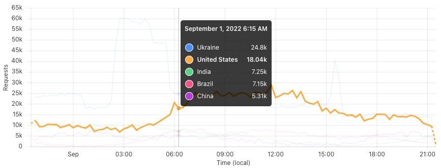
Our charts were clearly nonconforming with this standard, using color alone to represent different data being compared. For example, a typical graph might have used the color blue to show the number of requests to a website that were 200 OK, and the color orange to show 403 Forbidden, but failed to offer users another way to discern between the two status codes.
Our UI team went to work on the problem, and chose to focus our effort first on the Cloudflare dashboard time series graphs.
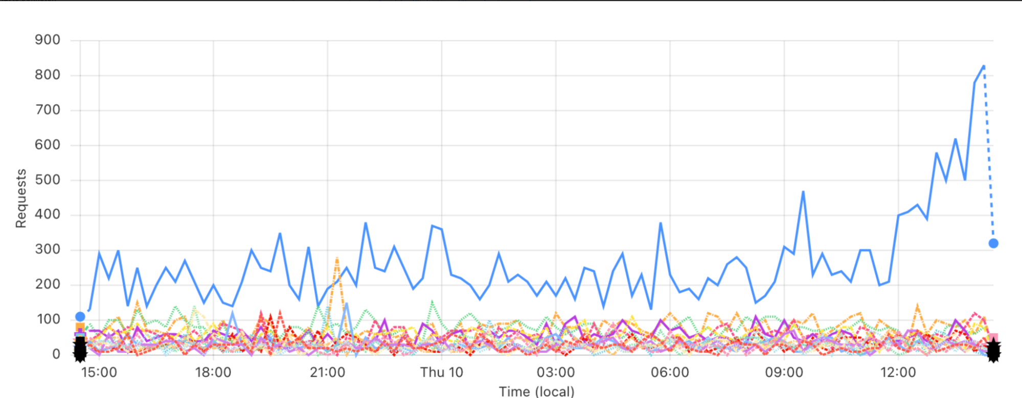
Interestingly, we found that design patterns recommended even by accessibility experts created wholly unusable visualizations when placed into the context of real world data. Examples of such recommended patterns include using different line weights, patterns (dashed, dotted or other line styles), and terminal glyphs (symbols set at the beginning and end of the lines) to differentiate items being compared.
We tried, and failed, to apply a number of these patterns; you can see the evolution of this work on our time series graph component in the three different images below.
v.1
Here is an early attempt at using both terminal glyphs and patterns to differentiate data in a time series graph. You can see that the terminal glyphs pile up and become indistinguishable; the differences among the line patterns are very hard to discern. This code never made it into production.
v.2
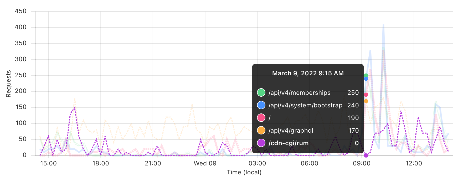
In this version, we eliminated terminal glyphs but kept line patterns. Additionally, we faded the unfocused items in the graph to help bring highlighted data to the forefront. This latter technique made it into our final solution.
v.3
Here we eliminated patterns altogether, simplified the user interface to only use the fading technique on unfocused items, and put our new, sequentially accessible colors to use. Finally, a visual design solution approved by accessibility and data visualization experts, as well as our design and engineering teams.
After arriving at our design solution, we had some engineering work to do.
In order to meet WCAG success criterion 2.1.1, we rewrote our time series graphs to be fully keyboard accessible by adding focus handling to every data point, and enabling the traversal of data using arrow keys.
Navigating time series data points by keyboard on the Cloudflare dashboard.
We did some fine-tuning, specifically to support screen readers: we eliminated auditory “chartjunk” (unnecessary clutter or information in a chart or graph) and cleaned up decontextualized data (a scenario in which numbers are exposed to and read by a screen reader, but contextualizing information, like x- and y-axis labels, is not).
And lastly, to meet WCAG 1.1.1, we engineered new UI component wrappers to make chart and graph data downloadable in CSV format. We deployed this part of the solution across all charts and graphs, not just the time series charts like those shown above. No matter how you browse and interact with the web, we hope you’ll notice this functionality around the Cloudflare dashboard and find value in it.
Making all of this data available to low vision, keyboard, and assistive technology users was an interesting challenge for us, and a true team effort. It necessitated a separate data visualization report conducted by another, more specialized team of third party experts, deep collaboration between engineering and design, and many weeks of development.
Applying this thorough treatment to all data visualizations on the Cloudflare dashboard is our goal, but still work in progress. Please stay tuned for more accessible updates to our chart and graph components.
Conclusion
There’s a lot of nuance to accessibility work, and we were novices at the beginning: researching and learning as we were doing. We also broke a lot of things in the process, which (as any engineering team knows!) can be stressful.
Overall, our team’s biggest challenge was figuring out how to complete a high volume of cross-functional work in the shortest time possible, while also setting a foundation for these improvements to persist over time.
As a frontend engineering and design team, we are very grateful for having had the opportunity to focus on this problem space and to learn from truly world-class accessibility experts along the way.
Accessibility matters to us, and we know it does to you. We’re proud of our progress, and there’s always more to do to make Cloudflare more usable for all of our customers. This is a critical piece of our foundation at Cloudflare, where we are building the most secure, performant and reliable solutions for the Internet. Stay tuned for what’s next!
Not using Cloudflare yet? Get started today and join us on our mission to build a better Internet.
1All references to “dashboard” in this post are specific to the primary user authenticated Cloudflare web platform. This does not include Cloudflare’s product-specific dashboards, marketing, support, educational materials, or third party integrations.
Today we’re proud to announce our first release of quick search for the Cloudflare dashboard, a beta version of our first ever cross-dashboard search tool to help you navigate our products and features. This first release is now available to a small percentage of our customers. Want to request early access? Let us know by filling out this form.
What we’re launching
We’re launching quick search to speed up common interactions with the Cloudflare dashboard. Our dashboard allows you to configure Cloudflare’s full suite of products and features, and quick search gives you a shortcut.
To get started, you can access the quick search tool from anywhere within the Cloudflare dashboard by clicking the magnifying glass button in the top navigation, or hitting Ctrl + K on Linux and Windows or ⌘ + K on Mac. (If you find yourself forgetting which key combination it is just remember that it’s ⌘ or Ctrl-K-wik.) From there, enter a search term and then select from the results shown below.
Access quick search from the top navigation bar, or use keyboard shortcuts Ctrl + K on Linux and Windows or ⌘ + K on Mac.
Current supported functionality
What functionality will you have access to? Below you’ll learn about the three core capabilities of quick search that are included in this release, as well as helpful tips for using the tool.
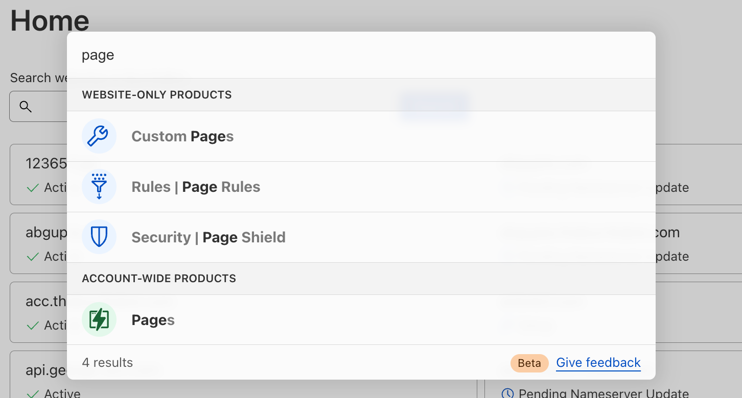
Search for a page in the dashboard
Start typing in the name of the product you’re looking for, and we’ll load matching terms after each key press. You will see results for any dashboard page that currently exists in your sidebar navigation. Then, just click the desired result to navigate directly there.
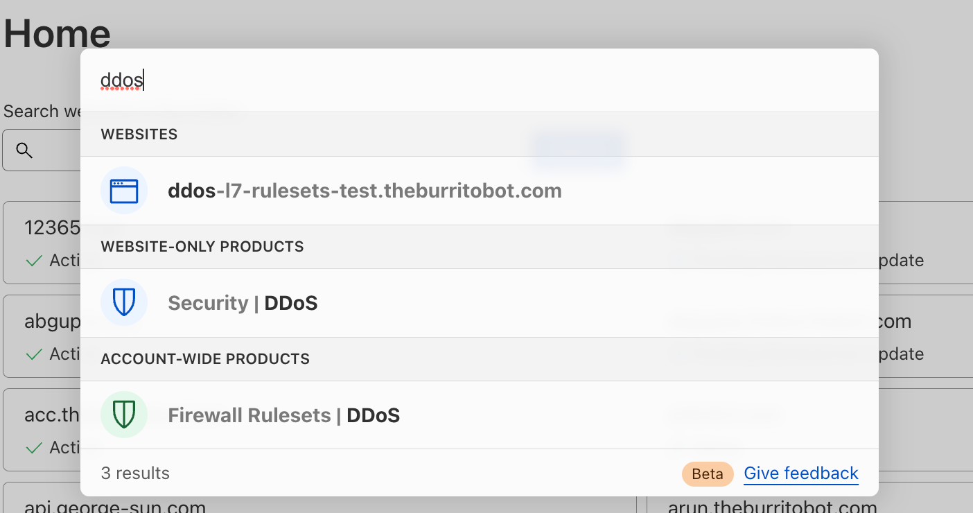
Search for “page” and you’ll see results categorized into “website-only products” and “account-wide products.”Search for “ddos” and you’ll see results categorized into “websites,” “website-only products” and “account-wide products.”
Search for website-only products
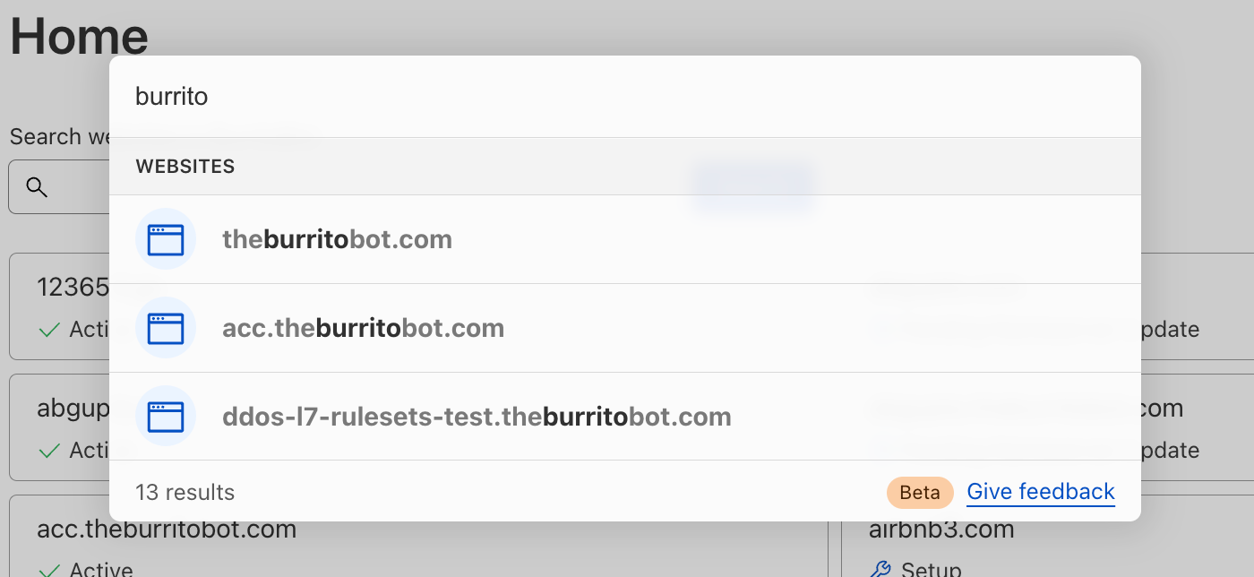
For our customers who manage a website or domain in Cloudflare, you have access to a multitude of Cloudflare products and features to enhance your website’s security, performance and reliability. Quick search can be used to easily find those products and features, regardless of where you currently are in the dashboard (even from within another website!).
You may easily search for your website by name to navigate to your website’s Overview page:
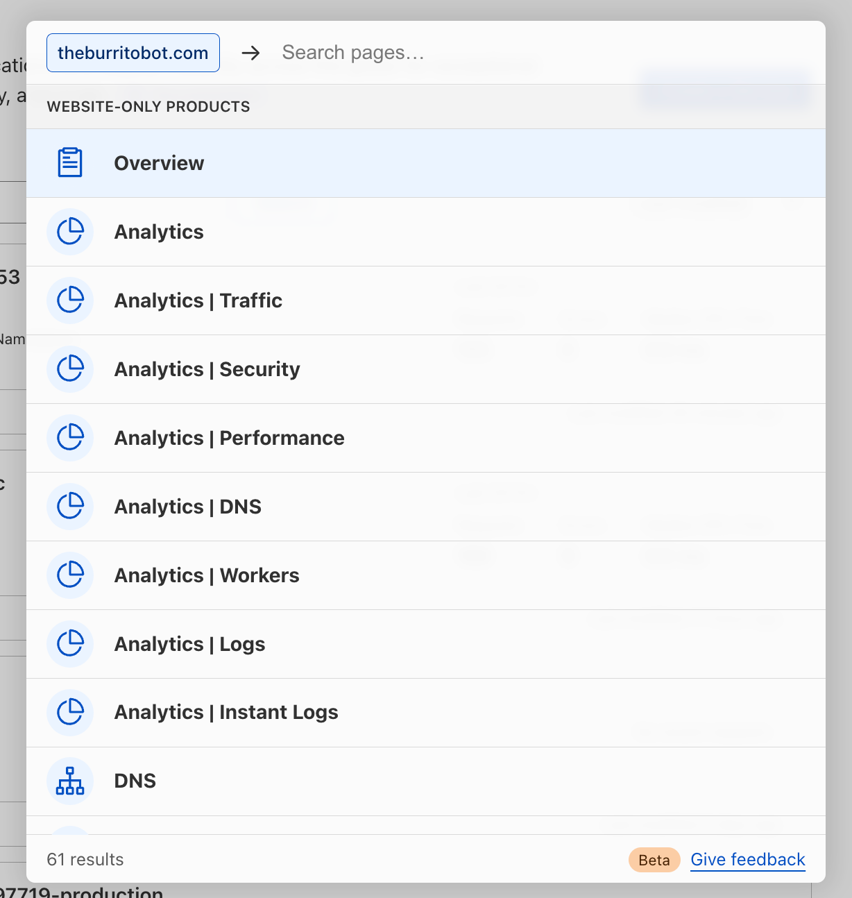
You may also navigate to the products and feature pages within your specific website(s). Note that you can perform a website-specific search from anywhere in your core dashboard using one of two different approaches, which are explained below.
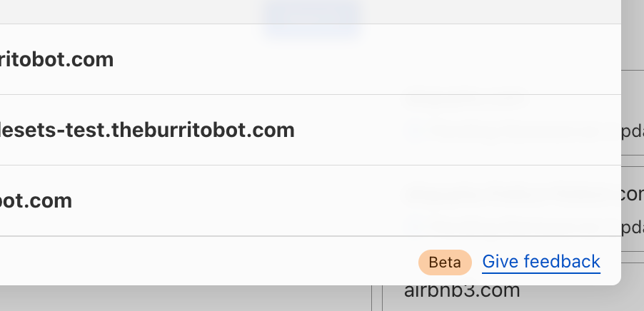
First, you may search first for your website by name, then navigate search results from there:
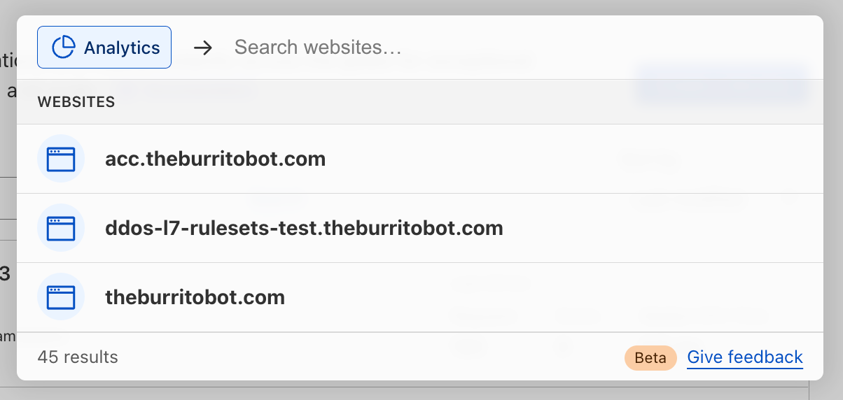
Alternatively, you may search first for the product or feature you’re looking for, then filter down by your website:
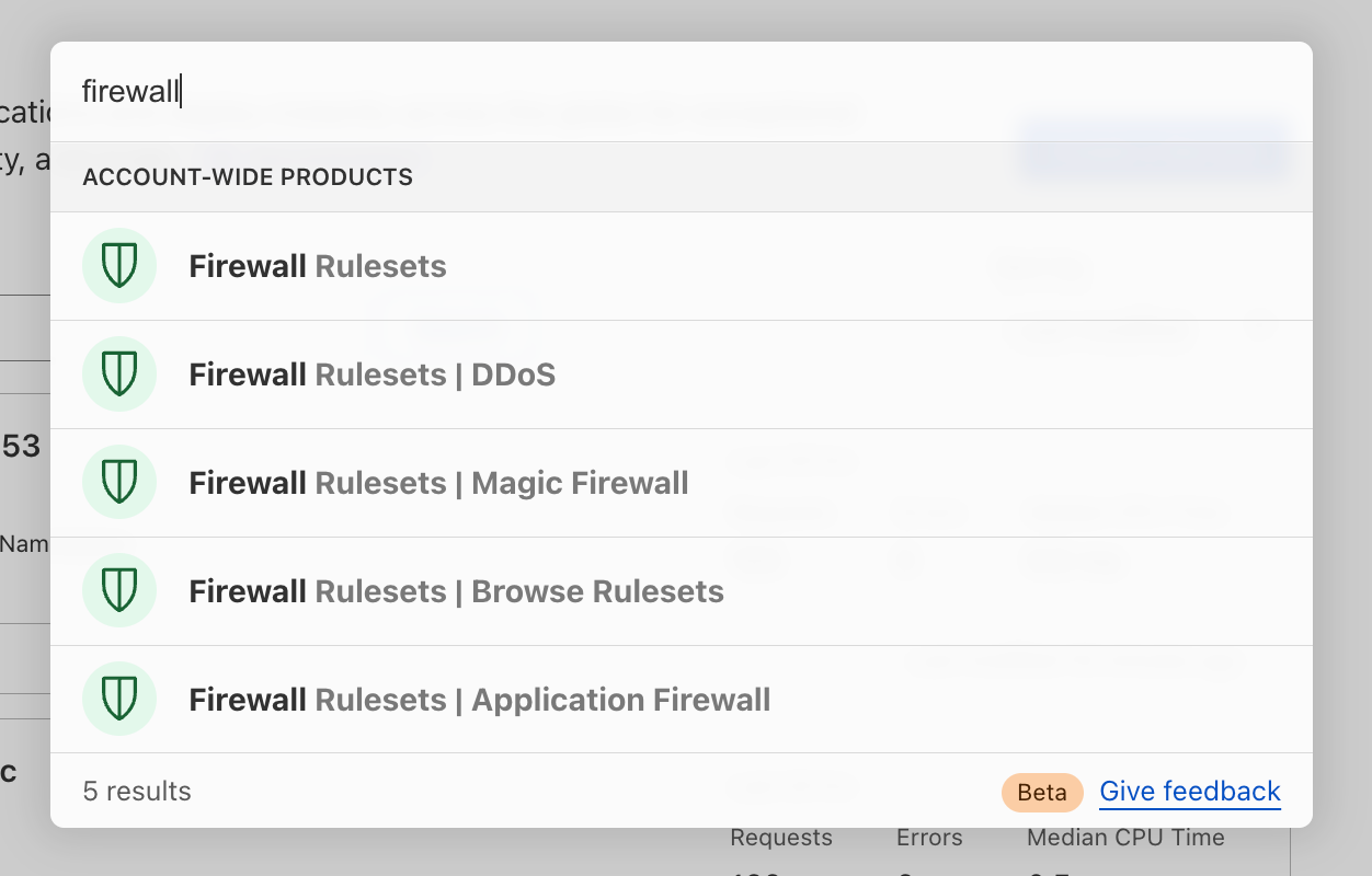
Search for account-wide products
Many Cloudflare products and features are not tied directly to a website or domain that you have set up in Cloudflare, like Workers, R2, Magic Transit—not to mention their related sub-pages. Now, you may use quick search to more easily navigate to those sections of the dashboard.
What’s next for quick search
Here’s an overview of what’s next on our quick search roadmap (and not yet supported today):
Search results do not currently return results of product- and feature-specific names or configurations, such as Worker names, specific DNS records, IP addresses, Firewall Rules.
Search results do not currently return results from within the Zero Trust dashboard.
Search results do not currently return results for Cloudflare content living outside the dashboard, like Support or Developer documentation.
We’d love to hear what you think. What would you like to see added next? Let us know using the feedback link found at the bottom of the search window.
Our vision for the future of the dashboard
We’re excited to launch quick search and to continue improving our dashboard experience for all customers. Over time, we’ll mature our search functionality to index any and all content you might be looking for — including search results for all product content, Support and Developer docs, extending search across accounts, caching your recent searches, and more.
Quick search is one of many important user experience improvements we are planning to tackle over the coming weeks, months and years. The dashboard is central to your Cloudflare experience, and we’re fully committed to making your experience delightful, useful, and easy. Stay tuned for an upcoming blog post outlining the vision for the Cloudflare dashboard, from our in-app home experience to our global navigation and beyond.
For now, keep your eye out for the little search icon that will help you in your day-to-day responsibilities in Cloudflare, and if you don’t see it yet, don’t worry—we can’t wait to ship it to you soon.
If you don’t yet see quick search in your Cloudflare dashboard, you can request early access by filling out this form.
The collective thoughts of the interwebz
Manage Consent
To provide the best experiences, we use technologies like cookies to store and/or access device information. Consenting to these technologies will allow us to process data such as browsing behavior or unique IDs on this site. Not consenting or withdrawing consent, may adversely affect certain features and functions.
Functional
Always active
The technical storage or access is strictly necessary for the legitimate purpose of enabling the use of a specific service explicitly requested by the subscriber or user, or for the sole purpose of carrying out the transmission of a communication over an electronic communications network.
Preferences
The technical storage or access is necessary for the legitimate purpose of storing preferences that are not requested by the subscriber or user.
Statistics
The technical storage or access that is used exclusively for statistical purposes.The technical storage or access that is used exclusively for anonymous statistical purposes. Without a subpoena, voluntary compliance on the part of your Internet Service Provider, or additional records from a third party, information stored or retrieved for this purpose alone cannot usually be used to identify you.
Marketing
The technical storage or access is required to create user profiles to send advertising, or to track the user on a website or across several websites for similar marketing purposes.