Tag Archives: computer vision

Causal Machine Learning for Creative Insights

Post Syndicated from Netflix Technology Blog original https://netflixtechblog.com/causal-machine-learning-for-creative-insights-4b0ce22a8a96

A framework to identify the causal impact of successful visual components.

By Billur Engin, Yinghong Lan, Grace Tang, Cristina Segalin, Kelli Griggs, Vi Iyengar

Introduction

At Netflix, we want our viewers to easily find TV shows and movies that resonate and engage. Our creative team helps make this happen by designing promotional artwork that best represents each title featured on our platform. What if we could use machine learning and computer vision to support our creative team in this process? Through identifying the components that contribute to a successful artwork — one that leads a member to choose and watch it — we can give our creative team data-driven insights to incorporate into their creative strategy, and help in their selection of which artwork to feature.

We are going to make an assumption that the presence of a specific component will lead to an artwork’s success. We will discuss a causal framework that will help us find and summarize the successful components as creative insights, and hypothesize and estimate their impact.

The Challenge

Given Netflix’s vast and increasingly diverse catalog, it is a challenge to design experiments that both work within an A/B test framework and are representative of all genres, plots, artists, and more. In the past, we have attempted to design A/B tests where we investigate one aspect of artwork at a time, often within one particular genre. However, this approach has a major drawback: it is not scalable because we either have to label images manually or create new asset variants differing only in the feature under investigation. The manual nature of these tasks means that we cannot test many titles at a time. Furthermore, given the multidimensional nature of artwork, we might be missing many other possible factors that might explain an artwork’s success, such as figure orientation, the color of the background, facial expressions, etc. Since we want to ensure that our testing framework allows for maximum creative freedom, and avoid any interruption to the design process, we decided to try an alternative approach.

Figure. Given the multidimensional nature of artwork, it is challenging to design an A/B test to investigate one aspect of artwork at a given time. We could be missing many other possible factors that might explain an artwork’s success, such as figure orientation, the color of the background, facial expressions, etc.

The Causal Framework

Thanks to our Artwork Personalization System and vision algorithms (some of which are exemplified here), we have a rich dataset of promotional artwork components and user engagement data to build a causal framework. Utilizing this dataset, we have developed the framework to test creative insights and estimate their causal impact on an artwork’s performance via the dataset generated through our recommendation system. In other words, we can learn which attributes led to a title’s successful selection based on its artwork.

Let’s first explore the workflow of the causal framework, as well as the data and success metrics that power it.

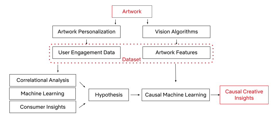
We represent the success of an artwork with the take rate: the probability of an average user to watch the promoted title after seeing its promotional artwork, adjusted for the popularity of the title. Every show on our platform has multiple promotional artwork assets. Using Netflix’s Artwork Personalization, we serve these assets to hundreds of millions of members everyday. To power this recommendation system, we look at user engagement patterns and see whether or not these engagements with artworks resulted in a successful title selection.

With the capability to annotate a given image (some of which are mentioned in an earlier post), an artwork asset in this case, we use a series of computer vision algorithms to gather objective image metadata, latent representation of the image, as well as some of the contextual metadata that a given image contains. This process allows our dataset to consist of both the image features and user data, all in an effort to understand which image components lead to successful user engagement. We also utilize machine learning algorithms, consumer insights¹, and correlational analysis for discovering high-level associations between image features and an artwork’s success. These statistically significant associations become our hypotheses for the next phase.

Once we have a specific hypothesis, we can test it by deploying causal machine learning algorithms. This framework reduces our experimental effort to uncover causal relationships, while taking into account confounding among the high-level variables (i.e. the variables that may influence both the treatment / intervention and outcome).

The Hypothesis and Assumptions

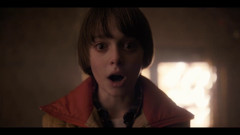
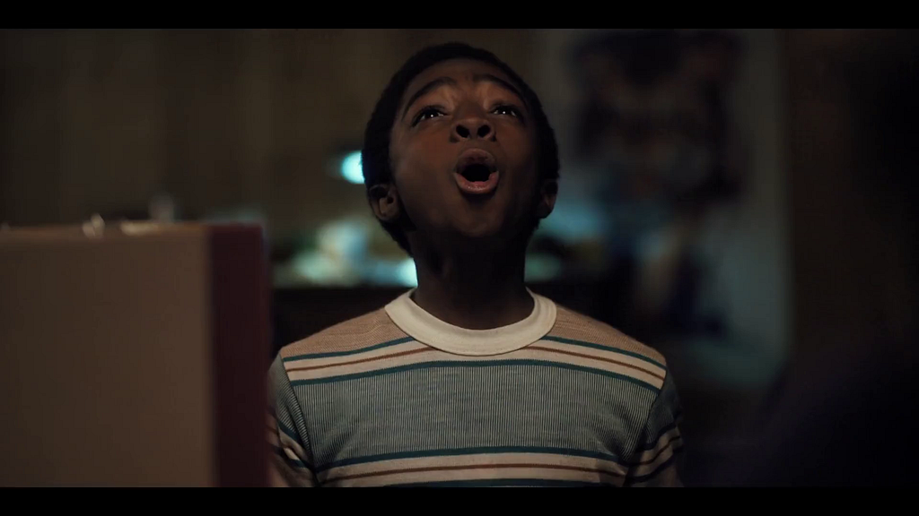
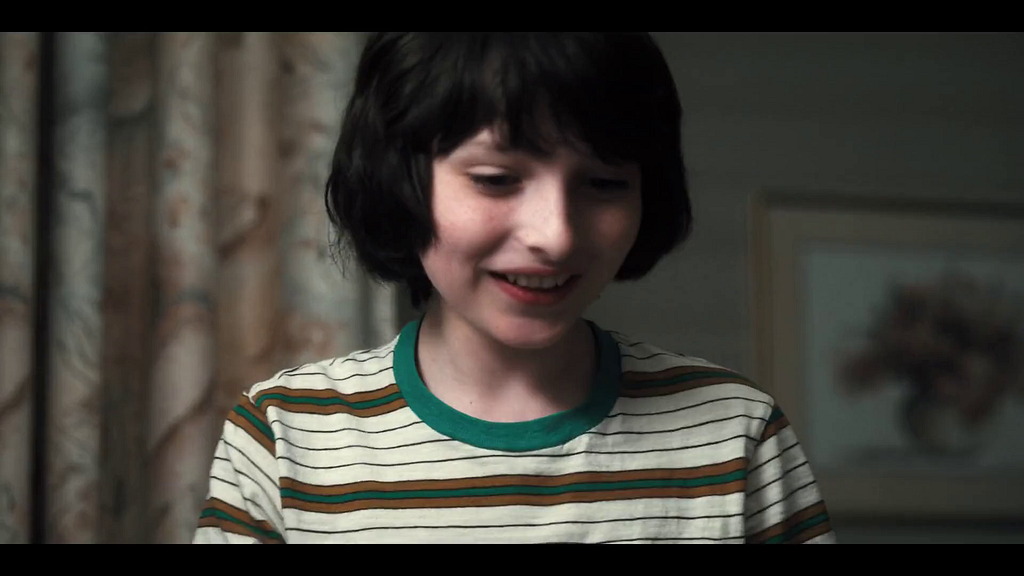
We will use the following hypothesis in the rest of the script: presence of a face in an artwork causally improves the asset performance. (We know that faces work well in artwork, especially images with an expressive facial emotion that’s in line with the tone of the title.)

Here are two promotional artwork assets from Unbreakable Kimmy Schmidt. We know that the image on the left performed better than the image on the right. However, the difference between them is not only the presence of a face. There are many other variances, like the difference in background, text placement, font size, face size, etc. Causal Machine Learning makes it possible for us to understand an artwork’s performance based on the causal impact of its treatment.

To make sure our hypothesis is fit for the causal framework, it’s important we go over the identification assumptions.

  • Consistency: The treatment component is sufficiently well-defined.

We use machine learning algorithms to predict whether or not the artwork contains a face. That’s why the first assumption we make is that our face detection algorithm is mostly accurate (~92% average precision).

  • Positivity / Probabilistic Assignment: Every unit (an artwork) has some chance of getting treated.

We calculate the propensity score (the probability of receiving the treatment based on certain baseline characteristics) of having a face for samples with different covariates. If a certain subset of artwork (such as artwork from a certain genre) has close to a 0 or 1 propensity score for having a face, then we discard these samples from our analysis.

  • Individualistic Assignment / SUTVA (stable unit treatment value assumption): The potential outcomes of a unit do not depend on the treatments assigned to others.

Creatives make the decision to create artwork with or without faces based on considerations limited to the title of interest itself. This decision is not dependent on whether other assets have a face in them or not.

  • Conditional exchangeability (Unconfoundedness): There are no unmeasured confounders.

This assumption is by definition not testable. Given a dataset, we can’t know if there has been an unobserved confounder. However, we can test the sensitivity of our conclusions toward the violation of this assumption in various different ways.

The Models

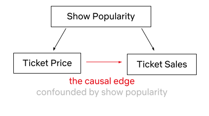
Now that we have established our hypothesis to be a causal inference problem, we can focus on the Causal Machine Learning Application. Predictive Machine Learning (ML) models are great at finding patterns and associations in order to predict outcomes, however they are not great at explaining cause-effect relationships, as their model structure does not reflect causality (the relationship between cause and effect). As an example, let’s say we looked at the price of Broadway theater tickets and the number of tickets sold. An ML algorithm may find a correlation between price increases and ticket sales. If we have used this algorithm for decision making, we could falsely conclude that increasing the ticket price leads to higher ticket sales if we do not consider the confounder of show popularity, which clearly impacts both ticket prices and sales. It is understandable that a Broadway musical ticket may be more expensive if the show is a hit, however simply increasing ticket prices to gain more customers is counter-intuitive.

Causal ML helps us estimate treatment effects from observational data, where it is challenging to conduct clean randomizations. Back-to-back publications on Causal ML, such as Double ML, Causal Forests, Causal Neural Networks, and many more, showcased a toolset for investigating treatment effects, via combining domain knowledge with ML in the learning system. Unlike predictive ML models, Causal ML explicitly controls for confounders, by modeling both treatment of interest as a function of confounders (i.e., propensity scores) as well as the impact of confounders on the outcome of interest. In doing so, Causal ML isolates out the causal impact of treatment on outcome. Moreover, the estimation steps of Causal ML are carefully set up to achieve better error bounds for the estimated treatment effects, another consideration often overlooked in predictive ML. Compared to more traditional Causal Inference methods anchored on linear models, Causal ML leverages the latest ML techniques to not only better control for confounders (when propensity or outcome models are hard to capture by linear models) but also more flexibly estimate treatment effects (when treatment effect heterogeneity is nonlinear). In short, by utilizing machine learning algorithms, Causal ML provides researchers with a framework for understanding causal relationships with flexible ML methods.

Y : outcome variable (take rate)
T : binary treatment variable (presence of a face or not)
W: a vector of covariates (features of the title and artwork)
X ⊆ W: a vector of covariates (a subset of W) along which treatment effect heterogeneity is evaluated

Let’s dive more into the causal ML (Double ML to be specific) application steps for creative insights.

  1. Build a propensity model to predict treatment probability (T) given the W covariates.

2. Build a potential outcome model to predict Y given the W covariates.

3. Residualization of

  • The treatment (observed T — predicted T via propensity model)
  • The outcome (observed Y — predicted Y via potential outcome model)

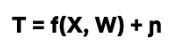
4. Fit a third model on the residuals to predict the average treatment effect (ATE) or conditional average treatment effect (CATE).

Where 𝜖 and η are stochastic errors and we assume that E[ 𝜖|T,W] = 0 , E[ η|W] = 0.

For the estimation of the nuisance functions (i.e., the propensity score model and the outcome model), we have implemented the propensity model as a classifier (as we have a binary treatment variable — the presence of face) and the potential outcome model as a regressor (as we have a continuous outcome variable — adjusted take rate). We have used grid search for tuning the XGBoosting classifier & regressor hyperparameters. We have also used k-fold cross-validation to avoid overfitting. Finally, we have used a causal forest on the residuals of treatment and the outcome variables to capture the ATE, as well as CATE on different genres and countries.

Mediation and Moderation

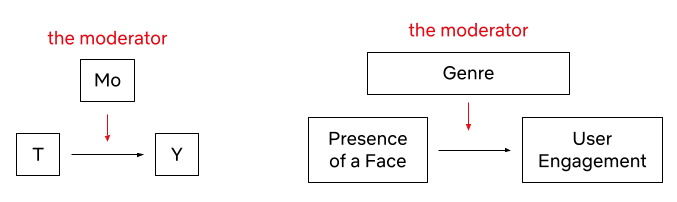
ATE will reveal the impact of the treatment — in this case, having a face in the artwork — across the board. The result will answer the question of whether it is worth applying this approach for all of our titles across our catalog, regardless of potential conditioning variables e.g. genre, country, etc. Another advantage of our multi-feature dataset is that we get to deep dive into the relationships between attributes. To do this, we can employ two methods: mediation and moderation.

In their classic paper, Baron & Kenny define a moderator as “a qualitative (e.g., sex, race, class) or quantitative (e.g., level of reward) variable that affects the direction and/or strength of the relation between an independent or predictor variable and a dependent or criterion variable.”. We can investigate suspected moderators to uncover Conditional Average Treatment Effects (CATE). For example, we might suspect that the effect of the presence of a face in artwork varies across genres (e.g. certain genres, like nature documentaries, probably benefit less from the presence of a human face since titles in those genres tend to focus more on non-human subject matter). We can investigate these relationships by including an interaction term between the suspected moderator and the independent variable. If the interaction term is significant, we can conclude that the third variable is a moderator of the relationship between the independent and dependent variables.

Mediation, on the other hand, occurs when a third variable explains the relationship between an independent and dependent variable. To quote Baron & Kenny once more, “whereas moderator variables specify when certain effects will hold, mediators speak to how or why such effects occur.”

For example, we observed that the presence of more than 3 people tends to negatively impact performance. It could be that higher numbers of faces make it harder for a user to focus on any one face in the asset. However, since face count and face size tend to be negatively correlated (since we fit more information in an image of fixed size, each individual piece of information tends to be smaller), one could also hypothesize that the negative correlation with face count is not driven so much from the number of people featured in the artwork, but rather the size of each individual person’s face, which may affect how visible each person is. To test this, we can run a mediation analysis to see if face size is mediating the effect of face count on the asset’s performance.

The steps of the mediation analysis are as follows: We have already detected a correlation between the independent variable (number of faces) and the outcome variable (user engagement) — in other words, we observed that a higher number of faces is associated with lower user engagement. But, we also observe that the number of faces is negatively correlated with average face size — faces tend to be smaller when more faces are fit into the same fixed-size canvas. To find out the degree to which face size mediates the effect of face count, we regress user engagement on both average face size and the number of faces. If 1) face size is a significant predictor of engagement, and 2) the significance of the predictive contribution of the number of people drops, we can conclude that face size mediates the effect of the number of people in artwork user engagement. If the coefficient for the number of people is no longer significant, it shows that face size fully mediates the effect of the number of faces on engagement.

In this dataset, we found that face size only partially mediates the effect of face count on asset effectiveness. This implies that both factors have an impact on asset effectiveness — fewer faces tend to be more effective even if we control for the effect of face size.

Sensitivity Analysis

As alluded to above, the conditional exchangeability assumption (unconfoundedness) is not testable by definition. It is thus crucial to evaluate how sensitive our findings and insights are to the violation of this assumption. Inspired by prior work, we conducted a suite of sensitivity analyses that stress-tested this assumption from multiple different angles. In addition, we leveraged ideas from academic research (most notably the E-value) and concluded that our estimates are robust even when the unconfoundedness assumption is violated. We are actively working on designing and implementing a standardized framework for sensitivity analysis and will share the various applications in an upcoming blog post — stay tuned for a more detailed discussion!

Finally, we also compared our estimated treatment effects with known effects for specific genres that were derived with other different methods, validating our estimates with consistency across different methods

Conclusion

Using the causal machine learning framework, we can potentially test and identify the various components of promotional artwork and gain invaluable creative insights. With this post, we just started to scratch the surface of this interesting challenge. In the upcoming posts in this series, we will share alternative machine learning and computer vision approaches that can provide insights from a causal perspective. These insights will guide and assist our team of talented strategists and creatives to select and generate the most attractive artwork, leveraging the attributes that these models selected, down to a specific genre. Ultimately this will give Netflix members a better and more personalized experience.

If these types of challenges interest you, please let us know! We are always looking for great people who are inspired by causal inference, machine learning, and computer vision to join our team.

Contributions

The authors contributed to the post as follows.

Billur Engin was the main driver of this blog post, she worked on the causal machine learning theory and its application in the artwork space. Yinghong Lan contributed equally to the causal machine learning theory. Grace Tang worked on the mediation analysis. Cristina Segalin engineered and extracted the visual features at scale from artworks used in the analysis. Grace Tang and Cristina Segalin initiated and conceptualized the problem space that is being used as the illustrative example in this post (studying factors affecting user engagement with a broad multivariate analysis of artwork features), curated the data, and performed initial statistical analysis and construction of predictive models supporting this work.

Acknowledgments

We would like to thank Shiva Chaitanya for reviewing this work, and a special thanks to Shaun Wright , Luca Aldag, Sarah Soquel Morhaim, and Anna Pulido who helped make this possible.

Footnotes

¹The Consumer Insights team at Netflix seeks to understand members and non-members through a wide range of quantitative and qualitative research methods.


Causal Machine Learning for Creative Insights was originally published in Netflix TechBlog on Medium, where people are continuing the conversation by highlighting and responding to this story.

AVA Discovery View: Surfacing Authentic Moments

Post Syndicated from Netflix Technology Blog original https://netflixtechblog.com/ava-discovery-view-surfacing-authentic-moments-b8cd145491cc

By: Hamid Shahid, Laura Johnson, Tiffany Low

Synopsis

At Netflix, we have created millions of artwork to represent our titles. Each artwork tells a story about the title it represents. From our testing on promotional assets, we know which of these assets have performed well and which ones haven’t. Through this, our teams have developed an intuition of what visual and thematic artwork characteristics work well for what genres of titles. A piece of promotional artwork may resonate more in certain regions, for certain genres, or for fans of particular talent. The complexity of these factors makes it difficult to determine the best creative strategy for upcoming titles.

Our assets are often created by selecting static image frames directly from our source videos. To improve it, we decided to invest in creating a Media Understanding Platform, which enables us to extract meaningful insights from media that we can then surface in our creative tools. In this post, we will take a deeper look into one of these tools, AVA Discovery View.

Intro to AVA Discovery View

AVA is an internal tool that surfaces still frames from video content. The tool provides an efficient way for creatives (photo editors, artwork designers, etc.) to pull moments from video content that authentically represent the title’s narrative themes, main characters, and visual characteristics. These still moments are used by multiple teams across Netflix for artwork (on and off the Netflix platform), Publicity, Marketing, Social teams, and more.

Stills are used to merchandise & publicize titles authentically, providing a diverse set of entry points to members who may watch for different reasons. For example, for our hit title “Wednesday”, one member may watch it because they love mysteries, while another may watch because they love coming-of-age stories or goth aesthetics. Another member may be drawn by talent. It’s a creative’s job to select frames with all these entry points in mind. Stills may be enhanced and combined to create a more polished piece of artwork or be used as is. For many teams and titles, Stills are essential to Netflix’s promotional asset strategy.

Watching every moment of content to find the best frames and select them manually takes a lot of time, and this approach is often not scalable. While frames can be saved manually from the video content, AVA goes beyond providing the functionality to surface authentic frames — it suggests the best moments for creatives to use: enter AVA Discovery View.

Example of AVA Discovery View

AVA’s imagery-harvesting algorithms pre-select and group relevant frames into categories like Storylines & Tones, Prominent Characters, and Environments.

Let’s look deeper at how different facets of a title are shown in one of Netflix’s biggest hits — “Wednesday”.

Storyline / Tone

The title “Wednesday” involves a character with supernatural abilities sleuthing to solve a mystery. The title has a dark, imaginative tone with shades of wit and dry humor. The setting is an extraordinary high school where teenagers of supernatural abilities are enrolled. The main character is a teenager and has relationship issues with her parents.

The paragraph above provides a short glimpse of the title and is similar to the briefs that our creatives have to work with. Finding authentic moments from this information to build the base of the artwork suite is not trivial and has been very time-consuming for our creatives.

This is where AVA Discovery View comes in and functions as a creative assistant. Using the information about the storyline and tones associated with a title, it surfaces key moments, which not only provide a nice visual summary but also provide a quick landscape view of the title’s main narrative themes and its visual language.

Storyline & Tone suggestions

Creatives can click on any storyline to see moments that best reflect that storyline and the title’s overall tone. For example, the following images illustrate how it displays moments for the “imaginative” tone.

Prominent Characters

Talent is a major draw for our titles, and our members want to see who is featured in a title to choose whether or not they want to watch that title. Getting to know the prominent characters for a title and then finding the best possible moments featuring them used to be an arduous task.

With the AVA Discovery View, all the prominent characters of the title and their best possible shots are presented to the creatives. They can see how much a character is featured in the title and find shots containing multiple characters and the best possible stills for the characters themselves.

Sensitivities

We don’t want the Netflix home screen to shock or offend audiences, so we aim to avoid artwork with violence, nudity, gore or similar attributes.

To help our creatives understand content sensitivities, AVA Discovery View lists moments where content contains gore, violence, intimacy, nudity, smoking, etc.

Sensitive Moments

Environments

The setting and the filming location often provide great genre cues and form the basis of great-looking artwork. Finding moments from a virtual setting in the title or the actual filming location required a visual scan of all episodes of a title. Now, AVA Discovery View shows such moments as suggestions to the creatives.

For example, for the title “Wednesday”, the creatives are presented with “Nevermore Academy” as a suggested environment

Suggested Environment — Nevermore Academy

Challenges

Algorithm Quality

AVA Discovery View included several different algorithms at the start, and since its release, we have expanded support to additional algorithms. Each algorithm needed a process of evaluation and tuning to get great results in AVA Discovery View.

For Visual Search

  • We found that the model was influenced by the text present in the image. For example, stills of title credits would often get picked up and highly recommended to users. We added a step where such stills with text results would be filtered out and not present in the search.
  • We also found that users preferred results that had a confidence threshold cutoff applied to them.

For Prominent Characters

  • We found that our current algorithm model did not handle animated faces well. As a result, we often find that poor or no suggestions are returned for animated content.

For Sensitive Moments

  • We found that setting a high confidence threshold was helpful. The algorithm was originally developed to be sensitive to bloody scenes, and when applied to scenes of cooking and painting, often flagged as false positives.

One challenge we encountered was the repetition of suggestions. Multiple suggestions from the same scene could be returned and lead to many visually similar moments. Users preferred seeing only the best frames and a diverse set of frames.

  • We added a ranking step to some algorithms to mark frames too visually similar to higher-ranked frames. These duplicate frames would be filtered out from the suggestions list.
  • However, not all algorithms can take this approach. We are exploring using scene boundary algorithms to group similar moments together as a single recommendation.

Suggestion Ranking

AVA Discovery View presents multiple levels of algorithmic suggestions, and a challenge was to help users navigate through the best-performing suggestions and avoid selecting bad suggestions.

  • The suggestion categories are presented based on our users’ workflow relevance. We show Storyline/Tone, Prominent Characters, Environments, then Sensitivities.
  • Within each suggestion category, we display suggestions ranked by the number of results and tie break along the confidence threshold.

Algorithm Feedback

As we launched the initial set of algorithms for AVA Discovery View, our team interviewed users about their experiences. We also built mechanisms within the tool to get explicit and implicit user feedback.

Explicit Feedback

  • For each algorithmic suggestion presented to a user, users can click a thumbs up or thumbs down to give direct feedback.

Implicit Feedback

  • We have tracking enabled to detect when an algorithmic suggestion has been utilized (downloaded or published for use on Netflix promotional purposes).
  • This implicit feedback is much easier to collect, although it may not work for all algorithms. For example, suggestions from Sensitivities are meant to be content watch-outs that should not be used for promotional purposes. As a result, this row does poorly on implicit feedback as we do not expect downloads or publish actions on these suggestions.

This feedback is easily accessible by our algorithm partners and used in training improved versions of the models.

Intersection Queries across Multiple Algorithms

Several media understanding algorithms return clip or short-duration video segment suggestions. We compute the timecode intersections against a set of known high-quality frames to surface the best frame within these clips.

We also rely on intersection queries to help users narrow a large set of frames to a specific moment. For example, returning stills with two or more prominent characters or filtering only indoor scenes from a search query.

Technical Architecture

Discovery View Plugin Architecture

Discovery View Plugin Architecture

We built Discovery View as a pluggable feature that could quickly be extended to support more algorithms and other types of suggestions. Discovery View is available via Studio Gateway for AVA UI and other front-end applications to leverage.

Unified Interface for Discovery

All Discovery View rows implement the same interface, and it’s simple to extend it and plug it into the existing view.

Scalable Categories
In the Discovery View feature, we dynamically hide categories or recommendations based on the results of algorithms. Categories can be hidden if no suggestions are found. On the other hand, for a large number of suggestions, only top suggestions are retrieved, and users have the ability to request more.

Graceful Failure Handling
We load Discovery View suggestions independently for a responsive user experience.

Asset Feedback MicroService

Asset Feedback MicroService

We identified that Asset Feedback is a functionality that is useful elsewhere in our ecosystem as well, so we decided to create a separate microservice for it. The service serves an important function of getting feedback about the quality of stills and ties them to the algorithms. This information is available both at individual and aggregated levels for our algorithm partners.

Media Understanding Platform

AVA Discovery View relies on the Media Understanding Platform (MUP) as the main interface for algorithm suggestions. The key features of this platform are

Uniform Query Interface

Hosting all of the algorithms in AVA Discovery View on MUP made it easier for product integration as the suggestions could be queried from each algorithm similarly

Rich Query Feature Set

We could test different confidence thresholds per algorithm, intersect across algorithm suggestions, and order suggestions by various fields.

Fast Algo Onboarding

Each algorithm took fewer than two weeks to onboard, and the platform ensured that new titles delivered to Netflix would automatically generate algorithm suggestions. Our team was able to spend more time evaluating algorithm performance and quickly iterate on AVA Discovery View.

To learn more about MUP, please see a previous blog post from our team: Building a Media Understanding Platform for ML Innovations.

Impact

Discovering authentic moments in an efficient and scalable way has a huge impact on Netflix and its creative teams. AVA has become a place to gain title insights and discover assets. It provides a concise brief on the main narratives, the visual language, and the title’s prominent characters. An AVA user can find relevant and visually stunning frames quickly and easily and leverage them as a context-gathering tool.

Future Work

To improve AVA Discovery View, our team needs to balance the number of frames returned and the quality of the suggestions so that creatives can build more trust with the feature.

Eliminating Repetition

AVA Discovery View will often put the same frame into multiple categories, which results in creatives viewing and evaluating the same frame multiple times. How can we solve for an engaging frame being a part of multiple groupings without bloating each grouping with repetition?

Improving Frame Quality

We’d like to only show creatives the best frames from a certain moment and work to eliminate frames that have either poor technical quality (a poor character expression) or poor editorial quality (not relevant to grouping, not relevant to narrative). Sifting through frames that aren’t up to quality standards creates user fatigue.

Building User Trust

Creatives don’t want to wonder whether there’s something better outside an AVA Discovery View grouping or if anything is missing from these suggested frames.

When looking at a particular grouping (like “Wednesday”’s Solving a Mystery or Gothic), creatives need to trust that it doesn’t contain any frames that don’t belong there, that these are the best quality frames, and that there are no better frames that exist in the content that isn’t included in the grouping. Suppose a creative is leveraging AVA Discovery View and doing separate manual work to improve frame quality or check for missing moments. In that case, AVA Discovery View hasn’t yet fully optimized the user experience.

Acknowledgment

Special thanks to Abhishek Soni, Amir Ziai, Andrew Johnson, Ankush Agrawal, Aneesh Vartakavi, Audra Reed, Brianda Suarez, Faraz Ahmad, Faris Mustafa, Fifi Maree, Guru Tahasildar, Gustavo Carmo, Haley Jones Phillips, Janan Barge, Karen Williams, Laura Johnson, Maria Perkovic, Meenakshi Jindal, Nagendra Kamath, Nicola Pharoah, Qiang Liu, Samuel Carvajal, Shervin Ardeshir, Supriya Vadlamani, Varun Sekhri, and Vitali Kauhanka for making it all possible.


AVA Discovery View: Surfacing Authentic Moments was originally published in Netflix TechBlog on Medium, where people are continuing the conversation by highlighting and responding to this story.

Detecting Scene Changes in Audiovisual Content

Post Syndicated from Netflix Technology Blog original https://netflixtechblog.com/detecting-scene-changes-in-audiovisual-content-77a61d3eaad6

Avneesh Saluja, Andy Yao, Hossein Taghavi

Introduction

When watching a movie or an episode of a TV show, we experience a cohesive narrative that unfolds before us, often without giving much thought to the underlying structure that makes it all possible. However, movies and episodes are not atomic units, but rather composed of smaller elements such as frames, shots, scenes, sequences, and acts. Understanding these elements and how they relate to each other is crucial for tasks such as video summarization and highlights detection, content-based video retrieval, dubbing quality assessment, and video editing. At Netflix, such workflows are performed hundreds of times a day by many teams around the world, so investing in algorithmically-assisted tooling around content understanding can reap outsized rewards.

While segmentation of more granular units like frames and shot boundaries is either trivial or can primarily rely on pixel-based information, higher order segmentation¹ requires a more nuanced understanding of the content, such as the narrative or emotional arcs. Furthermore, some cues can be better inferred from modalities other than the video, e.g. the screenplay or the audio and dialogue track. Scene boundary detection, in particular, is the task of identifying the transitions between scenes, where a scene is defined as a continuous sequence of shots that take place in the same time and location (often with a relatively static set of characters) and share a common action or theme.

In this blog post, we present two complementary approaches to scene boundary detection in audiovisual content. The first method, which can be seen as a form of weak supervision, leverages auxiliary data in the form of a screenplay by aligning screenplay text with timed text (closed captions, audio descriptions) and assigning timestamps to the screenplay’s scene headers (a.k.a. sluglines). In the second approach, we show that a relatively simple, supervised sequential model (bidirectional LSTM or GRU) that uses rich, pretrained shot-level embeddings can outperform the current state-of-the-art baselines on our internal benchmarks.

Figure 1: a scene consists of a sequence of shots.

Leveraging Aligned Screenplay Information

Screenplays are the blueprints of a movie or show. They are formatted in a specific way, with each scene beginning with a scene header, indicating attributes such as the location and time of day. This consistent formatting makes it possible to parse screenplays into a structured format. At the same time, a) changes made on the fly (directorial or actor discretion) or b) in post production and editing are rarely reflected in the screenplay, i.e. it isn’t rewritten to reflect the changes.

Figure 2: screenplay elements, from The Witcher S1E1.

In order to leverage this noisily aligned data source, we need to align time-stamped text (e.g. closed captions and audio descriptions) with screenplay text (dialogue and action² lines), bearing in mind a) the on-the-fly changes that might result in semantically similar but not identical line pairs and b) the possible post-shoot changes that are more significant (reordering, removing, or inserting entire scenes). To address the first challenge, we use pre trained sentence-level embeddings, e.g. from an embedding model optimized for paraphrase identification, to represent text in both sources. For the second challenge, we use dynamic time warping (DTW), a method for measuring the similarity between two sequences that may vary in time or speed. While DTW assumes a monotonicity condition on the alignments³ which is frequently violated in practice, it is robust enough to recover from local misalignments and the vast majority of salient events (like scene boundaries) are well-aligned.

As a result of DTW, the scene headers have timestamps that can indicate possible scene boundaries in the video. The alignments can also be used to e.g., augment audiovisual ML models with screenplay information like scene-level embeddings, or transfer labels assigned to audiovisual content to train screenplay prediction models.

Figure 3: alignments between screenplay and video via time stamped text for The Witcher S1E1.

A Multimodal Sequential Model

The alignment method above is a great way to get up and running with the scene change task since it combines easy-to-use pretrained embeddings with a well-known dynamic programming technique. However, it presupposes the availability of high-quality screenplays. A complementary approach (which in fact, can use the above alignments as a feature) that we present next is to train a sequence model on annotated scene change data. Certain workflows in Netflix capture this information, and that is our primary data source; publicly-released datasets are also available.

From an architectural perspective, the model is relatively simple — a bidirectional GRU (biGRU) that ingests shot representations at each step and predicts if a shot is at the end of a scene.⁴ The richness in the model comes from these pretrained, multimodal shot embeddings, a preferable design choice in our setting given the difficulty in obtaining labeled scene change data and the relatively larger scale at which we can pretrain various embedding models for shots.

For video embeddings, we leverage an in-house model pretrained on aligned video clips paired with text (the aforementioned “timestamped text”). For audio embeddings, we first perform source separation to try and separate foreground (speech) from background (music, sound effects, noise), embed each separated waveform separately using wav2vec2, and then concatenate the results. Both early and late-stage fusion approaches are explored; in the former (Figure 4a), the audio and video embeddings are concatenated and fed into a single biGRU, and in the latter (Figure 4b) each input modality is encoded with its own biGRU, after which the hidden states are concatenated prior to the output layer.

Figure 4a: Early Fusion (concatenate embeddings at the input).
Figure 4b: Late Fusion (concatenate prior to prediction output).

We find:

  • Our results match and sometimes even outperform the state-of-the-art (benchmarked using the video modality only and on our evaluation data). We evaluate the outputs using F-1 score for the positive label, and also relax this evaluation to consider “off-by-n” F-1 i.e., if the model predicts scene changes within n shots of the ground truth. This is a more realistic measure for our use cases due to the human-in-the-loop setting that these models are deployed in.
  • As with previous work, adding audio features improves results by 10–15%. A primary driver of variation in performance is late vs. early fusion.
  • Late fusion is consistently 3–7% better than early fusion. Intuitively, this result makes sense — the temporal dependencies between shots is likely modality-specific and should be encoded separately.

Conclusion

We have presented two complementary approaches to scene boundary detection that leverage a variety of available modalities — screenplay, audio, and video. Logically, the next steps are to a) combine these approaches and use screenplay features in a unified model and b) generalize the outputs across multiple shot-level inference tasks, e.g. shot type classification and memorable moments identification, as we hypothesize that this path would be useful for training general purpose video understanding models of longer-form content. Longer-form content also contains more complex narrative structure, and we envision this work as the first in a series of projects that aim to better integrate narrative understanding in our multimodal machine learning models.

Special thanks to Amir Ziai, Anna Pulido, and Angie Pollema.

Footnotes

  1. Sometimes referred to as boundary detection to avoid confusion with image segmentation techniques.
  2. Descriptive (non-dialogue) lines that describe the salient aspects of a scene.
  3. For two sources X and Y, if a) shot a in source X is aligned to shot b in source Y, b) shot c in source X is aligned to shot d in source Y, and c) shot c comes after shot a in X, then d) shot d has to come after shot b in Y.
  4. We experiment with adding a Conditional Random Field (CRF) layer on top to enforce some notion of global consistency, but found it did not improve the results noticeably.


Detecting Scene Changes in Audiovisual Content was originally published in Netflix TechBlog on Medium, where people are continuing the conversation by highlighting and responding to this story.

Discovering Creative Insights in Promotional Artwork

Post Syndicated from Netflix Technology Blog original https://netflixtechblog.com/discovering-creative-insights-in-promotional-artwork-295e4d788db5

By Grace Tang, Aneesh Vartakavi, Julija Bagdonaite, Cristina Segalin, and Vi Iyengar

When members are shown a title on Netflix, the displayed artwork, trailers, and synopses are personalized. That means members see the assets that are most likely to help them make an informed choice. These assets are a critical source of information for the member to make a decision to watch, or not watch, a title. The stories on Netflix are multidimensional and there are many ways that a single story could appeal to different members. We want to show members the images, trailers, and synopses that are most helpful to them for making a watch decision.

In a previous blog post we explained how our artwork personalization algorithm can pick the best image for each member, but how do we create a good set of images to choose from? What data would you like to have if you were designing an asset suite?

In this blog post, we talk about two approaches to create effective artwork. Broadly, they are:

  1. The top-down approach, where we preemptively identify image properties to investigate, informed by our initial beliefs.
  2. The bottom-up approach, where we let the data naturally surface important trends.

The role of promotional artwork

Great promotional media helps viewers discover titles they’ll love. In addition to helping members quickly find titles already aligned with their tastes, they help members discover new content. We want to make artwork that is compelling and personally relevant, but we also want to represent the title authentically. We don’t want to make clickbait.

Here’s an example: Purple Hearts is a film about an aspiring singer-songwriter who commits to a marriage of convenience with a soon-to-deploy Marine. This title has storylines that might appeal to both fans of romance as well as military and war themes. This is reflected in our artwork suite for this title.

Images for the title “Purple Hearts”

Creative Insights

To create suites that are relevant, attractive, and authentic, we’ve relied on creative strategists and designers with intimate knowledge of the titles to recommend and create the right art for upcoming titles. To supplement their domain expertise, we’ve built a suite of tools to help them look for trends. By inspecting past asset performance from thousands of titles that have already been launched on Netflix, we achieve a beautiful intersection of art & science. However, there are some downsides to this approach: It is tedious to manually scrub through this large collection of data, and looking for trends this way could be subjective and vulnerable to confirmation bias.

Creators often have years of experience and expert knowledge on what makes a good piece of art. However, it is still useful to test our assumptions, especially in the context of the specific canvases we use on the Netflix product. For example, certain traditional art styles that are effective in traditional media like movie posters might not translate well to the Netflix UI in your living room. Compared to a movie poster or physical billboard, Netflix artwork on TV screens and mobile phones have very different size, aspect ratios, and amount of attention paid to them. As a consequence, we need to conduct research into the effectiveness of artwork on our unique user interfaces instead of extrapolating from established design principles.

Given these challenges, we develop data-driven recommendations and surface them to creators in an actionable, user-friendly way. These insights complement their extensive domain expertise in order to help them to create more effective asset suites. We do this in two ways, a top-down approach that can find known features that have worked well in the past, and a bottom-up approach that surfaces groups of images with no prior knowledge or assumptions.

Top-down approach

In our top-down approach, we describe an image using attributes and find features that make images successful. We collaborate with experts to identify a large set of features based on their prior knowledge and experience, and model them using Computer Vision and Machine Learning techniques. These features range from low level features like color and texture, to higher level features like the number of faces, composition, and facial expressions.

An example of the features we might capture for this image include: number of people (two), where they’re facing (facing each other), emotion (neutral to positive), saturation (low), objects present (military uniform)

We can use pre-trained models/APIs to create some of these features, like face detection and object labeling. We also build internal datasets and models for features where pre-trained models are not sufficient. For example, common Computer Vision models can tell us that an image contains two people facing each other with happy facial expressions — are they friends, or in a romantic relationship? We have built human-in-the-loop tools to help experts train ML models rapidly and efficiently, enabling them to build custom models for subjective and complex attributes.

Once we describe an image with features, we employ various predictive and causal methods to extract insights about which features are most important for effective artwork, which are leveraged to create artwork for upcoming titles. An example insight is that when we look across the catalog, we found that single person portraits tend to perform better than images featuring more than one person.

Single Character Portraits

Bottom-up approach

The top-down approach can deliver clear actionable insights supported by data, but these insights are limited to the features we are able to identify beforehand and model computationally. We balance this using a bottom-up approach where we do not make any prior guesses, and let the data surface patterns and features. In practice, we surface clusters of similar images and have our creative experts derive insights, patterns and inspiration from these groups.

One such method we use for image clustering is leveraging large pre-trained convolutional neural networks to model image similarity. Features from the early layers often model low level similarity like colors, edges, textures and shape, while features from the final layers group images depending on the task (eg. similar objects if the model is trained for object detection). We could then use an unsupervised clustering algorithm (like k-means) to find clusters within these images.

Using our example title above, one of the characters in Purple Hearts is in the Marines. Looking at clusters of images from similar titles, we see a cluster that contains imagery commonly associated with images of military and war, featuring characters in military uniform.

An example cluster of imagery related to military and war.

Sampling some images from the cluster above, we see many examples of soldiers or officers in uniform, some holding weapons, with serious facial expressions, looking off camera. A creator could find this pattern of images within the cluster below, confirm that the pattern has worked well in the past using performance data, and use this as inspiration to create final artwork.

A creator can draw inspiration from images in the cluster to the left, and use this to create effective artwork for new titles, such as the image for Purple Hearts on the right.

Similarly, the title has a romance storyline, so we find a cluster of images that show romance. From such a cluster, a creator could infer that showing close physical proximity and body language convey romance, and use this as inspiration to create the artwork below.

On the flip side, creatives can also use these clusters to learn what not to do. For example, here are images within the same cluster with military and war imagery above. If, hypothetically speaking, they were presented with historical evidence that these kinds of images didn’t perform well for a given canvas, a creative strategist could infer that highly saturated silhouettes don’t work as well in this context, confirm it with a test to establish a causal relationship, and decide not to use it for their title.

A creator can also spot patterns that didn’t work in the past, and avoid using it for future titles.

Member clustering

Another complementary technique is member clustering, where we group members based on their preferences. We can group them by viewing behavior, or also leverage our image personalization algorithm to find groups of members that positively responded to the same image asset. As we observe these patterns across many titles, we can learn to predict which user clusters might be interested in a title, and we can also learn which assets might resonate with these user clusters.

As an example, let’s say we are able to cluster Netflix members into two broad clusters — one that likes romance, and another that enjoys action. We can look at how these two groups of members responded to a title after its release. We might find that 80% of viewers of Purple Hearts belong to the romance cluster, while 20% belong to the action cluster. Furthermore, we might find that a representative romance fan (eg. the cluster centroid) responds most positively to images featuring the star couple in an embrace. Meanwhile, viewers in the action cluster respond most strongly to images featuring a soldier on the battlefield. As we observe these patterns across many titles, we can learn to predict which user clusters might be interested in similar upcoming titles, and we can also learn which themes might resonate with these user clusters. Insights like these can guide artwork creation strategy for future titles.

Conclusion

Our goal is to empower creatives with data-driven insights to create better artwork. Top-down and bottom-up methods approach this goal from different angles, and provide insights with different tradeoffs.

Top-down features have the benefit of being clearly explainable and testable. On the other hand, it is relatively difficult to model the effects of interactions and combinations of features. It is also challenging to capture complex image features, requiring custom models. For example, there are many visually distinct ways to convey a theme of “love”: heart emojis, two people holding hands, or people gazing into each others’ eyes and so on, which are all very visually different. Another challenge with top-down approaches is that our lower level features could miss the true underlying trend. For example, we might detect that the colors green and blue are effective features for nature documentaries, but what is really driving effectiveness may be the portrayal of natural settings like forests or oceans.

In contrast, bottom-up methods model complex high-level features and their combinations, but their insights are less explainable and subjective. Two users may look at the same cluster of images and extract different insights. However, bottom-up methods are valuable because they can surface unexpected patterns, providing inspiration and leaving room for creative exploration and interpretation without being prescriptive.

The two approaches are complementary. Unsupervised clusters can give rise to observable trends that we can then use to create new testable top-down hypotheses. Conversely, top-down labels can be used to describe unsupervised clusters to expose common themes within clusters that we might not have spotted at first glance. Our users synthesize information from both sources to design better artwork.

There are many other important considerations that our current models don’t account for. For example, there are factors outside of the image itself that might affect its effectiveness, like how popular a celebrity is locally, cultural differences in aesthetic preferences or how certain themes are portrayed, what device a member is using at the time and so on. As our member base becomes increasingly global and diverse, these are factors we need to account for in order to create an inclusive and personalized experience.

Acknowledgements

This work would not have been possible without our cross-functional partners in the creative innovation space. We would like to specifically thank Ben Klein and Amir Ziai for helping to build the technology we describe here.


Discovering Creative Insights in Promotional Artwork was originally published in Netflix TechBlog on Medium, where people are continuing the conversation by highlighting and responding to this story.

Match Cutting at Netflix: Finding Cuts with Smooth Visual Transitions

Post Syndicated from Netflix Technology Blog original https://netflixtechblog.com/match-cutting-at-netflix-finding-cuts-with-smooth-visual-transitions-31c3fc14ae59

By Boris Chen, Kelli Griggs, Amir Ziai, Yuchen Xie, Becky Tucker, Vi Iyengar, Ritwik Kumar

Creating Media with Machine Learning episode 1

Introduction

At Netflix, part of what we do is build tools to help our creatives make exciting videos to share with the world. Today, we’d like to share some of the work we’ve been doing on match cuts.

In film, a match cut is a transition between two shots that uses similar visual framing, composition, or action to fluidly bring the viewer from one scene to the next. It is a powerful visual storytelling tool used to create a connection between two scenes.

[Spoiler alert] consider this scene from Squid Game:

The players voted to leave the game after red-light green-light, and are back in the real world. After a rough night, Gi Hung finds another calling card and considers returning to the game. As he waits for the van, a series of powerful match cuts begins, showing the other characters doing the exact same thing. We never see their stories, but because of the way it was edited, we instinctively understand that they made the same decision. This creates an emotional bond between these characters and ties them together.

A more common example is a cut from an older person to a younger person (or vice versa), usually used to signify a flashback (or flashforward). This is sometimes used to develop the story of a character. This could be done with words verbalized by a narrator or a character, but that could ruin the flow of a film, and it is not nearly as elegant as a single well executed match cut.

An example from Oldboy. A child wipes their eyes on a train, which cuts to a flashback of a younger child also wiping their eyes. We as the viewer understand that the next scene must be from this child’s upbringing.
A flashforward from a young Indian Jones to an older Indian Jones conveys to the viewer that what we just saw about his childhood makes him the person he is today.

Here is one of the most famous examples from Stanley Kubrik’s 2001: A Space Odyssey. A bone is thrown into the air. As it spins, a single instantaneous cut brings the viewer from the prehistoric first act of the film into the futuristic second act. This highly artistic cut suggests that mankind’s evolution from primates to space technology is natural and inevitable.

Match cutting is also widely used outside of film. They can be found in trailers, like this sequence of shots from the trailer for Firefly Lane.

Match cutting is considered one of the most difficult video editing techniques, because finding a pair of shots that match can take days, if not weeks. An editor typically watches one or more long-form videos and relies on memory or manual tagging to identify shots that would match to a reference shot observed earlier.

A typical two hour movie might have around 2,000 shots, which means there are roughly 2 million pairs of shots to compare. It quickly becomes impossible to do this many comparisons manually, especially when trying to find match cuts across a 10 episode series, or multiple seasons of a show, or across multiple different shows.

What’s needed in the art of match cutting is tools to help editors find shots that match well together, which is what we’ve started building.

Our Initial Approach

Collecting training data is much more difficult compared to more common computer vision tasks. While some types of match cuts are more obvious, others are more subtle and subjective.

For instance, consider this match cut from Lawrence of Arabia. A man blows a match out, which cuts into a long, silent shot of a sunrise. It’s difficult to explain why this works, but many creatives recognize this as one of the greatest match cuts in film.

To avoid such complexities, we started with a more well-defined flavor of match cuts: ones where the visual framing of a person is aligned, aka frame matching. This came from the intuition of our video editors, who said that a large percentage of match cuts are centered around matching the silhouettes of people.

Frame matches from Stranger Things.

We tried several approaches, but ultimately what worked well for frame matching was instance segmentation. The output of segmentation models gives us a pixel mask of which pixels belong to which objects. We take the segmentation output of two different frames, and compute intersection over union (IoU) between the two. We then rank pairs using IoU and surface high-scoring pairs as candidates.

A few other details were added along the way. To deal with not having to brute force every single pair of frames, we only took the middle frame of each shot, since many frames look visually similar within a single shot. To deal with similar frames from different shots, we performed image deduplication upfront. In our early research, we simply discarded any mask that wasn’t a person to keep things simple. Later on, we added non-person masks back to be able to find frame match cuts of animals and objects.

A series of frame match cuts of animals from Our planet.
Object frame match from Paddington 2.

Action and Motion

At this point, we decided to move onto a second flavor of match cutting: action matching. This type of match cut involves the continuation of motion of object or person A’s motion to the object or person B’s motion in another shot (A and B can be the same so long as the background, clothing, time of day, or some other attribute changes between the two shots).

An action match cut from Resident Evil.
A series of action mat cuts from Extraction, Red Notice, Sandman, Glow, Arcane, Sea Beast, and Royalteen.

To capture this type of information, we had to move beyond image level and extend into video understanding, action recognition, and motion. Optical flow is a common technique used to capture motion, so that’s what we tried first.

Consider the following shots and the corresponding optical flow representations:

Shots from The Umbrella Academy.

A red pixel means the pixel is moving to the right. A blue pixel means the pixel is moving to the left. The intensity of the color represents the magnitude of the motion. The optical flow representations on the right show a temporal average of all the frames. While averaging can be a simple way to match the dimensionality of the data for clips of different duration, the downside is that some valuable information is lost.

When we substituted optical flow in as the shot representations (replacing instance segmentation masks) and used cosine similarity in place of IoU, we found some interesting results.

Shots from The Umbrella Academy.

We saw that a large percentage of the top matches were actually matching based on similar camera movement. In the example above, purple in the optical flow diagram means the pixel is moving up. This wasn’t what we were expecting, but it made sense after we saw the results. For most shots, the number of background pixels outnumbers the number of foreground pixels. Therefore, it’s not hard to see why a generic similarity metric giving equal weight to each pixel would surface many shots with similar camera movement.

Here are a couple of matches found using this method:

Camera movement match cut from Bridgerton.
Camera movement match cut from Blood & Water.

While this wasn’t what we were initially looking for, our video editors were delighted by this output, so we decided to ship this feature as is.

Our research into true action matching still remains as future work, where we hope to leverage action recognition and foreground-background segmentation.

Match cutting system

The two flavors of match cutting we explored share a number of common components. We realized that we can break the process of finding matching pairs into five steps.

System diagram for match cutting. The input is a video file (film or series episode) and the output is K match cut candidates of the desired flavor. Each colored square represents a different shot. The original input video is broken into a sequence of shots in step 1. In Step 2, duplicate shots are removed (in this example the fourth shot is removed). In step 3, we compute a representation of each shot depending on the flavor of match cutting that we’re interested in. In step 4 we enumerate all pairs and compute a score for each pair. Finally, in step 5, we sort pairs and extract the top K (e.g. K=3 in this illustration).

1- Shot segmentation

Movies, or episodes in a series, consist of a number of scenes. Scenes typically transpire in a single location and continuous time. Each scene can be one or many shots- where a shot is defined as a sequence of frames between two cuts. Shots are a very natural unit for match cutting, and our first task was to segment a movie into shots.

Stranger Things season 1 episode 1 broken down into scenes and shots.

Shots are typically a few seconds long, but can be much shorter (less than a second) or minutes long in rare cases. Detecting shot boundaries is largely a visual task and very accurate computer vision algorithms have been designed and are available. We used an in-house shot segmentation algorithm, but similar results can be achieved with open source solutions such as PySceneDetect and TransNet v2.

2- Shot deduplication

Our early attempts surfaced many near-duplicate shots. Imagine two people having a conversation in a scene. It’s common to cut back and forth as each character delivers a line.

A dialogue sequence from Stranger Things Season 1.

These near-duplicate shots are not very interesting for match cutting and we quickly realized that we need to filter them out. Given a sequence of shots, we identified groups of near-duplicate shots and only retained the earliest shot from each group.

Identifying near-duplicate shots

Given the following pair of shots, how do you determine if the two are near-duplicates?

Near-duplicate shots from Stranger Things.

You would probably inspect the two visually and look for differences in colors, presence of characters and objects, poses, and so on. We can use computer vision algorithms to mimic this approach. Given a shot, we can use an algorithm that’s been trained on a large dataset of videos (or images) and can describe it using a vector of numbers.

An encoder represents a shot from Stranger Things using a vector of numbers.

Given this algorithm (typically called an encoder in this context), we can extract a vector (aka embedding) for a pair of shots, and compute how similar they are. The vectors that such encoders produce tend to be high dimensional (hundreds or thousands of dimensions).

To build some intuition for this process, let’s look at a contrived example with 2 dimensional vectors.

Three shots from Stranger Things and the corresponding vector representations.

The following is a depiction of these vectors:

Shots 1 and 3 are near-duplicates. The vectors representing these shots are close to each other. All shots are from Stranger Things.

Shots 1 and 3 are near-duplicates and we see that vectors 1 and 3 are close to each other. We can quantify closeness between a pair of vectors using cosine similarity, which is a value between -1 and 1. Vectors with cosine similarity close to 1 are considered similar.

The following table shows the cosine similarity between pairs of shots:

Shots 1 and 3 have high cosine similarity (0.96) and are considered near-duplicates while shots 1 and 2 have a smaller cosine similarity value (0.42) and are not considered near-duplicates. Note that the cosine similarity of a vector with itself is 1 (i.e. it’s perfectly similar to itself) and that cosine similarity is commutative. All shots are from Stranger Things.

This approach helps us to formalize a concrete algorithmic notion of similarity.

3- Compute representations

Steps 1 and 2 are agnostic to the flavor of match cutting that we’re interested in finding. This step is meant for capturing the matching semantics that we are interested in. As we discussed earlier, for frame match cutting, this can be instance segmentation, and for camera movement, we can use optical flow.

However, there are many other possible options to represent each shot that can help us do the matching. These can be heuristically defined ahead of time based on our knowledge of the flavors, or can be learned from labeled data.

4- Compute pair scores

In this step, we compute a similarity score for all pairs. The similarity score function takes a pair of representations and produces a number. The higher this number, the more similar the pairs are deemed to be.

Steps 3 and 4 for a pair of shots from Stranger Things. In this example the representation is the person instance segmentation mask and the metric is IoU.

5- Extract top-K results

Similar to the first two steps, this step is also agnostic to the flavor. We simply rank pairs by the computed score in step 4, and take the top K (a parameter) pairs to be surfaced to our video editors.

Using this flexible abstraction, we have been able to explore many different options by picking different concrete implementations for steps 3 and 4.

Dataset

How well does this system work? To answer this question, we decided to collect a labeled dataset of approximately 20k labeled pairs. Each pair was annotated by 3 video editors. For frame match cutting, the three video editors were in perfect agreement (i.e. all three selected the same label) 84% of the time. For motion match cutting, which is a more nuanced and subjective task, perfect agreement was 75%.

We then took the majority label for each pair and used it to evaluate our model.

We started with 100 movies, which produced 128k shots and 8.2 billion unique pairs. This diagram depicts the process of reducing this set down to the final set of 19,305 pairs that were annotated.

Evaluation

Binary classification with frozen embeddings

With the above dataset with binary labels, we are armed to train our first model. We extracted fixed embeddings from a variety of image, video, and audio encoders (a model or algorithm that extracts a representation given a video clip) for each pair and then aggregated the results into a single feature vector to learn a classifier on top of.

We extracted fixed embeddings using the same encoder for each shot. Then we aggregated the embeddings and passed the aggregation results to a classification model.

We surface top ranking pairs to video editors. A high quality match cutting system places match cuts at the top of the list by producing higher scores. We used Average Precision (AP) as our evaluation metric. AP is an information retrieval metric that is suitable for ranking scenarios such as ours. AP ranges between 0 and 1, where higher values reflect a higher quality model.

The following table summarizes our results:

Reporting AP on the test set. Baseline is a random ranking of the pairs, which for AP is equivalent to the positive prevalence of each task in expectation.

EfficientNet7 and R(2+1)D perform best for frame and motion respectively.

Metric learning

A second approach we considered was metric learning. This approach gives us transformed embeddings which can be indexed and retrieved using Approximate Nearest Neighbor (ANN) methods.

Reporting AP on the test set. Baseline is a random ranking of the pairs similar to the previous section.

Leveraging ANN, we have been able to find matches across hundreds of shows (on the order of tens of millions of shots) in seconds.

If you’re interested in more technical details make sure you take a look at our preprint paper here.

Conclusion

There are many more ideas that have yet to be tried: other types of match cuts such as action, light, color, and sound, better representations, and end-to-end model training, just to name a few.

Match cuts from Partner Track.
An action match cut from Lost In Space and Cowboy Bebop.
A series of match cuts from 1899.

We’ve only scratched the surface of this work and will continue to build tools like this to empower our creatives. If this type of work interests you, we are always looking for collaboration opportunities and hiring great machine learning engineers, researchers, and interns to help build exciting tools.

We’ll leave you with this teaser for Firefly Lane, edited by Aly Parmelee, which was the first piece made with the help of the match cutting tool:


Match Cutting at Netflix: Finding Cuts with Smooth Visual Transitions was originally published in Netflix TechBlog on Medium, where people are continuing the conversation by highlighting and responding to this story.