Today we are taking a look at something a little different for ServeTheHome with Dell’s Pro Rugged 12 Tablet. The flagship model of Dell’s ruggedized hardware lineup, Dell’s toughly-armored tablet is aimed at the most extreme segment of road warriors: namely, those who need a Windows tablet or 2-in-1 that can stand up to brutal […]
Troubleshooting critical issues by deciphering a user’s journey on the Grab app is an extremely challenging task. With countless user journeys and multiple paths through the User Interface (UI), it’s akin to searching for a needle in a vast haystack. This challenge frequently resonates with us, the dedicated developers at Grab, as we strive to understand user behaviors, views, and interactions.
The challenge
The distinction between resolving an issue effectively versus spending hours on a wild goose chase is understanding our user journey in real-time.
The development team initially attempted to address the issue of the incomplete user journey tracking by implementing a system where a click stream event would be sent with every user interaction. However, this approach presented significant challenges due to the sheer volume of UI components—often numbering in the hundreds—and the reliance on individual developers to correctly instrument each one.
A common pitfall was that developers would occasionally overlook or forget to instrument certain user interactions, leading to breaks in the recorded user journey. This created a highly frustrating situation for both the development and product teams, as the integrity of the user journey data was consistently compromised. Despite continuous efforts to patch these bugs and address the omissions, the team found themselves in a perpetual state of reaction, constantly trying to catch up with newly discovered breaches rather than proactively preventing them. This reactive approach consumed valuable resources and hindered the ability to gain a complete and accurate understanding of user behavior.
Diagnosing system failures, application bugs, or poor user experiences in complex applications becomes inefficient without real-time performance metrics and detailed session tracking. When engineering teams rely on outdated or fragmented data, they are forced to piece together issue narratives reactively, long after the issues occur. This significantly delays the Mean Time To Resolution (MTTR). Such a reactive approach leads to increased downtime, higher operational costs, customer dissatisfaction, and a waste of developers’ time, as they spend more time “hunting” for clues rather than deploying solutions or new features.
Our ‘Eureka’ moment: AutoTrack SDK
The pivotal breakthrough that provides our unique advantage was the creation of auto tracking user journeys—our “Eureka” moment. To deliver this, we developed the new Software Development Kit (SDK) called AutoTrack.
AutoTrack is system that comprehensively records application state, UI view state, as well as user interactions – a solution that pieces together a chronicle of the user journey, from launch to interactions, as they navigate through the screens. AutoTrack SDK is built on the three core pillars:
Application state
User interactions
UI screens
Let’s delve deeper into the mechanics of how this operates.
Application state
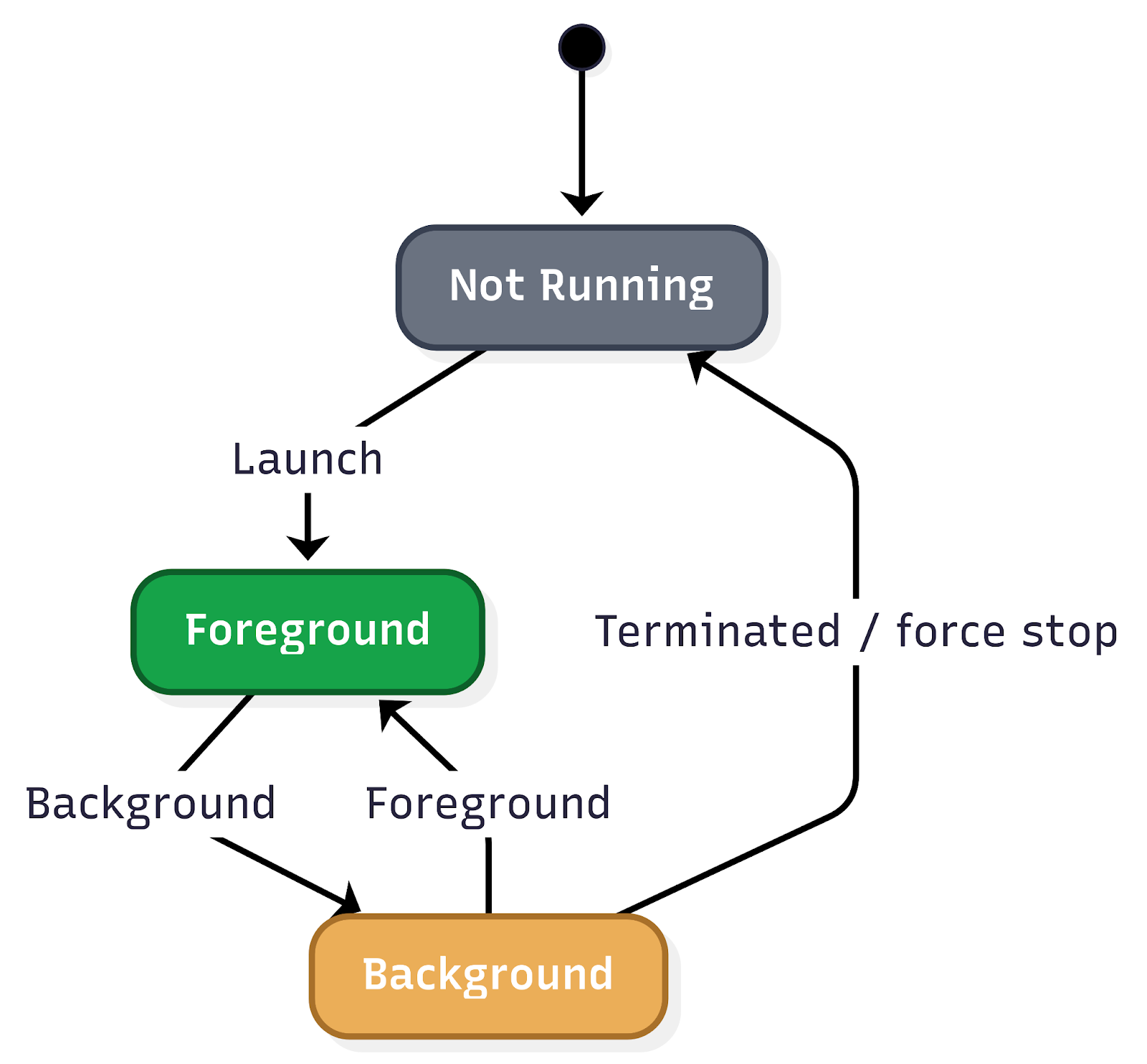
Understanding the application state is fundamental to comprehending user behavior and, consequently, executing effective troubleshooting. The application state provides crucial insights into how a user interacts with the app, particularly concerning its visibility and how it was initiated. This encompasses tracking when the app moves between the background and foreground, as well as the various launch mechanisms.
Figure 1. Application state user flow.
Key aspects of application state that are vital to monitor include: Application lifecycle transitions:
Background state: When the app is running but not actively displayed to the user (e.g., the user switches to another app, or the device is locked). Understanding how frequently and for how long an app resides in the background can inform power consumption analysis and the effectiveness of background tasks.
Foreground state: When the app is actively in use and displayed to the user. Monitoring transitions into and out of the foreground provides a real-time view of user engagement.
Inactive state: A temporary state where the app is in the foreground but not receiving events (e.g., an incoming call temporarily interrupts the app).
Suspended state: An app that is in the background and has been explicitly suspended by the operating system to free up resources.
Terminated state: When the app has been completely closed or crashed. Differentiating between intentional termination and crashes is critical for identifying stability issues.
Application launch mechanisms:
The way an app is launched significantly impacts the initial user experience and can influence subsequent interactions. Tracking these different launch types is essential for understanding user entry points and for debugging issues that might be specific to a particular launch method.
Explicit user launch: This is the most straightforward launch mechanism, where the user directly taps on the app icon from their device’s home screen or app drawer. This indicates a deliberate intent to use the app and often signifies a primary entry point for regular users.
Deeplinks: Deeplinks are URLs that, when clicked, open a specific page or section within a mobile app rather than a web page. They are powerful tools for enhancing user experience and engagement by providing direct access to relevant content.
Push notifications: Push notifications are messages sent by an app to a user’s device even when the app is not actively in use. Tapping on a push notification often launches the app and directs the user to a specific context related to the notification’s content.
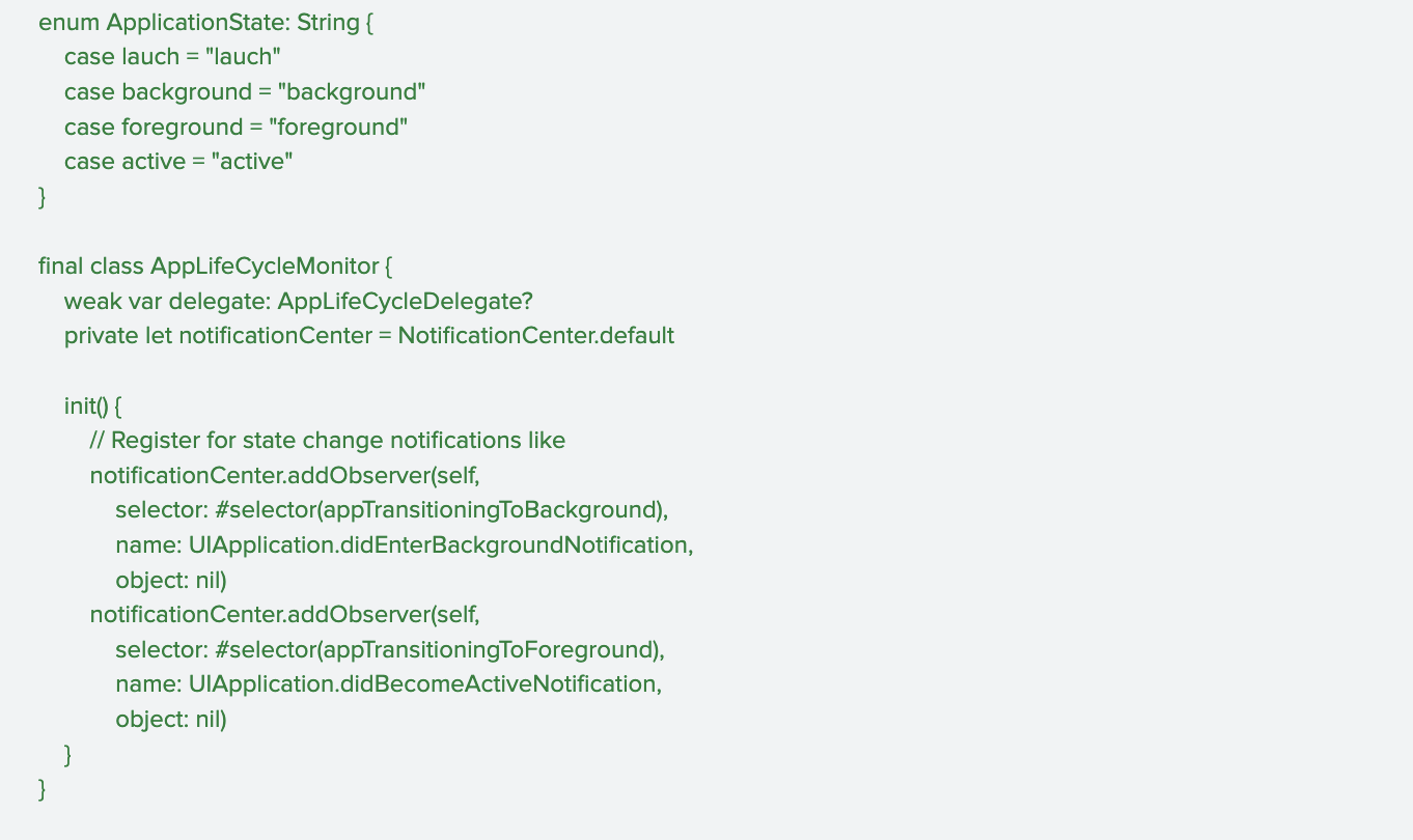
Figure 2. Code sample for tracking application lifecycle transition.
User interactions
Real-time session tracking is a crucial component in understanding user behavior and optimizing app performance. By meticulously tracking a wide array of user interactions, the system provides invaluable insights into how users navigate and engage with the app. This granular data forms the bedrock for constructing comprehensive user journeys, allowing development teams to visualise the path a user takes from their initial entry point to achieving their goals within the app.
This deep understanding of user interactions is the most important pillar in creating accurate and insightful user journey maps. These maps, in turn, are instrumental in identifying patterns of user behavior, both positive and negative. For instance, tracking helps to identify pain points, bugs, or areas of confusion that might lead to user frustration or abandonment.
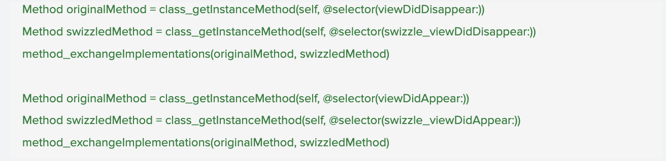
Figure 3. Sample code for real-time session tracking.
UI screen
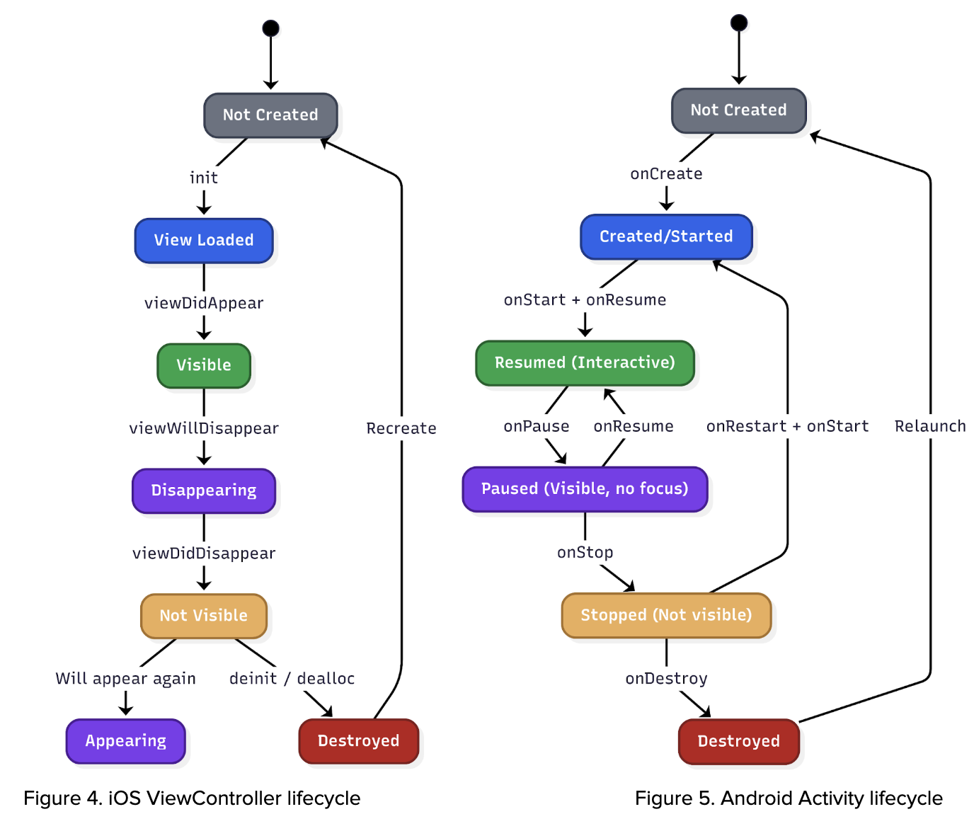
The system leverages lifecycle events from UIViewController (iOS), Activity (Android), and Fragments (Android) to accurately identify and track which specific screen is currently displayed to the user. This granular level of screen tracking is crucial because it significantly enriches the contextual information available to us. By understanding the precise UI that users are interacting with, we can account for the dynamic nature of our app. Different geographical regions, diverse user segments, and varying operational scenarios can lead to distinct user interfaces being presented. This capability ensures that our analysis and troubleshooting efforts are always based on the actual user experience, allowing for more precise problem identification and more effective solutions.
Figure 6. Sample code of UIViewController configuration.
UI screen data
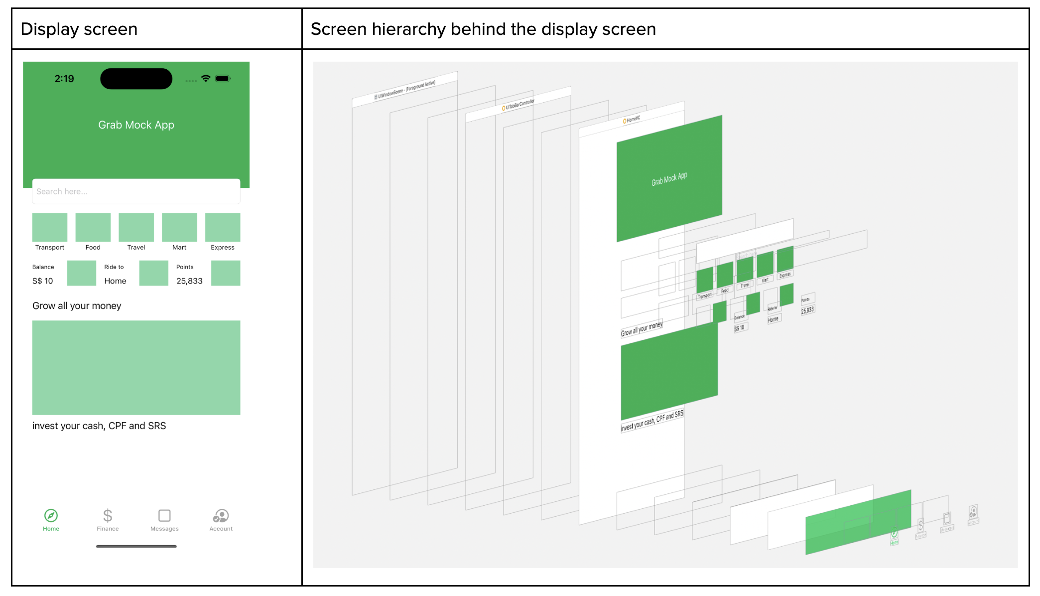
On top of that, whenever the screen appears, we capture the screen metadata where we read the full screen hierarchy. With the Screen hierarchy JSON data at hand, we employ it to train an AI model. This model, consequently, can generate an HTML file, which mirrors the user’s screen and interaction.
Disclaimer: information is redacted in compliance with GDPR/PDPA, personal data protection laws.
Figure 7. Screen hierarchy.
Applications of AutoTrack
Key applications of AutoTrack data:
Reconstructing user journeys and reproducing elusive bugs: One of the most significant benefits of AutoTrack is its ability to meticulously record user interactions within the app. This detailed session data allows our teams to precisely recreate the user journey that led to a reported issue. For bugs that are notoriously difficult to reproduce, this capability is a game-changer, eliminating hours of manual guesswork and dramatically accelerating the identification and resolution of underlying problems.
Automated issue assignment: When an issue is reported, AutoTrack data can be leveraged to automatically assign it to the most relevant team. By analysing the context of the issue within the recorded session, including the specific features or modules involved, the system can intelligently route the problem to the engineers best equipped to address it. This automation reduces triage time, ensures issues are handled by subject matter experts, and improves overall response efficiency.
Automating UI test case generation: The rich dataset provided by AutoTrack offers a powerful foundation for automating the creation of UI test cases. By observing how users interact with the interface, we can automatically generate test scripts that mimic real-world usage patterns. This not only speeds up the testing phase but also leads to more comprehensive test coverage, identifying edge cases and user flows that might otherwise be missed by manually written tests.
Understanding analytics event triggers: AutoTrack data provides a granular view into when and why specific analytics events are triggered within the application. This allows us to validate the accuracy of our analytics instrumentation, ensure that events are firing as expected, and gain deeper insights into user behavior. By understanding the precise context surrounding event triggers, we can refine our data collection strategies and derive more meaningful insights from our analytics.
Key takeaways and what’s next
AutoTrack replaces fragile manual instrumentation with a unified, real-time view of application state, screen context, and user interactions. That end-to-end trace makes elusive bugs reproducible, routes issues to the right owners, and seeds reliable UI tests—turning guesswork into grounded evidence so teams can ship fixes faster and with greater confidence.
Looking ahead, we are expanding AutoTrack across surfaces and deepening the context it captures—pairing sessions with network and performance signals, strengthening privacy guardrails, and integrating with automated triage and test generation. Look forward to reading more of our deep dives on auto-generated UI tests and how these journeys will power proactive quality across Grab’s app.
Join us
Grab is a leading superapp in Southeast Asia, operating across the deliveries, mobility and digital financial services sectors. Serving over 800 cities in eight Southeast Asian countries, Grab enables millions of people everyday to order food or groceries, send packages, hail a ride or taxi, pay for online purchases or access services such as lending and insurance, all through a single app. Grab was founded in 2012 with the mission to drive Southeast Asia forward by creating economic empowerment for everyone. Grab strives to serve a triple bottom line – we aim to simultaneously deliver financial performance for our shareholders and have a positive social impact, which includes economic empowerment for millions of people in the region, while mitigating our environmental footprint.
Powered by technology and driven by heart, our mission is to drive Southeast Asia forward by creating economic empowerment for everyone. If this mission speaks to you, join our team today!
The official Zabbix frontend works great on desktop, but it isn’t built for mobile. Monitoring doesn’t end when you step away from your workstation, and a reliable Zabbix mobile app keeps you connected to your Zabbix environment, gives you instant notifications, and allows you to react to problems or just check your host configuration at any time.
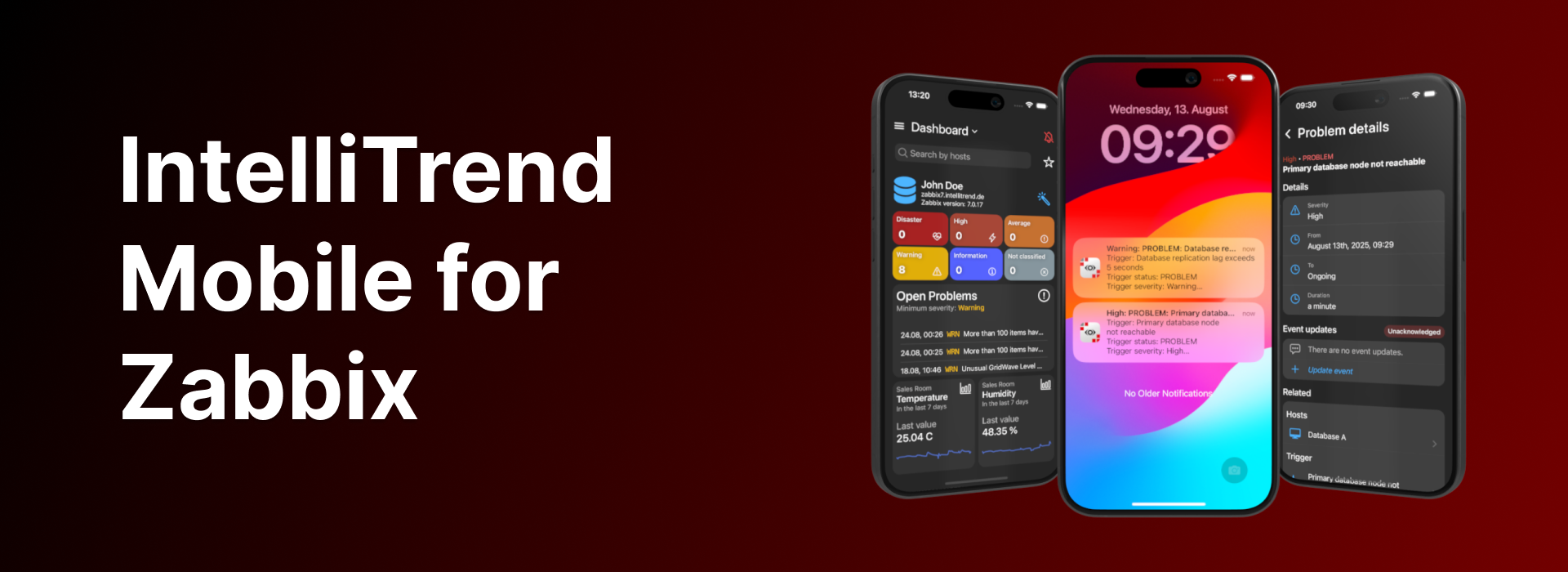
With IntelliTrend Mobile for Zabbix, you get a free, feature-rich mobile app for Zabbix, including real-time push notifications, custom mobile dashboards with unique widgets, built-in responsive host and item graphs, a detailed host viewer, and much more!
Mobile-optimized dashboards
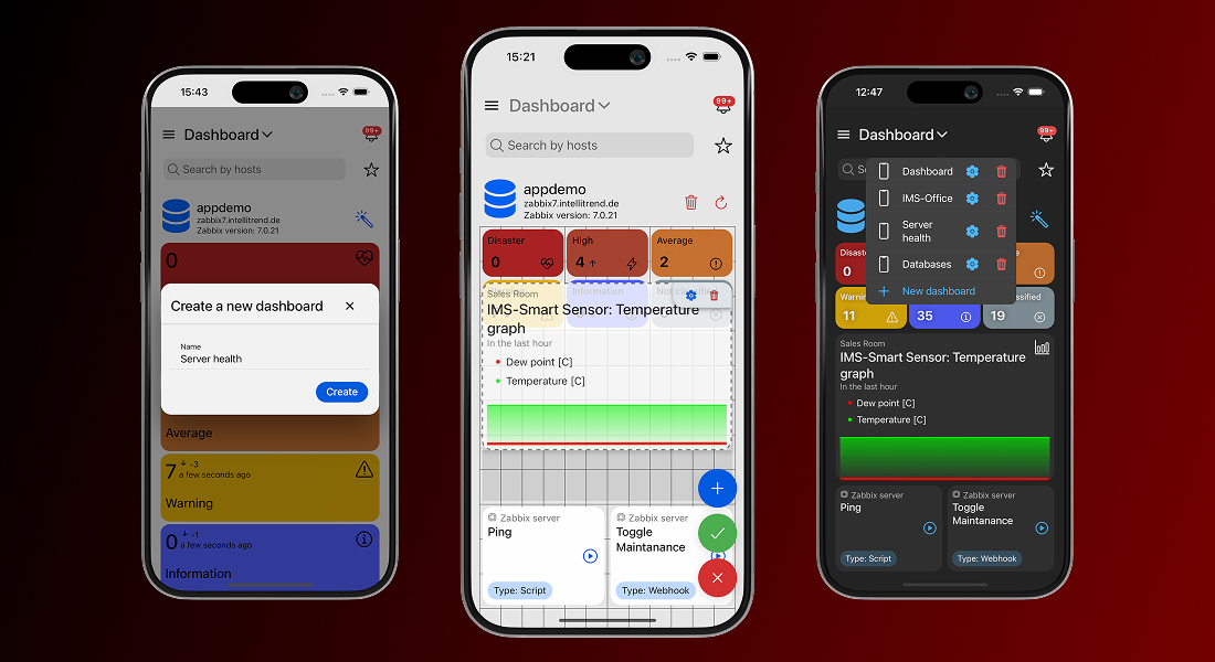
Zabbix dashboards are great and powerful, but they are built for desktop screens and don’t always scale well on mobile devices. IntelliTrend Mobile solves that by giving you the ability to build as many dashboards as you need, each tailored to a specific purpose.
One dashboard can focus on infrastructure health, another on critical issues, and another on a single customer or environment. Every dashboard is an independent workspace, featuring its own layout, collection of widgets, and set of filter criteria.
Grid-based dashboard layout
Every IntelliTrend Mobile dashboard is powered by a grid-based layout system that gives you full control over how your dashboard looks and feels. You are not stuck with fixed widget sizes or a predefined structure – you can place widgets exactly where you want them, drag them around freely, and resize them to give each widget the space it really needs.
This grid system keeps everything orderly without boxing you in. Whether you build a clean, minimal dashboard or pack it with data-rich widgets, the editor helps you shape a layout that looks intentional and stays easy to work with.
Highly customizable widgets
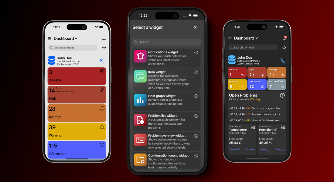
The app offers a variety of unique and customizable widgets, each designed to display key monitoring information clearly and efficiently. Each widget comes with its own set of configuration options, so you can decide what it shows and how it shows it. You can filter widgets by hosts, host groups, severities, and much more in order to keep the view focused on what matters the most to you.
Besides that, widgets let you adjust their appearance by hiding or revealing extra details, switching between compact and extended modes or adjusting how much data they present. The result is a dashboard that is fine-tuned to the way you work.
Smart problem management
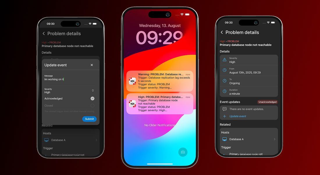
When issues happen, speed and context are everything. That’s why problem management is the most important part of any Zabbix mobile app. IntelliTrend Mobile is built to keep you informed the moment something goes wrong and to let you take action without wasting time or switching devices.
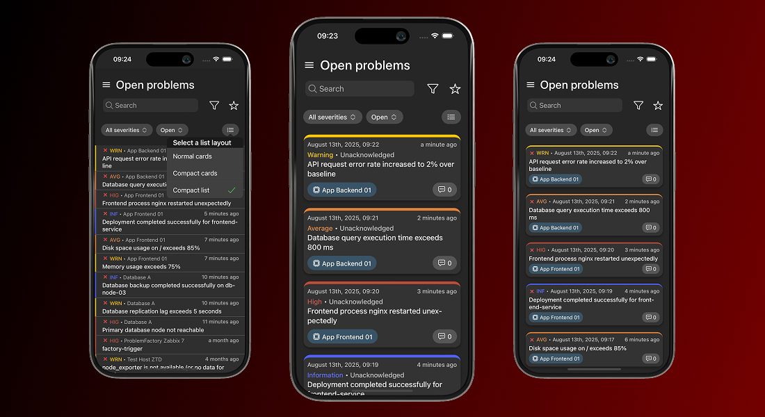
The problem view in the app gives you complete visibility into open and resolved issues, with filtering, sorting, and search options that let you quickly focus on the problems that require your attention. From the same interface, you can update and acknowledge problems without leaving the app.
Opening a problem takes you straight to a detailed view containing all the relevant information – severity, duration, related hosts, triggers, items, and historical data. What makes this view especially powerful is the ability to jump directly from the problem to the related host, item, or trigger within the app.
With a single tap, you can inspect the affected host, review item metrics, or analyze trigger history, all without leaving the mobile environment. This seamless navigation transforms problem management from a static list of alerts into a fully integrated, on-the-go investigation and resolution workflow.
Real-time response with Smart Alerts
The real game-changer, however, is IntelliTrend Mobile’s Smart Alerts feature. This isn’t just push notifications – it’s intelligent, actionable routing straight to the exact problem view in the app.
The moment a problem occurs, you’re notified in real time. Tap the alert and you’re immediately taken to the detailed problem screen. From there, you can analyze the issue, review metrics and history, acknowledge it, or take corrective action without ever opening the Zabbix web interface. No delays, no barriers, no switching devices!
With Smart Alerts, your team reacts faster, stays informed, and keeps systems running smoothly, turning mobile monitoring from passive alerts into active, on-the-go problem management.
Flexible problem list views
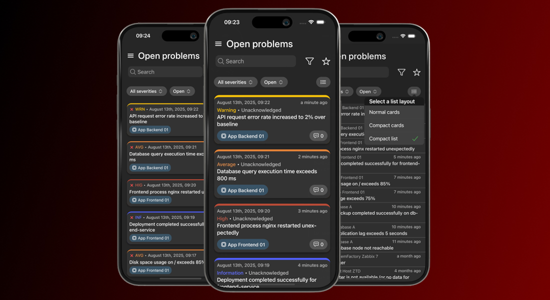
IntelliTrend Mobile lets you choose how problems are displayed in the list. By default, each problem appears as a detailed card showing all relevant information. If you prefer a cleaner overview, you can switch to a compact card view or even a compact list view, for maximum information density.
This flexibility is especially helpful when your Zabbix server generates many problems, allowing you to scan large numbers of problems at a glance while keeping the interface tidy and manageable.
View item and host graphs with mobile-optimized charts
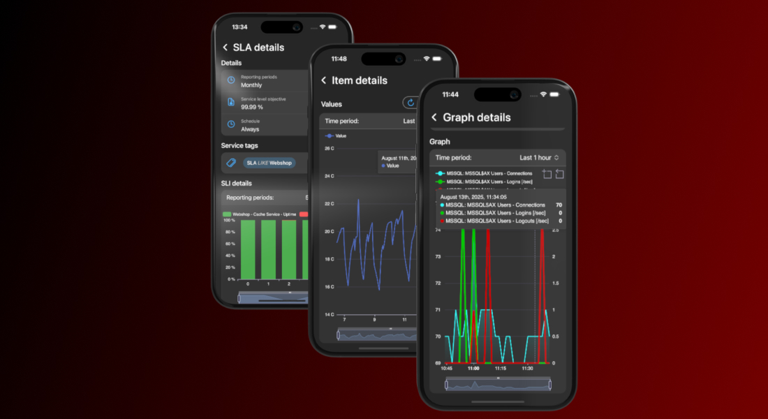
IntelliTrend Mobile reshapes the way you view Zabbix data while you’re on the move. Instead of relying on Zabbix’s static, desktop-focused graphs, the app renders item histories, host graphs, service uptimes, and SLA metrics using fully native, mobile-friendly charts. These charts are responsive, adapting seamlessly to your screen size and orientation for a smooth and clear viewing experience, whether you’re on a phone or tablet.
Every graph is interactive. You can zoom in to inspect a specific time window, pan across the timeline, or hover with your finger to see precise data points. Multiple data series can be toggled on or off, making it easy to focus on the metrics that matter.
You can quickly switch between time periods and pinpoint when an issue started, track its progression, or confirm when it was resolved – without ever opening the Zabbix web interface.
Complete host overview
You can also view all the essential details about any host right from the mobile app. Every host has a detailed view that puts all relevant information at your fingertips, making management simple, efficient, and fully mobile.
For each host, you can quickly see its visible and technical names, current status (enabled or disabled), and maintenance state, including whether data collection continues during maintenance. If the host is monitored by a proxy, you see the proxy that monitors it.
The host details view gives you instant access to all related configurations and objects:
Templates and host groups
You can view all templates assigned to a host and dive into any template’s full details with a single tap, making it easy to understand the monitoring configuration at a glance. Host groups work the same way – just tap a group to see every host it contains, giving you instant insight into related systems.
Host interfaces
IntelliTrend Mobile gives you a complete view of each host interface, including agent, SNMP, JMX, and IPMI types. For every interface, you can see its IP address, DNS name, port, and the interface type configured in Zabbix.
The app also shows the current availability status, highlighting interfaces that are unreachable or experiencing errors. This makes it easy to quickly identify connectivity problems, verify which monitoring protocols are active, and troubleshoot issues with data collection.
Macros
Macros are displayed with full detail (including type, value, and description) so you can verify configuration settings quickly or troubleshoot dynamically, all without leaving the host view.
Inventory
The host inventory view in IntelliTrend Mobile gives you full access to the complete Zabbix host inventory. All inventory fields configured in Zabbix are displayed directly in the app, giving you a complete overview of the host’s recorded details. You can also see the inventory mode for the host (Disabled, Manual, or Automatic) so it’s immediately clear how the inventory is being managed.
Open and resolved problems
From the host details page, you can jump straight into all open or resolved problems related to that specific host. One tap takes you directly to a filtered problem list, making it effortless to review recent problems or check the current state of the host without navigating through multiple menus.
Items, triggers, and graphs
All items, triggers, and graphs tied to the host are just one step away. Each entry opens a filtered list focused solely on that host, letting you move from the host view into any related object instantly. Whether you need to inspect a value, review a trigger, or explore a graph, the app keeps the entire chain of information connected.
Scripts
Execute host scripts directly from your mobile device, whether you’re restarting a service, collecting diagnostics, or triggering an automated workflow. It’s a fast, practical way to take action remotely, enabling real operations work even when you’re away from your desk.
With all these features combined, the host details view becomes a powerful, fully mobile workflow. Everything you need to monitor, analyze, and take action is right at your fingertips, making host management faster, more efficient, and truly on-the-go.
Customize your views
Favorites
You can create favorites for specific hosts or host groups and quickly switch your global scope to focus on them. Once a favorite is active, the app automatically filters all dashboards and list pages to show only data related to that host or host group.
Favorites make it easier to concentrate on the systems you manage most often, so you don’t have to reapply filters or navigate through long lists every time. You can switch between favorites at any time, giving you a fast way to move between different parts of your environment.
Layout modes
Everyone works differently, so the app comes with useful customization options. In addition to the filtering and sorting available on every list page, you can switch between different layout modes for all list pages.
Choose from the standard layout, a compact card layout, or a compact list layout for maximum information density. This lets you decide how much information you want to see at once and allows you to apply layout preferences individually for each page or set them globally in the app settings.
Many more features
The app already supports a wide range of features designed to give you full visibility into your Zabbix environment. Beyond the previously mentioned features, the app includes many more features, such as accessing services and SLAs to keep track of service performance and availability, explore templates, and view triggers, items, and graphs in detail.
But our development doesn’t stop here. We are constantly expanding app functionality and improving existing features based on user feedback. If you haven’t tried the app yet, now is a great time! We’d love to hear your honest thoughts about what works well, what could be better, and which features you’d like to see next. Your feedback helps to shape the future of IntelliTrend Mobile, and we take every suggestion seriously.
We take a look at the GL.iNet Comet GL-RM1PE, a little PoE-powered box that lets you easily remotely manage systems as if you were sitting next to them
Since launching during Birthday Week in 2020, Radar has announced significant new capabilities and data sets during subsequent Birthday Weeks. We continue that tradition this year with a two-part launch, adding more dimensions to Radar’s ability to slice and dice the Internet.
First, we’re adding regional traffic insights. Regional traffic insights bring a more localized perspective to the traffic trends shown on Radar.
Both features extend Radar’s mission of providing deeper, more granular visibility into the health and security of the Internet. Below, we dig into these new capabilities and data sets.
Introducing regional Internet traffic insights on Radar
However, sometimes Internet usage shifts on a more local level — maybe a sporting event in a particular region drives people online to find out more information. Or maybe a storm or other natural disaster causes infrastructure damage and power outages in a given state, impacting Internet traffic.
For the last few years, the Radar team relied on internal data sets and Jupyter notebooks to visualize these “sub-national” traffic shifts. But today, we are bringing that insight to Cloudflare Radar, and to you, with the launch of regional traffic insights. With this new capability, you’ll be able to see traffic trends at a more local level, including bytes and requests, as well as breakouts of desktop/mobile device and bot/human traffic shares. And for even more granular visibility, within the Data Explorer, you’ll also be able to select an autonomous system to join with the regional selection — for example, looking at AS7922 (Comcast) in Massachusetts (United States).
Geographic guidance
In line with common industry practice, the region names displayed on Radar are sourced in data from GeoNames (geonames.org), a crowdsourced geographical database. Specifically, we are using the “first-order administrative divisions” listed for each country — for example, the states of America, the departments of Honduras, or the provinces of Canada. Those geographical names reflect data provided by GeoNames; for more information, please refer to their About page.
Requests logged by Cloudflare’s services include the IP address of the device making the request. The address range (“prefix”) that includes this address is associated with a GeoNames ID within our IP address geolocation data, and we then match that GeoNames ID with the associated country and “first order administrative division” found in the GeoNames dataset. (For example: 155.246.1.142 → 155.246.0.0/16 → GeoNames ID 5101760 → United States > New Jersey)
Drilling down into Radar traffic data
Within Cloudflare Radar, there are several ways to get to this regional data. If you know the name of the region of interest, you can type it into the search bar at the top of the page, and select it from the results. For example, beginning to type Massachusetts returns the U.S. state, linked to its regional traffic page. Typing the region name into the Traffic in dropdown at the top of a Traffic page will also return the same set of results.
Radar’s country-level pages now have a new Traffic characteristics by region card that includes both summary and time series views of regional traffic. The summary view is presented as a map and table, similar to the Traffic characteristics card in the Worldwide traffic view. After selecting a metric from the dropdown at the top right of the card, the table and map are updated to reflect the relevant summary values for the chosen time period. Within the paginated table, the region names are linked, and clicking one will take you to the relevant page. Within the map, the summary values are represented by circles placed in the centroid of each region, sized in relation to their value. Clicking a circle will take you to the relevant page.
Below the summary map and table, the card also includes a time series graph of traffic at a regional level for the top five highest traffic regions within the country. These graphs can reveal interesting regional differences in traffic patterns. For example, the Traffic volume by region in Iraq graph for HTTP request traffic shown below highlights the differing Internet shutdown schedules (Kurdistan Region, central and southern Iraq) across the different governorates. On days when the schedules do not overlap, such as September 2 and 7, traffic from the Erbil and Sulaymaniyah governorates, which are located in the Kurdistan Region, does not drop concurrent with the loss in traffic observed in Baghdad and Basra.
Mobile vs. desktop device traffic trends
Over the past several years, a number of Radar blog posts have explored how human activity impacts Internet traffic, including holiday celebrations, elections, and the Paris 2024 Summer Olympics. With the new regional views, this impact now becomes even clearer at a more local level. For instance, mobile devices account for, on average, just over half of the request traffic seen from Nairobi Country in Kenya. A clear diurnal pattern is seen on weekdays, where mobile device usage drops during workday hours, and then rises again in the evening. However, during the weekends, mobile traffic remains elevated, presumably due to fewer people using desktop computers in office environments, as well as fewer desktop computers in use at home, in line with Kenya’s mobile-first culture.
Bot vs human traffic trends
Similar to how the mobile vs. desktop view exposes shifts in human activity, bot vs. human traffic insights do as well. One interpretation of the graph below is that overnight bot activity from Lisbon increased significantly during the first few days of September. However, since the graph shows traffic shares, and given the timing of the apparent increases, the more likely cause is increasingly larger drops in human-driven traffic – users in Lisbon appear to begin logging off around 23:00 UTC (midnight local time), and start getting back online around 05:00 UTC (06:00 local time). The shares and shifts will obviously vary by country and region, but they can provide a perspective on the nocturnal habits of users in a region.
Customize regional analysis with Radar’s Data Explorer
Within the Data Explorer, you can use the breakdown options and filters to customize your analysis of regional traffic data.
At a country level, choosing to breakdown by regions generates a stacked area graph that shows the relative traffic shares of the top 20 regions in the selected country, along with a bar graph showing summary share values. For example, the graph below shows that in aggregate, Virginia and California are responsible for just over a quarter of the HTTP request volume in the United States.
You can also use Data Explorer to drill down on traffic at a network (ASN) level in a given region, in both summary and timeseries views. For example, looking at HTTP request traffic for Massachusetts by ASN, we can see that AS7922 (Comcast), accounts for a third, followed by AS701 (Verizon Fios, 15%), AS21928 (T-Mobile, 8.8%), AS6167 (Verizon Wireless, 5.1%), AS7018 (AT&T, 4.7%), and AS20115 (Charter/Spectrum, 4.5%). Over 70% of the request traffic is concentrated in these six providers, with nearly half of that from one provider.
Going a level deeper, you can also look at traffic trends over time for an ASN within a given region, and even compare it with another time period. The graph below shows traffic for AS7922 (Comcast) in Massachusetts over a seven-day period, compared with the prior week. While the traffic volumes on most days were largely in line with the previous week, Saturday and Sunday were noticeably higher. These differences may reflect a shift in human activity, as September 6 & 7 were quite rainy in Massachusetts, so people may have spent more time indoors and online. (The prior weekend was Labor Day weekend, but those Saturday and Sunday traffic levels were in line with the preceding weekend.) You can also add another ASN to the traffic trends comparison. Selecting Massachusetts (Location) and AS701 (ASN) (Verizon Fios) in the Compare section finds that traffic on that network was higher on Saturday and Sunday as well, lending credence to the rainy weekend theory.
Regional comparisons, whether within the same country or across different countries, are also possible in Data Explorer. For instance, if the Kansas City Chiefs and Philadelphia Eagles were to meet yet again in the Super Bowl, the configuration below could be used to compare traffic patterns in the teams’ respective home states, as well as comparing the trends with the previous week, showing how human activity impacted it over the course of the game.
As always, the data powering the visualizations described above are also available through the Radar API. The timeseries_groups and summary methods for the NetFlows and HTTP endpoints now have an ADM1 dimension, allowing traffic to be broken down by first-order administrative divisions. In addition, the new geoId filter for the NetFlows and HTTP endpoints allows you to filter the results by a specific geolocation, using its GeoNames ID. And finally, there are new get and list endpoints for fetching geolocation details.
A note regarding data quantity and quality
As you’d expect, the more traffic we see from a given geography, the better the “signal”, and the clearer the associated graph is — this is generally the case when traffic is aggregated at a country level. However, for some smaller or less populous regions, especially in developing countries or countries with poor Internet connectivity, lower traffic will likely cause the signal to be weaker, resulting in graphs that appear spiky or incomplete. (Note that this will also be true for region+ASN views.) An illustrative example is shown below, for Northern Darfur State in Sudan. Traffic is observed somewhat inconsistently, resulting in the spikes seen in the graph. Similarly, the “Previous 7 days” line is largely incomplete, indicating a lack of traffic data for that period. In these cases, it will be hard to draw definitive conclusions from such graphs.
Although the Internet arguably transcends geographical boundaries, the reality is that usage patterns can vary by location, with traffic trends that reflect more localized human activity. The new regional insights on Cloudflare Radar traffic pages, and in the Data Explorer, provide a perspective at a sub-national level. We are exploring the potential to go a level deeper in the future, providing traffic data for “second-order administrative divisions” (such as counties, cities, etc.).
If you share our regional traffic graphs on social media, be sure to tag us: @CloudflareRadar (X), noc.social/@cloudflareradar (Mastodon), and radar.cloudflare.com (Bluesky). If you have questions or comments, you can reach out to us on social media, or contact us via email.
Introducing Certificate Transparency insights on Radar
Just as we’re bringing more granular detail to traffic patterns, we’re also shedding more light on the very foundation of trust on the Internet: TLS certificates. Certificate Authorities (CAs) serve as trusted gatekeepers for the Internet: any website that wants to prove its identity to clients must present a certificate issued by a CA that the client trusts. But how do we know that CAs themselves are trustworthy and only issue certificates they are authorized to issue?
That’s where Certificate Transparency (CT) comes in. Clients that enforce CT (most major browsers) will only trust a website certificate if it is both signed by a trusted CA and has proof that the certificate has been added to a public, append-only CT log, so that it can be publicly audited. Only recently, CT played a key role in detecting the unauthorized issuance of certificates for 1.1.1.1, a public DNS resolver service that Cloudflare operates.
In addition to its role as a vital safety mechanism for the Internet, CT has proven to be invaluable in other ways, as it provides publicly-accessible lists of all website certificates used on the Internet. This dataset is a treasure trove of intelligence for researchers measuring the Internet, security teams detecting malicious activity like phishing campaigns, or penetration testers mapping a target’s external attack surface.
The sheer amount of data (multiple terabytes) available in CT makes it difficult for regular Internet users to download and explore themselves. Instead, services like crt.sh, Censys, and Merklemap provide easy search interfaces to allow discoverability for specific domain names and certificates. We launchedMerkle Town in 2018 to share broad insights into the CT ecosystem using data from our own CT monitoring service.
Certificate Transparency on Cloudflare Radar is the next evolution of Merkle Town, providing integration with security and domain information already on Radar and more interactive ways to explore and analyze CT data. (For long-time Merkle Town users, we’re keeping it around until we’ve reached full feature parity.)
In the sections below, we’ll walk you through the features available in the new dashboard.
Certificate volume and characteristics
The CT page leads with a view of how many certificates are being issued and logged over time. Because the same certificate can appear multiple times within a single log or be submitted to several logs, the total count can be inflated. To address this, two distinct lines are shown: one for total entries and another for unique entries. Uniqueness, however, is calculated only within the selected time range — for example, if certificate C is added to log A in one period and to log B in another, it will appear in the unique count for both periods. It is also important to note that the CT charts and date filters use the log timestamp, which is the time a certificate was added to a CT log. Additionally, the data displayed on the page was collected from the logs monitored by Cloudflare — delays, backlogs, or other inconsistencies may exist, so please report any issues or discrepancies.
Alongside this chart is a comparison between certificates and pre-certificates. A pre-certificate is a special type of certificate used in CT that allows a CA to publicly log a certificate before it is officially issued. CAs are not required to log full certificates if corresponding pre-certificates have already been logged (although many CAs do anyway), so typically there are more pre-certificates logged than full certificates, as seen in the chart.
While certificate issuance trends are interesting on their own, analyzing the characteristics of issued certificates provides deeper insight into the state of the web’s trust infrastructure. Starting with the public key algorithm, which defines how secure connections are established between clients and servers, we found that more than 65% of certificates still use RSA, while the remainder use ECDSA. RSA remains dominant due to its long-standing compatibility with a wide range of clients, while ECDSA is increasingly adopted for its efficiency and smaller key sizes, which can improve performance and reduce computational overhead. In the coming years, we expect post-quantum signature algorithms like ML-DSA to appear when public CAs begin to offer support.
Next, a breakdown of certificates by signature algorithm reveals how Certificate Authorities (CAs) sign the certificates they issue. Most certificates (over 65%) use RSA with SHA-256, followed by ECDSA with SHA-384 at 19%, ECDSA with SHA-256 at 12%, and a small fraction using other algorithms. The choice of signature algorithm reflects a balance between widespread support, security, and performance, with stronger algorithms like ECDSA gradually gaining traction for modern deployments.
Certificates are also categorized by validation level, which reflects the degree to which the CA has verified the identity of the certificate requester. The main validation types are Domain Validation (DV), Organization Validation (OV), and Extended Validation (EV). DV certificates verify only control of the domain, OV certificates verify both domain control and the organization behind it, and EV certificates involve more rigorous checks and display additional identity information in browsers. The industry trend is toward simpler, automated issuance, with DV certificates now making up almost 98% of issued certificates, while EV issuance has become largely obsolete.
Finally, the chart on certificate duration shows the difference between the NotBefore and NotAfter dates embedded in each certificate, which define the period during which the certificate is valid. Currently, the majority (92%) of issued certificates have durations between 47 and 100 days. Shorter certificate lifetimes improve security by limiting exposure if a certificate is compromised, and the industry is moving toward even shorter durations, driven by browser policies and automated renewal systems.
Certificate issuance
Certificate issuance is the process by which CAs generate certificates for domain owners. Many CAs are operated by larger organizations that manage multiple subordinate CAs under a single corporate umbrella. The CT page highlights the distribution of certificate issuance across the top CA owners. At the moment, the Internet Security Research Group (ISRG), also known as Let’s Encrypt, issues more than 66% of all certificates, followed by other widely used CA owners including Google Trust Services, Sectigo, and GoDaddy.
The impact of events like the July 21-22 Let’s Encrypt API outage due to internal DNS failures that significantly reduced certificate issuance rates are visible in this visualization, as issuance rates dropped significantly during the two-day period.
In addition to CA owners, the page provides a breakdown of certificate issuance by individual CA certificates. Among the top five CAs, Let’s Encrypt’s four intermediate CAs — R12, R13, E7, and E8 — represent the bulk of its issuance. The bar chart can also be filtered by CA owner to display only the certificates associated with a specified organization.
The CT section also offers dedicated CA-specific pages. By searching for a CA name or fingerprint in the top search bar, you can reach a page showing all insights and trends available on the main CT page, filtered by the selected CA. The page also includes an additional CA information card, which provides details such as the CA’s owner, revocation status, parent certificate, validity period, country, inclusion in public root stores, and a list of all CAs operated by the same owner. All of this information is derived from the Common CA Database (CCADB).
Certificate Transparency logs
Next on the CT page is a section focused on CT logs. This section shows the distribution of certificates across CT log operators, identifying the organizations that manage the infrastructure behind the logs. Over the last three months, Sectigo operated the logs containing the largest number of certificates (2.8 billion), followed by Google (2.5 billion), Cloudflare (1.6 billion), and Let’s Encrypt (1.4 billion). Note that the same certificate can be logged multiple times across CT logs, so organizations that operate multiple CT logs with overlapping acceptance criteria may log certificates at an elevated rate. As such, the relative rank of the operators in this graph should not be construed as a measure of how load-bearing the logs are within the ecosystem.
Below this, a bar chart displays the distribution of certificates across individual CT logs. Among the top five logs are Google’s xenon2025h1 and argon2025h2, Cloudflare’s nimbus2025, and Let’s Encrypt’s oak2025h2. This chart can also be filtered by operator to show only the logs associated with a specific owner. Next to the chart, another view shows the distribution of certificates by log API, distinguishing between logs following the original RFC 6962 API versus those compatible with the newer and more efficient static CT API.
Similar to the dedicated CA pages, the CT section also provides log-specific pages. By searching for a log name in the top search bar, you can access a page showing all insights and trends available on the main CT page, filtered by the selected log. Two additional cards are included: one showing information about the log, derived from Google Chrome’s log list, including details such as the operator, API type, documentation, and a list of other logs operated by the same organization; and another displaying performance metrics with two radar charts tracking uptime and response time over the past 90 days, as observed by Cloudflare’s CT monitor. These metrics are useful to determine if logs are meeting the ongoing requirements for inclusion in CT programs like Google’s.
Certificate coverage
Last but not least, the CT page includes a section on certificate coverage. Certificates can cover multiple top-level domains (TLDs), include wildcard entries, and support IP addresses in Subject Alternative Names (SANs).
Next to this view, two half-donut charts provide further insights into certificate coverage: one shows the share of certificates that include wildcard entries — almost 25% of certificates use wildcards to cover multiple subdomains — while the other shows certificates that include IP addresses, revealing that the vast majority of certificates do not contain IPs in their SAN fields
Expanded domain certificate data
The domain information page has also been updated to provide richer details about certificates. The certificates table, which displays certificates recorded in active CT logs for the specified domain, now includes expandable rows. Expanding a row reveals further information, including the certificate’s SHA-256 fingerprint, subject and issuer details — Common Name (CN), Organization (O), and Country (C) — the validity period (NotBefore and NotAfter), and the CT log where the certificate was found.
While the charts above highlight key insights in the CT ecosystem, all underlying data is accessible via the API and can be explored interactively across time periods, CAs, logs, and additional filters and dimensions using Radar’s Data Explorer. And as always, Radar charts and graphs can be downloaded for sharing or embedded directly into blogs, websites, and dashboards for further analysis. Don’t hesitate to reach out to us with feedback, suggestions, and feature requests — we’re already working through a list of early feedback from the CT community!
To provide the best experiences, we use technologies like cookies to store and/or access device information. Consenting to these technologies will allow us to process data such as browsing behavior or unique IDs on this site. Not consenting or withdrawing consent, may adversely affect certain features and functions.
Functional
Always active
The technical storage or access is strictly necessary for the legitimate purpose of enabling the use of a specific service explicitly requested by the subscriber or user, or for the sole purpose of carrying out the transmission of a communication over an electronic communications network.
Preferences
The technical storage or access is necessary for the legitimate purpose of storing preferences that are not requested by the subscriber or user.
Statistics
The technical storage or access that is used exclusively for statistical purposes.The technical storage or access that is used exclusively for anonymous statistical purposes. Without a subpoena, voluntary compliance on the part of your Internet Service Provider, or additional records from a third party, information stored or retrieved for this purpose alone cannot usually be used to identify you.
Marketing
The technical storage or access is required to create user profiles to send advertising, or to track the user on a website or across several websites for similar marketing purposes.