Post Syndicated from Ashley Whittaker original https://www.raspberrypi.org/blog/raspberry-pi-weatherclock-shows-you-the-hours-forecast/
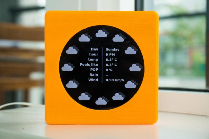
Meet Eli’s WeatherClock, a digital–analogue timepiece that displays the weather at each hour of the day as well as the time. Here’s an example: every day at 3pm, instead of the hour hand just pointing to a number three on the clock’s face, it also points to a visual representation of what the weather is doing. Obviously, Eli’s WeatherClock still tells the time using the standard positions of the hour and minute hands, but it does two jobs in one, and it looks much more interesting than a regular clock.
Detailed forecast
You can also press on every hour position of the watch’s touchscreen display to see more detailed meteorological information, such as temperature and the likelihood of rain. Then once you’ve gotten all the detail you need, you return to the simple analogue resting face to by pressing the centre of the touchscreen.
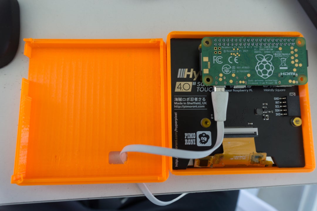
Under the hood
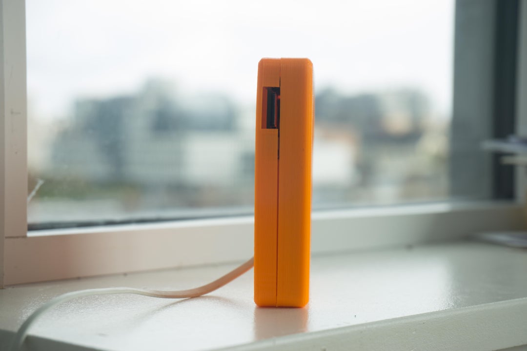
The device uses the openWeatherMap API to fetch weather data for your location. It’s a simple build powered by Raspberry Pi Zero W with a Pimoroni 4″ HyperPixel Hi-Res Display providing the user interface. And its slim, pocket-sized design means you can take it with you on your travels.
We found this creation on The Digital Vagrant‘s YouTube channel. A friend named Eli gave them the idea so the maker named the project after him. The Digital Vagrant liked the idea of being able to quickly check the weather before leaving the house — no need to check a computer or get your phone out of your bag.
Want to make your own WeatherClock? The lovely maker has deposited everything you need on GitHub.
The post Raspberry Pi ‘WeatherClock’ shows you the hour’s forecast appeared first on Raspberry Pi.