All posts by Kevin Guthrie

Saving another 100TB of RAM with math (and Rust)

Post Syndicated from Kevin Guthrie original https://blog.cloudflare.com/saving-100-tb-of-ram-with-math/

Cloudflare operates at a scale so big that even after working here for years, it doesn’t seem real. We have thousands of servers all over the world with petabytes of RAM and millions of CPU cores, and all of it is pushed to the max. As vast as those resources feel, they are still finite, and when you need every service to run on every node, it doesn’t leave room for wasted space.

At this scale, small improvements are greatly magnified, so even 1%-at-a-time improvements are worth celebrating. And some tweaks add up to a lot more: in this post, we’ll look at how small changes to a single algorithm reduced the memory footprint of one of our Pingora-based services significantly. That allowed us to reclaim more than 100TB of RAM globally, on top of the 100TB of memory the DNS team was able to shed last month.

Waste not

Maintaining equitable resource sharing between teams is not easy, especially in large organizations. One of the ways Cloudflare ensures the balance is kept is through the tireless efforts of the wonderful Performance team. 

This story starts with a ticket filed by Ivan who found: Excessive memory usage from pingora-ketama in Pingora Backend Router. The finding was that our internal load-balancing service, Pingora Backend Router (yes, PBR), was using significantly more memory than expected — specifically in structures associated with pingora-ketama, which is our open-source library for handling consistent hashing.

In order to talk about how we addressed this seeming overuse of memory, we need to talk about what consistent hashing even is, why we are using it in PBR, and how it became so memory hungry. Along the way, we’ll learn some Rust and even a little math.

Consistent hashing

Consistent hashing is a widely used method for distributing tasks across multiple servers in a way that does not require large changes when servers are added or removed. Internally we use it to route cacheable requests to servers by URL. This allows us to keep only one copy of a file stored per data center and gives a stable way to find the location of each file. We have mentioned this system before, but let’s take the time to walk through how and why this algorithm is used and how it works.

The key concept of consistent hashing is that while hash functions can accept any kind of input, their output is limited to a single unsigned integer (32, 64, or 128-bit integers depending on which hash function). This allows us to relate tasks and servers to each other in a consistent way. Most discussions of consistent hashing have you think of that output space as a continuous, circular ring that wraps around from its max value to zero. This depiction makes for some nice visualizations, but it can also make the simple concept of integer ranges seem more complicated than it needs to be. For our discussion, we’ll represent the 32-bit output of our hash function as a number line.

Now, let’s say we have a set of servers, A, B, & C, and a set of tasks t-z. We can map each onto the number line based on the hash of their representative values, so something like IP addresses for servers and cache keys for tasks.

Assigning tasks to servers is now just a matter of finding the first server to the left of each task. We can represent this visually by coloring in the region of hashes that will be associated with each server. Notice that the range covered by server C wraps around to the beginning, hence the idea that hashes exist in a ring.

And that’s it. At a base level, consistent hashing is this simple — but it doesn’t take long to see that there is room for improvement. Notice that the range covered by server A in our example is significantly larger than that of either B or C. This is a problem because the fraction of the requests a server handles is going to be proportional to the size of its range on the number line. Ideally we would like to guarantee each server will have an equal size, but because hashes are essentially random numbers, we have to talk about the size of the regions in terms of statistics. 😨

Math and consequences

First: don’t panic. I promise I'm not about to lie to you and that we will stay safely within the bounds of a day-one probability lesson. When we talk about statistical distributions, there are two big factors that help us quantify uncertainty in helpful ways: expected value and standard deviation. In (over-)simplified terms, expected value gives us a point where measurements based on a distribution will be centered, and standard deviation tells how close to that central point most measurements are likely to be.

For consistent hashing, we can calculate these factors for the fractional size of the range associated with one of N servers. (Details on where this formula comes from later).

In terms of concrete numbers, let’s say we have 100 servers. The formulas above give:

That tells us that we can expect that the range each server handles will be centered around 0.99% of the total and most of the lengths to fall within 1% of what's expected. This sounds good until we realize that that’s 0.99% of the total length. We need to scale the standard deviation by the expected value to see how big the error is as a fraction of the target size. This value is called the coefficient of variation.

What if we add hashes?

The simplicity of consistent hashing is a double-edged sword. It’s easy to understand and implement because everything is turned into easily-relatable hashes on the same numberline, but any improvements to the system will also need to be relatable to that numberline. That means the solution to any consistent hashing problem can only be more hashes. It’s less like a golden hammer (a tool with which all problems look like nails) and more like a golden nail in that it turns all tools into hammers.

To solve the problem of imbalanced workloads, we can add multiple hashes to represent each server instead of just one. We’ll get to the math behind this momentarily, but it should make some intuitive sense that while each individual range has a large standard deviation, adding a bunch together should make their total size even out. If we take our three-server example from the above diagrams and add two more hashes at random for each server, we see that it helps even out each server’s workload. 

This is an admittedly contrived example. The random nature of the system means there’s no guarantee how much improvement you will get from adding 2 additional hashes per server, but it should make some intuitive sense that combining more of these hash segments together produces a more even distribution. Each segment in the sum has a chance of balancing another. Maybe one is too short; maybe one is too long. This is essentially what the law of large numbers tells us should happen… The obvious problem is it only works for large numbers. In NGINX, the baseline number of hashes per server is hardcoded to 160, and Pingora uses the same value as the default. I’ll spare you the math for now, but if we go back to our 100-server example, if we use 160 points per server instead of just one, the coefficient of variation (which we can think of like an error margin) drops from about 99% to about 8%, a significant improvement.

What if we add more hashes?

We saw above that increasing the number of hashes per server by a constant amount allows us to improve how evenly workloads are distributed per server, but what if we don’t want to distribute the work evenly? In Cloudflare’s case, we have some servers that have more storage space than others, so it would be better to have the number of requests allotted to a server be proportional to its disk space. One way to accomplish this is with the ketama algorithm. The naming is a little funny because the algorithm is named after the library where it was first implemented, and the library was named … well you can google it 😶‍🌫️.

For us, since we want workload to be scaled based on storage, we can use the disk space as the weight, which is exactly what the Pingora team has been doing for years. Elsewhere in the company where workloads are more compute-intensive, weights might be based on CPU or GPU count.

What if we add even more hashes???

The last problem we need to address is that so far we are working under the assumption that any server can handle any request, but in practice that is not the case. Things like compliance requirements or enabled caching features mean only a subset of servers can handle any particular request. Unfortunately, unlike before, we can’t solve this problem by adding more hashes to the same ring. We have to add completely new rings, and not only that — every combination of features potentially needs its own specific ring!

Storage improvements

One big improvement came from Zaidoon, who had an insight about our struct for storing hashes in PBR. That struct looks like this:

Unfortunately, Rust doesn’t make it that easy. Changing the size of the index as we did above does nothing to reduce the memory footprint. This is because Rust has alignment rules that require the size of a structure in memory to be a multiple of its largest (or “most aligned”) field. In this case, the hash is the largest with four bytes, so when stored in memory, a Point is required to have size $mN \times 4m$, so the minimum size is eight bytes.

Luckily there are well-known ways around this. You (meaning me) might be tempted to use #[repr(packed)], but that is controversial for good reasons. A safer but less readable solution is to store the hash and index as raw byte array and access them with getters. Both methods compile to the same thing.

This simple (if wordy) change reduces the amount of memory used for consistent hashing by a whopping 25%! In order to do better than that, we’ll need to jump back into the math, so everybody hang on to something; this is the home stretch.

What if we tried fewer hashes?

You may have noticed that we gave the formula for the standard deviation for the case where there is only one hash per server. Deriving the formula for the case where there are $m k m$ hashes per server is not easy, and most sources only give you an approximation or an asymptotic limit, but not us. I might not be a statistician, but I grew up with a calculus teacher (Hi, Mom!), and I wanted to know the actual value. The full derivation is in a supplemental post, but here is the payoff.

To see how increasing the hash count improves the accuracy, we need to look again at the coefficient of variation.

The predictions from my beautiful math only work if we think about hashes in a continuous ring, but in practice we use 32-bit numbers for the hashes that have the potential for collisions, and the probability of collisions goes up surprisingly quickly as the number of hashes increases (see the birthday paradox). Collisions matter because in the ideal case, every hash contributes to the volume and distribution of requests handled by the associated server, but a collision means some contributions are randomly dropped, introducing unpredictable error. If we compare some simulated results with 32-bit hashes with the predicted error rate, we can see that for data centers with 2048 servers, the error rate increases: between 10,000 and 100,000 hashes per server.

Ultimately, even though this realization feels kind of bad, it’s great news for our plan to reclaim some RAM! Now that we have some math to back it up, we determined that we could decrease the number of hashes we were generating for each server by 90% without incurring any appreciable error, so that is what we set out to do.

Migrating without melting origins

There was one more problem: changing the hash ring changes where some cacheable requests go. Even if the new ring is better, switching the whole network at once would effectively invalidate almost all cached content. It would turn a memory optimization into an apocalyptic increase in origin traffic.

So we did not make this a single global flip. For a while, PBR carried both versions of the cacheable load balancer in memory: the old ketama ring and the new smaller one. Each request used our normal migration framework to decide which ring should select the backend. That meant the rollout decision was stable per request hash, and it also gave us a clean rollback path. If anything looked wrong, we could send new requests back through the old ring without redeploying PBR.

We then rolled the migration out in layers. We started with small validation locations, moved through progressively larger groups of data centers, and only then continued toward the rest of the world. 

The important part was that we controlled two dimensions independently: how much traffic used the new ring, and where that traffic was allowed to move. A plain global percentage rollout would have spread cache churn everywhere at once. Data-center-scoped rollout kept the blast radius small and made it much easier to tell whether a change was actually safe.

During the migration, we watched backend-selection traces, ring-version counters, PBR connection errors, process memory, startup time, cache behavior, and origin traffic. Once the migration reached 100%, we removed the temporary old-ring path, and voila!

The chart above shows the comparison of the memory used by PBR the week of the change compared with data from a few weeks before, as well as the result of subtracting one from the other. The sharp drop is the day where the version of PBR with the large (now unused) hash rings was decommissioned forever. Looking at the difference, we get the satisfying result that our changes dropped the used memory by 100TB!

Try it yourself

All the changes we talked about in this post are available now in the pingora-ketama crate in the form of a (for now) unadvertised cargo feature. The v2 ring has the compacted storage format, a faster sorting method, and the ability to scale the base number of hashes per node. Our focus in making these changes had to be on stability and control, so the v1 ring is identical to what pingora ketama has always used, and the library makes it possible to run both simultaneously and decide on a request-by-request basis which to use and when. 

Beyond trying our literal consistent hashing changes, I would like you to take away from this some inspiration to dig into your own systems to see what “simple” or “obvious” decisions are hiding potential wins, if you’re willing to get into the numbers. You might not be able to solve all your problems with Rust, but math is universal.

Performance measurements… and the people who love them

Post Syndicated from Kevin Guthrie original https://blog.cloudflare.com/loving-performance-measurements/

⚠️ WARNING ⚠️ This blog post contains graphic depictions of probability. Reader discretion is advised.

Measuring performance is tricky. You have to think about accuracy and precision. Are your sampling rates high enough? Could they be too high?? How much metadata does each recording need??? Even after all that, all you have is raw data. Eventually for all this raw performance information to be useful, it has to be aggregated and communicated. Whether it’s in the form of a dashboard, customer report, or a paged alert, performance measurements are only useful if someone can see and understand them.

This post is a collection of things I’ve learned working on customer performance escalations within Cloudflare and analyzing existing tools (both internal and commercial) that we use when evaluating our own performance.  A lot of this information also comes from Gil Tene’s talk, How NOT to Measure Latency. You should definitely watch that too (but maybe after reading this, so you don’t spoil the ending). I was surprised by my own blind spots and which assumptions turned out to be wrong, even though they seemed “obviously true” at the start. I expect I am not alone in these regards. For that reason this journey starts by establishing fundamental definitions and ends with some new tools and techniques that we will be sharing as well as the surprising results that those tools uncovered.

Check your verbiage

So … what is performance? Alright, let’s start with something easy: definitions. “Performance” is not a very precise term because it gets used in too many contexts. Most of us as nerds and engineers have a gut understanding of what it means, without a real definition. We can’t really measure it because how “good” something is depends on what makes that thing good. “Latency” is better … but not as much as you might think. Latency does at least have an implicit time unit, so we can measure it. But … what is latency? There are lots of good, specific examples of measurements of latency, but we are going to use a general definition. Someone starts something, and then it finishes — the elapsed time between is the latency.


This seems a bit reductive, but it’s a surprisingly useful definition because it gives us a key insight. This fundamental definition of latency is based around the client’s perspective. Indeed, when we look at our internal measurements of latency for health checks and monitoring, they all have this one-sided caller/callee relationship. There is the latency of the caching layer from the point of view of the ingress proxy. There’s the latency of the origin from the cache’s point of view. Each component can measure the latency of its upstream counterparts, but not the other way around. 

This one-sided nature of latency observation is a real problem for us because Cloudflare only exists on the server side. This makes all of our internal measurements of latency purely estimations. Even if we did have full visibility into a client’s request timing, the start-to-finish latency of a request to Cloudflare isn’t a great measure of Cloudflare’s latency. The process of making an HTTP request has lots of steps, only a subset of which are affected by us. Time spent on things like DNS lookup, local computation for TLS, or resource contention do affect the client’s experience of latency, but only serve as sources of noise when we are considering our own performance.

There is a very useful and common metric that is used to measure web requests, and I’m sure lots of you have been screaming it in your brains from the second you read the title of this post. ✨Time to first byte✨. Clearly this is the answer, right?!  But … what is “Time to first byte”?

TTFB mine

Time to first byte (TTFB) on its face is simple. The name implies that it’s the time it takes (on the client’s side) to receive the first byte of the response from the server, but unfortunately, that only describes when the timer should end. It doesn’t say when the timer should start. This ambiguity is just one factor that leads to inconsistencies when trying to compare TTFB across different measurement platforms … or even across a single platform because there is no one definition of TTFB. Similar to “performance”, it is used in too many places to have a single definition. That being said, TTFB is a very useful concept, so in order to measure it and report it in an unambiguous way, we need to pick a definition that’s already in use.

We have mentioned TTFB in other blog posts, but this one sums up the problem best with “Time to first byte isn’t what it used to be.” You should read that article too, but the gist is that one popular TTFB definition used by browsers was changed in a confusing way with the introduction of early hints in June 2022. That post and others make the point that while TTFB is useful, it isn’t the best direct measurement for web performance. Later on in this post we will derive why that’s the case.

One common place we see TTFB used is our customers’ analysis comparing Cloudflare’s performance to our competitors through Catchpoint. Customers, as you might imagine, have a vested interest in measuring our latency, as it affects theirs. Catchpoint provides several tools built on their global Internet probe network for measuring HTTP request latency (among other things) and visualizing it in their web interface. In an effort to align better with our customers, we decided to adopt Catchpoint’s terminology for talking about latency, both internally and externally.

Catchpoint catch-up

While Catchpoint makes things like TTFB easy to plot over time, the visualization tool doesn’t give a definition of what TTFB is, but after going through all of their technical blog posts and combing through thousands of lines of raw data, we were able to get functional definitions for TTFB and other composite metrics. This was an important step because these metrics are how our customers are viewing our performance, so we all need to be able to understand exactly what they signify! The final report for this is internal (and long and dry), so in this post, I’ll give you the highlights in the form of colorful diagrams, starting with this one.


This diagram shows our customers’ most commonly viewed client metrics on Catchpoint and how they fit together into the processing of a request from the server side. Notice that some are directly measured, and some are calculated based on the direct measurements. Right in the middle is TTFB, which Catchpoint calculates as the sum of the DNS, Connect, TLS, and Wait times. It’s worth noting again that this is not the definition of TTFB, this is just Catchpoint’s definition, and now ours.

This breakdown of HTTPS phases is not the only one commonly used. Browsers themselves have a standard for measuring the stages of a request. The diagram below shows how most browsers are reporting request metrics. Luckily (and maybe unsurprisingly) these phases match Catchpoint’s very closely.


There are some differences beyond the inclusion of things like AppCache and Redirects (which are not directly impacted by Cloudflare’s latency). Browser timing metrics are based on timestamps instead of durations. The diagram subtly calls this out with gaps between the different phases indicating that there is the potential for the computer running the browser to do things that are not part of any phase. We can line up these timestamps with Catchpoint’s metrics like so:


Now that we, our customers, and our browsers (with data coming from RUM) have a common and well-defined language to talk about the phases of a request, we can start to measure, visualize, and compare the components that make up the network latency of a request. 

Visual basics

Now that we have defined what our key values for latency are, we can record numbers and put them in a chart and watch them roll by … except not directly. In most cases, the systems we use to record the data actively prevent us from seeing the recorded data in its raw form. Tools like Prometheus are designed to collect pre-aggregated data, not individual samples, and for a good reason. Storing every recorded metric (even compacted) would be an enormous amount of data. Even worse, the data loses its value exponentially over time, since the most recent data is the most actionable.

The unavoidable conclusion is that some aggregation has to be done before performance data can be visualized. In most cases, the aggregation means looking at a series of windowed percentiles over time. The most common are 50th percentile (median), 75th, 90th, and 99th if you’re really lucky. Here is an example of a latency visualization from one of our own internal dashboards.


It clearly shows a spike in latency around 14:40 UTC. Was it an incident? The p99 jumped by 1300% (500ms to 6500

ms) for multiple minutes while the p50 jumped by more than 13600% (4.4ms to 600ms). It is a clear signal, so something must have happened, but what was it? Let me keep you in suspense for a second while we talk about statistics and probability.

Uncooked math

Let me start with a quote from my dear, close, personal friend @ThePrimeagen:


It’s a good reminder that while statistics is a great tool for providing a simplified and generalized representation of a complex system, it can also obscure important subtleties of that system. A good way to think of statistical modeling is like lossy compression. In the latency visualization above (which is a plot of TTFB over time), we are compressing the entire spectrum of latency metrics into 4 percentile bands, and because we are only considering up to the 99th percentile, there’s an entire 1% of samples left over that we are ignoring! 

“What?” I hear you asking. “P99 is already well into perfection territory. We’re not trying to be perfectionists. Maybe we should get our p50s down first”. Let’s put things in perspective. This zone (www.cloudflare.com) is getting about 30,000 req/s and the 99th percentile latency is 500 ms. (Here we are defining latency as “Edge TTFB”, a server-side approximation of our now official definition.) So there are 300 req/s that are taking longer than half a second to complete, and that’s just the portion of the request that we can see. How much worse than 500 ms are those requests in the top 1%? If we look at the 100th percentile (the max), we get a much different vibe from our Edge TTFB plot.


Viewed like this, the spike in latency no longer looks so remarkable. Without seeing more of the picture, we could easily believe something was wrong when in reality, even if something is wrong, it is not localized to that moment. In this case, it’s like we are using our own statistics to lie to ourselves. 

The top 1% of requests have 99% of the latency

Maybe you’re still not convinced. It feels more intuitive to focus on the median because the latency experienced by 50 out of 100 people seems more important to focus on than that of 1 in 100. I would argue that is a totally true statement, but notice I said “people” and not “requests.” A person visiting a website is not likely to be doing it one request at a time.

Taking www.cloudflare.com as an example again, when a user opens that page, their browser makes more than 70 requests. It sounds big, but in the world of user-facing websites, it’s not that bad. In contrast, www.amazon.com issues more than 400 requests! It’s worth noting that not all those requests need to complete before a web page or application becomes usable. That’s why more advanced and browser-focused metrics exist, but I will leave a discussion of those for later blog posts. I am more interested in how making that many requests changes the probability calculations for expected latency on a per-user basis. 

Here’s a brief primer on combining probabilities that covers everything you need to know to understand this section.

  • The probability of two things happening is the probability of the first happening multiplied by the probability of the second thing happening. $$P(X\cap Y )=P(X) \times P (Y)$$

  • The probability of something in the $X^{th}$ percentile happening is $X\%$. $$P(pX) = X\%$$

Let’s define $P( pX_{N} )$ as the probability that someone on a website with $N$ requests experiences no latencies >= the $X^{th}$ percentile. For example, $P(p50_{2})$ would be the probability of getting no latencies greater than the median on a page with 2 requests. This is equivalent to the probability of one request having a latency less than the $p50$ and the other request having a latency less than the $p50$. We can use the first identities above. 

$$\begin{align}
P( p50_{2}) &= P\left ( p50 \cap p50 \right ) \\
  &= P( p50) \times P\left ( p50 \right ) \\
  &= 50\%^{2} \\
  &= 25\%
\end{align}$$

We can generalize this for any percentile and any number of requests. $$P( pX_{N}) = X\%^{N}$$

For www.cloudflare.com and its 70ish requests, the percentage of visitors that won’t experience a latency above the median is 

$$\begin{align}
P( p50_{70}) &= 50\%^{70} \\
  &\approx 0.000000000000000000001\%
\end{align}$$

This vanishingly small number should make you question why we would value the $p50$ latency so highly at all when effectively no one experiences it as their worst case latency.

So now the question is, what request latency percentile should we be looking at? Let’s go back to the statement at the beginning of this section. What does the median person experience on www.cloudflare.com? We can use a little algebra to solve for that.

$$\begin{align}
P( pX_{70}) &= 50\% \\
X^{70}  &= 50\% \\
X &= e^{ \frac{ln\left ( 50\% \right )}{70}} \\
X &\approx  99\%
\end{align}$$

This seems a little too perfect, but I am not making this up. For www.cloudflare.com, if you want to capture a value that’s representative of what the median user can expect, you need to look at $p99$ request latency. Extending this even further, if you want a value that’s representative of what 99% of users will experience, you need to look at the 99.99th percentile!

Spherical latency in a vacuum

Okay, this is where we bring everything together, so stay with me. So far, we have only talked about measuring the performance of a single system. This gives us absolute numbers to look at internally for monitoring, but if you’ll recall, the goal of this post was to be able to clearly communicate about performance outside the company. Often this communication takes the form of comparing Cloudflare’s performance against other providers. How are these comparisons done? By plotting a percentile request “latency” over time and eyeballing the difference.


With everything we have discussed in this post, it seems like we can devise a better method for doing this comparison. We saw how exposing more of the percentile spectrum can provide a new perspective on existing data, and how impactful higher percentile statistics can be when looking at a more complete user experience. Let me close this post with an example of how putting those two concepts together yields some intriguing results.

One last thing

Below is a comparison of the latency (defined here as the sum of the TLS, Connect, and Wait times or the equivalent of TTFB – DNS lookup time) for the customer when viewed through Cloudflare and a competing provider. This is the same data represented in the chart immediately above (containing 90,000 samples for each provider), just in a different form called a CDF plot, which is one of a few ways we are making it easier to visualize the entire percentile range. The chart shows the percentiles on the y-axis and latency measurements on the x-axis, so to see the latency value for a given percentile, you go up to the percentile you want and then over to the curve. Interpreting these charts is as easy as finding which curve is farther to the left for any given percentile. That curve will have the lower latency.


It’s pretty clear that for nearly the entire percentile range, the other provider has the lower latency by as much as 30ms. That is, until you get to the very top of the chart. There’s a little bit of blue that’s above (and therefore to the left) of the green. In order to see what’s going on there more clearly, we can use a different kind of visualization. This one is called a QQ-Plot, or quantile-quantile plot. This shows the same information as the CDF plot, but now each point on the represents a specific quantile, and the 2 axes are the latency values of the two providers at that percentile.


This chart looks complicated, but interpreting it is similar to the CDF plot. The blue is a dividing marker that shows where the latency of both providers is equal. Points below the line indicate percentiles where the other provider has a lower latency than Cloudflare, and points above the line indicate percentiles where Cloudflare is faster. We see again that for most of the percentile range, the other provider is faster, but for percentiles above 99, Cloudflare is significantly faster. 

This is not so compelling by itself, but what if we take into account the number of requests this page issues … which is over 180. Using the same math from above, and only considering half the requests to be required for the page to be considered loaded, yields this new effective QQ plot.


Taking multiple requests into account, we see that the median latency is close to even for both Cloudflare and the other provider, but the stories above and below that point are very different. A user has about an even chance of an experience where Cloudflare is significantly faster and one where Cloudflare is slightly slower than the other provider. We can show the impact of this shift in perspective more directly by calculating the expected value for request and experienced latency.

Latency Kind

Cloudflare (ms)

Other CDN (ms)

Difference (ms)

Expected Request Latency

141.9

129.9

+12.0

Expected Experienced Latency 

Based on 90 Requests 

207.9

281.8

-71.9

Shifting the focus from individual request latency to user latency we see that Cloudflare is 70 ms faster than the other provider. This is where our obsession with reliability and tail latency becomes a win for our customers, but without a large volume of raw data, knowledge, and tools, this win would be totally hidden. That is why in the near future we are going to be making this tool and others available to our customers so that we can all get a more accurate and clear picture of our users’ experiences with latency. Keep an eye out for more announcements to come later in 2025.

A good day to trie-hard: saving compute 1% at a time

Post Syndicated from Kevin Guthrie original https://blog.cloudflare.com/pingora-saving-compute-1-percent-at-a-time


Cloudflare’s global network handles a lot of HTTP requests – over 60 million per second on average. That in and of itself is not news, but it is the starting point to an adventure that started a few months ago and ends with the announcement of a new open-source Rust crate that we are using to reduce our CPU utilization, enabling our CDN to handle even more of the world’s ever-increasing Web traffic. 

Motivation

Let’s start at the beginning. You may recall a few months ago we released Pingora (the heart of our Rust-based proxy services) as an open-source project on GitHub. I work on the team that maintains the Pingora framework, as well as Cloudflare’s production services built upon it. One of those services is responsible for the final step in transmitting users’ (non-cached) requests to their true destination. Internally, we call the request’s destination server its “origin”, so our service has the (unimaginative) name of “pingora-origin”.

One of the many responsibilities of pingora-origin is to ensure that when a request leaves our infrastructure, it has been cleaned to remove the internal information we use to route, measure, and optimize traffic for our customers. This has to be done for every request that leaves Cloudflare, and as I mentioned above, it’s a lot of requests. At the time of writing, the rate of requests leaving pingora-origin (globally) is 35 million requests per second. Any code that has to be run per-request is in the hottest of hot paths, and it’s in this path that we find this code and comment:

// PERF: heavy function: 1.7% CPU time
pub fn clear_internal_headers(request_header: &mut RequestHeader) {
    INTERNAL_HEADERS.iter().for_each(|h| {
        request_header.remove_header(h);
    });
}

This small and pleasantly-readable function consumes more than 1.7% of pingora-origin’s total cpu time. To put that in perspective, the total cpu time consumed by pingora-origin is 40,000 compute-seconds per second. You can think of this as 40,000 saturated CPU cores fully dedicated to running pingora-origin. Of those 40,000, 1.7% (680) are only dedicated to evaluating clear_internal_headers. The function’s heavy usage and simplicity make it seem like a great place to start optimizing.

Benchmarking

Benchmarking the function shown above is straightforward because we can use the wonderful criterion Rust crate. Criterion provides an api for timing rust code down to the nanosecond by aggregating multiple isolated executions. It also provides feedback on how the performance improves or regresses over time. The input for the benchmark is a large set of synthesized requests with a random number of headers with a uniform distribution of internal vs. non-internal headers. With our tooling and test data we find that our original clear_internal_headers function runs in an average of 3.65µs. Now for each new method of clearing headers, we can measure against the same set of requests and get a relative performance difference. 

Reducing Reads

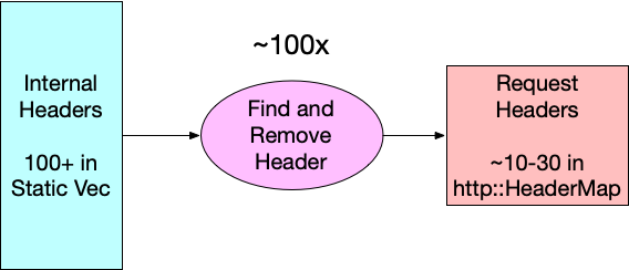
One potentially quick win is to invert how we find the headers that need to be removed from requests. If you look at the original code, you can see that we are evaluating request_header.remove_header(h) for each header in our list of internal headers, so 100+ times. Diagrammatically, it looks like this:


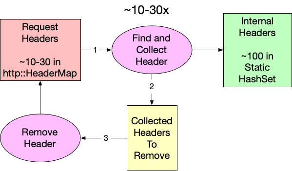
Since an average request has significantly fewer than 100 headers (10-30), flipping the lookup direction should reduce the number of reads while yielding the same intersection. Because we are working in Rust (and because retain does not exist for http::HeaderMap yet), we have to collect the identified internal headers in a separate step before removing them from the request. Conceptually, it looks like this:


Using our benchmarking tool, we can measure the impact of this small change, and surprisingly this is already a substantial improvement. The runtime improves from 3.65µs to 1.53µs. That’s a 2.39x speed improvement for our function. We can calculate the theoretical CPU percentage by multiplying the starting utilization by the ratio of the new and old times: 1.71% * 1.53 / 3.65 = 0.717%. Unfortunately, if we subtract that from the original 1.71% that only equates to saving 1.71% – 0.717% = 0.993% of the total CPU time. We should be able to do better. 

Searching Data Structures

Now that we have reorganized our function to search a static set of internal headers instead of the actual request, we have the freedom to choose what data structure we store our header name in simply by changing the type of INTERNAL_HEADER_SET.

pub fn clear_internal_headers(request_header: &mut RequestHeader) {
   let to_remove = request_header
       .headers
       .keys()
       .filter_map(|name| INTERNAL_HEADER_SET.get(name))
       .collect::<Vec<_>>();


   to_remove.into_iter().for_each(|k| {
       request_header.remove_header(k);
   });

Our first attempt used std::HashMap, but there may be other data structures that better suit our needs. All computer science students were taught at some point that hash tables are great because they have constant-time asymptotic behavior, or O(1), for reading. (If you are not familiar with big O notation, it is a way to express how an algorithm consumes a resource, in this case time, as the input size changes.) This means no matter how large the map gets, reads always take the same amount of time. Too bad this is only partially true. In order to read from a hash table, you have to compute the hash. Computing a hash for strings requires reading every byte, so while read time for a hashmap is constant over the table’s size, it’s linear over key length. So, our goal is to find a data structure that is better than O(L) where L is the length of the key.

There are a few common data structures that provide for reads that have read behavior that meets our criteria. Sorted sets like BTreeSet use comparisons for searching, and that makes them logarithmic over key length O(log(L)), but they are also logarithmic in size too. The net effect is that even very fast sorted sets like FST work out to be a little (50 ns) slower in our benchmarks than the standard hashmap.

State machines like parsers and regex are another common tool for searching for strings, though it’s hard to consider them data structures. These systems work by accepting input one unit at a time and determining on each step whether or not to keep evaluating. Being able to make these determinations at every step means state machines are very fast to identify negative cases (i.e. when a string is not valid or not a match). This is perfect for us because only one or two headers per request on average will be internal. In fact, benchmarking an implementation of clear_internal_headers using regular expressions clocks in as taking about twice as long as the hashmap-based solution. This is impressively fast given that regexes, while powerful, aren’t known for their raw speed. This approach feels promising – we just need something in between a data structure and a state machine.

That’s where the trie comes in.

Don’t Just Trie

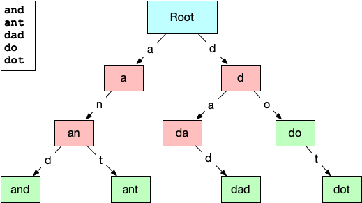
A trie (pronounced like “try” or “tree”) is a type of tree data structure normally used for prefix searches or auto-complete systems over a known set of strings. The structure of the trie lends itself to this because each node in the trie represents a substring of characters found in the initial set. The connections between the nodes represent the characters that can follow a prefix. Here is a small example of a trie built from the words: “and”, “ant”, “dad”, “do”, & “dot”. 


The root node represents an empty string prefix, so the two lettered edges directed out of it are the only letters that can appear as the first letter in the list of strings, “a” and “d”. Subsequent nodes have increasingly longer prefixes until the final valid words are reached. This layout should make it easy to see how a trie could be useful for quickly identifying strings that are not contained. Even at the root node, we can eliminate any strings that are presented that do not start with “a” or “d”. This paring down of the search space on every step gives reading from a trie the O(log(L)) we were looking for … but only for misses. Hits within a trie are still O(L), but that’s okay, because we are getting misses over 90% of the time.

Benchmarking a few trie implementations from crates.io was disheartening. Remember, most tries are used in response to keyboard events, so optimizing them to run in the hot path of tens of millions of requests per second is not a priority. The fastest existing implementation we found was radix_trie, but it still clocked in at a full microsecond slower than hashmap. The only thing left to do was write our own implementation of a trie that was optimized for our use case.

Trie Hard

And we did! Today we are announcing trie-hard. The repository gives a full description of how it works, but the big takeaway is that it gets its speed from storing node relationships in the bits of unsigned integers and keeping the entire tree in a contiguous chunk of memory. In our benchmarks, we found that trie-hard reduced the average runtime for clear_internal_headers to under a microsecond (0.93µs). We can reuse the same formula from above to calculate the expected CPU utilization for trie-hard to be 1.71% * 3.65 / 0.93 = 0.43% That means we have finally achieved and surpassed our goal by reducing the compute utilization of pingora-origin by 1.71% – 0.43% =  1.28%! 

Up until now we have been working only in theory and local benchmarking. What really matters is whether our benchmarking reflects real-life behavior. Trie-hard has been running in production since July 2024, and over the course of this project we have been collecting performance metrics from the running production of pingora-origin using a statistical sampling of its stack trace over time. Using this technique, the CPU utilization percentage of a function is estimated by the percent of samples in which the function appears. If we compare the sampled performance of the different versions of clear_internal_headers, we can see that the results from the performance sampling closely match what our benchmarks predicted.

Implementation

Stack trace samples containing clear_internal_headers

Actual CPU Usage (%)

Predicted CPU Usage (%)

Original 

19 / 1111

1.71

n/a

Hashmap

9 / 1103

0.82

0.72

trie-hard

4 / 1171

0.34

0.43

Conclusion

Optimizing functions and writing new data structures is cool, but the real conclusion for this post is that knowing where your code is slow and by how much is more important than how you go about optimizing it. Take a moment to thank your observability team (if you’re lucky enough to have one), and make use of flame graphs or any other profiling and benchmarking tool you can. Optimizing operations that are already measured in microseconds may seem a little silly, but these small improvements add up.