Tag Archives: TTFB

Workers KV is faster than ever with a new architecture

Post Syndicated from Charles Burnett original http://blog.cloudflare.com/faster-workers-kv-architecture/

Workers KV is faster than ever with a new architecture

Workers KV is faster than ever with a new architecture

We’re excited to announce a significant performance improvement coming to Workers KV, focused on dramatically improving cold read performance and reducing latency, even for long tail access patterns.

Developers using KV have seen great performance on hot reads, but ask why their 95th percentile latency — often on a key (or set of keys) that hadn’t been accessed recently or in that region — was higher than expected. We took this feedback to heart: we’ve been working feverishly on a new caching layer for KV behind the scenes, which enables customers to achieve much more frequent hot reads, reduced worst case latency times, better flexibility and control over cache TTLs, and much faster consistency over our previous iterations, and it’s now live for all KV users.

The best part? Developers using KV don’t need to change anything to benefit from this increased performance.

What is Workers KV?

Workers KV is a key value store designed for read heavy use-cases and applications powered by Cloudflare’s network. KV’s focus on read-heavy use-cases allows it to serve hot (cached) reads in milliseconds, which makes it ideal for storing per-application or customer configuration data, routing configuration, multivariate (A/B testing) configurations, and even small asset data that you need to serve quickly.  Anything that you can serialize and need quickly you can store in KV, all the way up to 25 MiB worth of data per each individual key, with no cap on total data stored.

The problem

KV might be optimized for read-heavy workloads, but it’s critical that writes are globally available quickly enough that they’re useful for your application. Under typical conditions, the convergence delay for an eventually consistent system like KV is approximately one minute, globally: a write from one location should be able to be observed by all readers. Typical conditions are great, but typical unfortunately didn’t mean “always”. It could take significant time to restore global consistency where regions like North America and Europe are reading the same value. We needed to improve not just the average convergence, but the worst case as well.

Speaking of consistency, setting a long cache Time to Live (cacheTTL) for reads would result in a situation where you won’t notice a write for the entire cacheTTL duration, as the existing cached data had not timed out yet. This means you have to trade off read latency for infrequently accessed keys against noticing writes. Developers using KV have been consistent in their feedback: a higher cache TTL should improve performance, but not multiply the time it takes for KV to converge on a write to that key.

Lastly, our cold read times also left room for improvement. While cache hits are fast in KV, a cache miss would result in a request being routed all the way to our storage backends. While this is slow for everyone, it was particularly slow for folks in regions not immediately in the US or EU.This is poor performance that doesn’t represent what we can achieve with our global presence.

Our solution

A new horizontally scaled tiered cache

We’ve revamped Workers KV to be powered by a new tiered cache implementation. This implementation is written as a Worker service. We reuse the Dynamic Dispatch infrastructure developed for Workers for Platforms which lets us jump from our old KV worker into our new caching service within hundreds of microseconds. Importantly, this means we don’t impact cache hit performance to implement this new transparent caching layer. We leverage the same infrastructure powering Smart Placement to implement the tiering.

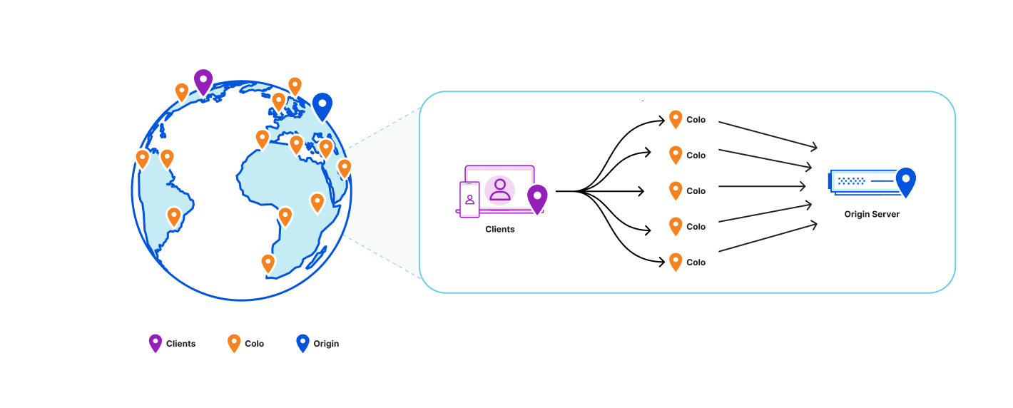
Before we re-designed KV, our topology looked like this:
Workers KV is faster than ever with a new architecture
All data centers in Cloudflare’s network can reach out to the origin in the event of a cache miss or to do a background refresh.

Cache TTL and efficiency

Our design goal was clear and ambitious: “can we relax honoring the cacheTTL constraint without violating it”? While this seems contradictory, the motivation is clear: we want to minimize the need to communicate with our storage backends while honoring the user-facing semantics of the cacheTTL setting, as it can have security implications if violated (e.g. if you use it to store and validate security tokens). Answering this design question also manages to simultaneously solve many of the problems outlined earlier.

Comparing existing solutions

First, let’s look at the design constraints for two eventually consistent storage systems at Cloudflare: Quicksilver and Tiered CDN.

Quicksilver gives us global consistency within seconds using a push architecture to replicate the data across all machines at Cloudflare. That architecture however doesn’t scale for Workers KV’s needs, which can have terabytes of data just within one namespace. This would be too much to replicate to every single data center.

By comparison, the tiered CDN cache is a pull mechanism where each hop pulls a more recent version of the asset into the local cache on access. That scales better because we only use storage for assets that are accessed, which works well with most use-cases where the vast majority of data is never retrieved. However, a pull based architecture is insufficient because it can only let us aggregate traffic across broader regions but we still can’t decouple how long we serve from the cache from the cacheTTL.

Push based architectures let us know when an asset is updated and enable scalable storage. By blending the properties of both systems, we can decouple how long we store the assets in cache from the cacheTTL. And that’s exactly what we did: KV now uses a hybrid push/pull caching layer where data centers closest to customers will pull from the regional data centers that are a little bit farther away. Writes will broadcast to all regional data centers that a key has been updated, so that the regional data center will remove that key from the local cache.
Workers KV is faster than ever with a new architecture
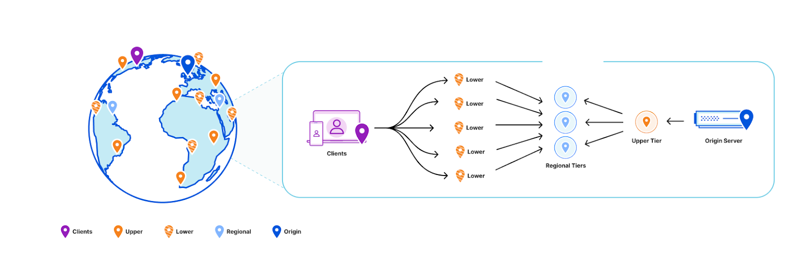
Traditional regional tiered cache topology

We can solve this problem by taking advantage of the fact that we semantically understand the write operations that are happening within Workers KV:

  1. Workers KV doesn’t have one data center per region as might be typical for your zone in a Cloudflare CDN regional tiered cache topology. Instead, each key in a KV namespace is deterministically assigned a data center by performing a weighted rendezvous hash. The rendezvous hash ensures that load is distributed equally across the region and outages result in optimal shifts of traffic.
  2. When the data center closest to a customer has a miss, it computes the regional data center affinity and provides that information to our Smart Placement infrastructure. When a regional tier misses, we repeat this process except using data centers in the KV origin region.
  3. Finally, a miss at the upper tier exits to our storage nodes located in that origin region.

When we do a write, we only purge (invalidate) the key from the regional and upper tier data centers. This is a fixed number of data centers in our network regardless of how many data centers we add, which ensures that we aren’t reducing cache hit rates as our network continues to grow Compared with a global purge that delivers the event to every data center in our network, because we only need to deliver this purge to a random fixed set of data centers in our network, our aggregate write capacity for Workers KV automatically scales horizontally as we add more data centers.
Workers KV is faster than ever with a new architecture
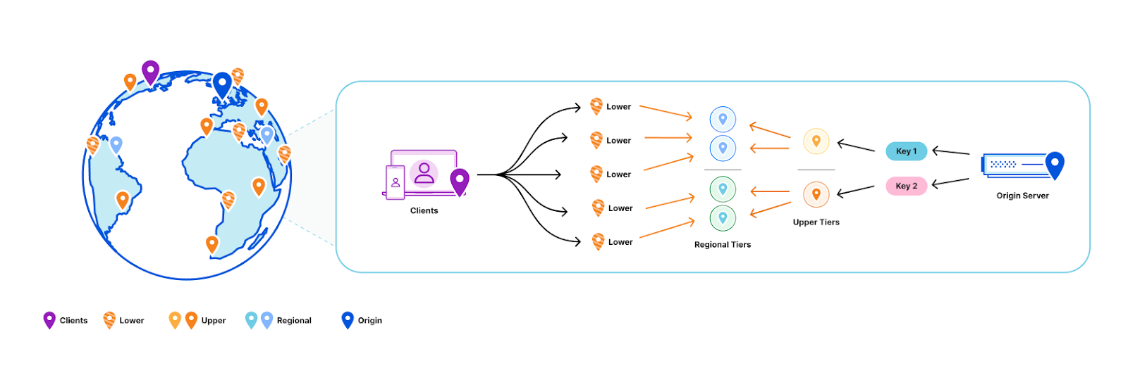
All lower-tier data centers will reach out to a regional tier responsible for a given key in the event of a cache miss. If the regional tier doesn’t have the content, the regional tier will then ask an upper-tier out of region for the content. On a write for a given key, the responsible regional and upper tiers have that key deleted from cache.

Why do we call this a hybrid topology? The data centers closest to customers pull from the regional data centers as normal, but we automatically push invalidation events to the regional tier data centers on every write. That way, those customer data center pulls know to get an updated value when there is one. This means that while the cacheTTL parameter controls the caching behavior closest to the customer, it’s treated as a suggestion at best at the regional and upper tiers.

This way we’ve combined the push design principles behind Quicksilver, which delivers global consistency within seconds, with the pull-based design of our CDN tiered caching which can scale to handle “infinite” size workloads and prioritizes the assets that are most frequently accessed.

Visualizing it

It can be a bit hard to follow what’s happening in the new caching layer since there’s so many moving parts.

Here’s a video of a simplified version of how it works:

Small yellow balls represent KV read requests, larger green balls represent read responses. A larger purple ball represents a KV write request, while a read response ball represents a KV write response. Teal balls represent purge requests being broadcast. The “E” is a data center that doesn’t participate as a regional tier. The R represents the regional tier for key N while O is the upper tier for key N.

Decoupled cache TTL and consistency parameters

As a refresher, the objects written to KV can specify a cacheTTL: by default this is set to 1 minute, which is also the minimum acceptable value. This means that if an asset has been in the cache for longer than a minute, we bypass the cache and read instead from our durable storage nodes. In order to prevent eyeballs noticing origin fetches every minute, we implement stale while revalidate logic in our caching layer that automatically refreshes from the storage nodes in the background as requests come in.

Workers KV is faster than ever with a new architecture
Here’s an example from a Worker that’s constantly reading the same key

Notice the absence of any spikes indicating a cache miss? You’d expect to see them regularly every minute or so in the tens or even hundreds of milliseconds when the cacheTTL should expire. The reason this doesn’t happen is because as the expiry time is approaching, a background request to the storage nodes occurs and the cache is updated with an expiry time one more minute into the future; thus the asset in cache is never too stale and eyeball requests are always served from cache. Let’s take a look at requests to our storage layer before and after adding tiering:

Workers KV is faster than ever with a new architecture
Yellow is the estimated number of requests that would have occurred to origin without the new caching layer. Blue is the number of requests we’re making now.

The above chart is for a system with conservative parameters set. The upper tier doesn’t store the data for much longer than the cacheTTL currently and the upper tier will itself still do a background refresh probabilistically even though it doesn’t actually need to since we see all writes.

The new caching layer we’ve built inherits the old background refresh mechanism and expands on it. The first thing we did is decouple the background refresh period from the cacheTTL as a separate parameter (also defaulting to 1 minute). This means that even if you set a cacheTTL for 1 hour, KV will still check every minute from the regional tier to see if the value has been updated. If the data you’re storing within KV doesn’t have strict requirements on stale reads (think a key that’s accessed once every 10 minutes but needs to honor a write within 1 minute like security tokens), then you can increase the cacheTTL so that infrequently accessed keys stick around in the cache without changing the observed consistency.

Consistency improvements

Speaking of consistency, we’ve improved the worst case performance of that as well. Historically, we’ve had a background system that crawls all data in the storage nodes to figure out which region has the most up to date value and update accordingly. This gives us complete consistency coverage, but could take a significant amount of time to confirm. We would also periodically check both backends to see if network conditions had changed to pick the primary storage region to use for a given customer-close data center. Of course inconsistencies would be resolved then, but in practice this happens randomly, and at a low probability that won’t typically catch any meaningful values served inconsistently.

With the new caching layer all this changes. Since we’re now only reading keys on first access or after a write, we have enough storage capacity that we can check both backends on every read. When a customer requests data, we make a call to each origin data center, with the fastest response being returned immediately to reduce read latency. If the other data center has a newer value than what was returned first, we synchronize both data centers and notify our caching layer to purge that key from all regional data centers. If the other data center instead has an older value, we just synchronize the data centers without purging since we served the latest value. This means that even if our data centers are inconsistent, readers will notice new values much more quickly.

Latency improvements

Here’s the latency improvement at 10% rollout on a logarithmic x-axis:

Workers KV is faster than ever with a new architecture

Architecture that just gets better

This is just the start of what we can do. We now have a solid foundation for making further improvements, including making our best case reads even faster. We’ll be working on cutting out parts of our traditional stack that add unnecessary latency, and adding new high performance features that were too difficult to integrate otherwise. We can also explore features like setting the consistency TTL parameter for sub one minute consistency for additional cost. Similarly, we could create a best effort global purge feature if you want to choose to signal writes that way. Finally, we’re looking at exposing this new caching layer as a general Worker binding anyone can use within a Worker in front of their own service or to put in front of their Worker. If these sound like the killer features you need, please reach out to us if you’re interested in trying them out.

What next?

Developers don’t have to do anything to benefit from KV’s new performance improvements. We are currently in the process of rolling out our new architecture, and you don’t have to redeploy your Worker or change the way you use KV to benefit.

Workers KV is a natural fit for any application built on top of our Workers platform. We provide a native API that enables any Worker script to read, write, list, and manageyour Workers KV storage. You can also interact with Workers KV directly via our REST API from any client that can make a HTTP request, and the Cloudflare Dashboard provides an easy way to create, list, and delete keys to be used with the rest of your Workers setup.

Regardless of how you use Workers KV, it will be faster than ever before. We’re excited to see what you build with us, and you can dive into our documentation to start building with it.

Are you measuring what matters? A fresh look at Time To First Byte

Post Syndicated from Sam Marsh original http://blog.cloudflare.com/ttfb-is-not-what-it-used-to-be/

Are you measuring what matters? A fresh look at Time To First Byte

Are you measuring what matters? A fresh look at Time To First Byte

Today, we’re making the case for why Time To First Byte (TTFB) is not a good metric for evaluating how fast web pages load. There are better metrics out there that give a more accurate representation of how well a server or content delivery network performs for end users. In this blog, we’ll go over the ambiguity of measuring TTFB, touch on more meaningful metrics such as Core Web Vitals that should be used instead, and finish on scenarios where TTFB still makes sense to measure.

Many of our customers ask what the best way would be to evaluate how well a network like ours works. This is a good question! Measuring performance is difficult. It’s easy to simplify the question to “How close is Cloudflare to end users?” The predominant metric that’s been used to measure that is round trip time (RTT). This is the time it takes for one network packet to travel from an end user to Cloudflare and back. We measure this metric and mention it from time to time: Cloudflare has an average RTT of 50 milliseconds for 95% of the Internet-connected population.

Whilst RTT is a relatively good indicator of the quality of a network, it doesn’t necessarily tell you that much about how good it is at actually delivering actual websites to end users. For instance, what if the web server is really slow? A user might be very close to the data center that serves the traffic, but if it takes a long time to actually grab the asset from disk and serve it the result will still be a poor experience.

This is where TTFB comes in. It measures the time it takes between a request being sent from an end user until the very first byte of the response being received. This sounds great on paper! However it doesn’t capture how a webpage or web application loads, and what happens after the first byte is received.

In this blog we’ll cover what TTFB is a good indicator of, what it's not great for, and what you should be using instead.

What is TTFB?

TTFB is a metric which reports the duration between sending the request from the client to a server for a given file, and the receipt of the first byte of said file. For example, if you were to download the Cloudflare logo from our website the TTFB would be how long it took to receive the first byte of that image. Similarly, if you were to measure the TTFB of a request to cloudflare.com the metric would return the TTFB of how long it took from request to receiving the first byte of the first HTTP response. Not how long it took for the image to be fully visible or for the web page to be loaded in a state that allowed a user to begin using it.

The simplest answer therefore is to look at the diametrically opposite measurement, Time to Last Byte (TTLB). TTLB, as you’d expect, measures how long it takes until the last byte of data is received from the server. For the Cloudflare logo file this would make sense, as until the image is fully downloaded it's not exactly useful. But what about for a webpage? Do you really need to wait until every single file is fully downloaded, even those images at the bottom of the page you can't immediately see? TTLB is fine for measuring how long it took to download a single file from a CDN / server. However for multi-faceted traffic, like web pages, it is too conservative, as it doesn’t tell you how long it took for the web page to be usable.

As an analogy we can look at measuring how long it takes to process an incoming airplane full of passengers. What's important is to understand how long it takes for those passengers to disembark, pass through passport control, collect their baggage and leave the terminal, if no onward journeys. TTFB would measure success as how long it took to get the first passenger off of the airplane. TTLB would measure how long it took the last passenger to leave the terminal, even if this passenger remained in the terminal for hours afterwards due to passport issues or getting lost. Neither are a good measure of success for the airline.

Why TTFB doesn't make sense

TTFB is a widely-used metric because it is easy-to-understand and it is a great signal for connection setup time, server time and network latency. It can help website owners identify when performance issues originate from their server. But is TTFB a good signal for how real users experience the loading speed of a web page in a browser?

When a web page loads in a browser, the user’s perception of speed isn’t related to the moment the browser first receives bytes of data. It is related to when the user starts to see the page rendering on the screen.

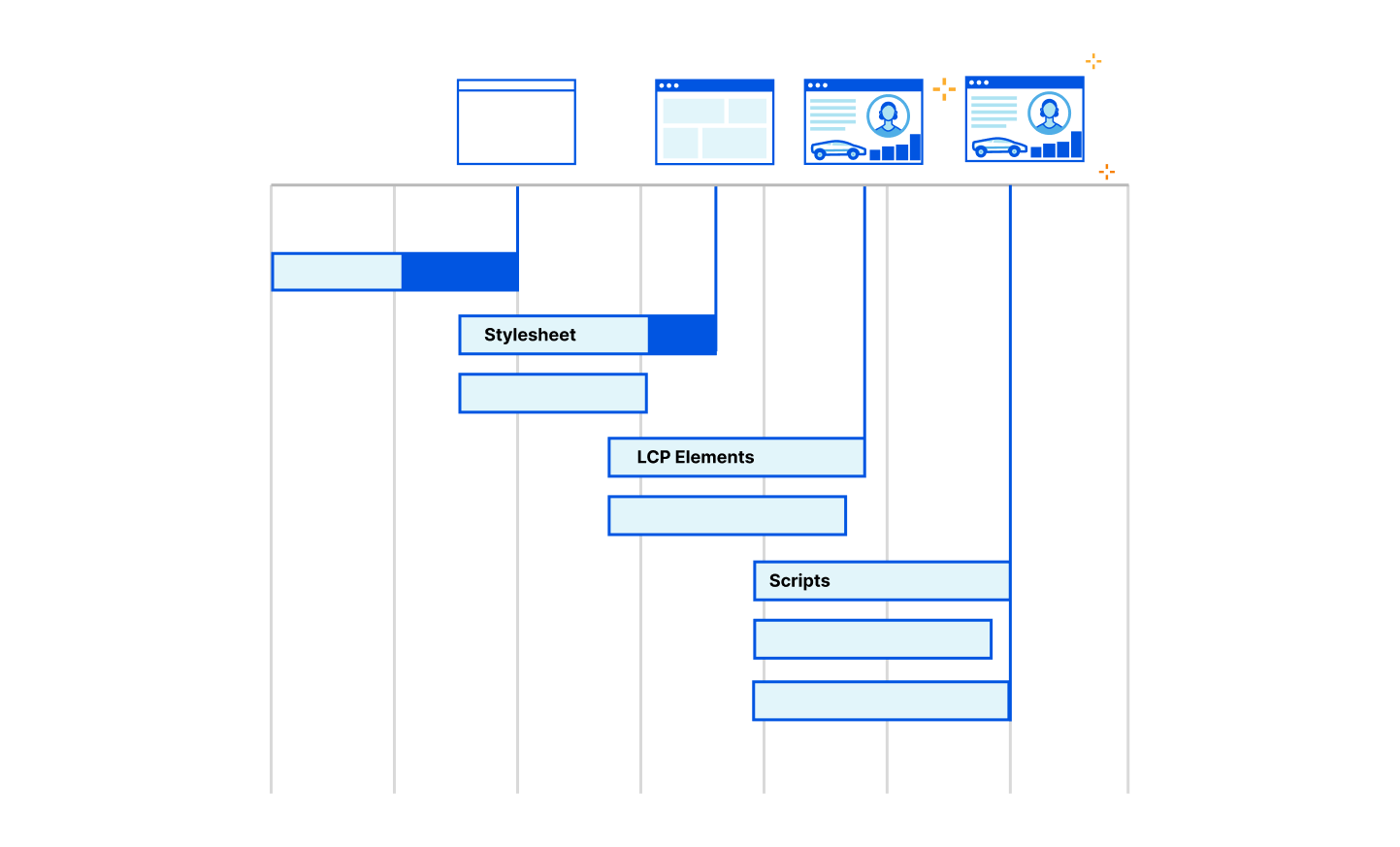
The loading of a web page in a browser is a very complex process. Almost all of this process happens after TTFB is reported. After the first byte has been received, the browser still has to load the main HTML file. It also has to load fonts, stylesheets, javascript, images and other resources. Often these resources link to other resources that also must be downloaded. Often these resources entirely block the rendering of the page. Alongside all these downloads, the browser is also parsing the HTML, CSS and JavaScript. It is building data structures that represent the content of the web page as well as how it is styled. All of this is in preparation to start rendering the final page onto the screen for the user.

Are you measuring what matters? A fresh look at Time To First Byte

When the user starts seeing the web page actually rendered on the screen, TTFB has become a distant memory for the browser. For a metric that signals the loading speed as perceived by the user, TTFB falls dramatically short.

Receiving the first byte isn't sufficient to determine a good end user experience as most pages have additional render blocking resources that get loaded after the initial document request. Render-blocking resources are scripts, stylesheets, and HTML imports that prevent a web page from loading quickly. From a TTFB perspective it means the client could stop the ‘TTFB clock’ on receipt of the first byte of one of these files, but the web browser is blocked from showing anything to the user until the remaining critical assets are downloaded.

This is because browsers need instructions for what to render and what resources need to be fetched to complete “painting” a given web page. These instructions come from a server response. But the servers sending these responses often need time to compile these resources — this is known as “server think time.” While the servers are busy during this time… browsers sit idle and wait. And the TTFB counter goes up.

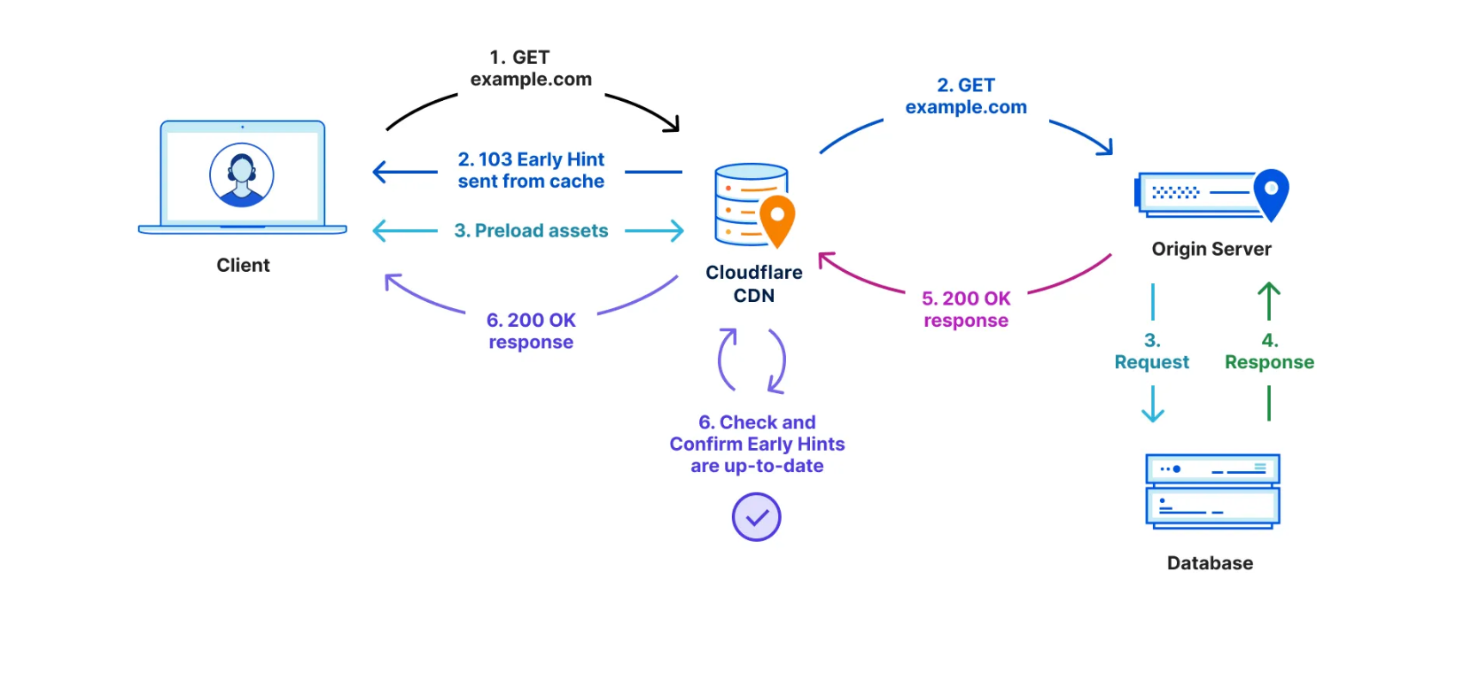
There have been a number of attempts over the years to benefit from this “think time”. First came Server Push, which was superseded last year by Early Hints. Early Hints take advantage of “server think time” to asynchronously send instructions to the browser to begin loading resources while the origin server is compiling the full response. By sending these hints to a browser before the full response is prepared, the browser can figure out what it needs to do to load the webpage faster for the end user. It also stops the TTFB clock, meaning a lower TTFB. This helps ensure the browser gets the critical files sooner to begin loading the webpage, and it also means the first byte is delivered sooner as there is no waiting on the server for the whole dataset to be prepared and ready to send. Even with Early Hints, though, TTFB doesn’t accurately define how long it took the web page to be in a usable state.

Are you measuring what matters? A fresh look at Time To First Byte

TTFB also does not take into account multiplexing benefits of HTTP/2 and HTTP/3 which allow browsers to load files in parallel. It also doesn't take into account compression on the origin, which would result in a higher TTFB but a quicker page load overall due to the time the server took to compress the assets and send them in a small format over the network.

Cloudflare offers many features that can improve the loading speed of a website, but don’t necessarily impact the TTFB score. These features include Zaraz, Rocket Loader, HTTP/2 and HTTP/3 Prioritization, Mirage, Polish, Image Resizing, Auto Minify and Cache. These features improve the loading time of a webpage, ensuring they load optimally through a series of enhancements from image optimization and compression to render blocking elimination by optimizing the sending of assets from the server to the browser in the best possible order.

More comprehensive metrics are required to illustrate the full loading process of a web page, and the benefit provided by these features. This is where Real User Monitoring helps.  At Cloudflare we are all-in on Real User Monitoring (RUM) as the future of website performance. We’re investing heavily in it: both from an observation point of view and from an optimization one also.

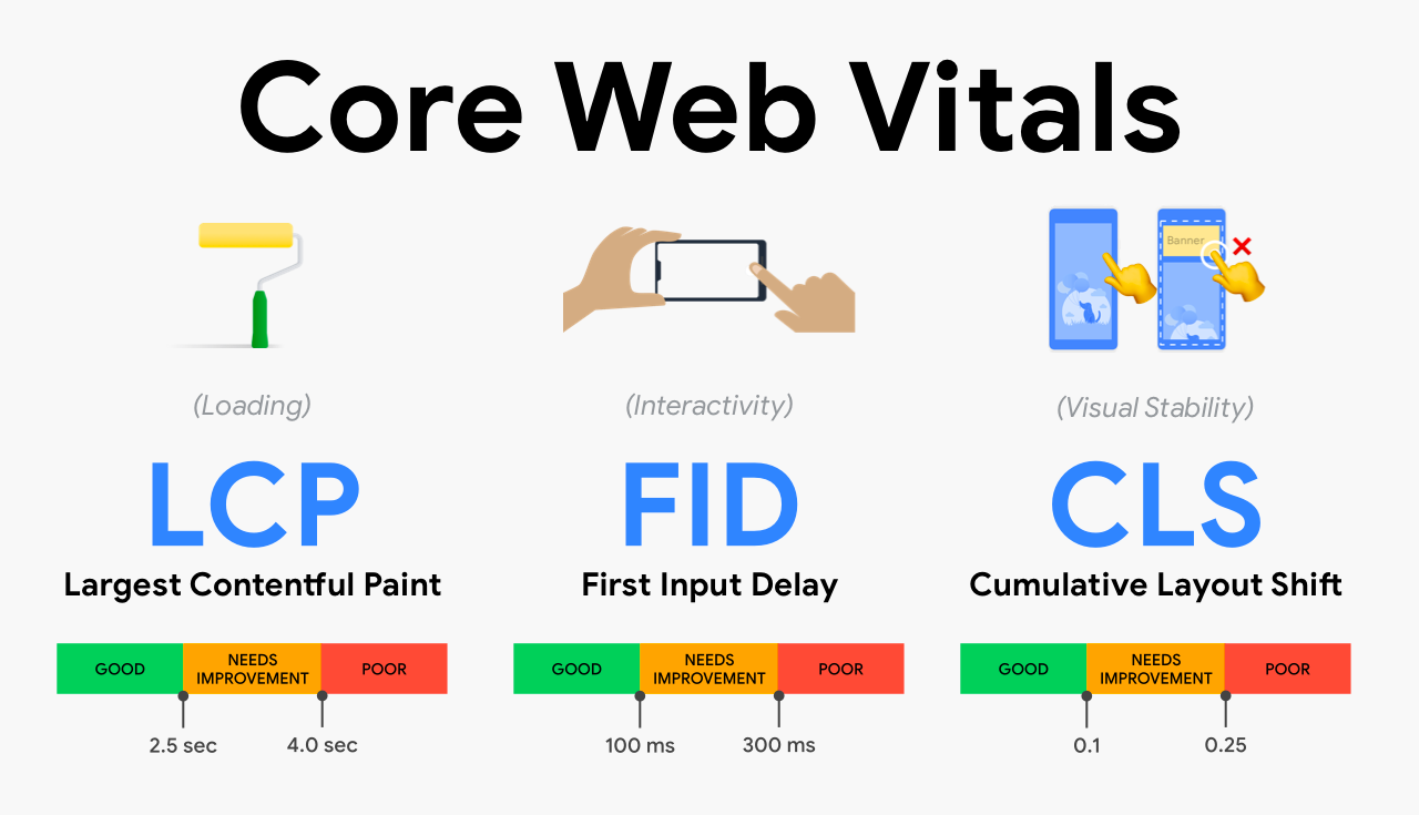
For those unfamiliar with RUM, we typically optimize websites for three main metrics – known as the “Core Web Vitals”. This is a set of key metrics which are believed to be the best and most accurate representation of a poorly performing website vs a well performing one. These key metrics are Largest Contentful Paint, First Input Delay and Cumulative Layout Shift.

Are you measuring what matters? A fresh look at Time To First Byte
Source: https://addyosmani.com/blog/web-vitals-extension/ 

LCP measures loading performance; typically how long it takes to load the largest image or text block visible in the browser. FID measures interactivity. For example, the time between when a user clicks or taps on a button to when the browser responds and starts doing something. Finally, CLS measures visual stability. A good, or bad example of CLS is when you go to a website on your mobile phone, tap on a link and the page moves at the last second meaning you tap something you didn't want to. That would be a lower CLS score as its poor user experience.

Looking at these metrics gives us a good idea of how the end user is truly experiencing your website (RUM) vs. how quickly the first byte of the file was retrieved from the nearest Cloudflare data center (TTFB).

Good TTFB, bad user experience

One of the “sub parts” that comprise LCP is TTFB. That means a poor TTFB is very likely to result in a poor LCP. If it takes you 20 seconds to retrieve the first byte of the first image, your user isn't going to have a good experience – regardless of your outlook on TTFB vs RUM.

Conversely, we found that a good TTFB does not always mean a good LCP score, or FID or CLS. We ran a query to collect RUM metrics of web pages we served which had a good TTFB score. Good is defined as a TTFB as less than 800ms. This allowed us to ask the question: TTFB says these websites are good. Does the RUM data support that?

We took four distinct samples from our RUM data in June. Each sample had a different date-range and sample-rate combination. In each sample we queried for 200,000 page views. From these 200,000 page views we filtered for only the page views that reported a 'Good' TTFB. Across the samples, of all page views that have a good TTFB, about 21% of them did not have a “good” LCP score. 46% of them did not have a “good” FID score. And 57% of them did not have a good CLS score.

This clearly shows the disparity between measuring the time it takes to receive the first byte of traffic, vs the time it takes for a webpage to become stable and interactive. In summary, LCP includes TTFB but also includes other parts of the loading experience. LCP is a more comprehensive, user-centric metric.

TTFB is not all bad

Reading this post and others from Speed Week 2023 you may conclude we really don't like TTFB and you should stop using it. That isn't the case.

There are a few situations where TTFB does matter. For starters, there are many applications that aren’t websites. File servers, APIs and all sorts of streaming protocols don’t have the same semantics as web pages and the best way to objectively measure performance is to in fact look at exactly when the first byte is returned from a server.

To help optimize TTFB for these scenarios we are announcing Timing Insights, a new analytics tool to help you understand what is contributing to "Time to First Byte" (TTFB) of Cloudflare and your origin. Timing Insights breaks down TTFB from the perspective of our servers to help you understand what is slow, so that you can begin addressing it.

Get started with RUM today

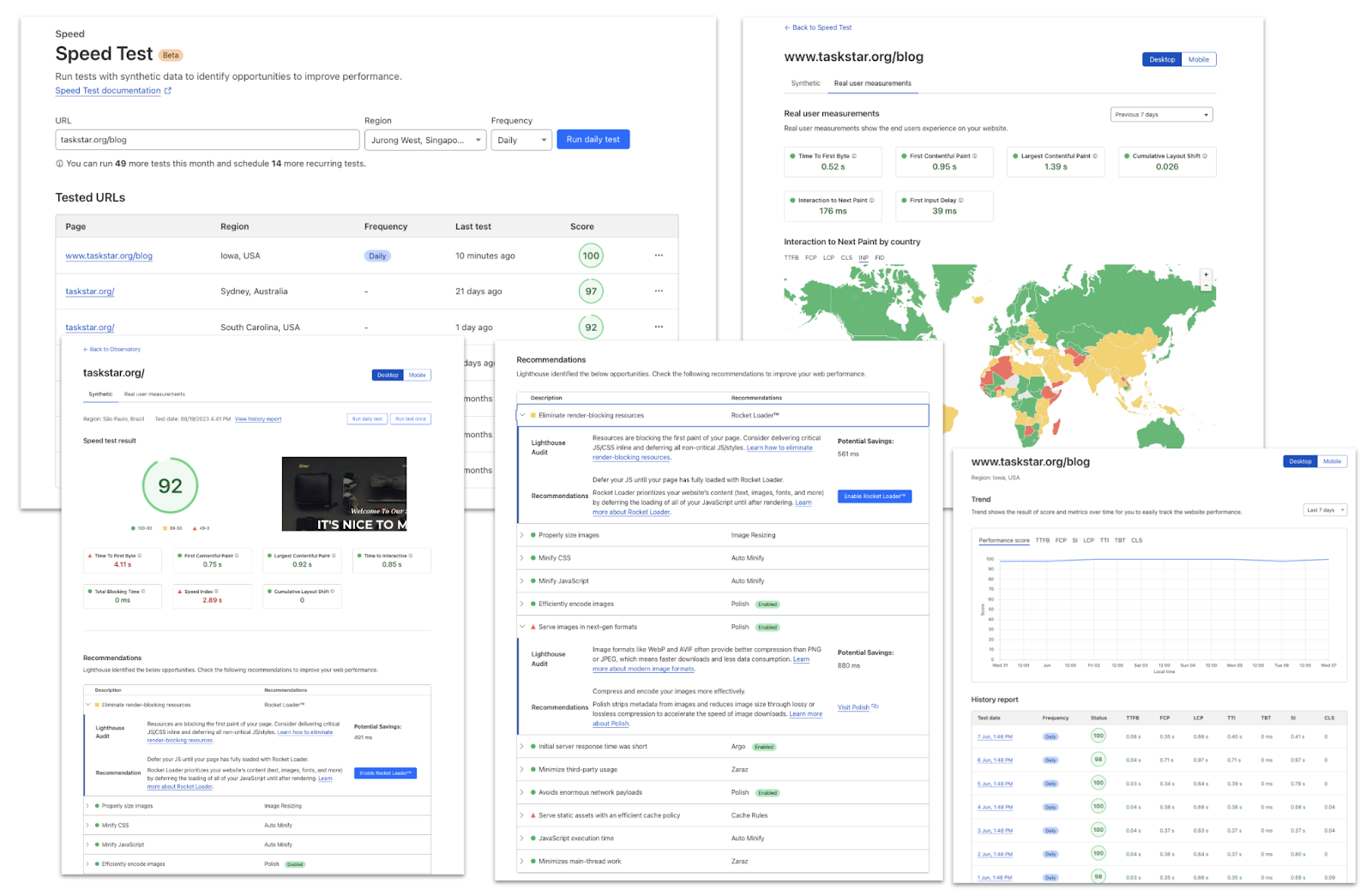
To help you understand the real user experience of your website we have today launched Cloudflare Observatory the new home of performance at Cloudflare.

Are you measuring what matters? A fresh look at Time To First Byte

Cloudflare users can now easily monitor website performance using Real User Monitoring (RUM) data along with scheduled synthetic tests from different regions in a single dashboard. This will identify any performance issues your website may have. The best bit? Once we’ve identified any issues, Observatory will highlight customized recommendations to resolve these issues, all with a single click.

Start making your website faster today with Observatory.

Benchmarking Edge Network Performance: Akamai, Cloudflare, AWS CloudFront, Fastly, and Google

Post Syndicated from John Graham-Cumming original https://blog.cloudflare.com/benchmarking-edge-network-performance/

Benchmarking Edge Network Performance: Akamai, Cloudflare, AWS CloudFront, Fastly, and Google

Benchmarking Edge Network Performance: Akamai, Cloudflare, AWS CloudFront, Fastly, and Google

During Speed Week we’ve talked a lot about services that make the web faster. Argo 2.0 for better routing around bad Internet weather, Orpheus to ensure that origins are reachable from anywhere, image optimization to send just the right bits to the client, Tiered Cache to maximize cache hit rates and get the most out of Cloudflare’s new 25% bigger network, our expanded fiber backbone and more.

Those things are all great.

But it’s vital that we also measure the performance of our network and benchmark ourselves against industry players large and small to make sure we are providing the best, fastest service.

We recently ran a measurement experiment where we used Real User Measurement (RUM) data from the standard browser API to test the performance of Cloudflare and others in real-world conditions across the globe. We wanted to use third-party tests for this, but they didn’t have the granularity we wanted. We want to drill down to every single ISP in the world to make sure we optimize everywhere. We knew that in some places the answers we got wouldn’t be good, and we’d need to do work to improve our performance. But without detailed analysis across the entire globe we couldn’t know we were really the fastest or where we needed to improve.

In this blog post I’ll describe how that measurement worked and what the results are. But the short version is: Cloudflare is #1 in almost all cases whether you look at all the networks on the globe, or the top 1,000 largest, or the top 1,000 most active, and whether you look at mean timings or 95th percentile, and you measure how quickly a connection can be established, how long it takes for the first byte to arrive in a user’s web browser, or how long the complete download takes. And we’re not resting here, we’re committed to working network by network globally to ensure that we are always #1.

Why we measured

Commercial Internet measurement services (such as Cedexis, Catchpoint, Pingdom, ThousandEyes) already exist and perform the sorts of RUM measurements that Cloudflare used for this test. And we wanted to ensure that our test was as fair as possible and allowed each network to put its best foot forward.

We subscribe to the third party monitoring services already. And, when we looked at their data we weren’t satisfied.

First, we worried that the way they sampled wasn’t globally representative and was often skewed by measuring from the server, rather than the eyeball, side of the network. Or, even if operating from the eyeball side, could be skewed as artificial or tainted by bots and other automated traffic.

Second, it wasn’t granular enough. It showed our performance by country or region, but didn’t dive into individual networks and therefore obscured the details and outliers behind averages. While we looked good in third party tests, we didn’t trust them to be as thorough and accurate as we wanted. The goal isn’t to pick a test where we looked good. The goal was to be accurate and see where we weren’t good enough yet, so we could focus on those areas and improve. That’s why we had to build this ourselves.

We benchmark against others because it’s useful to know what’s possible. If someone else is faster than we are somewhere then it proves it’s possible. We won’t be satisfied until we’re at least as good as everyone else everywhere. Now we have the granular data to ensure that’ll happen. We plan our next update during Birthday Week when our target is to take 10% of networks where we’re not the fastest and become the fastest.

How we measured

To measure performance we did two things. We created a small internal team to do the measurements separate from the team that manages and optimizes our network. The goal was to show the team where we need to improve.

And to ensure that the other CDNs were tested using their most representative assets we used the very same endpoints that commercial measurement services use on the assumption that our competitors will have already ensured that those endpoints are optimized to show their networks’ best performance.

The measurements in this blog post are based on four days just before Speed Week began (2021-09-10 12:25:02 UTC to 2021-09-13 16:21:10 UTC). We took measurements of downloading exactly the same 100KB PNG file. We categorized them by the network the measurement was taken from. It’s identified by its ASN and a name. We’re not done with these measurements and will continue measuring and optimizing.

A 100KB file is a common test measurement used in the industry and allows us to measure network characteristics like the connection time, but also the total download time.

Before we get into results let’s talk a little about how the Internet fits together. The Internet is a network of networks that cooperate to form the global network that we all use. These networks are identified by a strangely named “autonomous system number” or ASN. The idea is that large networks (like ISPs, or cloud providers, or universities, or mobile phone companies) operate autonomously and then join the global Internet through a protocol called BGP (which we’ve written about in the past).

In a way the Internet is these ASNs and because the Internet is made of them we want to measure our performance for each ASN. Why? Because one part of improving performance is improving our connectivity to each ASN and knowing how we’re doing on a per-network basis helps enormously.

There are roughly 70,000 ASNs in the global Internet and during the measurement period we saw traffic from about 21,000 (exact number: 20,728) of them. This makes sense since not all networks are “external” (as in the source of traffic to websites); many ASNs are intermediaries moving traffic around the Internet.

For the rest of this blog we simply say “network” instead of “ASN”.

What we measured

Getting real user measurement data used to be hard but has been made easy for HTTP endpoints thanks to the Resource Timing API, supported by most modern browsers. This API allows a page to measure network timing data of fetched resources using high-resolution timestamps, accurate to 5 µs (microseconds).

The point of this API is to get timing information that shows how a real end-user experiences the Internet (and not a synthetic test that might measure a single component of all the things that happen when a user browses the web).

Benchmarking Edge Network Performance: Akamai, Cloudflare, AWS CloudFront, Fastly, and Google

The Resource Timing API is supported by pretty much every browser enabling measurement on everything from old versions of Internet Explorer, to mobile browsers on iOS and Android to the latest version of Chrome. Using this API gives us a view of real world use on real world browsers.

We don’t just instruct the browser to download an image too. To make sure that we’re fair and replicate the real-life end-user experience, we make sure that no local caching was involved in the request, check if the object has been compressed by the server or not, take the HTTP headers size into account, and record if the connection has been pre-warmed or not, to name a few technical details.

Here’s a high-level example on how this works:

await fetch("https://example.com/100KB.png?r=7562574954", {
              mode: "cors",
              cache: "no-cache",
              credentials: "omit",
              method: "GET",
})

performance.getEntriesByType("resource");

{
   connectEnd: 1400.3999999761581
   connectStart: 1400.3999999761581
   decodedBodySize: 102400
   domainLookupEnd: 1400.3999999761581
   domainLookupStart: 1400.3999999761581
   duration: 51.60000002384186
   encodedBodySize: 102400
   entryType: "resource"
   fetchStart: 1400.3999999761581
   initiatorType: "fetch"
   name: "https://example.com/100KB.png"
   nextHopProtocol: "h2"
   redirectEnd: 0
   redirectStart: 0
   requestStart: 1406
   responseEnd: 1452
   responseStart: 1428.5
   secureConnectionStart: 1400.3999999761581
   startTime: 1400.3999999761581
   transferSize: 102700
   workerStart: 0
}

To measure the performance of each CDN we downloaded an image from each, when a browser visited one of our special pages. Once every image is downloaded we record the measurements using a Cloudflare Workers based API.

The three measurements: TCP connection time, TTFB and TTLB

We focused on three measurements to illustrate how fast our network is: TCP connection time, TTFB and TTLB. Here’s why those three values matter.

TCP connection time is used to show how well-connected we are to the global Internet as it counts only the time taken for a machine to establish a connection to the remote host (before any higher level protocols are used). The TCP connection time is calculated as connectEnd – connectStart (see the diagram above).

TTFB (or time to first byte) is the time taken once an HTTP request has been sent for the first byte of data to be returned by the server. This is a common measurement used to show how responsive a server is. We calculate TTFB as responseStart – connectStart – (requestStart – connectEnd).

TTLB (or time to last byte) is the time taken to send the entire response to the web browser. It’s a good measure of how long a complete download takes and helps measure how good the server (or CDN) is at sending data. We calculate TTLB as responseEnd – connectStart – (requestStart – connectEnd).

We then produced two sets of data: mean and p95. The mean is a very well understood number for laypeople and gives the average user experience, but it doesn’t capture the breadth of different speeds people experience very well. Because it averages everything together it can miss skewed distributions of data (where lots of people get good performance and lots bad performance, for example).

To address the mean’s problems we also used p95, the 95th percentile. This number tells us what performance 95% of measurements fall below. That can be a hard number to understand, but you can think of it as the “reasonable worst case” performance for a user. Only 5% of measurements were worse than this number.

An example chart

As this blog contains a lot of data, let’s start with a detailed look at a chart of results. We compared ourselves against industry giants Google and Amazon CloudFront, industry pioneer Akamai and up and comer Fastly.

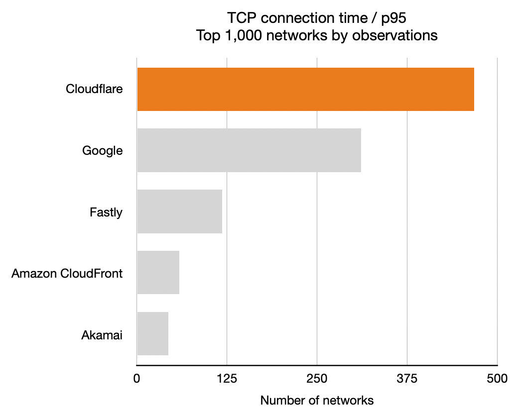
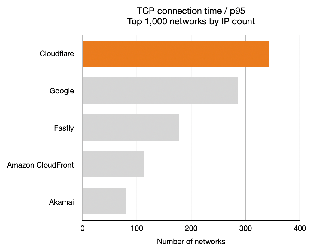
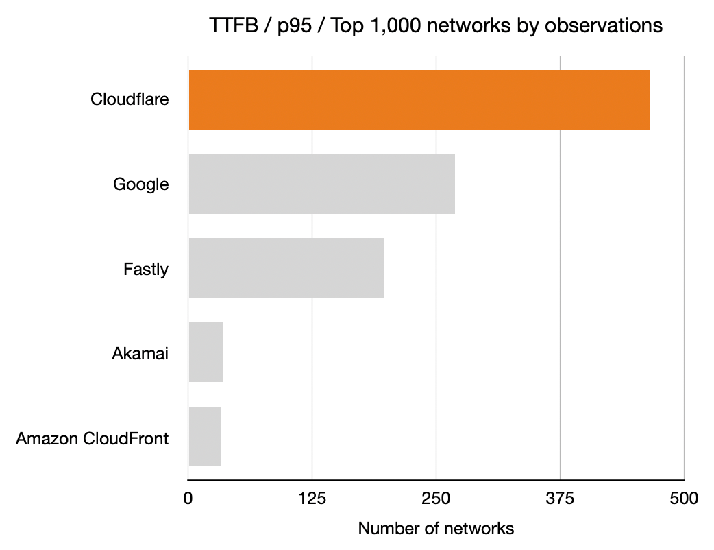
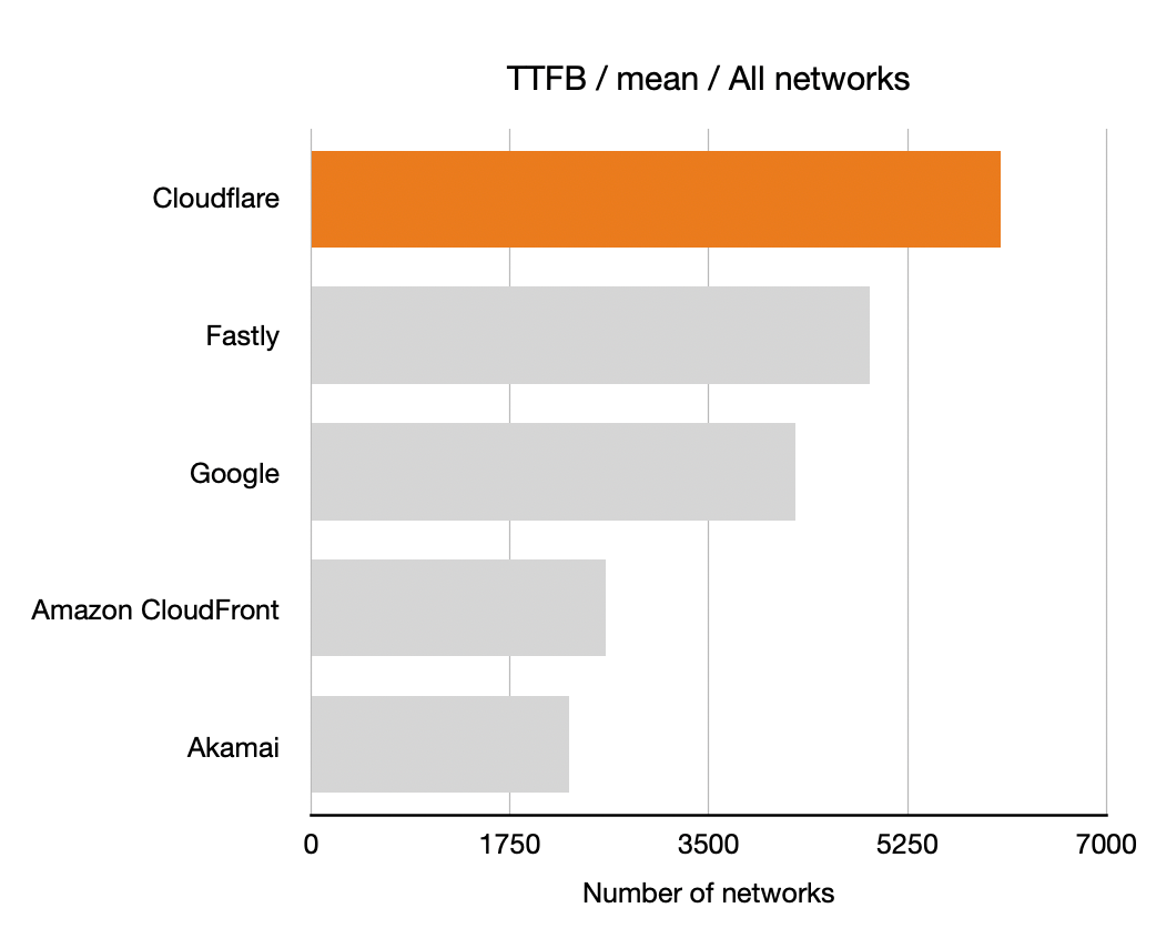
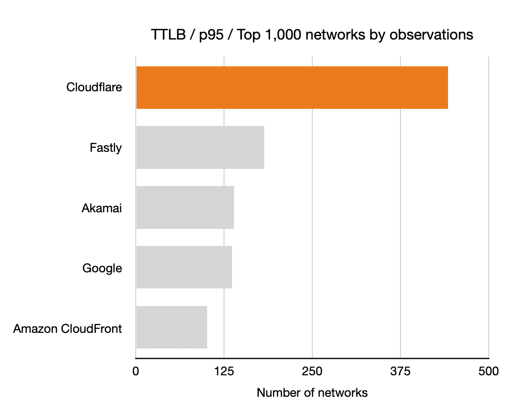
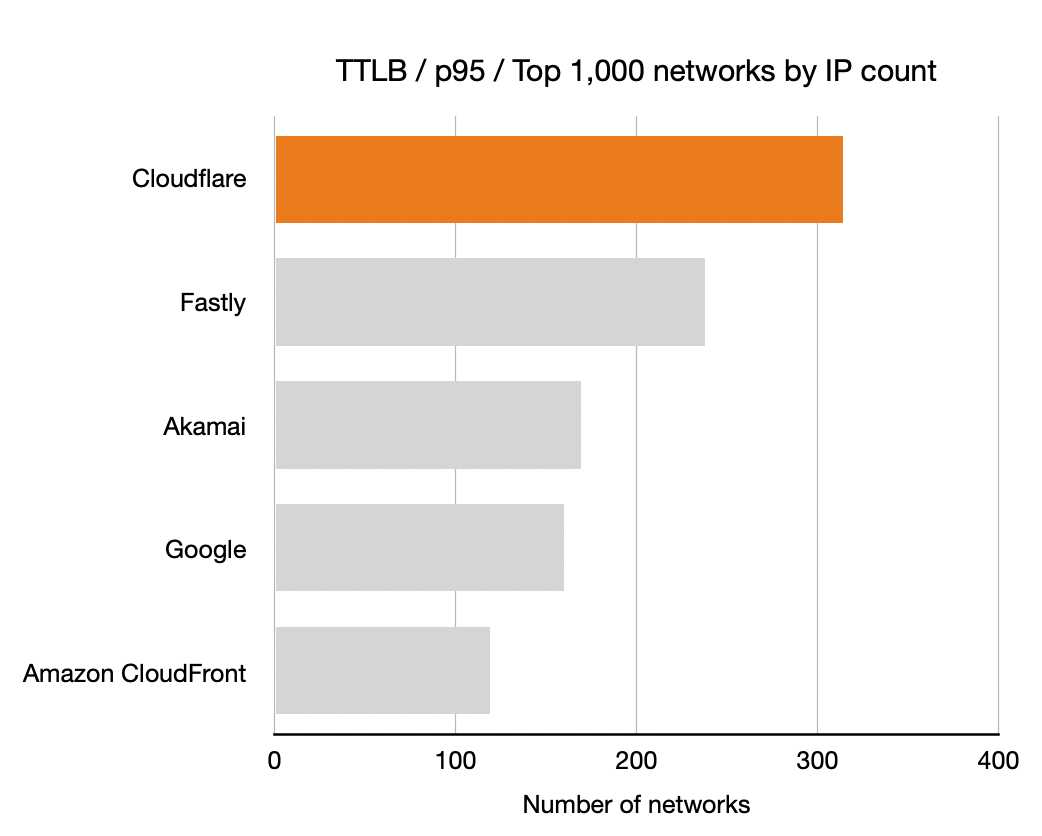
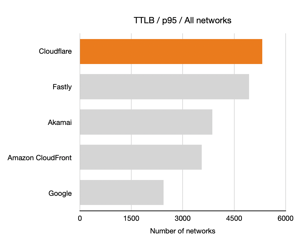
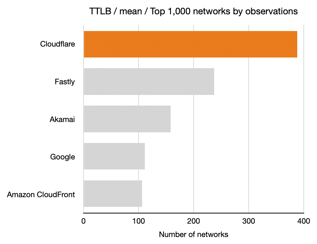
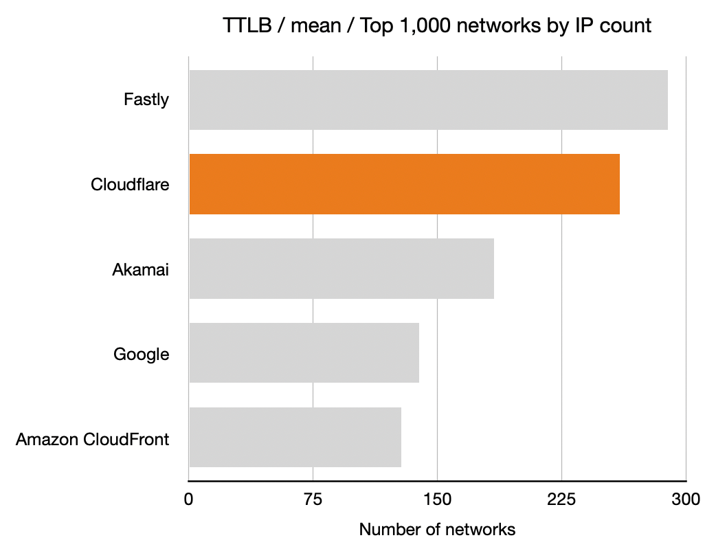
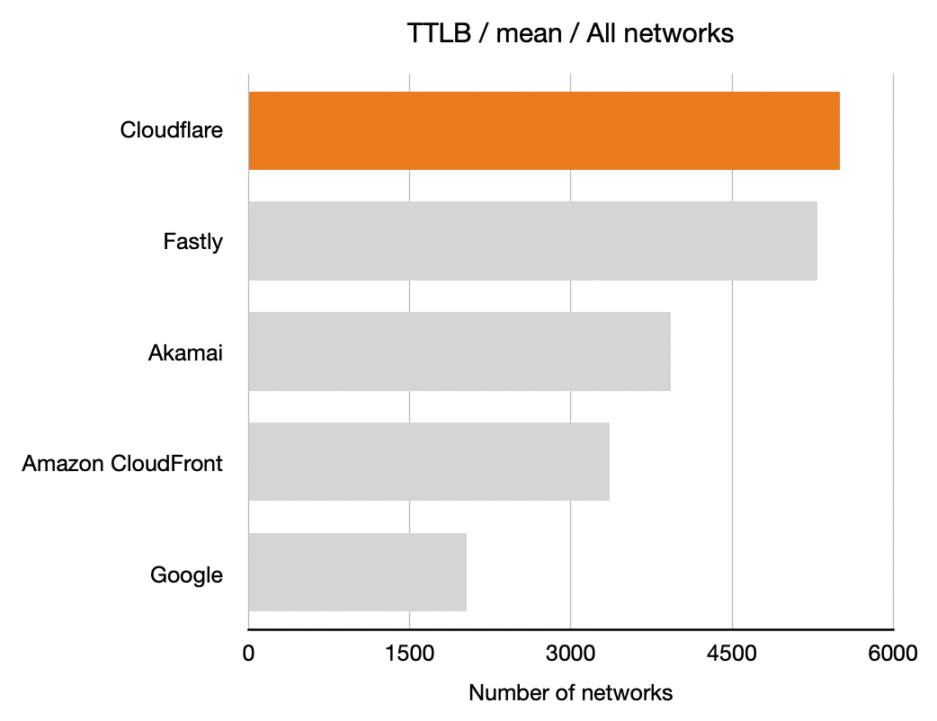
For each network (represented by an ASN) and for each CDN we calculated which CDN had the best performance. Here, for example, is a count of the number of networks on which each CDN had the best performance for TTFB. This particular chart shows p95 and includes data from the top 1,000 networks (by number of IPv4 addresses advertised).

In these charts, longer bars are better; the bars indicate the number of networks for which that CDN had the lowest TTFB at p95.

Benchmarking Edge Network Performance: Akamai, Cloudflare, AWS CloudFront, Fastly, and Google

This shows that Cloudflare had the lowest time to first byte (the TTFB, or the time it took the first byte of content to reach their browser) at the 95th percentile for the largest number of networks in the top 1,000 (based on the number IPv4 addresses they advertise). Google was next, then Fastly followed by Amazon CloudFront and Akamai.

All three measures, TCP connection time, time to first byte and time to last byte, matter to the user experience. For this example, I focused on time to first byte (TTFB) because it’s such a common measure of responsiveness of the web. It’s literally the time it takes a web server to start responding to a request from a browser for a web page.

To understand the data we gathered let’s look at two large US-based ISPs: Cox and Comcast. Cox serves about 6.5 million customers and Comcast has about 30 million customers. We performed roughly 22,000 measurements on Cox’s network and 100,000 on Comcast’s. Below we’ll make use of measurement counts to rank networks by their size, here we see that our measurements and customer counts of Cox and Comcast track nicely.

Cox Communications has ASN 22773 and our data shows that the p95 TTFB for the five CDNs was as follows: Cloudflare 332.6ms, Fastly 357.6ms, Google 380.3ms, Amazon CloudFront 404.4ms and Akamai 441.5ms. In this case Cloudflare was the fastest and about 7% faster than the next CDN (Fastly) which was faster than Google and so on.

Looking at Comcast (with ASN 7922) we see p95 TTFB was 323.7ms (Fastly), 324.2ms (Cloudflare), 353.7ms (Google), 384.6ms (Akamai) and 418.8ms (Amazon CloudFront). Here Fastly (323.7ms) edged out Cloudflare (324.2ms) by 0.2%.

Figures like these go into determining which CDN is the fastest for each network for this analysis and the charts presented. At a granular level they matter to Cloudflare as we can then target networks and connectivity for optimization.

The results

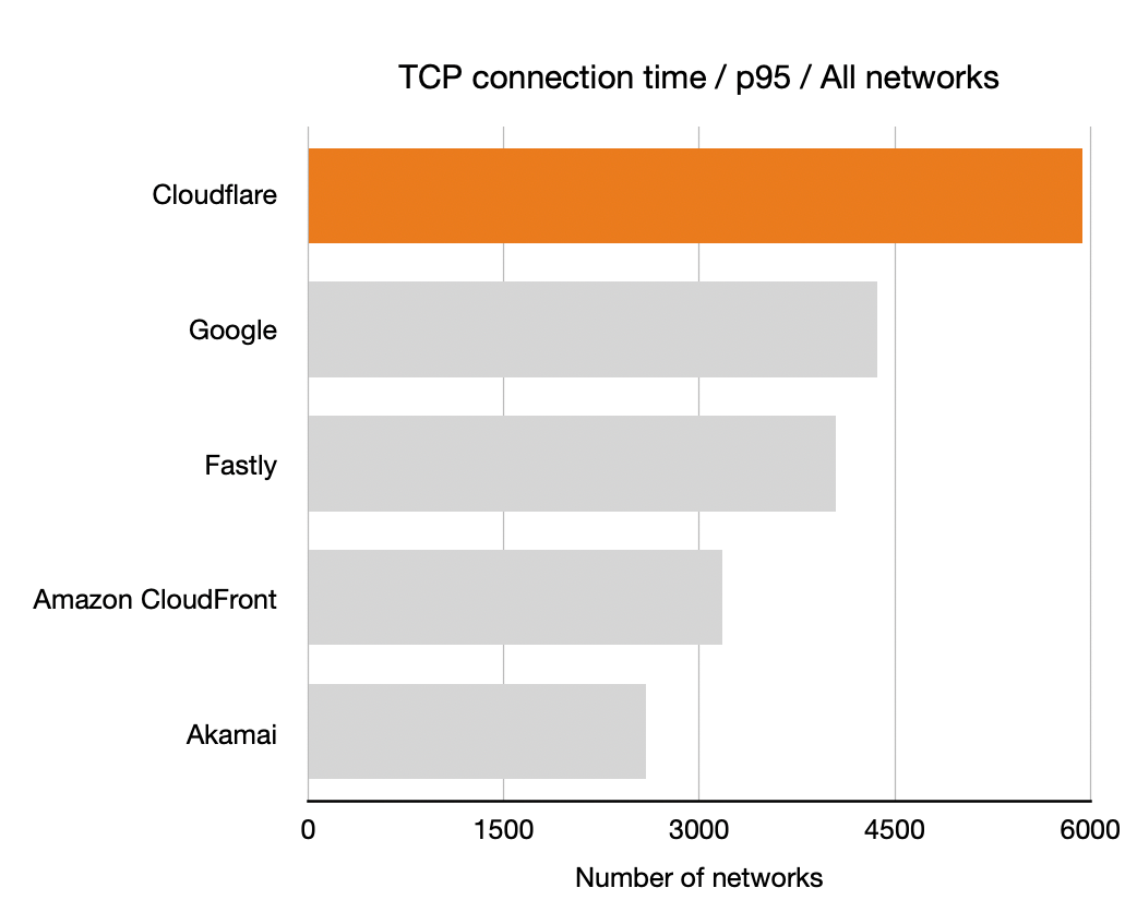
Shown below are the results for three different measurement types (TCP connection time, TTFB and TTLB) with two different aggregations (mean and p95) and for three different groupings of networks.

The first grouping is the simplest: it’s all the networks we have data for. The second grouping is the one used above, the top 1,000 networks by number of IP addresses. But we also show a third grouping, top 1,000 networks by number of observations. That last group is important.

Top 1,000 networks by number of IP addresses is interesting (it includes the major ISPs) but it also includes some networks that have huge numbers of IP addresses available that aren’t necessarily used. These come about because of historical allocations of IP addresses organisations like the US Department of Defense.

Cloudflare’s testing reveals which networks are most used, and so we also report results for the top 1,000 networks by number of observations to get an idea of how we’re performing on networks with heavy usage.

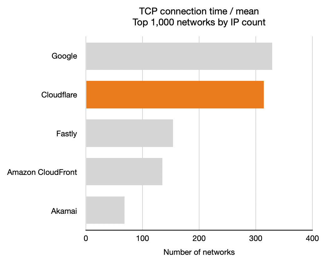
Hence, we have 18 charts showing all combinations of (TCP connection time, TTFB, TTLB), (mean, p95) and (all networks, top 1,000 networks by IP count, top 1,000 networks by observations).

You’ll see that in two of the charts Cloudflare is not #1 of 18 (we’re #2). We’ll be working to make sure we’re #1 for every measurement over the next few weeks. Both of those are average times. We’re most interested in the p95 measurements because they show the “reasonable worst case” scenario for someone using the Internet. But as we go about optimizing performance we want to be #1 on every chart so that we’re top no matter how performance is measured.

TCP Connection Time

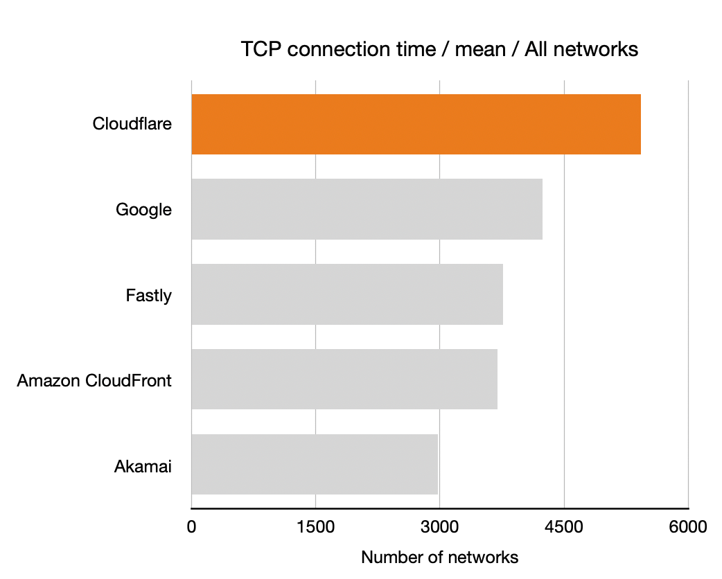
Let’s start with TCP connection time to get a sense of how well-connected the five companies we’ve measured. Recall that longer bars are better here, they indicate that the particular CDN was the highest performance for that many networks: more networks is better.

Benchmarking Edge Network Performance: Akamai, Cloudflare, AWS CloudFront, Fastly, and Google Benchmarking Edge Network Performance: Akamai, Cloudflare, AWS CloudFront, Fastly, and Google

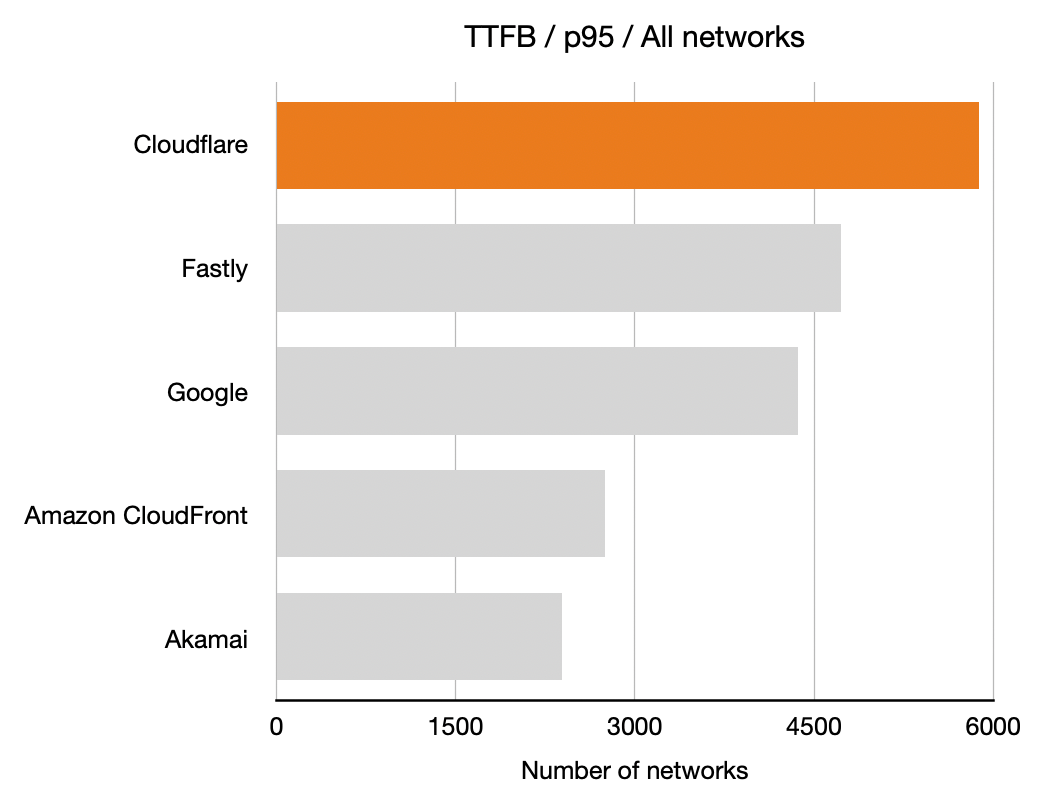
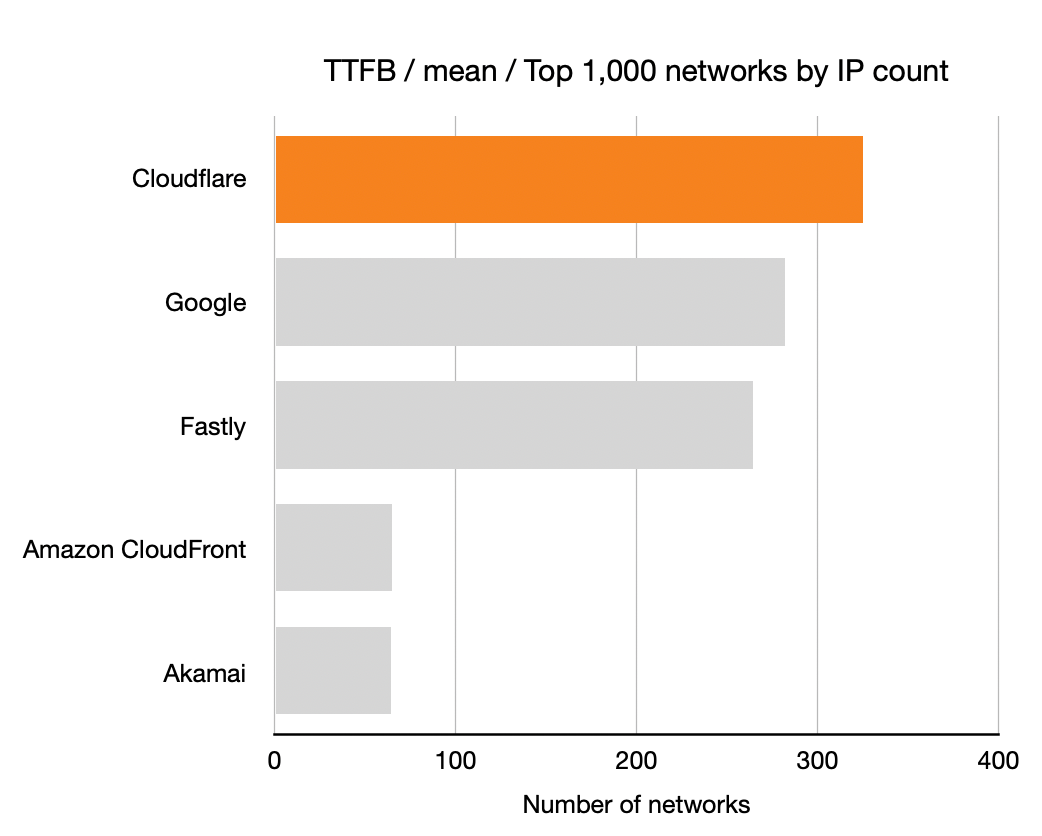
Time To First Byte (TTFB)

Next up is TTFB for the five companies. Once again, longer bars is better means more networks where that CDN had the lowest TTFB.

Benchmarking Edge Network Performance: Akamai, Cloudflare, AWS CloudFront, Fastly, and Google Benchmarking Edge Network Performance: Akamai, Cloudflare, AWS CloudFront, Fastly, and Google

Time To Last Byte (TTLB)

And finally the TTLB measurements. Once again, longer bars is better means more networks where that CDN had the lowest TTLB.

Benchmarking Edge Network Performance: Akamai, Cloudflare, AWS CloudFront, Fastly, and Google Benchmarking Edge Network Performance: Akamai, Cloudflare, AWS CloudFront, Fastly, and Google

Optimization Targets

Looking not just at where we are #1 but where we are #1 or #2 helps us see how quickly we can optimize our network to be #1 in more places. Examining the top 1,000 networks by observations we see that we’re currently #1 or #2 for TTFB in 69.9% of networks, for TTLB in 65.0% of networks and for TCP connection time in 70.5%.

To see how much optimization we need to do to go from #2 to #1 we looked at the three measures and see that median TTFB of the #1 network is 92.3%, median TTLB is 94.0% and TCP connection time is 91.5%.

The latter figure is very interesting because it shows that we can make big gains by optimizing network level routing.

Where’s the world map?

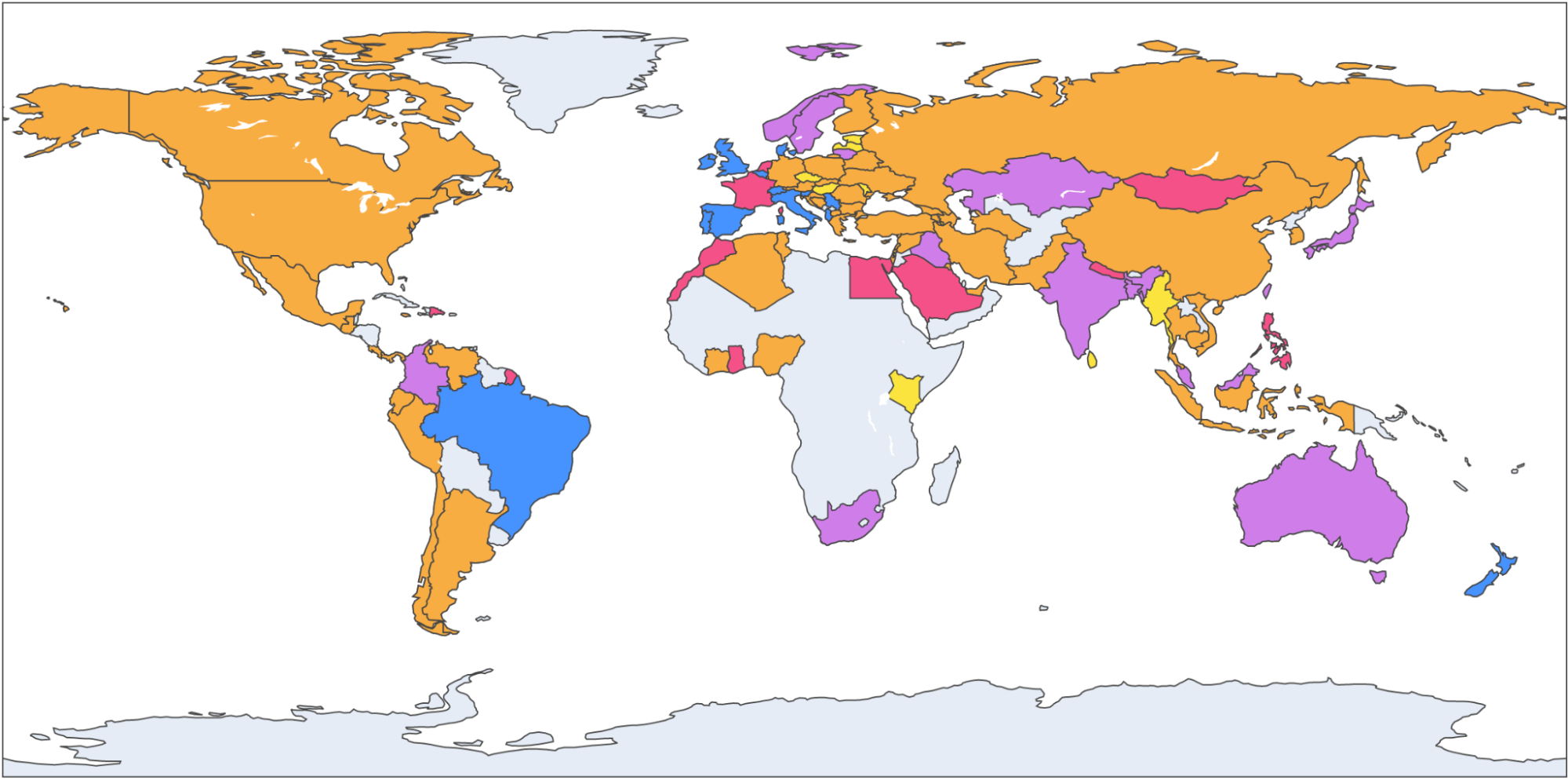
It’s very common to present data about Internet performance on maps. World maps look good but they obscure information. The reason is very simple: world maps show geography (and, depending on the projection, a very skewed version of the world’s actual countries and land masses).

Here’s an example world map with countries colored by who had the lowest TTLB at p95. Cloudflare is in orange, Amazon CloudFront in yellow, Google in purple, Akamai in red and Fastly in blue.

Benchmarking Edge Network Performance: Akamai, Cloudflare, AWS CloudFront, Fastly, and Google

What that doesn’t show is population. And Cloudflare is interested in how well we perform for people. Consider Russia and Indonesia. Indonesia has double the population of Russia and about 1/10th of the land.

By focusing on networks we can optimize for the people who use the Internet. For example, Biznet is a major ISP in Indonesia with ASN 17451. Looking at TTFB at p95 (the same statistics we discussed earlier for US ISPs Cox and Comcast) we see that for Biznet users Cloudflare has the fastest p95 TTFB at 677.7ms, Fastly 744.0ms, Google 872.8ms, Amazon CloudFront 1,239.9 and Akamai 1,248.9ms.

What’s next

The data we’ve gathered gives us a granular view of every network that connects to Cloudflare. This allows us to optimize routes and over the coming days and weeks we’ll be using the data to further increase Cloudflare’s performance.

In just over a week it’s Cloudflare’s Birthday Week, and we are aiming to improve our performance in 10% of the networks where we are not #1 today. Stay tuned.

Introducing Automatic Platform Optimization, starting with WordPress

Post Syndicated from Garrett Galow original https://blog.cloudflare.com/automatic-platform-optimizations-starting-with-wordpress/

Introducing Automatic Platform Optimization, starting with WordPress

Introducing Automatic Platform Optimization, starting with WordPress

Today, we are announcing a new service to serve more than just the static content of your website with the Automatic Platform Optimization (APO) service. With this launch, we are supporting WordPress, the most popular website hosting solution serving 38% of all websites. Our testing, as detailed below, showed a 72% reduction in Time to First Byte (TTFB), 23% reduction to First Contentful Paint, and 13% reduction in Speed Index for desktop users at the 90th percentile, by serving nearly all of your website’s content from Cloudflare’s network. This means visitors to your website see not only the first content sooner but all content more quickly.

With Automatic Platform Optimization for WordPress, your customers won’t suffer any slowness caused by common issues like shared hosting congestion, slow database lookups, or misbehaving plugins. This service is now available for anyone using WordPress. It costs $5/month for customers on our Free plan and is included, at no additional cost, in our Professional, Business, and Enterprise plans. No usage fees, no surprises, just speed.

How to get started

The easiest way to get started with APO is from your WordPress admin console.

1. First, install the Cloudflare WordPress plugin on your WordPress website or update to the latest version (3.8.2 or higher).
2. Authenticate the plugin (steps here) to talk to Cloudflare if you have not already done that.
3. From the Home screen of the Cloudflare section, turn on Automatic Platform Optimization.

Free customers will first be directed to the Cloudflare Dashboard to purchase the service.

Why We Built This

At Cloudflare, we jump at the opportunity to make hard problems for our customers disappear with the click of a button. Running a consistently fast website is challenging. Many businesses don’t have the time nor money to spend on complicated and expensive performance solutions for their site. Even if they do, it can be extremely costly to pay for specialized attention to ensure you get the best performance possible. Having a fast website doesn’t have to be complicated, though. The closer your content is to your customers, the better your site will perform. Static content caching does this for files like images, CSS and JavaScript, but that is only part of the equation. Dynamic content is still fetched from the origin incurring costly round trips and additional processing time. For more info on dynamic versus static content, see our learning center.

WordPress is one of the most open platforms in the world, but that means you are always at risk of incurring performance penalties because of plugins or other sources that, while necessary, may be hard to pinpoint and resolve. With the Automatic Platform Optimization service, we put your website into our network that is within 10 milliseconds of 99% of the Internet-connected population in the developed world, all without having to change your existing hosting provider. This means that for most requests your customers won’t even need to go to your origin, reducing many costly round trips and server processing time. These optimizations run on our edge network, so they also will not impact render or interactivity since no additional JavaScript is run on the client.

How We Measure Web Performance

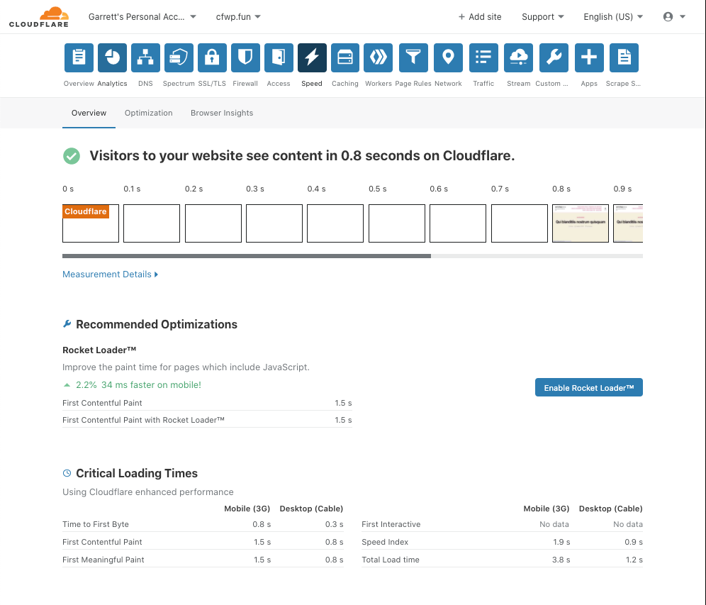
Evaluating performance of a website is difficult. There are many different metrics you can track and it is not always obvious which metrics most meaningfully represent a user’s experience. As discussed when we blogged about our new Speed page, we aim to simplify this for customers by automating tests using the infrastructure of webpagetest.org, and summarizing both the results visually and numerically in one place.

Introducing Automatic Platform Optimization, starting with WordPress

The visualization gives you a clear idea of what customers are going to see when they come to your site, and the Critical Loading Times provide the most important metrics to judge your performance. On top of seeing your site’s performance, we provide a list of recommendations for ways to even further increase your performance. If you are using WordPress, then we will test your site with Automatic Platform Optimizations to estimate the benefit you will get with the service.

The Benefits of Automatic Platform Optimization

We tested APO on over 500 Cloudflare customer websites that run on WordPress to understand what the performance improvements would be. The results speak for themselves:

Test Results

Metric Percentiles Baseline Cloudflare APO Enabled Improvement (%)
Time to First Byte (TTFB) 90th 1252 ms 351 ms 71.96%
10th 254 ms 261 ms -2.76%
First Contentful Paint
(FCP)
90th 2655 ms 2056 ms 22.55%
10th 894 ms 783 ms 12.46%
Speed Index
(SI)
90th 6428 5586 13.11%
10th 1301 1242 4.52%

Note: Results are based on test results of 505 randomly selected websites that are cached by Cloudflare. Tests were run using WebPageTest from South Carolina, USA and the following environment: Chrome, Cable connection speed.

Most importantly, with APO, a site’s TTFB is made both fast and consistent. Because we now serve the html from Cloudflare’s edge with 0 origin processing time, getting the first byte to the eyeball is consistently fast. Under heavy load, a WordPress origin can suffer delays in building the html and returning it to visitors. APO removes the variance due to load resulting in consistent TTFB <400 ms.

Additionally, between faster TTFB and additional caching of third party fonts, we see performance improvements in both FCP and SI for both the fastest and slowest of the sites we tested. Some of this comes naturally from reducing the TTFB, since every millisecond you shave off of TTFB is a potential millisecond gain for other metrics. Caching additional third party fonts allows us to reduce the time it takes to fetch that content. Given fonts can often block paints due to text rendering, this improves the rate at which the page paints, and improves the Speed Index.

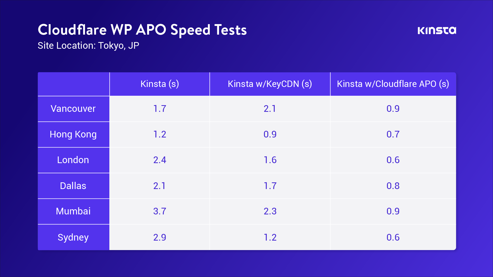
We asked the folks at Kinsta to try out APO, given their expertise in WordPress, and tell us what they think. Brian Li, a Website Content Manager at Kinsta, ran a set of tests from around the world on a website hosted in Tokyo. I’ll let him explain what they did and the results:

At Kinsta, WordPress performance is something that’s near and dear to our hearts. So, when Cloudflare reached out about testing their new Automatic Platform Optimization (APO) service for WordPress, we were all ears.
 
This is what we did to test out the new service:

  1. We set up a test site in Tokyo, Japan – one of the 24 high-performance data center locations available for Kinsta customers.
  2. We ran several speed tests from six different locations around the world with and without Cloudflare’s APO.

 
The results were incredible!
 
By caching static HTML on Cloudflare’s edge network, we saw a 70-300% performance increase. As expected, the testing locations furthest away from Tokyo saw the biggest reduction in load time.
 
If your WordPress site uses a traditional CDN that only caches CSS, JS, and images, upgrading to Cloudflare’s WordPress APO is a no-brainer and will help you stay competitive with modern Jamstack and static sites that live on the edge by default.

Brian’s test results are summarized in this image:

Introducing Automatic Platform Optimization, starting with WordPress
Page Load Speeds for loading a website hosted in Tokyo from 6 locations worldwide – comparing Kinsta, Kinsta with KeyCDN, and Kinsta with Cloudflare APO.

One of the clear benefits, from Kinsta’s testing of APO, is the consistency of performance for serving your site no matter where your visitors are in the world. The consistent sub-second performance shown with APO versus two or three second load times in other setups makes it clear that if you have a global customer base, APO delivers an improved experience for all visitors.

How Automatic Platform Optimization Works

Automatic Platform Optimization is the result of being able to use the power of Cloudflare Workers to intelligently cache dynamic content. By caching dynamic content, we can serve the entire website from our edge network. Think ‘static site’ but without any of the work of having to build or maintain a static site. Customers can keep managing and updating content on their website in the same way and leave the hard work for performance to us. Serving both static and dynamic content from our network results, generally, in no origin requests or origin processing time. This means all the communication occurs between the user’s device and our edge. Reducing the multitude of round trips typically required from our edge to the origin for dynamic content is what makes this service so effective. Let’s first see what it normally looks like to load a WordPress site for a visitor.

Introducing Automatic Platform Optimization, starting with WordPress
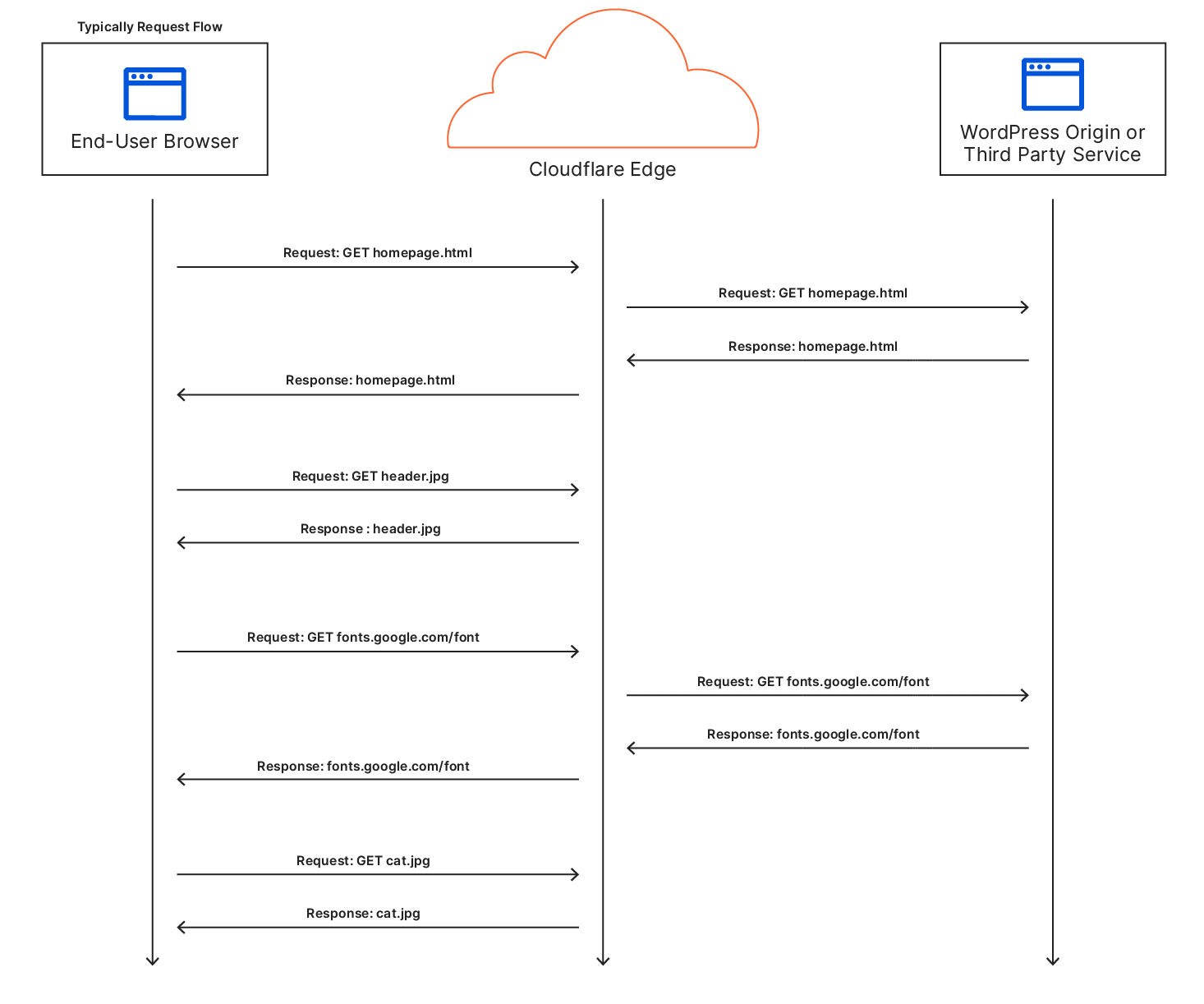
A sequence diagram for a typical user visiting a site‌‌

In a regular request flow, Cloudflare is able to cache some of the content like images, CSS, or JS, while other requests go to either the origin or a third party service in order to fetch the content. Most importantly the first request to fetch the HTML for the site needs to go to the origin which is a typical cause of long TTFB, since no other requests get made until the client can receive the HTML and parse it to make subsequent requests.

Introducing Automatic Platform Optimization, starting with WordPress
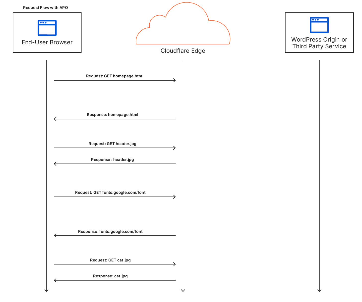
The same site visit but with APO enabled.

Once APO is enabled, all those trips to the origin are removed. TTFB benefits greatly because the first hop starts and ends at Cloudflare’s network. This also means the browser starts working on fetching and painting the webpage sooner meaning each paint event occurs earlier. Last by caching third party fonts, we remove additional requests that would need to leave Cloudflare’s network and extend the time to display text to the user. Often, websites use fonts hosted on third-party domains. While this saves bandwidth costs that would be incurred from hosting it on the origin, depending on where those fonts are hosted, it can still be a costly operation to fetch them. By rehosting the fonts and serving them from our cache, we can reduce one of the remaining costly round trips.

With APO for WordPress, you can say bye bye to database congestion or unwieldy plugins slowing down your customers’ experience. These benefits are stacked on top of our already fast TLS connection times and industry leading protocol support like HTTP/2 that ensure we are using the most efficient and the fastest way to connect and deliver your website to your customers.

For customers with WordPress sites that support authenticated sessions, you do not have to worry about us caching content from authenticated users and serving it to others. We bypass the cache on standard WordPress and WooCommerce cookies for authenticated users. This ensures customized content for a specific user is only visible to that user. While this has been available to customers with our Business-level service, it is now available for any WordPress customer that enables APO.

You might be wondering: “This all sounds great, but what about when I change content on my site?” Because this service works in tandem with our WordPress plugin, we are able to understand when you make changes and ensure we quickly purge the content in Cloudflare’s edge and refresh it with the new content. With the plugin installed, we detect content changes and update our edge network worldwide with automatic cache purges. As part of this release, we have updated our WordPress plugin, so whether or not you use APO, you should upgrade to the latest version today. If you do not or cannot use our WordPress plugin, then APO will still provide the same performance benefits, but may serve stale content for up to 30 minutes and when the content is requested again.

This service was built on the prototype work originally blogged about here and here. For a more in depth look at the technical side of the service and how Cloudflare Workers allowed us to build the Automatic Platform Optimization service, see the accompanying blog post.

WordPress Today, Other Platforms Coming Soon

While today’s announcement is focused on supporting WordPress, this is just the start. We plan to bring these same capabilities to other popular platforms used for web hosting. If you operate a platform and are interested in how we may be able to work together to improve things for all your customers, please get in touch. If you are running a website, let us know what platform you want to see us bring Automatic Platform Optimization to next.