Tag Archives: embedding

MAPS: Netflix’s Multimodal Asset Personalization at Scale

Post Syndicated from Netflix Technology Blog original https://netflixtechblog.com/maps-netflixs-multimodal-asset-personalization-at-scale-32f96320785e

By Emma Yanyang Kong, Aditya Deshpande, Asad Abbasi, Bowei Yan, David Fagnan, Ashish Rastogi, Dhaval Patel, Ray Zhang

Introduction

The Netflix experience is a journey of discovery. Every visual cue, from the artwork on a title to the video previews that autoplay while you browse, is there to connect you with a story you will love. We call these visual cues assets, and choosing the right one for each member is a personalization problem of its own. But which image or video preview of Squid Game should we show you? And what do we do right after a title launches, when there’s far too little interaction data to know which asset we should recommend to each member?

For years, our models answered the first question well and the second poorly. They learned which assets members interacted with, but treated every asset as an opaque ID, blind to what was actually in the artwork or video preview. Right after a title launched, its assets had no history, so we dialed up exploration on its assets to gather interaction data, and otherwise fell back to popularity heuristics that ignore your taste. Only once enough interactions had piled up could personalization take over. This is the classic cold-start problem.

This post shares how multimodal embeddings let our models see and hear the assets they recommend, so personalization can kick in far sooner, close to a title’s launch. Because a new asset arrives with its embedding the model already understands, that embedding carries member taste signals from related assets immediately. Consequently, the model needs far less interaction history before it can personalize. We cover three production systems, artwork personalization, query-aware artwork ranking, and video preview personalization, plus a cheap trick for choosing new embeddings before committing to full end-to-end integration and A/B testing.

Artwork Personalization

A single image is often a member’s first touchpoint with a title, so we create a diverse set of artworks for each title to appeal to different member tastes. We already use personalized artwork based on members’ interaction histories, but this approach breaks down for newer titles and their assets, where there is little or no behavioral data to learn from.

Making the Model See the Artwork

Our solution is to let the model “look” at the picture. We encode each artwork with CLIP, a pretrained image-text embedding model, and fold the result into how the model represents that asset, concatenating the per-asset CLIP image embedding, a 768-dimensional vector, with the asset’s learned ID embedding to give an asset representation:

e_id(a) is the asset’s learned ID embedding, and e_a is its CLIP image embedding. The two are concatenated and passed through an MLP layer to give h_a, the representation the model scores against a member.

This single change transforms how the model handles a brand-new artwork. Instead of treating it as an unseen ID, the model now receives a CLIP embedding the moment the asset is created. That allows a member’s preferences over visual themes, talent, and color palettes to be applied immediately, long before the asset accumulates any interactions of its own. Because those preferences are expressed in image-embedding space rather than tied to specific asset IDs, they transfer seamlessly across titles. If you consistently engage with artwork featuring a particular comedian, the model can carry that signal to their new title and prioritize the asset that places them front and center, even if it has never shown you that exact image before, as in the figure below. In this way, cold-start shifts from being a blind spot to something the embedding space already has an informed opinion about.

Knowledge transfer through CLIP embeddings. A member who has interacted with a comedian’s past stand-up artwork (left) leads the model to favor the new-title asset that features that comedian prominently (green check) over one that does not, even though it has never seen that specific image before.

From Five Models to One

That shift, from scoring an asset by the ID it happens to carry to scoring it by what the image actually contains, powers a second big win, model consolidation. Each title’s artwork spans multiple canvases with different croppings (billboard, vertical-box, horizontal-panel, short-panel, landscape-panel), and historically we trained a separate model per canvas, since an ID-based model has no way to know that the cropped and resized renderings of one scene are related, so signal could not flow between canvases and each faced its own cold-start.

CLIP embeddings break that barrier. Because they are largely invariant to crop, resize, and aspect ratio, those near-identical renderings map to nearly the same vector, as the figure further below shows. A single unified model can therefore pool interaction signal across every canvas, so a member’s affinity learned on a high-traffic canvas immediately informs the artwork we pick on a sparse one. The result is one model in place of five, with the largest gains on the canvases that have the least interaction data.

One source image, many canvases. The same Running Point artwork is cropped and resized across billboard, TV, mobile, and out-of-home placements, each with a different asset ID. Because CLIP embeddings barely change under crop and resize, a single unified model can personalize all of them.

Mixing Five Canvases of Training Data

Consolidation introduced a challenge that the per-canvas models never faced: how to effectively mix data across disparate canvases? The canvases differ widely in impression volume, and the interactions they log are not all worth the same to a member’s long-term experience. Training on pooled raw counts would let the highest-volume canvas and the most frequent interaction types dominate, so the low-data canvases we were trying to help would benefit least. Hand-tuning a weight per canvas would just trade that problem for a set of arbitrary hyperparameters and endless online sweeps to tune them.

Instead we use reward-based weighting, building on Netflix’s long-term reward modeling. Each training example is weighted by the long-term reward score attached to its interaction type:

a_ti is a training example, a positive interaction on asset i of title t. Its weight is set by the interaction type e observed on it, scored by ρ, that type’s long-term reward.

where e(·) is the type of the observed positive interaction and ρ is that type’s long-term reward score. Because interaction types are not distributed evenly across canvases, weighting by long-term value rebalances the canvas mixture on its own, with no weight set by hand. A canvas contributes in proportion to the long-term value of the interactions it drives rather than to how many impressions it happens to get. Consolidation becomes feasible, and the unified model optimizes for long-term member satisfaction instead of whichever short-term action is most frequent.

A Note on Offline Evaluation

Every result presented here must clear two bars: an offline metric evaluation followed by a large-scale online A/B test. The offline metric is the subtle one. Judging a new model on logs from the current production policy is biased, because that policy shows some assets far more often than others. The logged rewards describe what the policy preferred, not what members would have chosen from the full candidate set, so a new model that disagrees with the logging policy looks worse than it is, because the impressions it would have picked are barely represented in the data.

We handle this with inverse propensity scoring (IPS) computed on a dedicated slice of exploration traffic. A small fraction of traffic is served by a randomized policy that samples among a title’s candidate assets from a known distribution, so the propensity of showing a given asset in a given context is logged exactly at serving time rather than estimated after the fact. Reweighting every observation by the inverse of its logged propensity gives:

where D is the exploration slice and r(x, a) is the observed reward, such as a play. Impressions that exploration made rare are upweighted accordingly, and the estimator becomes an unbiased estimate of the reward a candidate policy would have earned had we actually deployed it. Having propensities that are known by construction, rather than modeled after the fact, is in our experience the single biggest reason our offline numbers track online outcomes. We report IPS as a ratio against the production baseline, and a candidate has to win there before it gets any A/B traffic.

Combining Both Ideas Works Better

Two ideas are bundled together here, so we ablated them separately against the old five-model production system.

  • V1, image embeddings only. The five per-canvas models kept as they were, each one augmented with image embeddings.
  • V2, unified model only. A single model trained over all five canvases, but with learned ID embeddings alone and no image content.
  • V3, both together. One unified model over all five canvases, with image embeddings in its asset representation.

As the chart below shows, each idea helped exactly where we expected: on the data-starved short-panel canvas and landscape-panel canvas. V3 was the clear winner. A change inside ±1% is not significant for this offline metric, and those bars are hatched in the chart. Most of what V1 and V2 do on their own sits inside that band.

Relative offline IPS lift by canvas for the three variants, each measured against the prior per-canvas model on that same canvas. Both ideas help where interaction data is scarcest, and V3 is strongest. Hatched bars fall inside the ±1% band, where the change in the offline metric is not significant; V3 values are labeled on the plot.

In the online A/B test across all device platforms, which ran for at least four weeks, the results drew a much clearer line: Neither idea moved our online core member metrics on its own. V1 and V2 were both flat and non-significant, and only V3 won a statistically significant lift. It is what runs in production today.

The two ingredients need each other. V1 tells a per-canvas model what an asset looks like, but one sparse canvas has too few examples to teach it how to use that. V2 supplies plenty of data, but only ID-based data, which a new asset lacks. V3 has both, so mature canvases teach the shared model how CLIP embeddings map to member preference and that mapping transfers straight to the sparse ones. The effects compound rather than add, since the V3 short-panel lift (5.691%) exceeds V1 and V2 combined. The lesson is to look for a second blocking factor before concluding that content features do not help.

Cold-Start Challenge from a New UI Launch

The real test came from the product change that motivated the work. Netflix was preparing its largest TV home-screen redesign in a decade, which would make short-panel the dominant artwork canvas effectively overnight. This was a cold-start problem in its sharpest form. The canvas about to receive the most impressions had the least historical data, and waiting for short-panel interactions to accumulate would have degraded the user experience. Consolidation lets short-panel selection draw on signal pooled from every canvas, and CLIP embeddings let the unified model personalize a short-panel asset that has gathered very few interactions of its own.

We shipped V3 ahead of the launch and measured it with a month-long holdback A/B test, keeping a small control group on the prior per-canvas model. V3 absorbed the shift immediately, with statistically significant gains on both our core discovery metric and streaming hours, and larger gains than in the steady-state ablation. That stronger result is what we expected, since a sudden shift in which canvas dominates is exactly where V3 should help most.

Query-Aware Artwork Personalization

Your general taste is the right signal when browsing, but not when searching. For example, when searching for a specific actor, you want artwork that features them, even if your broader taste says otherwise. On the Netflix Search Page, the member’s intent is explicit and stated in the query, and the displayed artwork should reflect it.

The same CLIP embeddings we added for cold-start hand us this almost for free. Because CLIP projects text and images into one shared embedding space, we can measure how well a query matches a candidate artwork directly by the cosine similarity between the CLIP text embedding of the query and the CLIP image embedding of the asset. We blend that alignment term with the usual personalization score:

Here the personalization term is the score the artwork model above already produces for a member and asset, the second term compares the text embedding of the query against the image embedding of the asset, and the mixing weight α between 0 and 1 is tuned through online A/B testing. The first term is “what we think you like”; the second is “what you just asked for,” and α sets how much each matters.

Crucially, this took no extra modeling effort. The CLIP embeddings already sit in the asset representation from the artwork work above, so they carry the text-image alignment for free, and we get a query-aware ranker by adding a single similarity term at scoring time. The effect is visible in the search results themselves.

Query-aware artwork for a search for a specific actor. Each result surfaces an asset that visually features the searched actor, aligning the artwork with the member’s explicit intent.

Personalizing Video Previews via MediaFM

Video previews raise the bar over still artwork. A video preview unfolds over time, and its appeal comes as much from motion, pacing, dialogue, and soundtrack as from any single frame. Our older video preview personalization models saw none of that. Like the early artwork models, they treated each preview as an opaque ID. Our first content-aware attempt, SeqCLIP, described a video preview by its frames, encoding each with a CLIP embedding and then averaging them into one vector. That captured what a video preview looked like, but a mean of still frames still misses what it sounds like, the dialogue and music that carry so much of a preview’s tone.

To capture the rest, we turned to MediaFM, Netflix’s first in-house multimodal foundation model. Trained on 80 million shots, MediaFM fuses the following three signals per shot into a single embedding:

  • Visual: SeqCLIP
  • Audio: A pretrained speech and audio embedding model
  • Text: Captions encoded via a large-scale text model

Adopting MediaFM required no new infrastructure, since we simply integrate its shot embeddings into the asset representation, exactly as we did with CLIP embeddings for artwork.

The added modalities paid off. We evaluated both embeddings against the ID-only baseline offline with IPS and then in a five-week online A/B test across all device platforms, and both signals gave the same ordering, MediaFM > SeqCLIP > ID-only, and each step of added content awareness helped, with the gains largest on TV. Offline, both content-aware embeddings beat the ID-only baseline on IPS and MediaFM beat SeqCLIP, as the chart below shows. Online, MediaFM came out on top too, delivering a statistically significant lift in our core streaming metric over the ID-only baseline and outperforming SeqCLIP. This shows that the audio and timed-text signals, which a visual-only encoder like SeqCLIP cannot capture, add real value. We have since shipped MediaFM as the default video preview embedding across all platforms.

Relative offline IPS lift for the two content-aware video preview embeddings, each measured against the ID-only baseline at the zero rule. Adding visual content awareness helps, and adding audio and timed text on top of it helps further.

Choosing Embeddings Cheaply with a Proxy Task

New embeddings arrive constantly, but end-to-end trials are expensive, which cost data engineering, model retraining, and weeks of A/B test traffic. We couldn’t afford to run the full pipeline for every candidate, so we gated the funnel with a cheap question:

From the content embedding alone, can you predict which asset wins under a plain, unpersonalized policy?

We first select a fixed set of titles. For each title we use exploration data to find its debiased popularity winner, the asset with the highest interaction rate after we adjust for how often it was shown using its propensity score. We mark this winner with a binary label, 1 for the winner and 0 otherwise. We then train a linear probe to recover that label from the asset embedding alone, with no title, cast, or metadata, by minimizing the standard binary cross-entropy loss:

Keeping the probe linear and embedding-only is intentional, since it isolates how much of an asset’s popularity is actually encoded in the embedding. If the embedding captures the semantic drivers of popularity, a simple linear classifier should be able to identify likely winners. If it does not, the probe performs no better than random guessing, which is the baseline we score it against.

We first used the linear probe to screen and prune a broad set of candidate embeddings before modifying any production pipeline, narrowing the field to two finalists, SeqCLIP and the leading MediaFM variant. We then carried both through full offline evaluation and online A/B testing. All three signals, the linear probe accuracies, the offline IPS lifts, and the online A/B results, ranked MediaFM ahead of SeqCLIP, as the chart below shows. That alignment is why the linear probe now gates every new MediaFM version before release.

Linear probe Δaccuracy, offline IPS lift, and online A/B metric lift for the two finalists. All three agree that MediaFM beats SeqCLIP. The online panel is measured against the ID-based baseline, with its values withheld.

The Netflix Embedding Store

None of this would be practical without shared infrastructure. Every embedding in this post, CLIP for artwork, SeqCLIP and MediaFM for video previews, lives in the Netflix Embedding Store, a component of Netflix’s AI Platform that hosts dense embeddings for titles, games, member profiles and multimedia assets. A foundation model encodes raw asset content into a dense vector once, and the Embedding Store serves that vector to every downstream system, the artwork model, the query-aware ranker, the video preview model, and others, through the same interface. Crucially, it serves the exact same embeddings at training time and at online inference time, so there is no skew between what a model learns from and what it sees in production.

Its key property is that it decouples foundation-model updates from personalization-model deployments. A new embedding, or a new version of an existing one, can be registered, backfilled across the catalog, and validated entirely on its own, without touching the training or serving code of any model that consumes it. Once it is in the Embedding Store, it becomes available to every ranking and personalization model through configuration alone, no downstream code changes, no coordinated release. This is what let us swap CLIP into the artwork model, stand up the query-aware ranker on the same vectors, and roll MediaFM through the video preview model, each as an independent change rather than a cross-team migration.

Foundation-model embeddings (CLIP, SeqCLIP, MediaFM) are stored once and consumed by every downstream system: artwork, query-aware artwork, video previews, and other rankers.

What We Learned, and What’s Next

Three lessons stood out.

  1. Pretrained CLIP embeddings let us consolidate five artwork models into one while boosting performance on data-starved canvases. This benefit became especially clear when the redesigned TV home screen rolled out.
  2. For video, multimodality wins decisively. The audio and text signals that a purely visual encoder cannot access pushed MediaFM past SeqCLIP.
  3. A cheap proxy task yields big savings, efficiently pruning the candidate set before running full end-to-end experiments and online A/B tests.

Next, we aim to extend the Embedding Store toward a single shared semantic space for image, text, and video. Such a unified representation would enable cross-modal retrieval, such as matching a video preview to a search query, or a static artwork to the video preview it was derived from, as well as unified asset ranking across surface types and a more cohesive, intuitive discovery experience for members everywhere.

Acknowledgements

We thank Aneesh Vartakavi, Santiago Castro, and Avneesh Saluja for the CLIP embedding and MediaFM work that made the content-aware models described here possible, and Ratna Kavuri for the backend systems that serve multimedia personalization in production.


MAPS: Netflix’s Multimodal Asset Personalization at Scale was originally published in Netflix TechBlog on Medium, where people are continuing the conversation by highlighting and responding to this story.

Build a semantic search engine for tabular columns with Transformers and Amazon OpenSearch Service

Post Syndicated from Kachi Odoemene original https://aws.amazon.com/blogs/big-data/build-a-semantic-search-engine-for-tabular-columns-with-transformers-and-amazon-opensearch-service/

Finding similar columns in a data lake has important applications in data cleaning and annotation, schema matching, data discovery, and analytics across multiple data sources. The inability to accurately find and analyze data from disparate sources represents a potential efficiency killer for everyone from data scientists, medical researchers, academics, to financial and government analysts.

Conventional solutions involve lexical keyword search or regular expression matching, which are susceptible to data quality issues such as absent column names or different column naming conventions across diverse datasets (for example, zip_code, zcode, postalcode).

In this post, we demonstrate a solution for searching for similar columns based on column name, column content, or both. The solution uses approximate nearest neighbors algorithms available in Amazon OpenSearch Service to search for semantically similar columns. To facilitate the search, we create features representations (embeddings) for individual columns in the data lake using pre-trained Transformer models from the sentence-transformers library in Amazon SageMaker. Finally, to interact with and visualize results from our solution, we build an interactive Streamlit web application running on AWS Fargate.

We include a code tutorial for you to deploy the resources to run the solution on sample data or your own data.

Solution overview

The following architecture diagram illustrates the two-stage workflow for finding semantically similar columns. The first stage runs an AWS Step Functions workflow that creates embeddings from tabular columns and builds the OpenSearch Service search index. The second stage, or the online inference stage, runs a Streamlit application through Fargate. The web application collects input search queries and retrieves from the OpenSearch Service index the approximate k-most-similar columns to the query.

Solution architecture

Figure 1. Solution architecture

The automated workflow proceeds in the following steps:

  1. The user uploads tabular datasets into an Amazon Simple Storage Service (Amazon S3) bucket, which invokes an AWS Lambda function that initiates the Step Functions workflow.
  2. The workflow begins with an AWS Glue job that converts the CSV files into Apache Parquet data format.
  3. A SageMaker Processing job creates embeddings for each column using pre-trained models or custom column embedding models. The SageMaker Processing job saves the column embeddings for each table in Amazon S3.
  4. A Lambda function creates the OpenSearch Service domain and cluster to index the column embeddings produced in the previous step.
  5. Finally, an interactive Streamlit web application is deployed with Fargate. The web application provides an interface for the user to input queries to search the OpenSearch Service domain for similar columns.

You can download the code tutorial from GitHub to try this solution on sample data or your own data. Instructions on the how to deploy the required resources for this tutorial are available on Github.

Prerequistes

To implement this solution, you need the following:

  • An AWS account.
  • Basic familiarity with AWS services such as the AWS Cloud Development Kit (AWS CDK), Lambda, OpenSearch Service, and SageMaker Processing.
  • A tabular dataset to create the search index. You can bring your own tabular data or download the sample datasets on GitHub.

Build a search index

The first stage builds the column search engine index. The following figure illustrates the Step Functions workflow that runs this stage.

Step functions workflow

Figure 2 – Step functions workflow – multiple embedding models

Datasets

In this post, we build a search index to include over 400 columns from over 25 tabular datasets. The datasets originate from the following public sources:

For the the full list of the tables included in the index, see the code tutorial on GitHub.

You can bring your own tabular dataset to augment the sample data or build your own search index. We include two Lambda functions that initiate the Step Functions workflow to build the search index for individual CSV files or a batch of CSV files, respectively.

Transform CSV to Parquet

Raw CSV files are converted to Parquet data format with AWS Glue. Parquet is a column-oriented format file format preferred in big data analytics that provides efficient compression and encoding. In our experiments, the Parquet data format offered significant reduction in storage size compared to raw CSV files. We also used Parquet as a common data format to convert other data formats (for example JSON and NDJSON) because it supports advanced nested data structures.

Create tabular column embeddings

To extract embeddings for individual table columns in the sample tabular datasets in this post, we use the following pre-trained models from the sentence-transformers library. For additional models, see Pretrained Models.

Model name Dimension Size (MB)
all-MiniLM-L6-v2 384 80
all-distilroberta-v1 768 290
average_word_embeddings_glove.6B.300d 300 420

The SageMaker Processing job runs create_embeddings.py(code) for a single model. For extracting embeddings from multiple models, the workflow runs parallel SageMaker Processing jobs as shown in the Step Functions workflow. We use the model to create two sets of embeddings:

  • column_name_embeddings – Embeddings of column names (headers)
  • column_content_embeddings – Average embedding of all the rows in the column

For more information about the column embedding process, see the code tutorial on GitHub.

An alternative to the SageMaker Processing step is to create a SageMaker batch transform to get column embeddings on large datasets. This would require deploying the model to a SageMaker endpoint. For more information, see Use Batch Transform.

Index embeddings with OpenSearch Service

In the final step of this stage, a Lambda function adds the column embeddings to a OpenSearch Service approximate k-Nearest-Neighbor (kNN) search index. Each model is assigned its own search index. For more information about the approximate kNN search index parameters, see k-NN.

Online inference and semantic search with a web app

The second stage of the workflow runs a Streamlit web application where you can provide inputs and search for semantically similar columns indexed in OpenSearch Service. The application layer uses an Application Load Balancer, Fargate, and Lambda. The application infrastructure is automatically deployed as part of the solution.

The application allows you to provide an input and search for semantically similar column names, column content, or both. Additionally, you can select the embedding model and number of nearest neighbors to return from the search. The application receives inputs, embeds the input with the specified model, and uses kNN search in OpenSearch Service to search indexed column embeddings and find the most similar columns to the given input. The search results displayed include the table names, column names, and similarity scores for the columns identified, as well as the locations of the data in Amazon S3 for further exploration.

The following figure shows an example of the web application. In this example, we searched for columns in our data lake that have similar Column Names (payload type) to district (payload). The application used all-MiniLM-L6-v2 as the embedding model and returned 10 (k) nearest neighbors from our OpenSearch Service index.

The application returned transit_district, city, borough, and location as the four most similar columns based on the data indexed in OpenSearch Service. This example demonstrates the ability of the search approach to identify semantically similar columns across datasets.

Web application user interface

Figure 3: Web application user interface

Clean up

To delete the resources created by the AWS CDK in this tutorial, run the following command:

cdk destroy --all

Conclusion

In this post, we presented an end-to-end workflow for building a semantic search engine for tabular columns.

Get started today on your own data with our code tutorial available on GitHub. If you’d like help accelerating your use of ML in your products and processes, please contact the Amazon Machine Learning Solutions Lab.


About the Authors

Kachi Odoemene is an Applied Scientist at AWS AI. He builds AI/ML solutions to solve business problems for AWS customers.

Taylor McNally is a Deep Learning Architect at Amazon Machine Learning Solutions Lab. He helps customers from various industries build solutions leveraging AI/ML on AWS. He enjoys a good cup of coffee, the outdoors, and time with his family and energetic dog.

Austin Welch is a Data Scientist in the Amazon ML Solutions Lab. He develops custom deep learning models to help AWS public sector customers accelerate their AI and cloud adoption. In his spare time, he enjoys reading, traveling, and jiu-jitsu.


Fulfillment by Amazon uses Amazon QuickSight to deliver key reporting insights to Amazon Marketplace sellers

Post Syndicated from Ravi Kiran Nidadavolu original https://aws.amazon.com/blogs/big-data/fulfillment-by-amazon-uses-amazon-quicksight-to-deliver-key-reporting-insights-to-amazon-marketplace-sellers/

Fulfillment by Amazon logoFulfillment by Amazon (FBA) was launched in 2006, allowing businesses to outsource shipping to Amazon. With this fulfillment option, Amazon stores, picks, packs, ships, and delivers the products to customer as well as handling the customer service and returns for those orders.

Within Seller Central, a website where sellers can monitor their Amazon sales activity, the FBA Reporting team manages Report Central and the associated reporting APIs accessed by FBA sellers. Report Central offers 60+ downloadable reports to help sellers make data-driven decisions across inventory, sales, payments, customer concessions, removals and global shipping services.

The FBA Reporting team receives millions of report download requests from hundreds of thousands of users, in a multi-tenant fashion, every month. Tasked with ensuring speed, efficiency, and user-friendliness in the reports that sellers need to track their business operations, we turned to Amazon QuickSight.

In this post, we discuss what influenced the decision to implement QuickSight Embedded, as well as some of the benefits to FBA sellers.

Customer obsession drives innovation

Prior to implementing QuickSight Embedded, sellers had to create visuals within the limitations of their preferred spreadsheet program, which meant additional work and manual step-by-step processes to get the data out of Report Central and into whichever tools would be used. In some cases, it also meant additional cost to FBA sellers, depending on the analytics tools they were using.

To address this pain point for FBA sellers, we began researching, comparing, and contrasting our options. Initially, we considered building our own analytics tool, but decided against it due to concerns with the effort needed for long-term maintenance, upgrades, and the time investment necessary before we’d be able to bring innovative insights to customers. Once the decision was made to move forward with implementing an existing analytics solution, we began researching QuickSight, a fast, easy-to-use, cloud-powered business analytics service that makes it easy for all users to build visualizations, perform ad hoc analysis, and quickly get business insights from their data, any time, on any device.

The following screenshot shows examples of visuals created by Sales Trend data.

QuickSight enabled the us to provide data access to sellers via a QuickSight dashboard embedded directly into Seller Central.

The FBA Sales Analytics dashboard provides sellers with a summarized view of how their sales are trending over a specified time period. Sellers can filter the content on the page by SKU (or multiple SKUs), Marketplace, and time period. They can also define the granularity of the data: daily, weekly, or monthly. The analytics page includes 1 year of historical data. There are three major components:

  • Sales Fulfilled Chart – A chart showing the trend of fulfilled sales over the specified time period, with year-over-year comparisons. The granularity of the data is determined by the filter selection (daily, weekly, monthly). Sellers can hover over any data point on the chart to see a pop-up with details. They can also download the data to a CSV file.
  • Summary Table – This table displays a comparison of Sales Fulfilled ($) and Units Fulfilled reports, based on the selected filters. It also displays the year-over-year variance.
  • Top Selling SKUs – This shows details about the top-selling SKUs (based on total sales) and the year-over-year variance per SKU, and also includes a link to drill down per SKU.

With QuickSight, we are able to provide sellers with useful visualizations of sales-related data, allowing them to quickly and easily identify trends and track the impact of their actions, without needing to spend extra time and resources creating data visualizations via more manual processes.

Partnering with QuickSight has also enabled us to offer more detail and flexibility to sellers, allowing them to change the period of time for the data they’d like to review, filter based on useful controls, and drill down into whichever areas are most helpful for them.

Analytics at the speed of business

The primary motivation for our choosing QuickSight was that it not only provided a faster, more efficient, and less expensive experience for FBA sellers, but it also did most of the heavy lifting, freeing our team up to focus more of our time on product and dashboard design. One of the benefits of QuickSight being an Amazon product is that accessing data stored in Amazon Redshift, Amazon Relational Database Service (Amazon RDS), Amazon Athena, and other AWS services is a seamless, automatic experience.

The visual editor and toolkit provided by QuickSight allows us to make updates to established dashboards, and even create entirely new dashboards, in a matter of hours. Agility fosters experimentation with changes to visual elements by quickly copying a dashboard, tweaking it, soliciting feedback from stakeholders, and implementing it. The effort reduction from embedding QuickSight’s analytical capabilities allows our team to launch updates and features much faster.

Improving the status quo with QuickSight

By embedding QuickSight into Seller Central, we have been able to offer hundreds of thousands of FBA sellers year-over-year comparison information. QuickSight has allowed our team to iterate and launch updates more quickly, without having to worry about scaling or maintaining infrastructure resources.

Currently underway is an initiative to launch more dashboards to provide insights into inventory trends.

To learn more about how you can embed customized data visuals, interactive dashboards and natural language querying into any application, visit Amazon QuickSight Embedded.


About the Author

Ravi Kiran Nidadavolu is a Software Development Manager with Fulfillment by Amazon.

California State University Chancellor’s Office reduces cost and improves efficiency using Amazon QuickSight for streamlined HR reporting in higher education

Post Syndicated from Madi Hsieh original https://aws.amazon.com/blogs/big-data/california-state-university-chancellors-office-reduces-cost-and-improves-efficiency-using-amazon-quicksight-for-streamlined-hr-reporting-in-higher-education/

The California State University Chancellor’s Office (CSUCO) sits at the center of America’s most significant and diverse 4-year universities. The California State University (CSU) serves approximately 477,000 students and employs more than 55,000 staff and faculty members across 23 universities and 7 off-campus centers. The CSU provides students with opportunities to develop intellectually and personally, and to contribute back to the communities throughout California. For this large organization, managing a wide system of campuses while maintaining the decentralized autonomy of each is crucial. In 2019, they needed a highly secure tool to streamline the process of pulling HR data. The CSU had been using a legacy central data warehouse based on data from their financial system, but it lacked the robustness to keep up with modern technology. This wasn’t going to work for their HR reporting needs.

Looking for a tool to match the cloud-based infrastructure of their other operations, the Business Intelligence and Data Operations (BI/DO) team within the Chancellor’s Office chose Amazon QuickSight, a fast, easy-to-use, cloud-powered business analytics service that makes it easy for all employees within an organization to build visualizations, perform ad hoc analysis, and quickly get business insights from their data, any time, on any device. The team uses QuickSight to organize HR information across the CSU, implementing a centralized security system.

“It’s easy to use, very straightforward, and relatively intuitive. When you couple the experience of using QuickSight, with a huge cost difference to [the BI platform we had been using], to me, it’s a simple choice,”

– Andy Sydnor, Director Business Intelligence and Data Operations at the CSUCO.

With QuickSight, the team has the capability to harness security measures and deliver data insights efficiently across their campuses.

In this post, we share how the CSUCO uses QuickSight to reduce cost and improve efficiency in their HR reporting.

Delivering BI insights across the CSU’s 23 universities

The CSUCO serves the university system’s faculty, students, and staff by overseeing operations in several areas, including finance, HR, student information, and space and facilities. Since migrating to QuickSight in 2019, the team has built dashboards to support these operations. Dashboards include COVID-related leaves of absence, historical financial reports, and employee training data, along with a large selection of dashboards to track employee data at an individual campus level or from a system-wide perspective.

The team created a process for reading security roles from the ERP system and then translating them using QuickSight groups for internal HR reporting. QuickSight allowed them to match security measures with the benefits of low maintenance and familiarity to their end-users.

With QuickSight, the CSUCO is able to run a decentralized security process where campus security teams can provision access directly and users can get to their data faster. Before transitioning to QuickSight, the BI/DO team spent hours trying to get to specific individual-level data, but with QuickSight, the retrieval time was shortened to just minutes. For the first time, Sydnor and his team were able to pinpoint a specific employee’s work history without having to take additional actions to find the exact data they needed.

Cost savings compared to other BI tools

Sydnor shares that, for a public organization, one of the most attractive qualities of QuickSight is the immense cost savings. The BI/DO team at the Chancellor’s Office estimates that they’re saving roughly 40% on costs since switching from their previous BI platform, which is a huge benefit for a public organization of this scale. Their previous BI tool was costing them extensive amounts of money on licensing for features they didn’t require; the CSUCO felt they weren’t getting the best use of their investment.

The functionality of QuickSight to meet their reporting needs at an affordable price point is what makes QuickSight the CSUCO’s preferred BI reporting tool. Sydnor likes that with QuickSight, “we don’t have to go out and buy a subscription or a license for somebody, we can just provision access. It’s much easier to distribute the product.” QuickSight allows the CSUCO to focus their budget in other areas rather than having to pay for charges by infrequent users.

Simple and intuitive interface

Getting started in QuickSight was a no-brainer for Sydnor and his team. As a public organization, the procurement process can be cumbersome, thereby slowing down valuable time for putting their data to action. As an existing AWS customer, the CSUCO could seamlessly integrate QuickSight into their package of AWS services. An issue they were running into with other BI tools was encountering roadblocks to setting up the system, which wasn’t an issue with QuickSight, because it’s a fully managed service that doesn’t require deploying any servers.

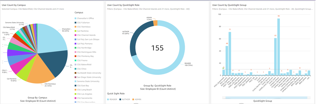
The following screenshot shows an example of the CSUCO security audit dashboard.

example of the CSUCO security audit dashboard.

Sydnor tells us, “Our previous BI tool had a huge library of visualization, but we don’t need 95% of those. Our presentations look great with the breadth of visuals QuickSight provides. Most people just want the data and ultimately, need a robust vehicle to get data out of a database and onto a table or visualization.”

Converting from their original BI tool to QuickSight was painless for his team. Sydnor tells us that he has “yet to see something we can’t do with QuickSight.” One of Sydnor’s employees who was a user of the previous tool learned QuickSight in just 30 minutes. Now, they conduct QuickSight demos all the time.

Looking to the future: Expanding BI integration and adopting Amazon QuickSight Q

With QuickSight, the Chancellor’s Office aims to roll out more HR dashboards across its campuses and extend the tool for faculty use in the classroom. In the upcoming year, two campuses are joining CSUCO in building their own HR reporting dashboards through QuickSight. The organization is also making plans to use QuickSight to report on student data and implement external-facing dashboards. Some of the data points they’re excited to explore are insights into at-risk students and classroom scheduling on campus.

Thinking ahead, CSUCO is considering Amazon QuickSight Q, a machine learning-powered natural language capability that gives anyone in an organization the ability to ask business questions in natural language and receive accurate answers with relevant visualizations. Sydnor says, “How cool would that be if professors could go in and ask simple, straightforward questions like, ‘How many of my department’s students are taking full course loads this semester?’ It has a lot of potential.”

Summary

The CSUCO is excited to be a champion of QuickSight in the CSU, and are looking for ways to increase its implementation across their organization in the future.

To learn more, visit the website for the California State University Chancellor’s Office. For more on QuickSight, visit the Amazon QuickSight product page, or browse other Big Data Blog posts featuring QuickSight.


About the authors

Madi Hsieh, AWS 2022 Summer Intern, UCLA.

Tina Kelleher, Program Manager at AWS.

Measure the adoption of your Amazon QuickSight dashboards and view your BI portfolio in a single pane of glass

Post Syndicated from Maitri Brahmbhatt original https://aws.amazon.com/blogs/big-data/measure-the-adoption-of-your-amazon-quicksight-dashboards-and-view-your-bi-portfolio-in-a-single-pane-of-glass/

Amazon QuickSight is a fully managed, cloud-native business intelligence (BI) service. If you plan to deploy enterprise-grade QuickSight dashboards, measuring user adoption and usage patterns is an important ingredient for the success of your BI investment. For example, knowing the usage patterns like geo location, department, and job role can help you fine-tune your dashboards to the right audience. Furthermore, to return the investment of your BI portfolio, with dashboard usage, you can reduce license costs by identifying inactive QuickSight authors.

In this post, we introduce the latest Admin Console, an AWS packaged solution that you can easily deploy and use to create a usage and inventory dashboard for your QuickSight assets. The Admin Console helps identify usage patterns of an individual user and dashboards. It can also help you track which dashboards and groups you have or need access to, and what you can do with that access, by providing more details on QuickSight group and user permissions and activities and QuickSight asset (dashboards, analyses, and datasets) permissions. With timely access to interactive usage metrics, the Admin Console can help BI leaders and administrators make a cost-efficient plan for dashboard improvements. Another common use case of this dashboard is to provide a centralized repository of the QuickSight assets. QuickSight artifacts consists of multiple types of assets (dashboards, analyses, datasets, and more) with dependencies between them. Having a single repository to view all assets and their dependencies can be an important element in your enterprise data dictionary.

This post demonstrates how to build the Admin Console using a serverless data pipeline. With basic AWS knowledge, you can create this solution in your own environment within an hour. Alternatively, you can dive deep into the source code to meet your specific needs.

Admin Console dashboard

The following animation displays the contents of our demo dashboard.

The Admin Console dashboard includes six sheets:

  • Landing Page – Provides drill-down into each detailed tabs.
  • User Analysis – Provides detailed analysis of the user behavior and identifies active and inactive users and authors.
  • Dashboard Analysis – Shows the most commonly viewed dashboards.
  • Assets Access Permissions – Provides information on permissions applied to each asset, such as dashboard, analysis, datasets, data source, and themes.
  • Data Dictionary – Provides information on the relationships between each of your assets, such as which analysis was used to build each dashboard, and which datasets and data sources are being used in each analysis. It also provides details on each dataset, including schema name, table name, columns, and more.
  • Overview – Provides instructions on how to use the dashboard.

You can interactively play with the sample dashboard in the following Interactive Dashboard Demo.

Let’s look at Forwood Safety, an innovative, values-driven company with a laser focus on fatality prevention. An early adopter of QuickSight, they collaborated with AWS to deploy this solution to collect BI application usage insights.

“Our engineers love this admin console solution,” says Faye Crompton, Leader of Analytics and Benchmarking at Forwood. “It helps us to understand how users analyze critical control learnings by helping us to quickly identify the most frequently visited dashboards in Forwood’s self-service analytics and reporting tool, FAST.”

Solution overview

The following diagram illustrates the workflow of the solution.

The workflow involves the following steps:

  1. The AWS Lambda function Data_Prepare is scheduled to run hourly. This function calls QuickSight APIs to get the QuickSight namespace, group, user, and asset access permissions information.
  2. The Lambda function Dataset_Info is scheduled to run hourly. This function calls QuickSight APIs to get dashboard, analysis, dataset, and data source information.
  3. Both the functions save the results to an Amazon Simple Storage Service (Amazon S3) bucket.
  4. AWS CloudTrail logs are stored in an S3 bucket.
  5. Based on the file in Amazon S3 that contains user-group information, dataset information, QuickSight assets access permissions information, as well as dashboard views and user login events from the CloudTrail logs, five Amazon Athena tables are created. Optionally, the BI engineer can combine these tables with employee information tables to display human resource information of the users.
  6. Four QuickSight datasets fetch the data from the Athena tables created in Step 5 and import them into SPICE. Then, based on these datasets, a QuickSight dashboard is created.

Prerequisites

For this walkthrough, you should have the following prerequisites:

Create solution resources

We can create all the resources needed for this dashboard using three CloudFormation templates: one for Lambda functions, one for Athena tables, and one for QuickSight objects.

CloudFormation template for Lambda functions

This template creates the Lambda functions data_prepare and dataset_info.

  • Choose Launch Stack and follow the steps to create these resources.

After the stack creation is successful, you have two Lambda functions, data_prepare and dataset_info, and one S3 bucket named admin-console[AWS-account-ID]. You can verify if the Lambda function can run successfully and if the group_membership, object_access, datasets_info, and data_dictionary folders are created in the S3 bucket under admin-console[AWS-account-ID]/monitoring/quicksight/, as shown in the following screenshots.

The Data_Prepare Lambda function is scheduled to run hourly with the CloudWatch Events rule admin-console-every-hour. This function calls the QuickSight Assets APIs to get QuickSight users, assets, and the access permissions information. Finally, this function creates two files, group_membership.csv and object_access.csv, and saves these files to an S3 bucket.

The Dataset_Info Lambda function is scheduled to run hourly and calls the QuickSight Assets APIs to get datasets, schemas, tables, and fields (columns) information. Then this function creates two files, datasets_info.csv and data_dictionary.csv, and saves these files to an S3 bucket.

  •  Create a CloudTrail log if you don’t already have one and note down the S3 bucket name of the log files for future use.
  •  Note down all the resources created from the previous steps. If the S3 bucket name for the CloudTrail log from step 2 is different from the one in step 1’s output, use the S3 bucket from step 2.

The following table summarizes the keys and values you use when creating the Athena tables with the next CloudFormation stack.

Key Value Description
cloudtraillog s3://cloudtrail-awslogs-[aws-account-id]-do-not-delete/AWSLogs/[aws-account-id]/CloudTrail The Amazon S3 location of the CloudTrail log
cloudtraillogtablename cloudtrail_logs The table name of CloudTrail log
groupmembership s3://admin-console[aws-account-id]/monitoring/quicksight/group_membership The Amazon S3 location of group_membership.csv
objectaccess s3://admin-console[aws-account-id]/monitoring/quicksight/object_access The Amazon S3 location of object_access.csv
dataset info s3://admin-console[aws-account-id]/monitoring/quicksight/datsets_info The Amazon S3 location of datsets_info.csv
datadict s3://admin-console[aws-account-id]/monitoring/quicksight/data_dictionary The Amazon S3 location of data_dictionary.csv

CloudFormation template for Athena tables

To create your Athena tables, complete the following steps:

  • Download the following JSON file.
  • Edit the file and replace the corresponding fields with the keys and values you noted in the previous section.

For example, search for the groupmembership keyword.

Then replace the location value with the Amazon S3 location for the groupmembership folder.

  • Create Athena tables by deploying this edited file as a CloudFormation template. For instructions, refer to Get started.

After a successful deployment, you have a database called admin-console created in AwsDataCatalog in Athena and three tables in the database: cloudtrail_logs, group_membership, object_access, datasets_info and data_dict

  • Confirm the tables via the Athena console.

The following screenshot shows sample data of the group_membership table.

The following screenshot shows sample data of the object_access table.

For instructions on building an Athena table with CloudTrail events, see Amazon QuickSight Now Supports Audit Logging with AWS CloudTrail. For this post, we create the table cloudtrail_logs in the default database.

  • After all five tables are created in Athena, go to the security permissions on the QuickSight console to enable bucket access for s3://admin-console[AWS-account-ID] and s3://cloudtrail-awslogs-[aws-account-id]-do-not-delete.
  • Enable Athena access under Security & Permissions.

Now QuickSight can access all five tables through Athena.

CloudFormation template for QuickSight objects

To create the QuickSight objects, complete the following steps:

  • Get the QuickSight admin user’s ARN by running following command in the AWS Command Line Interface (AWS CLI):
    aws quicksight describe-user --aws-account-id [aws-account-id] --namespace default --user-name [admin-user-name]

    For example: arn:aws:quicksight:us-east-1:12345678910:user/default/admin/xyz.

  • Choose Launch Stack to create the QuickSight datasets and dashboard:

  • Provide the ARN you noted earlier.

After a successful deployment, four datasets named Admin-Console-Group-Membership, Admin-Console-dataset-info, Admin-Console-Object-Access, and Admin-Console-CFN-Main are created and you have the dashboard named admin-console-dashboard. If modifying the dashboard is preferred, use the dashboard save-as option, then recreate the analysis, make modifications, and publish a new dashboard.

  • Set your preferred SPICE refresh schedule for the four SPICE datasets, and share the dashboard in your organization as needed.

Dashboard demo

The following screenshot shows the Admin Console Landing page.

The following screenshot shows the User Analysis sheet.

The following screenshot shows the Dashboards Analysis sheet.

The following screenshot shows the Access Permissions sheet.

The following screenshot shows the Data Dictionary sheet.

The following screenshot shows the Overview sheet.

You can interactively play with the sample dashboard in the following Interactive Dashboard Demo.

You can reference the public template of the preceding dashboard in create-template, create-analysis, and create-dashboard API calls to create this dashboard and analysis in your account. The public template of this dashboard with the template ARN is 'TemplateArn': 'arn:aws:quicksight:us-east-1:889399602426:template/admin-console'.

Tips and tricks

Here are some advanced tips and tricks to build the dashboard as the Admin Console to analyze usage metrics. The following steps are based on the dataset admin_console. You can apply the same logic to create the calculated fields to analyze user login activities.

  • Create parameters – For example, we can create a parameter called InActivityMonths, as in the following screenshot. Similarly, we can create other parameters such as InActivityDays, Start Date, and End Date.

  • Create controls based on the parameters – In the following screenshot, we create controls based on the start and end date.

  • Create calculated fields – For instance, we can create a calculated field to detect the active or inactive status of QuickSight authors. If the time span between the latest view dashboard activity and now is larger or equal to the number defined in the Inactivity Months control, the author status is Inactive. The following screenshot shows the relevant code. According to the end-user’s requirements, we can define several calculated fields to perform the analysis.

  • Create visuals – For example, we create an insight to display the top three dashboard views by reader and a visual to display the authors of these dashboards.

  • Add URL actions – You can add an URL action to define some extra features to email inactive authors or check details of users.

The following sample code defines the action to email inactive authors:

mailto:<<email>>?subject=Alert to inactive author! &body=Hi, <<username>>, any author without activity for more than a month will be deleted. Please log in to your QuickSight account to continue accessing and building analyses and dashboards!

Clean up

To avoid incurring future charges, delete all the resources you created with the CloudFormation templates.

Conclusion

This post discussed how BI administrators can use QuickSight, CloudTrail, and other AWS services to create a centralized view to analyze QuickSight usage metrics. We also presented a serverless data pipeline to support the Admin Console dashboard.

If you would like to have a demo, please email us.

Appendix

We can perform some additional sophisticated analysis to collect advanced usage metrics. For example, Forwood Safety raised a unique request to analyze the readers who log in but don’t view any dashboard actions (see the following code). This helps their clients identify and prevent any wasting of reader sessions fees. Leadership teams value the ability to minimize uneconomical user activity.

CREATE OR REPLACE VIEW "loginwithoutviewdashboard" AS
with login as
(SELECT COALESCE("useridentity"."username", "split_part"("useridentity"."arn", '/', 3)) AS "user_name", awsregion,
date_parse(eventtime, '%Y-%m-%dT%H:%i:%sZ') AS event_time
FROM cloudtrail_logs
WHERE
eventname = 'AssumeRoleWithSAML'
GROUP BY  1,2,3),
dashboard as
(SELECT COALESCE("useridentity"."username", "split_part"("useridentity"."arn", '/', 3)) AS "user_name", awsregion,
date_parse(eventtime, '%Y-%m-%dT%H:%i:%sZ') AS event_time
FROM cloudtrail_logs
WHERE
eventsource = 'quicksight.amazonaws.com'
AND
eventname = 'GetDashboard'
GROUP BY  1,2,3),
users as 
(select Namespace,
Group,
User,
(case
when Group in (‘quicksight-fed-bi-developer’, ‘quicksight-fed-bi-admin’)
then ‘Author’
else ‘Reader’
end)
as author_status
from "group_membership" )
select l.* 
from login as l 
join dashboard as d 
join users as u 
on l.user_name=d.user_name 
and 
l.awsregion=d.awsregion 
and 
l.user_name=u.user_name
where d.event_time>(l.event_time + interval '30' minute ) 
and 
d.event_time<l.event_time 
and 
u.author_status='Reader'

About the Authors

Ying Wang is a Manager of Software Development Engineer. She has 12 years of expertise in data analytics and science. She assisted customers with enterprise data architecture solutions to scale their data analytics in the cloud during her time as a data architect. Currently, she helps customer to unlock the power of Data with QuickSight from engineering by delivering new features.

Ian Liao is a Senior Data Visualization Architect at AWS Professional Services. Before AWS, Ian spent years building startups in data and analytics. Now he enjoys helping customer to scale their data application on the cloud.

Maitri Brahmbhatt is a Business Intelligence Engineer at AWS. She helps customers and partners leverage their data to gain insights into their business and make data driven decisions by developing QuickSight dashboards.