Tag Archives: design

Agent platform (Part 1): How we help Grab build and run AI agents at scale

Post Syndicated from Grab Tech original https://engineering.grab.com/how-grab-builds-and-runs-ai-agents-at-scale

Part 1: From one support bot to a framework

At Grab, AI agents have evolved from interesting team prototypes into production services used every day by millions of merchants, drivers, and consumers. Today, more than 500 services run on our internal agent framework, over 50 Model Context Protocol (MCP) servers are registered on our remote MCP framework, and a single Large Language Model (LLM) gateway fronts every model call across the company, handling billions of tokens each month.

None of this was designed up front. It began as the plumbing behind one internal support bot, which then expanded because the same problems kept resurfacing for every team trying to ship an agent. This series tells the story of what the platform eventually became. This Part 1 of the blog focuses on the beginning: the architecture of our AI support bot, the specific pain points we hit while scaling and iterating on it, and how each of those failures became a core building block in the framework we now call LLM-Kit.

The bot that started it

Imagine you have a question for the Technical Infrastructure (Tech Infra) team – the engineers who run the cloud platforms, databases, developer tooling, and AI infrastructure behind Grab’s ecosystem. Instead of immediately paging an on-call engineer, a bot first triages the request, checks the team’s documentation, runbooks, and past Slack threads, and tries to answer directly in the thread. If it still cannot resolve the issue, it routes the ticket to the right human, with the relevant context already attached.

That is what we built with the Tech Infra Support Bot.

In the first half of 2023, Tech Infra handled thousands of support tickets, many of them repeated questions that had already been answered somewhere internally. Before LLMs, the bot’s role was mainly operational; performing tasks like helping track acknowledgments and response times for on-call engineers. With the arrival of GPT-4-32k, we evolved it into a GPT-powered Level-0 support layer that could answer documented questions before a human needed to be paged.

The first production version was a Go service organized around two planes:

  • A reasoning plane. At Level-0, it was a single-agent loop. It takes the user’s question, decides which tools to call, executes those calls, feeds the results back into the prompt, and returns an answer. The default model at the time was gpt-4.1; today, we have evolved to the latest reasoning models.

  • A tool plane. The tools provided the bot’s core working context. Retrieval flowed through Glean, which covered Confluence,
    TechDocs, internal drives, and Jira. Other tools handled log search through Kibana, GitLab runbook and file access, Slack conversation search, and a small set of Hypertext Transfer Protocol (HTTP) plugins. In the first version, tools and prompts were defined in per-channel JavaScript Object Notation (JSON) configs and resolved at request time. As models became more capable, we later standardized the tool set across channels.

A trimmed version of that tool config looked like this:

"agent_plugins": [
  {"name": "glean_search",        "type": "common", "metadata": {"wiki_space_collection": ["..."]}},
  {"name": "runbook_search",      "type": "common"},
  {"name": "gitlab_runbook_reader","type": "common"},
  {"name": "gitlab_read_file","type": "common"},
  {"name": "kibana_log_search",   "type": "common", "metadata": {"index": "k8s*"}},
  {"name": "slack_conversation_tool", "type": "common"}
]

It worked, but it taught us, the hard way, why a demo agent is not a production agent.

What it takes to scale and improve quickly

As we worked on improving the agent, we kept running into the same kinds of friction. Over time, those pain points formed clear patterns, and they were the same ones we saw other teams run into as well.

  • Vibe check is not an evaluation strategy. The bot had a base prompt, and each Slack channel could configure its own prompt, tools, and documentation filters. But the workflow was essentially: configure it, ship it, and hope it reduced toil. There were no real evaluations, just optimism that it would work.

  • Fast model and provider switching is essential. The AI landscape moves incredibly fast: a new state-of-the-art (SOTA) model appears on Tuesday, and a highly efficient open-source alternative shows up on Thursday. Switching providers should not feel like open-heart surgery. A unified Software Development Kit (SDK) and an LLM API gateway remove the need to refactor payload schemas, rewrite error handling, or integrate each provider from scratch. If moving from OpenAI to Anthropic, or routing to an open-source model endpoint, takes more than a few config changes, technical debt is already slowing you down.

  • Observability cannot be an afterthought. When an answer was wrong, figuring out “why” meant grepping logs across three separate systems: the agent workflow, the tool calls, and the model call. There was no shared trace tying them together. That level of friction is survivable for an internal tool; it is unacceptable for a customer-facing agent.

  • Everything around the agent took longer than the agent itself. Auth (OIDC), secrets management (Vault), per-environment config, vector database integration, LLM tracing, health probes, and metrics were not agent-specific problems. However, they all had to be solved before anything could be shipped. The reasoning loop took a whole afternoon. The production wrapper took two weeks.

The pattern was clear: the hard part of building an agent was not the agent itself, but everything around it that had to be in place before it could safely run in front of users. So we began pulling those shared components out of the bot and consolidating them into a unified framework.

Extracting the framework: LLM-Kit

LLM-Kit emerged when we stopped solving these problems service by service and started solving them once, centrally. It is intentionally not a new agent abstraction or a Domain-Specific Language (DSL). Instead, it is a curated set of integrations and scaffolding built around Grab’s existing infrastructure, pipelines, secret management, and observability. Just as importantly, we chose to build a framework rather than a heavy centralized platform. In a space evolving this quickly, a platform would have locked teams into rigid assumptions that would soon become outdated. A framework let us meet developers where they already were: standardizing the plumbing while preserving the freedom to iterate quickly. Looking back, that was the right first choice. Each part of LLM-Kit is a direct response to one of the failures described above.

We first wrote about LLM-Kit’s structure and code architecture in a 2024 blog post. Two years and a few hundred agents later, the overall shape is still recognizable, but almost every underlying layer has changed. Poetry was replaced by uv; we standardized on the OpenTelemetry stack; LangChain evolved into LangGraph and Deep Agents; and some tools moved onto our MCP framework.

It starts with a template. The entry point is a user interface (UI) form. An engineer fills in an application name and a few details, and gets back a GitLab repository with the production wrapper already assembled. Under the hood the template stamps out a full FastAPI service:

/
├── app/
│   ├── server.py              # FastAPI app factory: mounts routes + middleware, boots OTel + statsd
│   ├── agents/
│   │   ├── simple_react_agent.py   # a single-agent LangGraph ReAct loop (agent <-> tools)
│   │   ├── mcp_react_agent.py      # the same loop, but tools are pulled from remote MCP servers
│   │   └── simple_react_agent.png  # auto-exported graph diagram (generated in dev)
│   ├── routes/
│   │   ├── api.py             # router aggregator
│   │   ├── health_check.py    # liveness/readiness probe
│   │   ├── oidc.py            # OIDC login/callback (skipped in proxy-auth mode)
│   │   └── evalshub_eval.py   # runs ROUGE / BLEU / LLM-as-judge evals on the agent
│   ├── core/config.py         # AppConfig (pydantic-settings) + INI/secret parsing
│   ├── tools/word_length_tool.py   # an example tool to copy from
│   ├── utils/prompts.py       # prompt/message assembly helpers
│   └── storage/connection.py  # Postgres + pgvector engine and connection pooling
├── sdk/         # a generated, typed client SDK (protobuf) other services import
├── configs/
│   ├── dev.ini / stg.ini / prd.ini   # one config per environment
│   └── secret.ini.example     # secret template; real values resolve from Vault at deploy
├── databases/postgresql/      # SQL migrations (pgvector extension bootstrapped for you)
├── scripts/
│   ├── db.py / db.sh          # migration runner
│   └── gunicorn_conf.py       # production server/worker config
├── tests/
│   ├── unit_tests/            # starter unit tests (e.g. the health check)
│   └── evalshub_evaluation/   # golden test cases the eval route runs against
├── Dockerfile                 # multi-stage, distroless
├── Makefile                   # setup / run / test / lint targets
├── pyproject.toml             # uv build backend + pinned deps
└── .pre-commit-config.yaml

Three things are worth pulling out of that tree:

  • app/agents/ is the part you actually own. You get two working agents to fork from rather than a blank file: simple_react_agent.py is a single-agent LangGraph ReAct loop, and mcp_react_agent.py is the same loop wired to pull its tools from remote MCP servers. Both compile to a LangGraph StateGraph with a retry policy and a 30-second per-step timeout, and in dev the graph is auto-exported as a diagram. This is a real step up from the bare LangChain agent initialization we scaffolded in 2024.

  • app/routes/evalshub_eval.py ships evals on day one. The template comes with an endpoint that runs Recall-Oriented Understudy for Gisting Evaluation (ROUGE), Bilingual Evaluation Understudy (BLEU), and LLM-as-judge evaluators over a set of golden test cases in tests/evalshub_evaluation/. The thing we most wished the support bot had, is now in the box before a builder writes a line of their own logic.

  • Everything else is the production wrapper. core/config.py, storage/, configs/, databases/, scripts/, the distroless Dockerfile, and the pyproject.toml (now uv, not the Poetry we used in 2024) are the auth, secrets, persistence, packaging, and deploy plumbing that every service needs and that no team should have to write from scratch.

The day-one wiring that used to take two weeks or more now takes about an hour. The rest of this section is what “pre-wired” means, layer by layer.

Config and secrets are solved once. Apps declare environment configs as initialization (INI) files with secret interpolation, so secrets resolve from Vault at boot, and a single secret.ini.example is enough to run any LLM-Kit app locally:

[CONFIG]
GRABGPT_API_KEY=${SECRET:GRABGPT_API_KEY}
OTEL_EXPORTER_OTLP_ENDPOINT=<otel-collector-endpoint>
POSTGRES_POOL_RECYCLE=1800

Model access behind one resolver. Every model call goes through the GrabGPT Gateway, which is OpenAI-compatible. LLM-Kit’s job is just to resolve the right endpoint (per environment, and per data tier) and inject the key so application code never hard-codes a provider again:

from openai import OpenAI
from llm_kit.grabgpt import resolve_grabgpt_base_url, resolve_grabgpt_api_key

client = OpenAI(
    base_url=resolve_grabgpt_base_url("prd", "public"),  # provider chosen centrally
    api_key=resolve_grabgpt_api_key(),
)

That one indirection is what later lets a platform team change which provider serves a model, configure fallback routing, set budgets, and manage cost attribution, without a single application touching its code.

Tracing wired in, not bolted on. A single instrumentor auto-instruments FastAPI, outbound HTTP, LangChain, and MCP, and stamps every span with Kubernetes resource attributes (pod, namespace, image, service version). Structured logs auto-inject the trace and span IDs, so logs and traces correlate in Grafana/Kibana for free:

exporter = OTLPSpanExporter(endpoint=app_config.otel_exporter_otlp_endpoint)
OTELInstrumentor(exporter=exporter, excluded_urls=["health_check"]).instrument_app(app)

The three systems, no shared trace problem turns into one end-to-end trace across every LLM call, tool call, and retrieval step.

Tools can be exposed through MCP servers built on our MCP framework. Instead of hardwiring a large set of tool functions inside the agent process, the agent connects to MCP servers and discovers their tools at runtime. That means adding a new capability can be as simple as registering an MCP server, rather than redeploying the agent.

client = MultiServerMCPClient({
    "mcp-gitlab-remote": {
        "transport": "streamable_http",
        "url": "<remote-mcp-gitlab-endpoint>/mcp/",
        "headers": {"Authorization": "Bearer <token>"},
    }
})
tools = await client.get_tools()   # schema negotiated, no redeploy

An agent is just another service in the ecosystem, with gRPC on both sides. Most of Grab’s backend communicates over gRPC, and agents are rarely standalone; other services call them, and they in turn call other internal services. The template is designed to support both directions.

On the serving side, the scaffold includes a Protocol Buffers (protobuf) contract (sdk/.../.proto, with a sample Hello remote procedure call (RPC)) and a generated, typed client SDK package that other teams import to call your agent without hand-writing HTTP. make gen-proto regenerates the Python stubs from the .proto, and a gen-proto-check Continuous Integration (CI) step fails the build if the committed stubs drift from the contract. A gRPC server runs alongside FastAPI (default port 8087, multi-worker-safe via SO_REUSEPORT) and ships a standard gRPC health service out of the box:

$ grpcurl -plaintext localhost:8087 grpc.health.v1.Health/Check

On the calling side, LLM-Kit ships a channel provider so an agent never hardcodes an address. The auto provider tries Istio, then Consul, then a static fallback, health-checks the channel it selects, and runs a background monitor that re-selects after a few consecutive failures:

from llm_kit.grpc.channel_providers.auto import (
    AutoGrpcChannelProvider, AutoGrpcChannelProviderConfig,
)

provider = AutoGrpcChannelProvider(logger, AutoGrpcChannelProviderConfig(
    client_name="my-agent",
    service_key="some-internal-service",   # resolved via Istio / Consul
    enable_istio=True, enable_consul=True,
))
channel = provider.get_channel()           # first healthy channel, auto-reselected on failure
stub = SomeServiceStub(channel)

This is the less glamorous side of being production-ready. Before an agent can deliver value, it needs to both accept calls from and make calls to the rest of the company’s services using the same transport the broader system already relies on.

What’s next

LLM-Kit solved building and shipping one agent. At 500 agents, the problems were no longer framework problems. They were platform problems: who can change which model everyone calls, how one team safely reuses another team’s tools, and how you know an agent got better and not just different after a prompt change. We built three answers for that layer: the GrabGPT Gateway, a remote MCP framework, and an evals platform. Part 2 starts with the gateway — one endpoint, five providers, and what it takes to make “swap the model” a configuration change instead of an incident.

Join us

Grab is Southeast Asia’s leading superapp, serving over 900 cities across eight countries (Cambodia, Indonesia, Malaysia, Myanmar, the Philippines, Singapore, Thailand, and Vietnam). Through a single platform, millions of users access mobility, delivery, and digital financial services, including ride-hailing, food delivery, payments, lending, and digital banking via GXS Bank and GXBank. Founded in 2012, Grab’s mission is to drive Southeast Asia forward by creating economic empowerment for everyone while delivering sustainable financial performance and positive social impact.

Powered by technology and driven by heart, our mission is to drive Southeast Asia forward by creating economic empowerment for everyone. If this mission speaks to you, join our team today!
The most-seen UI on the Internet? Redesigning Turnstile and Challenge Pages

Post Syndicated from Leo Bacevicius original https://blog.cloudflare.com/the-most-seen-ui-on-the-internet-redesigning-turnstile-and-challenge-pages/

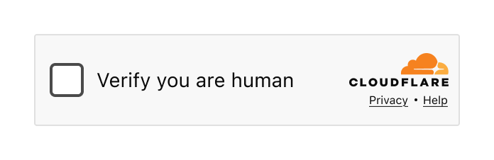
You’ve seen it. Maybe you didn’t register it consciously, but you’ve seen it. That little widget asking you to verify you’re human. That full-page security check before accessing a website. If you’ve spent any time on the Internet, you’ve encountered Cloudflare’s Turnstile widget or Challenge Pages — likely more times than you can count.


The Turnstile widget – a familiar sight across millions of websites

When we say that a large portion of the Internet sits behind Cloudflare, we mean it. Our Turnstile widget and Challenge Pages are served 7.67 billion times every single day. That’s not a typo. Billions. This might just be the most-seen user interface on the Internet.

And that comes with enormous responsibility.

Designing a product with billions of eyeballs on it isn’t just challenging — it requires a fundamentally different approach. Every pixel, every word, every interaction has to work for someone’s grandmother in rural Japan, a teenager in São Paulo, a visually impaired developer in Berlin, and a busy executive in Lagos. All at the same time. In moments of frustration.

Today we’re sharing the story of how we redesigned Turnstile and Challenge Pages. It’s a story told in three parts, by three of us: the design process and research that shaped our decisions (Leo), the engineering challenge of deploying changes at unprecedented scale (Ana), and the measurable impact on billions of users (Marina).

Let’s start with how we approached the problem from a design perspective.

Part 1: The design process

The problem

Let’s be honest: nobody likes being asked to prove they’re human. You know you’re human. I know I’m human. The only one who doesn’t seem convinced is that little widget standing between you and the website you’re trying to access. At best, it’s a minor inconvenience. At worst? You’ve probably wanted to throw your computer out the window in a fit of rage. We’ve all been there. And no one would blame you.


Turnstile integrated into a login flow

As the world warms up to what appears to be an inevitable AI revolution, the need for security verification is only increasing. At Cloudflare, we’ve seen a significant rise in bot attacks — and in response, organizations are investing more heavily in security measures. That means more challenges being issued to more end users, more often.

The numbers tell the story:

2023: 2.14B daily

2024: 3B daily

2025: 5.35B daily

That’s a 58.1% average increase in security checks, year over year. More security checks mean more opportunities for end user frustration. The more companies integrate these verification systems to protect themselves and their customers, the higher the chance that someone, somewhere, is going to have a bad experience.

We knew it was time to take a hard look at our flagship products and ask ourselves: Are we doing right by the billions of people who encounter these experiences? Are we fulfilling our mission to build a better Internet — not just a more secure one, but a more human one?

The answer, we discovered, was: we could do better.

The design audit

Before redesigning anything, we needed to understand what we were working with. We started by conducting a comprehensive audit of every state, every error message, and every interaction across both Turnstile and Challenge Pages.

What we found wasn’t the best.


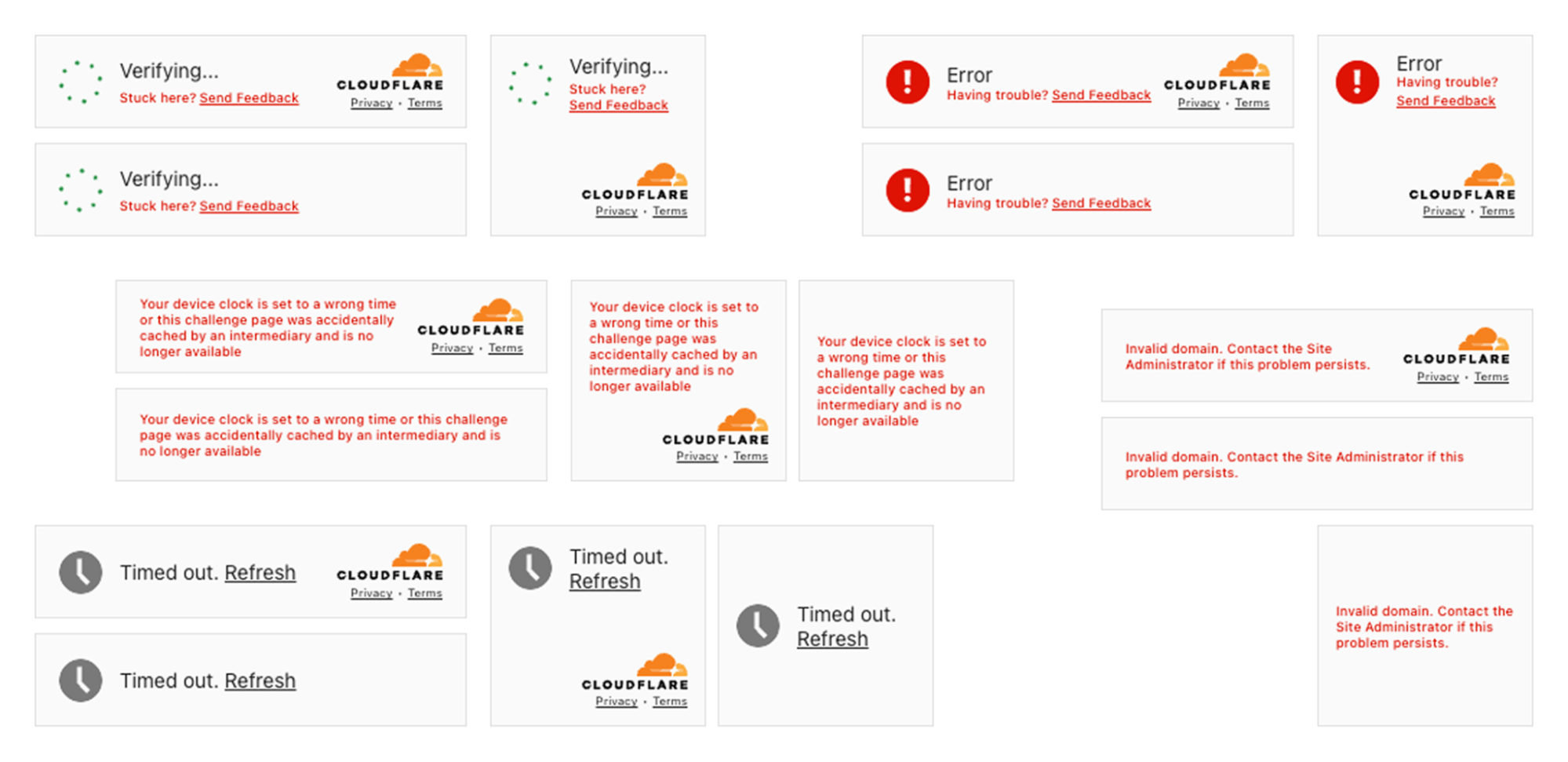
The state of inconsistency in the Turnstile widget. Multiple states with no unified approach

The inconsistencies were glaring. We had no unified approach across the multitude of different error scenarios. Some messages were overly verbose and technical (“Your device clock is set to a wrong time or this challenge page was accidentally cached by an intermediary and is no longer available”). Others were too vague to be helpful (“Timed out”). The visual language varied wildly — different layouts, different hierarchies, different tones of voice.

We also examined the feedback we’d received online. Social media, support tickets, community forums — we read it all. The frustration was palpable, and much of it was avoidable.

Take our feedback mechanism, for example. We offered users feedback options like “The widget sometimes fails” versus “The widget fails all the time.” But what’s the difference, really? And how were they supposed to know how often it failed? We were asking users to interpret ambiguous options during their most frustrated moments. The more we left open to interpretation, the less useful the feedback became — and the more frustration we saw across social channels.


The previous feedback screen: “The widget sometimes fails” vs “The widget fails all the time” — what’s the difference?

Our Challenge Pages — the full-page security blocks that appear when we detect suspicious activity or when site owners have heightened security settings — had similar issues. Some states were confusing. Others used too much technical jargon. Many failed to provide actionable guidance when users needed it most.


The state of inconsistency on the Challenge pages. Multiple states with no unified approach

The audit was humbling. But it gave us a clear picture of where we needed to focus.

Mapping the user journey

To design better experiences, we first needed to understand every possible path a user could take. What was the happy path? Was there even one? And what were the unhappy paths that led to escalating frustration?


Mapping the complete user journey — from initial encounter through error scenarios, with sentiment tracking

This was a true cross-functional effort. We worked closely with engineers like Ana who knew the technical ins and outs of every edge case, and with Marina on the product side who understood not just how the product worked, but how users felt about it — the love and the hate we’d see online.

We have some of the smartest people working on bot protection at Cloudflare. But intelligence and clarity aren’t the same thing. There’s a delicate balance between technical complexity and user simplicity. Only when these two dance together successfully can we communicate information in a way that actually makes sense to people.

And here’s the thing: the messaging has to work for everyone. A person of any age. Any mental or physical capability. Any cultural background. Any level of technical sophistication. That’s what designing at scale really means — you can’t ignore edge cases, since, at such scale, they are no longer edge cases.

Establishing a unified information architecture

One of the most influential books in UX design is Steve Krug’s Don’t Make Me Think. The core principle is simple: every moment a user spends trying to interpret, understand, or decode your interface is a moment of friction. And friction, especially in moments of frustration, leads to abandonment.

Our audit revealed that we were asking users to think far too much. Different pieces of information occupied the same space in the UI across different states. There was no consistent visual hierarchy. Users encountering an error state in Turnstile would find information in a completely different place than they would on a Challenge Page.

We made a fundamental decision: one information architecture to rule them all.


Visual diagram displaying a unified information architecture with a consistent structure across Turnstile widget and Challenge pages

Both Turnstile and Challenge Pages would now follow the same structural pattern. The same visual hierarchy. The same placement for actions, for explanatory text, for links to documentation.

Did this constrain our design options? Absolutely. We had to say no to a lot of creative ideas that didn’t fit the framework. But constraints aren’t the enemy of good design — they’re often its best friend. By limiting our options, we could go deeper on the details that actually mattered.

For users, the benefit is profound: they don’t need to re-learn what each piece of the UI means. Error states look consistent. Help links are always in the same place. Once you understand one state, you understand them all. That’s cognitive load reduced to a minimum — exactly where it should be during a security verification.

What user research taught us

How do you keep yourself accountable when redesigning something that billions of people see? You test. A lot.

We recruited 8 participants across 8 different countries, deliberately seeking diversity in age, digital savviness, and cultural background. We weren’t looking for tech-savvy early adopters — we wanted to understand how the redesign would work for everyone.

Our approach was rigorous: participants saw both the current experience and proposed changes, without knowing which was “old” or “new.” We counterbalanced positioning to eliminate bias. And we did not just test our new ideas, but also challenged our assumptions about what needed changing in the first place.


Two different versions of a Turnstile being tested in an A/B test

Some things didn’t need fixing

One hypothesis: should we align with competitors? Most CAPTCHA providers show “I am human” across all states. We use distinct content — “Verify you are human,” then “Verifying…,” then “Success!”

Were we overcomplicating things? We tested it head-to-head.

Our approach won decisively. For the interactivity state, “Verify you are human” scored 5 out of 8 points versus just 3 for “I am human.” For the verifying state, it was even more dramatic — 7.5 versus 0.5. Users wanted to know what was happening, not just be told what they were.


User testing results: users strongly favored our approach over the competitor-style design

This experiment didn’t ship as a feature, but it was invaluable. It gave us confidence we weren’t just being different for the sake of it. Some things were already right.

But these needed to change

The research surfaced four areas where we were failing users:

Help, not bureaucracy. When users encountered errors, we offered “Send Feedback.” In testing, they were baffled. “Who am I sending this to? The website? Cloudflare? My ISP?” More importantly, we discovered something fundamental: at the moment of maximum frustration, people don’t want to file a report — they want to fix the problem. We replaced “Send Feedback” with “Troubleshoot” — a single word that promises action rather than bureaucracy.


The problematic “Send Feedback” prompt: users didn’t know who they were sending feedback to

Attention, not alarm. We’d used red backgrounds liberally for errors. The reaction in testing was visceral — participants felt they had failed, felt powerless. Even for simple issues that would resolve with a retry, users assumed the worst and gave up. Red at full saturation wasn’t communicating “Here’s something to address.” It was communicating “You have failed, and there’s nothing you can do.” The fix: red only for icons, never for text or backgrounds.


The evolution: from the states with unclear error state description in red to much clearer and concise error communication in neutral-color text.

Scannable, not verbose. We’d tried to be thorough, explaining errors in technical detail. It backfired. Non-technical users found it alienating. Technical users didn’t need it. Everyone was trying to read it in the tiny real estate of a widget. The lesson: less is more, especially in constrained spaces during stressful moments.

Accessible to everyone. Our audit revealed 10px fonts in some states. Grey text that technically met AA (at least 4.5:1 for normal text and 3:1 for large text) compliance but was difficult to read in practice. “Technically compliant” isn’t good enough when you’re serving the entire Internet.

We set a clear goal: to meet the WCAG 2.2 AAA standard— the highest and most stringent level of web accessibility compliance, designed to make content accessible to the broadest range of users, including those with severe disabilities. Throughout the redesign, when visual consistency conflicted with readability, readability won. Every time.

This extended beyond vision. We designed for screen reader users, keyboard-only navigators, and people with color vision variations — going beyond what automated compliance tools can catch.

And accessibility isn’t just about impairments — it’s about language. What fits in English, overflows in German. What’s concise in Spanish is ambiguous in Japanese. Supporting over 40 languages forced us to radically simplify. The same “Unable to connect to website / Troubleshoot” pattern now works across English, Bulgarian, Danish, German, Greek, Japanese, Indonesian, Russian, Slovak, Slovenian, Serbian, Filipino, and many more.


The redesigned error state across 12 languages — consistent layout despite varying text lengths 

Final redesign

So what did we actually ship?

First, let’s talk about what we didn’t change. The happy path — “Verify you are human” → “Verifying…” → “Success!” — tested exceptionally well. Users understood what was happening at each stage. The distinct content for each state, which we’d worried might be overcomplicating things, was actually our competitive advantage.


The happy path: Verify you are human → Verifying → Success! These states tested well and remained largely unchanged

But for the states that needed work, we made significant changes guided by everything we learned.

Simplified, scannable content

We radically reduced the amount of text in error states. Instead of verbose explanations like “Your device clock is set to a wrong time or this challenge page was accidentally cached by an intermediary and is no longer available,” we now show:

  1. A clear, simple state name (e.g., “Incorrect device time”)

  2. A prominent “Troubleshoot” link

That’s it. The detailed guidance now lives in a dedicated modal screen that opens when users need it — giving them room to actually read and follow troubleshooting steps.


The troubleshooting modal: detailed guidance when users need it, without cluttering the widget

The troubleshooting modal provides context (“This error occurs when your device’s clock or calendar is inaccurate. To complete this website’s security verification process, your device must be set to the correct date and time in your time zone.”), numbered steps to try, links to documentation, and — only after the user has tried to resolve the issue — an option to submit feedback to Cloudflare. Help first, feedback second.

AAA accessibility compliance

Every state now meets WCAG 2.2 AAA standards for contrast and readability. Font sizes have established minimums. Interactive elements are clearly focusable and properly announced by screen readers.

Unified experience across Turnstile and Challenge pages

Whether users encounter the compact Turnstile widget or a full Challenge Page, the information architecture is now consistent. Same hierarchy. Same placement. Same mental model.

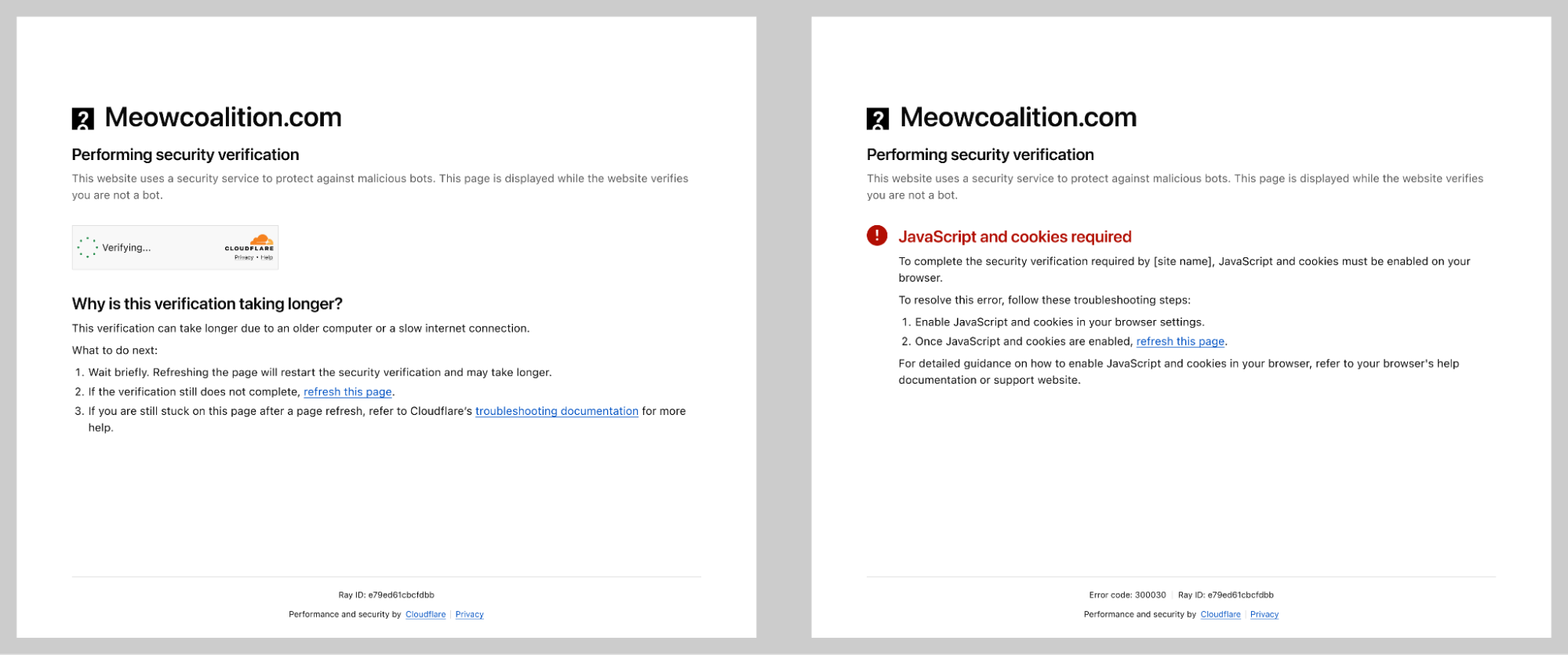
Challenge Pages now follow a clean structure: the website name and favicon at the top, a clear status message (like “Verification successful” or “Your browser is out of date”), and actionable guidance below. No more walls of orange or red text. No more technical jargon without context.


Re-designed Challenge page states with clear troubleshooting instructions.

Validated across languages

Every piece of content was tested in over 40 supported languages. Our process involved three layers of validation:

  1. Initial design review by the design team

  2. Professional translation by our qualified vendor

  3. Final review by native-speaking Cloudflare employees

This wasn’t just about translation accuracy — it was about ensuring the visual design held up when content length varied dramatically between languages.

The complete picture

The result is a security verification experience that’s clearer, more accessible, less frustrating, and — crucially — just as secure. We didn’t compromise on protection to improve the experience. We proved that good design and strong security aren’t in conflict.


Re-designed Turnstile widgets on the left and a re-designed Challenge page on the right

But designing the experience was only half the battle. Shipping it to billions of users? That’s where Ana comes in.

Part 2: Shipping to billions

Beyond centering a div

Some may say the hardest part of being a Frontend Engineer is centering a div. In reality, the real challenge often lies much deeper, especially when working close to the platform primitives. Building a critical piece of Internet infrastructure using native APIs forces you to think differently about UI development, tradeoffs, and long-term maintainability.

In our case, we use Rust to handle the UI for both the Turnstile widget and the Challenge page. This decision brought clear benefits in terms of safety and consistency across platforms, but it also increased frontend complexity. Many of us are used to the ergonomics of modern frameworks like React, where common UI interactions come almost for free. Working with Rust meant reimplementing even simple interactions using lower level constructs like document.getElementById, createElement, and appendChild.

On top of that, compile times and strict checks naturally slowed down rapid UI iteration compared to JavaScript based frameworks. Debugging was also more involved, as the tooling ecosystem is still evolving. These constraints pushed us to be more deliberate, more thoughtful, and ultimately more disciplined in how we approached UI development.

Small visual changes, big global impact

What initially looked like small visual tweaks such as padding adjustments or alignment changes quickly revealed a much bigger challenge: internationalization.

Once translations were available, we had to ensure that content remained readable and usable across 38 languages and 16 different UI states. Text length variability alone required careful design decisions. Some translations can be 30 to 300 percent longer than English. A short English string like “Stuck?” becomes “Tidak bisa melanjutkan?” in Indonesian or “Es geht nicht weiter?” in German, dramatically changing layout requirements.

Right-to-left language support added another layer of complexity. Supporting Arabic, Persian or Farsi, and Hebrew meant more than flipping text direction. Entire layouts had to be mirrored, including alignment, navigation patterns, directional icons, and animation flows. Many of these elements are implicitly designed with left-to-right assumptions, so we had to revisit those decisions and make them truly bidirectional.

Ordered lists also required special care. Not every culture uses the Western 1, 2, 3 numbering system, and hardcoding numeric sequences can make interfaces feel foreign or incorrect. We leaned on locale-aware numbering and fully translatable list formats to ensure ordering felt natural and culturally appropriate in every language.

Building confidence through testing

As we started listing action points in feedback reports, correctness became even more critical. Every action needed to render properly, trigger the right flow, and behave consistently across states, languages, and edge cases.

To get there, we invested heavily in testing. Unit tests helped us validate logic in isolation, while end-to-end tests ensured that new states and languages worked as expected in real scenarios. This testing foundation gave us confidence to iterate safely, prevented regressions, and ensured that feedback reports remained reliable and actionable for users.

The outcome

What began as a set of technical constraints turned into an opportunity to build a more robust, inclusive, and well-tested UI system. Working with fewer abstractions and closer to the browser primitives forced us to rethink assumptions, improve our internationalization strategy, and raise the overall quality bar.

The result is not just a solution that works, but one we trust. And that trust is what allows us to keep improving, even when centering a div turns out to be the easy part.

Part 3: The impact

Designing for billions of people is a responsibility we take seriously. At this scale, it is essential to leverage measurable data to tell us the real impact of our design choices. As we prepare to roll out these changes, we are focusing on five key metrics that will tell us if we’ve truly succeeded in making the Internet’s most-seen UI more human.

1. Challenge Completion Rate

Our primary north star is the Challenge Solve Rate: the percentage of issued challenges that are successfully completed. By moving away from technical jargon like “intermediary caching” and toward simple, actionable labels like “Incorrect device time,” we expect a significant uptick in CSR. A higher CSR doesn’t mean we’re being easier on bots; it means we’re removing the hurdles that were accidentally tripping up legitimate human users.

2. Time to Complete

Every second a user spends on a challenge page is a second they aren’t getting the information that they need. Our research showed that users were often paralyzed by choice when seeing a wall of red text. With our new scannable, neutral-color design, we are tracking Time to Complete to ensure users can identify and resolve issues in seconds rather than minutes.

3. Abandonment Rate Changes

In the past, our liberal use of “saturated red” caused a visceral reaction: users felt they had failed and simply gave up. By reserving red only for icons and using a unified architecture, we aim to reduce Abandonment Rates. We want users to feel empowered to click Troubleshoot rather than feeling powerless and clicking away.

4. Support Ticket Volume

One of the bigger shifts from a product perspective is our new Troubleshooting Modal. By providing clear, numbered steps directly within the widget, we are building self-service support into the UI. We expect this to result in a measurable decrease in support ticket volume for both our customers and our own internal teams.

5. Social Sentiment

We know that security challenges are rarely loved, but they shouldn’t be hated because they are confusing. We are monitoring Social Sentiment across community forums, feedback reports, and social channels to see if the conversation shifts from “this widget is broken” to “I had an issue, but I fixed it”.

As a Product Manager, my goal is often invisible security — the best challenge is the one the user never sees. But when a challenge must be seen, it should be an assistant, not a bouncer. This redesign proves that AAA accessibility and high-security standards aren’t in competition; they are two sides of the same coin. By unifying the architecture of Turnstile and Challenge Pages, we’ve built a foundation that allows us to iterate faster and protect the Internet more humanely than ever before.

Looking ahead

This redesign is a foundation, not a finish line.

We’re continuing to monitor how users interact with the new experience, and we’re committed to iterating based on what we learn. The feedback mechanisms we’ve built into the new design — the ones that actually help users troubleshoot, rather than just asking them to report problems — will give us richer insights than we’ve ever had before.

We’re also watching how the security landscape evolves. As bot attacks grow more sophisticated, and as AI continues to blur the line between human and automated behavior, the challenge of verification will only get harder. Our job is to stay ahead — to keep improving security without making the human experience worse.

If you encounter the new Turnstile or Challenge Pages and have feedback, we want to hear it. Reach out through our community forums or use the feedback mechanisms built into the experience itself.

Demystifying user journeys: Revolutionizing troubleshooting with auto tracking

Post Syndicated from Grab Tech original https://engineering.grab.com/auto-track-sdk

Introduction

Troubleshooting critical issues by deciphering a user’s journey on the Grab app is an extremely challenging task. With countless user journeys and multiple paths through the User Interface (UI), it’s akin to searching for a needle in a vast haystack. This challenge frequently resonates with us, the dedicated developers at Grab, as we strive to understand user behaviors, views, and interactions.

The challenge

The distinction between resolving an issue effectively versus spending hours on a wild goose chase is understanding our user journey in real-time.

The development team initially attempted to address the issue of the incomplete user journey tracking by implementing a system where a click stream event would be sent with every user interaction. However, this approach presented significant challenges due to the sheer volume of UI components—often numbering in the hundreds—and the reliance on individual developers to correctly instrument each one.

A common pitfall was that developers would occasionally overlook or forget to instrument certain user interactions, leading to breaks in the recorded user journey. This created a highly frustrating situation for both the development and product teams, as the integrity of the user journey data was consistently compromised. Despite continuous efforts to patch these bugs and address the omissions, the team found themselves in a perpetual state of reaction, constantly trying to catch up with newly discovered breaches rather than proactively preventing them. This reactive approach consumed valuable resources and hindered the ability to gain a complete and accurate understanding of user behavior.

Diagnosing system failures, application bugs, or poor user experiences in complex applications becomes inefficient without real-time performance metrics and detailed session tracking. When engineering teams rely on outdated or fragmented data, they are forced to piece together issue narratives reactively, long after the issues occur. This significantly delays the Mean Time To Resolution (MTTR). Such a reactive approach leads to increased downtime, higher operational costs, customer dissatisfaction, and a waste of developers’ time, as they spend more time “hunting” for clues rather than deploying solutions or new features.

Our ‘Eureka’ moment: AutoTrack SDK

The pivotal breakthrough that provides our unique advantage was the creation of auto tracking user journeys—our “Eureka” moment. To deliver this, we developed the new Software Development Kit (SDK) called AutoTrack.

AutoTrack is system that comprehensively records application state, UI view state, as well as user interactions – a solution that pieces together a chronicle of the user journey, from launch to interactions, as they navigate through the screens. AutoTrack SDK is built on the three core pillars:

  1. Application state
  2. User interactions
  3. UI screens

Let’s delve deeper into the mechanics of how this operates.

Application state

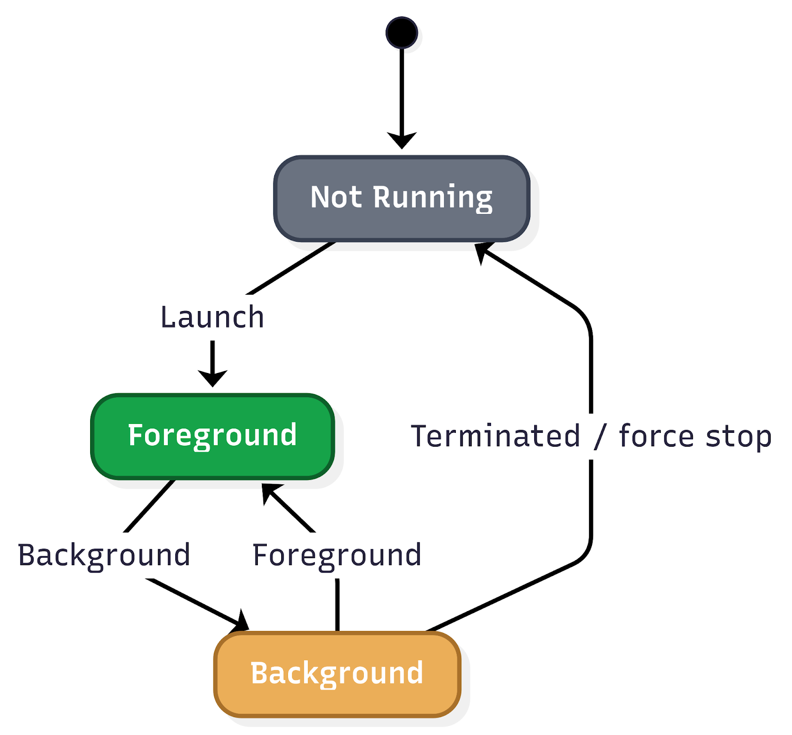
Understanding the application state is fundamental to comprehending user behavior and, consequently, executing effective troubleshooting. The application state provides crucial insights into how a user interacts with the app, particularly concerning its visibility and how it was initiated. This encompasses tracking when the app moves between the background and foreground, as well as the various launch mechanisms.

Figure 1. Application state user flow.

Key aspects of application state that are vital to monitor include:
Application lifecycle transitions:

  • Background state: When the app is running but not actively displayed to the user (e.g., the user switches to another app, or the device is locked). Understanding how frequently and for how long an app resides in the background can inform power consumption analysis and the effectiveness of background tasks.
  • Foreground state: When the app is actively in use and displayed to the user. Monitoring transitions into and out of the foreground provides a real-time view of user engagement.
  • Inactive state: A temporary state where the app is in the foreground but not receiving events (e.g., an incoming call temporarily interrupts the app).
  • Suspended state: An app that is in the background and has been explicitly suspended by the operating system to free up resources.
  • Terminated state: When the app has been completely closed or crashed. Differentiating between intentional termination and crashes is critical for identifying stability issues.

Application launch mechanisms:

The way an app is launched significantly impacts the initial user experience and can influence subsequent interactions. Tracking these different launch types is essential for understanding user entry points and for debugging issues that might be specific to a particular launch method.

  • Explicit user launch: This is the most straightforward launch mechanism, where the user directly taps on the app icon from their device’s home screen or app drawer. This indicates a deliberate intent to use the app and often signifies a primary entry point for regular users.
  • Deeplinks: Deeplinks are URLs that, when clicked, open a specific page or section within a mobile app rather than a web page. They are powerful tools for enhancing user experience and engagement by providing direct access to relevant content.
  • Push notifications: Push notifications are messages sent by an app to a user’s device even when the app is not actively in use. Tapping on a push notification often launches the app and directs the user to a specific context related to the notification’s content.
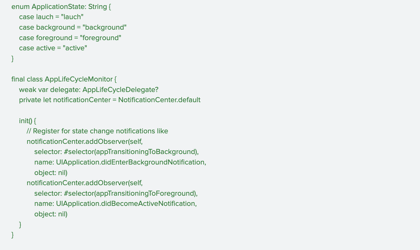
Figure 2. Code sample for tracking application lifecycle transition.

User interactions

Real-time session tracking is a crucial component in understanding user behavior and optimizing app performance. By meticulously tracking a wide array of user interactions, the system provides invaluable insights into how users navigate and engage with the app. This granular data forms the bedrock for constructing comprehensive user journeys, allowing development teams to visualise the path a user takes from their initial entry point to achieving their goals within the app.

This deep understanding of user interactions is the most important pillar in creating accurate and insightful user journey maps. These maps, in turn, are instrumental in identifying patterns of user behavior, both positive and negative. For instance, tracking helps to identify pain points, bugs, or areas of confusion that might lead to user frustration or abandonment.

Figure 3. Sample code for real-time session tracking.

UI screen

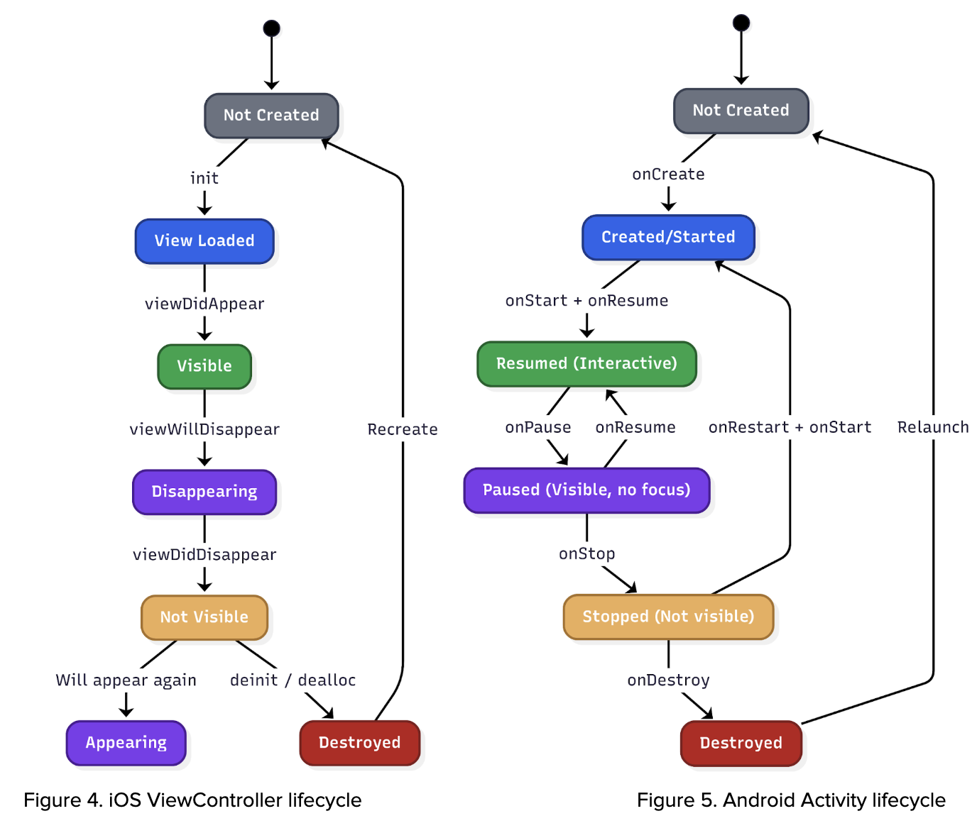
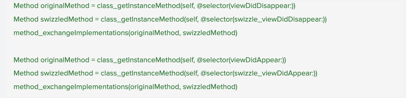
The system leverages lifecycle events from UIViewController (iOS), Activity (Android), and Fragments (Android) to accurately identify and track which specific screen is currently displayed to the user. This granular level of screen tracking is crucial because it significantly enriches the contextual information available to us. By understanding the precise UI that users are interacting with, we can account for the dynamic nature of our app. Different geographical regions, diverse user segments, and varying operational scenarios can lead to distinct user interfaces being presented. This capability ensures that our analysis and troubleshooting efforts are always based on the actual user experience, allowing for more precise problem identification and more effective solutions.

Figure 6. Sample code of UIViewController configuration.

UI screen data

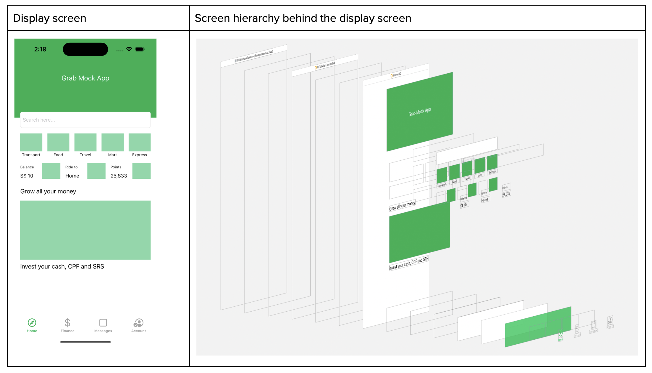
On top of that, whenever the screen appears, we capture the screen metadata where we read the full screen hierarchy. With the Screen hierarchy JSON data at hand, we employ it to train an AI model. This model, consequently, can generate an HTML file, which mirrors the user’s screen and interaction.

Disclaimer: information is redacted in compliance with GDPR/PDPA, personal data protection laws.

Figure 7. Screen hierarchy.

Applications of AutoTrack

Key applications of AutoTrack data:

  • Reconstructing user journeys and reproducing elusive bugs: One of the most significant benefits of AutoTrack is its ability to meticulously record user interactions within the app. This detailed session data allows our teams to precisely recreate the user journey that led to a reported issue. For bugs that are notoriously difficult to reproduce, this capability is a game-changer, eliminating hours of manual guesswork and dramatically accelerating the identification and resolution of underlying problems.
  • Automated issue assignment: When an issue is reported, AutoTrack data can be leveraged to automatically assign it to the most relevant team. By analysing the context of the issue within the recorded session, including the specific features or modules involved, the system can intelligently route the problem to the engineers best equipped to address it. This automation reduces triage time, ensures issues are handled by subject matter experts, and improves overall response efficiency.
  • Automating UI test case generation: The rich dataset provided by AutoTrack offers a powerful foundation for automating the creation of UI test cases. By observing how users interact with the interface, we can automatically generate test scripts that mimic real-world usage patterns. This not only speeds up the testing phase but also leads to more comprehensive test coverage, identifying edge cases and user flows that might otherwise be missed by manually written tests.
  • Understanding analytics event triggers: AutoTrack data provides a granular view into when and why specific analytics events are triggered within the application. This allows us to validate the accuracy of our analytics instrumentation, ensure that events are firing as expected, and gain deeper insights into user behavior. By understanding the precise context surrounding event triggers, we can refine our data collection strategies and derive more meaningful insights from our analytics.

Key takeaways and what’s next

AutoTrack replaces fragile manual instrumentation with a unified, real-time view of application state, screen context, and user interactions. That end-to-end trace makes elusive bugs reproducible, routes issues to the right owners, and seeds reliable UI tests—turning guesswork into grounded evidence so teams can ship fixes faster and with greater confidence.

Looking ahead, we are expanding AutoTrack across surfaces and deepening the context it captures—pairing sessions with network and performance signals, strengthening privacy guardrails, and integrating with automated triage and test generation. Look forward to reading more of our deep dives on auto-generated UI tests and how these journeys will power proactive quality across Grab’s app.

Join us

Grab is a leading superapp in Southeast Asia, operating across the deliveries, mobility and digital financial services sectors. Serving over 800 cities in eight Southeast Asian countries, Grab enables millions of people everyday to order food or groceries, send packages, hail a ride or taxi, pay for online purchases or access services such as lending and insurance, all through a single app. Grab was founded in 2012 with the mission to drive Southeast Asia forward by creating economic empowerment for everyone. Grab strives to serve a triple bottom line – we aim to simultaneously deliver financial performance for our shareholders and have a positive social impact, which includes economic empowerment for millions of people in the region, while mitigating our environmental footprint.

Powered by technology and driven by heart, our mission is to drive Southeast Asia forward by creating economic empowerment for everyone. If this mission speaks to you, join our team today!
Building Jetflow: a framework for flexible, performant data pipelines at Cloudflare

Post Syndicated from Harry Hough original https://blog.cloudflare.com/building-jetflow-a-framework-for-flexible-performant-data-pipelines-at-cloudflare/

The Cloudflare Business Intelligence team manages a petabyte-scale data lake and ingests thousands of tables every day from many different sources. These include internal databases such as Postgres and ClickHouse, as well as external SaaS applications such as Salesforce. These tasks are often complex and tables may have hundreds of millions or billions of rows of new data each day. They are also business-critical for product decisions, growth plannings, and internal monitoring. In total, about 141 billion rows are ingested every day.

As Cloudflare has grown, the data has become ever larger and more complex. Our existing Extract Load Transform (ELT) solution could no longer meet our technical and business requirements. After evaluating other common ELT solutions, we concluded that their performance generally did not surpass our current system, either.

It became clear that we needed to build our own framework to cope with our unique requirements — and so Jetflow was born. 

What we achieved

Over 100x efficiency improvement in GB-s:

  • Our longest running job with 19 billion rows was taking 48 hours using 300 GB of memory, and now completes in 5.5 hours using 4 GB of memory

  • We estimate that ingestion of 50 TB from Postgres via Jetflow could cost under $100 based on rates published by commercial cloud providers

>10x performance improvement:

  • Our largest dataset was ingesting 60-80,000 rows per second, this is now 2-5 million rows per second per database connection.

  • In addition, these numbers scale well with multiple database connections for some databases.

Extensibility: 

  • The modular design makes it easy to extend and test. Today Jetflow works with ClickHouse, Postgres, Kafka, many different SaaS APIs, Google BigQuery and many others. It has continued to work well and remain flexible with the addition of new use cases.

How did we do this?

Requirements

The first step to designing our new framework had to be a clear understanding of the problems we were aiming to solve, with clear requirements to stop us creating new ones.

Performant & efficient

We needed to be able to move more data in less time as some ingestion jobs were taking ~24 hours, and our data will only grow. The data should be ingested in a streaming fashion and use less memory and compute resources than our existing solution.

Backwards compatible 

Given the daily ingestion of thousands of tables, the chosen solution needed to allow for the migration of individual tables as needed. Due to our usage of Spark downstream and Spark’s limitations in merging desperate Parquet schemas, the chosen solution had to offer the flexibility to generate the precise schemas needed for each case to match legacy.

We also required seamless integration with our custom metadata system, used for dependency checks and job status information.

Ease of use

We want a configuration file that can be version-controlled, without introducing bottlenecks on repositories with many concurrent changes.

To increase accessibility for different roles within the team, another requirement was no-code (or configuration as code) in the vast majority of cases. Users should not have to worry about availability or translation of data types between source and target systems, or writing new code for each new ingestion. The configuration needed should also be minimal — for example, data schema should be inferred from the source system and not need to be supplied by the user.

Customizable

Striking a balance with the no-code requirement above, although we want a low bar of entry we also want to have the option to tune and override options if desired, with a flexible and optional configuration layer. For example, writing Parquet files is often more expensive than reading from the database, so we want to be able to allocate more resources and concurrency as needed. 

Additionally, we wanted to allow for control over where the work is executed, with the ability to spin up concurrent workers in different threads, different containers, or on different machines. The execution of workers and communication of data was abstracted away with an interface, and different implementations can be written and injected, controlled via the job configuration. 

Testable

We wanted a solution capable of running locally in a containerized environment, which would allow us to write tests for every stage of the pipeline. With “black box” solutions, testing often means validating the output after making a change, which is a slow feedback loop, risks not testing all edge cases as there isn’t good visibility of all code paths internally, and makes debugging issues painful.

Designing a flexible framework 

To build a truly flexible framework, we broke the pipeline down into distinct stages, and then create a config layer to define the composition of the pipeline from these stages, and any configuration overrides. Every pipeline configuration that makes sense logically should execute correctly, and users should not be able to create pipeline configs that do not work. 

Pipeline configuration

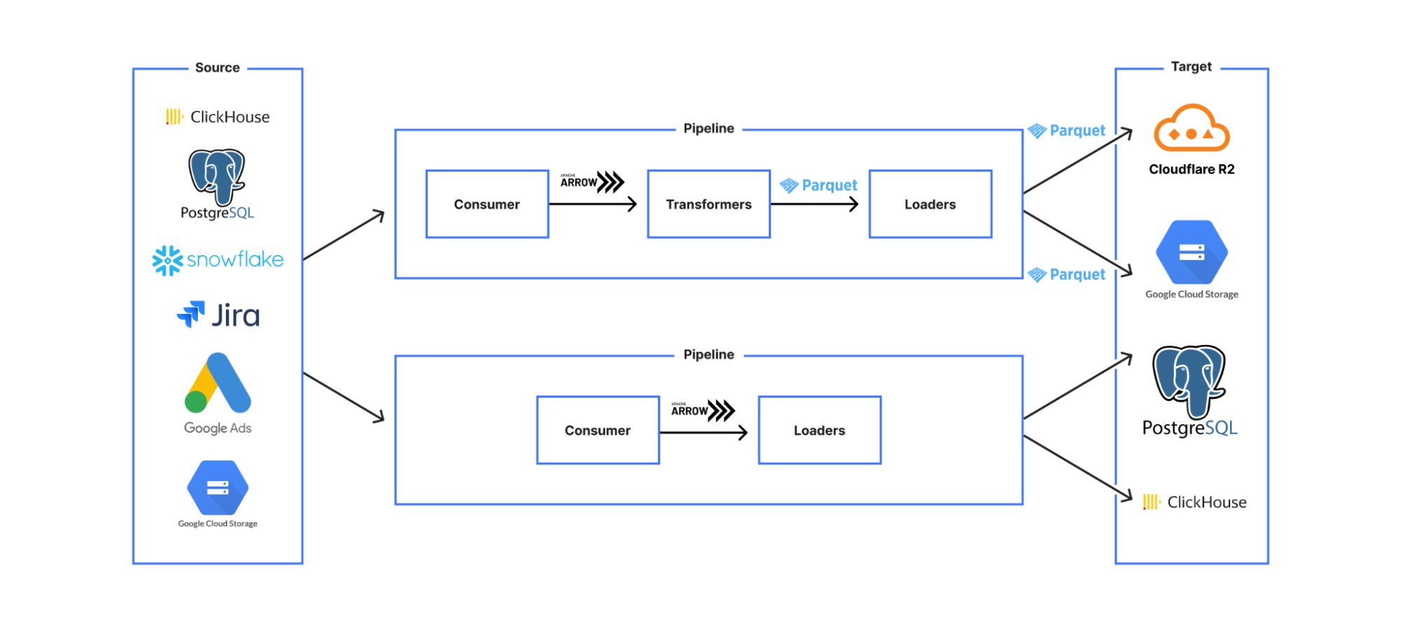
This led us to a design where we created stages which were classified according to the meaningfully different categories of:

  • Consumers

  • Transformers

  • Loaders


The pipeline was constructed via a YAML file that required a consumer, zero or more transformers, and at least one loader. Consumers create a data stream (via reading from the source system), Transformers (e.g. data transformations, validations) take a data stream input and output a data stream conforming to the same API so that they can be chained, and Loaders have the same data streaming interface, but are the stages with persistent effects — i.e. stages where data is saved to an external system. 

This modular design means that each stage is independently testable, with shared behaviour (such as error handling and concurrency) inherited from shared base stages, significantly decreasing development time for new use cases and increasing confidence in code correctness.

Data divisions

Next, we designed a breakdown for the data that would allow the pipeline to be idempotent both on whole pipeline re-run and also on internal retry of any data partition due to transient error. We decided on a design that let us parallelize processing, while maintaining meaningful data divisions that allowed the pipeline to perform cleanups of data where required for a retry.

  • RunInstance: the least granular division, corresponding to a business unit for a single run of the pipeline (e.g. one month/day/hour of data). 

  • Partition: a division of the RunInstance that allows each row to be allocated to a partition in a way that is deterministic and self-evident from the row data without external state, and is therefore idempotent on retry. (e.g. an accountId range, a 10-minute interval)

  • Batch: a division of the partition data that is non-deterministic and used only to break the data down into smaller chunks for streaming/parallel processing for faster processing with fewer resources. (e.g. 10k rows, 50 MB)

The options that the user configures in the consumer stage YAML both construct the query that is used to retrieve the data from the source system, and also encode the semantic meaning of this data division in a system agnostic way, so that later stages understand what this data represents — e.g. this partition contains the data for all accounts IDs 0-500. This means that we can do targeted data cleanup and avoid, for example, duplicate data entries if a single data partition is retried due to error.


Framework implementation

Standard internal state for stage compatibility 

Our most common use case is something like read from a database, convert to Parquet format, and then save to object storage, with each of these steps being a separate stage. As more use cases were onboarded to Jetflow, we had to make sure that if someone wrote a new stage it would be compatible with the other stages. We don’t want to create a situation where new code needs to be written for every output format and target system, or you end up with a custom pipeline for every different use case.

The way we have solved this problem is by having our stage extractor class only allow output data in a single format. This means as long as any downstream stages support this format as in the input and output format they would be compatible with the rest of the pipeline. This seems obvious in retrospect, but internally was a painful learning experience, as we originally created a custom type system and struggled with stage interoperability. 

For this internal format, we chose to use Arrow, an in-memory columnar data format. The key benefits of this format for us are:

  • Arrow ecosystem: Many data projects now support Arrow as an output format. This means when we write extractor stages for new data sources, it is often trivial to produce Arrow output.

  • No serialisation overhead: This makes it easy to move Arrow data between machines and even programming languages with minimum overhead. Jetflow was designed from the start to have the flexibility to be able to run in a wide range of systems via a job controller interface, so this efficiency in data transmission means there’s minimal compromise on performance when creating distributed implementations.

  • Reserve memory in large fixed-size batches to avoid memory allocations: As Go is a garbage collected (GC) language and GC cycle times are affected mostly by the number of objects rather than the sizes of those objects, fewer heap objects reduces CPU time spent garbage collecting significantly, even if the total size is the same. As the number of objects to scan, and possibly collect, during a GC cycle increases with the number of allocations, if we have 8192 rows with 10 columns each, Arrow would only require us to do 10 allocations versus the 8192 allocations of most drivers that allocate on a row by row basis, meaning fewer objects and lower GC cycle times with Arrow.

Converting rows to columns

Another important performance optimization was reducing the number of conversion steps that happen when reading and processing data. Most data ingestion frameworks internally represent data as rows. In our case, we are mostly writing data in Parquet format, which is column based. When reading data from column-based sources (e.g. ClickHouse, where most drivers receive RowBinary format), converting into row-based memory representations for the specific language implementation is inefficient. This is then converted again from rows to columns to write Parquet files. These conversions result in a significant performance impact.

Jetflow instead reads data from column-based sources in columnar formats (e.g. for ClickHouse-native Block format) and then copies this data into Arrow column format. Parquet files are then written directly from Arrow columns. The simplification of this process improves performance.


Writing each pipelines stage

Case study: ClickHouse

When testing an initial version of Jetflow, we discovered that due to the architecture of ClickHouse, using additional connections would not be of any benefit, since ClickHouse was reading faster than we were receiving data. It should then be possible, with a more optimized database driver, to take better advantage of that single connection to read a much larger number of rows per second, without needing additional connections.

Initially, a custom database driver was written for ClickHouse, but we ended up switching to the excellent ch-go low level library, which directly reads Blocks from ClickHouse in a columnar format. This had a dramatic effect on performance in comparison to the standard Go driver. Combined with the framework optimisations above, we now ingest millions of rows per second with a single ClickHouse connection.

A valuable lesson learned is that as with any software, tradeoffs are often made for the sake of convenience or a common use case that may not match your own. Most database drivers tend not to be optimized for reading large batches of rows, and have high per-row overhead.

Case study: Postgres

For Postgres, we use the excellent jackc/pgx driver, but instead of using the database/sql Scan interface, we directly receive the raw bytes for each row and use the jackc/pgx internal scan functions for each Postgres OID (Object Identifier) type.

The database/sql Scan interface in Go uses reflection to understand the type passed to the function and then also uses reflection to set each field with the column value received from Postgres. In typical scenarios, this is fast enough and easy to use, but falls short for our use cases in terms of performance. The jackc/pgx driver reuses the row bytes produced each time the next Postgres row is requested, resulting in zero allocations per row. This allows us to write high-performance, low-allocation code within Jetflow. With this design, we are able to achieve nearly 600,000 rows per second per Postgres connection for most tables, with very low memory usage.

Conclusion

As of early July 2025, the team ingests 77 billion records per day via Jetflow. The remaining jobs are in the process of being migrated to Jetflow, which will bring the total daily ingestion to 141 billion records. The framework has allowed us to ingest tables in cases that would not otherwise have been possible, and provided significant cost savings due to ingestions running for less time and with fewer resources. 

In the future, we plan to open source the project, and if you are interested in joining our team to help develop tools like this, then open roles can be found at https://www.cloudflare.com/careers/jobs/.

Design system annotations, part 2: Advanced methods of annotating components

Post Syndicated from Jan Maarten original https://github.blog/engineering/user-experience/design-system-annotations-part-2-advanced-methods-of-annotating-components/


In part one of our design system annotation series, we discussed the ways in which accessibility can get left out of design system components from one instance to another. Our solution? Using a set of “Preset annotations” for each component with Primer. This allows designers to include specific pre-set details that aren’t already built into the component and visually communicated in the design itself. 

That being said, Preset annotations are unique to each design system — and while ours may be a helpful reference for how to build them — they’re not something other organizations can utilize if you’re not also using the Primer design system. 

Luckily, you can build your own. Here’s how. 

How to make Preset annotations for your design system

Start by assessing components to understand which ones would need Preset annotations—not all of them will. Prioritize components that would benefit most from having a Preset annotation, and build that key information into each one. Next, determine what properties should be included. Only include key information that isn’t conveyed visually, isn’t in the component properties, and isn’t already baked into a coded component. 

The start of a list of Primer components with notes for those which need Preset annotations. There are notes pointing to ActionBar, ActionMenu, and Autocomplete with details about what information should be documented in their Preset.

Prioritizing components

When a design system has 60+ components, knowing where to start can be a challenge. Which components need these annotations the most? Which ones would have the highest impact for both design teams and our users? 

When we set out to create a new set of Preset annotations based on our proof of concept, we decided to use ten Primer components that would benefit the most. To help pick them, we used an internal tool called Primer Query that tracks all component implementations across the GitHub codebase as well as any audit issues connected to them. Here is a video breakdown of how it works, if you’re curious. 

We then prioritized new Preset annotations based on the following criteria:

  1. Components that align to organization priorities (i.e. high value products and/or those that receive a lot of traffic).
  2. Components that appear frequently in accessibility audit issues.
  3. Components with React implementations (as our preferred development framework).
  4. Most frequently implemented components. 

Mapping out the properties

For each component, we cross-referenced multiple sources to figure out what component properties and attributes would need to be added in each Preset annotation. The things we were looking for may only exist in one or two of those places, and thus are less likely to be accounted for all the way through the design and development lifecycle. The sources include:

Component documentation on Primer.style

Design system docs should contain usage guidance for designers and developers, and accessibility requirements should be a part of this guidance as well. Some of the guidance and requirements get built into the component’s Figma asset, while some only end up in the coded component. 

Look for any accessibility requirements that are not built into either Figma or code. If it’s built in, putting the same info in the Preset annotation may be redundant or irrelevant.

Coded demos in Storybook 

Our component sandbox helped us see how each component is built in React or Rails, as well as what the HTML output is. We looked for any code structure or accessibility attributes that are not included in the component documentation or the Figma asset itself—especially when they may vary from one implementation to another. 

Component properties in the Figma asset library

Library assets provide a lot of flexibility through text layers, image fills, variants, and elaborate sets of component properties. We paid close attention to these options to understand what designers can and can’t change. Worthwhile additions to a Preset Annotation are accessibility attributes, requirements, and usage guidance in other sources that aren’t built into the Figma component. 

Other potential sources 

  • Experiences from team members: The designers, developers, and accessibility specialists you work with may have insight into things that the docs and design tools may have missed. If your team and design system have been around for a while, their insights may be more valuable than those you’ll find in the docs, component demos, or asset libraries. Take some time to ask which components have had challenging bugs and which get intentionally broken when implemented.
  • Findings from recent audits: Design system components themselves may have unresolved audit issues and remediation recommendations. If that’s the case, those issues are likely present in Storybook demos and may be unaccounted for in the component documentation. Design system audit issues may have details that both help create a Preset annotation and offer insights about what should not be carried over from existing resources.

What we learned from creating Preset annotations

Preset annotations may not be for every team or organization. However, they are especially well suited for younger design systems and those that aren’t well adopted. 

Mature design systems like Primer have frequent updates. This means that without close monitoring, the design system components themselves may fall out of sync with how a Preset annotation is built. This can end up causing confusion and rework after development starts, so it may be wise to make sure there’s some capacity to maintain these annotations after they’ve been created. 

For newer teams at GitHub, new members of existing teams, and team members who were less familiar with the design system, the built-in guidance and links to documentation and component demos proved very useful. Those who are more experienced are also able to fine-tune the Presets and how they’re used.

If you don’t already have extensive experience with the design system components (or peers to help build them), it can take a lot of time to assess and map out the properties needed to build a Preset. It can also be challenging to name a component property succinctly enough that it doesn’t get truncated in Figma’s properties panel. If the context is not self-evident, some training or additional documentation may help.

It’s not always clear that you need a Preset annotation

There may be enough overlap between the Preset annotation for a component and types of annotations that aren’t specific to the design system. 
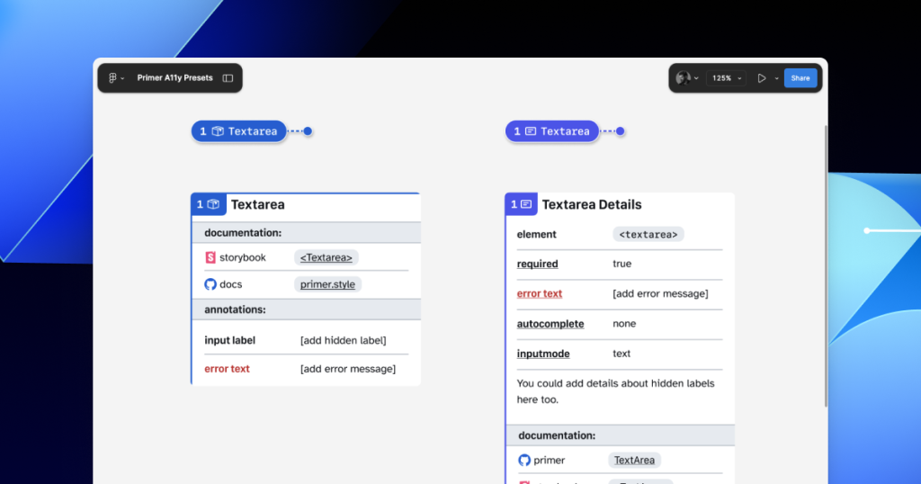
For example, the GitHub Annotation Toolkit has components to annotate basic <textarea> form elements in addition to a Preset annotation for our <TextArea> Primer component:

Comparison between a Form Element annotation for the textarea HTML element and a Preset annotation for the TextArea Primer component.

In many instances, this flexibility may be confusing because you could use either annotation. For example, the Primer <TextArea> Preset has built-in links to specific Primer docs, and while the non-Preset version doesn’t, you could always add the links manually. While there’s some overlap between the two, using either one is better than none. 

One way around this confusion is to add Primer-specific properties to the default set of annotations. This would allow you to do things like toggle a boolean property on a normal Button annotation and have it show links and properties specific to your design system’s button component. 

Our Preset creation process may unlock automation

There are currently a number of existing Figma plugins that advertise the ability to scan a design file to help with annotations. That being said, the results are often mixed and contain an unmanageable amount of noise and false positives. One of the reasons these issues happen is that these public plugins are design system agnostic.

Current automated annotation tools aren’t able to understand that any design system components are being used without bespoke programming or thorough training of AI models. For plugins like this to be able to label design elements accurately, they first need to understand how to identify the components on the canvas, the variants used, and the set properties. 

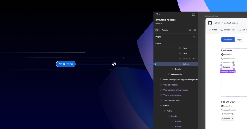
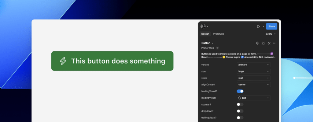
A Figma file showing an open design for Releases with an expanded layer tree highlighting a Primer Button component in the design. To the left of the screenshot are several git-lines and a Preset annotation for a Primer Button with a zap icon intersecting it. The git-line trails and the direction of the annotation give the feeling of flying toward the layer tree, which visually suggests this Primer Button layer can be automatically identified and annotated.

With that in mind, perhaps the most exciting insight is that the process of mapping out component properties for a Preset annotation—the things that don’t get conveyed in the visual design or in the code—is also something that would need to be done in any attempt to automate more usable annotations. 

In other words, if a team uses a design system and wants to automate adding annotations, the tool they use would need to understand their components. In order for it to understand their components well enough to automate accurately, these hidden component properties would need to be mapped out. The task of creating a set of Preset annotations may be a vital stepping stone to something even more streamlined. 

A promising new method: Figma’s Code Connect 

While building our new set of Preset annotations, we experimented with other ways to enhance Primer with annotations. Though not all of those experiments worked out, one of them did: adding accessibility attributes through Code Connect. 

Primer was one of the early adopters of Figma’s new Code Connect feature in Dev Mode. Says Lukas Oppermann, our staff systems designer, “With Code Connect, we can actually move the design and the code a little bit further apart again. We can concentrate on creating the best UX for the designers working in Figma with design libraries and, on the code side, we can have the best developer experience.” 

To that end, Code Connect allows us to bypass much of our Preset annotations, as well as the downsides of some of our other experiments. It does this by adding key accessibility details directly into the code that developers can export from Figma.

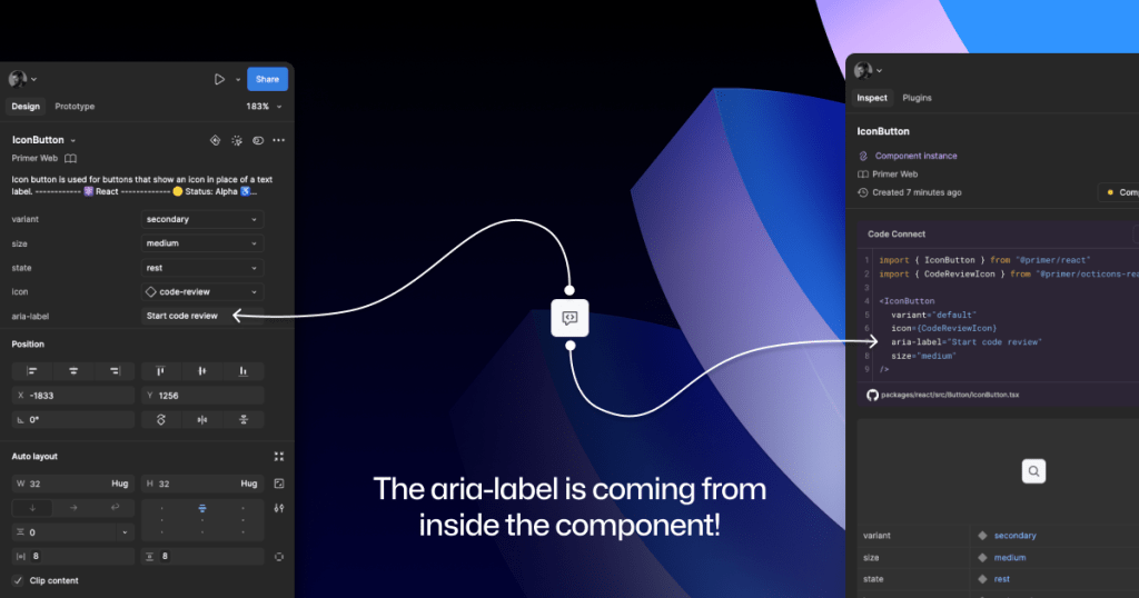
GitHub’s Octicons are used in many of our Primer components. They are decorative by default, but they sometimes need alt text or aria-label attributes depending on how they’re used. In the IconButton component, that button uses an Octicon and needs an accessible name to describe its function. 

When using a basic annotation kit, this may mean adding stamps for a Button and Decorative Image as well as a note in the margins that specifies what the aria-label should be. When using Preset annotations, there are fewer things to add to the canvas and the annotation process takes less time.

With Code Connect set up, Lukas added a hidden layer in the IconButton Figma component. It has a text property for aria-label which lets designers add the value directly from the component properties panel. No annotations needed. The hidden layer doesn’t disrupt any of the visuals, and the aria-label property gets exported directly with the rest of the component’s code.

An IconButton component with a code-review icon. On the left is a screenshot of the component’s properties panel, with an aria-label value of: Start code review. On the right is the Code Connect output showing usable React code for an IconButton that includes the parameter: aria-label=Start code review.

It takes time to set up Code Connect with each of your design system components. Here are a few tips to help:

  • Consistency is key. Make sure that the properties you create and how you place hidden layers is consistent across components. This helps set clear expectations so your teams can understand how these hidden layers and properties function. 
  • Use a branch of your design system library to experiment. Hiding attributes like aria-label is quite simple compared to other complex information that Preset annotations are capable of handling. 
  • Use visual regression testing (VRT). Adding complexity directly to a component comes with increased risk of things breaking in the future, especially for those with many variants. Figma’s merge conflict UI is helpful, but may not catch everything.

We’ve made the GitHub Annotation Toolkit open source, so you can see first-hand how we’ve implemented our Primer A11y Preset annotations and visual regression tests. Check it out and start annotating today!

Figma library cover for the GitHub Annotation Toolkit with a grid background that looks like a starry night sky. There's an armada of little annotation stamp labels covering the bottom two thirds of the image, all at an angle. There's a series of angled git lines above them. Both look like they're launching from the ground and through into the sky grid.

Further reading

Accessibility annotation kits are a great resource, provided they’re used responsibly. Eric Bailey, one of the contributors to our forthcoming GitHub Annotation Toolkit, has written extensively about how annotations can highlight and amplify deeply structural issues when you’re building digital products.

The post Design system annotations, part 2: Advanced methods of annotating components appeared first on The GitHub Blog.

Design system annotations, part 1: How accessibility gets left out of components

Post Syndicated from Jan Maarten original https://github.blog/engineering/user-experience/design-system-annotations-part-1-how-accessibility-gets-left-out-of-components/


When it comes to design systems, every organization tends to be at a different place in their accessibility journey. Some have put a great deal of work into making their design system accessible while others have a long way to go before getting there. To help on this journey, many organizations rely on accessibility annotations to make sure there are no access barriers when a design is ready to be built. 

However, it’s a common misconception (especially for organizations with mature design systems) that accessible components will result in accessible designs. While design systems are fantastic for scaling standards and consistency, they can’t prevent every issue with our designs or how we build them. Access barriers can still slip through the cracks and make it into production.

This is the root of the problem our Accessibility Design team set out to solve. 

In this two-part series, we’ll show you exactly how accessible design system components can produce inaccessible designs. Then we’ll demonstrate our solution: integrating annotations with our Primer components. This allows us to spend less time annotating, increases design system adoption, and reaches teams who may not have accessibility support. And in our next post, we’ll walk you through how you can do the same for your own components.

Let’s dig in.

What are annotations and their benefits? 

Annotations are notes included in design projects that help make the unseen explicit by conveying design intent that isn’t shown visually. They improve the usability of digital experiences by providing a holistic picture for developers of how an experience should function. Integrating annotations into our design process helps our teams work better together by closing communication gaps and preventing quality issues, accessibility audit issues, and expensive re-work. 

Some of the questions annotations help us answer include:

  • How is assistive technology meant to navigate a page from one element to another?
  • What’s the alternative text for informative images and buttons without labels?
  • How does content shift depending on viewport size, screen orientation, or zoom level?
  • Which virtual keyboard should be used for a form input on mobile?
  • How should focus be managed for complex interactions?

Our answers to questions like this—or the lack thereof—can make or break the experience of the web for a lot of people, especially users with disabilities. Some annotation tools are built specifically to help with this by guiding designers to include key details about web standards, platform functionality, and accessibility (a11y). 

Most public annotation kits are well suited for teams who are creating new design system components, teams who aren’t already using a design system, or teams who don’t have specialized accessibility knowledge. They usually help annotate things like:

  • Controls such as buttons and links
  • Structural elements such as headings and landmarks
  • Decorative images and informative descriptions 
  • Forms and other elements that require labels and semantic roles 
  • Focus order for assistive technology and keyboard navigation

GitHub’s annotation’s toolkit

One of our top priorities is to meet our colleagues where they’re at. We wanted all our designers to be able to use annotations out of the box because we believe they shouldn’t need to be a certified accessibility specialist in order to get things built in an accessible way. 

 A browser window showing the Web Accessibility Annotation Kit in the cvs-health/annotations repository.

To this end, last year we began creating an internal Figma library—the GitHub Annotation Toolkit—which is now open source! Our toolkit builds on the legacy of the former Inclusive Design team at CVS Health. Their two open source annotation kits help make documentation that’s easy to create and consume, and are among the most widely used annotation libraries in the Figma Community. 

While they add clarity, annotations can also add overhead. If teams are only relying on specialists to interpret designs and technical specifications for developers, the hand-off process can take longer than it needs to. To create our annotation toolkit, we rebuilt its predecessor from the ground up to avoid that overhead, making extensive improvements and adding inline documentation to make it more intuitive and helpful for all of our designers—not just accessibility specialists. 

Design systems can also help reduce that overhead. When you audit your design systems for accessibility, there’s less need for specialist attention on every product feature, since you’re using annotations to add technical semantics and specialist knowledge into every component. This means that designers and developers only need to adhere to the usage guidelines consistently, right?

The problems with annotations and design system components

Unfortunately, it’s not that simple. 

Accessibility is not binary

While design systems can help drive more accessible design at scale, they are constantly evolving and the work on them is never done. The accessibility of any component isn’t binary. Some may have a few severe issues that create access barriers, such as being inoperable with a keyboard or missing alt text. Others may have a few trivial issues, such as generic control labels. 

Most of the time, it will be a misnomer to claim that your design system is “fully accessible.” There’s always more work to do—it’s just a question of how much. The Web Content Accessibility Guidelines (WCAG) are a great starting point, but their “Success Criteria” isn’t tailored for the unique context that is your website or product or audience. 

While the WCAG should be used as a foundation to build from, it’s important to understand that it can’t capture every nuance of disabled users’ needs because your users’ needs are not every user’s needs. It would be very easy to believe that your design system is “fully accessible” if you never look past WCAG to talk to your users. If Primer has accessible components, it’s because we feel that direct participation and input from daily assistive technology users is the most important aspect of our work. Testing plans with real users—with and without disabilities—is where you really find what matters most. 

Accessible components do not guarantee accessible designs

Arranging a series of accessible components on a page does not automatically create an accurate and informative heading hierarchy. There’s a good chance that without additional documentation, the heading structure won’t make sense visually—nor as a medium for navigating with assistive technology.

A page wireframe showing a linear layout of an H1 title, an H2 in a banner below it, and a row of several cards below with headings of H4. The caption reads: this accessible card has an H4, breaking the page structure by skipping heading levels. Next to the wireframe is a diagram showing the page structure as a tree view, highlighting the level skipping from H2 to H4.

It’s great when accessible components are flexible and responsive, but what about when they’re placed in a layout that the component guidance doesn’t account for? Do they adapt to different zoom levels, viewport sizes, and screen orientations? Do they lose any functionality or context when any of those things change?

Component usage is contextual. You can add an image or icon to your design, but the design system docs can’t write descriptive text for you. You can use the same image in multiple places, but the image description may need to change depending on context. 

Similarly, forms built using the same input components may do different things and require different error validation messages. It’s no wonder that adopting design system components doesn’t get rid of all audit issues.

Design system components in Figma don’t include all the details

Annotation kits don’t include components for specific design systems because almost every organization is using their own. When annotation kits are adopted, teams often add ways to label their design system components. 

This labeling lets developers know they can use something that’s already been built, and that they don’t need to build something from scratch. It also helps identify any design system components that get ‘detached’ in Figma. And it reduces the number of things that need to be annotated. 

Let’s look at an example:

A green Primer button with a lightning bolt icon and a label that says: this button does something. To the right is a set of Figma component properties that control the button’s visual appearance.

If we’re using this Primer Button component from the Primer Web Figma library, there are a few important things that we won’t know just by looking at the design or the component properties:

  • Functional differences when components are implemented. Is this a link that just looks visually like a button? If so, a developer would use the <LinkButton> React component instead of <Button>.
  • Accessible labels for folks using assistive technology. The icon may need alt text. In some cases, the button text might need some visually-hidden text to differentiate it from similar buttons. How would we know what that text is? Without annotations, the Figma component doesn’t have a place to display this.
  • Whether user data is submitted. When a design doesn’t include an obvious form with input fields, how do we convey that the button needs specific attributes to submit data? 

It’s risky to leave questions like this unanswered, hoping someone notices and guesses the correct answer. 

A solution that streamlines the annotation process while minimizing risk

When creating new components, a set of detailed annotations can be a huge factor in how robust and accessible they are. Once the component is built, design teams can start to add instances of that component in their designs. When those designs are ready to be annotated, those new components shouldn’t need to be annotated again. In most cases, it would be redundant and unnecessary—but not in every case. 

There are some important details in many Primer components that may change from one instance to another. If we use the CVS Health annotation kit out of the box, we should be able to capture those variations, but we wouldn’t be able to avoid those redundant and unnecessary annotations. As we built our own annotation toolkit, we built a set of annotations for each Primer component to do both of those things at once. 

An annotated Primer Brand accordion with six Stamps and four Detail notes in the margins.

This accordion component has been thoroughly annotated so that an engineer has everything they need to build it the first time. These include heading levels, semantics for <detail> and <summary> elements, landmarks, and decorative icons. All of this is built into the component so we don’t need to annotate most of this when adding the accordion to our new designs.

However, there are two important things we need to annotate, as they can change from one instance to another:

  1. The optional title at the top.
  2. The heading level of each item within the accordion.

If we don’t specify these things, we’re leaving it to chance that the page’s heading structure will break or that the experience will be confusing for people to understand and navigate the page. The risks may be low for a single button or basic accordion, but they grow with pattern complexity, component nesting, interaction states, duplicated instances, and so on. 

An annotated Primer Brand accordion with one Stamp and one Detail note in the margins.

Instead of annotating what’s already built into the component or leaving these details to chance, we can add two quick annotations. One Stamp to point to the component, and one Details annotation where we fill in some blanks to make the heading levels clear. 

Because the prompts for specific component details are pre-set in the annotation, we call them Preset annotations.

A mosaic of preset annotation for various Primer components.

Introducing our Primer A11y Preset annotations

With this proof of concept, we selected ten frequently used Primer components for the same treatment and built a new set of Preset annotations to document these easily missed accessibility details—our Primer A11y Presets. 

Those Primer components tend to contribute to more accessibility audit issues when key details are missing on implementation. Issues for these components relate to things like lack of proper labels, error validation messages, or missing HTML or ARIA attributes

IconButton Preset annotation, with guidance toggled on.

Each of our Preset annotations is linked to component docs and Storybook demos. This will hopefully help developers get straight to the technical info they need without designers having to find and add links manually. We also included guidance for how to fill out each Preset, as well as how to use the component in an accessible way. This helps designers get support inline without leaving their Figma canvas. 

Want to create your own? Check out Design system annotations, part 2

Button components in Google’s Material Design and Shopify’s Polaris, IBM’s Carbon, or our Primer design system are all very different from one another. Because Preset annotations are based on specific components, they only work if you’re also using the design system they’re made for. 

In part 2 of this series, we’ll walk you through how you can build your own set of Preset annotations for your design system, as well as some different ways to document important accessibility details before development starts.

You may also like: 

If you’re more of a visual learner, you can watch Alexis Lucio explore Preset annotations during GitHub’s Dev Community Event to kick off Figma’s Config 2024. 

Get the guide to GitHub’s Annotation Toolkit >

The post Design system annotations, part 1: How accessibility gets left out of components appeared first on The GitHub Blog.

Leveraging RAG-powered LLMs for Analytical Tasks

Post Syndicated from Grab Tech original https://engineering.grab.com/transforming-the-analytics-landscape-with-RAG-powered-LM

Introduction

Retrieval-Augmented Generation (RAG) is a powerful process that is designed to integrate direct function calling to answer queries more efficiently by retrieving relevant information from a broad database. In the rapidly evolving business landscape, Data Analysts (DAs) are struggling with the growing number of data queries from stakeholders. The conventional method of manually writing and running similar queries repeatedly is time-consuming and inefficient. This is where RAG-powered Large Language Models (LLMs) step in, offering a transformative solution to streamline the analytics process and empower DAs to focus on higher value tasks.

In this article, we will share how the Integrity Analytics team has built out a data solution using LLMs to help automate tedious analytical tasks like generating regular metric reports and performing fraud investigations.

While LLMs are known for their proficiency in data interpretation and insight generation, they represent just a fragment of the entire solution. For a comprehensive solution, LLMs must be integrated with other essential tools. The following is required in assembling a solution:

  • Internally facing LLM tool – Spellvault is a platform within Grab that stores, shares, and refines LLM prompts. It features low/no-code RAG capabilities that lower the barrier of entry for people to create LLM applications.
  • Data – with real time or close to real-time latency to ensure accuracy. It has to be in a standardised format to ensure that all LLM data inputs are accurate.
  • Scheduler – runs LLM applications at regular intervals. Useful for automating routine tasks.
  • Messaging Tool – a user interface where users can interact with LLM by entering a command to receive reports and insights.

Introducing Data-Arks, the data middleware serving up relevant data to the LLM agents

For most data use cases, DAs are usually running the same set of SQL queries with minor changes to parameters like dates, age or other filter conditions. In most instances, we already have a clear understanding of the required data and format to accomplish a task. Therefore, we need a tool that can execute the exact SQL query and channel the data output to the LLM.

Figure 1. Data-Arks hosts various APIs which can be called to serve data to applications like SpellVault.

What is Data-Arks?

Data-Arks is an in-house Python-based API platform housing several frequently used SQL queries and python functions packaged into individual APIs. Data-Arks is also integrated with Slack, Wiki, and JIRA APIs, allowing users to parse and fetch information and data from these tools as well. The benefits of Data-Arks are summarised as follows:

  • Integration: Data-Arks service allows users to upload any SQL query or Python script on the platform. These queries are then surfaced as APIs, which can be called to serve data to the LLM agent.

  • Versatility: Data-Arks can be extended to everyone. Employees from various teams and functions at Grab can self-serve to upload any SQL query that they want onto the platform, allowing this tool to be used for different teams’ use cases.

Automating regular report generation and summarisation using Data-Arks and Spellvault

LLMs are just one piece of the puzzle, to build a comprehensive solution, they must be integrated with other tools. Figure 2 shows how different tools are used in executing report summaries in Slack.

Figure 2 shows how different tools are used in executing report summaries in Slack.

Figure 2. Report Summarizer uses various tools to summarise queries and deliver a summarised report through Slack.

Figure 3 is an example of a summarised report generated by the Report Summarizer using dummy data. Report Summarizer calls a Data-Arks API to generate the data in a tabular format and LLM helps summarise and generate a short paragraph of key insights. This automated report generation has helped save an estimated 3-4 hours per report.

Figure 3. Sample of a report generated using dummy data extracted from [https://data.gov.my/](https://data.gov.my/).

LLM bots for fraud investigations

LLMs also excel in helping to streamline fraud investigations, as LLMs are able to contextualise several different data points and information and derive useful insights from them.

Introducing A* bot, the team’s very own LLM fraud investigation helper.

A set of frequently used queries for fraud investigation is made available as Data-Arks APIs. Upon a user prompt or query, SpellVault selects the most relevant queries using RAG, executes them and provides a summary of the results to users through Slack.

Figure 4. A* bot uses Data-Arks and Spellvault to get information for fraud investigations.

Figure 5 shows a sample of fraud investigation responses from A* bot. Scaling to multiple queries for a fraud investigation process, what was once a time-consuming fraud investigation can now be reduced to a matter of minutes, as the A* bot is capable of providing all the necessary information simultaneously.

Figure 5. Sample of fraud investigation responses.

RAG vs fine-tuning

On deciding between RAG or fine-tuning to improve LLM accuracy, three key factors tipped the scales in favour of the RAG approach:

  • Effort and cost considerations
    Fine-tuning requires significant computational cost as it involves taking a base model and further training it with smaller, domain specific data and context. RAG is computationally less expensive as it relies on retrieving only relevant data and context to augment a model’s response. As the same base model can be used for different use cases, RAG is the preferred choice due to its flexibility and cost efficiency.

  • Ability to respond with the latest information
    Fine-tuning requires model re-training with each new information update, whereas RAG simply retrieves required context and data from a knowledge base to enhance its response. Thus, by using RAG, LLM is able to answer questions using the most current information from our production database, eliminating the need for model re-training.

  • Speed and scalability
    Without the burden of model re-training, the team can rapidly scale and build out new LLM applications with a well managed knowledge base.

What’s next?

The potential of using RAG-powered LLM can be limitless as the ability of GPT is correlated with the tools it equips. Hence, the process does not stop here and we will try to onboard more tools or integration to GPT. In the near future, we plan to utilise Data-Arks to provide images to GPT as GPT-4o is a multimodal model that has vision capabilities. We are committed to pushing the boundaries of what’s possible with RAG-powered LLM, and we look forward to unveiling the exciting advancements that lie ahead.

Figure 6. What’s next?

We would like to express our sincere gratitude to the following individuals and teams whose invaluable support and contributions have made this project a reality:
– Meichen Lu, a senior data scientist at Grab, for her guidance and assistance in building the MVP and testing the concept.
– The data engineering team, particularly Jia Long Loh and Pu Li, for setting up the necessary services and infrastructure.

Join us

Grab is the leading superapp platform in Southeast Asia, providing everyday services that matter to consumers. More than just a ride-hailing and food delivery app, Grab offers a wide range of on-demand services in the region, including mobility, food, package and grocery delivery services, mobile payments, and financial services across 700 cities in eight countries.

Powered by technology and driven by heart, our mission is to drive Southeast Asia forward by creating economic empowerment for everyone. If this mission speaks to you, join our team today!
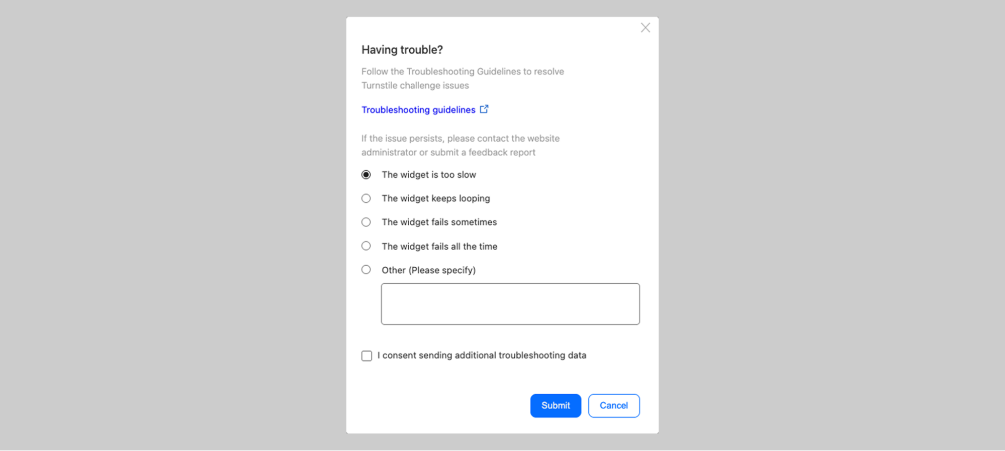
Unveiling the process: The creation of our powerful campaign builder

Post Syndicated from Grab Tech original https://engineering.grab.com/the-creation-of-our-powerful-campaign-builder

In a previous blog, we introduced Trident, Grab’s internal marketing campaign platform. Trident empowers our marketing team to configure If This, Then That (IFTTT) logic and processes real-time events based on that.

While we mainly covered how we scaled up the system to handle large volumes of real-time events, we did not explain the implementation of the event processing mechanism. This blog will fill up this missing piece. We will walk you through the various processing mechanisms supported in Trident and how they were built.

Base building block: Treatment

In our system, we use the term “treatment” to refer to the core unit of a full IFTTT data structure. A treatment is an amalgamation of three key elements – an event, conditions (which are optional), and actions. For example, consider a promotional campaign that offers “100 GrabPoints for completing a ride paid with GrabPay Credit”. This campaign can be transformed into a treatment in which the event is “ride completion”, the condition is “payment made using GrabPay Credit”, and the action is “awarding 100 GrabPoints”.

Data generated across various Kafka streams by multiple services within Grab forms the crux of events and conditions for a treatment. Trident processes these Kafka streams, treating each data object as an event for the treatments. It evaluates the set conditions against the data received from these events. If all conditions are met, Trident then executes the actions.

Figure 1. Trident processes Kafka streams as events for treatments.

When the Trident user interface (UI) was first established, campaign creators had to grasp the treatment concept and configure the treatments accordingly. As we improved the UI, it became more user-friendly.

Building on top of treatment

Campaigns can be more complex than the example we provided earlier. In such scenarios, a single campaign may need transformation into several treatments. All these individual treatments are categorised under what we refer to as a “treatment group”. In this section, we discuss features that we have developed to manage such intricate campaigns.

Counter

Let’s say we have a marketing campaign that “rewards users after they complete 4 rides”. For this requirement, it’s necessary for us to keep track of the number of rides each user has completed. To make this possible, we developed a capability known as counter.

On the backend, a single counter setup translates into two treatments.

Treatment 1:

  • Event: onRideCompleted
  • Condition: N/A
  • Action: incrementUserStats

Treatment 2:

  • Event: onProfileUpdate
  • Condition: Ride Count == 4
  • Action: awardReward

In this feature, we introduce a new event, onProfileUpdate. The incrementUserStats action in Treatment 1 triggers the onProfileUpdate event following the update of the user counter. This allows Treatment 2 to consume the event and perform subsequent evaluations.

Figure 2. The end-to-end evaluation process when using the Counter feature.

When the onRideCompleted event is consumed, Treatment 1 is evaluated which then executes the incrementUserStat action. This action increments the user’s ride counter in the database, gets the latest counter value, and publishes an onProfileUpdate event to Kafka.

There are also other consumers that listen to onProfileUpdate events. When this event is consumed, Treatment 2 is evaluated. This process involves verifying whether the Ride Count equals to 4. If the condition is satisfied, the awardReward action is triggered.

This feature is not limited to counting the number of event occurrences only. It’s also capable of tallying the total amount of transactions, among other things.

Delay

Another feature available on Trident is a delay function. This feature is particularly beneficial in situations where we want to time our actions based on user behaviour. For example, we might want to give a ride voucher to a user three hours after they’ve ordered a ride to a theme park. The intention for this is to offer them a voucher they can use for their return trip.

On the backend, a delay setup translates into two treatments. Given the above scenario, the treatments are as follows:

Treatment 1:

  • Event: onRideCompleted
  • Condition: Dropoff Location == Universal Studio
  • Action: scheduleDelayedEvent

Treatment 2:

  • Event: onDelayedEvent
  • Condition: N/A
  • Action: awardReward

We introduce a new event, onDelayedEvent, which Treatment 1 triggers during the scheduleDelayedEvent action. This is made possible by using Simple Queue Service (SQS), given its built-in capability to publish an event with a delay.

Figure 3. The end-to-end evaluation process when using the Delay feature.

The maximum delay that SQS supports is 15 minutes; meanwhile, our platform allows for a delay of up to x hours. To address this limitation, we publish the event multiple times upon receiving the message, extending the delay by another 15 minutes each time, until it reaches the desired delay of x hours.

Limit

The Limit feature is used to restrict the number of actions for a specific campaign or user within that campaign. This feature can be applied on a daily basis or for the full duration of the campaign.

For instance, we can use the Limit feature to distribute 1000 vouchers to users who have completed a ride and restrict it to only one voucher for one user per day. This ensures a controlled distribution of rewards and prevents a user from excessively using the benefits of a campaign.

In the backend, a limit setup translates into conditions within a single treatment. Given the above scenario, the treatment would be as follows:

  • Event: onRideCompleted
  • Condition: TotalUsageCount <= 1000 AND DailyUserUsageCount <= 1
  • Action: awardReward

Similar to the Counter feature, it’s necessary for us to keep track of the number of completed rides for each user in the database.

Figure 4. The end-to-end evaluation process when using the Limit feature.

A better campaign builder

As our campaigns grew more and more complex, the treatment creation quickly became overwhelming. A complex logic flow often required the creation of many treatments, which was cumbersome and error-prone. The need for a more visual and simpler campaign builder UI became evident.

Our design team came up with a flow-chart-like UI. Figure 5, 6, and 7 show examples of how certain imaginary campaign setup would look like in the new UI.

Figure 5. When users complete a food order, if they are a gold user, award them with A. However, if they are a silver user, award them with B.
Figure 6. When users complete a food or mart order, increment a counter. When the counter reaches 5, send them a message. Once the counter reaches 10, award them with points.
Figure 7. When a user confirms a ride booking, wait for 1 minute, and then conduct A/B testing by sending a message 50% of the time.

The campaign setup in the new UI can be naturally stored as a node tree structure. The following is how the example in figure 5 would look like in JSON format. We assign each node a unique number ID, and store a map of the ID to node content.

{
  "1": {
    "type": "scenario",
    "data": { "eventType": "foodOrderComplete"  },
    "children": ["2", "3"]
  },
  "2": {
    "type": "condition",
    "data": { "lhs": "var.user.tier", "operator": "eq", "rhs": "gold" },
    "children": ["4"]
  },
  "3": {
    "type": "condition",
    "data": { "lhs": "var.user.tier", "operator": "eq", "rhs": "silver" },
    "children": ["5"]
  },
  "4": {
    "type": "action",
    "data": {
      "type": "awardReward",
      "payload": { "rewardID": "ID-of-A"  }
    }
  },
  "5": {
    "type": "action",
    "data": {
      "type": "awardReward",
      "payload": { "rewardID": "ID-of-B"  }
    }
  }
}

Conversion to treatments

The question then arises, how do we execute this node tree as treatments? This requires a conversion process. We then developed the following algorithm for converting the node tree into equivalent treatments:

// convertToTreatments is the main function
func convertToTreatments(rootNode) -> []Treatment:
  output = []

  for each scenario in rootNode.scenarios:
    // traverse down each branch
    context = createConversionContext(scenario)
    for child in rootNode.children:
      treatments = convertHelper(context, child)
      output.append(treatments)

  return output

// convertHelper is a recursive helper function
func convertHelper(context, node) -> []Treatment:
  output = []
  f = getNodeConverterFunc(node.type)
  treatments, updatedContext = f(context, node)

  output.append(treatments)

  for child in rootNode.children:
    treatments = convertHelper(updatedContext, child)
    output.append(treatments)

  return output

The getNodeConverterFunc will return different handler functions according to the node type. Each handler function will either update the conversion context, create treatments, or both.

Table 1. The handler logic mapping for each node type.
Node type Logic
condition Add conditions into the context and return the updated context.
action Return a treatment with the event type, condition from the context, and the action itself.
delay Return a treatment with the event type, condition from the context, and a scheduleDelayedEvent action.
count Return a treatment with the event type, condition from the context, and an incrementUserStats action.
count condition Form a condition with the count key from the context, and return an updated context with the condition.

It is important to note that treatments cannot always be reverted to their original node tree structure. This is because different node trees might be converted into the same set of treatments.

The following is an example where two different node trees setups correspond to the same set of treatments:

  • Food order complete -> if gold user -> then award A
  • Food order complete -> if silver user -> then award B
Figure 8. An example of two node tree setups corresponding to the the same set of treatments.

Therefore, we need to store both the campaign node tree JSON and treatments, along with the mapping between the nodes and the treatments. Campaigns are executed using treatments, but displayed using the node tree JSON.

Figure 9. For each campaign, we store both the node tree JSON and treatments, along with their mapping.

How we handle campaign updates

There are instances where a marketing user updates a campaign after its creation. For such cases we need to identify:

  • Which existing treatments should be removed.
  • Which existing treatments should be updated.
  • What new treatments should be added.

We can do this by using the node-treatment mapping information we stored. The following is the pseudocode for this process:

func howToUpdateTreatments(oldTreatments []Treatment, newTreatments []Treatment):
  treatmentsUpdate = map[int]Treatment // treatment ID -> updated treatment
  treatmentsRemove = []int // list of treatment IDs
  treatmentsAdd = []Treatment // list of new treatments to be created

  matchedOldTreamentIDs = set()

  for newTreatment in newTreatments:
    matched = false

    // see whether the nodes match any old treatment
    for oldTreatment in oldTreatments:
      // two treatments are considered matched if their linked node IDs are identical
      if isSame(oldTreatment.nodeIDs, newTreatment.nodeIDs):
        matched = true
        treatmentsUpdate[oldTreament.ID] = newTreatment
        matchedOldTreamentIDs.Add(oldTreatment.ID)
        break

    // if no match, that means it is a new treatment we need to create
    if not matched:
      treatmentsAdd.Append(newTreatment)

  // all the non-matched old treatments should be deleted
  for oldTreatment in oldTreatments:
    if not matchedOldTreamentIDs.contains(oldTreatment.ID):
      treatmentsRemove.Append(oldTreatment.ID)

  return treatmentsAdd, treatmentsUpdate, treatmentsRemove

For a visual illustration, let’s consider a campaign that initially resembles the one shown in figure 10. The node IDs are highlighted in red.

Figure 10. A campaign in node tree structure.

This campaign will generate two treatments.

Table 2. The campaign shown in the figure 10 will generated two treatments.
ID Treatment Linked node IDs
1 Event: food order complete
Condition: gold user
Action: award A
1, 2, 3
2 Event: food order complete
Condition: silver user
Action: award B
1, 4, 5

After creation, the campaign creator updates the upper condition branch, deletes the lower branch, and creates a new branch. Note that after node deletion, the deleted node ID will not be reused.

Figure 11. An updated campaign in node tree structure.

According to our logic in figure 11, the following update will be performed:

  • Update action for treatment 1 to “award C”.
  • Delete treatment 2
  • Create a new treatment: food -> is promo used -> send push

Conclusion

This article reveals the workings of Trident, our bespoke marketing campaign platform. By exploring the core concept of a “treatment” and additional features like Counter, Delay and Limit, we illustrated the flexibility and sophistication of our system.

We’ve explained changes to the Trident UI that have made campaign creation more intuitive. Transforming campaign setups into executable treatments while preserving the visual representation ensures seamless campaign execution and adaptation.

Our devotion to improving Trident aims to empower our marketing team to design engaging and dynamic campaigns, ultimately providing excellent experiences to our users.

Join us

Grab is the leading superapp platform in Southeast Asia, providing everyday services that matter to consumers. More than just a ride-hailing and food delivery app, Grab offers a wide range of on-demand services in the region, including mobility, food, package and grocery delivery services, mobile payments, and financial services across 700 cities in eight countries.

Powered by technology and driven by heart, our mission is to drive Southeast Asia forward by creating economic empowerment for everyone. If this mission speaks to you, join our team today!

Chimera Sandbox: A scalable experimentation and development platform for Notebook services

Post Syndicated from Grab Tech original https://engineering.grab.com/chimera-sandbox

Key to innovation and improvement in machine learning (ML) models is the ability for rapid iteration. Our team, Chimera, part of the Artificial Intelligence (AI) Platform team, provides the essential compute infrastructure, ML pipeline components, and backend services. This support enables our ML engineers, data scientists, and data analysts to efficiently experiment and develop ML solutions at scale.

With a commitment to leveraging the latest Generative AI (GenAI) technologies, Grab is enhancing productivity tools for all Grabbers. Our Chimera Sandbox, a scalable Notebook platform, facilitates swift experimentation and development of ML solutions, offering deep integration with our AI Gateway. This enables easy access to various Large Language Models (LLMs) (both proprietary and open source), ensuring scalability, compliance, and access control are managed seamlessly.

What is Chimera Sandbox?

Chimera Sandbox is a Notebook service platform. It allows users to launch multiple notebook and visualisation services for experimentation and development. The platform offers an extremely quick onboarding process enabling any Grabber to start learning, exploring and experimenting in just a few minutes. This inclusivity and ease of use have been key in driving the adoption of the platform across different teams within Grab and empowering all Grabbers to be GenAI-ready.

One significant challenge in harnessing ML for innovation, whether for technical experts or non-technical enthusiasts, has been the accessibility of resources. This includes GPU instances and specialised services for developing LLM-powered applications. Chimera Sandbox addresses this head-on by offering an extensive array of compute instances, both with and without GPU support, thus removing barriers to experimentation. Its deep integration with Grab’s suite of internal ML tools transforms the way users approach ML projects. Users benefit from features like hyperparameter tuning, tracking ML training metadata, accessing diverse LLMs through Grab’s AI Gateway, and experimenting with rich datasets from Grab’s data lake. Chimera Sandbox ensures that users have everything they need at their fingertips. This ecosystem not only accelerates the development process but also encourages innovative approaches to solving complex problems.

The underlying compute infrastructure of the Chimera Sandbox platform is Grab’s very own battle-tested, highly scalable ML compute infrastructure running on multiple Kubernetes clusters. Each cluster can scale up to thousands of nodes at peak times gracefully. This scalability ensures that the platform can handle the high computational demands of ML tasks. The robustness of Kubernetes ensures that the platform remains stable, reliable, and highly available even under heavy load. At any point in time, there can be hundreds of data scientists, ML engineers and developers experimenting and developing on the Chimera Sandbox platform.

Figure 1. Chimera Sandbox Platform.
Figure 2. UI for Starting Chimera Sandbox.

Best of both worlds

Chimera Sandbox is suitable for both new users who want to explore and experiment ML solutions and advanced users who want to have full control over the Notebook services they run. Users can launch Notebook services using default Docker images provided by the Chimera Sandbox platform. These images come pre-loaded with popular data science and ML libraries and various Grab internal systems integrations. Chimera also provides basic Docker images from which the users can use as base images to build their own customised Notebook service Docker images. Once the images are built, the users can configure their Notebook services to use their custom Docker images. This ensures their Notebook environment can be exactly the way they want them to be.

Figure 3. Users are able to customise their Notebook service with additional packages.

Real-time collaboration

The Chimera Sandbox platform also features a real-time collaboration feature. This feature fosters a collaborative environment where users can exchange ideas and work together on projects.

CPU and GPU choices

Chimera Sandbox offers a wide variety of CPU and GPU choices to cater to specific needs, whether it is a CPU, memory, or GPU intensive experimentation. This flexibility allows users to choose the most suitable computational resources for their tasks, ensuring optimal performance and efficiency.

Deep integration with Spark

The platform is deeply integrated with internal Spark engines, enabling users to experiment building extract, transform, and load (ETL) jobs with data from Grab’s data lake. Integrated helpers such as SparkConnect Kernel and %%spark_sql magic cell, provide a faster developer experience, which can execute Spark SQL queries without needing to write additional code to start a Spark session and query.

Figure 4. %%spark_sql magic cell enables users to quickly explore data with Spark.

In addition to Magic Cell, the Chimera Sandbox offers advanced Spark functionalities. Users can write PySpark code using pre-configured and configurable Spark clients in the runtime environment. The underlying computation engine leverages Grab’s custom Spark-on-Kubernetes operator, enabling support for large-scale Spark workloads. This high-code capability complements the low-code Magic Cell feature, providing users with a versatile data processing environment.

Chimera Sandbox features an AI Gallery to guide and accelerate users to start experimenting with ML solutions or building GenAI-powered applications. This is especially useful for new or novice users who are keen to explore what they can do on the Chimera Sandbox platform. With Chimera Sandbox, users are not just presented with a bare bones compute solution but rather are provided with ways to do ML tasks right from Chimera Sandbox Notebooks. This approach saves users from the hassle of having to piece together the examples from the public internet, which may not work on the platform. These ready-to-run and comprehensive notebooks in the AI Gallery assure users that they can run end-to-end examples without a hitch. Based on these examples, the users can only extend their experimentations and development for their specific needs. Not only that, these tutorials and notebooks exhibit the platform capabilities and integrations available on the platform in an interactive manner rather than having the users refer to a separate documentation.

Lastly, the AI Gallery encourages contributions from other Grabbers, fostering a collaborative environment. Users who are enthusiastic about creating educational contents on Chimera Sandbox can effectively share their work with other Grabbers.

Figure 5. Including AI Gallery in user specified sandbox images.

Integration with various LLM services

Notebook users on Chimera Sandbox can easily tap into a plethora of LLMs, both open source and proprietary models, without any additional setup via our AI Gateway. The platform takes care of access mechanisms and endpoints for various LLM services so that the users can easily use their favourite libraries to create LLM-powered applications and conduct experimentations. This seamless integration with LLMs enables users to focus on their GAI-powered ideas rather than having to worry about underlying logistics and technicalities of using different LLMs.

More than a notebook service

While Notebook is the most popular service on the platform, Chimera Sandbox offers much more than just notebook capabilities. It serves as a comprehensive namespace workspace equipped with a suite of ML/AI tools. Alongside notebooks, users can access essential ML tools such as Optuna for hyperparameter tuning, MLflow for experiment tracking, and other tools including Zeppelin, RStudio, Spark history, Polynote, and LabelStudio. All these services use a shared storage system, creating a tailored workspace for ML and AI tasks.

Figure 6. A Sandbox namespace with its out-of-the-box services.

Additionally, the Sandbox framework allows for the seamless integration of more services into personal workspaces. This high level of flexibility significantly enhances the capabilities of the Sandbox platform, making it an ideal environment for diverse ML and AI applications.

Cost attribution

For a multi-tenanted platform such as Chimera Sandbox, it is crucial to provide users information on how much they have spent with their experimentations. Cost showback and chargeback capabilities are of utmost importance for a platform on which users can launch Notebook services that use accelerated instances with GPUs. The platform provides cost attribution to individual users, so each user knows exactly how much they are spending on their experimentations and can make budget-conscious decisions. This transparency in cost attribution encourages responsible usage of resources and helps users manage their budgets effectively.

Growth and future plans

In essence, Chimera Sandbox is more than just a tool; it’s a catalyst for innovation and growth, empowering Grabbers to explore the frontiers of ML and AI. By providing an inclusive, flexible, and powerful platform, Chimera Sandbox is helping shape the future of Grab, making every Grabber not just ready but excited to contribute to the AI-driven transformation of our products and services.

In July and August of this year, teams were given the opportunity to intensively learn and experiment with AI. Since then, we have observed hockey stick growth on the Chimera Sandbox platform. We are enabling massive experimentation across different teams at Grab to experiment and work on different GAI-powered applications.

Figure 7. Chimera Sandbox daily active users.

Our future plans include mechanisms for better notebook discovery, collaboration and usability, and the ability to enable users to schedule their notebooks right from Chimera Sandbox. These enhancements aim to improve the user experience and make the platform even more versatile and powerful.

Join us

Grab is the leading superapp platform in Southeast Asia, providing everyday services that matter to consumers. More than just a ride-hailing and food delivery app, Grab offers a wide range of on-demand services in the region, including mobility, food, package and grocery delivery services, mobile payments, and financial services across 700 cities in eight countries.

Powered by technology and driven by heart, our mission is to drive Southeast Asia forward by creating economic empowerment for everyone. If this mission speaks to you, join our team today!

How we improved translation experience with cost efficiency

Post Syndicated from Grab Tech original https://engineering.grab.com/improved-translation-experience-with-cost-efficiency

Introduction

As COVID restrictions were fully lifted in 2023, the number of tourists grew dramatically. People began to explore the world again, frequently using the Grab app to make bookings outside of their home country. However, we noticed that communication posed a challenge for some users. Despite our efforts to integrate an auto-translation feature in the booking chat, we received feedback about occasional missed or inaccurate translations. You can refer to this blog for a better understanding of Grab’s chat system.

An example of a bad translation. The correct translation is: ‘ok sir’.

In an effort to enhance the user experience for travellers using the Grab app, we formed an engineering squad to tackle this problem. The objectives are as follows:

  • Ensure translation is provided when it’s needed.
  • Improve the quality of translation.
  • Maintain the cost of this service within a reasonable range.

Ensure translation is provided when it’s needed

Originally, we relied on users’ device language settings to determine if translation is needed. For example, if both the passenger and driver’s language setting is set to English, translation is not needed. Interestingly, it turned out that the device language setting did not reliably indicate the language in which a user would send their messages. There were numerous cases where despite having their device language set to English, drivers sent messages in another language.

Therefore, we needed to detect the language of user messages on the fly to make sure we trigger translation when it’s needed.

Language detection

Simple as it may seem, language detection is not that straightforward a task. We were unable to find an open-source language detector library that covered all Southeast Asian languages. We looked for Golang libraries as our service was written in Golang. The closest we could find were the following:

  • Whatlang: unable to detect Malay
  • Lingua: unable to detect Burmese and Khmer

We decided to choose Lingua over Whatlang as the base detector due to the following factors:

  • Overall higher accuracy.
  • Capability to provide detection confidence level.
  • We have more users using Malay than those using Burmese or Khmer.

When a translation request comes in, our first step is to use Lingua for language detection. If the detection confidence level falls below a predefined threshold, we fall back to call the third-party translation service as it can detect all Southeast Asian languages.

You may ask, why don’t we simply use the third-party service in the first place. It’s because:

  • The third-party service only has a translate API that also does language detection, but it does not provide a standalone language detection API.
  • Using the translate API is costly, so we need to avoid calling it when it’s unnecessary. We will cover more on this in a later section.

Another challenge we’ve encountered is the difficulty of distinguishing between Malay and Indonesian languages due to their strong similarities and shared vocabulary. The identical text might convey different meanings in these two languages, which the third-party translation service struggles to accurately detect and translate.

Differentiating Malay and Indonesian is a tough problem in general. However, in our case, the detection has a very specific context, and we can make use of the context to enhance our detection accuracy.

Making use of translation context

All our translations are for the messages sent in the context of a booking or order, predominantly between passenger and driver. There are two simple facts that can aid in our language detection:

  • Booking/order happens in one single country.
  • Drivers are almost always local to that country.

So, for a booking that happens in an Indonesian city, if the driver’s message is detected as Malay, it’s highly likely that the message is actually in Bahasa Indonesia.

Improve quality of translation

Initially, we were entirely dependent on a third-party service for translating our chat messages. While overall powerful, the third-party service is not perfect, and it does generate weird translations from time to time.

An example of a weird translation from a third-party service recorded on 19 Dec 2023.

Then, it came to us that we might be able to build an in-house translation model that could translate chat messages better than the third-party service. The reasons being:

  • The scope of our chat content is highly specific. All the chats are related to bookings or orders. There would not be conversations about life or work in the chat. Maybe a small Machine Learning (ML) model would suffice to do the job.
  • The third-party service is a general translation service. It doesn’t know the context of our messages. We, however, know the whole context. Having the right context gives us a great edge on generating the right translation.

Training steps

To create our own translation model, we took the following steps:

  • Perform topic modelling on Grab chat conversations.
  • Worked with the localisation team to create a benchmark set of translations.
  • Measured existing translation solutions against benchmarks.
  • Used an open source Large Language Model (LLM) to produce synthetic training data.
  • Used synthetic data to train our lightweight translation model.

Topic modelling

In this step, our aim was to generate a dataset which is both representative of the chat messages sent by our users and diverse enough to capture all of the nuances of the conversations. To achieve this, we took a stratified sampling approach. This involved a random sample of past chat conversation messages stratified by various topics to ensure a comprehensive and balanced representation.

Developing a benchmark

For this step we engaged Grab’s localisation team to create a benchmark for translations. The intention behind this step wasn’t to create enough translation examples to fully train or even finetune a model, but rather, it was to act as a benchmark for translation quality, and also as a set of few-shot learning examples for when we generate our synthetic data.

This second point was critical! Although LLMs can generate good quality translations, LLMs are highly susceptible to their training examples. Thus, by using a set of handcrafted translation examples, we hoped to produce a set of examples that would teach the model the exact style, level of formality, and correct tone for the context in which we plan to deploy the final model.

Benchmarking

From a theoretical perspective there are two ways that one can measure the performance of a machine translation system. The first is through the computation of some sort of translation quality score such as a BLEU or CHRF++ score. The second method is via subjective evaluation. For example, you could give each translation a score from 1 to 5 or pit two translations against each other and ask someone to assess which they prefer.

Both methods have their relative strengths and weaknesses. The advantage of a subjective method is that it corresponds better with what we want, a high quality translation experience for our users. The disadvantage of this method is that it is quite laborious. The opposite is true for the computed translation quality scores, that is to say that they correspond less well to a human’s subjective experience of our translation quality, but that they are easier and faster to compute.

To overcome the inherent limitations of each method, we decided to do the following:

  1. Set a benchmark score for the translation quality of various translation services using a CHRF++ score.
  2. Train our model until its CHRF++ score is significantly better than the benchmark score.
  3. Perform a manual A/B test between the newly trained model and the existing translation service.

Synthetic data generation

To generate the training data needed to create our model, we had to rely on an open source LLM to generate the synthetic translation data. For this task, we spent considerable effort looking for a model which had both a large enough parameter count to ensure high quality outputs, but also a model which had the correct tokenizer to handle the diverse sets of languages which Grab’s customers speak. This is particularly important for languages which use non-standard character sets such as Vietnamese and Thai. We settled on using a public model from Hugging Face for this task.

We then used a subset of the previously mentioned benchmark translations to input as few-shot learning examples to our prompt. After many rounds of iteration, we were able to generate translations which were superior to the benchmark CHRF++ scores which we had attained in the previous section.

Model fine tuning

We now had one last step before we had something that was production ready! Although we had successfully engineered a prompt capable of generating high quality translations from the public Hugging Face model, there was no way we’d be able to deploy such a model. The model was far too big for us to deploy it in a cost efficient manner and within an acceptable latency. Our solution to this was to fine-tune a smaller bespoke model using the synthetic training data which was derived from the larger model.

These models were language specific (e.g. English to Indonesian) and built solely for the purpose of language translation. They are 99% smaller than the public model. With approximately 10 Million synthetic training examples, we were able to achieve performance which was 98% as effective as our larger model.

We deployed our model and ran several A/B tests with it. Our model performed pretty well overall, but we noticed a critical problem: sometimes, numbers got mutated in the translation. These numbers can be part of an address, phone number, price etc. Showing the wrong number in a translation can cause great confusion to the users. Unfortunately, an ML model’s output can never be fully controlled; therefore, we added an additional layer of programmatic check to mitigate this issue.

Post-translation quality check

Our goal is to ensure non-translatable content such as numbers, special symbols, and emojis in the original message doesn’t get mutated in the translation produced by our in-house model. We extract all the non-translatable content from the original message, count the occurrences of each, and then try to match the same in the translation. If it fails to match, we discard the in-house translation and fall back to using the third-party translation service.

Keep cost low

At Grab, we try to be as cost efficient as possible in all aspects. In the case of translation, we tried to minimise cost by avoiding unnecessary on-the-fly translations.

As you would have guessed, the first thing we did was to implement caching. A cache layer is placed before both the in-house translation model and the third-party translation. We try to serve translation from the cache first before hitting the underlying translation service. However, given that translation requests are in free text and can be quite dynamic, the impact of caching is limited. There’s more we need to do.

For context, in a booking chat, other than the users, Grab’s internal services can also send messages to the chat room. These messages are called system messages. For example,our food service always sends a message with information on the food order when an order is confirmed.

System messages are all fairly static in nature, however, we saw a very high amount of translation cost attributed to system messages. Taking a deeper look, we noticed the following:

  • Many system messages were not sent in the recipient’s language, thus requiring on-the-fly translation.
  • Many system messages, though having the same static structure, contain quite a few variants such as passenger’s name and food order item name. This makes it challenging to utilise our translation cache effectively as each message is different.

Since all system messages are manually prepared, we should be able to get them all manually translated into all the required languages, and avoid on-the-fly translations altogether.

Therefore, we launched an internal campaign, mandating all internal services that send system messages to chat rooms to get manual translations prepared, and pass in the translated contents. This alone helped us save roughly US$255K a year!

Next steps

At Grab, we firmly believe that our proprietary in-house translation models are not only more cost-effective but cater more accurately to our unique use cases compared to third-party services. We will focus on expanding these models to more languages and countries across our operating regions.

Additionally, we are exploring opportunities to apply learnings of our chat translations to other Grab content. This strategy aims to guarantee a seamless language experience for our rapidly expanding user base, especially travellers. We are enthusiastically looking forward to the opportunities this journey brings!

Join us

Grab is the leading superapp platform in Southeast Asia, providing everyday services that matter to consumers. More than just a ride-hailing and food delivery app, Grab offers a wide range of on-demand services in the region, including mobility, food, package and grocery delivery services, mobile payments, and financial services across 428 cities in eight countries.

Powered by technology and driven by heart, our mission is to drive Southeast Asia forward by creating economic empowerment for everyone. If this mission speaks to you, join our team today!
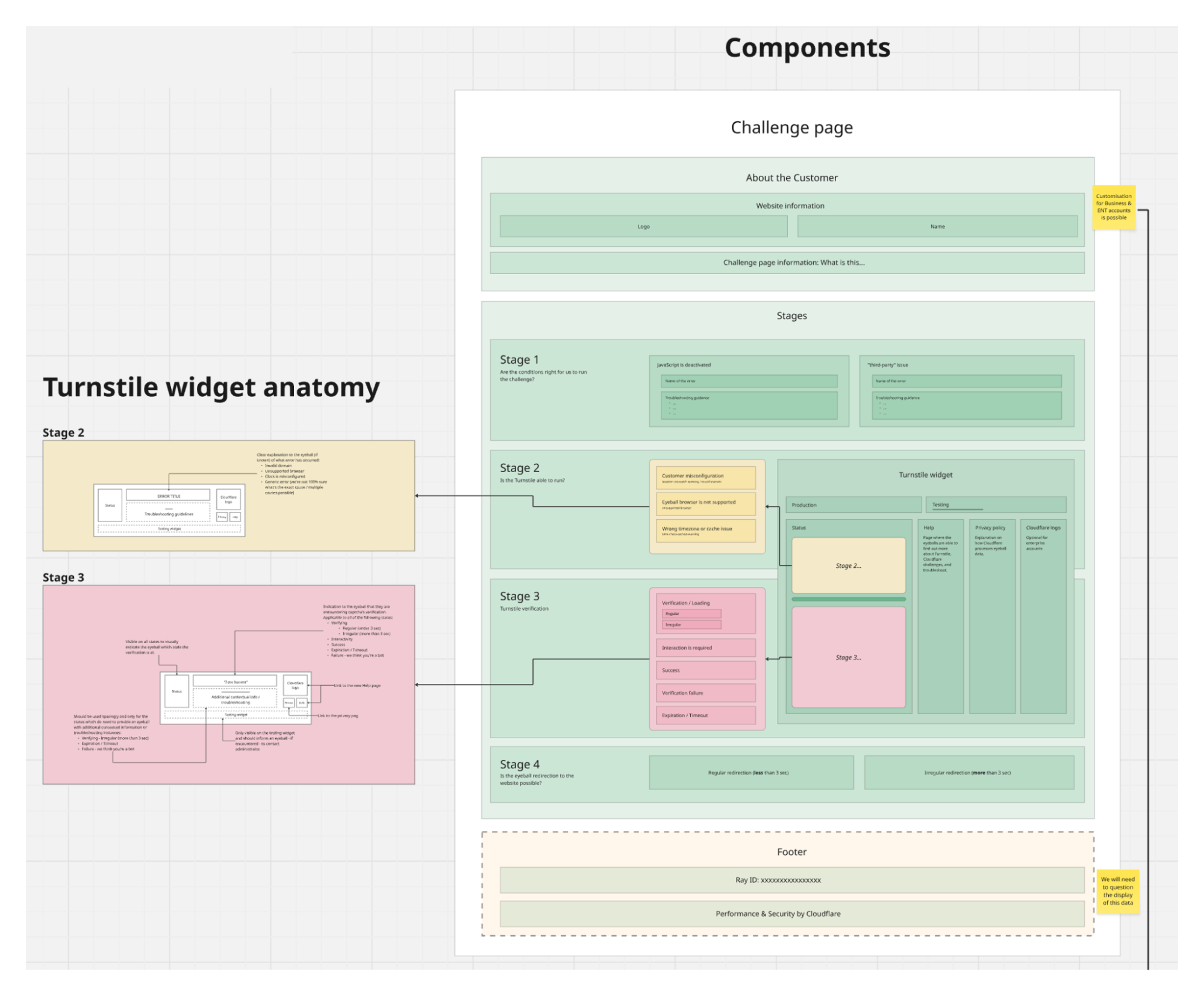
The journey of building a comprehensive attribution platform

Post Syndicated from Grab Tech original https://engineering.grab.com/attribution-platform

The Grab superapp offers a comprehensive array of services from ride-hailing and food delivery to financial services. This creates multifaceted user journeys, traversing homepages, product pages, checkouts, and interactions with diverse content, including advertisements and promo codes.

Background: Why ads and attribution matter in our superapp

Ads are crucial for Grab in driving user engagement and supporting our ecosystem by seamlessly connecting users with our services. In the ever-evolving world of advertising, the ability to gauge the impact of marketing investments takes on pivotal significance. Advertisers dedicate substantial resources to promote their businesses, necessitating a clear understanding of the return on AdSpend (ROAS) for each campaign. In this context, attribution plays a central role, serving as the guiding compass for advertisers and marketers, elucidating the effectiveness of touchpoints within campaigns.

For instance, a merchant-partner seeks to enhance its reach by advertising on the Grab food delivery homepage. With the assistance of our attribution system, the merchant-partner can now precisely gauge the impact of their homepage ads on Grab. This involves tracking user engagement and monitoring the resulting orders that stem from these interactions. This level of granularity not only highlights the value of attribution but also demonstrates its capability in providing detailed insights into the effectiveness of advertising campaigns and enabling merchant-partners to optimise their campaigns with more precision.

In this blog, we delve into the technical intricacies, software architecture, challenges, and solutions involved in crafting a state-of-the-art engineering solution for the attribution platform.

Genesis: Pre-project landscape

When our journey began in 2020, Grab’s marketing efforts had limited attribution capabilities and data analytics was predominantly reliant on ad hoc queries conducted by business and data analysts. Before the introduction of a standardised approach, we had to manage discrepant results and a time-consuming manual process of data preparation, cleansing, and storage across teams. When issues arose in the analytical pipeline, resolution efforts took relatively longer and were reoccurring. We needed a comprehensive engineering solution that would address the identified gaps, and significantly enhance metrics related to ROI, attribution accuracy, and data-handling efficiency.

Inception: The pure ads attribution engine (Kappa architecture)

We chose Kappa architecture due to its imperative role in achieving near real-time attribution, especially in support of our new pricing model, cost per order (CPO). With this solution, we aimed to drastically reduce data latency from 2-3 days to just a few minutes. Traditional ETL (Extract, Transform, and Load) based batch processing methods were evaluated but quickly found to be inadequate for our purposes, mainly due to their speed.

In the advertising industry, rapid decision-making is critical. Traditional batch processing solutions would introduce significant latency, hampering our ability to make real-time, data-driven decisions. With its architecture’s inherent capability for real-time stream processing, Kappa emerged as the logical choice. Additionally, Kappa offers the agility required to empower our ad-serving team for real-time decision support, and better ad ranking and selection, enabling dynamic and effective targeting decisions without delay.

The first step on this journey was to create a pure and near real-time stream processing Ads Attribution Engine. This engine was based on the Kappa architecture to provide advertisers with quick insights into their ROAS offering real-time attribution, enabling advertisers to optimise their campaigns efficiently.

High-level workflow of the Ads Attribution Engine

In this solution, we used the following tools in our tech stack:

  • Kafka for event streams
  • DDB for events storage
  • Amazon S3 as the data lake
  • An in-house stream processing framework similar to Keystone
  • Redis for caching events
  • ScyllaDB for storing ad metadata
  • Amazon relational database service (RDS) for analytics
Architecture of the near real-time stream processing Ads Attribution Engine

Evolution: Merging marketing levers – Ads and promos

We began to envision a world where we could merge various marketing levers into a unified Attribution Engine, starting with ads and promos. This evolved vision also aimed to prevent order double counting (when a user interacts with both ads and promos in the same checkout), which would provide a more holistic attribution solution.

With the unified Attribution Engine, we would also enable more sophisticated personalisation through machine learning models and drive higher conversions.

The unified Attribution Engine workflow, which included Promo touch points

The unified attribution engine used mostly the same tech stack, except for analytics where Druid was used instead of RDS.

Architecture of the unified Attribution Engine

Introspection: Identifying shortcomings and the path to improvement

While the unified attribution engine was a step in the right direction, it wasn’t without its challenges. There were challenges related to real-time data processing costs, scalability for longer attribution windows, latency and lag issues, out-of-order events leading to misattribution, and the complexity of implementing multi-touch attribution models. To truly empower advertisers and enhance the attribution process, we knew we needed to evolve further.

Rebirth: The birth of a full-fledged attribution platform (Lambda architecture)

This journey eventually led us to build a full-fledged attribution platform using Lambda architecture, which blended both batch and real-time stream processing methods. With this change, our platform could rapidly and accurately process data and attribute the impact of ads and promos on user behaviour.

Why Lambda architecture?

This choice was a strategic one – real-time processing is vital for tracking events as they occur, but it offers only a current snapshot of user behaviour. This means we would not be able to analyse historical data, which is a crucial aspect of accurate attribution and exploring multiple attribution models. Historical data allows us to identify trends, patterns, and correlations not evident in real-time data alone.

High level workflow for the full-fledged attribution platform with Lambda architecture

In this system’s tech stack, the key components are:

  • Coban, an in-house stream processing framework used for real-time data processing
  • Spark-based ETL jobs for batch processing
  • Amazon S3 as the data warehouse
  • An offline layer that is capable of providing historical context, handling large data volumes, performing complex analytics, and so on.

Key benefits of the offline layer

  • Provides historical context: The offline layer enriches the attribution process by providing a historical perspective on user interactions, essential for precise attribution analysis spanning extended time periods.
  • Handles enormous data volumes: This layer efficiently manages and processes extensive data generated by advertising campaigns, ensuring that attribution seamlessly accommodates large-scale data sets.
  • Performs complex analytics: Enables more intricate computations and data analysis than real-time processing alone, the offline layer is instrumental in fine-tuning attribution models and enhancing their accuracy.
  • Ensures reliability in the face of challenges: By providing fault tolerance and resilience against system failures, the offline layer ensures the continuous and dependable operation of the attribution system, even during unexpected events.
  • Optimises data storage and serving: Relying on Amazon S3, the storage layer for raw data optimises storage by building interactive reporting APIs.
Architecture of our comprehensive offline attribution platform

Challenges with Lambda and mitigation

Lambda architecture allows us to have the accuracy and robustness of batch processing along with real-time stream processing. However, we noticed some drawbacks that may lead to complexity due to maintaining both batch and stream processing:

  • Operating two parallel systems for batch and stream processing can lead to increased complexity in production environments.
  • Lambda architecture requires two sets of business logic – one for the batch layer and another for the stream layer.
  • Synchronisation across both layers can make system alterations more challenging.
  • This dual implementation could also allude to inconsistencies and introduce potential bugs into the system.

To mitigate these complications, we’re establishing an optimisation strategy for our current system. By distinctly separating the responsibilities of our real-time pipelines from those of our offline jobs, we intend to harness the full potential of each approach, while simultaneously curbing the added complexity.

Hence, redefining the way we utilise Lambda architecture, striking an efficient balance between real-time responsiveness and sturdy accuracy with the below proposal.

Vanguard: Enhancements in the future

In the coming months, we will be implementing the optimisation strategy and improving our attribution platform solution. This strategy can be broken down into the following sections.

Real-time pipeline handling time-sensitive data: Real-time pipelines can process and deliver time-sensitive metrics like CPO-related data in near real-time, allowing for budget capping and immediate adjustments to marketing spend. This can provide us with actionable insights that can help with areas like real-time bidding, real-time marketing, or dynamic pricing. By limiting the volume of data through the real-time path, we can ensure it’s more manageable and focused on immediate actionable data.

Batch jobs handling all other reporting data: Batch processing is best suited for computations that are not time-bound and where completeness is more important. By dedicating more time to the processing phase, batch processing can handle larger volumes and more complex computations, providing more comprehensive and accurate reporting.

This approach will simplify our Lambda architecture, as the batch and real-time pipelines will have clear separation of duties. It may also reduce the chance of discrepancies between the real-time and batch-processing datasets and lower the operational load of our real-time system.

Conclusion: A holistic attribution picture

Through our journey of building a comprehensive attribution platform, we can now deliver a holistic and dependable view of user behaviour and empower merchant-partners to use insights from advertisements and promotions. This journey has been a long one, but we were able to improve our attribution solution in several ways:

  • Attribution latency: Successfully reduced attribution latency from 2-3 days to just a few minutes, ensuring that advertisers can access real-time insights and feedback.
  • Data accuracy: Through improved data collection and processing, we achieved data discrepancies of less than 1%, enhancing the accuracy and reliability of attribution data.
  • Conversion rate: Advertisers witnessed a significant increase in conversion rates, a direct result of our real-time attribution capabilities.
  • Cost efficiency: Embracing the Lambda architecture led to a ~25% reduction in real-time data processing costs, allowing for more efficient campaign optimisations.
  • Operational resilience: Building an offline layer provided fault tolerance and resilience against system failures, ensuring that our attribution system continued to operate seamlessly, even during unexpected events.

Join us

Grab is the leading superapp platform in Southeast Asia, providing everyday services that matter to consumers. More than just a ride-hailing and food delivery app, Grab offers a wide range of on-demand services in the region, including mobility, food, package and grocery delivery services, mobile payments, and financial services across 428 cities in eight countries.

Powered by technology and driven by heart, our mission is to drive Southeast Asia forward by creating economic empowerment for everyone. If this mission speaks to you, join our team today!
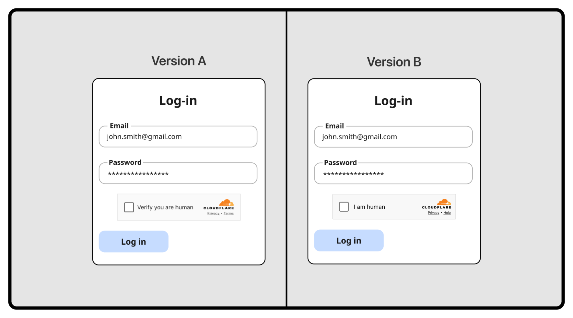
Message Center – Redesigning the messaging experience on the Grab superapp

Post Syndicated from Grab Tech original https://engineering.grab.com/message-center

Since 2016, Grab has been using GrabChat, a built-in messaging feature to connect our users with delivery-partners or driver-partners. However, as the Grab superapp grew to include more features, the limitations of the old system became apparent. GrabChat could only handle two-party chats because that’s what it was designed to do. To make our messaging feature more extensible for future features, we decided to redesign the messaging experience, which is now called Message Center.

Migrating from the old GrabChat to the new Message Center

To some, building our own chat function might not be the ideal approach, especially with open source alternatives like Signal. However, Grab’s business requirements introduce some level of complexity, which required us to develop our own solution.

Some of these requirements include, but are not limited to:

  • Handle multiple user types (passengers, driver-partners, consumers, delivery-partners, customer support agents, merchant-partners, etc.) with custom user interface (UI) rendering logic and behaviour.
  • Enable other Grab backend services to send system generated messages (e.g. your driver is reaching) and customise push notifications.
  • Persist message state even if users uninstall and reinstall their apps. Users should be able to receive undelivered messages even if they were offline for hours.
  • Provide translation options for non-native speakers.
  • Filter profanities in the chat.
  • Allow users to handle group chats. This feature might come in handy in future if there needs to be communication between passengers, driver-partners, and delivery-partners.

Solution architecture

Message Center architecture

The new Message Center was designed to have two components:

  1. Message-center backend: Message processor service that handles logical and database operations.
  2. Message-center postman: Message delivery service that can scale independently from the backend service.

This architecture allows the services to be sufficiently decoupled and scale independently. For example, if you have a group chat with N participants and each message sent results in N messages being delivered, this architecture would enable message-center postman to scale accordingly to handle the higher load.

As Grab delivers millions of events a day via the Message Center service, we need to ensure that our system can handle high throughput. As such, we are using Apache Kafka as the low-latency high-throughput event stream connecting both services and Amazon SQS as a redundant delay queue that attempts a retry 10 seconds later.

Another important aspect for this service is the ability to support low-latency and bi-directional communications from the client to the server. That’s why we chose Transmission Control Protocol (TCP) as the main protocol for client-server communication. Mobile and web clients connect to Hermes, Grab’s TCP gateway service, which then digests the TCP packets and proxies the payloads to Message Center via gRPC. If both recipients and senders are online, the message is successfully delivered in a matter of milliseconds.

Unlike HTTP, individual TCP packets do not require a response so there is an inherent uncertainty in whether the messages were successfully delivered. Message delivery can fail due to several reasons, such as the client terminating the connection but the server’s connection remaining established. This is why we built a system of acknowledgements (ACKs) between the client and server, which ensures that every event is received by the receiving party.

The following diagram shows the high-level sequence of events when sending a message.

Events involved in sending a message on Message Center

Following the sequence of events involved in sending a message and updating its status for the sender from sending to sent to delivered to read, the process can get very complicated quickly. For example, the sender will retry the 1302 TCP new message until it receives a server ACK. Similarly, the server will also keep attempting to send the 1402 TCP message receipt or 1303 TCP message unless it receives a client ACK. With this in mind, we knew we had to give special attention to the ACK implementation, to prevent infinite retries on the client and server, which can quickly cascade to a system-wide failure.

Lastly, we also had to consider dropped TCP connections on mobile devices, which happens quite frequently. What happens then? Message Center relies on Hedwig, another in-house notification service, to send push notifications to the mobile device when it receives a failed response from Hermes. Message Center also maintains a user-events DynamoDB database, which updates the state of every pending event of the client to delivered whenever a client ACK is received.

Every time the mobile client reconnects to Hermes, it also sends a special TCP message to notify Message Center that the client is back online, and then the server retries sending all the pending events to the client.

Learnings/Conclusion

With large-scale features like Message Center, it’s important to:

  • Decouple services so that each microservice can function and scale as needed.
  • Understand our feature requirements well so that we can make the best choices and design for extensibility.
  • Implement safeguards to prevent system timeouts, infinite loops, or other failures from cascading to the entire system, i.e. rate limiting, message batching, and idempotent eventIDs.

Join us

Grab is the leading superapp platform in Southeast Asia, providing everyday services that matter to consumers. More than just a ride-hailing and food delivery app, Grab offers a wide range of on-demand services in the region, including mobility, food, package and grocery delivery services, mobile payments, and financial services across 428 cities in eight countries.

Powered by technology and driven by heart, our mission is to drive Southeast Asia forward by creating economic empowerment for everyone. If this mission speaks to you, join our team today!

Evolution of quality at Grab

Post Syndicated from Grab Tech original https://engineering.grab.com/evolution-of-quality

To achieve our vision of becoming the leading superapp in Southeast Asia, we constantly need to balance development velocity with maintaining the high quality of the Grab app. Like most tech companies, we started out with the traditional software development lifecycle (SDLC) but as our app evolved, we soon noticed several challenges like high feature bugs and production issues.  

In this article, we dive deeper into our quality improvement journey that officially began in 2019, the challenges we faced along the way, and where we stand as of 2022.

Background

Figure 1 – Software development life cycle (SDLC) sample

When Grab first started in 2012, we were using the Agile SDLC (Figure 1) across all teams and features. This meant that every new feature went through the entire process and was only released to app distribution platforms (PlayStore or AppStore) after the quality assurance (QA) team manually tested and signed off on it.

Over time, we discovered that feature testing took longer, with more bugs being reported and impact areas that needed to be tested. This was the same for regression testing as QA engineers had to manually test each feature in the app before a release. Despite the best efforts of our QA teams, there were still many major and critical production issues reported on our app – the highest numbers were in 2019 (Figure 2).

Figure 2 – Critical open production issue (OPI) trend

This surge in production issues and feature bugs was directly impacting our users’ experience on our app. To directly address the high production issues and slow testing process, we changed our testing strategy and adopted shift-left testing.

Solution

Shift-left testing is an approach that brings testing forward to the early phases of software development. This means testing can start as early as the planning and design phases.

Figure 3 – Shift-left testing

By adopting shift-left testing, engineering teams at Grab are able to proactively prevent possible defect leakage in the early stages of testing, directly addressing our users’ concerns without delaying delivery times.

With shift-left testing, we made three significant changes to our SDLC:

  • Software engineers conduct acceptance testing
  • Incorporate Definition of Ready (DoR) and Definition of Done (DoD)
  • Balanced testing strategy

Let’s dive deeper into how we implemented each change, the challenges, and learnings we gained along the way.

Software engineers conduct acceptance testing

Acceptance testing determines whether a feature satisfies the defined acceptance criteria, which helps the team evaluate if the feature fulfills our consumers’ needs. Typically, acceptance testing is done after development. But our QA engineers still discovered many bugs and the cost of fixing bugs at this stage is more expensive and time-consuming. We also realised that the most common root causes of bugs were associated with insufficient requirements, vague details, or missing test cases.

With shift-left testing, QA engineers start writing test cases before development starts and these acceptance tests will be executed by the software engineers during development. Writing acceptance tests early helps identify potential gaps in the requirements before development begins. It also prevents possible bugs and streamlines the testing process as engineers can find and fix bugs even before the testing phase. This is because they can execute the test cases directly during the development stage.

On top of that, QA and Product managers also made Given/When/Then (GWT) the standard for acceptance criteria and test cases, making them easier for all stakeholders to understand.

Step by Step style GWT format
  1. Open the Grab app
  2. Navigate to home feed
  3. Tap on merchant entry point card
  4. Check that merchant landing page is shown
Given user opens the app
And user navigates to the home feed
When the user taps on the merchant entry point card
Then the user should see the merchant’s landing page

By enabling software engineers to conduct acceptance testing, we minimised back-and-forth discussions within the team regarding bug fixes and also, influenced a significant shift in perspective – quality is everyone’s responsibility.

Another key aspect of shift-left testing is for teams to agree on a standard of quality in earlier stages of the SDLC. To do that, we started incorporating Definition of Ready (DoR) and Definition of Done (DoD) in our tasks.

Incorporate Definition of Ready (DoR) and Definition of Done (DoD)

As mentioned, quality checks can be done before development even begins and can start as early as backlog grooming and sprint planning. The team needs to agree on a standard for work products such as requirements, design, engineering solutions, and test cases. Having this alignment helps reduce the possibility of unclear requirements or misunderstandings that may lead to re-work or a low-quality feature.

To enforce consistent quality of work products, everyone in the team should have access to these products and should follow DoRs and DoDs as standards in completing their tasks.

  • DoR: Explicit criteria that an epic, user story, or task must meet before it can be accepted into an upcoming sprint. 
  • DoD: List of criteria to fulfill before we can mark the epic, user story, or task complete, or the entry or exit criteria for each story state transitions. 

Including DoRs and DoDs have proven to improve delivery pace and quality. One of the first teams to adopt this observed significant improvements in their delivery speed and app quality – consistently delivering over 90% of task commitments, minimising technical debt, and reducing manual testing times.

Unfortunately, having these two changes alone were not sufficient – testing was still manually intensive and time consuming. To ease the load on our QA engineers, we needed to develop a balanced testing strategy.  

Balanced testing strategy

Figure 4 – Test automation strategy

Our initial automation strategy only included unit testing, but we have since enhanced our testing strategy to be more balanced.

  • Unit testing
  • UI component testing
  • Backend integration testing
  • End-to-End (E2E) testing

Simply having good coverage in one layer does not guarantee good quality of an app or new feature. It is important for teams to test vigorously with different types of testing to ensure that we cover all possible scenarios before a release.

As you already know, unit tests are written and executed by software engineers during the development phases. Let’s look at what the remaining three layers mean.

UI component testing

This type of testing focuses on individual components within the application and is useful for testing specific use cases of a service or feature. To reduce manual effort from QA engineers, teams started exploring automation and introduced a mobile testing framework for component testing.

This UI component testing framework used mocked API responses to test screens and interactions on the elements. These UI component tests were automatically executed whenever the pipeline was run, which helped to reduce manual regression efforts. With shift-left testing, we also revised the DoD for new features to include at least 70% coverage of UI component tests.

Backend integration testing

Backend integration testing is especially important if your application regularly interacts with backend services, much like the Grab app. This means we need to ensure the quality and stability of these backend services. Since Grab started its journey toward becoming a superapp, more teams started performing backend integration tests like API integration tests.

Our backend integration tests also covered positive and negative test cases to determine the happy and unhappy paths. At the moment, majority of Grab teams have complete test coverage for happy path use cases and are continuously improving coverage for other use cases.

End-to-End (E2E) testing

E2E tests are important because they simulate the entire user experience from start to end, ensuring that the system works as expected. We started exploring E2E testing frameworks, from as early as 2015, to automate tests for critical services like logging in and booking a ride.

But as Grab introduced more services, off-the-shelf solutions were no longer a viable option, as we noticed issues like automation limitations and increased test flakiness. We needed a framework that is compatible with existing processes, stable enough to reduce flakiness, scalable, and easy to learn.

With this criteria in mind, our QA engineering teams built an internal E2E framework that could make API calls, test different account-based scenarios, and provide many other features. Multiple pilot teams have started implementing tests with the E2E framework, which has helped to reduce regression efforts. We are continuously improving the framework by adding new capabilities to cover more test scenarios.

Now that we’ve covered all the changes we implemented with shift-left testing, let’s take a look at how this changed our SDLC.

Impact

Figure 5 – Updated SDLC process

Since the implementation of shift-left testing, we have improved our app quality without compromising our project delivery pace. Compared to 2019, we observed the following improvements within the Grab superapp in 2022:

  • Production issues with “Major and Critical” severity bugs found in production were reduced by 60%
  • Bugs found in development phase with “Major and Critical” severity were reduced by 40%

What’s next?

Through this journey, we recognise that there’s no such thing as a bug-free app – no matter how much we test, production issues still happen occasionally. To minimise the occurrence of bugs, we’re regularly conducting root cause analyses and writing postmortem reports for production incidents. These allow us to retrospect with other teams and come up with corrective actions and prevention plans. Through these continuous learnings and improvements, we can continue to shape the future of the Grab superapp.

Special thanks to Sori Han for designing the images in this article.

Join us

Grab is the leading superapp platform in Southeast Asia, providing everyday services that matter to consumers. More than just a ride-hailing and food delivery app, Grab offers a wide range of on-demand services in the region, including mobility, food, package and grocery delivery services, mobile payments, and financial services across 428 cities in eight countries.

Powered by technology and driven by heart, our mission is to drive Southeast Asia forward by creating economic empowerment for everyone. If this mission speaks to you, join our team today!
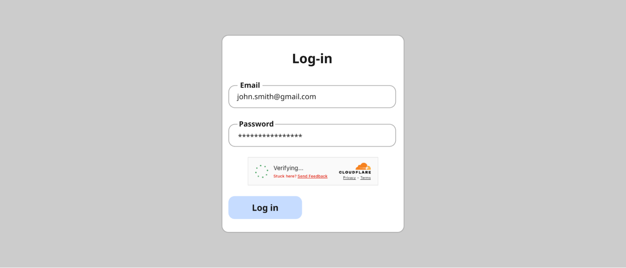
Determine the best technology stack for your web-based projects

Post Syndicated from Grab Tech original https://engineering.grab.com/determining-tech-stack

In the current technology landscape, startups are developing rapidly. This usually leads to an increase in the number of engineers in teams, with the goal of increasing the speed of product development and delivery frequency. However, this growth often leads to a diverse selection of technology stacks being used by different teams within the same organisation.

Having different technology stacks within a team could lead to a bigger problem in the future, especially if documentation is not well-maintained. The best course of action is to pick just one technology stack for your projects, but it begs the question, “How do I choose the best technology stack for my projects?”

One such example is OVO, which is an Indonesian payments, rewards, and financial services platform within Grab. We share our process and analysis to determine the best technology stack that complies with precise standards. By the end of the article, you may also learn to choose the best technology stack for your needs.

Background

In recent years, we have seen massive growth in modern web technologies, such as React, Angular, Vue, Svelte, Django, TypeScript, and many more. Each technology has its benefits. However, having so many choices can be confusing when you must determine which technologies are best for your projects. To narrow down the choices, a few aspects, such as scalability, stability, and usage in the market, must be considered.

That’s the problem that we used to face. Most of our legacy services were not standardised and were written in different languages like PHP, React, and Vue. Also, the documentation for these legacy services is not well-structured or regularly updated.

Current technology stack usage in OVO

We realised that we had two main problems:

  • Various technology stacks (PHP, Vue, React, Nuxt, and Go) maintained simultaneously, with incomplete documentation, may consume a lot of time to understand the code, especially for engineers unfamiliar with the frameworks or even a new hire.
  • Context switching when reviewing code makes it hard to review other teammates’ merge requests on complex projects and quickly offer better code suggestions.

To prevent these problems from recurring, teams must use one primary technology stack.

After detailed comparisons, we narrowed our choices to two options – React and Vue – because we have developed projects in both technologies and already have the user interface (UI) library in each technology stack.

Taken from ulam.io

Next, we conducted a more detailed research and exploration for each technology. The main goals were to find the unique features, scalability, ease of migration, and compatibility for the UI library for React and Vue. To test the compatibility of each UI library, we also used a sample UI on one of our upcoming projects and sliced it.

Here’s a quick summary of our exploration:

Metrics Vue React
UI Library Compatibility Doesn’t require much component development Doesn’t require much component development
Scalability Easier to upgrade, slower in releasing major updates, clear migration guide Quicker release of major versions, supports gradual updates
Others Composition API, strong community (Vue Community) Latest version (v18) of React gradual updates, doesn’t support IE

From this table, we found that the differences between these frameworks are miniscule, making it tough for us to determine which to use. Ultimately, we decided to step back and see the Big Why

Solution

The Big Why here was “Why do we need to standardise our technology stack?”. We wanted to ease the onboarding process for new hires and reduce the complexity, like context switching, during code reviews, which ultimately saves time.

As Kleppmann (2017) states, “The majority of the cost of software is in its ongoing maintenance”. In this case, the biggest cost was time. Increasing the ease of maintenance would reduce the cost, so we decided to use maintainability as our north star metric.

Kleppmann (2017) also highlighted three design principles in any software system:

  • Operability: Make it easy to keep the system running.
  • Simplicity: Easy for new engineers to understand the system by minimising complexity.
  • Evolvability: Make it easy for engineers to make changes to the system in the future.

Keeping these design principles in mind, we defined three metrics that our selected tech stack must achieve:

  • Scalability
    • Keeping software and platforms up to date
    • Anticipating possible future problems
  • Stability of the library and documentation
    • Establishing good practices and tools for development
  • Usage in the market
    • The popularity of the library or framework and variety of coding best practices

Metrics Vue React
Scalability Framework

Operability
Easier to update because there aren’t many approaches to writing Vue.

Evolvability
Since Vue is a framework, it needs fewer steps to upgrade.

Library
Supports gradual updates but there will be many different approaches when upgrading React on our services.
Stability of the library and documentation Has standardised documentation Has many versions of documentation
Usage on Market Smaller market share.

Simplicity
We can reduce complexity for new hires, as the Vue standard in OVO remains consistent with standards in other companies.

Larger market share.

Many React variants are currently in the market, so different companies may have different folder structures/conventions.

Screenshot taken from https://www.statista.com/ on 2022-10-13

After conducting a detailed comparison between Vue and React, we decided to use Vue as our primary tech stack as it best aligns with Kleppmann’s three design principles and our north star metric of maintainability. Even though we noticed a few disadvantages to using Vue, such as smaller market share, we found that Vue is still the better option as it complies with all our metrics.

Moving forward, we will only use one tech stack across our projects but we decided not to migrate technology for existing projects. This allows us to continue exploring and learning about other technologies’ developments. One of the things we need to do is ensure that our current projects are kept up-to-date.

Implementation

After deciding on the primary technology stack, we had to do the following:

  • Define a boilerplate for future Vue projects, which will include items like a general library or dependencies, implementation for unit testing, and folder structure, to align with our north star metric.
  • Update our existing UI library with new components and the latest Vue version.
  • Perform periodic upgrades to existing React services and create a standardised code structure with proper documentation.

With these practices in place, we can ensure that future projects will be standardised, making them easier for engineers to maintain.

Impact

There are a few key benefits of standardising our technology stack.

  • Scalability and maintainability: It’s much easier to scale and maintain projects using the same technology stack. For example, when implementing security patches on all projects due to certain vulnerabilities in the system or libraries, we will need one patch for each technology. With only one stack, we only need to implement one patch across all projects, saving a lot of time.
  • Faster onboarding process: The onboarding process is simplified for new hires because we have standardisation between all services, which will minimise the amount of context switching and lower the learning curve.
  • Faster deliveries: When it’s easier to implement a change, there’s a compounding impact where the delivery process is shortened and release to production is quicker. Ultimately, faster deliveries of a new product or feature will help increase revenue.

Learnings/Conclusion

For every big decision, it is important to take a step back and understand the Big Why or the main motivation behind it, in order to remain objective. That’s why after we identified maintainability as our north star metric, it was easier to narrow down the choices and make detailed comparisons.

The north star metric, or deciding factor, might differ vastly, but it depends on the problems you are trying to solve.

References

Join us

Grab is the leading superapp platform in Southeast Asia, providing everyday services that matter to consumers. More than just a ride-hailing and food delivery app, Grab offers a wide range of on-demand services in the region, including mobility, food, package and grocery delivery services, mobile payments, and financial services across 428 cities in eight countries.

Powered by technology and driven by heart, our mission is to drive Southeast Asia forward by creating economic empowerment for everyone. If this mission speaks to you, join our team today!

How KartaCam powers GrabMaps

Post Syndicated from Grab Tech original https://engineering.grab.com/kartacam-powers-grabmaps

Introduction

The foundation for making any map is in imagery, but due to the complexity and dynamism of the real world, it is difficult for companies to collect high-quality, fresh images in an efficient yet low-cost manner. This is the case for Grab’s Geo team as well.

Traditional map-making methods rely on professional-grade cameras that provide high resolution images to collect mapping imagery. These images are rich in content and detail, providing a good snapshot of the real world. However, we see two major challenges with this approach.

The first is high cost. Professional cameras are too expensive to use at scale, especially in an emerging region like Southeast Asia. Apart from high equipment cost, operational cost is also high as local operation teams need professional training before collecting imagery.

The other major challenge, related to the first, is that imagery will not be refreshed in a timely manner because of the high cost and operational effort required. It typically takes months or years before imagery is refreshed, which means maps get outdated easily.

Compared to traditional collection methods, there are more affordable alternatives that some emerging map providers are using, such as crowdsourced collection done with smartphones or other consumer-grade action cameras. This allows more timely imagery refresh at a much lower cost.

That said, there are several challenges with crowdsourcing imagery, such as:

  • Inconsistent quality in collected images.
  • Low operational efficiency as cameras and smartphones are not optimised for mapping.
  • Unreliable location accuracy.

In order to solve the challenges above, we started building our own artificial intelligence (AI) camera called KartaCam.

What is KartaCam?

Designed specifically for map-making, KartaCam is a lightweight camera that is easy to operate. It is everything you need for accurate and efficient image collection. KartaCam is powered by edge AI, and mainly comprises a camera module, a dual-band Global Navigation Satellite System (GNSS) module, and a built-in 4G Long-Term Evolution (LTE) module.

KartaCam

Camera module

The camera module or optical design of KartaCam focuses on several key features:

  • Wide field of vision (FOV): A wide FOV to capture as many scenes and details as possible without requiring additional trips. A single KartaCam has a wide lens FOV of >150° and when we use four KartaCams together, each facing a different direction, we increase the FOV to 360°.
  • High image quality: A combination of high-definition optical lens and a high-resolution pixel image sensor can help to achieve better image quality. KartaCam uses a high-quality 12MP image sensor.
  • Ease of use: Portable and easy to start using for people with little to no photography training. At Grab, we can easily deploy KartaCam to our fleet of driver-partners to map our region as they regularly travel these roads while ferrying passengers or making deliveries.

Edge AI for smart capturing on edge

Each KartaCam device is also equipped with edge AI, which enables AI computations to operate closer to the actual data – in our case, imagery collection. With edge AI, we can make decisions about imagery collection (i.e. upload, delete or recapture) at the device-level.

To help with these decisions, we use a series of edge AI models and algorithms that are executed immediately after each image capture such as:

  • Scene recognition model: For efficient map-making, we ensure that we make the right screen verdicts, meaning we only upload and process the right scene images. Unqualified images such as indoor, raining, and cloudy images are deleted directly on the KartaCam device. Joint detection algorithms are deployed in some instances to improve the accuracy of scene verdicts. For example, to detect indoor recording we look at a combination of driver moving speed, Inertial Measurement Units (IMU) data and edge AI image detection.

  • Image quality (IQ) checking AI model: The quality of the images collected is paramount for map-making. Only qualified images judged by our IQ classification algorithm will be uploaded while those that are blurry or considered low-quality will be deleted. Once an unqualified image is detected (usually within the next second), a new image is captured, improving the success rate of collection.

  • Object detection AI model: Only roadside images that contain relevant map-making content such as traffic signs, lights, and Point of Interest (POI) text are uploaded.

  • Privacy information detection: Edge AI also helps protect privacy when collecting street images for map-making. It automatically blurs private information such as pedestrians’ faces and car plate numbers before uploading, ensuring adequate privacy protection.


Better positioning with a dual-band GNSS module

The Global Positioning System (GPS) mainly uses two frequency bands: L1 and L5. Most traditional phone or GPS modules only support the legacy GPS L1 band, while modern GPS modules support both L1 and L5. KartaCam leverages the L5 band which provides improved signal structure, transmission capabilities, and a wider bandwidth that can reduce multipath error, interference, and noise impacts. In addition, KartaCam uses a fine-tuned high-quality ceramic antenna that, together with the dual frequency band GPS module, greatly improves positioning accuracy.

Keeping KartaCam connected

KartaCam has a built-in 4G LTE module that ensures it is always connected and can be remotely managed. The KartaCam management portal can monitor camera settings like resolution and capturing intervals, even in edge AI machine learning models. This makes it easy for Grab’s map ops team and drivers to configure their cameras and upload captured images in a timely manner.

Enhancing KartaCam

KartaCam 360: Capturing a panorama view

To improve single collection trip efficiency, we group four KartaCams together to collect 360° images. The four cameras can be synchronised within milliseconds and the collected images are stitched together in a panoramic view.

With KartaCam 360, we can increase the number of images collected in a single trip. According to Grab’s benchmark testing in Singapore and Jakarta, the POI information collected by KartaCam 360 is comparable to that of professional cameras, which cost about 20x more.

KartaCam 360 & Scooter mount
Image sample from KartaCam 360

KartaCam and the image collection workflow

KartaCam, together with other GrabMaps imagery tools, provides a highly efficient, end-to-end, low-cost, and edge AI-powered smart solution to map the region. KartaCam is fully integrated as part of our map-making workflow.

Our map-making solution includes the following components:

  • Collection management tool – Platform that defines map collection tasks for our driver-partners.
  • KartaView application – Mobile application provides map collection tasks and handles crowdsourced imagery collection.
  • KartaCam – Camera device connected to KartaView via Bluetooth and equipped with edge automatic processing for imagery capturing according to the task accepted.
  • Camera management tool – Handles camera parameters and settings for all KartaCam devices and can remotely control the KartaCam.
  • Automatic processing – Collected images are processed for quality check, stitching, and personal identification information (PII) blurring.
  • KartaView imagery platform – Processed images are then uploaded and the driver-partner receives payment.

In a future article, we will dive deeper into the technology behind KartaView and its role in GrabMaps.

Impact

At the moment, Grab is rolling out thousands of KartaCams to all locations across Southeast Asia where Grab operates. This saves operational costs while improving the efficiency and quality of our data collection.


Better data quality and more map attributes

Due to the excellent image quality, wide FOV coverage, accurate GPS positioning, and sensor data, the 360° images captured by KartaCam 360 also register detailed map attributes like POIs, traffic signs, and address plates. This will help us build a high quality map with rich and accurate content.


Reducing operational costs

Based on our research, the hardware cost for KartaCam 360 is significantly lower compared to similar professional cameras in the market. This makes it a more feasible option to scale up in Southeast Asia as the preferred tool for crowdsourcing imagery collection.

With image quality checks and detection conducted at the edge, we can avoid re-collections and also ensure that only qualified images are uploaded. These result in saving time as well as operational and upload costs.

Upholding privacy standards

KartaCam automatically blurs captured images that contain PII, like faces and licence plates directly from the edge devices. This means that all sensitive information is removed at this stage and is never uploaded to Grab servers.

On-the-edge blurring example

What’s next?

Moving forward, Grab will continue to enhance KartaCam’s performance in the following aspects:

  • Further improve image quality with better image sensors, unique optical components, and state-of-art Image Signal Processor (ISP).
  • Make KartaCam compatible with Light Detection And Ranging (LIDAR) for high-definition collection and indoor use cases.
  • Improve GNSS module performance with higher sampling frequency and accuracy, and integrate new technology like Real-Time Kinematic (RTK) and Precise Point Positioning (PPP) solutions to further improve the positioning accuracy. When combined with sensor fusion from IMU sensors, we can improve positioning accuracy for map-making further.
  • Improve usability, integration, and enhance imagery collection and portability for KartaCam so driver-partners can easily capture mapping data. 
  • Explore new product concepts for future passive street imagery collection.

To find out more about how KartaCam delivers comprehensive cost-effective mapping data, check out this article.

Join us

Grab is the leading superapp platform in Southeast Asia, providing everyday services that matter to consumers. More than just a ride-hailing and food delivery app, Grab offers a wide range of on-demand services in the region, including mobility, food, package and grocery delivery services, mobile payments, and financial services across 428 cities in eight countries.

Powered by technology and driven by heart, our mission is to drive Southeast Asia forward by creating economic empowerment for everyone. If this mission speaks to you, join our team today!

References

Accelerating GitHub theme creation with color tooling

Post Syndicated from Cole Bemis original https://github.blog/2022-06-14-accelerating-github-theme-creation-with-color-tooling/

Dark mode is no longer a nice-to-have feature. It’s an expectation. Yet, for many teams, implementing dark mode is still a daunting task.

Creating a palette for dark interfaces is not as simple as inverting colors and complexity increases if your team is planning multiple themes. Many people find themselves using a combination of disjointed color tools, which can be a painful experience.

GitHub dark mode (unveiled at GitHub Universe in December 2020) was the result of trial and error, copy and paste, as well as back and forth in a Figma file (with more than 370,000 layers!).

A screenshot of the Figma file we made while designing GitHub dark mode

A few months after shipping dark mode, we began working on a dark high contrast theme to provide an option that maximizes legibility. While we were designing this new theme, we set out to improve our workflow by building an experimental tool to solve some of the challenges we encountered while designing the original dark color palette.

We’re calling our experimental color tool Primer Prism.

A sneak peek of Primer Prism

Part of GitHub’s Primer ecosystem, Primer Prism is a tool for creating and maintaining cohesive, consistent, and accessible color palettes. It allows us to:

  • Create or import color scales.
  • Adjust colors in a perceptually uniform color space (HSLuv).
  • Check contrast of color pairs.
  • Edit lightness curves across multiple color scales at once.
  • Export color palettes to production-ready code (JSON).

Our workflow

Our improved workflow for creating color palettes with Primer Prism is an iterative cycle comprised of three steps:

  1.  Defining tones
  2. Choosing colors
  3. Testing colors

Defining tones

We start by defining the color palette’s tonal character and contrast needs:

  • How light or dark should the background be?
  • What should the contrast ratio between the foreground and background be?

Although each palette will have a unique tonal character, we are mindful that all palettes meet contrast accessibility guidelines.

In Primer Prism, we start a new color palette by creating a new color scale and adjusting the lightness curve. In this phase, we’re only concerned with lightness and contrast. We’ll revisit hue and saturation later.

As we change the lightness of each color, Primer Prism checks the contrast of potential color pairings in the scale using the WCAG 2 standard.

Dragging lightness sliders up and down to adjust the lightness curve of a scale

Primer Prism also allows us to share curves across multiple color scales. So, when we have more scales, we can quickly change the tonal character of the entire color palette by adjusting a single lightness curve.

Adjusting the lightness curve of all color scales at once

Primer Prism uses the HSLuv color space to ensure that the lightness values are perceptually uniform across the entire palette. In the HSLuv color space, two colors with the same lightness value will look equally bright.

Choosing colors

Next, we define the overall color character of our palette:

  • What hues do we need (for example: red, blue, green, etc.)?
  • How vibrant do we want the colors to be?

We create a color scale for every hue using the same lightness curve we made earlier. Then, we compare and adjust the base color (the fifth step in the scale) across all the color scales until the palette feels cohesive and consistent.

A side-by-side comparison of every color scale

After deciding on the base color for each scale, we fine-tune the tints (lighter colors) and shades (darker colors). Blue, for example, shifts towards green hues in the tints and purple hues in the shades.

The hue, saturation, and lightness curves of the blue color scale

Fine-tuning color scales is more of an art than a science and often requires many micro-adjustments before the colors “feel right.” Check out Color in UI Design: A (Practical) Framework by Eric D. Kennedy to learn more about the fundamentals of designing color scales.

Testing colors

To test our colors in real-world scenarios, we export the palette from Primer Prism as a JSON object and add it to Primer Primitives, our repository of design tokens. We use pre-releases of the Primer Primitives package to test new color palettes on GitHub.com.

The dark color palette applied to GitHub.com

What’s next

We used Primer Prism to design several new color palettes, accelerating the creation of dark high contrast, light high contrast, and colorblind themes for GitHub. Next, we plan to improve our tooling to support the following key workflows.

Visual testing workflow

We plan to integrate visual testing directly into Primer Prism. Currently, visual testing of color palettes happens outside of Primer Prism, typically in Figma or production applications. However, we want a more convenient way to visualize how the colors will look when mapped to functional variables and used in actual user interfaces.

GitHub workflow

We plan to integrate GitHub into Primer Prism. Right now, it’s a hassle to edit existing color palettes because Primer Prism is not connected to the GitHub repository where we store color variables (Primer Primitives). A GitHub integration will allow us to directly pull from and push to the Primer Primitives repository.

Figma workflow

Our designers use Figma to explore and test new design ideas. We plan to create a Figma plugin to seamlessly integrate Primer Prism into their workflow.

Try it out

Primer Prism is open source and available for anyone to use at primer.style/prism.

We’d love to hear what you think. If you have feedback, please create an issue or start a discussion in the GitHub repository.

Warning: Primer Prism is experimental. Expect bugs and breaking changes as we continue to iterate.

Thanks

Huge shout-out to @Juliusschaeper, @auareyou, @edokoa, and @broccolini for their incredible work on the GitHub dark mode color palette.

Primer Prism was inspired by many existing color tools:
ColorBox by Lyft
Components AI
Huetone by Alexey Ardov
Leonardo by Adobe
Palettte by Gabriel Adorf
Palx by Brent Jackson
Scale by Hayk An

Further reading

A new WAF experience

Post Syndicated from Zhiyuan Zheng original https://blog.cloudflare.com/new-waf-experience/

A new WAF experience

A new WAF experience

Around three years ago, we brought multiple features into the Firewall tab in our dashboard navigation, with the motivation “to make our products and services intuitive.” With our hard work in expanding capabilities offerings in the past three years, we want to take another opportunity to evaluate the intuitiveness of Cloudflare WAF (Web Application Firewall).

Our customers lead the way to new WAF

The security landscape is moving fast; types of web applications are growing rapidly; and within the industry there are various approaches to what a WAF includes and can offer. Cloudflare not only proxies enterprise applications, but also millions of personal blogs, community sites, and small businesses stores. The diversity of use cases are covered by various products we offer; however, these products are currently scattered and that makes visibility of active protection rules unclear. This pushes us to reflect on how we can best support our customers in getting the most value out of WAF by providing a clearer offering that meets expectations.

A few months ago, we reached out to our customers to answer a simple question: what do you consider to be part of WAF? We employed a range of user research methods including card sorting, tree testing, design evaluation, and surveys to help with this. The results of this research illustrated how our customers think about WAF, what it means to them, and how it supports their use cases. This inspired the product team to expand scope and contemplate what (Web Application) Security means, beyond merely the WAF.

Based on what hundreds of customers told us, our user research and product design teams collaborated with product management to rethink the security experience. We examined our assumptions and assessed the effectiveness of design concepts to create a structure (or information architecture) that reflected our customers’ mental models.

This new structure consolidates firewall rules, managed rules, and rate limiting rules to become a part of WAF. The new WAF strives to be the one-stop shop for web application security as it pertains to differentiating malicious from clean traffic.

As of today, you will see the following changes to our navigation:

  1. Firewall is being renamed to Security.
  2. Under Security, you will now find WAF.
  3. Firewall rules, managed rules, and rate limiting rules will now appear under WAF.

From now on, when we refer to WAF, we will be referring to above three features.

Further, some important updates are coming for these features. Advanced rate limiting rules will be launched as part of Security Week, and every customer will also get a free set of managed rules to protect all traffic from high profile vulnerabilities. And finally, in the next few months, firewall rules will move to the Ruleset Engine, adding more powerful capabilities thanks to the new Ruleset API. Feeling excited?

How customers shaped the future of WAF

Almost 500 customers participated in this user research study that helped us learn about needs and context of use. We employed four research methods, all of which were conducted in an unmoderated manner; this meant people around the world could participate remotely at a time and place of their choosing.

  • Card sorting involved participants grouping navigational elements into categories that made sense to them.
  • Tree testing assessed how well or poorly a proposed navigational structure performed for our target audience.
  • Design evaluation involved a task-based approach to measure effectiveness and utility of design concepts.
  • Survey questions helped us dive deeper into results, as well as painting a picture of our participants.

Results of this four-pronged study informed changes to both WAF and Security that are detailed below.

The new WAF experience

The final result reveals the WAF as part of a broader Security category, which also includes Bots, DDoS, API Shield and Page Shield. This destination enables you to create your rules (a.k.a. firewall rules), deploy Cloudflare managed rules, set rate limit conditions, and includes handy tools to protect your web applications.

All customers across all plans will now see the WAF products organized as below:

A new WAF experience
  1. Firewall rules allow you to create custom, user-defined logic by blocking or allowing traffic that leverages all the components of the HTTP requests and dynamic fields computed by Cloudflare, such as Bot score.
  2. Rate limiting rules include the traditional IP-based product we launched back in 2018 and the newer Advanced Rate Limiting for ENT customers on the Advanced plan (coming soon).
  3. Managed rules allows customers to deploy sets of rules managed by the Cloudflare analyst team. These rulesets include a “Cloudflare Free Managed Ruleset” currently being rolled out for all plans including FREE, as well as Cloudflare Managed, OWASP implementation, and Exposed Credentials Check for all paying plans.
  4. Tools give access to IP Access Rules, Zone Lockdown and User Agent Blocking. Although still actively supported, these products cover specific use cases that can be covered using firewall rules. However, they remain a part of the WAF toolbox for convenience.

Redesigning the WAF experience

Gestalt design principles suggest that “elements which are close in proximity to each other are perceived to share similar functionality or traits.” This principle in addition to the input from our customers informed our design decisions.

After reviewing the responses of the study, we understood the importance of making it easy to find the security products in the Dashboard, and the need to make it clear how particular products were related to or worked together with each other.

Crucially, the page needed to:

  • Display each type of rule we support, i.e. firewall rules, rate limiting rules and managed rules
  • Show the usage amount of each type
  • Give the customer the ability to add a new rule and manage existing rules
  • Allow the customer to reprioritise rules using the existing drag and drop behavior
  • Be flexible enough to accommodate future additions and consolidations of WAF features

We iterated on multiple options, including predominantly vertical page layouts, table based page layouts, and even accordion based page layouts. Each of these options, however, would force us to replicate buttons of similar functionality on the page. With the risk of causing additional confusion, we abandoned these options in favor of a horizontal, tabbed page layout.

How can I get it?

As of today, we are launching this new design of WAF to everyone! In the meantime, we are updating documentation to walk you through how to maximize the power of Cloudflare WAF.

Looking forward

This is a starting point of our journey to make Cloudflare WAF not only powerful but also easy to adapt to your needs. We are evaluating approaches to empower your decision-making process when protecting your web applications. Among growing intel information and more rules creation possibilities, we want to shorten your path from a possible threat detection (such as by security overview) to setting up the right rule to mitigate such threat. Stay tuned!

How Grab built a scalable, high-performance ad server

Post Syndicated from Grab Tech original https://engineering.grab.com/scalable-ads-server

Why ads?

GrabAds is a service that provides businesses with an opportunity to market their products to Grab’s consumer base. During the pandemic, as the demand for food delivery grew, we realised that ads could be a service we offer to our small restaurant merchant-partners to expand their reach. This would allow them to not only mitigate the loss of in-person traffic but also grow by attracting more customers.

Many of these small merchant-partners had no experience with digital advertising and we provided an easy-to-use, scalable option that could match their business size. On the other side of the equation, our large network of merchant-partners provided consumers with more choices. For hungry consumers stuck at home, personalised ads and promotions helped them satisfy their cravings, thus fulfilling their intent of opening the Grab app in the first place!

Why build our own ad server?

Building an ad server is an ambitious undertaking and one might rightfully ask why we should invest the time and effort to build a technically complex distributed system when there are several reasonable off-the-shelf solutions available.

The answer is we didn’t, at least not at first. We used one of these off-the-shelf solutions to move fast and build a minimally viable product (MVP). The result of this experiment was a resounding success; we were providing clear value to our merchant-partners, our consumers and Grab’s overall business.

However, to take things to the next level meant scaling the ads business up exponentially. Apart from being one of the few companies with the user engagement to support an ads business at scale, we also have an ecosystem that combines our network of merchant-partners, an understanding of our consumers’ interactions across multiple services in the Grab superapp, and a payments solution, GrabPay, to close the loop. Furthermore, given the hyperlocal nature of our business, the in-app user experience is highly customised by location. In order to integrate seamlessly with this ecosystem, scale as Grab’s overall business grows and handle personalisation using machine learning (ML), we needed an in-house solution.

What we built

We designed and built a set of microservices, streams and pipelines which orchestrated the core ad serving functionality, as shown below.

Search data flow
  1. Targeting – This is the first step in the ad serving flow. We fetch a set of candidate ads specifically targeted to the request based on keywords the user searched for, the user’s location, the time of day, and the data we have about the user’s preferences or other characteristics. We chose ElasticSearch as the data store for our ads repository as it allows us to query based on a disparate set of targeting criteria.
  2. Capping – In this step, we filter out candidate ads which have exceeded various caps. This includes cases where an advertising campaign has already reached its budget goal, as well as custom requirements about the frequency an ad is allowed to be shown to the same user. In order to make this decision, we need to know how much budget has already been spent and how many times an ad has already been shown. We chose ScyllaDB to store these “stats”, which is scalable, low-cost and can handle the large read and write requirements of this process (more on how this data gets written to ScyllaDB in the Tracking step).
  3. Pacing – In this step, we alter the probability that a matching ad candidate can be served, based on a specific campaign goal. For example, in some cases, it is desirable for an ad to be shown evenly throughout the day instead of exhausting the entire ad budget as soon as possible. Similar to Capping, we require access to information on how many times an ad has already been served and use the same ScyllaDB stats store for this.
  4. Scoring – In this step, we score each ad. There are a number of factors that can be used to calculate this score including predicted clickthrough rate (pCTR), predicted conversion rate (pCVR) and other heuristics that represent how relevant an ad is for a given user.
  5. Ranking – This is where we compare the scored candidate ads with each other and make the final decision on which candidate ads should be served. This can be done in several ways such as running a lottery or performing an auction. Having our own ad server allows us to customise the ranking algorithm in countless ways, including incorporating ML predictions for user behaviour. The team has a ton of exciting ideas on how to optimise this step and now that we have our own stack, we’re ready to execute on those ideas.
  6. Pricing – After choosing the winning ads, the final step before actually returning those ads in the API response is to determine what price we will charge the advertiser. In an auction, this is called the clearing price and can be thought of as the minimum bid price required to outbid all the other candidate ads. Depending on how the ad campaign is set up, the advertiser will pay this price if the ad is seen (i.e. an impression occurs), if the ad is clicked, or if the ad results in a purchase.
  7. Tracking – Here, we close the feedback loop and track what users do when they are shown an ad. This can include viewing an ad and ignoring it, watching a video ad, clicking on an ad, and more. The best outcome is for the ad to trigger a purchase on the Grab app. For example, placing a GrabFood order with a merchant-partner; providing that merchant-partner with a new consumer. We track these events using a series of API calls, Kafka streams and data pipelines. The data ultimately ends up in our ScyllaDB stats store and can then be used by the Capping and Pacing steps above.

Principles

In addition to all the usual distributed systems best practices, there are a few key principles that we focused on when building our system.

  1. Latency – Latency is important for ads. If the user scrolls faster than an ad can load, the ad won’t be seen. The longer an ad remains on the screen, the more likely the user will notice it, have their interest piqued and click on it. As such, we set strict limits on the latency of the ad serving flow. We spent a large amount of effort tuning ElasticSearch so that it could return targeted ads in the shortest amount of time possible. We parallelised parts of the serving flow wherever possible and we made sure to A/B test all changes both for business impact and to ensure they did not increase our API latency.
  2. Graceful fallbacks – We need user-specific information to make personalised decisions about which ads to show to a given user. This data could come in the form of segmentation of our users, attributes of a single user or scores derived from ML models. All of these require the ad server to make dependency calls that could add latency to the serving flow. We followed the principle of setting strict timeouts and having graceful fallbacks when we can’t fetch the data needed to return the most optimal result. This could be due to network failures or dependencies operating slower than usual. It’s often better to return a non-personalised result than no result at all.
  3. Global optimisation – Predicting supply (the amount of users viewing the app) and demand (the amount of advertisers wanting to show ads to those users) is difficult. As a superapp, we support multiple types of ads on various screens. For example, we have image ads, video ads, search ads, and rewarded ads. These ads could be shown on the home screen, when booking a ride, or when searching for food delivery. We intentionally decided to have a single ad server supporting all of these scenarios. This allows us to optimise across all users and app locations. This also ensures that engineering improvements we make in one place translate everywhere where ads or promoted content are shown.

What’s next?

Grab’s ads business is just getting started. As the number of users and use cases grow, ads will become a more important part of the mix. We can help our merchant-partners grow their own businesses while giving our users more options and a better experience.

Some of the big challenges ahead are:

  1. Optimising our real-time ad decisions, including exciting work on using ML for more personalised results. There are many factors that can be considered in ad personalisation such as past purchase history, the user’s location and in-app browsing behaviour. Another area of optimisation is improving our auction strategy to ensure we have the most efficient ad marketplace possible.
  2. Expanding the types of ads we support, including experimenting with new types of content, finding the best way to add value as Grab expands its breadth of services.
  3. Scaling our services so that we can match Grab’s velocity and handle growth while maintaining low latency and high reliability.

Join us

Grab is a leading superapp in Southeast Asia, providing everyday services that matter to consumers. More than just a ride-hailing and food delivery app, Grab offers a wide range of on-demand services in the region, including mobility, food, package and grocery delivery services, mobile payments, and financial services across over 400 cities in eight countries.

Powered by technology and driven by heart, our mission is to drive Southeast Asia forward by creating economic empowerment for everyone. If this mission speaks to you, join our team today!

Designing products and services based on Jobs to be Done

Post Syndicated from Grab Tech original https://engineering.grab.com/designing-products-and-services-based-on-jtbd

Introduction

In 2016, Clayton Christensen, a Harvard Business School professor, wrote a book called Competing Against Luck. In his book, he talked about the kind of jobs that exist in our everyday life and how we can uncover hidden jobs through the act of non-consumption. Non-consumption is the inability for a consumer to fulfil an important Job to be Done (JTBD).

JTBD is a framework; it is a different way of looking at consumer goals and is based on the notion that people buy products and services to get a job done. In this article, we will walk through what the JTBD framework is, look at an example of a popular JTBD, and look at how we use the JTBD framework in one of Grab’s services.

JTBD framework

In his book, Clayton Christensen gives the example of the milkshake, as a JTBD example. In the mid-90s, a fast food chain was trying to understand how to improve the milkshakes they were selling and how they could sell more milkshakes. To sell more, they needed to improve the product. To understand the job of the milkshake, they interviewed their customers. They asked their customers why they were buying the milkshakes, and what progress the milkshake would help them make.

Job 1: To fill their stomachs

One of the key insights was the first job, the customers wanted something that could fill their stomachs during their early morning commute to the office. Usually, these car drives would take one to two hours, so they needed something to keep them awake and to keep themselves full.

In this scenario, the competition could be a banana, but think about the properties of a banana. A banana could fill your stomach but your hands get dirty and sticky after peeling it. Bananas cannot do a good job here. Another competitor could be a Snickers bar, but it is rather unhealthy, and depending on how many bites you take, you could finish it in one minute.

By understanding the job the milkshake was performing, the restaurant now had a specific way of improving the product. The milkshake could be made milkier so it takes time to drink through a straw. The customer can then enjoy the milkshake throughout the journey; the milkshake is optimised for the job.

Search data flow
Milkshake

Job 2: To make children happy

As part of the study, they also interviewed parents who came to buy milkshakes in the afternoon, around 3:00 PM. They found out that the parents were buying the milkshakes to make their children happy.

By knowing this, they were able to optimise the job by offering a smaller version of the milkshake which came in different flavours like strawberry and chocolate. From this milkshake example, we learn that multiple jobs can exist for one product. From that, we can make changes to a product to meet those different jobs.

JTBD at GrabFood

A team at GrabFood wanted to prioritise which features or products to build, and performed a prioritisation exercise. However, there was a lack of fundamental understanding of why our consumers were using GrabFood or any other food delivery services. To gain deeper insights on this, we conducted a JTBD study.

We applied the JTBD framework in our research investigation. We used the force diagram framework to find out what job a consumer wanted to achieve and the corresponding push and pull factors driving the consumer’s decision. A job here is defined as the progress that the consumer is trying to make in a particular context.

Search data flow
Force diagram

There were four key points in the force diagram:

  • What jobs are people using GrabFood for?
  • What did people use prior to GrabFood to get the jobs done?
  • What pushed them to seek a new solution? What is attractive about this new solution?
  • What are the things that will make them go back to the old product? What are the anxieties of the new product?

By applying this framework, we progressively asked these questions in our interview sessions:

  • Can you remind us of the last time you used GrabFood? — This was to uncover the situation or the circumstances.
  • Why did you order this food? — This was to get down to the core of the need.
  • Can you tell us, before GrabFood, what did you use to get the same job done?

From the interview sessions, we were able to uncover a number of JTBDs, one example was working parents buying food for their families. Before GrabFood, most of them were buying from food vendors directly, but that is a time consuming activity and it adds additional friction to an already busy day. This led them in search of a new solution and GrabFood provided that solution.

Let’s look at this JTBD in more depth. One anxiety that parents had when ordering GrabFood was the sheer number of choices they had to make in order to check out their order:

Search data flow
Force diagram – inertia, anxiety

There was already a solution for this problem: bundles! Food bundles is a well-known concept from the food and beverage industry; items that complement each other are bundled together for a more efficient checkout experience.

Search data flow
Force diagram – pull, push

However, not all GrabFood merchants created bundles to solve this problem for their consumers. This was an untapped opportunity for the merchants to solve a critical problem for their consumers. Eureka! We knew that we needed to help merchants create bundles in an efficient way to solve for the consumer’s JTBD.

We decided to add a functionality to the GrabMerchant app that allowed merchants to create bundles. We built an algorithm that matched complementary items and automatically suggested these bundles to merchants. The merchant only had to tap a button to create a bundle instantly.

Search data flow
Bundle

The feature was released and thousands of restaurants started adding bundles to their menu. Our JTBD analysis proved to be correct: food and beverage entrepreneurs were now equipped with an essential tool to drive growth and we removed an obstacle for parents to choose GrabFood to solve for their JTBD.

Conclusion

At Grab, we understand the importance of research. We educate designers and other non-researcher employees to conduct research studies. We also encourage the sharing of research findings, and we ensure that research insights are consumable. By using the JTBD framework and asking questions specifically to understand the job of our consumers and partners, we are able to gain fundamental understanding of why our consumers are using our products and services. This helps us improve our products and services, and optimise it for the jobs that need to be done throughout Southeast Asia.

This article was written based on an episode of the Grab Design Podcast – a conversation with Grab Lead Researcher Soon Hau Chua. Want to listen to the Grab Design Podcast? Join the team, we’re hiring!


Special thanks to Amira Khazali and Irene from Tech Learning.


Join us

Grab is a leading superapp in Southeast Asia, providing everyday services that matter to consumers. More than just a ride-hailing and food delivery app, Grab offers a wide range of on-demand services in the region, including mobility, food, package and grocery delivery services, mobile payments, and financial services across over 400 cities in eight countries.

Powered by technology and driven by heart, our mission is to drive Southeast Asia forward by creating economic empowerment for everyone. If this mission speaks to you, join our team today!

Reshaping Chat Support for Our Users

Post Syndicated from Grab Tech original https://engineering.grab.com/reshaping-chat-support

Introduction

The Grab support team plays a key role in ensuring our users receive support when things don’t go as expected or whenever there are questions on our products and services.

In the past, when users required real-time support, their only option was to call our hotline and wait in the queue to talk to an agent. But voice support has its downsides: sometimes it is complex to describe an issue in the app, and it requires the user’s full attention on the call.

With chat messaging apps growing massively in the last years, chat has become the expected support channel users are familiar with. It offers real-time support with the option of multitasking and easily explaining the issue by sharing pictures and documents. Compared to voice support, chat provides access to the conversation for future reference.

With chat growth, building a chat system tailored to our support needs and integrated with internal data, seemed to be the next natural move.

In our previous articles, we covered the tech challenges of building the chat platform for the web, our workforce routing system and improving agent efficiency with machine learning. In this article, we will explain our approach and key learnings when building our in-house chat for support from a Product and Design angle.

A glimpse at agent and user experience

Why Reinvent the Wheel

We wanted to deliver a product that would fully delight our users. That’s why we decided to build an in-house chat tool that can:

  1. Prevent chat disconnections and ensure a consistent chat experience: Building a native chat experience allowed us to ensure a stable chat session, even when users leave the app. Besides, leveraging on the existing Grab chat infrastructure helped us achieve this fast and ensure the chat experience is consistent throughout the app. You can read more about the chat architecture here.
  2. Improve productivity and provide faster support turnarounds: By building the agent experience in the CRM tool, we could reduce the number of tools the support team uses and build features tailored to our internal processes. This helped to provide faster help for our users.
  3. Allow integration with internal systems and services: Chat can be easily integrated with in-house AI models or chatbot, which helps us personalise the user experience and improve agent productivity.
  4. Route our users to the best support specialist available: Our newly built routing system accounts for all the use cases we were wishing for such as prioritising certain requests, better distribution of the chat load during peak hours, making changes at scale and ensuring each chat is routed to the best support specialist available.

Fail Fast with an MVP

Before building a full-fledged solution, we needed to prove the concept, an MVP that would have the key features and yet, would not take too much effort if it fails. To kick start our experiment, we established the success criteria for our MVP; how do we measure its success or failure?

Defining What Success Looks Like

Any experiment requires a hypothesis – something you’re trying to prove or disprove and it should relate to your final product. To tailor the final product around the success criteria, we need to understand how success is measured in our situation. In our case, disconnections during chat support was one of the key challenges faced so our hypothesis was:

Starting with Design Sprint

Our design sprint aimed to solutionise a series of problem statements, and generate a prototype to validate our hypothesis. To spark ideation, we run sketching exercises such as Crazy 8, Solution sketch and end off with sharing and voting.


Some of the prototypes built during the Design sprint

Defining MVP Scope to Run the Experiment

To test our hypothesis quickly, we had to cut the scope by focusing on the basic functionality of allowing chat message exchanges with one agent.

Here is the main flow and a sneak peek of the design:

Accepting chats
Accepting chats
Handling concurrent chats

What We Learnt from the Experiment

During the experiment, we had to constantly put ourselves in our users’ shoes as ‘we are not our users’. We decided to shadow our chat support agents and get a sense of the potential issues our users actually face. By doing so, we learnt a lot about how the tool was used and spotted several problems to address in the next iterations.

In the end, the experiment confirmed our hypothesis that having a native in-app chat was more stable than the previous chat in use, resulting in a better user experience overall.

Starting with the End in Mind

Once the experiment was successful, we focused on scaling. We defined the most critical jobs to be done for our users so that we could scale the product further. When designing solutions to tackle each of them, we ensured that the product would be flexible enough to address future pain points. Would this work for more channels, more users, more products, more countries?

Before scaling, the problems to solve were:

  • Monitoring the performance of the system in real-time, so that swift operational changes can be made to ensure users receive fast support;
  • Routing each chat to the best agent available, considering skills, occupancy, as well as issue prioritisation. You can read more about the our routing system design here;
  • Easily communicate with users and show empathy, for which we built file-sharing capabilities for both users and agents, as well as allowing emojis, which create a more personalised experience.

Scaling Efficiently

We broke down the chat support journey to determine what areas could be improved.

Reducing Waiting Time

When analysing the current wait time, we realised that when there was a surge in support requests, the average waiting time increased drastically. In these cases, most users would be unresponsive by the time an agent finally attends to them.

To solve this problem, the team worked on a dynamic queue limit concept based on Little’s law. The idea is that considering the number of incoming chats and the agents’ capacity, we can forecast the number of users we can handle in a reasonable time, and prevent the remaining from initiating a chat. When this happens, we ensure there’s a backup channel for support so that no user is left unattended.

This allowed us to reduce chat waiting time by ~30% and reduce unresponsive users by ~7%.

Reducing Time to Reply

A big part of the chat time is spent typing the message to send to the user. Although the previous tool had templated messages, we observed that 85% of them were free-typed. This is because agents felt the templates were impersonal and wanted to add their personal style to the messages.

With this information in mind, we knew we could help by providing autocomplete suggestions  while the agents are typing. We built a machine learning based feature that considers several factors such as user type, the entry point to support, and the last messages exchanged, to suggest how the agent should complete the sentence. When this feature was first launched, we reduced the average chat time by 12%!
Read this to find out more about how we built this machine learning feature, from defining the problem space to its implementation.


Reducing the Overall Chat Time

Looking at the average chat time, we realised that there was still room for improvement. How can we help our agents to manage their time better so that we can reduce the waiting time for users in the queue?

We needed to provide visibility of chat durations so that our agents could manage their time better. So, we added a timer at the top of each chat window to indicate how long the chat was taking.

Timer in the minimised chat

We also added nudges to remind agents that they had other users to attend to while they were in the chat.

Timer in the maximised chat

By providing visibility via prompts and colour-coded indicators to prevent exceeding the expected chat duration, we reduced the average chat time by 22%!

What We Learnt from this Project

  • Start with the end in mind. When you embark on a big project like this, have a clear vision of how the end state looks like and plan each step backwards. How does success look like and how are we going to measure it? How do we get there?
  • Data is king. Data helped us spot issues in real-time and guided us through all the iterations following the MVP. It helped us prioritise the most impactful problems and take the right design decisions. Instrumentation must be part of your MVP scope!
  • Remote user testing is better than no user testing at all. Ideally, you want to do user testing in the exact environment your users will be using the tool but a pandemic might make things a bit more complex. Don’t let this stop you! The qualitative feedback we received from real users, even with a prototype on a video call, helped us optimise the tool for their needs.
  • Address the root cause, not the symptoms. Whenever you are tasked with solving a big problem, break it down into its components by asking “Why?” until you find the root cause. In the first phases, we realised the tool had a longer chat time compared to 3rd party softwares. By iteratively splitting the problem into smaller ones, we were able to address the root causes instead of the symptoms.
  • Shadow your users whenever you can. By looking at the users in action, we learned a ton about their creative ways to go around the tool’s limitations. This allowed us to iterate further on the design and help them be more efficient.

Of course, this would not have been possible without the incredible work of several teams: CSE, CE, Comms platform, Driver and Merchant teams.


Join Us

Grab is the leading superapp platform in Southeast Asia, providing everyday services that matter to consumers. More than just a ride-hailing and food delivery app, Grab offers a wide range of on-demand services in the region, including mobility, food, package and grocery delivery services, mobile payments, and financial services across 428 cities in eight countries.

Powered by technology and driven by heart, our mission is to drive Southeast Asia forward by creating economic empowerment for everyone. If this mission speaks to you, join our team today!