Post Syndicated from Leo Bacevicius original https://blog.cloudflare.com/the-most-seen-ui-on-the-internet-redesigning-turnstile-and-challenge-pages/
You’ve seen it. Maybe you didn’t register it consciously, but you’ve seen it. That little widget asking you to verify you’re human. That full-page security check before accessing a website. If you’ve spent any time on the Internet, you’ve encountered Cloudflare’s Turnstile widget or Challenge Pages — likely more times than you can count.
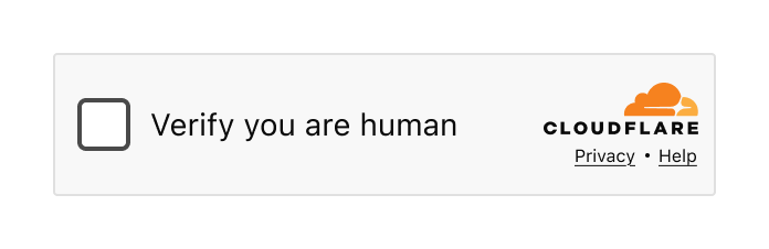
The Turnstile widget – a familiar sight across millions of websites
When we say that a large portion of the Internet sits behind Cloudflare, we mean it. Our Turnstile widget and Challenge Pages are served 7.67 billion times every single day. That’s not a typo. Billions. This might just be the most-seen user interface on the Internet.
And that comes with enormous responsibility.
Designing a product with billions of eyeballs on it isn’t just challenging — it requires a fundamentally different approach. Every pixel, every word, every interaction has to work for someone’s grandmother in rural Japan, a teenager in São Paulo, a visually impaired developer in Berlin, and a busy executive in Lagos. All at the same time. In moments of frustration.
Today we’re sharing the story of how we redesigned Turnstile and Challenge Pages. It’s a story told in three parts, by three of us: the design process and research that shaped our decisions (Leo), the engineering challenge of deploying changes at unprecedented scale (Ana), and the measurable impact on billions of users (Marina).
Let’s start with how we approached the problem from a design perspective.
Let’s be honest: nobody likes being asked to prove they’re human. You know you’re human. I know I’m human. The only one who doesn’t seem convinced is that little widget standing between you and the website you’re trying to access. At best, it’s a minor inconvenience. At worst? You’ve probably wanted to throw your computer out the window in a fit of rage. We’ve all been there. And no one would blame you.

Turnstile integrated into a login flow
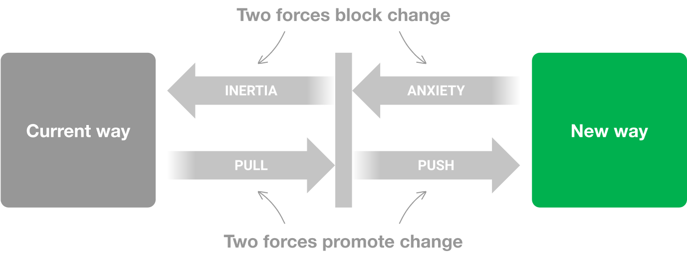
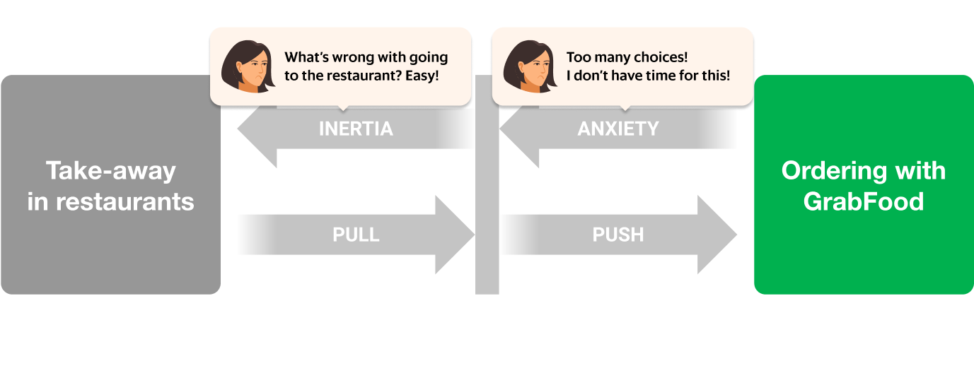
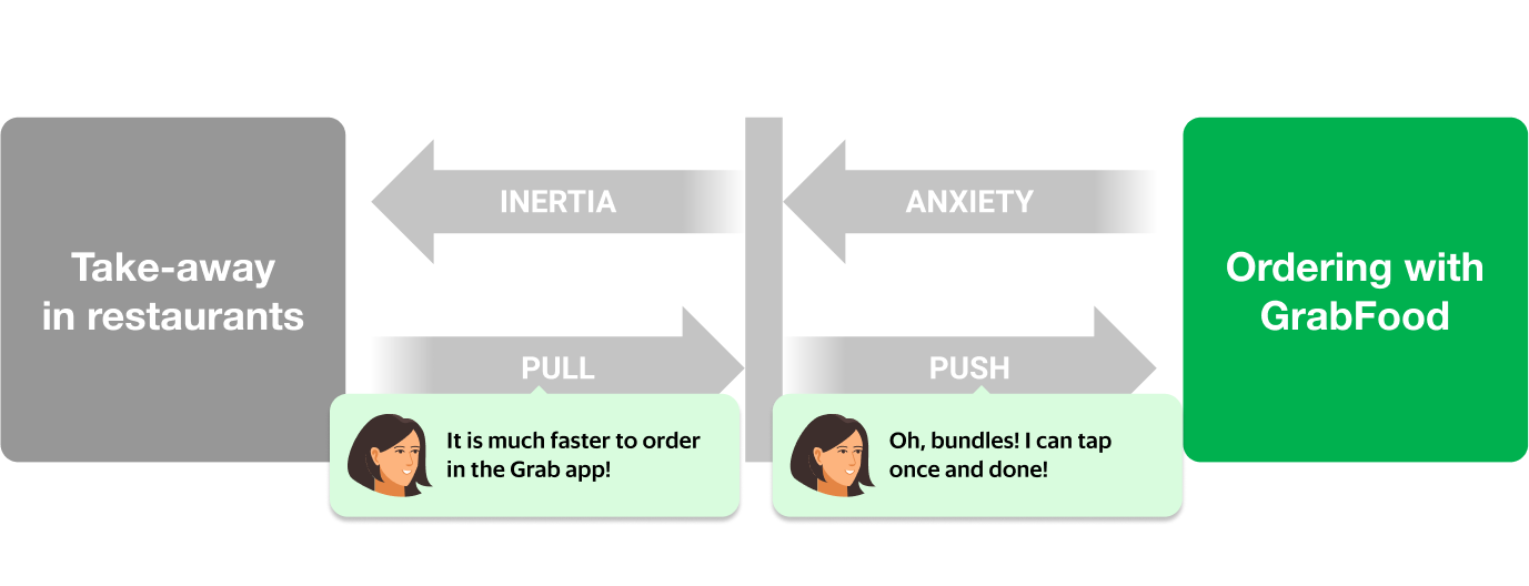
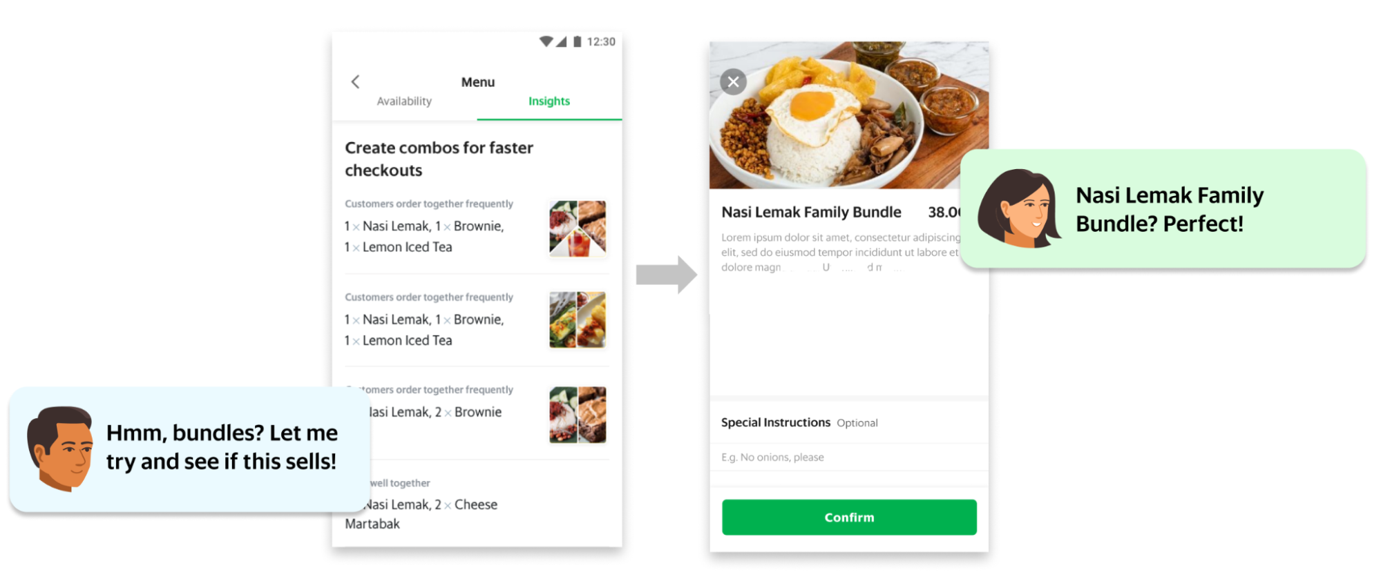
As the world warms up to what appears to be an inevitable AI revolution, the need for security verification is only increasing. At Cloudflare, we’ve seen a significant rise in bot attacks — and in response, organizations are investing more heavily in security measures. That means more challenges being issued to more end users, more often.
The numbers tell the story:
2023: 2.14B daily
2024: 3B daily
2025: 5.35B daily
That’s a 58.1% average increase in security checks, year over year. More security checks mean more opportunities for end user frustration. The more companies integrate these verification systems to protect themselves and their customers, the higher the chance that someone, somewhere, is going to have a bad experience.
We knew it was time to take a hard look at our flagship products and ask ourselves: Are we doing right by the billions of people who encounter these experiences? Are we fulfilling our mission to build a better Internet — not just a more secure one, but a more human one?
The answer, we discovered, was: we could do better.
Before redesigning anything, we needed to understand what we were working with. We started by conducting a comprehensive audit of every state, every error message, and every interaction across both Turnstile and Challenge Pages.
What we found wasn’t the best.
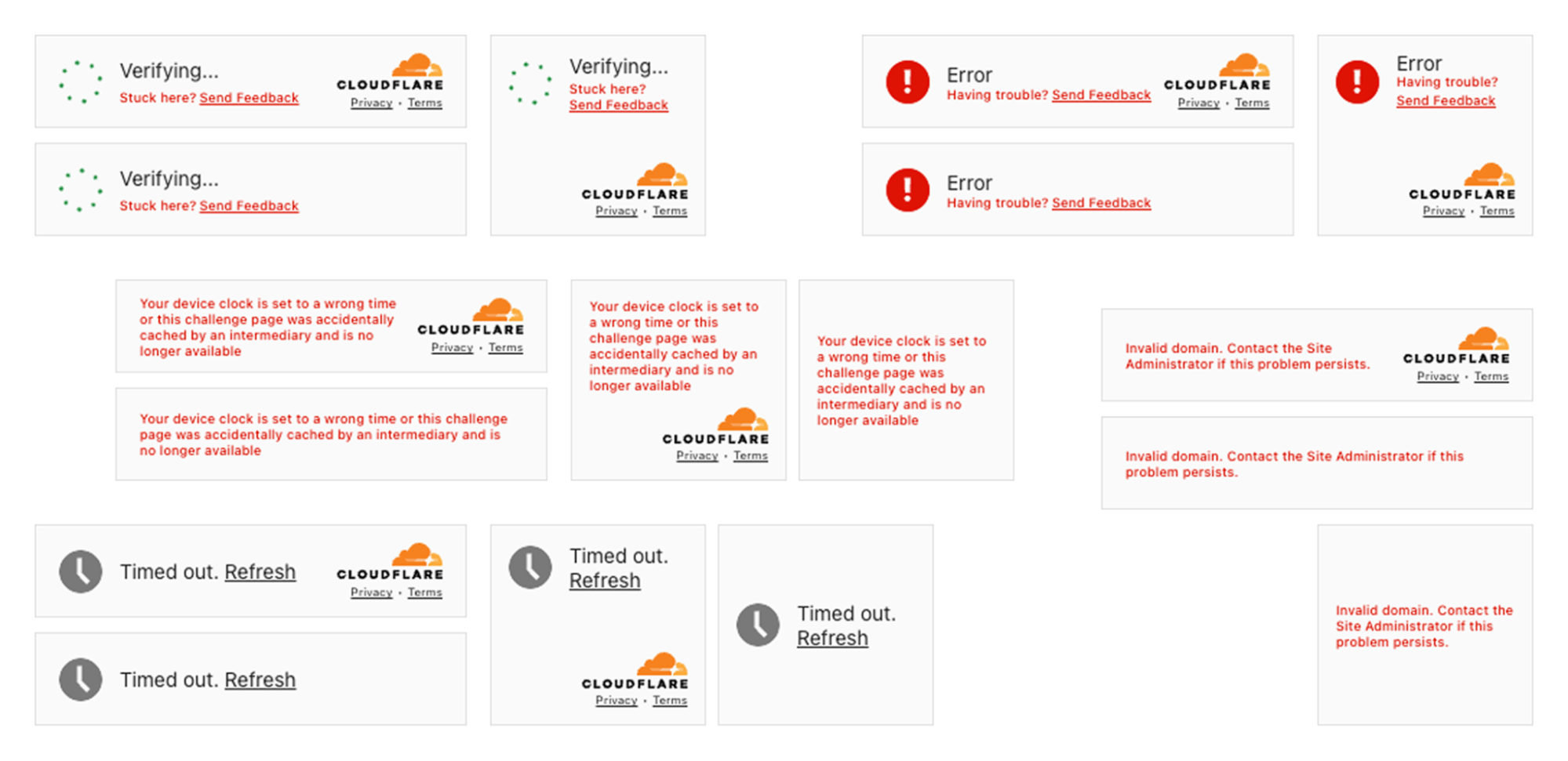
The state of inconsistency in the Turnstile widget. Multiple states with no unified approach
The inconsistencies were glaring. We had no unified approach across the multitude of different error scenarios. Some messages were overly verbose and technical (“Your device clock is set to a wrong time or this challenge page was accidentally cached by an intermediary and is no longer available”). Others were too vague to be helpful (“Timed out”). The visual language varied wildly — different layouts, different hierarchies, different tones of voice.
We also examined the feedback we’d received online. Social media, support tickets, community forums — we read it all. The frustration was palpable, and much of it was avoidable.
Take our feedback mechanism, for example. We offered users feedback options like “The widget sometimes fails” versus “The widget fails all the time.” But what’s the difference, really? And how were they supposed to know how often it failed? We were asking users to interpret ambiguous options during their most frustrated moments. The more we left open to interpretation, the less useful the feedback became — and the more frustration we saw across social channels.
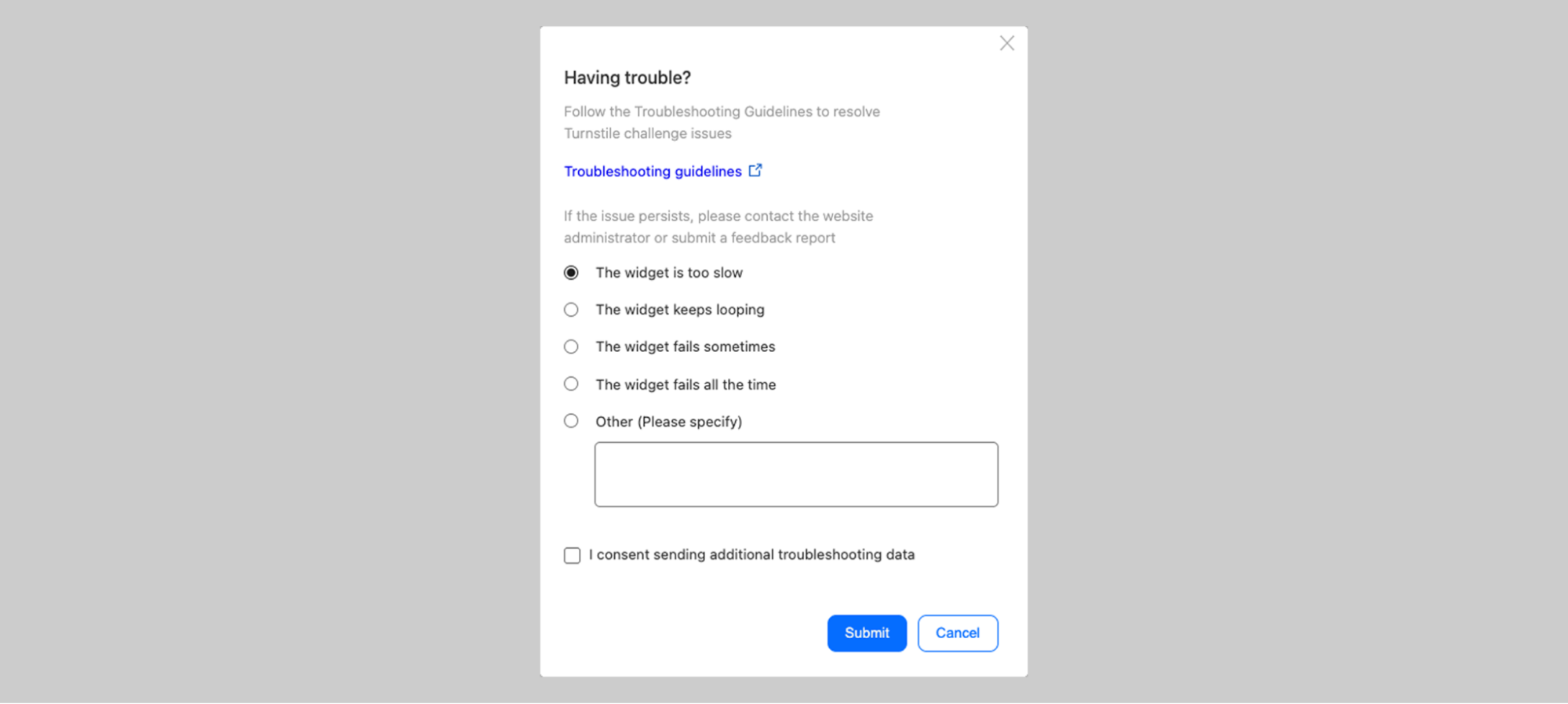
The previous feedback screen: “The widget sometimes fails” vs “The widget fails all the time” — what’s the difference?
Our Challenge Pages — the full-page security blocks that appear when we detect suspicious activity or when site owners have heightened security settings — had similar issues. Some states were confusing. Others used too much technical jargon. Many failed to provide actionable guidance when users needed it most.

The state of inconsistency on the Challenge pages. Multiple states with no unified approach
The audit was humbling. But it gave us a clear picture of where we needed to focus.
To design better experiences, we first needed to understand every possible path a user could take. What was the happy path? Was there even one? And what were the unhappy paths that led to escalating frustration?

Mapping the complete user journey — from initial encounter through error scenarios, with sentiment tracking
This was a true cross-functional effort. We worked closely with engineers like Ana who knew the technical ins and outs of every edge case, and with Marina on the product side who understood not just how the product worked, but how users felt about it — the love and the hate we’d see online.
We have some of the smartest people working on bot protection at Cloudflare. But intelligence and clarity aren’t the same thing. There’s a delicate balance between technical complexity and user simplicity. Only when these two dance together successfully can we communicate information in a way that actually makes sense to people.
And here’s the thing: the messaging has to work for everyone. A person of any age. Any mental or physical capability. Any cultural background. Any level of technical sophistication. That’s what designing at scale really means — you can’t ignore edge cases, since, at such scale, they are no longer edge cases.
One of the most influential books in UX design is Steve Krug’s Don’t Make Me Think. The core principle is simple: every moment a user spends trying to interpret, understand, or decode your interface is a moment of friction. And friction, especially in moments of frustration, leads to abandonment.
Our audit revealed that we were asking users to think far too much. Different pieces of information occupied the same space in the UI across different states. There was no consistent visual hierarchy. Users encountering an error state in Turnstile would find information in a completely different place than they would on a Challenge Page.
We made a fundamental decision: one information architecture to rule them all.
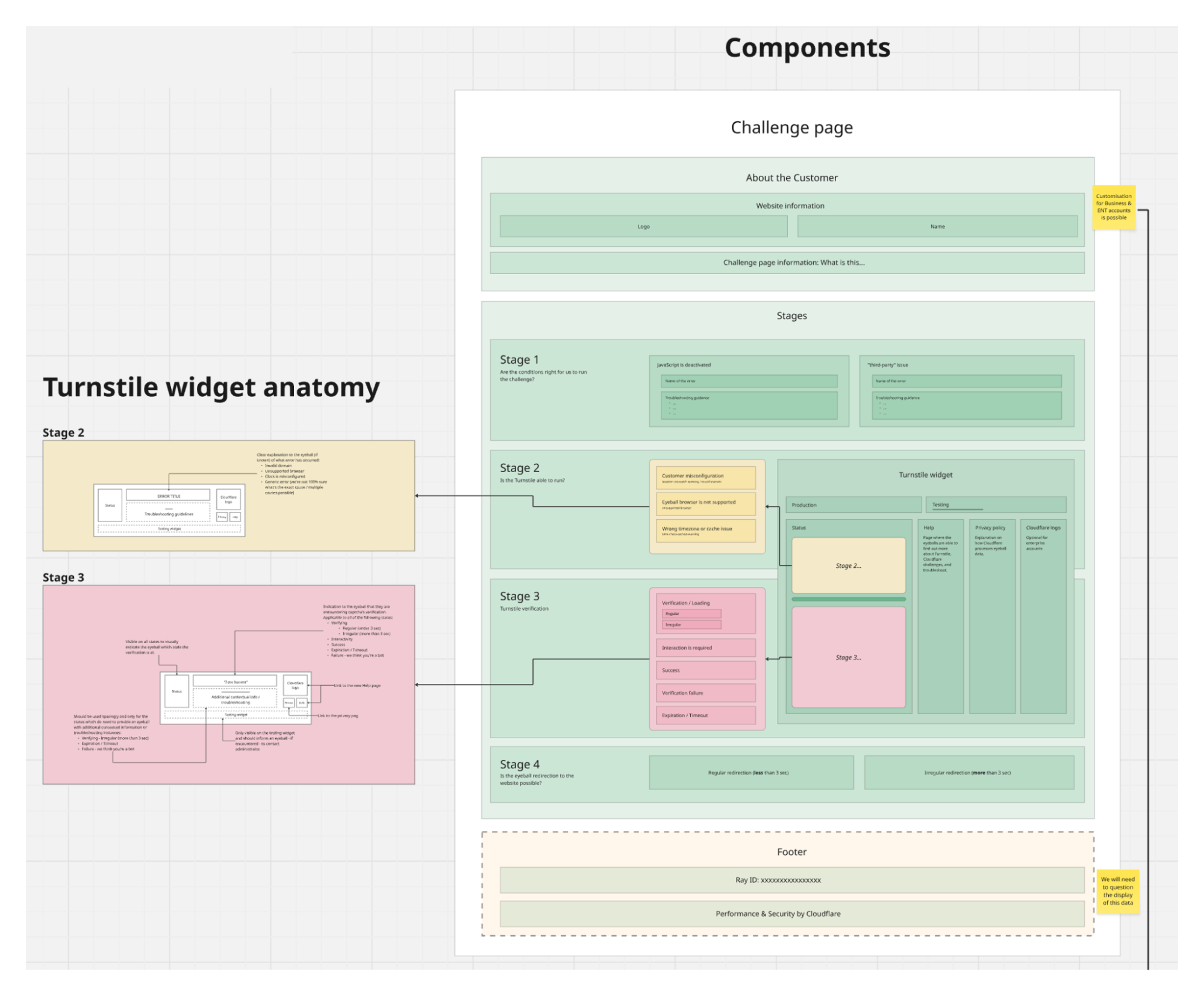
Visual diagram displaying a unified information architecture with a consistent structure across Turnstile widget and Challenge pages
Both Turnstile and Challenge Pages would now follow the same structural pattern. The same visual hierarchy. The same placement for actions, for explanatory text, for links to documentation.
Did this constrain our design options? Absolutely. We had to say no to a lot of creative ideas that didn’t fit the framework. But constraints aren’t the enemy of good design — they’re often its best friend. By limiting our options, we could go deeper on the details that actually mattered.
For users, the benefit is profound: they don’t need to re-learn what each piece of the UI means. Error states look consistent. Help links are always in the same place. Once you understand one state, you understand them all. That’s cognitive load reduced to a minimum — exactly where it should be during a security verification.
How do you keep yourself accountable when redesigning something that billions of people see? You test. A lot.
We recruited 8 participants across 8 different countries, deliberately seeking diversity in age, digital savviness, and cultural background. We weren’t looking for tech-savvy early adopters — we wanted to understand how the redesign would work for everyone.
Our approach was rigorous: participants saw both the current experience and proposed changes, without knowing which was “old” or “new.” We counterbalanced positioning to eliminate bias. And we did not just test our new ideas, but also challenged our assumptions about what needed changing in the first place.
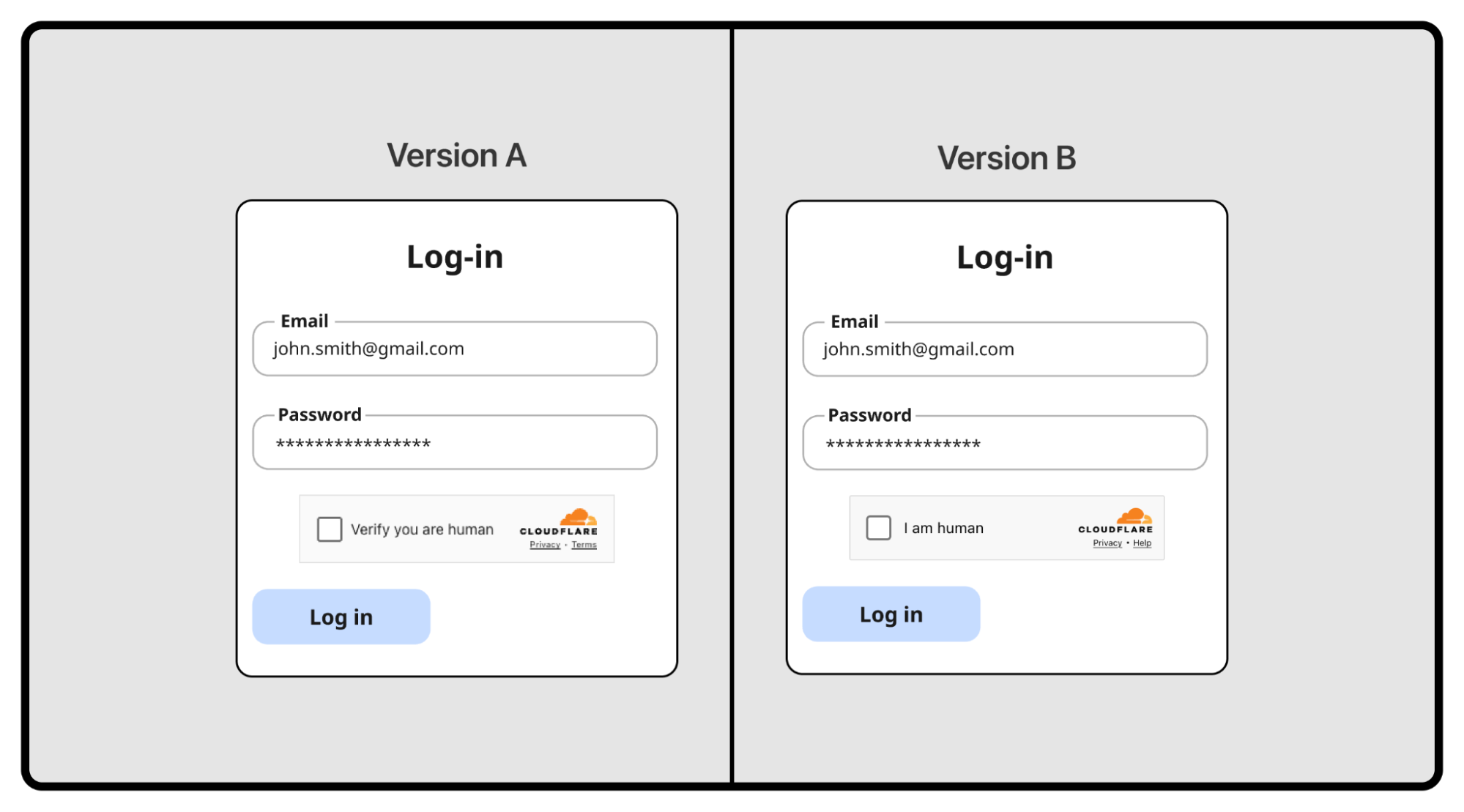
Two different versions of a Turnstile being tested in an A/B test
One hypothesis: should we align with competitors? Most CAPTCHA providers show “I am human” across all states. We use distinct content — “Verify you are human,” then “Verifying…,” then “Success!”
Were we overcomplicating things? We tested it head-to-head.
Our approach won decisively. For the interactivity state, “Verify you are human” scored 5 out of 8 points versus just 3 for “I am human.” For the verifying state, it was even more dramatic — 7.5 versus 0.5. Users wanted to know what was happening, not just be told what they were.

User testing results: users strongly favored our approach over the competitor-style design
This experiment didn’t ship as a feature, but it was invaluable. It gave us confidence we weren’t just being different for the sake of it. Some things were already right.
The research surfaced four areas where we were failing users:
Help, not bureaucracy. When users encountered errors, we offered “Send Feedback.” In testing, they were baffled. “Who am I sending this to? The website? Cloudflare? My ISP?” More importantly, we discovered something fundamental: at the moment of maximum frustration, people don’t want to file a report — they want to fix the problem. We replaced “Send Feedback” with “Troubleshoot” — a single word that promises action rather than bureaucracy.
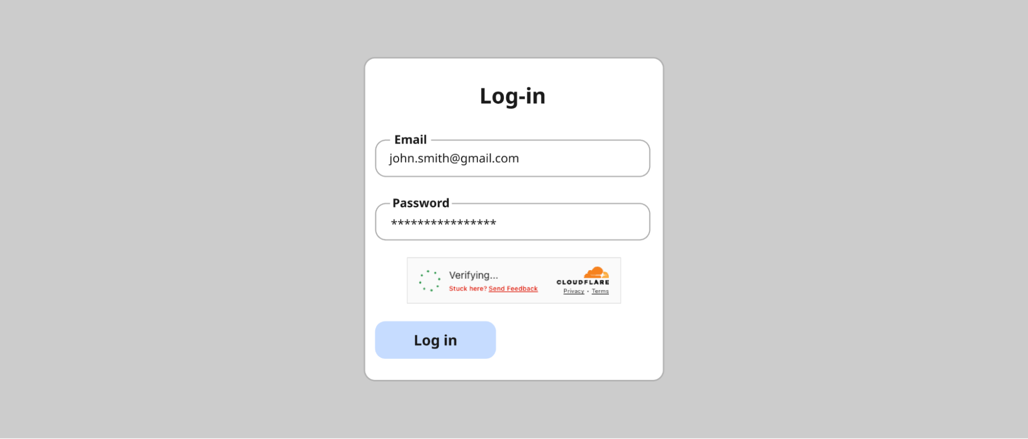
The problematic “Send Feedback” prompt: users didn’t know who they were sending feedback to
Attention, not alarm. We’d used red backgrounds liberally for errors. The reaction in testing was visceral — participants felt they had failed, felt powerless. Even for simple issues that would resolve with a retry, users assumed the worst and gave up. Red at full saturation wasn’t communicating “Here’s something to address.” It was communicating “You have failed, and there’s nothing you can do.” The fix: red only for icons, never for text or backgrounds.

The evolution: from the states with unclear error state description in red to much clearer and concise error communication in neutral-color text.
Scannable, not verbose. We’d tried to be thorough, explaining errors in technical detail. It backfired. Non-technical users found it alienating. Technical users didn’t need it. Everyone was trying to read it in the tiny real estate of a widget. The lesson: less is more, especially in constrained spaces during stressful moments.
Accessible to everyone. Our audit revealed 10px fonts in some states. Grey text that technically met AA (at least 4.5:1 for normal text and 3:1 for large text) compliance but was difficult to read in practice. “Technically compliant” isn’t good enough when you’re serving the entire Internet.
We set a clear goal: to meet the WCAG 2.2 AAA standard— the highest and most stringent level of web accessibility compliance, designed to make content accessible to the broadest range of users, including those with severe disabilities. Throughout the redesign, when visual consistency conflicted with readability, readability won. Every time.
This extended beyond vision. We designed for screen reader users, keyboard-only navigators, and people with color vision variations — going beyond what automated compliance tools can catch.
And accessibility isn’t just about impairments — it’s about language. What fits in English, overflows in German. What’s concise in Spanish is ambiguous in Japanese. Supporting over 40 languages forced us to radically simplify. The same “Unable to connect to website / Troubleshoot” pattern now works across English, Bulgarian, Danish, German, Greek, Japanese, Indonesian, Russian, Slovak, Slovenian, Serbian, Filipino, and many more.

The redesigned error state across 12 languages — consistent layout despite varying text lengths
So what did we actually ship?
First, let’s talk about what we didn’t change. The happy path — “Verify you are human” → “Verifying…” → “Success!” — tested exceptionally well. Users understood what was happening at each stage. The distinct content for each state, which we’d worried might be overcomplicating things, was actually our competitive advantage.

The happy path: Verify you are human → Verifying → Success! These states tested well and remained largely unchanged
But for the states that needed work, we made significant changes guided by everything we learned.
We radically reduced the amount of text in error states. Instead of verbose explanations like “Your device clock is set to a wrong time or this challenge page was accidentally cached by an intermediary and is no longer available,” we now show:
-
A clear, simple state name (e.g., “Incorrect device time”)
-
A prominent “Troubleshoot” link
That’s it. The detailed guidance now lives in a dedicated modal screen that opens when users need it — giving them room to actually read and follow troubleshooting steps.

The troubleshooting modal: detailed guidance when users need it, without cluttering the widget
The troubleshooting modal provides context (“This error occurs when your device’s clock or calendar is inaccurate. To complete this website’s security verification process, your device must be set to the correct date and time in your time zone.”), numbered steps to try, links to documentation, and — only after the user has tried to resolve the issue — an option to submit feedback to Cloudflare. Help first, feedback second.
Every state now meets WCAG 2.2 AAA standards for contrast and readability. Font sizes have established minimums. Interactive elements are clearly focusable and properly announced by screen readers.
Whether users encounter the compact Turnstile widget or a full Challenge Page, the information architecture is now consistent. Same hierarchy. Same placement. Same mental model.
Challenge Pages now follow a clean structure: the website name and favicon at the top, a clear status message (like “Verification successful” or “Your browser is out of date”), and actionable guidance below. No more walls of orange or red text. No more technical jargon without context.
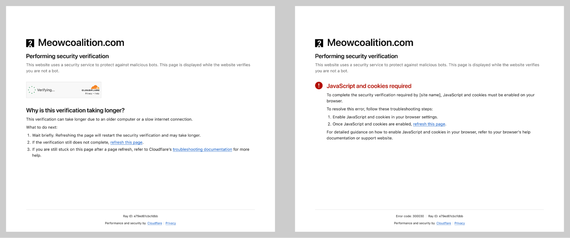
Re-designed Challenge page states with clear troubleshooting instructions.
Every piece of content was tested in over 40 supported languages. Our process involved three layers of validation:
-
Initial design review by the design team
-
Professional translation by our qualified vendor
-
Final review by native-speaking Cloudflare employees
This wasn’t just about translation accuracy — it was about ensuring the visual design held up when content length varied dramatically between languages.
The result is a security verification experience that’s clearer, more accessible, less frustrating, and — crucially — just as secure. We didn’t compromise on protection to improve the experience. We proved that good design and strong security aren’t in conflict.

Re-designed Turnstile widgets on the left and a re-designed Challenge page on the right
But designing the experience was only half the battle. Shipping it to billions of users? That’s where Ana comes in.
Some may say the hardest part of being a Frontend Engineer is centering a div. In reality, the real challenge often lies much deeper, especially when working close to the platform primitives. Building a critical piece of Internet infrastructure using native APIs forces you to think differently about UI development, tradeoffs, and long-term maintainability.
In our case, we use Rust to handle the UI for both the Turnstile widget and the Challenge page. This decision brought clear benefits in terms of safety and consistency across platforms, but it also increased frontend complexity. Many of us are used to the ergonomics of modern frameworks like React, where common UI interactions come almost for free. Working with Rust meant reimplementing even simple interactions using lower level constructs like document.getElementById, createElement, and appendChild.
On top of that, compile times and strict checks naturally slowed down rapid UI iteration compared to JavaScript based frameworks. Debugging was also more involved, as the tooling ecosystem is still evolving. These constraints pushed us to be more deliberate, more thoughtful, and ultimately more disciplined in how we approached UI development.
What initially looked like small visual tweaks such as padding adjustments or alignment changes quickly revealed a much bigger challenge: internationalization.
Once translations were available, we had to ensure that content remained readable and usable across 38 languages and 16 different UI states. Text length variability alone required careful design decisions. Some translations can be 30 to 300 percent longer than English. A short English string like “Stuck?” becomes “Tidak bisa melanjutkan?” in Indonesian or “Es geht nicht weiter?” in German, dramatically changing layout requirements.
Right-to-left language support added another layer of complexity. Supporting Arabic, Persian or Farsi, and Hebrew meant more than flipping text direction. Entire layouts had to be mirrored, including alignment, navigation patterns, directional icons, and animation flows. Many of these elements are implicitly designed with left-to-right assumptions, so we had to revisit those decisions and make them truly bidirectional.
Ordered lists also required special care. Not every culture uses the Western 1, 2, 3 numbering system, and hardcoding numeric sequences can make interfaces feel foreign or incorrect. We leaned on locale-aware numbering and fully translatable list formats to ensure ordering felt natural and culturally appropriate in every language.
As we started listing action points in feedback reports, correctness became even more critical. Every action needed to render properly, trigger the right flow, and behave consistently across states, languages, and edge cases.
To get there, we invested heavily in testing. Unit tests helped us validate logic in isolation, while end-to-end tests ensured that new states and languages worked as expected in real scenarios. This testing foundation gave us confidence to iterate safely, prevented regressions, and ensured that feedback reports remained reliable and actionable for users.
What began as a set of technical constraints turned into an opportunity to build a more robust, inclusive, and well-tested UI system. Working with fewer abstractions and closer to the browser primitives forced us to rethink assumptions, improve our internationalization strategy, and raise the overall quality bar.
The result is not just a solution that works, but one we trust. And that trust is what allows us to keep improving, even when centering a div turns out to be the easy part.
Designing for billions of people is a responsibility we take seriously. At this scale, it is essential to leverage measurable data to tell us the real impact of our design choices. As we prepare to roll out these changes, we are focusing on five key metrics that will tell us if we’ve truly succeeded in making the Internet’s most-seen UI more human.
Our primary north star is the Challenge Solve Rate: the percentage of issued challenges that are successfully completed. By moving away from technical jargon like “intermediary caching” and toward simple, actionable labels like “Incorrect device time,” we expect a significant uptick in CSR. A higher CSR doesn’t mean we’re being easier on bots; it means we’re removing the hurdles that were accidentally tripping up legitimate human users.
Every second a user spends on a challenge page is a second they aren’t getting the information that they need. Our research showed that users were often paralyzed by choice when seeing a wall of red text. With our new scannable, neutral-color design, we are tracking Time to Complete to ensure users can identify and resolve issues in seconds rather than minutes.
In the past, our liberal use of “saturated red” caused a visceral reaction: users felt they had failed and simply gave up. By reserving red only for icons and using a unified architecture, we aim to reduce Abandonment Rates. We want users to feel empowered to click Troubleshoot rather than feeling powerless and clicking away.
One of the bigger shifts from a product perspective is our new Troubleshooting Modal. By providing clear, numbered steps directly within the widget, we are building self-service support into the UI. We expect this to result in a measurable decrease in support ticket volume for both our customers and our own internal teams.
We know that security challenges are rarely loved, but they shouldn’t be hated because they are confusing. We are monitoring Social Sentiment across community forums, feedback reports, and social channels to see if the conversation shifts from “this widget is broken” to “I had an issue, but I fixed it”.
As a Product Manager, my goal is often invisible security — the best challenge is the one the user never sees. But when a challenge must be seen, it should be an assistant, not a bouncer. This redesign proves that AAA accessibility and high-security standards aren’t in competition; they are two sides of the same coin. By unifying the architecture of Turnstile and Challenge Pages, we’ve built a foundation that allows us to iterate faster and protect the Internet more humanely than ever before.
This redesign is a foundation, not a finish line.
We’re continuing to monitor how users interact with the new experience, and we’re committed to iterating based on what we learn. The feedback mechanisms we’ve built into the new design — the ones that actually help users troubleshoot, rather than just asking them to report problems — will give us richer insights than we’ve ever had before.
We’re also watching how the security landscape evolves. As bot attacks grow more sophisticated, and as AI continues to blur the line between human and automated behavior, the challenge of verification will only get harder. Our job is to stay ahead — to keep improving security without making the human experience worse.
If you encounter the new Turnstile or Challenge Pages and have feedback, we want to hear it. Reach out through our community forums or use the feedback mechanisms built into the experience itself.