All posts by Netflix Technology Blog

Seamlessly Swapping the API backend of the Netflix Android app

Post Syndicated from Netflix Technology Blog original https://netflixtechblog.com/seamlessly-swapping-the-api-backend-of-the-netflix-android-app-3d4317155187

How we migrated our Android endpoints out of a monolith into a new microservice

by Rohan Dhruva, Ed Ballot

As Android developers, we usually have the luxury of treating our backends as magic boxes running in the cloud, faithfully returning us JSON. At Netflix, we have adopted the Backend for Frontend (BFF) pattern: instead of having one general purpose “backend API”, we have one backend per client (Android/iOS/TV/web). On the Android team, while most of our time is spent working on the app, we are also responsible for maintaining this backend that our app communicates with, and its orchestration code.

Recently, we completed a year-long project rearchitecting and decoupling our backend from the centralized model used previously. We did this migration without slowing down the usual cadence of our releases, and with particular care to avoid any negative effects to the user experience. We went from an essentially serverless model in a monolithic service, to deploying and maintaining a new microservice that hosted our app backend endpoints. This allowed Android engineers to have much more control and observability over how we get our data. Over the course of this post, we will talk about our approach to this migration, the strategies that we employed, and the tools we built to support this.

Background

The Netflix Android app uses the falcor data model and query protocol. This allows the app to query a list of “paths” in each HTTP request, and get specially formatted JSON (jsonGraph) that we use to cache the data and hydrate the UI. As mentioned earlier, each client team owns their respective endpoints: which effectively means that we’re writing the resolvers for each of the paths that are in a query.

Screenshot from the Netflix Android app

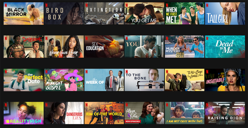
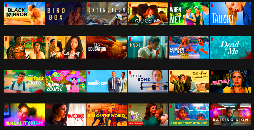
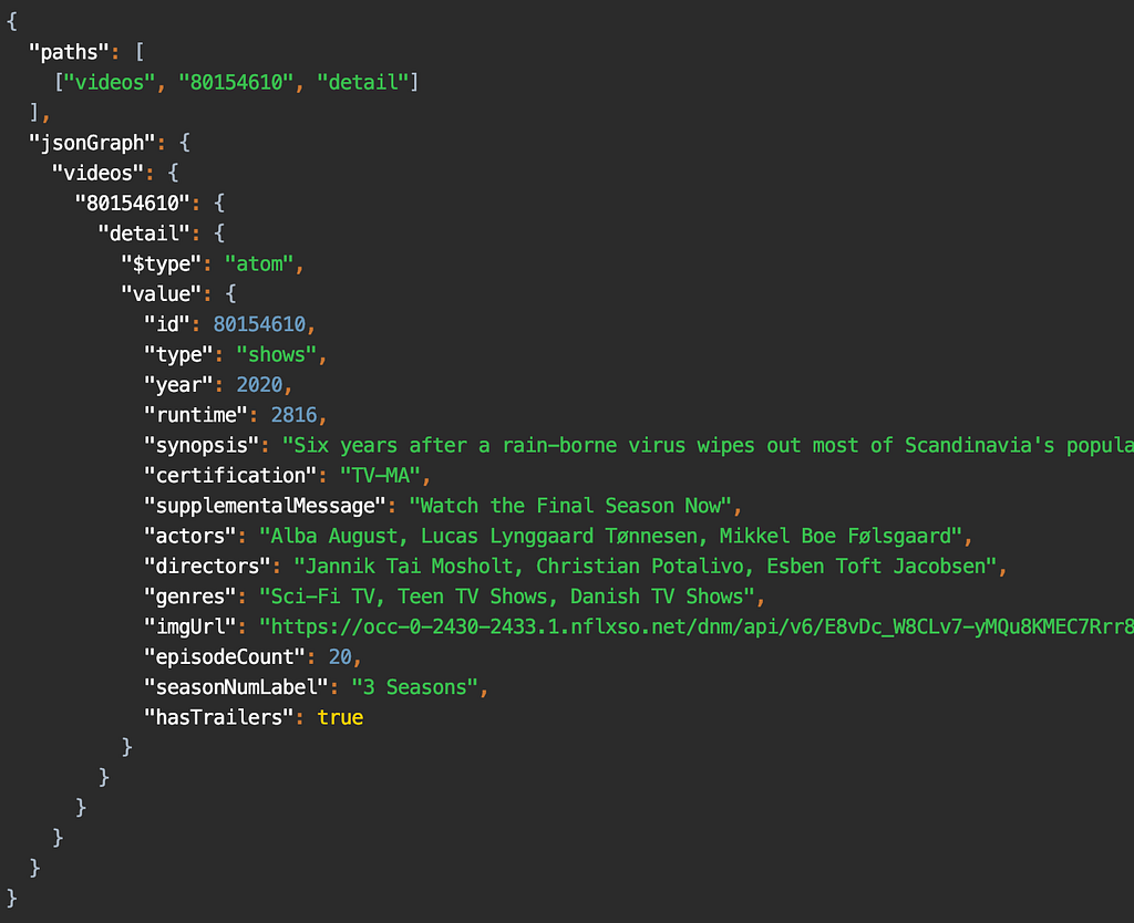
As an example, to render the screen shown here, the app sends a query that looks like this:

paths: ["videos", 80154610, "detail"]

A path starts from a root object, and is followed by a sequence of keys that we want to retrieve the data for. In the snippet above, we’re accessing the detail key for the video object with id 80154610.

For that query, the response is:

Response for the query [“videos”, 80154610, “detail”]

In the Monolith

In the example you see above, the data that the app needs is served by different backend microservices. For example, the artwork service is separate from the video metadata service, but we need the data from both in the detail key.

We do this orchestration on our endpoint code using a library provided by our API team, which exposes an RxJava API to handle the downstream calls to the various backend microservices. Our endpoint route handlers are effectively fetching the data using this API, usually across multiple different calls, and massaging it into data models that the UI expects. These handlers we wrote were deployed into a service run by the API team, shown in the diagram below.

Diagram of Netflix API monolith
Image taken from a previously published blog post

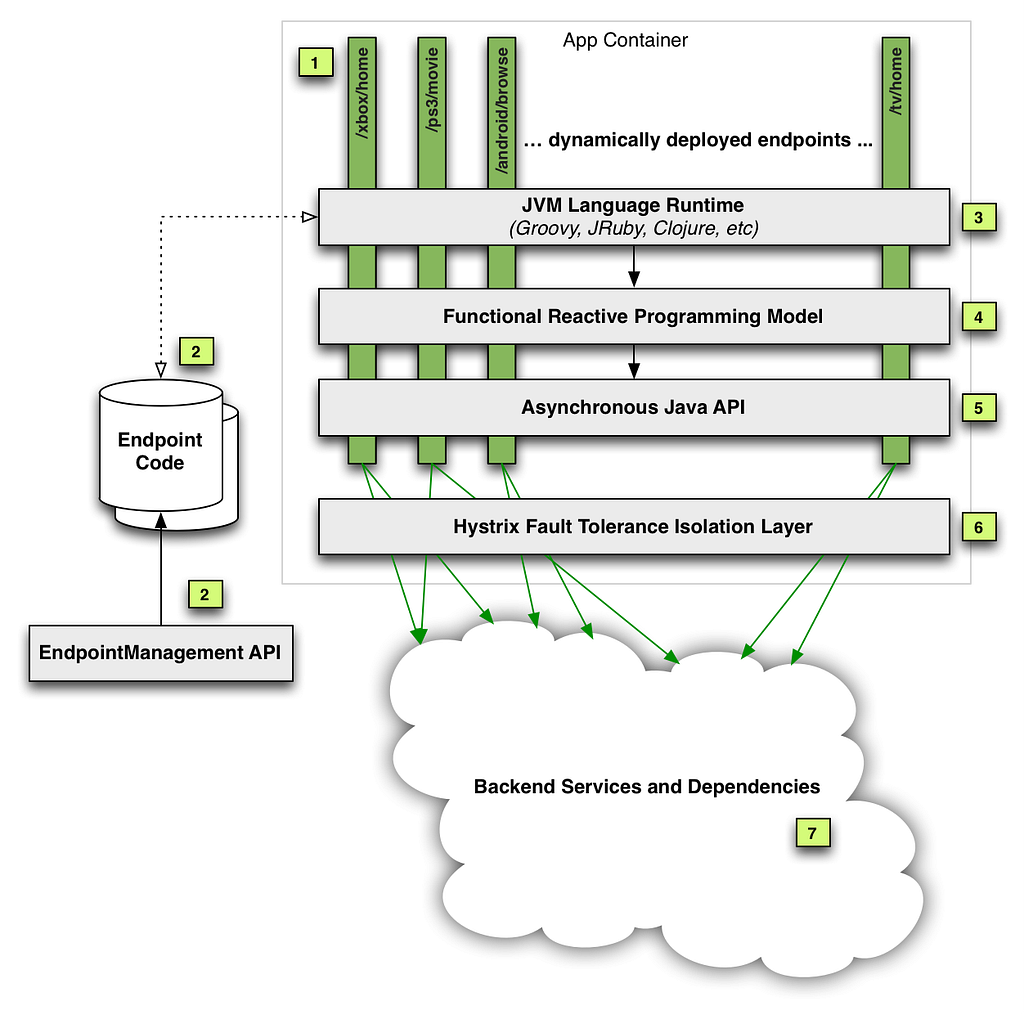
As you can see, our code was just a part (#2 in the diagram) of this monolithic service. In addition to hosting our route handlers, this service also handled the business logic necessary to make the downstream calls in a fault tolerant manner. While this gave client teams a very convenient “serverless” model, over time we ran into multiple operational and devex challenges with this service. You can read more about this in our previous posts here: part 1, part 2.

The Microservice

It was clear that we needed to isolate the endpoint code (owned by each client team), from the complex logic of fault tolerant downstream calls. Essentially, we wanted to break out the client-specific code from this monolith into its own service. We tried a few iterations of what this new service should look like, and eventually settled on a modern architecture that aimed to give more control of the API experience to the client teams. It was a Node.js service with a composable JavaScript API that made downstream microservice calls, replacing the old Java API.

Java…Script?

As Android developers, we’ve come to rely on the safety of a strongly typed language like Kotlin, maybe with a side of Java. Since this new microservice uses Node.js, we had to write our endpoints in JavaScript, a language that many people on our team were not familiar with. The context around why the Node.js ecosystem was chosen for this new service deserves an article in and of itself. For us, it means that we now need to have ~15 MDN tabs open when writing routes 🙂

Let’s briefly discuss the architecture of this microservice. It looks like a very typical backend service in the Node.js world: a combination of Restify, a stack of HTTP middleware, and the Falcor-based API. We’ll gloss over the details of this stack: the general idea is that we’re still writing resolvers for paths like [videos, <id>, detail], but we’re now writing them in JavaScript.

The big difference from the monolith, though, is that this is now a standalone service deployed as a separate “application” (service) in our cloud infrastructure. More importantly, we’re no longer just getting and returning requests from the context of an endpoint script running in a service: we’re now getting a chance to handle the HTTP request in its entirety. Starting from “terminating” the request from our public gateway, we then make downstream calls to the api application (using the previously mentioned JS API), and build up various parts of the response. Finally, we return the required JSON response from our service.

The Migration

Before we look at what this change meant for us, we want to talk about how we did it. Our app had ~170 query paths (think: route handlers), so we had to figure out an iterative approach to this migration. Let’s take a look at what we built in the app to support this migration. Going back to the screenshot above, if you scroll a bit further down on that page, you will see the section titled “more like this”:

Screenshot from the Netflix app showing “more like this”

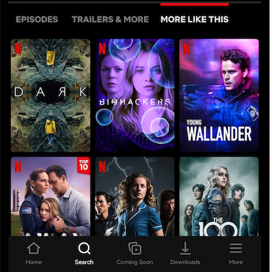
As you can imagine, this does not belong in the video details data for this title. Instead, it is part of a different path: [videos, <id>, similars]. The general idea here is that each UI screen (Activity/Fragment) needs data from multiple query paths to render the UI.

To prepare ourselves for a big change in the tech stack of our endpoint, we decided to track metrics around the time taken to respond to queries. After some consultation with our backend teams, we determined the most effective way to group these metrics were by UI screen. Our app uses a version of the repository pattern, where each screen can fetch data using a list of query paths. These paths, along with some other configuration, builds a Task. These Tasks already carry a uiLabel that uniquely identifies each screen: this label became our starting point, which we passed in a header to our endpoint. We then used this to log the time taken to respond to each query, grouped by the uiLabel. This meant that we could track any possible regressions to user experience by screen, which corresponds to how users navigate through the app. We will talk more about how we used these metrics in the sections to follow.

Fast forward a year: the 170 number we started with slowly but surely whittled down to 0, and we had all our “routes” (query paths) migrated to the new microservice. So, how did it go…?

The Good

Today, a big part of this migration is done: most of our app gets its data from this new microservice, and hopefully our users never noticed. As with any migration of this scale, we hit a few bumps along the way: but first, let’s look at good parts.

Migration Testing Infrastructure

Our monolith had been around for many years and hadn’t been created with functional and unit testing in mind, so those were independently bolted on by each UI team. For the migration, testing was a first-class citizen. While there was no technical reason stopping us from adding full automation coverage earlier, it was just much easier to add this while migrating each query path.

For each route we migrated, we wanted to make sure we were not introducing any regressions: either in the form of missing (or worse, wrong) data, or by increasing the latency of each endpoint. If we pare down the problem to absolute basics, we essentially have two services returning JSON. We want to make sure that for a given set of paths as input, the returned JSON is always exactly the same. With lots of guidance from other platform and backend teams, we took a 3-pronged approach to ensure correctness for each route migrated.

Functional Testing
Functional testing was the most straightforward of them all: a set of tests alongside each path exercised it against the old and new endpoints. We then used the excellent Jest testing framework with a set of custom matchers that sanitized a few things like timestamps and uuids. It gave us really high confidence during development, and helped us cover all the code paths that we had to migrate. The test suite automated a few things like setting up a test user, and matching the query parameters/headers sent by a real device: but that’s as far as it goes. The scope of functional testing was limited to the already setup test scenarios, but we would never be able to replicate the variety of device, language and locale combinations used by millions of our users across the globe.

Replay Testing
Enter replay testing. This was a custom built, 3-step pipeline:

  • Capture the production traffic for the desired path(s)
  • Replay the traffic against the two services in the TEST environment
  • Compare and assert for differences

It was a self-contained flow that, by design, captured entire requests, and not just the one path we requested. This test was the closest to production: it replayed real requests sent by the device, thus exercising the part of our service that fetches responses from the old endpoint and stitches them together with data from the new endpoint. The thoroughness and flexibility of this replay pipeline is best described in its own post. For us, the replay test tooling gave the confidence that our new code was nearly bug free.

Canaries
Canaries were the last step involved in “vetting” our new route handler implementation. In this step, a pipeline picks our candidate change, deploys the service, makes it publicly discoverable, and redirects a small percentage of production traffic to this new service. You can find a lot more details about how this works in the Spinnaker canaries documentation.

This is where our previously mentioned uiLabel metrics become relevant: for the duration of the canary, Kayenta was configured to capture and compare these metrics for all requests (in addition to the system level metrics already being tracked, like server CPU and memory). At the end of the canary period, we got a report that aggregated and compared the percentiles of each request made by a particular UI screen. Looking at our high traffic UI screens (like the homepage) allowed us to identify any regressions caused by the endpoint before we enabled it for all our users. Here’s one such report to get an idea of what it looks like:

Graph showing a 4–5% regression in the homepage latency.

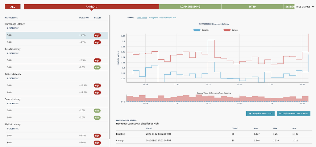
Each identified regression (like this one) was subject to a lot of analysis: chasing down a few of these led to previously unidentified performance gains! Being able to canary a new route let us verify latency and error rates were within acceptable limits. This type of tooling required time and effort to create, but in the end, the feedback it provided was well worth the cost.

Observability

Many Android engineers will be familiar with systrace or one of the excellent profilers in Android Studio. Imagine getting a similar tracing for your endpoint code, traversing along many different microservices: that is effectively what distributed tracing provides. Our microservice and router were already integrated into the Netflix request tracing infrastructure. We used Zipkin to consume the traces, which allowed us to search for a trace by path. Here’s what a typical trace looks like:

Zipkin trace for a call
A typical zipkin trace (truncated)

Request tracing has been critical to the success of Netflix infrastructure, but when we operated in the monolith, we did not have the ability to get this detailed look into how our app interacted with the various microservices. To demonstrate how this helped us, let us zoom into this part of the picture:

Serialized calls to this service adds a few ms latency

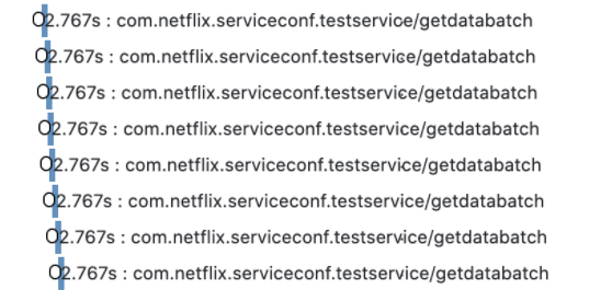
It’s pretty clear here that the calls are being serialized: however, at this point we’re already ~10 hops disconnected from our microservice. It’s hard to conclude this, and uncover such problems, from looking at raw numbers: either on our service or the testservice above, and even harder to attribute them back to the exact UI platform or screen. With the rich end-to-end tracing instrumented in the Netflix microservice ecosystem and made easily accessible via Zipkin, we were able to pretty quickly triage this problem to the responsible team.

End-to-end Ownership

As we mentioned earlier, our new service now had the “ownership” for the lifetime of the request. Where previously we only returned a Java object back to the api middleware, now the final step in the service was to flush the JSON down the request buffer. This increased ownership gave us the opportunity to easily test new optimisations at this layer. For example, with about a day’s worth of work, we had a prototype of the app using the binary msgpack response format instead of plain JSON. In addition to the flexible service architecture, this can also be attributed to the Node.js ecosystem and the rich selection of npm packages available.

Local Development

Before the migration, developing and debugging on the endpoint was painful due to slow deployment and lack of local debugging (this post covers that in more detail). One of the Android team’s biggest motivations for doing this migration project was to improve this experience. The new microservice gave us fast deployment and debug support by running the service in a local Docker instance, which has led to significant productivity improvements.

The Not-so-good

In the arduous process of breaking a monolith, you might get a sharp shard or two flung at you. A lot of what follows is not specific to Android, but we want to briefly mention these issues because they did end up affecting our app.

Latencies

The old api service was running on the same “machine” that also cached a lot of video metadata (by design). This meant that data that was static (e.g. video titles, descriptions) could be aggressively cached and reused across multiple requests. However, with the new microservice, even fetching this cached data needed to incur a network round trip, which added some latency.

This might sound like a classic example of “monoliths vs microservices”, but the reality is somewhat more complex. The monolith was also essentially still talking to a lot of downstream microservices: it just happened to have a custom-designed cache that helped a lot. Some of this increased latency was mitigated by better observability and more efficient batching of requests. But, for a small fraction of requests, after a lot of attempts at optimization, we just had to take the latency hit: sometimes, there are no silver bullets.

Increased Partial Query Errors

As each call to our endpoint might need to make multiple requests to the api service, some of these calls can fail, leaving us with partial data. Handling such partial query errors isn’t a new problem: it is baked into the nature of composite protocols like Falcor or GraphQL. However, as we moved our route handlers into a new microservice, we now introduced a network boundary for fetching any data, as mentioned earlier.

This meant that we now ran into partial states that weren’t possible before because of the custom caching. We were not completely aware of this problem in the beginning of our migration: we only saw it when some of our deserialized data objects had null fields. Since a lot of our code uses Kotlin, these partial data objects led to immediate crashes, which helped us notice the problem early: before it ever hit production.

As a result of increased partial errors, we’ve had to improve overall error handling approach and explore ways to minimize the impact of the network errors. In some cases, we also added custom retry logic on either the endpoint or the client code.

Final Thoughts

This has been a long (you can tell!) and a fulfilling journey for us on the Android team: as we mentioned earlier, on our team we typically work on the app and, until now, we did not have a chance to work with our endpoint with this level of scrutiny. Not only did we learn more about the intriguing world of microservices, but for us working on this project, it provided us the perfect opportunity to add observability to our app-endpoint interaction. At the same time, we ran into some unexpected issues like partial errors and made our app more resilient to them in the process.

As we continue to evolve and improve our app, we hope to share more insights like these with you.

The planning and successful migration to this new service was the combined effort of multiple backend and front end teams.

On the Android team, we ship the Netflix app on Android to millions of members around the world. Our responsibilities include extensive A/B testing on a wide variety of devices by building highly performant and often custom UI experiences. We work on data driven optimizations at scale in a diverse and sometimes unforgiving device and network ecosystem. If you find these challenges interesting, and want to work with us, we have an open position.


Seamlessly Swapping the API backend of the Netflix Android app was originally published in Netflix TechBlog on Medium, where people are continuing the conversation by highlighting and responding to this story.

HDMI — Scaling Netflix Certification

Post Syndicated from Netflix Technology Blog original https://netflixtechblog.com/hdmi-scaling-netflix-certification-8e9cb3ec524f

HDMI — Scaling Netflix Certification

Scott Bolter, Matthew Lehman, Akshay Garg ¹

At Netflix, we take the task of preserving the creative vision of our content all the way to a subscriber TV screen very seriously. This significantly increases the scope of our application integration and certification processes for streaming devices like set-top-boxes (STBs) and TVs. However, given a diverse device ecosystem, scaling this deeper level of validation for each device presents a significant challenge for our certification teams.

Our first step towards addressing this challenge is to actively engineer the removal of manual and subjective testing approaches across different functional touch points of the Netflix application on a streaming device. In this article we talk about one such functional area, High Definition Multimedia Interface (HDMI), the challenges it brings in relation to Netflix certification on STBs, and our in-house developed automated and objective testing workflows that help us simplify this process.

Why test High Definition Multimedia Interface (HDMI) ?

The HDMI spec includes several protocols and capabilities that are key to successfully transmitting audio, video, and other digital messages from source (STB) to sink (display) devices. Some of these capabilities include:

  • Extended Display Identification Data (EDID)
  • Audio and Video metadata (Info Frames) to help communicate media formats like multi-channel audio and High Dynamic Range (HDR) video
  • High-Bandwidth Digital Content Protection (HDCP)
  • Consumer Electronics Control (CEC)

A high quality Netflix experience on the STB device depends on the correct implementation of each of these capabilities, so we have a vested interest in thoroughly testing them.

Scaling HDMI Testing

Here are some of the challenges associated with HDMI testing on STBs:

  • The need to physically obtain and replicate different home entertainment setups of TVs and Home Theater Systems (HDMI topologies).
  • Time spent in manually changing these topologies between and during different tests.
  • Inconsistent test results due to different device models used in the HDMI topology.
  • Subjectivity in test results to accommodate differences in HDMI sink behaviors.

To deal with these scaling challenges, we have opted to integrate API-enabled HDMI Signal Analyzers into our test infrastructure. This provides the ability to simulate different HDMI topologies within a test case by leveraging the analyzer’s API.

Simulating multiple HDMI Topologies²

Next, we will cover basics of the HDMI protocols highlighted in the previous section and walk through the automation workflows that we have developed to address the related challenges.

EDID

Background

Every HDMI-capable TV transmits its Extended Display Identification Data, or EDID, to the connected HDMI source device (STB). The EDID is the means by which a sink device advertises its supported audio and video capabilities such as the spatial resolution (number of pixels), the temporal resolution (number of frames per second), and the color formats in which these frames of pixels are rendered.

EDID exchange between HDMI Sink and HDMI Source

Testing Approach

Using an HDMI Analyzer we can advertise the EDID of any HDMI capable sink to a STB device. This allows us to simulate an environment under which the device under test (DUT) i.e. the STB behaves just as it would if it were physically connected to an HDMI sink represented by that EDID. This ability to emulate different HDMI sinks has proven very useful for us, yielding increased automation, objective evaluation and scalability of a number of our test cases. In comparison, previously a tester was tasked to gather many physical HDMI sink devices, plug them into the DUT, validate, and move to the next scenario.

Test Area: Requested Media Profile Validation

A Netflix capable STB should request accurate media streams from our cloud service for optimal user experience. The media stream format and fidelity to be requested is decided by a combination of the inherent HDMI output capabilities of the STB and that of the connected HDMI topology. For example, an HD-only STB should not request 4K video streams. Likewise, a STB connected to a TV with stereo-only speakers should not request multi-channel Dolby Digital Plus Atmos audio streams. In order to comprehensively test the accuracy of the media streams being requested by the DUT under different HDMI setups, we emulate a variety of HDMI sinks with distinct resolution and media format capabilities by looping through a collection of EDID files on an HDMI analyzer connected to the DUT. For each EDID version we then validate the media profiles being requested by the DUT in an automated manner by comparing them against a reference expected set. This ensures that the media streams requested by DUT accurately reflect its HDMI capabilities and the active HDMI topology.

HDR

Background

HDR enables a wider range of colors, deeper blacks, and brighter specular highlights. However, when graphics in the sRGB color space, such as subtitles and media player controls, are composited on a video layer in the HDR format they need to be correctly converted into a wider BT.2020 color space and a larger range of luminance. Netflix gives guidance to preserve the original creative intent of the non-HDR graphics, so they appear the same when rendered in HDR output mode. This concept is known as perceptual mapping (BT.2087.0).

An increasing number of STB devices are capable of producing HDR output within the entire user experience rather than only during video playback, making accurate graphics color space and luminance mapping a more important part of a good user experience. Incorrectly mapped, these graphics can appear dim or colors can look oversaturated as you can see in the images below.

Undersaturated Netflix UI
Expected Netflix UI after SDR to HDR graphics conversion
Oversaturated Netflix UI

Testing Approach

Even if a STB follows the Netflix recommended sRGB to HDR color volume mapping for graphics, the end result on a screen is rather subjective. Different display panels add their own characteristics to the final output. Some testers might even prefer oversaturated graphics. Thankfully we can use an HDMI analyzer in an automated manner to remove this subjectivity from our testing.

Test Area: sRGB Graphics to HDR Color Volume mapping

Using an HDMI Analyzer we can objectively measure the pixel values for characteristics such as chromaticity and luminance. In our HDR-specific tests we use graphics that cover both the boundary of the sRGB color space as well as its entire luminance range. When these images are then applied to the graphics plane of a STB sending HDMI output in HDR mode, the STB has to convert its graphics plane into HDR color volume so that it can output both the graphics and video elements in a unified format. By capturing this STB output on an HDMI analyzer we measure and verify that after this graphics color volume conversion on the STB, the output pixel values of the graphics section follow the expected boundaries of it’s original non-HDR color space and luminance range as per our perceptual mapping requirement. The figure below highlights this testing process.

Validation of SDR to HDR color volume conversion for graphics

HDCP

Background

With the goal of preventing content piracy, it is of utmost importance that a STB device running the Netflix application is able to protect our content from being compromised on that device. One of the many important steps toward ensuring this is to validate STB devices’ adherence to High-bandwidth Digital Content Protection (HDCP) policies as specified in the Digital Rights Management (DRM) licenses associated with our streams.

A Netflix DRM license typically provides a mapping of the minimum required HDCP version (v1.4 or v2.2) for each content resolution i.e. the minimum HDCP version that must be established on the link between HDMI source (STB) and sink device (display) for the source to be able to send the associated decrypted video signal at a specific resolution over the HDMI cable. In order to effectively apply these HDCP policies, we must be able to trust the HDMI source device’s reporting of the effective HDCP state negotiated with the HDMI sink as well as its enforcement of the minimum required HDCP version for each output content resolution.

Testing Approach

As the task of procuring various audio/video repeaters (e.g. Home Theater Systems), HDMI switches and connected displays is very time-consuming and does not scale, once again we lean in on using an HDMI analyzer for our test automation purposes.

Test Area: Accurate HDCP Version Reporting

Leveraging the analyzer, we can simulate the following HDMI topologies:

  1. STB connected to a TV
  2. STB connected to a repeater which in turn is connected to a TV

In each topology, we can also tweak the level of HDCP support i.e. HDCP v1.4 or HDCP v2.2 on the repeater and the TV individually in an automated manner using the relevant HDMI Analyzer API’s. These abilities allow us to create multiple test setups as shown in the figure below and in each such setup, the DUT is required to report the effective HDCP version (the lowest version in the topology) to the Netflix application so that our service can serve the appropriate content to the client in that configuration.

Multiple possible HDCP version configurations

Test Area: Adherence to HDCP Policies

While testing of the reported HDCP version would ensure that the DUT sends correct data to Netflix services to obtain the appropriate content streams and DRM licenses, we also need to test that the DUT adheres to the video output restrictions stipulated in that license e.g. blocking content requiring HDCP v2.2 when HDCP v1.4 is negotiated on the HDMI link. To ensure this we again use an HDMI analyzer to emulate different HDMI topologies virtually and initiate playback using a variety of DRM licenses that stipulate distinct types of content protection rules for video output. Finally, we switch across different HDCP versions on the HDMI Analyzer, ensuring that in each configuration, DUT is able to follow the DRM license stipulated video output protection rules by taking one of the following required actions:

  1. Allow HDMI output of the video stream as-is
  2. Downscale the video output resolution if resolution is the content protection criteria
  3. Block the HDMI video output completely
  4. Stop playback by throwing an insufficient HDCP protection error to Netflix application

each of which can be validated in an automated manner leveraging the HDMI analyzer and the relevant Netflix application events.

CEC

Background

Consumer Electronics Control (CEC) protocol implementations on HDMI devices typically provide a convenience of an indirect device control e.g. using a TV remote to control the volume of the connected home theater system. However, aside from this benefit, CEC messages can also indicate which HDMI input of a downstream device (HDMI sink) is actively being used or if the downstream device itself is in a standby state. This is something of interest to a streaming application like Netflix running on an HDMI source. Whether or not the STB running Netflix is connected to an active HDMI input on the sink device has implications for what the Netflix application should or should not be doing, so we want the STB to correctly signal this active or inactive CEC state to the Netflix application.

Testing Approach

Once again, to remove the issues of variability in how CEC is branded on a sink device, how it is enabled in a device menu system, and under what conditions relevant CEC messages are transmitted, we can use an HDMI analyzer to send carefully crafted CEC operational codes to the STB.

Test Area: Accurate CEC Active State Notifications

After sending custom CEC messages targeted to the DUT on the HDMI bus, we can ensure that it behaves correctly in response to these messages. Some of these test scenarios are highlighted in the figure below.

CEC Active State notification in different scenarios

As an example we could send a CEC message to the STB to notify it that the active HDMI input on the HDMI sink has changed to some other source. Likewise we can also simulate the occurrence of an HDMI sink standby transition by broadcasting a CEC Standby message. In both scenarios we expect the source device to become CEC inactive and notify this updated CEC state to its local Netflix application.

Summary

At Netflix we deeply care about the quality of experience for our subscribers. It motivates us to invest in test automation to scale our approach to ensure the best possible device integration from our partners. The ideas discussed here represent a tip of the iceberg with many more challenges still left to be identified and addressed. If you are passionate about device test automation and want to help us solve these kinds of problems, please check out our jobs site for exciting opportunities.

[1] Equal contribution from all authors.

[2] Diagrams courtesy of Sunny Kong.


HDMI — Scaling Netflix Certification was originally published in Netflix TechBlog on Medium, where people are continuing the conversation by highlighting and responding to this story.

Edgar: Solving Mysteries Faster with Observability

Post Syndicated from Netflix Technology Blog original https://netflixtechblog.com/edgar-solving-mysteries-faster-with-observability-e1a76302c71f

Edgar helps Netflix teams troubleshoot distributed systems efficiently with the help of a summarized presentation of request tracing, logs, analysis, and metadata.

by Elizabeth Carretto

Everyone loves Unsolved Mysteries. There’s always someone who seems like the surefire culprit. There’s a clear motive, the perfect opportunity, and an incriminating footprint left behind. Yet, this is Unsolved Mysteries! It’s never that simple. Whether it’s a cryptic note behind the TV or a mysterious phone call from an unknown number at a critical moment, the pieces rarely fit together perfectly. As mystery lovers, we want to answer the age-old question of whodunit; we want to understand what really happened.

For engineers, instead of whodunit, the question is often “what failed and why?” When a problem occurs, we put on our detective hats and start our mystery-solving process by gathering evidence. The more complex a system, the more places to look for clues. An engineer can find herself digging through logs, poring over traces, and staring at dozens of dashboards.

All of these sources make it challenging to know where to begin and add to the time spent figuring out what went wrong. While this abundance of dashboards and information is by no means unique to Netflix, it certainly holds true within our microservices architecture. Each microservice may be easy to understand and debug individually, but what about when combined into a request that hits tens or hundreds of microservices? Searching for key evidence becomes like digging for a needle in a group of haystacks.

Example call graph in Edgar

In some cases, the question we’re answering is, “What’s happening right now??” and every second without resolution can carry a heavy cost. We want to resolve the problem as quickly as possible so our members can resume enjoying their favorite movies and shows. For teams building observability tools, the question is: how do we make understanding a system’s behavior fast and digestible? Quick to parse, and easy to pinpoint where something went wrong even if you aren’t deeply familiar with the inner workings and intricacies of that system? At Netflix, we’ve answered that question with a suite of observability tools. In an earlier blog post, we discussed Telltale, our health monitoring system. Telltale tells us when an application is unhealthy, but sometimes we need more fine-grained insight. We need to know why a specific request is failing and where. We built Edgar to ease this burden, by empowering our users to troubleshoot distributed systems efficiently with the help of a summarized presentation of request tracing, logs, analysis, and metadata.

What is Edgar?

Edgar is a self-service tool for troubleshooting distributed systems, built on a foundation of request tracing, with additional context layered on top. With request tracing and additional data from logs, events, metadata, and analysis, Edgar is able to show the flow of a request through our distributed system — what services were hit by a call, what information was passed from one service to the next, what happened inside that service, how long did it take, and what status was emitted — and highlight where an issue may have occurred. If you’re familiar with platforms like Zipkin or OpenTelemetry, this likely sounds familiar. But, there are a few substantial differences in how Edgar approaches its data and its users.

  • While Edgar is built on top of request tracing, it also uses the traces as the thread to tie additional context together. Deriving meaningful value from trace data alone can be challenging, as Cindy Sridharan articulated in this blog post. In addition to trace data, Edgar pulls in additional context from logs, events, and metadata, sifting through them to determine valuable and relevant information, so that Edgar can visually highlight where an error occurred and provide detailed context.
  • Edgar captures 100% of interesting traces, as opposed to sampling a small fixed percentage of traffic. This difference has substantial technological implications, from the classification of what’s interesting to transport to cost-effective storage (keep an eye out for later Netflix Tech Blog posts addressing these topics).
  • Edgar provides a powerful and consumable user experience to both engineers and non-engineers alike. If you embrace the cost and complexity of storing vast amounts of traces, you want to get the most value out of that cost. With Edgar, we’ve found that we can leverage that value by curating an experience for additional teams such as customer service operations, and we have embraced the challenge of building a product that makes trace data easy to access, easy to grok, and easy to gain insight by several user personas.

Tracing as a foundation

Logs, metrics, and traces are the three pillars of observability. Metrics communicate what’s happening on a macro scale, traces illustrate the ecosystem of an isolated request, and the logs provide a detail-rich snapshot into what happened within a service. These pillars have immense value and it is no surprise that the industry has invested heavily in building impressive dashboards and tooling around each. The downside is that we have so many dashboards. In one request hitting just ten services, there might be ten different analytics dashboards and ten different log stores. However, a request has its own unique trace identifier, which is a common thread tying all the pieces of this request together. The trace ID is typically generated at the first service that receives the request and then passed along from service to service as a header value. This makes the trace a great starting point to unify this data in a centralized location.

A trace is a set of segments representing each step of a single request throughout a system. Distributed tracing is the process of generating, transporting, storing, and retrieving traces in a distributed system. As a request flows between services, each distinct unit of work is documented as a span. A trace is made up of many spans, which are grouped together using a trace ID to form a single, end-to-end umbrella. A span:

  • Represents a unit of work, such as a network call from one service to another (a client/server relationship) or a purely internal action (e.g., starting and finishing a method).
  • Relates to other spans through a parent/child relationship.
  • Contains a set of key value pairs called tags, where service owners can attach helpful values such as urls, version numbers, regions, corresponding IDs, and errors. Tags can be associated with errors or warnings, which Edgar can display visually on a graph representation of the request.
  • Has a start time and an end time. Thanks to these timestamps, a user can quickly see how long the operation took.

The trace (along with its underlying spans) allows us to graphically represent the request chronologically.

Sample timeline view of a trace, based on Jaegar UI’s timeline view

Adding context to traces

With distributed tracing alone, Edgar is able to draw the path of a request as it flows through various systems. This centralized view is extremely helpful to determine which services were hit and when, but it lacks nuance. A tag might indicate there was an error but doesn’t fully answer the question of what happened. Adding logs to the picture can help a great deal. With logs, a user can see what the service itself had to say about what went wrong. If a data fetcher fails, the log can tell you what query it was running and what exact IDs or fields led to the failure. That alone might give an engineer the knowledge she needs to reproduce the issue. In Edgar, we parse the logs looking for error or warning values. We add these errors and warnings to our UI, highlighting them in our call graph and clearly associating them with a given service, to make it easy for users to view any errors we uncovered.

Example view of errors associated with a service, including an error parsed from a log

With the trace and additional context from logs illustrating the issue, one of the next questions may be how does this individual trace fit into the overall health and behavior of each service. Is this an anomaly or are we dealing with a pattern? To help answer this question, Edgar pulls in anomaly detection from a partner application, Telltale. Telltale provides Edgar with latency benchmarks that indicate if the individual trace’s latency is abnormal for this given service. A trace alone could tell you that a service took 500ms to respond, but it takes in-depth knowledge of a particular service’s typical behavior to make a determination if this response time is an outlier. Telltale’s anomaly analysis looks at historic behavior and can evaluate whether the latency experienced by this trace is anomalous. With this knowledge, Edgar can then visually warn that something happened in a service that caused its latency to fall outside of normal bounds.

Sample latency analysis

Edgar should reduce burden, not add to it

Presenting all of this data in one interface reduces the footwork of an engineer to uncover each source. However, discovery is only part of the path to resolution. With all the evidence presented and summarized by Edgar, an engineer may know what went wrong and where it went wrong. This is a huge step towards resolution, but not yet cause for celebration. The root cause may have been identified, but who owns the service in question? Many times, finding the right point of contact would require a jump into Slack or a company directory, which costs more time. In Edgar, we have integrated with our services to provide that information in-app alongside the details of a trace. For any service configured with an owner and support channel, Edgar provides a link to a service’s contact email and their Slack channel, smoothing the hand-off from one party to the next. If an engineer does need to pass an issue along to another team or person, Edgar’s request detail page contains all the context — the trace, logs, analysis — and is easily shareable, eliminating the need to write a detailed description or provide a cascade of links to communicate the issue.

Edgar’s request detail page

A key aspect of Edgar’s mission is to minimize the burden on both users and service owners. With all of its data sources, the sheer quantity of data could become overwhelming. It is essential for Edgar to maintain a prioritized interface, built to highlight errors and abnormalities to the user and assist users in taking the next step towards resolution. As our UI grows, it’s important to be discerning and judicious in how we handle new data sources, weaving them into our existing errors and warnings models to minimize disruption and to facilitate speedy understanding. We lean heavily on focus groups and user feedback to ensure a tight feedback loop so that Edgar can continue to meet our users’ needs as their services and use cases evolve.

As services evolve, they might change their log format or use new tags to indicate errors. We built an admin page to give our service owners that configurability and to decouple our product from in-depth service knowledge. Service owners can configure the essential details of their log stores, such as where their logs are located and what fields they use for trace IDs and span IDs. Knowing their trace and span IDs is what enables Edgar to correlate the traces and logs. Beyond that though, what are the idiosyncrasies of their logs? Some fields may be irrelevant or deprecated, and teams would like to hide them by default. Alternatively, some fields contain the most important information, and by promoting them in the Edgar UI, they are able to view these fields more quickly. This self-service configuration helps reduce the burden on service owners.

Initial log configuration in Edgar

Leveraging Edgar

In order for users to turn to Edgar in a situation when time is of the essence, users need to be able to trust Edgar. In particular, they need to be able to count on Edgar having data about their issue. Many approaches to distributed tracing involve setting a sample rate, such as 5%, and then only tracing that percentage of request traffic. Instead of sampling a fixed percentage, Edgar’s mission is to capture 100% of interesting requests. As a result, when an error happens, Edgar’s users can be confident they will be able to find it. That’s key to positioning Edgar as a reliable source. Edgar’s approach makes a commitment to have data about a given issue.

In addition to storing trace data for all requests, Edgar implemented a feature to collect additional details on-demand at a user’s discretion for a given criteria. With this fine-grained level of tracing turned on, Edgar captures request and response payloads as well as headers for requests matching the user’s criteria. This adds clarity to exactly what data is being passed from service to service through a request’s path. While this level of granularity is unsustainable for all request traffic, it is a robust tool in targeted use cases, especially for errors that prove challenging to reproduce.

As you can imagine, this comes with very real storage costs. While the Edgar team has done its best to manage these costs effectively and to optimize our storage, the cost is not insignificant. One way to strengthen our return on investment is by being a key tool throughout the software development lifecycle. Edgar is a crucial tool for operating and maintaining a production service, where reducing the time to recovery has direct customer impact. Engineers also rely on our tool throughout development and testing, and they use the Edgar request page to communicate issues across teams.

By providing our tool to multiple sets of users, we are able to leverage our cost more efficiently. Edgar has become not just a tool for engineers, but rather a tool for anyone who needs to troubleshoot a service at Netflix. In Edgar’s early days, as we strove to build valuable abstractions on top of trace data, the Edgar team first targeted streaming video use cases. We built a curated experience for streaming video, grouping requests into playback sessions, marked by starting and stopping playback for a given asset. We found this experience was powerful for customer service operations as well as engineering teams. Our team listened to customer service operations to understand which common issues caused an undue amount of support pain so that we could summarize these issues in our UI. This empowers customer service operations, as well as engineers, to quickly understand member issues with minimal digging. By logically grouping traces and summarizing the behavior at a higher level, trace data becomes extremely useful in answering questions like why a member didn’t receive 4k video for a certain title or why a member couldn’t watch certain content.

An example error viewing a playback session in Edgar

Extending Edgar for Studio

As the studio side of Netflix grew, we realized that our movie and show production support would benefit from a similar aggregation of user activity. Our movie and show production support might need to answer why someone from the production crew can’t log in or access their materials for a particular project. As we worked to serve this new user group, we sought to understand what issues our production support needed to answer most frequently and then tied together various data sources to answer those questions in Edgar.

The Edgar team built out an experience to meet this need, building another abstraction with trace data; this time, the focus was on troubleshooting production-related use cases and applications, rather than a streaming video session. Edgar provides our production support the ability to search for a given contractor, vendor, or member of production staff by their name or email. After finding the individual, Edgar reaches into numerous log stores for their user ID, and then pulls together their login history, role access change log, and recent traces emitted from production-related applications. Edgar scans through this data for errors and warnings and then presents those errors right at the front. Perhaps a vendor tried to login with the wrong password too many times, or they were assigned an incorrect role on a production. In this new domain, Edgar is solving the same multi-dashboarded problem by tying together information and pointing its users to the next step of resolution.

An example error for a production-related user

What Edgar is and is not

Edgar’s goal is not to be the be-all, end-all of tools or to be the One Tool to Rule Them All. Rather, our goal is to act as a concierge of troubleshooting — Edgar should quickly be able to guide users to an understanding of an issue, as well usher them to the next location, where they can remedy the problem. Let’s say a production vendor is unable to access materials for their production due to an incorrect role/permissions assignment, and this production vendor reaches out to support for assistance troubleshooting. When a support user searches for this vendor, Edgar should be able to indicate that this vendor recently had a role change and summarize what this role change is. Instead of being assigned to Dead To Me Season 2, they were assigned to Season 1! In this case, Edgar’s goal is to help a support user come to this conclusion and direct them quickly to the role management tool where this can be rectified, not to own the full circle of resolution.

Usage at Netflix

While Edgar was created around Netflix’s core streaming video use-case, it has since evolved to cover a wide array of applications. While Netflix streaming video is used by millions of members, some applications using Edgar may measure their volume in requests per minute, rather than requests per second, and may only have tens or hundreds of users rather than millions. While we started with a curated approach to solve a pain point for engineers and support working on streaming video, we found that this pain point is scale agnostic. Getting to the bottom of a problem is costly for all engineers, whether they are building a budget forecasting application used heavily by 30 people or a SVOD application used by millions.

Today, many applications and services at Netflix, covering a wide array of type and scale, publish trace data that is accessible in Edgar, and teams ranging from service owners to customer service operations rely on Edgar’s insights. From streaming to studio, Edgar leverages its wealth of knowledge to speed up troubleshooting across applications with the same fundamental approach of summarizing request tracing, logs, analysis, and metadata.

As you settle into your couch to watch a new episode of Unsolved Mysteries, you may still find yourself with more questions than answers. Why did the victim leave his house so abruptly? How did the suspect disappear into thin air? Hang on, how many people saw that UFO?? Unfortunately, Edgar can’t help you there (trust me, we’re disappointed too). But, if your relaxing evening is interrupted by a production outage, Edgar will be behind the scenes, helping Netflix engineers solve the mystery at hand.

Keeping services up and running allows Netflix to share stories with our members around the globe. Underneath every outage and failure, there is a story to tell, and powerful observability tooling is needed to tell it. If you are passionate about observability then come talk to us.


Edgar: Solving Mysteries Faster with Observability was originally published in Netflix TechBlog on Medium, where people are continuing the conversation by highlighting and responding to this story.

Key Challenges with Quasi Experiments at Netflix

Post Syndicated from Netflix Technology Blog original https://netflixtechblog.com/key-challenges-with-quasi-experiments-at-netflix-89b4f234b852

Kamer Toker-Yildiz, Colin McFarland, Julia Glick

At Netflix, when we can’t run A/B experiments we run quasi experiments! We run quasi experiments with various objectives such as non-member experiments focusing on acquisition, member experiments focusing on member engagement, or video streaming experiments focusing on content delivery. Consolidating on one methodology could be a challenge, as we may face different design or data constraints or optimization goals. We discuss some key challenges and approaches Netflix has been using to handle small sample size and limited pre-intervention data in quasi experiments.

Within-country quasi design to measure the impact of TV ads in France and Germany. Geographic units are defined based on the lowest level of media buying capability.

Design and Randomization

We face various business problems where we cannot run individual level A/B tests but can benefit from quasi experiments. For instance, consider the case where we want to measure the impact of TV or billboard advertising on member engagement. It is impossible for us to have identical treatment and control groups at the member level as we cannot hold back individuals from such forms of advertising. Our solution is to randomize our member base at the smallest possible level. For instance, TV advertising can be bought at TV media market level only in most countries. This usually involves groups of cities in closer geographic proximity.

One of the major problems we face in quasi experiments is having small sample size where asymptotic properties may not practically hold. We typically have a small number of geographic units due to test limitations and also use broader or distant groups of units to minimize geographic spillovers. We are also more likely to face high variation and uneven distributions in treatment and control groups due to heterogeneity across units. For example, let’s say we are interested in measuring the impact of marketing Lost in Space series on sci-fi viewing in the UK. London with its high population is randomly assigned to the treatment cell, and people in London love sci-fi much more than other cities. If we ignore the latter fact, we will overestimate the true impact of marketing — which is now confounded. In summary, simple randomization and mean comparison we typically utilize in A/B testing with millions of members may not work well for quasi experiments.

Completely tackling these problems during the design phase may not be possible. We use some statistical approaches during design and analysis to minimize bias and maximize precision of our estimates. During design, one approach we utilize is running repeated randomizations, i.e. ‘re-randomization’. In particular, we keep randomizing until we find a randomization that gives us the maximum desired level of balance on key variables across test cells. This approach generally enables us to define more similar test groups (i.e. getting closer to apples to apples comparison). However, we may still face two issues: 1) we can only simultaneously balance on a limited number of observed variables, and it is very difficult to find identical geographic units on all dimensions, and 2) we can still face noisy results with large confidence intervals due to small sample size. We next discuss some of our analysis approaches to further tackle these problems.

Analysis

Going Beyond Simple Comparisons

Difference in differences (diff-in-diff or DID) comparison is a very common approach used in quasi experiments. In diff-in-diff, we usually consider two time periods; pre and post intervention. We utilize the pre-intervention period to generate baselines for our metrics, and normalize post intervention values by the baseline. This normalization is a simple but very powerful way of controlling for inherent differences between treatment and control groups. For example, let’s say our success metric is signups and we are running a quasi experiment in France. We have Paris and Lyon in two test cells. We cannot directly compare signups in two cities as populations are very different. Normalizing with respect to pre-intervention signups would reduce variation and help us make comparisons at the same scale. Although the diff-in-diff approach generally works reasonably well, we have observed some cases where it may not be as applicable as we discuss next.

Success Metrics With Historical Observations But Small Sample Size

In our non-member focused tests, we can observe historical acquisition metrics, e.g. signup counts, however, we don’t typically observe any other information about non-members. High variation in outcome metrics combined with small sample size can be a problem to design a well powered experiment using traditional diff-in-diff like approaches. To tackle this problem, we try to implement designs involving multiple interventions in each unit over an extended period of time whenever possible (i.e. instead of a typical experiment with single intervention period). This can help us gather enough evidence to run a well-powered experiment even with a very small sample size (i.e. few geographic units).

In particular, we turn the intervention (e.g. advertising) “on” and “off” repeatedly over time in different patterns and geographic units to capture short term effects. Every time we “toggle” the intervention, it gives us another chance to read the effect of the test. So even if we only have few geographic units, we can eventually read a reasonably precise estimate of the effect size (although, of course, results may not be generalizable to others if we have very few units). As our analysis approach, we can use observations from steady-state units to estimate what would otherwise have happened in units that are changing. To estimate the treatment effect, we fit a dynamic linear model (aka DLM), a type of state space model where the observations are conditionally Gaussian. DLMs are a very flexible category of models, but we only use a narrow subset of possible DLM structures to keep things simple. We currently have a robust internal package embedded in our internal tool, Quasimodo, to cover experiments that have similar structure. Our model is comparable to Google’s CausalImpact package, but uses a multivariate structure to let us analyze more than a single point-in-time intervention in a single region.

Success Metrics Without Historical Observations

In our member focused tests, we sometimes face cases where we don’t have success metrics with historical observations. For example, Netflix promotes its new shows that are yet to be launched on service to increase member engagement once the show is available. For a new show, we start observing metrics only when the show launches. As a result, our success metrics inherently don’t have any historical observations making it impossible to utilize the benefits of similar time series based approaches.

In these cases, we utilize the benefits of richer member data to measure and control for members’ inherent engagement or interest with the show. We do this by using relevant pre-treatment proxies, e.g. viewing of similar shows, interest in Netflix originals or similar genres. We have observed that controlling for geographic as well as individual level differences work best in minimizing confounding effects and improving precision. For example, if members in Toronto watch more Netflix originals than members in other cities in Canada, we should then control for pre-treatment Netflix originals viewing at both individual and city level to capture within and between unit variation separately.

This is in nature very similar to covariate adjustment. However, we do more than just running a simple regression with a large set of control variables. At Netflix, we have worked on developing approaches at the intersection of regression covariate adjustment and machine learning based propensity score matching by using a wide set of relevant member features. Such combined approaches help us explicitly control for members’ inherent interest in the new show using hundreds of features while minimizing linearity assumptions and degrees of freedom challenges we may face. We thus gain significant wins in both reducing potential confounding effects as well as maximizing precision to more accurately capture the treatment effect we are interested in.

Next Steps

We have excelled in the quasi experimentation space with many measurement strategies now in play across Netflix for various use cases. However we are not done yet! We can expand methodologies to more use cases and continue to improve the measurement. As an example, another exciting area we have yet to explore is combining these approaches for those metrics where we can use both time series approaches and a rich set of internal features (e.g. general member engagement metrics). If you’re interested in working on these and other causal inference problems, join our dream team!


Key Challenges with Quasi Experiments at Netflix was originally published in Netflix TechBlog on Medium, where people are continuing the conversation by highlighting and responding to this story.

Optimized shot-based encodes for 4K: Now streaming!

Post Syndicated from Netflix Technology Blog original https://netflixtechblog.com/optimized-shot-based-encodes-for-4k-now-streaming-47b516b10bbb

by Aditya Mavlankar, Liwei Guo, Anush Moorthy and Anne Aaron

Netflix has an ever-expanding collection of titles which customers can enjoy in 4K resolution with a suitable device and subscription plan. Netflix creates premium bitstreams for those titles in addition to the catalog-wide 8-bit stream profiles¹. Premium features comprise a title-dependent combination of 10-bit bit-depth, 4K resolution, high frame rate (HFR) and high dynamic range (HDR) and pave the way for an extraordinary viewing experience.

The premium bitstreams, launched several years ago, were rolled out with a fixed-bitrate ladder, with fixed 4K resolution bitrates — 8, 10, 12 and 16 Mbps — regardless of content characteristics. Since then, we’ve developed algorithms such as per-title encode optimizations and per-shot dynamic optimization, but these innovations were not back-ported on these premium bitstreams. Moreover, the encoding group of pictures (GoP) duration (or keyframe period) was constant throughout the stream causing additional inefficiency due to shot boundaries not aligning with GoP boundaries.

As the number of 4K titles in our catalog continues to grow and more devices support the premium features, we expect these video streams to have an increasing impact on our members and the network. We’ve worked hard over the last year to leapfrog to our most advanced encoding innovations — shot-optimized encoding and 4K VMAF model — and applied those to the premium bitstreams. More specifically, we’ve improved the traditional 4K and 10-bit ladder by employing

In this blog post, we present benefits of applying the above-mentioned optimizations to standard dynamic range (SDR) 10-bit and 4K streams (some titles are also HFR). As for HDR, our team is currently developing an HDR extension to VMAF, Netflix’s video quality metric, which will then be used to optimize the HDR streams.

¹ The 8-bit stream profiles go up to 1080p resolution.

Bitrate versus quality comparison

For a sample of titles from the 4K collection, the following plots show the rate-quality comparison of the fixed-bitrate ladder and the optimized ladder. The plots have been arranged in decreasing order of the new highest bitrate — which is now content adaptive and commensurate with the overall complexity of the respective title.

Fig. 1: Example of a thriller-drama episode showing new highest bitrate of 11.8 Mbps
Fig. 2: Example of a sitcom episode with some action showing new highest bitrate of 8.5 Mbps
Fig. 3: Example of a sitcom episode with less action showing new highest bitrate of 6.6 Mbps
Fig. 4: Example of a 4K animation episode showing new highest bitrate of 1.8 Mbps

The bitrate as well as quality shown for any point is the average for the corresponding stream, computed over the duration of the title. The annotation next to the point is the corresponding encoding resolution; it should be noted that video received by the client device is decoded and scaled to the device’s display resolution. As for VMAF score computation, for encoding resolutions less than 4K, we follow the VMAF best practice to upscale to 4K assuming bicubic upsampling. Aside from the encoding resolution, each point is also associated with an appropriate pixel aspect ratio (PAR) to achieve a target 16:9 display aspect ratio (DAR). For example, the 640×480 encoding resolution is paired with a 4:3 PAR to achieve 16:9 DAR, consistent with the DAR for other points on the ladder.

The last example, showing the new highest bitrate to be 1.8 Mbps, is for a 4K animation title episode which can be very efficiently encoded. It serves as an extreme example of content adaptive ladder optimization — it however should not to be interpreted as all animation titles landing on similar low bitrates.

The resolutions and bitrates for the fixed-bitrate ladder are pre-determined; minor deviation in the achieved bitrate is due to rate control in the encoder implementation not hitting the target bitrate precisely. On the other hand, each point on the optimized ladder is associated with optimal bit allocation across all shots with the goal of maximizing a video quality objective function while resulting in the corresponding average bitrate. Consequently, for the optimized encodes, the bitrate varies shot to shot depending on relative complexity and overall bit budget and in theory can reach the respective codec level maximum. Various points are constrained to different codec levels, so receivers with different decoder level capabilities can stream the corresponding subset of points up to the corresponding level.

The fixed-bitrate ladder often appears like steps — since it is not title adaptive it switches “late” to most encoding resolutions and as a result the quality stays flat within that resolution even with increasing bitrate. For example, two 1080p points with identical VMAF score or four 4K points with identical VMAF score, resulting in wasted bits and increased storage footprint.

On the other hand, the optimized ladder appears closer to a monotonically increasing curve — increasing bitrate results in an increasing VMAF score. As a side note, we do have some additional points, not shown in the plots, that are used in resolution limited scenarios — such as a streaming session limited to 720p or 1080p highest encoding resolution. Such points lie under (or to the right of) the convex hull main ladder curve but allow quality to ramp up in resolution limited scenarios.

Challenging-to-encode content

For the optimized ladders we have logic to detect quality saturation at the high end, meaning an increase in bitrate not resulting in material improvement in quality. Once such a bitrate is reached it is a good candidate for the topmost rung of the ladder. An additional limit can be imposed as a safeguard to avoid excessively high bitrates.

Sometimes we ingest a title that would need more bits at the highest end of the quality spectrum — even higher than the 16 Mbps limit of the fixed-bitrate ladder. For example,

  • a rock concert with fast-changing lighting effects and other details or
  • a wildlife documentary with fast action and/or challenging spatial details.

This scenario is generally rare. Nevertheless, below plot highlights such a case where the optimized ladder exceeds the fixed-bitrate ladder in terms of the highest bitrate, thereby achieving an improvement in the highest quality.

As expected, the quality is higher for the same bitrate, even when compared in the low or medium bitrate regions.

Fig. 5: Example of a movie with action and great amount of rich spatial details showing new highest bitrate of 17.2 Mbps

Visual examples

As an example, we compare the 1.75 Mbps encode from the fixed-bitrate ladder with the 1.45 Mbps encode from the optimized ladder for one of the titles from our 4K collection. Since 4K resolution entails a rather large number of pixels, we show 1024×512 pixel cutouts from the two encodes. The encodes are decoded and scaled to a 4K canvas prior to extracting the cutouts. We toggle between the cutouts so it is convenient to spot differences. We also show the corresponding full frame which helps to get a sense of how the cutout fits in the corresponding video frame.

Fig. 6: Pristine full frame — the purpose is to give a sense of how below cutouts fit in the frame
Fig. 7: Toggling between 1024×512 pixel cutouts from two encodes as annotated. Corresponding to pristine frame shown in Figure 6.
Fig. 8: Pristine full frame — the purpose is to give a sense of how below cutouts fit in the frame
Fig. 9: Toggling between 1024×512 pixel cutouts from two encodes as annotated. Corresponding to pristine frame shown in Figure 8.
Fig. 10: Pristine full frame — the purpose is to give a sense of how below cutouts fit in the frame
Fig. 11: Toggling between 1024×512 pixel cutouts from two encodes as annotated. Corresponding to pristine frame shown in Figure 10.
Fig. 12: Pristine full frame — the purpose is to give a sense of how below cutouts fit in the frame
Fig. 13: Toggling between 1024×512 pixel cutouts from two encodes as annotated. Corresponding to pristine frame shown in Figure 12.
Fig. 14: Pristine full frame — the purpose is to give a sense of how below cutouts fit in the frame
Fig. 15: Toggling between 1024×512 pixel cutouts from two encodes as annotated. Corresponding to pristine frame shown in Figure 14.

As can be seen, the encode from the optimized ladder delivers crisper textures and higher detail for less bits. At 1.45 Mbps it is by no means a perfect 4K rendition, but still very commendable for that bitrate. There exist higher bitrate points on the optimized ladder that deliver impeccable 4K quality, also for less bits compared to the fixed-bitrate ladder.

Compression and bitrate ladder improvements

Even before testing the new streams in the field, we observe the following advantages of the optimized ladders vs the fixed ladders, evaluated over 100 sample titles:

  • Computing the Bjøntegaard Delta (BD) rate shows 50% gains on average over the fixed-bitrate ladder. Meaning, on average we need 50% less bitrate to achieve the same quality with the optimized ladder.
  • The highest 4K bitrate on average is 8 Mbps which is also a 50% reduction compared to 16 Mbps of the fixed-bitrate ladder.
  • As mobile devices continue to improve, they adopt premium features (other than 4K resolution) like 10-bit and HFR. These video encodes can be delivered to mobile devices as well. The fixed-bitrate ladder starts at 560 kbps which may be too high for some cellular networks. The optimized ladder, on the other hand, has lower bitrate points that are viable in most cellular scenarios.
  • The optimized ladder entails a smaller storage footprint compared to the fixed-bitrate ladder.
  • The new ladder considers adding 1440p resolution (aka QHD) points if they lie on the convex hull of rate-quality tradeoff and most titles seem to get the 1440p treatment. As a result, when averaged over 100 titles, the bitrate required to jump to a resolution higher than 1080p (meaning either QHD or 4K) is 1.7 Mbps compared to 8 Mbps of the fixed-bitrate ladder. When averaged over 100 titles, the bitrate required to jump to 4K resolution is 3.2 Mbps compared to 8 Mbps of the fixed-bitrate ladder.

Benefits to members

At Netflix we perform A/B testing of encoding optimizations to detect any playback issues on client devices as well as gauge the benefits experienced by our members. One set of streaming sessions receives the default encodes and the other set of streaming sessions receives the new encodes. This in turn allows us to compare error rates as well as various metrics related to quality of experience (QoE). Although our streams are standard compliant, the A/B testing can and does sometimes find device-side implementations with minor gaps; in such cases we work with our device partners to find the best remedy.

Overall, while A/B testing these new encodes, we have seen the following benefits, which are in line with the offline evaluation covered in the previous section:

  • For members with high-bandwidth connections we deliver the same great quality at half the bitrate on average.
  • For members with constrained bandwidth we deliver higher quality at the same (or even lower) bitrate — higher VMAF at the same encoding resolution and bitrate or even higher resolutions than they could stream before. For example, members who were limited by their network to 720p can now be served 1080p or higher resolution instead.
  • Most streaming sessions start with a higher initial quality.
  • The number of rebuffers per hour go down by over 65%; members also experience fewer quality drops while streaming.
  • The reduced bitrate together with some Digital Rights Management (DRM) system improvements (not covered in this blog) result in reducing the initial play delay by about 10%.

Next steps

We have started re-encoding the 4K titles in our catalog to generate the optimized streams and we expect to complete in a couple of months. We continue to work on applying similar optimizations to our HDR streams.

Acknowledgements

We thank Lishan Zhu for help rendered during A/B testing.

This is a collective effort on the part of our larger team, known as Encoding Technologies, and various other teams that we have crucial partnerships with, such as:

If you are passionate about video compression research and would like to contribute to this field, we have an open position.


Optimized shot-based encodes for 4K: Now streaming! was originally published in Netflix TechBlog on Medium, where people are continuing the conversation by highlighting and responding to this story.