All posts by Netflix Technology Blog

Netflix Video Quality at Scale with Cosmos Microservices

Post Syndicated from Netflix Technology Blog original https://netflixtechblog.com/netflix-video-quality-at-scale-with-cosmos-microservices-552be631c113

by Christos G. Bampis, Chao Chen, Anush K. Moorthy and Zhi Li

Introduction

Measuring video quality at scale is an essential component of the Netflix streaming pipeline. Perceptual quality measurements are used to drive video encoding optimizations, perform video codec comparisons, carry out A/B testing and optimize streaming QoE decisions to mention a few. In particular, the VMAF metric lies at the core of improving the Netflix member’s streaming video quality. It has become a de facto standard for perceptual quality measurements within Netflix and, thanks to its open-source nature, throughout the video industry.

As VMAF evolves and is integrated with more encoding and streaming workflows within Netflix, we need scalable ways of fostering video quality innovations. For example, when we design a new version of VMAF, we need to effectively roll it out throughout the entire Netflix catalog of movies and TV shows. This article explains how we designed microservices and workflows on top of the Cosmos platform to bolster such video quality innovations.

The coupling problem

Until recently, video quality measurements were generated as part of our Reloaded production system. This system is responsible for processing incoming media files, such as video, audio and subtitles, and making them playable on the streaming service. The Reloaded system is a well-matured and scalable system, but its monolithic architecture can slow down rapid innovation. More importantly, within Reloaded, video quality measurements are generated together with video encoding. This tight coupling means that it is not possible to achieve the following without re-encoding:

A) rollout of new video quality algorithms

B) maintaining the data quality of our catalog (e.g. via bug fixes).

Re-encoding the entire catalog in order to generate updated quality scores is an extremely costly solution and hence infeasible. Such coupling problems abound with our Reloaded architecture, and hence the Media Cloud Engineering and Encoding Technologies teams have been working together to develop a solution that addresses many of the concerns with our previous architecture. We call this system Cosmos.

Cosmos is a computing platform for workflow-driven, media-centric microservices. Cosmos offers several benefits as highlighted in the linked blog, such as separation of concerns, independent deployments, observability, rapid prototyping and productization. Here, we describe how we architected the video quality service using Cosmos and how we managed the migration from Reloaded to Cosmos for video quality computations while running a production system.

Video quality as a service

In Cosmos, all video quality computations are performed by an independent microservice called the Video Quality Service (VQS). VQS takes as input two videos: a source and its derivative, and returns back the measured perceptual quality of the derivative. The measured quality could be a single value, in cases where only a single metric’s output is needed (e.g., VMAF), or it could also return back multiple perceptual quality scores, in cases where the request asks for such computation (e.g., VMAF and SSIM).

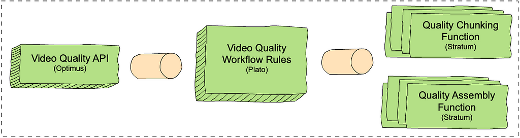
VQS, like most Cosmos services, consists of three domain-specific and scale-agnostic layers. Each layer is built on top of a corresponding scale-aware Cosmos subsystem. There is an external-facing API layer (Optimus), a rule-based video quality workflow layer (Plato) and a serverless compute layer (Stratum). The inter-layer communication is based on our internally developed and maintained Timestone queuing system. The figure below shows each layer and the corresponding Cosmos subsystem in parenthesis.

An overview of the Video Quality Service (VQS) in Cosmos.
  1. The VQS API layer exposes endpoints: one to request quality measurements (measureQuality) and one to get quality results asynchronously (getQuality).
  2. The VQS workflow layer consists of rules that determine how to measure video quality. Similar to chunk-based encoding, the VQS workflow consists of chunk-based quality calculations, followed by an assembly step. This enables us to use our scale to increase throughput and reduce latencies. The chunk-based quality step computes the quality for each chunk and the assembly step combines the results of all quality computations. For example, if we have two chunks with two and three frames and VMAF scores of [50, 60] and [80, 70, 90] respectively, the assembly step combines the scores into [50, 60, 80, 70, 90]. The chunking rule calls out to the chunk-based quality computation function in Stratum (see below) for all the chunks in the video, and the assembly rule calls out to the assembly function.
  3. The VQS Stratum layer consists of two functions, which perform the chunk-based quality calculation and assembly.

Deep dive into the VQS workflow

The following trace graph from our observability portal, Nirvana, sheds more light on how VQS works. The request provides the source and the derivative whose quality is to be computed and requests that the VQS provides quality scores using VMAF, PSNR and SSIM as quality metrics.

A simplified trace graph from Nirvana.

Here is a step-by-step description of the processes involved:

1. VQS is called using the measureQuality endpoint. The VQS API layer will translate the external request into VQS-specific data models.

2. The workflow is initiated. Here, based on the video length, the throughput and latency requirements, available scale etc., the VQS workflow decides that it will split the quality computation across two chunks and hence, it creates two messages (one for each chunk) to be executed independently by the chunk-based quality computation Stratum function. All three requested quality metrics will be calculated for each chunk.

3. Quality calculation begins for each chunk. The figure does not show the chunk start times separately, however, each chunked quality computation starts and completes (annotated as 3a and 3b) independently based on resource availability.

3b. Plato initiates assembly once all chunked quality computations complete.

4. Assembly begins, with separate invocations to the assembler stratum functions for each metric. As before, the start time for each metric’s assembly can vary. Such separation of computation allows us to fail partially, return early, scale independently depending on metric complexity etc.

4a & 4b. Assembly for two of the metrics (e.g. PSNR and SSIM) is complete.

4c & 5. Assembly for VMAF is complete and the entire workflow is thus completed. The quality results are now available to the caller via the getQuality endpoint.

The above is a simplified illustration of the workflow, however, in practice, the actual design is extremely flexible, and supports a variety of features, including different quality metrics, adaptive chunking strategies, producing quality at different temporal granularities (frame-level, segment level and aggregate) and measuring quality for different use cases, such as measuring quality for different device types (like a phone), SDR, HDR and others.

Living a double life

While VQS is a dedicated video quality microservice that addresses the aforementioned coupling with video encoding, there is another aspect to be addressed. The entire Reloaded system is currently being migrated into Cosmos. This is a big, cross-team effort which means that some applications are still in Reloaded, while others have already made it into Cosmos. How do we leverage VQS, while some applications that consume video quality measurements are still in Reloaded? In other words, how do we manage living a life in both worlds?

A bridge between two worlds

To live such a life, we developed several “bridging” workflows, which allow us to route video quality traffic from Reloaded into Cosmos. Each of these workflows also acts as a translator of Reloaded data models into appropriate Cosmos-service data models. Meanwhile, Cosmos-only workflows can be integrated with VQS without the need for bridging. This allows us to not only operate in both worlds and provide existing video quality features, but also roll out new features ubiquitously (either for Reloaded or Cosmos customer applications).

Living a double life, VQS is at the center of both!

Data conversions as a service

To complete our design, we have to solve one last puzzle. While we have a way to call VQS, the VQS output is designed to avoid the centralized data modeling of Reloaded. For example, VQS relies on the Netflix Media Database (NMDB) to store and index the quality scores, while the Reloaded system uses a mix of non-queryable data models and files. To aid our transition, we introduced another Cosmos microservice: the Document Conversion Service (DCS). DCS is responsible for converting between Cosmos data models and Reloaded data models. Further, DCS also interfaces with NMDB and hence is capable of converting from the data store to Reloaded file-based data and vice-versa. DCS has several other end points that perform similar data conversion when needed so the above described Roman-riding can occur gracefully.

Left: DCS is called to convert the output of VQS into a requested data model. Right: DCS converts Reloaded data models into Cosmos data models before calling VQS.

Where we are now and what’s next

We have migrated almost all of our video quality computations from Reloaded into Cosmos. VQS currently represents the largest workload fueled by the Cosmos platform. Video quality has matured in Cosmos and we are invested in making VQS more flexible and efficient. Besides supporting existing video quality features, all our new video quality features have been developed in VQS. Stay tuned for more details on these algorithmic innovations.

Acknowledgments

This work was made possible with the help of many stunning Netflix colleagues. We would like to thank George Ye and Sujana Sooreddy for their contributions to the Reloaded-Cosmos bridge development, Ameya Vasani and Frank San Miguel for contributing to power up VQS at scale and Susie Xia for helping with performance analysis. Also, the Media Content Playback team, the Media Compute/Storage Infrastructure team and the entire Cosmos platform team that brought Cosmos to life and whole-heartedly supported us in our venture into Cosmos.

If you are interested in becoming a member of our team, we are hiring! Our current job postings can be found here:

https://jobs.netflix.com/jobs/101109705

https://jobs.netflix.com/jobs/127695186

https://jobs.netflix.com/jobs/126802582


Netflix Video Quality at Scale with Cosmos Microservices was originally published in Netflix TechBlog on Medium, where people are continuing the conversation by highlighting and responding to this story.

Data Engineers of Netflix — Interview with Pallavi Phadnis

Post Syndicated from Netflix Technology Blog original https://netflixtechblog.com/data-engineers-of-netflix-interview-with-pallavi-phadnis-a1fcc5f64906

Data Engineers of Netflix — Interview with Pallavi Phadnis

This post is part of our “Data Engineers of Netflix” series, where our very own data engineers talk about their journeys to Data Engineering @ Netflix.

Pallavi Phadnis is a Senior Software Engineer at Netflix.

Pallavi Phadnis is a Senior Software Engineer on the Product Data Science and Engineering team. In this post, Pallavi talks about her journey to Netflix and the challenges that keep the work interesting.

Pallavi received her master’s degree from Carnegie Mellon. Before joining Netflix, she worked in the advertising and e-commerce industries as a backend software engineer. In her free time, she enjoys watching Netflix and traveling.

Her favorite shows: Stranger Things, Gilmore Girls, and Breaking Bad.

Pallavi, what’s your journey to data engineering at Netflix?

Netflix’s unique work culture and petabyte-scale data problems are what drew me to Netflix.

During earlier years of my career, I primarily worked as a backend software engineer, designing and building the backend systems that enable big data analytics. I developed many batch and real-time data pipelines using open source technologies for AOL Advertising and eBay. I also built online serving systems and microservices powering Walmart’s e-commerce.

Those years of experience solving technical problems for various businesses have taught me that data has the power to maximize the potential of any product.

Before I joined Netflix, I was always fascinated by my experience as a Netflix member which left a great impression of Netflix engineering teams on me. When I read Netflix’s culture memo for the first time, I was impressed by how candid, direct and transparent the work culture sounded. These cultural points resonated with me most: freedom and responsibility, high bar for performance, and no hiring of brilliant jerks.

Over the years, I followed the big data open-source community and Netflix tech blogs closely, and learned a lot about Netflix’s innovative engineering solutions and active contributions to the open-source ecosystem. In 2017, I attended the Women in Big Data conference at Netflix and met with several amazing women in data engineering, including our VP. At this conference, I also got to know my current team: Consolidated Logging (CL).

CL provides an end-to-end solution for logging, processing, and analyzing user interactions on Netflix apps from all devices. It is critical for fast-paced product innovation at Netflix since CL provides foundational data for personalization, A/B experimentation, and performance analytics. Moreover, its petabyte scale also brings unique engineering challenges. The scope of work, business impact, and engineering challenges of CL were very exciting to me. Plus, the roles on the CL team require a blend of data engineering, software engineering, and distributed systems skills, which align really well with my interests and expertise.

What is your favorite project?

The project I am most proud of is building the Consolidated Logging V2 platform which processes and enriches data at a massive scale (5 million+ events per sec at peak) in real-time. I re-architected our legacy data pipelines and built a new platform on top of Apache Flink and Iceberg. The scale brought some interesting learnings and involved working closely with the Apache Flink and Kafka community to fix core issues. Thanks to the migration to V2, we were able to improve data availability and usability for our consumers significantly. The efficiency achieved in processing and storage layers brought us big savings on computing and storage costs. You can learn more about it from my talk at the Flink forward conference. Over the last couple of years, we have been continuously enhancing the V2 platform to support more logging use cases beyond Netflix streaming apps and provide further analytics capabilities. For instance, I am recently working on a project to build a common analytics solution for 100s of Netflix studio and internal apps.

How’s data engineering similar and different from software engineering?

The data engineering role at Netflix is similar to the software engineering role in many aspects. Both roles involve designing and developing large-scale solutions using various open-source technologies. In addition to the business logic, they need a good understanding of the framework internals and infrastructure in order to ensure production stability, for example, maintaining SLA to minimize the impact on the upstream and downstream applications. At Netflix, it is fairly common for data engineers and software engineers to collaborate on the same projects.

In addition, data engineers are responsible for designing data logging specifications and optimized data models to ensure that the desired business questions can be answered. Therefore, they have to understand both the product and the business use cases of the data in depth.

In other words, data engineers bridge the gap between data producers (such as client UI teams) and data consumers (such as data analysts and data scientists.)

Learning more

Interested in learning more about data roles at Netflix? You’re in the right place! Keep an eye out for our open roles in Data Science and Engineering by visiting our jobs site here. Our culture is key to our impact and growth: read about it here. To learn more about our Data Engineers, check out our chats with Dhevi Rajendran, Samuel Setegne, and Kevin Wylie.


Data Engineers of Netflix — Interview with Pallavi Phadnis was originally published in Netflix TechBlog on Medium, where people are continuing the conversation by highlighting and responding to this story.

Open-Sourcing a Monitoring GUI for Metaflow

Post Syndicated from Netflix Technology Blog original https://netflixtechblog.com/open-sourcing-a-monitoring-gui-for-metaflow-75ff465f0d60

Open-Sourcing a Monitoring GUI for Metaflow, Netflix’s ML Platform

tl;dr Today, we are open-sourcing a long-awaited GUI for Metaflow. The Metaflow GUI allows data scientists to monitor their workflows in real-time, track experiments, and see detailed logs and results for every executed task. The GUI can be extended with plugins, allowing the community to build integrations to other systems, custom visualizations, and embed upcoming features of Metaflow directly into its views.

Metaflow is a full-stack framework for data science that we started developing at Netflix over four years ago and which we open-sourced in 2019. It allows data scientists to define ML workflows, test them locally, scale-out to the cloud, and deploy to production in idiomatic Python code. Since open-sourcing, the Metaflow community has been growing quickly: it is now the 7th most starred active project on Netflix’s GitHub account with nearly 4800 stars. Outside Netflix, Metaflow is used to power machine learning in production by hundreds of companies across industries from bioinformatics to real estate.

Since its inception, Metaflow has been a command-line-centric tool. It makes it easy for data scientists to express even complex machine learning applications in idiomatic Python, test them locally, or scale them out in the cloud — all using their favorite IDEs and terminals. Following our culture of freedom and responsibility, Metaflow grants data scientists the freedom to choose the right modeling approach, handle data and features flexibly, and construct workflows easily while ensuring that the resulting project executes responsibly and robustly on the production infrastructure.

As the number and criticality of projects running on Metaflow increased — some of which are very central to our business — our ML platform team started receiving an increasing number of support requests. Frequently, the questions were of the nature “can you help me understand why my flow takes so long to execute” or “how can I find the logs for a model that failed last night.” Technically, Metaflow provides a Python API that allows the user to inspect all details e.g., in a notebook, but writing code in a notebook to answer basic questions like this felt overkill and unnecessarily tedious. After observing the situation for months, we started forming an understanding of the kind of a new user interface that could address the growing needs of our users.

Requirements for a Metaflow GUI

Metaflow is a human-centered system by design. We consider our Python API and the CLI to be integral parts of the overall user interface and user experience, which singularly focuses on making it easier to build production-ready ML projects from scratch. In our approach, Python code provides a highly expressive and productive user interface for expressing complex business logic, such as ML models and workflows. At the same time, the CLI allows users to execute specific commands quickly and even automate common actions. When it comes to complex, real-life development work like this, it would be hard to achieve the same level of productivity on a graphical user interface.

However, textual UIs are quite lacking when it comes to discoverability and getting a holistic understanding of the system’s state. The questions we were hearing reflected this gap: we were lacking a user interface that would allow the users, quite simply, to figure out quickly what is happening in their Metaflow projects.

Netflix has a long history of developing innovative tools for observability, so when we began to specify requirements for the new GUI, we were able to leverage experiences from the previous GUIs built for other use cases, as well as real-life user stories from Metaflow users. We wanted to scope the GUI tightly, focusing on a specific gap in the Metaflow experience:

  1. The GUI should allow the users to see what flows and tasks are executing and what is happening inside them. Notably, we didn’t want to replace any of the functionality in the Metaflow APIs or CLI with the GUI — just to complement them. This meant that the GUI would be read-only: all actions like writing code and starting executions should happen on the users’ IDE and terminal as before. We also had no need to build a model-monitoring GUI yet, which is a wholly separate problem domain.
  2. The GUI would be targeted at professional data scientists. Instead of a fancy GUI for demos and presentations, we wanted a serious productivity tool with carefully thought-out user workflows that would fit seamlessly into our toolchain of data science. This requires attention to small details: for instance, users should be able to copy a link to any view in the GUI and share it e.g., on Slack, for easy collaboration and support (or to integrate with the Metaflow Slack bot). And, there should be natural affordances for navigating between the CLI, the GUI, and notebooks.
  3. The GUI should be scalable and snappy: it should handle our existing repository consisting of millions of runs, some of which contain tens of thousands of tasks without hiccups. Based on our experiences with other GUIs operating at Netflix-scale, this is not a trivial requirement: scalability needs to be baked into the design from the very beginning. Sluggish GUIs are hard to debug and fix afterwards, and they can have a significantly negative impact on productivity.
  4. The GUI should integrate well with other GUIs. A modern ML stack consists of many independent systems like data warehouses, compute layers, model serving systems, and, in particular, notebooks. It should be possible to find runs and tasks of interest in the Metaflow GUI and use a task-specific view to jump to other GUIs for further information. Our landscape of tools is constantly evolving, so we didn’t want to hardcode these links and views in the GUI itself. Instead, following the integration-friendly ethos of Metaflow, we want to embed relevant information in the GUI as plugins.
  5. Finally, we wanted to minimize the operational overhead of the GUI. In particular, under no circumstances should the GUI impact Metaflow executions. The GUI backend should be a simple service, optionally sitting alongside the existing Metaflow metadata service, providing a read-only, real-time view to the stored state. The frontend side should be easily extensible and maintainable, suggesting that we wanted a modern React app.

Monitoring GUI for Metaflow

As our ML Platform team had limited frontend resources, we reached out to Codemate to help with the implementation. As it often happens in software engineering projects, the project took longer than expected to finish, mostly because the problem of tracking and visualizing thousands of concurrent objects in real-time in a highly distributed environment is a surprisingly non-trivial problem (duh!). After countless iterations, we are finally very happy with the outcome, which we have now used in production for a few months.

When you open the GUI, you see an overview of all flows and runs, both current and historical, which you can group and filter in various ways:

Runs Grouped by flows

We can use this view for experiment tracking: Metaflow records every execution automatically, so data scientists can track all their work using this view. Naturally, the view can be grouped by user. They can also tag their runs and filter the view by tags, allowing them to focus on particular subsets of experiments.

After you click a specific run, you see all its tasks on a timeline:

Timeline view for a run

The timeline view is extremely useful in understanding performance bottlenecks, distribution of task runtimes, and finding failed tasks. At the top, you can see global attributes of the run, such as its status, start time, parameters etc. You can click a specific task to see more details:

Task view

This task view shows logs produced by a task, its results, and optionally links to other systems that are relevant to the task. For instance, if the task had deployed a model to a model serving platform, the view could include a link to a UI used for monitoring microservices.

As specified in our requirements, the GUI should work well with Metaflow CLI. To facilitate this, the top bar includes a navigation component where the user can copy-paste any pathspec, i.e., a path to any object in the Metaflow universe, which are prominently shown in the CLI output. This way, the user can easily move from the CLI to the GUI to observe runs and tasks in detail.

While the CLI is great, it is challenging to visualize flows. Each flow can be represented as a Directed Acyclic Graph (DAG), and so the GUI provides a much better way to visualize a flow. The DAG view presents all the steps of a flow and how they are related. Each step may have developer comments. They are colored to indicate the current state. Split steps are grouped by shaded boxes, while steps that participated in a foreach are grouped by a double shade box. Clicking on a step will take you to the Task view.

DAG View

Users at different organizations will likely have some special use cases that are not directly supported. The Metaflow GUI is extensible through its plugin API. For example, Netflix has its container orchestration platform called Titus. Users can configure tasks to utilize Titus to scale up or out. When failures happen, users will need to access their Titus containers for more information, and within the task view, a simple plugin provides a link for further troubleshooting.

Example task-level plugin

Try it at home!

We know that our user stories and requirements for a Metaflow GUI are not unique to Netflix. A number of companies in the Metaflow community have requested GUI for Metaflow in the past. To support the thriving community and invite 3rd party contributions to the GUI, we are open-sourcing our Monitoring GUI for Metaflow today!

You can find detailed instructions for how to deploy the GUI here. If you want to see the GUI in action before deploying it, Outerbounds, a new startup founded by our ex-colleagues, has deployed a public demo instance of the GUI. Outerbounds also hosts an active Slack community of Metaflow users where you can find support for GUI-related issues and share feedback and ideas for improvement.

With the new GUI, data scientists don’t have to fly blind anymore. Instead of reaching out to a platform team for support, they can easily see the state of their workflows on their own. We hope that Metaflow users outside Netflix will find the GUI equally beneficial, and companies will find creative ways to improve the GUI with new plugins.

For more context on the development process and motivation for the GUI, you can watch this recording of the GUI launch meetup.


Open-Sourcing a Monitoring GUI for Metaflow was originally published in Netflix TechBlog on Medium, where people are continuing the conversation by highlighting and responding to this story.

Interpreting A/B test results: false negatives and power

Post Syndicated from Netflix Technology Blog original https://netflixtechblog.com/interpreting-a-b-test-results-false-negatives-and-power-6943995cf3a8

Martin Tingley with Wenjing Zheng, Simon Ejdemyr, Stephanie Lane, and Colin McFarland

This is the fourth post in a multi-part series on how Netflix uses A/B tests to inform decisions and continuously innovate on our products. Need to catch up? Have a look at Part 1 (Decision Making at Netflix), Part 2 (What is an A/B Test?), Part 3 (False positives and statistical significance). Subsequent posts will go into more details on experimentation across Netflix, how Netflix has invested in infrastructure to support and scale experimentation, and the importance of the culture of experimentation within Netflix.

In Part 3: False positives and statistical significance, we defined the two types of mistakes that can occur when interpreting test results: false positives and false negatives. We then used simple thought exercises based on flipping coins to build intuition around false positives and related concepts such as statistical significance, p-values, and confidence intervals. In this post, we’ll do the same for false negatives and the related concept of statistical power.

Figure 1: As in Part 3, we’ll use thought exercises based on flipping coins, such as this one displaying Caesar Augustus, to build up intuition about core statistical concepts.

False negatives and power

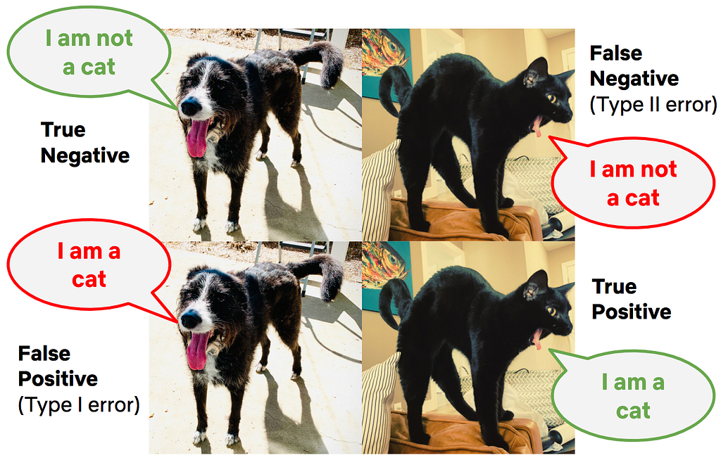
A false negative occurs when the data do not indicate a meaningful difference between treatment and control, but in truth there is a difference. Continuing on an example from Part 3, a false negative corresponds to labeling the photo of the cat as a “not cat.” False negatives are closely related to the statistical concept of power, which gives the probability of a true positive given the experimental design and a true effect of a specific size. In fact, power is simply one minus the false negative rate.

Power involves thinking about possible outcomes given a specific assumption about the actual state of the world — similar to how in Part 3 we defined significance by first assuming the null hypothesis is true. To build intuition about power, let’s go back to the same coin example from Part 3, where the goal is to decide if the coin is unfair using an experiment that calculates the fraction of heads in 100 flips. The distribution of outcomes under the null hypothesis that the coin is fair is shown in black in Figure 2. To make the diagram easier to interpret, we’ve smoothed over the tops of the histograms.

What would happen in this experiment if the coin is not fair? To make the thought exercise more specific, let’s work through what happens when we have a coin where heads occurs, on average, 64% of the time (the choice of that peculiar number will become clear later on). Because there is uncertainty or noise in our experiment, we don’t expect to see exactly 64 heads in 100 flips. But as with the null hypothesis that the coin is fair, we can calculate all the possible outcomes if this specific alternative hypothesis is true. This distribution is shown with the red curve in Figure 2.

Figure 2: Illustrating power using the example of flipping a coin 100 times and calculating the fraction of heads. The black and red dashed lines show, respectively, the distribution of outcomes assuming the probability of heads is 50% (null hypothesis) and 64% (specific value of the alternative hypothesis). Here, the power against this alternative is 80% (red shading).

Visually, power is the fraction of this alternative (red) distribution that lies beyond the critical values under the null hypothesis (the blue lines and black curve; see Part 3). Here, 80% of the alternative distribution (red) falls to the right of the taller blue line that demarcates the critical value of the upper rejection region. Assuming that the truth about the coin is that the probability of heads is 64%, then the power of this test is 80%. To be complete, there is also a negligibly small part of the alternative (red) distribution that falls within the lower rejection region (to the left of the short blue line).

The power of a test corresponds to a specific, postulated effect size. In our example, the test has 80% power to detect that a coin is unfair, if that unfair coin in truth has a probability of heads equal to 64%. The interpretation is as follows: if the coin has probability of heads equal to 64%, and we repeatedly run the experiment of flipping 100 times and making a decision at the 5% significance level, then we will correctly reject the null hypothesis that the coin is fair in about 4 out of every 5 experiments. And 20% of those repeated experiments will result in a false negative: we’ll not reject the null hypothesis that the coin is fair, even though it is unfair.

Ways to increase power

In designing an A/B test, we first fix the significance level (the convention is 5%: if there is no difference between treatment and control, we’ll see false positives 5% of the time), and then design the experiment to control false negatives. There are three primary levers we can pull to increase power and reduce the probability of false negatives:

  1. Effect size. Simply put, the larger the effect size — the difference in metric values between Groups A and B — the higher the probability that we’ll be able to correctly detect that difference. To build intuition, think about running an experiment to determine if a coin is unfair, where the data we collect is the fraction of heads in 100 flips. Now think of two scenarios. In the first scenario, the true probability of heads is 55%, and in the second it is 75%. Intuitively (and mathematically!) it is more likely that our experiment identifies the coin as unfair in the second scenario. The true probability of heads is further from the null value of 50%, so it’s more likely that an experiment will produce an outcome that falls in the rejection region. In the product development context, we can increase the expected magnitude of metric movements by being bold vs incremental with the hypotheses we test. Another strategy to increase effect sizes is to test in new areas of the product, where there may be room for larger improvements in member satisfaction. That said, one of the joys of learning through experimentation is the element of surprise: at times, seemingly small changes can have a major impact on top-line metrics.
  2. Sample size. The more units in the experiment, the higher the power and the easier it is to correctly identify smaller effects. To build intuition, think again about running an experiment to determine if a coin is unfair, where the data we collect is the fraction of heads in a fixed number of flips and the true probability of heads is 64%. Consider two scenarios: in the first, we flip the coin 20 times, and in the second, we flip the coin 100 times. Intuitively (and mathematically!), it is more likely that our experiment identifies the coin as unfair in the second scenario. With more data, the result from the experiment is going to be closer to the true rate of 64% heads, while the outcomes under the assumption of a fair coin concentrate around 0.50, causing the rejection region to encroach on the 50% value. These effects combine, so that with more data there is a greater probability that the result from the experiment with the unfair coin will fall in that rejection region, resulting in a true positive. In the product development context, we can increase the power by allocating more members (or other units) to the test or by reducing the number of test groups, though there is a tradeoff between the sample size in each test and the number of non-overlapping tests that can be run at the same time.
  3. The variability of the metric in the underlying population. The more homogenous the metric within the population we are testing on, the easier it is to correctly identify true effects. The intuition for this one is a bit trickier, and our simple coin examples finally break down. Say at Netflix that we run a test that aims to reduce some measure of latency, such as the delay between a member pressing play and video playback commencing. Given the variety of devices and internet connections that people use to access Netflix, there is a lot of natural variability in this metric across our users. As a result, if the test treatment results in a small reduction in the latency metric, it’s hard to successfully identify — the “noise” from the variability across members overwhelms the small signal. In contrast, if we ran the test on a set of members that used similar devices with similar web connections, then the small signal is easier to identify — there is less noise that might drown out the signal. We spend a lot of time at Netflix building statistical analysis models that exploit this intuition, and increase power by effectively lowering the variability; see here for a technical description of our approach.

Powering for reasonable and meaningful effects

Power and the false negative rate are functions of a postulated effect size. Much like how the 5% false positive rate is a widely-accepted convention, the rule of thumb with power is to aim for 80% power for a reasonable and meaningful effect size (we’ll get to each of those below). That is, we postulate an effect size and then design the experiment, primarily through setting the sample size, such that, if the true impact of the treatment experience is as we’ve postulated, the test will correctly identify that there is an effect 80% of the time. And 20% of the time the result from the test will be a false negative: in truth, there is an effect, but our observation from the test does not lie in the rejection region and we fail to conclude that there is an effect. That’s why the examples above used a 64% probability of heads: an experiment with 100 flips then has 80% power.

What constitutes a reasonable effect size can be tricky, as tests can surprise us. But a mix of domain knowledge and common sense can generally provide solid estimates. In an area where testing has a long history, such as optimizing the recommendation systems that help Netflix members choose content that’s great for them, we have a solid idea about the effect sizes that our tests tend to produce (be they positive or negative). Given an understanding of past effect sizes, as well as the analysis strategy, we can set the sample size to ensure the test has 80% power for a reasonable metric movement.

The second consideration, both in this experimental design phase and in deciding where to invest efforts, is to determine what constitutes a meaningful impact to the primary metrics used to decide the test. What is meaningful will depend on the impact area of the experiment (member satisfaction, playback latency, technical performance of back end systems, etc.), and potentially the effort or costs associated with the new product experience. As a hypothetical, say that, for effect sizes smaller than a 0.1% change in the primary metric, the cost of supporting the new product feature outweighs the benefits. In this case, there’s little point in powering a test to detect a 0.01% change in the metric, as successfully identifying an effect of that size won’t result in a meaningful change in decisions. Likewise, if the effect sizes seen in tests in a given innovation area are consistently immaterial to the user experience or the business, that’s a sign that experimentation resources can be more efficiently deployed elsewhere.

Summary

Parts 3 and 4 of this series have focussed on defining and building intuition around the core concepts used to analyze test results: false positives and negatives, statistical significance, p-values, and power.

An uncomfortable truth about experimentation is that we can’t simultaneously minimize both false positives and false negatives. In fact, false positives and negatives trade off with one another. If we used a more stringent false positive rate, such as 0.01%, we’d reduce the number of false positives for tests where there is no difference between A and B — but we’d also reduce the power of the test, increasing the rate of false negatives, for those tests where there is a meaningful difference. Using a 5% false positive rate and targeting 80% power are well-established conventions that balance between limiting false discovery and enabling true discovery. However, in instances where a false positive (or false negative) poses a larger risk, researchers may deviate from these rules of thumb to minimize one type of uncertainty over another.

Our goal is not to eliminate uncertainty, but to understand and quantify the uncertainty in order to make sound decisions. In many cases, results from A/B tests require nuanced interpretation, and in fact the test result itself is only one input into a business decision. In the next post, we’ll cover how to build confidence in a decision using test results. Follow the Netflix Tech Blog to stay up to date.


Interpreting A/B test results: false negatives and power was originally published in Netflix TechBlog on Medium, where people are continuing the conversation by highlighting and responding to this story.

Revisiting BetterTLS: Certificate Path Building

Post Syndicated from Netflix Technology Blog original https://netflixtechblog.com/revisiting-bettertls-certificate-path-building-4c978b79843f

By Ian Haken

Last year the AddTrust root certificate expired and lots of clients had a bad time. Some Roku devices weren’t working right, Heroku had problems, and some folks couldn’t even curl. In the aftermath Ryan Sleevi wrote a really great blog post not just about the issue of this one certificate’s expiry, but the problem that so many TLS implementations have in general with certificate path building. If you haven’t read that blog post, you should. This post is probably going to make a lot more sense if you’ve read that one first, so go ahead and read it now.

To recap that previous AddTrust root certificate expiry, there was a certificate graph that looked like this:

The AddTrust certificate graph

This is a real example, and you can see the five certificates in the above graph here:

  1. www.agwa.name (leaf certificate)
  2. Sectigo RSA Domain Validation Secure Server CA (intermediate CA)
  3. USERTrust RSA Certification Authority (intermediate CA)
  4. USERTrust RSA Certification Authority (self-signed)
  5. AddTrust External CA Root (self-signed)

The important thing to understand about a certificate graph is that the boxes represent entities (meaning an X.500 Distinguished Name and public key). Entities are things you trust (or don’t, as the case may be). The arrows between entities represent certificates: a way to extend trust from one entity to another. This means that if you trust either the “USERTrust RSA Certification Authority” entity or the “AddTrust External CA Root” entity, you should be able to discover a chain of trust from that trusted entity (the “trust anchor”) down to “www.agwa.name”, the “end-entity”.

(Note that the self-signed certificates (4 and 5) are often useful for defining trusted entities, but aren’t going to be important in the context of path building.)

The problem that occurred last summer started because certificate 3 expired. The “USERTrust RSA Certificate Authority” was relatively new and not directly trusted by many clients and so most servers would send certificates 1, 2, and 3 to clients. If a client only trusted “AddTrust External CA Root” then this would be fine; that client can build a certificate chain 1 ← 2 ← 3 and see that they should trust www.agwa.name’s public key. On the other hand, if the client trusts “USERTrust RSA Certification Authority” then that’s also fine; it only needs to build a chain 1 ← 2.

The problem that arose was that some clients weren’t good at certificate path building (even though this is a fairly simple case of path building compared to the next example below). Those clients didn’t realize that they could stop building a chain at 2 if they trusted “USERTrust RSA Certification Authority”. So when certificate 3 expired on May 30, 2020, these clients treated the entire collection of certificates sent by the server as invalid and would no longer establish trust in the end-entity.

Even though that story is a year old and was well covered then, I’m retelling it here because a couple of weeks ago something kind of similar happened: a certificate for the Let’s Encrypt R3 CA expired (certificate 2 below) on September 30, 2021. This should have been fine; the Let’s Encrypt R3 entity also has a certificate signed by the ISRG Root X1 CA (3) which nowadays is trusted by most clients.

The Let’s Encrypt R3 Certificate Graph
  1. src.agwa.name (leaf certificate)
  2. Let’s Encrypt R3 (signed by DST Root CA X3)
  3. Let’s Encrypt R3 (signed by ISRG Root X1)
  4. DST Root CA X3 (self-signed)
  5. ISRG Root X1 (self-signed)

But predictably, even though it’s been a year since Ryan’s post, lots of services and clients had issues. You should read Scott Helme’s full post-mortem on the event to understand some of the contributing factors, but one big problem is that most TLS implementations still aren’t very good at path building. As a result, servers generally can’t send a complete collection of certificates down to clients (containing different possible paths to different trust anchors) which makes it hard to host a service that both old and new devices can talk to.

Maybe it’s because I saw history repeating or maybe it’s because I had just listened to Ryan Sleevi talk about the history of web PKI, but the whole episode really made me want to get back to something I had been wanting to do for a while. So over the last couple of weeks I set some time aside, started reading some RFCs, had to get more coffee, finished reading some RFCs, and finally started making certificates. The end result is the first major update to BetterTLS since its first release: a new suite of tests to exercise TLS implementations’ certificate path building. As a bonus, it also checks whether TLS implementations apply certain validity checks. Some of the checks are part of RFCs, like Basic Constraints, while others are not fully standardized, like distrusting deprecated signature algorithms and enforcing EKU constraints on CAs.

I found the results of applying these tests to various TLS implementations pretty interesting, but before I get into those results let me give you a few more details about why TLS implementations should be doing good path building and why we care about it.

What is Certificate Path Building?

If you want the really detailed answer to “What is Certificate Path Building” you can take a look at RFC 4158. But in short, certificate path building is the process of building a chain of trust from some end entity (like the blue boxes in the examples above) back to a trust anchor (like the ISRG Root X1 CA) given a collection of certificates. In the context of TLS, that collection of certificates is sent from the server to the client as part of the TLS handshake. A lot of the time, that collection of certificates is actually already an ordered sequence of certificates from end-entity to trust anchor, such as in the first example where servers would send certificates 1, 2, 3. This happens to already be a chain from “www.agwa.name” to “AddTrust External CA Root”.

But what happens if we can’t be sure what trust anchor the client has, such as the second example above where the server doesn’t know if the client will trust DST Root CA X3 or ISRG Root X1? In this case the server could send all the certificates (1, 2, and 3) and let the client figure out which path makes sense (either 1 ← 2, or 1 ← 3). But if the client expects the server’s certificates to simply be a chain already, the sequence 1 ← 2 ← 3 is going to fail to validate.

Why Does This Matter?

The most important reason for clients to support robust path building is that it allows for agility in the web PKI ecosystem. For example, we can add additional certificates that conform to new requirements such as SHA-1 deprecation, validity length restrictions, or trust anchor removal, all while leaving existing certificates in place to preserve legacy client functionality. This allows static, infrequently updated, or intentionally end-of-lifed clients to continue working while browsers (which frequently enforce new constraints like the ones mentioned above) can take advantage of the additional certificates in the handshake that conform to the new requirements.

In particular, Netflix runs on a lot of devices. Millions of them. The reality though is that the above description applies to many of them. Some devices only run older versions of Android of iOS. Some are embedded devices that no longer receive updates. Regardless of the specifics, the update cadence (if one exists) for those devices is outside of our control. But ideally we’d love it if every device that used to work just kept working. To that end, it’s helpful to know what trade-offs we can make in terms of agility versus retaining support for every device. Are those devices stuck using certain signature algorithms or cipher suites? Will those devices accept a certificate set that includes extra certificates with other alternate signature algorithms?

As service owners, having test suites that can answer these questions can guide decision making. On the other hand, TLS library implementers using these test suites can ensure that applications built with their libraries operate reliably throughout churn in the web PKI ecosystem.

An Aside About Agility

More than 4 years passed between publication of the first draft of the TLS 1.3 specification and the final version. An impressive amount of consideration went into the design of all of the versions of the TLS and SSL protocols and it speaks to the designers’ foresight and diligence that a single server can support clients speaking SSL 3.0 (final specification released 1996) all the way up to TLS 1.3 (final specification released 2018).

(Although I should say that in practice, supporting such a broad set of protocol versions on a single server is probably not a good idea.)

The reason that TLS protocol can support this is because agility has been designed into the system. The client advertises the TLS versions, cipher suites, and extensions it supports and the server can make decisions about the best supported version of those options and negotiate the details in its response. Over time this has allowed the ecosystem to evolve gracefully, supporting new cryptographic primitives (like elliptic curve cryptography) and deprecating old ones (like the MD5 hash algorithm).

Unfortunately the TLS specification has not enabled the same agility with the certificates that it relies on in practice. While there are great specifications like RFC 4158 for how to think about certificate path building, TLS specifications up to 1.2 only allowed for server to present “the chain”:

This is a sequence (chain) of certificates. The sender’s certificate MUST come first in the list. Each following certificate MUST directly certify the one preceding it.

Only in TLS 1.3 did the specification allow for greater flexibility:

The sender’s certificate MUST come in the first CertificateEntry in the list. Each following certificate SHOULD directly certify the one immediately preceding it.

Note: Prior to TLS 1.3, “certificate_list” ordering required each certificate to certify the one immediately preceding it; however, some implementations allowed some flexibility. Servers sometimes send both a current and deprecated intermediate for transitional purposes, and others are simply configured incorrectly, but these cases can nonetheless be validated properly. For maximum compatibility, all implementations SHOULD be prepared to handle potentially extraneous certificates and arbitrary orderings from any TLS version, with the exception of the end-entity certificate which MUST be first.

This change to the specification is hugely significant because it’s the first formalization that TLS implementations should be doing robust path building. Implementations which conform to this are far more likely to continue operating in a PKI ecosystem undergoing frequent changes. If more TLS implementations can tolerate changes, then web PKI ecosystem will be in a place where it is able to undergo those changes. And ultimately this means we will be able to update best practices and retain trust agility as time goes on, making the web a more secure place.

It’s hard to imagine a world where SSL and TLS were so inflexible that we wouldn’t have been able to gracefully transition off of MD5 or transition to PFS cipher suites. I’m hopeful that this update to the TLS specification will help bring the same agility that has existed in the TLS protocol itself to the web PKI ecosystem.

Test Results

So what does the new test suite in BetterTLS tell us about the state of certificate path building in TLS implementations? The good news is that there has been some improvement in the state of the world since Ryan’s roundup last year. The bad news is that that improvement isn’t everywhere.

The test suite both identifies what relevant features a TLS implementation supports (like default distrust of deprecated signing algorithms) and evaluates correctness. Here’s a quick enumeration of what features this test suite looks for:

  • Branching Path Building: Implementations that support “branching” path building can handle cases like the Let’s Encrypt R3 example above where an entity has multiple issuing certificates and the client needs to check multiple possible paths to find a route to a trust anchor. Importantly, as invalid certificates are found during path building (for all of the reasons listed below) the implementation should be able to pick an alternate issuer certificate to continue building a path. This is the primary feature of interest in this test suite.
  • Certificate expiration: Implementations should treat expired certificates as invalid during path building. This is a pretty straightforward expectation and fortunately all the tested implementations were properly verifying this.
  • Name constraints: Implementations should treat certificates with a name constraint extension in conflict with the end entity’s identity as invalid. Check out BetterTLS’s name constraints test suite for more thorough evaluations of this evaluation. All of the implementations tested below correctly evaluated the simple name constraints check in this test suite.
  • Bad Extended Key Usage (EKU) on CAs: This check tests whether an implementation rejects CA certificates with an Extended Key Usage extension that is incompatible with the end-entity’s use of the certificate for TLS server authentication. The Mozilla Certificate Policy FAQ states:

Inclusion of EKU in CA certificates is generally allowed. NSS and CryptoAPI both treat the EKU extension in intermediate certificates as a constraint on the permitted EKU OIDs in end-entity certificates. Browsers and certificate client software have been using EKU in intermediate certificates, and it has been common for enterprise subordinate CAs in Windows environments to use EKU in their intermediate certificates to constrain certificate issuance.

While many implementations support the semantics of an incompatible EKU in CAs as a reason to treat a certificate as invalid, RFCs do not require this behavior so we do see several implementations below not applying this verification.

  • Missing Basic Constraints Extension: This check tests whether the implementation rejects paths where a CA is missing the Basic Constraints extension. RFC 5280 requires that all CAs have this extension, so all implementations should support this.
  • Not a CA: This check tests whether the implementation rejects paths where a CA has a Basic Constraints extension, but that extension does not identify the certificate as being a CA. Similarly to the above, all implementations should support this and fortunately all of the implementations tested applied this check correctly.
  • Deprecated Signing Algorithm: This check tests whether the implementation rejects certificates that have been signed with an algorithm that is considered deprecated (in particular, with an algorithm using SHA-1). Enforcement of SHA-1 deprecation is not universally present in all TLS implementations at this point, so we see a mix of implementations below that do and do not apply it.

For more information about these checks, check out the repository’s README. Now on to the results!

webpki

webpki is a rust library for validating web PKI certificates. It’s the underlying validation mechanism for the rustls library that I actually tested. webpki shows up as the hero of the non-browser TLS implementations, supporting all of the features and having a 100% test pass rate. webpki is primarily maintained by Brian Smith who also worked on the mozilla::pkix codebase that’s used by Firefox.

Go

Go didn’t distrust deprecated signature algorithms by default (although looking at the issues tracker, an update was merged to change this long before I started working on this test suite; it should land in Go 1.18), but otherwise supported all the features in the test suite. However, while it supported EKU constraints on CAs the test suite discovered a bug that causes path building to fail under certain conditions when only a subset of paths have an EKU constraint.

Upon inspection, the Go x509 library validates most certificate constraints (like expiration and name constraints) as it builds paths, but EKU constraints are only applied after candidate paths are found. This looks to be a violation of Sleevi’s Rule, which probably explains why the EKU corner case causes Go to have a bad time:

Even if a library supports path building, doing some form of depth-first search in the PKI graph, the next most common mistake is still treating path building and path verification as separable, independent steps. That is, the path builder finds “a chain” that is rooted in a trusted CA, and then completes. The completed chain is then handed to a path verifier, which asks “Does this chain meet all the caller’s/application’s requirements”, and returns a “Yes/No” answer. If the answer is “No”, you want the path builder to consider those other paths in the graph, to see if there are any “Yes” paths. Yet if the path building and verification steps are different, you’re bound to have a bad time.

Java

I didn’t evaluate JDKs other than OpenJDK, but the latest version of OpenJDK 11 actually performed quite well. This JDK didn’t enforce EKU constraints on CAs or distrust certificates signed with SHA-1 algorithms. Otherwise, the JDK did a good job of building certificate paths.

PKI.js

The PKI.js library is a javascript library that can perform a number of PKI-related operations including certificate verification. It’s unclear if the “certificate chain validator” is meant to support complex certificate sets or if it was only meant to handle pre-validated paths, but the implementation fared poorly against the test suite. It didn’t support EKU constraints, distrust deprecated signature algorithms, didn’t perform any branching path building, and failed to validate even a simple “chain” when a parent certificate has expired but the intermediate was already trusted (this is the same issue OpenSSL ran into with the expired AddTrust certificate last year).

Even worse, when the certificate pool had a cycle (like in RFC 4158 figure 7), the validator got stuck in an infinite loop.

OpenSSL

In short, OpenSSL doesn’t appear to have changed significantly since Ryan’s roundup last year. OpenSSL does support the less ubiquitous validation checks (such as EKU constraints on CAs and distrusting deprecated signing algorithms), but it still doesn’t support branching path building (only non-branching chains).

LibreSSL

LibreSSL showed significant improvement over last year’s evaluation, which appears to be largely attributable to Bob Beck’s work on a new x509 verifier in LibreSSL 3.2.2 based on Go’s verifier. It supported path building and passed all of the non-skipped tests. As with other implementations it didn’t distrust deprecated algorithms by default. The one big surprise though is that it also didn’t distrust certificates missing the Basic Constraints extension, which as we described above is strictly required by the RFC 5280 spec:

If the basic constraints extension is not present in a version 3 certificate, or the extension is present but the cA boolean is not asserted, then the certified public key MUST NOT be used to verify certificate signatures.

BoringSSL

BoringSSL performed similarly to OpenSSL. Not only did it not support any path building (only non-branching chains), but it also didn’t distrust deprecated signature algorithms.

GnuTLS

GnuTLS looked just like OpenSSL in its results. It also supported all the validation checks in the test suite (EKU constraints, deprecated signature algorithms) but didn’t support branching path building.

Browsers

By and large, browsers (or the operating system libraries they utilize) do a good job of path building.

Firefox (all platforms)

Firefox didn’t distrust deprecated signature algorithms, but otherwise supported path building and passed all tests.

Chrome (all platforms)
Chrome supported all validation cases and passed all tests.

Microsoft Edge (Windows)
Edge supported all validation cases and passed all tests.

Safari (MacOS)
Safari didn’t support EKU constraints on CAs but did pass simple branching path building test cases. However, it failed most of the more complicated path building test cases (such as cases with cycles).

Summary

+-----------+----------+-------------------+---+-------------------+
| | Supports | Distrusts SHA-1 |EKU| Has other errors? |
| | branching| signing algs? | | |
+-----------+----------+-------------------+---+-------------------+
| webpki | ✓ | ✓ | ✓ | |
+-----------+----------+-------------------+---+-------------------+| Go | ✓ | ✖ (Fixed in 1.18) | ✓ | EKU bug |
+-----------+----------+-------------------+---+-------------------+
| Java | ✓ | ✖ | ✖ | |
+-----------+----------+-------------------+---+-------------------+
| PKI.js | ✖ | ✖ | ✖ | Fails even non- |
| | | | | branching path |
| | | | | building cases, |
| | | | | has infinite loop |
+-----------+----------+-------------------+---+-------------------+
| OpenSSL | ✖ | ✓ | ✓ | |
+-----------+----------+-------------------+---+-------------------+
| LibreSSL | ✓ | ✖ | ✓ | Doesn't require |
| | | | | Basic Constraints |
+-----------+----------+-------------------+---+-------------------+
| BoringSSL | ✖ | ✖ | ✓ | |
+-----------+----------+-------------------+---+-------------------+
| GnuTLS | ✖ | ✓ | ✓ | |
+-----------+----------+-------------------+---+-------------------+
| Firefox | ✓ | ✖ | ✓ | |
+-----------+----------+-------------------+---+-------------------+
| Chrome | ✓ | ✓ | ✓ | |
+-----------+----------+-------------------+---+-------------------+
| Edge | ✓ | ✓ | ✓ | |
+-----------+----------+-------------------+---+-------------------+
| Safari | Kind of? | ✓ | ✖ | Failed complex |
| | | | | path finding cases|
+-----------+----------+-------------------+---+-------------------+

Closing Thoughts

For most of the history of TLS, implementations have been pretty poor at certificate path building (if they supported it at all). In fairness, until recently the TLS specifications asserted that servers MUST behave in such a way that didn’t require clients to implement certificate path building.

However the evolution of the web PKI ecosystem has necessitated flexibility and this has been more directly codified in the TLS 1.3 specification. If you work on a TLS implementation, you really really ought to take heed of these new expectations in the TLS 1.3 specification. We’re going to have a lot more stability on the web if implementations can do good path building.

To be clear, it doesn’t need to be every implementation’s goal to pass every test in this suite. I’ll be the first to admit that the test suite contains some more pathological test cases than you’re likely to see in web PKI in practice. But at a minimum you should look at the changes that have occurred in the web PKI ecosystem in the past decade and be confident that your library supports enough path building to easily handle transitions (such as servers sending multiple possible paths to a trust anchor). And passing all of the tests in the BetterTLS test suite is a useful metric for establishing that confidence.

It’s important to make sure clients are forward-compatible with changes to the web PKI, because it’s not a matter of “if” but “when.” In Scott’s own words:

One thing that’s certain is that this event is coming again. Over the next few years we’re going to see a wide selection of Root Certificates expiring for all of the major CAs and we’re likely to keep experiencing the exact same issues unless something changes in the wider ecosystem.

If you are in a position to choose between different client-side TLS libraries, you can use these test results as a point of consideration for which libraries are most likely to weather those changes.

And if you are a service owner, it is important to know your customers. Will they be able to handle a transition from RSA to ECDSA? Will they be able to handle a transition from ECDSA to a post-quantum signature algorithm? Will they be able to handle having multiple certificates in a handshake when an old trust is expiring or no longer trusted by new clients? Knowing your clients can help you be resilient and set up appropriate configurations and endpoints to support them.

Standards, security base lines, and best practices in web PKI have been rapidly changing over the last few years and are only going to keep changing. Whether you implement TLS or just consume it, whether it’s a distrusted CA, a broken signature algorithm, or just the expiry of a certificate in good standing, it’s important to make sure that your application will be able to handle the next big change. We hope that BetterTLS can play a part in making that easier!


Revisiting BetterTLS: Certificate Path Building was originally published in Netflix TechBlog on Medium, where people are continuing the conversation by highlighting and responding to this story.

CAMBI, a banding artifact detector

Post Syndicated from Netflix Technology Blog original https://netflixtechblog.com/cambi-a-banding-artifact-detector-96777ae12fe2

by Joel Sole, Mariana Afonso, Lukas Krasula, Zhi Li, and Pulkit Tandon

Introducing the banding artifacts detector developed by Netflix aiming at further improving the delivered video quality

Banding artifacts can be pretty annoying. But, first of all, you may wonder, what is a banding artifact?

Banding artifact?

You are at home enjoying a show on your brand-new TV. Great content delivered at excellent quality. But then, you notice some bands in an otherwise beautiful sunset scene. What was that? A sci-fi plot twist? Some device glitch? More likely, banding artifacts, which appear as false staircase edges in what should be smoothly varying image areas.

Bands can show up in the sky in that sunset scene, in dark scenes, in flat backgrounds, etc. In any case, we don’t like them, nor should anybody be distracted from the storyline by their presence.

Just a subtle change in the video signal can cause banding artifacts. This slight variation in the value of some pixels disproportionately impacts the perceived quality. Bands are more visible (and annoying) when the viewing conditions are right: large TV with good contrast and a dark environment without screen reflections.

Some examples below. Since we don’t know where and when you are reading this blog post, we exaggerate the banding artifacts, so you get the gist. The first example is from the opening scene of one of our first shows. Check out the sky. Do you see the bands? The viewing environment (background brightness, ambient lighting, screen brightness, contrast, viewing distance) influences the bands’ visibility. You may play with those factors and observe how the perception of banding is affected.

Banding artifacts are also found in compressed images, as in this one we have often used to illustrate the point:

Even the Voyager encountered banding along the way; xkcd 🙂

How annoying is it?

We set up an experiment to measure the perceived quality in the presence of banding artifacts. We asked participants to rate the impact of the banding artifacts on a scale from 0 (unwatchable) to 100 (imperceptible) for a range of videos with different resolutions, bit-rates, and dithering. Participants rated 86 videos in total. Most of the content was banding-prone, while some not. The collected mean opinion scores (MOS) covered the entire scale.

According to usual metrics, the videos in the experiment with perceptible banding should be mid to high-quality (i.e., PSNR>40dB and VMAF>80). However, the experiment scores show something entirely different, as we’ll see below.

You can’t fix it if you don’t know it’s there

Netflix encodes video at scale. Likewise, video quality is assessed at scale within the encoding pipeline, not by an army of humans rating each video. This is where objective video quality metrics come in, as they automatically provide actionable insights into the actual quality of an encode.

PSNR has been the primary video quality metric for decades: it is based on the average pixel distance of the encoded video to the source video. In the case of banding, this distance is tiny compared to its perceptual impact. Consequently, there is little information about banding in the PSNR numbers. The data from the subjective experiment confirms this lack of correlation between PSNR and MOS:

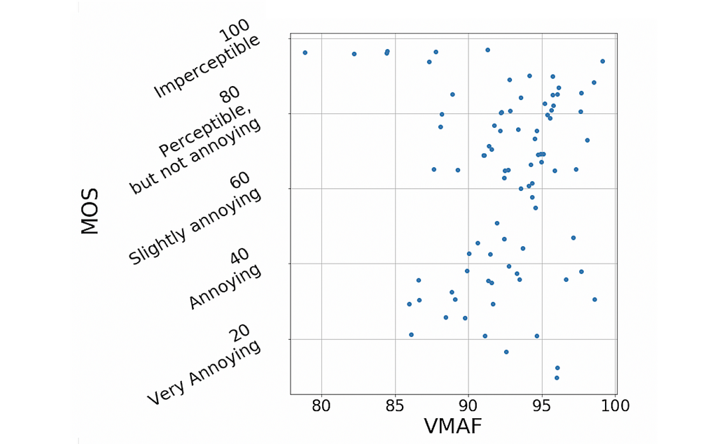
Another video quality metric is VMAF, which Netflix jointly developed with several collaborators and open-sourced on Github. VMAF has become a de facto standard for evaluating the performance of encoding systems and driving encoding optimizations, being a crucial factor for the quality of Netflix encodes. However, VMAF does not specifically target banding artifacts. It was designed with our streaming use case in mind, in particular, to capture the video quality of movies and shows in the presence of encoding and scaling artifacts. VMAF works exceptionally well in the general case, but, like PSNR, lacks correlation with MOS in the presence of banding:

VMAF, PSNR, and other commonly used video quality metrics don’t detect banding artifacts properly and, if we can’t catch the issue, we cannot take steps to fix it. Ideally, our wish list for a banding detector would include the following items:

  • High correlation with MOS for content distorted with banding artifacts
  • Simple, intuitive, distortion-specific, and based on human visual system principles
  • Consistent performance across the different resolutions, qualities, and bit-depths delivered in our service
  • Robust to dithering, which video pipelines commonly introduce

We didn’t find any algorithm in the literature that fit our purposes. So we set out to develop one.

CAMBI

We hand-crafted in a traditional NNN (non-neural network) way an algorithm to meet our requirements. A white box solution derived from first principles with just a few, visually-motivated, parameters: the contrast-aware multiscale banding index (CAMBI).

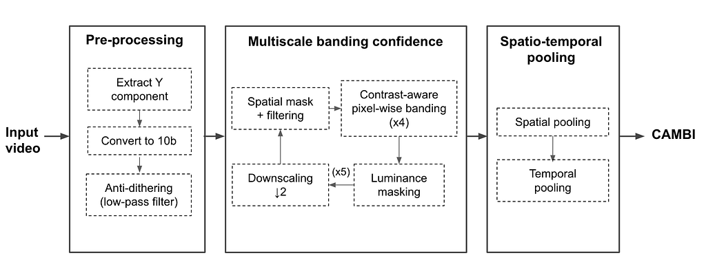
A block diagram describing the steps involved in CAMBI is shown below. CAMBI operates as a no-reference banding detector taking a (distorted) video as an input and producing a banding visibility score as the output. The algorithm extracts pixel-level maps at multiple scales for frames of the encoded video. Subsequently, it combines these maps into a single index motivated by the human contrast sensitivity function (CSF).

Pre-processing

Each input frame goes through up to three pre-processing steps.

The first step extracts the luma component: although chromatic banding exists, like most past works, we assume that most of the banding can be captured in the luma channel. The second step is converting the luma channel to 10-bit (if the input is 8-bit).

Third, we account for the presence of dithering in the frame. Dithering is intentionally applied noise used to randomize quantization error that is shown to reduce banding visibility. To account for both dithered and non-dithered content, we use a 2×2 filter to smoothen the intensity values to replicate the low-pass filtering done by the human visual system.

Multiscale Banding Confidence

We consider banding detection a contrast-detection problem, and hence banding visibility is majorly governed by the CSF. The CSF itself largely depends on the perceived contrast across a step and the spatial frequency of the steps. CAMBI explicitly accounts for the contrast across pixels by looking at the differences in pixel intensity and does this at multiple scales to account for spatial frequency. This is done by calculating pixel-wise banding confidence at different contrasts and scales, each referred to as a CAMBI map for the frame. Banding confidence computation also considers the sensitivity to change in brightness depending on the local brightness. At the end of this process, twenty CAMBI maps are obtained per frame capturing banding across four contrast steps and five scales.

Spatio-Temporal Pooling

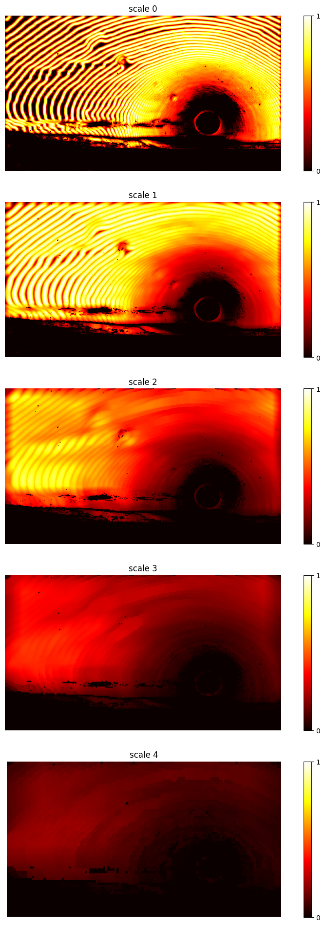
CAMBI maps are spatiotemporally pooled to obtain the final banding index. Spatial pooling is done based on the observation that CAMBI maps belong to the initial linear phase of the CSF. First, pooling is applied in the contrast dimension by keeping the maximum weighted contrast for each position. The result is five maps, one per scale. There is an example of such maps further down in this post.

Since regions with the poorest quality dominate the perceived quality of the video, only a percentage of the pixels, those with the most banding, is considered during spatial pooling for the maps at each scale. The resulting scores per scale are linearly combined with CSF-based weights to derive the CAMBI for each frame.

According to our experiments, CAMBI is temporally stable within a single video shot, so a simple average suffices as a temporal pooling mechanism across frames. However, note that this assumption breaks down for videos with multiple shots with different characteristics.

CAMBI agrees with the subjective assessments

Our results show that CAMBI provides a high correlation with MOS while, as illustrated above, VMAF and PSNR have very little correlation. The table reports two correlation coefficients, namely Spearman Rank Order Correlation (SROCC) and Pearson’s Linear Correlation (PLCC):

The following plot visualizes that CAMBI correlates well with subjective scores and that a CAMBI of around 5 is where banding starts to be slightly annoying. Note that, unlike the two quality metrics, CAMBI correlates inversely with MOS: the higher the CAMBI score is, the more perceptible the banding is, and thus the quality is lower.

Staring at the sunset

We use this sunset as an example of banding and how CAMBI scores it. Below we also show the same sunset with fake colors, so bands pop up even more.

There is no banding on the sea part of the image. In the sky, the size of the bands increases as the distance from the sun increases. The five maps below, one per scale, capture the confidence of banding at different spatial frequencies. These maps are further spatially pooled, accounting for the CSF, giving a CAMBI score of 19 for the frame, which perceptually corresponds to somewhere between ‘annoying’ to ‘very annoying’ banding according to the MOS data.

Open-source and next steps

A banding detection mechanism robust to multiple encoding parameters can help identify the onset of banding in videos and serve as the first step towards its mitigation. In the future, we hope to leverage CAMBI to develop a new version of VMAF that can account for banding artifacts.

We open-sourced CAMBI as a new standalone feature in libvmaf. Similar to VMAF, CAMBI is an organic project expected to be gradually improved over time. We welcome any feedback and contributions.

Acknowledgments

We want to thank Christos Bampis, Kyle Swanson, Andrey Norkin, and Anush Moorthy for the fruitful discussions and all the participants in the subjective tests that made this work possible.


CAMBI, a banding artifact detector was originally published in Netflix TechBlog on Medium, where people are continuing the conversation by highlighting and responding to this story.

Safe Updates of Client Applications at Netflix

Post Syndicated from Netflix Technology Blog original https://netflixtechblog.com/safe-updates-of-client-applications-at-netflix-1d01c71a930c

By Minal Mishra

Quality of a client application is of paramount importance to global digital products, as it is the primary way customers interact with a brand. At Netflix, we have significant investments in ensuring new versions of our applications are well tested. However, Netflix is available for streaming on thousands of types of devices and it is powered by hundreds of micro-services which are deployed independently, making it extremely challenging to comprehensively test internally. Hence, it became important to supplement our release decisions with strong evidence received from the field during the update process.

Our team was formed to mine health signals from the field to quickly evaluate new versions of the client applications. As we invested in systems to enable this vision, it led to increased development velocity, which arguably led to better development practices and quality of the applications. The goal of this blog post is to highlight the investment areas for this vision and the challenges we are facing today.

Client Applications

We deal with two classes of client application updates. The first is where an application package is downloaded from the service or a CDN. An example of this is Netflix’s video player or the TV UI javascript package. The second is one where an application is hosted behind an app store, for example mobile phones or even game consoles. We have more flexibility to control the distribution of the application in the former than in the latter case.

Deployment Strategies

We are all familiar with the advantages of releasing frequently and in smaller chunks. It helps bring a healthy balance to the velocity and quality equation. The challenge for clients is that each instance of the application runs on a Netflix member’s device and signals are derived from a firehose of events being sent by devices across the globe. Depending on the type of client, we need to determine the right strategy to sample consumer devices, and provide a system that can enable various client engineering teams to look for their signals. Hence, the sampling strategy is different if it is a mobile application versus a smart TV. In contrast, a server application runs on servers which are typically identical and a routing abstraction can serve sampled traffic to new versions. And the signals to evaluate a new version are derived from comparatively few thousands of homogenous servers instead of millions of heterogeneous devices.

Staged rollouts of apps mimic the different phases of moon

A widely adopted technique for client applications is gradually rolling out a new version of software rather than making the release available to all users instantly, also known as staged or phased rollout. There are two main benefits to this approach.

  • First, if something were to fail catastrophically, the release can be paused for triage, limiting the number of customers impacted.
  • Second, backend services or infrastructure can be scaled intelligently as adoption ramps up.
Application version adoption over time for a staged rollout

This chart represents a counter metric, which exhibits version adoption over the duration of a staged rollout. There is a gradual increase in the percentage of devices switching to N+1 version. In the past, during this period client engineering teams would visually monitor their metric dashboards to evaluate signals as more consumers migrated to a new version of their application.

Client-side error rate during the staged rollout

The chart of client-side error rate during the same time period as the version migration is shown here. We observe that the metric for the new version N+1 stabilizes as the rollout ramps up and reaches closer to 100%, whereas the metric for the current version N becomes noisy over the same time duration. Trying to compare any metric during this time period can be a futile effort, as obvious in this case where there was no customer impacting shift in the error rate but we cannot interpret that from the chart. Typically, teams time-shift one metric over the other to visually detect metric deviations, but time can still be a confounder. Staged rollouts have a lot of benefits, but there is a significant opportunity cost to wait before the new version reaches a critical level of adoption.

AB Tests/Client Canaries

So we brought the science of controlled testing into this decision framework by using what has been utilized for feature evaluations. The main goal of A/B testing is to design a robust experiment that is going to yield repeatable results and enable us to make sound decisions about whether or not to launch a product feature (read more about A/B tests at Netflix here). In the application update use case, we recommend an extreme version of A/B testing: we test the entire application. The new version may include a user facing feature which is designed to be A/B tested and resides behind a feature flag. However, most times it is adding new obvious improvements, simple bug fixes, performance enhancements, productizing outcomes from previous A/B tests, logging etc that are being shipped in the application. If we apply A/B tests methodology (or client canaries as we like to call them to differentiate from traditional feature based A/B tests) the allocation would look identical for both the versions at any time.

Client Canary and Control allocation along with the client-side error rate metric

This chart is showing the new and the baseline version allocations growing over time. Although, majority of users are already on the baseline version we are randomly “allocating” a fraction of those users to be the control group of our experiment. This ensures there is no sampling mismatch between the treatment and the control group. It is easier to visually compare the client side error rate for both versions and even apply statistical inference to change the conversation from “we think” there is a shift in metrics to “we know”.

Client Canaries and A/B tests

But there are differences between feature related A/B tests at Netflix and the incremental product changes used for Client Canaries. The main distinctions are: a shorter runtime, multiple executions of analysis sometimes concurrent with allocation, and use of data to support the null hypothesis. The runtime is predetermined, which in a way, is the stopping rule for client canaries. Unlike feature A/B tests at Netflix, we limit our evidence collection to a few hours, so we can release updates within a working day. We continuously analyze metrics to find egregious regressions sooner rather than once all the evidence has been collected.

Phases of A/B Tests

The three key phases of any A/B tests can be split into Allocation, Metric Collection and Analysis. We use orchestration to connect and manage client applications through the A/B test lifecycle, thereby reducing the cognitive load of deploying them frequently.

Allocation

Sampling is the first stage once your new application has been packaged, tested and published. As time is of the essence here, we rely on dynamic allocation and allocate devices which come to the service during the canary time period based on pre-configured rules. We leverage the allocation service used for all experimentation at Netflix for this purpose.

However, for applications gated behind an external app store (example mobile apps), we only have access to staged rollout solutions provided by the app stores. We can control the percentage of users receiving updated apps, which can increase over time. In order to mimic the client canary solution, we built a synthetic allocation service to perform sampling post-installation of the app updates. This service tries to allocate a device to the control group that typically matches the profile of a device seen in the treatment group, which was allocated by the app store’s staged rollout solution. This ensures we are controlling for key variables which have the potential to impact the analysis.

Metrics

Metrics are a foundational component for client canaries and A/B tests as they give us the necessary insight required to make decisions. And for our use case, metrics need to be computed in real time from millions of user events being sent to our service. Operating at Netflix’s scale, we have to process the event streams on a scalable platform like Mantis and store the time-series data in Apache Druid. To be further cost-efficient with the time-series data we store the metrics for a sliding time window of a few weeks and compress it to a 1 minute time granularity.

The other challenge is to enable client application engineers to contribute to metrics and dimensions as they are aware of what can be a valuable insight. To do this, our real-time metric data pipeline provides the right abstractions to remove the complexity of a distributed stream processing system and also enables these contributions to be used in offline computations for feature A/B test evaluations.The former reduces the barrier to entry and the latter provides additional motivation for client engineers to contribute. Additionally, this gets us closer to consistent metric definitions in both realtime and offline systems.

As we accept contributions, we have to have the right checks in place to ensure the data pipeline is reliable and robust. Changes in user events, stream processing jobs or even in the platform can impact metrics, and so it is imperative that we actively monitor the data pipeline and ingestion.

Analysis

Historically, we have relied on conventional statistical tests built into Kayenta to detect metric shifts for the release of new versions of applications. It has served us well over the last few years, however at Netflix we are always looking to improve. Some reasons to explore alternate solutions:

  1. Under the hood ACA uses a fixed horizon statistical hypothesis test which is subject to peeking due to frequent analysis execution during the canary time period. And without a correction, this can erode our false positive guarantees, and the correction itself is a function of the number of peeks — which is not known in advance. This often leads to more false errors in the outcomes.
  2. Due to limited time for the canary, rare event metrics such as errors can often be missing from control or treatment and hence might not get evaluated.
  3. Our intuition suggests any form of metric compression, like aggregating to 1 minute granularity, leads to a loss in power for the analysis, and the tradeoff is that we need more time to confidently detect the metric shifts.

We are actively working on a promising solution to tackle some of these limitations and hope to share more in future.

Orchestration

Orchestration reduces the cognitive load of frequently setting up, executing, analyzing and making decisions for client application canaries. To manage A/B test lifecycle, we decided to build a node.js powered extensible backend service to serve the javascript competency of client engineers while complementing the continuous deployment platform Spinnaker. The drawbacks of most orchestration solutions is the lack of version control and testing. So the main design tenets for this service along with reusability and extensibility are testability and traceability.

Conclusion

Today, most client applications at Netflix use the client canary model to continuously update their applications. We have seen a significant increase in adoption of this methodology over the past 4 years as shown in this cumulative graph of client canary counts.

Year-over-year increase in Client Canaries at Netflix

Time constraints, the need for speed and quality have created several challenges in the client application’s frequent update domain that our team at Netflix aims to solve. We covered some metric related ones in a previous post describing “How Netflix uses Druid for Real-time Insights to Ensure a High-Quality Experience”. We intend to share more in the future diving into the challenges and solutions in the Allocation, Analysis and Orchestration space.


Safe Updates of Client Applications at Netflix was originally published in Netflix TechBlog on Medium, where people are continuing the conversation by highlighting and responding to this story.

Interpreting A/B test results: false positives and statistical significance

Post Syndicated from Netflix Technology Blog original https://netflixtechblog.com/interpreting-a-b-test-results-false-positives-and-statistical-significance-c1522d0db27a

Martin Tingley with Wenjing Zheng, Simon Ejdemyr, Stephanie Lane, and Colin McFarland

This is the third post in a multi-part series on how Netflix uses A/B tests to inform decisions and continuously innovate on our products. Need to catch up? Have a look at Part 1 (Decision Making at Netflix) and Part 2 (What is an A/B Test?). Subsequent posts will go into more details on experimentation across Netflix, how Netflix has invested in infrastructure to support and scale experimentation, and the importance of the culture of experimentation within Netflix.

In Part 2: What is an A/B Test we talked about testing the Top 10 lists on Netflix, and how the primary decision metric for this test was a measure of member satisfaction with Netflix. If a test like this shows a statistically significant improvement in the primary decision metric, the feature is a strong candidate for a roll out to all of our members. But how do we know if we’ve made the right decision, given the results of the test? It’s important to acknowledge that no approach to decision making can entirely eliminate uncertainty and the possibility of making mistakes. Using a framework based on hypothesis generation, A/B testing, and statistical analysis allows us to carefully quantify uncertainties, and understand the probabilities of making different types of mistakes.

There are two types of mistakes we can make in acting on test results. A false positive (also called a Type I error) occurs when the data from the test indicates a meaningful difference between the control and treatment experiences, but in truth there is no difference. This scenario is like having a medical test come back as positive for a disease when you are healthy. The other error we can make in deciding on a test is a false negative (also called a Type II error), which occurs when the data do not indicate a meaningful difference between treatment and control, but in truth there is a difference. This scenario is like having a medical test come back negative — when you do indeed have the disease you are being tested for.

As another way to build intuition, consider the real reason that the internet and machine learning exist: to label if images show cats. For a given image, there are two possible decisions (apply the label “cat” or “not cat”), and likewise there are two possible truths (the image either features a cat or it does not). This leads to a total of four possible outcomes, shown in Figure 1. The same is true with A/B tests: we make one of two decisions based on the data (“sufficient evidence to conclude that the Top 10 list affects member satisfaction” or “insufficient evidence”), and there are two possible truths, that we never get to know with complete uncertainty (“Top 10 list truly affects member satisfaction” or “it does not”).

Figure 1: The four possible outcomes when labeling an image as either showing a cat or not.

The uncomfortable truth about false positives and false negatives is that we can’t make them both go away. In fact, they trade off with one another. Designing experiments so that the rate of false positives is minuscule necessarily increases the false negative rate, and vice versa. In practice, we aim to quantify, understand, and control these two sources of error.

In the remainder of this post, we’ll use simple examples to build up intuition around false positives and related statistical concepts; in the next post in this series, we’ll do the same for false negatives.

False positives and statistical significance

With a great hypothesis and a clear understanding of the primary decision metric, it’s time to turn to the statistical aspects of designing an A/B test. This process generally starts by fixing the acceptable false positive rate. By convention, this false positive rate is usually set to 5%: for tests where there is not a meaningful difference between treatment and control, we’ll falsely conclude that there is a “statistically significant” difference 5% of the time. Tests that are conducted with this 5% false positive rate are said to be run at the 5% significance level.

Using the 5% significance level convention can feel uncomfortable. By following this convention, we are accepting that, in instances when the treatment and control experience are not meaningfully different for our members, we’ll make a mistake 5% of the time. We’ll label 5% of the non-cat photos as displaying cats.

The false positive rate is closely associated with the “statistical significance” of the observed difference in metric values between the treatment and control groups, which we measure using the p-value. The p-value is the probability of seeing an outcome at least as extreme as our A/B test result, had there truly been no difference between the treatment and control experiences. An intuitive way to understand statistical significance and p-values, which have been confusing students of statistics for over a century (your authors included!), is in terms of simple games of chance where we can calculate and visualize all the relevant probabilities.

Figure 2: Thinking about simple games of chance, such as flipping coins like this one displaying Julius Caesar, is a great way to build up intuition about statistics.

Say we want to know if a coin is unfair, in the sense that the probability of heads is not 0.5 (or 50%). It may sound like a simple scenario, but it is directly relevant to many businesses, Netflix included, where the goal is to understand if a new product experience results in a different rate for some binary user activity, from clicking on a UI feature to retaining the Netflix service for another month. So any intuition we can build through simple games with coins maps directly to interpreting A/B tests.

To decide if the coin is unfair, let’s run the following experiment: we’ll flip the coin 100 times and calculate the fraction of outcomes that are heads. Because of randomness, or “noise,” even if the coin were perfectly fair we wouldn’t expect exactly 50 heads and 50 tails — but how much of a deviation from 50 is “too much”? When do we have sufficient evidence to reject the baseline assertion that the coin is in fact fair? Would you be willing to conclude that the coin is unfair if 60 out of 100 flips were heads? 70? We need a way to align on a decision framework and understand the associated false positive rate.

To build intuition, let’s run through a thought exercise. First, we’ll assume the coin is fair — this is our “null hypothesis,” which is always a statement of status quo or equality. We then seek compelling evidence against this null hypothesis from the data. To make a decision on what constitutes compelling evidence, we calculate the probability of every possible outcome, assuming that the null hypothesis is true. For the coin flipping example, that’s the probability of 100 flips yielding zero heads, one head, two heads, and so forth up to 100 heads — assuming that the coin is fair. Skipping over the math, each of these possible outcomes and their associated probabilities are shown with the black and blue bars in Figure 3 (ignore the colors for now).

We can then compare this probability distribution of outcomes, calculated under the assumption that the coin is fair, to the data we’ve collected. Say we observe that 55% of 100 flips are heads (the solid red line in Figure 3). To quantify if this observation is compelling evidence that the coin is not fair, we count up the probabilities associated with every outcome that is less likely than our observation. Here, because we’ve made no assumptions about heads or tails being more likely, we sum up the probabilities of 55% or more of the flips coming up heads (the bars to the right of the solid red line) and the probabilities of 55% or more of the flips coming up tails (the bars to the left of the dashed red line).

This is the mythical p-value: the probability of seeing a result as extreme as our observation, if the null hypothesis were true. In our case, the null hypothesis is that the coin is fair, the observation is 55% heads in 100 flips, and the p-value is about 0.32. The interpretation is as follows: were we to repeat, many times, the experiment of flipping a coin 100 times and calculating the fraction of heads, with a fair coin (the null hypothesis is true), in 32% of those experiments the outcome would feature at least 55% heads or at least 55% tails (results at least as unlikely as our actual observation).

Figure 3: Flipping a fair coin 100 times, the probability of each outcome expressed as the fraction of heads.

How do we use the p-value to decide if there is statistically significant evidence that the coin is unfair — or that our new product experience is an improvement on the status quo? It comes back to that 5% false positive rate that we agreed to accept at the beginning: we conclude that there is a statistically significant effect if the p-value is less than 0.05. This formalizes the intuition that we should reject the null hypothesis that the coin is fair if our result is sufficiently unlikely to occur under the assumption of a fair coin. In the example of observing 55 heads in 100 coin flips, we calculated a p-value of 0.32. Because the p-value is larger than the 0.05 significance level, we conclude that there is not statistically significant evidence that the coin is unfair.

There are two conclusions that we can make from an experiment or A/B test: we either conclude there is an effect (“the coin is unfair”, “the Top 10 feature increases member satisfaction”) or we conclude that there is insufficient evidence to conclude there is an effect (“cannot conclude the coin is unfair,” “cannot conclude that the Top 10 row increases member satisfaction”). It’s a lot like a jury trial, where the two possible outcomes are “guilty” or “not guilty” — and “not guilty” is very different from “innocent.” Likewise, this (frequentist) approach to A/B testing does not allow us to make the conclusion that there is no effect — we never conclude the coin is fair, or that the new product feature has no impact on our members. We just conclude we’ve not collected enough evidence to reject the null assumption that there is no difference. In the coin example above, we observed 55% heads in 100 flips, and concluded we had insufficient evidence to label the coin as unfair. Critically, we did not conclude that the coin was fair — after all, if we gathered more evidence, say by flipping that same coin 1000 times, we might find sufficiently compelling evidence to reject the null hypothesis of fairness.

​​Rejection Regions and Confidence Intervals

There are two other concepts in A/B testing that are closely related to p-values: the rejection region for a test, and the confidence interval for an observation. We cover them both in this section, building on the coin example from above.

Rejection Regions. Another way to build a decision rule for a test is in terms of what’s called a “rejection region” — the set of values for which we’d conclude that the coin is unfair. To calculate the rejection region, we once more assume the null hypothesis is true (the coin is fair), and then define the rejection region as the set of least likely outcomes with probabilities that sum to no more than 0.05. The rejection region consists of the outcomes that are the most extreme, provided the null hypothesis is correct — the outcomes where the evidence against the null hypothesis is strongest. If an observation falls in the rejection region, we conclude that there is statistically significant evidence that the coin is not fair, and “reject” the null. In the case of the simple coin experiment, the rejection region corresponds to observing fewer than 40% or more than 60% heads (shown with blue shaded bars in Figure 3). We call the boundaries of the rejection region, here 40% and 60% heads, the critical values of the test.

There is an equivalence between the rejection region and the p-value, and both lead to the same decision: the p-value is less than 0.05 if and only if the observation lies in the rejection region.

Confidence Intervals. So far, we’ve approached building a decision rule by first starting with the null hypothesis, which is always a statement of no change or equivalence (“the coin is fair” or “the product innovation does not impact member satisfaction”). We then define possible outcomes under this null hypothesis and compare our observation to that distribution. To understand confidence intervals, it helps to flip the problem around to focus on the observation. We then go through a thought exercise: given the observation, what values of the null hypothesis would lead to a decision not to reject, assuming we specify a 5% false positive rate? For our coin flipping example, the observation is 55% heads in 100 flips and we do not reject the null of a fair coin. Nor would we reject the null hypothesis that the probability of heads was 47.5%, 50%, or 60%. There’s a whole range of values for which we would not reject the null, from about 45% to 65% probability of heads (Figure 4).

This range of values is a confidence interval: the set of values under the null hypothesis that would not result in a rejection, given the data from the test. Because we’ve mapped out the interval using tests at the 5% significance level, we’ve created a 95% confidence interval. The interpretation is that, under repeated experiments, the confidence intervals will cover the true value (here, the actual probability of heads) 95% of the time.

There is an equivalence between the confidence interval and the p-value, and both lead to the same decision: the 95% confidence interval does not cover the null value if and only if the p-value is less than 0.05, and in both cases we reject the null hypothesis of no effect.

Figure 4: Building the confidence interval by mapping out the set of values that, when used to define a null hypothesis, would not result in rejection for a given observation.

Summary

Using a series of thought exercises based on flipping coins, we’ve built up intuition about false positives, statistical significance and p-values, rejection regions, confidence intervals, and the two decisions we can make based on test data. These core concepts and intuition map directly to comparing treatment and control experiences in an A/B test. We define a “null hypothesis” of no difference: the “B” experience does not alter affect member satisfaction. We then play the same thought experiment: what are the possible outcomes and their associated probabilities for the difference in metric values between the treatment and control groups, assuming there is no difference in member satisfaction? We can then compare the observation from the experiment to this distribution, just like with the coin example, calculate a p-value and make a conclusion about the test. And just like with the coin example, we can define rejection regions and calculate confidence intervals.

But false positives are only of the two mistakes we can make when acting on test results. In the next post in this series, we’ll cover the other type of mistake, false negatives, and the closely related concept of statistical power. Follow the Netflix Tech Blog to stay up to date.


Interpreting A/B test results: false positives and statistical significance was originally published in Netflix TechBlog on Medium, where people are continuing the conversation by highlighting and responding to this story.

How We Build Micro Frontends With Lattice

Post Syndicated from Netflix Technology Blog original https://netflixtechblog.com/how-we-build-micro-frontends-with-lattice-22b8635f77ea

Written by Michael Possumato, Nick Tomlin, Jordan Andree, Andrew Shim, and Rahul Pilani.

As we continue to grow here at Netflix, the needs of Revenue and Growth Engineering are rapidly evolving; and our tools must also evolve just as rapidly. The Revenue and Growth Tools (RGT) team decided to set off on a journey to build tools in an abstract manner to have solutions readily available within our organization. We identified common design patterns and architectures scattered across various tools which were all duplicating efforts in some way or another.

We needed to consolidate these tools in a way that scaled with the teams we served. It needed to have the agility of a micro frontend and the extensibility of a framework to empower our stakeholders to extend our tools. We would abstract parts of which anyone can then customize, or extend, to meet their specific business or technical requirements. The end result is Lattice: RGT’s pluggable framework for micro frontends.

A Different Approach to Our Tools

A UI composed of other dependencies is nothing new; it’s something all modern web applications do today. The traditional approach of bundling dependencies at build time lacks the flexibility we need to empower our stakeholders. We want external dependencies to be resolved on-demand from any number of sources, from another application to an engineer’s laptop.

This led us to the following high level objectives:

  • Low Friction Adoption: Encourage reuse of existing front end code and avoid creating new packages that encapsulate UI functionality. Applications can be difficult to manage when functionality must be shared across packages. We would leverage an approach that enabled applications to extend their core functionality using common, and familiar, React paradigms.
  • Weak Dependencies: Host applications could reference modules over https to a remote bundle hosted internally within Netflix. These bundles could be owned by teams outside of RGT built by already adopted standards such as with Webpack Module Federation or native JavaScript Modules.
  • Highly Aligned, Loosely Coupled: fully align with the standard frameworks and libraries used within Netflix. Plugins should be focused on delivering their core functionality without unnecessary boilerplate and have the freedom to implement without cumbersome API wrappers.
  • Metadata Driven: Plugin modules are defined from a configuration which could be injected at any point in the application lifecycle. The framework must be flexible enough to register, and unregister, plugins such that the extensions only apply when necessary.
  • Rapid Development: Reduce the development cycle by avoiding unnecessary builds and deployments. Plugins would be developed in a manner in which all of the context is available to them ahead of time via TypeScript declarations. By designing to rigid interfaces defined by a host application, both the plugin and host can be developed in parallel.

A Theoretical Example

Example Developer Dashboard Application with Embedded Lattice Plugins

Let’s take the above example — it renders and controls its own header and content areas to expose specific functionality to users. Upon release, we receive feedback that it would be nice if we could include information presented from other tools within this application. Using our new framework, Lattice, we are able to embed the existing functionality from the other applications.

A Lattice Plugin Host (which we’ll dive into later) allows us to extend the existing application by referencing two external plugins, Workflows and Spinnaker. In our example, we need to define two areas that can be extended — the application content for portal components and configurable routing.

The sequence of events in order to accomplish the above rendering process would be handled by three components — our new framework Lattice and the two plugins:

Dispatch Cycle within Lattice

First, Lattice will load both plugins asynchronously.

Next, the framework will dispatch events as they flow through the application.

In our example, Workflows will register its routes and Spinnaker will add its overlays.

An Implementation with React

In order to accomplish the above scenario, the Host Application needs to include the Lattice library and add a new PluginHost with a configuration referencing the external plugins. This host requires information about the specific application and the configuration indicating which plugins to load:

Enhancing a React Application with a Lattice Plugin Host

We’ve mocked this implementation in the example above with a useFetchPluginConfiguration hook to retrieve the metadata from an external service. Owners can then choose to add or remove plugins dynamically, outside of the application source code.

Allowing plugins access to the routing can be done using hooks defined by the Lattice framework. The usePluggableState hook will retrieve the default application routes and pass them through the Lattice framework. If any plugin responds to this AppRoutes identifier, they can choose to inject their specific routes:

Extending Existing Application State with Lattice Hooks

Plugins can inject any React element into the page with the<Pluggable /> component as illustrated below. This will allow plugins to render within this AppContent area:

Rendering Custom Children with Lattice Pluggable

The final example application snippet has been included below:

Under the Hood

Lattice is a tiny framework that provides an abstraction layer for React web applications to leverage.

Using Lattice, developers can focus on their core product, and simply wrap areas of their application that are customizable by external plugins. Developers can also extend components to use external state by using Lattice hooks.

Lattice Plugin Modules are JavaScript functions implemented by remote applications. These functions act as the “glue” between the host application and the remote component(s) being shared. Modules declare which components within their application should be exposed and how they should be rendered based on information the host provides.

A Lattice Pluggable Component allows a host application to expose a mount point through a standard React component that plugins can manipulate or override with their own content.

Lattice Custom Hooks are used to manipulate state using a state reducer pattern. These hooks allow host applications to maintain their own initial state, and modify accordingly, while also allowing plugins the opportunity to inject their own data.

Lattice Plugins

Lattice Functionality within a Host Application

The core of Lattice provides the ability to asynchronously load remote modules via Webpack Module Federation, Native ES Modules, or a custom implementation defined outside of the framework. The host application provides Lattice with basic application context and a configuration which defines the remote plugin modules to load. Once loaded, references to these plugins are stored internally within a React Context instance.

Exposing Functionality to Lattice as a Federated Module

Plugin modules can then provide new functionality, or change existing functionality, to the host application. Standard identifiers are used that all Lattice-enabled applications should implement to allow plugins to universally work across different applications. Most extensions will choose to extend existing application functionality, which will not be universal, and requires knowledge of the host’s design.

Lattice requires constant identifier values (aka “magic strings”) to understand what is being rendered. The Lattice Plugin Host will dispatch this identifier through all of the plugins which have been registered and loaded. Plugin responses are composed together, and the final returned value is what gets rendered in the component tree. Through this model, plugins can decide to extend, change, or simply ignore the event. Think of this process as an approach similar to that of Redux or Express Middleware functions.

Lattice can also be used to extend existing application functionality. In order to accomplish this, Plugins must be aware of the host identifiers and data shapes used in the host application lifecycle. While this might sound like an impossible task to maintain, we encourage host applications to publish a TypeScript declarations project which is shared between the host and plugins. Think of us as having a DefinitelyTyped repository for all of the Netflix internal tools that embrace extending via Lattice.

Using this approach, we are able to provide developers with a highly aligned, loosely coupled development environment shared between host applications and plugins. Plugins can be developed in a silo, simply adhering to the interface which has been declared.

The Possibilities are Endless

While our original approach was to extend core functionality within an application, we have found that we are able to leverage Lattice in other ways. The concept of writing a simple if statement has been replaced; we take a step back, and consider which domain in our organization should be responsible for said logic and consider moving the logic into their respective plugin.

We have also found that we can easily model more fine-grained areas within an application. For example, we can render individual form components using Lattice identifiers and have plugins be responsible for the specific UI elements. This empowers us to build these generic tools backed by metadata models and a default out-of-box experience which others can choose to override.

Most importantly, we are able to easily, and quickly, respond to conflicting requirements by simply implementing different plugins.

What’s Next?

We are only getting started with Lattice and currently gauging interest internally from other teams. By dogfooding our approach within RGT, we can work out the kinks, squash some bugs, and build a robust process for building micro frontends with Lattice. The developer experience is crucial for Lattice to be successful. Empowering developers with the ability to understand the lifecycle of Lattice events within an application, verify functionality prior to deployments, versioning, developing end-to-end test suites, and general best practices are some nuggets critical to our success.


How We Build Micro Frontends With Lattice was originally published in Netflix TechBlog on Medium, where people are continuing the conversation by highlighting and responding to this story.
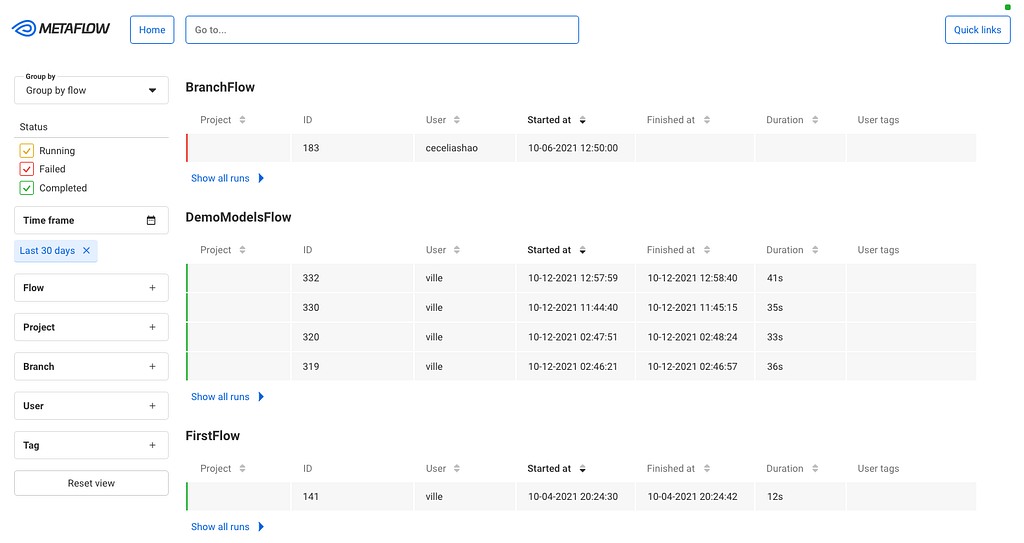
Netflix Cloud Packaging in the Terabyte Era

Post Syndicated from Netflix Technology Blog original https://netflixtechblog.com/netflix-cloud-packaging-in-the-terabyte-era-d6869b4b84ae

By Xiaomei Liu, Rosanna Lee, Cyril Concolato

Introduction

Behind the scenes of the beloved Netflix streaming service and content, there are many technology innovations in media processing. Packaging has always been an important step in media processing. After content ingestion, inspection and encoding, the packaging step encapsulates encoded video and audio in codec agnostic container formats and provides features such as audio video synchronization, random access and DRM protection. Our previous tech blog Packaging award-winning shows with award-winning technology detailed our packaging technology deployed on the streaming side.

As Netflix becomes a producer of award winning content, the studio and content creation needs are also pushing the envelope of technology advancements. As an example, cloud-based post-production editing and collaboration pipelines demand a complex set of functionalities, including the generation and hosting of high quality proxy content. Supporting those workflows poses new challenges to our packaging service.

The Terabyte Era

Apple ProRes encoded video and PCM audio with Quicktime container are one of the most popular formats in professional post-production editing. The ProRes codec family provides great editing performance and image quality. ProRes 422 HQ offers visually lossless preservation of the highest quality professional HD video and is a great video format choice for high quality editing proxy.

As described by the white paper Apple ProRes (link), the target data rate of the Apple ProRes HQ for 1920×1080 at 29.97 is 220 Mbps. With the wide adoption of 4K content across the production pipeline, the generation of ProRes 422 HQ at the resolution of 3840×2160 requires our processing pipeline to encode and package content in the order of terabytes. The following table gives us an example of file sizes for 4K ProRes 422 HQ proxies.

Table 1: Movie and File Size Examples

Initial Architecture

A simplified view of our initial cloud video processing pipeline is illustrated in the following diagram. The inspection stage examines the input media for compliance with Netflix’s delivery specifications and generates rich metadata. This metadata includes both file level information such as video encoding format, video frame rate, and resolution, as well as frame level information such as frame offset, frame dependency, and frame active region to facilitate downstream processing stages. After the inspection stage, we leverage the cloud scaling functionality to slice the video into chunks for the encoding to expedite this computationally intensive process (more details in High Quality Video Encoding at Scale) with parallel chunk encoding in multiple cloud instances. Once all the chunks are encoded, they are physically stitched back into a final encoded bitstream. Lastly, the packager kicks in, adding a system layer to the asset, making it ready to be consumed by the clients.

Figure 1: A Simplified Video Processing Pipeline

With this architecture, chunk encoding is very efficient and processed in distributed cloud computing instances. However, assembly and packaging become the processing bottleneck, especially when the file size increases to the terabyte range. From chunk encoding to assembly and packaging, the result of each previous processing step must be uploaded to cloud storage and then downloaded by the next processing step.

Uploading and downloading data always come with a penalty, namely latency. While the input to our encoders, assemblers and packager instances is mounted using MezzFS and therefore read in parallel to be processed, output data is uploaded only after all processing is complete. The following table breaks down the various processing (including download) and uploading phases within an assembler and packager instance operating on large media files. It is worth pointing out that cloud processing is always subject to variable network conditions.

Table 2: Assembler and Packager Processing Time

Additionally, in this architecture, the packager still needs access to local storage for its packaged output (before uploading it to the final cloud destination) and any intermediate output if there are multiple passes in the processing. Since not all projects are terabytes projects, allocating the largest cloud storage to all packager instances is not an efficient use of cloud resources. We took the approach of allocating small or large cloud storage space depending on the actual packaging input size (Figure 2). Jobs processing large files were directed to instances with cloud storage large enough to hold intermediate results and packaged output.

Figure 2: Cloud Resource and Job Sizes

This initial architecture was designed at a time when packaging from a list of chunks was not possible and terabyte-sized files were not considered. It is very clear now that there will be significant processing savings if the physical assembly of the encoded chunks can be avoided. Also, the use of different sizes of local storage is not optimal, given that we can only support a small number of storage configurations, and given that the configurations need periodic updates as the maximum file size in the catalog inevitably grows.

Improved Architecture

In order to address the limitations of our initial architecture, we proceeded to make some optimizations.

Virtual Assembly

Figure 3 describes how a virtual assembly of the encoded chunks replaces the physical assembly used in our previous architecture. In this approach, an index assembler generates an index file, maintaining the temporal order of the encoded chunks. Care has been taken to ensure all chunks are accounted for and are in the right order during the virtual assembly to ensure the consistency of the final packaged stream and the original source. The index file keeps track of the physical location (URL) of each chunk and also keeps track of the physical location (URL + byte offset + size) of each video frame to facilitate downstream processing. The main advantage of using an assembled index is that any processing downstream of the video encoding can be abstracted away from the physical storage of the encoded video. Media processing services downstream of video encoding have intelligent downloaders that consume the assembled index file in order to mount the encoded video as video frames or encoded chunks. This is also the case with the packager, which reads and writes the encoded chunks only when it is generating the packaged output.

Figure 3: Video Processing with Index and Virtual Assembly

Using virtual assembly greatly improves the latency performance of the ProRes 422 HQ proxy generation by removing one round trip of cloud downloading and cloud uploading by the physical assembler.

Writable MezzFS

As described in a previous blog post, MezzFS is a tool developed by Netflix that allows cloud storage objects to be mounted as local files via FUSE. It allows our encoders and packagers to do random access reads of cloud storage objects without having to download an entire object before beginning their processing.

With similar goals in mind for write operations, we set about supporting storage of objects in the cloud without incurring any local storage and before the entire object has been created so that data generation and uploading can occur simultaneously. There are existing distributed file systems for the cloud as well as off-the-shelf FUSE modules for S3. We chose to enhance MezzFS instead of using these other solutions because the cloud storage system where packager stores its output is a custom object store service built on top of S3 with additional security features. Doing so has the added advantage of being able to design and tune the enhancement to suit the requirements of packager and our other encoding applications.

The requirements and challenges for supporting write operations are different from those for read operations. Our previous blog post described how MezzFS addresses the challenges for reads using various techniques, such as adaptive buffering and regional caches, to make the system performant and to lower costs. For write operations, those challenges do not apply. Furthermore, the goal for writes is not to build a general purpose system that supports arbitrary writers, but rather one that maximizes potential packager performance. In order to do so, we started by analyzing the packager’s IO patterns and configuring the packager to make its patterns more friendly to cloud writes.

The problematic pattern of packagers is that they do not always generate data linearly. They sometimes update parts of the file that had been written earlier for various reasons. For example, both ISOBMFF (ISO/IEC 14496–12) and Apple Quicktime use box structures to represent packaged media. The ‘moov’ box represents the metadata header describing the media while the ‘mdat’ box encapsulates the media content. Boxes start with a header which gives size and type of the box before the box content. When a packager is encapsulating the media content into the ‘mdat’ box, the size of the box is not known until all the media data are processed. To optimize the packager for writable MezzFS, we did not utilize the packager features that require multi-pass processing, intermediate storage and frequent update of headers.

With this packager constraint, there are a number of ways to design a writable MezzFS feature, but we wanted a solution that best fit the IO patterns of the packager in terms of latency, network utilization, and memory usage. In order to do that, the storage cloud object is modeled as a number of fixed size parts. MezzFS maintains a pool of upload buffers that correspond to a subset of these parts. As the packager creates and writes data to the object, data fills up the buffers, which are automatically uploaded asynchronously to the cloud. You can think of packaging as creating a stream of output that is stored directly in the cloud.

What happens when the packager references bytes that have already been uploaded (e.g. when it updates the ‘mdat’ size)? Any single read or write operation may involve a mix of previously uploaded and yet-to-be uploaded bytes. MezzFS borrows from how operating systems handle page faults. It downloads the part(s) that contain the referenced, uploaded bytes and keeps them in an LRU active cache. Packager’s read/write operations are then translated into operations on the upload buffers and/or buffers in the active cache. The buffers in the active cache are uploaded to the cloud as the cache becomes full. Just as with virtual memory management systems, locality of reference is important in determining the active cache size and performance. If the packager updates random, unrelated parts of the file within short periods of time, thrashing would occur and performance would be degraded. Our analysis of packager’s IO patterns determined that the packager makes updates with close proximity to each other — at most few parts at a time — thus making this design viable.

Figure 4: Overview of Writable MezzFS Design

Use of MezzFS is not without its cost in terms of performance. Use of FUSE means that file operations must go through MezzFS instead of directly to the kernel. As faster disk technology such as NVMe SSD are adopted, this overhead becomes increasingly noticeable and the time saved by uploading while packaging is counterbalanced by this overhead. As shown in Figure 5, packaging locally using non-NVMe local storage such as AWS Elastic Block Store (EBS) and then uploading takes more time than using MezzFS, but doing the same with NVMe SSD takes less time.

Figure 5: Performance Comparison of Packager Jobs using Writable MezzFS

However, time savings is not the only factor to consider when choosing between different upload techniques. Use of writable MezzFS offers the advantage of not requiring a large disk — larger and faster disks incur higher monetary costs and multiple disk size configurations make resource scheduling and sharing more challenging.

Conclusion

Supporting packaging of media content at terabytes scale is challenging. With innovation from system architecture, platform engineering and underlying packaging tools, processing terabyte-sized media files is now supported with greater efficiency.

The overall ProRes video processing speed is increased from 50GB/Hour to 300GB/Hour. From a different perspective, the processing time to movie runtime ratio is reduced from 6:1 to about 1:1. This significantly improves the Studio high quality proxy generation efficiency and workflow latency.

In addition to speed improvements, there is no longer a need to keep different configurations of local storage for cloud packagers. All the cloud packager instances now share a single scheduling queue with optimized compute resource utilization. There is also no need for multi-terabyte local storage, and no more unexpected out-of-disk processing failures. The single-sized local disk storage is future-proof for movies with longer runtime and higher resolution.

Acknowledgements

We would like to thank Anush Moorthy, Subbu Venkatrav and Chao Chen for their contribution to virtual assembly, Zoran Simic and Barak Alon for their contribution to writable MezzFS.

We’re hiring!

If you are passionate about media processing and platform engineering, come join us at Netflix! The Media Systems team is hiring. Please contact Flavio Ribeiro for more information.


Netflix Cloud Packaging in the Terabyte Era was originally published in Netflix TechBlog on Medium, where people are continuing the conversation by highlighting and responding to this story.
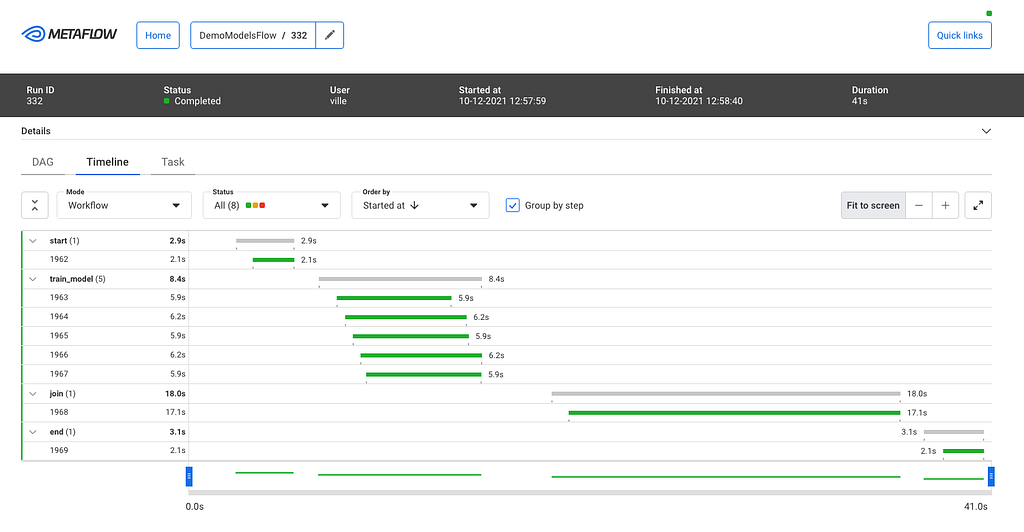
What is an A/B Test?

Post Syndicated from Netflix Technology Blog original https://netflixtechblog.com/what-is-an-a-b-test-b08cc1b57962

Martin Tingley with Wenjing Zheng, Simon Ejdemyr, Stephanie Lane, and Colin McFarland

This is the second post in a multi-part series on how Netflix uses A/B tests to inform decisions and continuously innovate on our products. See here for Part 1: Decision Making at Netflix. Subsequent posts will go into more details on the statistics of A/B tests, experimentation across Netflix, how Netflix has invested in infrastructure to support and scale experimentation, and the importance of the culture of experimentation within Netflix.

An A/B test is a simple controlled experiment. Let’s say — this is a hypothetical! — we want to learn if a new product experience that flips all of the boxart upside down in the TV UI is good for our members.

Figure 1: How do we decide if Product Experience B, with the Upside Down box art, is a better experience for our members?

To run the experiment, we take a subset of our members, usually a simple random sample, and then use random assignment to evenly split that sample into two groups. Group “A,” often called the “control group,” continues to receive the base Netflix UI experience, while Group “B,” often called the “treatment group”, receives a different experience, based on a specific hypothesis about improving the member experience (more on those hypotheses below). Here, Group B receives the Upside Down box art.

We wait, and we then compare the values of a variety of metrics from Group A to those from Group B. Some metrics will be specific to the given hypothesis. For a UI experiment, we’ll look at engagement with different variants of the new feature. For an experiment that aims to deliver more relevant results in the search experience, we’ll measure if members are finding more things to watch through search. In other types of experiments, we might focus on more technical metrics, such as the time it takes the app to load, or the quality of video we are able to provide under different network conditions.

Figure 2: A simple A/B test. We split a random sample of Netflix members into two groups using random assignment. Group “A” receives the current product experience, while Group “B” receives some change that we think is an improvement to the Netflix experience. Here, Group “B” receives the “Upside Down” product experience. We then compare metrics between the two groups. Critically, random assignment ensures that, on average, everything else is held constant between the two groups.

With many experiments, including the Upside Down box art example, we need to think carefully about what our metrics are telling us. Suppose we look at the click through rate, measuring the fraction of members in each experience that clicked on a title. This metric alone may be a misleading measure of whether this new UI is a success, as members might click on a title in the Upside Down product experience only in order to read it more easily. In this case, we might also want to evaluate what fraction of members subsequently navigate away from that title versus proceeding to play it.

In all cases, we also look at more general metrics that aim to capture the joy and satisfaction that Netflix is delivering to our members. These metrics include measures of member engagement with Netflix: are the ideas we are testing helping our members to choose Netflix as their entertainment destination on any given night?

There’s a lot of statistics involved as well — how large a difference is considered significant? How many members do we need in a test in order to detect an effect of a given magnitude? How do we most efficiently analyze the data? We’ll cover some of those details in subsequent posts, focussing on the high level intuition.

Holding everything else constant

Because we create our control (“A”) and treatment (“B”) groups using random assignment, we can ensure that individuals in the two groups are, on average, balanced on all dimensions that may be meaningful to the test. Random assignment ensures, for example, that the average length of Netflix membership is not markedly different between the control and treatment groups, nor are content preferences, primary language selections, and so forth. The only remaining difference between the groups is the new experience we are testing, ensuring our estimate of the impact of the new experience is not biased in any way.

To understand how important this is, let’s consider another way we could make decisions: we could roll out the new Upside Down box art experience (discussed above) to all Netflix members, and see if there’s a big change in one of our metrics. If there’s a positive change, or no evidence of any meaningful change, we’ll keep the new experience; if there’s evidence of a negative change, we’ll roll back to the prior product experience.

Let’s say we did that (again — this is a hypothetical!), and flipped the switch to the Upside Down experience on the 16th day of a month. How would you act if we gathered the following data?

Figure 3: Hypothetical data for the release of the new Upside Down box art product experience on Day 16.

The data look good: we release a new product experience and member engagement goes way up! But if you had these data, plus the knowledge that Product B flips all the box art in the UI upside down, how confident would you be that the new product experience really is good for our members?

Do we really know that the new product experience is what caused the increase in engagement? What other explanations are possible?

What if you also knew that Netflix released a hit title, like a new season of Stranger Things or Bridgerton, or a hit movie like Army of the Dead, on the same day as the (hypothetical) roll out of the new Upside Down product experience? Now we have more than one possible explanation for the increase in engagement: it could be the new product experience, it could be the hit title that’s all over social media, it could be both. Or it could be something else entirely. The key point is that we don’t know if the new product experience caused the increase in engagement.

What if instead we’d run an A/B test with the Upside Down box art product experience, with one group of members receiving the current product (“A”) and another group the Upside Down product (“B”) over the entire month, and gathered the following data:

Figure 4: Hypothetical data for an A/B test of a new product experience.

In this case, we are led to a different conclusion: the Upside Down product results in generally lower engagement (not surprisingly!), and both groups see an increase in engagement concurrent with the launch of the big title.

A/B tests let us make causal statements. We’ve introduced the Upside Down product experience to Group B only, and because we’ve randomly assigned members to groups A and B, everything else is held constant between the two groups. We can therefore conclude with high probability (more on the details next time) that the Upside Down product caused the reduction in engagement.

This hypothetical example is extreme, but the broad lesson is that there is always something we won’t be able to control. If we roll out an experience to everyone and simply measure a metric before and after the change, there can be relevant differences between the two time periods that prevent us from making a causal conclusion. Maybe it’s a new title that takes off. Maybe it’s a new product partnership that unlocks Netflix for more users to enjoy. There’s always something we won’t know about. Running A/B tests, where possible, allows us to substantiate causality and confidently make changes to the product knowing that our members have voted for them with their actions.

It all starts with an idea

An A/B test starts with an idea — some change we can make to the UI, the personalization systems that help members find content, the signup flow for new members, or any other part of the Netflix experience that we believe will produce a positive result for our members. Some ideas we test are incremental innovations, like ways to improve the text copy that appears in the Netflix product; some are more ambitious, like the test that led to “Top 10” lists that Netflix now shows in the UI.

As with all innovations that are rolled out to Netflix members around the globe, Top 10 started as an idea that was turned into a testable hypothesis. Here, the core idea was that surfacing titles that are popular in each country would benefit our members in two ways. First, by surfacing what’s popular we can help members have shared experiences and connect with one another through conversations about popular titles. Second, we can help members choose some great content to watch by fulfilling the intrinsic human desire to be part of a shared conversation.

Figure 5: An example of the Top 10 experience on the Web UI.

We next turn this idea into a testable hypothesis, a statement of the form “If we make change X, it will improve the member experience in a way that makes metric Y improve.” With the Top 10 example, the hypothesis read: “Showing members the Top 10 experience will help them find something to watch, increasing member joy and satisfaction.” The primary decision metric for this test (and many others) is a measure of member engagement with Netflix: are the ideas we are testing helping our members to choose Netflix as their entertainment destination on any given night? Our research shows that this metric (details omitted) is correlated, in the long term, with the probability that members will retain their subscriptions. Other areas of the business in which we run tests, such as the signup page experience or server side infrastructure, make use of different primary decision metrics, though the principle is the same: what can we measure, during the test, that is aligned with delivering more value in the long-term to our members?

Along with the primary decision metric for a test, we also consider a number of secondary metrics and how they will be impacted by the product feature we are testing. The goal here is to articulate the causal chain, from how user behavior will change in response to the new product experience to the change in our primary decision metric.

Articulating the causal chain between the product change and changes in the primary decision metric, and monitoring secondary metrics along this chain, helps us build confidence that any movement in our primary metric is the result of the causal chain we are hypothesizing, and not the result of some unintended consequence of the new feature (or a false positive — much more on that in later posts!). For the Top 10 test, engagement is our primary decision metric — but we also look at metrics such as title-level viewing of those titles that appear in the Top 10 list, the fraction of viewing that originates from that row vs other parts of the UI, and so forth. If the Top 10 experience really is good for our members in accord with the hypothesis, we’d expect the treatment group to show an increase in viewing of titles that appear in the Top 10 list, and for generally strong engagement from that row.

Finally, because not all of the ideas we test are winners with our members (and sometimes new features have bugs!) we also look at metrics that act as “guardrails.” Our goal is to limit any downside consequences and to ensure that the new product experience does not have unintended impacts on the member experience. For example, we might compare customer service contacts for the control and treatment groups, to check that the new feature is not increasing the contact rate, which may indicate member confusion or dissatisfaction.

Summary

This post has focused on building intuition: the basics of an A/B test, why it’s important to run an A/B test versus rolling out a feature and looking at metrics pre- and post- making a change, and how we turn an idea into a testable hypothesis. Next time, we’ll jump into the basic statistical concepts that we use when comparing metrics from the treatment and control experiences. Follow the Netflix Tech Blog to stay up to date.


What is an A/B Test? was originally published in Netflix TechBlog on Medium, where people are continuing the conversation by highlighting and responding to this story.
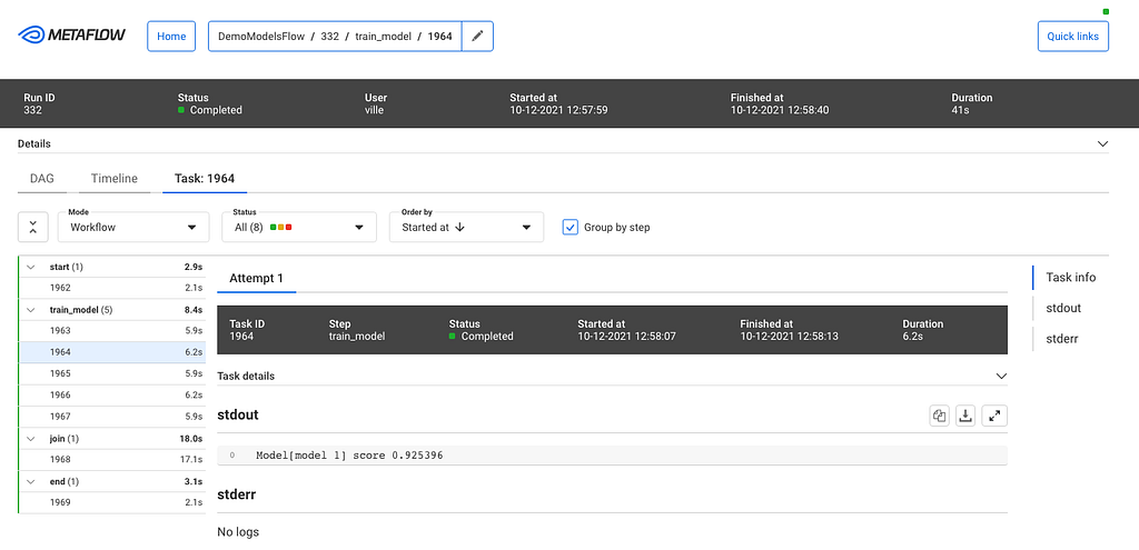
Practical API Design at Netflix, Part 2: Protobuf FieldMask for Mutation Operations

Post Syndicated from Netflix Technology Blog original https://netflixtechblog.com/practical-api-design-at-netflix-part-2-protobuf-fieldmask-for-mutation-operations-2e75e1d230e4

By Ricky Gardiner, Alex Borysov

Background

In our previous post, we discussed how we utilize FieldMask as a solution when designing our APIs so that consumers can request the data they need when fetched via gRPC. In this blog post we will continue to cover how Netflix Studio Engineering uses FieldMask for mutation operations such as update and remove.

Example: Netflix Studio Production

Money Heist (La casa de papel) / Netflix

Previously we outlined what a Production is and how the Production Service makes gRPC calls to other microservices such as the Schedule Service and Script Service to retrieve schedules and scripts (aka screenplay) for a particular production such as La Casa De Papel. We can take that model and showcase how we can mutate particular fields on a production.

Mutating Production Details

Let’s say we want to update the format field from LIVE_ACTION to HYBRID as our production has added some animated elements. A naive way for us to solve this is to add an updateProductionFormatRequest method and gRPC endpoint just to update the productionFormat:

This allows us to update the production format for a particular production but what if we then want to update other fields such as titleor even multiple fields such as productionFormat, schedule, etc? Building on top of this we could just implement an update method for every field: one for Production format, another for title and so on:

This can become unmanageable when maintaining our APIs due to the number of fields on the Production. What if we want to update more than one field and do it atomically in a single RPC? Creating additional methods for various combinations of fields will lead to an explosion of mutation APIs. This solution is not scalable.

Instead of trying to create every single combination possible, another solution could be to have an UpdateProduction endpoint that requires all fields from the consumer:

The issue with this solution is two-fold as the consumer must know and provide every single required field in a Production even if they just want to update one field such as the format. The other issue is that since a Production has many fields the request payload can become quite large particularly if the production has schedule or scripts information.

What if, instead of all the fields, we send only the fields we actually want to update, and leave all other fields unset? In our example, we would only set the production format field (and ID to reference the production):

This could work if we never need to remove or blank out any fields. But what if we want to remove the value of the title field? Again, we can introduce one-off methods like RemoveProductionTitle, but as discussed above, this solution does not scale well. What if we want to remove a value of a nested field such as the planned launch date field from the schedule? We would end up adding remove RPCs for every individual nullable sub-field.

Utilizing FieldMask for Mutations

Instead of numerous RPCs or requiring a large payload, we can utilize a FieldMask for all our mutations. The FieldMask will list all of the fields we would like to explicitly update. First, let’s update our proto file to add in the UpdateProductionRequest, which will contain the data we want to update from a production, and a FieldMask of what should be updated:

Now, we can use a FieldMask to make mutations. We can update the format by creating a FieldMask for the format field by using the FieldMaskUtil.fromStringList() utility method which constructs a FieldMask for a list of field paths in a certain type. In this case, we will have one type, but will build upon this example later:

Since our FieldMask only specifies the format field that will be the only field that is updated even if we provide more data in ProductionUpdateOperation. It becomes easier to add or remove more fields to our FieldMask by modifying the paths. Data that is provided in the payload but not added in a path of a FieldMask will not be updated and simply ignored in the operation. But, if we omit a value it will perform a remove mutation on that field. Let’s modify our example above to showcase this and update the format but remove the planned launch date, which is a nested field on the ProductionSchedule as “schedule.planned_launch_date”:

In this example, we are performing both update and remove mutations as we have added “format” and “schedule.planned_launch_date” paths to our FieldMask. When we provide this in our payload these fields will be updated to the new values, but when building our payload we are only providing the format and omitting the schedule.planned_launch_date. Omitting this from the payload but having it defined in our FieldMask will function as a remove mutation:

Empty / Missing Field Mask

When a field mask is unset or has no paths, the update operation applies to all the payload fields. This means the caller must send the whole payload or, as mentioned above, any unset fields will be removed.

This convention has an implication on schema evolution: when a new field is added to the message, all the consumers must start sending its value on the update operation or it will get removed.

Suppose we want to add a new field: production budget. We will extend both the Production message, and ProductionUpdateOperation:

If there is a consumer that doesn’t know about this new field or hasn’t updated client stubs yet, it can accidentally null the budget field out by not sending the FieldMask in the update request.

To avoid this issue, the producer should consider requiring the field mask for all the update operations. Another option would be to implement a versioning protocol: force all callers to send their version numbers and implement custom logic to skip fields not present in the old version.

Bella Ciao

In this blog post series, we have gone over how we use FieldMask at Netflix and how it can be a practical and scalable solution when designing your APIs.

API designers should aim for simplicity, but make their APIs open for extension and evolution. It’s often not easy to keep APIs simple and future-proof. Utilizing FieldMask in APIs helps us achieve both simplicity and flexibility.


Practical API Design at Netflix, Part 2: Protobuf FieldMask for Mutation Operations was originally published in Netflix TechBlog on Medium, where people are continuing the conversation by highlighting and responding to this story.
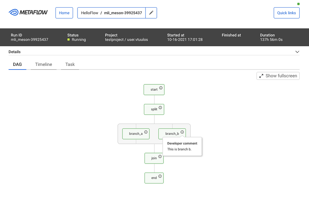
The Show Must Go On: Securing Netflix Studios At Scale

Post Syndicated from Netflix Technology Blog original https://netflixtechblog.com/the-show-must-go-on-securing-netflix-studios-at-scale-19b801c86479

Written by Jose Fernandez, Arthur Gonigberg, Julia Knecht, and Patrick Thomas

Netflix Zuul Open Source Logo

In 2017, Netflix Studios was hitting an inflection point from a period of merely rapid growth to the sort of explosive growth that throws “how do we scale?” into every conversation. The vision was to create a “Studio in the Cloud”, with applications supporting every part of the business from pitch to play. The security team was working diligently to support this effort, faced with two apparently contradictory priorities:

  • 1) streamline any security processes so that we could get applications built and deployed to the public internet faster
  • 2) raise the overall security bar so that the accumulated risk of this giant and growing portfolio of newly internet-facing, high-sensitivity assets didn’t exceed its value

The journey to resolve that contradiction has been a collaboration that we’re proud of, and that we think exemplifies how Netflix approaches infrastructure product development and product security partnerships. You’ll hear from two teams here: first Application Security, and then Cloud Gateway.

Julia & Patrick (Netflix Application Security): In deciding how to address this, we focused on two observations. The first was that there were too many security things that each software team needed to think about — things like TLS certificates, authentication, security headers, request logging, rate limiting, among many others. There were security checklists for developers, but they were lengthy and mostly manual, neither of which contributed to the goal of accelerating development. Adding to the complexity, many of the checklist items themselves had a variety of different options to fulfill them (“new apps do this, but legacy apps do that”; “Java apps should use this approach, but Ruby apps should try one of these four things”… yes, there were flowcharts inside checklists. Ouch.). For development teams, just working through the flowcharts of requirements and options was a monumental task. Supporting developers through those checklists for edge cases, and then validating that each team’s choices resulted in an architecture with all the desired security properties, was similarly not scalable for our security engineers.

Our second observation centered on strong authentication as our highest-leverage control. Missing or incomplete authentication in an application was the most critical type of issue we regularly faced, while at the same time, an application that had a bulletproof authentication story was an application we considered to be lower risk. Concepts like Zero Trust, Beyond Corp, and Identity Aware Proxies all seemed to point the same way: there is powerful assurance in making 100% authentication a property of the architecture of the application rather than an implementation detail within an application.

With both of these observations in hand, we looked at the challenge through a lens that we have found incredibly valuable: how do we productize it? Netflix engineers talk a lot about the concept of a “Paved Road”. One especially attractive part of a Paved Road approach for security teams with a large portfolio is that it helps turn lots of questions into a boolean proposition: Instead of “Tell me how your app does this important security thing?”, it’s just “Are you using this paved road product that handles that?”. So, what would a product look like that could tackle most of the security checklist for a team, and that also could give us that architectural property of guaranteed authentication? With these lofty goals in mind, we turned to our central engineering teams to help get us there.

Partnering to Productize Security

Jose & Arthur (Netflix Cloud Gateway): The Cloud Gateway team develops and operates Netflix’s “Front Door”. Historically we have been responsible for connecting, routing, and steering internet traffic from Netflix subscribers to services in the cloud. Our gateways are powered by our flagship open-source technology Zuul. When Netflix Studios and our security partners approached us, the proposal was conceptually simple and a good fit for our modular, filter-based approach. To try it out, we deployed a custom Zuul build (which we named “API Wall” and eventually, more affectionately, “Wall-E”) with a new filter for Netflix’s Single-Sign-On provider, enabled it for all requests, and boom! — an application deployment strategy that guarantees authentication for services behind it.

Wall-E logical diagram showing a proxy with distinct filters

Killing the Checklist

Once we worked together to integrate our SSO with Wall-E, we had established a pretty exciting pattern of adding security requirements as filters. We thought back to our checklist through the lens of: which of these things are consistent enough across applications to add as a required filter? Our web application firewall (WAF), DDoS prevention, security header validation, and durable logging all fit the bill. One by one, we saw our checklists’ requirements bite the dust, and shift from ‘individual app developer-owned’ to ‘Wall-E owned’ (and consistently implemented!).

By this point, it was clear that we had achieved the vision in the AppSec team’s original request. We eventually were able to add so much security leverage into Wall-E that the bulk of the “going internet-facing” checklist for Studio applications boiled down to one item: Will you use Wall-E?

A small section of our go-external security questionnaire and checklist for studio apps before Wall-E and after Wall-E.

The Early Adopter Challenge

Wall-E’s early adopters were handpicked and nudged along by the Application Security team. Back then, the Cloud Gateway team had to work closely with application developers to provide a seamless migration without disrupting users. These joint efforts took several weeks for both parties. During our initial consultations, it was clear that developers preferred prioritizing product work over security or infrastructure improvements. Our meetings usually ended like this: “Security suggested we talk to you, and we like the idea of improving our security posture, but we have product goals to meet. Let’s talk again next quarter”. These conversations surfaced a couple of problems we knew we had to overcome to address this early adopter challenge:

  1. Setting up Wall-E for an application took too much time and effort, and the hands-on approach would not scale.
  2. Security improvements alone were not enough to drive organic adoption in Netflix’s “context not control” culture.

We were under pressure to improve our adoption numbers and decided to focus first on the setup friction by improving the developer experience and automating the onboarding process.

Scaling With Developer Experience

Developers in the Netflix streaming world compose the customer-facing Netflix experience out of hundreds of microservices, reachable by complex routing rules. On the Netflix Studio side, in Content Engineering, each team develops distinct products with simpler routing needs. To support that much different model, we did another thing that seemed simple at the time but has had an outsized impact over the years: we asked app teams to integrate with us by creating a version-controlled YAML file. Originally this was intended as a simplified and developer-friendly way to help collect domain names and some routing rules into a versionable package, but we quickly realized we had stumbled into a powerful model: we were harvesting developer intent.

An interactive Wall-E configuration wizard, and a concise declarative format for an application’s routing, resource, and authentication decisions

This small change was a kind of magic, and completely flipped our relationship with development teams: since we had a concise, standardized definition of the app they intended to expose, we could proactively automate a lot of the setup. Specify a domain name? Wall-E can ensure that it automagically exists, with DNS and TLS configured correctly. Iterating on this experience eventually led to other intent-based streamlining, like asking about intended user populations and related applications (to select OAuth configs and claims). We could now tell developers that setting up Wall-E would only take a few minutes and that our tooling would automate everything.

Going Faster, Faster

As all of these pieces came together, app teams outside Studio took notice. For a typical paved road application with no unusual security complications, a team could go from “git init” to a production-ready, fully authenticated, internet accessible application in a little less than 10 minutes. The automation of the infrastructure setup, combined with reducing risk enough to streamline security review saves developers days, if not weeks, on each application. Developers didn’t necessarily care that the original motivating factor was about security: what they saw in practice was that apps using Wall-E could get in front of users sooner, and iterate faster.

This created that virtuous cycle that core engineering product teams get incredibly excited about: more users make the amortized platform investment more valuable, but they also bring more ideas and clarity for feature ideas, which in turn attract more users. This set the tone for the next year of development, along two tracks: fixing adoption blockers, and turning more “developer intent” into product features to just handle things for them.

For adoption, both the security team and our team were asking the same question of developers: Is there anything that prevents you from using Wall-E? Each time we got an answer to that question, we tried to figure out how we could address it. Nearly all of the blockers related to systems in which (usually for historical reasons) some application team was solving both authentication and application routing in a custom way. Examples include legacy mTLS and various webhook schemes​. With Wall-E as a clear, durable, paved road choice, we finally had enough of a carrot to move these teams away from supporting unique, potentially risky features. The value proposition wasn’t just “let us help you migrate and you’ll only ever have to deal with incoming traffic that is already properly authenticated”, it was also “you can throw away the services and manual processes that handled your custom mechanisms and offload any responsibility for authentication, WAF integration and monitoring, and DDoS protection to the platform”. Overall, we cannot overstate the value of organizationally committing to a single paved road product to handle these kinds of concerns. It creates an amazing clarity and strategic pressure that helps align actual services that teams operate to the charters and expertise that define them. The difference between 2–4 “right-ish” ways and a single paved road one is powerful.

Also, with fewer exceptions and clearer criteria for apps that should adopt this paved road, our AppSec Engineering and User Focused Security Engineering (UFSE) teams could automate security guidance to give more appropriate automated nudges for adoption. Every leader’s security risk dashboard now includes a Wall-E adoption metric, and roughly ⅔ of recommended apps have chosen to adopt it. Wall-E now fronts over 350 applications, and is adding roughly 3 new production applications (mostly internet-facing) per week.

Automated guidance data, showing the percentage of applications recommended to use Wall-E which have taken it up. The jumpiness in the number of apps recommended for adoption is real: as adoption blockers were discovered then eventually solved, and as we standardized guidance across the company, our automated recommendations reflected these developments.

As adoption continued to increase, we looked at various signals of developer intent for good functionality to move from development-team-owned to platform-owned. One particularly pleasing example turned out to be UI hosting: it popped up over and over again as both an awkward exception to our “full authentication” goal, and also oftentimes the only thing that required Single Page App (SPA) UI teams to run actual cloud instances and have to be on-call for infrastructure. This eventually matured into an opinionated, declarative asset service that abstracts static file hosting for application teams: developers get fast static asset deployments, security gets strong guardrails around UI applications, and Netflix overall has fewer cloud instances to manage (and pay for!). Wall-E became a requirement for the best UI developer experience, and that drove even more adoption.

A productized approach also meant that we could efficiently enable lots of complex but “nice to have” features to enhance the developer experience, like Atlas metrics for free, and integration with our request tracing tool, Edgar.

From Product to Platform

You may have noticed a word sneak into the conversation up there… “platform”. Netflix has a Developer Productivity organization: teams dedicated to helping other developers be more effective. A big part of their work is this idea of harvesting developer intent and automating the necessary touchpoints across our systems. As these teams came to see Wall-E as the clear answer for many of their customers, they started integrating their tools to configure Wall-E from the even higher level developer intents they were harvesting. In effect, this moves authentication and traffic routing (and everything else that Wall-E handles) from being a specific product that developers need to think about and make a choice about, to just a fact that developers can trust and generally ignore. In 2019, essentially 100% of the Wall-E app configuration was done manually by developers. In 2021, that interaction has changed dramatically: now more than 50% of app configuration in WallE is done by automated tools (which are acting on higher-level abstractions on behalf of developers).

This scale and standardization again multiplies value: our internal risk quantification forecasts show compelling annualized savings in risk and incident response costs across the Wall-E portfolio. These applications have fewer, less severe, and less exploitable bugs compared to non-Wall-E apps, and we rarely need an urgent response from app owners (we call this not-getting-paged-at-midnight-as-a-service). Developer time saved on initial application setup and unneeded services additionally adds up on the order of team-months of productivity per year.

Looking back to the core need that started us down this road (“streamline any security processes […]” and “raise the overall security bar […]”), Wall-E’s evolution to being part of the platform cements and extends the initial success. Going forward, more and more apps and developers can benefit from these security assurances while needing to think less and less about them. It’s an outcome we’re quite proud of.

Let’s Do More Of That

To briefly recap, here’s a few of the things that we take away from this journey:

  • If you can do one thing to manage a large product security portfolio, do bulletproof authentication; preferably as a property of the architecture
  • Security teams and central engineering teams can and should have a collaborative, mutually supportive partnership
  • “Productizing” a capability (eg: clearly articulated; defined value proposition; branded; measured), even for internal tools, is useful to drive adoption and find further value
  • A specific product makes the “paved road” clearer; a boolean “uses/doesn’t use” is strongly preferable to various options with subtle caveats
  • Hitch the security wagon to developer productivity
  • Harvesting intent is powerful; it lets many teams add value

What’s Next

We see incredible power in this kind of security/infrastructure partnership work, and we’re excited to leverage these wins into our next goal: to truly become an infrastructure-as-service provider by building a full-fledged Gateway API, thereby handing off ownership of the developer experience to our partner teams in the Developer Productivity organization. This will allow us to focus on the challenges that will come on our way to the next milestone: 1000 applications behind Wall-E.

If this kind of thing is exciting to you, we are hiring for both of these teams: Senior Software Engineer and Engineering Manager on Application Networking; and Senior Security Partner and Appsec Senior Software Engineer.

With special thanks to Cloud Gateway and InfoSec team members past and present, especially Sunil Agrawal, Mikey Cohen, Will Rose, Dilip Kancharla, our partners on Studio & Developer Productivity, and the early Wall-E adopters that provided valuable feedback and ideas. And also to Queen for the song references we slipped in; tell us if you find ’em all.


The Show Must Go On: Securing Netflix Studios At Scale was originally published in Netflix TechBlog on Medium, where people are continuing the conversation by highlighting and responding to this story.
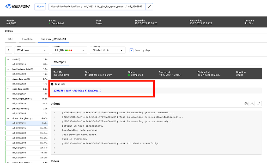
Decision Making at Netflix

Post Syndicated from Netflix Technology Blog original https://netflixtechblog.com/decision-making-at-netflix-33065fa06481

Martin Tingley with Wenjing Zheng, Simon Ejdemyr, Stephanie Lane, and Colin McFarland

This introduction is the first in a multi-part series on how Netflix uses A/B tests to make decisions that continuously improve our products, so we can deliver more joy and satisfaction to our members. Subsequent posts will cover the basic statistical concepts underpinning A/B tests, the role of experimentation across Netflix, how Netflix has invested in infrastructure to support and scale experimentation, and the importance of the culture of experimentation within Netflix.

Netflix was created with the idea of putting consumer choice and control at the center of the entertainment experience, and as a company we continuously evolve our product offerings to improve on that value proposition. For example, the Netflix UI has undergone a complete transformation over the last decade. Back in 2010, the UI was static, with limited navigation options and a presentation inspired by displays at a video rental store. Now, the UI is immersive and video-forward, the navigation options richer but less obtrusive, and the box art presentation takes greater advantage of the digital experience.

Figure 1: The Netflix TVUI in 2010 (top) and in 2020 (bottom).

Transitioning from that 2010 experience to what we have today required Netflix to make countless decisions. What’s the right balance between a large display area for a single title vs showing more titles? Are videos better than static images? How do we deliver a seamless video-forward experience on constrained networks? How do we select which titles to show? Where do the navigation menus belong and what should they contain? The list goes on.

Making decisions is easy — what’s hard is making the right decisions. How can we be confident that our decisions are delivering a better product experience for current members and helping grow the business with new members? There are a number of ways Netflix could make decisions about how to evolve our product to deliver more joy to our members:

  • Let leadership make all the decisions.
  • Hire some experts in design, product management, UX, streaming delivery, and other disciplines — and then go with their best ideas.
  • Have an internal debate and let the viewpoints of our most charismatic colleagues carry the day.
  • Copy the competition.
Figure 2: Different ways to make decisions. Clockwise from top left: leadership, internal experts, copy the competition, group debate.

In each of these paradigms, a limited number of viewpoints and perspectives contribute to the decision. The leadership group is small, group debates can only be so big, and Netflix has only so many experts in each domain area where we need to make decisions. And there are maybe a few tens of streaming or related services that we could use as inspiration. Moreover, these paradigms don’t provide a systematic way to make decisions or resolve conflicting viewpoints.

At Netflix, we believe there’s a better way to make decisions about how to improve the experience we deliver to our members: we use A/B tests. Experimentation scales. Instead of small groups of executives or experts contributing to a decision, experimentation gives all our members the opportunity to vote, with their actions, on how to continue to evolve their joyful Netflix experience.

More broadly, A/B testing, along with other causal inference methods like quasi-experimentation are ways that Netflix uses the scientific method to inform decision making. We form hypotheses, gather empirical data, including from experiments, that provide evidence for or against our hypotheses, and then make conclusions and generate new hypotheses. As explained by my colleague Nirmal Govind, experimentation plays a critical role in the iterative cycle of deduction (drawing specific conclusions from a general principle) and induction (formulating a general principle from specific results and observations) that underpins the scientific method.

Curious to learn more? Follow the Netflix Tech Blog for future posts that will dive into the details of A/B tests and how Netflix uses tests to inform decision making.


Decision Making at Netflix was originally published in Netflix TechBlog on Medium, where people are continuing the conversation by highlighting and responding to this story.

Practical API Design at Netflix, Part 1: Using Protobuf FieldMask

Post Syndicated from Netflix Technology Blog original https://netflixtechblog.com/practical-api-design-at-netflix-part-1-using-protobuf-fieldmask-35cfdc606518

By Alex Borysov, Ricky Gardiner

Background

At Netflix, we heavily use gRPC for the purpose of backend to backend communication. When we process a request it is often beneficial to know which fields the caller is interested in and which ones they ignore. Some response fields can be expensive to compute, some fields can require remote calls to other services. Remote calls are never free; they impose extra latency, increase probability of an error, and consume network bandwidth. How can we understand which fields the caller doesn’t need to be supplied in the response, so we can avoid making unnecessary computations and remove calls? With GraphQL this comes out of the box through the use of field selectors. In the JSON:API standard a similar technique is known as Sparse Fieldsets. How can we achieve a similar functionality when designing our gRPC APIs? The solution we use within the Netflix Studio Engineering is protobuf FieldMask.

Money Heist (La casa de papel) / Netflix

Protobuf FieldMask

Protocol Buffers, or simply protobuf, is a data serialization mechanism. By default, gRPC uses protobuf as its IDL (interface definition language) and data serialization protocol.

FieldMask is a protobuf message. There are a number of utilities and conventions on how to use this message when it is present in an RPC request. A FieldMask message contains a single field named paths, which is used to specify fields that should be returned by a read operation or modified by an update operation.

Example: Netflix Studio Production

Money Heist (La casa de papel) / Netflix

Let’s assume there is a Production service that manages Studio Content Productions (in the film and TV industry, the term production refers to the process of making a movie, not the environment to run a software).

GetProduction returns a Production message by its unique ID. A production contains multiple fields such as: title, format, schedule dates, scripts aka screenplay, budgets, episodes, etc, but let’s keep this example simple and focus on filtering out schedule dates and scripts when requesting a production.

Reading Production Details

Let’s say we want to get production information for a particular production such as “La Casa De Papel” using the GetProduction API. While a production has many fields, some of these fields are returned from other services such as schedule from the Schedule service, or scripts from the Script service.

The Production service will make RPCs to Schedule and Script services every time GetProduction is called, even if clients ignore the schedule and scripts fields in the response. As mentioned above, remote calls are not free. If the service knows which fields are important for the caller, it can make an informed decision about making expensive calls, starting resource-heavy computations, and/or calling the database. In this example, if the caller only needs production title and production format, the Production service can avoid making remote calls to Schedule and Script services.

Additionally, requesting a large number of fields can make the response payload massive. This can become an issue for some applications, for example, on mobile devices with limited network bandwidth. In these cases it is a good practice for consumers to request only the fields they need.

Money Heist (La casa de papel) / Netflix

A naïve way of solving these problems can be adding additional request parameters, such as includeSchedule and includeScripts:

This approach requires adding a custom includeXXX field for every expensive response field and doesn’t work well for nested fields. It also increases the complexity of the request, ultimately making maintenance and support more challenging.

Add FieldMask to the Request Message

Instead of creating one-off “include” fields, API designers can add field_mask field to the request message:

Consumers can set paths for the fields they expect to receive in the response. If a consumer is only interested in production titles and format, they can set a FieldMask with paths “title” and “format”:

Masking fields

Please note, even though code samples in this blog post are written in Java, demonstrated concepts apply to any other language supported by protocol buffers.

If consumers only need a title and an email of the last person who updated the schedule, they can set a different field mask:

By convention, if a FieldMask is not present in the request, all fields should be returned.

Protobuf Field Names vs Field Numbers

You might notice that paths in the FieldMask are specified using field names, whereas on the wire, encoded protocol buffers messages contain only field numbers, not field names. This (alongside some other techniques like ZigZag encoding for signed types) makes protobuf messages space-efficient.

To understand the difference between field numbers and field names, let’s take a detailed look at how protobuf encodes and decodes messages.

Our protobuf message definition (.proto file) contains Production message with five fields. Every field has a type, name, and number.

When the protobuf compiler (protoc) compiles this message definition, it creates the code in the language of your choice (Java in our example). This generated code contains classes for defined messages, together with message and field descriptors. Descriptors contain all the information needed to encode and decode a message into its binary format. For example, they contain field numbers, names, types. Message producer uses descriptors to convert a message to its wire format. For efficiency, the binary message contains only field number-value pairs. Field names are not included. When a consumer receives the message, it decodes the byte stream into an object (for example, Java object) by referencing the compiled message definitions.

As mentioned above, FieldMask lists field names, not numbers. Here at Netflix we are using field numbers and convert them to field names using FieldMaskUtil.fromFieldNumbers() utility method. This method utilizes the compiled message definitions to convert field numbers to field names and creates a FieldMask.

However, there is an easy-to-overlook limitation: using FieldMask can limit your ability to rename message fields. Renaming a message field is generally considered a safe operation, because, as described above, the field name is not sent on the wire, it is derived using the field number on the consumer side. With FieldMask, field names are sent in the message payload (in the paths field value) and become significant.

Suppose we want to rename the field title to title_name and publish version 2.0 of our message definition:

In this chart, the producer (server) utilizes new descriptors, with field number 2 named title_name. The binary message sent over the wire contains the field number and its value. The consumer still uses the original descriptors, where the field number 2 is called title. It is still able to decode the message by field number.

This works well if the consumer doesn’t use FieldMask to request the field. If the consumer makes a call with the “title” path in the FieldMask field, the producer will not be able to find this field. The producer doesn’t have a field named title in its descriptors, so it doesn’t know the consumer asked for field number 2.

As we see, if a field is renamed, the backend should be able to support new and old field names until all the callers migrate to the new field name (backward compatibility issue).

There are multiple ways to deal with this limitation:

  • Never rename fields when FieldMask is used. This is the simplest solution, but it’s not always possible
  • Require the backend to support all the old field names. This solves the backward compatibility issue but requires extra code on the backend to keep track of all historical field names
  • Deprecate old and create a new field instead of renaming. In our example, we would create the title_name field number 6. This option has some advantages over the previous one: it allows the producer to keep using generated descriptors instead of custom converters; also, deprecating a field makes it more prominent on the consumer side

Regardless of the solution, it is important to remember that FieldMask makes field names an integral part of your API contract.

Using FieldMask on the Producer (Server) Side

On the producer (server) side, unnecessary fields can be removed from the response payload using the FieldMaskUtil.merge() method (lines ##8 and 9):

If the server code also needs to know which fields are requested in order to avoid making external calls, database queries or expensive computations, this information can be obtained from the FieldMask paths field:

This code calls the makeExpensiveCallToScheduleServicemethod (line #21) only if the schedule field is requested. Let’s explore this code sample in more detail.

(1) The SCHEDULE_FIELD_NAME constant contains the name of the field. This code sample uses message type Descriptor and FieldDescriptor to lookup field name by field number. The difference between protobuf field names and field numbers is described in the Protobuf Field Names vs Field Numbers section above.

(2) FieldMaskUtil.normalize() returns FieldMask with alphabetically sorted and deduplicated field paths (aka canonical form).

(3) Expression (lines ##14 – 17) that yields the scheduleFieldRequestedvalue takes a stream of FieldMask paths, maps it to a stream of top-level fields, and returns true if top-level fields contain the value of the SCHEDULE_FIELD_NAME constant.

(4) ProductionSchedule is retrieved only if scheduleFieldRequested is true.

If you end up using FieldMask for different messages and fields, consider creating reusable utility helper methods. For example, a method that returns all top-level fields based on FieldMask and FieldDescriptor, a method to return if a field is present in a FieldMask, etc.

Ship Pre-built FieldMasks

Some access patterns can be more common than others. If multiple consumers are interested in the same subset of fields, API producers can ship client libraries with FieldMask pre-built for the most frequently used field combinations.

Providing pre-built field masks simplifies API usage for the most common scenarios and leaves consumers the flexibility to build their own field masks for more specific use-cases.

Limitations

  • Using FieldMask can limit your ability to rename message fields (described in the Protobuf Field Names vs Field Numbers section)
  • Repeated fields are only allowed in the last position of a path string. This means you cannot select (mask) individual sub-fields in a message inside a list. This can change in the foreseeable future, as a recently approved Google API Improvement Proposal AIP-161 Field masks includes support for wildcards on repeated fields.

Bella Ciao

Protobuf FieldMask is a simple, yet powerful concept. It can help make APIs more robust and service implementations more efficient.

This blog post covered how and why it is used at Netflix Studio Engineering for APIs that read the data. Part 2 will shed light on using FieldMask for update and remove operations.


Practical API Design at Netflix, Part 1: Using Protobuf FieldMask was originally published in Netflix TechBlog on Medium, where people are continuing the conversation by highlighting and responding to this story.
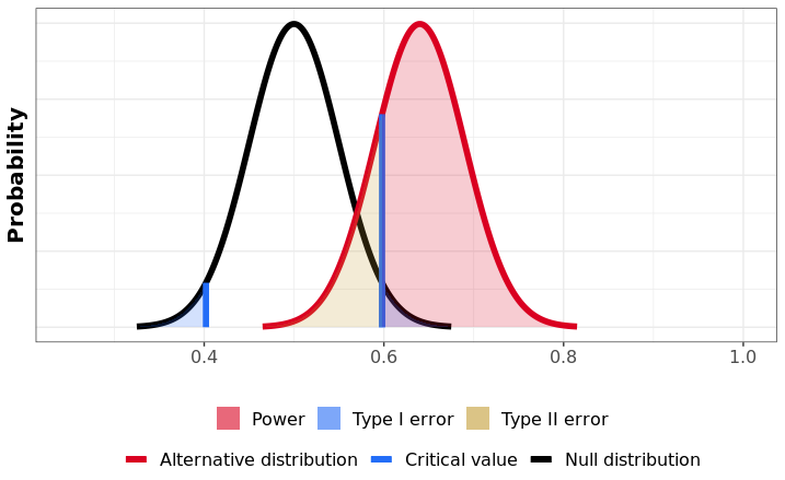
Towards a Reliable Device Management Platform

Post Syndicated from Netflix Technology Blog original https://netflixtechblog.com/towards-a-reliable-device-management-platform-4f86230ca623

By Benson Ma, Alok Ahuja

Introduction

At Netflix, hundreds of different device types, from streaming sticks to smart TVs, are tested every day through automation to ensure that new software releases continue to deliver the quality of the Netflix experience that our customers enjoy. In addition, Netflix continuously works with its partners (such as Roku, Samsung, LG, Amazon) to port the Netflix SDK to their new and upcoming devices (TVs, smart boxes, etc), to ensure the quality bar is reached before allowing the Netflix application on the device to go out into the world. The Partner Infrastructure team at Netflix provides solutions to support these two significant efforts by enabling device management at scale.

Background

To normalize the diversity of networking environments across both the Netflix and Partner networks and create a consistent and controllable computing environment on which users can run regression and Netflix application certification testing for devices, the Partner Infrastructure team provides a customized embedded computer called the Reference Automation Environment (RAE). Complementing the hardware is the software on the RAE and in the cloud, and bridging the software on both ends is a bi-directional control plane. Together, they form the Device Management Platform, which is the infrastructural foundation for Netflix Test Studio (NTS). Users then effectively run tests by connecting their devices to the RAE in a plug-and-play fashion.

The platform allows for effective device management at scale, and its feature set is broadly divided into two areas:

  1. Provide a service-level abstraction for controlling devices and their environments (hardware and software topologies).
  2. Collect and aggregate information and state updates for all devices attached to the RAEs in the fleet. In this blog post, we will focus on the latter feature set.

Over the lifecycle of a device connected to the RAE, the device can change attributes at any time. For example, when running tests, the state of the device will change from “available for testing” to “in test.” In addition, because many of these devices are pre-production devices and thus subject to frequent firmware changes, attributes that are generally static in production devices can sometimes change as well, such as the MAC address and the Electronic Serial Number (ESN) assigned to the Netflix installation on the device. As such, it is very critical to be able to keep device information up to date for device tests to work properly. In the Device Management Platform, this is achieved by having device updates be event-sourced through the control plane to the cloud so that NTS will always have the most up-to-date information about the devices available for testing. The challenge, then, is to be able to ingest and process these events in a scalable manner, i.e., scaling with the number of devices, which will be the focus of this blog post.

System Setup

Architecture

The following diagram summarizes the architecture description:

Figure 1: Event-sourcing architecture of the Device Management Platform.

The RAE is configured to be effectively a router that devices under test (DUTs) are connected to. On the RAE, there exists a service called the Local Registry, which is responsible for detecting, onboarding, and maintaining information about all devices connected to the LAN side of the RAE. When a new hardware device is connected, the Local Registry detects and collects a set of information about it, such as networking information and ESN. At periodic intervals, the Local Registry probes the device to check on its connection status. As the device attributes and properties change over time, these changes are saved into the Local Registry and simultaneously published upstream to the Device Management Platform’s control plane. In addition to attribute changes, a complete snapshot of the device record is published upstream by the Local Registry at regular intervals as a form of state reconciliation. These checkpoint events enable faster state reconstruction by consumers of the data feed while guarding against missed updates.

On the cloud side, a service called the Cloud Registry ingests the device information updates published by the Local Registry instance, processes them, and subsequently pushes materialized data into a datastore backed by CockroachDB. CockroachDB is chosen as the backing data store since it offered SQL capabilities, and our data model for the device records was normalized. In addition, unlike other SQL stores, CockroachDB is designed from the ground up to be horizontally scalable, which addresses our concerns about Cloud Registry’s ability to scale up with the number of devices onboarded onto the Device Management Platform.

Control Plane

MQTT forms the basis of the control plane for the Device Management Platform. MQTT is an OASIS standard messaging protocol for the Internet of Things (IoT) and was designed as a highly lightweight yet reliable publish/subscribe messaging transport that is ideal for connecting remote devices with a small code footprint and minimal network bandwidth. MQTT clients connect to the MQTT broker and send messages prefixed with a topic. In contrast, the broker is responsible for receiving all messages, filtering them, determining who is subscribed to which topic, and sending the messages to the subscribed clients accordingly. The key features that make MQTT highly appealing to us are its support for hierarchical topics, client authentication and authorization, per-topic ACLs, and bi-directional request/response message patterns, all of which are crucial for the business use cases we have for the control plane.

Inside the control plane, device commands and device information updates are prefixed with a topic string that includes both the RAE serial number and the device_session_id, which is a UUID corresponding to a device session. Embedding these two bits of information into the topic for every message allows for us to apply topic ACLs and effectively control which RAEs and DUTs users can see and interact with, in the safety and isolation against other users’ devices.

Since Kafka is a supported messaging platform at Netflix, a bridge is established between the two protocols to allow cloud-side services to communicate with the control plane. Through the bridge, MQTT messages are converted directly to Kafka records, where the record key is set to be the MQTT topic that the message was assigned to. Since device information updates published on MQTT contain the device_session_id in the topic, this means that all device information updates for a given device session will effectively appear on the same Kafka partition, thus giving us a well-defined message order for consumption.

Canary Test Workloads

In addition to serving the regular message traffic between users and DUTs, the control plane itself is stress-tested at roughly 3-hour intervals, where nearly 3000 ephemeral MQTT clients are created to connect to and generate flash traffic on the MQTT brokers. This is intended to be a canary test to verify that the brokers are online and able to handle sudden influxes of client connections and high message loads. As such, we can see that the traffic load on the Device Management Platform’s control plane is very dynamic over time.

Adherence to the Paved-Path

At Netflix, we emphasize building out solutions that use paved-path tooling as much as possible (see posts here and here). In particular, the flavor of Spring Boot Native maintained by the Runtime team is the basis for many of the web services developed inside Netflix (including the Cloud Registry). The Netflix Spring package comes with all the integrations needed for applications to work seamlessly within the Netflix ecosystem. In particular, the Kafka integration is the most relevant for this blog post.

Translating to System Requirements

Given the system setup that we have described, we came up with a list of fundamental business requirements that the Cloud Registry’s Kafka-based device updates processing solution must address.

Back-Pressure Support

Because the processing workload varies significantly over time, the solution must first and foremost scale with the message load by providing back-pressure support as defined in the Reactive Streams specification — in other words, the solution should be able to switch between push and pull-based back-pressure models depending on the downstream being able to cope with the message production rate or not.

In-Order Processing

The semantics of correct device information updates ingestion requires that messages be consumed in the order that they are produced. Since message order is guaranteed per Kafka partition, and all updates for a given device session are assigned to the same partition, this means that the order of processing of updates for each device can be enforced as long as only one thread is assigned per partition. At the same time, events arriving on different partitions should be processed in parallel for maximum throughput.

Fault Tolerance

If the underlying KafkaConsumer crashes due to ephemeral system or network events, it should be automatically restarted. If an exception is thrown during the consumption of a message, the exception should be gracefully caught, and message consumption should seamlessly continue after the offending message is dropped.

Graceful Shutdown

Application shutdowns are necessary and inevitable when a service is re-deployed, or its instance group is resized. As such, processor shutdowns should be invokable from outside of the Kafka consumption context to facilitate graceful application termination. In addition, since Kafka messages are usually pulled down in batches by the KafkaConsumer, the implemented solution should, upon receiving the shutdown signal, consume and drain all the already-fetched messages remaining in its internal queue prior to shutting down.

Paved-Path Integration

As mentioned earlier, Spring is heavily employed as the paved-path solution for developing services at Netflix, and the Cloud Registry is a Spring Boot Native application. Thus, the implemented solution must integrate with Netflix Spring facilities for authentication and metrics support at the very minimum — the former for access to the Kafka clusters and the latter for service monitoring and alerts. In addition, the lifecycle management of the implemented solution must also be integrated into Spring’s lifecycle management.

Long-Term Maintainability

The implemented solution must be friendly enough for long-term maintenance support. This means that it must at the very least be unit- and functional-testable for rapid and iterative feedback-driven development, and the code must be reasonably ergonomic to lower the learning curve for new maintainers.

Adopting a Stream Processing Framework

There are many frameworks available for reliable stream processing for integration into web services (for example, Kafka Streams, Spring KafkaListener, Project Reactor, Flink, Alpakka-Kafka, to name a few). We chose Alpakka-Kafka as the basis of the Kafka processing solution for the following reasons.

  1. Alpakka-Kafka turns out to satisfy all of the system requirements we laid out, including the need for Netflix Spring integration. It further provides advanced and fine-grained control over stream processing, including automatic back-pressure support and streams supervision.
  2. Compared to the other solutions that may satisfy all of our system requirements, Akka is a much more lightweight framework, with its integration into a Spring Boot application being relatively short and concise. In addition, Akka and Alpakka-Kafka code is much less terse than the other solutions out there, which lowers the learning curve for maintainers.
  3. The maintenance costs over time for an Alpakka-Kafka-based solution is much lower than that for the other solutions, as both Akka and Alpakka-Kafka are mature ecosystems in terms of documentation and community support, having been around for at least 12 and 6 years, respectively.

The construction of the Alpakka-based Kafka processing pipeline can be summarized with the following diagram:

Figure 2: Kafka processing pipeline employed by the Cloud Registry.

Implementation

The integration of Alpakka-Kafka streams with the Netflix Spring application context is very straightforward and is implemented as follows:

  1. Import the Alpakka-Kafka library in build.gradle, but exclude the kafka-client transitive dependency that comes packaged with it so that the Netflix internal-enhanced variant is used.
  2. Build a Spring @Configuration class that autowires the KafkaProperties bean injected by the Netflix Spring runtime and, using the Kafka settings available from that bean, construct an Alpakka-Kafka ConsumerSettings bean.
  3. Construct an Alpakka-Kafka processing graph using the ConsumerSettings bean as an input.

Because this integration explicitly uses the Netflix-enhanced KafkaConsumer and Netflix Spring-injected Kafka settings, the authentication, and metrics-logging facilities that come with the paved-path Spring KafkaListener are immediately enjoyed by the Alpakka-Kafka-based solution.

Testing

Functional testing of the Alpakka-Kafka consumers is very straightforward with the EmbeddedKafka library, which provides an in-memory Kafka instance to run tests against. To scale up testing with the complexity of the Kafka message processing pipeline, the message processing code was separated from the Alpakka-Kafka graph code. This allowed the message processing code to be tested separately using functional tests while minimizing the surface area of required testing by EmbeddedKafka-based Kafka integration tests.

Results

Prior to Alpakka-Kafka

The original Kafka processing solution implemented in the Cloud Registry was built on Spring KafkaListener, primarily due to its immediate availability as a paved-path solution provided by Netflix Spring. A timeline of the transition from Spring KafkaListener to Alpakka-Kafka is presented here for a better understanding of the motivations for the transition.

Memory and GC Troubles

The Spring KafkaListener-based solution was deployed earlier this year, during which messages on the Kafka topic were sparse because the Local Registry was not fully in production at the time. Upstream event sourcing was fully enabled on the producer side at around 2021–07–15 15:00 PST. By the following morning, alerts were received regarding high memory consumption and GC latencies, to the point where the service was unresponsive to HTTP requests. An investigation of the JVM memory dump revealed an internal Kafka message concurrent queue whose size had grown uncontrollably to over 1.3 million elements.

The cause for this abnormal queue growth is due to Spring KafkaListener’s lack of native back-pressure support. With KafkaListener, the Kafka message fetch rate is fixed on application startup. However, it can be adjusted by tuning the max-poll-interval-ms and max-poll-records configuration values, which need to be somehow determined empirically beforehand for best performance. This setup is neither optimal nor break-proof since the Kafka message processing rate will vary depending on environmental factors, such as database latencies in our system setup. As a result, the KafkaListener ends up effectively over-consuming messages over time, which is manifested in the growth of its internal message queue.

After doubling the number of service instances and increasing the instance sizes with only mediocre success, the decision was made to look into an alternative Kafka processing solution with full back-pressure management capabilities.

Kafka Topic Metrics

The enabling of event-sourcing from Local Registry significantly increased the Device Management Platform’s control plane traffic, as evidenced by the 9x growth of Kafka topic message publication frequency from 100 messages / 90 kB incoming per second to 900 messages / 840kB incoming per second (Figure 3).

Figure 3: Message traffic over time before and after event-sourcing was enabled.

The spikes that occur on 3-hour intervals shown here correspond to the canary runs mentioned earlier that effectively load-test the Kafka topic with a flood of new records. Hereafter, they will be referred to as burst events. While the average message publication rate is low compared to the data systems out there that produce hundreds of thousands, if not millions, events per second, it does highlight the significance of having back-pressure management in place even at the lower end of the message load spectrum.

Kafka Consumption Improvements with Alpakka-Kafka

We now compare the Kafka consumption between the Spring KafkaListener-based Kafka processing solution and the Alpakka-Kafka-based solution, the latter of which was deployed to production on 2021–07–23 18:00 PST. In particular, we will look at three indicators of Kafka consumption performance: the message fetch rate, the max consumer lag, and the commit rate.

Fetch Request Metrics

Upon deployment of the Alpakka-Kafka-based processor, we made a few observations:

  • Prior to the deployment, the number of fetch calls over time generally remained unchanged across burst events but was otherwise actually quite unstable over time (Figure 4).
  • After the deployment, the fetch calls over time followed a 1:1 correspondence with the Kafka topic’s message publication rate, including the interval burst events (Figure 4). Outside of the burst event windows, the number of fetch calls over time was very stable.
  • Surprisingly, the average number of records fetched per fetch request during the burst events windows decreased compared to that of the Spring KafkaListener-based processor (Figure 5).

What we can infer from these observations is that, with native back-pressure support in place, the Alpakka-Kafka-based processor is able to dynamically scale its Kafka consumption such that it is never under-consuming or over-consuming Kafka messages. This behavior keeps the processor constantly busy enough, but without overloading it with a growing queue of messages pulled from Kafka that eventually overflows the JVM’s memory and GC capacity.

Figure 4: Record fetch calls made by the KafkaConsumer over time, before and after deployment of the Alpakka-Kafka-based processor.
Figure 5: Average number of records fetched per fetch request over time, before and after deployment.

Max Consumer Lag

Except for JVM and service uptime, the most significant improvements with the Alpakka-Kafka-based processor manifested in the Kafka consumer lag metrics. While the Spring KafkaListener was deployed, the max consumer lag generally floated long-term at around 60,000 records, excluding the burst event time windows (this is not visually discernible from the graph due to the orders of magnitude differences in plotted values). From a functional point of view, this was unacceptable, as such a large constant lag value implies that device information updates will take a significantly long enough time to propagate into service such that it will be noticeable by our users. The situation exacerbates during the burst event windows, where the max consumer lag would increase to values of over 100 million records (Figure 6).

Since the deployment of the Alpakka-Kafka-based processor, the max consumer lag over time has averaged at zero outside of the burst event windows. Inside the burst event windows, the max consumer lag increases ephemerally to roughly 20,000 records, with only one outlier in the 48 hour time period since deployment (Figure 7). These metrics show us that the Kafka consumption patterns employed by Alpakka-Kafka and the streaming capabilities of Akka, in general, perform exceptionally well at scale, from the quiet use case to the presence of sudden huge message loads.

Figure 6: Max consumer lag of the KafkaConsumer over time, before and after deployment.
Figure 7: Max consumer lag of the KafkaConsumer over time, magnified to the time window some time after deployment.

Commit Rate and Average Commit Latency

When a Kafka consumer fetches records, it can perform manual or automatic offset commits — this is configurable through enable.auto.commit. Contrary to the name, the semantics of manual vs auto commit don’t necessarily refer to how the offset commits are performed, but when in relations to the record fetch-process cycle. With auto commits, messages are acknowledged to have been received as soon as they are fetched and irrespective of processing, whereas with manual commits, the consumer can decide to acknowledge only after a message is properly processed.

By default, when enable.auto.commit is set to false, the Spring KafkaListener performs an offset commit every time a record is processed, i.e., the acknowledgement mode is set to AckMode.RECORD. This is exceedingly inefficient, and is known to reduce the message consumption throughput of the consumer. With the Alpakka-Kafka-based processor, we opted for making record commits in batches (set to 1000 by default), with a max interval of 1 second allowed between commits. This behavior is similar to the AckMode.COUNT_TIME acknowledgement mode in Spring KafkaListener, but with the added benefit of automatically attempting to complete outstanding commit requests when the Kafka consumption fails or terminates.

Under a manual offset commit scheme, it is always possible to re-process Kafka messages in the case of failures. To retain the (mainly) exactly-once processing that is guaranteed by the automatic offset commit scheme, the Kafka processor was updated to store device updates using idempotent upserts, i.e., perform an upsert conditioned on the timestamp of record in the database being earlier than the timestamp of the update to be upserted. This effectively ensures exactly-once processing on a per-event basis.

With the deployment of the Alpakka-Kafka-based processor, the commit rate was significantly lowered from roughly 7 kbytes/sec to 50 bytes/sec (Figure 8), but the average commit latency increased from 1 ms on average to 12 ms (Figure 9). Nonetheless, this is a considerable reduction in the network overhead spent on committing offsets, and has contributed significantly to the improved throughput of the Kafka processing.

Figure 8: Rate of offset commits made by the KafkaConsumer over time, before and after deployment.
Figure 9: Average latency per offset commit over time, before and after deployment.

Conclusion

Kafka streams processing can be difficult to get right. Many system implementation details need to be considered in light of the business requirements. Fortunately, the primitives provided by Akka streams and Alpakka-Kafka empower us to achieve exactly this by allowing us to build streaming solutions that match the business workflows we have while scaling up developer productivity in building out and maintaining these solutions. With the Alpakka-Kafka-based processor in place in the Cloud Registry, we have ensured fault tolerance in the consumer side of the control plane, which is key to enabling accurate and reliable device state aggregation within the Device Management Platform.

Though we have achieved fault-tolerant message consumption, it is only one aspect of the design and implementation of the Device Management Platform. The reliability of the platform and its control plane rests on significant work made in several areas, including the MQTT transport, authentication and authorization, and systems monitoring, all of which we plan to discuss in detail in future blog posts. In the meantime, as a result of this work, we can expect the Device Management Platform to continue to scale to increasing workloads over time as we onboard ever more devices into our systems.


Towards a Reliable Device Management Platform was originally published in Netflix TechBlog on Medium, where people are continuing the conversation by highlighting and responding to this story.
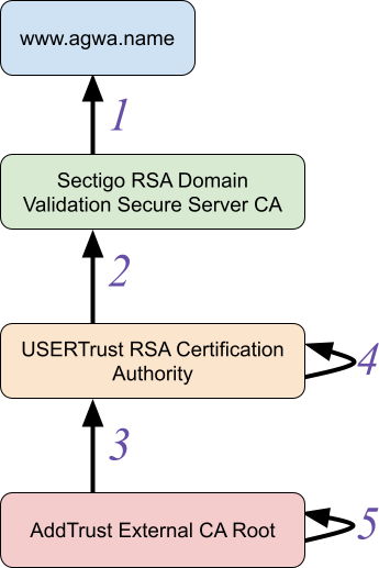
Data Movement in Netflix Studio via Data Mesh

Post Syndicated from Netflix Technology Blog original https://netflixtechblog.com/data-movement-in-netflix-studio-via-data-mesh-3fddcceb1059

By Andrew Nguonly, Armando Magalhães, Obi-Ike Nwoke, Shervin Afshar, Sreyashi Das, Tongliang Liu, Wei Liu, Yucheng Zeng

Background

Over the next few years, most content on Netflix will come from Netflix’s own Studio. From the moment a Netflix film or series is pitched and long before it becomes available on Netflix, it goes through many phases. This happens at an unprecedented scale and introduces many interesting challenges; one of the challenges is how to provide visibility of Studio data across multiple phases and systems to facilitate operational excellence and empower decision making. Netflix is known for its loosely coupled microservice architecture and with a global studio footprint, surfacing and connecting the data from microservices into a studio data catalog in real time has become more important than ever.

Operational Reporting is a reporting paradigm specialized in covering high-resolution, low-latency data sets, serving detailed day-to-day activities¹ and processes of a business domain. Such a paradigm aspires to assist front-line operations personnel and stakeholders in “running the business”²; performing their tasks through means such as ad hoc analysis, decision-support, and tracking (of tasks, assets, schedules, etc). The paradigm spans across methods, tools, and technologies and is usually defined in contrast to analytical reporting and predictive modeling which are more strategic (vs. tactical) in nature.

At Netflix Studio, teams build various views of business data to provide visibility for day-to-day decision making. With dependable near real-time data, Studio teams are able to track and react better to the ever-changing pace of productions and improve efficiency of global business operations using the most up-to-date information. Data connectivity across Netflix Studio and availability of Operational Reporting tools also incentivizes studio users to avoid forming data silos.

The Journey

In the past few years, Netflix Studio has gone through few iterations of data movement approaches. In the initial stage, data consumers set up ETL pipelines directly pulling data from databases. With this batch style approach, several issues have surfaced like data movement is tightly coupled with database tables, database schema is not an exact mapping of business data model, and data being stale given it is not real time etc. Later on, we moved to event driven streaming data pipelines (powered by Delta), which solved some problems compared to the batch style, but had its own pain points, such as a high learning curve of stream processing technologies, manual pipeline setup, a lack of schema evolution support, inefficiency of onboarding new entities, inconsistent security access models, etc.

With the latest Data Mesh Platform, data movement in Netflix Studio reaches a new stage. This configuration driven platform decreases the significant lead time when creating a new pipeline, while offering new support features like end-to-end schema evolution, self-serve UI and secure data access. The high level diagram below indicates the latest version of data movement for Operational Reporting.

Operational Reporting Architecture Overview

For data delivery, we leverage the Data Mesh platform to power the data movement. Netflix Studio applications expose GraphQL queries via Studio Edge, which is a unified graph that connects all data in Netflix Studio and provides consistent data retrieval. Change Data Capture(CDC) source connector reads from studio applications’ database transaction logs and emits the change events. The CDC events are passed on to the Data Mesh enrichment processor, which issues GraphQL queries to Studio Edge to enrich the data. Once the data has landed in the Iceberg tables in Netflix Data Warehouse, they could be used for ad-hoc or scheduled querying and reporting. Centralized data will be moved to third party services such as Google Sheets and Airtable for the stakeholders. We will deep dive into Data Delivery and Data Consumption in the following sections.

Data Delivery via Data Mesh

What is Data Mesh?

Data Mesh is a fully managed, streaming data pipeline product used for enabling Change Data Capture (CDC) use cases. In Data Mesh, users create sources and construct pipelines. Sources mimic the state of an externally managed source — as changes occur in the external source, corresponding CDC messages are produced to the Data Mesh source. Pipelines can be configured to transform and store data to externally managed sinks.

Data Mesh provides a drag-and-drop, self-service user interface for exploring sources and creating pipelines so that users can focus on delivering business value without having to worry about managing and scaling complex data streaming infrastructure.

CDC and data source

Change data capture or CDC, is a semantic for processing changes in a source for the purpose of replicating those changes to a sink. The table changes could be row changes (insert row, update row, delete row) or schema changes (add column, alter column, drop column). As of now, CDC sources have been implemented for data stores at Netflix (MySQL, Postgres). CDC events can also be sent to Data Mesh via a Java Client Producer Library.

Reusable Processors and Configuration Driven

In Data Mesh, a processor is a configurable data processing application that consumes, transforms, and produces CDC events. A processor has 1 or more inputs and 0 or more outputs. Processors with 0 outputs are sink connectors; which write events to externally managed sinks (e.g. Iceberg, ElasticSearch, etc).

Processors with Different Inputs/Outputs

Data Mesh allows developers to contribute processors to the platform. Processors are not necessarily centrally developed and managed. However, the Data Mesh platform team strives to provide and manage the most highly leveraged processors (e.g. source connectors and sink connectors)

Processors are reusable. The same processor image package is used multiple times for all instances of the processor. Each instance is configured to fit each use case. For example, a GraphQL enrichment processor can be provisioned to query GraphQL Services to enrich data in different pipelines; an Iceberg sink processor can be initialized multiple times to write data to different databases/tables with different schema.

End-to-End Schema Evolution

Schema is a key component of Data Mesh. When an upstream schema evolves (e.g. schema change in the MySQL table), Data Mesh detects the change, checks the compatibility and applies the change to the downstream. With schema evolution, Data Mesh ensures the Operational Reporting pipelines always produce data with the latest schema.

We will cover a few core concepts in the Data Mesh Schema domain.

Consumer schema
Consumer schema defines how data is consumed by the downstream processors. See example below.

Consumer Schema Example
Consumer Schema Example

Schema Compatibility
Data Mesh uses Consumer Schema compatibility to achieve flexible yet safe schema evolution. If a field consumed by an Operational Reporting pipeline is removed from CDC source, Data Mesh categorizes this change as incompatible, pauses the pipeline processing and notifies the pipeline owner. On the other hand, if a required field is not consumed by any consumer, dropping such fields would be compatible.

Two Types of Processors
1. Pass through all fields from upstream to downstream.

  • Example: Filter Processor, Sink Processors
Opt in to schema Evolution example

2. Only uses a subset of fields from upstream.

  • Example: Project Processor, Enrichment Processor
Opt out to schema Evolution example

In Data Mesh, we introduce the Opt-in to Schema Evolution boolean flag to differentiate those two types of use cases.

  • Opt in: All the upstream fields will be propagated to the processor. For example, when a new field is added upstream, it will be propagated automatically.
  • Opt out: Only a subset of fields (defined using ‘Is Consumed’ checkboxes) is propagated and used in the processor. Upstream changes to the rest of the fields won’t affect this processor.

Schema Propagation
After the Schema Compatibility is checked, Data Mesh Platform will propagate the schema change based on the end user’s intention. With the opt-in to schema Evolution flag, Operational Reporting pipelines can keep the schema up-to-date with upstream data stores. As part of schema propagation, the platform also syncs the schema from the pipeline to the Iceberg sink.

Schema Evolution Diagram

Enrichment Processor via GraphQL

In the current Data Mesh Operational Reporting pipelines, the most commonly used intermediate processor is the GraphQL Enrichment Processor. It takes in the column value from CDC events coming from Source Connector as GraphQL query input, then submits a query to Studio Edge to enrich the data. With Studio Edge’s single data model, it centralizes data modeling efforts, which is highly leveraged by Studio UI Apps, Backend services and Search platforms. Enriching the data via Studio Edge helps us achieve consistent data modeling across the whole ecosystem for Operational Reporting.

Here is the example of GraphQL processor configuration, pipeline builder only need config the following fields to provision an enrichment processor:

GraphQL Enrichment Processor Configuration Example

The image below is a sample Operational Reporting pipeline in the production environment to sink the Movie related data. Teams who want to move their data no longer need to learn and write customized Stream Processing jobs. Instead they just need to configure the pipeline topology in the UI while getting other features like schema evolution and secure data access out of the box.

Operational Reporting Pipeline Example

Iceberg Sink

Apache Iceberg is an open source table format for huge analytics datasets. Data Mesh leverages Iceberg tables as data warehouse sinks for downstream analytics use cases. Currently Iceberg sink is appended only. Views are built on top of the raw Iceberg tables to retrieve the latest record for every primary key based on the operational timestamp, which indicates when the record is produced in the sink. Current pipeline consumers are directly consuming Views instead of raw tables.

The compaction process is needed to optimize the performance of downstream queries on the business view as well as lower costs of S3 GET OBJECT operations. A daily process ranks the records by timestamp to generate a data frame of compacted records. Old data files are overwritten with a set of new data files that contain only the compacted data.

Data Quality

Data Mesh provides metrics and dashboards at both the processor and pipeline level for operational observability. Operational Reporting pipeline owners will get alerts if something goes wrong with their pipelines. We also have two types of auditing on the data tables generated from Data Mesh pipelines to guarantee data quality: end-to-end auditing and synthetic events.

Most of the business views created on top of the Iceberg tables can tolerate a few minutes of latency. However, it is paramount that we validate the complete set of identifiers such as a list of movie ids across producers and consumers for higher overall confidence in the data transport layer of choice. For end-to-end audits, the objective is to run the audits hourly via Big data Platform Scheduler, which is a centralized and integrated tool provided by Netflix data platform for running workflows in an efficient, reliable and reproducible way. The audits check for equality (i.e. query results should be the same), the symmetric difference between two data sets should be empty across multiple runs, and the eventual consistency within the SLA. An hourly notification is sent when a set of primary keys consistently do not match between source of truth and target Data Mesh tables.

End to End (Black Box) Auditing Example

Synthetic events audits are artificially triggered change events to imitate common CUD operations of services. It is generating heartbeat signals at a constant frequency with the objective of using them as a baseline to verify the health of the pipeline regardless of traffic patterns or occasional silences.

Data Consumption

Our studio partners rely on data to make informed decisions and to collaborate during all the phases related to production. The Studio Tech Solutions team provides near real-time reports in some data tool of choice, which we call trackers to empower the decision making.

For the past few years, many of these trackers were powered by hand-curated SQL scripts and API calls being managed by CRON schedulers implemented in a Java Service called Lego. Lego was the main tool for the STS team, and at its peak, Lego managed 300+ trackers.

This strategy had its own set of challenges: being schema-less and treating every report column like a string not always worked out, the volatile reliance on direct RDS connections and rate limits from third party APIs would often make jobs fail. We had a set of “core views” which would be specifically tailored for reports, but this caused queries that just required a very small subset of fields to be slow and expensive due to the view doing a huge amount of joining and aggregation work before being able to retrieve that small subset.

Besides the issues, this worked fine when we didn’t have many trackers to maintain, but as we created more trackers to the point of having many hundreds, we started having issues around maintenance, awareness, knowledge sharing and standardization. New team members had a hard time getting onboard, figuring out which SQL powered which tracker was tough, the lack of standards made every SQL look different and having to update trackers as the data sources changed was a nightmare.

With this in mind, the Studio Tech Solutions focused efforts in building Genesis, a Semantic Data Layer that allows the team to map data points in Data Source Definitions defined as YAML files and then use those to generate the SQL needed for the trackers, based on a selection of fields, filters and formatters specified in an Input Definition file. Genesis takes care of joining, aggregating, formatting and filtering data based on what is available in the Data Source Definitions and specified by the user through the Input Definition being executed.

Genesis Data Source and Input definition example

Genesis is a stateless CLI written in Node.js that reads everything it needs from the file system based on the paths specified in the arguments. This allows us to hook Genesis into Jenkins Jobs, providing a GitOps and CI experience to maintain existing trackers, as well as create new trackers. We can simply change the data layer, trigger an empty pull request, review the changes and have all our trackers up to date with the data source changes.

As of the date of writing, Genesis powers 240+ trackers and is growing everyday, empowering thousands of partners in our studios globally to collaborate, annotate and share information using near-real-time data.

Git-based Tracker management workflow powered by Genesis and the Big Data Scheduler

The generated queries are then used in Workflow Definitions for multiple trackers. The Netflix Data Warehouse offers support for users to create data movement workflows that are managed through our Big Data Scheduler, powered by Titus.

We use the scheduler to execute our queries and move the results to a data tool, which often is a Google Sheet Tab, Airtable base or Tableau dashboard. The scheduler offers templated jobs for moving data from a Presto SQL output to these tools, making it easy to create and maintain hundreds of data movement workflows.

The diagram below summarizes the data consumption flow when building trackers:

Data Consumption Overview

As of July 2021, the Studio Tech Solutions team is finishing a migration from all the trackers built in Lego to use Genesis and the Data Portal. This strategy has increased the Studio Tech Solutions team performance and stability. Trackers are now easy for the team to create, review, change, monitor and discover.

Now and Future

In conclusion, our studio partners have a tracker available to them, populated with near real-time data and tailored to their needs. They can manipulate, annotate, and collaborate using a flexible tool they are familiar with.

Along the journey, we have learned that evolving data movement in complex domains could take multiple iterations and needs to be driven by the business impact. The great cross-functional partnership and collaboration among all data stakeholders is crucial to shape the ideal data product.

However, our story doesn’t end here. We still have a long journey ahead of us to fulfill the vision of such ideal data product, especially in areas such as:

  • Self-servicing data pipelines provisioning via configuration
  • Providing toolings for data discoverability, understandability, usage visibility and change management
  • Enabling data domain orientation and ownership/governance management
  • Bootstrapping trackers in our Studio ecosystem instead of third party tools. Along the same line as the point above, this would allow us to maintain high standards of data governance, lineage, and security.
  • Read-write reports and trackers using GraphQL mutations

These are some of the interesting areas that Netflix Studio is planning to invest in. We will have follow up blog posts on these topics in future. Please stay tuned!

Endnotes

¹ Inmon, Bill. Operational and Informational Reporting, Information Management, July 1st, 2000.
² Dehghani, Zhamak. Data Mesh: Delivering Data-driven Value at Scale, O’Reilly Media, Inc., 2021.

Acknowledgements

Data Movement via Data Mesh has been a success in Netflix Studio owing to multiple teams’ efforts. We would like to acknowledge the following colleagues: Amanda Benhamou, Andreas Andreakis, Anthony Preza, Bo Lei, Charles Zhao, Justin Cunningham, Kasturi Chatterjee, Kevin Zhu, Stephanie Barreyro, Yoomi Koh.


Data Movement in Netflix Studio via Data Mesh was originally published in Netflix TechBlog on Medium, where people are continuing the conversation by highlighting and responding to this story.
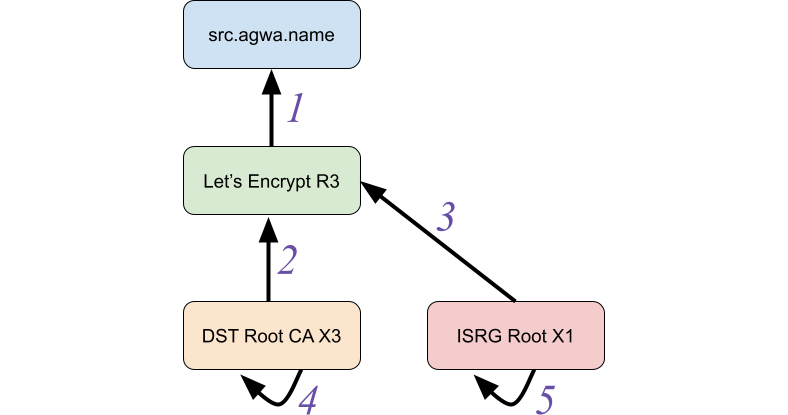
Data Engineers of Netflix — Interview with Kevin Wylie

Post Syndicated from Netflix Technology Blog original https://netflixtechblog.com/data-engineers-of-netflix-interview-with-kevin-wylie-7fb9113a01ea

Data Engineers of Netflix — Interview with Kevin Wylie

This post is part of our “Data Engineers of Netflix” series, where our very own data engineers talk about their journeys to Data Engineering @ Netflix.

Kevin Wylie is a Data Engineer on the Content Data Science and Engineering team. In this post, Kevin talks about his extensive experience in content analytics at Netflix since joining more than 10 years ago.

Kevin grew up in the Washington, DC area, and received his undergraduate degree in Mathematics from Virginia Tech. Before joining Netflix, he worked at MySpace, helping implement page categorization, pathing analysis, sessionization, and more. In his free time he enjoys gardening and playing sports with his 4 kids.

His favorite TV shows: Ozark, Breaking Bad, Black Mirror, Barry, and Chernobyl

Since I joined Netflix back in 2011, my favorite project has been designing and building the first version of our entertainment knowledge graph. The knowledge graph enabled us to better understand the trends of movies, TV shows, talent, and books. Building the knowledge graph offered many interesting technical challenges such as entity resolution (e.g., are these two movie names in different languages really the same?), and distributed graph algorithms in Spark. After we launched the product, analysts and scientists began surfacing new insights that were previously hidden behind difficult-to-use data. The combination of overcoming technical hurdles and creating new opportunities for analysis was rewarding.

Kevin, what drew you to data engineering?

I stumbled into data engineering rather than making an intentional career move into the field. I started my career as an application developer with basic familiarity with SQL. I was later hired into my first purely data gig where I was able to deepen my knowledge of big data. After that, I joined MySpace back at its peak as a data engineer and got my first taste of data warehousing at internet-scale.

What keeps me engaged and enjoying data engineering is giving super-suits and adrenaline shots to analytics engineers and data scientists.

When I make something complex seem simple, or create a clean environment for my stakeholders to explore, research and test, I empower them to do more impactful business-facing work. I like that data engineering isn’t in the limelight, but instead can help create economies of scale for downstream analytics professionals.

What drew you to Netflix?

My wife came across the Netflix job posting in her effort to keep us in Los Angeles near her twin sister’s family. As a big data engineer, I found that there was an enormous amount of opportunity in the Bay Area, but opportunities were more limited in LA where we were based at the time. So the chance to work at Netflix was exciting because it allowed me to live closer to family, but also provided the kind of data scale that was most common for Bay Area companies.

The company was intriguing to begin with, but I knew nothing of the talent, culture, or leadership’s vision. I had been a happy subscriber of Netflix’s DVD-rental program (no late fees!) for years.

After interviewing, it became clear to me that this company culture was different than any I had experienced.

I was especially intrigued by the trust they put in each employee. Speaking with fellow employees allowed me to get a sense for the kinds of people Netflix hires. The interview panel’s humility, curiosity and business acumen was quite impressive and inspired me to join them.

I was also excited by the prospect of doing analytics on movies and TV shows, which was something I enjoyed exploring outside of work. It seemed fortuitous that the area of analytics that I’d be working in would align so well with my hobbies and interests!

Kevin, you’ve been at Netflix for over 10 years now, which is pretty incredible. Over the course of your time here, how has your role evolved?

When I joined Netflix back in 2011, our content analytics team was just 3 people. We had a small office in Los Angeles focused on content, and significantly more employees at the headquarters in Los Gatos. The company was primarily thought of as a tech company.

At the time, the data engineering team mainly used a data warehouse ETL tool called Ab Initio, and an MPP (Massively Parallel Processing) database for warehousing. Both were appliances located in our own data center. Hadoop was being lightly tested, but only in a few high-scale areas.

Fast forward 10 years, and Netflix is now the leading streaming entertainment service — serving members in over 190 countries. In the data engineering space, very little of the same technology remains. Our data centers are retired, Hadoop has been replaced by Spark, Ab Initio and our MPP database no longer fits our big data ecosystem.

In addition to the company and tech shifting, my role has evolved quite a bit as our company has grown. When we were a smaller company, the ability to span multiple functions was valued for agility and speed of delivery. The sooner we could ingest new data and create dashboards and reports for non-technical users to explore and analyze, the sooner we could deliver results. But now, we have a much more mature business, and many more analytics stakeholders that we serve.

For a few years, I was in a management role, leading a great team of people with diverse backgrounds and skill sets. However, I missed creating data products with my own hands so I wanted to step back into a hands-on engineering role. My boss was gracious enough to let me make this change and focus on impacting the business as an individual contributor.

As I think about my future at Netflix, what motivates me is largely the same as what I’ve always been passionate about. I want to make the lives of data consumers easier and to enable them to be more impactful. As the company scales and as we continue to invest in storytelling, the opportunity grows for me to influence these decisions through better access to information and insights. The biggest impact I can make as a data engineer is creating economies of scale by producing data products that will serve a diverse set of use cases and stakeholders.

If I can build beautifully simple data products for analytics engineers, data scientists, and analysts, we can all get better at Netflix’s goal: entertaining the world.

Learning more

Interested in learning more about data roles at Netflix? You’re in the right place! Keep an eye out for our open roles in Data Science and Engineering by visiting our jobs site here. Our culture is key to our impact and growth: read about it here. To learn more about our Data Engineers, check out our chats with Dhevi Rajendran and Samuel Setegne.


Data Engineers of Netflix — Interview with Kevin Wylie was originally published in Netflix TechBlog on Medium, where people are continuing the conversation by highlighting and responding to this story.

Exploring Data @ Netflix

Post Syndicated from Netflix Technology Blog original https://netflixtechblog.com/exploring-data-netflix-9d87e20072e3

By Gim Mahasintunan on behalf of Data Platform Engineering.

Supporting a rapidly growing base of engineers of varied backgrounds using different data stores can be challenging in any organization. Netflix’s internal teams strive to provide leverage by investing in easy-to-use tooling that streamlines the user experience and incorporates best practices.

In this blog post, we are thrilled to share that we are open-sourcing one such tool: the Netflix Data Explorer. The Data Explorer gives our engineers fast, safe access to their data stored in Cassandra and Dynomite/Redis data stores.

Netflix Data Explorer on GitHub

History

We began this project several years ago when we were onboarding many new Dynomite customers. Dynomite is a high-speed in-memory database, providing highly available cross datacenter replication while preserving Redis-like semantics. We wanted to lower the barrier for adoption so users didn’t need to know datastore-specific CLI commands, could avoid mistakenly running commands that might negatively impact performance, and allow them to access the clusters they frequented every day.

As the project took off, we saw a similar need for our other datastores. Cassandra, our most significant footprint in the fleet, seemed like a great candidate. Users frequently had questions on how they should set up replication, create tables using an appropriate compaction strategy, and craft CQL queries. We knew we could give our users an elevated experience, and at the same time, eliminate many of the common questions on our support channels.

We’ll explore some of the Data Explorer features, and along the way, we’ll highlight some of the ways we enabled the OSS community while still handling some of the unique Netflix-specific use cases.

Multi-Cluster Access

By simply directing users to a single web portal for all of their data stores, we can gain a considerable increase in user productivity. Furthermore, in production environments with hundreds of clusters, we can reduce the available data stores to those authorized for access; this can be supported in OSS environments by implementing a Cluster Access Control Provider responsible for fetching ownership information.

Browsing your accessible clusters in different environments and regions

Schema Designer

Writing CREATE TABLE statements can be an intimidating experience for new Cassandra users. So to help lower the intimidation factor, we built a schema designer that lets users drag and drop their way to a new table.

The schema designer allows you to create a new table using any primitive or collection data type, then designate your partition key and clustering columns. It also provides tools to view the storage layout on disk; browse the supported sample queries (to help design efficient point queries); guide you through the process of choosing a compaction strategy, and many other advanced settings.

Dragging and dropping your way to a new Cassandra table

Explore Your Data

You can quickly execute point queries against your cluster in Explore mode. The Explore mode supports full CRUD of records and allows you to export result sets to CSV or download them as CQL insert statements. The exported CQL can be a handy tool for quickly replicating data from a PROD environment to your TEST environment.

Explore mode gives you quick access to table data

Support for Binary Data

Binary data is another popular feature used by many of our engineers. The Data Explorer won’t fetch binary value data by default (as the persisted data might be sizable). Users can opt-in to retrieve these fields with their choice of encoding.

Choosing how you want to decode blob data

Query IDE

Efficient point queries are available in the Explore mode, but you may have users that still require the flexibility of CQL. Enter the Query mode, which includes a powerful CQL IDE with features like autocomplete and helpful snippets.

Example of free-form Cassandra queries with autocomplete assistance

There are also guardrails in place to help prevent users from making mistakes. For instance, we’ll redirect the user to a bespoke workflow for deleting a table if they try to perform a “DROP TABLE…” command ensuring the operation is done safely with additional validation. (See our integration with Metrics later in this article.)

As you submit queries, they will be saved in the Recent Queries view as well — handy when you are trying to remember that WHERE clause you had crafted before the long weekend.

Dynomite and Redis Features

While C* is feature-rich and might have a more extensive install base, we have plenty of good stuff for Dynomite and Redis users too. Note, the terms Dynomite and Redis are used interchangeably unless explicitly distinguished.

Key Scanning

Since Redis is an in-memory data store, we need to avoid operations that inadvertently load all the keys into memory. We perform SCAN operations across all nodes in the cluster, ensuring we don’t strain the cluster.

Scanning for keys on a Dynomite cluster

Dynomite Collection Support

In addition to simple String keys, Dynomite supports a rich collection of data types, including Lists, Hashes, and sorted and unsorted Sets. The UI supports creating and manipulating these collection types as well.

Editing a Redis hash value

Supporting OSS

As we were building the Data Explorer, we started getting some strong signals that the ease-of-use and productivity gains that we’d seen internally would benefit folks outside of Netflix as well. We tried to balance codifying some hard-learned best practices that would be generally applicable while maintaining the flexibility to support various OSS environments. To that end, we’ve built several adapter layers into the product where you can provide custom implementations as needed.

The application was architected to enable OSS by introducing seams where users could provide their implementations for discovery, access control, and data store-specific connection settings. Users can choose one of the built-in service providers or supply a custom provider.

The diagram below shows the server-side architecture. The server is a Node.js Express application written in TypeScript, and the client is a Single Page App written in Vue.js.

Data Explorer architecture and service adapter layers

Demo Environment

Deploying a new tool in any real-world environment is a time commitment. We get it, and to help you with that initial setup, we have included a dockerized demo environment. It can build the app, pull down images for Cassandra and Redis, and run everything in Docker containers so you can dive right in. Note, the demo environment is not intended for production use.

Overridable Configuration

The Data Explorer ships with many default behaviors, but since no two production environments are alike, we provide a mechanism to override the defaults and specify your custom values for various settings. These can range from which port numbers to use to which features should be disabled in a production environment. (For example, the ability to drop a Cassandra table.)

CLI Setup Tool

To further improve the experience of creating your configuration file, we have built a CLI tool that provides a series of prompts for you to follow. The CLI tool is the recommended approach for building your configuration file, and you can re-run the tool at any point to create a new configuration.

The CLI allows you to create a custom configuration

You can also generate multiple configuration files and easily switch between them when working with different environments. We have instructions on GitHub on working with more than one configuration file.

Service Adapters

It’s no secret that Netflix is a big proponent of microservices: we have discovery services for identifying Cassandra and Dynomite clusters in the environment; access-control services that identify who owns a data store and who can access it; and LDAP services to find out information about the logged-in user. There’s a good chance you have similar services in your environment too.

To help enable such environments, we have several pre-canned configurations with overridable values and adapter layers in place.

Discovery

The first example of this adapter layer in action is how the application finds Discovery information — these are the names and IP addresses of the clusters you want to access. The CLI allows you to choose from a few simple options. For instance, if you have a process that can update a JSON file on disk, you can select “file system.” If instead, you have a REST-based microservice that provides this information, then you can choose “custom” and write a few lines of code necessary to fetch it.

Choosing to discover our data store clusters by reading a local file

Metrics

Another example of this service adapter layer is integration with an external metrics service. We progressively enhance the UI by displaying keyspace and table metrics by implementing a metrics service adapter. These metrics provide insight into which tables are being used at a glance and help our customers make an informed decision when dropping a table.

Without metrics support
With optional metrics support

OSS users can enable the optional Metrics support via the CLI. You then just need to write the custom code to fetch the metrics.

CLI enabling customization of advanced features

i18n Support

While internationalization wasn’t an explicit goal, we discovered that providing Netflix-specific messages in some instances yielded additional value to our internal users. Fundamentally, this is similar to how resource bundles handle different locales.

We are making en-NFLX.ts available internally and en-US.ts available externally. Enterprise customers can enhance their user’s experience by creating custom resource bundles (en-ACME.ts) that link to other tools or enhance default messages. Only a small percentage of the UI and server-side exceptions use these message bundles currently — most commonly to augment messages somehow (e.g., provide links to internal slack channels).

Final Thoughts

We invite you to check out the project and let us know how it works for you. By sharing the Netflix Data Explorer with the OSS community, we hope to help you explore your data and inspire some new ideas.


Exploring Data @ Netflix was originally published in Netflix TechBlog on Medium, where people are continuing the conversation by highlighting and responding to this story.

Introducing Netflix Timed Text Authoring Lineage

Post Syndicated from Netflix Technology Blog original https://netflixtechblog.com/introducing-netflix-timed-text-authoring-lineage-6fb57b72ad41

A Script Authoring Specification

By: Bhanu Srikanth, Andy Swan, Casey Wilms, Patrick Pearson

The Art of Dubbing and Subtitling

Dubbing and subtitling are inherently creative processes. At Netflix, we strive to make shows as joyful to watch in every language as in the original language, whether a member watches with original or dubbed audio, closed captions, forced narratives, subtitles or any combination they prefer. Capturing creative vision and nuances in translation is critical to achieving this goal. Creating a dub or a subtitle is a complex, multi-step process that involves:

  • Transcribing and timing the dialogue in the original language from a completed show to create a source transcription text
  • Notating dialogue events with character information and other annotations
  • Generating localization notes to guide further adaptation
  • Translating the dialogue to a target language
  • Adapting the translation to the dubbing and subtitling specifications; ex. matching the actor’s lip movements in the case of dubs and considering reading speeds and shot changes for subtitles

Authoring Scripts

Script files are the essence and the driving force in the localization workflow. They carry dialogue, timecodes and other information as they travel from one tool to another to be transcribed, translated, and adapted for performance by voice artists. Dub scripts, Audio Description, Forced Narratives, Closed Captions, and Subtitles all need to be authored in complex tools that manage the timing, location, and formatting of the text on screen.

Currently, scripts get delivered to Netflix in various ways — Microsoft Word, PDF, Microsoft Excel, Rich Text files, etc., to name a few. These carry crucial information such as dialogues, timecodes, annotations, and other localization contexts. However, the variety of these file formats and inconsistent way of specifying such information across them has made efforts to streamline the localization workflow unattainable in the past.

Timed Text Authoring Lineage, an Authoring Specification

We decided to remove this stumbling block by developing a new authoring specification called Timed Text Authoring Lineage (TTAL). It enables a seamless exchange of script files between various authoring and prompting tools in the localization pipeline. A TTAL file carries all pertinent information such as type of script, dialogues, timecode, metadata, original language text, transcribed text, language information etc. We have designed TTAL to be robust and extensible to capture all of these details.

By defining vocabulary and annotations around timed text, we strive to simplify our approach to capturing, storing, and sharing materials across the localization pipeline. The name TTAL is carefully crafted to convey its purpose and usage:

  • “Timed Text” in the name means it carries the dialogue along with the corresponding timecode
  • “Authoring” underscores that this is used for authoring scripts in dubbing and subtitling
  • The “Lineage” part of the name speaks to how the script has evolved from the time the show was produced in one language to the time when it was performed in another language by the voice actors or subtitled in other languages.

In a nutshell, TTAL has been designed to simplify script authoring, so the creative energy is spent on the art of dubbing and subtitling rather than managing adapted and recorded script delivery.
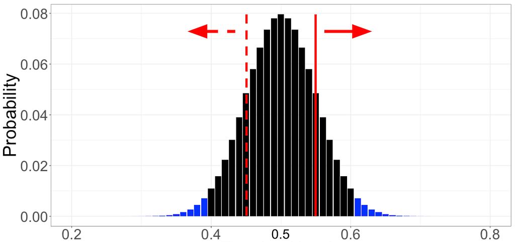
Example TTAL Workflow In Dubbing

We have been piloting the authoring and exchange of TTAL scripts as well as the associated workflow with our technology partners and English dubbing partners over the last few months. We receive adapted scripts before recording and again once recording is complete. This workflow, illustrated below, has enabled our dubbing partners to deliver more accurate scripts at crucial moments.
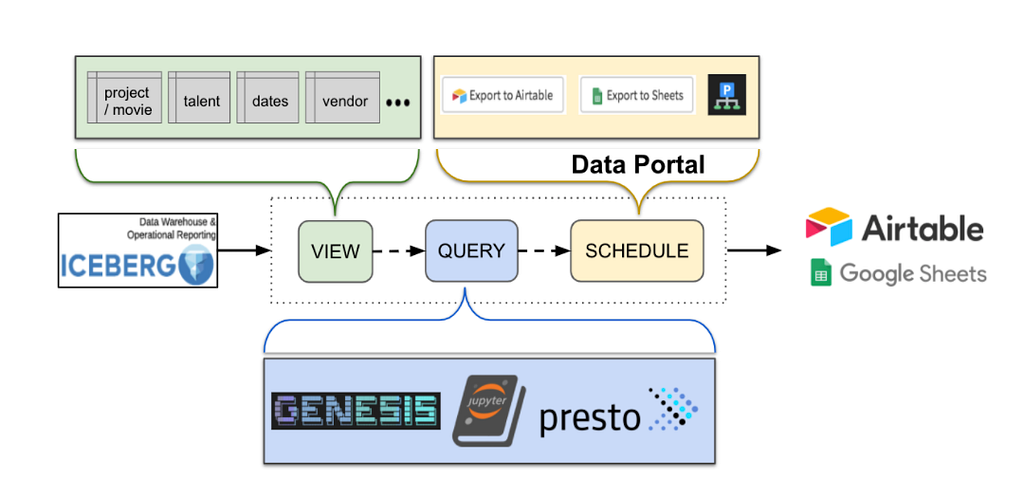
Prompting Tools

As an initial step, we worked closely with several dubbing technology providers to incorporate TTAL into their product using JSON as the underlying format. We appreciate the efforts put forth by the developers of these products for test driving TTAL and giving us crucial feedback to improve it.

Third-party tools that support import and export of scripts in TTAL are:

Servicing The Ultimate Goal

Having tools in the localization pipeline adopt TTAL as a unified way to exchange scripts will be beneficial to all players in the ecosystem in more ways than one. It will improve the capture of consistently structured dub scripts giving us the ability to better parse and leverage the contents of scripts, pave the path for streamlining the workflow, and enable interoperability between tools in the localization pipeline. Ultimately, all these will serve Netflix’s unwavering goal of fulfilling and maintaining the creative vision throughout the localization process.

Moving Forward

This is just the beginning. We have laid a solid foundation for enabling interoperability by developing a specification for script authoring. We have worked with a few dubbing technology developers to incorporate TTAL into their products, and have modified the specification based on feedback from these early adopters. In addition, we have piloted the workflow with our English dubbing partners.

These efforts have proven that Timed Text Authoring Lineage fills a crucial gap and benefits the entire localization ecosystem, from individual transcribers and script authors, dubbing and subtitling service providers, to technology developers and content creators. We are confident that enabling tools to exchange scripts seamlessly will remove operational headaches and make additional time and effort available for the art of transcribing, translation and adaptation of subtitles and dubs.

Finally, TTAL is an evolving specification. As the adoption of TTAL continues, we expect to learn more and improve the specifications. We are committed to continued collaboration with our localization partners and tool developers to mature this further. If you are interested in incorporating TTAL in the tools you are developing, please reach out to us at [email protected] to learn more about this exciting new specification and explore how you can use TTAL in your workflows. Please check out this video to learn how TTAL exports work in VoiceQ, one of the first prompting tools to incorporate TTAL.


Introducing Netflix Timed Text Authoring Lineage was originally published in Netflix TechBlog on Medium, where people are continuing the conversation by highlighting and responding to this story.