This is the first entry of a multi-part blog series describing how we built a Real-Time Distributed Graph (RDG). In Part 1, we will discuss the motivation for creating the RDG and the architecture of the data processing pipeline that populates it.
Introduction
The Netflix product experience historically consisted of a single core offering: streaming video on demand. Our members logged into the app, browsed, and watched titles such as Stranger Things, Squid Game, and Bridgerton. Although this is still the core of our product, our business has changed significantly over the last few years. For example, we introduced ad-supported plans, live programming events (e.g., Jake Paul vs. Mike Tyson and NFL Christmas Day Games), and mobile games as part of a Netflix subscription. This evolution of our business has created a new class of problems where we have to analyze member interactions with the app across different business verticals. Let’s walk through a simple example scenario:
Imagine a Netflix member logging into the app on their smartphone and beginning to watch an episode of Stranger Things.
Eventually, they decide to watch on a bigger screen, so they log into the app on a smart TV in their home and continue watching the same episode.
Finally, after completing the episode, they log into the app on their tablet and play the game “Stranger Things: 1984”.
We want to know that these three activities belong to the same member, despite occurring at different times and across various devices. In a traditional data warehouse, these events would land in at least two different tables and may be processed at different cadences. But in a graph system, they become connected almost instantly. Ultimately, analyzing member interactions in the app across domains empowers Netflix to create more personalized and engaging experiences.
In the early days of our business expansion, discovering these relationships and contextual insights was extremely difficult. Netflix is famous for adopting a microservices architecture — hundreds of microservices developed and maintained by hundreds of individual teams. Some notable benefits of microservices are:
Service Decomposition: The overall platform is separated into smaller services, each responsible for a specific business capability. This modularity allows for independent service development, deployment, and scaling.
Data Isolation: Each service manages its own data, reducing interdependencies. This allows teams to choose the most suitable data schemas and storage technologies for their services.
However, these benefits also led to drawbacks for our data science and engineering partners. In practice, the separation of business concerns and service development ultimately resulted in a separation of data. Manually stitching data together from our data warehouse and siloed databases was an onerous task for our partners. Our data engineering team recognized we needed a solution to process and store our enormous swath of interconnected data while enabling fast querying to discover insights. Although we could have structured the data in various ways, we ultimately settled on a graph representation. We believe a graph offers key advantages, specifically:
Relationship-Centric Queries: Graphs enable fast “hops” across multiple nodes and edges without expensive joins or manual denormalization that would be required in table-based data models.
Flexibility as Relationships Grow: As new connections and entities emerge, graphs can quickly adapt without significant schema changes or re-architecture.
Pattern and Anomaly Detection: Our stakeholders’ use cases often require identifying hidden relationships, cycles, or groupings in the data — capabilities much more naturally expressed and efficiently executed using graph traversals than siloed point lookups.
This is why we set out to build a Real-Time Distributed Graph, or “RDG” for short.
Ingestion and Processing
Three main layers in the system power the RDG:
Ingestion and Processing — receive events from disparate upstream data sources and use them to generate graph nodes and edges.
Storage — write nodes and edges to persistent data stores.
Serving — expose ways for internal clients to query graph nodes and edges.
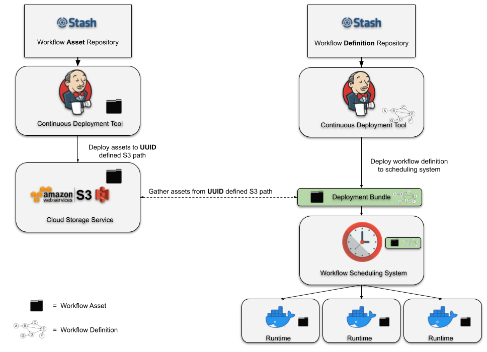
The rest of this post will focus on the first layer, while subsequent posts in this blog series will cover the other layers. The diagram below depicts a high-level overview of the ingestion and processing pipeline:
Building and updating the RDG in real-time requires continuously processing vast volumes of incoming data. Batch processing systems and traditional data warehouses cannot offer the low latency needed to maintain an up-to-date graph that supports real-time applications. We opted for a stream processing architecture, enabling us to update the graph’s data as events happen, thus minimizing delay and ensuring the system reflects the latest member interactions within the Netflix app.
Kafka as the Ingestion Backbone
Member actions in the Netflix app are published to our API Gateway, which then writes them as records to Apache Kafka topics. Kafka is the mechanism through which internal data applications can consume these events. It provides durable, replayable streams that downstream processors, such as Apache Flink jobs, can consume in real-time.
Our team’s applications consume several different Kafka topics, each generating up to roughly 1 million messages per second. Topic records are encoded in the Apache Avro format, and Avro schemas are persisted in an internal centralized schema registry. In order to strike a balance between maintaining data availability and managing the financial expenses of storage infrastructure, we tailor retention policies for each topic according to its throughput and record size. We also persist topic records to Apache Iceberg data warehouse tables, which allows us to backfill data in scenarios where older data is no longer available in the Kafka topics.
Processing Data with Apache Flink
The event records in the Kafka streams are ingested by Flink jobs. We chose Flink because of its strong capabilities around near-real-time event processing. There is also robust internal platform support for Flink within Netflix, which allows jobs to integrate with Kafka and various storage backends seamlessly. At a high level, the anatomy of an RDG Flink job looks like this:
For the sake of simplicity, the diagram above depicts a basic flow in which a member logs into their Netflix account and begins watching an episode of Stranger Things. Reading the diagram from left to right:
The actions of logging into the app and watching the Stranger Things episode are ultimately written as events to Kafka topics.
The Flink job consumes event records from the upstream Kafka topics.
Next, we have a series of Flink processor functions that:
Apply filtering and projections to remove noise based on the individual fields that are present — or in some cases, not present — in the events.
Enrich events with additional metadata, which are stored and accessed by the processor functions via side inputs.
Transform events into graph primitives — nodes representing entities (e.g., member accounts and show/movie titles), and edges representing relationships or interactions between them. In this example, the diagram only shows a few nodes and an edge to keep things simple. However, in reality, we create and update up to a few dozen different nodes and edges, depending on the member actions that occurred within the Netflix app.
Buffer, detect, and deduplicate overlapping updates that occur to the same nodes and edges within a small, configurable time window. This step reduces the data throughput we publish downstream. It is implemented using stateful process functions and timers.
Publish nodes and edges records to Data Mesh, an abstraction layer that connects data applications and storage systems. We write a total (nodes + edges) of more than 5 million records per second to Data Mesh, which handles persisting the records to various data stores that other internal services can query.
From One Job to Many: Scaling Flink the Hard Way
Initially, we tried having just one Flink job that consumed all the Kafka source topics. However, this quickly became a big operational headache since different topics can have different data volumes and throughputs at different times during the day. Consequently, tuning the monolithic Flink job became extremely difficult — we struggled to find CPU, memory, job parallelism, and checkpointing interval configurations that ensured job stability.
Instead, we pivoted to having a 1:1 mapping from the Kafka source topic to the consuming Flink job. Although this led to additional operational overhead due to more jobs to develop and deploy, each job has been much simpler to maintain, analyze, and tune.
Similarly, each node and edge type is written to a separate Kafka topic. This means we have significantly more Kafka topics to manage. However, we decided the tradeoff of having bespoke tuning and scaling per topic was worth it. We also designed the graph data model to be as generic and flexible as possible, so adding new types of nodes and edges would be an infrequent operation.
Acknowledgements
We would be remiss if we didn’t give a special shout-out to our stunning colleagues who work on the internal Netflix data platform. Building the RDG was a multi-year effort that required us to design novel solutions, and the investments and foundations from our platform teams were critical to its successful creation. You make the lives of Netflix data engineers much easier, and the RDG would not exist without your diligent collaboration!
—
Thanks for reading the first season of the RDG blog series; stay tuned for Season 2, where we will go over the storage layer containing the graph’s various nodes and edges.
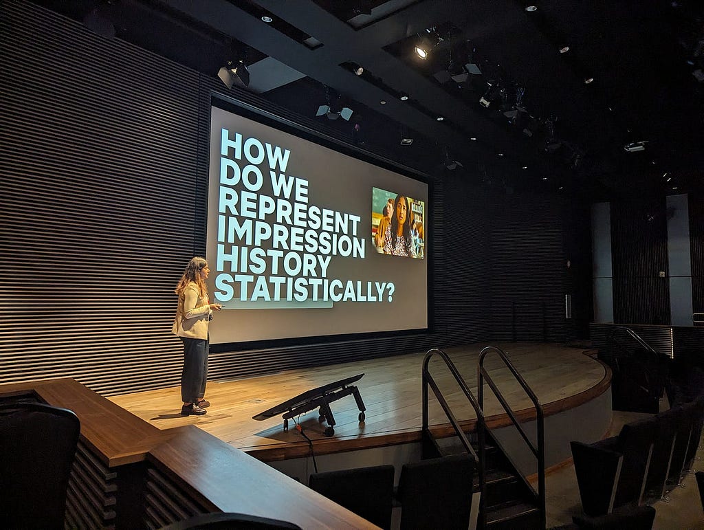
At Netflix, we prioritize getting timely data and insights into the hands of the people who can act on them. One of our key internal applications for this purpose is Muse. Muse’s ultimate goal is to help Netflix members discover content they’ll love by ensuring our promotional media is as effective and authentic as possible. It achieves this by equipping creative strategists and launch managers with data-driven insights showing which artwork or video clips resonate best with global or regional audiences and flagging outliers such as potentially misleading (clickbait-y) assets. These kinds of applications fall under Online Analytical Processing (OLAP), a category of systems designed for complex querying and data exploration. However, enabling Muse to support new, more advanced filtering and grouping capabilities while maintaining high performance and data accuracy has been a challenge. Previous posts have touched on artwork personalization and our impressions architecture. In this post, we’ll discuss some steps we’ve taken to evolve the Muse data serving layer to enable new capabilities while maintaining high performance and data accuracy.
Muse application
An Evolving Architecture
Like many early analytics applications, Muse began as a simple dashboard powered by batch data pipelines (Spark¹) and a modest Druid² cluster. As the application evolved, so did user demands. Users wanted new features like outlier detection and notification delivery, media comparison and playback, and advanced filtering, all while requiring lower latency and supporting ever-growing datasets (in the order of trillions of rows a year). One of the most challenging requirements was enabling dynamic analysis of promotional media performance by “audience” affinities: internally defined, algorithmically inferred labels representing collections of viewers with similar tastes. Answering questions like “Does specific promotional media resonate more with Character Drama fans or Pop Culture enthusiasts?” required augmenting already voluminous impression and playback data. Supporting filtering and grouping by these many-to-many audience relationships led to a combinatorial explosion in data volume, pushing the limits of our original architecture.
To address these complexities and support the evolving needs of our users, we undertook a significant evolution of Muse’s architecture. Today’s Muse is a React app that queries a GraphQL layer served with a set of Spring Boot GRPC microservices. In the remainder of this post, we’ll focus on steps we took to scale the data microservice, its backing ETL, and our Druid cluster. Specifically, we’ve changed the data model to rely on HyperLogLog (HLL) sketches, used Hollow for access to in-memory, precomputed aggregates, and taken a series of steps to tune Druid. To ensure the accuracy of these changes, we relied heavily on internal debugging tools to validate pre- and post-changes.
Muse’s Current Architecture
Moving to HyperLogLog (HLL) Sketches for Distinct Counts
Some of the most important metrics we track are impressions, the number of times an asset is shown to a user within a time window, and qualified plays, which links a playback event with a minimum duration back to a specific impression. Calculating these metrics requires counting distinct users. However, performing distinct counts in distributed systems is resource-intensive and challenging. For instance, to determine how many unique profiles have ever seen a particular asset, we need to compare each new set of profile ids with those from all days before it, potentially spanning months or even years.
For performance, we can trade accuracy. The Apache Datasketches library allows us to get distinct count estimates that are within a 1–2% error. This is tunable with a precision parameter called logK (0.8% in our case with logK of 17). We build sketches in two places:
During our Spark ETL: we persist precomputed aggregates like all-time impressions per asset in the form of HLL sketches. Each day, we merge a new HLL sketch into the existing one using a combination of hll_union and hll_union_agg (functions added by our very own Ryan Berti)
We use Datasketches in our ETL and serving systems
HLL has been a huge performance boost for us both within the serving and ETL layer. Across our most common OLAP query patterns, we’ve seen latencies reduce by approx 50%. Nevertheless, running APPROX_COUNT_DISTINCT over large date ranges on the Druid cluster for very large titles exhausts limited threads, especially in high-concurrency situations. To further offload Druid query volume and preserve cluster threads, we’ve also relied extensively on the Hollow library.
Hollow as a Read-Only Key Value Store for Precomputed Aggregates
Our in-house Hollow³ infrastructure allows us to easily create Hollow feeds — essentially highly compressed and performant in-memory key/value stores — from Iceberg⁴ tables. In this setup, dedicated producer servers listen for changes to Iceberg tables, and when updates occur, they push the latest data to downstream consumers. On the consumer side, our Spring Boot applications listen to announcements from these producers and automatically refresh in-memory caches with the latest dataset.
This architecture has enabled us to migrate several data access patterns from Druid to Hollow, specifically ones with a limited number of parameter combinations per title. One of these was fetching distinct filter dimensions. For example, while most Netflix-branded titles are released globally, licensed titles often have rights restrictions that limit their availability to specific countries and time windows. As a result, a particular licensed title might only be available to members in Germany and Luxembourg.
Distinct countries queried from a Hollow feed for the assets for Manta Manta
In the past, retrieving these distinct country values per asset required issuing a SELECT DISTINCT query to our Druid cluster. With Hollow, we maintain a feed of distinct dimension values, allowing us to perform stream operations like the one below directly on a cached dataset.
/**
 * Returns the possible filter values for a dimension such as countries
 */
public List<Dimension> getDimensions(long movieId, String dimensionId) {
    // Access in-memory Hollow feed with near instant query time
    Map<String, List<Dimension>> dimensions = dimensionsHollowConsumer.lookup(movieId);
    return dimensions.getOrDefault(dimensionId, List.of()).stream()
        .sorted(Comparator.comparing(Dimension::getName))
        .toList();
}
Although it adds complexity to our service by requiring more intricate request routing and a higher memory footprint, pre-computed aggregates have given us greater stability and performance. In the case of fetching distinct dimensions, we’ve observed query times drop from hundreds of milliseconds to just tens of milliseconds. More importantly, this shift has offloaded high concurrency demands from our Druid cluster, resulting in more consistent query performance. In addition to this use case, cached pre-computed aggregates also power features such as retrieving recently launched titles, accessing all-time asset metrics, and serving various pieces of title metadata.
Tuning Druid
Even with the efficiencies gained from HLL sketches and Hollow feeds, ensuring that our Druid cluster operates performantly has been an ongoing challenge. Fortunately, at Netflix, we are in the company of multiple Apache Druid PMC members like Maytas Monsereenusorn and Jesse Tuğlu who have helped us wring out every ounce of performance. Some of the key optimizations we’ve implemented include:
Increasing broker count relative to historical nodes: We aim for a broker-to-historical ratio close to the recommended 1:15, which helps improve query throughput.
Tuning segment sizes: By targeting the 300–700 MB “sweet spot” for segment sizes, primarily using the tuningConfig.targetRowsPerSegment parameter during ingestion — we ensure that each segment a single historical thread scans is not overly large.
Leveraging Druid lookups for data enrichment: Since joins can be prohibitively expensive in Druid, we use lookups at query time for any key column enrichment.
Optimizing search predicates: We ensure that all search predicates operate on physical columns rather than virtual ones, creating necessary columns during ingestion with transformSpec.transforms.
Use of multi-value dimensions: Exploiting the Druid multi-value dimension feature was key to overcoming the “many-to-many” combinatorial quandary when integrating audience filtering and grouping functionality mentioned in the “An Evolving Architecture” section above.
Together, these optimizations, combined with previous ones, have decreased our p99 Druid latencies by roughly 50%.
Validation & Rollout
Rolling out these changes to our metrics system required a thorough validation and release strategy. Our approach prioritized both data integrity and user trust, leveraging a blend of automation, targeted tooling, and incremental exposure to production traffic. At the core of our strategy was a parallel stack deployment: both the legacy and new metric stacks operated side-by-side within the Muse Data microservice. This setup allowed us to validate data quality, monitor real-world performance, and mitigate risk by enabling seamless fallback at any stage.
We adopted a two-pronged validation process:
Automated Offline Validation: Using Jupyter Notebooks, we automated the sampling and comparison of key metrics across both the legacy and new stacks. Our sampling set included a representative mix: recently accessed titles, high-profile launches, and edge-case titles with unique handling requirements. This allowed us to catch subtle discrepancies in metrics early in the process. Iterative testing on this set guided fixes, such as tuning the HLL logK parameter and benchmarking end-to-end latency improvements.
In-App Data Comparison Tooling: To facilitate rapid triage, we built a developer-facing comparison feature within our application that displays data from both the legacy and new metric stacks side by side. The tool automatically highlights any significant differences, making it easy to quickly spot and investigate discrepancies identified during offline validation or reported by users.
We implemented several release best practices to mitigate risk and maintain stability:
Staggered Implementation by Application Segment: We developed and deployed the new metric stack in stages, focusing on specific application segments. This meant building out support for asset types like artwork and video separately and then further dividing by CEE phase (Explore, Exploit). By implementing changes segment by segment, we were able to isolate issues early, validate each piece independently, and reduce overall risk during the migration.
Shadow Testing (“Dark Launch”): Prior to exposing the new stack to end users, we mirrored production traffic asynchronously to the new implementation. This allowed us to validate real-world latency and catch potential faults in a live environment, without impacting the actual user experience.
Granular Feature Flagging: We implemented fine-grained feature flags to control exposure within each segment. This allowed us to target specific user groups or titles and instantly roll back or adjust the rollout scope if any issues were detected, ensuring rapid mitigation with minimal disruption.
Learnings and Next Steps
Our journey with Muse tested the limits of several parts of the stack: the ETL layer, the Druid layer, and the data serving layer. While some choices, like leveraging Netflix’s in-house Hollow infrastructure, were influenced by available resources, simple principles like offloading query volume, pre-filtering of rows and columns before Druid rollup, and optimizing search predicates (along with a bit of HLL magic) went a long way in allowing us to support new capabilities while maintaining performance. Additionally, engineering best practices like producing side-by-side implementations and backwards-compatible changes enabled us to roll out revisions steadily while maintaining rigorous validation standards. Looking ahead, we’ll continue to build on this foundation by supporting a wider range of content types like Live and Games, incorporating synopsis data, deepening our understanding of how assets work together to influence member choosing, and incorporating new metrics to distinguish between “effective” and “authentic” promotional assets, in service of helping members find content that truly resonates with them.
¹ Apache Spark is an open-source analytics engine for processing large-scale data, enabling tasks like batch processing, machine learning, and stream processing.
² Apache Druid is a high-performance, real-time analytics database designed for quickly querying large volumes of data.
³ Hollow is a Java library for efficient in-memory storage and access to moderately sized, read-only datasets, making it ideal for high-performance data retrieval.
⁴ Apache Iceberg is an open-source table format designed for large-scale analytical datasets stored in data lakes. It provides a robust and reliable way to manage data in formats like Parquet or ORC within cloud object storage or distributed file systems.
As Netflix’s offerings grow — across films, series, games, live events, and ads — so does the complexity of the systems that support it. Core business concepts like ‘actor’ or ‘movie’ are modeled in many places: in our Enterprise GraphQL Gateway powering internal apps, in our asset management platform storing media assets, in our media computing platform that powers encoding pipelines, to name a few. Each system models these concepts differently and in isolation, with little coordination or shared understanding. While they often operate on the same concepts, these systems remain largely unaware of that fact, and of each other.
As a result, several challenges emerge:
Duplicated and Inconsistent Models — Teams re-model the same business entities in different systems, leading to conflicting definitions that are hard to reconcile.
Inconsistent Terminology — Even within a single system, teams may use different terms for the same concept, or the same term for different concepts, making collaboration harder.
Data Quality Issues — Discrepancies and broken references are hard to detect across our many microservices. While identifiers and foreign keys exist, they are inconsistently modeled and poorly documented, requiring manual work from domain experts to find and fix any data issues.
Limited Connectivity — Within systems, relationships between data are constrained by what each system supports. Across systems, they are effectively non-existent.
To address these challenges, we need new foundations that allow us to define a model once, at the conceptual level, and reuse those definitions everywhere. But it isn’t enough to just document concepts; we need to connect them to real systems and data. And more than just connect, we have to project those definitions outward, generating schemas and enforcing consistency across systems. The conceptual model must become part of the control plane.
These were the core ideas that led us to build UDA.
Introducing UDA
UDA (Unified Data Architecture) is the foundation for connected data in Content Engineering. It enables teams to model domains once and represent them consistently across systems — powering automation, discoverability, and semantic interoperability.
Using UDA, users and systems can:
Register and connect domain models — formal conceptualizations of federated business domains expressed as data.
Why? So everyone uses the same official definitions for business concepts, which avoids confusion and stops different teams from rebuilding similar models in conflicting ways.
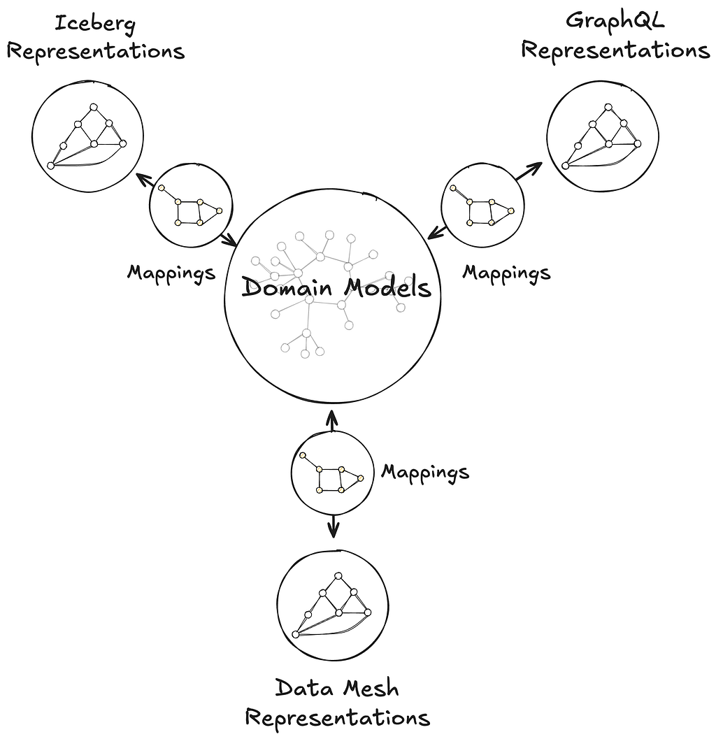
Catalog and map domain models to data containers, such as GraphQL type resolvers served by a Domain Graph Service, Data Mesh sources, or Iceberg tables, through their representation as a graph.
Why? To make it easy to find where the actual data for these business concepts lives (e.g., in which specific database, table, or service) and understand how it’s structured there.
Transpile domain models into schema definition languages like GraphQL, Avro, SQL, RDF, and Java, while preserving semantics.
Why? To automatically create consistent technical data structures (schemas) for various systems directly from the domain models, saving developers manual effort and reducing errors caused by out-of-sync definitions.
Move data faithfully between data containers, such as from federated GraphQL entities to Data Mesh (a general purpose data movement and processing platform for moving data between Netflix systems at scale), Change Data Capture (CDC) sources to joinable Iceberg Data Products.
Why? To save developer time by automatically handling how data is moved and correctly transformed between different systems. This means less manual work to configure data movement, ensuring data shows up consistently and accurately wherever it’s needed.
Discover and explore domain concepts via search and graph traversal.
Why? So anyone can more easily find the specific business information they’re looking for, understand how different concepts and data are related, and be confident they are accessing the correct information.
Programmatically introspect the knowledge graph using Java, GraphQL, or SPARQL.
Why? So developers can build smarter applications that leverage this connected business information, automate more complex data-dependent workflows, and help uncover new insights from the relationships in the data.
This post introduces the foundations of UDA as a knowledge graph, connecting domain models to data containers through mappings, and grounded in an in-house metamodel, or model of models, called Upper. Upper defines the language for domain modeling in UDA and enables projections that automatically generate schemas and pipelines across systems.
The same domain model can be connected to semantically equivalent data containers in the UDA knowledge graph.
This post also highlights two systems that leverage UDA in production:
Primary Data Management (PDM) is our platform for managing authoritative reference data and taxonomies. PDM turns domain models into flat or hierarchical taxonomies that drive a generated UI for business users. These taxonomy models are projected into Avro and GraphQL schemas, automatically provisioning data products in the Warehouse and GraphQL APIs in the Enterprise Gateway.
Sphere is our self-service operational reporting tool for business users. Sphere uses UDA to catalog and relate business concepts across systems, enabling discovery through familiar terms like ‘actor’ or ‘movie.’ Once concepts are selected, Sphere walks the knowledge graph and generates SQL queries to retrieve data from the warehouse, no manual joins or technical mediation required.
UDA is a Knowledge Graph
UDA needs to solve the data integration problem. We needed a data catalog unified with a schema registry, but with a hard requirement for semantic integration. Connecting business concepts to schemas and data containers in a graph-like structure, grounded in strong semantic foundations, naturally led us to consider a knowledge graph approach.
We chose RDF and SHACL as the foundation for UDA’s knowledge graph. But operationalizing them at enterprise scale surfaced several challenges:
RDF lacked a usable information model. While RDF offers a flexible graph structure, it provides little guidance on how to organize data into named graphs, manage ontology ownership, or define governance boundaries. Standard follow-your-nose mechanisms like owl:imports apply only to ontologies and don’t extend to named graphs; we needed a generalized mechanism to express and resolve dependencies between them.
SHACL is not a modeling language for enterprise data. Designed to validate native RDF, SHACL assumes globally unique URIs and a single data graph. But enterprise data is structured around local schemas and typed keys, as in GraphQL, Avro, or SQL. SHACL could not express these patterns, making it difficult to model and validate real-world data across heterogeneous systems.
Teams lacked shared authoring practices. Without strong guidelines, teams modeled their ontologies inconsistently breaking semantic interoperability. Even subtle differences in style, structure, or naming led to divergent interpretations and made transpilation harder to define consistently across schemas.
Ontology tooling lacked support for collaborative modeling. Unlike GraphQL Federation, ontology frameworks had no built-in support for modular contributions, team ownership, or safe federation. Most engineers found the tools and concepts unfamiliar, and available authoring environments lacked the structure needed for coordinated contributions.
To address these challenges, UDA adopts a named-graph-first information model. Each named graph conforms to a governing model, itself a named graph in the knowledge graph. This systematic approach ensures resolution, modularity, and enables governance across the entire graph. While a full description of UDA’s information infrastructure is beyond the scope of this post, the next sections explain how UDA bootstraps the knowledge graph with its metamodel and uses it to model data container representations and mappings.
Upper is Domain Modeling
Upper is a language for formally describing domains — business or system — and their concepts. These concepts are organized into domain models: controlled vocabularies that define classes of keyed entities, their attributes, and their relationships to other entities, which may be keyed or nested, within the same domain or across domains. Keyed concepts within a domain model can be organized in taxonomies of types, which can be as complex as the business or the data system needs them to be. Keyed concepts can also be extended from other domain models — that is, new attributes and relationships can be contributed monotonically. Finally, Upper ships with a rich set of datatypes for attribute values, which can also be customized per domain.
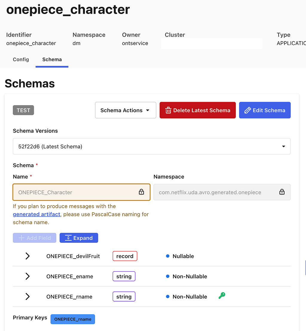
The graph representation of the onepiece: domain model from our UI. Depicted here you can see how Characters are related to Devil Fruit, and that each Devil Fruit has a type.
Upper domain models are data. They are expressed as conceptual RDF and organized into named graphs, making them introspectable, queryable, and versionable within the UDA knowledge graph. This graph unifies not just the domain models themselves, but also the schemas they transpile to — GraphQL, Avro, Iceberg, Java — and the mappings that connect domain concepts to concrete data containers, such as GraphQL type resolvers served by a Domain Graph Service, Data Mesh sources, or Iceberg tables, through their representations. Upper raises the level of abstraction above traditional ontology languages: it defines a strict subset of semantic technologies from the W3C tailored and generalized for domain modeling. It builds on ontology frameworks like RDFS, OWL, and SHACL so domain authors can model effectively without even needing to learn what an ontology is.
Upper is the metamodel for Connected Data in UDA — the model for all models. It is designed as a bootstrapping upper ontology, which means that Upper is self-referencing, because it models itself as a domain model; self-describing, because it defines the very concept of a domain model; and self-validating, because it conforms to its own model. This approach enables UDA to bootstrap its own infrastructure: Upper itself is projected into a generated Jena-based Java API and GraphQL schema used in GraphQL service federated into Netflix’s Enterprise GraphQL gateway. These same generated APIs are then used by the projections and the UI. Because all domain models are conservative extensions of Upper, other system domain models — including those for GraphQL, Avro, Data Mesh, and Mappings — integrate seamlessly into the same runtime, enabling consistent data semantics and interoperability across schemas.
Traversing a domain model programmatically using the Java API generated from the Upper metamodel.
Data Container Representations
Data containers are repositories of information. They contain instance data that conform to their own schema languages or type systems: federated entities from GraphQL services, Avro records from Data Mesh sources, rows from Iceberg tables, or objects from Java APIs. Each container operates within the context of a system that imposes its own structural and operational constraints.
A Data Mesh source is a data container.
Data container representations are data. They are faithful interpretations of the members of data systems as graph data. UDA captures the definition of these systems as their own domain models, the system domains. These models encode both the information architecture of the systems and the schemas of the data containers within. They provide a blueprint for translating the systems into graph representations.
UDA catalogs the data container representations into the knowledge graph. It records the coordinates and metadata of the underlying data assets, but unlike a traditional catalog, it only tracks assets that are semantically connected to domain models. This enables users and systems to connect concepts from domain models to the concrete locations where corresponding instance data can be accessed. Those connections are called Mappings.
Mappings
Mappings are data that connect domain models to data containers. Every element in a domain model is addressable, from the domain model itself down to specific attributes and relationships. Likewise, data container representations make all components addressable, from an Iceberg table to an individual column, or from a GraphQL type to a specific field. A Mapping connects nodes in a subgraph of the domain model to nodes in a subgraph of a container representation. Visually, the Mapping is the set of arcs that link those two graphs together.
A mapping between a domain model and a Data Mesh Source from the UDA UI. Link to full mapping.
Mappings enable discovery. Starting from a domain concept, users and systems can walk the knowledge graph to find where that concept is materialized — in which data system, in which container, and even how a specific attribute or relationship is physically accessed. The inverse is also supported: given a data container, one can trace back to the domain concepts it participates in.
Mappings shape UDA’s approach to semantic data integration. Most existing schema languages are not expressive enough in capturing richer semantics of a domain to address requirements for data integration (for example, “accessibility of data, providing semantic context to support its interpretation, and establishing meaningful links between data”). A trivial example of this could be seen in the lack of built-in facilities in Avro to represent foreign keys, making it very hard to express how entities relate across Data Mesh sources. Mappings, together with the corresponding system domain models, allow for such relationships, and many other constraints, to be defined in the domain models and used programmatically in actual data systems.
Mappings enable intent-based automation. Data is not always available in the systems where consumers need it. Because Mappings encode both meaning and location, UDA can reason about how data should move, preserving semantics, without requiring the consumer to specify how it should be done. Beyond the cataloging use case, connecting to existing containers, UDA automatically derives canonical Mappings from registered domain models as part of the projection process.
Projections
A projection produces a concrete data container. These containers, such as a GraphQL schema or a Data Mesh source, implement the characteristics derived from a registered domain model. Each projection is a concrete realization of Upper’s denotational semantics, ensuring semantic interoperability across all containers projected from the same domain model.
Projections produce consistent public contracts across systems. The data containers generated by projections encode data contracts in the form of schemas, derived by transpiling a domain model into the target container’s schema language. UDA currently supports transpilation to GraphQL and Avro schemas.
The GraphQL transpilation produces a schema that adheres to the official GraphQL spec with the ability to generate all GraphQL types defined in the spec. Given that the UDA domain model can be federated, it also supports generating federated graphQL schemas. Below is an example of a transpiled GraphQL schema.
The Avro transpilation produces a schema that is a Data Mesh flavor of Avro, which includes some customization on top of the official Avro spec. This schema is used to automatically create a Data Mesh source container. Below is an example of a transpiled Avro schema.
Projections can automatically populate data containers. Some projections, such as those to GraphQL schemas or Data Mesh sources produce empty containers that require developers to populate the data. This might be creating GraphQL APIs or pushing events onto Data Mesh sources. Conversely, other containers, like Iceberg Tables, are automatically created and populated by UDA. For Iceberg Tables, UDA leverages the Data Mesh platform to automatically create data streams to move data into tables. This process utilizes much of the same infrastructure detailed in this blog post here.
Projections have mappings. UDA automatically generates and manages mappings between the newly created data containers and the projected domain model.
Early Adopters
Controlled Vocabularies (PDM)
The full range of Netflix’s business activities relies on a sprawling data model that captures the details of our many business processes. Teams need to be able to coordinate operational activities to ensure that content production is complete, advertising campaigns are in place, and promotional assets are ready to deploy. We implicitly depend upon a singular definition of shared concepts, such as content production is complete. Multiple definitions create coordination challenges. Software (and humans) don’t know that the definitions mean the same thing.
We started the Primary Data Management (PDM) initiative to create unified and consistent definitions for the core concepts in our data model. These definitions form controlled vocabularies, standardized and governed lists for what values are permitted within certain fields in our data model.
Primary Data Management (PDM) is a single place where business users can manage controlled vocabularies. Our data model governance has been scattered across different tools and teams creating coordination challenges. This is an information management problem relating to the definition, maintenance and consistent use of reference data and taxonomies. This problem is not unique to Netflix, so we looked outward for existing solutions to this problem.
Managing the taxonomy of One Piece characters in PDM.
PDM uses the Simple Knowledge Organization System (SKOS)model. It is a W3C data standard designed for modeling knowledge. Its terminology is abstract, with Concepts that can be organized into ConceptSchemes and properties to describe various types of relationships. Every system is hardcoded against something, that’s how software knows how to manipulate data. We want a system that can work with a data model as its input, so we still need something concrete to build the software against. This is what SKOS provides, a generic basis for modeling knowledge that our system can understand.
PDM uses Domain Models to integrate SKOS into the rest of Content Engineering’s ecosystem. A core premise of the system is that it takes a domain model as input, and everything that can be derived is derived from that model. PDM builds a user interface based upon the model definition and leverages UDA to project this model into type-safe interfaces for other systems to use. The system will provision a Domain Graph Service (DGS) within our federated GraphQL API environment using a GraphQL schema that UDA projects from the domain model. UDA is also used to provision data movement pipelines which are able to feed our GraphSearch infrastructure as well as move data into the warehouse. The data movement systems use Avro schemas, and UDA creates a projection from the domain model to Avro.
Consumers of controlled vocabularies never know they’re using SKOS. Domain models use terms that fit in with the domain. SKOS’s generic notion of broader and narrower to define a hierarchy are hidden from consumers as super-properties within the model. This allows consumers to work with language that is familiar to them while enabling PDM to work with any model. The best of both worlds.
Operational Reporting (Sphere)
Operational reporting serves the detailed day-to-day activities and processes of a business domain. It is a reporting paradigm specialized in covering high-resolution, low-latency data sets.
Operational reporting systems should generate reports without relying on technical intermediaries. Operational reporting systems need to address the persistent challenge of empowering business users to explore and obtain the data they need, when they need it. Without such self-service systems, requests for new reports or data extracts often result in back-and-forth exchanges, where the initial query may not exactly meet business users’ expectations, requiring further clarification and refinement.
Data discovery and query generation are two relevant aspects of data integration. Supplying end-users with an accurate, contextual, and user-friendly data discovery experience provides a basis for query generation mechanism which produces syntactically correct and semantically reliable queries.
Operational reports are predominantly run on data hydrated from GraphQL services into the Data Warehouse. You can read about our journey from conventional data movement to streaming data pipelines based on CDC and GraphQL hydration in this blog post. Among the challenging byproducts of this approach was that a single, distinct data concept is now present in two places (GraphQL and data warehouse), with some disparity in semantic context to guide and support the interpretations and connectivity of that data. To address this, we formulate a mechanism to use the syntax and semantics captured in the federated schema from Netflix’s Enterprise GraphQL and populate representational domain models in UDA to preserve those details and add more.
Domain models enable the data discovery experience. Metadata aggregated from various data-producing systems is captured in UDA domain models using a unified vocabulary. This metadata is surfaced for the users’ search and discovery needs; instead of specifying exact tables and join keys, users simply can search for familiar business concepts such as ‘actors’ or ‘movies’. We use UDA models to disambiguate and resolve the intended concepts and their related data entities.
UDA knowledge graph is the data landscape for query generation. Once concepts are discovered and their mappings to corresponding data containers are identified and located in the knowledge graph, we use them to establish join strategies. Through graph traversal, we identify boundaries and islands within the data landscape. This ensures only feasible, joinable combinations are selected while weeding out semantically incorrect and non-executable query candidates.
Generating a report in Sphere.
Sphere is a UDA-powered self-service operational reporting system. The solution based on knowledge graphs described above is called Sphere. Seeing self-service operational reporting through this lens, we can improve business users’ agency in access to operational data. They are empowered to explore, assemble, and refine reports at the conceptual level, while technical complexities are managed by the system.
Stay Tuned
UDA marks a fundamental shift in how we approach data modeling within Content Engineering. By providing a unified knowledge graph composed of what we know about our various data systems and the business concepts within them, we’ve made information more consistent, connected, and discoverable across our organization. We’re excited about future applications of these ideas such as:
Supporting additional projections like Protobuf/gRPC
Materializing the knowledge graph of instance data for querying, profiling, and management
Finally solving some of the initial challenges posed by Graph Search (that actually inspired some of this work)
If you’re interested in this space, we’d love to connect — whether you’re exploring new roles down the road or just want to swap ideas.
Expect to see future blog posts exploring PDM and Sphere in more detail soon!
At Grab, we’ve been working to perfect our Spark observability tools. Our initial solution, Iris, was developed to provide a custom, in-depth observability tool for Spark jobs. As described in our previous blog post, Iris collects and analyses metrics and metadata at the job level, providing insights into resource usage, performance, and query patterns across our Spark clusters.
Iris addresses a critical gap in Spark observability by providing real-time performance metrics at the Spark application level. Unlike traditional monitoring tools that typically provide metrics only at the EC2 instance level, Iris dives deeper into the Spark ecosystem. It bridges the observability gap by making Spark metrics accessible through a tabular dataset, enabling real-time monitoring and historical analysis. This approach eliminates the need to parse complex Spark event log JSON files, which users are often unable to access when they need immediate insights. Iris empowers users with on-demand access to comprehensive Spark performance data, facilitating quicker decision-making and more efficient resource management.
Iris served us well, offering basic dashboards and charts that helped our teams understand trends, discover issues, and debug their Spark jobs. However, as our needs evolved and usage grew, we began to encounter limitations:
Fragmented user experience and access control: Observability data is split between Grafana (real-time) and Superset (historical), forcing users to switch platforms for a complete view. The complex Grafana dashboards, while powerful, were challenging for non-technical users. The lack of granular permissions hindered wider adoption. We needed a unified, user-friendly interface with role-based access to serve all Grabbers effectively.
Operational overhead: Our data pipeline for offline analytics includes multiple hops and complex transformations.
Data management: We faced challenges managing real-time data in InfluxDB alongside offline data in our data lake, particularly with string-type metadata.
These challenges and the need for a centralised, user-friendly web application prompted us to seek a more robust solution. Enter StarRocks – a modern analytical database that addresses many of our pain points:
Pain points with InfluxDB
StarRocks solution
Limited SQL compatibility: Requires use of Flux query language instead of full SQL
Full MySQL-compatible SQL support, enabling seamless integration with existing tools and skills
Complex data ingestion pipeline: Requires external agents like Telegraf to consume Kafka and insert into InfluxDB
Direct Kafka ingestion, eliminating the need for intermediate agents and simplifying the data pipeline
Limited pre-aggregation capabilities: Aggregation is limited to time windows and indexed columns, not string columns
Flexible materialised views supporting complex aggregations on any column type, improving query performance
Poor support for metadata and joins: Designed primarily for numerical time series data, with slow performance on string data and joins
Efficient handling of both time-series and string-type metadata in a single system, with optimised join performance
Difficult integration with data lake: There is no official way to backup or stream data directly to the datalake, requiring separate pipelines
Native S3 integration for easy backup and direct data lake accessibility, eliminating the need for separate ingestion pipelines
Performance issues with high cardinality data: Indexing unique identifiers (like app\_id) causes huge indexes and slow queries
Optimised for high cardinality data, allowing efficient querying on unique identifiers without performance degradation
In this blog post, we will dive into leveraging StarRocks to build the next generation of the Spark observability platform. We will explore the architecture, data model, and key features that are helping us overcome previous limitations and provide more value to Spark users at Grab.
System architecture overview
In the journey to enhance user experience, we’ve made substantial changes to the architecture, moving from the Telegraf/InfluxDB/Grafana (TIG) stack to a more streamlined and powerful setup centered around StarRocks. This new architecture addresses the previous challenges and provides a more unified, flexible, and efficient solution.
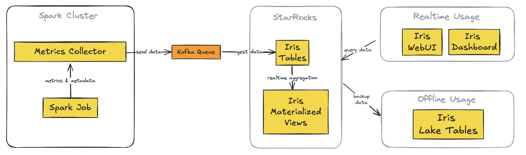
Figure 1. New Iris architecture with StarRocks integration
Key Components of the new architecture:
1. StarRocks database
Replaces InfluxDB for both real-time and historical data storage
Supports complex queries on metrics and metadata tables
2. Direct Kafka ingestion
StarRocks ingests data directly from Kafka, eliminating Telegraf
3. Custom web application (Iris UI)
Replaces Grafana dashboards
Centralised, flexible interface with custom API
4. Superset integration
Maintained and now connected directly to StarRocks
Provides real-time data access, consistent with the custom web app
5. Simplified offline data process
Scheduled backups from StarRocks to S3 directly
Replaces previous complex data lake pipelines
Key improvements:
1. Unified data store: Single source for real-time and historical data
2. Streamlined data flow: A simplified pipeline reduces latency and failure points
3. Flexible visualisation: Custom web app with intuitive, role-specific interfaces
4. Consistent real-time access: Across both custom app and Superset
5. Simplified backup and data lake integration: Direct S3 backups
Data model and ingestion
The Iris observability system is designed to monitor both job executions and ad-hoc cluster usage, encompassing what we call “cluster observation”. This model accounts for two scenarios:
Adhoc use: Pre-created clusters shared among team users
Job execution: New clusters are created for each job submission
Key design points
For each cluster, we capture both metadata and metrics:
Key point
Description
Linkage
We use worker\_uuid to link metadata with worker metrics app\_id to link metadata with Spark event metrics.
Granularity
Worker metrics are captured every 5 seconds, linked by worker\_uuid. Spark events are captured as they occur, linked by app\_id. Metadata can be captured multiple times.
Flexibility
This schema allows for queries at various levels: Individual worker level, job level, cluster level.
Historical analysis
The design enables insights from historical runs, such as: Auto-scaling behaviour, maximum worker count per job, maximum or average memory usage over time.
We use StarRocks’ routine load feature to ingest data directly from Kafka into our tables. Refer to the StarRocks documentation: Load data using routine load.
Here is a simple example of creating a routine load job for cluster worker metrics:
This configuration sets up continuous data ingestion from the specified Kafka topic into our cluster_worker_metrics table, with JSON parsing.
For monitoring the routine, StarRocks provides built-in tools to monitor the status/error log of routine load jobs. Example query to check load:
    C/C++
    SHOW ROUTINE LOAD WHERE NAME = "iris.routetine_cluster_worker_metrics_raw";
Handle both real-time and historical data in the unified system
The new Iris system uses StarRocks to efficiently manage both real-time and historical data. We have implemented three key features to achieve this:
StarRocks’ routine load enables near real-time data ingestion from Kafka. Multiple load tasks concurrently consume messages from different topic partitions, resulting in data appearing in Iris tables within seconds of collection. This quick ingestion keeps our monitoring capabilities current, providing users with up-to-date information about their Spark jobs.
For historical analysis, StarRocks serves as a persistent dataset, storing metadata and job metrics with a time-to-live of over 30 days. This allows us to perform analysis based on the last 30 days of job runs directly in StarRocks, which is significantly faster than using offline data in our data lake.
We’ve also implemented materialised views in StarRocks to pre-calculate and aggregate data for each job run. These views combine information from metadata, worker metrics, and Spark metrics, creating ready-to-use summary data. This approach eliminates the need for complex join operations when users access the job run summary screen in the UI, improving response times for both SQL queries and API access.
This setup offers substantial improvements over our previous InfluxDB-based system. As a time-series database, InfluxDB makes complex queries and joins challenging. It also lacked support for materialised views, making it difficult to create pre-built job-run summaries. Previously, we had to query our data lake using Spark and Presto to view historical runs for a particular job over the last 30 days, which was slower than directly querying in StarRocks.
By combining real-time ingestion, persistent storage, and materialised views, Iris now provides a unified, efficient platform for both immediate monitoring and in-depth historical analysis of Spark jobs.
Query performance and optimisation
StarRocks has significantly improved our query performance for Spark observability. Here are some key aspects of our optimisation strategy.
Materialised views
As mentioned, we leverage StarRocks’ materialised views to pre-aggregate job run summaries. This approach significantly reduces query complexity and improves response times for common UI operations. Materialised views combine data from metadata, worker metrics, and Spark metrics tables, thus eliminating the need for complex joins during query execution. This is particularly beneficial for our job-run summary screen, where pre-calculated aggregations can be retrieved instantly, improving both speed and user experience.
Here’s an example
    C/C++
    CREATE MATERIALIZED VIEW job_runs_001
    PARTITION BY (`report_date`)
    DISTRIBUTED BY HASH(`report_date`,`platform`)
    REFRESH ASYNC
    PROPERTIES (
        "auto_refresh_partitions_limit" = "3",
        "partition_ttl" = "33 DAY"
    )
    AS
    select m.report_date                                                                     as report_date,
        m.platform,
        m.job_id,
        m.run_id,
        m.app_id,
        m.app_attempt_id,
        ANY_VALUE(COALESCE(m.cluster_id, m.cluster_name))                                 as cluster_id,
        ANY_VALUE(m.cluster_name)                                                         as cluster_name,
        ANY_VALUE(m.job_name)                                                             as job_name,
        ANY_VALUE(m.job_owner)                                                            as job_owner,
        ANY_VALUE(m.job_client)                                                           as job_client,
        ANY_VALUE(CASE WHEN m.worker_role = 'driver' THEN m.spark_ui_url END)             as spark_ui_url,
        ANY_VALUE(CASE WHEN m.worker_role = 'driver' THEN m.spark_history_url END)        as spark_history_url,
        ANY_VALUE(CASE WHEN m.worker_role = 'driver' THEN m.driver_log_location END)      as driver_log_location,
        COUNT(d.worker_uuid)                                                              as total_instances,
        from_unixtime(MIN(d.start_time) / 1000, 'yyyy-MM-dd HH:mm:ss')                    as start_time,
        from_unixtime(MAX(d.end_time) / 1000, 'yyyy-MM-dd HH:mm:ss')                      as end_time,
        COALESCE((((MAX(d.end_time) - MIN(d.start_time)) + 120000) / (1000 * 3600)), 0)   as job_hour,
        SUM(COALESCE(d.machine_hour, 0))                                                  as machine_hour,
        SUM(COALESCE(d.cpu_hour, 0))                                                      as cpu_hour,
        MAX(COALESCE(CASE WHEN d.worker_role = 'driver' THEN d.cpu_utilization END, 0))   as driver_cpu_utilization,
        MAX(COALESCE(CASE WHEN d.worker_role = 'driver' THEN d.memory_utilization END,
                        0))                                                                  as driver_memory_utilization,
        MAX(COALESCE(CASE WHEN d.worker_role = 'executor' THEN d.cpu_utilization END, 0)) as worker_cpu_utilization,
        MAX(COALESCE(CASE WHEN d.worker_role = 'executor' THEN d.memory_utilization END,
                        0))                                                                  as worker_memory_utilization,
        -- other relevant metrics fields
    from iris.cluster_worker_metadata_view_001 m
            left join iris.cluster_worker_metrics_view_006 d
                    on d.report_date >= m.report_date and d.platform = m.platform and d.worker_uuid = m.worker_uuid and
                        d.worker_role = m.worker_role
    where m.job_id is not null
    group by m.report_date,
            m.platform,
            m.job_id,
            m.run_id,
            m.app_id,
            m.app_attempt_id;
StarRocks offers powerful and flexible materialised view capabilities that significantly enhance our query performance and data management in Iris. Here are three key features we leverage:
SYNC and ASYNC
StarRocks supports both SYNC and ASYNC materialised views. We primarily use ASYNC views as they allow us to join multiple underlying tables, which is crucial for our job-run summaries. We can configure these views to refresh:
Immediately when downstream tables are updated.
At set intervals (e.g., every 1 minute). This flexibility allows us to balance data freshness with system performance.
Example setting:
    C/C++
    REFRESH ASYNC START('2022-09-01 10:00:00') EVERY (interval 1 day)
For more details on supported features and settings, refer to the StarRocks documentation: Materialised view.
Partition TTL
We utilise the partition Time To Live (TTL) feature for materialised views. This allows us to control the amount of historical data stored in the views, typically setting it to 33 days. This ensures that the views remain performant and do not consume excessive storage while still providing quick access to recent historical data.
    C/C++
    PROPERTIES (
        "partition_ttl" = "33 DAY"
    )
Selective partition refresh
StarRocks allows us to refresh only specific partitions of a materialised view instead of the entire dataset. We take advantage of this by configuring our views to refresh only the most recent partitions (e.g., the last few days) where new data is typically added. This approach significantly reduces the computational overhead of keeping our materialised views up-to-date, especially for large historical datasets.
Our tables are partitioned by date, allowing for efficient pruning of historical data. This partitioning strategy is crucial for queries that focus on recent job runs or specific time ranges. By quickly eliminating irrelevant partitions, we significantly reduce the amount of data scanned for each query, leading to faster execution times.
    C/C++
    PARTITION BY RANGE(`report_date`)()
    DISTRIBUTED BY HASH(`report_date`,`platform`)
Dynamic partitioning
We utilise StarRocks’ dynamic partitioning feature to automatically manage our partitions. This ensures that new partitions are created as fresh data arrives and old partitions are dropped when data expires. Dynamic partitioning helps maintain optimal query performance over time without manual intervention, which is especially important for our continuous data ingestion process.
Here’s an example of how we configure dynamic partitioning for a 33-day retention period:
To verify that dynamic partitioning is working correctly and to monitor the state of your partitions, you can use the following SQL command:
    C/C++
    SHOW PARTITIONS FROM iris.cluster_worker_metrics_raw;
This command provides a summary of all partitions for the specified table (in this case, iris.cluster_worker_metrics_raw). The output includes valuable information such as:
The total number of partitions
The date range covered by each partition
Row count per partition
Size of each partition
While dynamic partitioning keeps the most recent 33 days of data readily available in StarRocks for fast querying, we’ve implemented a strategy to retain older data for long-term analysis.
We use a daily cron job to back up data older than 30 days to Amazon S3. This ensures we maintain historical data without impacting the performance of our primary StarRocks cluster.
Here’s an example of the backup query we use:
    Python
    INSERT INTO
        FILES(
            "path" = "{s3backUpPath}/{table_name}/",
            "format" = "parquet",
            "compression" = "zstd",
            "partition_by" = "report_date",
            "aws.s3.region" = "ap-southeast-1"
        )
        SELECT * FROM iris.{table_name} WHERE report_date between '{start_date}' and '{end_date}';
After backing up to S3, we map this data to a data lake table, enabling us to query historical data beyond the 33-day window in StarRocks when needed, without affecting the performance of our primary observability system.
    Python
    df_snapshot = spark.read.parquet(f"{s3backUpPath}/{table_name}")

    # do the transformation if needed here

    df_snapshot.write.format("delta").mode("overwrite").option("partitionOverwriteMode", "dynamic").option("mergeSchema", "true").partitionBy("report_date").save(f"{s3SinkPath}/{table_name}")

    %sql
    CREATE TABLE IF NOT EXISTS iris.{table_name}
    USING DELTA
    LOCATION '{s3SinkPath}/{table_name}'
Data replication
StarRocks uses data replication across multiple nodes, which is crucial for both fault tolerance and query performance. This strategy allows parallel query execution speeding up data retrieval. It’s particularly beneficial for our front-end queries, where low latency is crucial for user experience. This approach aligns with best practices seen in other distributed database systems like Cassandra, DynamoDB, and MySQL’s master-slave architecture.
    C/C++
    PROPERTIES (
        "replication_num" = "3",
    );
Unified web application
We’ve developed a comprehensive web application for Iris, consisting of both backend and frontend components. This unified interface offers users a seamless experience for monitoring and analysing Spark jobs.
Backend
Built using Golang, our backend service connects directly to the StarRocks database.
It queries data from both raw tables and materialised views, leveraging the optimised data structures we’ve set up in StarRocks.
The backend handles authentication and authorisation, ensuring that users have appropriate access to job data.
Frontend
The frontend offers several key screens to show:
List of job runs
Job status
Job metadata
Driver log
Spark UI
Statistics on resource usage and cost
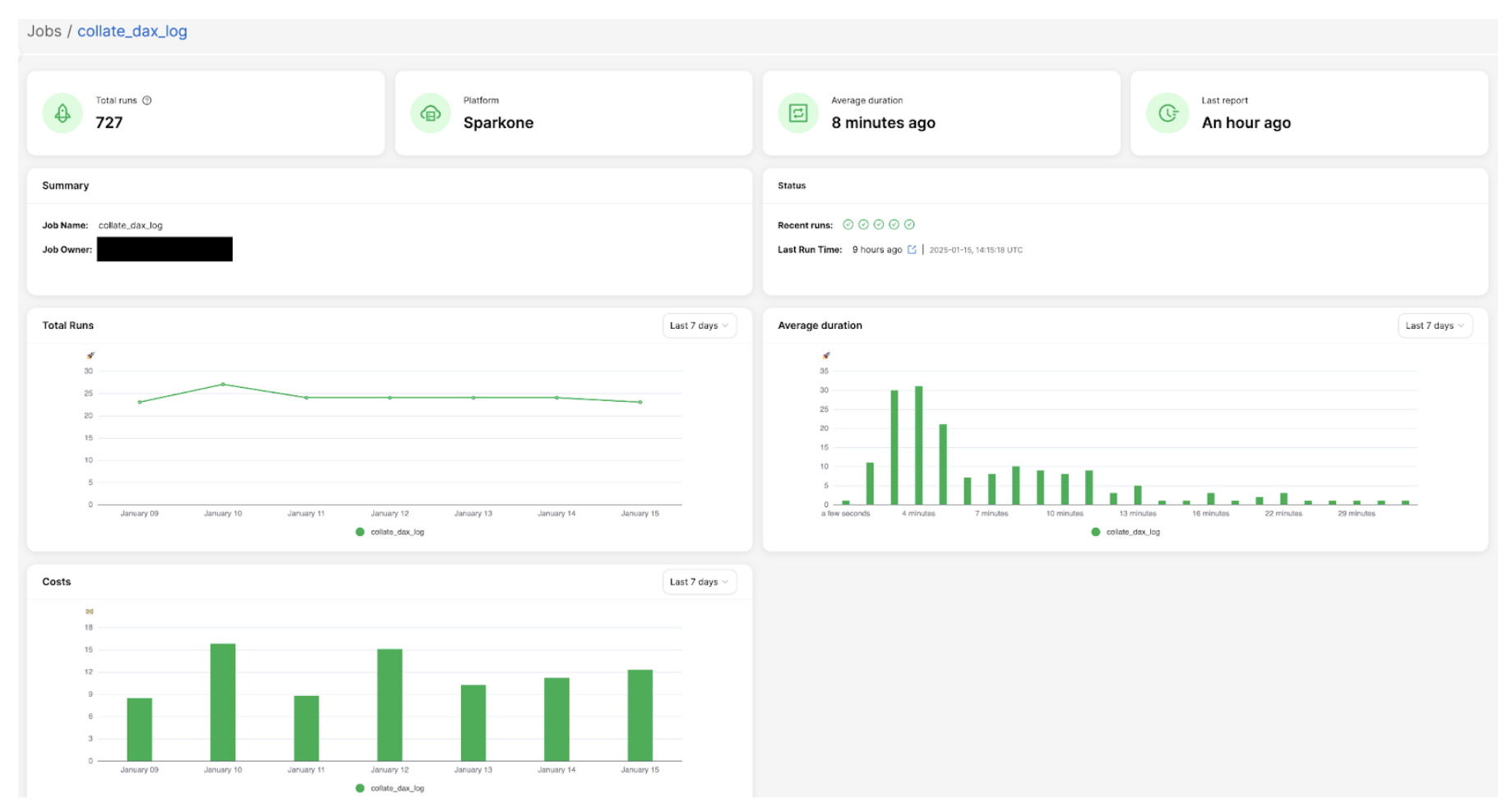
Here is an example of the job overview screen, which displays key summary information: total number of runs, job owner details, performance trends, and cost analysis charts. This comprehensive view provides users with a quick snapshot of their Spark job’s overall health and resource utilisation.
Figure 2: Example of job overview screen
Advanced analytics and insights
One of the key features we’ve implemented in Iris is the ability to perform analytics on historical job runs to capture trends. This feature leverages the power of StarRocks and our data model to provide users with valuable insights and recommendations. Here’s how we’ve implemented it:
Historical run analysis
We’ve created a materialised view that aggregates job run data over the last 30 days. This view likely includes metrics such as count of runs, p95 values for various resource utilisation, etc.
    C/C++
    CREATE MATERIALIZED VIEW job_run_summaries_001
    REFRESH ASYNC EVERY(INTERVAL 1 DAY)
    AS
    select platform,
        job_id,
        count(distinct run_id)                                as count_run,
        ceil(percentile_approx(total_instances, 0.95))        as p95_total_instances,
        ceil(percentile_approx(worker_instances, 0.95))       as p95_worker_instances,
        percentile_approx(job_hour, 0.95)                     as p95_job_hour,
        percentile_approx(machine_hour, 0.95)                 as p95_machine_hour,
        percentile_approx(cpu_hour, 0.95)                     as p95_cpu_hour,
        percentile_approx(worker_gc_hour, 0.95)               as p95_worker_gc_hour,
        ceil(percentile_approx(driver_cpus, 0.95))            as p95_driver_cpus,
        ceil(percentile_approx(worker_cpus, 0.95))            as p95_worker_cpus,
        ceil(percentile_approx(driver_memory_gb, 0.95))       as p95_driver_memory_gb,
        ceil(percentile_approx(worker_memory_gb, 0.95))       as p95_worker_memory_gb,
        percentile_approx(driver_cpu_utilization, 0.95)       as p95_driver_cpu_utilization,
        percentile_approx(worker_cpu_utilization, 0.95)       as p95_worker_cpu_utilization,
        percentile_approx(driver_memory_utilization, 0.95)    as p95_driver_memory_utilization,
        percentile_approx(worker_memory_utilization, 0.95)    as p95_worker_memory_utilization,
        percentile_approx(total_gb_read, 0.95)                as p95_gb_read,
        percentile_approx(total_gb_written, 0.95)             as p95_gb_written,
        percentile_approx(total_memory_gb_spilled, 0.95)      as p95_memory_gb_spilled,
        percentile_approx(disk_spilled_rate, 0.95)            as p95_disk_spilled_rate
    from iris.job_runs
    where report_date >= current_date - interval 30 day
    group by platform, job_id;
Using this aggregated data, we can identify trends in job performance and resource usage over time, such as increasing run times or spikes in resource consumption.
Recommendation API
Based on trend analysis insights, we’ve built a recommendation API that suggests optimizations, such as adjusting resource allocations, identifying potential bottlenecks, or proposing schedule changes to optimise cost and performance.
Frontend integration
The recommendations generated by our API are integrated into the Iris front end. Users can view these recommendations directly in the job overview or details screens, offering actionable insights to improve Spark jobs.
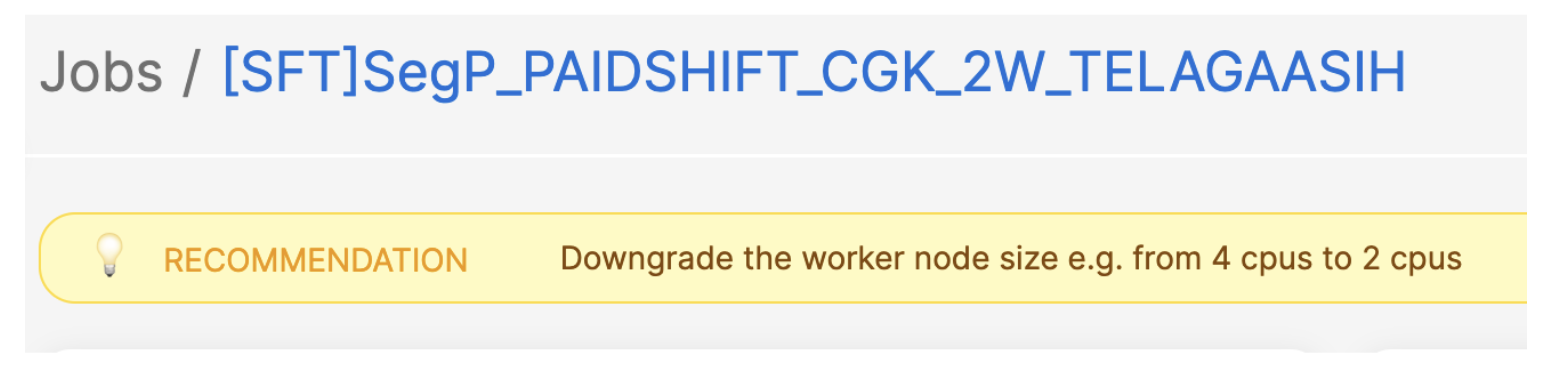
Here is an example: in a job with consistently low resource utilisation (less than 25% over time), our system suggests reducing the worker size by half to optimise costs.
Figure 3. Example of job with low resource utilisation.
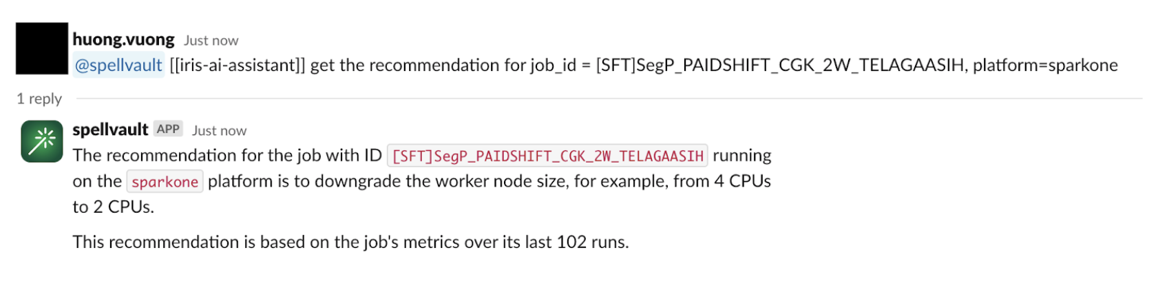
Slackbot integration
To make these insights more accessible, we’ve integrated the recommendation system with a SpellVault app (a GenAI platform at Grab). This allows users to interact with the recommendation system directly from Slack, allowing them to stay informed about job performance and potential optimisations without constantly checking the Iris web interface.
Figure 4. Example of integration with SpellVault.
Migration and adoption
Migration strategy
Fully migrating real-time CPU/Memory charts from Grafana to the new Iris UI
Will deprecate the Grafana dashboard after migration
Retaining Superset for platform metrics and specific BI needs
User onboarding and feedback
Iris deployed within the One DE app, centralising access to data engineering tools. The feedback button in the UI allows users to submit comments easily.
Lessons learned and future roadmap
Lessons learned
Unified data store: Using StarRocks as a single source for both real-time and historical data has significantly improved query performance and streamlined our architecture.
Materialised views: Leveraging StarRocks’ materialised views for pre-aggregations has significantly enhanced query response times, especially for common UI operations.
Dynamic partitioning: Implementing dynamic partitioning has helped in maintaining optimal performance as data volumes grow, automatically managing data retention.
Direct Kafka ingestion: StarRocks’ ability to ingest data directly from Kafka has streamlined our data pipeline, reducing latency and complexity.
Flexible data model: Compared to the previous time-series-focused InfluxDB, the StarRocks relational model enables more complex queries and simplifies metadata handling.
Future roadmap
Enhanced recommendations: Expand the recommendation system to include more in-depth suggestions, such as identifying potential bottlenecks and recommending Spark configurations to add or remove from jobs. These recommendations, aimed at improving runtime and cost performance, will leverage the detailed Spark metrics and event data we’re already collecting.
Advanced analytics: Leverage the comprehensive Spark metrics data to provide deeper insights into job performance and resource utilisation.
Integration expansion: Enhance Iris integration with other internal tools and platforms to increase adoption and ensure a seamless experience across the data engineering ecosystem.
Machine learning integration: Explore the possibility of incorporating machine learning models for predictive analytics on Spark performance.
Scalability improvements: Continue to optimise the system to handle increasing data volumes and user loads as adoption grows.
User experience enhancements: Continuously improve the Iris application’s UI/UX based on user feedback to make it more intuitive and informative.
Conclusion
The journey of building the Iris web application, powered by StarRocks, has been transformative for our Spark observability capabilities at Grab. This evolution was driven by the need for a user-friendly, centralised platform for Spark monitoring and logging.
By leveraging StarRocks’ capabilities, we’ve created a unified interface that seamlessly handles both real-time and historical data. This has allowed us to consolidate previously fragmented tools like Grafana and Superset into a single, cohesive platform. The ability to capture and analyse job metadata and metrics in one place has been crucial, enabling us to implement effective showback/chargeback mechanisms at the job level.
Looking ahead, we’re excited about the potential for more advanced analytics and machine learning-driven insights. The lessons learned from this project will guide our approach to building robust, scalable, and user-friendly data tools at Grab.
Join us
Grab is a leading superapp in Southeast Asia, operating across the deliveries, mobility and digital financial services sectors. Serving over 800 cities in eight Southeast Asian countries, Grab enables millions of people everyday to order food or groceries, send packages, hail a ride or taxi, pay for online purchases or access services such as lending and insurance, all through a single app. Grab was founded in 2012 with the mission to drive Southeast Asia forward by creating economic empowerment for everyone. Grab strives to serve a triple bottom line – we aim to simultaneously deliver financial performance for our shareholders and have a positive social impact, which includes economic empowerment for millions of people in the region, while mitigating our environmental footprint.
Powered by technology and driven by heart, our mission is to drive Southeast Asia forward by creating economic empowerment for everyone. If this mission speaks to you, join our team today!
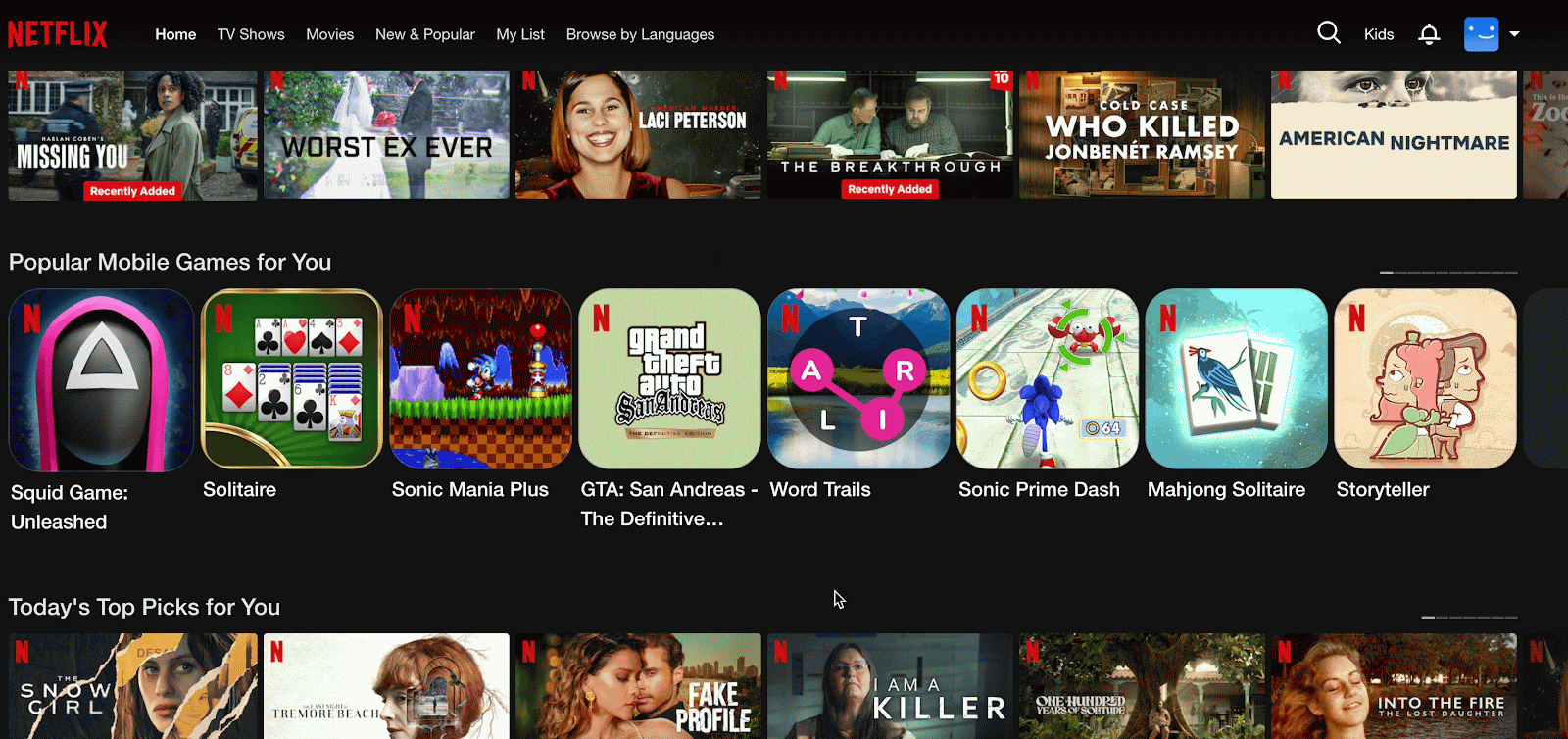
Imagine scrolling through Netflix, where each movie poster or promotional banner competes for your attention. Every image you hover over isn’t just a visual placeholder; it’s a critical data point that fuels our sophisticated personalization engine. At Netflix, we call these images ‘impressions,’ and they play a pivotal role in transforming your interaction from simple browsing into an immersive binge-watching experience, all tailored to your unique tastes.
Capturing these moments and turning them into a personalized journey is no simple feat. It requires a state-of-the-art system that can track and process these impressions while maintaining a detailed history of each profile’s exposure. This nuanced integration of data and technology empowers us to offer bespoke content recommendations.
In this multi-part blog series, we take you behind the scenes of our system that processes billions of impressions daily. We will explore the challenges we encounter and unveil how we are building a resilient solution that transforms these client-side impressions into a personalized content discovery experience for every Netflix viewer.
Impressions on homepage
Why do we need impression history?
Enhanced Personalization
To tailor recommendations more effectively, it’s crucial to track what content a user has already encountered. Having impression history helps us achieve this by allowing us to identify content that has been displayed on the homepage but not engaged with, helping us deliver fresh, engaging recommendations.
Frequency Capping
By maintaining a history of impressions, we can implement frequency capping to prevent over-exposure to the same content. This ensures users aren’t repeatedly shown identical options, keeping the viewing experience vibrant and reducing the risk of frustration or disengagement.
Highlighting New Releases
For new content, impression history helps us monitor initial user interactions and adjust our merchandising efforts accordingly. We can experiment with different content placements or promotional strategies to boost visibility and engagement.
Analytical Insights
Additionally, impression history offers insightful information for addressing a number of platform-related analytics queries. Analyzing impression history, for example, might help determine how well a specific row on the home page is functioning or assess the effectiveness of a merchandising strategy.
Architecture Overview
The first pivotal step in managing impressions begins with the creation of a Source-of-Truth (SOT) dataset. This foundational dataset is essential, as it supports various downstream workflows and enables a multitude of use cases.
Collecting Raw Impression Events
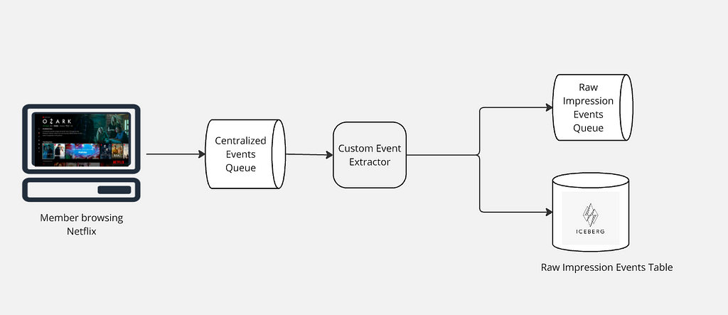
As Netflix members explore our platform, their interactions with the user interface spark a vast array of raw events. These events are promptly relayed from the client side to our servers, entering a centralized event processing queue. This queue ensures we are consistently capturing raw events from our global user base.
After raw events are collected into a centralized queue, a custom event extractor processes this data to identify and extract all impression events. These extracted events are then routed to an Apache Kafka topic for immediate processing needs and simultaneously stored in an Apache Iceberg table for long-term retention and historical analysis. This dual-path approach leverages Kafka’s capability for low-latency streaming and Iceberg’s efficient management of large-scale, immutable datasets, ensuring both real-time responsiveness and comprehensive historical data availability.
Collecting raw impression events
Filtering & Enriching Raw Impressions
Once the raw impression events are queued, a stateless Apache Flink job takes charge, meticulously processing this data. It filters out any invalid entries and enriches the valid ones with additional metadata, such as show or movie title details, and the specific page and row location where each impression was presented to users. This refined output is then structured using an Avro schema, establishing a definitive source of truth for Netflix’s impression data. The enriched data is seamlessly accessible for both real-time applications via Kafka and historical analysis through storage in an Apache Iceberg table. This dual availability ensures immediate processing capabilities alongside comprehensive long-term data retention.
Impression Source-of-Truth architecture
Ensuring High Quality Impressions
Maintaining the highest quality of impressions is a top priority. We accomplish this by gathering detailed column-level metrics that offer insights into the state and quality of each impression. These metrics include everything from validating identifiers to checking that essential columns are properly filled. The data collected feeds into a comprehensive quality dashboard and supports a tiered threshold-based alerting system. These alerts promptly notify us of any potential issues, enabling us to swiftly address regressions. Additionally, while enriching the data, we ensure that all columns are in agreement with each other, offering in-place corrections wherever possible to deliver accurate data.
Dashboard showing mismatch count between two columns- entityId and videoId
Configuration
We handle a staggering volume of 1 to 1.5 million impression events globally every second, with each event approximately 1.2KB in size. To efficiently process this massive influx in real-time, we employ Apache Flink for its low-latency stream processing capabilities, which seamlessly integrates both batch and stream processing to facilitate efficient backfilling of historical data and ensure consistency across real-time and historical analyses. Our Flink configuration includes 8 task managers per region, each equipped with 8 CPU cores and 32GB of memory, operating at a parallelism of 48, allowing us to handle the necessary scale and speed for seamless performance delivery. The Flink job’s sink is equipped with a data mesh connector, as detailed in our Data Mesh platform which has two outputs: Kafka and Iceberg. This setup allows for efficient streaming of real-time data through Kafka and the preservation of historical data in Iceberg, providing a comprehensive and flexible data processing and storage solution.
Raw impressions records per second
We utilize the ‘island model’ for deploying our Flink jobs, where all dependencies for a given application reside within a single region. This approach ensures high availability by isolating regions, so if one becomes degraded, others remain unaffected, allowing traffic to be shifted between regions to maintain service continuity. Thus, all data in one region is processed by the Flink job deployed within that region.
Future Work
Addressing the Challenge of Unschematized Events
Allowing raw events to land on our centralized processing queue unschematized offers significant flexibility, but it also introduces challenges. Without a defined schema, it can be difficult to determine whether missing data was intentional or due to a logging error. We are investigating solutions to introduce schema management that maintains flexibility while providing clarity.
Automating Performance Tuning with Autoscalers
Tuning the performance of our Apache Flink jobs is currently a manual process. The next step is to integrate with autoscalers, which can dynamically adjust resources based on workload demands. This integration will not only optimize performance but also ensure more efficient resource utilization.
Improving Data Quality Alerts
Right now, there’s a lot of business rules dictating when a data quality alert needs to be fired. This leads to a lot of false positives that require manual judgement. A lot of times it is difficult to track changes leading to regression due to inadequate data lineage information. We are investing in building a comprehensive data quality platform that more intelligently identifies anomalies in our impression stream, keeps track of data lineage and data governance, and also, generates alerts notifying producers of any regressions. This approach will enhance efficiency, reduce manual oversight, and ensure a higher standard of data integrity.
Conclusion
Creating a reliable source of truth for impressions is a complex but essential task that enhances personalization and discovery experience. Stay tuned for the next part of this series, where we’ll delve into how we use this SOT dataset to create a microservice that provides impression histories. We invite you to share your thoughts in the comments and continue with us on this journey of discovering impressions.
Acknowledgments
We are genuinely grateful to our amazing colleagues whose contributions were essential to the success of Impressions: Julian Jaffe, Bryan Keller, Yun Wang, Brandon Bremen, Kyle Alford, Ron Brown and Shriya Arora.
A summary of sessions at the first Data Engineering Open Forum at Netflix on April 18th, 2024
The Data Engineering Open Forum at Netflix on April 18th, 2024.
At Netflix, we aspire to entertain the world, and our data engineering teams play a crucial role in this mission by enabling data-driven decision-making at scale. Netflix is not the only place where data engineers are solving challenging problems with creative solutions. On April 18th, 2024, we hosted the inaugural Data Engineering Open Forum at our Los Gatos office, bringing together data engineers from various industries to share, learn, and connect.
At the conference, our speakers share their unique perspectives on modern developments, immediate challenges, and future prospects of data engineering. We are excited to share the recordings of talks from the conference with the rest of the world.
Summary: At Netflix, hundreds of thousands of workflows and millions of jobs are running every day on our big data platform, but diagnosing and remediating job failures can impose considerable operational burdens. To handle errors efficiently, Netflix developed a rule-based classifier for error classification called “Pensive.” However, as the system has increased in scale and complexity, Pensive has been facing challenges due to its limited support for operational automation, especially for handling memory configuration errors and unclassified errors. To address these challenges, we have developed a new feature called “Auto Remediation,” which integrates the rules-based classifier with an ML service.
Automating the Data Architect: Generative AI for Enterprise Data Modeling
Speaker: Jide Ogunjobi (Founder & CTO at Context Data)
Summary: As organizations accumulate ever-larger stores of data across disparate systems, efficiently querying and gaining insights from enterprise data remain ongoing challenges. To address this, we propose developing an intelligent agent that can automatically discover, map, and query all data within an enterprise. This “Enterprise Data Model/Architect Agent” employs generative AI techniques for autonomous enterprise data modeling and architecture.
Tulika Bhatt, Senior Data Engineer at Netflix, shared how her team manages impression data at scale.
Speaker:Tulika Bhatt (Senior Data Engineer at Netflix)
Summary: Netflix generates approximately 18 billion impressions daily. These impressions significantly influence a viewer’s browsing experience, as they are essential for powering video ranker algorithms and computing adaptive pages, With the evolution of user interfaces to be more responsive to in-session interactions, coupled with the growing demand for real-time adaptive recommendations, it has become highly imperative that these impressions are provided on a near real-time basis. This talk will delve into the creative solutions Netflix deploys to manage this high-volume, real-time data requirement while balancing scalability and cost.
Reflections on Building a Data Platform From the Ground Up in a Post-GDPR World
Summary: The requirements for creating a new data warehouse in the post-GDPR world are significantly different from those of the pre-GDPR world, such as the need to prioritize sensitive data protection and regulatory compliance over performance and cost. In this talk, Jessica Larson shares her takeaways from building a new data platform post-GDPR.
Unbundling the Data Warehouse: The Case for Independent Storage
Speaker: Jason Reid (Co-founder & Head of Product at Tabular)
Summary: Unbundling a data warehouse means splitting it into constituent and modular components that interact via open standard interfaces. In this talk, Jason Reid discusses the pros and cons of both data warehouse bundling and unbundling in terms of performance, governance, and flexibility, and he examines how the trend of data warehouse unbundling will impact the data engineering landscape in the next 5 years.
Clark Wright, Staff Analytics Engineer at Airbnb, talked about the concept of Data Quality Score at Airbnb.
Data Quality Score: How We Evolved the Data Quality Strategy at Airbnb
Speaker: Clark Wright (Staff Analytics Engineer at Airbnb)
Summary: Recently, Airbnb published a post to their Tech Blog called Data Quality Score: The next chapter of data quality at Airbnb. In this talk, Clark Wright shares the narrative of how data practitioners at Airbnb recognized the need for higher-quality data and then proposed, conceptualized, and launched Airbnb’s first Data Quality Score.
Speaker: Iaroslav Zeigerman (Co-Founder and Chief Architect at Tobiko Data)
Summary: The development and evolution of data pipelines are hindered by outdated tooling compared to software development. Creating new development environments is cumbersome: Populating them with data is compute-intensive, and the deployment process is error-prone, leading to higher costs, slower iteration, and unreliable data. SQLMesh, an open-source project born from our collective experience at companies like Airbnb, Apple, Google, and Netflix, is designed to handle the complexities of evolving data pipelines at an internet scale. In this talk, Iaroslav Zeigerman discusses challenges faced by data practitioners today and how core SQLMesh concepts solve them.
If you are interested in attending a future Data Engineering Open Forum, we highly recommend you join our Google Group to stay tuned to event announcements.
Earlier this summer Netflix held our first-ever Data Engineering Forum. Engineers from across the company came together to share best practices on everything from Data Processing Patterns to Building Reliable Data Pipelines. The result was a series of talks which we are now sharing with the rest of the Data Engineering community!
You can find each of the talks below with a short description of each, or you can go straight to the playlist on YouTube here.
Chris Stephens, Data Engineer, Content & Studio and Pedro Duarte, Software Engineer, Consolidated Logging walk engineers new to Netflix through the building blocks of the Netflix Data Engineering stack. Learn more about how batch and streaming data pipelines are built at Netflix.
Lee Woodridge and Pallavi Phadnis, Data Engineers at Netflix, talk about how you can apply different processing strategies for your batch pipelines by implementing generic abstractions to help scale, be more efficient, handle late-arriving data, and be more fault tolerant.
Mark Cho, Guil Pires and Sujay Jain, Engineers from the Netflix Data Platform talk about how a managed Streaming SQL using Apache Flink can help unlock new Stream Processing use cases at Netflix. You can read more about Data Mesh, Netflix’s next-generation stream processing platform, here
Holden Karau, OSS Engineer, Data Platform Engineering, talks about the importance of reliable data pipelines and how to build them covering tools from testing to validation and auditing. The talk uses Apache Spark as an example, but the concepts generalize regardless of your specific tools.
Tristan Reid, software engineer, shares experiences about the Knowledge Management project at Netflix, which seeks to leverage language modeling techniques and metadata from internal systems to improve the impact of the >100K memos that circulate within the company.
Abhinaya Shetty and Bharath Mummadisetty, Data Engineers from Netflix’s Membership Data Engineering team, introduce Psyberg, an incremental ETL framework. Learn about how Psyberg leverages Iceberg metadata to handle late-arriving data, and improves data pipelines while simplifying on-call life!
Judit Lantos, Data Engineer, Member Experience Data Engineering, shares a case study to demonstrate an effective approach for optimizing complex ETL jobs.
In the last 2 decades, Netflix has revolutionized the way video content is consumed, however, there is significant work to be done in revolutionizing how movies and tv shows are made. In this video, Sr. Data Engineers Amanual Kahsay and Dao Mi showcase how data and insights are being utilized to accomplish such a vision.
We hope that our fellow members of the Data Engineering Community find these videos useful and engaging. Please follow our Netflix Data Twitter account for updates and notifications of future Data Engineering Summits!
This post is for all data practitioners, who are interested in learning about bootstrapping, standardization and automation of batch data pipelines at Netflix.
You may remember Dataflow from the post we wrote last year titled Data pipeline asset management with Dataflow. That article was a deep dive into one of the more technical aspects of Dataflow and didn’t properly introduce this tool in the first place. This time we’ll try to give justice to the intro and then we will focus on one of the very first features Dataflow came with. That feature is called sample workflows, but before we start in let’s have a quick look at Dataflow in general.
Dataflow
Dataflow is a command line utility built to improve experience and to streamline the data pipeline development at Netflix. Check out this high level Dataflow help command output below:
Options: --docker-image TEXT Url of the docker image to run in. --run-in-docker Run dataflow in a docker container. -v, --verbose Enables verbose mode. --version Show the version and exit. --help Show this message and exit.
As you can see Dataflow CLI is divided into four main subject areas (or commands). The most commonly used one is dataflow project, which helps folks in managing their data pipeline repositories through creation, testing, deployment and few other activities.
The dataflow migration command is a special feature, developed single handedly by Stephen Huenneke, to fully automate the communication and tracking of a data warehouse table changes. Thanks to the Netflix internal lineage system (built by Girish Lingappa) Dataflow migration can then help you identify downstream usage of the table in question. And finally it can help you craft a message to all the owners of these dependencies. After your migration has started Dataflow will also keep track of its progress and help you communicate with the downstream users.
Dataflow mock command is another standalone feature. It lets you create YAML formatted mock data files based on selected tables, columns and a few rows of data from the Netflix data warehouse. Its main purpose is to enable easy unit testing of your data pipelines, but it can technically be used in any other situations as a readable data format for small data sets.
All the above commands are very likely to be described in separate future blog posts, but right now let’s focus on the dataflow sample command.
Sample workflows
Dataflow sample workflows is a set of templates anyone can use to bootstrap their data pipeline project. And by “sample” we mean “an example”, like food samples in your local grocery store. One of the main reasons this feature exists is just like with food samples, to give you “a taste” of the production quality ETL code that you could encounter inside the Netflix data ecosystem.
All the code you get with the Dataflow sample workflows is fully functional, adjusted to your environment and isolated from other sample workflows that others generated. This pipeline is safe to run the moment it shows up in your directory. It will, not only, build a nice example aggregate table and fill it up with real data, but it will also present you with a complete set of recommended components:
clean DDL code,
proper table metadata settings,
transformation job (in a language of choice) wrapped in an optional WAP (Write, Audit, Publish) pattern,
sample set of data audits for the generated data,
and a fully functional unit test for your transformation logic.
And last, but not least, these sample workflows are being tested continuously as part of the Dataflow code change protocol, so you can be sure that what you get is working. This is one way to build trust with our internal user base.
Next, let’s have a look at the actual business logic of these sample workflows.
Business Logic
There are several variants of the sample workflow you can get from Dataflow, but all of them share the same business logic. This was a conscious decision in order to clearly illustrate the difference between various languages in which your ETL could be written in. Obviously not all tools are made with the same use case in mind, so we are planning to add more code samples for other (than classical batch ETL) data processing purposes, e.g. Machine Learning model building and scoring.
The example business logic we use in our template computes the top hundred movies/shows in every country where Netflix operates on a daily basis. This is not an actual production pipeline running at Netflix, because it is a highly simplified code but it serves well the purpose of illustrating a batch ETL job with various transformation stages. Let’s review the transformation steps below.
Step 1: on a daily basis, incrementally, sum up all viewing time of all movies and shows in every country
WITH STEP_1 AS (
   SELECT
       title_id
       , country_code
       , SUM(view_hours) AS view_hours
   FROM some_db.source_table
   WHERE playback_date = CURRENT_DATE
   GROUP BY
       title_id
       , country_code
)
Step 2: rank all titles from most watched to least in every county
WITH STEP_2 AS (
   SELECT
       title_id
       , country_code
       , view_hours
       , RANK() OVER (
          PARTITION BY country_code
          ORDER BY view_hours DESC
       ) AS title_rank
   FROM STEP_1
)
Step 3: filter all titles to the top 100
WITH STEP_3 AS (
   SELECT
       title_id
       , country_code
       , view_hours
       , title_rank
   FROM STEP_2
   WHERE title_rank <= 100
)
Now, using the above simple 3-step transformation we will produce data that can be written to the following Iceberg table:
CREATE TABLE IF NOT EXISTS ${TARGET_DB}.dataflow_sample_results (
  title_id INT COMMENT "Title ID of the movie or show."
  , country_code STRING COMMENT "Country code of the playback session."
  , title_rank INT COMMENT "Rank of a given title in a given country."
  , view_hours DOUBLE COMMENT "Total viewing hours of a given title in a given country."
)
COMMENT
  "Example dataset brought to you by Dataflow. For more information on this
   and other examples please visit the Dataflow documentation page."
PARTITIONED BY (
  date DATE COMMENT "Playback date."
)
STORED AS ICEBERG;
As you can infer from the above table structure we are going to load about 19,000 rows into this table on a daily basis. And they will look something like this:
 sql> SELECT * FROM foo.dataflow_sample_results
      WHERE date = 20220101 and country_code = 'US'
      ORDER BY title_rank LIMIT 5;

 title_id | country_code | title_rank | view_hours | date
----------+--------------+------------+------------+----------
 11111111 | US           |          1 |   123      | 20220101
 44444444 | US           |          2 |   111      | 20220101
 33333333 | US           |          3 |   98       | 20220101
 55555555 | US           |          4 |   55       | 20220101
 22222222 | US           |          5 |   11       | 20220101
(5 rows)
With the business logic out of the way, we can now start talking about the components, or the boiler-plate, of our sample workflows.
Components
Let’s have a look at the most common workflow components that we use at Netflix. These components may not fit into every ETL use case, but are used often enough to be included in every template (or sample workflow). The workflow author, after all, has the final word on whether they want to use all of these patterns or keep only some. Either way they are here to start with, ready to go, if needed.
Workflow Definitions
Below you can see a typical file structure of a sample workflow package written in SparkSQL.
Above bolded files define a series of steps (a.k.a. jobs) their cadence, dependencies, and the sequence in which they should be executed.
This is one way we can tie components together into a cohesive workflow. In every sample workflow package there are three workflow definition files that work together to provide flexible functionality. The sample workflow code assumes a daily execution pattern, but it is very easy to adjust them to run at different cadence. For the workflow orchestration we use Netflix homegrown Maestro scheduler.
The main workflow definition file holds the logic of a single run, in this case one day-worth of data. This logic consists of the following parts: DDL code, table metadata information, data transformation and a few audit steps. It’s designed to run for a single date, and meant to be called from the daily or backfill workflows. This main workflow can also be called manually during development with arbitrary run-time parameters to get a feel for the workflow in action.
The daily workflow executes the main one on a daily basis for the predefined number of previous days. This is sometimes necessary for the purpose of catching up on some late arriving data. This is where we define a trigger schedule, notifications schemes, and update the “high water mark” timestamps on our target table.
The backfill workflow executes the main for a specified range of days. This is useful for restating data, most often because of a transformation logic change, but sometimes as a response to upstream data updates.
DDL
Often, the first step in a data pipeline is to define the target table structure and column metadata via a DDL statement. We understand that some folks choose to have their output schema be an implicit result of the transform code itself, but the explicit statement of the output schema is not only useful for adding table (and column) level comments, but also serves as one way to validate the transform logic.
Generally, we prefer to execute DDL commands as part of the workflow itself, instead of running outside of the schedule, because it simplifies the development process. See below example of hooking the table creation SQL file into the main workflow definition.
The metadata step provides context on the output table itself as well as the data contained within. Attributes are set via Metacat, which is a Netflix internal metadata management platform. Below is an example of plugging that metadata step in the main workflow definition
Optionally, this step can use the Write-Audit-Publish pattern to ensure that data is correct before it is made available to the rest of the company. See example below:
Audit steps can be defined to verify data quality. If a “blocking” audit fails, the job will halt and the write step is not committed, so invalid data will not be exposed to users. This step is optional and configurable, see a partial example of an audit from the main workflow below.
A successful write will typically be followed by a metadata call to set the valid time (or high-water mark) of a dataset. This allows other processes, consuming our table, to be notified and start their processing. See an example high water mark job from the main workflow definition.
Unit test artifacts are also generated as part of the sample workflow structure. They consist of data mocks, the actual test code, and a simple execution harness depending on the workflow language. See the bolded file below.
These unit tests are intended to test one “unit” of data transform in isolation. They can be run during development to quickly capture code typos and syntax issues, or during automated testing/deployment phase, to make sure that code changes have not broken any tests.
We want unit tests to run quickly so that we can have continuous feedback and fast iterations during the development cycle. Running code against a production database can be slow, especially with the overhead required for distributed data processing systems like Apache Spark. Mocks allow you to run tests locally against a small sample of “real” data to validate your transformation code functionality.
Languages
Over time, the extraction of data from Netflix’s source systems has grown to encompass a wider range of end-users, such as engineers, data scientists, analysts, marketers, and other stakeholders. Focusing on convenience, Dataflow allows for these differing personas to go about their work seamlessly. A large number of our data users employ SparkSQL, pyspark, and Scala. A small but growing contingency of data scientists and analytics engineers use R, backed by the Sparklyr interface or other data processing tools, like Metaflow.
With an understanding that the data landscape and the technologies employed by end-users are not homogenous, Dataflow creates a malleable path toward. It solidifies different recipes or repeatable templates for data extraction. Within this section, we’ll preview a few methods, starting with sparkSQL and python’s manner of creating data pipelines with dataflow. Then we’ll segue into the Scala and R use cases.
To begin, after installing Dataflow, a user can run the following command to understand how to get started.
Create a sample workflow based on selected RECIPE and land it in the specified TARGET_PATH.
Currently supported workflow RECIPEs are: spark-sql, pyspark, scala and sparklyr.
If TARGET_PATH: - if not specified, current directory is assumed - points to a directory, it will be used as the target location
Options: --source-path TEXT Source path of the sample workflows. --workflow-shortname TEXT Workflow short name. --workflow-id TEXT Workflow ID. --skip-info Skip the info about the workflow sample. --help Show this message and exit.
Once again, let’s assume we have a directory called stranger-data in which the user creates workflow templates in all four languages that Dataflow offers. To better illustrate how to generate the sample workflows using Dataflow, let’s look at the full command one would use to create one of these workflows, e.g:
$ cd stranger-data
$ dataflow sample workflow spark-sql ./sparksql-workflow
By repeating the above command for each type of transformation language we can arrive at the following directory structure
Earlier we talked about the business logic of these sample workflows and we showed the Spark SQL version of that example data transformation. Now let’s discuss different approaches to writing the data in other languages.
PySpark
This partial pySpark code below will have the same functionality as the SparkSQL example above, but it utilizes Spark dataframes Python interface.
As you can see we try to make Netflix data engineering life easier by offering paved paths and suggestions on how to structure their code, while trying to keep the variety of options wide enough so they can pick and choose what works best for them in any particular case.
Having a well-defined set of defaults for data pipeline creation across Netflix makes onboarding easier, provides standardization and centralization best practices. Let’s review them below.
Onboarding
Ramping up on a new team or a business vertical always takes some effort, especially in a “highly aligned, loosely coupled” culture. Having a well-documented starting point removes some of the struggle that comes with starting from scratch and considerably speeds up the first iteration of the development cycle.
Standardization
Standardization makes life easier for new team members as well as those already familiar with the domain and tech stack.
Some transfer of work between people or teams is inevitable. Having standardized layout and patterns removes friction from this exchange. Also, code reviews and suggestions are easier to manage when working from a similar baseline.
Standardization also makes project layout more intuitive and minimizes risk of human error as the codebase evolves.
Centralized Best Practices
Data infrastructure evolves continually. Having easy access to a centralized set of good defaults is critical to ensure that best practices evolve along with the technology, and that users are aware of what’s the latest on the tech-stack menu.
Even better, Dataflow offers executable best practices, which present these concepts in the context of an actual use case. Instead of reading documentation, you can initialize a “real” project, change it as needed, and iterate from there.
Hopefully you won’t need to wait another year to read about other features of Dataflow. Here are a few topics that we could write about next. Please have a look at the subjects below and, if you feel strongly about any of them, let us know in the comments section:
Branch driven deployment — to explain how Dataflow lets anyone customize their CI/CD jobs based on the git branch for easy testing in isolated environments.
Local SparkSQL unit testing— to clarify how Dataflow helps in making robust unit tests for Spark SQL transform code, with ease.
Data migrations made easy — to show how Dataflow can be used to plan a table migration, support the communication with downstream users and help in monitoring it to completion.
asset — any business logic code in a raw (e.g. SQL) or compiled (e.g. JAR) form to be executed as part of the user defined data pipeline.
data pipeline — a set of tasks (or jobs) to be executed in a predefined order (a.k.a. DAG) for the purpose of transforming data using some business logic.
Dataflow — Netflix homegrown CLI tool for data pipeline management.
job — a.k.a task, an atomic unit of data transformation logic, a non-separable execution block in the workflow chain.
namespace — unique label, usually representing a business subject area, assigned to a workflow asset to identify it across all other assets managed by Dataflow (e.g. security).
workflow — see “data pipeline”
Intro
The problem of managing scheduled workflows and their assets is as old as the use of cron daemon in early Unix operating systems. The design of a cron job is simple, you take some system command, you pick the schedule to run it on and you are done. Example:
0 0 * * MON /home/alice/backup.sh
In the above example the system would wake up every Monday morning and execute the backup.sh script. Simple right? But what if the script does not exist in the given path, or what if it existed initially but then Alice let Bob access her home directory and he accidentally deleted it? Or what if Alice wanted to add new backup functionality and she accidentally broke existing code while updating it?
The answers to these questions is something we would like to address in this article and propose a clean solution to this problem.
Let’s define some requirements that we are interested in delivering to the Netflix data engineers or anyone who would like to schedule a workflow with some external assets in it. By external assets we simply mean some executable carrying the actual business logic of the job. It could be a JAR compiled from Scala, a Python script or module, or a simple SQL file. The important thing is that this business logic can be built in a separate repository and maintained independently from the workflow definition. Keeping all that in mind we would like to achieve the following properties for the whole workflow deployment:
Versioning: we want both the workflow definition and its assets to be versioned and we want the versions to be tied together in a clear way.
Transparency: we want to know which version of an asset is running along with every workflow instance, so if there are any issues we can easily identify which version caused the problem and to which one we could revert, if necessary.
ACID deployment: for every scheduler workflow definition change, we would like to have all the workflow assets bundled in an atomic, durable, isolated and consistent manner. This way, if necessary, all we need to know is which version of the workflow to roll back to, and the rest would be taken care of for us.
While all the above goals are our North Star, we also don’t want to negatively affect fast deployment, high availability and arbitrary life span of any deployed asset.
Previous solutions
The basic approach to pulling down arbitrary workflow resources during workflow execution has been known to mankind since the invention of cron, and with the advent of “infinite” cloud storage systems like S3, this approach has served us for many years. Its apparent flexibility and convenience can often fool us into thinking that by simply replacing the asset in the S3 location we can, without any hassle, introduce changes to our business logic. This method often proves very troublesome especially if there is more than one engineer working on the same pipeline and they are not all aware of the other folks’ “deployment process”.
The slightly improved approach is shown on the diagram below.
In Figure 1, you can see an illustration of a typical deployment pipeline manually constructed by a user for an individual project. The continuous deployment tool submits a workflow definition with pointers to assets in fixed S3 locations. These assets are then separately deployed to these fixed locations. At runtime, the assets are retrieved from the defined locations in S3 and executed in the runtime container. Despite requiring users to construct the deployment pipeline manually, often by writing their own scripts from scratch, this design works and has been successfully used by many teams for years. That being said, it does have some drawbacks that are revealed as you try to add any amount of complexity to your deployment logic. Let’s discuss a few of them.
Does not consider branch/PR deployments
In any production pipeline, you want the flexibility of having a “safe” alternative deployment logic. For example, you may want to build your Scala code and deploy it to an alternative location in S3 while pushing a sandbox version of your workflow that points to this alternative location. Something this simple gets very complicated very quickly and requires the user to consider a number of things. Where should this alternative location be in S3? Is a single location enough? How do you set up your deployment logic to know when to deploy the workflow to a test or dev environment? Answers to these questions often end up being more custom logic inside of the user’s deployment scripts.
Cannot rollback to previous workflow versions
When you deploy a workflow, you really want it to encapsulate an atomic and idempotent unit of work. Part of the reason for that is the desire for the ability to rollback to a previous workflow version and knowing that it will always behave as it did in previous runs. There can be many reasons to rollback but the typical one is when you’ve recognized a regression in a recent deployment that was not caught during testing. In the current design, reverting to a previous workflow definition in your scheduling system is not enough! You have to rebuild your assets from source and move them to your fixed S3 location that your workflow points to. To enable atomic rollbacks, you can add more custom logic to your deployment scripts to always deploy your assets to a new location and generate new pointers for your workflows to use, but that comes with higher complexity that often just doesn’t feel worth it. More commonly, teams will opt to do more testing to try and catch regressions before deploying to production and will accept the extra burden of rebuilding all of their workflow dependencies in the event of a regression.
Runtime dependency on user-managed cloud storage locations
At runtime, the container must reach out to a user-defined storage location to retrieve the assets required. This causes the user-managed storage system to be a critical runtime dependency. If we zoom out to look at an entire workflow management system, the runtime dependencies can become unwieldy if it relies on various storage systems that are arbitrarily defined by the workflow developers!
Dataflow deployment with asset management
In the attempt to deliver a simple and robust solution to the managed workflow deployments we created a command line utility called Dataflow. It is a Python based CLI + library that can be installed anywhere inside the Netflix environment. This utility can build and configure workflow definitions and their assets during testing and deployment. See below diagram:
Figure 2. Dataflow asset management system.
In Figure 2, we show a variation of the typical manually constructed deployment pipeline. Every asset deployment is released to some newly calculated UUID. The workflow definition can then identify a specific asset by its UUID. Deploying the workflow to the scheduling system produces a “Deployment Bundle”. The bundle includes all of the assets that have been referenced by the workflow definition and the entire bundle is deployed to the scheduling system. At every scheduled runtime, the scheduling system can create an instance of your workflow without having to gather runtime dependencies from external systems.
The asset management system that we’ve created for Dataflow provides a strong abstraction over this deployment design. Deploying the asset, generating the UUID, and building the deployment bundle is all handled automatically by the Dataflow build logic. The user does not need to be aware of anything that’s happening on S3, nor that S3 is being used at all! Instead, the user is given a flexible UUID referencing system that’s layered on top of our scheduling system’s workflow DSL. Later in the article we’ll cover this referencing system in some detail. But first, let’s look at an example of deploying an asset and a workflow.
Deployment of an asset
Let’s walk through an example of a workflow asset build and deployment. Let’s assume we have a repository called stranger-data with the following structure:
Before deploying the assets, and especially if we made any changes to them, we can run unit tests to make sure that we didn’t break anything. In a typical Dataflow configuration this manual testing is optional because Dataflow continuous integration tests will do that for us on any pull-request.
Notice that the test command we use above not only executes unit test suites defined in our Scala and Python sub-projects, but it also renders and statically validates all the workflow definitions in our repo, but more on that later…
Assuming all tests passed, let’s now use the Dataflow command to build and deploy a new version of the Scala and Python assets into the Dataflow asset registry.
stranger-data$ dataflow project deploy
Building Python Assets: -> ./pyspark-workflow/hello_world/setup.py... CREATED ./pyspark-workflow/hello_world/dist/hello_world-0.0.1-py3.7.egg Summary: 1 successful, 0 failed.
The above list could come in handy, for example if we needed to find and access an older version of an asset deployed from a given branch and commit hash.
Deployment of a workflow
Now let’s have a look at the build and deployment of the workflow definition which references the above assets as part of its pipeline DAG.
Let’s list the workflow definitions in our repo again:
You can see from the above snippet that the write job wants to access some version of the JAR from the scala-workflow namespace. A typical workflow definition, written in YAML, does not need any compilation before it is shipped to the Scheduler API, but Dataflow designates a special step called “rendering” to substitute all of the Dataflow variables and build the final version.
The above expression ${dataflow.jar.scala-workflow} means that the workflow will be rendered and deployed with the latest version of the scala-workflow JAR available at the time of the workflow deployment. It is possible that the JAR is built as part of the same repository in which case the new build of the JAR and a new version of the workflow may be coming from the same deployment. But the JAR may be built as part of a completely different project and in that case the testing and deployment of the new workflow version can be completely decoupled.
We showed above how one would request the latest asset version available during deployment, but with Dataflow asset management we can distinguish two more asset access patterns. An obvious next one is to specify it by all its attributes: asset type, asset namespace, git repo owner, git repo name, git branch name, commit hash and consecutive build number. There is one more extra method for a middle ground solution to pick a specific build for a given namespace and git branch, which can help during testing and development. All of this is part of the user-interface for determining how the deployment bundle will be created. See below diagram for a visual illustration.
Figure 3. A closer at the Deployment Bundle
In short, using the above variables gives the user full flexibility and allows them to pick any version of any asset in any workflow.
An example of the workflow deployment with the rendering step is shown below:
stranger-data$ dataflow project deploy
...
Building Scheduler Workflows:
 -> ./scala-workflow/main.sch.yaml... CREATED ./.workflows/scala-workflow.main.sch.rendered.yaml
 -> ./pyspark-workflow/main.sch.yaml... CREATED ./.workflows/pyspark-workflow.main.sch.rendered.yaml
Summary: 2 successful, 0 failed.
And here you can see what the workflow definition looks like before it is sent to the Scheduler API and registered as the latest version. Notice the value of the script variable of the write job. In the original code says ${dataflow.jar.scala-workflow} and in the rendered version it is translated to a specific file pointer:
The Infrastructure DSE team at Netflix is responsible for providing insights into data that can help the Netflix platform and service scale in a secure and effective way. Our team members partner with business units like Platform, OpenConnect, InfoSec and engage in enterprise level initiatives on a regular basis.
One side effect of such wide engagement is that over the years our repository evolved into a mono-repo with each module requiring a customized build, testing and deployment strategy packaged into a single Jenkins job. This setup required constant upkeep and also meant every time we had a build failure multiple people needed to spend a lot of time in communication to ensure they did not step on each other.
Last quarter we decided to split the mono-repo into separate modules and adopt Dataflow as our asset orchestration tool. Post deployment, the team relies on Dataflow for automated execution of unit tests, management and deployment of workflow related assets.
By the end of the migration process our Jenkins configuration went from:
Figure 4. Real example of a deployment script.
to:
cd /dataflow_workspace
dataflow project deploy
The simplicity of deployment enabled the team to focus on the problems they set out to solve while the branch based customization gave us the flexibility to be our most effective at solving them.
Conclusions
This new method available for Netflix data engineers makes workflow management easier, more transparent and more reliable. And while it remains fairly easy and safe to build your business logic code (in Scala, Python, etc) in the same repository as the workflow definition that invokes it, the new Dataflow versioned asset registry makes it easier yet to build that code completely independently and then reference it safely inside data pipelines in any other Netflix repository, thus enabling easy code sharing and reuse.
One more aspect of data workflow development that gets enabled by this functionality is what we call branch-driven deployment. This approach enables multiple versions of your business logic and workflows to be running at the same time in the scheduler ecosystem, and makes it easy, not only for individual users to run isolated versions of the code during development, but also to define isolated staging environments through which the code can pass before it reaches the production stage. Obviously, in order for the workflows to be safely used in that configuration they must comply with a few simple rules with regards to the parametrization of their inputs and outputs, but let’s leave this subject for another blog post.
Credits
Special thanks to Peter Volpe, Harrington Joseph and Daniel Watson for the initial design review.
Data Engineers of Netflix — Interview with Pallavi Phadnis
This post is part of our “Data Engineers of Netflix” series, where our very own data engineers talk about their journeys to Data Engineering @ Netflix.
Pallavi Phadnis is a Senior Software Engineer at Netflix.
Pallavi Phadnis is a Senior Software Engineer on the Product Data Science and Engineering team. In this post, Pallavi talks about her journey to Netflix and the challenges that keep the work interesting.
Pallavi received her master’s degree from Carnegie Mellon. Before joining Netflix, she worked in the advertising and e-commerce industries as a backend software engineer. In her free time, she enjoys watching Netflix and traveling.
Her favorite shows: Stranger Things, Gilmore Girls, and Breaking Bad.
Pallavi, what’s your journey to data engineering at Netflix?
Netflix’s unique work culture and petabyte-scale data problems are what drew me to Netflix.
During earlier years of my career, I primarily worked as a backend software engineer, designing and building the backend systems that enable big data analytics. I developed many batch and real-time data pipelines using open source technologies for AOL Advertising and eBay. I also built online serving systems and microservices powering Walmart’s e-commerce.
Those years of experience solving technical problems for various businesses have taught me that data has the power to maximize the potential of any product.
Before I joined Netflix, I was always fascinated by my experience as a Netflix member which left a great impression of Netflix engineering teams on me. When I read Netflix’s culture memo for the first time, I was impressed by how candid, direct and transparent the work culture sounded. These cultural points resonated with me most: freedom and responsibility, high bar for performance, and no hiring of brilliant jerks.
Over the years, I followed the big data open-source community and Netflix tech blogs closely, and learned a lot about Netflix’s innovative engineering solutions and active contributions to the open-source ecosystem. In 2017, I attended the Women in Big Data conference at Netflix and met with several amazing women in data engineering, including our VP. At this conference, I also got to know my current team: Consolidated Logging (CL).
CL provides an end-to-end solution for logging, processing, and analyzing user interactions on Netflix apps from all devices. It is critical for fast-paced product innovation at Netflix since CL provides foundational data for personalization, A/B experimentation, and performance analytics. Moreover, its petabyte scale also brings unique engineering challenges. The scope of work, business impact, and engineering challenges of CL were very exciting to me. Plus, the roles on the CL team require a blend of data engineering, software engineering, and distributed systems skills, which align really well with my interests and expertise.
What is your favorite project?
The project I am most proud of is building the Consolidated Logging V2 platform which processes and enriches data at a massive scale (5 million+ events per sec at peak) in real-time. I re-architected our legacy data pipelines and built a new platform on top of Apache Flink and Iceberg. The scale brought some interesting learnings and involved working closely with the Apache Flink and Kafka community to fix core issues. Thanks to the migration to V2, we were able to improve data availability and usability for our consumers significantly. The efficiency achieved in processing and storage layers brought us big savings on computing and storage costs. You can learn more about it from my talk at the Flink forward conference. Over the last couple of years, we have been continuously enhancing the V2 platform to support more logging use cases beyond Netflix streaming apps and provide further analytics capabilities. For instance, I am recently working on a project to build a common analytics solution for 100s of Netflix studio and internal apps.
How’s data engineering similar and different from software engineering?
The data engineering role at Netflix is similar to the software engineering role in many aspects. Both roles involve designing and developing large-scale solutions using various open-source technologies. In addition to the business logic, they need a good understanding of the framework internals and infrastructure in order to ensure production stability, for example, maintaining SLA to minimize the impact on the upstream and downstream applications. At Netflix, it is fairly common for data engineers and software engineers to collaborate on the same projects.
In addition, data engineers are responsible for designing data logging specifications and optimized data models to ensure that the desired business questions can be answered. Therefore, they have to understand both the product and the business use cases of the data in depth.
In other words, data engineers bridge the gap between data producers (such as client UI teams) and data consumers (such as data analysts and data scientists.)
Learning more
Interested in learning more about data roles at Netflix? You’re in the right place! Keep an eye out for our open roles in Data Science and Engineering by visiting our jobs site here. Our culture is key to our impact and growth: read about it here. To learn more about our Data Engineers, check out our chats with Dhevi Rajendran, Samuel Setegne, and Kevin Wylie.
Data Engineers of Netflix — Interview with Kevin Wylie
This post is part of our “Data Engineers of Netflix” series, where our very own data engineers talk about their journeys to Data Engineering @ Netflix.
Kevin Wylie is a Data Engineer on the Content Data Science and Engineering team. In this post, Kevin talks about his extensive experience in content analytics at Netflix since joining more than 10 years ago.
Kevin grew up in the Washington, DC area, and received his undergraduate degree in Mathematics from Virginia Tech. Before joining Netflix, he worked at MySpace, helping implement page categorization, pathing analysis, sessionization, and more. In his free time he enjoys gardening and playing sports with his 4 kids.
His favorite TV shows: Ozark, Breaking Bad, Black Mirror, Barry, and Chernobyl
Since I joined Netflix back in 2011, my favorite project has been designing and building the first version of our entertainment knowledge graph. The knowledge graph enabled us to better understand the trends of movies, TV shows, talent, and books. Building the knowledge graph offered many interesting technical challenges such as entity resolution (e.g., are these two movie names in different languages really the same?), and distributed graph algorithms in Spark. After we launched the product, analysts and scientists began surfacing new insights that were previously hidden behind difficult-to-use data. The combination of overcoming technical hurdles and creating new opportunities for analysis was rewarding.
Kevin, what drew you to data engineering?
I stumbled into data engineering rather than making an intentional career move into the field. I started my career as an application developer with basic familiarity with SQL. I was later hired into my first purely data gig where I was able to deepen my knowledge of big data. After that, I joined MySpace back at its peak as a data engineer and got my first taste of data warehousing at internet-scale.
What keeps me engaged and enjoying data engineering is giving super-suits and adrenaline shots to analytics engineers and data scientists.
When I make something complex seem simple, or create a clean environment for my stakeholders to explore, research and test, I empower them to do more impactful business-facing work. I like that data engineering isn’t in the limelight, but instead can help create economies of scale for downstream analytics professionals.
What drew you to Netflix?
My wife came across the Netflix job posting in her effort to keep us in Los Angeles near her twin sister’s family. As a big data engineer, I found that there was an enormous amount of opportunity in the Bay Area, but opportunities were more limited in LA where we were based at the time. So the chance to work at Netflix was exciting because it allowed me to live closer to family, but also provided the kind of data scale that was most common for Bay Area companies.
The company was intriguing to begin with, but I knew nothing of the talent, culture, or leadership’s vision. I had been a happy subscriber of Netflix’s DVD-rental program (no late fees!) for years.
After interviewing, it became clear to me that this company culture was different than any I had experienced.
I was especially intrigued by the trust they put in each employee. Speaking with fellow employees allowed me to get a sense for the kinds of people Netflix hires. The interview panel’s humility, curiosity and business acumen was quite impressive and inspired me to join them.
I was also excited by the prospect of doing analytics on movies and TV shows, which was something I enjoyed exploring outside of work. It seemed fortuitous that the area of analytics that I’d be working in would align so well with my hobbies and interests!
Kevin, you’ve been at Netflix for over 10 years now, which is pretty incredible. Over the course of your time here, how has your role evolved?
When I joined Netflix back in 2011, our content analytics team was just 3 people. We had a small office in Los Angeles focused on content, and significantly more employees at the headquarters in Los Gatos. The company was primarily thought of as a tech company.
At the time, the data engineering team mainly used a data warehouse ETL tool called Ab Initio, and an MPP (Massively Parallel Processing) database for warehousing. Both were appliances located in our own data center. Hadoop was being lightly tested, but only in a few high-scale areas.
Fast forward 10 years, and Netflix is now the leading streaming entertainment service — serving members in over 190 countries. In the data engineering space, very little of the same technology remains. Our data centers are retired, Hadoop has been replaced by Spark, Ab Initio and our MPP database no longer fits our big data ecosystem.
In addition to the company and tech shifting, my role has evolved quite a bit as our company has grown. When we were a smaller company, the ability to span multiple functions was valued for agility and speed of delivery. The sooner we could ingest new data and create dashboards and reports for non-technical users to explore and analyze, the sooner we could deliver results. But now, we have a much more mature business, and many more analytics stakeholders that we serve.
For a few years, I was in a management role, leading a great team of people with diverse backgrounds and skill sets. However, I missed creating data products with my own hands so I wanted to step back into a hands-on engineering role. My boss was gracious enough to let me make this change and focus on impacting the business as an individual contributor.
As I think about my future at Netflix, what motivates me is largely the same as what I’ve always been passionate about. I want to make the lives of data consumers easier and to enable them to be more impactful. As the company scales and as we continue to invest in storytelling, the opportunity grows for me to influence these decisions through better access to information and insights. The biggest impact I can make as a data engineer is creating economies of scale by producing data products that will serve a diverse set of use cases and stakeholders.
If I can build beautifully simple data products for analytics engineers, data scientists, and analysts, we can all get better at Netflix’s goal: entertaining the world.
Learning more
Interested in learning more about data roles at Netflix? You’re in the right place! Keep an eye out for our open roles in Data Science and Engineering by visiting our jobs site here. Our culture is key to our impact and growth: read about it here. To learn more about our Data Engineers, check out our chats with Dhevi Rajendran and Samuel Setegne.
Data Engineers of Netflix — Interview with Dhevi Rajendran
Dhevi Rajendran
This post is part of our “Data Engineers of Netflix” interview series, where our very own data engineers talk about their journeys to Data Engineering @ Netflix.
Dhevi Rajendran is a Data Engineer on the Growth Data Science and Engineering team. Dhevi joined Netflix in July 2020 and is one of many Data Engineers who have onboarded remotely during the pandemic. In this post, Dhevi talks about her passion for data engineering and taking on a new role during the pandemic.
Before Netflix, Dhevi was a software engineer at Two Sigma, where she was most recently on a data engineering team responsible for bringing in datasets from a variety of different sources for research and trading purposes. In her free time, she enjoys drawing, doing puzzles, reading, writing, traveling, cooking, and learning new things.
Her favorite TV shows: Atlanta, Barry, Better Call Saul, Breaking Bad, Dark, Fargo, Succession, The Killing
Her favorite movies: Das Leben der Anderen, Good Will Hunting, Intouchables, Mother, Spirited Away, The Dark Knight, The Truman Show, Up
Dhevi, so what got you into data engineering?
While my background has mostly been in backend software engineering, I was most recently doing backend work in the data space prior to Netflix. One great thing about working with data is the impact you can create as an engineer.
At Netflix, the work that data engineers do to produce data in a robust, scalable way is incredibly important to provide the best experience to our members as they interact with our service.
Beyond the really interesting technical challenges that come with working with big data, there are lots of opportunities to think about higher-level domain challenges as a data engineer. In college, I had done human-computer interaction research on subtitles for the Deaf and hard-of-hearing as well as computational genomics research on Alzheimer’s disease. I’ve always enjoyed learning about new areas and combining this knowledge with my technical skills to solve real-world problems.
What drew you to Netflix?
Netflix’s mission and its culture primarily drew me to Netflix. I liked the idea of being a part of a company that brings joy to so many members around the world with an incredibly powerful platform for their stories to be heard. The blend of creativity and a strong engineering culture at Netflix really appealed to me.
The culture was also something that piqued my interest. I was pretty skeptical of Netflix’s culture memo at first. Many companies have lofty ideals that don’t necessarily translate into the reality of the company culture, so I was surprised to see how consistently the culture memo aligns with the actual culture at the company. I’ve found the culture of freedom and responsibility empowering.
Rather than the typical top-down approach many companies use, Netflix trusts each person to make the right decisions for the company by using their deep knowledge of the problems they’re solving along with the context they gather from their leaders and stakeholders.
This means a lot less red tape, a lot less friction, and a lot more freedom for everyone at the company to do what’s best for the business. I also really appreciate the amount of visibility and input we get into broader strategic decisions that the company makes.
Finally, I was also really excited about joining the Growth Data Engineering team! My team is responsible for building data products relating to how we connect with our new members around the world, which is high-impact and has far-reaching global significance. I love that I get to help Netflix connect with new members around the world and help shape the first impression we make on them.
What is your favorite project or a project that you’re particularly proud of?
I have been primarily involved in the payments space. Not a project per se, but one of the things I’ve enjoyed being involved in is the cross-functional meetings with peers and stakeholders who are working in the payments space. These meetings include product managers, designers, consumer insights researchers, software engineers, data scientists, and people in a wide variety of other roles.
I love that I get to work cross-functionally with such a diverse group of people looking at the same set of problems from a variety of unique perspectives.
In addition to my day-to-day technical work, these meetings have provided me with the opportunity to be involved in the high-level product, design, and strategic discussions, which I value. Through these cross-functional efforts, I’ve also really gotten to learn and appreciate the nuances of payments. From using credit cards (which are fairly common in the US but not as widely adopted outside the US) to physically paying in person, members in different countries prefer to pay for our subscription in a wide variety of ways. It’s incredible to see the thoughtful and deeply member-driven approach we use to think about something as seemingly routine, straightforward, and often taken for granted as payments.
What was it like taking on a new role during the pandemic?
First off, I feel very lucky to have found a new role in this very difficult period. With the amount of change and uncertainty, the past year brought, it somehow felt both fitting and imprudent to voluntarily add a career change to the mix. The prospect was daunting at first. I knew there would be a bunch for me to learn coming into Netflix, considering that I hadn’t worked with the technologies my team uses (primarily Scala and Spark). Looking back now, I’m incredibly grateful for the opportunity and glad that I took it. I’ve already learned so much in the past six months and am excited about how much more I can learn and the impact I can make going forward.
Onboarding remotely has been a unique experience as well. Building relationships and gathering broader context are more difficult right now. I’ve found that I’ve learned to be more proactive and actively seek out opportunities to get to know people and the business, whether through setting up coffee chats, reading memos, or attending meetings covering topics I want to learn more about. I still haven’t met anyone I work with in person, but my teammates, my manager, and people across the company have been really helpful throughout the onboarding process.
It’s been incredible to see how gracious people are with their time and knowledge. The amount of empathy and understanding people have shown to each other, including to those who are new to the company, has made taking the leap and joining Netflix a positive experience.
Learning more
Interested in learning more about data roles at Netflix? You’re in the right place! Keep an eye out for our open roles in Data Science and Engineering here. Our culture is key to our impact and growth: read about it here.
Data Engineers of Netflix — Interview with Samuel Setegne
Samuel Setegne
This post is part of our “Data Engineers of Netflix” interview series, where our very own data engineers talk about their journeys to Data Engineering @ Netflix.
Samuel Setegne is a Senior Software Engineer on the Core Data Science and Engineering team. Samuel and his team build tools and frameworks that support data engineering teams across Netflix. In this post, Samuel talks about his journey from being a clinical researcher to supporting data engineering teams.
Samuel comes from West Philadelphia, and he received his Master’s in Biotechnology from Temple University. Before Netflix, Samuel worked at Travelers Insurance in the Data Science & Engineering space, implementing real-time machine learning models to predict severity and complexity at the onset of property claims.
His favorite movies: Scarface, I Am Legend and The Old Guard
Sam, what drew you to data engineering?
Early in my career, I was headed full speed towards life as a clinical researcher. Many healthcare practitioners had strong hunches and wild theories that were exciting to test against an empirical study. I personally loved looking at raw data and using it to understand patterns in the world through technology. However, most challenges that came with my role were domain-related but not as technically demanding. For example — clinical data was often small enough to fit into memory on an average computer and only in rare cases would its computation require any technical ingenuity or massive computing power. There was not enough scope to explore the distributed and large-scale computing challenges that usually come with big data processing. Furthermore, engineering velocity was often sacrificed owing to rigid processes.
Moving into pure Data engineering not only offered me the technical challenges I’ve always craved for but also the opportunity to connect the dots through data which was the best of both worlds.
What is your favorite project or a project you’re particularly proud of?
The very first project I had the opportunity to work on as a Netflix contractor was migrating all of Data Science and Engineering’s Python 2 code to Python 3. This was without a doubt, my favorite project that also opened the door for me to join the organization as a full-time employee. It was thrilling to analyze code from various cross-functional teams and learn different coding patterns and styles.
This kind of exposure opened up opportunities for me to engage with various data engineering teams and advocate for python best practices that helped me drive greater impact at Netflix.
What drew you to Netflix?
What initially caught my attention about a chance to work at Netflix was the variety and quality of content. My family and friends were always ecstatic about having lively and raucous conversations about Netflix shows or movies they recently watched like Marco Polo and Tiger King.
Although other great companies play a role in our daily lives, many of them serve as a kind of utility, whereas Netflix is meant to make us live, laugh, and love by enabling us to experience new voices, cultures, and perspectives.
After I read Netflix’s culture memo, I was completely sold. It precisely described what I always knew was missing in places I’ve worked before. I found the mantra of “people over process” extremely refreshing and eventually learned that it unlocked a bold and creative part of me in my technical designs. For instance, if I feel that a design of an application or a pipeline would benefit from new technology or architecture, I have the freedom to explore and innovate without excessive red tape. Typically in large corporations, you’re tied to strict and redundant processes, causing a lot of fatigue for engineers. When I landed at Netflix, it was a breath of fresh air to learn that we lean into freedom and responsibility and allow engineers to push the boundaries.
Sam, how do you approach building tools/frameworks that can be used across data engineering teams?
My team provides generalized solutions for common and repetitive data engineering tasks. This helps provide “paved path” solutions for data engineering teams and reduces the burden of re-inventing the wheel. When you have many specialized teams composed of highly skilled engineers, the last thing you want for a data engineer is to spend too much time solving small problems that are usually buried inside of the big, broad, and impactful problems. When we extrapolate that to every engineer on every Data Science & Engineering team, it easily adds up and is something worth optimizing.
Any time you have a data engineer spending cycles working on tasks where the data engineering part of their brain is turned off, that’s an opportunity where better tooling can help.
For example, many data engineering teams have to orchestrate notification campaigns when they make changes to critical tables that have downstream dependencies. This is achievable by a Data Engineer but it can be very time-consuming, especially having to track the migration of these downstream users over to your new table or table schema to ensure it’s safe to finalize your changes. This problem was tackled by one of my highly skilled team members who built a centralized migration service that lets Data Engineers easily start “migration campaigns” that can automatically identify downstream users and provide notification and status-tracking capabilities by leveraging Jira. The aim is to enable Data Engineers to quickly fire up one of these campaigns and keep an eye out for its completion while using that extra time to focus on other tasks.
By investing in the right tooling to streamline redundant (yet necessary) tasks, we can drive higher data engineering productivity and efficiency, while accelerating innovation for Netflix.
Learning more
Interested in learning more about data roles at Netflix? You’re in the right place! Keep an eye out for our open roles in Data Science and Engineering by visiting our jobs site here. Our culture is key to our impact and growth: read about it here. Check out our chat with Dhevi Rajendran to know more about starting a new role as a Data Engineer during the pandemic here.
Part of our series on who works in Analytics at Netflix — and what the role entails
by Alex Diamond
This Q&A aims to mythbust some common misconceptions about succeeding in analytics at a big tech company.
This isn’t your typical recruiting story. I wasn’t actively looking for a new job and Netflix was the only place I applied. I didn’t know anyone who worked there and just submitted my resume through the Jobs page 🤷🏼♀️ . I wasn’t even entirely sure what the right role fit would be and originally applied for a different position, before being redirected to the Analytics Engineer role. So if you find yourself in a similar situation, don’t be discouraged!
How did you come to Netflix?
Movies and TV have always been one of my primary sources of joy. I distinctly remember being a teenager, perching my laptop on the edge of the kitchen table to “borrow” my neighbor’s WiFi (back in the days before passwords 👵🏻), and streaming my favorite Netflix show. I felt a little bit of ✨magic✨ come through the screen each time, and that always stuck with me. So when I saw the opportunity to actually contribute in some way to making the content I loved, I jumped at it. Working in Studio Data Science & Engineering (“Studio DSE”) was basically a dream come true.
Not only did I find the subject matter interesting, but the Netflix culture seemed to align with how I do my best work. I liked the idea of Freedom and Responsibility, especially if it meant having autonomy to execute projects all the way from inception through completion. Another major point of interest for me was working with “stunning colleagues”, from whom I could continue to learn and grow.
What was your path to working with data?
My road-to-data was more of a stumbling-into-data. I went to an alternative high school for at-risk students and had major gaps in my formal education — not exactly a head start. I then enrolled at a local public college at 16. When it was time to pick a major, I was struggling in every subject except one: Math. I completed a combined math bachelors + masters program, but without any professional guidance, networking, or internships, I was entirely lost. I had the piece of paper, but what next? I held plentyof jobs as a student, but now I needed a career.
A visual representation of all the jobs I had in high school and college: From pizza, to gourmet rice krispie treats, to clothing retail, to doors and locks
After receiving a grand total of *zero* interviews from sending out my resume, the natural next step was…more school. I entered a PhD program in Computer Science and shortly thereafter discovered I really liked the coding aspects more than the theory. So I earned the honor of being a PhD dropout.
A visual representation of all the hats I’ve worn
And here’s where things started to click! I used my newfound Python and SQL skills to land an entry-level Business Intelligence Analyst position at a company called Big Ass Fans. They make — you guessed it — very large industrial ventilation fans. I was given the opportunity to branch out and learn new skills to tackle any problem in front of me, aka my “becoming useful” phase. Within a few months I’d picked up BI tools, predictive modeling, and data ingestion/ETL. After a few years of wearing many different proverbial hats, I put them all to use in the Analytics Engineer role here. And ever since, Netflix has been a place where I can do my best work, put to use the skills I’ve gathered over the years, and grow in new ways.
What does an ordinary day look like?
As part of the Studio DSE team, our work is focused on aiding the movie-making process for our Netflix Originals, leading all the way up to a title’s launch on the service. Despite the affinity for TV and movies that brought me here, I didn’t actually know very much about how they got made. But over time, and by asking lots of questions, I’ve picked up the industry lingo! (Can you guess what “DOOD” stands for?)
My main stakeholders are members of our Studio team. They’re experts on the production process and an invaluable resource for me, sharing their expertise and providing context when I don’t know what something means. True to the “people over process” philosophy, we adapt alongside our stakeholders’ needs throughout the production process. That means the work products don’t always fit what you might imagine a traditional Analytics Engineer builds — if such a thing even exists!
A typical production lifecycle
On an ordinary day, my time is generally split evenly across:
🤝📢 Speaking with stakeholders to understand their primary needs
🐱💻 Writing code (SQL, Python)
📊📈 Building visual outputs (Tableau, memos, scrappy web apps)
🤯✍️ Brainstorming and vision planning for future work
Some days have more of one than the others, but variety is the spice of life! The one constant is that my day always starts with a ridiculous amount of coffee. And that it later continues with even more coffee. ☕☕☕
My road-to-data was more of a stumbling-into-data.
What advice would you give to someone just starting their career in data?
🐾 Dip your toes in things. As you try new things, your interests will evolve and you’ll pick up skills across a broad span of subject areas. The first time I tried building the front-end for a small web app, it wasn’t very pretty. But it piqued my interest and after a few times it started to become second nature.
💪 Find your strengths and weaknesses. You don’t have to be an expert in everything. Just knowing when to reach out for guidance on something allows you to uplevel your skills in that area over time. My weakness is statistics: I can use it when needed but it’s just not a subject that comes naturally to me. I own that about myself and lean on my stats-loving peers when needed.
🌸 Look for roles that allow you to grow. As you grow in your career, you’ll provide impact to the business in ways you didn’t even expect. As a business intelligence analyst, I gained data science skills. And in my current Analytics Engineer role, I’ve picked up a lot of product management and strategic thinking experience.
This is what I look like.
☝️ One Last Thing
I started off my career with the vague notion of, “I guess I want to be a data scientist?” But what that’s meant in practice has really varied depending on the needs of each job and project. It’s ok if you don’t have it all figured out. Be excited to try new things, lean into strengths, and don’t be afraid of your weaknesses — own them.
If this post resonates with you and you’d like to explore opportunities with Netflix, check out our analytics site, search open roles, and learn about our culture. You can also find more stories like this here.
Back when we were all working in offices, my favorite days were Monday, Wednesday, and Friday. Those were the days with the best hot breakfast, and I’ve always been a sucker for free food. I started the day by arriving at the LA office right before 8am and finding a parking spot close to the entrance. I would greet the familiar faces at the reception desk and take a moment to check out which Netflix Original was currently being projected across the lobby. Take the elevator uninterrupted up to the top floor. Grab myself a plate of scrambled eggs, salsa, and bacon. Pour myself some coffee. Then sit at a small table next to the floor-to-ceiling windows with a clear view of the Hollywood sign.
My morning journey from lobby to elevators to breakfast (Photo Credit: Netflix)
During the day, the LA office buzzes with excitement and conversation. My time in the morning is like the calm before the storm — a chance to reflect before my head is full of numbers and figures. I often think about all the things that led me to becoming a Netflix employee. From my family immigrating to the United States from Mexico when I was very young to the teachers and professors that encouraged a low income student like me to dream big. It has been a journey and I’m grateful to be at a place that values the voice I bring to the table.
At the time of posting we’re working from home due to the pandemic, so my days look a bit different: The hot breakfasts are not as consistent and conversations are mainly with my dog. We still find ways to keep connected, but I for one am looking forward to when the office is fully open and I can look out to the Hollywood sign again.
Ok. But what do I actually do? (Besides eating breakfast)
What do I do at Netflix?
I’m a Senior Analytics Engineer on the Content and Marketing Analytics Research team. My team focuses on innovating and maintaining the metrics Netflix uses to understand performance of our shows and films on the service. We partner closely with the business strategy team to provide as much information as we can to our content executives, so that — combined with their industry experience — they can make the best decisions for Netflix.
Being an Analytics Engineer is like being a hybrid of a librarian 📚 and a Swiss army knife 🛠️: Two good things to have on hand when you’re not quite sure what you will need. Like a librarian, I have access to an encyclopedia of knowledge about our content data and have become the resident expert in one of our most important internal metrics. And like a Swiss army knife, I possess a multitude of tools to get the job done — be it SQL, Jupyter Notebooks, Tableau, or Google Sheets.
One of my favorite things about being an Analytics Engineer is the variety. I have some days where I am brainstorming and collaborating with amazing colleagues and other days where I can put my headphones on to work out a tough problem or build a dashboard.
One of my current projects involves understanding how viewing habits have evolved over the past several years. We started out with a small working group where we brainstormed the key questions to address, what data we could use to answer said questions, and came up with a work plan for how the analysis might take shape. Then I put on my headphones and got to work, writing SQL and using Tableau to present the data in a useful way. We met frequently to discuss our findings and iterate on the analysis. The great thing about these working groups is that we each contribute different skills and ideas. We benefit from both our individual strengths and our willingness to collaborate — Our values of Selflessness and Inclusion, in action.
How did I become interested in Analytics?
I did not set out from the start to be an Analyst. I never had a 5 year plan and my path has been a winding one.
Yours truly, featuring part of my extensive Netflix apparel collection
In college, I majored in Physics because it was “the science that explains all the other sciences”. But what I ended up liking most about it was the math. Between that and the fact that there aren’t many entry-level physics jobs, I pursued a PhD in Applied Mathematics. This turned out to be a wise choice as I avoided entering the workforce right before the 2008 recession.
I loved grad school. The lectures, the research, and most of all the lifelong friendships. But as much as I enjoyed being a student, the academic track wasn’t for me. So without much of a plan I headed back home to California after graduation.
Looking around to see what I could do with my Applied Math background, I quickly settled on Data Science. I wasn’t well versed in it but I knew it was in demand. I started my new data science career as an analyst at a small marketing company. I had an incredible boss who encouraged me to learn new skills on the job. I honed my SQL and Python skills and implemented a clustering model. I also got my first introduction to working for an actual business.
Later on I went to Hulu to grow in the core skills of a data scientist. But while the predictive modeling I was doing was interesting and challenging, I missed being close to the business. As an analyst, I got to attend more meetings with the decision makers and be part of the conversation.
So by the time the opportunity arose to interview for a position at Netflix, I had figured out that Analytics was the best area for me.
It has been a journey and I’m grateful to be at a place that values the voice I bring to the table.
Why Netflix?
Growing up I watched a lot of TV. I mean a lot of TV. But I never thought I could actually work in the TV and Film business. I feel incredibly fortunate to be working at a job I am passionate about and to be at a company that brings joy to people around the world.
Even though I’d been a loyal Netflix customer since the DVD days, I had not heard about their unique culture until I started interviewing. When I did read the culture doc (which I recently learned is also published in Spanish and 12 other languages!), it sounded pretty intimidating. Phrases like “high performance” and “dream team” made me imagine an almost gladiator-style workplace. But I quickly learned this wasn’t the case. Through a combination of my existing network, the interview process, and other online resources about the company, I found that folks are actually very friendly and helpful! Everyone just wants to do their best work and help you do your best work too. Think more The Great British Baking Show and less Hell’s Kitchen. Selflessness really is embraced as an important Netflix value.
Having been here for 3 years now, I can say that working at Netflix is really special. The company is always evolving, big decisions are made in a transparent way, and I’m encouraged to voice my thoughts. But the single most important factor is the people. My Content Analytics teammates continuously impress me not only with their quality of work, but also with their kindness and mutual trust. This foundation makes innovating more fun, lets us be open about our passions outside of work, and means we genuinely enjoy each other’s company. That balance is crucial for me and is why this truly is the place where I can do my best work.
If this post resonates with you and you’d like to explore opportunities with Netflix, check out our analytics site, search open roles, and learn about our culture. You can also find more stories like this here.
This Q&A provides insights into the diverse set of skills, projects, and culture within Data Science and Engineering (DSE) at Netflix through the eyes of two team members: Chris Pham and Julie Beckley.
Photo from a team curling offsite — There’s us to the right!
[Chris] Julie and I joined the Streaming DSE team at Netflix a few years ago and have been close colleagues and friends since then. At work, we regularly lean on each other for help based on our respective areas of expertise — I bring my breadth of big data tools and technologies while Julie has been building statistical models for the past decade. Outside of work, we share a love of good food and coffee, exchanging tips on making espresso.
1. What was your path to working in data?
[Julie] I took a traditional path to data science. Since mathematics was my favorite subject in school, I decided to pursue it for my bachelors degree at McGill University (while indulging in French culture in the beautiful city of Montreal). Over the course of the four years it became clear that I enjoyed combining analytical skills with solving real world problems, so a PhD in Statistics was a natural next step. After completing my education, I was still not certain whether I wanted a job in academia or industry. I took a role as a Research Staff Member at IBM Research, which served as a middle ground with a joint focus on real world applications, academic research, and even allowed me to teach a graduate Machine Learning course! I then transitioned to a full industry role at Netflix.
[Chris] I initially wanted to build a career in consulting after receiving my graduate degree in Economics because I had a passion for analytical problem solving and statistical modeling. A role in data science eventually seemed like a natural transition, but it wasn’t without its hurdles: With my consulting background, I had to go through a few other roles first while learning how to code on the side. A lot of my learning and training was self-guided until 2016, when a manager at my last company took a chance on me and helped me make the rare transfer from a role in HR to Data Science.
2. Tell me about some of the exciting projects you’re a part of.
[Julie] Chris and I have the same primary stakeholders (or engineering team that we support): Encoding Technologies. They are continuously innovating compression algorithms to efficiently send high quality audio and video files to our customers over the internet. I focus on improving experimentation methodology to test how well the newest files are working: do they need less bits to stream while providing a higher video quality? Do they cause less errors? My work is typically developed in R or Python. I love the cross-functional nature of my work, as it allows me to learn from others and creatively explore new statistical methodologies to improve the Netflix service.
[Chris] When I first started working with Encoding Technologies, there was so much data waiting to be translated into actionable insights. It was fun starting from almost nothing and transforming all of that data into self-serve tools and dashboards for the team to understand their contribution to the Netflix streaming experience. These projects have involved using Spark, Python, SQL, Tableau, and Jupyter notebooks. Over the last year, I’ve spent a lot of time analyzing data to inform how we roll out new encoding innovations to the diverse ecosystem of devices that stream Netflix.
3. How do your projects impact the business at Netflix?
[Julie] Encoding experimentation (and more broadly, streaming experimentation) is critical for ensuring our customers have a good Quality of Experience when watching Netflix. In other words, the content you’re about to watch needs to load quickly with high video quality. When we test new encodes, we need effective data science methods to quickly and accurately understand whether customers are having a better experience. With these insights, the engineering teams can quickly understand what’s working well and what needs to be improved. It’s super exciting to see the impact of my work when I hear from friends and family that Netflix is streaming well for them!
[Chris] There’s a lot of things to consider when we roll out a new compression algorithm. Which devices get this treatment? What is the benefit to the streaming experience? Is the benefit uniform, or do certain cohorts of members — such as those who stream over a cellular connection — benefit more? How does a decision of this scale affect the efficiency of our globally distributed content delivery network, Open Connect? It’s one big optimization problem that requires balancing several different factors. Streaming DSE is at the center of it all, bringing together different teams at Netflix and using data to drive decisions that impact our members around the world.
4. What does it take to succeed at Netflix in a data role?
[Julie] One of the special things about working at Netflix is that a diverse set of skills and backgrounds is truly appreciated, since there are many ways to add value to the company. From my experience, being proactive in pushing forward on your ideas is key. The values in the Netflix culture document allow for a framework where everyone is a leader to work well — this is because we expect initiative, direct and candid feedback, and transparency in everything we do. This leads to a great environment where I am constantly challenged, learning, and receiving constructive feedback on how I can do better!
[Chris] I think a big part of our jobs is continuously thinking about how data can benefit our stakeholders. Julie and I will never know as much about video and audio compression algorithms as our talented Encoding Technologies team, but we should be the ones most familiar with the data: How to access, analyze, and visualize it; how to transform it into metrics that act as strong and accurate proxies for a member’s experience; and how to guide others to draw the right conclusions from data so they can act on it. Writing memos is a big part of Netflix culture, which I’ve found has been helpful for sharing ideas, soliciting feedback, and documenting project details. So writing well, especially the ability to translate technical concepts for a non-technical audience, is also very useful.
5. What piece of advice would you pass along to those just starting out their career in data?
[Julie] One piece of advice I would pass along (and wish I could give to my younger self) is not to stress and try to plan every step of your data science career. Your career is long (and unpredictable!), so as long as you work hard and stay motivated, it will move in an exciting direction.
[Chris] Everyone wants to build fancy models or tools, but fewer are willing to do the foundational things like cleaning the data and writing the documentation. I’ve found that volunteering and being proactive (no matter the task) has been an effective way of building trust with others, and it opened my career up to many more opportunities early on.
If this post resonates with you and you’d like to explore opportunities with Netflix, check out our analytics site, search open roles, and learn about our culture. You can also find more stories like this here.
Across nearly every industry, there is recognition that data analytics is key to driving informed business decision-making. But there is far less agreement on what that term “data analytics” actually means — or what to call the people responsible for the work.
Even within Netflix, we have many groups that do some form of data analysis, including business strategy and consumer insights. But here we are talking about Netflix’s Data Science and Engineering group, which specializes in analytics at scale. The group has technical, engineering-oriented roles that fall under two broad category titles: “Analytics Engineers” and “Visualization Engineers.” In this post, we refer to these two titles collectively as the “analytics role.” These professionals come from a wide range of backgrounds and bring different skills to their work, while sharing a common drive to generate and scale business impact through data.
Individuals in these roles possess deep business context and are thought leaders alongside their business counterparts. This enables them to fully understand where their partners are coming from.
What’s the purpose of the analytics role at Netflix?
When you think about data at Netflix, what comes to mind? Oftentimes it is our content recommendation algorithm or the online delivery of video to your device at home. Both are integral parts of the business, but far from the whole picture. Data is used to inform a wide range of questions — ‘How can we make the product experience even better?’, ‘Which shows and films bring the most joy to our members?’, ‘Who can we partner with to expand access to our service in new markets?’. Our Analytics and Visualization Engineers are taking on these and other big questions for the company, informing decision-making across every corner of the business.
We align our analytic teams with business area verticals
Since the problem space is so varied, we align our analytics professionals with the listed business area verticals rather than organizing them within a single functional horizontal. The expectation is that individuals in these roles possess deep business context and are thought leaders alongside their business counterparts. This enables them to fully understand where their partners are coming from. It also means Analytics and Visualization Engineers are a specialized resource and a rare commodity. There are many more questions and stakeholders than analytics team members, and the job is not to take on every request. Instead, these individual contributors are given freedom to choose their projects and are responsible for prioritizing the ones that will have the most business impact (and deprioritizing the rest). This requires a lot of judgment and embodies our “context not control” culture.
“OK, but what do they actually do…?”
What does the job entail?
You’ve probably caught on to some common themes: People in the analytics role are highly connected to the business, solve end-to-end problems, and are directly responsible for improving business outcomes. But what makes this group really shine are their differences. They come from lots of backgrounds, which yields different perspectives on how to approach problems. We use the catch-all titles of Analytics and Visualization Engineers so as to not get too hung up on specific credentials. Instead, people are empowered to leverage their unique skills to make Netflix better.
A couple other defining characteristics of the role are full ownership of the problem (in Netflix lingo, you are the “informed captain” of your space) and creating trustworthy outputs. These are only possible through the one-two punch of deep business context 👊 and technical excellence 👊. Full ownership often means building new data pipelines, navigating complex schemas and large data sets, developing or improving metrics for business performance, and creating intuitive visualizations and dashboards — always with an eye towards actionable insights.
We use the catch-all titles of Analytics and Visualization Engineers so as to not get too hung up on specific credentials. Instead, people are empowered to leverage their unique skills to make Netflix better.
Because these professionals vary in their expertise, so too does their day-to-day. Below are three broadly defined personas to help illustrate some of the different backgrounds, motivations, and activities of individuals in the analytics role at Netflix. Many of our colleagues have come in with expertise that spans multiple personas. Others have grown into new areas as part of their professional development at Netflix. Ultimately, these skills are all on a continuum, some broad and some deep, and these are just a few examples of such expertise. So if you find yourself connecting with any part of these descriptions, the analytics role could be for you.
The Analyst is motivated by delivering metrics, findings, or dashboards that drive analytical insights and business decisions. They love to communicate their discoveries to nontechnical audiences, explain caveats, and debate analytic choices and strategic implications with peers and stakeholders. Their expertise is descriptive analytic methodology, but they have the necessary tools to be scrappy (e.g. coding, math, stats), and do what’s required to answer the highest priority business questions.
The Engineer enjoys making data available by piping it in from new sources in optimal ways, building robust data models, prototyping systems, and doing project-specific engineering. They’re still analysts at heart but, similar to data engineers, they have a deep understanding of data warehouse capabilities and are pros at data processing optimization and performance tuning. Being at this intersection of disciplines allows them to produce full-stack outputs, layering visualizations and analytics on their projects.
The Visualizer is passionate about the scalability, beauty, and functionality of dashboards and their capability for telling a visual story. They also have an eye for principled engineering, i.e. managing the data under the surface. They want to pick the perfect chart type for the narrative while also focusing on delivering key analytic insights. They may use industry tools (e.g. Tableau, Looker, Power BI) to their fullest extent, developing a deeper understanding of analytics by examining these tools under the hood. Or they may create sophisticated visuals from scratch and build the type of custom UI that enterprise tools don’t offer (e.g. JavaScript web apps).
Introducing Analytics at Netflix
Whether you’re a data professional, student, or Netflix enthusiast, we invite you to meet our stunning colleagues and hear their stories. If this series resonates with you and you’d like to explore opportunities with us, check out our analytics site, search open roles, and learn about our culture.