Tag Archives: Big Data

How the GoDaddy data platform achieved over 60% cost reduction and 50% performance boost by adopting Amazon EMR Serverless

Post Syndicated from Brandon Abear original https://aws.amazon.com/blogs/big-data/how-the-godaddy-data-platform-achieved-over-60-cost-reduction-and-50-performance-boost-by-adopting-amazon-emr-serverless/

This is a guest post co-written with Brandon Abear, Dinesh Sharma, John Bush, and Ozcan IIikhan from GoDaddy.

GoDaddy empowers everyday entrepreneurs by providing all the help and tools to succeed online. With more than 20 million customers worldwide, GoDaddy is the place people come to name their ideas, build a professional website, attract customers, and manage their work.

At GoDaddy, we take pride in being a data-driven company. Our relentless pursuit of valuable insights from data fuels our business decisions and ensures customer satisfaction. Our commitment to efficiency is unwavering, and we’ve undertaken an exciting initiative to optimize our batch processing jobs. In this journey, we have identified a structured approach that we refer to as the seven layers of improvement opportunities. This methodology has become our guide in the pursuit of efficiency.

In this post, we discuss how we enhanced operational efficiency with Amazon EMR Serverless. We share our benchmarking results and methodology, and insights into the cost-effectiveness of EMR Serverless vs. fixed capacity Amazon EMR on EC2 transient clusters on our data workflows orchestrated using Amazon Managed Workflows for Apache Airflow (Amazon MWAA). We share our strategy for the adoption of EMR Serverless in areas where it excels. Our findings reveal significant benefits, including over 60% cost reduction, 50% faster Spark workloads, a remarkable five-times improvement in development and testing speed, and a significant reduction in our carbon footprint.

Background

In late 2020, GoDaddy’s data platform initiated its AWS Cloud journey, migrating an 800-node Hadoop cluster with 2.5 PB of data from its data center to EMR on EC2. This lift-and-shift approach facilitated a direct comparison between on-premises and cloud environments, ensuring a smooth transition to AWS pipelines, minimizing data validation issues and migration delays.

By early 2022, we successfully migrated our big data workloads to EMR on EC2. Using best practices learned from the AWS FinHack program, we fine-tuned resource-intensive jobs, converted Pig and Hive jobs to Spark, and reduced our batch workload spend by 22.75% in 2022. However, scalability challenges emerged due to the multitude of jobs. This prompted GoDaddy to embark on a systematic optimization journey, establishing a foundation for more sustainable and efficient big data processing.

Seven layers of improvement opportunities

In our quest for operational efficiency, we have identified seven distinct layers of opportunities for optimization within our batch processing jobs, as shown in the following figure. These layers range from precise code-level enhancements to more comprehensive platform improvements. This multi-layered approach has become our strategic blueprint in the ongoing pursuit of better performance and higher efficiency.

Seven layers of improvement opportunities

The layers are as follows:

  • Code optimization – Focuses on refining the code logic and how it can be optimized for better performance. This involves performance enhancements through selective caching, partition and projection pruning, join optimizations, and other job-specific tuning. Using AI coding solutions is also an integral part of this process.
  • Software updates – Updating to the latest versions of open source software (OSS) to capitalize on new features and improvements. For example, Adaptive Query Execution in Spark 3 brings significant performance and cost improvements.
  • Custom Spark configurations Tuning of custom Spark configurations to maximize resource utilization, memory, and parallelism. We can achieve significant improvements by right-sizing tasks, such as through spark.sql.shuffle.partitions, spark.sql.files.maxPartitionBytes, spark.executor.cores, and spark.executor.memory. However, these custom configurations might be counterproductive if they are not compatible with the specific Spark version.
  • Resource provisioning time The time it takes to launch resources like ephemeral EMR clusters on Amazon Elastic Compute Cloud (Amazon EC2). Although some factors influencing this time are outside of an engineer’s control, identifying and addressing the factors that can be optimized can help reduce overall provisioning time.
  • Fine-grained scaling at task level Dynamically adjusting resources such as CPU, memory, disk, and network bandwidth based on each stage’s needs within a task. The aim here is to avoid fixed cluster sizes that could result in resource waste.
  • Fine-grained scaling across multiple tasks in a workflow Given that each task has unique resource requirements, maintaining a fixed resource size may result in under- or over-provisioning for certain tasks within the same workflow. Traditionally, the size of the largest task determines the cluster size for a multi-task workflow. However, dynamically adjusting resources across multiple tasks and steps within a workflow result in a more cost-effective implementation.
  • Platform-level enhancements – Enhancements at preceding layers can only optimize a given job or a workflow. Platform improvement aims to attain efficiency at the company level. We can achieve this through various means, such as updating or upgrading the core infrastructure, introducing new frameworks, allocating appropriate resources for each job profile, balancing service usage, optimizing the use of Savings Plans and Spot Instances, or implementing other comprehensive changes to boost efficiency across all tasks and workflows.

Layers 1–3: Previous cost reductions

After we migrated from on premises to AWS Cloud, we primarily focused our cost-optimization efforts on the first three layers shown in the diagram. By transitioning our most costly legacy Pig and Hive pipelines to Spark and optimizing Spark configurations for Amazon EMR, we achieved significant cost savings.

For example, a legacy Pig job took 10 hours to complete and ranked among the top 10 most expensive EMR jobs. Upon reviewing TEZ logs and cluster metrics, we discovered that the cluster was vastly over-provisioned for the data volume being processed and remained under-utilized for most of the runtime. Transitioning from Pig to Spark was more efficient. Although no automated tools were available for the conversion, manual optimizations were made, including:

  • Reduced unnecessary disk writes, saving serialization and deserialization time (Layer 1)
  • Replaced Airflow task parallelization with Spark, simplifying the Airflow DAG (Layer 1)
  • Eliminated redundant Spark transformations (Layer 1)
  • Upgraded from Spark 2 to 3, using Adaptive Query Execution (Layer 2)
  • Addressed skewed joins and optimized smaller dimension tables (Layer 3)

As a result, job cost decreased by 95%, and job completion time was reduced to 1 hour. However, this approach was labor-intensive and not scalable for numerous jobs.

Layers 4–6: Find and adopt the right compute solution

In late 2022, following our significant accomplishments in optimization at the previous levels, our attention moved towards enhancing the remaining layers.

Understanding the state of our batch processing

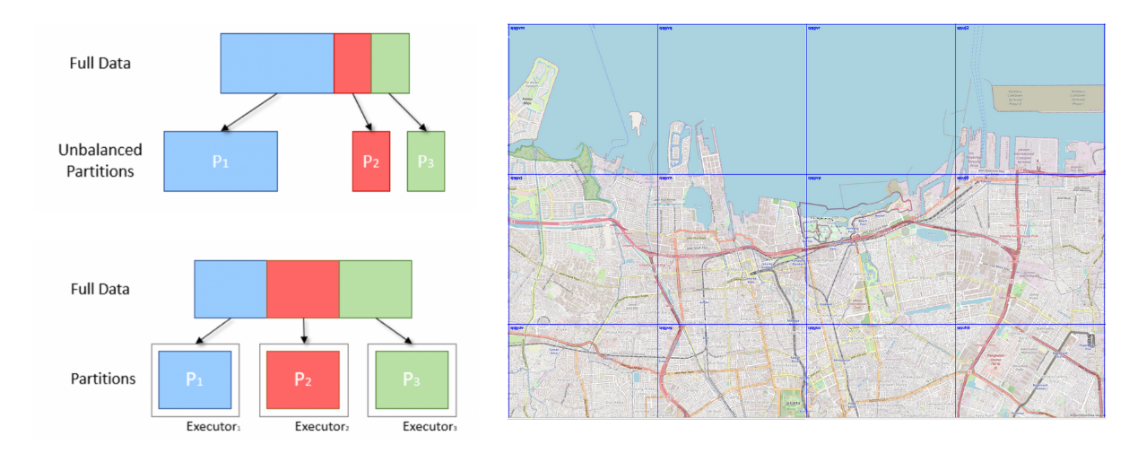
We use Amazon MWAA to orchestrate our data workflows in the cloud at scale. Apache Airflow is an open source tool used to programmatically author, schedule, and monitor sequences of processes and tasks referred to as workflows. In this post, the terms workflow and job are used interchangeably, referring to the Directed Acyclic Graphs (DAGs) consisting of tasks orchestrated by Amazon MWAA. For each workflow, we have sequential or parallel tasks, and even a combination of both in the DAG between create_emr and terminate_emr tasks running on a transient EMR cluster with fixed compute capacity throughout the workflow run. Even after optimizing a portion of our workload, we still had numerous non-optimized workflows that were under-utilized due to over-provisioning of compute resources based on the most resource-intensive task in the workflow, as shown in the following figure.

This highlighted the impracticality of static resource allocation and led us to recognize the necessity of a dynamic resource allocation (DRA) system. Before proposing a solution, we gathered extensive data to thoroughly understand our batch processing. Analyzing the cluster step time, excluding provisioning and idle time, revealed significant insights: a right-skewed distribution with over half of the workflows completing in 20 minutes or less and only 10% taking more than 60 minutes. This distribution guided our choice of a fast-provisioning compute solution, dramatically reducing workflow runtimes. The following diagram illustrates step times (excluding provisioning and idle time) of EMR on EC2 transient clusters in one of our batch processing accounts.

Furthermore, based on the step time (excluding provisioning and idle time) distribution of the workflows, we categorized our workflows into three groups:

  • Quick run – Lasting 20 minutes or less
  • Medium run – Lasting between 20–60 minutes
  • Long run – Exceeding 60 minutes, often spanning several hours or more

Another factor we needed to consider was the extensive use of transient clusters for reasons such as security, job and cost isolation, and purpose-built clusters. Additionally, there was a significant variation in resource needs between peak hours and periods of low utilization.

Instead of fixed-size clusters, we could potentially use managed scaling on EMR on EC2 to achieve some cost benefits. However, migrating to EMR Serverless appears to be a more strategic direction for our data platform. In addition to potential cost benefits, EMR Serverless offers additional advantages such as a one-click upgrade to the newest Amazon EMR versions, a simplified operational and debugging experience, and automatic upgrades to the latest generations upon rollout. These features collectively simplify the process of operating a platform on a larger scale.

Evaluating EMR Serverless: A case study at GoDaddy

EMR Serverless is a serverless option in Amazon EMR that eliminates the complexities of configuring, managing, and scaling clusters when running big data frameworks like Apache Spark and Apache Hive. With EMR Serverless, businesses can enjoy numerous benefits, including cost-effectiveness, faster provisioning, simplified developer experience, and improved resilience to Availability Zone failures.

Recognizing the potential of EMR Serverless, we conducted an in-depth benchmark study using real production workflows. The study aimed to assess EMR Serverless performance and efficiency while also creating an adoption plan for large-scale implementation. The findings were highly encouraging, showing EMR Serverless can effectively handle our workloads.

Benchmarking methodology

We split our data workflows into three categories based on total step time (excluding provisioning and idle time): quick run (0–20 minutes), medium run (20–60 minutes), and long run (over 60 minutes). We analyzed the impact of the EMR deployment type (Amazon EC2 vs. EMR Serverless) on two key metrics: cost-efficiency and total runtime speedup, which served as our overall evaluation criteria. Although we did not formally measure ease of use and resiliency, these factors were considered throughout the evaluation process.

The high-level steps to assess the environment are as follows:

  1. Prepare the data and environment:
    1. Choose three to five random production jobs from each job category.
    2. Implement required adjustments to prevent interference with production.
  2. Run tests:
    1. Run scripts over several days or through multiple iterations to gather precise and consistent data points.
    2. Perform tests using EMR on EC2 and EMR Serverless.
  3. Validate data and test runs:
    1. Validate input and output datasets, partitions, and row counts to ensure identical data processing.
  4. Gather metrics and analyze results:
    1. Gather relevant metrics from the tests.
    2. Analyze results to draw insights and conclusions.

Benchmark results

Our benchmark results showed significant enhancements across all three job categories for both runtime speedup and cost-efficiency. The improvements were most pronounced for quick jobs, directly resulting from faster startup times. For instance, a 20-minute (including cluster provisioning and shut down) data workflow running on an EMR on EC2 transient cluster of fixed compute capacity finishes in 10 minutes on EMR Serverless, providing a shorter runtime with cost benefits. Overall, the shift to EMR Serverless delivered substantial performance improvements and cost reductions at scale across job brackets, as seen in the following figure.

Historically, we devoted more time to tuning our long-run workflows. Interestingly, we discovered that the existing custom Spark configurations for these jobs did not always translate well to EMR Serverless. In cases where the results were insignificant, a common approach was to discard previous Spark configurations related to executor cores. By allowing EMR Serverless to autonomously manage these Spark configurations, we often observed improved outcomes. The following graph shows the average runtime and cost improvement per job when comparing EMR Serverless to EMR on EC2.

Per Job Improvement

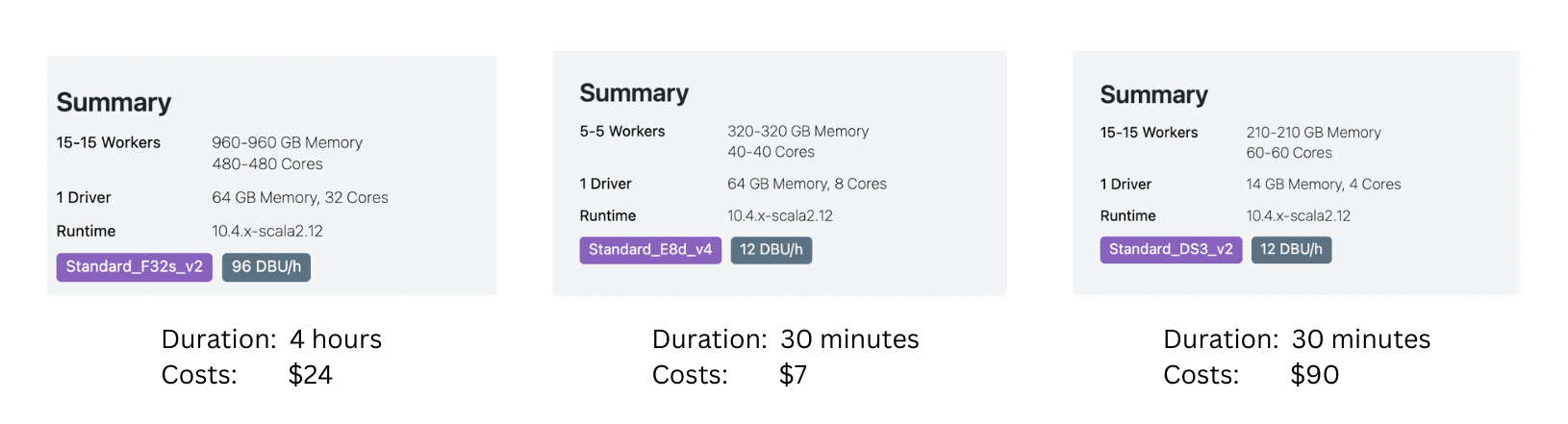
The following table shows a sample comparison of results for the same workflow running on different deployment options of Amazon EMR (EMR on EC2 and EMR Serverless).

Metric EMR on EC2
(Average)
EMR Serverless
(Average)
EMR on EC2 vs
EMR Serverless
Total Run Cost ($) $ 5.82 $ 2.60 55%
Total Run Time (Minutes) 53.40 39.40 26%
Provisioning Time (Minutes) 10.20 0.05 .
Provisioning Cost ($) $ 1.19 . .
Steps Time (Minutes) 38.20 39.16 -3%
Steps Cost ($) $ 4.30 . .
Idle Time (Minutes) 4.80 . .
EMR Release Label emr-6.9.0 .
Hadoop Distribution Amazon 3.3.3 .
Spark Version Spark 3.3.0 .
Hive/HCatalog Version Hive 3.1.3, HCatalog 3.1.3 .
Job Type Spark .

AWS Graviton2 on EMR Serverless performance evaluation

After seeing compelling results with EMR Serverless for our workloads, we decided to further analyze the performance of the AWS Graviton2 (arm64) architecture within EMR Serverless. AWS had benchmarked Spark workloads on Graviton2 EMR Serverless using the TPC-DS 3TB scale, showing a 27% overall price-performance improvement.

To better understand the integration benefits, we ran our own study using GoDaddy’s production workloads on a daily schedule and observed an impressive 23.8% price-performance enhancement across a range of jobs when using Graviton2. For more details about this study, see GoDaddy benchmarking results in up to 24% better price-performance for their Spark workloads with AWS Graviton2 on Amazon EMR Serverless.

Adoption strategy for EMR Serverless

We strategically implemented a phased rollout of EMR Serverless via deployment rings, enabling systematic integration. This gradual approach let us validate improvements and halt further adoption of EMR Serverless, if needed. It served both as a safety net to catch issues early and a means to refine our infrastructure. The process mitigated change impact through smooth operations while building team expertise of our Data Engineering and DevOps teams. Additionally, it fostered tight feedback loops, allowing prompt adjustments and ensuring efficient EMR Serverless integration.

We divided our workflows into three main adoption groups, as shown in the following image:

  • Canaries This group aids in detecting and resolving any potential problems early in the deployment stage.
  • Early adopters This is the second batch of workflows that adopt the new compute solution after initial issues have been identified and rectified by the canaries group.
  • Broad deployment rings The largest group of rings, this group represents the wide-scale deployment of the solution. These are deployed after successful testing and implementation in the previous two groups.

Rings

We further broke down these workflows into granular deployment rings to adopt EMR Serverless, as shown in the following table.

Ring # Name Details
Ring 0 Canary Low adoption risk jobs that are expected to yield some cost saving benefits.
Ring 1 Early Adopters Low risk Quick-run Spark jobs that expect to yield high gains.
Ring 2 Quick-run Rest of the Quick-run (step_time <= 20 min) Spark jobs
Ring 3 LargerJobs_EZ High potential gain, easy move, medium-run and long-run Spark jobs
Ring 4 LargerJobs Rest of the medium-run and long-run Spark jobs with potential gains
Ring 5 Hive Hive jobs with potentially higher cost savings
Ring 6 Redshift_EZ Easy migration Redshift jobs that suit EMR Serverless
Ring 7 Glue_EZ Easy migration Glue jobs that suit EMR Serverless

Production adoption results summary

The encouraging benchmarking and canary adoption results generated considerable interest in wider EMR Serverless adoption at GoDaddy. To date, the EMR Serverless rollout remains underway. Thus far, it has reduced costs by 62.5% and accelerated total batch workflow completion by 50.4%.

Based on preliminary benchmarks, our team expected substantial gains for quick jobs. To our surprise, actual production deployments surpassed projections, averaging 64.4% faster vs. 42% projected, and 71.8% cheaper vs. 40% predicted.

Remarkably, long-running jobs also saw significant performance improvements due to the rapid provisioning of EMR Serverless and aggressive scaling enabled by dynamic resource allocation. We observed substantial parallelization during high-resource segments, resulting in a 40.5% faster total runtime compared to traditional approaches. The following chart illustrates the average enhancements per job category.

Prod Jobs Savings

Additionally, we observed the highest degree of dispersion for speed improvements within the long-run job category, as shown in the following box-and-whisker plot.

Whisker Plot

Sample workflows adopted EMR Serverless

For a large workflow migrated to EMR Serverless, comparing 3-week averages pre- and post-migration revealed impressive cost savings—a 75.30% decrease based on retail pricing with 10% improvement in total runtime, boosting operational efficiency. The following graph illustrates the cost trend.

Although quick-run jobs realized minimal per-dollar cost reductions, they delivered the most significant percentage cost savings. With thousands of these workflows running daily, the accumulated savings are substantial. The following graph shows the cost trend for a small workload migrated from EMR on EC2 to EMR Serverless. Comparing 3-week pre- and post-migration averages revealed a remarkable 92.43% cost savings on the retail on-demand pricing, alongside an 80.6% acceleration in total runtime.

Sample workflows adopted EMR Serverless 2

Layer 7: Platform-wide improvements

We aim to revolutionize compute operations at GoDaddy, providing simplified yet powerful solutions for all users with our Intelligent Compute Platform. With AWS compute solutions like EMR Serverless and EMR on EC2, it provided optimized runs of data processing and machine learning (ML) workloads. An ML-powered job broker intelligently determines when and how to run jobs based on various parameters, while still allowing power users to customize. Additionally, an ML-powered compute resource manager pre-provisions resources based on load and historical data, providing efficient, fast provisioning at optimum cost. Intelligent compute empowers users with out-of-the-box optimization, catering to diverse personas without compromising power users.

The following diagram shows a high-level illustration of the intelligent compute architecture.

Insights and recommended best-practices

The following section discusses the insights we’ve gathered and the recommended best practices we’ve developed during our preliminary and wider adoption stages.

Infrastructure preparation

Although EMR Serverless is a deployment method within EMR, it requires some infrastructure preparedness to optimize its potential. Consider the following requirements and practical guidance on implementation:

  • Use large subnets across multiple Availability Zones – When running EMR Serverless workloads within your VPC, make sure the subnets span across multiple Availability Zones and are not constrained by IP addresses. Refer to Configuring VPC access and Best practices for subnet planning for details.
  • Modify maximum concurrent vCPU quota For extensive compute requirements, it is recommended to increase your max concurrent vCPUs per account service quota.
  • Amazon MWAA version compatibility When adopting EMR Serverless, GoDaddy’s decentralized Amazon MWAA ecosystem for data pipeline orchestration created compatibility issues from disparate AWS Providers versions. Directly upgrading Amazon MWAA was more efficient than updating numerous DAGs. We facilitated adoption by upgrading Amazon MWAA instances ourselves, documenting issues, and sharing findings and effort estimates for accurate upgrade planning.
  • GoDaddy EMR operator To streamline migrating numerous Airflow DAGs from EMR on EC2 to EMR Serverless, we developed custom operators adapting existing interfaces. This allowed seamless transitions while retaining familiar tuning options. Data engineers could easily migrate pipelines with simple find-replace imports and immediately use EMR Serverless.

Unexpected behavior mitigation

The following are unexpected behaviors we ran into and what we did to mitigate them:

  • Spark DRA aggressive scaling For some jobs (8.33% of initial benchmarks, 13.6% of production), cost increased after migrating to EMR Serverless. This was due to Spark DRA excessively assigning new workers briefly, prioritizing performance over cost. To counteract this, we set maximum executor thresholds by adjusting spark.dynamicAllocation.maxExecutor, effectively limiting EMR Serverless scaling aggression. When migrating from EMR on EC2, we suggest observing the max core count in the Spark History UI to replicate similar compute limits in EMR Serverless, such as --conf spark.executor.cores and --conf spark.dynamicAllocation.maxExecutors.
  • Managing disk space for large-scale jobs When transitioning jobs that process large data volumes with substantial shuffles and significant disk requirements to EMR Serverless, we recommend configuring spark.emr-serverless.executor.disk by referring to existing Spark job metrics. Furthermore, configurations like spark.executor.cores combined with spark.emr-serverless.executor.disk and spark.dynamicAllocation.maxExecutors allow control over the underlying worker size and total attached storage when advantageous. For example, a shuffle-heavy job with relatively low disk usage may benefit from using a larger worker to increase the likelihood of local shuffle fetches.

Conclusion

As discussed in this post, our experiences with adopting EMR Serverless on arm64 have been overwhelmingly positive. The impressive results we’ve achieved, including a 60% reduction in cost, 50% faster runs of batch Spark workloads, and an astounding five-times improvement in development and testing speed, speak volumes about the potential of this technology. Furthermore, our current results suggest that by widely adopting Graviton2 on EMR Serverless, we could potentially reduce the carbon footprint by up to 60% for our batch processing.

However, it’s crucial to understand that these results are not a one-size-fits-all scenario. The enhancements you can expect are subject to factors including, but not limited to, the specific nature of your workflows, cluster configurations, resource utilization levels, and fluctuations in computational capacity. Therefore, we strongly advocate for a data-driven, ring-based deployment strategy when considering the integration of EMR Serverless, which can help optimize its benefits to the fullest.

Special thanks to Mukul Sharma and Boris Berlin for their contributions to benchmarking. Many thanks to Travis Muhlestein (CDO), Abhijit Kundu (VP Eng), Vincent Yung (Sr. Director Eng.), and Wai Kin Lau (Sr. Director Data Eng.) for their continued support.


About the Authors

Brandon Abear is a Principal Data Engineer in the Data & Analytics (DnA) organization at GoDaddy. He enjoys all things big data. In his spare time, he enjoys traveling, watching movies, and playing rhythm games.

Dinesh Sharma is a Principal Data Engineer in the Data & Analytics (DnA) organization at GoDaddy. He is passionate about user experience and developer productivity, always looking for ways to optimize engineering processes and saving cost. In his spare time, he loves reading and is an avid manga fan.

John Bush is a Principal Software Engineer in the Data & Analytics (DnA) organization at GoDaddy. He is passionate about making it easier for organizations to manage data and use it to drive their businesses forward. In his spare time, he loves hiking, camping, and riding his ebike.

Ozcan Ilikhan is the Director of Engineering for the Data and ML Platform at GoDaddy. He has over two decades of multidisciplinary leadership experience, spanning startups to global enterprises. He has a passion for leveraging data and AI in creating solutions that delight customers, empower them to achieve more, and boost operational efficiency. Outside of his professional life, he enjoys reading, hiking, gardening, volunteering, and embarking on DIY projects.

Harsh Vardhan is an AWS Solutions Architect, specializing in big data and analytics. He has over 8 years of experience working in the field of big data and data science. He is passionate about helping customers adopt best practices and discover insights from their data.

Sliding window rate limits in distributed systems

Post Syndicated from Grab Tech original https://engineering.grab.com/frequency-capping

Like many other companies, Grab uses marketing communications to notify users of promotions or other news. If a user receives these notifications from multiple companies, it would be a form of information overload and they might even start considering these communications as spam. Over time, this could lead to some users revoking their consent to receive marketing communications altogether. Hence, it is important to find a rate-limited solution that sends the right amount of communications to our users.

Background

In Grab, marketing emails and push notifications are part of carefully designed campaigns to ensure that users get the right notifications (i.e. based on past orders or usage patterns). Trident is Grab’s in-house tool to compose these campaigns so that they run efficiently at scale. An example of a campaign is scheduling a marketing email blast to 10 million users at 4 pm. Read more about Trident’s architecture here.

Trident relies on Hedwig, another in-house service, to deliver the messages to users. Hedwig does the heavy lifting of delivering large amounts of emails and push notifications to users while maintaining a high query per second (QPS) rate and minimal delay. The following high-level architectural illustration demonstrates the interaction between Trident and Hedwig.

Diagram of data interaction between Trident and Hedwig

The aim is to regulate the number of marketing comms sent to users daily and weekly, tailored based on their interaction patterns with the Grab superapp.

Solution

Based on their interaction patterns with our superapp, we have clustered users into a few segments.

For example:

New: Users recently signed up to the Grab app but haven’t taken any rides yet.
Active: Users who took rides in the past month.

With these metrics, we came up with optimal daily and weekly frequency limit values for each clustered user segment. The solution discussed in this article ensures that the comms sent to a user do not exceed the daily and weekly thresholds for the segment. This is also called frequency capping.

However, frequency capping can be split into two sub-problems:

Efficient storage of clustered user data

With a huge customer base of over 270 million users, storing the user segment membership information has to be cost-efficient and memory-sleek. Querying the segment to which a user belongs should also have minimal latency.

Persistent tracking of comms sent per user

To stay within the daily and weekly thresholds, we need to actively track the number of comms sent to each user, which can be referred to make rate limiting decisions. The rate limiting logic should also have minimal latency, be cost efficient, and not take up too much memory storage.

Optimising storage of user segment data

The problem here is figuring out which segment a particular user belongs to and ensuring that the user doesn’t appear in more than one segment. There are two options that suit our needs and we’ll explain more about each option, as well as what was the best option for us.

Bloom filter 

A Bloom filter is a space-efficient probabilistic data structure that addresses this problem well. Simply put, Bloom filters internally use arrays to track memberships of the elements.

For our scenario, each user segment would need its own bloom filter. We used this bloom filter calculator to estimate the memory required for each bloom filter. We found that we needed approximately 1 GB of memory and 23 hash functions to accurately represent the membership information of 270 million users in an array. Additionally, this method guarantees a false positive rate of  1.0E-7, which means 1 in 1 million elements may get wrong membership results because of hash collision.

With Grab’s existing segments, this approach needs 4GB of memory, which may increase as we increase the number of segments in the future. Moreover, the potential hash collision needs to be handled by increasing the memory size with even more hash functions. Another thing to note is that Bloom filters do not support deletion so every time a change needs to be done, you need to create a new version of the Bloom filter. Although Bloom filters have many advantages, these shortcomings led us to explore another approach.

Roaring bitmaps Roaring bitmaps are sets of unsigned integers consisting of containers of disjoint subsets, which can store large amounts of data in a compressed form. Essentially, roaring bitmaps could reduce memory storage significantly and overcome the hash collision problem. To understand the intuition behind this, first, we need to know how bitmaps work and the possible drawbacks behind it.

To represent a list of numbers as a bitmap, we first need to create an array with a size equivalent to the largest element in the list. For every element in the list, we then mark the bit value as 1 in the corresponding index in the array. While bitmaps work very well for storing integers in closer intervals, they occupy more space and become sparse when storing integer ranges with uneven distribution, as shown in the image below.

Diagram of bitmaps with uneven distribution

To reduce memory footprint and improve the performance of bitmaps, there are compression techniques such as Run-Length Encoding (RLE), and Word Aligned Hybrid (WAH). However, this would require additional effort to implement, whereas using roaring bitmaps would solve these issues.

Roaring bitmaps’ hybrid data storage approach offers the following advantages:

  • Faster set operations (union, intersection, differencing).
  • Better compression ratio when handling mixed datasets (both dense and sparse data distribution).
  • Ability to scale to large datasets without significant performance loss.

To summarise, roaring bitmaps can store positive integers from 0 to (2^32)-1. Each positive integer value is converted to a 32-bit binary, where the 16 Most Significant Bits (MSB) are used as the key and the remaining 16 Least Significant Bits (LSB) are represented as the value. The values are then stored in an array, a bitmap, or used to run containers with RLE encoding data structures.

If the number of integers mapped to the key is less than 4096, then all the integers are stored in an array in sorted order and converted into a bitmap container in the runtime as the size exceeds. Roaring bitmap analyses the distribution of set bits in the bitmap container i.e. if the continuous interval of set bits is more than a given threshold, the bitmap container can be more efficiently represented using the RLE container. Internally, the RLE container uses an array where the even indices store the beginning of the runs and the odd indices represent the length of the runs. This enables the roaring bitmap to dynamically switch between the containers to optimise storage and performance.

The following diagram shows how a set of elements with different distributions are stored in roaring bitmaps.

Diagram of how roaring bitmaps store elements with different distributions

In Grab, we developed a microservice that abstracts roaring bitmaps implementations and provides an API to check set membership and enumeration of elements in the sets. Check out this blog to learn more about it.

Distributed rate limiting

The second part of the problem involves rate limiting the number of communication messages sent to users on a daily or weekly basis and each segment has specific daily and weekly limits. By utilising roaring bitmaps, we can determine the segment to which a user belongs. After identifying the appropriate segment, we will apply the personalised limits to the user using a distributed rate limiter, which will be discussed in further detail in the following sections.

Choosing the right datastore

Based on our use case, Amazon ElasticCache for Redis and DynamoDB were two viable options for storing the sent communication messages count per user. However, we decided to choose Redis due to a number of factors:

  • Higher throughput at lower latency – Redis shards data across nodes in the cluster.
  • Cost-effective – Usage of Lua script reduces unnecessary data transfer overheads.
  • Better at handling spiky rate limiting workloads at scale.

Distributed rate limiter

To appropriately limit the comms our users receive, we needed a rate limiting algorithm, which could execute directly in the datastore cluster, then return the results in the application logic for further processing. The two rate limiting algorithms we considered were the sliding window rate limiter and sliding log rate limiter.

The sliding window rate limiter algorithm divides time into a fixed-size window (we defined this as 1 minute) and counts the number of requests within each window. On the other hand, the sliding log maintains a log of each request timestamp and counts the number of requests between two timestamp ranges, providing a more fine-grained method of rate limiting. Although sliding log consumes more memory to store the log of request timestamp, we opted for the sliding log approach as the accuracy of the rate limiting was more important than memory consumption.

The sliding log rate limiter utilises a Redis sorted set data structure to efficiently track and organise request logs. Each timestamp in milliseconds is stored as a unique member in the set. The score assigned to each member represents the corresponding timestamp, allowing for easy sorting in ascending order. This design choice optimises the speed of search operations when querying for the total request count within specific time ranges.

Sliding Log Rate limiter Algorithm:

Input:
  # user specific redis key where the request timestamp logs are stored as sorted set
  keys => user_redis_key

  # limit_value is the limit that needs to be applied for the user
  # start_time_in_millis is the starting point of the time window
  # end_time_in_millis is the ending point of the time window
  # current_time_in_millis is the current time the request is sent
  # eviction_time_in_millis, members in the set whose value is less than this will be evicted from the set

  args => limit_value, start_time_in_millis, end_time_in_millis, current_time_in_millis, eviction_time_in_millis

Output:
  # 0 means not_allowed and 1 means allowed
  response => 0 / 1

Logic:
  # zcount fetches the count of the request timestamp logs falling between the start and the end timestamp
  request_count = zcount user_redis_key start_time_in_millis end_time_in_millis

  response = 0
  # if the count of request logs is less than allowed limits then record the usage by adding current timestamp in sorted set

  if request_count < limit_value then
    zadd user_redis_key current_time_in_millis current_time_in_millis
    response = 1

  # zremrangebyscore removes the members in the sorted set whose score is less than eviction_time_in_millis

  zremrangebyscore user_redis_key -inf eviction_time_in_millis
  return response

This algorithm takes O(log n) time complexity, where n is the number of request logs stored in the sorted set. It is not possible to evict entries in the sorted set like how we have time-to-live (TTL) for Redis keys. To prevent the size of the sorted set from increasing over time, we have a fixed variable eviction_time_in_millis that is passed to the script. The zremrangebyscore command then deletes members from the sorted set whose score is less than eviction_time_in_millis in O(log n) time complexity.

Lua script optimisations

In Redis Cluster mode, all Redis keys accessed by a Lua script must be present on the same node, and they should be passed as part of the KEYS input array of the script. If the script attempts to access keys located on different nodes within the cluster, a CROSSSLOT error will be thrown. Redis keys, or userIDs, are distributed across multiple nodes in the cluster so it is not feasible to send a batch of userIDs within the same Lua script for rate limiting, as this might result in a CROSSSLOT error.

Invoking a separate Lua script call for each user is a possible approach, but it incurs a significant number of network calls, which can be optimised further with the following approach:

  1. Upload the Lua script into the Redis server during the server startup with the SCRIPT LOAD command and we get the SHA1 hash of the script if the upload is successful.
  2. The SHA1 hash can then be used to invoke the Lua script with the EVALSHA command passing the keys and arguments as script input.
  3. Redis pipelining takes in multiple EVALSHA commands that call the Lua script and each invocation corresponds to a userID for getting the rate limiting result.
  4. Redis pipelining groups the EVALSHA Redis commands with Redis keys located on the same nodes internally. It then sends the grouped commands in a single network call to the relevant nodes within the Redis cluster and provides the rate limiting outcome to the client.

Since Redis operates on a single thread, any long-running Lua script can cause other Redis commands to be blocked until the script completes execution. Thus, it’s optimal for the Lua script to execute in under 5 milliseconds. Additionally, the current time is passed as an argument to the script to account for potential variations in time when the script is executed on a node’s replica, which could be caused by clock drift.

By bringing together roaring bitmaps and the distributed rate limiter, this is what our final solution looks like:

Our final solution using roaring bitmaps and distributed rate limiter

The roaring bitmaps structure is serialised and stored in an AWS S3 bucket, which is then downloaded in the instance during server startup. After which, triggering a user segment membership check can simply be done with a local method call. The configuration service manages the mapping information between the segment and allowed rate limiting values.

Whenever a marketing message needs to be sent to a user, we first find the segment to which the user belongs, retrieve the defined rate limiting values from the configuration service, then execute the Lua script to get the rate limiting decision. If there is enough quota available for the user, we send the comms.

The architecture of the messaging service looks something like this:

Architecture of the messaging service

Impact

In addition to decreasing the unsubscription rate, there was a significant enhancement in the latency of sending communications. Eliminating redundant communications also alleviated the system load, resulting in a reduction of the delay between the scheduled time and the actual send time of comms.

Conclusion

Applying rate limiters to safeguard our services is not only a standard practice but also a necessary process. Many times, this can be achieved by configuring the rate limiters at the instance level. The need for rate limiters for business logic may not be as common, but when you need it, the solution must be lightning-fast, and capable of seamlessly operating within a distributed environment.

Join us

Grab is the leading superapp platform in Southeast Asia, providing everyday services that matter to consumers. More than just a ride-hailing and food delivery app, Grab offers a wide range of on-demand services in the region, including mobility, food, package and grocery delivery services, mobile payments, and financial services across 428 cities in eight countries.

Powered by technology and driven by heart, our mission is to drive Southeast Asia forward by creating economic empowerment for everyone. If this mission speaks to you, join our team today!

Road localisation in GrabMaps

Post Syndicated from Grab Tech original https://engineering.grab.com/road-localisation-grabmaps

Introduction

In 2022, Grab achieved self-sufficiency in its Geo services. As part of this transition, one crucial step was moving towards using an internally-developed map tailored specifically to the market in which Grab operates. Now that we have full control over the map layer, we can add more data to it or improve it according to the needs of the services running on top. One key aspect that this transition unlocked for us was the possibility of creating hyperlocal data at map level.

For instance, by determining the country to which a road belongs, we can now automatically infer the official language of that country and display the street name in that language. In another example, knowing the country for a specific road, we can automatically infer the driving side (left-handed or right-handed) leading to an improved navigation experience. Furthermore, this capability also enables us to efficiently handle various scenarios. For example, if we know that a road is part of a gated community, an area where our driver partners face restricted access, we can prevent the transit through that area.

These are just some examples of the possibilities from having full control over the map layer. By having an internal map, we can align our maps with specific markets and provide better experiences for our driver-partners and customers.

Background

For all these to be possible, we first needed to localise the roads inside the map. Our goal was to include hyperlocal data into the map, which refers to data that is specific to a certain area, such as a country, city, or even a smaller part of the city like a gated community. At the same time, we aimed to deliver our map with a high cadence, thus, we needed to find the right way to process this large amount of data while continuing to create maps in a cost-effective manner.

Solution

In the following sections of this article, we will use an extract from the Southeast Asia map to provide visual representations of the concepts discussed.

In Figure 1, Image 1 shows a visualisation of the road network, the roads belonging to this area. The coloured lines in Image 2 represent the borders identifying the countries in the same area. Overlapping the information from Image 1 and Image 2, we can extrapolate and say that the entire surface included in a certain border could have the same set of common properties as shown in Image 3. In Image 4, we then proceed with adding localised roads for each area.

Figure 1 – Map of Southeast Asia

For this to be possible, we have to find a way to localise each road and identify its associated country. Once this localisation process is complete, we can replicate all this information specific to a given border onto each individual road. This information includes details such as the country name, driving side, and official language. We can go even further and infer more information, and add hyperlocal data. For example, in Vietnam, we can automatically prevent motorcycle access on the motorways.

Assigning each road on the map to a specific area, such as a country, service area, or subdivision, presents a complex task. So, how can we efficiently accomplish this?

Implementation

The most straightforward approach would be to test the inclusion of each road into each area boundary, but that is easier said than done. With close to 30 million road segments in the Southeast Asia map and over 10 thousand areas, the computational cost of determining inclusion or intersection between a polyline and a polygon is expensive.

Our solution to this challenge involves replacing the expensive yet precise operation with a decent approximation. We introduce a proxy entity, the geohash, and we use it to approximate the areas and also to localise the roads.

We replace the geometrical inclusion with a series of simpler and less expensive operations. First, we conduct an inexpensive precomputation where we identify all the geohases that belong to a certain area or within a defined border. We then identify the geohashes to which the roads belong to. Finally, we use these precomputed values to assign roads to their respective areas. This process is also computationally inexpensive.

Given the large area we process, we leverage big data techniques to distribute the execution across multiple nodes and thus speed up the operation. We want to deliver the map daily and this is one of the many operations that are part of the map-making process.

What is a geohash?

To further understand our implementation we will first explain the geohash concept. A geohash is a unique identifier of a specific region on the Earth. The basic idea is that the Earth is divided into regions of user-defined size and each region is assigned a unique id, which is known as its geohash. For a given location on earth, the geohash algorithm converts its latitude and longitude into a string.

Geohashes uses a Base-32 alphabet encoding system comprising characters ranging from 0 to 9 and A to Z, excluding “A”, “I”, “L” and “O”. Imagine dividing the world into a grid with 32 cells. The first character in a geohash identifies the initial location of one of these 32 cells. Each of these cells are then further subdivided into 32 smaller cells.This subdivision process continues and refines to specific areas in the world. Adding characters to the geohash sub-divides a cell, effectively zooming in to a more detailed area.

The precision factor of the geohash determines the size of the cell. For instance, a precision factor of one creates a cell 5,000 km high and 5,000 km wide. A precision factor of six creates a cell 0.61km high and 1.22 km wide. Furthermore, a precision factor of nine creates a cell 4.77 m high and 4.77 m wide. It is important to note that cells are not always square and can have varying dimensions.

In Figure 2, we have exemplified a geohash 6 grid and its code is wsdt33.

Figure 2 – An example of geohash code wsdt33

Using less expensive operations

Calculating the inclusion of the roads inside a certain border is an expensive operation. However, quantifying the exact expense is challenging as it depends on several factors. One factor is the complexity of the border. Borders are usually irregular and very detailed, as they need to correctly reflect the actual border. The complexity of the road geometry is another factor that plays an important role as roads are not always straight lines.

Figure 3 – Roads to localise

Since this operation is expensive both in terms of cloud cost and time to run, we need to identify a cheaper and faster way that would yield similar results. Knowing that the complexity of the border lines is the cause of the problem, we tried using a different alternative, a rectangle. Calculating the inclusion of a polyline inside a rectangle is a cheaper operation.

Figure 4 – Roads inside a rectangle

So we transformed this large, one step operation, where we test each road segment for inclusion in a border, into a series of smaller operations where we perform the following steps:

  1. Identify all the geohashes that are part of a certain area or belong to a certain border. In this process we include additional areas to make sure that we cover the entire surface inside the border.
  2. For each road segment, we identify the list of geohashes that it belongs to. A road, depending on its length or depending on its shape, might belong to multiple geohashes.

In Figure 5, we identify that the road belongs to two geohashes and that the two geohashes are part of the border we use.

Figure 5 – Geohashes as proxy

Now, all we need to do is join the two data sets together. This kind of operation is a great candidate for a big data approach, as it allows us to run it in parallel and speed up the processing time.

Precision tradeoff

We mentioned earlier that, for the sake of argument, we replace precision with a decent approximation. Let’s now delve into the real tradeoff by adopting this approach.

The first thing that stands out with this approach is that we traded precision for cost. We are able to reduce the cost as this approach uses less hardware resources and computation time. However, this reduction in precision suffers, particularly for roads located near the borders as they might be wrongly classified.

Going back to the initial example, let’s take the case of the external road, on the left side of the area. As you can see in Figure 6, it is clear that the road does not belong to our border. But when we apply the geohash approach it gets included into the middle geohash.

Figure 6 – Wrong road localisation

Given that just a small part of the geohash falls inside the border, the entire geohash will be classified as belonging to that area, and, as a consequence, the road that belongs to that geohash will be wrongly localised and we’ll end up adding the wrong localisation information to that road. This is clearly a consequence of the precision tradeoff. So, how can we solve this?

Geohash precision

One option is to increase the geohash precision. By using smaller and smaller geohashes, we can better reflect the actual area. As we go deeper and we further split the geohash, we can accurately follow the border. However, a high geohash precision also equates to a computationally intensive operation bringing us back to our initial situation. Therefore, it is crucial to find the right balance between the geohash size and the complexity of operations.

Figure 7 – Geohash precision

Geohash coverage percentage

To find a balance between precision and data loss, we looked into calculating the geohash coverage percentage. For example, in Figure 8, the blue geohash is entirely within the border. Here we can say that it has a 100% geohash coverage.

Figure 8 – Geohash inside the border

However, take for example the geohash in Figure 9. It touches the border and has only around 80% of its surface inside the area. Given that most of its surface is within the border, we still can say that it belongs to the area.

Figure 9 – Geohash partially inside the border

Let’s look at another example. In Figure 10, only a small part of the geohash is within the border. We can say that the geohash coverage percentage here is around 5%. For these cases, it becomes difficult for us to determine whether the geohash does belong to the area. What would be a good tradeoff in this case?

Figure 10 – Geohash barely inside the border

Border shape

To go one step further, we can consider a mixed solution, where we use the border shape but only for the geohashes touching the border. This would still be an intensive computational operation but the number of roads located in these geohashes will be much smaller, so it is still a gain.

For the geohashes with full coverage inside the area, we’ll use the geohash for the localisation, the simpler operation. For the geohashes that are near the border, we’ll use a different approach. To increase the precision around the borders, we can cut the geohash following the border’s shape. Instead of having a rectangle, we’ll use a more complex shape which is still simpler than the initial border shape.

Figure 11 – Geohash following a border’s shape

Result

We began with a simple approach and we enhanced it to improve precision. This also increased the complexity of the operation. We then asked, what are the actual gains? Was it worthwhile to go through all this process? In this section, we put this to the test.

We first created a benchmark by taking a small sample of the data and ran the localisation process on a laptop. The sample comprised approximately 2% of the borders and 0.0014% of the roads. We ran the localisation process using two approaches.

  • With the first approach, we calculated the intersection between all the roads and borders. The entire operation took around 38 minutes.
  • For the second approach, we optimised the operation using geohashes. In this approach, the runtime was only 78 seconds (1.3 minutes).

However, it is important to note that this is not an apples-to-apples comparison. The operation that we measured was the localisation of the roads but we did not include the border filling operation where we fill the borders with geohashes. This is because this operation does not need to be run every time. It can be run once and reused multiple times.

Though not often required, it is still crucial to understand and consider the operation of precomputing areas and filling borders with geohashes. The precomputation process depends on several factors:

  • Number and shape of the borders – The more borders and the more complex the borders are, the longer the operation will take.
  • Geohash precision – How accurate do we need our localisation to be? The more accurate it needs to be, the longer it will take.
  • Hardware availability

Going back to our hypothesis, although this precomputation might be expensive, it is rarely run as the borders don’t change often and can be triggered only when needed. However, regular computation, where we find the area to which each road belongs to, is often run as the roads change constantly. In our system, we run this localisation for each map processing.

We can also further optimise this process by applying the opposite approach. Geohashes that have full coverage inside a border can be merged together into larger geohashes thus simplifying the computation inside the border. In the end, we can have a solution that is fully optimised for our needs with the best cost-to-performance ratio.

Figure 12 – Optimised geohashes

Conclusion

Although geohashes seem to be the right solution for this kind of problem, we also need to monitor their content. One consideration is the road density inside a geohash. For example, a geohash inside a city centre usually has a lot of roads while one in the countryside may have much less. We need to consider this aspect to have a balanced computation operation and take full advantage of the big data approach. In our case, we achieve this balance by considering the number of road kilometres within a geohash.

Figure 13 – Unbalanced data

Additionally, the resources that we choose also matter. To optimise time and cost, we need to find the right balance between the running time and resource cost. As shown in Figure 14, based on a sample data we ran, sometimes, we get the best result when using smaller machines.

Figure 14 – Cost vs runtime

The achievements and insights showcased in this article are indebted to the contributions made by Mihai Chintoanu. His expertise and collaborative efforts have profoundly enriched the content and findings presented herein.

Join us

Grab is the leading superapp platform in Southeast Asia, providing everyday services that matter to consumers. More than just a ride-hailing and food delivery app, Grab offers a wide range of on-demand services in the region, including mobility, food, package and grocery delivery services, mobile payments, and financial services across 428 cities in eight countries.

Powered by technology and driven by heart, our mission is to drive Southeast Asia forward by creating economic empowerment for everyone. If this mission speaks to you, join our team today!

Streaming SQL in Data Mesh

Post Syndicated from Netflix Technology Blog original https://netflixtechblog.com/streaming-sql-in-data-mesh-0d83f5a00d08

Democratizing Stream Processing @ Netflix

By Guil Pires, Mark Cho, Mingliang Liu, Sujay Jain

Data powers much of what we do at Netflix. On the Data Platform team, we build the infrastructure used across the company to process data at scale.

In our last blog post, we introduced “Data Mesh” — A Data Movement and Processing Platform. When a user wants to leverage Data Mesh to move and transform data, they start by creating a new Data Mesh pipeline. The pipeline is composed of individual “Processors” that are connected by Kafka topics. The Processors themselves are implemented as Flink jobs that use the DataStream API.

Since then, we have seen many use cases (including Netflix Graph Search) adopt Data Mesh for stream processing. We were able to onboard many of these use cases by offering some commonly used Processors out of the box, such as Projection, Filtering, Unioning, and Field Renaming.

An example of a Data Mesh pipeline which moves and transforms data using Union, GraphQL Enrichment, and Column Rename Processor before writing to an Iceberg table.

By keeping the logic of individual Processors simple, it allowed them to be reusable so we could centrally manage and operate them at scale. It also allowed them to be composable, so users could combine the different Processors to express the logic they needed.

However, this design decision led to a different set of challenges.

Some teams found the provided building blocks were not expressive enough. For use cases which were not solvable using existing Processors, users had to express their business logic by building a custom Processor. To do this, they had to use the low-level DataStream API from Flink and the Data Mesh SDK, which came with a steep learning curve. After it was built, they also had to operate the custom Processors themselves.

Furthermore, many pipelines needed to be composed of multiple Processors. Since each Processor was implemented as a Flink Job connected by Kafka topics, it meant there was a relatively high runtime overhead cost for many pipelines.

We explored various options to solve these challenges, and eventually landed on building the Data Mesh SQL Processor that would provide additional flexibility for expressing users’ business logic.

The existing Data Mesh Processors have a lot of overlap with SQL. For example, filtering and projection can be expressed in SQL through SELECT and WHERE clauses. Additionally, instead of implementing business logic by composing multiple individual Processors together, users could express their logic in a single SQL query, avoiding the additional resource and latency overhead that came from multiple Flink jobs and Kafka topics. Furthermore, SQL can support User Defined Functions (UDFs) and custom connectors for lookup joins, which can be used to extend expressiveness.

Data Mesh SQL Processor

Since Data Mesh Processors are built on top of Flink, it made sense to consider using Flink SQL instead of continuing to build additional Processors for every transform operation we needed to support.

The Data Mesh SQL Processor is a platform-managed, parameterized Flink Job that takes schematized sources and a Flink SQL query that will be executed against those sources. By leveraging Flink SQL within a Data Mesh Processor, we were able to support the streaming SQL functionality without changing the architecture of Data Mesh.

Underneath the hood, the Data Mesh SQL Processor is implemented using Flink’s Table API, which provides a powerful abstraction to convert between DataStreams and Dynamic Tables. Based on the sources that the processor is connected to, the SQL Processor will automatically convert the upstream sources as tables within Flink’s SQL engine. User’s query is then registered with the SQL engine and translated into a Flink job graph consisting of physical operators that can be executed on a Flink cluster. Unlike the low-level DataStream API, users do not have to manually build a job graph using low-level operators, as this is all managed by Flink’s SQL engine.

SQL Experience on Data Mesh

The SQL Processor enables users to fully leverage the capabilities of the Data Mesh platform. This includes features such as autoscaling, the ability to manage pipelines declaratively via Infrastructure as Code, and a rich connector ecosystem.

In order to ensure a seamless user experience, we’ve enhanced the Data Mesh platform with SQL-centric features. These enhancements include an Interactive Query Mode, real-time query validation, and automated schema inference.

To understand how these features help the users be more productive, let’s take a look at a typical user workflow when using the Data Mesh SQL Processor.

  • Users start their journey by live sampling their upstream data sources using the Interactive Query Mode.
  • As the user iterate on their SQL query, the query validation service provides real-time feedback about the query.
  • With a valid query, users can leverage the Interactive Query Mode again to execute the query and get the live results streamed back to the UI within seconds.
  • For more efficient schema management and evolution, the platform will automatically infer the output schema based on the fields selected by the SQL query.
  • Once the user is done editing their query, it is saved to the Data Mesh Pipeline, which will then be deployed as a long running, streaming SQL job.
Overview of the SQL Processor workflow.

Users typically iterate on their SQL query multiple times before deploying it. Validating and analyzing queries at runtime after deployment will not only slow down their iteration, but also make it difficult to automate schema evolution in Data Mesh.

To address this challenge, we have implemented a query validation service that can verify a Flink SQL query and provide a meaningful error message for violations in real time. This enables users to have prompt validation feedback while they are editing the query. We leverage Apache Flink’s internal Planner classes to parse and transform SQL queries without creating a fully-fledged streaming table environment. This makes the query service lightweight, scalable, and execution agnostic.

To effectively operate thousands of use cases at the platform layer, we built opinionated guardrails to limit some functionalities of Flink SQL. We plan on gradually expanding the supported capabilities over time. We implemented the guardrails by recursively inspecting the Calcite tree constructed from user’s query. If the tree contains nodes that we currently don’t support, the query will be rejected from being deployed. Additionally, we translate Flink’s internal exceptions containing cryptic error messages into more meaningful error messages for our users. We plan on continuing our investments into improving the guardrails, as having proper guardrails help to improve the user experience. Some ideas for the future include rules to reject expensive and suboptimal queries.

To help Data Mesh users iterate quickly on their business logic, we have built the Interactive Query Mode as part of the platform. Users can start live sampling their streaming data by executing a simple `SELECT * FROM <table>` query. Using the Interactive Query Mode, Data Mesh platform will execute the Flink SQL query and display the results in the UI in seconds. Since this is a Flink SQL query on streaming data, new results will continue to be delivered to the user in real-time.

Users can continue to iterate and modify their Flink SQL query and once they’re satisfied with their query output, they can save the query as part of their stream processing pipeline.

To provide this interactive experience, we maintain an always-running Flink Session Cluster that can run concurrent parameterized queries. These queries will output their data to a Mantis sink in order to stream the results back to the user’s browser.

An animated gif showing the interactive query mode in action
Interactive Query mode in action

Learnings from our journey

In hindsight, we wish we had invested in enabling Flink SQL on the DataMesh platform much earlier. If we had the Data Mesh SQL Processor earlier, we would’ve been able to avoid spending engineering resources to build smaller building blocks such as the Union Processor, Column Rename Processor, Projection and Filtering Processor.

Since we’ve productionized Data Mesh SQL Processor, we’ve seen excitement and quick adoption from our Data Mesh users. Thanks to the flexibility of Flink SQL, users have a new way to express their streaming transformation logic other than writing a custom processor using the low-level DataStream API.

While Flink SQL is a powerful tool, we view the Data Mesh SQL Processor as a complimentary addition to our platform. It is not meant to be a replacement for custom processors and Flink jobs using low-level DataStream API. Since SQL is a higher-level abstraction, users no longer have control over low-level Flink operators and state. This means that if state evolution is critical to the user’s business logic, then having complete control over the state can only be done through low-level abstractions like the DataStream API. Even with this limitation, we have seen that there are many new use cases that are unlocked through the Data Mesh SQL Processor.

Our early investment in guardrails has helped set clear expectations with our users and keep the operational burden manageable. It has allowed us to productionize queries and patterns that we are confident about supporting, while providing a framework to introduce new capabilities gradually.

Future of SQL on Data Mesh

While introducing the SQL Processor to the Data Mesh platform was a great step forward, we still have much more work to do in order to unlock the power of stream processing at Netflix. We’ve been working with our partner teams to prioritize and build the next set of features to extend the SQL Processor. These include stream enrichment using Slowly-Changing-Dimension (SCD) tables, temporal joins, and windowed aggregations.

Stay tuned for more updates!


Streaming SQL in Data Mesh was originally published in Netflix TechBlog on Medium, where people are continuing the conversation by highlighting and responding to this story.

Building hyperlocal GrabMaps

Post Syndicated from Grab Tech original https://engineering.grab.com/building-hyperlocal-grabmaps

Introduction

Southeast Asia (SEA) is a dynamic market, very different from other parts of the world. When travelling on the road, you may experience fast-changing road restrictions, new roads appearing overnight, and high traffic congestion. To address these challenges, GrabMaps has adapted to the SEA market by leveraging big data solutions. One of the solutions is the integration of hyperlocal data in GrabMaps.

Hyperlocal information is oriented around very small geographical communities and obtained from the local knowledge that our map team gathers. The map team is spread across SEA, enabling us to define clear specifications (e.g. legal speed limits), and validate that our solutions are viable.

Figure 1 – Map showing detections from images and probe data, and hyperlocal data.

Hyperlocal inputs make our mapping data even more robust, adding to the details collected from our image and probe detection pipelines. Figure 1 shows how data from our detection pipeline is overlaid with hyperlocal data, and then mapped across the SEA region. If you are curious and would like to check out the data yourself, you can download it here.

Processing hyperlocal data

Now let’s go through the process of detecting hyperlocal data.

Download data

GrabMaps is based on OpenStreetMap (OSM). The first step in the process is to download the .pbf file for Asia from geofabrick.de. This .pbf file contains all the data that is available on OSM, such as details of places, trees, and roads. Take for example a park, the .pbf file would contain data on the park name, wheelchair accessibility, and many more.

For this article, we will focus on hyperlocal data related to the road network. For each road, you can obtain data such as the type of road (residential or motorway), direction of traffic (one-way or more), and road name.

Convert data

To take advantage of big data computing, the next step in the process is to convert the .pbf file into Parquet format using a Parquetizer. This will convert the binary data in the .pbf file into a table format. Each road in SEA is now displayed as a row in a table as shown in Figure 2.

Figure 2 – Road data in Parquet format.

Identify hyperlocal data

After the data is prepared, GrabMaps then identifies and inputs all of our hyperlocal data, and delivers a consolidated view to our downstream services. Our hyperlocal data is obtained from various sources, either by looking at geometry, or other attributes in OSM such as the direction of travel and speed limit. We also apply customised rules defined by our local map team, all in a fully automated manner. This enhances the map together with data obtained from our rides and deliveries GPS pings and from KartaView, Grab’s product for imagery collection.

Figure 3 – Architecture diagram showing how hyperlocal data is integrated into GrabMaps.

Benefit of our hyperlocal GrabMaps

GrabNav, a turn-by-turn navigation tool available on the Grab driver app, is one of our products that benefits from having hyperlocal data. Here are some hyperlocal data that are made available through our approach:

  • Localisation of roads: The country, state/county, or city the road is in
  • Language spoken, driving side, and speed limit
  • Region-specific default speed regulations
  • Consistent name usage using language inference
  • Complex attributes like intersection links

To further explain the benefits of this hyperlocal feature, we will use intersection links as an example. In the next section, we will explain how intersection links data is used and how it impacts our driver-partners and passengers.

An intersection link is when two or more roads meet. Figure 4 and 5 illustrates what an intersection link looks like in a GrabMaps mock and in OSM.

Figure 4 – Mock of an intersection link.
Figure 5 – Intersection link illustration from a real road network in OSM.

To locate intersection links in a road network, there are computations involved. We would first combine big data processing (which we do using Spark) with graphs. We use geohash as the unit of processing, and for each geohash, a bi-directional graph is created.

From such resulting graphs, we can determine intersection links if:

  • Road segments are parallel
  • The roads have the same name
  • The roads are one way roads
  • Angles and the shape of the road are in the intervals or requirements we seek

Each intersection link we identify is tagged in the map as intersection_links. Our downstream service teams can then identify them by searching for the tag.

Impact

The impact we create with our intersection link can be explained through the following example.

Figure 6 – Longer route, without GrabMaps intersection link feature. The arrow indicates where the route should have suggested a U-turn.
Figure 7 – Shorter route using GrabMaps by taking a closer link between two main roads.

Figure 6 and Figure 7 show two different routes for the same origin and destination. However, you can see that Figure 7 has a shorter route and this is made available by taking an intersection link early on in the route. The highlighted road segment in Figure 7 is an intersection link, tagged by the process we described earlier. The route is now much shorter making GrabNav more efficient in its route suggestion.

There are numerous factors that can impact a driver-partner’s trip, and intersection links are just one example. There are many more features that GrabMaps offers across Grab’s services that allow us to “outserve” our partners.

Conclusion

GrabMaps and GrabNav deliver enriched experiences to our driver-partners. By integrating certain hyperlocal data features, we are also able to provide more accurate pricing for both our driver-partners and passengers. In our mission towards sustainable growth, this is an area that we will keep on improving by leveraging scalable tech solutions.

Join us

Grab is the leading superapp platform in Southeast Asia, providing everyday services that matter to consumers. More than just a ride-hailing and food delivery app, Grab offers a wide range of on-demand services in the region, including mobility, food, package and grocery delivery services, mobile payments, and financial services across 428 cities in eight countries.

Powered by technology and driven by heart, our mission is to drive Southeast Asia forward by creating economic empowerment for everyone. If this mission speaks to you, join our team today!

Let’s Architect! Architecting a data mesh

Post Syndicated from Luca Mezzalira original https://aws.amazon.com/blogs/architecture/lets-architect-architecting-a-data-mesh/

Data architectures were mainly designed around technologies rather than business domains in the past. This changed in 2019, when Zhamak Dehghani introduced the data mesh. Data mesh is an application of the Domain-Driven-Design (DDD) principles to data architectures: Data is organized into data domains and the data is the product that the team owns and offers for consumption.

A data mesh architecture unites the disparate data sources within an organization through centrally managed data-sharing and governance guidelines. Business functions can maintain control over how shared data is accessed because data mesh also solves advanced data security challenges through distributed, decentralized ownership.

This edition of Let’s Architect! introduces data mesh, highlights the foundational concepts of data architectures, and covers the patterns for designing a data mesh in the AWS cloud with supporting resources.

Data lakes, lake houses and data mesh: what, why, and how?

Let’s explore a video introduction to data lakes, lake houses, and data mesh. This resource explains how to leverage those concepts to gain greater data insights across different business segments, with a special focus on best practices to build a well-architected, modern data architecture on AWS. It also gives an overview of the AWS cloud services that can be used to create such architectures and describes the fundamental pillars of designing them.

Take me to this intro to data lakes, lake houses, and data mesh video!

Data mesh is an architecture pattern where data are organized into domains and seen as products to expose for consumption

Data mesh is an architecture pattern where data are organized into domains and seen as products to expose for consumption

Building data mesh architectures on AWS

Knowing what a data mesh architecture is, here is a step-by-step video from re:Invent 2022 on designing one. It covers a use case on how GoDaddy considered and implemented data mesh, in addition to:

  • The fundamental pillars behind a well-architected data mesh in the cloud
  • Finding an approach to build a data mesh architecture using native AWS services
  • Reasons for considering a data mesh architecture where data lakes provide limitations in some scenarios
  • How data mesh can be applied in practice to overcome them
  • The mental models to apply during the data mesh design process

Take me to this re:Invent 2022 video!

In the data mesh architecture the producers expose their data for consumption to the consumers. Access is regulated through a centralized governance layer.

In the data mesh architecture the producers expose their data for consumption to the consumers. Access is regulated through a centralized governance layer.

Amazon DataZone: Democratize data with governance

Now let’s explore data accessibility as it relates to data mesh architectures.

Amazon DataZone is a new AWS business data catalog allowing you to unlock data across organizational boundaries with built-in governance. This service provides a unified environment where everyone in an organization—from data producers to data consumers—can access, share, and consume data in a governed manner.

Here is a video to learn how to apply AWS analytics services to discover, access, and share data across organizational boundaries within the context of a data mesh architecture.

Take me to this re:Invent 2022 video!

Amazon DataZone accelerates the adoption of the data mesh pattern by making it scalable to high number of producers and consumers.

Amazon DataZone accelerates the adoption of the data mesh pattern by making it scalable to high number of producers and consumers.

Build a data mesh on AWS

Feeling inspired to build? Hands-on experience is a great way to learn and see how the theoretical concepts apply in practice.

This workshop teaches you a data mesh architecture building approach on AWS. Many organizations are interested in implementing this architecture to:

  1. Move away from centralized data lakes to decentralized ownership
  2. Deliver analytics solutions across business units

Learn how a data mesh architecture can be implemented with AWS native services.

Take me to this workshop!

The diagrams shows how to separate the producers, consumers and governance components through a multi-account strategy.

The diagrams shows how to separate the producers, consumers and governance components through a multi-account strategy.

See you next time!

Thanks for exploring architecture tools and resources with us!

Next time we’ll talk about monitoring and observability.

To find all the posts from this series, check out the Let’s Architect! page of the AWS Architecture Blog.

AWS Local Zones and AWS Outposts, choosing the right technology for your edge workload

Post Syndicated from Sheila Busser original https://aws.amazon.com/blogs/compute/aws-local-zones-and-aws-outposts-choosing-the-right-technology-for-your-edge-workload/

This blog post is written by Joe Sacco, Senior Technical Account Manager.

The AWS Global Cloud Infrastructure includes 30 Launched Regions, 96 Availability Zones (AZs), 410+ Points of Presence with 400+ Edge Locations, and 13 Regional Edge Caches.  With over 200 AWS services, most customer workloads can run in the AWS Regions. However, for some location-sensitive workloads with low-latency or data residency requirements, and when an AWS Region isn’t close enough, AWS offers two additional infrastructure options: AWS Local Zones and AWS Outposts. Although Local Zones and Outposts solve for similar problems, we’ll review use cases as well as the services and features available that can help you decide which offering best suits your needs.

Let’s start with an overview of Local Zones and Outposts.

What are Local Zones?

Local Zones are a new type of infrastructure deployment that places AWS compute, storage, database, and other select AWS services in large metropolitan areas closer to end users. This gives you access to single-digit millisecond latency with the use of AWS Direct Connect and the ability to meet data residency requirements. Local Zones are also connected to their parent Region via AWS’s redundant and high bandwidth private network. This gives applications running in Local Zones fast, secure, and seamless access to a complete list of services in the parent Region.

Unlike Outposts, which you deploy within your datacenter or a co-location of your choice, Local Zones are owned, managed, and operated by AWS. Local Zones eliminate the need for you to manage power, connectivity, and capacity. Furthermore, you can provision workloads on a Local Zone from your AWS Management Console just as you would for AZs and Regions today.

AWS Local Zones how it worksWhat is Outposts?

Outposts is a family of fully managed solutions delivering AWS infrastructure and services to virtually any on-premises or edge location for a truly consistent hybrid experience. Outposts lets you run some AWS services locally and connect to a broad range of services available in the local AWS Region. Outposts comes in two types of offerings: Outposts rack and Outposts servers, with which you can run applications and workloads on-premises using the same AWS infrastructure, services, tools, and APIs as in AWS Regions.

The Outposts rack is available as an industry standard 42U form factor. It provides the same AWS infrastructure, services, tools, and APIs to your data center or co-location space  that you would find in an AWS Region.

Outposts Rack

The Outposts servers come in a 1U or 2U form factor and are designed for locations that have limited space or smaller capacity requirements. Both support different compute instances, as detailed in the Outposts servers feature page.

Outposts ServersCustomer use cases

Now that we have an overview of both Local Zones and Outposts service offerings, let’s dive into use cases, the differences between them, and how your business can leverage each to accomplish your workloads requirements.

Low latency

Customers today require low latency computing for workloads, such as medical imaging, transaction processing for Enterprise Resource Planning (ERP) applications, enterprise migration with hybrid architecture, real-time multiplayer gaming, telco network function virtualization, and regulated gaming workloads.

Outposts can meet ultra-low latency requirements. This is accomplished by bringing AWS services on premises and to the edge at Outpost Sites. An Outpost site is the physical location where your Outpost operates, and it can be local within one of your data centers or at a co-location facility of your choice.

When accessing from within the same metro, Local Zones will provide you with a low, single millisecond latency experience when communicating with your applications. Latency between Local Zones and AWS Regions or Local Zones and on-premises environments varies, and these will depend on how close the nearest Local Zone is as well as the type of modality used for the connection (Public Internet, VPN, and AWS Direct Connect). You should always choose the closest Local Zone location to achieve the lowest possible latency. For use cases such as mobile gaming, you can utilize Local Zones by deploying your applications to a Local Zone location nearest to your end users. Local Zones are generally available in 17 metros across the US, 4 outside the US, and we are continuing to launch Local Zones in 30 cities across 25 countries. Check out updates for more general availability of Local Zones.

Data residency

On occasion, data must remain in a specific geographic region for regulatory or information security reasons. Healthcare and other regulated industries, such as financial services or Oil & Gas, have specific data residency requirements.

Outposts helps meet a customer’s data residency requirements because it’s installed on premises and essentially brings AWS to where the data currently resides. This allows you to pick and control where your workloads run, and where your data will stay. Check out the full list of countries and territories where Outposts is available on the FAQs page of Outposts rack and the FAQs page of Outposts servers.

Local Zones bring AWS closer or within a customer’s geographic boundary in a fully AWS owned and operated mode. Although Local Zones can help meet data residency use cases in some scenarios, data residency requirements vary depending on the jurisdictions. Therefore, you should work closely with your compliance and information security teams when choosing the Local Zone location in which to deploy your regulated workloads.

Migration and modernization

When trying to migrate to the cloud and modernize your stack, some workloads can be challenging. Often there are on-premises applications which are difficult to move into Regions due to latency-sensitive system intermittencies between their various components. As dependencies arise, you may choose to segment these migrations into smaller pieces. Then this will require latency-sensitive connectivity between the various parts of the application.

Outposts and Local Zones both allow for a gradual migration and modernization of your stack. You can choose to migrate parts of their workloads while still maintaining latency-sensitive connectivity between components until the entirety is ready to move.

Factors in selecting Local Zones or Outposts

Choosing between Local Zones and Outposts will depend on the following factors, and you should examine all of them together when selecting a service for your use case.

  1. Latency requirements

Local Zones can achieve low single millisecond latency when accessing within the same metro. On the other hand, Outposts can achieve ultra-low latency requirements when deployed within your datacenter or at a co-location facility of your choice. When selecting one over the other, you must work backward from your goal and workload requirements.

If you’re conducting a migration and modernization strategy which requires ultra-low latency between a workloads application and database tiers that are difficult to migrate to the AWS Regions, then Outposts would be the right solution for you.

Alternatively, if your workload involves streaming live broadcasts to end users which requires low single millisecond latency, but your end users are located where an AWS Region isn’t available, then Local Zones distributed across various metros would work best to serve your content.

  1. Availability of services needed to support your workload

Local Zones and Outposts differ with their list of supported AWS services, and you must review your workload’s service requirements when determining the best fit for you. For example, if a customer has a computer vision workload that requires storing and retrieving large volumes of images locally using Amazon Simple Storage Service (Amazon S3), then Outposts and certain Local Zones meet this requirement while other Local Zones don’t. Learn how you can use Amazon S3 on Outposts for computer vision workloads.

Outposts rack and servers support different sets of AWS services locally. You can view comparisons between them, or visit the Outposts servers and Outposts rack feature sites for more details.

Local Zones’ features vary depending on the location in which you choose to deploy. You can view more details and a full list of supported features and services per location on our Local Zones features page.

  1. Investment and management of infrastructure on-premises

Management of the infrastructure and prerequisites are another factor when considering which AWS service best suits your needs.

Outposts is ordered through AWS, and it requires installation in a customer’s on-premises datacenter or co-location provider of their choice. Outposts rack installation is handled by AWS, while Outposts servers installation is done by the customer or a third-party of their choosing. There are power and redundant networking requirements for the Outpost Site, as well as a required subscription to AWS Enterprise Support or On-Ramp Support.

Local Zones infrastructure is fully-managed by AWS, including the power, networking, and capacity. This reduces operational management as well as the overhead cost for customers. An Enterprise support agreement isn’t required to utilize Local Zones.

You should always choose Regions or Local Zones if your use case allows, and use Outposts when a Region or Local Zone isn’t a good fit. If both Outposts and Local Zones fit a customer’s use case and requirements, then Local Zones will be the preferred choice.

  1. Regulations, compliance, and information security

If a Local Zone is either unavailable or unable to meet your residency requirements within your geographic boundary consider Outposts, which can be deployed to a data center or co-location facility of your choice. Data residency requirements can be a factor based on your industry and the regulations to which your workload must adhere. Furthermore, you should work closely with your compliance and information security teams when choosing between Local Zones or Outposts.

Conclusion

Whether you’re dealing with latency-sensitive applications, data residency requirements, or a migration and modernization strategy, AWS provides options and flexibility for you to leverage the same AWS infrastructure, services, APIs, and tools to metro areas and on-premises locations with Local Zones and Outposts.

The decision of which technology to use will depend on several factors that we discussed above. You must work across teams within your organization to make sure that the latency requirements (low single millisecond latency within a metro for Local Zones vs the ultra low latency of Outposts when deployed close to or within your datacenter), data reseidency needs, installation prerequisites, and availability of services to support your workload are met.

Once these factors are taken into account, and you have made a choice, visit our product pages for Outposts and Local Zones with information on how you can get started.

Let’s Architect! Modern data architectures

Post Syndicated from Luca Mezzalira original https://aws.amazon.com/blogs/architecture/lets-architect-modern-data-architectures/

With the rapid growth in data coming from data platforms and applications, and the continuous improvements in state-of-the-art machine learning algorithms, data are becoming key assets for companies.

Modern data architectures include data mesh—a recent style that represents a paradigm shift, in which data is treated as a product and data architectures are designed around business domains. This type of approach supports the idea of distributed data, where each business domain focuses on the quality of the data it produces and exposes to the consumers.

In this edition of Let’s Architect!, we focus on data mesh and how it is designed on AWS, plus other approaches to adopt modern architectural patterns.

Design a data mesh architecture using AWS Lake Formation and AWS Glue

Domain Driven Design (DDD) is a software design approach where a solution is divided into domains aligned with business capabilities, software, and organizational boundaries. Unlike software architectures, most data architectures are often designed around technologies rather than business domains.

In this blog, you can learn about data mesh, an architectural pattern that applies the principles of DDD to data architectures. Data are organized into domains and considered the product that each team owns and offers for consumption.

A data mesh design organizes around data domains. Each domain owns multiple data products with their own data and technology stacks

A data mesh design organizes around data domains. Each domain owns multiple data products with their own data and technology stacks

Building Data Mesh Architectures on AWS

In this video, discover how to use the data mesh approach in AWS. Specifically, how to implement certain design patterns for building a data mesh architecture with AWS services in the cloud.

This is a pragmatic presentation to get a quick understanding of data mesh fundamentals, the benefits/challenges, and the AWS services that you can use to build it. This video provides additional context to the aforementioned blog post and includes several examples on the benefits of modern data architectures.

This diagram demonstrates the pattern for sharing data catalogs between producer domains and consumer domains

This diagram demonstrates the pattern for sharing data catalogs between producer domains and consumer domains

Build a modern data architecture on AWS with Amazon AppFlow, AWS Lake Formation, and Amazon Redshift

In this blog, you can learn how to build a modern data strategy using AWS managed services to ingest data from sources like Salesforce. Also discussed is how to automatically create metadata catalogs and share data seamlessly between the data lake and data warehouse, plus creating alerts in the event of an orchestrated data workflow failure.

The second part of the post explains how a data warehouse can be built by using an agile data modeling pattern, as well as how ELT jobs were quickly developed, orchestrated, and configured to perform automated data quality testing.

A data platform architecture and the subcomponents used to build it

A data platform architecture and the subcomponents used to build it

AWS Lake Formation Workshop

With a modern data architecture on AWS, architects and engineers can rapidly build scalable data lakes; use a broad and deep collection of purpose-built data services; and ensure compliance via unified data access, security, and governance. As data mesh is a modern architectural pattern, you can build it using a service like AWS Lake Formation.

Familiarize yourself with new technologies and services by not only learning how they work, but also to building prototypes and projects to gain hands-on experience. This workshop allows builders to become familiar with the features of AWS Lake Formation and its integrations with other AWS services.

A data catalog is a key component in a data mesh architecture. AWS Glue crawlers interact with data stores and other elements to populate the data catalog

A data catalog is a key component in a data mesh architecture. AWS Glue crawlers interact with data stores and other elements to populate the data catalog

See you next time!

Thanks for joining our discussion on data mesh! See you in a couple of weeks when we talk more about architectures and the challenges that we face every day while working with distributed systems.

Other posts in this series

Looking for more architecture content?

AWS Architecture Center provides reference architecture diagrams, vetted architecture solutions, Well-Architected best practices, patterns, icons, and more!

Interactively develop your AWS Glue streaming ETL jobs using AWS Glue Studio notebooks

Post Syndicated from Arun A K original https://aws.amazon.com/blogs/big-data/interactively-develop-your-aws-glue-streaming-etl-jobs-using-aws-glue-studio-notebooks/

Enterprise customers are modernizing their data warehouses and data lakes to provide real-time insights, because having the right insights at the right time is crucial for good business outcomes. To enable near-real-time decision-making, data pipelines need to process real-time or near-real-time data. This data is sourced from IoT devices, change data capture (CDC) services like AWS Data Migration Service (AWS DMS), and streaming services such as Amazon Kinesis, Apache Kafka, and others. These data pipelines need to be robust, able to scale, and able to process large data volumes in near-real time. AWS Glue streaming extract, transform, and load (ETL) jobs process data from data streams, including Kinesis and Apache Kafka, apply complex transformations in-flight, and load it into a target data stores for analytics and machine learning (ML).

Hundreds of customers are using AWS Glue streaming ETL for their near-real-time data processing requirements. These customers required an interactive capability to process streaming jobs. Previously, when developing and running a streaming job, you had to wait for the results to be available in the job logs or persisted into a target data warehouse or data lake to be able to view the results. With this approach, debugging and adjusting code is difficult, resulting in a longer development timeline.

Today, we are launching a new AWS Glue streaming ETL feature to interactively develop streaming ETL jobs in AWS Glue Studio notebooks and interactive sessions.

In this post, we provide a use case and step-by-step instructions to develop and debug your AWS Glue streaming ETL job using a notebook.

Solution overview

To demonstrate the streaming interactive sessions capability, we develop, test, and deploy an AWS Glue streaming ETL job to process Apache Webserver logs. The following high-level diagram represents the flow of events in our job.
BDB-2464 High Level Application Architecture
Apache Webserver logs are streamed to Amazon Kinesis Data Streams. An AWS Glue streaming ETL job consumes the data in near-real time and runs an aggregation that computes how many times a webpage has been unavailable (status code 500 and above) due to an internal error. The aggregate information is then published to a downstream Amazon DynamoDB table. As part of this post, we develop this job using AWS Glue Studio notebooks.

You can either work with the instructions provided in the notebook, which you download when instructed later in this post, or follow along with this post to author your first streaming interactive session job.

Prerequisites

To get started, click the Launch Stack button below, to run an AWS CloudFormation template on your AWS environment.

BDB-2063-launch-cloudformation-stack

The template provisions a Kinesis data stream, DynamoDB table, AWS Glue job to generate simulated log data, and the necessary AWS Identity and Access Management (IAM) role and polices. After you deploy your resources, you can review the Resources tab on the AWS CloudFormation console for detailed information.

Set up the AWS Glue streaming interactive session job

To set up your AWS Glue streaming job, complete the following steps:

  1. Download the notebook file and save it to a local directory on your computer.
  2. On the AWS Glue console, choose Jobs in the navigation pane.
  3. Choose Create job.
  4. Select Jupyter Notebook.
  5. Under Options, select Upload and edit an existing notebook.
  6. Choose Choose file and browse to the notebook file you downloaded.
  7. Choose Create.
BDB-2464 Create Job
  1. For Job name¸ enter a name for the job.
  2. For IAM Role, use the role glue-iss-role-0v8glq, which is provisioned as part of the CloudFormation template.
  3. Choose Start notebook job.
BDB-2464 Start Notebook

You can see that the notebook is loaded into the UI. There are markdown cells with instructions as well as code blocks that you can run sequentially. You can either run the instructions on the notebook or follow along with this post to continue with the job development.

BDB-2464 Explore Notebook

Run notebook cells

Let’s run the code block that has the magics. The notebook has notes on what each magic does.

  1. Run the first cell.
BDB-2464 Run First Cell

After running the cell, you can see in the output section that the defaults have been reconfigured.

BDB-2464 Configurations Set

In the context of streaming interactive sessions, an important configuration is job type, which is set to streaming. Additionally, to minimize costs, the number of workers is set to 2 (default 5), which is sufficient for our use case that deals with a low-volume simulated dataset.

Our next step is to initialize an AWS Glue streaming session.

  1. Run the next code cell.
BDB-2464 Initiate Session

After we run this cell, we can see that a session has been initialized and a session ID is created.

A Kinesis data stream and AWS Glue data generator job that feeds into this stream have already been provisioned and triggered by the CloudFormation template. With the next cell, we consume this data as an Apache Spark DataFrame.

  1. Run the next cell.
BDB-2464 Fetch From Kinesis

Because there are no print statements, the cells don’t show any output. You can proceed to run the following cells.

Explore the data stream

To help enhance the interactive experience in AWS Glue interactive sessions, GlueContext provides the method getSampleStreamingDynamicFrame. It provides a snapshot of the stream in a static DynamicFrame. It takes three arguments:

  • The Spark streaming DataFrame
  • An options map
  • A writeStreamFunction to apply a function to every sampled record

Available options are as follows:

  • windowSize – Also known as the micro-batch duration, this parameter determines how long a streaming query will wait after the previous batch was triggered.
  • pollingTimeInMs – This is the total length of time the method will run. It starts at least one micro-batch to obtain sample records from the input stream. The time unit is milliseconds, and the value should be greater than the windowSize.
  • recordPollingLimit – This is defaulted to 100, and helps you set an upper bound on the number of records that is retrieved from the stream.

Run the next code cell and explore the output.

BDB-2464 Sample Data

We see that the sample consists of 100 records (the default record limit), and we have successfully displayed the first 10 records from the sample.

Work with the data

Now that we know what our data looks like, we can write the logic to clean and format it for our analytics.

Run the code cell containing the reformat function.

Note that Python UDFs aren’t the recommended way to handle data transformations in a Spark application. We use reformat() to exemplify troubleshooting. When working with a real-world production application, we recommend using native APIs wherever possible.

BDB-2464 Run The UDF

We see that the code cell failed to run. The failure was on purpose. We deliberately created a division by zero exception in our parser.

BDB-2464 Error Running The Code

Failure and recovery

In case of a regular AWS Glue job, for any error, the whole application exits, and you have to make code changes and resubmit the application. However, in case of interactive sessions, the coding context and definitions are fully preserved and the session is still operational. There is no need to bootstrap a new cluster and rerun all the preceding transformation. This allows you to focus on quickly iterating your batch function implementation to obtain the desired outcome. You can fix the defects and run them in a matter of seconds.

To test this out, go back to the code and comment or delete the erroneous line error_line=1/0 and rerun the cell.

BDB-2464 Error Corrected

Implement business logic

Now that we have successfully tested our parsing logic on the sample stream, let’s implement the actual business logic. The logics are implemented in the processBatch method within the next code cell. In this method, we do the following:

  • Pass the streaming DataFrame in micro-batches
  • Parse the input stream
  • Filter messages with status code >=500
  • Over a 1-minute interval, get the count of failures per webpage
  • Persist the preceding metric to a DynamoDB table (glue-iss-ddbtbl-0v8glq)
  1. Run the next code cell to trigger the stream processing.
BDB-2464 Trigger DDB Write
  1. Wait a few minutes for the cell to complete.
  2. On the DynamoDB console, navigate to the Items page and select the glue-iss-ddbtbl-0v8glq table.
BDB-2464 Explore DDB

The page displays the aggregated results that have been written by our interactive session job.

Deploy the streaming job

So far, we have been developing and testing our application using the streaming interactive sessions. Now that we’re confident of the job, let’s convert this into an AWS Glue job. We have seen that the majority of code cells are doing exploratory analysis and sampling, and aren’t required to be a part of the main job.

A commented code cell that represents the whole application is provided to you. You can uncomment the cell and delete all other cells. Another option would be to not use the commented cell, but delete just the two cells from the notebook that do the sampling or debugging and print statements.

To delete a cell, choose the cell and then choose the delete icon.

BDB-2464 Delete a Cell

Now that you have the final application code ready, save and deploy the AWS Glue job by choosing Save.

BDB-2464 Save Job

A banner message appears when the job is updated.

BDB-2464 Save Job Banner

Explore the AWS Glue job

After you save the notebook, you should be able to access the job like any regular AWS Glue job on the Jobs page of the AWS Glue console.

BDB-2464 Job Page

Additionally, you can look at the Job details tab to confirm the initial configurations, such as number of workers, have taken effect after deploying the job.

BDB-2464 Job Details Page

Run the AWS Glue job

If needed, you can choose Run to run the job as an AWS Glue streaming job.

BDB-2464 Job Run

To track progress, you can access the run details on the Runs tab.

BDB-2464 Job Run Details

Clean up

To avoid incurring additional charges to your account, stop the streaming job that you started as part of the instructions. Also, on the AWS CloudFormation console, select the stack that you provisioned and delete it.

Conclusion

In this post, we demonstrated how to do the following:

  • Author a job using notebooks
  • Preview incoming data streams
  • Code and fix issues without having to publish AWS Glue jobs
  • Review the end-to-end working code, remove any debugging, and print statements or cells from the notebook
  • Publish the code as an AWS Glue job

We did all of this via a notebook interface.

With these improvements in the overall development timelines of AWS Glue jobs, it’s easier to author jobs using the streaming interactive sessions. We encourage you to use the prescribed use case, CloudFormation stack, and notebook to jumpstart your individual use cases to adopt AWS Glue streaming workloads.

The goal of this post was to give you hands-on experience working with AWS Glue streaming and interactive sessions. When onboarding a productionized workload onto your AWS environment, based on the data sensitivity and security requirements, ensure you implement and enforce tighter security controls.


About the authors

Arun A K is a Big Data Solutions Architect with AWS. He works with customers to provide architectural guidance for running analytics solutions on the cloud. In his free time, Arun loves to enjoy quality time with his family.

Linan Zheng is a Software Development Engineer at AWS Glue Streaming Team, helping building the serverless data platform. His works involve large scale optimization engine for transactional data formats and streaming interactive sessions.

Roman Gavrilov is an Engineering Manager at AWS Glue. He has over a decade of experience building scalable Big Data and Event-Driven solutions. His team works on Glue Streaming ETL to allow near real time data preparation and enrichment for machine learning and analytics.

Shiv Narayanan is a Senior Technical Product Manager on the AWS Glue team. He works with AWS customers across the globe to strategize, build, develop, and deploy modern data platforms.

From centralized architecture to decentralized architecture: How data sharing fine-tunes Amazon Redshift workloads

Post Syndicated from Jingbin Ma original https://aws.amazon.com/blogs/big-data/from-centralized-architecture-to-decentralized-architecture-how-data-sharing-fine-tunes-amazon-redshift-workloads/

Amazon Redshift is a fully managed, petabyte-scale, massively parallel data warehouse that offers simple operations and high performance. It makes it fast, simple, and cost-effective to analyze all your data using standard SQL and your existing business intelligence (BI) tools. Today, Amazon Redshift has become the most widely used cloud data warehouse.

With the significant growth of data for big data analytics over the years, some customers have asked how they should optimize Amazon Redshift workloads. In this post, we explore how to optimize workloads on Amazon Redshift clusters using Amazon Redshift RA3 nodes, data sharing, and pausing and resuming clusters. For more cost-optimization methods, refer to Getting the most out of your analytics stack with Amazon Redshift.

Key features of Amazon Redshift

First, let’s review some key features:

  • RA3 nodes – Amazon Redshift RA3 nodes are backed by a new managed storage model that gives you the power to separately optimize your compute power and your storage. They bring a few very important features, one of which is data sharing. RA3 nodes also support the ability to pause and resume, which allows you to easily suspend on-demand billing while the cluster is not being used.
  • Data sharing – Amazon Redshift data sharing offers you to extend the ease of use, performance, and cost benefits of Amazon Redshift in a single cluster to multi-cluster deployments while being able to share data. Data sharing enables instant, granular, and fast data access across Redshift clusters without the need to copy or move it. You can securely share live data with Amazon Redshift clusters in the same or different AWS accounts, and across regions. You can share data at many levels, including schemas, tables, views, and user-defined functions. You can also share the most up-to-date and consistent information as it’s updated in Amazon Redshift Serverless. It also provides fine-grained access controls that you can tailor for different users and businesses that all need access to the data. However, data sharing in Amazon Redshift has a few limitations.

Solution overview

In this use case, our customer is heavily using Amazon Redshift as their data warehouse for their analytics workloads, and they have been enjoying the possibility and convenience that Amazon Redshift brought to their business. They mainly use Amazon Redshift to store and process user behavioral data for BI purposes. The data has increased by hundreds of gigabytes daily in recent months, and employees from departments continuously run queries against the Amazon Redshift cluster on their BI platform during business hours.

The company runs four major analytics workloads on a single Amazon Redshift cluster, because some data is used by all workloads:

  • Queries from the BI platform – Various queries run mainly during business hours.
  • Hourly ETL – This extract, transform, and load (ETL) job runs in the first few minutes of each hour. It generally takes about 40 minutes.
  • Daily ETL – This job runs twice a day during business hours, because the operation team needs to get daily reports before the end of the day. Each job normally takes between 1.5–3 hours. It’s the second-most resource-heavy workload.
  • Weekly ETL – This job runs in the early morning every Sunday. It’s the most resource-heavy workload. The job normally takes 3–4 hours.

The analytics team has migrated to the RA3 family and increased the number of nodes of the Amazon Redshift cluster to 12 over the years to keep the average runtime of queries from their BI tool within an acceptable time due to the data size, especially when other workloads are running.

However, they have noticed that performance is reduced while running ETL tasks, and the duration of ETL tasks is long. Therefore, the analytics team wants to explore solutions to optimize their Amazon Redshift cluster.

Because CPU utilization spikes appear while the ETL tasks are running, the AWS team’s first thought was to separate workloads and relevant data into multiple Amazon Redshift clusters with different cluster sizes. By reducing the total number of nodes, we hoped to reduce the cost of Amazon Redshift.

After a series of conversations, the AWS team found that one of the reasons that the customer keeps all workloads on the 12-node Amazon Redshift cluster is to manage the performance of queries from their BI platform, especially while running ETL workloads, which have a big impact on the performance of all workloads on the Amazon Redshift cluster. The obstacle is that many tables in the data warehouse are required to be read and written by multiple workloads, and only the producer of a data share can update the shared data.

The challenge of dividing the Amazon Redshift cluster into multiple clusters is data consistency. Some tables need to be read by ETL workloads and written by BI workloads, and some tables are the opposite. Therefore, if we duplicate data into two Amazon Redshift clusters or only create a data share from the BI cluster to the reporting cluster, the customer will have to develop a data synchronization process to keep the data consistent between all Amazon Redshift clusters, and this process could be very complicated and unmaintainable.

After more analysis to gain an in-depth understanding of the customer’s workloads, the AWS team found that we could put tables into four groups, and proposed a multi-cluster, two-way data sharing solution. The purpose of the solution is to divide the workloads into separate Amazon Redshift clusters so that we can use Amazon Redshift to pause and resume clusters for periodic workloads to reduce the Amazon Redshift running costs, because clusters can still access a single copy of data that is required for workloads. The solution should meet the data consistency requirements without building a complicated data synchronization process.

The following diagram illustrates the old architecture (left) compared to the new multi-cluster solution (right).

Improve the old architecture (left) to the new multi-cluster solution (right)

Dividing workloads and data

Due to the characteristics of the four major workloads, we categorized workloads into two categories: long-running workloads and periodic-running workloads.

The long-running workloads are for the BI platform and hourly ETL jobs. Because the hourly ETL workload requires about 40 minutes to run, the gain is small even if we migrate it to an isolated Amazon Redshift cluster and pause and resume it every hour. Therefore, we leave it with the BI platform.

The periodic-running workloads are the daily and weekly ETL jobs. The daily job generally takes about 1 hour and 40 minutes to 3 hours, and the weekly job generally takes 3–4 hours.

Data sharing plan

The next step is identifying all data (tables) access patterns of each category. We identified four types of tables:

  • Type 1 – Tables are only read and written by long-running workloads
  • Type 2 – Tables are read and written by long-running workloads, and are also read by periodic-running workloads
  • Type 3 – Tables are read and written by periodic-running workloads, and are also read by long-running workloads
  • Type 4 – Tables are only read and written by periodic-running workloads

Fortunately, there is no table that is required to be written by all workloads. Therefore, we can separate the Amazon Redshift cluster into two Amazon Redshift clusters: one for the long-running workloads, and the other for periodic-running workloads with 20 RA3 nodes.

We created a two-way data share between the long-running cluster and the periodic-running cluster. For type 2 tables, we created a data share on the long-running cluster as the producer and the periodic-running cluster as the consumer. For type 3 tables, we created a data share on the periodic-running cluster as the producer and the long-running cluster as the consumer.

The following diagram illustrates this data sharing configuration.

The long-running cluster (producer) shares type 2 tables to the periodic-running cluster (consumer). The periodic-running cluster (producer’) shares type 3 tables to the long-running cluster (consumer’)

Build two-way data share across Amazon Redshift clusters

In this section, we walk through the steps to build a two-way data share across Amazon Redshift clusters. First, let’s take a snapshot of the original Amazon Redshift cluster, which became the long-running cluster later.

Take a snapshot of the long-running-cluster from the Amazon Redshift console

Now, let’s create a new Amazon Redshift cluster with 20 RA3 nodes for periodic-running workloads. Then we migrate the type 3 and type 4 tables to the periodic-running cluster. Make sure you choose the ra3 node type. (Amazon Redshift Serverless supports data sharing too, and it becomes generally available in July 2022, so it is also an option now.)

Create the periodic-running-cluster. Make sure you select the ra3 node type.

Create the long-to-periodic data share

The next step is to create the long-to-periodic data share. Complete the following steps:

  1. On the periodic-running cluster, get the namespace by running the following query:
SELECT current_namespace;

Make sure record the namespace.

  1. On the long-running cluster, we run queries similar to the following:
CREATE DATASHARE ltop_share SET PUBLICACCESSIBLE TRUE;
ALTER DATASHARE ltop_share ADD SCHEMA public_long;
ALTER DATASHARE ltop_share ADD ALL TABLES IN SCHEMA public_long;
GRANT USAGE ON DATASHARE ltop_share TO NAMESPACE '[periodic-running-cluster-namespace]';
  1. We can validate the long-to-periodic data share using the following command:
SHOW datashares;
  1. After we validate the data share, we get the long-running cluster namespace with the following query:
SELECT current-namespace;

Make sure record the namespace.

  1. On the periodic-running cluster, run the following command to load the data from the long-to-periodic data share with the long-running cluster namespace:
CREATE DATABASE ltop FROM DATASHARE ltop_share OF NAMESPACE '[long-running-cluster-namespace]';
  1. Confirm that we have read access to tables in the long-to-periodic data share.

Create the periodic-to-long data share

The next step is to create the periodic-to-long data share. We use the namespaces of the long-running cluster and the periodic-running cluster that we collected in the previous step.

  1. On the periodic-running cluster, run queries similar to the following to create the periodic-to-long data share:
CREATE DATASHARE ptol_share SET PUBLICACCESSIBLE TRUE;
ALTER DATASHARE ptol_share ADD SCHEMA public_periodic;
ALTER DATASHARE ptol_share ADD ALL TABLES IN SCHEMA public_periodic;
GRANT USAGE ON DATASHARE ptol_share TO NAMESPACE '[long-running-cluster-namespace]';
  1. Validate the data share using the following command:
SHOW datashares;
  1. On the long-running cluster, run the following command to load the data from the periodic-to-long data using the periodic-running cluster namespace:
CREATE DATABASE ptol FROM DATASHARE ptol_share OF NAMESPACE '[periodic-running-cluster-namespace]';
  1. Check that we have read access to the tables in the periodic-to-long data share.

At this stage, we have separated workloads into two Amazon Redshift clusters and built a two-way data share across two Amazon Redshift clusters.

The next step is updating the code of different workloads to use the correct endpoints of two Amazon Redshift clusters and perform consolidated tests.

Pause and resume the periodic-running Amazon Redshift cluster

Let’s update the crontab scripts, which run periodic-running workloads. We make two updates.

  1. When the scripts start, call the Amazon Redshift check and resume cluster APIs to resume the periodic-running Amazon Redshift cluster when the cluster is paused:
    aws redshift resume-cluster --cluster-identifier [periodic-running-cluster-id]

  2. After the workloads are finished, call the Amazon Redshift pause cluster API with the cluster ID to pause the cluster:
    aws redshift pause-cluster --cluster-identifier [periodic-running-cluster-id]

Results

After we migrated the workloads to the new architecture, the company’s analytics team ran some tests to verify the results.

According to tests, the performance of all workloads improved:

  • The BI workload is about 100% faster during the ETL workload running periods
  • The hourly ETL workload is about 50% faster
  • The daily workload duration reduced to approximately 40 minutes, from a maximum of 3 hours
  • The weekly workload duration reduced to approximately 1.5 hours, from a maximum of 4 hours

All functionalities work properly, and cost of the new architecture only increased approximately 13%, while over 10% of new data had been added during the testing period.

Learnings and limitations

After we separated the workloads into different Amazon Redshift clusters, we discovered a few things:

  • The performance of the BI workloads was 100% faster because there was no resource competition with daily and weekly ETL workloads anymore
  • The duration of ETL workloads on the periodic-running cluster was reduced significantly because there were more nodes and no resource competition from the BI and hourly ETL workloads
  • Even when over 10% new data was added, the overall cost of the Amazon Redshift clusters only increased by 13%, due to using the cluster pause and resume function of the Amazon Redshift RA3 family

As a result, we saw a 70% price-performance improvement of the Amazon Redshift cluster.

However, there are some limitations of the solution:

  • To use the Amazon Redshift pause and resume function, the code for calling the Amazon Redshift pause and resume APIs must be added to all scheduled scripts that run ETL workloads on the periodic-running cluster
  • Amazon Redshift clusters require several minutes to finish pausing and resuming, although you’re not charged during these processes
  • The size of Amazon Redshift clusters can’t automatically scale in and out depending on workloads

Next steps

After improving performance significantly, we can explore the possibility of reducing the number of nodes of the long-running cluster to reduce Amazon Redshift costs.

Another possible optimization is using Amazon Redshift Spectrum to reduce the cost of Amazon Redshift on cluster storage. With Redshift Spectrum, multiple Amazon Redshift clusters can concurrently query and retrieve the same structured and semistructured dataset in Amazon Simple Storage Service (Amazon S3) without the need to make copies of the data for each cluster or having to load the data into Amazon Redshift tables.

Amazon Redshift Serverless was announced for preview in AWS re:Invent 2021 and became generally available in July 2022. Redshift Serverless automatically provisions and intelligently scales your data warehouse capacity to deliver best-in-class performance for all your analytics. You only pay for the compute used for the duration of the workloads on a per-second basis. You can benefit from this simplicity without making any changes to your existing analytics and BI applications. You can also share data for read purposes across different Amazon Redshift Serverless instances within or across AWS accounts.

Therefore, we can explore the possibility of removing the need to script for pausing and resuming the periodic-running cluster by using Redshift Serverless to make the management easier. We can also explore the possibility of improving the granularity of workloads.

Conclusion

In this post, we discussed how to optimize workloads on Amazon Redshift clusters using RA3 nodes, data sharing, and pausing and resuming clusters. We also explored a use case implementing a multi-cluster two-way data share solution to improve workload performance with a minimum code change. If you have any questions or feedback, please leave them in the comments section.


About the authors

Jingbin Ma

Jingbin Ma is a Sr. Solutions Architect at Amazon Web Services. He helps customers build well-architected applications using AWS services. He has many years of experience working in the internet industry, and his last role was CTO of a New Zealand IT company before joining AWS. He is passionate about serverless and infrastructure as code.

Chao PanChao Pan is a Data Analytics Solutions Architect at Amazon Web Services. He’s responsible for the consultation and design of customers’ big data solution architectures. He has extensive experience in open-source big data. Outside of work, he enjoys hiking.

Bias in the machine: How can we address gender bias in AI?

Post Syndicated from Sue Sentance original https://www.raspberrypi.org/blog/gender-bias-in-ai-machine-learning-biased-data/

At the Raspberry Pi Foundation, we’ve been thinking about questions relating to artificial intelligence (AI) education and data science education for several months now, inviting experts to share their perspectives in a series of very well-attended seminars. At the same time, we’ve been running a programme of research trials to find out what interventions in school might successfully improve gender balance in computing. We’re learning a lot, and one primary lesson is that these topics are not discrete: there are relationships between them.

We can’t talk about AI education — or computer science education more generally — without considering the context in which we deliver it, and the societal issues surrounding computing, AI, and data. For this International Women’s Day, I’m writing about the intersection of AI and gender, particularly with respect to gender bias in machine learning.

The quest for gender equality

Gender inequality is everywhere, and researchers, activists, and initiatives, and governments themselves, have struggled since the 1960s to tackle it. As women and girls around the world continue to suffer from discrimination, the United Nations has pledged, in its Sustainable Development Goals, to achieve gender equality and to empower all women and girls.

While progress has been made, new developments in technology may be threatening to undo this. As Susan Leahy, a machine learning researcher from the Insight Centre for Data Analytics, puts it:

Artificial intelligence is increasingly influencing the opinions and behaviour of people in everyday life. However, the over-representation of men in the design of these technologies could quietly undo decades of advances in gender equality.

Susan Leavy, 2018 [1]

Gender-biased data

In her 2019 award-winning book Invisible Women: Exploring Data Bias in a World Designed for Men [2], Caroline Ceriado Perez discusses the effects of gender-biased data. She describes, for example, how the designs of cities, workplaces, smartphones, and even crash test dummies are all based on data gathered from men. She also discusses that medical research has historically been conducted by men, on male bodies.

Looking at this problem from a different angle, researcher Mayra Buvinic and her colleagues highlight that in most countries of the world, there are no sources of data that capture the differences between male and female participation in civil society organisations, or in local advisory or decision making bodies [3]. A lack of data about girls and women will surely impact decision making negatively. 

Bias in machine learning

Machine learning (ML) is a type of artificial intelligence technology that relies on vast datasets for training. ML is currently being use in various systems for automated decision making. Bias in datasets for training ML models can be caused in several ways. For example, datasets can be biased because they are incomplete or skewed (as is the case in datasets which lack data about women). Another example is that datasets can be biased because of the use of incorrect labels by people who annotate the data. Annotating data is necessary for supervised learning, where machine learning models are trained to categorise data into categories decided upon by people (e.g. pineapples and mangoes).

A banana, a glass flask, and a potted plant on a white surface. Each object is surrounded by a white rectangular frame with a label identifying the object.
Max Gruber / Better Images of AI / Banana / Plant / Flask / CC-BY 4.0

In order for a machine learning model to categorise new data appropriately, it needs to be trained with data that is gathered from everyone, and is, in the case of supervised learning, annotated without bias. Failing to do this creates a biased ML model. Bias has been demonstrated in different types of AI systems that have been released as products. For example:

Facial recognition: AI researcher Joy Buolamwini discovered that existing AI facial recognition systems do not identify dark-skinned and female faces accurately. Her discovery, and her work to push for the first-ever piece of legislation in the USA to govern against bias in the algorithms that impact our lives, is narrated in the 2020 documentary Coded Bias

Natural language processing: Imagine an AI system that is tasked with filling in the missing word in “Man is to king as woman is to X” comes up with “queen”. But what if the system completes “Man is to software developer as woman is to X” with “secretary” or some other word that reflects stereotypical views of gender and careers? AI models called word embeddings learn by identifying patterns in huge collections of texts. In addition to the structural patterns of the text language, word embeddings learn human biases expressed in the texts. You can read more about this issue in this Brookings Institute report

Not noticing

There is much debate about the level of bias in systems using artificial intelligence, and some AI researchers worry that this will cause distrust in machine learning systems. Thus, some scientists are keen to emphasise the breadth of their training data across the genders. However, other researchers point out that despite all good intentions, gender disparities are so entrenched in society that we literally are not aware of all of them. White and male dominance in our society may be so unconsciously prevalent that we don’t notice all its effects.

Three women discuss something while looking at a laptop screen.

As sociologist Pierre Bourdieu famously asserted in 1977: “What is essential goes without saying because it comes without saying: the tradition is silent, not least about itself as a tradition.” [4]. This view holds that people’s experiences are deeply, or completely, shaped by social conventions, even those conventions that are biased. That means we cannot be sure we have accounted for all disparities when collecting data.

What is being done in the AI sector to address bias?

Developers and researchers of AI systems have been trying to establish rules for how to avoid bias in AI models. An example rule set is given in an article in the Harvard Business Review, which describes the fact that speech recognition systems originally performed poorly for female speakers as opposed to male ones, because systems analysed and modelled speech for taller speakers with longer vocal cords and lower-pitched voices (typically men).

A women looks at a computer screen.

The article recommends four ways for people who work in machine learning to try to avoid gender bias:

  • Ensure diversity in the training data (in the example from the article, including as many female audio samples as male ones)
  • Ensure that a diverse group of people labels the training data
  • Measure the accuracy of a ML model separately for different demographic categories to check whether the model is biased against some demographic categories
  • Establish techniques to encourage ML models towards unbiased results

What can everybody else do?

The above points can help people in the AI industry, which is of course important — but what about the rest of us? It’s important to raise awareness of the issues around gender data bias and AI lest we find out too late that we are reintroducing gender inequalities we have fought so hard to remove. Awareness is a good start, and some other suggestions, drawn out from others’ work in this area are:

Improve the gender balance in the AI workforce

Having more women in AI and data science, particularly in both technical and leadership roles, will help to reduce gender bias. A 2020 report by the World Economic Forum (WEF) on gender parity found that women account for only 26% of data and AI positions in the workforce. The WEF suggests five ways in which the AI workforce gender balance could be addressed:

  1. Support STEM education
  2. Showcase female AI trailblazers
  3. Mentor women for leadership roles
  4. Create equal opportunities
  5. Ensure a gender-equal reward system

Ensure the collection of and access to high-quality and up-to-date gender data

We need high-quality dataset on women and girls, with good coverage, including country coverage. Data needs to be comparable across countries in terms of concepts, definitions, and measures. Data should have both complexity and granularity, so it can be cross-tabulated and disaggregated, following the recommendations from the Data2x project on mapping gender data gaps.

A woman works at a multi-screen computer setup on a desk.

Educate young people about AI

At the Raspberry Pi Foundation we believe that introducing some of the potential (positive and negative) impacts of AI systems to young people through their school education may help to build awareness and understanding at a young age. The jury is out on what exactly to teach in AI education, and how to teach it. But we think educating young people about new and future technologies can help them to see AI-related work opportunities as being open to all, and to develop critical and ethical thinking.

Three teenage girls at a laptop

In our AI education seminars we heard a number of perspectives on this topic, and you can revisit the videos, presentation slides, and blog posts. We’ve also been curating a list of resources that can help to further AI education — although there is a long way to go until we understand this area fully. 

We’d love to hear your thoughts on this topic.


References

[1] Leavy, S. (2018). Gender bias in artificial intelligence: The need for diversity and gender theory in machine learning. Proceedings of the 1st International Workshop on Gender Equality in Software Engineering, 14–16.

[2] Perez, C. C. (2019). Invisible Women: Exploring Data Bias in a World Designed for Men. Random House.

[3] Buvinic M., Levine R. (2016). Closing the gender data gap. Significance 13(2):34–37 

[4] Bourdieu, P. (1977). Outline of a Theory of Practice (No. 16). Cambridge University Press. (p.167)

The post Bias in the machine: How can we address gender bias in AI? appeared first on Raspberry Pi.

Auto-Diagnosis and Remediation in Netflix Data Platform

Post Syndicated from Netflix Technology Blog original https://netflixtechblog.com/auto-diagnosis-and-remediation-in-netflix-data-platform-5bcc52d853d1

By Vikram Srivastava and Marcelo Mayworm

Netflix has one of the most complex data platforms in the cloud on which our data scientists and engineers run batch and streaming workloads. As our subscribers grow worldwide and Netflix enters the world of gaming, the number of batch workflows and real-time data pipelines increases rapidly. The data platform is built on top of several distributed systems, and due to the inherent nature of these systems, it is inevitable that these workloads run into failures periodically. Troubleshooting these problems is not a trivial task and requires collecting logs and metrics from several different systems and analyzing them to identify the root cause. At our scale, even a tiny percentage of disrupted workloads can generate a substantial operational support burden for the data platform team when troubleshooting involves manual steps. And we can’t discount the productivity impact it causes on data platform users.

It motivates us to be proactive in detecting and handling failed workloads in our production environment, avoiding interruptions that could slow down our teams. We have been working on an auto-diagnosis and remediation system called Pensive in the data platform to address these concerns. With the goal of troubleshooting failing and slow workloads and remediating them without human intervention wherever possible. As our platform continues to grow and different scenarios and issues can disrupt the workloads, Pensive has to be proactive in detecting broad problems at the platform level in real-time and diagnosing the impact across the workloads.

Pensive infrastructure comprises two separate systems to support batch and streaming workloads. This blog will explore these two systems and how they perform auto-diagnosis and remediation across our Big Data Platform and Real-time infrastructure.

Batch Pensive

Batch Pensive Architecture

Batch workflows in the data platform run using a Scheduler service that launches containers on the Netflix container management platform called Titus to run workflow steps. These steps launch jobs on clusters running Apache Spark and Presto via Genie. If a workflow step fails, Scheduler asks Pensive to diagnose the step’s error. Pensive collects logs for the failed jobs launched by the step from the relevant data platform components and then extracts the stack traces. Pensive relies on a regular expression based rules engine that has been curated over time. The rules encode information about whether an error is due to a platform issue or a user bug and whether the error is transient or not. If a regular expression from one of the rules matches, then Pensive returns information about that error to the Scheduler. If the error is transient, Scheduler will retry that step with exponential backoff a few more times.

The most critical part of Pensive is the set of rules used to classify an error. We need to evolve them as the platform evolves to ensure that the percentage of errors that Pensive cannot classify remains low. Initially, the rules were added on an ad-hoc basis as requests came in from platform component owners and users. We have now moved to a more systematic approach where unknown errors are fed into a Machine Learning process that performs clustering to propose new regular expressions for commonly occurring errors. We take the proposals to platform component owners to then come up with the classification of the error source and whether it is of transitory nature. In the future, we are looking to automate this process.

Detection of Platform-wide Issues

Pensive does error classification on individual workflow step failures, but by doing real-time analytics on the errors detected by Pensive using Apache Kafka and Apache Druid, we can quickly identify platform issues affecting many workflows. Once the individual diagnoses get stored in a Druid table, our monitoring and alerting system called Atlas does aggregations every minute and sends out alerts if there is a sudden increase in the number of failures due to platform errors. This has led to a dramatic reduction in the time it takes to detect issues in hardware or bugs in recently rolled out data platform software.

Streaming Pensive

Streaming Pensive Architecture

Apache Flink powers real-time stream processing jobs in the Netflix data platform. And most of the Flink jobs run under a managed platform called Keystone, which abstracts out the underlying Flink job details and allows users to consume data from Apache Kafka streams and publish them to different data stores like Elasticsearch and Apache Iceberg on AWS S3.

Since the data platform manages keystone pipelines, users expect platform issues to be detected and remediated by the Keystone team without any involvement from their end. Furthermore, data in Kafka streams have a finite retention period, which adds time pressure for resolving the issues to avoid data loss.

For every Flink job running as part of a Keystone pipeline, we monitor the metric indicating how far the Flink consumer lags behind the Kafka producer. If it crosses a threshold, Atlas sends a notification to Streaming Pensive.

Like its batch counterpart, Streaming Pensive also has a rules engine to diagnose errors. However, in addition to logs, Streaming Pensive also has rules for checking various metric values for multiple components in the Keystone pipeline. The issue may occur in the source Kafka stream, the main Flink job, or the sinks to which the Flink job is writing data. Streaming Pensive diagnoses it and tries to remediate the issue automatically when it happens. Some examples where we are able to auto-remediate are:

  • If Streaming Pensive finds that one or more Flink Task Managers are going out of memory, it can redeploy the Flink cluster with more Task Managers.
  • If Streaming Pensive finds that there is an unexpected increase in the rate of incoming messages on the source Kafka cluster, it can increase the topic retention size and period so that we don’t lose any data while the consumer is lagging. If the spike goes away after some time, Streaming Pensive can revert the retention changes. Otherwise, it will page the job owner to investigate if there is a bug causing the increased rate or if the consumers need to be reconfigured to handle the higher rate.

Even though we have a high success rate, there are still occasions where automation is not possible. If manual intervention is required, Streaming Pensive will page the relevant component team to take timely action to resolve the issue.

What’s Next?

Pensive has had a significant impact on the operability of the Netflix data platform. And helped engineering teams lower the burden of operations work, freeing them to tackle more critical and challenging problems. But our job is nowhere near done. We have a long roadmap ahead of us. Some of the features and expansions we have planned are:

  • Batch Pensive is currently diagnosing failed jobs only, and we want to increase the scope into optimization to determine why jobs have become slow.
  • Auto-configure batch workflows so that they finish successfully or become faster and use fewer resources when possible. One example where it can dramatically help is Spark jobs, where memory tuning is a significant challenge.
  • Expand Pensive with Machine Learning classifiers.
  • The streaming platform recently added Data Mesh, and we need to expand Streaming Pensive to cover that.

Acknowledgments

This work could not have been completed without the help of the Big Data Compute and the Real-time Data Infrastructure teams within the Netflix data platform. They have been great partners for us as we work on improving the Pensive infrastructure.


Auto-Diagnosis and Remediation in Netflix Data Platform was originally published in Netflix TechBlog on Medium, where people are continuing the conversation by highlighting and responding to this story.

Data Engineers of Netflix — Interview with Pallavi Phadnis

Post Syndicated from Netflix Technology Blog original https://netflixtechblog.com/data-engineers-of-netflix-interview-with-pallavi-phadnis-a1fcc5f64906

Data Engineers of Netflix — Interview with Pallavi Phadnis

This post is part of our “Data Engineers of Netflix” series, where our very own data engineers talk about their journeys to Data Engineering @ Netflix.

Pallavi Phadnis is a Senior Software Engineer at Netflix.

Pallavi Phadnis is a Senior Software Engineer on the Product Data Science and Engineering team. In this post, Pallavi talks about her journey to Netflix and the challenges that keep the work interesting.

Pallavi received her master’s degree from Carnegie Mellon. Before joining Netflix, she worked in the advertising and e-commerce industries as a backend software engineer. In her free time, she enjoys watching Netflix and traveling.

Her favorite shows: Stranger Things, Gilmore Girls, and Breaking Bad.

Pallavi, what’s your journey to data engineering at Netflix?

Netflix’s unique work culture and petabyte-scale data problems are what drew me to Netflix.

During earlier years of my career, I primarily worked as a backend software engineer, designing and building the backend systems that enable big data analytics. I developed many batch and real-time data pipelines using open source technologies for AOL Advertising and eBay. I also built online serving systems and microservices powering Walmart’s e-commerce.

Those years of experience solving technical problems for various businesses have taught me that data has the power to maximize the potential of any product.

Before I joined Netflix, I was always fascinated by my experience as a Netflix member which left a great impression of Netflix engineering teams on me. When I read Netflix’s culture memo for the first time, I was impressed by how candid, direct and transparent the work culture sounded. These cultural points resonated with me most: freedom and responsibility, high bar for performance, and no hiring of brilliant jerks.

Over the years, I followed the big data open-source community and Netflix tech blogs closely, and learned a lot about Netflix’s innovative engineering solutions and active contributions to the open-source ecosystem. In 2017, I attended the Women in Big Data conference at Netflix and met with several amazing women in data engineering, including our VP. At this conference, I also got to know my current team: Consolidated Logging (CL).

CL provides an end-to-end solution for logging, processing, and analyzing user interactions on Netflix apps from all devices. It is critical for fast-paced product innovation at Netflix since CL provides foundational data for personalization, A/B experimentation, and performance analytics. Moreover, its petabyte scale also brings unique engineering challenges. The scope of work, business impact, and engineering challenges of CL were very exciting to me. Plus, the roles on the CL team require a blend of data engineering, software engineering, and distributed systems skills, which align really well with my interests and expertise.

What is your favorite project?

The project I am most proud of is building the Consolidated Logging V2 platform which processes and enriches data at a massive scale (5 million+ events per sec at peak) in real-time. I re-architected our legacy data pipelines and built a new platform on top of Apache Flink and Iceberg. The scale brought some interesting learnings and involved working closely with the Apache Flink and Kafka community to fix core issues. Thanks to the migration to V2, we were able to improve data availability and usability for our consumers significantly. The efficiency achieved in processing and storage layers brought us big savings on computing and storage costs. You can learn more about it from my talk at the Flink forward conference. Over the last couple of years, we have been continuously enhancing the V2 platform to support more logging use cases beyond Netflix streaming apps and provide further analytics capabilities. For instance, I am recently working on a project to build a common analytics solution for 100s of Netflix studio and internal apps.

How’s data engineering similar and different from software engineering?

The data engineering role at Netflix is similar to the software engineering role in many aspects. Both roles involve designing and developing large-scale solutions using various open-source technologies. In addition to the business logic, they need a good understanding of the framework internals and infrastructure in order to ensure production stability, for example, maintaining SLA to minimize the impact on the upstream and downstream applications. At Netflix, it is fairly common for data engineers and software engineers to collaborate on the same projects.

In addition, data engineers are responsible for designing data logging specifications and optimized data models to ensure that the desired business questions can be answered. Therefore, they have to understand both the product and the business use cases of the data in depth.

In other words, data engineers bridge the gap between data producers (such as client UI teams) and data consumers (such as data analysts and data scientists.)

Learning more

Interested in learning more about data roles at Netflix? You’re in the right place! Keep an eye out for our open roles in Data Science and Engineering by visiting our jobs site here. Our culture is key to our impact and growth: read about it here. To learn more about our Data Engineers, check out our chats with Dhevi Rajendran, Samuel Setegne, and Kevin Wylie.


Data Engineers of Netflix — Interview with Pallavi Phadnis was originally published in Netflix TechBlog on Medium, where people are continuing the conversation by highlighting and responding to this story.

Data Engineers of Netflix — Interview with Kevin Wylie

Post Syndicated from Netflix Technology Blog original https://netflixtechblog.com/data-engineers-of-netflix-interview-with-kevin-wylie-7fb9113a01ea

Data Engineers of Netflix — Interview with Kevin Wylie

This post is part of our “Data Engineers of Netflix” series, where our very own data engineers talk about their journeys to Data Engineering @ Netflix.

Kevin Wylie is a Data Engineer on the Content Data Science and Engineering team. In this post, Kevin talks about his extensive experience in content analytics at Netflix since joining more than 10 years ago.

Kevin grew up in the Washington, DC area, and received his undergraduate degree in Mathematics from Virginia Tech. Before joining Netflix, he worked at MySpace, helping implement page categorization, pathing analysis, sessionization, and more. In his free time he enjoys gardening and playing sports with his 4 kids.

His favorite TV shows: Ozark, Breaking Bad, Black Mirror, Barry, and Chernobyl

Since I joined Netflix back in 2011, my favorite project has been designing and building the first version of our entertainment knowledge graph. The knowledge graph enabled us to better understand the trends of movies, TV shows, talent, and books. Building the knowledge graph offered many interesting technical challenges such as entity resolution (e.g., are these two movie names in different languages really the same?), and distributed graph algorithms in Spark. After we launched the product, analysts and scientists began surfacing new insights that were previously hidden behind difficult-to-use data. The combination of overcoming technical hurdles and creating new opportunities for analysis was rewarding.

Kevin, what drew you to data engineering?

I stumbled into data engineering rather than making an intentional career move into the field. I started my career as an application developer with basic familiarity with SQL. I was later hired into my first purely data gig where I was able to deepen my knowledge of big data. After that, I joined MySpace back at its peak as a data engineer and got my first taste of data warehousing at internet-scale.

What keeps me engaged and enjoying data engineering is giving super-suits and adrenaline shots to analytics engineers and data scientists.

When I make something complex seem simple, or create a clean environment for my stakeholders to explore, research and test, I empower them to do more impactful business-facing work. I like that data engineering isn’t in the limelight, but instead can help create economies of scale for downstream analytics professionals.

What drew you to Netflix?

My wife came across the Netflix job posting in her effort to keep us in Los Angeles near her twin sister’s family. As a big data engineer, I found that there was an enormous amount of opportunity in the Bay Area, but opportunities were more limited in LA where we were based at the time. So the chance to work at Netflix was exciting because it allowed me to live closer to family, but also provided the kind of data scale that was most common for Bay Area companies.

The company was intriguing to begin with, but I knew nothing of the talent, culture, or leadership’s vision. I had been a happy subscriber of Netflix’s DVD-rental program (no late fees!) for years.

After interviewing, it became clear to me that this company culture was different than any I had experienced.

I was especially intrigued by the trust they put in each employee. Speaking with fellow employees allowed me to get a sense for the kinds of people Netflix hires. The interview panel’s humility, curiosity and business acumen was quite impressive and inspired me to join them.

I was also excited by the prospect of doing analytics on movies and TV shows, which was something I enjoyed exploring outside of work. It seemed fortuitous that the area of analytics that I’d be working in would align so well with my hobbies and interests!

Kevin, you’ve been at Netflix for over 10 years now, which is pretty incredible. Over the course of your time here, how has your role evolved?

When I joined Netflix back in 2011, our content analytics team was just 3 people. We had a small office in Los Angeles focused on content, and significantly more employees at the headquarters in Los Gatos. The company was primarily thought of as a tech company.

At the time, the data engineering team mainly used a data warehouse ETL tool called Ab Initio, and an MPP (Massively Parallel Processing) database for warehousing. Both were appliances located in our own data center. Hadoop was being lightly tested, but only in a few high-scale areas.

Fast forward 10 years, and Netflix is now the leading streaming entertainment service — serving members in over 190 countries. In the data engineering space, very little of the same technology remains. Our data centers are retired, Hadoop has been replaced by Spark, Ab Initio and our MPP database no longer fits our big data ecosystem.

In addition to the company and tech shifting, my role has evolved quite a bit as our company has grown. When we were a smaller company, the ability to span multiple functions was valued for agility and speed of delivery. The sooner we could ingest new data and create dashboards and reports for non-technical users to explore and analyze, the sooner we could deliver results. But now, we have a much more mature business, and many more analytics stakeholders that we serve.

For a few years, I was in a management role, leading a great team of people with diverse backgrounds and skill sets. However, I missed creating data products with my own hands so I wanted to step back into a hands-on engineering role. My boss was gracious enough to let me make this change and focus on impacting the business as an individual contributor.

As I think about my future at Netflix, what motivates me is largely the same as what I’ve always been passionate about. I want to make the lives of data consumers easier and to enable them to be more impactful. As the company scales and as we continue to invest in storytelling, the opportunity grows for me to influence these decisions through better access to information and insights. The biggest impact I can make as a data engineer is creating economies of scale by producing data products that will serve a diverse set of use cases and stakeholders.

If I can build beautifully simple data products for analytics engineers, data scientists, and analysts, we can all get better at Netflix’s goal: entertaining the world.

Learning more

Interested in learning more about data roles at Netflix? You’re in the right place! Keep an eye out for our open roles in Data Science and Engineering by visiting our jobs site here. Our culture is key to our impact and growth: read about it here. To learn more about our Data Engineers, check out our chats with Dhevi Rajendran and Samuel Setegne.


Data Engineers of Netflix — Interview with Kevin Wylie was originally published in Netflix TechBlog on Medium, where people are continuing the conversation by highlighting and responding to this story.

How Netflix uses eBPF flow logs at scale for network insight

Post Syndicated from Netflix Technology Blog original https://netflixtechblog.com/how-netflix-uses-ebpf-flow-logs-at-scale-for-network-insight-e3ea997dca96

By Alok Tiagi, Hariharan Ananthakrishnan, Ivan Porto Carrero and Keerti Lakshminarayan

Netflix has developed a network observability sidecar called Flow Exporter that uses eBPF tracepoints to capture TCP flows at near real time. At much less than 1% of CPU and memory on the instance, this highly performant sidecar provides flow data at scale for network insight.

Challenges

The cloud network infrastructure that Netflix utilizes today consists of AWS services such as VPC, DirectConnect, VPC Peering, Transit Gateways, NAT Gateways, etc and Netflix owned devices. Netflix software infrastructure is a large distributed ecosystem that consists of specialized functional tiers that are operated on the AWS and Netflix owned services. While we strive to keep the ecosystem simple, the inherent nature of leveraging a variety of technologies will lead us to challenges such as:

  • App Dependencies and Data Flow Mappings: With the number of micro services growing by the day without understanding and having visibility into an application’s dependencies and data flows, it is difficult for both service owners and centralized teams to identify systemic issues.
  • Pathway Validation: Netflix velocity of change within the production streaming and studio environment can result in the inability of services to communicate with other resources.
  • Service Segmentation: The ease of the cloud deployments has led to the organic growth of multiple AWS accounts, deployment practices, interconnection practices, etc. Without having network visibility, it’s difficult to improve our reliability, security and capacity posture.
  • Network Availability: The expected continued growth of our ecosystem makes it difficult to understand our network bottlenecks and potential limits we may be reaching.

Cloud Network Insight is a suite of solutions that provides both operational and analytical insight into the cloud network infrastructure to address the identified problems. By collecting, accessing and analyzing network data from a variety of sources like VPC Flow Logs, ELB Access Logs, eBPF flow logs on the instances, etc, we can provide network insight to users and central teams through multiple data visualization techniques like Lumen, Atlas, etc.

Flow Exporter

The Flow Exporter is a sidecar that uses eBPF tracepoints to capture TCP flows at near real time on instances that power the Netflix microservices architecture.

What is BPF?

Berkeley Packet Filter (BPF) is an in-kernel execution engine that processes a virtual instruction set, and has been extended as eBPF for providing a safe way to extend kernel functionality. In some ways, eBPF does to the kernel what JavaScript does to websites: it allows all sorts of new applications to be created.

An eBPF flow log record represents one or more network flows that contain TCP/IP statistics that occur within a variable aggregation interval.

The sidecar has been implemented by leveraging the highly performant eBPF along with carefully chosen transport protocols to consume less than 1% of CPU and memory on any instance in our fleet. The choice of transport protocols like GRPC, HTTPS & UDP is runtime dependent on characteristics of the instance placement.

The runtime behavior of the Flow Exporter can be dynamically managed by configuration changes via Fast Properties. The Flow Exporter also publishes various operational metrics to Atlas. These metrics are visualized using Lumen, a self-service dashboarding infrastructure.

So how do we ingest and enrich these flows at scale ?

Flow Collector is a regional service that ingests and enriches flows. IP addresses within the cloud can move from one EC2 instance or Titus container to another over time. We use Sonar to attribute an IP address to a specific application at a particular time. Sonar is an IPv6 and IPv4 address identity tracking service.

Flow Collector consumes two data streams, the IP address change events from Sonar via Kafka and eBPF flow log data from the Flow Exporter sidecars. It performs real time attribution of flow data with application metadata from Sonar. The attributed flows are pushed to Keystone that routes them to the Hive and Druid datastores.

The attributed flow data drives various use cases within Netflix like network monitoring and network usage forecasting available via Lumen dashboards and machine learning based network segmentation. The data is also used by security and other partner teams for insight and incident analysis.

Summary

Providing network insight into the cloud network infrastructure using eBPF flow logs at scale is made possible with eBPF and a highly scalable and efficient flow collection pipeline. After several iterations of the architecture and some tuning, the solution has proven to be able to scale.

We are currently ingesting and enriching billions of eBPF flow logs per hour and providing visibility into our cloud ecosystem. The enriched data allows us to analyze networks across a variety of dimensions (e.g. availability, performance, and security), to ensure applications can effectively deliver their data payload across a globally dispersed cloud-based ecosystem.

Special Thanks To

Brendan Gregg


How Netflix uses eBPF flow logs at scale for network insight was originally published in Netflix TechBlog on Medium, where people are continuing the conversation by highlighting and responding to this story.

Data Engineers of Netflix — Interview with Dhevi Rajendran

Post Syndicated from Netflix Technology Blog original https://netflixtechblog.com/data-engineers-of-netflix-interview-with-dhevi-rajendran-a9ab7c7b36e5

Data Engineers of Netflix — Interview with Dhevi Rajendran

Dhevi Rajendran

This post is part of our “Data Engineers of Netflix” interview series, where our very own data engineers talk about their journeys to Data Engineering @ Netflix.

Dhevi Rajendran is a Data Engineer on the Growth Data Science and Engineering team. Dhevi joined Netflix in July 2020 and is one of many Data Engineers who have onboarded remotely during the pandemic. In this post, Dhevi talks about her passion for data engineering and taking on a new role during the pandemic.

Before Netflix, Dhevi was a software engineer at Two Sigma, where she was most recently on a data engineering team responsible for bringing in datasets from a variety of different sources for research and trading purposes. In her free time, she enjoys drawing, doing puzzles, reading, writing, traveling, cooking, and learning new things.

Her favorite TV shows: Atlanta, Barry, Better Call Saul, Breaking Bad, Dark, Fargo, Succession, The Killing

Her favorite movies: Das Leben der Anderen, Good Will Hunting, Intouchables, Mother, Spirited Away, The Dark Knight, The Truman Show, Up

Dhevi, so what got you into data engineering?

While my background has mostly been in backend software engineering, I was most recently doing backend work in the data space prior to Netflix. One great thing about working with data is the impact you can create as an engineer.

At Netflix, the work that data engineers do to produce data in a robust, scalable way is incredibly important to provide the best experience to our members as they interact with our service.

Beyond the really interesting technical challenges that come with working with big data, there are lots of opportunities to think about higher-level domain challenges as a data engineer. In college, I had done human-computer interaction research on subtitles for the Deaf and hard-of-hearing as well as computational genomics research on Alzheimer’s disease. I’ve always enjoyed learning about new areas and combining this knowledge with my technical skills to solve real-world problems.

What drew you to Netflix?

Netflix’s mission and its culture primarily drew me to Netflix. I liked the idea of being a part of a company that brings joy to so many members around the world with an incredibly powerful platform for their stories to be heard. The blend of creativity and a strong engineering culture at Netflix really appealed to me.

The culture was also something that piqued my interest. I was pretty skeptical of Netflix’s culture memo at first. Many companies have lofty ideals that don’t necessarily translate into the reality of the company culture, so I was surprised to see how consistently the culture memo aligns with the actual culture at the company. I’ve found the culture of freedom and responsibility empowering.

Rather than the typical top-down approach many companies use, Netflix trusts each person to make the right decisions for the company by using their deep knowledge of the problems they’re solving along with the context they gather from their leaders and stakeholders.

This means a lot less red tape, a lot less friction, and a lot more freedom for everyone at the company to do what’s best for the business. I also really appreciate the amount of visibility and input we get into broader strategic decisions that the company makes.

Finally, I was also really excited about joining the Growth Data Engineering team! My team is responsible for building data products relating to how we connect with our new members around the world, which is high-impact and has far-reaching global significance. I love that I get to help Netflix connect with new members around the world and help shape the first impression we make on them.

What is your favorite project or a project that you’re particularly proud of?

I have been primarily involved in the payments space. Not a project per se, but one of the things I’ve enjoyed being involved in is the cross-functional meetings with peers and stakeholders who are working in the payments space. These meetings include product managers, designers, consumer insights researchers, software engineers, data scientists, and people in a wide variety of other roles.

I love that I get to work cross-functionally with such a diverse group of people looking at the same set of problems from a variety of unique perspectives.

In addition to my day-to-day technical work, these meetings have provided me with the opportunity to be involved in the high-level product, design, and strategic discussions, which I value. Through these cross-functional efforts, I’ve also really gotten to learn and appreciate the nuances of payments. From using credit cards (which are fairly common in the US but not as widely adopted outside the US) to physically paying in person, members in different countries prefer to pay for our subscription in a wide variety of ways. It’s incredible to see the thoughtful and deeply member-driven approach we use to think about something as seemingly routine, straightforward, and often taken for granted as payments.

What was it like taking on a new role during the pandemic?

First off, I feel very lucky to have found a new role in this very difficult period. With the amount of change and uncertainty, the past year brought, it somehow felt both fitting and imprudent to voluntarily add a career change to the mix. The prospect was daunting at first. I knew there would be a bunch for me to learn coming into Netflix, considering that I hadn’t worked with the technologies my team uses (primarily Scala and Spark). Looking back now, I’m incredibly grateful for the opportunity and glad that I took it. I’ve already learned so much in the past six months and am excited about how much more I can learn and the impact I can make going forward.

Onboarding remotely has been a unique experience as well. Building relationships and gathering broader context are more difficult right now. I’ve found that I’ve learned to be more proactive and actively seek out opportunities to get to know people and the business, whether through setting up coffee chats, reading memos, or attending meetings covering topics I want to learn more about. I still haven’t met anyone I work with in person, but my teammates, my manager, and people across the company have been really helpful throughout the onboarding process.

It’s been incredible to see how gracious people are with their time and knowledge. The amount of empathy and understanding people have shown to each other, including to those who are new to the company, has made taking the leap and joining Netflix a positive experience.

Learning more

Interested in learning more about data roles at Netflix? You’re in the right place! Keep an eye out for our open roles in Data Science and Engineering here. Our culture is key to our impact and growth: read about it here.


Data Engineers of Netflix — Interview with Dhevi Rajendran was originally published in Netflix TechBlog on Medium, where people are continuing the conversation by highlighting and responding to this story.

Data Engineers of Netflix — Interview with Samuel Setegne

Post Syndicated from Netflix Technology Blog original https://netflixtechblog.com/data-engineers-of-netflix-interview-with-samuel-setegne-f3027f58c2e2

Data Engineers of Netflix — Interview with Samuel Setegne

Samuel Setegne

This post is part of our “Data Engineers of Netflix” interview series, where our very own data engineers talk about their journeys to Data Engineering @ Netflix.

Samuel Setegne is a Senior Software Engineer on the Core Data Science and Engineering team. Samuel and his team build tools and frameworks that support data engineering teams across Netflix. In this post, Samuel talks about his journey from being a clinical researcher to supporting data engineering teams.

Samuel comes from West Philadelphia, and he received his Master’s in Biotechnology from Temple University. Before Netflix, Samuel worked at Travelers Insurance in the Data Science & Engineering space, implementing real-time machine learning models to predict severity and complexity at the onset of property claims.

His favorite TV shows: Bojack Horseman, Marco Polo, and The Witcher

His favorite movies: Scarface, I Am Legend and The Old Guard

Sam, what drew you to data engineering?

Early in my career, I was headed full speed towards life as a clinical researcher. Many healthcare practitioners had strong hunches and wild theories that were exciting to test against an empirical study. I personally loved looking at raw data and using it to understand patterns in the world through technology. However, most challenges that came with my role were domain-related but not as technically demanding. For example — clinical data was often small enough to fit into memory on an average computer and only in rare cases would its computation require any technical ingenuity or massive computing power. There was not enough scope to explore the distributed and large-scale computing challenges that usually come with big data processing. Furthermore, engineering velocity was often sacrificed owing to rigid processes.

Moving into pure Data engineering not only offered me the technical challenges I’ve always craved for but also the opportunity to connect the dots through data which was the best of both worlds.

What is your favorite project or a project you’re particularly proud of?

The very first project I had the opportunity to work on as a Netflix contractor was migrating all of Data Science and Engineering’s Python 2 code to Python 3. This was without a doubt, my favorite project that also opened the door for me to join the organization as a full-time employee. It was thrilling to analyze code from various cross-functional teams and learn different coding patterns and styles.

This kind of exposure opened up opportunities for me to engage with various data engineering teams and advocate for python best practices that helped me drive greater impact at Netflix.

What drew you to Netflix?

What initially caught my attention about a chance to work at Netflix was the variety and quality of content. My family and friends were always ecstatic about having lively and raucous conversations about Netflix shows or movies they recently watched like Marco Polo and Tiger King.

Although other great companies play a role in our daily lives, many of them serve as a kind of utility, whereas Netflix is meant to make us live, laugh, and love by enabling us to experience new voices, cultures, and perspectives.

After I read Netflix’s culture memo, I was completely sold. It precisely described what I always knew was missing in places I’ve worked before. I found the mantra of “people over process” extremely refreshing and eventually learned that it unlocked a bold and creative part of me in my technical designs. For instance, if I feel that a design of an application or a pipeline would benefit from new technology or architecture, I have the freedom to explore and innovate without excessive red tape. Typically in large corporations, you’re tied to strict and redundant processes, causing a lot of fatigue for engineers. When I landed at Netflix, it was a breath of fresh air to learn that we lean into freedom and responsibility and allow engineers to push the boundaries.

Sam, how do you approach building tools/frameworks that can be used across data engineering teams?

My team provides generalized solutions for common and repetitive data engineering tasks. This helps provide “paved path” solutions for data engineering teams and reduces the burden of re-inventing the wheel. When you have many specialized teams composed of highly skilled engineers, the last thing you want for a data engineer is to spend too much time solving small problems that are usually buried inside of the big, broad, and impactful problems. When we extrapolate that to every engineer on every Data Science & Engineering team, it easily adds up and is something worth optimizing.

Any time you have a data engineer spending cycles working on tasks where the data engineering part of their brain is turned off, that’s an opportunity where better tooling can help.

For example, many data engineering teams have to orchestrate notification campaigns when they make changes to critical tables that have downstream dependencies. This is achievable by a Data Engineer but it can be very time-consuming, especially having to track the migration of these downstream users over to your new table or table schema to ensure it’s safe to finalize your changes. This problem was tackled by one of my highly skilled team members who built a centralized migration service that lets Data Engineers easily start “migration campaigns” that can automatically identify downstream users and provide notification and status-tracking capabilities by leveraging Jira. The aim is to enable Data Engineers to quickly fire up one of these campaigns and keep an eye out for its completion while using that extra time to focus on other tasks.

By investing in the right tooling to streamline redundant (yet necessary) tasks, we can drive higher data engineering productivity and efficiency, while accelerating innovation for Netflix.

Learning more

Interested in learning more about data roles at Netflix? You’re in the right place! Keep an eye out for our open roles in Data Science and Engineering by visiting our jobs site here. Our culture is key to our impact and growth: read about it here. Check out our chat with Dhevi Rajendran to know more about starting a new role as a Data Engineer during the pandemic here.


Data Engineers of Netflix — Interview with Samuel Setegne was originally published in Netflix TechBlog on Medium, where people are continuing the conversation by highlighting and responding to this story.

Managing complexity in Zabbix installations with Splunk

Post Syndicated from Christian Anton original https://blog.zabbix.com/managing-complexity-in-zabbix-installations-with-splunk/13053/

A big data analytics engine can be used to optimize large and complex Zabbix installations: keeping track of the amount and kind of problems over time, top alert producers, and much more. You can employ Splunk to optimize and analyze vital Zabbix runtime parameters, such as ‘unsupported items,’ repeatedly happening host availability issues, misconfigured agents, and Zabbix Queue entries.

Contents

I. Complexity (1:15)
II. Zabbix entity inventory (8:28)
III. Use cases (15:16)
IV. Conclusion (20:09)
V. Questions & Answers (21:41)

secadm GmbH is a service provider located in the south of Germany. The company with a strong background in monitoring and automation, network infrastructure, and security software development supports customers of all sizes to manage their IT infrastructures. secadm GmbH is a Zabbix partner and also a Zabbix training partner.

Complexity

Operating a Zabbix deployment of a specific size comes with some challenges:

  • A huge number of hosts, templates, items, host groups, macros, and configuration elements inside your Zabbix instance.
  • LLD rules/unsupported items — items that are unable to fetch information, for example, a wrong password or a wrong path, in an external check. It is often hard to get a hold of how many of those you have and in which of the various error states. Therefore, it’s also difficult to fix them.
  • Host availability/network issues — errors that you see only in the logs — things going up and down, losing their connectivity, but getting back in time before issuing an alert.
  • Queue entries. In larger Zabbix installations, you might have ten thousand or even more items in this service queue. Zabbix actually tells you that some items do not receive their data in time. Zabbix shows that something is really wrong, though it doesn’t give a hint about what is wrong.
  • Zabbix as a monitoring tool is there to actually generate problems and alerts out of these problems. Many problems often cause ‘alert fatigue’ when people start ignoring monitoring results because of too many alerts.

Therefore, we receive a lot of questions from our customers, such as:

  • Where do all these problems come from?
  • What are the hosts generating most of the problems, at what times, and generated by what templates?
  • Did the latest change/upgrade have any negative impact on our monitoring?
  • Can you get rid of unsupported items?
  • How many hosts have specific problems (for instance, caused by a known bug in an old version of an agent that behaves strangely with a specific version of the Zabbix server), and what would be the effect if we fixed those problems?
  • Where do all these queue entries come from?

Zabbix is a transparent and predictable monitoring tool that offers great ways to organize the monitored elements with templates and macros. Zabbix also offers excellent visualization capabilities. However, Zabbix is not an analytical utility offering a flexible query language to gather the required information in the required format, having on-demand statistical functions, and allowing you to enrich and correlate data with the data from arbitrary sources. So, extra tools will have to do the extra work.

Secadm GmbH being the partner of Zabbix and Splunk, has concluded that it’s obvious to use Splunk for such extra work. Splunk is offering many possibilities to onboard data in the platform far beyond the simple indexing of log data, looking up the Key-Value store, implementing scripts and programs inside the Splunk platform to fetch data in real-time and on-demand out of other systems without having to store and to index any kind of information, as well as performing custom search commands.

Zabbix entity inventory

The most important Zabbix data used for analysis — the inventory of all elements inside Zabbix that do not often change, such as:

  • Hosts,
  • Items,
  • Proxies,
  • Templates,
  • Triggers,
  • Discovery rules (LLD),
  • Item Prototypes, and
  • Trigger Prototypes.

As this data is not changing constantly, we fetch this data from Splunk with the scheduled search and custom search command directly from the API endpoints in Zabbix. Then we can store this information inside the Splunk KV Store, which is, in fact, the MongoDB allowing us to perform searches in milliseconds without having to index any data and quickly get the results.

Zabbix entity inventory

So, you can get statistics on status and state to drill down on the unsupported items for a list of all of the items. You can further identify the correlation for the hostnames instead of host IDs, which are not human-readable. The hostnames are available at the KV Store, which stores the hosts with their metadata. You can also identify how many unsupported items there are on each host.

You can also get information on the hostnames, hosts, item names, item types, and errors. You can categorize the problems as SNMP problems, shell problems such as wrong paths, and see how often certain problems happen and what hosts are assigned to what templates and host groups, and so on. This information may also be aggregated or correlated with information from UCMDB.

More data

More fun than having data within a data analytics platform has more data.

  • Indexing the Zabbix Server / Proxy Logs logs, categorizing events to identify availability issues, item problems, preprocessing problems, housekeepers statistics, etc.

  • A module to fetch information from Zabbix (item, host, trigger) in real-time.

  • Gathering metrics (History / Trends data) directly from Zabbix in real-time without the need to store these metrics in any place other than the Zabbix database. We can still use the data for graphing, correlations, calculations, etc.

  • Onboarding the Zabbix problems into Splunk by using the new custom Media types — Webhook.

Custom Media type

  • Correlation of the alert logs, which are new and available through the API since Zabbix 5.0.
  • Working on the queue items to solve these questions.

Use cases

Zabbix queue

Zabbix queue may be a real headache as you can wait for a Zabbix installation with 20,000-50,000 items for 5 or 10 minutes or even longer.

In this dashboard, the same view is displayed in Zabbix: items are categorized by overtime, item type, proxy, etc. Splunk here offers what Zabbix fails — the history so that you can see the spikes when things have changed dramatically. For instance, when more significant network changes happen, the network slows down, and the queues grow dramatically. You can see whether these queues have gone back down or remained up. This information is complicated to analyze in Zabbix.

You can also drill down to see the items correlated with their actual status and the host’s status inside Zabbix. So, you can clearly see, for instance, that an item is on the host that is down or in the queue as it’s not supported and doesn’t get any data.

Here, there is also an Ignore list. So you can get statistics for the remaining items and group them, for instance, by Item type. You can go further and analyze and fix the problems.

Zabbix problems analytics

Zabbix problems dashboard

In this dashboard, Zabbix problems are displayed by system categories. For instance, we can see that over the last 24 hours, Windows caused most of the problems.

Here, we can also drill down to see, for instance, if there are many similar problems. You can go further to identify a single issue that has caused many alerts or problems. You can see that one host is creating almost all of the problems. So, if you switch this one host off, you would have fewer problems.

Zabbix data for management visibility

We can use Zabbix data for greater management visibility, such as:

  • Correlation of data to generate meaningful dashboards:

— Zabbix (metrics, status, problems, etc.),
— application logs,
— other data sources,
— inventory (CMDB, …)

  • Business-level visualization.

Conclusion

Splunk is open-source software and is distributed for free. We are currently in the process of integrating Splunk with Zabbix.

If you are interested in Splunk, you can send a request to [email protected]  or look for Christian Anton on LinkedIn or Instagram.

Questions & Answers

Question. If we use this kind of integration, are there any performance issues caused by Splunk or some misconfiguration?

Answer. We have been using Splunk for installations with several tens of thousands of monitored hosts and from hundreds of thousands up to millions of items and have not seen any performance implications.

Question. How does this connector work under the hood? Does it use the API or direct queries to the database?

Answer. We rely on the API. Besides, we can fetch the data directly from the database.


Optimizing data warehouse storage

Post Syndicated from Netflix Technology Blog original https://netflixtechblog.com/optimizing-data-warehouse-storage-7b94a48fdcbe

By Anupom Syam

Background

At Netflix, our current data warehouse contains hundreds of Petabytes of data stored in AWS S3, and each day we ingest and create additional Petabytes. At this scale, we can gain a significant amount of performance and cost benefits by optimizing the storage layout (records, objects, partitions) as the data lands into our warehouse.

There are several benefits of such optimizations like saving on storage, faster query time, cheaper downstream processing, and an increase in developer productivity by removing additional ETLs written only for query performance improvement. On the other hand, these optimizations themselves need to be sufficiently inexpensive to justify their own processing cost over the gains they bring.

We built AutoOptimize to efficiently and transparently optimize the data and metadata storage layout while maximizing their cost and performance benefits.

This article will list some of the use cases of AutoOptimize, discuss the design principles that help enhance efficiency, and present the high-level architecture. Then deep dive into the merging use case of AutoOptimize and share some results and benefits.

Use cases

We found several use cases where a system like AutoOptimize can bring tons of value. Some of the optimizations are prerequisites for a high-performance data warehouse. Sometimes Data Engineers write downstream ETLs on ingested data to optimize the data/metadata layouts to make other ETL processes cheaper and faster. The goal of AutoOptimize is to centralize such optimizations that will remove duplicate work and while doing it more efficiently than vanilla ETLs.

Merge

As the data lands into the data warehouse through real-time data ingestion systems, it comes in different sizes. This results in a perpetually increasing number of small files across the partitions. Merging those numerous smaller files into a handful of larger files can make query processing faster and reduce storage space.

Sort

Presorted records and files in partitions make queries faster and save significant amounts of storage space as it enables a higher level of compression. We already had some existing tables with sorting stages to reduce table storage and improve downstream query performance.

Compaction

Modern data warehouses allow updating and deleting pre-existing records. Iceberg plans to enable this in the form of delta files. Over time, the number of delta files grows, and compacting them to their source files can make the read operations more optimal.

Metadata optimization

In Iceberg, the physical partitioning is decoupled from logical partitioning by keeping a map to file locations in the metadata. This enables us to add additional indexes in the metadata to make point queries more optimal. We can also reorganize the metadata to make file scanning much faster.

Design Principles

For AutoOptimize to efficiently optimize the data layout, we’ve made the following choices:

  1. Just in time vs. periodic optimization
    Only optimize a given data set when required (based on what changed) instead of blind periodic runs.
  2. Essential vs. complete optimization
    Allow users to optimize at the point of diminishing returns instead of a binary setting. For example, we allow a partition to have a few small files instead of always merging files in perfect sizes.
  3. Minimum replacement vs. full overwrite
    Only replace the required minimum amount of files instead of a full sweep overwrite.

These principles reduce resource usage by being more efficient and effective while lowering the end-to-end latency in data processing.

Other than these principles, there are some other design considerations to support and enable:

  • Multi-tenancy with database and table prioritization.
  • Both automatic (event-driven) as well as manual (ad-hoc) optimization.
  • Transparency to end-users.

High-Level Design

AutoOptimize High-Level Design

AutoOptimize is split into 2 subsystems (Service and Actors) to decouple the decisions from the actions at a high level. This decoupling of responsibilities helps us to design, manage, use, and scale the subsystems independently.

AutoOptimize Service

The service is the decision-maker. It decides what to do and when to do in response to an incoming event. It is responsible for listening to incoming events and requests and prioritizing different tables and actions to make the best usage of the available resources.

The work done in the service can be further broken down into the following 3 steps:

Observe: Listen to changes in the warehouse in near real-time. Also, respond to ad-hoc requests created manually by end-users.

Orient: Gather tuning parameters for a particular table that changed. Also, adjust the resource allocation for the table or the number of actors depending on the backlog.

Decide: Determine the highest value action with the right parameters for this particular change and when to act depending on how the action falls in the global priority across all tables and actions.

In AutoOptimize, the service is a cluster of Java (Spring Boot) applications using Redis to keep the states.

AutoOptimize Actors

Actors in AutoOptimize are responsible for the actual work (merging/sorting/compaction etc.). The AutoOptimize Service sends commands to the actors that specify what to do. The job of Actors is to perform those commands in a distributed and fault-tolerant manner.

Actors in AutoOptimize are a pool of long-running Spark jobs managed by the AutoOptimize service.

This was not intentional but we found that the way we modularized AutoOptimize’s decision-making workflow is very similar to the OODA loop and decided to use the same taxonomy.

Other Components

Iceberg
We use Apache Iceberg as the table format. AutoOptimize relies on some of the Iceberg specific features such as snapshot and atomic operations to perform the optimizations in an accurate and scalable manner.

AutoAnalyze
In short, AutoAnalyze finds the best tuning/configuration parameters for a table. It uses “What-If” experiments and previous experiences and heuristics to find the most fitting attributes for a table. We will publish a follow-up blog post about AutoAnalyze in the future. For AutoOptimize, it may find if a table needs file merging or suggest a target file size and other parameters.

Deep Dive into File Merge

File merge is the first use-case that we built for AutoOptimize. Previously we had our homegrown system called Ursula responsible for data ingestion into the Hive based warehouse. The Ursula based pipeline also performed file merges on the ingested table partitions periodically. Since then, we have moved our ingestion to Keystone and our table layout to Iceberg.

The migration out of Ursula to Keystone/Iceberg based ingestion initiated the need for a replacement for Ursula file merge. File merging is necessary for a low latency streaming ingestion pipeline as data often arrive late and unevenly. The number of small files cripples across partitions over time and can have some serious side effects like:

  1. Slowing down queries.
  2. More processing resources.
  3. Increase in storage space.

The goal of File merge in AutoOptimize is to efficiently reduce the side effects while not adding additional latency to the data pipeline.

Solutions

This section will discuss some of the solutions that helped us achieve the previously stated goals.

Just in time optimization

AutoOptimize file merge gets triggered via table change events. This allows AutoOptimize to act right away with a minimum lag. But the problem with being event-driven is it’s expensive to scan the changed partitions every time they change. If we can determine “how noisy” a partition is from the changesets in a rolling manner, we will eliminate unnecessary full partition scanning with early signals from snapshots.

Essential work

After a full partition scan, AutoOptimize gets a more comprehensive view of the state of the partition. We can get a more accurate state of the partition at this stage and avoid non-essential work.

Partition Entropy
We introduced a concept called Partition Entropy (PE) used for early pruning at each step to reduce actual work. It’s a set of stats about the state of the partition. We calculate this in a rolling manner after each snapshot scan and more exhaustively after each partition scan.

The parts of PE that deal with file sizes are called File Size Entropy (FSE). FSE of a partition is derived from the Mean Squared Error (MSE) of file sizes in a partition. We will use the terms FSE and MSE interchangeably.

We use the standard Mean Squared Error formula:

Where,

N = Number of files in the partition
Target = Target File Size
Actual = min(Actual File Size, Target)

When a partition is scanned, it’s easy to calculate the MSE using the above formula as we know the sizes of all files in that partition. We store the MSE and N for each partition in Redis for later use.

At the snapshot scan stage, we get a commit definition containing the list of files and their metadata (like size, number of records, etc.) that got added and deleted in the commit. We calculate the new MSE’ of a changed partition in a rolling manner from the snapshot information and the previously stored stats using this formula:

Where,

M = Number of files added in the snapshot.
Target = Target File Size.
Actual = min(Actual File Size, Target)
N = Previously stored number of files in the partition.
MSE = Previously stored MSE.

We have a tolerance threshold (T) for each partition and skip further processing of the partition if MSE < T². This helps us significantly reduce the number of full partition scans at the snapshot scan step and the number of actual merges in the partition scan stage.

Entropy-Based Filtering

The actual formulas are a little bit more complicated than what stated here, as we need to take care of deleted files and some other edge cases. We could also use Mean Absolute Error but we want to be biased towards outliers — as the goal is to have a more even file size in a partition than having a mixed bag of different sizes with some perfect sized files.

Minimum replacement

Once we start processing a partition, we find the minimum amount of work needed to reduce the File Size Entropy and thus reduce the number of small files.

We use 2 different packing algorithms to achieve this:

Knuth/Plass line breaking algorithm
We use this strategy when the sort order among files is important. With a correct error function (ex: Error²), this algorithm helps minimize MSE with a bounding run time of O(n²).

First Fit Decreasing bin packing algorithm
We use a modified version of the original FFD algorithm if we can ignore the sort order. This helps reduce the number of replacements with an O(nlog(n)) running time.

These methods help us smooth out the file size histogram while doing it optimally with minimal file replacement.

Multi-tenancy

AutoOptimize is multi-tenant; that is, it runs on many different databases and tables. When running the optimizations, it also needs to prioritize and allocate resources at different levels for different tasks. It requires answering questions like which table should be processed first or get more resource bandwidth or what optimization gives the most ROI.

To support multi-tenancy and tasks prioritization, it needs to have the following properties:

  • Weighted resource sharing across different priorities.
  • Fair resource sharing across different tables and tasks with the same priority.
  • Handle bursts to prevent starvation.

We use different types of Weighted Fair Queue implementations inside AutoOptimize, including different combinations of the followings:

  1. Weighted Round Robin
  2. Deficit Weighted Round Robin
  3. Fixed Priority Preemptive

Reliable Priority Queue
To support prioritization and fair resource usage, we introduced a concept called Reliable Priority Queue (RPQ) in AutoOptimize. A reliable queue does not lose items if the subscriber fails to process the items after a dequeue. An RPQ also has a sense of prioritization across different items while being reliable. The concept is fairly similar to the default Redis RPOPLPUSH reliable queue pattern. But for AutoOptimize’s use case, we use Sorted Sets instead of lists to enable prioritization.

The goal of AutoOptimize is to optimize the warehouse with a holistic perspective. Making it multi-tenant with a notion of different priorities helps us make the most optimal resource allocation.

Results

22% reduction in partition scans

2% reduction in merge actions

72% reduction in file replacements

These savings are stacked on top of each other as they are applied in sequence in the AutoOptimize pipeline. This results in a massive reduction in actual processing need while reducing the number of files by 80%.

80% reduction in the number of files

70% saving in compute

We are using 70% less compute instances than our previous merge implementation.

We also see up to 60% improvement in query performance and an additional 1% saving in storage.

Benefits

Increase processing efficiency: As AutoOptimize uses file replacement and can avoid processing by filtering early, it can save processing costs by skipping files that are not required to be merged.

Increase storage efficiency: AutoOptimize helps save storage costs by enabling AutoAnalyze recommendations to sort the records.

Reduce lag: Periodic overwrite ETLs take more time as it works in batches. AutoOptimize reduces end to end lag in data processing by optimizing as we go.

Faster query: A smaller number of files results in smaller file scanning, fewer network calls, and makes queries faster.

Ease of use: AutoOptimize provides a frictionless way to setup optimization with minimum maintenance overhead from Data Engineering.

Developer productivity: Instead of adding an ETL per table for merging, which adds ongoing incremental maintenance cost, we have a single solution that can transparently scale to many tables.

Conclusion

We believe the problems we faced at Netflix are not unique, and some of the techniques and design considerations we made can be applied more generally. By laying out the data intelligently as they are ingested into the warehouse, we are removing complexities for Data Engineers and accelerating the end-to-end pipeline. At the same time, we are gaining a significant amount of performance and cost improvement by optimizing only when it makes sense. We plan to extend AutoOptimize into other use cases and integrate it more with the Iceberg ecosystem in the future.


Optimizing data warehouse storage was originally published in Netflix TechBlog on Medium, where people are continuing the conversation by highlighting and responding to this story.

Bulk vs Individual Compression

Post Syndicated from Bozho original https://techblog.bozho.net/bulk-vs-individual-compression/

I’d like to share something very brief and very obvious – that compression works better with large amounts of data. That is, if you have to compress 100 sentences you’d better compress them in bulk rather than once sentence at a time. Let me illustrate that:

public static void main(String[] args) throws Exception {
    List<String> sentences = new ArrayList<>();
    for (int i = 0; i < 100; i ++) {
        StringBuilder sentence = new StringBuilder();
        for (int j = 0; j < 100; j ++) { 
          sentence.append(RandomStringUtils.randomAlphabetic(10)).append(" "); 
        } 
        sentences.add(sentence.toString()); 
    } 
    byte[] compressed = compress(StringUtils.join(sentences, ". ")); 
    System.out.println(compressed.length); 
    System.out.println(sentences.stream().collect(Collectors.summingInt(sentence -> compress(sentence).length)));
}

The compress method is using commons-compress to easily generate results for multiple compression algorithms:

public static byte[] compress(String str) {
   if (str == null || str.length() == 0) {
       return new byte[0];
   }
   ByteArrayOutputStream out = new ByteArrayOutputStream();
   try (CompressorOutputStream gzip = new CompressorStreamFactory()
           .createCompressorOutputStream(CompressorStreamFactory.GZIP, out)) {
       gzip.write(str.getBytes("UTF-8"));
       gzip.close();
       return out.toByteArray();
   } catch (Exception ex) {
       throw new RuntimeException(ex);
   }
}

The results are as follows, in bytes (note that there’s some randomness, so algorithms are not directly comparable):

Algorithm Bulk Individual
GZIP 6590 10596
LZ4_FRAMED 9214 10900
BZIP2 6663 12451

Why is that an obvious result? Because of the way most compression algorithms work – they look for patterns in the raw data and create a map of those patterns (a very rough description).

How is that useful? In big data scenarios where the underlying store supports per-record compression (e.g. a database or search engine), you may save a significant amount of disk space if you bundle multiple records into one stored/indexed record.

This is not a generically useful advice, though. You should check the particular datastore implementation. For example MS SQL Server supports both row and page compression. Cassandra does compression on an SSTable level, so it may not matter how you structure your rows. Certainly, if storing data in files, storing it in one file and compressing it is more efficient than compressing multiple files separately.

Disk space is cheap so playing with data bundling and compression may be seen as premature optimization. But in systems that operate on large datasets it’s a decision that can save you a lot of storage costs.

The post Bulk vs Individual Compression appeared first on Bozho's tech blog.