Tag Archives: data-visualization

Extending Zabbix: the power of scripting

Post Syndicated from Giedrius Stasiulionis original https://blog.zabbix.com/extending-zabbix-the-power-of-scripting/27401/

Scripts can extend Zabbix in various different aspects. If you know your ways around a CLI, you will be able to extend your monitoring capabilities and streamline workflows related to most Zabbix components.

What I like about Zabbix is that it is very flexible and powerful tool right out of the box. It has many different ways to collect, evaluate and visualize data, all implemented natively and ready to use.

However, in more complex environments or custom use cases, you will inevitably face situations when something can’t be collected (or displayed) in a way that you want. Luckily enough, Zabbix is flexible even here! It provides you with ways to apply your knowledge and imagination so that even most custom monitoring scenarios would be covered. Even though Zabbix is an open-source tool, in this article I will talk about extending it without changing its code, but rather by applying something on top, with the help of scripting. I will guide you through some examples, which will hopefully pique your curiosity and maybe you will find them interesting enough to experiment and create something similar for yourself.

Although first idea which comes to ones mind when talking about scripts in Zabbix is most likely data collection, it is not the only place where scripts can help. So I will divide those examples / ideas into three sub categories:

  • Data collection
  • Zabbix internals
  • Visualization

Data collection

First things first. Data collection is a starting point for any kind of monitoring. There are multiple ways how to collect data in “custom” ways, but the easiest one is to use UserParameter capabilities. Basics of it are very nicely covered by official documentation or in other sources, e.g. in this video by Dmitry Lambert, so I will skip the “Hello World” part and provide some more advanced ideas which might be useful to consider. Also, the provided examples use common scripting themes/scenarios and you can find many similar solutions in the community, so maybe this will serve better as a reminder or a showcase for someone who has never created any custom items before.

Data collection: DB checks

There is a lot of good information on how to setup DB checks for Zabbix, so this is just a reminder, that one of the ways to do it is via custom scripts. I personally have done it for various different databases: MySQL, Oracle, PostgreSQL, OpenEdge Progress. Thing is ODBC is not always a great or permitted way to go, since some security restrictions might be in place and you can’t get direct access to DB from just anywhere you want. Or you want to transform your retrieved data in a ways that are complex and could hardly be covered by preprocessing. Then you have to rely on Zabbix agent running those queries either from localhost where DB resides or from some other place which is allowed to connect to your DB. Here is an example how you can do it for PostgreSQL

#!/bin/bash

my_dir="$(dirname ${0})"
conf_file="${my_dir}/sms_queue.conf"

[[ ! -f $conf_file ]] && echo -1 && exit 1

. ${conf_file}

export PGPASSWORD="${db_pass}"

query="SELECT COUNT(*) FROM sms WHERE sms.status IN ('retriable', 'validated');"

psql -h "${db_host}" -p "${db_port}" -U "${db_user}" -d "${db}" -c "${query}" -At 2>/dev/null

[[ $? -ne 0 ]] && echo -1 && exit 1

exit 0

Now what’s left is to feed the output of this script into Zabbix via UserParameter. Similar approach can be applied to Oracle (via sqlplus) or MySQL.

Data collection: log delay statistics

I once faced a situation when some graphs which are based on log data started having gaps. It meant something was wrong either with data collection (Zabbix agent) or with data not being there at the moment of collection (so nothing to collect). Quick check suggested it was the second one, but I needed to prove it somehow.

Since these log lines had timestamps of creation, it was a logical step to try to measure, how much do they differ from “current time” of reading. And this is how I came up with the following custom script to implement such idea.

First of all, we need to read the file, say once each minute. We are talking about log with several hundreds of thousands lines per minute, so this script should be made efficient. It should read the file in portions created between two script runs. I have explained such reading in details here so now we will not focus on it.

Next what this script does is it greps timestamps only from each line and counts immediately number of unique lines with the same timestamp (degree of seconds). That is where it becomes fast – it doesn’t need to analyze each and every line individually but it can analyze already grouped content!

Finally, delay is calculated based on the difference between “now” and collected timestamps, and those counters are exactly what is then passed to Zabbix.

#!/bin/bash

my_log="${1}"

my_project="${my_log##*\/}"
my_project="${my_project%%.log}"

me="$(basename ${0})"
my_dir="/tmp/log_delays/${my_project}"

[[ ! -d ${my_dir} ]] && mkdir -p ${my_dir}

# only one instance of this script at single point of time
# this makes sure you don't damage temp files

me_running="${my_dir}/${me}.running"

# allow only one process
# but make it more sophisticated:
# script is being run each minute
# if .running file is here for more than 10 minutes, something is wrong
# delete .running and try to run once again

[[ -f $me_running && $(($(date +%s)-$(stat -c %Y $me_running))) -lt 600 ]] && exit 1

touch $me_running

[[ "${my_log}" == "" || ! -f "${my_log}" ]] && exit 1

log_read="${my_dir}/${me}.read"

# get current file size in bytes

current_size=$(wc -c < "${my_log}")

# remember how many bytes you have now for next read
# when run for first time, you don't know the previous

[[ ! -f "${log_read}" ]] && echo "${current_size}" > "${log_read}"

bytes_read=$(cat "${log_read}")
echo "${current_size}" > "${log_read}"

# if rotated, let's read from the beginning

if [[ ${bytes_read} -gt ${current_size} ]]; then
  bytes_read=0
fi


# get the portion

now=$(date +%s)

delay_1_min=0
delay_5_min=0
delay_10_min=0
delay_30_min=0
delay_45_min=0
delay_60_min=0
delay_rest=0

while read line; do

  [[ ${line} == "" ]] && continue

  line=(${line})

  ts=$(date -d "${line[1]}+00:00" +%s)

  delay=$((now-ts))

  if [[ ${delay} -lt 60 ]]; then
    delay_1_min=$((${delay_1_min}+${line[0]}))
  elif [[ ${delay} -lt 300 ]]; then
    delay_5_min=$((${delay_5_min}+${line[0]}))
  elif [[ ${delay} -lt 600 ]]; then
    delay_10_min=$((${delay_10_min}+${line[0]}))
  elif [[ ${delay} -lt 1800 ]]; then
    delay_30_min=$((${delay_30_min}+${line[0]}))
  elif [[ ${delay} -lt 2700 ]]; then
    delay_45_min=$((${delay_45_min}+${line[0]}))
  elif [[ ${delay} -lt 3600 ]]; then
    delay_60_min=$((${delay_60_min}+${line[0]}))
  else
    delay_rest=$((${delay_rest}+${line[0]}))
  fi

done <<< "$(tail -c +$((bytes_read+1)) "${my_log}" | head -c $((current_size-bytes_read)) | grep -Po "(?<=timestamp\":\")(\d{4}-\d{2}-\d{2}T\d{2}:\d{2}:\d{2})(?=\.)" | sort | uniq -c | sort -k1nr)"

echo "delay_1_min=${delay_1_min}
delay_5_min=${delay_5_min}
delay_10_min=${delay_10_min}
delay_30_min=${delay_30_min}
delay_45_min=${delay_45_min}
delay_60_min=${delay_60_min}
delay_rest=${delay_rest}"


rm -f "${me_running}"

exit 0

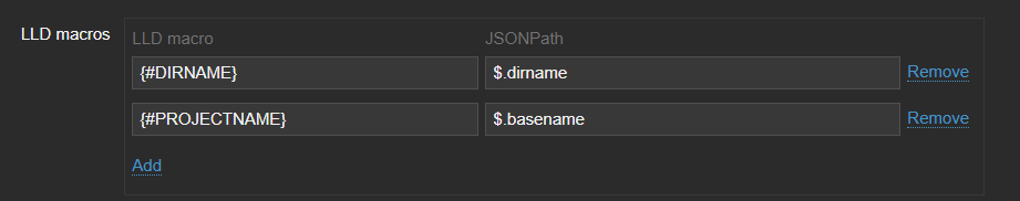
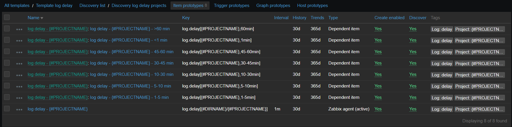
Now on Zabbix side, there is an item running this script and 7 dependent items, representing the degree of delay. Since there are many logs for which this data is collected, it is all put into LLD based on contents of specific directory:

vfs.dir.get[/var/log/logs,".*log$",,,,,1000]

This LLD then provides two macros:

And item prototypes will look like:

Those dependent items have one simple preprocessing step which takes needed number out of the script output:

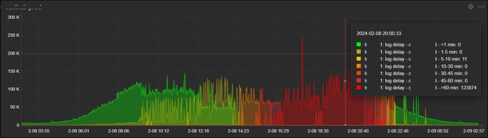
So the final result is the nice graph in dashboard, showing exactly when and what degree delays do appear:

So as you see, it is relatively easy to collect just about any data you wish, once you know how. As you can see from these examples, it might be something more complex but it can also be just a simple one-liner – in any case it should be obvious that possibilities are endless when talking about scripts in data collection. If something is executable from the CLI and has a valuable output, go ahead and collect it!

Zabbix internals

Another area where scripts can be really useful is adjusting how Zabbix behaves or controlling this behavior automatically. And in this case, we will employ Zabbix API, since it’s designed exactly for such or similar purposes.

Zabbix internals: automatically disabling problematic item

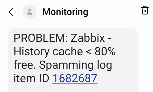
In our environment, we have many logs to be analyzed. And some of them sometimes go crazy – something that we intend to catch starts appearing there too often and requires attention – typically we would have to adjust the regexp, temporarily suppress some patterns and inform responsible teams about too extensive logging. If you don’t (or can’t) pay attention quick, it might kill Zabbix – history write cache starts filling up. So what we do is automatically detect such an item with most values received during some most recent short period of time and automatically disable it.

First of all there are two items – the one measuring history write cache and the other one extracting top item in the given table

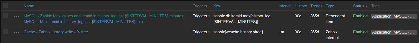
[root@linux ~]# zabbix_agentd -t zabbix.db.max[history_log,30] 2>/dev/null
zabbix.db.max[history_log,30] [t|463 1997050]
[root@linux ~]#

First number here is values gathered during provided period, second one is item id. The script behind this item looks like this

[root@linux ~]# grep zabbix.db.max /etc/zabbix/zabbix_agentd.d/userparameter_mysql.conf
UserParameter=zabbix.db.max[*],HOME=/etc/zabbix mysql -BN -e "USE zabbix; SELECT count(*), itemid FROM $1 WHERE clock >= unix_timestamp(NOW() - INTERVAL $2 MINUTE) GROUP BY itemid ORDER BY count(*) DESC LIMIT 1;"
[root@linux ~]#

And now relying on the history write cache item values showing us drop, we construct a trigger:

And as a last step, such trigger invokes action, which is running the script that disables the item with given ID with the help of Zabbix API, method “item.update”

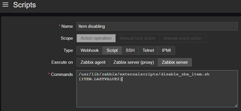
Now we are able to avoid unexpected behavior of our data sources affecting Zabbix performance, all done automatically – thanks to the scripts!

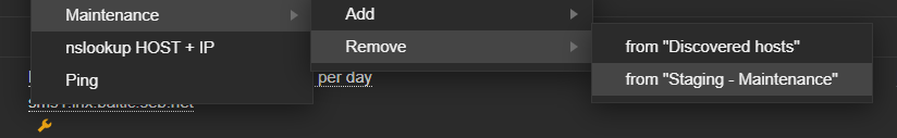
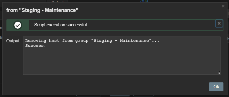
Zabbix internals: add host to group via frontend scripts

Zabbix maintenance mode is a great feature allowing us to reduce noise or avoid some false positive alerts once specific host is known to have issues. At some point we found it would be convenient to be able to add (or remove) specific host into (from) maintenance directly from “Problems” window. And that is possible and achieved via a frontend script, again with the help of Zabbix API, this time methods “host.get”, “hostgroup.get”, “hostgroup.massadd” and “hostgroup.massremove”

Data visualization

Zabbix has many different widgets that are able to cover various different ways of displaying your collected data. But in some cases, you might find yourself missing some small type of “something” which would allow your dashboards to shine even more – at least I constantly face it. Starting From version 6.4 Zabbix allows you to create your own widgets but it might be not such a straightforward procedure if you have little or no programming experience. However, you can employ two already existing widgets in order to customize your dashboard look in pretty easy way.

Data visualization: URL widget

First one example is done using the URL widget. You might feed just about any content there, so if you have any web development skills, you can easily create something which would look like custom widget. Here is an example. I need a clock but not the one already provided by Zabbix as a separate clock widget – I want to have a digital clock and I also want this clock to have a section, which would display the employee on duty now and in an upcoming shift. So with a little bit of HTML, CSS and JavaScript / AJAX, I have this

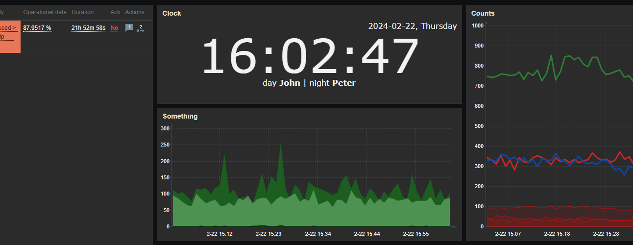
With styles properly chosen, such content can be smoothly integrated into dashboards, along with other widgets.

Data visualization: plain text widget with HTML formatting

Another useful widget which is often overlooked is the “Plain text” widget – in combination with the following parameters:

It becomes a very powerful tool to display nicely formatted data snapshots. Simple yet very good example here would be to display some content, which requires human readable structure – a table.

So again, integration with other dashboard widgets is so smooth – with just some custom HTML / CSS around your data you wrap it into something that looks like brand new “table” widget. Isn’t it awesome? And you are of course not limited to tables… Just use your imagination!

Conclusion

Although I personally prefer bash as the first option to solve things, there is no big difference regarding which scripting or programming languages to choose when extending Zabbix in these ways. Just try anything you feel most comfortable with.

I hope that examples shown here inspired you in some ways. Happy scripting!

The post Extending Zabbix: the power of scripting appeared first on Zabbix Blog.

Our First Netflix Data Engineering Summit

Post Syndicated from Netflix Technology Blog original https://netflixtechblog.com/our-first-netflix-data-engineering-summit-f326b0589102

Holden Karau Elizabeth Stone Pedro Duarte Chris Stephens Pallavi Phadnis Lee Woodridge Mark Cho Guil Pires Sujay Jain Tristan Reid Senthilnathan Athinarayanan Bharath Mummadisetty Abhinaya Shetty Judit Lantos Amanuel Kahsay Dao Mi Mick Dreeling Chris Colburn and Agata Gryzbek

Introduction

Earlier this summer Netflix held our first-ever Data Engineering Forum. Engineers from across the company came together to share best practices on everything from Data Processing Patterns to Building Reliable Data Pipelines. The result was a series of talks which we are now sharing with the rest of the Data Engineering community!

You can find each of the talks below with a short description of each, or you can go straight to the playlist on YouTube here.

The Talks

The Netflix Data Engineering Stack

Chris Stephens, Data Engineer, Content & Studio and Pedro Duarte, Software Engineer, Consolidated Logging walk engineers new to Netflix through the building blocks of the Netflix Data Engineering stack. Learn more about how batch and streaming data pipelines are built at Netflix.

Data Processing Patterns

Lee Woodridge and Pallavi Phadnis, Data Engineers at Netflix, talk about how you can apply different processing strategies for your batch pipelines by implementing generic abstractions to help scale, be more efficient, handle late-arriving data, and be more fault tolerant.

Streaming SQL on Data Mesh using Apache Flink

Mark Cho, Guil Pires and Sujay Jain, Engineers from the Netflix Data Platform talk about how a managed Streaming SQL using Apache Flink can help unlock new Stream Processing use cases at Netflix. You can read more about Data Mesh, Netflix’s next-generation stream processing platform, here

Building Reliable Data Pipelines

Holden Karau, OSS Engineer, Data Platform Engineering, talks about the importance of reliable data pipelines and how to build them covering tools from testing to validation and auditing. The talk uses Apache Spark as an example, but the concepts generalize regardless of your specific tools.

Knowledge Management — Leveraging Institutional Data

Tristan Reid, software engineer, shares experiences about the Knowledge Management project at Netflix, which seeks to leverage language modeling techniques and metadata from internal systems to improve the impact of the >100K memos that circulate within the company.

Psyberg, An Incremental ETL Framework Using Iceberg

Abhinaya Shetty and Bharath Mummadisetty, Data Engineers from Netflix’s Membership Data Engineering team, introduce Psyberg, an incremental ETL framework. Learn about how Psyberg leverages Iceberg metadata to handle late-arriving data, and improves data pipelines while simplifying on-call life!

Start/Stop/Continue for optimizing complex ETL jobs

Judit Lantos, Data Engineer, Member Experience Data Engineering, shares a case study to demonstrate an effective approach for optimizing complex ETL jobs.

Media Data for ML Studio Creative Production

In the last 2 decades, Netflix has revolutionized the way video content is consumed, however, there is significant work to be done in revolutionizing how movies and tv shows are made. In this video, Sr. Data Engineers Amanual Kahsay and Dao Mi showcase how data and insights are being utilized to accomplish such a vision.

We hope that our fellow members of the Data Engineering Community find these videos useful and engaging. Please follow our Netflix Data Twitter account for updates and notifications of future Data Engineering Summits!

Mick Dreeling, Chris Colburn


Our First Netflix Data Engineering Summit was originally published in Netflix TechBlog on Medium, where people are continuing the conversation by highlighting and responding to this story.

What’s Up, Home? – Thumbs up!

Post Syndicated from Janne Pikkarainen original https://blog.zabbix.com/whats-up-home-thumbs-up/20677/

In my previous blog post, I wrote about how I monitor my home with Zabbix. This week, I am showing how I utilize Grafana to visualize the data collected by Zabbix and what are my plans to further improve all this.

What’s on TV, honey?

First of all, one of the reasons I am building my home Grafana dashboards is that they can look fantastic. Combine that with the fact that nowadays it is super easy to cast your screen to the living room TV — or even access Grafana by using TV’s built-in web browser –, and you have one heck of a situational awareness screen. Not that it would really be needed at home, but hey, a real-time dashboard easily beats your average soap opera. I am sure my wife would not appreciate the idea that we would stare at Grafana all night long, but that is a different story altogether. I digress.

The other reason why I am building all this? I have monitored all kinds of IT stuff since 2001, and have done some very creative gymnastics with Nagios and Zabbix, so now it’s time to try out monitoring The Real World™. So far I have found out it is very similar to monitoring IT (duh).

Let’s dive into details

Above you can see a glimpse of my overall status Grafana dashboard. That’s actually all I have now, though it scrolls down for a page or two more.

The page provides me some really interesting information from battery levels to light status to firmware status of our devices. I will create some sub-dashboards and a Grafana playlist (slideshow), so our living room Mission Control TV can then show all the nuts and bolts of our home. Actually, we only have one TV and again, I am sure my wife would not appreciate The Grafana TV Show for too long, but one can dream.

Implemented so far:

  • Smart power outlet on/off status
  • Smart light bulbs on/off status
  • Info if our kitchen speaker is playing or not
  • Reachability status of different IoT devices we have around
  • Firmware status (is an upgrade needed or not) of our IoT devices
  • Amount of light (lux) status reported by Philips Hue motion sensors
  • Battery level monitoring of IoT devices; very good info to know especially about the smoke alarm device
  • Temperature monitoring in different rooms and outdoors
  • Humidity monitoring in different rooms and outdoors
  • Tons of details about our home Internet router; operational status of network ports, incoming/outgoing bandwidth, uplink status, errors, uptime, memory, CPU, disk and so on reported over SNMP
Let’s Explore!

For now, for the panels I chose to show a single stat and would like to see the timeline history of the values, I can quickly click on Explore and see my data in a different way. Explore is a very powerful feature of Grafana, so if you are a Grafana user and have not yet realized its potential, try it out!

Still to come

This public blog about monitoring my home kind of forces me to progress with it. So, here’s what is still to come:

  • Create a sensible Zabbix template; I have made some progress on investigating the JSON provided by Cozify, so stay tuned!
  • Buy a Raspberry Pi (that rhymes, yo) and move this setup from two virtual machines running on my ages-old MacBook Pro Retina mid-2012 to it. And, I gotta say, for a ten-year-old machine this MacBook is still fantastic!
  • For a Finn, a catastrophic, show-stopping missing feature is that our sauna is not monitored. AIEEE! Need to fix that.
  • The spring is coming and so is the gardening time. Not that I would understand anything about it, but I’m sure that this is an area my wife would totally approve — I’ll buy some sensors so we get alerted if our flowers and other plants are threatened by excessive heat and dryness.
  • Buy some air quality sensors so I can track the air quality both indoors and outdoors.
  • Extend the monitoring to cover not only our home, but nearby services as well. I already have a Python script that can tell me if our local train is gonna be late or is canceled, but that was for different reasons a long time ago and not even used in Zabbix or Grafana. However, inserting that data into Zabbix is trivial, so I will add that.
  • Add upcoming/active weather alerts to Grafana
  • Grafana is perfectly capable to display for example the lunch menus of the nearby restaurants, so why not?

I have worked at Forcepoint since 2014 and never get bored of visualizing and analyzing data. — Janne Pikkarainen

The post What’s Up, Home? – Thumbs up! appeared first on Zabbix Blog.

Mythbusting the Analytics Journey

Post Syndicated from Netflix Technology Blog original https://netflixtechblog.com/mythbusting-the-analytics-journey-58d692ea707e

Part of our series on who works in Analytics at Netflix — and what the role entails

by Alex Diamond

This Q&A aims to mythbust some common misconceptions about succeeding in analytics at a big tech company.

This isn’t your typical recruiting story. I wasn’t actively looking for a new job and Netflix was the only place I applied. I didn’t know anyone who worked there and just submitted my resume through the Jobs page 🤷🏼‍♀️ . I wasn’t even entirely sure what the right role fit would be and originally applied for a different position, before being redirected to the Analytics Engineer role. So if you find yourself in a similar situation, don’t be discouraged!

How did you come to Netflix?

Movies and TV have always been one of my primary sources of joy. I distinctly remember being a teenager, perching my laptop on the edge of the kitchen table to “borrow” my neighbor’s WiFi (back in the days before passwords 👵🏻), and streaming my favorite Netflix show. I felt a little bit of ✨magic✨ come through the screen each time, and that always stuck with me. So when I saw the opportunity to actually contribute in some way to making the content I loved, I jumped at it. Working in Studio Data Science & Engineering (“Studio DSE”) was basically a dream come true.

Not only did I find the subject matter interesting, but the Netflix culture seemed to align with how I do my best work. I liked the idea of Freedom and Responsibility, especially if it meant having autonomy to execute projects all the way from inception through completion. Another major point of interest for me was working with “stunning colleagues”, from whom I could continue to learn and grow.

What was your path to working with data?

My road-to-data was more of a stumbling-into-data. I went to an alternative high school for at-risk students and had major gaps in my formal education — not exactly a head start. I then enrolled at a local public college at 16. When it was time to pick a major, I was struggling in every subject except one: Math. I completed a combined math bachelors + masters program, but without any professional guidance, networking, or internships, I was entirely lost. I had the piece of paper, but what next? I held plenty of jobs as a student, but now I needed a career.

A visual representation of all the jobs I had in high school and college: From pizza, to gourmet rice krispie treats, to clothing retail, to doors and locks

After receiving a grand total of *zero* interviews from sending out my resume, the natural next step was…more school. I entered a PhD program in Computer Science and shortly thereafter discovered I really liked the coding aspects more than the theory. So I earned the honor of being a PhD dropout.

A visual representation of all the hats I’ve worn

And here’s where things started to click! I used my newfound Python and SQL skills to land an entry-level Business Intelligence Analyst position at a company called Big Ass Fans. They make — you guessed it — very large industrial ventilation fans. I was given the opportunity to branch out and learn new skills to tackle any problem in front of me, aka my “becoming useful” phase. Within a few months I’d picked up BI tools, predictive modeling, and data ingestion/ETL. After a few years of wearing many different proverbial hats, I put them all to use in the Analytics Engineer role here. And ever since, Netflix has been a place where I can do my best work, put to use the skills I’ve gathered over the years, and grow in new ways.

What does an ordinary day look like?

As part of the Studio DSE team, our work is focused on aiding the movie-making process for our Netflix Originals, leading all the way up to a title’s launch on the service. Despite the affinity for TV and movies that brought me here, I didn’t actually know very much about how they got made. But over time, and by asking lots of questions, I’ve picked up the industry lingo! (Can you guess what “DOOD” stands for?)

My main stakeholders are members of our Studio team. They’re experts on the production process and an invaluable resource for me, sharing their expertise and providing context when I don’t know what something means. True to the “people over process” philosophy, we adapt alongside our stakeholders’ needs throughout the production process. That means the work products don’t always fit what you might imagine a traditional Analytics Engineer builds — if such a thing even exists!

A typical production lifecycle

On an ordinary day, my time is generally split evenly across:

  • 🤝📢 Speaking with stakeholders to understand their primary needs
  • 🐱💻 Writing code (SQL, Python)
  • 📊📈 Building visual outputs (Tableau, memos, scrappy web apps)
  • 🤯✍️ Brainstorming and vision planning for future work

Some days have more of one than the others, but variety is the spice of life! The one constant is that my day always starts with a ridiculous amount of coffee. And that it later continues with even more coffee. ☕☕☕

My road-to-data was more of a stumbling-into-data.

What advice would you give to someone just starting their career in data?

🐾 Dip your toes in things. As you try new things, your interests will evolve and you’ll pick up skills across a broad span of subject areas. The first time I tried building the front-end for a small web app, it wasn’t very pretty. But it piqued my interest and after a few times it started to become second nature.

💪 Find your strengths and weaknesses. You don’t have to be an expert in everything. Just knowing when to reach out for guidance on something allows you to uplevel your skills in that area over time. My weakness is statistics: I can use it when needed but it’s just not a subject that comes naturally to me. I own that about myself and lean on my stats-loving peers when needed.

🌸 Look for roles that allow you to grow. As you grow in your career, you’ll provide impact to the business in ways you didn’t even expect. As a business intelligence analyst, I gained data science skills. And in my current Analytics Engineer role, I’ve picked up a lot of product management and strategic thinking experience.

This is what I look like.

☝️ One Last Thing

I started off my career with the vague notion of, “I guess I want to be a data scientist?” But what that’s meant in practice has really varied depending on the needs of each job and project. It’s ok if you don’t have it all figured out. Be excited to try new things, lean into strengths, and don’t be afraid of your weaknesses — own them.

If this post resonates with you and you’d like to explore opportunities with Netflix, check out our analytics site, search open roles, and learn about our culture. You can also find more stories like this here.


Mythbusting the Analytics Journey was originally published in Netflix TechBlog on Medium, where people are continuing the conversation by highlighting and responding to this story.

A Day in the Life of a Content Analytics Engineer

Post Syndicated from Netflix Technology Blog original https://netflixtechblog.com/a-day-in-the-life-of-a-content-analytics-engineer-eb0250b993be

Part of our series on who works in Analytics at Netflix — and what the role entails

by Rocio Ruelas

Back when we were all working in offices, my favorite days were Monday, Wednesday, and Friday. Those were the days with the best hot breakfast, and I’ve always been a sucker for free food. I started the day by arriving at the LA office right before 8am and finding a parking spot close to the entrance. I would greet the familiar faces at the reception desk and take a moment to check out which Netflix Original was currently being projected across the lobby. Take the elevator uninterrupted up to the top floor. Grab myself a plate of scrambled eggs, salsa, and bacon. Pour myself some coffee. Then sit at a small table next to the floor-to-ceiling windows with a clear view of the Hollywood sign.

My morning journey from lobby to elevators to breakfast (Photo Credit: Netflix)

During the day, the LA office buzzes with excitement and conversation. My time in the morning is like the calm before the storm — a chance to reflect before my head is full of numbers and figures. I often think about all the things that led me to becoming a Netflix employee. From my family immigrating to the United States from Mexico when I was very young to the teachers and professors that encouraged a low income student like me to dream big. It has been a journey and I’m grateful to be at a place that values the voice I bring to the table.

At the time of posting we’re working from home due to the pandemic, so my days look a bit different: The hot breakfasts are not as consistent and conversations are mainly with my dog. We still find ways to keep connected, but I for one am looking forward to when the office is fully open and I can look out to the Hollywood sign again.

Ok. But what do I actually do? (Besides eating breakfast)

What do I do at Netflix?

I’m a Senior Analytics Engineer on the Content and Marketing Analytics Research team. My team focuses on innovating and maintaining the metrics Netflix uses to understand performance of our shows and films on the service. We partner closely with the business strategy team to provide as much information as we can to our content executives, so that — combined with their industry experience — they can make the best decisions for Netflix.

Being an Analytics Engineer is like being a hybrid of a librarian 📚 and a Swiss army knife 🛠️: Two good things to have on hand when you’re not quite sure what you will need. Like a librarian, I have access to an encyclopedia of knowledge about our content data and have become the resident expert in one of our most important internal metrics. And like a Swiss army knife, I possess a multitude of tools to get the job done — be it SQL, Jupyter Notebooks, Tableau, or Google Sheets.

One of my favorite things about being an Analytics Engineer is the variety. I have some days where I am brainstorming and collaborating with amazing colleagues and other days where I can put my headphones on to work out a tough problem or build a dashboard.

One of my current projects involves understanding how viewing habits have evolved over the past several years. We started out with a small working group where we brainstormed the key questions to address, what data we could use to answer said questions, and came up with a work plan for how the analysis might take shape. Then I put on my headphones and got to work, writing SQL and using Tableau to present the data in a useful way. We met frequently to discuss our findings and iterate on the analysis. The great thing about these working groups is that we each contribute different skills and ideas. We benefit from both our individual strengths and our willingness to collaborate — Our values of Selflessness and Inclusion, in action.

How did I become interested in Analytics?

I did not set out from the start to be an Analyst. I never had a 5 year plan and my path has been a winding one.

Yours truly, featuring part of my extensive Netflix apparel collection

In college, I majored in Physics because it was “the science that explains all the other sciences”. But what I ended up liking most about it was the math. Between that and the fact that there aren’t many entry-level physics jobs, I pursued a PhD in Applied Mathematics. This turned out to be a wise choice as I avoided entering the workforce right before the 2008 recession.

I loved grad school. The lectures, the research, and most of all the lifelong friendships. But as much as I enjoyed being a student, the academic track wasn’t for me. So without much of a plan I headed back home to California after graduation.

Looking around to see what I could do with my Applied Math background, I quickly settled on Data Science. I wasn’t well versed in it but I knew it was in demand. I started my new data science career as an analyst at a small marketing company. I had an incredible boss who encouraged me to learn new skills on the job. I honed my SQL and Python skills and implemented a clustering model. I also got my first introduction to working for an actual business.

Later on I went to Hulu to grow in the core skills of a data scientist. But while the predictive modeling I was doing was interesting and challenging, I missed being close to the business. As an analyst, I got to attend more meetings with the decision makers and be part of the conversation.

So by the time the opportunity arose to interview for a position at Netflix, I had figured out that Analytics was the best area for me.

It has been a journey and I’m grateful to be at a place that values the voice I bring to the table.

Why Netflix?

Growing up I watched a lot of TV. I mean a lot of TV. But I never thought I could actually work in the TV and Film business. I feel incredibly fortunate to be working at a job I am passionate about and to be at a company that brings joy to people around the world.

Even though I’d been a loyal Netflix customer since the DVD days, I had not heard about their unique culture until I started interviewing. When I did read the culture doc (which I recently learned is also published in Spanish and 12 other languages!), it sounded pretty intimidating. Phrases like “high performance” and “dream team” made me imagine an almost gladiator-style workplace. But I quickly learned this wasn’t the case. Through a combination of my existing network, the interview process, and other online resources about the company, I found that folks are actually very friendly and helpful! Everyone just wants to do their best work and help you do your best work too. Think more The Great British Baking Show and less Hell’s Kitchen. Selflessness really is embraced as an important Netflix value.

Having been here for 3 years now, I can say that working at Netflix is really special. The company is always evolving, big decisions are made in a transparent way, and I’m encouraged to voice my thoughts. But the single most important factor is the people. My Content Analytics teammates continuously impress me not only with their quality of work, but also with their kindness and mutual trust. This foundation makes innovating more fun, lets us be open about our passions outside of work, and means we genuinely enjoy each other’s company. That balance is crucial for me and is why this truly is the place where I can do my best work.

If this post resonates with you and you’d like to explore opportunities with Netflix, check out our analytics site, search open roles, and learn about our culture. You can also find more stories like this here.


A Day in the Life of a Content Analytics Engineer was originally published in Netflix TechBlog on Medium, where people are continuing the conversation by highlighting and responding to this story.

Analytics at Netflix: Who we are and what we do

Post Syndicated from Netflix Technology Blog original https://netflixtechblog.com/analytics-at-netflix-who-we-are-and-what-we-do-7d9c08fe6965

Analytics at Netflix: Who We Are and What We Do

An Introduction to Analytics and Visualization Engineering at Netflix

by Molly Jackman & Meghana Reddy

Explained: Season 1 (Photo Credit: Netflix)

Across nearly every industry, there is recognition that data analytics is key to driving informed business decision-making. But there is far less agreement on what that term “data analytics” actually means — or what to call the people responsible for the work.

Even within Netflix, we have many groups that do some form of data analysis, including business strategy and consumer insights. But here we are talking about Netflix’s Data Science and Engineering group, which specializes in analytics at scale. The group has technical, engineering-oriented roles that fall under two broad category titles: “Analytics Engineers” and “Visualization Engineers.” In this post, we refer to these two titles collectively as the “analytics role.” These professionals come from a wide range of backgrounds and bring different skills to their work, while sharing a common drive to generate and scale business impact through data.

Individuals in these roles possess deep business context and are thought leaders alongside their business counterparts. This enables them to fully understand where their partners are coming from.

What’s the purpose of the analytics role at Netflix?

When you think about data at Netflix, what comes to mind? Oftentimes it is our content recommendation algorithm or the online delivery of video to your device at home. Both are integral parts of the business, but far from the whole picture. Data is used to inform a wide range of questions — ‘How can we make the product experience even better?’, ‘Which shows and films bring the most joy to our members?’, ‘Who can we partner with to expand access to our service in new markets?’. Our Analytics and Visualization Engineers are taking on these and other big questions for the company, informing decision-making across every corner of the business.

We align our analytic teams with business area verticals

Since the problem space is so varied, we align our analytics professionals with the listed business area verticals rather than organizing them within a single functional horizontal. The expectation is that individuals in these roles possess deep business context and are thought leaders alongside their business counterparts. This enables them to fully understand where their partners are coming from. It also means Analytics and Visualization Engineers are a specialized resource and a rare commodity. There are many more questions and stakeholders than analytics team members, and the job is not to take on every request. Instead, these individual contributors are given freedom to choose their projects and are responsible for prioritizing the ones that will have the most business impact (and deprioritizing the rest). This requires a lot of judgment and embodies our “context not control” culture.

“OK, but what do they actually do…?”

What does the job entail?

You’ve probably caught on to some common themes: People in the analytics role are highly connected to the business, solve end-to-end problems, and are directly responsible for improving business outcomes. But what makes this group really shine are their differences. They come from lots of backgrounds, which yields different perspectives on how to approach problems. We use the catch-all titles of Analytics and Visualization Engineers so as to not get too hung up on specific credentials. Instead, people are empowered to leverage their unique skills to make Netflix better.

A couple other defining characteristics of the role are full ownership of the problem (in Netflix lingo, you are the “informed captain” of your space) and creating trustworthy outputs. These are only possible through the one-two punch of deep business context 👊 and technical excellence 👊. Full ownership often means building new data pipelines, navigating complex schemas and large data sets, developing or improving metrics for business performance, and creating intuitive visualizations and dashboards — always with an eye towards actionable insights.

We use the catch-all titles of Analytics and Visualization Engineers so as to not get too hung up on specific credentials. Instead, people are empowered to leverage their unique skills to make Netflix better.

Because these professionals vary in their expertise, so too does their day-to-day. Below are three broadly defined personas to help illustrate some of the different backgrounds, motivations, and activities of individuals in the analytics role at Netflix. Many of our colleagues have come in with expertise that spans multiple personas. Others have grown into new areas as part of their professional development at Netflix. Ultimately, these skills are all on a continuum, some broad and some deep, and these are just a few examples of such expertise. So if you find yourself connecting with any part of these descriptions, the analytics role could be for you.

  • The Analyst is motivated by delivering metrics, findings, or dashboards that drive analytical insights and business decisions. They love to communicate their discoveries to nontechnical audiences, explain caveats, and debate analytic choices and strategic implications with peers and stakeholders. Their expertise is descriptive analytic methodology, but they have the necessary tools to be scrappy (e.g. coding, math, stats), and do what’s required to answer the highest priority business questions.
  • The Engineer enjoys making data available by piping it in from new sources in optimal ways, building robust data models, prototyping systems, and doing project-specific engineering. They’re still analysts at heart but, similar to data engineers, they have a deep understanding of data warehouse capabilities and are pros at data processing optimization and performance tuning. Being at this intersection of disciplines allows them to produce full-stack outputs, layering visualizations and analytics on their projects.
  • The Visualizer is passionate about the scalability, beauty, and functionality of dashboards and their capability for telling a visual story. They also have an eye for principled engineering, i.e. managing the data under the surface. They want to pick the perfect chart type for the narrative while also focusing on delivering key analytic insights. They may use industry tools (e.g. Tableau, Looker, Power BI) to their fullest extent, developing a deeper understanding of analytics by examining these tools under the hood. Or they may create sophisticated visuals from scratch and build the type of custom UI that enterprise tools don’t offer (e.g. JavaScript web apps).

Introducing Analytics at Netflix

Whether you’re a data professional, student, or Netflix enthusiast, we invite you to meet our stunning colleagues and hear their stories. If this series resonates with you and you’d like to explore opportunities with us, check out our analytics site, search open roles, and learn about our culture.

Welcome to Analytics at Netflix!

Related Posts:


Analytics at Netflix: Who we are and what we do was originally published in Netflix TechBlog on Medium, where people are continuing the conversation by highlighting and responding to this story.