Introducing composable, module system native and agent friendly command line tools for modern Java development
By Danny Thomas, JVM Ecosystem Team
Recent work on the Java language to pave the on-ramp has made it easier than ever to start a Java program and evolve it using the full language and platform. At the end of that on-ramp lies Java’s mature build and dependency management ecosystem, capable of carrying software to enormous scale and complexity.
That ecosystem reached its maturity by developing strong models for projects, dependencies, and builds. When the Java Module System arrived, those models were already serving developers exceptionally well. The module descriptor consequently became just another description of the project to keep in agreement.
We’re excited to announce a preview of ja and its family of composable tools, that build on the capabilities of the Java Module System to provide a modern command line development experience for Java. We take the module descriptor and make it a complete description of a project, with dependency versions sitting naturally beside its requires directives and module metadata provided through documentation tags:
Combined with command line ergonomics you’re used to in other languages, creating and consuming Java modules has never been easier.
Composable Tools
Java developers have long been exceptionally well served by graphical tools. An IDE formats source, navigates between declarations and usages, presents API documentation, and maintains a compiled view of the project. That experience has been so complete that Java has had less need to expose the same capabilities through small, composable command line tools. Those gaps become quickly apparent when coding agents work with the Java language, with agents frequently struggling to locate dependencies, documentation and sources.
ja only provides command line ergonomics and tool orchestration, each feature is underpinned by a standalone tool. You don’t need to adopt ja to get the benefit of these tools, you can compose them in any way you choose:
jig performs module version resolution, compilation and assembly, outputting standard module system arguments for use with other tools. It is also the bridge to and from Maven repositories providing a standalone module proxy and publishing commands
jfmt formats source using the Code Conventions for the Java Programming Language, adapted for the modern Java language. Avoids the very common whitespace, indentation, import ordering and qualified class references introduced in agent written code
jist provides source aware symbol search, providing a grep style interface for understanding class files and their associated sources. Gives coding agents access to symbols and sources without indexing, LSPs or MCPs while interoperating with other build tools via an argument file contract
jdocserver serves locally browsable API documentation
These projects use the tool discovery and execution capabilities of the platform, and are intended to be installed in your JDK along with the standard tools. They all implement Tool or ToolProvider, allowing them to be run in process.
This is also the tool discovery and execution model for ja. There we use OptionChecker and optional custom metadata to discover which module system options are supported so it can resolve the arguments on behalf of the tool. This provides a seamless transition from your source path modules to the standard JDK tooling such as jdeps, jlink and jshell.
Maven as a foundation
In a recent survey of the 1,000 most popular artifacts on Maven Central, just 232 had explicit module definitions and another 248 declared automatic module names. The remaining 520 expressed no Java module name opinion. The module system also makes no distinction between namespace and module name, so module-first tooling requires a solution to module naming and location in existing repositories.
Fortunately, Maven Central already gives published artifacts a verified namespace. Publishers prove control of reverse domain group IDs, reflecting Sonatype’s long standing case for namespaces in public repositories.
We use these conventions to establish a canonical Maven module coordinate, paring a verifiable DNS namespace with the complete module name, for example pkg:maven/com.netflix/com.netflix.tools.ja. For existing modules, authors choose to publish a single Maven relocation pom at the canonical coordinate, to allow for discovery of the original coordinate.
When neither are available, candidates are walked from the root of the namespace using common Maven artifact conventions inferring coordinates from module names. We also bundle a short list of aliases for the most popular modules that don’t use a reverse DNS module name, but we suggest authors should always namespace their modules. The module proxy in jig presents resolved modules using the filename based conventions for module naming, making even automatic modules without stable names safe when used with these tools.
These conventions and location strategies allow the majority of existing artifacts to be discovered using only the module name and version.
Integrity by default
ALL-UNNAMED has become unfortunately common in Java access options, because of the heavy use of the class path. It hides the source of the technical debt that applications are incurring by allowing such access and becomes increasingly consequential as Java moves toward Integrity by Default. For example, Preparing to Make Final Mean Final asks applications to explicitly authorize the modules allowed to mutate final fields.
We allow runtime access requirements to bedeclared as module metadata and carried with the module descriptor throughout the module’s lifecycle. For example a library may record the access it requires:
The command line interface for ja allows the dependency and authorization to be added together:
ja require [email protected] \
 --enable-final-field-mutation com.example.framework
Without that authorization, dependency resolution fails with an unsatisfied access requirement. Native access follows the same model through @enableNativeAccess and qualified exports and opens are also supported.
Module integrity is ensured by persistent hashes of resolved binary dependencies in a module-info.hash file, sequent resolution verifies those hashes and rejects an artifact that has changed.
We also take a step further than the recent improvements to annotation processor security by treating annotation processing as an explicit code generation step. The resulting sources are alongside regular module source, making them visible in code review and allowing a module to be assembled without executing generator code.
Make modules your default
We think every Java project should be modular, regardless of the build tool you’re using. If you’re a library author producing automatic modules, we’d encourage you to avoid split packages and produce explicit modules.
By Parth Jain, Rakesh Sukumar, Yingwu Zhao, Renzo Sanchez-Silva & Nathan Fisher A deep dive into the engineering challenges of building a real-time service dependency map at Netflix scale: from streaming architectures and distributed aggregation pipelines to time-travel queries and the methodology that made it work.
Introduction
In our first post, we introduced the problem: engineers at Netflix needed a unified, real-time view of service dependencies to troubleshoot faster, understand blast radius, and navigate our distributed architecture. We described our multi-source approach, combining eBPF network flows, IPC metrics, and distributed tracing into physically separate graph layers that can be queried independently or merged into a comprehensive view.
That post explained what we built and why. This post is about how, the engineering reality of building this system at Netflix scale.
Here’s the truth: the first version worked perfectly… in our local environment. Production was a different story. Kafka consumers fell behind. Instances ran out of memory. Some nodes received 100x the traffic of others. Garbage collection pauses consumed more CPU than actual business logic.
What you’ll learn in this post isn’t a success story, it’s a learning journey. We’ll walk through the architecture decisions that enabled scale, the production challenges that tested those decisions, the optimization methodology that guided us through, and the lessons that apply to any distributed system. Along the way, we’ll share the innovations that made it possible to process millions of flow records per second, reconstruct topology at any point in time, and provide sub-second query responses, all while maintaining near real-time freshness.
Architecture Deep-Dive: Building for Streaming and Scale
Streaming-First: Why Real-Time Matters
Traditional service topology systems use batch processing, aggregating data hourly or daily, then storing complete snapshots. This approach works at a modest scale but has a fundamental problem: by the time you see the data, it’s already old. During a production incident at 3am, an hour-old dependency map is archaeology, not observability.
Our key architectural decision was to build streaming-first. Instead of batch jobs that process historical data, we continuously ingest flow records from multi-region Kafka streams and IPC metrics as Server-Sent Events, process them through reactive pipelines with backpressure handling, and provide near real-time topology updates, typically within tens of minutes, compared to the hours-old or day-old data that batch processing approaches provide.
This wasn’t just about freshness, it was essential for our use cases. Live events can’t wait for the next hourly batch. Incident response needs current data. Change validation requires seeing immediate impact. The architecture had to support continuous updates while handling massive scale without falling behind.
How Backpressure Enables Real-Time Processing The streaming approach created new challenges, but also required solving a fundamental problem: how do you process millions of flow records per second in real-time without losing data when downstream systems slow down?
Traditional approaches fall short at our scale:
Unbounded queues: Simple but dangerous. Keep buffering until you run out of memory, then the instance crashes.
Drop-based flow control: Discard data when buffers fill. Fast, but now your topology is incomplete, you’ve lost connection information.
Batch processing: Process everything, but hours later. By then, the incident is over (or worse, still happening with stale data).
We needed something different: the ability to slow down gracefully under load without losing data. This is where reactive streams with backpressure became essential.
Here’s how it works: when Stage 3 can’t write to the graph database fast enough, it signals Stage 2 to slow down. Stage 2 signals Stage 1. Stage 1 signals the Kafka consumer to pause. The data waits in Kafka until downstream capacity returns.
When a downstream stage can’t keep up, it signals upstream to slow down — backpressure flows in the opposite direction of the data
Backpressure propagates naturally through the entire system. When any stage becomes overwhelmed from traffic spikes, GC pauses, or external slowdowns, the pipeline automatically slows to a sustainable rate. No data is lost in most cases, no instances crash, the system degrades gracefully.
This is what enables “real-time” at our scale. During normal operation, we process with minimal latency. During load spikes or temporary slowdowns, we slow down rather than fall over. The data still gets processed, just a few seconds or minutes later instead of immediately. For topology updates, this trade-off is acceptable: slightly delayed real-time updates are vastly better than hour-old batch data or incomplete topology from dropped records.
The cost of this approach is complexity. Reactive streams are harder to reason about compared to traditional synchronous blocking models (we’ll discuss this more in the challenges section). But at Netflix scale, backpressure isn’t optional, it’s the mechanism that keeps the system running reliably under production load.
Multi-Layer Architecture: Physical Separation for Independent Optimization
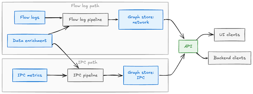
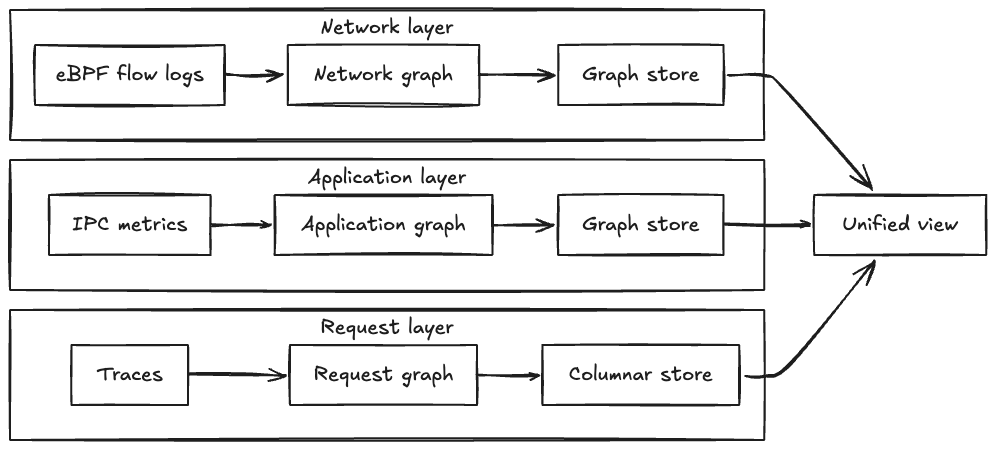
As we covered in our first post, our multi-source approach uses three physically separate topology layers with different storage optimized for each:
Network Layer: eBPF flow logs in graph database partition, comprehensive coverage but lacks application context
IPC Layer: Application metrics in a different graph database isolated from the one for Network Layer, rich endpoint details but only instrumented services
Tracing Layer: Distributed traces in columnar storage (Parquet), actual request paths but sampled.(We cover the tracing layer and its integration in our next post).
Flow logs and IPC metrics travel through two independently-optimized pipelines into separate graph stores, unified behind a single API
Physical storage isolation enables independent optimization, each layer has different throughput, query patterns, and evolution timelines. At query time, we execute parallel queries across relevant storage systems and merge results, providing unified views with sub-second latency while maintaining flexibility to evolve each layer independently.
The Three-Stage Distributed Aggregation Pipeline
The heart of the network layer ingestion is a three-stage distributed pipeline. This architecture solves a fundamental challenge with network flow logs: they only show individual network hops, not the true application-level connections we need to build a useful topology.
The Core Problem: Network Intermediaries
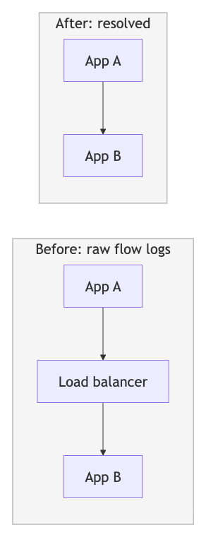
In cloud environments, traffic between applications rarely flows directly, it traverses intermediate network components like load balancers, NAT gateways, API gateways, and proxies. Network flow logs show individual hops: App A → Load Balancer and Load Balancer → App B appear as separate flows. But what engineers need is the logical dependency: App A → App B. Without resolving these intermediaries, our topology would be cluttered with infrastructure components rather than showing the service-to-service relationships that matter for troubleshooting.
The three-stage pipeline solves this:
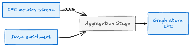
The flow log pipeline in detail — three stages connected by SSE, with enrichment applied just before the final graph write
Multi-Region Kafka (4 regions)
  → Filter invalid flow logs
  → 5-minute time-window batching
  → Create initial aggregators per window
  → Distribute via consistent hashing
  → Stream to Stage 2 via SSE
Stage 1 consumes flow logs from multi-region Kafka, filters invalid records, batches them into 5-minute time windows, and creates initial aggregator objects. At this stage, we’re still working with raw network hops, identifying which flows involve intermediaries but not yet resolving them. Aggregators stream to Stage 2 for resolution.
Stage 1 Aggregators (via SSE streams)
  → Group flows by intermediary (load balancer, NAT gateway, proxy, etc.)
  → Identify pairs: (Source → Intermediary) + (Intermediary → Destination)
  → Resolve to direct edges: Source → Destination
  → Track which intermediaries were traversed
  → Aggregate metrics across both hops
  → Re-distribute via consistent hashing
  → Stream to Stage 3 via SSE
This is the key step. Stage 2 performs graph resolution:
Collect flows by intermediary: Group aggregators where an intermediary is either source or destination, creating maps of flows going TO intermediaries (Source → Intermediary) and FROM intermediaries (Intermediary → Destination)
Resolve direct edges: For each intermediary, join its incoming and outgoing flows to create direct application edges (App A → App B), combining metrics from both hops
Result: Clean application-level topology showing App A → App B instead of App A → Load Balancer → App B
This resolution happens at aggregation time, not query time, with resolved edges flowing to Stage 3.
Why can’t we do this in a single stage? The fundamental issue is data locality. To resolve App A → Load Balancer → App B into App A → App B, we need both flows on the same instance to perform the join. But in Stage 1, flows are scattered across instances based on Kafka’s partitioning. Stage 2’s critical function is to redistribute aggregators by intermediary identifier, all flows involving “Load Balancer X” route to the same instance for resolution. This is the classic map-reduce pattern: Stage 1 maps, Stage 2 shuffles and reduces by intermediary, Stage 3 performs final aggregation.
A concrete example of why a single stage isn’t enough — Stage 1 scatters flows by partition, Stage 2 reshuffles by intermediary to resolve direct edges, and Stage 3 persists the final result.
Stage 3: Final Aggregation and Enrichment (GraphEntity Ingestion Service)
Stage 2 Aggregators (via SSE streams)Flow
  → Final aggregation across time windows
  → Enrich with external data (query key-value stores)
  → Convert to graph entities
  → Persist to graph database (throttled writes)
Stage 3 performs final aggregation of resolved edges, enriches graph nodes with external data sources (application health, ownership, metadata), converts aggregators to concrete graph entities (nodes and edges with all properties populated), and persists them to the distributed graph database with controlled throttling to respect storage system limits.
Why Three Stages, Not Two?
We initially used two stages: aggregate in Stage 1, resolve and persist in Stage 2. This worked in testing but failed at production scale, Stage 2 became overwhelmed by data concentration.
The problem: intermediary resolution requires collecting ALL flows involving an intermediary on the same instance.As a result, the instances handling flow logs for popular applications and their intermediaries became ‘hot nodes’ due to significant data concentrationCompounding this, data enrichment (querying external stores for health and metadata) meant the busiest instances were also doing the most I/O.
The solution: split responsibilities into three stages. Stage 2 focuses purely on resolution and redistributes. Stage 3 handles enrichment and persistence. This graduated redistribution (distribute, resolve, distribute again), persist, spreads load across multiple instances and isolates compute-heavy resolution from I/O-heavy enrichment. Even when intermediaries see 100x typical traffic, no single instance becomes a bottleneck.
Why Server-Sent Events Instead of gRPC or Message Queues?
We initially used gRPC but it became a performance bottleneck, serialization overhead, connection pool management, and memory pressure for streaming responses consumed more CPU than business logic. Message queues added infrastructure complexity without benefit for our use case.
SSE proved ideal: lightweight HTTP-based protocol with minimal serialization, natural backpressure integration with reactive streams, and simpler connection model. The lesson: industry best practices like “use gRPC for service communication” don’t apply universally. For streaming large volumes of pre-aggregated data, lighter-weight alternatives may be more appropriate. Measure, don’t assume.
Why IPC Doesn’t Need Three Stages
The IPC pipeline mirrors the same pattern as the flow log pipeline, but needs only a single stage.
The IPC layer uses single-stage aggregation because: (1) IPC metrics are already at application level, no intermediaries to resolve, and (2) data is partitioned correctly from the start — each node receives all IPC metrics for its assigned applications via consistent hashing, eliminating the need for redistribution. This highlights a key principle: data partitioning strategy determines processing architecture. When data arrives with the right partitioning, you can aggregate directly; when it doesn’t (like network flows requiring intermediary resolution), you need shuffle/redistribution stages.
Dynamic Load Distribution: How Hashing Works with Auto-Scaling
How do we decide which instance receives which aggregator when our Auto Scaling Groups dynamically add or remove instances? Traditional approaches assume static clusters requiring explicit rebalancing, coordination services, or manual data movement when cluster size changes.
Our Approach: Dynamic Consistent Hashing
We use consistent hashing with dynamic instance discovery from our service registry. Each instance queries the registry to get the current list of healthy ASG instances, maintains them in sorted order (ensuring all instances have the same view), and uses this list for the hash function findOwnerInstance(aggregator.primaryKey). When ASG scales up or down, the hash function naturally redistributes aggregators based on the updated instance list, no explicit coordination needed.
The key insight: leverage existing infrastructure. Our service registry already tracks ASG membership for health checking. Using it as our source of truth gives us dynamic cluster membership for free. Consistent hashing provides stable partitioning (most aggregators stay on the same instance during membership changes), while the sorted list ensures consistency.
The Result
Load follows infrastructure automatically. During traffic spikes or live events, new instances immediately receive their share. During deployments, aggregators seamlessly shift to healthy instances. This pattern proved crucial for production stability, no manual intervention, no coordination protocol, just automatic rebalancing.
The V1 Journey: Major Challenges at Production Scale
Getting the initial version (V1) to production taught us that scale changes everything. What works in development breaks in production. Every assumption gets tested. And fixing one bottleneck reveals the next.
Challenge 1: Kafka Consumer Lag
The Problem: Our multi-region Kafka consumers started falling behind. Consumer lag grew from seconds to minutes, then hours. Flow logs were arriving faster than we could process them. If this continued, we’d never catch up, and our “real-time” topology would become increasingly stale.
Investigation: We instrumented Kafka consumer metrics heavily. Key findings:
Kafka had fewer partitions than optimal for our consumer group size
Each fetch operation retrieved relatively few records
Network socket buffers weren’t right-sized for our throughput
Cross-region read latency added overhead
Solutions Applied:
Increased Kafka partitions: More partitions enabled more parallel consumers in our consumer group, distributing load across more instances.
Tuned fetch parameters: Increased records per fetch operation, reducing the number of network round-trips. This trades off per-message latency (we fetch larger batches) for throughput (more records processed per second).
Increased socket receive buffer size: Ensured network buffers never limited fetch operations. At our scale, default buffer sizes were too small.
Results: Throughput improved significantly, and lag reduced to acceptable levels, typically under a minute even during peak traffic.
Lesson: At scale, you can’t optimize in isolation. Fixing Kafka lag revealed the next bottleneck: our instances themselves couldn’t keep up with the higher ingest rate. The pipeline moved faster, which exposed downstream capacity problems.
Challenge 2: Hot Nodes and Data Amplification
The Problem: This was the most severe production issue we faced. Some instances in our Auto Scaling Group were receiving 100x more traffic than others. Memory usage spiked. Garbage collection pauses became frequent and long. More CPU time was spent in GC than in business logic. Eventually, hot instances would go DOWN, triggering cascading failures as their load redistributed to other instances.
Root Cause Investigation: Flow logs for popular services dominate traffic volume. A service like our authentication layer or recommendation API is called by hundreds of other services, generating orders of magnitude more flow records than typical services.
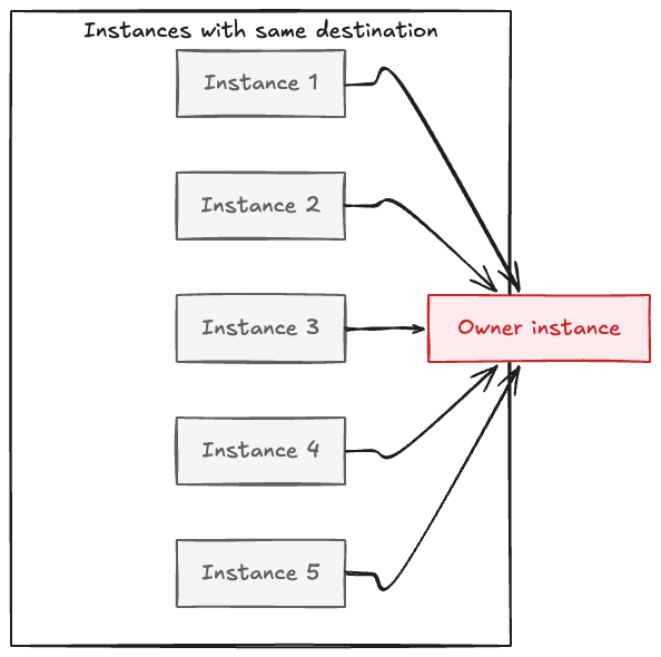
Our initial architecture used consistent hashing to determine which instance owned aggregation for each destination service. All flow logs for a given destination are routed to the same instance, the “owner” for that destination. This design seemed reasonable: group related data for efficient aggregation.
But popular destinations created hot nodes. One instance might own authentication services, another might own a rarely-used backend service. The load distribution was wildly uneven, some instances handled 100x the flow records of others.
Worse, data amplification occurred during redistribution. Consider a service called by 100 upstream services across 10 instances. All 10 instances receive flow logs for that destination (because they all have local clients calling it). When they route aggregators to the owner instance, that instance receives 10 separate aggregators it must merge. The data volume multiplied during shuffling.
When many instances route data for the same key to one owner, the volume multiplies right where it lands — the root cause of hot nodes.
We profiled extensively using async-profiler and heap dump analysis. The results were clear: hot instances spent most of their CPU on garbage collection, trying to manage the rapid allocation and deallocation of aggregator objects as flow logs poured in faster than they could be processed. Memory pressure led to GC thrashing, which consumed CPU, which slowed processing, which increased memory pressure, a vicious cycle.
Solution: The Three-Stage Pipeline’s Dual Benefits The three-stage pipeline we described earlier, designed primarily for proxy resolution, turned out to be exactly what we needed to solve the hot nodes problem as well. Here’s why:
Stage 1 performs initial aggregation locally before any distribution. Instead of sending every flow log to a remote instance immediately. Each instance performs online aggregation of raw flow logs into time-windowed aggregators (over 5-minute periods) directly in memory; this allows the raw flow to be discarded and garbage collected quickly, significantly reducing memory pressure, and ensures only the aggregation results are transferred across the network to downstream stages.
Stage 2 focuses on proxy resolution but also provides intermediate redistribution. Aggregators from Stage 1 distribute via consistent hashing to Stage 2 instances. Now we’re moving compressed aggregators, not individual flow logs. After resolution, Stage 2 redistributes resolved edges again to Stage 3, providing a second hashing operation that further spreads load.
Stage 3 receives resolved aggregators that have been compressed twice and distributed twice. Even for extremely popular services, load has been spread across enough distribution points that no single instance becomes overwhelmed.
The key insight: architectural decisions driven by one requirement (proxy resolution) often solve other problems (load distribution) as beneficial side effects. The three-stage pipeline with graduated redistribution achieves both goals, it resolves proxies to show clean application-level topology AND prevents hot nodes by spreading load across multiple distribution points.
Switching from gRPC to SSE As described earlier, this challenge also revealed that gRPC wasn’t the right protocol for inter-stage communication at our scale. We replaced gRPC with Server-Sent Events, dramatically reducing resource consumption on both sender and receiver sides.
Results:
CPU usage became evenly distributed across instances, no more hot nodes with 10x the load of others
Network bandwidth usage dropped significantly due to better aggregation and lighter-weight protocol
Memory pressure decreased as we reduced the object allocation rate
The system scaled gracefully with Auto Scaling Group changes
Lesson: Technology choices must match your specific use case. gRPC is excellent for request-response RPC patterns. For streaming large volumes of aggregated data in a pipeline, lighter-weight alternatives can be more appropriate. Let measurements guide the decision, not industry hype or existing team expertise.
Challenge 3: Memory and Garbage Collection
The Problem: Even after fixing hot nodes, we still saw high heap usage, frequent garbage collection pauses, and instances occasionally going DOWN. GC logs showed pauses consuming significant CPU time, in some cases, more than our business logic.
Root Cause: Multiple factors contributed: objects accumulating in heap while waiting for 5-minute aggregation windows to complete, unnecessary conversions between different object types as data flowed through stages, and immutability overhead, following Scala best practices, we used immutable data structures for aggregators, but every update created new objects, overwhelming the garbage collector at millions of records per second.
Investigation: Heap dumps and GC logs revealed flow log objects retained beyond their useful lifetime, unnecessary intermediate conversion objects, and constant creation/disposal of immutable aggregator versions. Minor GCs occurred every few seconds, major GCs took hundreds of milliseconds, the JVM spent more time on garbage collection than business logic.
Solutions Applied:
Faster processing: Process flow logs immediately, aggregate quickly, release references. Optimized Pekko stream stages to minimize object lifetime.
Eliminate unnecessary conversions: Route aggregators directly between stages instead of converting to intermediate types.
Mutable structures on hotpath: This was controversial, Scala best practices emphasize immutability. But at our scale, immutability created too many objects. We pragmatically chose mutable aggregators on the hotpath (immutability elsewhere), prioritizing performance over convention. Switching to mutable aggregators reduced heap allocation by over 50% and cut GC pause time significantly, though it required more careful code review.
Tuned time windows: Balanced data freshness against memory pressure.
Results:
Heap usage decreased substantially
GC pauses reduced to acceptable levels (tens of milliseconds instead of hundreds)
CPU freed up for business logic instead of garbage collection
Instance stability improved, no more instances going DOWN due to memory issues
Lesson: “Best practices” are starting points, not absolute rules. At unique scale, you may need to diverge from conventions. But do it deliberately, with measurement justifying the decision, and with awareness of the trade-offs. Don’t abandon immutability everywhere, just where performance data proves it’s necessary.
Challenge 4: Reactive Streams Complexity
The Problem: Our Pekko Streams pipelines would stall unexpectedly. Backpressure propagation didn’t work as expected. We struggled to debug why certain streams would stop processing without obvious errors. The reactive programming mental model, with its emphasis on async boundaries, backpressure, and demand-driven processing, proved harder to master than anticipated.
What We Learned: Reactive streams with backpressure are powerful tools for building systems that handle load spikes gracefully. When downstream consumers slow down (due to temporary load, GC pauses, or external system slowdowns), backpressure allows upstream producers to slow down rather than overflow buffers or drop data.
But this power comes with complexity:
Non-intuitive behavior: Traditional imperative code flows top-to-bottom. Reactive streams are demand-driven, downstream consumers pull from upstream producers. This inversion of control isn’t intuitive.
Async boundaries: The .async operator in Pekko Streams creates a boundary where processing moves to a different thread. This can improve parallelism but also introduces complexity around buffer sizing, demand signaling, and error propagation. We initially misunderstood when to use .async and ended up with over-parallelized streams that created more overhead than benefit.
Debugging difficulty: When a stream stalls, there’s no stack trace pointing to the problem. You must understand the internal mechanics, demand signals, buffer states, materializer state to diagnose issues.
Our Approach:
Deep learning investment: We invested significant time in understanding reactive streams concepts deeply. Reading documentation, experimenting with small examples, and building team expertise.
Simplified patterns: Where possible, we simplified our stream graphs. Complex branching and merging patterns are powerful but hard to debug. We preferred linear flows with clear stage boundaries.
Better monitoring: We added metrics at stream boundaries, tracking buffer sizes, element throughput, backpressure events. Visibility into stream internals helped diagnose issues.
Team education: We documented our learnings, shared patterns that worked, and built institutional knowledge about reactive streams.
Lesson: Powerful abstractions require investment. Don’t assume you understand a framework without validation. Build your mental model deliberately, test it with experiments, and be humble about your understanding. Reactive streams are worth mastering for systems that need to handle load gracefully, but expect a learning curve.
V2 Evolution: Continuous Refinement
V1 got us to production. The major architectural challenges like Kafka lag, hot nodes, memory pressure, were solved. But production at full scale revealed new optimization opportunities. V2 represents the continuous refinement that turns a working system into a production-ready system.
Challenge 5: Persistent Heap Pressure
The Problem: Despite V1 optimizations, we still observed higher-than-desired heap usage. GC metrics improved but weren’t optimal. Memory profiling showed room for improvement.
Root Cause: Deeper analysis revealed we were still doing unnecessary object conversions between stages. We’d convert aggregators to full graph entities (with all properties populated) before routing to the next stage, even though the next stage just needed the compressed aggregator state.
Solution: Architectural change to route aggregators directly through all stages, only converting to final graph entities at Stage 3 immediately before persistence. This eliminated two intermediate conversion steps and the associated object allocation.
Result: Heap usage dropped further, GC pauses became even less frequent, and memory headroom improved.
Challenge 6: Serialization Complexity
The Problem: Custom serialization logic for SSE messages caused occasional erratic errors that were hard to reproduce and debug. Different parts of the codebase used inconsistent serialization approaches.
Solution: Standardized on JSON encoding throughout the pipeline. While slightly less efficient than binary serialization, JSON’s human readability made debugging far easier, and the overhead was negligible compared to other operations. Consistency eliminated an entire class of bugs.
Result: Serialization-related errors disappeared. Debugging became easier because we could read SSE message contents directly.
Challenge 7: Stream Processing Inefficiencies
The Problem: Even after understanding reactive streams better, our Pekko configurations weren’t optimal. We had over-parallelized some stages and under-parallelized others. The .async boundaries weren’t placed optimally.
Solution: Through continued profiling and experimentation, we tuned parallelism parameters, adjusted buffer sizes, and refined async boundary placement. We added monitoring at stream boundaries to identify bottlenecks.
Result: Throughput improvements and more consistent processing latency.
Challenge 8: Uneven Graph Database Throughput
The Problem: Write distribution to our graph database wasn’t even. Some partitions received heavy write traffic while others sat idle. This caused throttling to kick in unevenly and limited overall write throughput.
Solution: Implemented batching of aggregators before writing to the graph database and improved distribution logic across partitions. Rather than writing each aggregator immediately, we batch them and write multiple entities in coordinated operations.
Result: More consistent write throughput and better utilization of database capacity.
Challenge 9: Data Enrichment at Aggregation Time
Beyond the core topology graph, we needed to enrich nodes with additional context. At Stage 3, before persisting graph entities, we integrate enrichment data from external sources, application health status, ownership information, and other metadata. Performing this enrichment at aggregation time rather than at query time avoids the performance overhead of post-query joins and ensures every topology node has full context when queried.
Pattern Recognition
Each V2 challenge followed the same pattern: production revealed an assumption, profiling identified the root cause, targeted fixes improved specific metrics. Measure, hypothesize, validate, iterate. This is how you build at scale, not by getting everything right upfront, but by continuous learning and improvement.
Time Travel: Continuous Topology Reconstruction
One of the most powerful capabilities we built enables querying historical topology: “What did the call graph look like when this incident happened?” This time-travel feature required solving an interesting architectural challenge, how to efficiently store and reconstruct topology across time.
The Problem
Engineers need to answer temporal questions: What did the topology look like during an incident? How have dependencies evolved? Traditional approaches, full snapshots or event sourcing — either have exponential storage costs or require slow log replay.
Our Approach: Time-Windowed Aggregators with Mutation Tracking
We combine two mechanisms:
1. Time-Windowed Aggregator Snapshots: Every aggregator stores startTs and endTs timestamps for its 5-minute window. These immutable aggregators persist in the graph database keyed by (entity_id, timestamp), providing checkpoint states every 5 minutes.
2. Property-Level Mutation Tracking: The graph database maintains mutation history at the property level, storing only changed properties with timestamps. This is much more efficient than full entity copies and provides sub-window precision beyond the 5-minute aggregation boundaries.
3. Query-Time Reconstruction: When querying historical topology, we query the mutation history API for the time range, retrieve all mutations, and reconstruct topology state by applying mutations in order.
This approach provides efficient storage (compressed aggregator states + sparse property mutations), fast retrieval (indexed mutation history, no log replay), and flexible analysis (arbitrary time ranges without pre-computing all possibilities).
Query-Time Re-Aggregation: We can further aggregate historical data at query time using the same aggregator classes from ingestion. This enables arbitrary groupby dimensions (availability tier, business domain, deployment cluster) that weren’t pre-computed, allowing exploratory analysis without exploding storage costs.
Lessons for Distributed Systems
While these challenges were specific to service topology, the lessons apply broadly to distributed systems at scale.
Scale Changes Everything
What works at 100 requests per second fails at 100,000 requests per second. The change isn’t linear, it’s qualitative. Approaches that are fine at modest scale hit fundamental walls at extreme scale.
Examples from our journey: immutable data structures create GC pressure at millions of allocations per second; single-stage aggregation fails catastrophically with power-law traffic distribution; standard gRPC becomes heavyweight for streaming aggregation at volume.
The lesson: be willing to break conventional wisdom when scale justifies it. But do it based on measurement, not speculation.
Optimize One Bottleneck at a Time
Distributed systems have cascading bottlenecks. Fix Kafka lag, and you discover hot node issues. Fix hot nodes, and you discover GC problems. Fix GC, and you discover serialization inefficiencies.
This isn’t failure, it’s the nature of complex systems. Each optimization raises throughput, which stresses the next weakest point. The approach: prioritize based on impact, fix the current bottleneck thoroughly with measurement confirming resolution, then move to the next one. Optimization at scale is continuous, not one-time.
Distribution Is Key to Scale
Single aggregation points are inevitable bottlenecks. Consistent hashing distributes load but doesn’t prevent concentration when data itself is unevenly distributed (power-law distributions like ours).
Our three-stage pipeline with graduated redistribution solved this. Load spreads across multiple distribution points at each stage. Even with highly skewed data, no single instance becomes overwhelmed. The general principle: use multi-stage processing with redistribution at each stage when dealing with skewed data at scale.
Current State and Impact
Service Topology operates in production today, processing flow logs, ipc metrics and traces from multiple regions and serving queries with sub-second latency. Teams across Netflix use it daily for incident investigation, blast radius analysis, dependency understanding, and production change management. The system has become essential infrastructure for maintaining reliability at scale.
Conclusion
Service Topology at Netflix represents a journey through building distributed systems at scale. We started with engineers struggling to understand dependencies across scattered tools. We built a multi-layer architecture using streaming aggregation, network intermediary resolution, and time-travel capabilities. And we learned that optimization at scale is continuous, measure, iterate, validate, repeat.
The challenges we faced, Kafka lag, hot nodes, memory pressure, required breaking conventional wisdom when data justified it. Each fix revealed the next bottleneck. But that iterative process, guided by constant measurement, is what makes systems work at extreme scale.
In our next post, we’ll explore the tracing layer integration, unified querying across heterogeneous storage, and how all three layers combine to provide comprehensive topology visibility.
Special thanks to the many engineers across Netflix who made this possible — the Observability team who built the broader system, the graph database platform team who provided the storage foundation, and the Platform Modernization Engineering, and Live teams who provided invaluable feedback and use cases throughout development.
By Parth Jain, Rakesh Sukumar, Yingwu Zhao, Renzo Sanchez & Nathan Fisher How we built a living map of our distributed infrastructure to help engineers understand dependencies, troubleshoot faster, and keep Netflix running smoothly for our members around the world.
The Puzzle with a Thousand Pieces
Picture this: It’s 3am, and an engineer gets paged. One of our critical services is showing elevated error rates. Members trying to watch their favorite films and series are seeing degraded experiences. The clock is ticking.
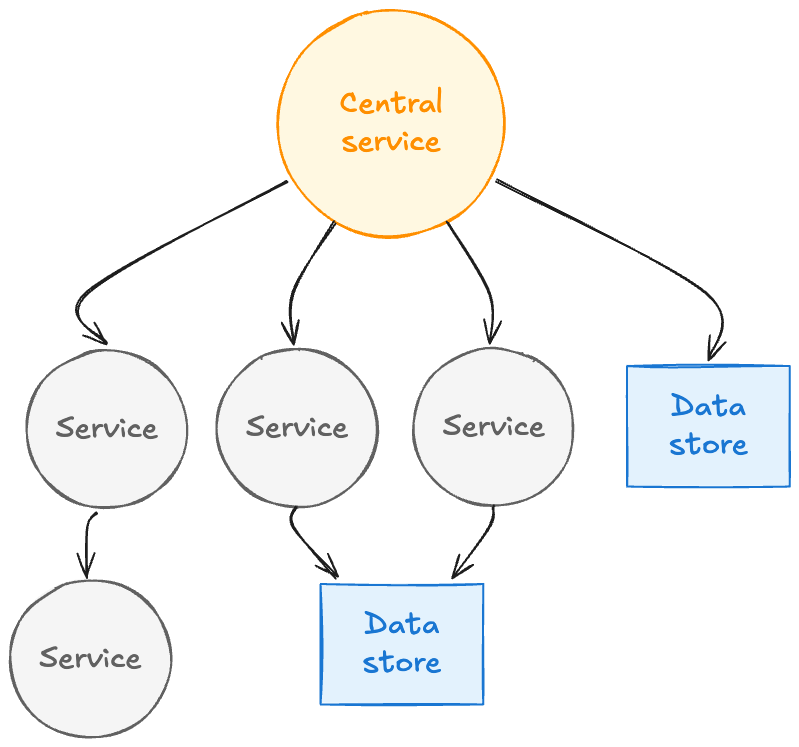
A single service at the center of a web of dependencies — services, data stores, and call chains branching in every direction. Without a unified map, engineers have to reason about this structure from memory and scattered signals.
In a system with thousands of microservices supporting our entertainment experience for members worldwide, answering these questions quickly can mean the difference between a minor blip and a major incident.
We kept hearing variations of this story from engineers across Netflix. The tooling gap was clear: we had plenty of signals, but no unified way to understand how everything connected.
The Three Questions Every Engineer Asks
When troubleshooting distributed systems, engineers fundamentally need to understand relationships:
Which services depend on each other? Not just theoretical dependencies from configuration files or architecture diagrams, but actual runtime connections based on real traffic.
What’s the blast radius? When something breaks or needs to go down for maintenance, what else will be affected? Which teams need to be notified?
Where’s the source? Is my problem caused by an upstream issue, or am I the root cause that’s cascading to others?
Traditional observability tools show fragments of this picture. Metrics show symptoms and performance characteristics. Logs show individual service behavior. Traces show single request flows through the system. But none of them show the complete map of how everything connects — the steady-state topology of dependencies that forms the backbone of our distributed architecture.
For an engineer at 3am, having to mentally stitch together information from multiple tools is slow, error-prone, and stressful. We needed something better: a unified view of service dependencies — a map showing how everything connects — with easy navigation to the detailed signals when you need to dig deeper.
Why This Matters More Than Ever
Netflix runs on thousands of microservices working together to deliver entertainment to our members. When you press play on your favorite series, that single action triggers a cascade of service-to-service calls — authentication, recommendations tailored to your tastes, video encoding selection, playback optimization, and more.
This architecture gives us tremendous flexibility and allows hundreds of engineering teams to innovate independently. But it also creates fundamental observability challenges.
And these challenges were growing. New initiatives like our Live programming and Ads-supported plans require even more sophisticated monitoring and faster troubleshooting. Live events can’t wait for lengthy incident investigations. The scale and real-time nature of these systems demanded better tooling.
We analyzed thousands of support requests from our engineers over a four-year period. The patterns were consistent:
“What are my upstream and downstream dependencies?”
“Is this failure in my service, or is something I depend on broken?”
“Which services will be impacted if I take this down for maintenance?”
“Why is this service showing as ‘Unknown’ in my metrics?”
“What changed in my call path recently that could explain this behavior?”
Engineers were asking dependency questions constantly. We needed to provide answers — quickly, accurately, and in real-time.
Building on What We Learned
We didn’t start from scratch. Over the years, we explored various approaches to solving this problem — from evaluating external graph databases and vendor platforms to building internal prototypes with different storage technologies and data models.
Each iteration taught us something valuable:
Real-time matters: Dependency maps that are hours old are useless in dynamic environments where services deploy multiple times per day. We needed near real-time updates.
Scale changes everything: Solutions that work at modest scale hit fundamental walls at Netflix scale. Storage systems that handle thousands of nodes struggle with our service count and traffic volume.
Integration is key: Any solution needs seamless integration with our existing observability ecosystem. Engineers shouldn’t have to learn entirely new tools or leave their existing workflows.
Data quality is critical: Incomplete or incorrect dependency information is worse than no information — it leads to wrong conclusions during incidents.
Multiple perspectives needed: We learned that no single source of dependency information tells the complete story. Network connectivity data lacks application context. Application metrics only cover instrumented services. We needed to combine multiple sources.
These lessons shaped every decision we made in building Service Topology.
What We Needed: A Living Map
We set out to build something specific: a living map of our infrastructure — one that updates in real-time as services deploy, as traffic patterns shift, as new dependencies form and old ones disappear.
The requirements were clear:
Real-time updates, not stale snapshots: In an environment where services deploy continuously, yesterday’s topology map is archaeology, not observability.
Fast queries at scale: When an engineer is troubleshooting at 3am, they can’t wait minutes for a query to return. We needed sub-second response times for traversing the call graph.
Multiple layers: Network-level connectivity doesn’t tell the whole story. We needed to see both the network layer (what’s actually talking to what) and the application layer (which APIs and endpoints are being called).
Rich context, not just connections: Knowing Service A talks to Service B isn’t enough. We needed to overlay health status, availability tiers, business domains, ownership information, and other metadata to make the information actionable.
Visual and programmatic access: Engineers needed a UI for exploration and troubleshooting. But automated systems — resilience frameworks, blast radius calculators, incident response automation — needed programmatic API access.
Our Approach: Three Sources of Truth
Three data sources produce three independent topology graphs — network, application, and request — each stored separately and queryable on their own or merged into a single unified view.
Here’s the key insight we arrived at: no single source tells the complete story.
We built Service Topology by using three complementary sources to build separate dependency graphs — one from each perspective — that can be combined into a unified view or explored independently:
Each source creates its own graph that is physically separate — the network layer in one graph database partition, the IPC layer in another partition, and the tracing layer using columnar storage optimized for analytical queries. This physical separation allows each layer to evolve independently and be queried in parallel. When users request a unified view, we execute traversal queries across all layers simultaneously and merge results, achieving sub-second response times even when combining all three layers.
Each source creates its own graph of service relationships:
1. eBPF Network Flows (Network Layer)
We capture network flow records at the kernel level using eBPF technology — information about which services are connecting to which other services over the network. This gives us ground truth about actual network-level communication.
The value: Comprehensive coverage. Every service shows up here because we’re capturing actual network traffic, regardless of whether applications are instrumented. This layer provides topology at both cluster-level (which deployment clusters are communicating) and app-level (which applications are communicating).
The limitation: Network-level information lacks application context. We know Service A connected to Service B’s IP address using a specific protocol, but not which specific API endpoint or path was called (e.g., /api/v1/users vs /api/v1/orders).
2. IPC Metrics (Application Layer)
We collect Inter-Process Communication metrics from our instrumented services. These are the metrics applications emit when they make calls to other services via gRPC, GraphQL, REST, or other protocols.
The value: Rich application context. We can see which specific endpoints were called, error rates, latency distributions, protocol details, and request/response characteristics. This layer provides app-level topology — since IPC metrics are emitted by applications, the natural granularity is application-to-application connections with endpoint details.
The limitation: Only works for instrumented services. If a service doesn’t emit IPC metrics, we won’t see its application-level calls this way.
3. End-to-End Tracing (Request Layer)
We integrate distributed tracing information that follows individual requests as they flow through our system. We aggregate traces to build a unified topology graph, but also allow engineers to overlay individual traces on the topology to see specific request flows.
The value: Shows actual request paths. Not just “Service A can call Service B,” but “Service A did call Service B as part of serving this specific member request.” This captures runtime behavior, including conditional logic and feature flags. Engineers can both see the aggregated pattern and drill into individual traces. We aggregate traces to build topology at both cluster-level and app-level, allowing engineers to view request patterns at the granularity most useful for their investigation.
The limitation: Sampling. We can’t trace every request without impacting performance, so we sample. This is excellent for understanding common flows, but may miss rarely-used code paths in the aggregated view.
Bringing It Together: Multi-Layer Architecture
Here’s what makes this powerful: we build three separate graphs — one from each source — that create different perspectives on service relationships:
Network graph from eBPF flows: Every connection, regardless of instrumentation
Application graph from IPC metrics: Rich endpoint and protocol details
Request graph from tracing: Actual runtime behavior and call paths
Engineers can:
View each graph independently to focus on a specific perspective (pure network connectivity, application-level calls, or traced request flows)
Combine them into a unified graph by querying multiple partitions in parallel and merging results — our system returns the union of nodes and edges from all requested layers while preserving each layer’s distinct properties
The unified view is especially powerful because:
Network flows ensure completeness — we don’t miss anything
IPC metrics provide application details — we understand the “how” and “what”
Tracing shows actual behavior — we see real request patterns
Each source compensates for the limitations of the others. The result is a comprehensive, accurate, and contextualized view of service dependencies that can be explored from multiple angles.
From Flows to Graph: How We Built It
Here’s the high-level architecture (we’ll dive deeper into engineering challenges in our next post):
Flow logs travel from multi-region Kafka through three aggregation stages — initial batching, intermediary resolution, and final enrichment — before being persisted to the graph database and served via API.
Multi-Region Ingestion: We consume flow logs from Kafka across multiple AWS regions where Netflix operates. This runs continuously, processing millions of flow records as they arrive.
Distributed Processing: We use Apache Pekko Streams (a fork of Akka) to process these flows in a distributed, fault-tolerant pipeline. The system automatically partitions work across our Auto Scaling Groups to handle the volume and provides natural backpressure handling.
Three-Stage Distributed Aggregation: We aggregate network flows through a three-stage pipeline that solves a fundamental challenge: network flow logs only show individual network hops through intermediaries (App A → Load Balancer → App B, or App A → NAT Gateway → App B), not the true application-level connections we need (App A → App B).
Stage 2 resolves network intermediaries: raw flow logs show two separate hops (App A → Load Balancer → App B), but the resolved graph stores the direct application-to-application relationship (App A → App B).
Stage 1 performs initial aggregation from Kafka. Stage 2 applies resolution logic — identifying network intermediaries (load balancers, NAT gateways, API gateways, proxies) and combining their incoming and outgoing flows to reconstruct direct application-to-application paths. Stage 3 performs final aggregation with health status integration before graph persistence. This graduated approach also prevents hot spots by distributing load across multiple points even when specific applications or network intermediaries see 100x more traffic than others.
Graph Storage: We persist the topology in Netflix’s graph database, an abstraction layer built on top of our distributed key-value storage infrastructure. This graph database is specifically designed for high-throughput graph operations at our scale, with fast multi-hop traversal capabilities. Each of our three data sources (network flows, IPC metrics, tracing) creates a separate graph that can be queried independently or merged.
gRPC API: We expose the topology through a gRPC service that supports multi-hop traversal, filtering by availability tier and business domain, pagination for large result sets, and sub-second query response times.
The technical details of building this at Netflix scale — handling Kafka lag, managing memory and garbage collection, optimizing distributed processing, debugging reactive streams — deserve their own discussion. We learned a lot, and we’ll share those lessons in our next post.
What Engineers Can Do Now
Today, the service topology map is helping engineers across Netflix:
Visualize Dependencies: See upstream and downstream dependencies for any service, with the ability to filter by availability tier (Tier 0, Tier 1, etc.) and business domain. Choose between the unified view (combining all sources) or individual graph views (network-only, IPC-only, or trace-only) depending on what you’re investigating.
Jump to Detailed Signals: From any service in the topology, quickly navigate to logs, traces, and detailed metrics in their respective tools. No more hunting for the right service name or time window — the topology provides the context and the starting point.
Understand Blast Radius: Before taking a service down for maintenance or making significant changes, see exactly what will be impacted. Identify which teams to notify and what to monitor.
Overlay Health Status: See not just the topology, but which services in the call path are experiencing issues. This is integrated with health status tracking, so you can quickly identify if a problem you’re seeing is actually originating somewhere else.
Query Programmatically: Use our gRPC API to integrate topology information into automated systems. For example, our Platform Modernization Engineering team uses this to verify that critical Live services have proper availability tier classifications throughout their dependency chains.
Investigate Faster: During incidents, quickly identify if a failure is local or if it’s propagating from somewhere else in the call graph. Follow the failure pattern to find the root cause.
Plan Changes Confidently: Understand the impact of proposed architectural changes or service migrations before implementing them.
Time Travel Through Topology: Query what the topology looked like at specific points in the past. Understand what changed in dependencies around the time an issue started, or see how your service’s dependency footprint has evolved over time. This time-travel capability is powered by time-window aggregation — instead of storing every time slice separately, we use layer-specific aggregators that accumulate topology data across windows, allowing us to reconstruct historical views efficiently without exploding storage costs.
The Living Map: Always Current
What makes this truly useful is that it’s a living map. It’s not a static diagram drawn in a design document that goes out of date the moment it’s published. It’s continuously updated based on actual traffic:
When a new service starts calling an API, it appears in the topology with near real-time freshness
When a service stops making calls to a dependency, that edge fades from the graph
When services deploy and their behavior changes, the topology reflects it
When incidents impact service health, the status overlay updates in real-time
This means engineers can trust what they see. The map reflects reality, not someone’s idea of what the architecture should be.
The Journey Continues
We’re not done. We continue to evolve the system with new capabilities:
Change Event Overlay: We’re working to surface deployment events, configuration changes, and other mutations alongside the topology graph. Correlation becomes easier when you can see both the dependencies and what changed when.
Richer Context: As we expand coverage and integrate more signals, we continue to enrich the topology with additional endpoint-level details, protocol information, and network path context.
And looking further ahead, we’re excited about something bigger: Automated root cause analysis. Imagine an intelligent agent that continuously crawls the topology graph, correlates failures across dependencies, understands historical patterns, and surfaces likely root causes automatically. Service topology provides the knowledge graph foundation that makes this kind of intelligent automation possible.
Why This Matters for Our Members
This might seem like infrastructure — plumbing that our members never see directly. But it matters immensely to their experience.
When engineers can quickly understand dependencies and identify issues, incidents get resolved faster. When we can model blast radius before making changes, we avoid disruptions. When automated systems can query dependency information programmatically, we can build smarter, more resilient systems.
All of this translates to what matters most: our members getting to watch their favorite films and series, seamlessly, whenever they want. Whether it’s a weekend binge of a beloved show, a live sports event, or discovering something new through our recommendations tailored to their tastes — we want it to just work.
What’s Next in This Series
This is the first in a series of posts about building Service Topology at Netflix.
In our next post, we’ll pull back the curtain on the engineering challenges we faced at scale: How do you handle Kafka consumer lag when ingesting millions of flow logs per second? What happens when distributed processing meets garbage collection pauses? How do you debug reactive streams that stall under load? How do you manage hot nodes in a distributed system? We’ll share the real problems we hit in production and the solutions we developed.
In future posts, we’ll explore the lessons we learned that apply to any distributed system at scale, and where we’re heading next with time travel capabilities and Automated root cause analysis.
Special thanks to the many engineers across Netflix who made this possible — the Observability team who built the broader system, the graph database platform team who provided the storage foundation, and the Platform Modernization Engineering, Live, and Ads teams who provided invaluable feedback and use cases throughout development.
Our previous blog posts (part 1, part 2, part 3) detailed how Netflix’s Graph Search platform addresses the challenges of searching across federated data sets within Netflix’s enterprise ecosystem. Although highly scalable and easy to configure, it still relies on a structured query language for input. Natural language based search has been possible for some time, but the level of effort required was high. The emergence of readily-available AI, specifically Large Language Models (LLMs), has created new opportunities to integrate AI search features, with a smaller investment and improved accuracy.
While Text-to-Query and Text-to-SQL are established problems, the complexity of distributed Graph Search data in the GraphQL ecosystem necessitates innovative solutions. This is the first in a three-part series where we will detail our journey: how we implemented these solutions, evaluated their performance, and ultimately evolved them into a self-managed platform.
The Need for Intuitive Search: Addressing Business and Product Demands
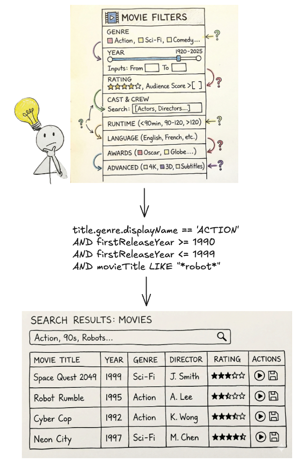
Natural language search is the ability to use everyday language to retrieve information as opposed to complex, structured query languages like the Graph Search Filter Domain Specific Language (DSL). When users interact with 100’s of various UIs within the suite of Content and Business Products applications, a frequent task is filtering a data table like the one below:
Example Content and Business Products application view
Ideally, a user simply wants to satisfy a query like “I want to see all movies from the 90s about robots from the US.” Because the underlying platform operates on the Graph Search Filter DSL, the application acts as an intermediary. Users input their requirements through UI elements — toggling facets or using query builders — and the system programmatically converts these interactions into a valid DSL query to filter the data.
The Complexity of filtering and DSL generation
This process presents a few issues.
Today, many applications have bespoke components for collecting user input — the experience varies across them and they have inconsistent support for the DSL. Users need to “learn” how to use each application to achieve their goals.
Additionally, some domains have hundreds of fields in an index that could be faceted or filtered by. A subject matter expert (SME) may know exactly what they want to accomplish, but be bottlenecked by the inefficient pace of filling out a large scale UI form and translating their questions in order to encode it in a representation Graph Search needs.
Most importantly, users think and operate using natural language, not technical constructs like query builders, components, or DSLs. By requiring them to switch contexts, we introduce friction that slows them down or even prevents their progress.
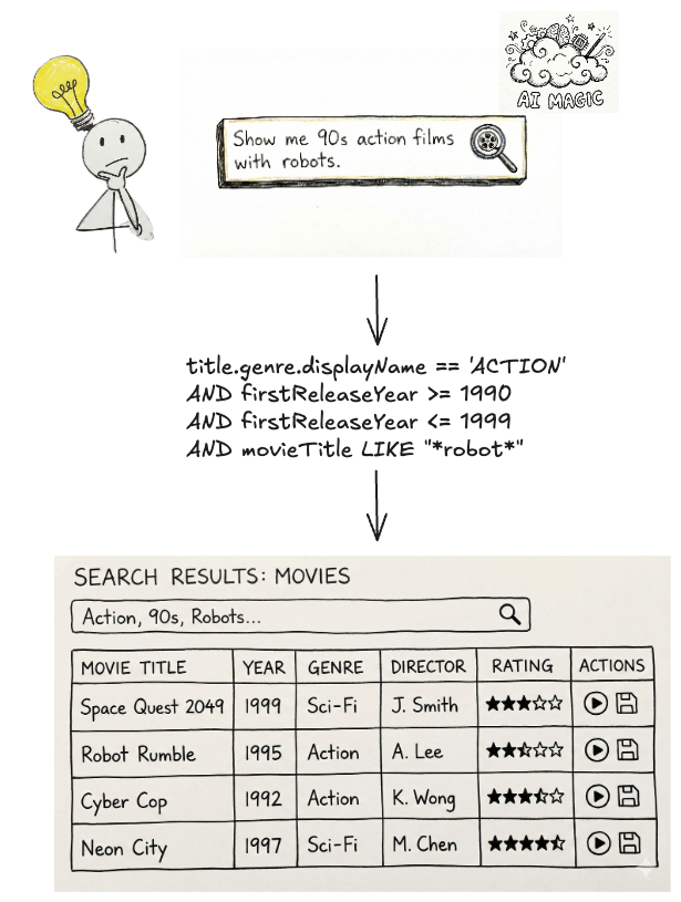
With readily-available AI components, our users can now interact with our systems through natural language. The challenge now is to make sure our offering, searching Netflix’s complex enterprise state with natural language, is an intuitive and trustworthy experience.
Natural language queries translated into Graph Search Filter DSL
We’ve made a decision to pursue generating Graph Search Filter statements from natural language to meet this need. Our intention is to augment and not replace existing applications with retrieval augmented generation (RAG), providing tooling and capabilities so that applications in our ecosystem have newly accessible means of processing and presenting their data in their distinct domain flavours. It should be noted that all the work here has direct application to building a RAG system on top of Graph Search in the future.
Under the Hood: Our Approach to Text-to-Query
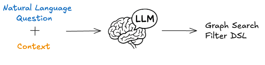
The core function of the text-to-query process is converting a user’s (often ambiguous) natural language question into a structured query. We primarily achieve this through the use of an LLM.
Before we dive deeper, let’s quickly revisit the structure of Graph Search Filter DSL. Each Graph Search index is defined by a GraphQL query, made up of a collection of fields. Each field has a type e.g. boolean, string, and some have their permitted values governed by controlled vocabularies — a standardized and governed list of values (like an enumeration, or a foreign key). The names of those fields can be used to construct expressions using comparison (e.g. > or ==) or inclusion/exclusion operators (e.g. IN). In turn those expressions can be combined using logical operators (e.g. AND) to construct complex statements.
Graph Search Filter DSL
With that understanding, we can now more rigorously define the conversion process. We need the LLM to generate a Graph Search Filter DSL statement that is syntactically, semantically, and pragmatically correct.
Syntactic correctness is easy — does it parse? To be syntactically correct, the generated statement must be well formedi.e. follow the grammar of the Graph Search Filter DSL.
Semantic correctness adds some additional complexity as it requires more knowledge of the index itself. To be semantically correct:
it must respect the field types i.e. only use comparisons that make sense given the underlying type;
it must only use fields that are actually present in the index, i.e. does not hallucinate;
when the values of a field are constrained to a controlled vocabulary, any comparison must only use values from that controlled vocabulary.
Pragmatic correctness is much more difficult. It asks the question: does the generated filter actually capture the intent of the user’s query?
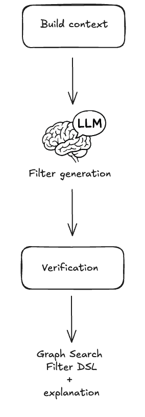
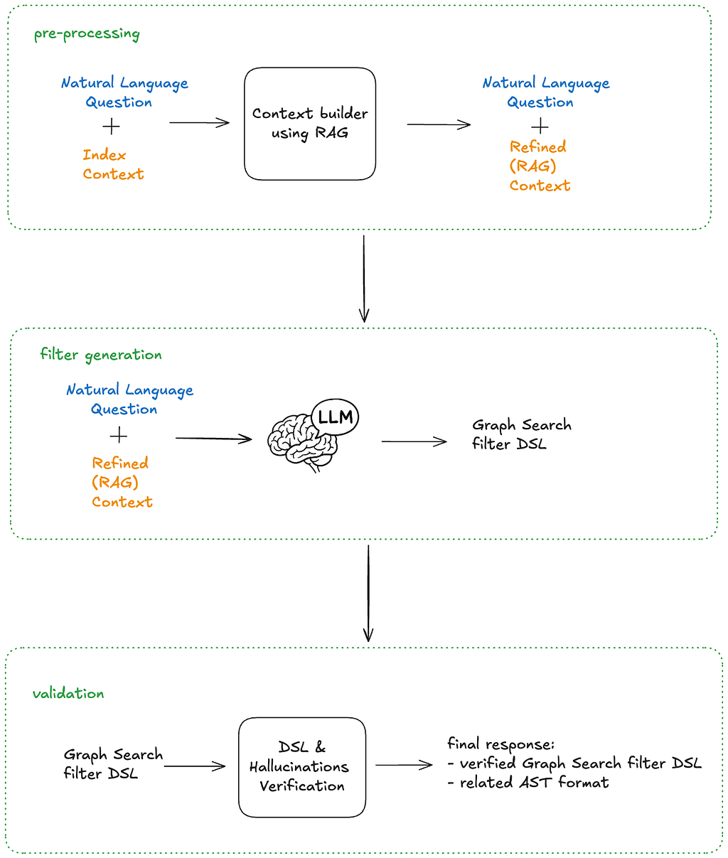
The following sections will detail how we pre-process the user’s question to create appropriate context for the instructions that we will provide to the LLM — both of which are fundamental to LLM interaction — as well as post-processing we perform on the generated statement to validate it, and help users understand and trust the results they receive.
At a high level that process looks like this:
Graph Search FIlter DSL generation process
Context Engineering
Preparation for the filter generation task is predominantly engineering the appropriate context. The LLM will need access to the fields of an index and their metadata in order to construct semantically correct filters. As the indices are defined by GraphQL queries, we can use the type information from the GraphQL schema to derive much of the required information. For some fields, there is additional information we can provide beyond what’s available in the schema as well, in particular permissible values that pull from controlled vocabularies.
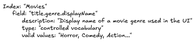
Each field in the index is associated with metadata as seen below, and that metadata is provided as part of the context.
Graph Search index representation
The field is derived from the document path as characterized by the GraphQL query.
The description is the comment from the GraphQL schema for the field.
The type is derived from the GraphQL schema for the field e.g. Boolean, String, enum. We also support an additional controlled vocabulary type we will discuss more of shortly.
The valid values are derived from enum values for the enum type or from a controlled vocabulary as we will now discuss.
A controlled vocabulary is a specific field type that consists of a finite set of allowed values, which are defined by a SMEs or domain owners. Index fields can be associated with a particular controlled vocabulary, e.g. countries with members such as Spain and Thailand, and any usage of that field within a generated statement must refer to values from that vocabulary.
Naively providing all the metadata as context to the LLM worked for simple cases but did not scale. Some indices have hundreds of fields and some controlled vocabularies have thousands of valid values. Providing all of those, especially the controlled vocabulary values and their accompanying metadata, expands the context; this proportionally increases latency and decreases the correctness of generated filter statements. Not providing the values wasn’t an option as we needed to ground the LLMs generated statements- without them, the LLM would frequently hallucinate values that did not exist.
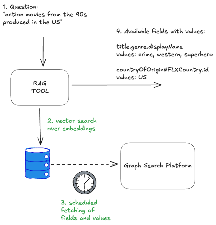
Curating the context to an appropriate subset was a problem we addressed using the well known RAG pattern.
Field RAG
As mentioned previously, some indices have hundreds of fields, however, most user’s questions typically refer only to a handful of them. If there was no cost in including them all, we would, but as mentioned prior, there is a cost in terms of the latency of query generation as well as the correctness of the generated query (e.g. needle-in-the-hackstack problem) and non-deterministic results.
To determine which subset of fields to include in the context, we “match” them against the intent of the user’s question.
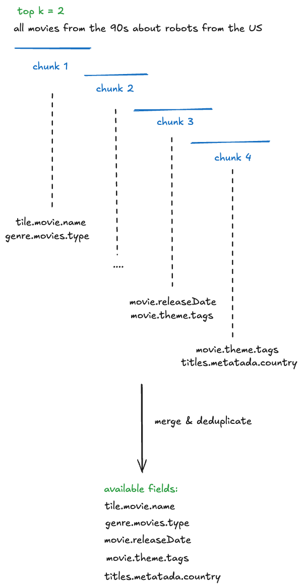
Embeddings are created for index fields and their metadata (name, description, type) and are indexed in a vector store
At filter generation time, the user’s question is chunked with an overlapping strategy. For each chunk, we perform a vector search to identify the top K most relevant values and the fields to which they belong.
Deduplication: The top K fields from each chunk are both consolidated and deduplicated before being provided as context to the system instructions.
Field RAG process (chunking, merge, deduplicate)
Controlled Vocabularies RAG
Index fields of the controlled vocabulary type are associated with a particular controlled vocabulary, again, countries are one example. Given a user’s question, we can infer whether or not it refers to values of a particular controlled vocabulary. In turn, by knowing which controlled vocabulary values are present, we can identify additional, related index fields that should be included in the context that may not have been identified by the field RAG step.
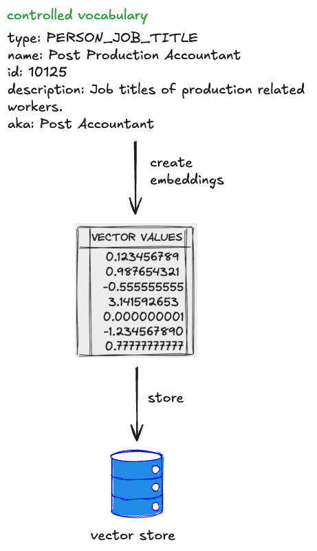
Each controlled vocabulary value has:
a unique identifier within its type;
a human readable display name;
a description of the value;
also-known-as values or AKA display names, e.g. “romcom” for “Romantic Comedy”.
To determine which subset of values to include in the context for controlled vocabulary fields (and also possibly infer additional fields), we “match” them against the user’s question.
Embeddings are created for controlled vocabulary values and their metadata, and these are indexed in a vector store. The controlled vocabularies are available via GraphQL and are regularly fetched and reindexed so this system stays up to date with any changes in the domain.
At filter generation time, the user’s question is chunked. For each chunk, we perform a vector search to identify the top K most relevant values (but only for the controlled vocabularies that are associated with fields in the index)
The top K values from each chunk are deduplicated by their controlled vocabulary type. The associated field definition is then injected into the context along with the matched values.
Controlled Vocabularies RAG
Combining both approaches, the RAG of fields and controlled vocabularies, we end up with the solution that each input question resolves in available and matched fields and values:
Field and CV RAG
The quality of results generated by the RAG tool can be significantly enhanced by tuning its various parameters, or “levers.” These include strategies for reranking, chunking, and the selection of different embedding generation models. The careful and systematic evaluation of these factors will be the focus of the subsequent parts of this series.
The Instructions
Once the context is constructed, it is provided to the LLM with a set of instructions and the user’s question. The instructions can be summarised as follows: “Given a natural language question, generate a syntactically, semantically, and pragmatically correct filter statement given the availability of the following index fields and their metadata.”
In order to generate a syntactically correct filter statement, the instructions include the syntax rules of the DSL.
In order to generate a semantically correct filter statement, the instructions tell the LLM to ground the generated statement in the provided context.
In order to generate a pragmatically correct filter statement, so far we focus on better context engineering to ensure that only the most relevant fields and values are provided. We haven’t identified any instructions that make the LLM just “do better” at this aspect of the task.
Graph Search Filter DSL generation
After the filter statement is generated by the LLM, we deterministically validate it prior to returning the values to the user.
Validation
Syntactic Correctness
Syntactic correctness ensures the LLM output is a parsable filter statement. We utilize an Abstract Syntax Tree (AST) parser built for our custom DSL. If the generated string fails to parse into a valid AST, we know immediately that the query is malformed and there is a fundamental issue with the generation.
The other approach to solve this problem could be using the structured outputs modes provided by some LLMs. However, our initial evaluation yielded mixed results, as the custom DSL is not natively supported and requires further work.
Semantic Correctness
Despite careful context engineering using the RAG pattern, the LLM sometimes hallucinates both fields and available values in the generated filter statement. The most straightforward way of preventing this phenomenon is validating the generated filters against available index metadata. This approach does not impact the overall latency of the system, as we are already working with an AST of the filter statement, and the metadata is freely available from the context engineering stage.
DSL verification & hallucinations
If a hallucination is detected it can be returned as an error to a user, indicating the need to refine the query, or can be provided back to the LLM in the form of a feedback loop for self correction.
This increases the filter generation time, so should be used cautiously with a limited number of retries.
Building Confidence
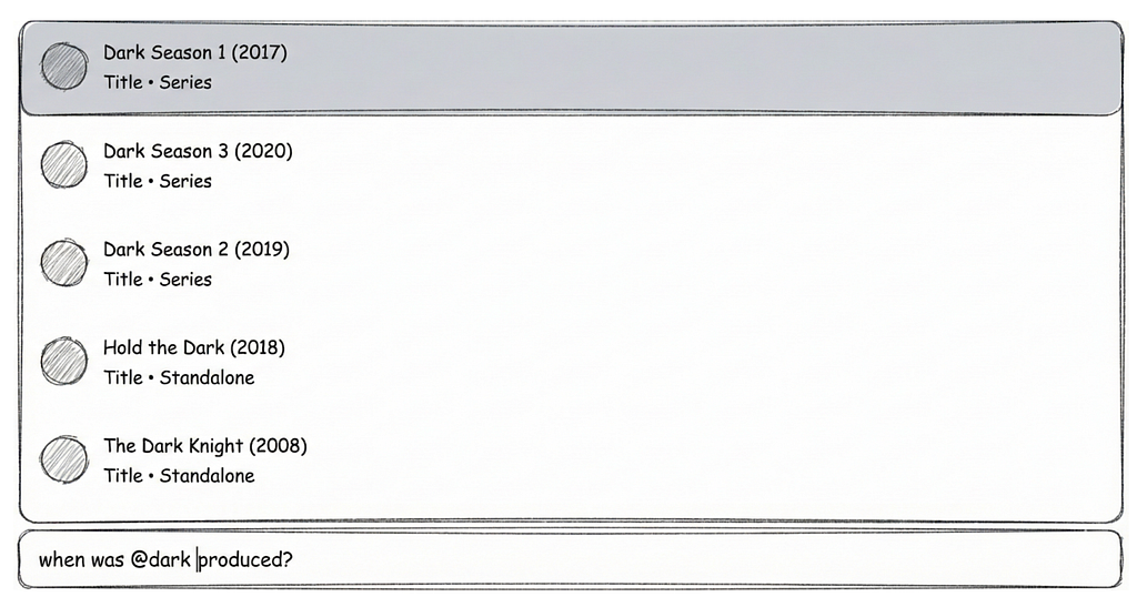
You probably noticed we are not validating the generated filter for pragmatic correctness. That task is the hardest challenge: The filter parses (syntactic) and uses real fields (semantic), but is it what the user meant? When a user searches for “Dark”, do they mean the specific German sci-fi series Dark, or are they browsing for the mood category “dark TV shows”?
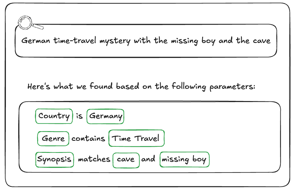
The gap between what a user intended and the generated filter statement is often caused by ambiguity. Ambiguity stems from the compression of natural language. A user says “German time-travel mystery with the missing boy and the cave” but the index contains discrete metadata fields like releaseYear, genreTags, and synopsisKeywords.
How do we ensure users aren’t inadvertently led to wrong answers or to answers for questions they didn’t ask?
Showing Our Work
One way we are handling ambiguity is by showing our work. We visualise the generated filters in the UI in a user-friendly way allowing them to very clearly see if the answer we’re returning is what they were looking for so they can trust the results..
We cannot show a raw DSL string (e.g., origin.country == ‘Germany’ AND genre.tags CONTAINS ‘Time Travel’ AND synopsisKeywords LIKE ‘*cave*’) to a non-technical user. Instead, we reflect its underlying AST into UI components.
After the LLM generates a filter statement, we parse it into an AST, and then map that AST to the existing “Chips” and “Facets” in our UI (see below). If the LLM generates a filter for origin.country == ‘Germany’, the user sees the “Country” dropdown pre-selected to “Germany.” This gives users immediate visual feedback and the ability to easily fine-tune the query using standard UI controls when the results need improvement or further experimentation.
Generated filters visualisation
Explicit Entity Selection
Another strategy we’ve developed to remove ambiguity happens at query time. We give users the ability to constrain their input to refer to known entities using “@mentions”. Similar to Slack, typing @ lets them search for entities directly from our specialized UI Graph Search component, giving them easy access to multiple controlled vocabularies (plus other identifying metadata like launch year) to feel confident they’re choosing the entity they intend.
If a user types, “When was @dark produced”, we explicitly know they are referring to the Series controlled vocabulary, allowing us to bypass the RAG inference step and hard-code that context, significantly increasing pragmatic correctness (and building user trust in the process).
Example @mentions usage in the UI
End-to-end architecture
As mentioned previously, the solution architecture is divided into pre-processing, filter statement generation, and then post-processing stages. The pre-processing handles context building and involves a RAG pattern for similarity search, while the post-processing validation stage checks the correctness of the LLM-generated filter statements and provides visibility into the results for end users. This design strategically balances LLM involvement with more deterministic strategies.
End-to-end architecture
The end-to-end process is as follows:
A user’s natural language question (with optional `@mentions` statements) are provided as input, along with the Graph Search index context
The context is scoped by using the RAG pattern on both fields and possible values
The pre-processed context and the question are fed into the LLM with an instruction asking for a syntactically and semantically correct filter statement
The generated filer statement DSL is verified and checked for hallucinations
The final response contains the related AST in order to build “Chips” and “Facets”
Summary
By combining our existing Graph Search infrastructure with the power and flexibility of LLMs, we’ve bridged the gap between complex filter statements and user intent. We moved from requiring users to speak our language (DSL) to our systems understanding theirs.
The initial challenge for our users was successfully addressed. However, our next steps involve transforming this system into a comprehensive and expandable platform, rigorously evaluating its performance in a live production environment, and expanding its capabilities to support GraphQL-first user interfaces. These topics, and others, will be the focus of the subsequent installments in this series. Be sure to follow along!
You may have noticed that we have a lot more to do on this project, including named entity recognition and extraction, intent detection so we can route questions to the appropriate indices, and query rewriting among others. If this kind of work interests you, reach out! We’re hiring in our Warsaw office, check for open roles here.
This blog post is a continuation of Part 2, where we cleared the ambiguity around title launch observability at Netflix. In this installment, we will explore the strategies, tools, and methodologies that were employed to achieve comprehensive title observability at scale.
Defining the observability endpoint
To create a comprehensive solution, we decided to introduce observability endpoints first. Each microservice involved in our Personalization stack that integrated with our observability solution had to introduce a new “Title Health” endpoint. Our goal was for each new endpoint to adhere to a few principles:
Accurate reflection of production behavior
Standardization across all endpoints
Answering the Insight Triad: “Healthy” or not, why not and how to fix it.
Accurately Reflecting Production Behavior
A key part of our solution is insights into production behavior, which necessitates our requests to the endpoint result in traffic to the real service functions that mimics the same pathways the traffic would take if it came from the usual callers.
In order to allow for this mimicking, many systems implement an “event” handling, where they convert our request into a call to the real service with properties enabled to log when titles are filtered out of their response and why. Building services that adhere to software best practices, such as Object-Oriented Programming (OOP), the SOLID principles, and modularization, is crucial to have success at this stage. Without these practices, service endpoints may become tightly coupled to business logic, making it challenging and costly to add a new endpoint that seamlessly integrates with the observability solution while following the same production logic.
A service with modular business logic facilitates the seamless addition of an observability endpoint.
Standardization
To standardize communication between our observability service and the personalization stack’s observability endpoints, we’ve developed a stable proto request/response format. This centralized format, defined and maintained by our team, ensures all endpoints adhere to a consistent protocol. As a result, requests are uniformly handled, and responses are processed cohesively. This standardization enhances adoption within the personalization stack, simplifies the system, and improves understanding and debuggability for engineers.
The request schema for the observability endpoint.
The Insight Triad API
To efficiently understand the health of a title and triage issues quickly, all implementations of the observability endpoint must answer: is the title eligible for this phase of promotion, if not — why is it not eligible, and what can be done to fix any problems.
The end-users of this observability system are Launch Managers, whose job it is to ensure smooth title launches. As such, they must be able to quickly see whether there is a problem, what the problem is, and how to solve it. Teams implementing the endpoint must provide as much information as possible so that a non-engineer (Launch Manager) can understand the root cause of the issue and fix any title setup issues as they arise. They must also provide enough information for partner engineers to identify the problem with the underlying service in cases of system-level issues.
These requirements are captured in the following protobuf object that defines the endpoint response.
The response schema for the observability endpoint.
High level architecture
We’ve distilled our comprehensive solution into the following key steps, capturing the essence of our approach:
Establish observability endpoints across all services within our Personalization and Discovery Stack.
Implement proactive monitoring for each of these endpoints.
Track real-time title impressions from the Netflix UI.
Store the data in an optimized, highly distributed datastore.
Offer easy-to-integrate APIs for our dashboard, enabling stakeholders to track specific titles effectively.
“Time Travel” to validate ahead of time.
Observability stack high level architecture diagram
In the following sections, we will explore each of these concepts and components as illustrated in the diagram above.
Key Features
Proactive monitoring through scheduled collectors jobs
Our Title Health microservice runs a scheduled collector job every 30 minutes for most of our personalization stack.
For each Netflix row we support (such as Trending Now, Coming Soon, etc.), there is a dedicated collector. These collectors retrieve the relevant list of titles from our catalog that qualify for a specific row by interfacing with our catalog services. These services are informed about the expected subset of titles for each row, for which we are assessing title health.
Once a collector retrieves its list of candidate titles, it orchestrates batched calls to assigned row services using the above standardized schema to retrieve all the relevant health information of the titles. Additionally, some collectors will instead poll our kafka queue for impressions data.
Real-time Title Impressions and Kafka Queue
In addition to evaluating title health via our personalization stack services, we also keep an eye on how our recommendation algorithms treat titles by reviewing impressions data. It’s essential that our algorithms treat all titles equitably, for each one has limitless potential.
This data is processed from a real-time impressions stream into a Kafka queue, which our title health system regularly polls. Specialized collectors access the Kafka queue every two minutes to retrieve impressions data. This data is then aggregated in minute(s) intervals, calculating the number of impressions titles receive in near-real-time, and presented as an additional health status indicator for stakeholders.
Data storage and distribution through Hollow Feeds
Netflix Hollow is an Open Source java library and toolset for disseminating in-memory datasets from a single producer to many consumers for high performance read-only access. Given the shape of our data, hollow feeds are an excellent strategy to distribute the data across our service boxes.
Once collectors gather health data from partner services in the personalization stack or from our impressions stream, this data is stored in a dedicated Hollow feed for each collector. Hollow offers numerous features that help us monitor the overall health of a Netflix row, including ensuring there are no large-scale issues across a feed publish. It also allows us to track the history of each title by maintaining a per-title data history, calculate differences between previous and current data versions, and roll back to earlier versions if a problematic data change is detected.
Observability Dashboard using Health Check Engine
We maintain several dashboards that utilize our title health service to present the status of titles to stakeholders. These user interfaces access an endpoint in our service, enabling them to request the current status of a title across all supported rows. This endpoint efficiently reads from all available Hollow Feeds to obtain the current status, thanks to Hollow’s in-memory capabilities. The results are returned in a standardized format, ensuring easy support for future UIs.
Additionally, we have other endpoints that can summarize the health of a title across subsets of sections to highlight specific member experiences.
Message depicting a dashboard request.
Time Traveling: Catching before launch
Titles launching at Netflix go through several phases of pre-promotion before ultimately launching on our platform. For each of these phases, the first several hours of promotion are critical for the reach and effective personalization of a title, especially once the title has launched. Thus, to prevent issues as titles go through the launch lifecycle, our observability system needs to be capable of simulating traffic ahead of time so that relevant teams can catch and fix issues before they impact members. We call this capability “Time Travel”.
Many of the metadata and assets involved in title setup have specific timelines for when they become available to members. To determine if a title will be viewable at the start of an experience, we must simulate a request to a partner service as if it were from a future time when those specific metadata or assets are available. This is achieved by including a future timestamp in our request to the observability endpoint, corresponding to when the title is expected to appear for a given experience. The endpoint then communicates with any further downstream services using the context of that future timestamp.
An example request with a future timestamp.
Conclusion
Throughout this series, we’ve explored the journey of enhancing title launch observability at Netflix. In Part 1, we identified the challenges of managing vast content launches and the need for scalable solutions to ensure each title’s success. Part 2 highlighted the strategic approach to navigating ambiguity, introducing “Title Health” as a framework to align teams and prioritize core issues. In this final part, we detailed the sophisticated system strategies and architecture, including observability endpoints, proactive monitoring, and “Time Travel” capabilities; all designed to ensure a thrilling viewing experience.
By investing in these innovative solutions, we enhance the discoverability and success of each title, fostering trust with content creators and partners. This journey not only bolsters our operational capabilities but also lays the groundwork for future innovations, ensuring that every story reaches its intended audience and that every member enjoys their favorite titles on Netflix.
Thank you for joining us on this exploration, and stay tuned for more insights and innovations as we continue to entertain the world.
A summary of sessions at the first Data Engineering Open Forum at Netflix on April 18th, 2024
The Data Engineering Open Forum at Netflix on April 18th, 2024.
At Netflix, we aspire to entertain the world, and our data engineering teams play a crucial role in this mission by enabling data-driven decision-making at scale. Netflix is not the only place where data engineers are solving challenging problems with creative solutions. On April 18th, 2024, we hosted the inaugural Data Engineering Open Forum at our Los Gatos office, bringing together data engineers from various industries to share, learn, and connect.
At the conference, our speakers share their unique perspectives on modern developments, immediate challenges, and future prospects of data engineering. We are excited to share the recordings of talks from the conference with the rest of the world.
Summary: At Netflix, hundreds of thousands of workflows and millions of jobs are running every day on our big data platform, but diagnosing and remediating job failures can impose considerable operational burdens. To handle errors efficiently, Netflix developed a rule-based classifier for error classification called “Pensive.” However, as the system has increased in scale and complexity, Pensive has been facing challenges due to its limited support for operational automation, especially for handling memory configuration errors and unclassified errors. To address these challenges, we have developed a new feature called “Auto Remediation,” which integrates the rules-based classifier with an ML service.
Automating the Data Architect: Generative AI for Enterprise Data Modeling
Speaker: Jide Ogunjobi (Founder & CTO at Context Data)
Summary: As organizations accumulate ever-larger stores of data across disparate systems, efficiently querying and gaining insights from enterprise data remain ongoing challenges. To address this, we propose developing an intelligent agent that can automatically discover, map, and query all data within an enterprise. This “Enterprise Data Model/Architect Agent” employs generative AI techniques for autonomous enterprise data modeling and architecture.
Tulika Bhatt, Senior Data Engineer at Netflix, shared how her team manages impression data at scale.
Speaker:Tulika Bhatt (Senior Data Engineer at Netflix)
Summary: Netflix generates approximately 18 billion impressions daily. These impressions significantly influence a viewer’s browsing experience, as they are essential for powering video ranker algorithms and computing adaptive pages, With the evolution of user interfaces to be more responsive to in-session interactions, coupled with the growing demand for real-time adaptive recommendations, it has become highly imperative that these impressions are provided on a near real-time basis. This talk will delve into the creative solutions Netflix deploys to manage this high-volume, real-time data requirement while balancing scalability and cost.
Reflections on Building a Data Platform From the Ground Up in a Post-GDPR World
Summary: The requirements for creating a new data warehouse in the post-GDPR world are significantly different from those of the pre-GDPR world, such as the need to prioritize sensitive data protection and regulatory compliance over performance and cost. In this talk, Jessica Larson shares her takeaways from building a new data platform post-GDPR.
Unbundling the Data Warehouse: The Case for Independent Storage
Speaker: Jason Reid (Co-founder & Head of Product at Tabular)
Summary: Unbundling a data warehouse means splitting it into constituent and modular components that interact via open standard interfaces. In this talk, Jason Reid discusses the pros and cons of both data warehouse bundling and unbundling in terms of performance, governance, and flexibility, and he examines how the trend of data warehouse unbundling will impact the data engineering landscape in the next 5 years.
Clark Wright, Staff Analytics Engineer at Airbnb, talked about the concept of Data Quality Score at Airbnb.
Data Quality Score: How We Evolved the Data Quality Strategy at Airbnb
Speaker: Clark Wright (Staff Analytics Engineer at Airbnb)
Summary: Recently, Airbnb published a post to their Tech Blog called Data Quality Score: The next chapter of data quality at Airbnb. In this talk, Clark Wright shares the narrative of how data practitioners at Airbnb recognized the need for higher-quality data and then proposed, conceptualized, and launched Airbnb’s first Data Quality Score.
Speaker: Iaroslav Zeigerman (Co-Founder and Chief Architect at Tobiko Data)
Summary: The development and evolution of data pipelines are hindered by outdated tooling compared to software development. Creating new development environments is cumbersome: Populating them with data is compute-intensive, and the deployment process is error-prone, leading to higher costs, slower iteration, and unreliable data. SQLMesh, an open-source project born from our collective experience at companies like Airbnb, Apple, Google, and Netflix, is designed to handle the complexities of evolving data pipelines at an internet scale. In this talk, Iaroslav Zeigerman discusses challenges faced by data practitioners today and how core SQLMesh concepts solve them.
If you are interested in attending a future Data Engineering Open Forum, we highly recommend you join our Google Group to stay tuned to event announcements.
When Zuul was designed and developed, there was an inherent assumption that connections were effectively free, given we weren’t using mutual TLS (mTLS). It’s built on top of Netty, using event loops for non-blocking execution of requests, one loop per core. To reduce contention among event loops, we created connection pools for each, keeping them completely independent. The result is that the entire request-response cycle happens on the same thread, significantly reducing context switching.
There is also a significant downside. It means that if each event loop has a connection pool that connects to every origin (our name for backend) server, there would be a multiplication of event loops by servers by Zuul instances. For example, a 16-core box connecting to an 800-server origin would have 12,800 connections. If the Zuul cluster has 100 instances, that’s 1,280,000 connections. That’s a significant amount and certainly more than is necessary relative to the traffic on most clusters.
As streaming has grown over the years, these numbers multiplied with bigger Zuul and origin clusters. More acutely, if a traffic spike occurs and Zuul instances scale up, it exponentially increases connections open to origins. Although this has been a known issue for a long time, it has never been a critical pain point until we moved large streaming applications to mTLS and our Envoy-based service mesh.
Fixing the Flows
The first step in improving connection overhead was implementing HTTP/2 (H2) multiplexing to the origins. Multiplexing allows the reuse of existing connections by creating multiple streams per connection, each able to send a request. Rather than requiring a connection for every request, we could reuse the same connection for many simultaneous requests. The more we reuse connections, the less overhead we have in establishing mTLS sessions with roundtrips, handshaking, and so on.
Although Zuul has had H2 proxying for some time, it never supported multiplexing. It effectively treated H2 connections as HTTP/1 (H1). For backward compatibility with existing H1 functionality, we modified the H2 connection bootstrap to create a stream and immediately release the connection back into the pool. Future requests will then be able to reuse the existing connection without creating a new one. Ideally, the connections to each origin server should converge towards 1 per event loop. It seems like a minor change, but it had to be seamlessly integrated into our existing metrics and connection bookkeeping.
The standard way to initiate H2 connections is, over TLS, via an upgrade with ALPN (Application-Layer Protocol Negotiation). ALPN allows us to gracefully downgrade back to H1 if the origin doesn’t support H2, so we can broadly enable it without impacting customers. Service mesh being available on many services made testing and rolling out this feature very easy because it enables ALPN by default. It meant that no work was required by service owners who were already on service mesh and mTLS.
Sadly, our plan hit a snag when we rolled out multiplexing. Although the feature was stable and functionally there was no impact, we didn’t get a reduction in overall connections. Because some origin clusters were so large, and we were connecting to them from all event loops, there wasn’t enough re-use of existing connections to trigger multiplexing. Even though we were now capable of multiplexing, we weren’t utilizing it.
Divide and Conquer
H2 multiplexing will improve connection spikes under load when there is a large demand for all the existing connections, but it didn’t help in steady-state. Partitioning the whole origin into subsets would allow us to reduce total connection counts while leveraging multiplexing to maintain existing throughput and headroom.
We had discussed subsetting many times over the years, but there was concern about disrupting load balancing with the algorithms available. An even distribution of traffic to origins is critical for accurate canary analysis and preventing hot-spotting of traffic on origin instances.
Subsetting was also top of mind after reading a recent ACM paper published by Google. It describes an improvement on their long-standing Deterministic Subsetting algorithm that they’ve used for many years. The Ringsteady algorithm (figure below) creates an evenly distributed ring of servers (yellow nodes) and then walks the ring to allocate them to each front-end task (blue nodes).
The algorithm relies on the idea of low-discrepancy numeric sequences to create a naturally balanced distribution ring that is more consistent than one built on a randomness-based consistent hash. The particular sequence used is a binary variant of the Van der Corput sequence. As long as the sequence of added servers is monotonically incrementing, for each additional server, the distribution will be evenly balanced between 0–1. Below is an example of what the binary Van der Corput sequence looks like.
Another big benefit of this distribution is that it provides a consistent expansion of the ring as servers are removed and added over time, evenly spreading new nodes among the subsets. This results in the stability of subsets and no cascading churn based on origin changes over time. Each node added or removed will only affect one subset, and new nodes will be added to a different subset every time.
Here’s a more concrete demonstration of the sequence above, in decimal form, with each number between 0–1 assigned to 4 subsets. In this example, each subset has 0.25 of that range depicted with its own color.
You can see that each new node added is balanced across subsets extremely well. If 50 nodes are added quickly, they will get distributed just as evenly. Similarly, if a large number of nodes are removed, it will affect all subsets equally.
The real killer feature, though, is that if a node is removed or added, it doesn’t require all the subsets to be shuffled and recomputed. Every single change will generally only create or remove one connection. This will hold for bigger changes, too, reducing almost all churn in the subsets.
Zuul’s Take
Our approach to implement this in Zuul was to integrate with Eureka service discovery changes and feed them into a distribution ring, based on the ideas discussed above. When new origins register in Zuul, we load their instances and create a new ring, and from then on, manage it with incremental deltas. We also take the additional step of shuffling the order of nodes before adding them to the ring. This helps prevent accidental hot spotting or overlap among Zuul instances.
The quirk in any load balancing algorithm from Google is that they do their load balancing centrally. Their centralized service creates subsets and load balances across their entire fleet, with a global view of the world. To use this algorithm, the key insight was to apply it to the event loops rather than the instances themselves. This allows us to continue having decentralized, client-side load balancing while also having the benefits of accurate subsetting. Although Zuul continues connecting to all origin servers, each event loop’s connection pool only gets a small subset of the whole. We end up with a singular, global view of the distribution that we can control on each instance — and a single sequence number that we can increment for each origin’s ring.
When a request comes in, Netty assigns it to an event loop, and it remains there for the duration of the request-response lifecycle. After running the inbound filters, we determine the destination and load the connection pool for this event loop. This will pull from a mapping of loop-to-subset, giving us the limited set of nodes we’re looking for. We then load balance using a modified choice-of-2, as discussed before. If this sounds familiar, it’s because there are no fundamental changes to how Zuul works. The only difference is that we provide a loop-bound subset of nodes to the load balancer as a starting point for its decision.
Another insight we had was that we needed to replicate the number of subsets among the event loops. This allows us to maintain low connection counts for large and small origins. At the same time, having a reasonable subset size ensures we can continue providing good balance and resiliency features for the origin. Most origins require this because they are not big enough to create enough instances in each subset.
However, we also don’t want to change this replication factor too often because it would cause a reshuffling of the entire ring and introduce a lot of churn. After a lot of iteration, we ended up implementing this by starting with an “ideal” subset size. We achieve this by computing the subset size that would achieve the ideal replication factor for a given cardinality of origin nodes. We can scale the replication factor across origins by growing our subsets until the desired subset size is achieved, especially as they scale up or down based on traffic patterns. Finally, we work backward to divide the ring into even slices based on the computed subset size.
Our ideal subset side is roughly 25–50 nodes, so an origin with 400 nodes will have 8 subsets of 50 nodes. On a 32-core instance, we’ll have a replication factor of 4. However, that also means that between 200 and 400 nodes, we’re not shuffling the subsets at all. An example of this subset recomputation is in the rollout graphs below.
An interesting challenge here was to satisfy the dual constraints of origin nodes with a range of cardinality, and the number of event loops that hold the subsets. Our goal is to scale the subsets as we run on instances with higher event loops, with a sub-linear increase in overall connections, and sufficient replication for availability guarantees. Scaling the replication factor elastically described above helped us achieve this successfully.
Subsetting Success
The results were outstanding. We saw improvements across all key metrics on Zuul, but most importantly, there was a significant reduction in total connection counts and churn.
Total Connections
This graph (as well as the ones below) shows a week’s worth of data, with the typical diurnal cycle of Netflix usage. Each of the 3 colors represents our deployment regions in AWS, and the blue vertical line shows when we turned on the feature.
Total connections at peak were significantly reduced in all 3 regions by a factor of 10x. This is a huge improvement, and it makes sense if you dig into how subsetting works. For example, a machine running 16 event loops could have 8 subsets — each subset is on 2 event loops. That means we’re dividing an origin by 8, hence an 8x improvement. As to why peak improvement goes up to 10x, it’s probably related to reduced churn (below).
Churn
This graph is a good proxy for churn. It shows how many TCP connections Zuul is opening per second. You can see the before and after very clearly. Looking at the peak-to-peak improvement, there is roughly an 8x improvement.
The decrease in churn is a testament to the stability of the subsets, even as origins scale up, down, and redeploy over time.
Looking specifically at connections created in the pool, the reduction is even more impressive:
The peak-to-peak reduction is massive and clearly shows how stable this distribution is. Although hard to see on the graph, the reduction went from thousands per second at peak down to about 60. Thereis effectively no churn of connections, even at peak traffic.
Load Balancing
The key constraint to subsetting is ensuring that the load balance on the backends is still consistent and evenly distributed. You’ll notice all the RPS on origin nodes grouped tightly, as expected. The thicker lines represent the subset size and the total origin size.
Balance at deployBalance 12 hours after deploy
In the second graph, you’ll note that we recompute the subset size (blue line) because the origin (purple line) became large enough that we could get away with less replication in the subsets. In this case, we went from a subset size of 100 for 400 servers (a division of 4) to 50 (a division of 8).
System Metrics
Given the significant reduction in connections, we saw reduced CPU utilization (~4%), heap usage (~15%), and latency (~3%) on Zuul, as well.
Zuul canary metrics
Rolling it Out
As we rolled this feature out to our largest origins — streaming playback APIs — we saw the pattern above continue, but with scale, it became more impressive. On some Zuul shards, we saw a reduction of as much as 13 million connections at peak, with almost no churn.
Today the feature is rolled out widely. We’re serving the same amount of traffic but with tens of millions fewer connections. Despite the reduction of connections, there is no decrease in resiliency or load balancing. H2 multiplexing allows us to scale up requests separately from connections, and our subsetting algorithm ensures an even traffic balance.
Although challenging to get right, subsetting is a worthwhile investment.
Acknowledgments
We would also like to thank Peter Ward, Paul Wankadia, and Kavita Guliani at Google for developing this algorithm and publishing their work for the benefit of the industry.
Titus is the Netflix cloud container runtime that runs and manages containers at scale. In the time since it was first presented as an advanced Mesos framework, Titus has transparently evolved from being built on top of Mesos to Kubernetes, handling an ever-increasing volume of containers. As the number of Titus users increased over the years, the load and pressure on the system increased substantially. The original assumptions and architectural choices were no longer viable. This blog post presents how our current iteration of Titus deals with high API call volumes by scaling out horizontally.
We introduce a caching mechanism in the API gateway layer, allowing us to offload processing from singleton leader elected controllers without giving up strict data consistency and guarantees clients observe. Titus API clients always see the latest (not stale) version of the data regardless of which gateway node serves their request, and in which order.
Overview
The figure below depicts a simplified high-level architecture of a single Titus cluster (a.k.a cell):
Titus Job Coordinator is a leader elected process managing the active state of the system. Active data includes jobs and tasks that are currently running. When a new leader is elected it loads all data from external storage. Mutations are first persisted to the active data store before in-memory state is changed. Data for completed jobs and tasks is moved to the archive store first, and only then removed from the active data store and from the leader memory.
Titus Gateway handles user requests. A user request could be a job creation request, a query to the active data store, or a query to the archive store (the latter handled directly in Titus Gateway). Requests are load balanced across all Titus Gateway nodes. All reads are consistent, so it does not matter which Titus Gateway instance is serving a query. For example, it is OK to send writes through one instance, and do reads from another one with full data read consistency guarantees. Titus Gateways always connect to the current Titus Job Coordinator leader. During leader failovers, all writes and reads of the active data are rejected until a connection to the active leader is re-established.
In the original version of the system, all queries to the active data set were forwarded to a singleton Titus Job Coordinator. The freshest data is served to all requests, and clients never observe read-your-write or monotonic-read consistency issues¹:
Data consistency on the Titus API is highly desirable as it simplifies client implementation. Causal consistency, which includes read-your-writes and monotonic-reads, frees clients from implementing client-side synchronization mechanisms. In PACELC terms we choose PC/EC and have the same level of availability for writes of our previous system while improving our theoretical availability for reads.
For example, a batch workflow orchestration system may create multiple jobs which are part of a single workflow execution. After the jobs are created, it monitors their execution progress. If the system creates a new job, followed immediately by a query to get its status, and there is a data propagation lag, it might decide that the job was lost and a replacement must be created. In that scenario, the system would need to deal with the data propagation latency directly, for example, by use of timeouts or client-originated update tracking mechanisms. As Titus API reads are always consistently reflecting the up-to-date state, such workarounds are not needed.
With traffic growth, a single leader node handling all request volume started becoming overloaded. We started seeing increased response latencies and leader servers running at dangerously high utilization. To mitigate this issue we decided to handle all query requests directly from Titus Gateway nodes but still preserve the original consistency guarantees:
The state from Titus Job Coordinator is replicated over a persistent stream connection, with low event propagation latencies. A new wire protocol provided by Titus Job Coordinator allows monitoring of the cache consistency level and guarantees that clients always receive the latest data version. The cache is kept in sync with the current leader process. When there is a failover (because of node failures with the current leader or a system upgrade), a new snapshot from the freshly elected leader is loaded, replacing the previous cache state. Titus Gateways handling client requests can now be horizontally scaled out. The details and workings of these mechanisms are the primary topics of this blog post.
How do I know that my cache is up to date?
It is an easy answer for systems that were built from the beginning with a consistent data versioning scheme and can depend on clients to follow the established protocol. Kubernetes is a good example here. Each object and each collection read from the Kubernetes cluster has a unique revision which is a monotonically increasing number. A user may request all changes since the last received revision. For more details, see Kubernetes API Concepts and the Shared Informer Pattern.
In our case, we did not want to change the API contract and impose additional constraints and requirements on our users. Doing so would require a substantial migration effort to move all clients off the old API with questionable value to the affected teams (except for helping us solve Titus' internal scalability problems). In our experience, such migrations require a nontrivial amount of work, particularly with the migration timeline not fully in our control.
To fulfill the existing API contract, we had to guarantee that for a request received at a time T₀, the data returned to the client is read from a cache that contains all state updates in Titus Job Coordinator up to time T₀.
The path over which data travels from Titus Job Coordinator to a Titus Gateway cache can be described as a sequence of event queues with different processing speeds:
A message generated by the event source may be buffered at any stage. Furthermore, as each event stream subscription from Titus Gateway to Titus Job Coordinator establishes a different instance of the processing pipeline, the state of the cache in each gateway instance may be vastly different.
Let’s assume a sequence of events E₁…E₁₀, and their location within the pipeline of two Titus Gateway instances at time T₁:
If a client makes a call to Titus Gateway 2 at the time T₁, it will read version E₈ of the data. If it immediately makes a request to Titus Gateway 1, the cache there is behind with respect to the other gateway so the client might read an older version of the data.
In both cases, data is not up to date in the caches. If a client created a new object at time T₀, and the object value is captured by an event update E₁₀, this object will be missing in both gateways at time T₁. A surprise to the client who successfully completed a create request, but the follow-up query returned a not-found error (read-your-write consistency violation).
The solution is to flush all the events created up to time T₁ and force clients to wait for the cache to receive them all. This work can be split into two different steps each with its own unique solution.
Implementation details
We solved the cache synchronization problem (as stated above) with a combination of two strategies:
Titus Gateway <-> Titus Job Coordinator synchronization protocol over the wire.
Usage of high-resolution monotonic time sources like Java’s nano time within a single server process. Java’s nano time is used as a logical time within a JVM to define an order for events happening in the JVM process. An alternative solution based on an atomic integer values generator to order the events would suffice as well. Having the local logical time source avoids issues with distributed clock synchronization.
If Titus Gateways subscribed to the Titus Job Coordinator event stream without synchronization steps, the amount of data staleness would be impossible to estimate. To guarantee that a Titus Gateway received all state updates that happened until some time Tₙ an explicit synchronization between the two services must happen. Here is what the protocol we implemented looks like:
Titus Gateway receives a client request (queryₐ).
Titus Gateway makes a request to the local cache to fetch the latest version of the data.
The local cache in Titus Gateway records the local logical time and sends it to Titus Job Coordinator in a keep-alive message (keep-aliveₐ).
Titus Job Coordinator saves the keep-alive request together with the local logical time Tₐ of the request arrival in a local queue (KAₐ, Tₐ).
Titus Job Coordinator sends state updates to Titus Gateway until the former observes a state update (event) with a timestamp past the recorded local logical time (E1, E2).
At that time, Titus Job Coordinator sends an acknowledgment event for the keep-alive message (KAₐ keep-alive ACK).
Titus Gateway receives the keep-alive acknowledgment and consequently knows that its local cache contains all state changes that happened up to the time when the keep-alive request was sent.
At this point the original client request can be handled from the local cache, guaranteeing that the client will get a fresh enough version of the data (responseₐ).
This process is illustrated by the figure below:
The procedure above explains how to synchronize a Titus Gateway cache with the source of truth in Titus Job Coordinator, but it does not address how the internal queues in Titus Job Coordinator are drained to the point where all relevant messages are processed. The solution here is to add a logical timestamp to each event and guarantee a minimum time interval between messages emitted inside the event stream. If not enough events are created because of data updates, a dummy message is generated and inserted into the stream. Dummy messages guarantee that each keep-alive request is acknowledged within a bounded time, and does not wait indefinitely until some change in the system happens. For example:
Ta, Tb, Tc, Td, and Te are high-resolution monotonic logical timestamps. At time Td a dummy message is inserted, so the interval between two consecutive events in the event stream is always below a configurable threshold. These timestamp values are compared with keep-alive request arrival timestamps to know when a keep-alive acknowledgment can be sent.
There are a few optimization techniques that can be used. Here are those implemented in Titus:
Before sending a keep-alive request for each new client request, wait a fixed interval and send a single keep-alive request for all requests that arrived during that time. So the maximum rate of keep-alive requests is constrained by 1 / max_interval. For example, if max_interval is set to 5ms, the max keep alive request rate is 200 req / sec.
Collapse multiple keep-alive requests in Titus Job Coordinator, sending a response to the latest one which has the arrival timestamp less than that of the timestamp of the last event sent over the network. On the Titus Gateway side, a keep-alive response with a given timestamp acknowledges all pending requests with keep-alive timestamps earlier or equal to the received one.
Do not wait for cache synchronization on requests that do not have ordering requirements, serving data from the local cache on each Titus Gateway. Clients that can tolerate eventual consistency can opt into this new API for lower response times and increased availability.
Given the mechanism described so far, let’s try to estimate the maximum wait time of a client request that arrived at Titus Gateway for different scenarios. Let’s assume that the maximum keep alive interval is 5ms, and the maximum interval between events emitted in Titus Job Coordinator is 2ms.
Assuming that the system runs idle (no changes made to the data), and the client request arrives at a time when a new keep-alive request wait time starts, the cache update latency is equal to 7 milliseconds + network propagation delay + processing time. If we ignore the processing time and assume that the network propagation delay is <1ms given we have to only send back a small keep-alive response, we should expect an 8ms delay in the typical case. If the client request does not have to wait for the keep-alive to be sent, and the keep-alive request is acknowledged immediately in Titus Job Coordinator, the delay is equal to network propagation delay + processing time, which we estimated to be <1ms. The average delay introduced by cache synchronization is around 4ms.
Network propagation delays and stream processing times start to become a more important factor as the number of state change events and client requests increases. However, Titus Job Coordinator can now dedicate its capacity for serving high bandwidth streams to a finite number of Titus Gateways, relying on the gateway instances to serve client requests, instead of serving payloads to all client requests itself. Titus Gateways can then be scaled out to match client request volumes.
We ran empirical tests for scenarios of low and high request volumes, and the results are presented in the next section.
Performance test results
To show how the system performs with and without the caching mechanism, we ran two tests:
A test with a low/moderate load showing a median latency increase due to overhead from the cache synchronization mechanism, but better 99th percentile latencies.
A test with load close to the peak of Titus Job Coordinator capacity, above which the original system collapses. Previous results hold, showing better scalability with the caching solution.
A single request in the tests below consists of one query. The query is of a moderate size, which is a collection of 100 records, with a serialized response size of ~256KB. The total payload (request size times the number of concurrently running requests) requires a network bandwidth of ~2Gbps in the first test and ~8Gbps in the second one.
Moderate load level
This test shows the impact of cache synchronization on query latency in a moderately loaded system. The query rate in this test is set to 1K requests/second.
Median latency without caching is half of what we observe with the introduction of the caching mechanism, due to the added synchronization delays. In exchange, the worst-case 99th percentile latencies are 90% lower, dropping from 292 milliseconds without a cache to 30 milliseconds with the cache.
Load level close to Titus Job Coordinator maximum
If Titus Job Coordinator has to handle all query requests (when the cache is not enabled), it handles the traffic well up to 4K test queries / second, and breaks down (sharp latency increase and a rapid drop of throughput) at around 4.5K queries/sec. The maximum load test is thus kept at 4K queries/second.
Without caching enabled the 99th percentile hovers around 1000ms, and the 80th percentile is around 336ms, compared with the cache-enabled 99th percentile at 46ms and 80th percentile at 22ms. The median still looks better on the setup with no cache at 17ms vs 19ms when the cache is enabled. It should be noted however that the system with caching enabled scales out linearly to more request load while keeping the same latency percentiles, while the no-cache setup collapses with a mere ~15% additional load increase.
Doubling the load when the caching is enabled does not increase the latencies at all. Here are latency percentiles when running 8K query requests/second:
Conclusion
After reaching the limit of vertical scaling of our previous system, we were pleased to implement a real solution that provides (in a practical sense) unlimited scalability of Titus read-only API. We were able to achieve better tail latencies with a minor sacrifice in median latencies when traffic is low, and gained the ability to horizontally scale out our API gateway processing layer to handle growth in traffic without changes to API clients. The upgrade process was completely transparent, and no single client observed any abnormalities or changes in API behavior during and after the migration.
The mechanism described here can be applied to any system relying on a singleton leader elected component as the source of truth for managed data, where the data fits in memory and latency is low.
As for prior art, there is ample coverage of cache coherence protocols in the literature, both in the context of multiprocessor architectures (Adve & Gharachorloo, 1996) and distributed systems (Gwertzman & Seltzer, 1996). Our work fits within mechanisms of client polling and invalidation protocols explored by Gwertzman and Seltzer (1996) in their survey paper. Central timestamping to facilitate linearizability in read replicas is similar to the Calvin system (example real-world implementations in systems like FoundationDB) as well as the replica watermarking in AWS Aurora.
Managing and operating asynchronous workflows can be difficult without the proper tools and architecture that puts observability, debugging, and tracing at the forefront.
Imagine getting paged outside normal work hours — users are having trouble with the application you’re responsible for, and you start diving into logs. However, they are scattered across multiple systems, and there isn’t an easy way to tie related messages together. Once you finally find useful identifiers, you may begin writing SQL queries against your production database to find out what went wrong. You’re joining tables, resolving status types, cross-referencing data manually with other systems, and by the end of it all you ask yourself why?
An upset on-call
This was the experience for us as the backend team on Prodicle Distribution, which is one of the many services offered in the suite of content production-facing applications called Prodicle.
Prodicle is one of the many applications that is at the exciting intersection of connecting the world of content productions to Netflix Studio Engineering. It enables a Production Office Coordinator to keep a Production’s cast, crew, and vendors organized and up to date with the latest information throughout the course of a title’s filming. (e.g. Netflix original series such as La Casa De Papel), as well as with Netflix Studio.
Users of Prodicle: Production Office Coordinator on their job
As the adoption of Prodicle grew over time, Productions asked for more features, which led to the system quickly evolving in multiple programming languages under different teams. When our team took ownership of Prodicle Distribution, we decided to revamp the service and expand its implementation to multiple UI clients built for web, Android and iOS.
Prodicle Distribution
Prodicle Distribution allows a production office coordinator to send secure, watermarked documents, such as scripts, to crew members as attachments or links, and track delivery. One distribution job might result in several thousand watermarked documents and links being created. If a job has 10 files and 20 recipients, then we have 10 x 20 = 200 unique watermarked documents and (optionally) links associated with them depending on the type of the Distribution job. The recipients of watermarked documents are able to access these documents and links in their email as well as in the Prodicle mobile application.
Prodicle Distribution
Our service is required to be elastic and handle bursty traffic. It also needs to handle third-party integration with Google Drive, making copies of PDFs with watermarks specific to each recipient, adding password protection, creating revocable links, generating thumbnails, and sending emails and push notifications. We are expected to process 1,000 watermarks for a single distribution in a minute, with non-linear latency growth as the number of watermarks increases. The goal is to process these documents as fast as possible and reliably deliver them to recipients while offering strong observability to both our users and internal teams.
Prodicle Distribution Requirements
Asynchronous workflow
Previously, the Distribution feature of Prodicle was treated as its own unique application. In late 2019, our team started integrating it with the rest of the ecosystem by writing a thin Java Domain graph service (DGS) to wrap the asynchronous watermarking functionality that was then in Ruby on Rails. The watermarking functionality, at the start, was a simple offering with various Google Drive integrations for storage and links. Our team was responsible for Google integrations, watermarking, bursty traffic management, and on-call support for this application. We had to traverse multiple codebases, and observability systems to debug errors and inefficiencies in the system. Things got hairy. New feature requests were adding to the maintenance burden for the team.
Initial offering of Prodicle Distribution backend
When we decided to migrate the asynchronous workflow to Java, we landed on these additional requirements: 1. We wanted a scalable service that was near real-time, 2. We wanted a workflow orchestrator with good observability for developers, and 3. We wanted to delegate the responsibility of watermarking and bursty traffic management for our asynchronous functions to appropriate teams.
Migration consideration for Prodicle Distribution’s asynchronous workflow
We evaluated what it would take to do this ourselves or rely on the offerings from our platform teams — Conductor and one of the new offerings Cosmos. Even though Cosmos was developed for asynchronous media processing, we worked with them to expand to generic file processing and tune their workflow platform for our near real-time use case. Early prototypes and load tests validated that the offering could meet our needs. We leaned into Cosmos because of the low variance in latency through the system, separation of concerns between the API, workflow, and the function systems, ease of load testing, customizable API layer and notifications, support for File I/O abstractions and elastic functions. Another benefit was their observability portal and its capabilities with search. We also migrated the ownership of watermarking to another internal team to focus on developing and supporting additional features.
Current architecture of Prodicle Distribution on Cosmos
With Cosmos, we are well-positioned to expand to future use cases like watermarking on images and videos. The Cosmos team is dedicated to improving features and functionality over the next year to make observations of our async workflows even better. It is great to have a team that will be improving the platform in the background as we continue our application development. We expect the performance and scaling to continue to get better without much effort on our part. We also expect other services to move some of their processing functionality into Cosmos, which makes integrations even easier because services can expose a function within the platform instead of GRPC or REST endpoints. The more services move to Cosmos, the bigger the value proposition becomes.
Deployed to Production for Productions
With productions returning to work in the midst of a global pandemic, the adoption of Prodicle Distribution has grown 10x, between June 2020 and April 2021. Starting January 2021 we did an incremental release of Prodicle Distribution on Cosmos and completed the migration in April 2021. We now support hundreds of productions, with tens of thousands of Distribution jobs, and millions of watermarks every month.
With our migration of Prodicle Distribution to Cosmos, we are able to use their observability portal called Nirvana to debug our workflow and bottlenecks.
Observing Prodicle Distribution on Cosmos in Nirvana
Now that we have a platform team dedicated to the management of our async infrastructure and watermarking, our team can better maintain and support the distribution of documents. Since our migration, the number of support tickets has decreased. It is now easier for the on-call engineer and the developers to find the associated logs and traces while visualizing the state of the asynchronous workflow and data in the whole system.
Netflix has been offering streaming video-on-demand (SVOD) for over 10 years. Throughout that time we’ve primarily relied on 3 plans (Basic, Standard, & Premium), combined with the 30-day free trial to drive global customer acquisition. The world has changed a lot in this time. Competition for people’s leisure time has increased, the device ecosystem has grown phenomenally, and consumers want to watch premium content whenever they want, wherever they are, and on whatever device they prefer. We need to be constantly adapting and innovating as a result of this change.
The Growth Engineering team is responsible for executing growth initiatives that help us anticipate and adapt to this change. In particular, it’s our job to design and build the systems and protocols that enable customers from all over the world to sign up for Netflix with the plan features and incentives that best suit their needs. For more background on Growth Engineering and the signup funnel, please have a look at our previous blog post that covers the basics. Alternatively, here’s a quick review of what the typical user journey for a signup looks like:
Signup Funnel Dynamics
There are 3 steps in a basic Netflix signup. We refer to these steps that comprise a user journey as a signup flow. Each step of the flow serves a distinct purpose.
Introduction and account creation Highlight our value propositions and begin the account creation process.
Plans & offers Highlight the various types of Netflix plans, along with any potential offers.
Payment Highlight the various payment options we have so customers can choose what suits their needs best.
The primary focus for the remainder of this post will be step 2: plans & offers. In particular, we’ll define plans and offers, review the legacy architecture and some of its shortcomings, and dig into our new architecture and some of its advantages.
Plans & Offers
Definitions
Let’s define what a plan and an offer is at Netflix. A plan is essentially a set of features with a price.
An offer is an incentive that typically involves a monetary discount or superior product features for a limited amount of time. Broadly speaking, an offer consists of one or more incentives and a set of attributes.
When we merge these two concepts together and present them to the customer, we have the plan selection page (shown above). Here, you can see that we have 3 plans and a 30-day free trial offer, regardless of which plan you choose. Let’s take a deeper look at the architecture, protocols, and systems involved.
Legacy Architecture
As previously mentioned, Netflix has had a relatively static set of plans and offers since the inception of streaming. As a result of this simple product offering, the architecture was also quite straightforward. It consisted of a small set of XML files that were loaded at runtime and stored in local memory. This was a perfectly sufficient design for many years. However, there are some downsides as the company continues to grow and the product continues to evolve. To name a few:
Updating XML files is error-prone and manual in nature.
A full deployment of the service is required whenever the XML files are updated.
Updating the XML files requires engaging domain experts from the backend engineering team that owns these files. This pulls them away from other business-critical work and can be a distraction.
A flat domain object structure that resulted in client-side logic in order to extract relevant plan and offer information in order to render the UI. For example, consider the data structure for a 30 day free trial on the Basic plan.
As the company matures and our product offering adapts to our global audience, all of the above issues are exacerbated further.
Below is a visual representation of the various systems involved in retrieving plan and offer data. Moving forward, we’ll refer to the combination of plan and offer data simply as SKU (Stock Keeping Unit) data.
New Architecture
If you recall from our previous blog post, Growth Engineering owns the business logic and protocols that allow our UI partners to build lightweight and flexible applications for almost any platform. This implies that the presentation layer should be void of any business logic and should simply be responsible for rendering data that is passed to it. In order to accomplish this we have designed a microservice architecture that emphasizes the Separation of Concerns design principle. Consider the updated system interaction diagram below:
There are 2 noteworthy changes that are worth discussing further. First, notice the presence of a dedicated SKU Eligibility Service. This service contains specialized business logic that used to be part of the Orchestration Service. By migrating this logic to a new microservice we simplify the Orchestration Service, clarify ownership over the domain, and unlock new use cases since it is now possible for other services not shown in this diagram to also consume eligible SKU data.
Second, notice that the SKU Service has been extended to a platform, which now leverages a rules engine and SKU catalog DB. This platform unlocks tremendous business value since product-oriented teams are now free to use the platform to experiment with different product offerings for our global audience, with little to no code changes required. This means that engineers can spend less time doing tedious work and more time designing creative solutions to better prepare us for future needs. Let’s take a deeper look at the role of each service involved in retrieving SKU data, starting from the visitor’s device and working our way down the stack.
Step 1 — Device sends a request for the plan selection page As discussed in our previous Growth Engineering blog post, we use a custom JSON protocol between our client UIs and our middle-tier Orchestration Service. An example of what this protocol might look like for a browser request to retrieve the plan selection page shown above might look as follows:
GET /plans
{
  “flow”: “browser”,
  “mode”: “planSelection”
}
As you can see, there are 2 critical pieces of information in this request:
Flow — The flow is a way to identify the platform. This allows the Orchestration Service to route the request to the appropriate platform-specific request handling logic.
Mode — This is essentially the name of the page being requested.
Given the flow and mode, the Orchestration Service can then process the request.
Step 2 — Request is routed to the Orchestration Service for processing The Orchestration Service is responsible for validating upstream requests, orchestrating calls to downstream services, and composing JSON responses during a signup flow. For this particular request the Orchestration Service needs to retrieve the SKU data from the SKU Eligibility Service and build the JSON response that can be consumed by the UI layer.
The JSON response for this request might look something like below. Notice the difference in data structures from the legacy implementation. This new contextual representation facilitates greater reuse, as well as potentially supporting offers other than a 30 day free trial:
As you can see, the response contains a list of SKUs, the selected SKU, and an action. The action corresponds to the button on the page and the withFields specify which fields the server expects to have sent back when the button is clicked.
Step 3 & 4 — Determine eligibility and retrieve eligible SKUs from SKU Eligibility Service Netflix is a global company and we often have different SKUs in different regions. This means we need to distinguish between availability of SKUs and eligibility for SKUs. You can think of eligibility as something that is applied at the user level, while availability is at the country level. The SKU Platform contains the global set of SKUs and as a result, is said to control the availability of SKUs. Eligibility for SKUs is determined by the SKU Eligibility Service. This distinction creates clear ownership boundaries and enables the Growth Engineering team to focus on surfacing the correct SKUs for our visitors.
This centralization of eligibility logic in the SKU Eligibility Service also enables innovation in different parts of the product that have traditionally been ignored. Different services can now interface directly with the SKU Eligibility Service in order to retrieve SKU data.
Step 5 — Retrieve eligible SKUs from SKU Platform The SKU Platform consists of a rules engine, a database, and application logic. The database contains the plans, prices and offers. The rules engine provides a means to extract available plans and offers when certain conditions within a rule match. Let’s consider a simple example where we attempt to retrieve offers in the US.
Keeping the Separation of Concerns in mind, notice that the SKU Platform has only one core responsibility. It is responsible for managing all Netflix SKUs. It provides access to these SKUs via a simple API that takes customer context and attempts to match it against the set of SKU rules. SKU eligibility is computed upstream and is treated just as any other condition would be in the SKU ruleset. By not coupling the concepts of eligibility and availability into a single service, we enable increased developer productivity since each team is able to focus on their core competencies and any change in eligibility does not affect the SKU Platform. One of the core tenets of a platform is the ability to support self-service. This negates the need to engage the backend domain experts for every desired change. The SKU Platform supports this via lightweight configuration changes to rules that do not require a full deployment. The next step is to invest further into self-service and support rule changes via a SKU UI. Stay tuned for more details on this, as well as more details on the internals of the new SKU Platform in one of our upcoming blog posts.
Conclusion
This work was a large cross-functional effort. We rebuilt our offers and plans from the ground up. It resulted in systems changes, as well as interaction changes between teams. Where there was once ambiguity, we now have clearly defined ownership over SKU availability and eligibility. We are now capable of introducing new plans and offers in various markets around the globe in order to meet our customer’s needs, with minimal engineering effort.
Let’s review some of the advantages the new architecture has over the legacy implementation. To name a few:
Domain objects that have a more reusable and extensible “shape”. This shape facilitates code reuse at the UI layer as well as the service layers.
A SKU Platform that enables product innovation with minimal engineering involvement. This means engineers can focus on more challenging and creative solutions for other problems. It also means fewer engineering teams are required to support initiatives in this space.
Configuration instead of code for updating SKU data, which improves innovation velocity.
Lower latency as a result of fewer service calls, which means fewer errors for our visitors.
The world is constantly changing. Device capabilities continue to improve. How, when, and where people want to be entertained continues to evolve. With these types of continued investments in infrastructure, the Growth Engineering team is able to build a solid foundation for future innovations that will allow us to continue to deliver the best possible experience for our members.
Join Growth Engineering and help us build the next generation of services that will allow the next 200 million subscribers to experience the joy of Netflix.
There’s a good chance you’ve probably visited the Netflix homepage. In the Growth Engineering team, we refer to this as the top of the signup funnel. For more background on the signup funnel and Growth Engineering’s role in the signup funnel, please read our initial post on the topic: Growth Engineering at Netflix — Accelerating Innovation. The primary focus of this post will be the top of the signup funnel. In particular, the Netflix homepage:
As discussed in our previous post, Growth Engineering owns the business logic and protocols that allow our UI partners to build lightweight and flexible applications for almost any platform. In some cases, like the homepage, this even involves providing appropriate imagery (e.g., the background image shown above). In this post, we’ll take a deep dive into the journey of content-based imagery on the Netflix homepage.
Motivation
At Netflix we do one thing — entertainment — and we aim to do it really well. We live and breathe TV shows and films, and we want everyone to be able to enjoy them too. That’s why we aspire to have best in class stories, across genres and believe people should have access to new voices, cultures and perspectives. The member-focused teams at Netflix are responsible for making sure the member experience is relevant and personalized, ensuring that this content is shown to the right people at the right time. But what about non-members; those who are simply interested in signing up for Netflix, how should we highlight our content and convey our value propositions to them?
The Solution
The main mechanism for highlighting our content in the signup flow is through content-based imagery. Before designing a solution it’s important to understand the main product requirements for such a feature:
The content needs to be new, relevant, and regional (not all countries have the same catalogue).
The artwork needs to appeal to a broader audience. The non-member homepage serves a very broad audience and is not personalized to the extent of the member experience.
The imagery needs to be localized.
We need to be able to easily determine what imagery is present for a given platform, region, and language.
The homepage needs to load in a reasonable amount of time, even in poor network conditions.
Unpacking Product Requirements
Given the scale we require and the product requirements listed above, there are a number of technical requirements:
A list of titles for the asset, in some order.
Ensure the titles are appropriate for a broad audience, which means all titles need to be tagged with metadata.
Localized images for each of the titles.
Different assets for different device types and screen sizes.
Server-generated assets, since client-side generation would require the retrieval of many individual images, which would increase latency and time-to-render.
To reduce latency, assets should be generated in an offline fashion and not in real time.
The assets need to be compressed, without reducing quality significantly.
The assets will need to be stored somewhere and we’ll need to generate URLs for each of them.
We’ll need to figure out how to provide the correct asset URL for a given request.
We’ll need to build a search index so that the assets can be searchable.
Given this set of requirements, we can effectively break this work down into 3 functional buckets:
The Design
For our design, we decided to build 3 separate microservices, mapping to the aforementioned functional buckets. Let’s take a look at each of these services in turn.
Asset Generation
The Asset Generation Service is responsible for generating groups of assets. We call these groups of assets, asset groups. Each request will generate a single asset group that will contain one or more assets. To support the demands of our stakeholders we designed a Domain Specific Language (DSL) that we call an asset generation recipe. An asset generation request contains a recipe. Below is an example of a simple recipe:
{
  "titleIds": [12345, 23456, 34567, …],
  "countries": [“US”],
  "type": “perspective”, // this is the design of the asset
  "rows": 10, // the number of rows and columns can control density
  "cols": 15,
  "padding": 10, // padding between individual images
  "columnOffsets": [0, 0, 0, 0…], // the y-offset for each column
  "rowOffsets": [0, -100, 0, -100, …], // the x-offset for each row
  "size": [1920, 1080] // size in pixels
}
This recipe can then be issued via an HTTP POST request to the Asset Generation Service. The recipe can then be translated into ImageMagick commands that can do the heavy lifting. At a high level, the following diagram captures the necessary steps required to build an asset.
Generating a single localized asset is a big achievement, but we still need to store the asset somewhere and have the ability to search for it. This requires an asset storage solution.
Asset Storage
We refer to asset storage and management simply as asset management. We felt it would be beneficial to create a separate microservice for asset management for 2 reasons. First, asset generation is CPU intensive and bursty. We can leverage high performance VMs in AWS to generate the assets. We can scale up when generation is occurring and scale down when there is no batch in the queue. However, it would be cost-inefficient to leverage this same hardware for lightweight and more consistent traffic patterns that an asset management service requires.
Let’s take a look at the internals of the Asset Management Service.
At this point we’ve laid out all the details in order to generate a content-based asset and have it stored as part of an asset group, which is persisted and indexed. The next thing to consider is, how do we retrieve an asset in real time and surface it on the Netflix homepage?
If you recall in our previous blog post, Growth Engineering owns a service called the Orchestration Service. It is a mid-tier service that emits a custom JSON data structure that contains fields that are consumed by the UI. The UI can then use these fields to control the presentation in the UI layer. There are two approaches for adding fields to the Orchestration Service’s response. First, the fields can be coded by hand. Second, fields can be added via configuration via a service we call the Customization Service. Since assets will need to be periodically refreshed and we want this process to be entirely automated, it makes sense to pursue the configuration-based approach. To accomplish this, the Asset Management Service needs to translate an asset group into a rule definition for the Customization Service.
Customization Service
Let’s review the Orchestration Service and introduce the Customization Service. The Orchestration Service emits fields in response to upstream requests. For the homepage, there are typically only a small number of fields provided by the Orchestration Service. The following fields are supplied by application code. For example:
The Orchestration Service also supports fields supplied by configuration. We call these adaptive fields. Adaptive fields are provided by the Customization Service. The Customization Service is a rules engine that emits the adaptive fields. For example, a rule to provide the background image for the homepage in the en-US locale would look as follows:
At this point, we are now able to generate an asset, persist it, search it, and generate customization rules for it. The generated rules then enable us to return a particular asset for a particular request. Let’s put it all together and review the system interaction diagram.
We now have all the pieces in place to automatically generate artwork and have that artwork appear on the Netflix homepage for a given request. At least one open question remains, how can we scale asset generation?
Scaling Asset Generation
Arguably, there are a number of approaches that could be used to scale asset generation. We decided to opt for an all-or-nothing approach. Meaning, all assets for a given recipe need to be generated as a single asset group. This enables smooth rollback in case of any errors. Additionally, asset generation is CPU intensive and each recipe can produce 1000s of assets as a result of the number of platform, region, and language permutations. Even with high performance VMs, generating 1000s of assets can take a long time. As a result, we needed to find a way to distribute asset generation across multiple VMs. Here’s what the final architecture looked like.
Briefly, let’s review the steps:
The batch process is initiated by a cron job. The job executes a script that contains an asset generation recipe.
The Asset Generation Service receives the request and creates asset generation tasks that can be distributed across any number of Asset Generation Worker nodes. One of the nodes is elected as the leader via Zookeeper. Its job is to coordinate asset generation across the other workers and ensure all assets get generated.
Once the primary worker node has all the assets, it creates an asset group in the Asset Management Service. The Asset Management Service persists, indexes, and uploads the assets to the CDN.
Finally, the Asset Management Service creates rules from the asset group and pushes the rules to the Customization Service. Once the data is published in the Customization Service, the Orchestration Service can supply the correct URLs in its JSON response by invoking the Customization Service with a request context that matches a given set of rules.
Conclusion
Automated asset generation has proven to be an extremely valuable investment. It is low-maintenance, high-leverage, and has allowed us to experiment with a variety of different types of assets on different platforms and on different parts of the product. This project was technically challenging and highly rewarding, both to the engineers involved in the project, and to the business. The Netflix homepage has come a long way over the last several years.
We’re hiring! Join Growth Engineering and help us build the future of Netflix.
To provide the best experiences, we use technologies like cookies to store and/or access device information. Consenting to these technologies will allow us to process data such as browsing behavior or unique IDs on this site. Not consenting or withdrawing consent, may adversely affect certain features and functions.
Functional
Always active
The technical storage or access is strictly necessary for the legitimate purpose of enabling the use of a specific service explicitly requested by the subscriber or user, or for the sole purpose of carrying out the transmission of a communication over an electronic communications network.
Preferences
The technical storage or access is necessary for the legitimate purpose of storing preferences that are not requested by the subscriber or user.
Statistics
The technical storage or access that is used exclusively for statistical purposes.The technical storage or access that is used exclusively for anonymous statistical purposes. Without a subpoena, voluntary compliance on the part of your Internet Service Provider, or additional records from a third party, information stored or retrieved for this purpose alone cannot usually be used to identify you.
Marketing
The technical storage or access is required to create user profiles to send advertising, or to track the user on a website or across several websites for similar marketing purposes.