Cloudflare has deployed a new protection to address a vulnerability in React Server Components (RSC). All Cloudflare customers are automatically protected, including those on free and paid plans, as long as their React application traffic is proxied through the Cloudflare Web Application Firewall (WAF).
Cloudflare Workers are inherently immune to this exploit. React-based applications and frameworks deployed on Workers are not affected by this vulnerability.
We strongly recommend that customers immediately update their systems to the most recent version of React, despite our WAF being designed to detect and prevent this exploit.
What you need to know
Cloudflare has been alerted by its security partners to a Remote Code Execution (RCE) vulnerability impacting Next.js, React Router, and other React frameworks (security advisory CVE-2025-55182, rated CVSS 10.0). Specifically, React version 19.0, 19.1, and 19.2, and Next.js from version 15 through 16 were found to insecurely deserialize malicious requests, leading to RCE.
In response, Cloudflare has deployed new rules across its network, with the default action set to Block. These new protections are included in both the Cloudflare Free Managed Ruleset (available to all Free customers) and the standard Cloudflare Managed Ruleset (available to all paying customers). More information about the different rulesets can be found in our documentation.
The rule ID is as follows:
Ruleset
Rule ID
Default action
Managed Ruleset
33aa8a8a948b48b28d40450c5fb92fba
Block
Free Ruleset
2b5d06e34a814a889bee9a0699702280
Block
Customers on Professional, Business, or Enterprise plans should ensure that Managed Rules are enabled — follow these steps to turn it on. Customers on a Free plan have these rules enabled by default.
We recommend that customers update to the latest version of React 19.2.1 and the latest versions of Next.js (16.0.7, 15.5.7, 15.4.8).
The rules were deployed at 5:00 PM GMT on Tuesday, December 2, 2025. Since their release until the publication of this blog and the official CVE announcement, we have not observed any attempted exploit.
Looking forward
The Cloudflare security team has collaborated with partners to identify various attack patterns and ensure the new rules effectively prevent any bypasses. Over the coming hours and days, the team will maintain continuous monitoring for potential attack variations, updating our protections as necessary to secure all traffic proxied via Cloudflare.
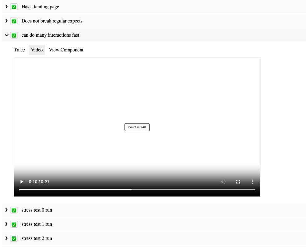
In this post, we’re excited to introduce SafeTest, a revolutionary library that offers a fresh perspective on End-To-End (E2E) tests for web-based User Interface (UI) applications.
The Challenges of Traditional UI Testing
Traditionally, UI tests have been conducted through either unit testing or integration testing (also referred to as End-To-End (E2E) testing). However, each of these methods presents a unique trade-off: you have to choose between controlling the test fixture and setup, or controlling the test driver.
For instance, when using react-testing-library, a unit testing solution, you maintain complete control over what to render and how the underlying services and imports should behave. However, you lose the ability to interact with an actual page, which can lead to a myriad of pain points:
Difficulty in interacting with complex UI elements like <Dropdown /> components.
Inability to test CORS setup or GraphQL calls.
Lack of visibility into z-index issues affecting click-ability of buttons.
Complex and unintuitive authoring and debugging of tests.
Conversely, using integration testing tools like Cypress or Playwright provides control over the page, but sacrifices the ability to instrument the bootstrapping code for the app. These tools operate by remotely controlling a browser to visit a URL and interact with the page. This approach has its own set of challenges:
Difficulty in making calls to an alternative API endpoint without implementing custom network layer API rewrite rules.
Inability to make assertions on spies/mocks or execute code within the app.
Testing something like dark mode entails clicking the theme switcher or knowing the localStorage mechanism to override.
Inability to test segments of the app, for example if a component is only visible after clicking a button and waiting for a 60 second timer to countdown, the test will need to run those actions and will be at least a minute long.
Recognizing these challenges, solutions like E2E Component Testing have emerged, with offerings from Cypress and Playwright. While these tools attempt to rectify the shortcomings of traditional integration testing methods, they have other limitations due to their architecture. They start a dev server with bootstrapping code to load the component and/or setup code you want, which limits their ability to handle complex enterprise applications that might have OAuth or a complex build pipeline. Moreover, updating TypeScript usage could break your tests until the Cypress/Playwright team updates their runner.
Welcome to SafeTest
SafeTest aims to address these issues with a novel approach to UI testing. The main idea is to have a snippet of code in our application bootstrapping stage that injects hooks to run our tests (see the How Safetest Works sections for more info on what this is doing). Note that how this works has no measurable impact on the regular usage of your app since SafeTest leverages lazy loading to dynamically load the tests only when running the tests (in the README example, the tests aren’t in the production bundle at all). Once that’s in place, we can use Playwright to run regular tests, thereby achieving the ideal browser control we want for our tests.
This approach also unlocks some exciting features:
Deep linking to a specific test without needing to run a node test server.
Two-way communication between the browser and test (node) context.
Access to all the DX features that come with Playwright (excluding the ones that come with @playwright/test).
Video recording of tests, trace viewing, and pause page functionality for trying out different page selectors/actions.
Ability to make assertions on spies in the browser in node, matching snapshot of the call within the browser.
Test Examples with SafeTest
SafeTest is designed to feel familiar to anyone who has conducted UI tests before, as it leverages the best parts of existing solutions. Here’s an example of how to test an entire application:
import { describe, it, expect } from 'safetest/jest';
import { render } from 'safetest/react';

describe('my app', () => {
  it('loads the main page', async () => {
    const { page } = await render();

    await expect(page.getByText('Welcome to the app')).toBeVisible();
    expect(await page.screenshot()).toMatchImageSnapshot();
  });
});
We can just as easily test a specific component
import { describe, it, expect, browserMock } from 'safetest/jest'; import { render } from 'safetest/react';
SafeTest utilizes React Context to allow for value overrides during tests. For an example of how this works, let’s assume we have a fetchPeople function used in a component:
import { useAsync } from 'react-use'; import { fetchPerson } from './api/person';
The render function also accepts a function that will be passed the initial app component, allowing for the injection of any desired elements anywhere in the app:
With overrides, we can write complex test cases such as ensuring a service method which combines API requests from /foo, /bar, and /baz, has the correct retry mechanism for just the failed API requests and still maps the return value correctly. So if /bar takes 3 attempts to resolve the method will make a total of 5 API calls.
Overrides aren’t limited to just API calls (since we can use also use page.route), we can also override specific app level values like feature flags or changing some static value:
+const Language = createOverride(navigator.language); export const LanguageChanger = () => { - const language = navigator.language; + const language = Language.useValue(); return <div>Current language is { language } </div>; }
await expect(page.getByText('Current language is abc')).toBeVisible(); }); });
Overrides are a powerful feature of SafeTest and the examples here only scratch the surface. For more information and examples, refer to the Overrides section on the README.
Many large corporations need a form of authentication to use the app. Typically, navigating to localhost:3000 just results in a perpetually loading page. You need to go to a different port, like localhost:8000, which has a proxy server to check and/or inject auth credentials into underlying service calls. This limitation is one of the main reasons that Cypress/Playwright Component Tests aren’t suitable for use at Netflix.
However, there’s usually a service that can generate test users whose credentials we can use to log in and interact with the application. This facilitates creating a light wrapper around SafeTest to automatically generate and assume that test user. For instance, here’s basically how we do it at Netflix:
import { setup } from 'safetest/setup'; import { createTestUser, addCookies } from 'netflix-test-helper';
type Setup = Parameters<typeof setup>[0] & { extraUserOptions?: UserOptions; };
After setting this up, we simply import the above package in place of where we would have used safetest/setup.
Beyond React
While this post focused on how SafeTest works with React, it’s not limited to just React. SafeTest also works with Vue, Svelte, Angular, and even can run on NextJS or Gatsby. It also runs using either Jest or Vitest based on which test runner your scaffolding started you off with. The examples folder demonstrates how to use SafeTest with different tooling combinations, and we encourage contributions to add more cases.
At its core, SafeTest is an intelligent glue for a test runner, a UI library, and a browser runner. Though the most common usage at Netflix employs Jest/React/Playwright, it’s easy to add more adapters for other options.
Conclusion
SafeTest is a powerful testing framework that’s being adopted within Netflix. It allows for easy authoring of tests and provides comprehensive reports when and how any failures occurred, complete with links to view a playback video or manually run the test steps to see what broke. We’re excited to see how it will revolutionize UI testing and look forward to your feedback and contributions.
Ever since we announced GitHub Copilot Chat in March this year, I’ve been thinking a lot about how it’s improving developer happiness and overall satisfaction while coding. Especially for junior developers looking to upskill, or those in the learning phase of diving into a new framework, GitHub Copilot Chat can be such a valuable tool to have in your back pocket.
With GitHub Copilot Chat, you can now interface with Copilot as a context-aware conversational assistant right in the IDE, allowing you to execute some of the most complex tasks with simple prompts. This goes beyond GitHub Copilot’s original capabilities, which focused on autocompletion and translating natural language comments into code. Now, developers can not only get code suggestions in-line, but they can ask Copilot questions directly, get explanations, offer prompts for code, and more, all while staying in the IDE—and in the flow.
Navigating a new framework (and saving time)
Recently, I was preparing a conference talk and demo about ReactJS, and I had to think a bit about what kind of app I wanted to make with the help of Copilot Chat. Since photography is a hobby of mine, I decided to make a photo gallery of the tulip fields and flower shows around Amsterdam. In the end, I went through a couple different versions of this photo gallery with Copilot Chat. Using a probabilistic model, which is currently based on OpenAI’s GPT-3.5-turbo, it found the best suggestion for me based on how I prompted it, including the question I asked, the code I’d started writing, and other open tabs in my IDE.
It had been a long time since I had used React, so it probably would’ve taken me a few days of searching and trial and error before coming up with something decent. But with Copilot Chat, each iteration of my photo gallery only took me about 20-30 minutes to go through.
Making prototypes and generating new code
What I most enjoyed about using Copilot Chat to create something new was discovering multiple ways I could implement my component. I didn’t have to leave my IDE and search for advice or a component to use because Copilot would suggest something in real time. If it offered me a suggestion that didn’t work out well, I could give it feedback on why that suggestion didn’t work, which enabled it to offer suggestions that better suited my needs.
Despite working in an unfamiliar framework, Copilot Chat enabled me to immediately start churning out my ideas, which was incredibly satisfying. It was empowering to discover that I can get something done so much faster than what I would have anticipated without any help.
This idea of looking for external help and examples to understand code has been part of the learning process since well before we had AI pair programming tools. I remember when I was first starting in my career and discovering all these new frameworks. I would spend hours, days, weeks doing tutorials and learning about different ways of implementing things. I would learn by copying and pasting things I saw on StackOverflow and seeing how they fit in with the rest of my code (or by chatting with my buddy that I shared a cubicle with at the time).
A lot of the time, these code snippets didn’t even work, but having something to start with really helped with the learning process and that excitement propelled me forward to the next step. This is exactly the magic I felt when using Copilot Chat—while being able to get a contextual suggestion that actually worked and helped me quickly progress to the next thing. Not to mention the amount of time and energy I saved by staying within the context of VS Code instead of searching through websites and other comments online (and avoiding some stress caused by the sentiment of some Stack Overflow comments).
GitHub Copilot Chat in action
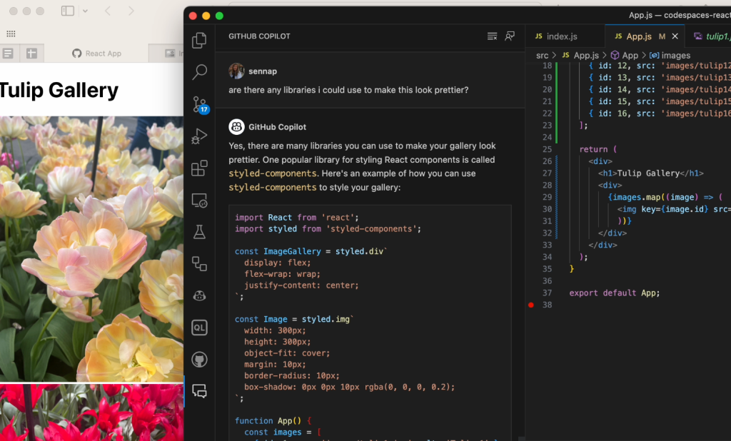
When it came time to build my photo gallery, I used Copilot Chat to get suggestions for popular React libraries I could use. There were a few of them that I checked out in separate iterations of the gallery but styled components seems to be the easiest one for me to configure.
I wanted to include a modal as well, so I asked Copilot if the styled components library supported modals. I was really surprised that it knew exactly how to utilize the modal component of the library and how to pass the props in and handle the onClick functionality from the get-go.
In the video, you may notice that it initially gives me a generic suggestion with some boilerplate examples of how to define a modal component and how to reference it from another file. I then asked it to iterate on that suggestion and give me something more specific to how I defined my gallery. This is important because the power of GitHub Copilot is really in the prompt that you provide it: the more fine-tuned the information, the more powerful its suggestions will be. For further reading, check out these prompt tips and tricks for leveraging GitHub Copilot effectively as well as this post on how we compose prompts at GitHub.
Testing out a UI change based on a natural language prompt
When I first tried rendering a modal, that close button was out of view on the top right corner of the screen. This isn’t too difficult to do if you’re regularly developing front-end. Full transparency: I would have needed to Google how to fix this since I just don’t remember how to and CSS is hard! I was shocked that just by asking Copilot Chat to center the “X” button in the modal, it gave me a better suggestion with some new CSS to add display properties to the button that adjust it to my intention. With Copilot Chat, I got the fix I needed without having to leave the IDE or break my flow.
Making accessibility improvements
I have a background in web accessibility and I knew there would be some improvements needed to make the modals interactive with proper focus handling. There are many facets to making a component accessible and it’s important to strategize early on. Best practices include working with accessibility linting tools, and also specialists that can help you balance constraints at the start of the design and development process.
Copilot Chat can be a great addition to those tools by pointing you in the right direction to fixing accessibility issues. In the case of my gallery, the images were not presenting themselves as interactive to keyboard or screen reader users (or, even visually, which goes to show that accessibility makes products better for everyone!). I asked Copilot Chat what it recommended for me to improve the interactivity of the images. The video below illustrates the suggestions it provided around using tabindex, aria attributes, and handling keydown events.
There are, of course, other accessibility considerations to be made here. At some point I decided to make each of the images button elements with a background image, since generally it’s better to use semantic HTML. I then carried on with the rest of my work to manage the focus correctly when opening and closing the modal, as well as making sure only the visible or focused content is presented to a screen reader.
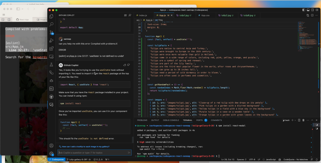
Troubleshooting errors
I was also surprised by Copilot Chat’s ability to help me debug my project whenever I came across an error message. I’d just paste the error into the chat window and GitHub Copilot would offer an explanation for what went wrong and an alternative approach so I could fix the bug quickly and move on.
Writing tests
Knowing that GitHub Copilot can suggest bug fixes, I also wanted to see how it would suggest I write tests for my code. You can ask Copilot Chat for all sorts of test cases, as well as just what kind of testing framework would make the most sense for your application.
In another iteration of my gallery, I used GitHub Copilot to help me render a countdown to the next opening of Tulip season (I went with March 21, 2024, when the tulip festival starts). I decided to make use of the new Copilot Chat slash commands that make it simple to highlight a function and prompt it to help me create some test cases. It suggested using the React testing library for rendering, as well as some methods from Jest to simulate the passage of time and make sure the passing days are represented correctly. From there, I learned about the Jest framework’s Timer Mocks and best practices for testing for fake timers.
Without GitHub Copilot and this new chat feature, navigating a test framework and relying solely on their documentation would have taken even more time.
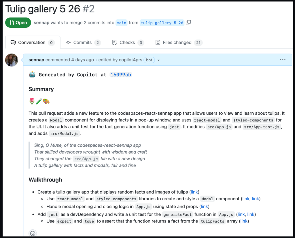
Summarizing my changes with GitHub Copilot for pull requests
Lastly, I used GitHub Copilot for pull requests to help summarize all the changes I made in a pull request. It gave me a summary of my changes, a walk through of each of the diffs relating to those changes, and even a poem about my application.
All of this is to show how Copilot Chat and GitHub Copilot for pull requests made the entire coding process much more enjoyable for me while working in an unfamiliar framework—from the initial idea phase to submitting a pull request.
Potential limitations and considerations
While the productivity increases for GitHub Copilot are amazing, there are valid concerns around the quality of code AI paired programming tools suggest and the danger of blindly trusting them. That’s why it’s important to remember that you, the developer, is ultimately the pilot. I think of using GitHub Copilot to be similar to pair programming with another developer: it helps me work faster, but I still need to verify the suggestions it’s giving me to ensure they meet my requirements.
While GitHub Copilot has numerous filters in place to avoid suggestions with vulnerabilities, it’s still important to review and test before deploying. As with any code you did not independently originate, you should ensure code suggestions go through proper code review, code security, and code quality channels to maintain the standards of your team.
As we continue to grow here at Netflix, the needs of Revenue and Growth Engineering are rapidly evolving; and our tools must also evolve just as rapidly. The Revenue and Growth Tools (RGT) team decided to set off on a journey to build tools in an abstract manner to have solutions readily available within our organization. We identified common design patterns and architectures scattered across various tools which were all duplicating efforts in some way or another.
We needed to consolidate these tools in a way that scaled with the teams we served. It needed to have the agility of a micro frontend and the extensibility of a framework to empower our stakeholders to extend our tools. We would abstract parts of which anyone can then customize, or extend, to meet their specific business or technical requirements. The end result is Lattice: RGT’s pluggable framework for micro frontends.
A Different Approach to Our Tools
A UI composed of other dependencies is nothing new; it’s something all modern web applications do today. The traditional approach of bundling dependencies at build time lacks the flexibility we need to empower our stakeholders. We want external dependencies to be resolved on-demand from any number of sources, from another application to an engineer’s laptop.
This led us to the following high level objectives:
Low Friction Adoption: Encourage reuse of existing front end code and avoid creating new packages that encapsulate UI functionality. Applications can be difficult to manage when functionality must be shared across packages. We would leverage an approach that enabled applications to extend their core functionality using common, and familiar, React paradigms.
Weak Dependencies: Host applications could reference modules over https to a remote bundle hosted internally within Netflix. These bundles could be owned by teams outside of RGT built by already adopted standards such as with Webpack Module Federation or native JavaScript Modules.
Highly Aligned, Loosely Coupled: fully align with the standard frameworks and libraries used within Netflix. Plugins should be focused on delivering their core functionality without unnecessary boilerplate and have the freedom to implement without cumbersome API wrappers.
Metadata Driven: Plugin modules are defined from a configuration which could be injected at any point in the application lifecycle. The framework must be flexible enough to register, and unregister, plugins such that the extensions only apply when necessary.
Rapid Development: Reduce the development cycle by avoiding unnecessary builds and deployments. Plugins would be developed in a manner in which all of the context is available to them ahead of time via TypeScript declarations. By designing to rigid interfaces defined by a host application, both the plugin and host can be developed in parallel.
A Theoretical Example
Example Developer Dashboard Application with Embedded Lattice Plugins
Let’s take the above example — it renders and controls its own header and content areas to expose specific functionality to users. Upon release, we receive feedback that it would be nice if we could include information presented from other tools within this application. Using our new framework, Lattice, we are able to embed the existing functionality from the other applications.
A Lattice Plugin Host (which we’ll dive into later) allows us to extend the existing application by referencing two external plugins, Workflows and Spinnaker. In our example, we need to define two areas that can be extended — the application content for portal components and configurable routing.
The sequence of events in order to accomplish the above rendering process would be handled by three components — our new framework Lattice and the two plugins:
Dispatch Cycle within Lattice
First, Lattice will load both plugins asynchronously.
Next, the framework will dispatch events as they flow through the application.
In our example, Workflows will register its routes and Spinnaker will add its overlays.
An Implementation with React
In order to accomplish the above scenario, the Host Application needs to include the Lattice library and add a new PluginHost with a configuration referencing the external plugins. This host requires information about the specific application and the configuration indicating which plugins to load:
Enhancing a React Application with a Lattice Plugin Host
We’ve mocked this implementation in the example above with a useFetchPluginConfiguration hook to retrieve the metadata from an external service. Owners can then choose to add or remove plugins dynamically, outside of the application source code.
Allowing plugins access to the routing can be done using hooks defined by the Lattice framework. The usePluggableState hook will retrieve the default application routes and pass them through the Lattice framework. If any plugin responds to this AppRoutes identifier, they can choose to inject their specific routes:
Extending Existing Application State with Lattice Hooks
Plugins can inject any React element into the page with the<Pluggable /> component as illustrated below. This will allow plugins to render within this AppContent area:
Rendering Custom Children with Lattice Pluggable
The final example application snippet has been included below:
Under the Hood
Lattice is a tiny framework that provides an abstraction layer for React web applications to leverage.
Using Lattice, developers can focus on their core product, and simply wrap areas of their application that are customizable by external plugins. Developers can also extend components to use external state by using Lattice hooks.
Lattice Plugin Modules are JavaScript functions implemented by remote applications. These functions act as the “glue” between the host application and the remote component(s) being shared. Modules declare which components within their application should be exposed and how they should be rendered based on information the host provides.
A Lattice Pluggable Component allows a host application to expose a mount point through a standard React component that plugins can manipulate or override with their own content.
Lattice Custom Hooks are used to manipulate state using a state reducer pattern. These hooks allow host applications to maintain their own initial state, and modify accordingly, while also allowing plugins the opportunity to inject their own data.
Lattice Plugins
Lattice Functionality within a Host Application
The core of Lattice provides the ability to asynchronously load remote modules via Webpack Module Federation, Native ES Modules, or a custom implementation defined outside of the framework. The host application provides Lattice with basic application context and a configuration which defines the remote plugin modules to load. Once loaded, references to these plugins are stored internally within a React Context instance.
Exposing Functionality to Lattice as a Federated Module
Plugin modules can then provide new functionality, or change existing functionality, to the host application. Standard identifiers are used that all Lattice-enabled applications should implement to allow plugins to universally work across different applications. Most extensions will choose to extend existing application functionality, which will not be universal, and requires knowledge of the host’s design.
Lattice requires constant identifier values (aka “magic strings”) to understand what is being rendered. The Lattice Plugin Host will dispatch this identifier through all of the plugins which have been registered and loaded. Plugin responses are composed together, and the final returned value is what gets rendered in the component tree. Through this model, plugins can decide to extend, change, or simply ignore the event. Think of this process as an approach similar to that of Redux or Express Middleware functions.
Lattice can also be used to extend existing application functionality. In order to accomplish this, Plugins must be aware of the host identifiers and data shapes used in the host application lifecycle. While this might sound like an impossible task to maintain, we encourage host applications to publish a TypeScript declarations project which is shared between the host and plugins. Think of us as having a DefinitelyTyped repository for all of the Netflix internal tools that embrace extending via Lattice.
Using this approach, we are able to provide developers with a highly aligned, loosely coupled development environment shared between host applications and plugins. Plugins can be developed in a silo, simply adhering to the interface which has been declared.
The Possibilities are Endless
While our original approach was to extend core functionality within an application, we have found that we are able to leverage Lattice in other ways. The concept of writing a simple if statement has been replaced; we take a step back, and consider which domain in our organization should be responsible for said logic and consider moving the logic into their respective plugin.
We have also found that we can easily model more fine-grained areas within an application. For example, we can render individual form components using Lattice identifiers and have plugins be responsible for the specific UI elements. This empowers us to build these generic tools backed by metadata models and a default out-of-box experience which others can choose to override.
Most importantly, we are able to easily, and quickly, respond to conflicting requirements by simply implementing different plugins.
What’s Next?
We are only getting started with Lattice and currently gauging interest internally from other teams. By dogfooding our approach within RGT, we can work out the kinks, squash some bugs, and build a robust process for building micro frontends with Lattice. The developer experience is crucial for Lattice to be successful. Empowering developers with the ability to understand the lifecycle of Lattice events within an application, verify functionality prior to deployments, versioning, developing end-to-end test suites, and general best practices are some nuggets critical to our success.
Hawkins may be the name of a fictional town in Indiana, most widely known as the backdrop for one of Netflix’s most popular TV series “Stranger Things,” but the name is so much more. Hawkins is the namesake that established the basis for a design system used across the Netflix Studio ecosystem.
Have you ever used a suite of applications that had an inconsistent user experience? It can be a nightmare to work efficiently. The learning curve can be immense for each and every application in the suite, as the user is essentially learning a new tool with each interaction. Aside from the burden on these users, the engineers responsible for building and maintaining these applications must keep reinventing the wheel, starting from scratch with toolsets, component libraries and design patterns. This investment is repetitive and costly. A design system, such as the one we developed for the Netflix Studio, can help alleviate most of these headaches.
We have been working on our own design system that is widely used across the Netflix Studio’s growing application catalogue, which consists of 80+ applications. These applications power the production of Netflix’s content, from pitch evaluation to financial forecasting and completed asset delivery. A typical day for a production employee could require using a handful of these applications to entertain our members across the world. We wanted a way to ensure that we can have a consistent user experience while also sharing as much code as possible.
In this blog post, we will highlight why we built Hawkins, as well as how we got buy-in across the engineering organization and our plans moving forward. We recently presented a talk on how we built Hawkins; so if you are interested in more details, check out the video.
What is a design system?
Before we can dive into the importance of having a design system, we have to define what a design system means. It can mean different things to different people. For Hawkins, our design system is composed of two main aspects.
General design system component mocks
First, we have the design elements that form the foundational layer of Hawkins. These consist of Figma components that are used throughout the design team. These components are used to build out mocks for the engineering team. Being the foundational layer, it is important that these assets are consistent and intuitive.
Second, we have our React component library, which is a JavaScript library for building user interfaces. The engineering team uses this component library to ensure that each and every component is reusable, conforms to the design assets and can be highly configurable for different situations. We also make sure that each component is composable and can be used in many different combinations. We made the decision to keep our components very atomic; this keeps them small, lightweight and easy to combine into larger components.
At Netflix, we have two teams composed of six people who work together to make Hawkins a success, but that doesn’t always need to be the case. A successful design system can be created with just a small team. The key aspects are that it is reusable, configurable and composable.
Why is a design system important?
Having a solid design system can help to alleviate many issues that come from maintaining so many different applications. A design system can bring cohesion across your suite of applications and drastically reduce the engineering burden for each application.
Examples of Figma components for the Hawkins Design System
Quality user experience can be hard to come by as your suite of applications grow. A design system should be there to help ease that burden, acting as the blueprint on how you build applications. Having a consistent user experience also reduces the training required. If users know how to fill out forms, access data in a table or receive notifications in one application, they will intuitively know how to in the next application.
The design system acts as a language that both designers and engineers can speak to align on how applications are built out. It also helps with onboarding new team members due to the documentation and examples outlined in your design system.
The last and arguably biggest win for design systems is the reduction of burden on engineering. There will only be one implementation of buttons, tables, forms, etc. This greatly reduces the number of bugs and improves the overall health and performance of every application that uses the design system. The entire engineering organization is working to improve one set of components vs. each using their own individual components. When a component is improved, whether through additional functionality or a bug fix, the benefit is shared across the entire organization.
Taking a wide view of the Netflix Studio landscape, we saw many opportunities where Hawkins could bring value to the engineering organization.
Build vs. buy
The first question we asked ourselves is whether we wanted to build out an entire design system from scratch or leverage an existing solution. There are pros and cons to each approach.
Building it yourself— The benefits of DIY means that you are in control every step of the way. You get to decide what will be included in the design system and what is better left out. The downside is that because you are responsible for it all, it will likely take longer to complete.
Leveraging an existing solution — When you leverage an existing solution, you can still customize certain elements of that solution, but ultimately you are getting a lot out of the box for free. Depending on which solution you choose, you could be inheriting a ton of issues or something that is battle tested. Do your research and don’t be afraid to ask around!
For Hawkins, we decided to take both approaches. On the design side, we decided to build it ourselves. This gave us complete creative control over how our user experience is throughout the design language. On the engineering side, we decided to build on top of an existing solution by utilizing Material-UI. Leveraging Material-UI, gave us a ton of components out of the box that we can configure and style to meet the needs of Hawkins. We also chose to obfuscate a number of the customizations that come from the library to ensure upgrading or replacing components will be smoother.
Generating users and getting buy-in
The single biggest question that we had when building out Hawkins is how to obtain buy-in across the engineering organization. We decided to track the number of uses of each component, the number of installs of the packages themselves, and how many applications were using Hawkins in production as metrics to determine success.
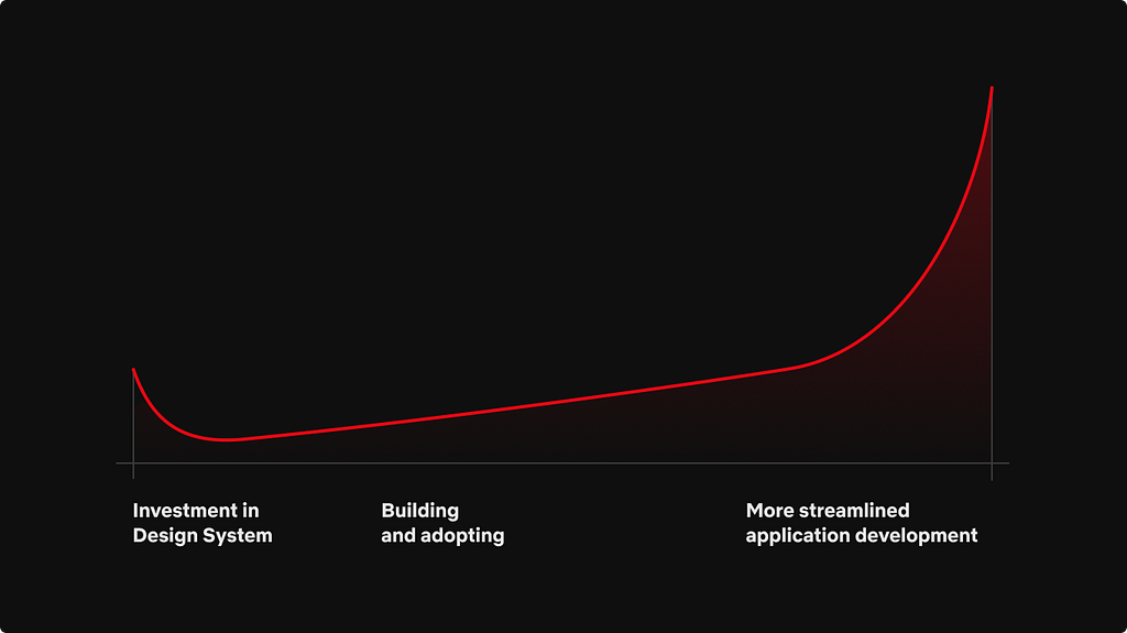
There is a definitive cost that comes with building out a design system no matter the route you take. The initial cost is very high, with research, building out the design tokens and the component library. Then, developers have to begin consuming the libraries inside of applications, either with full re-writes or feature by feature.
Graph depicting the cost of building a design system
A good representation of this is the graph above. While an organization may spend a lot of time initially making the design system, it will benefit greatly once it is fully implemented and trusted across the organization. With Hawkins, our initial build phase took about two quarters. The two quarters were split between Q1 consisting of creating the design language and Q2 being the implementation phase. Engineering and Design worked closely during the entire build phase. The end result was a significant number of components in Figma and a large component library leveraging Material-UI. Only then could we start to look for engineering teams to start using Hawkins.
When building out the component library, we set out to accomplish four key aspects that we felt would help drive support for Hawkins:
Document components — First, we ensured that each component was fully documented and had examples using Storybook.
On-call rotation for support — Next, we set up an on-call rotation in Slack, where engineers could not only seek guidance, but report any issues they may have encountered. It was extremely important to be responsive in our communication channels. The more support engineers feel they have, the more receptive they will be to using the design library.
Demonstrate Hawkins usefulness — Next, we started to do “road shows,” where we would join team meetings to demonstrate the value that Hawkins could bring to each and every team. This also provided an opportunity for the engineers to ask questions in person and for us to gather feedback to ensure our plans for Hawkins would meet their needs.
Bootstrap features for proof of concept— Finally, we helped bootstrap out features or applications for teams as a proof of concept. All of these together helped to foster a relationship between the Hawkins team and engineering teams.
Even today, as the Hawkins team, we run through all of the above exercises and more to ensure that the design system is robust and has the level of support the engineering organization can trust.
Handling the outliers
The Hawkins libraries all consist of basic components that are the building blocks to the applications across the Netflix Studio. When engineers increased their usage of Hawkins, it became clear that many folks were using the atomic components to build more complex experiences that were common across multiple applications, like in-app chat, data grids, and file uploaders, to name a few. We did not want to put these components straight into Hawkins because of the complexity and because they weren’t used across the entire Studio. So, we were tasked with identifying a way to share these complex components while still being able to benefit from all the work we accomplished on Hawkins.
To meet this challenge, developers decided to spin up a parallel library that sits right next to Hawkins. This library builds on top of the existing design system to provide a home for all the complex components that didn’t fit into the original design system.
Venn diagram showing the relationship between the libraries
This library was set up as a Lerna monorepo with tooling to quickly jumpstart a new package. We followed the same steps as Hawkins with Storybook and communication channels. The benefit of using a monorepo was that it gave engineering a single place to discover what components are available when building out applications. We also decided to version each package independently, which helped avoid issues with updating Hawkins or in downstream applications.
With so many components that will go into this parallel library, we decided on taking an “open source” approach to share the burden of responsibility for each component. Every engineer is welcome to contribute new components and help fix bugs or release new features in existing components. This model helps spread the ownership out from just a single engineer to a team of developers and engineers working in tandem.
It is the goal that eventually these components could be migrated into the Hawkins library. That is why we took the time to ensure that each repository has the same rules when it came to development, testing and building. This would allow for an easy migration.
Wrapping up
We still have a long way to go on Hawkins. There are still a plethora of improvements that we can do to enhance performance and developer ergonomics, and make it easier to work with Hawkins in general, especially as we start to use Hawkins outside of just the Netflix Studio!
Logo for the Hawkins Design System
We are very excited to share our work on Hawkins and dive into some of the nuances that we came across.
By Mohit Goenka, Gnanavel Shanmugam, and Lance Welsh
At Yahoo Mail, we’re constantly striving to upgrade our product experience. We do this not only by adding new features based on our members’ feedback, but also by providing the best technical solutions to power the most engaging experiences. As such, we’ve recently introduced a number of novel and unique revisions to the way in which we use Redux that have resulted in significant stability and performance improvements. Developers may find our methods useful in achieving similar results in their apps.
Improvements to product metrics
Last year Yahoo Mail implemented a brand new architecture using Redux. Since then, we have transformed the overall architecture to reduce latencies in various operations, reduce JavaScript exceptions, and better synchronized states. As a result, the product is much faster and more stable.
Stability improvements:
when checking for new emails – 20%
when reading emails – 30%
when sending emails – 20%
Performance improvements:
10% improvement in page load performance
40% improvement in frame rendering time
We have also reduced API calls by approximately 20%.
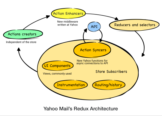
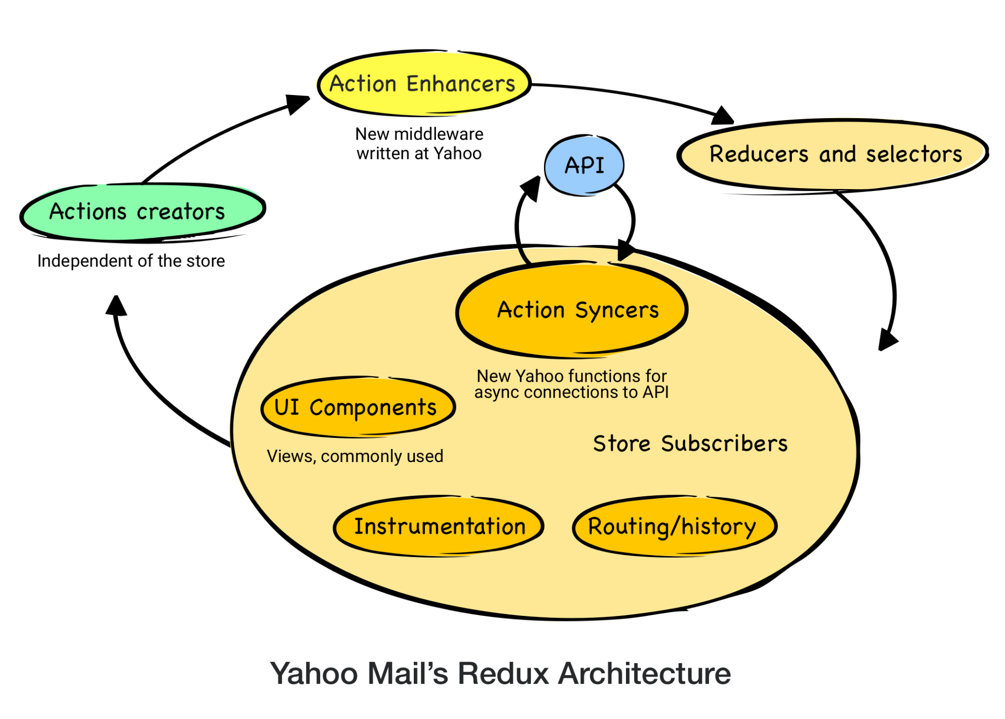
How we use Redux in Yahoo Mail
Redux architecture is reliant on one large store that represents the application state. In a Redux cycle, action creators dispatch actions to change the state of the store. React Components then respond to those state changes. We’ve made some modifications on top of this architecture that are atypical in the React-Redux community.
For instance, when fetching data over the network, the traditional methodology is to use Thunk middleware. Yahoo Mail fetches data over the network from our API. Thunks would create an unnecessary and undesirable dependency between the action creators and our API. If and when the API changes, the action creators must then also change. To keep these concerns separate we dispatch the action payload from the action creator to store them in the Redux state for later processing by “action syncers”. Action syncers use the payload information from the store to make requests to the API and process responses. In other words, the action syncers form an API layer by interacting with the store. An additional benefit to keeping the concerns separate is that the API layer can change as the backend changes, thereby preventing such changes from bubbling back up into the action creators and components. This also allowed us to optimize the API calls by batching, deduping, and processing the requests only when the network is available. We applied similar strategies for handling other side effects like route handling and instrumentation. Overall, action syncers helped us to reduce our API calls by ~20% and bring down API errors by 20-30%.
Another change to the normal Redux architecture was made to avoid unnecessary props. The React-Redux community has learned to avoid passing unnecessary props from high-level components through multiple layers down to lower-level components (prop drilling) for rendering. We have introduced action enhancers middleware to avoid passing additional unnecessary props that are purely used when dispatching actions. Action enhancers add data to the action payload so that data does not have to come from the component when dispatching the action. This avoids the component from having to receive that data through props and has improved frame rendering by ~40%. The use of action enhancers also avoids writing utility functions to add commonly-used data to each action from action creators.
In our new architecture, the store reducers accept the dispatched action via action enhancers to update the state. The store then updates the UI, completing the action cycle. Action syncers then initiate the call to the backend APIs to synchronize local changes.
Conclusion
Our novel use of Redux in Yahoo Mail has led to significant user-facing benefits through a more performant application. It has also reduced development cycles for new features due to its simplified architecture. We’re excited to share our work with the community and would love to hear from anyone interested in learning more.
When it comes to performance and reliability, there is perhaps no application where this matters more than with email. Today, we announced a new Yahoo Mail experience for desktop based on a completely rewritten tech stack that embodies these fundamental considerations and more.
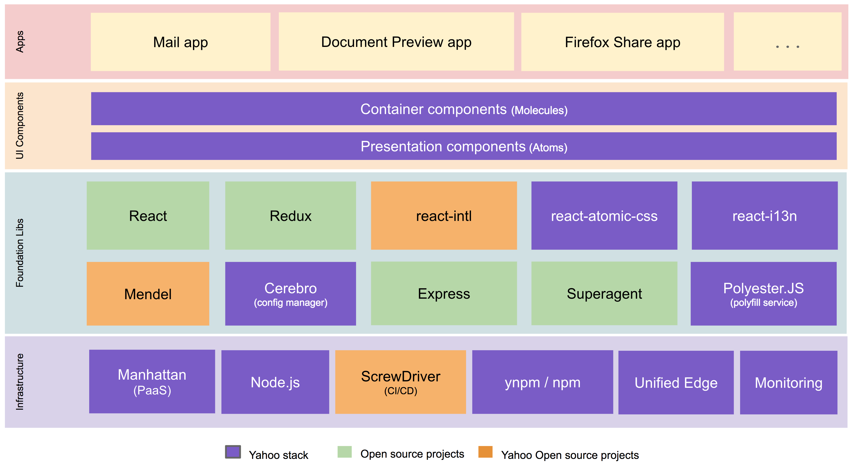
We built the new Yahoo Mail experience using a best-in-class front-end tech stack with open source technologies including React, Redux, Node.js, react-intl (open-sourced by Yahoo), and others. A high-level architectural diagram of our stack is below.
New Yahoo Mail Tech Stack
In building our new tech stack, we made use of the most modern tools available in the industry to come up with the best experience for our users by optimizing the following fundamentals:
Performance
A key feature of the new Yahoo Mail architecture is blazing-fast initial loading (aka, launch).
We introduced new network routing which sends users to their nearest geo-located email servers (proximity-based routing). This has resulted in a significant reduction in time to first byte and should be immediately noticeable to our international users in particular.
We now do server-side rendering to allow our users to see their mail sooner. This change will be immediately noticeable to our low-bandwidth users. Our application is isomorphic, meaning that the same code runs on the server (using Node.js) and the client. Prior versions of Yahoo Mail had programming logic duplicated on the server and the client because we used PHP on the server and JavaScript on the client.
Using efficient bundling strategies (JavaScript code is separated into application, vendor, and lazy loaded bundles) and pushing only the changed bundles during production pushes, we keep the cache hit ratio high. By using react-atomic-css, our homegrown solution for writing modular and scoped CSS in React, we get much better CSS reuse.
In prior versions of Yahoo Mail, the need to run various experiments in parallel resulted in additional branching and bloating of our JavaScript and CSS code. While rewriting all of our code, we solved this issue using Mendel, our homegrown solution for bucket testing isomorphic web apps, which we have open sourced.
Rather than using custom libraries, we use native HTML5 APIs and ES6 heavily and use PolyesterJS, our homegrown polyfill solution, to fill the gaps. These factors have further helped us to keep payload size minimal.
With all the above optimizations, we have been able to reduce our JavaScript and CSS footprint by approximately 50% compared to the previous desktop version of Yahoo Mail, helping us achieve a blazing-fast launch.
In addition to initial launch improvements, key features like search and message read (when a user opens an email to read it) have also benefited from the above optimizations and are considerably faster in the latest version of Yahoo Mail.
We also significantly reduced the memory consumed by Yahoo Mail on the browser. This is especially noticeable during a long running session.
Reliability
With this new version of Yahoo Mail, we have a 99.99% success rate on core flows: launch, message read, compose, search, and actions that affect messages. Accomplishing this over several billion user actions a day is a significant feat. Client-side errors (JavaScript exceptions) are reduced significantly when compared to prior Yahoo Mail versions.
Product agility and launch velocity
We focused on independently deployable components. As part of the re-architecture of Yahoo Mail, we invested in a robust continuous integration and delivery flow. Our new pipeline allows for daily (or more) pushes to all Mail users, and we push only the bundles that are modified, which keeps the cache hit ratio high.
Developer effectiveness and satisfaction
In developing our tech stack for the new Yahoo Mail experience, we heavily leveraged open source technologies, which allowed us to ensure a shorter learning curve for new engineers. We were able to implement a consistent and intuitive onboarding program for 30+ developers and are now using our program for all new hires. During the development process, we emphasise predictable flows and easy debugging.
Accessibility
The accessibility of this new version of Yahoo Mail is state of the art and delivers outstanding usability (efficiency) in addition to accessibility. It features six enhanced visual themes that can provide accommodation for people with low vision and has been optimized for use with Assistive Technology including alternate input devices, magnifiers, and popular screen readers such as NVDA and VoiceOver. These features have been rigorously evaluated and incorporate feedback from users with disabilities. It sets a new standard for the accessibility of web-based mail and is our most-accessible Mail experience yet.
Open source
We have open sourced some key components of our new Mail stack, like Mendel, our solution for bucket testing isomorphic web applications. We invite the community to use and build upon our code. Going forward, we plan on also open sourcing additional components like react-atomic-css, our solution for writing modular and scoped CSS in React, and lazy-component, our solution for on-demand loading of resources.
Many of our company’s best technical minds came together to write a brand new tech stack and enable a delightful new Yahoo Mail experience for our users.
We encourage our users and engineering peers in the industry to test the limits of our application, and to provide feedback by clicking on the Give Feedback call out in the lower left corner of the new version of Yahoo Mail.
The collective thoughts of the interwebz
Manage Consent
To provide the best experiences, we use technologies like cookies to store and/or access device information. Consenting to these technologies will allow us to process data such as browsing behavior or unique IDs on this site. Not consenting or withdrawing consent, may adversely affect certain features and functions.
Functional
Always active
The technical storage or access is strictly necessary for the legitimate purpose of enabling the use of a specific service explicitly requested by the subscriber or user, or for the sole purpose of carrying out the transmission of a communication over an electronic communications network.
Preferences
The technical storage or access is necessary for the legitimate purpose of storing preferences that are not requested by the subscriber or user.
Statistics
The technical storage or access that is used exclusively for statistical purposes.The technical storage or access that is used exclusively for anonymous statistical purposes. Without a subpoena, voluntary compliance on the part of your Internet Service Provider, or additional records from a third party, information stored or retrieved for this purpose alone cannot usually be used to identify you.
Marketing
The technical storage or access is required to create user profiles to send advertising, or to track the user on a website or across several websites for similar marketing purposes.


