All posts by Lai Yi Ohlsen

Introducing Radar Researcher: An AI tool for exploring Internet data in plain language

Post Syndicated from Lai Yi Ohlsen original https://blog.cloudflare.com/introducing-radar-researcher/

Since launching in 2020, Cloudflare Radar has provided one-of-a-kind insight into Internet traffic on a global scale. The open data that Radar publishes from our global network is used by a variety of experts in different domains: human rights advocates, journalists, academic researchers, network operators, and more.

Today, as part of Agents Week, Radar is beta-launching a new tool: Radar Researcher. 

Now, if you want to answer a question with Radar’s data, you can just ask in plain language and get an answer back with real, interactive charts, all built on Cloudflare's developer platform. You no longer need to find the right page, choose the right filters, or read the API documentation to write a query. 

Why we built Radar Researcher

Over the past six years, the Radar team has worked to provide clear, accessible, reliable data visualizations of complex datasets. This is not without its challenges: our user base is vast and ranges from curious novices to technical network experts. Even so, we publish as much insight into the Internet as seen from our network as we can: DNS queries from our public resolver 1.1.1.1, HTTP traffic from across our global network, network quality data collected from Cloudflare Speed Test, and so much more. We also believe in the power of open, public data, which is why everything you see in Radar’s data visualizations is available via our free API. Every year we make more and more of the Internet visible. 

But as Radar has evolved, so has the technology for working with data. AI tools are lowering the barrier to expertise: you no longer need to know a dataset's structure or vocabulary to get useful answers from it. Subject-matter experts become collaborators rather than gatekeepers.

Radar has always wanted to do more for users who shouldn't need to master our entire catalog and its vocabulary to fully appreciate our insights. (See our recent blog post on how the Internet responded to the 2026 FIFA World Cup.) 

We also know that many of our users are in a hurry. For example, a journalist writing about the latest Internet outage likely does not have the time to search through each page for the perfect graph to tell their story. This is why we built Radar Researcher.

Meet Radar Researcher

Radar Researcher is built to make accessing data as easy as describing what you’re looking for. All information is provided via Radar’s API, which ensures that the underlying LLM relies on real data, and can answer your questions quickly and in the same format as you would articulate them to a human.

It's available on every Radar page. Open the Radar Researcher panel from the header, and it docks beside whatever you're looking at, so you can keep browsing while you chat. Here are some examples of how you can use it: 

  • Get an answer in plain language, with real charts: Ask a question and get the same interactive visualizations you see across Radar, plus a short explanation.
  • Choose your depth: Pick a concise, direct answer or a fuller, multi-topic report.
  • Keep the analysis going: After each answer, it suggests useful follow-up questions.
  • Pick up where you left off: Conversations are saved in a searchable history you can pin and revisit, and you can share any conversation with a link. (Shared links expire automatically after 30 days.)
  • Audit the reasoning: Check how the LLM interpreted your question, which datasets it looked up and queried, and how it worked through the results to reach its answer.
  • Ask your way: Type, use voice input, or launch it straight from Radar's search bar.

Turn any chart into a conversation

Researcher doesn't only start from a blank prompt. Anywhere you see a chart on Radar, an Explain with AI action opens the assistant with that exact visualization already in hand. 

Instead of asking you to describe what you're looking at, it captures the exact visualization you're viewing and starts the conversation there. As you can see below, Radar Researcher takes the visualization in context, then analyzes the data and responds with an explanation.

Under the hood, the assistant hands the model three things at once: a screenshot of the chart (a vision-capable model reads the image directly), the exact data behind it from Radar's API, and the parameters of your current view, including location, date range, and any filters you've applied. The screenshot enables Radar Researcher to see what you see. The raw data keeps every number it cites precise instead of estimated from pixels, and the filters mean the explanation is about your exact view, not a generic version of the chart.

Use Case No. 1: What’s Internet quality like in Portugal?

Say you're curious how good the home Internet is in a given country. You can just ask:

Instead of manually calling the API, choosing parameters, or hunting through Radar's pages, Radar Researcher interprets the question and does the work for you. You can follow each step in the screenshot: it reads what you asked, queries Radar's Internet quality API, then analyzes the results and answers in plain language. And rather than a wall of numbers, it renders the same interactive charts you'd see on the Radar Internet Quality section.

From here you might ask a natural follow-up, like comparing Portugal to a neighbor, and Radar Researcher fetches fresh data for each one. It even suggests useful next steps of its own, such as how Portugal stacks up against Spain or the country's most common Internet outages. By letting you find what you're looking for in plain language, we hope applying Radar's data to your own analysis is easier than ever.

Use Case No. 2: Investigating an Internet disruption

Radar Researcher is also built with technical experts in mind. If we know one thing about engineers, researchers, and network operators, it’s that automation is key to their workflows. Looking at the same data with manual actions can be cumbersome and limiting: how do you ensure you're always looking at the most relevant data? 

Consider a real event. In early 2026, Iran went through a series of government-directed Internet shutdowns, including one that lasted nearly three months before traffic partially returned in May. Reporting a story like that means pulling several views and refreshing them as the situation develops. To investigate it, you can just ask Radar Researcher:

This time the question is open-ended, so Radar Researcher runs a short investigation. It looks up the outage events Cloudflare Radar recorded for Iran and gathers the matching traffic data, then explains the timeline in plain language: Iran's HTTP traffic index collapsed from around 0.58 on January 7 to effectively zero by January 9, began a partial recovery around January 17, and returned close to pre-shutdown levels by January 27. It presents this as an HTTP traffic index chart with the outage window annotated directly on the line, plus a table of the recorded outages that also flags a second shutdown starting February 28.

From there it suggests where to take the investigation next, such as how the traffic compared with neighboring countries.

How we built it

Radar Researcher is built entirely on Cloudflare's own developer platform. It's a showcase of the same tools any developer can use to build an AI agent.

At its core is a Cloudflare Worker running the Cloudflare Agents SDK. Each conversation is a stateful Durable Object with its own SQLite database, so your chat history, titles, and streaming responses persist. They even survive you leaving the page mid-answer, because generation continues server-side and resumes when you reconnect.
The "brain" is Workers AI, running open models like Kimi K2.7. Rather than betting on a single model, we run an ordered fallback chain across three different model families. If one model is momentarily at capacity, the request transparently cascades to the next, so an incident at any single provider doesn’t take Researcher down. Every call routes through AI Gateway for logging, cost tracking, caching, and safety guardrails.

The most interesting part is how Researcher reaches Radar's data. Instead of hand-writing a tool for every one of Radar's hundreds of endpoints, we connect the agent to the unified Cloudflare MCP server using Code Mode. The model gets just three tools (search, execute, and docs) and writes code to query the Radar API directly. It searches the OpenAPI spec to find the right endpoint, then executes a small snippet that fetches live data. Because the full API spec lives on the MCP server, nothing about Radar's API is hard-coded into the prompt. As Radar adds datasets, Researcher can use them with no code changes.

This is visible to you, too: every answer includes an expandable trace of the model's reasoning and the exact tool calls it made to gather the data, so you can always see how it got there.

From Markdown to real Radar charts

There was one problem to solve along the way. Language models answer in Markdown: text, tables, and bullet points. But we didn't want walls of numbers; we wanted the same rich, interactive charts you see everywhere else on Radar. Worse, when a model tries to write data directly into its answer, it tends to round, summarize, or truncate it, which is exactly what you don't want from a data tool.

Our solution keeps the data out of the model's prose entirely. When Radar Researcher fetches data, its code returns a small envelope that pairs the API path with the result. Then, instead of pasting numbers, the model emits a lightweight chart specification that simply references that same path:

Radar's frontend matches the chart's dataFrom to the fetched result and renders it with the exact same visualization components used across the rest of the site. The chart is always faithful to the API, and Radar Researcher can draw on our whole visual vocabulary: time series and stacked areas, donuts, bar charts, maps, histograms, etc.

A few small touches

Not everything needs the big model. Small, fast models handle the side tasks: one writes a short title for each new conversation, and another suggests the follow-up questions under each answer. Both run off to the side, so they never slow down your actual reply.

Radar Researcher also gets a little context about the here and now. We pass it the current date and time, plus the same high-level details about your connection that you'll find on Radar's IP page, such as your IP location and network. That way, when you ask something like "how's traffic here?", it can tailor the answer to where you are.

Everything reaches you through Radar's frontend (also a Worker) over a service binding, with per-IP rate limiting and shareable conversations stored in R2. Every layer, from compute to inference to gateway to storage to data, is Cloudflare.

Powered by agents — and ready for them

Radar Researcher shows how we use an AI agent to help people explore our data. But there's another side to the agent story: what happens when the agent isn't ours, but a general-purpose assistant running in your browser, acting on your behalf?

Today, an agent that wants to use a website mostly has to scrape the page and guess at how it works, which is brittle, slow, and error-prone. WebMCP is an emerging web standard that fixes this: a page can register a small set of well-defined tools that any browser agent can discover and call directly, instead of reverse-engineering the DOM (Document Object Model).

We've added WebMCP support to Radar, using both flavors the standard offers:

  • The imperative API lets us register tools in JavaScript that call straight into the same code that powers the UI, so an agent can drive Radar directly. Filter to a country, region, continent, or ASN; change the date range; search pages, sections, and entities (domains, ASNs, IPs, and more); jump to any section.
  • The declarative API turns Radar's existing HTML forms into tools by annotating them with a couple of attributes, so an agent can scan a URL with the URL Scanner, look up a domain's report, or test a website's post-quantum TLS key exchange support.

Every one of these simply drives functionality already available in the user interface, and it's pure progressive enhancement: in a browser without WebMCP, the tools just aren't there and nothing changes.

It’s also a case of practicing what we preach. Radar’s own URL Scanner evaluates how agent-ready a site is, and one of those checks looks for exactly this kind of WebMCP integration. By implementing it ourselves, Radar now passes its own agent-readiness check, and, more importantly, becomes a site that both people and agents can navigate with ease.

Try it out 

Radar Researcher is available in beta today on Cloudflare Radar. Look for the Researcher button in the header on any page. It's built entirely on Cloudflare's developer platform, and it's just getting started: we'll keep expanding the datasets it understands, sharpening its analysis, and adding new ways to interact with data.

Like all Cloudflare products, Radar is built with the user in mind. We want to know what’s useful. Please let us know what you think on social media at @CloudflareRadar (X), noc.social/@cloudflareradar (Mastodon), and radar.cloudflare.com (Bluesky), or by email at [email protected]

Tell us what works, what doesn’t, the insights you’re finding, what still feels beyond reach, and everything in between. Your feedback will help us improve and make Radar Researcher even better for our full launch. We can’t wait to see what you do with it! 

Natural disasters and government interference: examining Q2 2026’s major Internet disruption event

Post Syndicated from Lai Yi Ohlsen original https://blog.cloudflare.com/q2-2026-internet-disruption-summary/

Like most infrastructure, the Internet's fragility is easy to overlook — as long as it's working. When it fails, its complexity comes into full view. Cloudflare is in a unique position to detect and document the moments when one of the interrelated systems the Internet depends on breaks down and connectivity suffers as a result. Each quarter, we summarize the disruptions we detect and annotate on Cloudflare Radar.

In Q2 2026, Super Typhoon Sinlaku just north of Guam caused the longest outage, while government-mandated shutdowns during exam periods in Sudan were the most frequent. Iran restored national Internet access, reconnecting its citizens to the global network after an 88-day blackout, even as damage from drone strikes continued to disrupt AWS infrastructure elsewhere in the region. Finally, a cable cut in Saint Lucia and the distribution of faulty DNSSEC signatures in Germany underscored the fragility of Internet infrastructure, but also the remarkable stability these regional and global systems maintain when operating normally.

Here we will walk through the most significant Internet disruptions we observed in the second quarter of 2026, drawing on traffic data from Cloudflare Radar to show how each unfolded and what it meant for users on the ground. As always, this is a summary of notable, confirmed disruptions rather than an exhaustive list; a fuller view of detected traffic anomalies is available in the Cloudflare Radar Outage Center

Natural disasters and electricity cause disruptions in Guam, Venezuela, and Tanzania

Super Typhoon Sinlaku, the strongest storm of the 2026 Pacific typhoon season so far, tracked through the Mariana Islands in mid-April, passing just north of Guam. Though the island was spared a direct hit, the storm brought tropical-storm-force winds, knocking out power across Guam and disrupting water systems, which had a direct impact on Internet connectivity. Traffic from the territory fell as much as 80% below expected levels from April 13 to 14. 

Two months later, on June 24, two major earthquakes struck northern Venezuela within about a minute of each other, in Yumare and San Felipe, followed by an aftershock near the coast outside of Caracas. The first 7.5 magnitude earthquake took place at roughly 22:04 UTC (18:04 local time). The immediate impact of these events can be seen in Radar, which shows a sharp decrease in both HTTP bytes transferred at the same time as the earthquakes. This decrease can be seen particularly well in Fibex Telecom, which, according to APNIC data, has 1.6 million estimated users. The drop is also visible for CANTV, the state-owned incumbent, and VNET, a slightly smaller regional ISP. 

Across the Atlantic just a few days later, a power outage in Tanzania on June 27 caused a sharp drop in HTTP traffic there that lasted for at least five hours. While distinct in cause from the country's election-related blackout in October 2025 (a deliberate government action rather than an infrastructure failure) the resulting telemetry and user impact were nearly identical: a drastic loss of connectivity that left residents unable to communicate with loved ones or access critical news. 

It is striking how such fundamentally different events leave such similar footprints in the data and user experience. Taken together, these weather-related and power-driven disruptions demonstrate the immense impact the physical world can have on the digital, and the importance of Internet resilience and of building networks with enough redundancy in power, routing, and physical paths to withstand inevitable shocks.

Governments and geopolitics impact connectivity in Iran, UAE, Iraq and Sudan

Starting on May 26, Radar began seeing signs of Iran's previously announced Internet restoration, the tentative end of an 88-day shutdown that had left the country almost entirely offline since it began on February 28. On May 27, Radar reported that traffic had been restored to 40% of its pre-outage levels, a partial reopening consistent with reports that access was being reintroduced selectively rather than all at once. Since then, we have seen HTTP bytes climb to as high as 90% before settling back to roughly 59% of pre-shutdown levels. This volume is consistent with the traffic we observed in February, a window between this recent shutdown and a previous one in January, suggesting that connectivity has returned to something like its most recent pre-shutdown baseline rather than fully normalizing. In our 2026 World Cup analysis, Iran stood out as a solo outlier: While traffic in most participating countries rose and fell with match schedules, Iran's readings were dominated instead by the contrast between its post-restoration levels and the near-complete loss of connectivity that had preceded them.

Meanwhile, HTTP traffic to me-central-1, an AWS cloud region located in the United Arab Emirates, has remained low, aligning with AWS service reports on April 30 that the region "has suffered damage as a result of the conflict in the Middle East and is currently unable to reliably support customer applications." This update follows the reports on March 3 that facilities in both UAE and Bahrain “have experienced physical impacts to infrastructure as a result of drone strikes.” In the UAE, two facilities were “directly struck” and in Bahrain a drone strike near the facility caused “physical impact” to their infrastructure. The decreased traffic is the downstream signature of physical damage to the underlying data center infrastructure rather than a network fault, and it continues to affect the websites and applications hosted in that region, regardless of their own availability.

The second quarter of 2026 also included three government-mandated shutdowns in Iraq (on June 2, June 11, and June 28) as well as 10 in Sudan between April 13 and 23, all of which were imposed to prevent cheating on national exams — a seasonal pattern we have documented across multiple prior quarters in both countries. The outages in Sudan followed a consistent rhythm, each lasting approximately 3.5 hours from 11:45 to 15:15 UTC (13:45 to 17:15 local time), timed to the exam window. In Iraq the outages were shorter, lasting about 90 minutes each, and likewise scheduled around the hours in which exams were administered.

Each of these examples, whether a restoration or a disruption, illustrates the significant control governments exert over their national connectivity, and the ease with which access can be switched off, throttled, or selectively reintroduced as a matter of policy rather than infrastructure.

Infrastructure vulnerabilities affect users in Germany and Saint Lucia 

On May 5, a DNSSEC key rollover at DENIC, the registry for Germany's .de domain, started producing invalid signatures. These key rollovers are the periodic replacement of the cryptographic keys used to sign a zone's DNS records; they are a routine but crucial piece of maintenance, as resolvers that validate DNSSEC will only trust answers whose signatures match the current published keys. In other words, if the digital signatures don't match expected values, the resolver assumes the site has been tampered with and cuts off access. When invalid signatures started being produced, validating resolvers worldwide rejected every request for a .de website and returned SERVFAIL errors until normal operation was restored at 23:15 UTC (01:15 local time on May 6). 

Cloudflare Radar observed worldwide .de query volume rise during the outage. While perhaps initially counterintuitive, this is because failed answers are effectively uncacheable, so lookups normally served silently from cache instead had to be re-resolved and retried repeatedly, causing a sharp increase in queries.

From a user's perspective, the incident was experienced not as a DNS or cryptographic failure but simply as a wave of .de websites and services suddenly becoming unreachable. Though users were still able to access sites that did not use the .de TLD, the experience included pages failing to load, email bouncing, and apps timing out, all of which can mirror the experience of an outage. You can read more about DNSSEC and the impact of the events on our blog.

In the Caribbean, an infrastructure failure caused a similar drop in availability. On June 21, HTTP request traffic from Karib Cable’s network fell to essentially zero by around 21:00 UTC (17:00 local time), and remained flat for the better part of a day before recovering to expected levels around 17:00 UTC on June 22 (13:00 local time). The outage was reportedly caused by a fiber cut near the island, a familiar hazard for Caribbean networks that depend on a small number of terrestrial and submarine paths to reach the wider Internet, meaning a single break can sever a disproportionate amount of capacity. Because Karib Cable is one of the largest providers, the loss was also visible at the country level, with Saint Lucia's overall traffic dropping approximately 60% against the prior week for the duration of the cut.

Radar continues to monitor disruptions

The second quarter of 2026 saw Internet disruptions arise from a wide range of causes, including severe weather, an earthquake, power outages, government-directed shutdowns, damage to cloud infrastructure, cable cuts, and a DNSSEC misconfiguration. As these events demonstrate, the Internet depends on a complex set of interrelated systems, and a failure in any one of them can result in a loss of connectivity.

The Cloudflare Radar team is constantly monitoring for Internet disruptions, sharing our observations on the Cloudflare Radar Outage Center, via social media, and in posts on blog.cloudflare.com. Follow us on social media at @CloudflareRadar (X), noc.social/@cloudflareradar (Mastodon), and radar.cloudflare.com (Bluesky).

Iran’s Internet is partially restored, Cloudflare Radar data shows

Post Syndicated from Lai Yi Ohlsen original https://blog.cloudflare.com/iran-internet-partially-restored-may-2026/

On Tuesday, May 26, Iran’s vice president announced that Internet access had started to be restored in the country after being cut off almost three months ago, following the launch of U.S. and Israeli attacks on February 28.

Cloudflare Radar data confirms increased activity and indicates a partial restoration of the Internet in Iran. In this blog post, we’ll examine a range of data points that provide a lens into this prolonged shutdown – and the signs that Iran’s citizens are increasingly able to connect once again. As the situation continues to unfold, Radar will have the latest data on Iran’s connectivity.

The first shutdown

Iranian citizens have experienced two national Internet shutdowns this year. The first began on January 8 around 16:30 UTC (20:00 local time), and we explored the impact seen over the first few days in a blog post. Traffic from Iran remained near zero until January 21, when a small amount of traffic returned, only to disappear a little over 24 hours later. A similar brief restoration also occurred on January 25, before traffic recovered more fully beginning on January 27.

The second shutdown

In late February, as military strikes on Iran escalated, a second nationwide Internet shutdown began. That sweeping shutdown has persisted for nearly three months.

The shutdown began on February 28. On that date, Cloudflare Radar observed a sharp drop in traffic from Iran beginning around 10:30 local time (07:00 UTC). Traffic levels fell to well under 1% of previous levels, with only small amounts of Web and DNS traffic leaving the country.

Activity on May 26

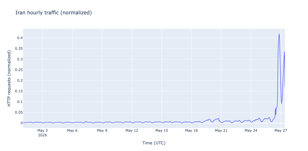
Our observations indicate that more traffic is now finally able to get through. Starting at around 11:00 UTC on May 26, 87 days after the second shutdown started, Cloudflare Radar observed a marked increase in both traffic and DNS queries.

Traffic increase

Data for bytes transferred across Cloudflare’s network shows a brief spike at 11:45 UTC, followed by a steady increase starting at 12:00 UTC. This surge in activity is roughly 15x than the levels observed during the prior week. Following expected diurnal patterns, the traffic starts declining around 21:00 UTC, followed by an increase starting at May 27 3:00 UTC (6:30 local time).

An increase in bytes transferred shows that a higher volume of data is successfully moving across Cloudflare’s network, which is a hopeful signal that a partial restoration is underway.

Traffic volume by region

Cloudflare Radar’s regional breakdowns, shown below, indicate that the vast majority of this new traffic is localized to Tehran, with 91.6% of HTTP requests originating from the capital city. While other regions show minor increases, they are not nearly as significant.

Traffic volume by network 

Following an initial burst at 11:45 UTC, Internet providers TCI, IranCell, RighTel and MCCI each saw increases in traffic. Cloudflare Radar measures this traffic by ASN, the unique identifier assigned to an individual network or group of networks. 

DNS query increase 

As shown in the graph below, queries to Cloudflare’s public DNS resolver (1.1.1.1) have also spiked. Because an increase in DNS traffic indicates that more users are requesting websites and services, this upward trend serves as a strong indicator that online access is returning.

Traffic has returned to 40% of previous levels

These increases in traffic validates that a partial restoration of Iran’s Internet has taken place. However, though these increases in DNS queries and traffic are significant, they remain well below what we observed prior to either disruption. As shown in the graph below, at its peak on May 26, traffic had only returned to 40% of the maximum amount of activity observed so far in 2026.


Network activity over the coming days will reveal whether traffic levels will successfully return to their pre-shutdown baselines. It should also be noted, however, that these changes could be temporary; as demonstrated in January, brief periods of recovery can quickly reverse.

IPv6 remains impacted

In January, we reported a near-complete loss of announced IPv6 address space that began several hours before the January 8 traffic drop. While a partial restoration of the country’s networks appears to be underway, the volume of announced IPv6 address space — and thus IPv6 traffic from Iran — remains effectively zero.

This is noteworthy because in contrast with IPv6, address space announcements for IPv4 have remained fairly consistent and stable throughout both major 2026 shutdowns in Iran. The fact that IPv4 addresses were not removed from global routing tables, combined with the complete loss of actual traffic, suggests that Iran’s shutdown was achieved through other technical means such as application filtering or whitelisting.

IPV6 address space dropped precipitously in January and has not returned to normal levels.

Amid both 2026 shutdowns, IPv4 address space has stayed relatively consistent.

Conclusion

Having spent the majority of 2026 offline, Iranian citizens face severe disruptions to their daily lives, making these early signs of traffic recovery a critical turning point. We will continue to closely monitor Internet connectivity in Iran and share our findings as the situation evolves.

You can explore more data on Internet connectivity in Iran and the rest of the world at Cloudflare Radar. And you can find our latest observations on X, Mastodon, and Bluesky.

Agents Week: network performance update

Post Syndicated from Lai Yi Ohlsen original https://blog.cloudflare.com/network-performance-agents-week/

When it comes to the Internet, performance is everything. Every millisecond shaved off a connection is a better experience for the real people using the applications and websites you build. That’s why, at Cloudflare, we measure our performance constantly and share updates on a regular basis. 

In our last performance post, published during Birthday Week 2025, we shared that Cloudflare was the fastest network in 40% of the largest 1,000 networks in the world. At the time, we noted a nuanced reading of that figure; we were competitive in many more networks, and the gaps were often notably small. But even so, we were not satisfied with 40%. By December 2025 (our most recent available analysis), we had become the fastest provider in 60% of the top networks. Here’s how we got there, and what it means.

How do we measure and compare network performance?

Before diving into the results, let’s review how we collect the data. We start with the 1,000 largest networks in the world by estimated population, using APNIC’s data as our source. These networks represent real users in nearly every geography, giving us a broad and meaningful picture of how Internet users experience the web.

To measure performance, we use TCP connection time, which is the time it takes for an end user’s device to complete a TCP handshake with the endpoint they’re trying to reach. We chose this metric because it most closely approximates what users actually perceive as “Internet speed.” It’s not so abstract that it ignores real-world constraints like congestion and distance, but it’s precise enough to give us actionable data. (We’ve previously written about why we favor this metric over alternatives.)

We calculate our rankings using the trimean of TCP connection times. The trimean is a weighted average of three values: the first quartile (25th percentile), the median (50th percentile), and the third quartile (75th percentile). This approach smooths out noise and outliers, giving us a cleaner signal about the typical user experience rather than an extreme case that might skew the picture.

To capture this data, we rely on Real User Measurements (RUM). When users encounter a Cloudflare-branded error page, a small speed test runs silently in the background. The browser retrieves small files from multiple providers including Cloudflare, Amazon CloudFront, Google, Fastly, and Akamai and records how long each exchange takes. This gives us performance data directly from the user’s browser, in their real-world network conditions. It’s the difference between testing a car’s top speed on a track versus watching how people actually drive on the highway. 

How did we improve? 

Historically we have shared how we’ve created new Cloudflare points of presence and reduced our end latency by simply getting more hardware closer to our users. Most recently, we deployed new locations in Constantine, Algeria; Malang, Indonesia; and Wroclaw, Poland. When we deployed our location in Wroclaw, our free users went from an average of 19ms round-trip time (RTT) to an average of 12ms round trip time (RTT), a 40% improvement. In Malang, Enterprise traffic went from a 39ms average RTT to a 37ms average RTT, a 5% improvement. Seeing our customers’ experience improve, even if only by a couple of milliseconds, is great. But adding new locations alone doesn’t fully explain how we went from being #1 in 40% of networks to #1 in 60% of networks.

The answer there has to do with improving how our network handles connections in software. By leveraging protocols like HTTP/3 and changing how we manage congestion windows, we can reduce processing time by milliseconds in code, in addition to the improvements on the wire. By improving CPU usage and memory usage in our software that handles fundamental actions like establishing connections, SSL/TLS termination, traffic management, and the core proxy that all requests flow through, we can make that software more efficient in its usage of resources across our global fleet of hardware. These ongoing efficiency gains result in better performance for you and your customers. 

Think of incoming connections to Cloudflare like toll booths on a highway. Lines can build up at toll booths if there aren’t enough toll booths, or if the booths themselves aren’t efficient at processing cars going through them. We’ve been constantly working to improve not only how our toll booths process incoming cars (the software improvements in connection handling), but also at improving how we send cars between available booths so that we can keep lines short and latency low.   

How do the results look today?

As we noted above, by December, Cloudflare had become the fastest provider in 60% of the top networks, up from 40% when we last reported. Since Birthday Week in September 2025 we have steadily increased the networks where we are the fastest. Let’s break down the impact.


This means that between September and December, we became the fastest in 40 additional countries and in 261 additional networks. We saw the biggest increase in the United States, where we are the fastest in 54 more ASNs.


On average throughout December, we were 6ms faster than the next-fastest provider. As shown above, the line representing Cloudflare’s latency, or connection time, is consistently lower throughout December than the next fastest provider.

A faster Internet is a better Internet

Every percentage point in our network ranking represents real users who are able to connect to their website or application that much faster because of Cloudflare. But we also know that 60% isn’t the ceiling. There are still networks where we’re number two, sometimes by the smallest of margins. We see those gaps clearly, and we’re working on them. We’re committed to being the fastest provider across every network in the world. 

Follow our blog for more performance updates as we continue to make the Internet faster.

How does Cloudflare’s Speed Test really work?

Post Syndicated from Lai Yi Ohlsen original https://blog.cloudflare.com/how-does-cloudflares-speed-test-really-work/

Anyone can say their Internet service is fast, but how do you really know if it is? Just as we check our temperature to see if a fever has gone down or test the air to know its quality, users of the Internet run speed tests to answer: “How fast is my connection?” Since it is common to talk about Internet connectivity in terms of “speed,” you might think this is a straightforward concept to measure, but there are actually many different ways to do so. For Cloudflare’s Speed Test, we set out to measure your connection’s quality and what it realistically provides, rather than focusing on peak bandwidth. In this blog post we’ll discuss how Cloudflare thinks about measuring Internet quality, how our own Cloudflare speed test works, and our future plans for providing Internet measurement tools that help everyone build a better Internet. 

What is a speed test? 

Before diving into Cloudflare’s speed test, let’s take a moment to understand what a speed test actually is. There’s no one definition of what Internet “speed” means, but what people are typically referring to is the measurement of throughput or the rate at which data is sent between sender and receiver within a network. Throughput is typically expressed in mega or gigabits per second (Mbps or Gbps), which are units that end users are usually familiar with, due to how commercial Internet Service Providers (ISPs) often market their packages (500 Mbps, 1 Gbps, increasingly 10 Gbps and so on). In light of this popular association, speed tests are typically designed to send data until the maximum throughput of a connection is met.

Most speed tests are run from end user devices such as laptops, mobile phones and sometimes routers, but where the test sends data to, meaning where the server is in the network, differs from test to test. These variances can impact results dramatically. For example, consider a user in New York City running one speed test that sends data to New Jersey, while another connects to a server in Singapore. Even if both tests use the exact same methodology, their results will differ noticeably due to the distance they have to travel and the network links they have to cross to get there. 

Server locations are one of many ways speed tests vary from one another. They may also differ in how the test decides to send more data, the number of TCP/UDP streams it opens to send data, which congestion control algorithm it uses, how it aggregates the samples it collects, etc. Each of these decisions influences what the end user sees as their final “speed”. It is also common for speed tests to measure latency, packet loss and sometimes latency variation (jitter), though as important as they are, and as we’ll discuss in more detail below, these metrics are not always intuitive for end users to understand. 

Speed tests gained popularity in the early days of the Internet, when bandwidth was the primary obstacle to a quality end user experience. But as the Internet has progressed and its use cases have expanded, bandwidth has become less of a limitation and, in some geographies, almost plentiful. Now, other challenges that can degrade your video calls or gaming sessions, such as latency under load (bufferbloat) and packet loss, have become the industry focus as key metrics to optimize when improving Internet connectivity. Nevertheless, speed tests remain a valuable tool for assessing Internet quality, in part because of their popularity with end users. Speed tests are by far the most well-known kind of Internet measurement and for that reason, Cloudflare is proud to provide one.

How does Cloudflare’s Speed Test work? 

When you visit Cloudflare’s Speed Test, results start appearing right away. That’s because as soon as the page loads, your browser begins sending data requests to Cloudflare’s Network Quality API and recording how long each exchange takes. The API runs on Cloudflare’s global network using Workers, leveraging our anycast architecture to automatically route you to the nearest data center.


Unlike many other speed test methodologies that focus on absolute maximum throughput, Cloudflare’s Speed Test doesn’t try to saturate your connection. Instead, it sends a series of data payloads of predefined sizes—what we call data blocks—to assess your connection’s quality under more realistic usage patterns. Each data block is transmitted a fixed number of times, and once the sequence completes, the detailed results are displayed in box-and-whisker plots to show the observed ranges and percentiles.

To generate each individual result, we record the time it takes to establish the connection and the time required for the data transfer to finish, subtracting any server “thinking time”. Establishing a connection involves exchanging individual packets back and forth and happens as quickly as network latency permits, while the data transfer time is limited by network bandwidth, congestion, server limits, and even the amount of data transferred—perhaps surprisingly, smaller transfers also have their throughput limited by network latency.

As throughput measurements run, the test also sends empty requests at regular intervals to measure loaded latency: the round-trip time (RTT) it takes for data to travel to Cloudflare’s network and back while your connection is busy. Loaded latency differs from idle latency, which measures RTT to Cloudflare’s network when no data is being transferred. Idle latency is recorded first, as soon as the page loads, and reflects the lowest expected latency. The test also measures loaded and idle jitter, the average variation between consecutive RTT measurements—reflecting network stability—and packet loss, the percentage of packets that fail to reach their destination when relayed through a WebRTC TURN server over a period of time.

Throughout the test, you can watch the aggregate results for each metric update in real time, but the final result isn’t calculated until all test sequences are complete. Once they are, the full set of measurements is used to compute an Aggregated Internet Measurement (AIM) score—a metric designed to translate your connection’s performance into end-user-friendly terms, such as how well it supports streaming, gaming, or video conferencing. The AIM score provides a convenient summary of overall performance, but in this deep dive, we’ll focus on what the detailed Cloudflare Speed Test results actually tell you—and what they don’t—about your Internet connection.

What do the Cloudflare Speed Test results represent? 

A defining feature of Cloudflare’s Speed Test is that it runs on Cloudflare’s own global network. Other speed test providers place their servers closer to end users or major exchange points to capture how the network performs under specific conditions. Cloudflare’s Speed Test, however—and any test built on our Network Quality API—measures performance in a context that mirrors what users actually do every day: accessing content delivered through Cloudflare’s network.

Additionally, since Cloudflare’s Speed Test does not strive to saturate a user’s connection, its download and upload tests do not technically measure maximum throughput, but rather the rate at which you can reliably expect to send various sizes of data. While this may seem like a small distinction, it means that Cloudflare’s Speed Test is not trying to show what your connection is capable of at its peak, but rather what it typically delivers—its quality.

Day to day, most users are not maximizing their available bandwidth. Video conferencing, streaming, web browsing, and even gaming all require minimal bandwidth and are much more sensitive to latency, jitter, and packet loss. In other words, achieving a high score on a throughput-saturating speed test—one that mirrors the service level you purchased from your ISP—does not necessarily equate to a high-quality online experience. The finer details of which metrics matter most for evaluating network quality depend on individual use cases. For example, a gamer might benefit more from lower latency (lower lag), while a remote worker may benefit more from lower jitter (smoother video conferencing). For the majority of modern use cases, throughput is just one of many metrics that contribute to a quality Internet connection

It’s also important to note that Cloudflare’s Speed Test runs primarily from an end-user device, within the browser. As a result, its measurements include potential bottlenecks beyond the access network—such as the browser itself, the local Wi-Fi network, and other factors. This means the results don’t solely reflect the performance of your ISP, but rather the combined performance of all components along the path to the content.

It’s common for end users to run speed tests to check whether they’re getting the Internet service they pay for. While that’s a perfectly reasonable question, there’s no standardized definition for how to answer it. This means that no speed test—including Cloudflare’s—is a definitive measure of ISP service. However, it is a helpful resource for assessing the quality of experience when accessing content delivered by Cloudflare’s vast global network.

How do I interpret my Cloudflare Speed Test results?

In this section, we’ll interpret the results from two speed test examples: the first test scoring “Great” on all three network quality rubrics, and the second scoring a mere “Average”. In your own tests, you may get a consistent score, or you may get different scores for video streaming, online gaming and video chatting, depending on how well-balanced your Internet connection is over these three use cases.

From these scores we already get a high-level interpretation of the test results. You can expect consistently good quality from the “Great” connection and reasonable quality with occasional glitches from the “Average” connection – but to understand why, we must look at the numbers.

Example 1: Wi-Fi over a residential fiber connection


This test ran from a laptop connected over Wi-Fi inside a single-family home served by a 500 Mbps residential fiber connection, and we can already see that we can’t quite reach the contracted download speed, topping off at 406 Mbps. The culprit here is Wi-Fi, which is usually the bottleneck on high-speed connections, and a common cause of observable instability.

But here we can see that we’re probably in an area of the house with good reception and without significant activity from neighboring Wi-Fi networks (the two most common causes of poor Wi-Fi). We can tell from the relatively consistent shape of the download and upload graphs, and from the low jitter.

The latency is well within what’s expected in an urban area (and could be 2 milliseconds lower by switching to a wired connection), and the difference between the numbers at idle and the numbers while loaded (downloading or uploading) is relatively small. This means you can expect to attend a video call while your files synchronize to and from your cloud drive of choice in the background, without any glitches. Large differences between the idle and loaded numbers are a common indicator of a poor connection—if you observe differences approaching 100 milliseconds or more over a wired connection, your ISP is likely at fault.

Higher-bandwidth connections should display lower idle to loaded latency differences. The higher the bandwidth, the less likely it is to be fully utilized in practice. However, congestion further upstream in the network can drive these numbers up, especially if your ISP is oversubscribing its capacity.

You might be wondering why the download and upload graphs start slow and ramp up. This happens because data transfers progressively send more packets at once for each required acknowledgment, starting by one acknowledgment for each packet. The consequence is that small data transfers are limited in speed by latency—the longer it takes for a packet to reach its destination, the longer it takes the acknowledgment packet to make its way back to the sender, and the longer it takes for the next data packet to be sent.

If you’re technically inclined, you may enjoy learning about congestion control algorithms, but that topic alone can fill entire books. For now, you can see this effect in the charts for each download size: transfers smaller than 10 MB can’t utilize the full bandwidth of this connection.


If you’re left wondering if this means that your normal day-to-day web browsing, composed primarily of relatively small data transfers, is mostly unable to fully utilize the available bandwidth above a certain level, then you have successfully grasped one of the reasons why pure speed is no longer the main indicator of quality of experience in modern broadband connections.

Example 2: Cellular 5G connection


The second test ran from the same laptop using a cellular 5G connection, and the results are very different. The speeds are much lower and inconsistent over time, the latency numbers are higher (especially under load), and the latency jitter is quite high.

From the download and upload speeds we can guess that we’re probably not in a densely populated area—in areas of dense 5G coverage you can expect higher speeds and lower latencies. On the other hand, in densely populated areas you can also expect more people to be using the network at the same time, driving speeds down and latencies up (due to congestion). From the detailed latency charts we can observe how irregular latencies are in this case, with some numbers above 100 milliseconds. 


Connection quality and convenience are often at odds with each other. The convenience of being able to access the Internet from anywhere in your house, or from a park or the beach, comes with quality tradeoffs. The Cloudflare Speed Test reports allows you to better understand those tradeoffs, compare your results against your peers or other available providers, and make more informed choices.

Why does Cloudflare provide a speed test?

Cloudflare provides its speed test to empower end users with greater insight into their connectivity and to help improve the Internet by offering transparency into how it performs. The engine that runs the test is open source, which means that anyone can use our speed test to facilitate their own research and can always verify how the results are produced. To enable researchers, policymakers, network operators, and other stakeholders to analyze Internet connectivity, all results from Cloudflare’s Speed Tests are published to Measurement Lab’s public Internet measurement dataset in BigQuery and are also accessible through Cloudflare’s Radar API. We share this data to advance open Internet research, but every result is anonymized to protect user privacy and is never used for commercial purposes.

What’s next for Cloudflare’s Speed Test? 

Originally developed in 2020, Cloudflare’s speed test has become a go-to resource for measuring end user network quality. In particular, we receive a lot of positive feedback about its easy-to-understand user interface and the metrics that it reports alongside throughput.

But at Cloudflare, we are always improving – so here’s what we’re planning to make Cloudflare’s speed test even better.

Increased Measurement

We’re continuing to expand the reach and scalability of Cloudflare’s Network Quality API to make it easier for third parties to integrate and use. Our goal is to empower customers to measure their users’ connectivity by utilizing Cloudflare’s network. We’re already proud to partner with UNICEF, which uses Cloudflare’s Speed Test as part of its Giga project to connect every school in the world to the Internet, and with Orb, which enables end users to continuously monitor the quality of their Internet connections from any platform or device using Cloudflare’s Network Quality API as part of its diagnostic measurement suite. Throughout 2026, we plan to significantly increase the number of third parties using our Speed Test and Network Quality API to power their own measurement tools and initiatives.

Additional Capabilities

To make the Speed Test more valuable for third parties, we’re also developing new capabilities that enable more detailed performance analysis. This includes support for higher throughput measurements—which, while not the sole indicator of connection quality, remain important for diagnosing network performance, especially in enterprise or shared-office environments where multiple users share the same connection. These enhancements will help make our platform a more comprehensive tool for understanding and improving network health.

Improved Diagnostics

Many users turn to speed tests not only to verify that they’re getting the service they’ve paid for, but also to diagnose connectivity issues. We want to make that diagnostic process even more effective. Our goal is to expose richer metrics and more advanced functionality to help users answer key questions, such as: Where’s the bottleneck? Is it within my local network or my ISP’s? Does this issue occur only with specific applications? Is it unique to me, or are others in my region experiencing it too? By providing deeper insight into these questions, we aim to make Cloudflare’s Speed Test a more powerful tool for understanding and improving real-world Internet performance.

Try It Now

Try running a Cloudflare Speed Test to test your connectivity today by visiting speed.cloudflare.com.

Network performance update: Birthday Week 2025

Post Syndicated from Lai Yi Ohlsen original https://blog.cloudflare.com/network-performance-update-birthday-week-2025/

We are committed to being the fastest network in the world because improvements in our performance translate to improvements for the own end users of your application. We are excited to share that Cloudflare continues to be the fastest network for the most peered networks in the world.

We relentlessly measure our own performance and our performance against peers. We publish those results routinely, starting with our first update in June 2021 and most recently with our last post in September 2024.

Today’s update breaks down where we have improved since our update last year and what our priorities are going into the next year. While we are excited to be the fastest in the greatest number of last-mile ISPs, we are never done improving and have more work to do.

How do we measure this metric, and what are the results?

We measure network performance by attempting to capture what the experience is like for Internet users across the globe. To do that we need to simulate what their connection is like from their last-mile ISP to our networks.

We start by taking the 1,000 largest networks in the world based on estimated population. We use that to give ourselves a representation of real users in nearly every geography.

We then measure performance itself with TCP connection time. TCP connection time is the time it takes for an end user to connect to the website or endpoint they are trying to reach. We chose this metric because we believe this most closely approximates what users perceive to be Internet speed, as opposed to other metrics which are either too scientific (ignoring real world challenges like congestion or distance) or too broad.

We take the trimean measurement of TCP connection times to calculate our metric. The trimean is a weighted average of three statistical values: the first quartile, the median, and the third quartile. This approach allows us to reduce some of the noise and outliers and get a comprehensive picture of quality.

For this year’s update, we examined the trimean of TCP connection times measured from August 6 to September 4, Cloudflare is the #1 provider in 40% of the top 1000 networks. In our September 2024 update, we shared that we were the #1 provider in 44% of the top 1000 networks.


The TCP Connection Time (Trimean) graph shows that we are the fastest TCP connection time in 383 networks, but that would make us the fastest in 38% of the top 1,000. We exclude networks that aren’t last-mile ISPs, such as transit networks, since they don’t reflect the end user experience, which brings the number of measured networks to 964 and makes Cloudflare the fastest in 40% of measured ISPs and the fastest across the top networks.

How do we capture this data? 

A Cloudflare-branded error page does more than just display an error; it kicks off a real-world speed test. Behind the scenes, on a selection of our error pages, we use Real User Measurements (RUM), which involves a browser retrieving a small file from multiple networks, including Cloudflare, Amazon CloudFront, Google, Fastly and Akamai.

Running these tests lets us gather performance data directly from the user’s perspective, providing a genuine comparison of different network speeds. We do this to understand where our network is fastest and, more importantly, where we can make further improvements. For a deeper dive into the technical details, the Speed Week blog post covers the full methodology.

By using RUM data, we track key metrics like TCP Connection Time, Time to First Byte (TTFB), and Time to Last Byte (TTLB). These are widely recognized, industry-standard metrics that allow us to objectively measure how quickly and efficiently a website loads for actual users. By monitoring these benchmarks, we can objectively compare our performance against other networks.

We specifically chose the top 1000 networks by estimated population from APNIC, excluding those that aren’t last-mile ISPs. Consistency is key: by analyzing the same group of networks in every cycle, we ensure our measurements and reporting remain reliable and directly comparable over time.

How do the results compare across countries?

The map below shows the fastest providers per country and Cloudflare is fastest in dozens of countries. 


The color coding is generated by grouping all the measurements we generate by which country the measurement originates from. Then we look at the trimean measurements for each provider to identify who is the fastest… Akamai was measured as well, but providers are only represented in the map if they ranked first in a country which Akamai does not anywhere in the world.

These slim margins mean that the fastest provider in a country is often determined by latency differences so small that the fastest provider is often only faster by less than 5%. As an example, let’s look at India, a country where we are currently the second-fastest provider.

India (IN)

Rank

Entity 

Connect Time (Trimean)

#1 Diff

#1

CloudFront

107 ms

#2

Cloudflare

113 ms

+4.81% (+5.16 ms)

#3

Google

117 ms

+8.74% (+9.39 ms)

#4 

Fastly

133 ms

+24% (+26 ms)

#5

Akamai

144 ms

+34% (+37 ms)

In India, Cloudflare is 5ms behind Cloudfront, the #1 provider (To put milliseconds into perspective, the average human eye blink lasts between 100ms and 400ms). The competition for the number one spot in many countries is fierce and often shifts day by day. For example, in Mexico on Tuesday, August 5th, Cloudflare was the second-fastest provider by 0.73 ms but then on Tuesday, August 12th, Cloudflare was the fastest provider by 3.72 ms. 

Mexico (MX)

Date

Rank

Entity 

Connect Time (Trimean)

#1 Diff

August 5, 2025

#1

CloudFront

116 ms

#2

Cloudflare

116 ms

+0.63% (+0.73 ms)

August 12, 2025

#1

Cloudflare

106 ms

#2

CloudFront

109 ms

+3.52% (+3.72 ms)

Because ranking reorderings are common, we also review country and network level rankings to evaluate and benchmark our performance. 

Focusing on where we are not the fastest yet

As mentioned above, in September 2024, Cloudflare was fastest in 44% of measured ISPs. These values can shift as providers constantly make improvements to their networks. One way we focus in on how we are prioritizing improving is to not just observe where we are not the fastest but to measure how far we are from the leader.

In these locations we tend to pace extremely close to the fastest provider, giving us an opportunity to capture the spot as we relentlessly improve. In networks where Cloudflare is 2nd, over 50% of those networks have a less than 5% difference (10ms or less) with the top provider.

Country

ASN

#1

Cloudflare Rank

#1 Diff (ms)

#1 Diff (%)

US

AS36352

Google

2

25 ms

32%

US

AS46475

Google

2

35 ms

29%

US

AS29802

Google

2

8.03 ms

21%

US

AS20473

Google

2

15 ms

13%

US

AS7018

CloudFront

2

23 ms

13%

US

AS4181

CloudFront

2

8.19 ms

11%

US

AS62240

Google

2

18 ms

9.77%

US

AS22773

CloudFront

2

12 ms

9.48%

US

AS6167

CloudFront

2

13 ms

7.55%

US

AS11427

Google

2

9.33 ms

5.27%

US

AS6614

CloudFront

2

6.68 ms

4.12%

US

AS4922

Google

2

3.38 ms

3.86%

US

AS11492

Fastly

2

3.73 ms

3.33%

US

AS11351

Google

2

5.14 ms

3.04%

US

AS396356

Google

2

4.12 ms

2.23%

US

AS212238

Google

2

3.42 ms

1.35%

US

AS20055

Fastly

2

1.22 ms

1.33%

US

AS40021

CloudFront

2

2.06 ms

0.91%

US

AS12271

Fastly

2

1.26 ms

0.89%

US

AS141039

CloudFront

2

1.26 ms

0.88%

In networks where Cloudflare is 3rd, 50% of those networks are less than a 10% difference with the top provider (10ms or less). Margins are small and suggest that in instances where Cloudflare isn’t number one across networks, we’re extremely close to our competitors and the top networks change day over day. 

Country

ASN

#1

Cloudflare Rank

#1 Diff (ms)

#1 Diff (%)

US

AS6461

Google

3

33 ms

39%

US

AS81

Fastly

3

43 ms

35%

US

AS14615

Google

3

24 ms

24%

US

AS13977

CloudFront

3

21 ms

19%

US

AS33363

Google

3

29 ms

18%

US

AS63949

Google

3

9.56 ms

14%

US

AS14593

Fastly

3

17 ms

13%

US

AS23089

CloudFront

3

7.4 ms

11%

US

AS16509

Fastly

3

10 ms

9.48%

US

AS209

CloudFront

3

9.69 ms

6.87%

US

AS27364

CloudFront

3

8.76 ms

6.61%

US

AS11404

CloudFront

3

6.11 ms

6.16%

US

AS46690

CloudFront

3

5.91 ms

5.43%

US

AS136787

CloudFront

3

8.23 ms

5.18%

US

AS6079

Fastly

3

5.45 ms

4.49%

US

AS5650

Google

3

3.91 ms

3.35%

Countries with an abundance of networks, like the United States, have a lot of noise we need to calibrate against. For example, the graph below represents the performance of all providers for a major ISP like AS701 (Verizon Business).

AS701 (Verizon Business) Connect Time (P95) between 2025-08-09 and 2025-09-09


In this chart, the “P95” value, or 95th percentile, refers to one point of a percentile distribution. The P95 shows the value below which 95% of the data points fall and is specifically good at helping identify the slowest or worst-case user experiences, such as those on poor networks or older devices. Additionally, we review the other numbers lower on the percentile chain in the table below, which tell us how performance varies across the full range of data. When we do so, the picture becomes more nuanced.

AS701 (Verizon Business) Provider Rankings for Connect Time at P95, P75 and P50

Rank

Entity 

Connect Time (P95)

Connect Time (P75)

Connect Time (P50)

#1

Fastly

128 ms

66 ms

48 ms

#2

Google

134 ms

72 ms

54 ms

#3

CloudFront

139 ms

67 ms

47 ms

#4 

Cloudflare

141 ms

68 ms

49 ms

#5

Akamai

160 ms

84 ms

61 ms

At the 95th percentile for AS701, Cloudflare ranks 4th but at the 75th and 50th, Cloudflare is only 2 milliseconds slower than the fastest provider. In other words, when reviewing more than one point along the distribution at the network level, Cloudflare is keeping up with the top providers for the less extreme samples. To capture these details, it’s important to look at the range of outcomes, not just one percentile.

To better reflect the full spectrum of user experiences, we started using the trimean in July 2025 to rank providers. This metric combines values from across the distribution of data – specifically the 75th, 50th and 25th percentiles – which gives a more balanced representation of overall performance, rather than only focusing on the extremes. Summarizing user experience with a single number is always challenging, but the trimean helps us compare providers in a way that better reflects how users actually experience the Internet.

Cloudflare is the fastest provider in 40% of networks in the majority of real-world conditions, not just in worst-case scenarios. Still, the 95th percentile remains key to understanding how performance holds up in challenging conditions and where other providers might fall behind in performance. When we review the 95th percentile across the same date range for all the networks, not just AS701, Cloudflare is fastest across roughly the same amount of networks but by 103 more networks than the next fastest provider. Being faster in such a wide margin of networks tells us that Cloudflare is particularly strong in the challenging, long-tail cases that other providers struggle with.


Our performance data shows that even when we are not the top-ranked provider, we remain exceptionally competitive, often trailing the leader by a mere handful of percentage points. Our strength at the 95th percentile also highlights our superior performance in the most challenging scenarios. Cloudflare’s ability to outperform other providers, in the worst-case, is a testament to the resilience and efficiency of our network.

Moving forward, we’ll continue to share multiple metrics and continue to make improvements to our network —and we’ll use this data to do it! Let’s talk about how. 

How does Cloudflare use this data to improve?

Cloudflare applies this data to identify regions and networks that need prioritization. If we are consistently slower than other providers in a network, we want to know why, so we can fix it.

For example, the graph below shows the 95th percentile of Connect Time for AS8966. Prior to June 13, 2025, our performance was suffering, and we were the slowest provider for the network. By referencing our own measurement data, we prioritized partner data centers in the region and almost immediately performance improved for users connecting through AS8966.

Cloudflare’s partner data centers consist of collaborations with local service providers who host Cloudflare’s equipment within their own facilities. This allows us to expand our network to new locations and get closer to users more quickly. In the case of AS8966, adding a new partner data center took us from being ranked last to ranked first and improved latency by roughly 150ms in one day. By using a data-driven approach, we made our network faster and most importantly, improved the end user experience.

TCP Connect Time (P95) for AS8966


What’s next?

We are always working to build a faster network and will continue sharing our process as we go. Our approach is straightforward: identify performance bottlenecks, implement fixes, and report the results. We believe in being transparent about our methods and are committed to a continuous cycle of improvement to achieve the best possible performance. Follow our blog for the latest performance updates as we continue to optimize our network and share our progress.