Post Syndicated from Lai Yi Ohlsen original https://blog.cloudflare.com/how-does-cloudflares-speed-test-really-work/
Anyone can say their Internet service is fast, but how do you really know if it is? Just as we check our temperature to see if a fever has gone down or test the air to know its quality, users of the Internet run speed tests to answer: “How fast is my connection?” Since it is common to talk about Internet connectivity in terms of “speed,” you might think this is a straightforward concept to measure, but there are actually many different ways to do so. For Cloudflare’s Speed Test, we set out to measure your connection’s quality and what it realistically provides, rather than focusing on peak bandwidth. In this blog post we’ll discuss how Cloudflare thinks about measuring Internet quality, how our own Cloudflare speed test works, and our future plans for providing Internet measurement tools that help everyone build a better Internet.
Before diving into Cloudflare’s speed test, let’s take a moment to understand what a speed test actually is. There’s no one definition of what Internet “speed” means, but what people are typically referring to is the measurement of throughput or the rate at which data is sent between sender and receiver within a network. Throughput is typically expressed in mega or gigabits per second (Mbps or Gbps), which are units that end users are usually familiar with, due to how commercial Internet Service Providers (ISPs) often market their packages (500 Mbps, 1 Gbps, increasingly 10 Gbps and so on). In light of this popular association, speed tests are typically designed to send data until the maximum throughput of a connection is met.
Most speed tests are run from end user devices such as laptops, mobile phones and sometimes routers, but where the test sends data to, meaning where the server is in the network, differs from test to test. These variances can impact results dramatically. For example, consider a user in New York City running one speed test that sends data to New Jersey, while another connects to a server in Singapore. Even if both tests use the exact same methodology, their results will differ noticeably due to the distance they have to travel and the network links they have to cross to get there.
Server locations are one of many ways speed tests vary from one another. They may also differ in how the test decides to send more data, the number of TCP/UDP streams it opens to send data, which congestion control algorithm it uses, how it aggregates the samples it collects, etc. Each of these decisions influences what the end user sees as their final “speed”. It is also common for speed tests to measure latency, packet loss and sometimes latency variation (jitter), though as important as they are, and as we’ll discuss in more detail below, these metrics are not always intuitive for end users to understand.
Speed tests gained popularity in the early days of the Internet, when bandwidth was the primary obstacle to a quality end user experience. But as the Internet has progressed and its use cases have expanded, bandwidth has become less of a limitation and, in some geographies, almost plentiful. Now, other challenges that can degrade your video calls or gaming sessions, such as latency under load (bufferbloat) and packet loss, have become the industry focus as key metrics to optimize when improving Internet connectivity. Nevertheless, speed tests remain a valuable tool for assessing Internet quality, in part because of their popularity with end users. Speed tests are by far the most well-known kind of Internet measurement and for that reason, Cloudflare is proud to provide one.
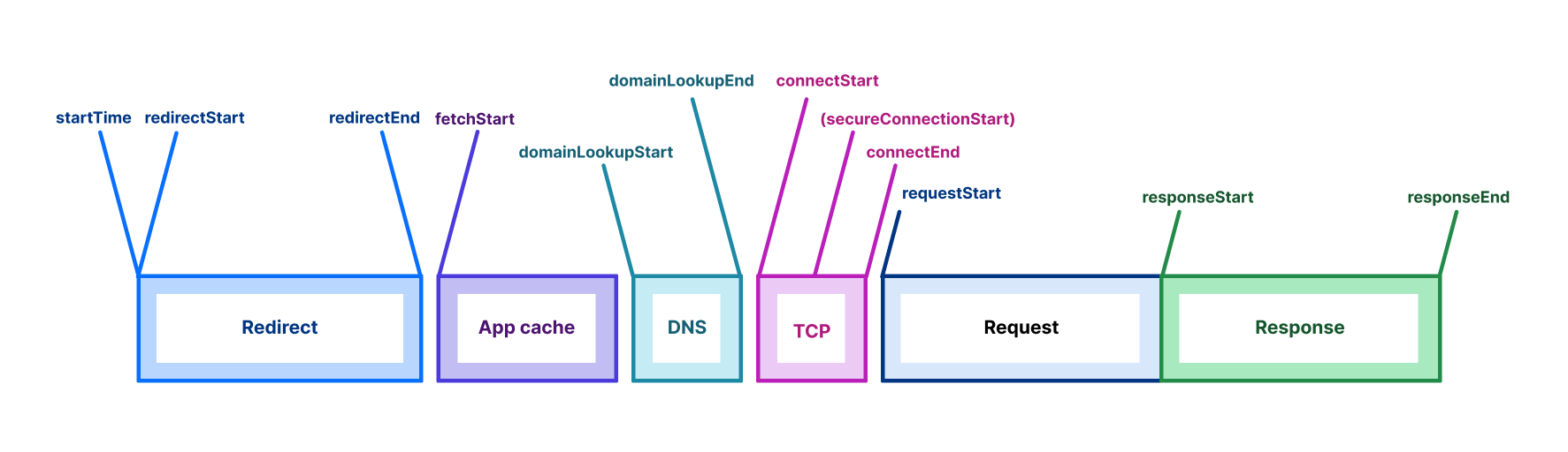
When you visit Cloudflare’s Speed Test, results start appearing right away. That’s because as soon as the page loads, your browser begins sending data requests to Cloudflare’s Network Quality API and recording how long each exchange takes. The API runs on Cloudflare’s global network using Workers, leveraging our anycast architecture to automatically route you to the nearest data center.

Unlike many other speed test methodologies that focus on absolute maximum throughput, Cloudflare’s Speed Test doesn’t try to saturate your connection. Instead, it sends a series of data payloads of predefined sizes—what we call data blocks—to assess your connection’s quality under more realistic usage patterns. Each data block is transmitted a fixed number of times, and once the sequence completes, the detailed results are displayed in box-and-whisker plots to show the observed ranges and percentiles.
To generate each individual result, we record the time it takes to establish the connection and the time required for the data transfer to finish, subtracting any server “thinking time”. Establishing a connection involves exchanging individual packets back and forth and happens as quickly as network latency permits, while the data transfer time is limited by network bandwidth, congestion, server limits, and even the amount of data transferred—perhaps surprisingly, smaller transfers also have their throughput limited by network latency.
As throughput measurements run, the test also sends empty requests at regular intervals to measure loaded latency: the round-trip time (RTT) it takes for data to travel to Cloudflare’s network and back while your connection is busy. Loaded latency differs from idle latency, which measures RTT to Cloudflare’s network when no data is being transferred. Idle latency is recorded first, as soon as the page loads, and reflects the lowest expected latency. The test also measures loaded and idle jitter, the average variation between consecutive RTT measurements—reflecting network stability—and packet loss, the percentage of packets that fail to reach their destination when relayed through a WebRTC TURN server over a period of time.
Throughout the test, you can watch the aggregate results for each metric update in real time, but the final result isn’t calculated until all test sequences are complete. Once they are, the full set of measurements is used to compute an Aggregated Internet Measurement (AIM) score—a metric designed to translate your connection’s performance into end-user-friendly terms, such as how well it supports streaming, gaming, or video conferencing. The AIM score provides a convenient summary of overall performance, but in this deep dive, we’ll focus on what the detailed Cloudflare Speed Test results actually tell you—and what they don’t—about your Internet connection.
A defining feature of Cloudflare’s Speed Test is that it runs on Cloudflare’s own global network. Other speed test providers place their servers closer to end users or major exchange points to capture how the network performs under specific conditions. Cloudflare’s Speed Test, however—and any test built on our Network Quality API—measures performance in a context that mirrors what users actually do every day: accessing content delivered through Cloudflare’s network.
Additionally, since Cloudflare’s Speed Test does not strive to saturate a user’s connection, its download and upload tests do not technically measure maximum throughput, but rather the rate at which you can reliably expect to send various sizes of data. While this may seem like a small distinction, it means that Cloudflare’s Speed Test is not trying to show what your connection is capable of at its peak, but rather what it typically delivers—its quality.
Day to day, most users are not maximizing their available bandwidth. Video conferencing, streaming, web browsing, and even gaming all require minimal bandwidth and are much more sensitive to latency, jitter, and packet loss. In other words, achieving a high score on a throughput-saturating speed test—one that mirrors the service level you purchased from your ISP—does not necessarily equate to a high-quality online experience. The finer details of which metrics matter most for evaluating network quality depend on individual use cases. For example, a gamer might benefit more from lower latency (lower lag), while a remote worker may benefit more from lower jitter (smoother video conferencing). For the majority of modern use cases, throughput is just one of many metrics that contribute to a quality Internet connection
It’s also important to note that Cloudflare’s Speed Test runs primarily from an end-user device, within the browser. As a result, its measurements include potential bottlenecks beyond the access network—such as the browser itself, the local Wi-Fi network, and other factors. This means the results don’t solely reflect the performance of your ISP, but rather the combined performance of all components along the path to the content.
It’s common for end users to run speed tests to check whether they’re getting the Internet service they pay for. While that’s a perfectly reasonable question, there’s no standardized definition for how to answer it. This means that no speed test—including Cloudflare’s—is a definitive measure of ISP service. However, it is a helpful resource for assessing the quality of experience when accessing content delivered by Cloudflare’s vast global network.
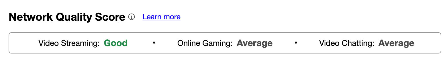
In this section, we’ll interpret the results from two speed test examples: the first test scoring “Great” on all three network quality rubrics, and the second scoring a mere “Average”. In your own tests, you may get a consistent score, or you may get different scores for video streaming, online gaming and video chatting, depending on how well-balanced your Internet connection is over these three use cases.
From these scores we already get a high-level interpretation of the test results. You can expect consistently good quality from the “Great” connection and reasonable quality with occasional glitches from the “Average” connection – but to understand why, we must look at the numbers.

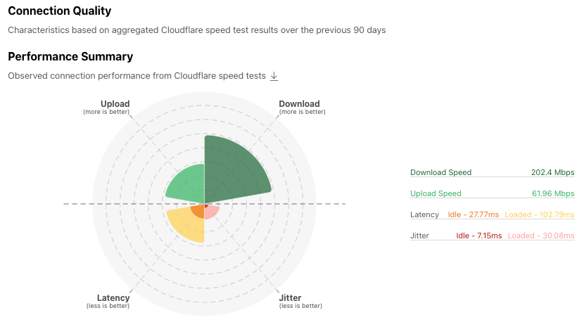
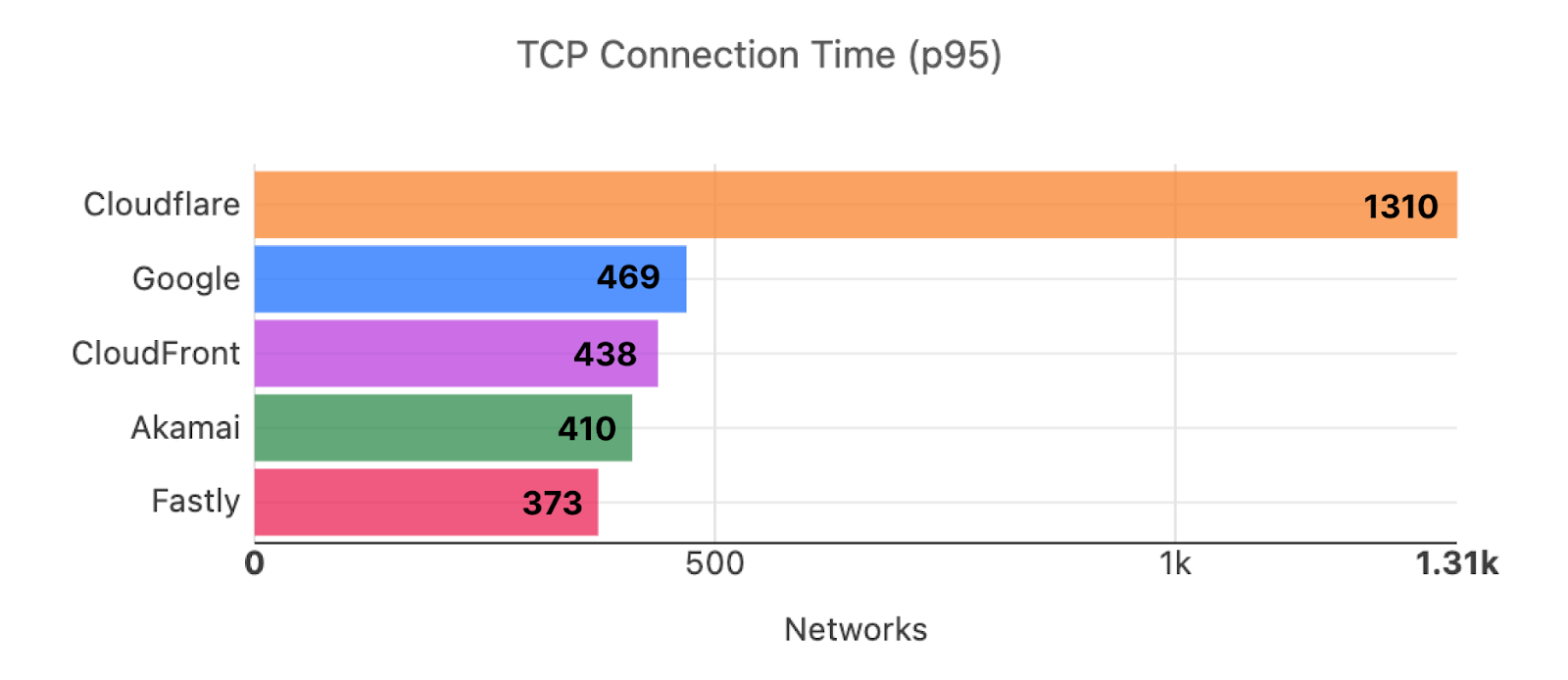
This test ran from a laptop connected over Wi-Fi inside a single-family home served by a 500 Mbps residential fiber connection, and we can already see that we can’t quite reach the contracted download speed, topping off at 406 Mbps. The culprit here is Wi-Fi, which is usually the bottleneck on high-speed connections, and a common cause of observable instability.
But here we can see that we’re probably in an area of the house with good reception and without significant activity from neighboring Wi-Fi networks (the two most common causes of poor Wi-Fi). We can tell from the relatively consistent shape of the download and upload graphs, and from the low jitter.
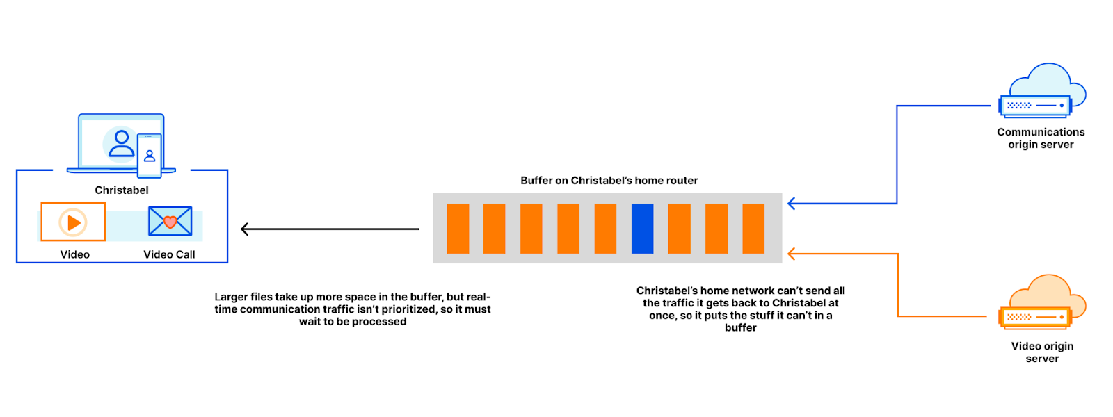
The latency is well within what’s expected in an urban area (and could be 2 milliseconds lower by switching to a wired connection), and the difference between the numbers at idle and the numbers while loaded (downloading or uploading) is relatively small. This means you can expect to attend a video call while your files synchronize to and from your cloud drive of choice in the background, without any glitches. Large differences between the idle and loaded numbers are a common indicator of a poor connection—if you observe differences approaching 100 milliseconds or more over a wired connection, your ISP is likely at fault.
Higher-bandwidth connections should display lower idle to loaded latency differences. The higher the bandwidth, the less likely it is to be fully utilized in practice. However, congestion further upstream in the network can drive these numbers up, especially if your ISP is oversubscribing its capacity.
You might be wondering why the download and upload graphs start slow and ramp up. This happens because data transfers progressively send more packets at once for each required acknowledgment, starting by one acknowledgment for each packet. The consequence is that small data transfers are limited in speed by latency—the longer it takes for a packet to reach its destination, the longer it takes the acknowledgment packet to make its way back to the sender, and the longer it takes for the next data packet to be sent.
If you’re technically inclined, you may enjoy learning about congestion control algorithms, but that topic alone can fill entire books. For now, you can see this effect in the charts for each download size: transfers smaller than 10 MB can’t utilize the full bandwidth of this connection.

If you’re left wondering if this means that your normal day-to-day web browsing, composed primarily of relatively small data transfers, is mostly unable to fully utilize the available bandwidth above a certain level, then you have successfully grasped one of the reasons why pure speed is no longer the main indicator of quality of experience in modern broadband connections.

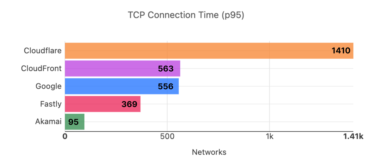
The second test ran from the same laptop using a cellular 5G connection, and the results are very different. The speeds are much lower and inconsistent over time, the latency numbers are higher (especially under load), and the latency jitter is quite high.
From the download and upload speeds we can guess that we’re probably not in a densely populated area—in areas of dense 5G coverage you can expect higher speeds and lower latencies. On the other hand, in densely populated areas you can also expect more people to be using the network at the same time, driving speeds down and latencies up (due to congestion). From the detailed latency charts we can observe how irregular latencies are in this case, with some numbers above 100 milliseconds.

Connection quality and convenience are often at odds with each other. The convenience of being able to access the Internet from anywhere in your house, or from a park or the beach, comes with quality tradeoffs. The Cloudflare Speed Test reports allows you to better understand those tradeoffs, compare your results against your peers or other available providers, and make more informed choices.
Cloudflare provides its speed test to empower end users with greater insight into their connectivity and to help improve the Internet by offering transparency into how it performs. The engine that runs the test is open source, which means that anyone can use our speed test to facilitate their own research and can always verify how the results are produced. To enable researchers, policymakers, network operators, and other stakeholders to analyze Internet connectivity, all results from Cloudflare’s Speed Tests are published to Measurement Lab’s public Internet measurement dataset in BigQuery and are also accessible through Cloudflare’s Radar API. We share this data to advance open Internet research, but every result is anonymized to protect user privacy and is never used for commercial purposes.
Originally developed in 2020, Cloudflare’s speed test has become a go-to resource for measuring end user network quality. In particular, we receive a lot of positive feedback about its easy-to-understand user interface and the metrics that it reports alongside throughput.
But at Cloudflare, we are always improving – so here’s what we’re planning to make Cloudflare’s speed test even better.
Increased Measurement
We’re continuing to expand the reach and scalability of Cloudflare’s Network Quality API to make it easier for third parties to integrate and use. Our goal is to empower customers to measure their users’ connectivity by utilizing Cloudflare’s network. We’re already proud to partner with UNICEF, which uses Cloudflare’s Speed Test as part of its Giga project to connect every school in the world to the Internet, and with Orb, which enables end users to continuously monitor the quality of their Internet connections from any platform or device using Cloudflare’s Network Quality API as part of its diagnostic measurement suite. Throughout 2026, we plan to significantly increase the number of third parties using our Speed Test and Network Quality API to power their own measurement tools and initiatives.
Additional Capabilities
To make the Speed Test more valuable for third parties, we’re also developing new capabilities that enable more detailed performance analysis. This includes support for higher throughput measurements—which, while not the sole indicator of connection quality, remain important for diagnosing network performance, especially in enterprise or shared-office environments where multiple users share the same connection. These enhancements will help make our platform a more comprehensive tool for understanding and improving network health.
Improved Diagnostics
Many users turn to speed tests not only to verify that they’re getting the service they’ve paid for, but also to diagnose connectivity issues. We want to make that diagnostic process even more effective. Our goal is to expose richer metrics and more advanced functionality to help users answer key questions, such as: Where’s the bottleneck? Is it within my local network or my ISP’s? Does this issue occur only with specific applications? Is it unique to me, or are others in my region experiencing it too? By providing deeper insight into these questions, we aim to make Cloudflare’s Speed Test a more powerful tool for understanding and improving real-world Internet performance.
Try running a Cloudflare Speed Test to test your connectivity today by visiting speed.cloudflare.com.