Tag Archives: Zabbix

What is Server Monitoring? Everything You Need to Know

Post Syndicated from Michael Kammer original https://blog.zabbix.com/what-is-server-monitoring-everything-you-need-to-know/26617/

Servers are the foundation of a company’s IT infrastructure, and the cost of server downtime can include anything from days without system access to the loss of important business data. This can lead to operational issues, service outages, and steep repair costs.

Viewed against this backdrop, server monitoring is an investment with massive benefits to any organization. The latest generation of server monitoring tools make it easier to assess server health and deal with any underlying issues as quickly and painlessly as possible.

What are servers, and how do they work?

Servers are computers (or applications) that run software services for other computers or devices on a network. The computer takes requests from the client computers or devices and performs tasks in response to the requests. These tasks can involve processing data, providing content, or performing calculations. Some servers are dedicated to hosting web services, which are software services offered on any computer connected to the internet.

What is server monitoring? Why does it matter?

Servers are some of the most important pieces of any company’s IT infrastructure. If a server is offline, running slowly, or experiencing outages, website performance will be affected and customers may decide to go elsewhere. If an internal file server is generating errors, important business data like accounting files or customer records could be compromised.

A server monitoring system is designed to watch your systems and provide a number of key metrics regarding their operation. In general, server monitoring software tests for accessibility (making sure that the server is alive and can be reached) and response time (guaranteeing that it is running fast enough to keep users happy). What’s more, it sends notifications about missing or corrupt files, security violations, and other issues.

Server monitoring is most often used for processing data in real time, but quality server monitoring is also predictive, letting users know when disks will reach capacity and whether memory or CPU utilization is about to be throttled. By evaluating historical data, it’s possible to find out if a server’s performance is degrading over time and even predict when a complete crash might occur.

How can server monitoring help businesses?

Here are a few of the most important business benefits of server monitoring:

Server monitoring tools give you a bird’s-eye view of your server’s health and performance

A quality server monitoring tool keeps IT administrators aware of metrics like CPU usage, RAM, disk space, and network bandwidth. This helps them to see when servers are slowing down or failing, allowing them to act before users are affected.

Server monitoring simplifies process automation

IT teams have long checklists when it comes to managing servers. They need to monitor hard disk space, keep an eye on infrastructure, schedule system backups, and update antivirus software. They also need to be able to foresee and solve critical events, while managing any disruptions.

A server monitoring tool helps IT professionals by automating all or many aspects of these jobs. It can show whether a backup was successful, if software is patched, and whether a server is in good condition. This allows IT teams to focus on tasks that benefit more from their involvement and expertise.

Server monitoring makes it easier to retain customers as well as employees

Acting quickly when servers develop issues (or even before) makes sure that employee workflows aren’t disrupted, allowing them to perform their duties, see results, and reach their goals. It also guarantees a positive customer experience by providing early notification of any issues.

Server monitoring keeps costs down

By automating processes and tasks (and freeing up time in the process) server monitoring systems make the most of resources and reduce costs. And by solving potential issues before they affect the organization, they help businesses avoid lost revenue from unfinished employee tasks, operational delays, and unfinished purchases.

What should you look for in a server monitoring solution?

Now that you’re sold on the benefits of server monitoring, you’ll want to choose the server monitoring solution that’s right for you. Here are a few capabilities to keep in mind:

Ease of use

Does the solution include an intuitive dashboard that makes it easy to monitor events and react to problems quickly? It should, and it should also allow you to make the most of the data it exports by providing graphs, reports, and integrations.

Customer support

Is it easy to contact support? How quickly do they respond? A quality server monitoring solution will provide a defined SLA and stick to it with no exceptions.

Breadth of coverage

A good solution will support all the server types (hardware, software, on-premises, cloud) that your enterprise uses. It should also be flexible enough to support any server types you may implement in the future.

Alert management

There are a few important questions to ask when it comes to alerts:

  • Does the solution include a dashboard or display that makes it easy to track events and react to problems quickly?
  • Is it easy to set up alerts via the configuration of thresholds that trigger them? How are alerts delivered?
  • Does the solution have a way to help you determine why a problem has occurred, instead of just telling you that something has gone wrong without context?

What are some best practices to keep in mind?

Here are a few best practices that will help you avoid the more common server monitoring pitfalls:

Proactively check for failures

Keep a sharp eye out for any issues that may affect your software or hardware. The tools included with a good monitoring solution can alert you to errors caused by a corrupted database (for example) and let you know if a security incident has left important services disabled.

Don’t forget your historical data

Server problems rarely occur in a vacuum, so look into the context of issues that emerge. You can do that by exploring metrics across a specific period, typically between 30 to 90 days. For example, you may find that CPU temperature has increased within the past week, which may suggest a problem with a server cooling system.

Operate your hardware in line with recommended tolerance levels

File servers are commonly pushed to the limit, rarely getting a break. That’s why it’s important to monitor metrics like CPU utilization, RAM utilization, storage capacity usage, and CPU temperature. Check these metrics regularly to identify issues before it’s too late.

Keep track of alerts

Always monitor your alerts in real time as they occur and explore reliable ways to manage and prioritize them. When escalating an incident, make sure it goes to the right individual as soon as possible.

Use server monitoring data to plan short-term cloud capacity

Server monitoring systems can help you plan the right computing power for specific moments. If services become slower or users experience other problems with performance, an IT manager can assess the situation through the server monitor. They’ll then be able to allocate extra resources to solve the problem.

Take advantage of capacity planning

Data center workloads have almost doubled in the past 5 years, and servers have had to keep up with this ongoing change. Analyzing long-term server utilization trends can prepare you for future server requirements.

Go beyond asset management

With server monitoring, you can discover which systems are approaching the end of their lives and whether any assets have disappeared from your network. You can also let your server monitoring tool handle the heavy lifting for you when it comes to tracking physical hardware.

The Zabbix Advantage

Zabbix is designed to make server monitoring easy. Our solution allows you to track any possible server performance metrics and incidents, including server performance, availability, and configuration changes.

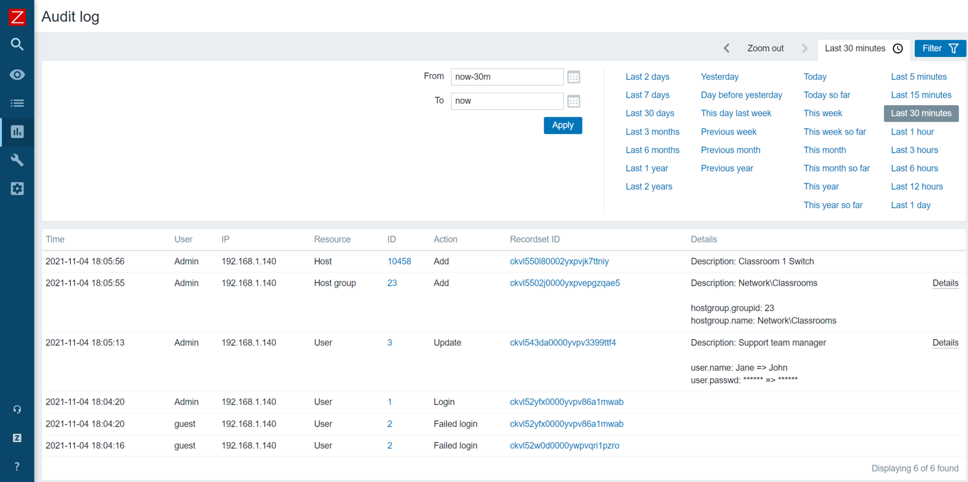
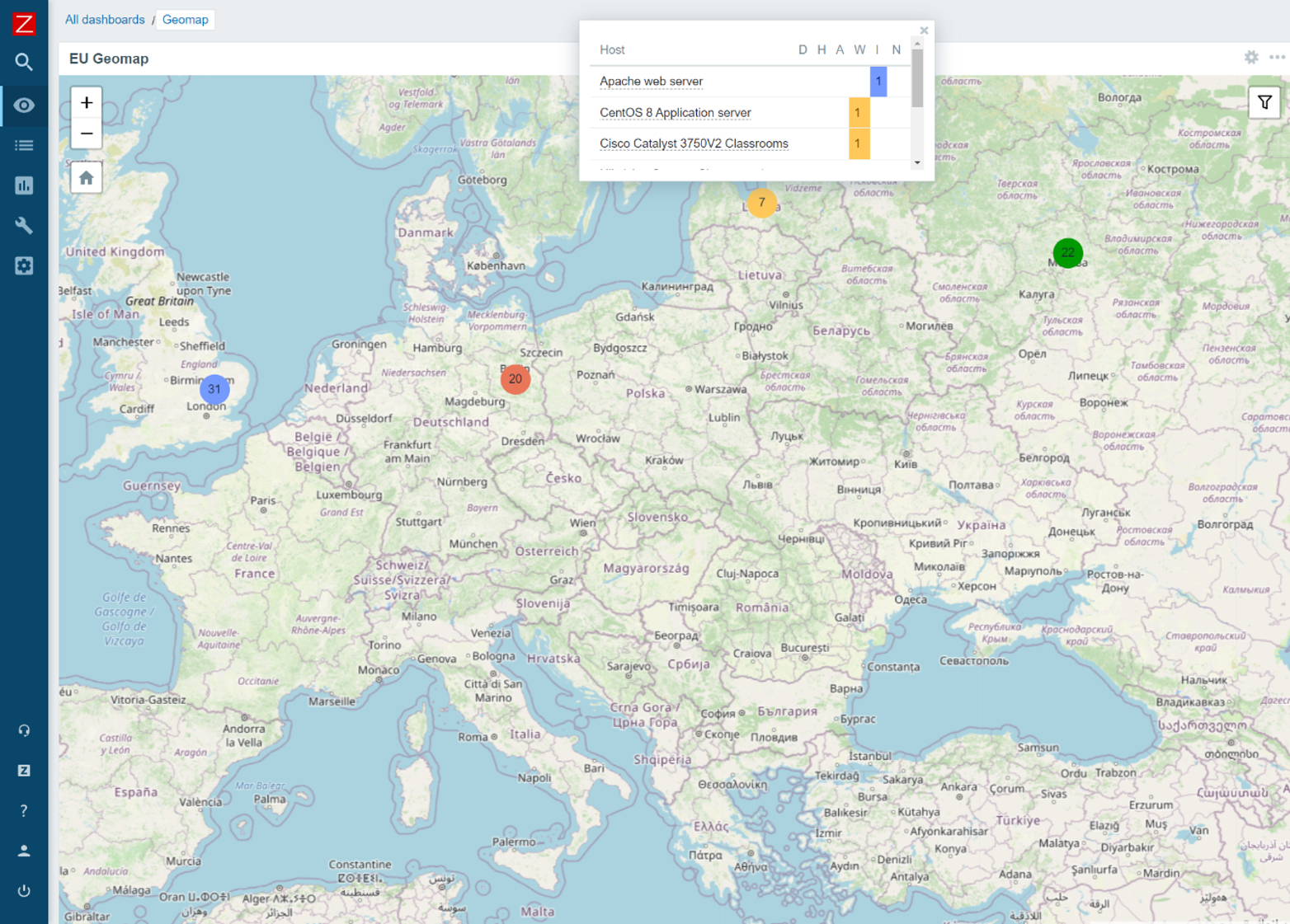
Intuitive dashboards, network graphs, and topology maps allow you to visualize server performance and availability, and our flexible alerting allows for multiple delivery methods and customized message content.

Not only that, our out-of-the-box templates come with preconfigured items, triggers, graphs, applications, screens, low-level discovery rules, and web scenarios – all designed to have you up and running in just a few minutes.

And because Zabbix is open-source, it’s not just affordable, it’s free. Contact us to find out more and enjoy the peace of mind that comes from knowing that your servers are under control.

FAQ

Why do we need server monitoring?

Server monitoring allows IT professionals to:

  • Monitor the responsiveness of a server
  • Know a server’s capacity, user load, and speed
  • Proactively detect and prevent any issues that might affect the server

Why do companies choose to monitor their servers?

Companies monitor servers so that they can:

  • Proactively identify any performance issues before they impact users
  • Understand a server’s system resource usage
  • Analyze a server for its reliability, availability, performance, security, etc.

How is server monitoring done?

Server monitoring tools constantly collect system data across an entire IT infrastructure, giving administrators a clear view of when certain metrics are above or below thresholds. They also automatically notify relevant parties if a critical system error is detected, allowing them to act in a timely manner to resolve issues.

What should you monitor on a server?

Key areas to monitor on a server include:

  • A server’s physical status
  • Server performance, including CPU utilization, memory resources, and disk activity
  • Server uptime
  • Page file usage
  • Context switches
  • Time synchronization
  • Process activity
  • Server capacity, user load, and speed

If I want to monitor a server, how easy is it to set things up?

Setting up a server monitoring tool is easy, provided you’ve taken into account these 5 steps:

  • Assess and create a monitoring plan
  • Discover how data can be collected
  • Define any and all metrics
  • Set up alerts
  • Have an established workflow

The post What is Server Monitoring? Everything You Need to Know appeared first on Zabbix Blog.

Zabbix in: exploratory data analysis rehearsal – Part 3

Post Syndicated from Paulo R. Deolindo Jr. original https://blog.zabbix.com/zabbix-in-exploratory-data-analysis-rehearsal-part-2-2/26266/

Abstract

This will be the last blog post of the “Zabbix in… exploratory data analysis rehearsal” series. To continue our initial proposal, we’ll close the third and fourth data distribution moments concept. This time, we’ll talk about Skewness and Kurtosis.

Remember the first and second articles of the series to be aware of what we are discussing here.

The four moments for a data distribution

While the first moment helps us with the location estimate for some data distribution, the second moment works with its variance. The third moment, called asymmetry, allows us to understand the value trends and the degree of the asymmetry. The fourth moment is called kurtosis and is about the probability of the peak’s existence (outliers).

These four moments are not the final study about the data distribution. There is so much to learn and apply to data science when considering statistical concepts, but for now we must finish the initial proposal and bring forward some insights for decision makers.

Let’s get started!

Asymmetry

Based on our web application scenario, we can see a certain asymmetry in response time in most cases. This is normal and expected – so far, no problems. But it is also true that some symmetry is also possible in certain cases. Again, no problems here.

So, where is the problem? When does it happen?

Sometimes, the web application response time can be too different from the previous one, and we have no control over it. In these cases, the outliers must be found, and the correct interpretation must be applied. At that point, we must consider anomalies in the environment. Sometimes, the outliers are just a deviation. In all cases, we must pay attention and monitor the metrics that can make the difference.

Speaking of asymmetry – why is this topic so special? One of the possible answers is that we need to understand the degree of the asymmetry – whether it is high or moderated and whether the values were in most cases smaller than or bigger than the mean or median. In other words, what does the asymmetry say about the web application performance?

Let’s check some implementations.

The key skewness

From version 6.0, Zabbix introduced the item key skewness.

For example, it can be used like this:

skewness(/host/key,1h) # the skewness for the last hour until now

Now, let’s see how this formula could be applied to our scenario:

skewness(//net.tcp.service.perf[http,”{HOST.CONN}”,”{$NGINX.STUB_STATUS.PORT}”],1h:now/h)

Using skewness and time shift “1h:now/h”, we are looking for some web application response time asymmetry at the previous hour.

The asymmetry can be negative (left skew), zero, positive (right skew) or undefined.

Definition: a left-skewed distribution is longer on the left side of its peak than on its right. In other words, a left-skewed distribution has a long tail on its left side.

Considering a left skew, it is possible to state that at the previous hour, the web application had more higher values than smaller values. This means that our web application does not perform as well as it should.

Look at the graph above. You can see some bars on the left side of the mean and other bars on the right side of the mean, with the same size as a mirror. We can consider this a normal distribution for web application response time, but it does not mean that the response times were good or bad – it only means that they had some balance and suggests more investigation.

Definition: a right-skewed distribution is longer on the right side of its peak than on its left. In other words, a right-skewed distribution has a long tail on its right side.

Considering a right skew, it is possible to state that at the previous hour, the web application had more smaller values than higher values. This means our web application performs as expected.

Value Map for Skewness

You must create in your template the following value map:

If you wish, the value map can also be as below:

“is greater than or equals”                                 0.1              à Mais tempos bons, se comparados à média

“equals”                                                               0               à Tempos de resposta simétricos ou bem distribuídos em bons e ruins

“is less than or equals”                                       0                à Mais tempos ruins, se comparados à média

Pearson Skewness Coefficient

The Pearson’s Coefficient is a very interesting indicator. Considering some skewness for a data distribution, it tells us if the asymmetry is strong or only moderate.

We can create a calculated item for the Pearson’s Coefficient:

(3*(avg-median))/stddevpop

In Zabbix, we need:

  • One item for the response time average considering the previous hour:
    • Key: resp.time.previous.hour
      • Formula: trendavg(//net.tcp.service.perf[http,”{HOST.CONN}”,”{$NGINX.STUB_STATUS.PORT}”],1h:now/h)
    • One item for calculating the median (for percentile, see the previous blog post):
      • Key: response.time.previous.hour
        • Formula: (last(//p51.previous.hour)+last(//p50.previous.hour))/2
      • One item for the standard deviation calculation:
        • Key:
          • Formula: response.time.previous.hour stddevpop(//net.tcp.service.perf[http,”{HOST.CONN}”,”{$NGINX.STUB_STATUS.PORT}”],1h:now/h)

Finally, a calculated item for a Pearson’s Coefficient:

  • Key: coefficient.requests.previous.hour
    • Formula:
      ((last(//trendavg.requests.per.minute)-
      last(//median.access.previous.hour))*3)
      /
      last(//stddevpop.requests.previous.hour)

To finish the exercise, create a value map:

Curtose

Kurtosis is the fourth data distribution and can indicate if the values are prone to peaks.

In Zabbix, you can implement or calculate kurtosis with other calculated items:

kurtosis(/host/key,1h)

Um valor negativo de curtose nos diz que a distribuição não está propensa ou produziu poucos outliers. Já um valor positivo de curtose nos diz que a distribuição está propensa ou produziu muitos outliers. Tudo gira em torno da média da distribuição de dados. Já um valor neutro, ou zero, nos diz que a distribuição é considerada simétrica.

Para nosso cenário web, temos:

kurtosis(//net.tcp.service.perf[http,”{HOST.CONN}”,”{$NGINX.STUB_STATUS.PORT}”],1h:now/h)

Explanatory Dashboard

Considering the image above, the data distribution for the web application response time at the previous hour has a left skew. This suggests that, when considering the response time mean at the previous hour, there were more higher values than smallest values. That’s sad – our web application performed poorly. Why?

However, because the skewness was moderated (considering the Pearson’s Coefficient), it means that the response time values were not so different from the others at the same hour.

As for kurtosis, we can say that the data distribution is prone to peaks because we have positive kurtosis. In basic statistics, the values are near the mean and there is a high probability of producing outliers.

This is a point to pay attention to if you are looking at a critical service.

Looking at other metrics

To check and validate our interpretation, let’s visualize the collected values on a simple Zabbix graph, using a graph widget.

Please consider using the following “time period” configuration:

The graph will show only the data collected at the previous hour – in this case, from 11:00 to 11:59.

The graph in Zabbix allows us to visualize the 50th percentile as well. We do not display the mean on the graph because it wouldn’t be well represented visually as it was collected only once, thus lacking an interesting visual trend line like the 50th percentile. However, notice that the mean and the 50th percentile values are very close, which will give us an idea of the data distribution around this measure.

Partial Conclusion

Skewness and Kurtosis, respectively, are the third and fourth moments of a data distribution. They help us understand the environment’s behavior and allow us to gain insight into a lot of things (in this case, we simply applied these concepts to IT infrastructure monitoring and focused on our web application to analyze its performance).

In most cases, the asymmetry will exist – it’s normal and expected. However, knowing some properties of the skewness can help us understand the response times, indicating good or poor performance. The skewness coefficient allows us to know if the asymmetry was strong or just moderated. Meanwhile, kurtosis helps us to understand if the data distribution produced some peaks considering an observation period or whether it is prone to produce peaks. We can then create some triggers for that and avoid some undesirable behaviors in the future, based on our data distribution observation. This is applied data science at its best.

Conclusion

Data science can be easily applied to (and bring up insights about) Zabbix and its Aggregate functions. It’s true that there are some special functions such as skewness, kurtosis, stddevpop, stddevsamp, mad, and so on, but there are old functions to help us too, such as percentile, forecast, timeleft, etc. All these functions must be used in calculated item formulas.

One of the interesting advantages of using Zabbix in data science and performing an exploratory data analysis is the fact that Zabbix can monitor everything. This means that the database already exists with the relevant date to analyze, in real time.

In the blog posts in this series, we took as a basis some data referring to the previous hour, the previous day, and so on, but we did nothing regarding the current hour. If we applied the concepts studied in real time data, we would have other “live” results, including support for decision-making. This is because we will not only study historical data, but instead will have the opportunity to change the course of events.

Zabbix is improving dashboards significantly. From Zabbix 6.4, we have many new out-of-the-box widgets and the possibility to create our own. However, there is a concern – Zabbix administrators sometimes show unnecessary data in dashboards, which can cloud the decision-making process. Zabbix administrators, in general, might want to learn storytelling techniques to rectify this situation. Maybe in a perfect world!

I hope you have enjoyed this blog post series.

Keep studying!


The post Zabbix in: exploratory data analysis rehearsal – Part 3 appeared first on Zabbix Blog.

Zabbix in: exploratory data analysis rehearsal – Part 2

Post Syndicated from Paulo R. Deolindo Jr. original https://blog.zabbix.com/zabbix-in-exploratory-data-analysis-rehearsal-part-2/26151/

Abstract

In the previous blog post, we just explored some of the basic statistic concepts to estimate KPIs for a web application response time: in that case, average, median and percentile. Additionally, we improved the nginx out-of-the-box template and showed some results in simple dashboards. Now we must continue our work but this time, analyzing some variances of the collected metrics, considering a certain period.

Please, read the previous blog post to understand the context in a better way. I wish you a good reading.

A little about basic statistic

In basic statistic, a data distribution has at least four moments:

  • Location estimate
  • Variance
  • Skewness
  • Kurtosis

In the previous blog post, we introduced the 1st moment, knowing some estimates of our data distribution. It means that we have analyzed some values of our web application response time. It reveals that the response time can have minimum and maximum values, average, a value that can represent a central value of the distribution and so on. Some metrics, such as average, can be influenced by outliers, but other metrics do not, such as 50th percentile or median. To conclude, now we know something about the variance of those values, but it isn’t enough. Let’s check the 2nd moment of the data distribution: Variance.

Variance

So, we have some notion about the variance of the web application response time, meaning that it can have some asymmetry (in most cases) and we also know that some KPIs must be considered but, which of them?

In exploratory data analysis, we can discover some key metrics but, in most cases, we won’t use all of them, so we have to know each one’s relevance to choose properly which metric can represent the reality of our scenario.

Yes! There are some cases when some metrics must be added to other metrics so that they make sense otherwise, we can discard them: we must create and understand the context for all those metrics.

Let’s check some concepts of the variance:

  • Variance
  • Standard deviation
  • Median absolute deviation (MAD)
  • Amplitude
  • IQR – Interquartile range

Amplitude

This concept is simple and its formula too: it is the difference between the maximum and the minimum value in a data distribution. In this case, we are talking about data distribution at the previous hour (,1h:now/h). We are interested in knowing the range of variation in response times in that period.

Let’s create a Calculated item to Amplitude metric in “Nginx by HTTP modified” template.

  • trendmax(//net.tcp.service.perf[http,”{HOST.CONN}”,”{$NGINX.STUB_STATUS.PORT}”],1h:now/h)
  • trendmin(//net.tcp.service.perf[http,”{HOST.CONN}”,”{$NGINX.STUB_STATUS.PORT}”],1h:now/h)

In other terms, it could be:

  • max(/host/key)-min(/host/key)

However, we are analysing a data distribution based on the previous hour, so…

  • trendmax(/host/key,1h:now/h)-trendmin(/host/key,1h:now/h)

Modifying our dashboard, we’ll see something like this:


This result interpretation could be: between the worst and the best response times, the variance is too small. It means, during that hour the response times had no significant differences.

However, amplitude itself is not enough to get some web application diagnosis at that moment. It’s necessary to combine this result with other results and we’ll see how to do it.

To complement, we can create some triggers based on it:

  • Fire if the response time amplitude was bigger than 5 seconds at the previous hour. It means that the web application did not perform as expected considering the web application requests.
    • Expression = last(/Nginx by HTTP modified/amplitude.previous.hour)>5
    • Level = Information
  • Fire if the response time amplitude reaches 5 seconds at least 3 consecutive times. It means at the last 3 hours, there was too much variance among the web application response times and it is not the expected.
    • Expression = max(/Nginx by HTTP modified/amplitude.previous.hour,#3)>5
    • Level = Warning

Remember, we are evaluating the previous hour and it makes no sense to generate this metric every single minute. Let’s create a Custom interval period for it.


By doing it, we are avoiding flapping on triggers environment.

IQR – Interquartile range

Consider these values below:

3, 5, 2, 1, 3, 3, 2, 6, 7, 8, 6, 7, 6

Open the shell environment. Create the file “vaules.txt” and insert each one, one per line. Now, read the file:

# cat values.txt

3
5
2
1
3
3
2
6
7
8
6
7
6

Now, send the value to Zabbix using Zabbix sender:

# for x in `cat values.txt`; do zabbix_sender -z 127.0.0.1 -s “Web server A” -k input.values -o $x; done

Look at the historical data using Zabbix frontend.


Now, let’s create some Calculated items to 75th  percentile and 25th  percentile.

  • Key: iqr.test.75
    Formula: percentile(//input.values,#13,75)
    Type: Numeric (float)
  • Key: iqr.test.25
    Formula: percentile(//input.values,#13,25)
    Type: Numeric (float)

If we apply it on a Linux terminal the command “sort values.txt”, we’ll get the same values ordered by size. Let’s check:

# sort values.txt


We’ll use the same concept here.

From the left to the right, go to the 25th percentile. You will get the number 3.

Do it again, but this time go to the 50th percentile. You will get the number 5.

And again, go to the 75th percentile. You will get the number 6.

The IQR is the difference between the 75th percentile (Q3) and the 25th percentile (Q1). So, we are excluding the outliers (the smallest values on the left and the biggest values on the right).

To calculate the IQR, you can create the following Calculate item:

  • key: iqr.test
    Formula: last(//iqr.test.75)-last(//iqr.test.25)

Now, we’ll apply this concept in Web Application Response Time.

The Calculated Item for the 75th percentile:

key: percentile.75.response.time.previous.hour
Formula: percentile(//net.tcp.service.perf[http,”{HOST.CONN}”,”{$NGINX.STUB_STATUS.PORT}”],1h:now/h,75)

The Calculated item for the 25th percentile:

key: percentile.25.response.time.previous.hour
Formula: percentile(//net.tcp.service.perf[http,”{HOST.CONN}”,”{$NGINX.STUB_STATUS.PORT}”],1h:now/h,25)

The Calculate item for the IQR:

key: iqr.response.time.previous.hour
Formula: last(//percentile.75.response.time.previous.hour)-last(//percentile.25.response.time.previous.hour)

Keep the monitoring schedule at the 1st minute for each hour, to avoid repetition (it’s very important) and adjust the dashboard.

Considering the worst web response time and the best web response time at the previous hour, the AMPLITUDE returns a big value in comparison to the IQR and it happens because the outliers were discarded in IQR calculation. So, just as the mean is a location estimate that is influenced by outliers and the median is not, so are the RANGE and IQR. The IQR is a robust indicator and allows us to know the difference between the web response time variance in a central position.

P.S.: we are considering only the previous hour, however, you can apply the IQR concept to an entire period, such as the previous day, or the previous week, the previous month and so on, using the correct time shift notation. You can use it to compare the web application response time variance between the periods you wish to observe and then, get some insights about the web application behavior at different times and situations.

Variance

The variance is a way to calculate the dispersion of data, considering its average. In Zabbix, calculating the variance is simple, since there is a specific formula for that, through a Calculated item.

The formula is the following:

  • Key: varpop.response.time.previous.hour
    Formula: varpop(//net.tcp.service.perf[http,”{HOST.CONN}”,”{$NGINX.STUB_STATUS.PORT}”],1h:now/h)

In this case, the formula returns the dispersion of data, however, there is a characteristic: at some point, the data is squared and then, the data scale changes.

Let’s check the steps for calculating the variance of the data:

1st) Calculate the mean;
2nd) Subtract the mean of each value;
3rd) Square each subtraction result;
4th) Perform the sum of all squares;
5th) Divide the result of the sum by the total observations.

At the 3rd step, we have the scale change. This new data can be used to other calculations in the future.

Standard Deviation

The root square of the variance.

Calculating the root square of the variance, the data can come back to its original scale!

There are at least two ways to do it:

  1. Using the root square key and formula in Zabbix:
    1. Key: varpop.previous.hour
    2. Formula: sqrt(last(//varpop.response.time.previous.hour))
  2. Using the standard deviation key and formula in Zabbix:
    1. Key:previous.hour
    2. Formula: stddevpop(//host,key,1h:now/h) # an example for the previous hour

A simple way to understand the standard deviation concept is: a way of knowing how “far” values are from the average. So, applying the specific formula, we’ll get that indicator.

Look at this:

The image above is a common image that can be found on the Internet, and it can help us understand some results. The standard deviation value must be near “zero”, otherwise, we’ll have serious deviations.

Let’s check the following Calculated item:

  • stddevpop(//net.tcp.service.perf[http,”{HOST.CONN}”,”{$NGINX.STUB_STATUS.PORT}”],1h:now/h)

We are calculating the standard deviation based on the collected values at the previous hour. Let’s check the Test item on the frontend:

The test returned some value less than 1, at about 0.000446. If this value is less than 1, we don’t have a complete deviation and it means that the collected values at the previous hour are near the average.

For a web application response time, it can represent a good behavior, with no significant variances and as expected, off course, other indicators must be checked to a complete and reliable diagnosis.

Important notes about standard deviation:

  • Sensitive to outliers
  • Can be calculated based on the population of a data distribution or based on its sample.
    • Using this formula: stddevsamp. In this case, it can return a different value from the the previous one.

Median Absolute Deviation (MAD)

While the Standard Deviation is a simple way to understand if the data of a distribution are far from its mean, MAD help us understand if these values are far from its median. So, MAD can be considered a robust estimate, because is not sensitive to outliers.

Warning: If you need to identify outliers or consider them in your analysis, the MAD function is not recommended, because it ignores them.

Let’s check our dashboard and compare different deviation calculations for the same data distribution:

Note that the last one is based on MAD function, and it is less than the other items, just because it is not considering outliers.

In this particular case, the web application is stable, and its response times are near to the mean or median (considering the MAD algorithm).

Exploratory Dashboard

Partial conclusion

In this post, we have just introduced the data distribution moments, presenting the variability or variance concept and then, we learned some techniques to achieve some KPIs or indicators.

What do we know? The response time for a web application can be different from the previous one and so on, so the knowledge of the variance can help us understand about the application behaviors using some extraordinary data. Then, we can decide if an application had a good or poor performance, for example.

Of course, it was a didactic example for some data distribution and the location estimate and variance concepts can be applied to other data exploratory analysis considering a long period, such as days, weeks, months, years, and so on. In those case, is very important consider using trends instead of history data.

Our goal is bringing to the light some extraordinary data and insights, instead of common data, allow us knowing better our application.

In the next posts, we’ll talk about Skewness and Kurtosis, the 3rd and 4th moments for a data distribution, respectively.

The post Zabbix in: exploratory data analysis rehearsal – Part 2 appeared first on Zabbix Blog.

Zabbix in: exploratory data analysis rehearsal – Part 1

Post Syndicated from Paulo R. Deolindo Jr. original https://blog.zabbix.com/zabbix-in-exploratory-data-analysis-rehearsal-part-1/25802/

Abstract

Imagine your happiness when you start a new enterprise device and application monitoring project using Zabbix[i]. Indeed, doing this is so easy that the first results bring up a lot of satisfaction very quickly. For example, when you apply a specific template [ii]in a specific host and the data comes (like magic) and you can create some dashboards with these data and visualize then.

If you haven’t done this yet, you must try it as soon as possible. You can create a web server host using both Apache or Nginx web services, applying the appropriate template and getting metrics by HTTP checks: “Apache by HTTP” template or “Nginx by HTTP” template. You will see interesting metrics being collected and you will be able to create and view some graphs or dashboards. But the work is not finished yet, because using Zabbix, you can do much more!

In this article, I’ll talk about how we can think of new metrics, new use cases, how to support our business and help the company with important results and insights using exploratory data analysis introducing and implementing some data science concepts using only Zabbix.

What is our goal?

Testing and learning some new Zabbix functions introduced from 6.0 version, compare some results and discuss insights.

Contextualizing

Let’s keep the focus on the web server metrics. However, all the results of this study can be used later in different scenarios.

The web server runs nginx version 1.18.0 and we are using “Nginx by HTTP” template to collect the following metrics:

  • HTTP agent master item: get_stub_status
  • Dependent items[i]:

Nginx: Connections accepted per second

Nginx: Connections active

Nginx: Connections dropped per second

Nginx: Connections handled per second

Nginx: Connections reading

Nginx: Connections waiting

Nginx: Connections writing

Nginx: Requests per second

Nginx: Requests total

Nginx: Version

  • Simple check items:

Nginx: Service response time

Nginx: Service status


That are the possibilities at the moment and below we have a simple dashboard created to view the initial results:

All widgets are reflecting metrics collected by using out-of-the-box “Nginx by HTTP” template.

Despite being Zabbix specialist and having some knowledge about our monitored application, there are some questions we need to ask ourselves. These questions do not need to be exhaustive, but they are relevant for our exercise. So, let’s jump to the next topic.

Generating new metrics! Bringing up some thoughts!

Let’s think about the collected metrics in the beginning of this monitoring project:

  1. Why the does number of requests only increase?
  2. When did we have more or fewer connections, considering for example, the last hour?
  3. What’s the percentage change comparing the current hour with the previous one?
  4. Which value can be representing the best or the worst response time performance?
  5. Considering some collected values, can we predict an application downtime?
  6. Can we detect anomalies in the application based on the amount of collected values and application behavior?
  7. How to stablish a baseline? Is it possible?

These are some questions we need to answer using this article and the next ones to come.

Generating new metrics

1st step: Let’s create a new template. From “nginx by HTTP”, clone it and change its name to “Nginx by HTTP modified”;

2nd step: Modify the “Nginx: Requests total” item, adding a new pre-processing step: “Simple change”. It will look like the image below:

It’s a Dependent item from the Master item “Nginx: Get stub status page” and the last one is based on HTTP agent to retrieve the main metric. So, if the number of the total connections always increase, the current value will be decreased from the last collected value. A simple mathematical operation: subtraction. And then, from this moment on we’ll have the number of new connections per minute.

The formula for the “Simple change” pre-processing step can be represented using the following images:

I also suggest you change the name of the item to: “Nginx: Requests at last minute”.

I can add some Tags[i] too. These tags can be used in the future to filter the views and so on.

Same metrics variations

With the modified nginx template we can retrieve how many new connections our web application receives per minute and then, we can create new metrics from the previous one. Using Zabbix timeshift[i] [ii]function, we can create metrics such as the number of connections:

  • At the last hour
  • Today so far and Yesterday
  • This week and at the previous week
  • This month and the previous month
  • This year and at the previous year
  • Etc

This exercise can be very interesting. Let’s create some Calculated items with the following formulas:

sum(//nginx.requests.total,1h:now/h)                                                    # Somatório de novas conexões na hora anterior

sum(//nginx.requests.total,1h:now/h+1h)                                              # Somatório de novas conexões da hora atual

In Zabbix official documentation we have lots of examples to creating Calculated items using “time shift” parameter. Please, see this link.

Improving our dashboard

Using the new metrics, we can improve our dashboard and enhance the data visualization. Briefly:

The same framework could be used to show the daily, weekly, monthly and yearly data, depending on your business rule, of course. Please, be patient because some items will have some delay in collecting operation (monthly, yearly, etc).

Basic statistics metrics using Zabbix

As we know, it is perfectly possible to generate some statistics values with Zabbix by using Calculated items. However, there are questions that can guide us to other thoughts and some answers will come in format of metrics, again.

  1. Today, which response time was the best?
  2. And if we think about the worst response time?
  3. And about the average?

We can start with these basic statistics and then, growing up latter.

All data in dashboard above were retrieved using simple Zabbix functions.


The best response time today so far.

min(//net.tcp.service.perf[http,”{HOST.CONN}”,”{$NGINX.STUB_STATUS.PORT}”],1d:now/d+1d)

The worst response time today so far.

max(//net.tcp.service.perf[http,”{HOST.CONN}”,”{$NGINX.STUB_STATUS.PORT}”],1d:now/d+1d)

The average of the response time today so far.

avg(//net.tcp.service.perf[http,”{HOST.CONN}”,”{$NGINX.STUB_STATUS.PORT}”],1d:now/d+1d)


It’s ok. Nothing is new, so far. But let’s check some thoughts.

Why we are Looking for the best, the worst and the average using min, max e avg functions, instead of  trendmin, trendmax e trendavg functions? The Trend-based functions retrieve data from trends tables, while History-based functions calculates in “real time”. If you wish to use History-based functions to calculate something in a short period, ok. But if you wish to use it to calculate some values considering a long period such as month or year… hum! It can be complicated, and it can take a lot of resources of your infrastructure power.

We need to remember an important thing: to use Trend-based functions, we must consider only data retrieved until the last full hour, because we have to consider the trend-cache sync process.

Look at the dashboard below, this time, using Trend-based Functions for the statistics.

Look at the current results. Basically, they are the same. There aren’t so many differences and, I guess, using it’s an intelligent way to retrieve the desired values.

Insights

If a response time is too short such as 0.06766 (the best of the day) and another value is too big and is representing the worst response time, such as 3.1017, can you imagine which and how many values exist between then?

How to calculate de average? You know: the sum of all collected values within a period, divided by the number of values.

So far, so good. The avg or trendavg functions can retrieve this average based on the desired period. However, if you look at the graph above, you will see some “peaks” in certain periods. These “peaks” are called “outliers”. The outliers are influencers of the average.

The outliers are important but because it exists, the average sometimes may not represent the reality. Think about this: a response time of the web application having stayed between 0.0600 and 0.0777 at the previous hour. During a specific minute within the same monitored period, for some reason, the response time was 3.0123. In this case, the average will increase. But, what if we discard the outlier? Obviously, the average will be as expected. In this case, the outlier was a deviation, “an error in the matrix”. So, we need to be able to calculate de average or other estimative location for our values, without the outlier.

And we cannot forget: if we are looking for anomalies based on the web application response time, we need to consider the outliers. If not, I guess, outliers can be removed on the calculation for now.

Ok! Outliers can influence the common average. So, how can we calculate something without the outliers?

Introduction to Median

About data timeline, we can affirm that the database is respecting the collected timestamp. Look at the collected data below:

2023-04-06 16:24:50 1680809090 0.06977
2023-04-06 16:23:50 1680809030 0.06981
2023-04-06 16:22:50 1680808970 0.07046
2023-04-06 16:21:50 1680808910 0.0694
2023-04-06 16:20:50 1680808850 0.06837
2023-04-06 16:19:50 1680808790 0.06941
2023-04-06 16:18:53 1680808733 3.1101
2023-04-06 16:17:51 1680808671 0.06942
2023-04-06 16:16:50 1680808610 0.07015
2023-04-06 16:15:50 1680808550 0.06971
2023-04-06 16:14:50 1680808490 0.07029

For the average, the timestamp or the collected order will not be important. However, if we ignore its timestamp and order the values from smallest to biggest, we’ll get something like this:

0.06837 0.0694 0.06941 0.06942 0.06971 0.06977 0.06981 0.07015 0.07029 0.07046 3.1101

Table 1.0 – 11 collected values, ordered by from smallest to biggest

In this case, the values are ordered by from the smallest one to the biggest one, ignoring their timestamp.

Look at the outlier at the end. It’s not important for us right now.

The timeline has an odd number of values and the value in green, is the central value. The Median. And what if it was an even number of values? How could we calculate the median? There is a formula for it.

0.0694 0.06941 0.06942 0.06971 0.06977 0.06981 0.07015 0.07029 0.07046 3.1101

Table 2.0 – 10 collected values, ordered by from smallest to biggest

Now, we have two groups of values. There is not a central position.

This time, we can use the median formula (in general): Calculate de average for the last value for the “Group A” and the first value for the “Group B”. Look at the timeline below and the values in green and orange colors.

Percentile in Zabbix

Despite considering the concept of median, we can also use the percentile calculation.

In most of cases, the median has a synonymous: “50th percentile”.

I’m proposing you an exercise:


1. You must create a Zabbix trapper item and send to it the following values using zabbix-sender:

0.06837, 0.0694, 0.06941, 0.06942, 0.06971, 0.06977, 0.06981, 0.07015, 0.07029, 0.07046, 3.1101

# for x in `cat numbers.txt`; do zabbix_sender -z 159.223.145.187 -s “Web server A” -k percentile.test -o “$x”; done

At the end, we’ll have 11 values in Zabbix database, and we’ll calculate the 50th percentile


2. You must create a Zabbix Calculated item with the following formula:

percentile(//percentile.test,#11,50)

In this case, we can read it: consider the last 11 values and return the value in the 50th position in the array. And you can check in advance the result using “Test” button in Zabbix.

Now, we’ll work with an even number of values, excluding the value 0.06837. Our values for the next test will be:

0.0694, 0.06941, 0.06942, 0.06971, 0.06977, 0.06981, 0.07015, 0.07029, 0.07046, 3.1101

Please, before sending the values with zabbix-sender again, clear the history and trends for this Calculated item and then, adjust the formula:

percentile(//percentile.test,#10,50)

Checking the result, something curious happened: the 50th percentile was the same value.

There is a simple explanation for this.

Considering the last 10 values, in green we have the “Group A” and in orange, we have the “Group B”. The value retrieved using 50th percentile formula occupies the same position in both first and second tests.

We can test it again but this time, let’s change the formula to 51st percentile. The next value will be the first value for the second group.

percentile(//percentile.test,#10,51)

The result was changed. Now, we have something different to work and then, in the next steps, we’ll retrieve the median.

So, the percentile can be considered the central value for an odd number of values, but when we have an even number of values, the result cannot be the expected.

Average ou Percentile?

Two different calculations. Two different results. Neither the first is wrong nor the second. Both values can be considered correct, but we need some context for this affirmation.

The average is considering the outliers. The last one, percentile, is not.

Let’s update our dashboard.

We don’t need to prove anything to anyone about the values, but we need to show the values and their context.

Median

It’s simple: If the median is the central value, we can retrieve the average for the 50th percentile and 51st percentile, in this case. Remember, our new connections are being collected every minute, so at the end of each hour, we’ll have an even number of values.

Fantastic. We can calculate de median in a simple way:

(last(//percentile.50.input.values)+last(//percentile.51.input.values))/2


This is the median formula in this case using Zabbix. Let’s check the results in our dashboard.

Partial conclusion

In this article, we have just explored some Zabbix functions to calculate basic statistics and bring up some insights about a symbolic web application and its response time.

There is no absolute truth about those metrics but each one of them needs a context.

In Exploratory Data Analysis, asking questions can guide us to interesting answers, but remember that we need to know where we are going or what we wish.

With Zabbix, you and me can perform a Data Scientist function, knowing Zabbix too and knowing it very well.

You don’t need to use python or R for all tasks in Data Science. We’ll talk about it in next articles for this series.

Keep in mind: Zabbix is your friend. Let’s learn Zabbix and get wonderful results!

_____________

[1] Infográfico Zabbix (unirede.net)

[1] [1] https://www.unirede.net/zabbix-templates-onde-conseguir/

[1] https://www.unirede.net/monitoramento-de-certificados-digitais-de-websites-com-zabbix-agent2/

[1] Tagging: Monitorando todos os serviços! – YouTube

[1] [1] Timeshift – YouTube

What’s Up, Home? – Follow the news

Post Syndicated from Janne Pikkarainen original https://blog.zabbix.com/whats-up-home-follow-the-news/25497/

Can you follow the news with Zabbix? Of course, you can! By day, I am a lead site reliability engineer at a global cyber security company. By night, I monitor my home with Zabbix & Grafana and do some weird experiments with them. Welcome to my blog about the project.

A long time ago, before the dawn of social media, RSS (Really Simple Syndication) readers were all the rave. Instead of visiting each site you followed individually, you could add their RSS feeds to your RSS reader, which then would show you the latest news titles from as many sources as you wanted. Not only the titles, but depending on the news site you could also read a teaser or even the full news through your RSS reader without ever visiting the site itself.

Is RSS still a thing?

This was all good for the end-users, but the beancounters at the news companies got worried, as of course without visits to news sites, the advertisement income would come down, too. RSS readers can still be useful, but…. oh, I’ll need to stop, this is not the scope of this blog post.

Instead, the underlying technology of RSS is what makes it interesting. It’s just XML, so easy to consume by whatever software. Even though RSS is not a media darling anymore, it’s useful for gathering info from various sources to be then utilized somewhere else — like in Zabbix.

Let’s follow this site

So, how to follow the latest posts on this site through Zabbix? Easy, as this is just about parsing some XML.

Let’s begin with adding a new HTTP agent item.

With that in place, let’s add some dependent items, with the end result being this:

Each of those is just dependent items with some item pre-processing — the example below parses the first occurrence of title to the text.

How to use this?

In this case, I created a separate dashboard to show the latest blog post title, a link to it and the publication date. Wouldn’t be too hard to create a custom Zabbix module to make this fancier, but let’s leave it for another day. For now, by just using Item value widget types, we get this.

In the real world, there are plenty of actual use cases. Use it to alert you about the latest vulnerabilities, updates or other news about the stuff you have in your environment. Create a news dashboard for your security operations team or developers. If your own products do utilize RSS for something, this also can be very handy for end-to-end testing, as both Zabbix and your eyes can spot visually if something is not right. I’m sure you can come up with more and better ideas.

I have been working at Forcepoint since 2014 and never get tired of the news. — Janne Pikkarainen

This post was originally published on the author’s page.

Zabbix 6.0 LTS at Zabbix Summit Online 2021

Post Syndicated from Arturs Lontons original https://blog.zabbix.com/zabbix-6-0-lts-at-zabbix-summit-online-2021/16115/

With Zabbix Summit Online 2021 just around the corner, it’s time to have a quick overview of the 6.0 LTS features that we can expect to see featured during the event. The Zabbix 6.0 LTS release aims to deliver some of the long-awaited enterprise-level features while also improving the general user experience, performance, scalability, and many other aspects of Zabbix.

Native Zabbix server cluster

Many of you will be extremely happy to hear that Zabbix 6.0 LTS release comes with out-of-the-box High availability for Zabbix Server. This means that HA will now be supported natively, without having to use external tools to create Zabbix Server clusters.

The native Zabbix Server cluster will have a speech dedicated to it during the Zabbix Summit Online 2021. You can expect to learn both the inner workings of the HA solution, the configuration and of course the main benefits of using the native HA solution. You can also take a look at the in-development version of the native Zabbix server cluster in the latest Zabbix 6.0 LTS alpha release.

Business service monitoring and root cause analysis

Service monitoring is also about to go through a significant redesign, focusing on delivering additional value by providing robust Business service monitoring (BSM) features. This is achieved by delivering significant additions to the existing service status calculation logic. With features such as service weights, service status analysis based on child problem severities, ability to calculate service status based on the number or percentage of children in a problem state, users will be able to implement BSM on a whole new level. BSM will also support root cause analysis – users will be informed about the root cause problem of the service status change.

All of this and more, together with examples and use cases will be covered during a separate speech dedicated to BSM. In addition, some of the BSM features are available in the latest Zabbix 6.0 LTS alpha release – with more to come as we continue working on the Zabbix 6.0 release.

Audit log redesign

The Audit log is another existing feature that has received a complete redesign. With the ability to log each and every change performed both by the Zabbix Server and Zabbix Frontend, the Audit log will become an invaluable source of audit information. Of course, the redesign also takes performance into consideration – the redesign was developed with the least possible performance impact in mind.

The audit log is constantly in development and the current Zabbix 6.0 LTS alpha release offers you an early look at the feature. We will also be covering the technical details of the new audit log implementation during the Summit and will explain how we are able to achieve minimal performance impact with major improvements to Zabbix audit logging.

Geographical maps

With Geographical maps, our users can finally display their entities on a geographical map based on the coordinates of the entity. Geographical maps can be used with multiple geographical map providers and display your hosts with their most severe problems. In addition, geographical maps will react dynamically to Zoom levels and support filtering.

The latest Zabbix 6.0 Alpha release includes the Geomap widget – feel free to deploy it in your QA environment, check out the different map providers, filter options and other great features that come with this widget.

Machine learning

When it comes to problem detection, Zabbix 6.0 LTS will deliver multiple trend new functions. A specific set of functions provides machine learning functionality for Anomaly detection and Baseline monitoring.

The topic will be covered in-depth during the Zabbix Summit Online 2021. We will look at the configuration of the new functions and also take a deeper dive at the logic and algorithms used under the hood.

During the Zabbix Summit Online 2021, we will also cover many other new features, such as:

  • New Dashboard widgets
  • New items for Zabbix Agent
  • New templates and integrations
  • Zabbix login password complexity settings
  • Performance improvements for Zabbix Server, Zabbix Proxy, and Zabbix Frontend
  • UI and UX improvements
  • Zabbix login password complexity requirements
  • New history and trend functions
  • And more!

Not only will you get the chance to have an early look at many new features not yet available in the latest alpha release, but also you will have a great chance to learn the inner workings of the new features, the upgrade and migration process to Zabbix 6.0 LTS and much more!

We are extremely excited to share all of the new features with our community, so don’t miss out – take a look at the full Zabbix Summit online 2021 agenda and register for the event by visiting our Zabbix Summit page, and we will see you at the Zabbix Summit Online 2021 on November 25!