The GitHub GraphQL API has been publicly available for over 4 years now. Its usage has grown immensely over time, and we’ve learned a lot from running one of the largest public GraphQL APIs in the world. Today, we are introducing a new format for object identifiers and a roll out plan that brings it to our GraphQL API this year.
What is driving the change?
As GitHub grows and reaches new scale milestones, we came to the realization that the current format of Global IDs in our GraphQL API will not support our projected growth over the coming years. The new format gives us more flexibility and scalability in handling your requests even faster.
What exactly is changing?
We are changing the Global ID format in our GraphQL API. As a result, all object identifiers in GraphQL will change and some identifiers will become longer than they are now. Since you can get an object’s Global ID via the REST API, these changes will also affect an object’s node_id returned via the REST API. Object identifiers will continue to be opaque strings and should not be decoded.
How will this be rolled out?
We understand that our APIs are a critical part of your engineering workflows, and our goal is to minimize the impact as much as possible. In order to give you time to migrate your implementations, caches, and data records to the new Global IDs, we will go through a gradual rollout and thorough deprecation process that includes three phases.
Introduce new format: This phase will introduce the new Global IDs into the wild on a type by type basis, for newly created objects only. Existing objects will continue to have the same ID. We will start by migrating the least requested object types, working our way towards the most popular types. Note that the new Global IDs may be longer and, in case you were storing the ID, you should ensure you can store the longer IDs. During this phase, as long as you can handle the potentially longer IDs, no action is required by you. The expected duration of this phase is 3 months.
Migrate: In this phase you should look to update your caches and data records. We will introduce migration tools allowing you to toggle between the two formats making it easy for you to update your caches to the new IDs. The migration tools will be detailed in a separate blog post, closer to launch date. You will be able to use the old or new IDs to refer to an object throughout this phase. The expected duration of this phase is 3 months.
Deprecate: In this phase, all REST API requests and GraphQL queries will return the new IDs. Requests made with the old IDs will continue to work, but the response will only include the new ID as well as a deprecation warning. The expected duration of this phase is 3 months.
Once the three migration phases are complete, we will sunset the old IDs. All requests made using the old IDs will result in an error. Overall, the whole process should take 9 months, with the goal of giving you plenty of time to adjust and migrate to the new format.
Tell us what you think
If you have any concerns about the rollout of this change impacting your app, please contact us and include information such as your app name so that we can better assist you.
With Grab’s wide range of services, we get large volumes of queries a day. Our Customer Support teams address concerns and issues from safety issues to general FAQs. The teams delight our customers through quick resolutions, resulting from world-class support framework and an efficient workforce routing system.
Our routing workforce system ensures that available resources are efficiently assigned to a request based on the right skillset and deciding factors such as department, country, request priority. Scalability to work across support channels (e.g. voice, chat, or digital) is also another factor considered for routing a request to a particular support specialist.
Sample flow of how it works today
Having an efficient workforce routing system ensures that requests are directed to relevant support specialists who are most suited to handle a certain type of issue, resulting in quicker resolution, happier and satisfied customers, and reduced cost spent on support.
We initially implemented a third-party solution, however there were a few limitations, such prioritisation, that motivated us to build our very own routing solution that provides better routing configuration controls and cost reduction from licensing costs.
This article describes how we built our in-house workforce routing system at Grab and focuses on Livechat, one of the domains of customer support.
Problem
Let’s run through the issues with our previous routing solution in the next sections.
Priority management
The third-party solution didn’t allow us to prioritise a group of requests over others. This was particularly important for handling safety issues that were not impacted due to other low-priority requests like enquiries. So our goal for the in-house solution was to ensure that we were able to configure the priority of the request queues.
Bespoke product customisation
With the third-party solution being a generic service provider, customisations often required long lead times as not all product requests from Grab were well received by the mass market. Building this in-house meant Grab had full controls over the design and configuration over routing. Here are a few sample use cases that were addressed by customisation:
Bulk configuration changes – Previously, it was challenging to assign the same configuration to multiple agents. So, we introduced another layer of grouping for agents that share the same configuration. For example, which queues the agents receive chats from and what the proficiency and max concurrency should be.
Resource Constraints – To avoid overwhelming resources with unlimited chats and maintaining reasonable wait times for our customers, we introduced a dynamic queue limit on the number of chat requests enqueued. This limit was based on factors like the number of incoming chats and the agent performance over the last hour.
Remote Work Challenges – With the pandemic situation and more of our agents working remotely, network issues were common. So we released an enhancement on the routing system to reroute chats handled by unavailable agents (due to disconnection for an extended period) to another available agent.The seamless experience helped increase customer satisfaction.
Reporting and analytics
Similar to previous point, having a solution addressing generic use cases doesn’t allow you to add customisations at will over monitoring. With the custom implementation, we were able to add more granular metrics which are very useful to assess the agent productivity and performance and helps in planning the resources ahead of time, and this is why reporting and analytics were so valuable for workforce planning. Few of the customisations added additionally were
Agent Time Utilisation – While basic agent tracking was available in the out-of-the-box solution, it limited users to three states (online, away, and invisible). With the custom routing solution, we were able to create customised statuses to reflect the time the agent spent in a particular status due to chat connection issues and failures and reflect this on dashboards for immediate attention.
Chat Transfers – The number of chat transfers could only be tabulated manually. We then automated this process with a custom implementation.
Solution
Now that we’ve covered the issues we’re solving, let’s cover the solutions.
Prioritising high-priority requests
During routing, the constraint is on the number of resources available. The incoming requests cannot simply be assigned to the first available agent. The issue with this approach is that we would eventually run out of agents to serve the high-priority requests.
One of the ways to prevent this is to have a separate group of agents to solely handle high-priority requests. This does not solve issues as the high-priority requests and low-priority requests share the same queue and are de-queued in a First-In, First-out (FIFO) order. As a result, the low-priority requests are directly processed instead of waiting for the queue to fill up before processing high-priority requests. Because of this queuing issue, prioritisation of requests is critical.
The need to prioritise
High-priority requests, such as safety issues, must not be in the queue for a long duration and should be handled as fast as possible even when the system is filled with low-priority requests.
There are two different kinds of queues, one to handle requests at priority level and other to handle individual issues, which are the business queues on which the queue limit constraints apply.
To illustrate further, here are two different scenarios of enqueuing/de-queuing:
Different issues with different priorities
In this scenario, the priority is set to dequeue safety issues, which are in the high-priority queue, before picking up the enquiry issues from the low-priority queue.
Different issues with different priorities
Identical issues with different priorities
In this scenario where identical issues have different priorities, the reallocated enquiry issue in the high-priority queue is dequeued first before picking up a low-priority enquiry issue. Reallocations happen when a chat is transferred to another agent or when it was not accepted by the allocated agent. When reallocated, it goes back to the queue with a higher priority.
Identical issues with different priorities
Approach
To implement different levels of priorities, we decided to use separate queues for each of the priorities and denoted the request queues by groups, which could logically exist in any of the priority queues.
For de-queueing, time slices of varied lengths were assigned to each of the queues to make sure the de-queueing worker spends more time on a higher priority queue.
The architecture uses multiple de-queueing workers running in parallel, with each worker looping over the queues and waiting for a message in a queue for a certain amount of time, and then allocating it to an agent.
for i := startIndex; i < len(consumer.priorityQueue); i++ {
 queue := consumer.priorityQueue\[i\]
 duration := queue.config.ProcessingDurationInMilliseconds
 for now := time.Now(); time.Since(now) < time.Duration(duration)\*time.Millisecond; {
   consumer.processMessage(queue.client, queue.config)
   // cool down
   time.Sleep(time.Millisecond \* 100)
 }
}
The above code snippet iterates over individual priority queues and waits for a message for a certain duration, it then processes the message upon receipt. There is also a cooldown period of 100ms before it moves on to receive a message from a different priority queue.
The caveat with the above approach is that the worker may end up spending more time than expected when it receives a message at the end of the waiting duration. We addressed this by having multiple workers running concurrently.
Request starvation
Now when priority queues are used, there is a possibility that some of the low-priority requests remain unprocessed for long periods of time. To ensure that this doesn’t happen, the workers are forced to run out of sync by tweaking the order in which priority queues are processed, such that when worker1 is processing a high-priority queue request, worker2 is waiting for a request in the medium-priority queue instead of the high-priority queue.
Customising to our needs
We wanted to make sure that agents with the adequate skills are assigned to the right queues to handle the requests. On top of that, we wanted to ensure that there is a limit on the number of requests that a queue can accept at a time, guaranteeing that the system isn’t flushed with too many requests, which can lead to longer waiting times for request allocation.
Approach
The queues are configured with a dynamic queue limit, which is the upper limit on the number of requests that a queue can accept. Additionally attributes such as country, department, and skills are defined on the queue.
The dynamic queue limit takes account of the utilisation factor of the queue and the available agents at the given time, which ensures an appropriate waiting time at the queue level.
A simple approach to assign which queues the agents can receive the requests from is to directly assign the queues to the agents. But this leads to another problem to solve, which is to control the number of concurrent chats an agent can handle and define how proficient an agent is at solving a request. Keeping this in mind, it made sense to have another grouping layer between the queue and agent assignment and to define attributes, such as concurrency, to make sure these groups can be reused.
There are three entities in agent assignment:
Queue
Agent Group
Agent
When the request is de-queued, the agent list mapped to the queue is found and then some additional business rules (e.g. checking for proficiency) are applied to calculate the eligibility score of each mapped agent to decide which agent is the best suited to cater to the request.
The factors impacting the eligibility score are proficiency, whether the agent is online/offline, the current concurrency, max concurrency and the last allocation time.
Ensuring the concurrency is not breached
To make sure that the agent doesn’t receive more chats than their defined concurrency, a locking mechanism is used at per agent level. During agent allocation, the worker acquires a lock on the agent record with an expiry, preventing other workers from allocating a chat to this agent. Only once the allocation process is complete (either failed or successful), the concurrency is updated and the lock is released, allowing other workers to assign more chats to the agent depending on the bandwidth.
A similar approach was used to ensure that the queue limit doesn’t exceed the desired limit.
Reallocation and transfers
Having the routing configuration set up, the reallocation of agents is done using the same steps for agent allocation.
To transfer a chat to another queue, the request goes back to the queue with a higher priority so that the request is assigned faster.
Unaccepted chats
If the agent fails to accept the request in a given period of time, then the request is put back into the queue, but this time with a higher priority. This is the reason why there’s a corresponding re-allocation queue with a higher priority than the normal queue to make sure that those unaccepted requests don’t have to wait in the queue again.
Informing the frontend about allocation
When an allocation of an agent happens, the routing system needs to inform the frontend by sending messages over websocket to the frontend. This is done with our super reliable messaging system called Hermes, which operates at scale in supporting 12k concurrent connections and establishes real time communication between agents and customers.
Finding the online agents
The routing system should only send the allocation message to the frontend when the agent is online and accepting requests. Frontend uses the same websocket connection used to receive the allocation message to inform the routing system about the availability of agents. This means that if for some reason, the websocket connection is broken due to internet connection issues, the agent would stop receiving any new chat requests.
Enriched reporting and analytics
The routing system is able to push monitoring metrics, such as number of online agents, number of chat requests assigned to the agent, and so on. Because of fine grained control that comes with building this system in-house, it gives us the ability to push more custom metrics.
There are two levels of monitoring offered by this system, real time monitoring and non-real time monitoring, which could be used for analytics for calculating things like the productivity of the agent and the time they spent on each chat.
We achieved the discussed solutions with the help of StatsD for real time monitoring and for analytical purposes, we sent the data used for Tableau visualisations and reporting to Presto tables.
Given that the bottleneck for this system is the number of resources (i.e. number of agents), the real time monitoring helps identify which configuration needs to be adjusted when there is a spike in the number of requests. Moreover, the analytical persistent data allows us the ability to predict the traffic and plan the workforce management such that they are efficiently handling the requests.
Scalability
Letting the system behave appropriately when rolled out to multiple regions is a very critical piece that needed to be taken into account. To ensure that there were enough workers to handle the requests, horizontal scaling of instances can be done if the CPU utilisation increases.
Now to understand the system limitations and behaviour before releasing to multiple regions, we ran load tests with 10x more traffic than expected. This gave us the understanding on what monitors and alerts we should add to make sure the system is able to function efficiently and reduce our recovery time if something goes wrong.
Next steps
The few enhancements lined up after building this routing solution are to focus on reducing customer’s waiting time and to reduce the time spent by the agents on unresponsive customers, who have waited too long in the queue. Aside from chats, we would like to employ this solution into handling digital issues (social media and emails) and voice requests (call).
Special thanks to Andrea Carlevato and Karen Kue for making sure that the blogpost is interesting and represents the problem we solved accurately.
Join us
Grab is more than just the leading ride-hailing and mobile payments platform in Southeast Asia. We use data and technology to improve everything from transportation to payments and financial services across a region of more than 620 million people. We aspire to unlock the true potential of Southeast Asia and look for like-minded individuals to join us on this ride.
If you share our vision of driving South East Asia forward, apply to join our team today.
At GitHub, our community is at the heart of everything we do. We want to make it easier to build the things you love, with the tools you prefer to use—which is why we’re committed to maintaining an open platform for developers. Launched in 2017 and now home to the world’s largest DevOps ecosystem, GitHub Marketplace is the single destination for developers to find, sell, and share tools and solutions that help simplify and improve the process of building software.
Whether buying or selling, our goal is to provide the best Marketplace experience for developers as possible. Today, we’re announcing some changes worth celebrating ; changes to increase your revenue, simplify the application verification process, and make it easier for everyone to build with GitHub.
Supporting our Marketplace partners
In the spirit of helping developers both thrive and profit, we’re increasing developer’s take-home pay for apps sold in the marketplace from 75 to 95%. GitHub will only keep a 5% transaction fee. This change puts more revenue in the pockets of the developers, who are doing the work building tools that support the GitHub community.
Simplifying app verification process on the Marketplace
We know our partners are excited to get on Marketplace, and we’ve made changes to make this as easy as possible. Previously, a deep review of app security and functionality was required before an app could be added to Marketplace. Moving forward, we’ll verify your organization’s identity and common-sense security precautions by:
Validating your domain with a simple DNS TXT record
Validating the email address on record
Requiring two-factor authentication for your GitHub organization
You can track your app submission’s progress from your organization’s profile settings to fix issues faster. Now developers can get their solutions added to the Marketplace faster and the community can moderate app quality.
Soon, we’ll move all “verified apps” to the validated publisher model, updating the “verified” badge to indicate publishers, and not apps are scrutinized. Learn more
GitHub Technology Partner Program updates
We’ve also made some updates to our Technology Partner Program. If you’re interested in the GitHub Marketplace but unsure how to build integrations to the GitHub platform, co-market with us, or learn about partner events and opportunities, you can get started with our technology partner program for help. You can also check out the partner-centric resources section or reach out to us at [email protected].
You’re now one step away from the technical and go-to-market resources you need to integrate with GitHub and help improve the lives of all software developers. Looking forward to seeing you on the Marketplace.
Welcome to another deep dive of the Building GitHub blog series, providing a look at how teams across the GitHub engineering organization identify and address opportunities to improve our internal development tooling and infrastructure.
In a previous post of this series, we described how we improved the deployment experience for github.com. When we describe deployments at GitHub, the deployment experience is an important part of what it takes to ship applications to production, especially at GitHub’s scale, but there is more to it: the actual deployment mechanics need to be fast and reliable.
Deploying GitHub
GitHub is deployed to two types of “targets”: multiple Kubernetes clusters and directly to bare metal hosts. Those two targets have different needs and characteristics, such as different number of replicas, different runtimes, etc.
The deployment process of GitHub is designed to be an invisible event for users—we deploy GitHub tens of times a day (yes, even on a Friday) without impact on our users.
When implementing deployments for a monolithic application, we must keep into account the impact that the deployment process has on the internal users of the tool as well. Hundreds of GitHub engineers work at the same time on new features and bug fixes on the same codebase and it’s critical that they can reliably deploy to production. If deployments take too long or if they are prone to fail (even if there is no impact on users), it will mean that developers at GitHub will spend more time getting those features out to users.
For these reasons, we asked ourselves the following questions:
How long does it take to get code successfully running in production?
How often do we roll back changes?
How often do deployments require any kind of manual intervention?
One thing was sure from the beginning, we needed data to answer those questions.
Measure all the things
We instrumented our tooling to send metrics on several important key aspects, including, but not limited to:
Duration of CI builds.
Duration of individual steps of the deployment pipeline.
Total duration of a deployment pipeline.
Final state of a deployment pipeline.
Number of deployments that are rolled back.
Occurrences of deployment retries in one of the steps of the pipeline.
As well as more general metrics related to the overall delivery:
How many pull requests we deploy/merge every week.
How long it takes to get a pull request from “ready to be deployed” to “merged”.
We used these metrics to implement several improvements to our deployment tooling: we generally made our deployments more reliable by analyzing those metrics, but we also introduced changes that allow us to tolerate some classes of intermittent deployment failures, introducing automatic retries in case of problems.
Additionally, instrumenting our deployment tooling allowed us to identify problems sooner when they happen so that we can react in a timely fashion.
Better visibility in the deployment process
As we mentioned, GitHub is a monolithic rails app that is deployed to Kubernetes and bare metal servers, with the customer facing part of GitHub being 100% deployed to Kubernetes. When we deploy a new version of GitHub we need to start hundreds of pods in multiple Kubernetes clusters.
A few months ago, our deploy tooling did not print much information on what was going on behind the scenes with our Kubernetes deployments. This meant that whenever a deployment failed, for example due to an issue that we didn’t previously detect in stages before canary, we would have to dig into what happened by directly asking Kubernetes.
At GitHub, we don’t require engineers deploying to understand the internals of Kubernetes. We abstract Kubernetes in a way that is easier to deal with and we have tooling in place to debug GitHub without directly accessing specific Kubernetes clusters.
We analyzed internal support requests to our infrastructure teams and found the possibility to reduce toil by making it easier to figure out what went wrong when deploying to Kubernetes.
For those reasons, we introduced changes to our tooling to provide better information on a deployment while it is being rolled out and proactively providing specific lower level information in case of failures, which includes a view of the Kubernetes events without the need to directly access Kubernetes itself.
This change allowed us to have better detailed information on the progress of a deployment and to increase the visibility on errors in case of failures, which reduces the time to detect a problem and ultimately reduces the overall time needed to deploy to production.
An SLO based approach to deployment reliability
When deployments fail, there is no impact for GitHub customers: deploys are automatically halted before there can be customer-facing issues and to do so we heavily rely on Kubernetes, for example by using readiness probes.
However, deploying GitHub tens of times a day means that the longer a deployment takes, the less things we can ship!
To make sure that we can successfully keep shipping new features to our customers, we defined a few service level objectives (SLOs) to keep track of how fast and reliable deploying GitHub is.
SLOs are usually defined for things like the success rate or latency of a web application, but they can be used for pretty much anything else. In our case, we started using SLOs to set reliability objectives and keep track of how much time it takes to deploy PRs to production which allows us to understand when we need to shift our focus from new features to improvements to the overall shipping flow of GitHub.
At GitHub we have a dedicated team that is responsible for the continuous deployment of applications, which means that we develop tools and best practices but ultimately also help Hubbers ship their applications. These SLOs are now an integral part of the team dynamics and influence the priorities of the team, to ensure that we can keep shipping hundreds of pull requests every week.
Conclusion
In this post we discussed how we make sure that we keep Hubbers shipping new features and improvements over time. Since we started taking a look at the problem, we significantly improved our deployment process, but more importantly we introduced SLOs that can guide investments to further improve our tools and processes so that GitHub users can keep getting fresh new features all year round.
In January, we experienced one incident resulting in significant impact and degraded state of availability for the GitHub Actions service.
January 28 04:21 UTC (lasting 3 hours 53 minutes)
Our service monitors detected abnormal levels of errors affecting the Actions service. This incident resulted in the failure or delay of some queued jobs for a period of time. Jobs that were queued during the incident were run successfully after the issue was resolved.
We identified the issue as caused by an infrastructure error in our SQL database layer. The database failure impacted one of the core microservices that facilitates authentication and communication between the Actions microservices, which affected queued jobs across the service. In normal circumstances, automated processes would detect that the database was unhealthy and failover with minimal or no customer impact. In this case, the failure pattern was not recognized by the automated processes, and telemetry did not show issues with the database, resulting in a longer time to determine the root cause and complete mitigation efforts.
To help avoid this class of failure in the future, we are updating the automation processes in our SQL database layer to improve error detection and failovers. Furthermore, we are continuing to invest in localizing failures to minimize the scope of impact resulting from infrastructure errors.
In summary
We’ll continue to keep you updated on the progress we’re making on ensuring reliability of our services. To learn more about how teams across GitHub identify and address opportunities to improve our engineering systems, check out the GitHub Engineering blog.
Creating a page full of product shots, animations, and videos that still loads fast and performs well can be tricky. Throughout the process of building GitHub’s new homepage, we’ve used the Core Web Vitals as one of our North Stars and measuring sticks. There are many differentways of optimizing for these metrics, and we’ve already written about how we optimized our WebGL globe. We’re going to take a deep-dive here into two of the strategies that produced the overall biggest performance impact for us: crafting high performance animations and serving the perfect image.
High performance animation and interactivity
As you scroll down the GitHub homepage, we animate in certain elements to bring your attention to them:
Traditionally, a typical way of building this relied on listening to the scroll event, calculating the visibility of all elements that you’re tracking, and triggering animations depending on the elements’ position in the viewport:
There’s at least one big problem with an approach like this: calls to getBoundingClientRect() will trigger reflows, and utilizing this technique might quickly create a performance bottleneck.
Luckily, IntersectionObservers are supported in all modern browsers, and they can be set up to notify you of an element’s position in the viewport, without ever listening to scroll events, or without calling getBoundingClientRect. An IntersectionObserver can be set up in just a few lines of code to track if an element is shown in the viewport, and trigger animations depending on its state, using each entry’s isIntersecting method:
// Create an intersection observer with default options, that
// triggers a class on/off depending on an element’s visibility
// in the viewport
const animationObserver = new IntersectionObserver((entries, observer) => {
  for (const entry of entries) {
    entry.target.classList.toggle('build-in-animate', entry.isIntersecting)
  }
});

// Use that IntersectionObserver to observe the visibility
// of some elements
for (const element of querySelectorAll('.js-build-in')) {
  animationObserver.observe(element);
}
Avoiding animation pollution
As we moved over to IntersectionObservers for our animations, we also went through all of our animations and doubled down on one of the core tenets of optimizing animations: only animate the transform and opacity properties, since these properties are easier for browsers to animate (generally computationally less expensive). We thought we did a fairly good job of following this principle already, but we discovered that in some circumstances we did not, because unexpected properties were bleeding into our transitions and polluting them as elements changed state.
One might think a reasonable implementation of the “only animate transform and opacity” principle might be to define a transition in CSS like so:
In other words, we’re only explicitly changing opacity and transform, but we’re defining the transition to animate all changed properties. These transitions can lead to poor performance since other property changes can pollute the transition (you may have a global style that changes the text color on hover, for example), which can cause unnecessary style and layout calculations. To avoid this kind of animation pollution, we moved to always explicitly defining only opacity and transform as animatable:
// Be explicit about what can animate (and not)
.animated {
  opacity: 0;
  transform: translateY(10px);
  transition: opacity 0.6s ease, transform 0.6s ease;
}

.animated:hover {
  opacity: 0;
  transform: translateY(0);
}
As we rebuilt all of our animations to be triggered through IntersectionObservers and to explicitly specify only opacity and transform as animatable, we saw a drastic decrease in CPU usage and style recalculations, helping to improve our Cumulative Layout Shift score:
Lazy-loading videos with IntersectionObservers
If you’re powering any animations through video elements, you likely want to do two things: only play the video while it’s visible in the viewport, and lazy-load the video when it’s needed. Sadly, the lazy load attribute doesn’t work on videos, but if we use IntersectionObservers to play videos as they appear in the viewport, we can get both of these features in one go:
<!-- HTML: A video that plays inline, muted, w/o autoplay & preload -->
<video loop muted playsinline preload="none" class="js-viewport-aware-video" poster="video-first-frame.jpg">
  <source type="video/mp4" src="video.h264.mp4">
</video>

// JS: Play videos while they are visible in the viewport
const videoObserver = new IntersectionObserver((entries, observer) => {
  for (const entry of entries) entry.isIntersecting ? video.play() : video.pause();
});

for (const element of querySelectorAll('.js-viewport-aware-video')) {
  videoObserver.observe(element);
}
Together with setting preload to none, this simple observer setup saves us several megabytes on each page load.
Serving the perfect image
We visit web pages with a myriad of different devices, screens and browsers, and something simple as displaying an image is becoming increasingly complex if you want to cover all bases. Our particular illustration style also happens to fall between all of the classic JPG, PNG or SVG formats. Take this illustration, for example, that we use to transition from the main narrative to the footer:
To render this illustration, we would ideally need the transparency from PNGs but combine it with the compression from JPGs, as saving an illustration like this as a PNG would weigh in at several megabytes. Luckily, WebP is, as of iOS 14 and macOS Big Sur, supported in Safari on both desktops and phones, which brings browser support up to a solid +90%. WebP does in fact give us the best of both worlds: we can create compressed, lossy images with transparency. What about support for older browsers? Even a new Mac running the latest version of Safari on macOS Catalina can’t render WebP images, so we have to do something.
This challenge eventually led us to develop a somewhat obscure solution: two JPGs embedded in an SVG (one for the image data and one for the mask), embedded as base64 data—essentially creating a transparent JPG with one single HTTP request. Take a look at this image. Download it, open it up, and inspect it. Yes, it’s a JPG with transparency, encoded in base64, wrapped in an SVG.
Part of the SVG specification is the mask element. With it, you can mask out parts of an SVG. If we embed an SVG in a document, we can use the mask element in tandem with the image element to render an image with transparency:
This is great, but it won’t work as a fallback for WebP. Since the paths for these images are dynamic (see href in the example above), the SVG needs to be embedded inside the document. If we instead save this SVG in a file and set it as the src of a regular img, the images won’t be loaded, and we’ll see nothing.
We can work around this limitation by embedding the image data inside the SVG as base64. There are services online where you can convert an image to base64, but if you’re on a Mac, base64 is available by default in your Terminal, and you can use it like so:
base64 -i <in-file> -o <outfile>
Where the in-file is your image of choice, the outfile is a text file where you’ll save the base64 data. With this technique, we can embed the images inside of the SVG and use the SVG as a src on a regular image.
These are the two images that we’re using to construct the footer illustration—one for the image data and one for the mask (black is completely transparent and white is fully opaque):
We convert the mask and the image to base64 using the Terminal command and then paste the data into the SVG:
<svg xmlns="http://www.w3.org/2000/svg" viewBox="0 0 2900 1494">
  <defs>
    <mask id="mask">
      <image width="300" height="300" href="data:image/png;base64,/* your image in base64 */”></image>
    </mask>
  </defs>
  <image mask="url(#mask)" width="300" height="300" href="data:image/jpeg;base64,/* your image in base64 */”></image>
</svg>
You can save that SVG and use it like any regular image. We can then safely use WebP with lazy loading and a solid fallback that works in all browsers:
This somewhat obscure SVG hack saves us hundreds of kilobytes on each page load, and it enables us to utilize the latest technologies for the browsers and operating systems that support them.
Towards a faster web
We’re working throughout the company to create a faster and more reliable GitHub, and these are some of the techniques that we’re utilizing. We still have a long way to go, and if you’d like to be part of that journey, check out our careers page.
Since the early beginnings, driver-partners have been the centerpiece of the wide-range of services or features provided by the Grab platform. Over time, many backend microservices were developed to support our driver-partners such as earnings, ratings, insurance, etc. All of these different microservices require certain information, such as name, phone number, email, active car types, and so on, to curate the services provided to the driver-partners.
We built the Drivers Data service to provide drivers-partners data to other microservices. The service attracts a high QPS and handles 10K requests during peak hours. Over the years, we have tried different strategies to serve driver-partners data in a resilient and cost-effective manner, while accounting for low response time. In this blog post, we talk about mirror cache, an in-memory local caching solution built to serve driver-partners data efficiently.
What we started with
Figure 1. Drivers Data service architecture
Our Drivers Data service previously used MySQL DB as persistent storage and two caching layers – standalone local cache (RAM of the EC2 instances) as primary cache and Redis as secondary for eventually consistent reads. With this setup, the cache hit ratio was very low.
Figure 2. Request flow chart
We opted for a cache aside strategy. So when a client request comes, the Drivers Data service responds in the following manner:
If data is present in the in-memory cache (local cache), then the service directly sends back the response.
If data is not present in the in-memory cache and found in Redis, then the service sends back the response and updates the local cache asynchronously with data from Redis.
If data is not present either in the in-memory cache or Redis, then the service responds back with the data fetched from the MySQL DB and updates both Redis and local cache asynchronously.
Figure 3. Percentage of response from different sources
The measurement of the response source revealed that during peak hours ~25% of the requests were being served via standalone local cache, ~20% by MySQL DB, and ~55% via Redis.
The low cache hit rate is caused by the driver-partners data loading patterns: low frequency per driver over time but the high frequency in a short amount of time. When a driver-partner is a candidate for a job or is involved in an ongoing job, different services make multiple requests to the Drivers Data service to fetch that specific driver-partner information. The frequency of calls for a specific driver-partner reduces if he/she is not involved in the job allocation process or is not doing any job at the moment.
While low frequency per driver over time impacts the Redis cache hit rate, high frequency in short amounts of time mostly contributes to in-memory cache hit rate. In our investigations, we found that local caches of different nodes in the Drivers Data service cluster were making redundant calls to Redis and DB for fetching the same data that are already present in a node local cache.
Making in-memory cache available on every instance while the data is in active use, we could greatly increase the in-memory cache hit rate, and that’s what we did.
Mirror cache design goals
We set the following design goals:
Support a local least recently used (LRU) cache use-case.
Support active cache invalidation.
Support best effort replication between local cache instances (EC2 instances). If any instance successfully fetches the latest data from the database, then it should try to replicate or mirror this latest data across all the other nodes in the cluster. If replication fails and the item is expired or not found, then the nodes should fetch it from the database.
Support async data replication across nodes to ensure updates for the same key happens only with more recent data. For any older updates, the current data in the cache is ignored. The ordering of cache updates is not guaranteed due to the async replication.
Ability to handle auto-scaling.
The building blocks
Figure 4. Mirror cache
The mirror cache library runs alongside the Drivers Data service inside each of the EC2 instances of the cluster. The two main components are in-memory cache and replicator.
In-memory cache
The in-memory cache is used to store multiple key/value pairs in RAM. There is a TTL associated with each key/value pair. We wanted to use a cache that can provide high hit ratio, memory bound, high throughput, and concurrency. After evaluating several options, we went with dgraph’s open-source concurrent caching library Ristretto as our in-memory local cache. We were particularly impressed by its use of the TinyLFU admission policy to ensure a high hit ratio.
Replicator
The replicator is responsible for mirroring/replicating each key/value entry among all the live instances of the Drivers Data service. The replicator has three main components: Membership Store, Notifier, and gRPC Server.
Membership Store
The Membership Store registers callbacks with our service discovery service to notify mirror cache in case any nodes are added or removed from the Drivers Data service cluster.
It maintains two maps – nodes in the same AZ (AWS availability zone) as itself (the current node of the Drivers Data service in which mirror cache is running) and the nodes in the other AZs.
Notifier
Each service (Drivers Data) node runs a single instance of mirror cache. So effectively, each node has one notifier.
Combine several (key/value) pairs updates to form a batch.
Propagate the batch updates among all the nodes in the same AZ as itself.
Send the batch updates to exactly one notifier (node) in different AZs who, in turn, are responsible for updating all the nodes in their own AZs with the latest batch of data. This communication technique helps to reduce cross AZ data transfer overheads.
In the case of auto-scaling, there is a warm-up period during which the notifier doesn’t notify the other nodes in the cluster. This is done to minimize duplicate data propagation. The warm-up period is configurable.
gRPC Server
An exclusive gRPC server runs for mirror cache. The different nodes of the Drivers Data service use this server to receive new cache updates from the other nodes in the cluster.
Here’s the structure of each cache update entity:
messageEntity{stringkey=1;// Key for cache entry.bytesvalue=2;// Value associated with the key.Metadatametadata=3;// Metadata related to the entity.replicationTypereplicate=4;// Further actions to be undertaken by the mirror cache after updating its own in-memory cache.int64TTL=5;// TTL associated with the data.booldelete=6;// If delete is set as true, then mirror cache needs to delete the key from it's local cache.}enumreplicationType{Nothing=0;// Stop propagation of the request.SameRZ=1;// Notify the nodes in the same Region and AZ.}messageMetadata{int64updatedAt=1;// Same as updatedAt time of DB.}
The server first checks if the local cache should update this new value or not. It tries to fetch the existing value for the key. If the value is not found, then the new key/value pair is added. If there is an existing value, then it compares the updatedAt time to ensure that stale data is not updated in the cache.
If the replicationType is Nothing, then the mirror cache stops further replication. In case the replicationType is SameRZ then the mirror cache tries to propagate this cache update among all the nodes in the same AZ as itself.
Run at scale
Figure 5. Drivers Data Service new architecture
The behavior of the service hasn’t changed and the requests are being served in the same manner as before. The only difference here is the replacement of the standalone local cache in each of the nodes with mirror cache. It is the responsibility of mirror cache to replicate any cache updates to the other nodes in the cluster.
After mirror cache was fully rolled out to production, we rechecked our metrics related to the response source and saw a huge improvement. The graph showed that during peak hours ~75% of the response was from in-memory local cache. About 15% of the response was served by MySQL DB and a further 10% via Redis.
The local cache hit ratio was at 0.75, a jump of 0.5 from before and there was a 5% drop in the number of DB calls too.
Figure 6. New percentage of response from different sources
Limitations and future improvements
Mirror cache is eventually consistent, so it is not a good choice for systems that need strong consistency.
Mirror cache stores all the data in volatile memory (RAM) and they are wiped out during deployments, resulting in a temporary load increase to Redis and DB.
Also, many new driver-partners are added everyday to the Grab system, and we might need to increase the cache size to maintain a high hit ratio. To address these issues we plan to use SSD in the future to store a part of the data and use RAM only to store hot data.
Conclusion
Mirror cache really helped us scale the Drivers Data service better and serve driver-partners data to the different microservices at low latencies. It also helped us achieve our original goal of an increase in the local cache hit ratio.
We also extended mirror cache in some other services and found similar promising results.
A huge shout out to Haoqiang Zhang and Roman Atachiants for their inputs into the final design. Special thanks to the Driver Backend team at Grab for their contribution.
Join us
Grab is more than just the leading ride-hailing and mobile payments platform in Southeast Asia. We use data and technology to improve everything from transportation to payments and financial services across a region of more than 620 million people. We aspire to unlock the true potential of Southeast Asia and look for like-minded individuals to join us on this ride.
If you share our vision of driving South East Asia forward, apply to join our team today.
Over the last year GitHub has doubled the number of developers contributing to the main GitHub.com application. While this seems like a solely positive thing on the surface, the 2x increase in folks contributing to the core software exposed some problems in terms of tooling. Tooling that worked for us a year ago no longer functioned in the same capacity. While GitHub itself has been a fantastic vehicle to drive change for GitHub, the deployment tooling and coordination has not enjoyed the same levels of success. One of those areas was our deployments.
GitHub.com is deployed primarily through chatops using a branch deploy model (we deploy branches before merging into the main branch). This meant that developers can add changes to a queue, check the status of the queue, and organize groups of pull requests to be deployed and merged. This all functioned using chatops in Slack in a room called #dotcom-ops. While this is a very simple system it started to cause some confusion while monitoring a deploy as a single chat room managed the queue, the deploy, and many other tasks for many people at the same time. All of a sudden this channel that was once a central part of a crucial information system was overwhelmed by the amount of information being pushed through it. Developers could no longer track their change through the system which resulted in a reduced capacity for that developer and an increased risk profile for GitHub.
This is just one step of about a dozen spread across hundreds of messages, it is hard to keep track and validate the state of a deploy.
The Build
At the beginning of this summer, we set out to be able to completely revamp the way we monitored deploy changes for GitHub.com. With the problem in mind –namely the multi-step, information-dense deploy process via chatops –we set out with a few main goals:
Simplify the Deploy for Developers
One of the main issues that we experienced with the previous system was that deploys were tracked across a number of different messages within the Slack channel. This made it very difficult to piece together the different messages that made-up a single deploy. Sometimes there could be as many as a few hundred messages in between subsequent messages from the deploy system.
Second Canary Stage
The second main issue was that we had a canary stage but the stage would only deploy to up to 2% of GitHub.com traffic. This meant that there were a whole slew of problems that would never get caught in the canary stage before we rolled out to 100% of production, and would have to instead start an incident and roll back. Availability and uptime is of the utmost concern to GitHub, so this risk became crucial to fix and address as GitHub continued to grow. With this in mind, we set out to introduce a second Canary stage at a higher percent so that we could catch more issues in earlier stages which would reduce the impact of future incidents.
At the end of this project, we were able to have two canary stages. The first is at 2% and aims to capture the majority of the issues. This low percentage keeps the risk profile at a tolerable level as such a small amount of traffic would actually be impacted by an issue. A second canary stage was introduced at 20% and allows us to direct to a much larger amount of traffic while still in canary stages. This has a higher risk profile, but is mitigated by the initial 2% canary stage, and allows us to transition with less risk to the 100% production stage.
Automate
The last issue is that developers had to sit with the deploy and help poke it along at every step of the way by running independent chatops commands to queue up, deploy canary, and deploy production – making judgement calls every step of the way. This meant that developers were fumbling with chatops commands multiple times in every deployment, and often getting them wrong.
We asked ourselves “what if there was one command and everything else just happened?”. So we did that, we automated the entire process.
The solution
We already had internal deploy software that was capable of tracking a single part of a deploy. This system had a proven track record and solid foundations, and so we aimed to add the ability to automate the entire deploy sequence from a single chatops command, rather than running multiple commands per deploy, and link these records together within the existing deployment infrastructure. Moreover, this new solution would provide an easy to use interface for a quick overview of any given deployment rather than piecing together multiple chatops commands.
We came up with two basic concepts:
A deploy is made up of many stages (canary, production, etc.)
There are gates between different stages that perform some sort of check to validate we can progress to the next stage
These concepts allowed us to model the entire system in a state-machine-like fashion:
This diagram shows an automatic progression between a 2% canary, 20% canary, production deploy, and a ready to merge stage – separated by automated 5-minute timers. Finally, a pointer was automated to progress across the data model after the timer gates completed and stages were deployed.
What resulted was a state machine backed deploy system with a first party UI component. This was combined with the traditional chatops with which our developers were already familiar. Below, you can see an overview of deploys which have recently been deployed to GitHub.com. Rather than tracking down various messages in a noisy Slack channel, you can go to a consolidated UI. You can see the state machine progression mentioned above in the overview on the right.
Drilling down into a specific deployment, you can see everything that has happened during a specific deployment. You can see that each stage of this deployment has an automatic 5-minute timer between them, and the ability to pause the deployment to give a developer more time to test. We also made sure that, in the case something is wrong, we have a quick way to rollback or revert the changes with the dropdown in the top right corner.
Finally, the entire system could be monitored and started from Slack – just like before. We found that this is how developers typically want to start their deploys, followed by monitoring in the UI component:
The results
These changes have revolutionized the way we deploy GitHub.com. Where confusion and frustration had once set in, we now have joy and content at the use of an automated system. We have received overwhelmingly positive feedback internally, and even attracted some attention from our very own Actions team. Our learnings, in this case, helped to inform and influence the decisions in the recent GitHub Actions CD offering announced at GitHub Universe. Our focus on our own developers means that we can apply our learnings to continue creating the best possible system for the 56M+ developers around the world.
Our work this past summer could not have been possible without the dedication and work from many people and teams. We’d like a special shoutout to the GitHub internal deploy team: their existing system, advice, and ongoing help was crucial in making sure our deploys were successful.
If you haven’t seen it, the GitHub Changelog helps you keep up-to-date with all the latest features and updates to GitHub. We shipped a tonne of changes last year, and it’s impossible to blog about every feature. In fact, we merged over 90,000 pull requests into the GitHub codebase in the past 12 months!
Here’s a quick recap of the top changes made to GitHub in 2020. We hope these changes are helping you build cooler things better and faster. Let us know what your favourite feature of the past year has been.
GitHub wherever you are
While we haven’t exactly been travelling a lot recently, one of the things we love is the flexibility to work wherever we want, however we want. Whether you want to work on your couch, in the terminal, or check your notifications on the go, we’ve shipped some updates for you.
GitHub CLI
Do you like to work in the command line? In September, we brought GitHub to your terminal. Having GitHub available in the command line reduces the need to switch between applications or various windows and helps simplify a bunch of automation scenarios.
The GitHub CLI allows you to run your entire GitHub workflow directly from the terminal. You can clone a repo, create, view and review PRs, open issues, assign tasks, and so much more. The CLI is available on Windows, iOS, and Linux. Best of all, the GitHub CLI is open source. Download the CLI today, check out the repo, and view the Docs for a full list of the CLI commands.
GitHub CLI 1.0 is here
Take GitHub to the command line and interact with repositories, issues, pull requests, releases, and more.
✓ Free and open source ✓ Available for macOS, Windows, Linux ✓ GitHub Enterprise Server supported
This new native app makes it easy to create, view, and comment on issues, check your notifications, merge a pull request, explore, organise your tasks, and more. One of the most used features of GitHub for Mobile is push notification support. Mobile alerts means you’ll never miss a mention or review again and can help keep your team unblocked.
GitHub for Mobile is available on iOS and Android. Download it today if you’re not already carrying the world’s development platform in your pocket.
Oh and did you know, GitHub for Mobile isn’t just in English? It’s also available in Brazilian Portuguese, Japanese, Simplified Chinese, and Spanish.
Did you know you can have GitHub in your pocket?
Carry the world's development platform wherever you go with GitHub Mobile. Check your notifications over a cup of coffee or merge pull requests whilst lounging on the couch. pic.twitter.com/yCooFYMZjW
With the release of GitHub Enterprise Server 2.21 in 2020, there was a host of amazing new features. There are new features for PRs, a new notification experience, and changes to issues. These are all designed to make it easier to connect, communicate, and collaborate within your organisation.
And now we’ve made Enterprise Server even better with GitHub Enterprise Server 3.0 RC. That means GitHub Actions, Packages, Code Scanning, Mobile Support, and Secret Scanning are now available in your Enterprise Server. This is the biggest release we’ve done of GitHub Enterprise Server in years, and you can install it now with full support.
Working better with automation
GitHub Actions was launched at the end of 2019 and is already the most popular CI/CD service on GitHub. Our team has continued adding features and improving ways for you to automate common tasks in your repository. GitHub Actions is so much more than simply CI/CD. Our community has really stepped up to help you automate all the things with over 6,500 open source Actions available in the GitHub Marketplace.
Some of the enhancements to GitHub Actions in 2020 include:
Workflow visualisation
We made it easy for you to see what’s happening with your Actions automation. With Workflow visualisation, you can now see a visual graph of your workflow.
This workflow visualisation allows you to easily view and understand your workflows no matter how complex they are. You can also track the progress of your workflow in real time and easily monitor what’s happening so you can access deployment targets.
On top of workflow visualisation, you can also create workflow templates. This makes it easier to promote best practices and consistency across your organisation. It also cuts down time when using the same or similar workflows. You can even define rules for these templates that work across your repo.
Self-hosted runners
Right at the end of 2019, we announced GitHub Actions supports self-hosted runner groups. It offered developers maximum flexibility and control over their workflows. Last year, we made updates to self-hosted runners, making self-hosted runners shareable across some or all of your GitHub organisations.
In addition, you can separate your runners into groups, and add custom labels to the runners in your groups. Read more about these Enterprise self-hosted runners and groups over on our GitHub Docs.
Environments & Environment Secrets
Last year we added environment protection rules and environment secrets across our CD capabilities in GitHub Actions. This new update ensures there is separation between the concerns of deployment and concerns surrounding development to meet compliance and security requirements.
Manual Approvals
With Environments, we also added the ability to pause a job that’s trying to deploy to the protected environment and request manual approval before that job continues. This unleashes a whole new raft of continuous deployment workflows, and we are very excited to see how you make use of these new features.
While having access to all 6,500+ actions in the marketplace helps integrate with different tools, some enterprises want to limit which actions you can invoke to a limited trusted sub-set. You can now fine-tune access to your external actions by limiting control to GitHub-verified authors, and even limit access to specific Actions.
Keeping your code safe and secure is one of the most important things for us at GitHub. That’s why we made a number of improvements to GitHub Advanced Security for 2020.
If you missed the talk at GitHub Universe on the state of security in the software industry, don’t forget to check it out. Justin Hutchings, the Staff Product Manager for Security, walks through the latest trends in security and all things DevSecOps. It’s definitely worth carving out some time over the weekend to watch this:
Working better with your communities
GitHub is about building code together. That’s why we’re always making improvements to the way you work with your team and your community.
Issues improvements
Issues are important for keeping track of your project, so we have been busy making issues work better and faster on GitHub.
Sometimes when creating an issue, you might like to add a GIF or short video to demo a bug or new feature. Now you can do it natively by adding an *.mp4 or *.mov into your issue.
GitHub Discussions
Issues are a great place to talk about feature updates and bug fixes, but what about when you want to have an open- ended conversation or have your community help answering common questions?
GitHub Discussions is a place for you and your community to come together and collaborate, chat, or discuss something in a separate space, away from your issues. Discussions allows you to have threaded conversations. You can even convert Issues to Discussions, mark questions as answered, categorise your topics, and pin your Discussions. These features help you provide a welcoming space to new people as well as quick access to the most common discussion points.
We also added some other fancy features to GitHub Sponsors. This includes the ability to export a list of your sponsors. You can also set up webhooks for events in your sponsored account and easily keep track of everything that’s happening via your activity feed.
At GitHub Universe, we also announcedSponsors for Companies. This means organisations can now invest in open source projects via their billing arrangement with GitHub. Now is a great time to consider supporting your company’s most critical open source dependencies.
Working better with code
We’re always finding ways to help developers. As Nat said in his GitHub Universe keynote, the thing we care about the most is helping developers build amazing things. That’s why we’re always trying to make it quicker and easier to collaborate on code.
Convert pull requests to drafts
Draft pull requests are a great way to let your team know you are working on a feature. It helps start the conversation about how it should be built without worrying about someone thinking it’s ready to merge into main. We recently made it easy to convert an existing PR into a draft anytime.
Alongside the entire Git community, we’ve been trying to make it easier for teams wanting to use more inclusive naming for their default branch. This also gives teams much more flexibility around branch naming. We’ve added first-tier support for renaming branches in the GitHub UI.
This helps take care of retargeting pull requests and updating branch protection rules. Furthermore, it provides instructions to people who have forked or cloned your repo to make it easier for them to update to your new branch names.
Re-directing to the new default branch
We provided re-directs so links to deleted branch names now point to the new default branch. In addition, we updated GitHub Pages to allow it to publish from any branch. We also added a preference so you can set the default branch name for your organization. If you need to stay with ‘master’ for compatibility with your existing tooling and automation, or if you prefer to use a different default branch, such as ‘development,’ you can now set this in a single place.
For new organizations to GitHub, we also updated the default to ‘main’ to reflect the new consensus among the Git community. Existing repos are also not affected by any of these changes. Hopefully we’ve helped make it easier for the people who do want to move away from the old ‘master’ terminology in Git.
Design updates for repos and GitHub UI
In mid 2020, we launched a fresh new look to the GitHub UI. The way repos are shown on the homepage and the overall look and feel of GitHub is super sleek. There’s responsive layout, improved UX in the mobile web experience, and more. We also made lots of small improvements. For example, the way your commits are shown in the pull request timeline has changed. PRs in the past were ordered by author date. Now they’ll show up according to their chronological order in the head branch.
If you’ve been following a lot of our socials, you’ll know we’ve also got a brand new look and feel to GitHub.com. Check out these changes, and we hope it gives you fresh vibes for the future.
Go to the Dark Side
Speaking of fresh vibes, you’ve asked for it, and now it’s here! No longer will you be blinded by the light. Now you can go to the dark side with dark mode for the web.
These are just some of the highlights for 2020. We’re all looking forward to bringing you more great updates in 2021.
Keep an eye on the Changelog to stay informed and ensure you don’t miss out on any cool updates. You can also follow our changes with @GHChangelog on Twitter and see what’s coming soon by checking out the GitHub Roadmap. Tweet us your favourite changes for 2020, and tell us what you’re most excited to see in 2021.
Ever wondered what goes behind the scenes when you receive advisory messages on a confirmed booking? Or perhaps how you are awarded with rewards or points after completing a GrabPay payment transaction? At Grab, thousands of such campaigns targeting millions of users are operated daily by a backbone service called Trident. In this post, we share how Trident supports Grab’s daily business, the engineering challenges behind it, and how we solved them.
60-minute GrabMart delivery guarantee campaign operated via Trident
What is Trident?
Trident is essentially Grab’s in-house real-time if this, then that (IFTTT) engine, which automates various types of business workflows. The nature of these workflows could either be to create awareness or to incentivize users to use other Grab services.
If you are an active Grab user, you might have noticed new rewards or messages that appear in your Grab account. Most likely, these originate from a Trident campaign. Here are a few examples of types of campaigns that Trident could support:
After a user makes a GrabExpress booking, Trident sends the user a message that says something like “Try out GrabMart too”.
After a user makes multiple ride bookings in a week, Trident sends the user a food reward as a GrabFood incentive.
After a user is dropped off at his office in the morning, Trident awards the user a ride reward to use on the way back home on the same evening.
If a GrabMart order delivery takes over an hour of waiting time, Trident awards the user a free-delivery reward as compensation.
If the driver cancels the booking, then Trident awards points to the user as a compensation.
With the current COVID pandemic, when a user makes a ride booking, Trident sends a message to both the passenger and driver reminding about COVID protocols.
Trident processes events based on campaigns, which are basically a logic configuration on what event should trigger what actions under what conditions. To illustrate this better, let’s take a sample campaign as shown in the image below. This mock campaign setup is taken from the Trident Internal Management portal.
Trident process flow
This sample setup basically translates to: for each user, count his/her number of completed GrabMart orders. Once he/she reaches 2 orders, send him/her a message saying “Make one more order to earn a reward”. And if the user reaches 3 orders, award him/her the reward and send a congratulatory message. 😁
Other than the basic event, condition, and action, Trident also allows more fine-grained configurations such as supporting the overall budget of a campaign, adding limitations to avoid over awarding, experimenting A/B testing, delaying of actions, and so on.
An IFTTT engine is nothing new or fancy, but building a high-throughput real-time IFTTT system poses a challenge due to the scale that Grab operates at. We need to handle billions of events and run thousands of campaigns on an average day. The amount of actions triggered by Trident is also massive.
In the month of October 2020, more than 2,000 events were processed every single second during peak hours. Across the entire month, we awarded nearly half a billion rewards, and sent over 2.5 billion communications to our end-users.
Now that we covered the importance of Trident to the business, let’s drill down on how we designed the Trident system to handle events at a massive scale and overcame the performance hurdles with optimization.
Architecture design
We designed the Trident architecture with the following goals in mind:
Independence: It must run independently of other services, and must not bring performance impacts to other services.
Robustness: All events must be processed exactly once (i.e. no event missed, no event gets double processed).
Scalability: It must be able to scale up processing power when the event volume surges and withstand when popular campaigns run.
The following diagram depicts how the overall system architecture looks like.
Trident architecture
Trident consumes events from multiple Kafka streams published by various backend services across Grab (e.g. GrabFood orders, Transport rides, GrabPay payment processing, GrabAds events). Given the nature of Kafka streams, Trident is completely decoupled from all other upstream services.
Each processed event is given a unique event key and stored in Redis for 24 hours. For any event that triggers an action, its key is persisted in MySQL as well. Before storing records in both Redis and MySQL, we make sure any duplicate event is filtered out. Together with the at-least-once delivery guaranteed by Kafka, we achieve exactly-once event processing.
Scalability is a key challenge for Trident. To achieve high performance under massive event volume, we needed to scale on both the server level and data store level. The following mind map shows an outline of our strategies.
Outline of Trident’s scale strategy
Scale servers
Our source of events are Kafka streams. There are mostly two factors that could affect the load on our system:
Number of events produced in the streams (more rides, food orders, etc. results in more events for us to process).
Number of campaigns running.
Nature of campaigns running. The campaigns that trigger actions for more users cause higher load on our system.
There are naturally two types of approaches to scale up server capacity:
Distribute workload among server instances.
Reduce load (i.e. reduce the amount of work required to process each event).
Distribute load
Distributing workload seems trivial with the load balancing and auto-horizontal scaling based on CPU usage that cloud providers offer. However, an additional server sits idle until it can consume from a Kafka partition.
Each Kafka partition can only be consumed by one consumer within the same consumer group (our auto-scaling server group in this case). Therefore, any scaling in or out requires matching the Kafka partition configuration with the server auto-scaling configuration.
Here’s an example of a bad case of load distribution:
Kafka partitions config mismatches server auto-scaling config
And here’s an example of a good load distribution where the configurations for the Kafka partitions and the server auto-scaling match:
Kafka partitions config matches server auto-scaling config
Within each server instance, we also tried to increase processing throughput while keeping the resource utilization rate in check. Each Kafka partition consumer has multiple goroutines processing events, and the number of active goroutines is dynamically adjusted according to the event volume from the partition and time of the day (peak/off-peak).
Reduce load
You may ask how we reduced the amount of processing work for each event. First, we needed to see where we spent most of the processing time. After performing some profiling, we identified that the rule evaluation logic was the major time consumer.
What is rule evaluation?
Recall that Trident needs to operate thousands of campaigns daily. Each campaign has a set of rules defined. When Trident receives an event, it needs to check through the rules for all the campaigns to see whether there is any match. This checking process is called rule evaluation.
More specifically, a rule consists of one or more conditions combined by AND/OR Boolean operators. A condition consists of an operator with a left-hand side (LHS) and a right-hand side (RHS). The left-hand side is the name of a variable, and the right-hand side a value. A sample rule in JSON:
Country is Singapore and taxi type is either JustGrab or GrabCar.
  {
    "operator": "and",
    "conditions": [
    {
      "operator": "eq",
      "lhs": "var.country",
      "rhs": "sg"
      },
      {
        "operator": "or",
        "conditions": [
        {
          "operator": "eq",
          "lhs": "var.taxi",
          "rhs": <taxi-type-id-for-justgrab>
          },
          {
            "operator": "eq",
            "lhs": "var.taxi",
            "rhs": <taxi-type-id-for-grabcard>
          }
        ]
      }
    ]
  }
When evaluating the rule, our system loads the values of the LHS variable, evaluates against the RHS value, and returns as result (true/false) whether the rule evaluation passed or not.
To reduce the resources spent on rule evaluation, there are two types of strategies:
Avoid unnecessary rule evaluation
Evaluate “cheap” rules first
We implemented these two strategies with event prefiltering and weighted rule evaluation.
Event prefiltering
Just like the DB index helps speed up data look-up, having a pre-built map also helped us narrow down the range of campaigns to evaluate. We loaded active campaigns from the DB every few minutes and organized them into an in-memory hash map, with event type as key, and list of corresponding campaigns as the value. The reason we picked event type as the key is that it is very fast to determine (most of the time just a type assertion), and it can distribute events in a reasonably even way.
When processing events, we just looked up the map, and only ran rule evaluation on the campaigns in the matching hash bucket. This saved us at least 90% of the processing time.
Event prefiltering
Weighted rule evaluation
Evaluating different rules comes with different costs. This is because different variables (i.e. LHS) in the rule can have different sources of values:
The value is already available in memory (already consumed from the event stream).
The value is the result of a database query.
The value is the result of a call to an external service.
These three sources are ranked by cost:
In-memory < database < external service
We aimed to maximally avoid evaluating expensive rules (i.e. those that require calling external service, or querying a DB) while ensuring the correctness of evaluation results.
First optimization – Lazy loading
Lazy loading is a common performance optimization technique, which literally means “don’t do it until it’s necessary”.
Take the following rule as an example:
A & B
If we load the variable values for both A and B before passing to evaluation, then we are unnecessarily loading B if A is false. Since most of the time the rule evaluation fails early (for example, the transaction amount is less than the given minimum amount), there is no point in loading all the data beforehand. So we do lazy loading ie. load data only when evaluating that part of the rule.
Second optimization – Add weight
Let’s take the same example as above, but in a different order.
B & A
Source of data for A is memory and B is external service
Now even if we are doing lazy loading, in this case, we are loading the external data always even though it potentially may fail at the next condition whose data is in memory.
Since most of our campaigns are targeted, a popular condition is to check if a user is in a certain segment, which is usually the first condition that a campaign creator sets. This data resides in another service. So it becomes quite expensive to evaluate this condition first even though the next condition’s data can be already in memory (e.g. if the taxi type is JustGrab).
So, we did the next phase of optimization here, by sorting the conditions based on weight of the source of data (low weight if data is in memory, higher if it’s in our database and highest if it’s in an external system). If AND was the only logical operator we supported, then it would have been quite simple. But the presence of OR made it complex. We came up with an algorithm that sorts the evaluation based on weight keeping in mind the AND/OR. Here’s what the flowchart looks like:
Event flowchart
An example:
Conditions: A & ( B | C ) & ( D | E )

Actual result: true & ( false | false ) & ( true | true ) --> false

Weight: B < D < E < C < A

Expected check order: B, D, C
Firstly, we start validating B which is false. Apparently, we cannot skip the sibling conditions here since B and C are connected by |. Next, we check D. D is true and its only sibling E is connected by | so we can mark E “skip”. Then, we check E but since E has been marked “skip”, we just skip it. Still, we cannot get the final result yet, so we need to continue validating C which is false. Now we know (B | C) is false so the whole condition is false too. We can stop now.
Sub-streams
After investigation, we learned that we consumed a particular stream that produced terabytes of data per hour. It caused our CPU usage to shoot up by 30%. We found out that we process only a handful of event types from that stream. So we introduced a sub-stream in between, which contains the event types we want to support. This stream is populated from the main stream by another server, thereby reducing the load on Trident.
Protect downstream
While we scaled up our servers wildly, we needed to keep in mind that there were many downstream services that received more traffic. For example, we call the GrabRewards service for awarding rewards or the LocaleService for checking the user’s locale. It is crucial for us to have control over our outbound traffic to avoid causing any stability issues in Grab.
Therefore, we implemented rate limiting. There is a total rate limit configured for calling each downstream service, and the limit varies in different time ranges (e.g. tighter limit for calling critical service during peak hour).
Scale data store
We have two types of storage in Trident: cache storage (Redis) and persistent storage (MySQL and others).
Scaling cache storage is straightforward, since Redis Cluster already offers everything we need:
High performance: Known to be fast and efficient.
Scaling capability: New shards can be added at any time to spread out the load.
Fault tolerance: Data replication makes sure that data does not get lost when any single Redis instance fails, and auto election mechanism makes sure the cluster can always auto restore itself in case of any single instance failure.
All we needed to make sure is that our cache keys can be hashed evenly into different shards.
As for scaling persistent data storage, we tackled it in two ways just like we did for servers:
Distribute load
Reduce load (both overall and per query)
Distribute load
There are two levels of load distribution for persistent storage: infra level and DB level. On the infra level, we split data with different access patterns into different types of storage. Then on the DB level, we further distributed read/write load onto different DB instances.
Infra level
Just like any typical online service, Trident has two types of data in terms of access pattern:
Online data: Frequent access. Requires quick access. Medium size.
Offline data: Infrequent access. Tolerates slow access. Large size.
For online data, we need to use a high-performance database, while for offline data, we can just use cheap storage. The following table shows Trident’s online/offline data and the corresponding storage.
Trident’s online/offline data and storage
Writing of offline data is done asynchronously to minimize performance impact as shown below.
Online/offline data split
For retrieving data for the users, we have high timeout for such APIs.
DB level
We further distributed load on the MySQL DB level, mainly by introducing replicas, and redirecting all read queries that can tolerate slightly outdated data to the replicas. This relieved more than 30% of the load from the master instance.
Going forward, we plan to segregate the single MySQL database into multiple databases, based on table usage, to further distribute load if necessary.
Reduce load
To reduce the load on the DB, we reduced the overall number of queries and removed unnecessary queries. We also optimized the schema and query, so that query completes faster.
Query reduction
We needed to track usage of a campaign. The tracking is just incrementing the value against a unique key in the MySQL database. For a popular campaign, it’s possible that multiple increment (a write query) queries are made to the database for the same key. If this happens, it can cause an IOPS burst. So we came up with the following algorithm to reduce the number of queries.
Have a fixed number of threads per instance that can make such a query to the DB.
The increment queries are queued into above threads.
If a thread is idle (not busy in querying the database) then proceed to write to the database then itself.
If the thread is busy, then increment in memory.
When the thread becomes free, increment by the above sum in the database.
To prevent accidental over awarding of benefits (rewards, points, etc), we require campaign creators to set the limits. However, there are some campaigns that don’t need a limit, so the campaign creators just specify a large number. Such popular campaigns can cause very high QPS to our database. We had a brilliant trick to address this issue- we just don’t track if the number is high. Do you think people really want to limit usage when they set the per user limit to 100,000? 😉
Query optimization
One of our requirements was to track the usage of a campaign – overall as well as per user (and more like daily overall, daily per user, etc). We used the following query for this purpose:
INSERT INTO … ON DUPLICATE KEY UPDATE value = value + inc
The table had a unique key index (combining multiple columns) along with a usual auto-increment integer primary key. We encountered performance issues arising from MySQL gap locks when high write QPS hit this table (i.e. when popular campaigns ran). After testing out a few approaches, we ended up making the following changes to solve the problem:
Removed the auto-increment integer primary key.
Converted the secondary unique key to the primary key.
Conclusion
Trident is Grab’s in-house real-time IFTTT engine, which processes events and operates business mechanisms on a massive scale. In this article, we discussed the strategies we implemented to achieve large-scale high-performance event processing. The overall ideas of distributing and reducing load may be straightforward, but there were lots of thoughts and learnings shared in detail. If you have any comments or questions about Trident, feel free to leave a comment below.
All the examples of campaigns given in the article are for demonstration purpose only, they are not real live campaigns.
Join us
Grab is more than just the leading ride-hailing and mobile payments platform in Southeast Asia. We use data and technology to improve everything from transportation to payments and financial services across a region of more than 620 million people. We aspire to unlock the true potential of Southeast Asia and look for like-minded individuals to join us on this ride.
If you share our vision of driving South East Asia forward, apply to join our team today.
In December, we experienced no incidents resulting in service downtime. This month’s GitHub Availability Report will provide a summary and follow-up details on how we addressed an incident mentioned in November’s report.
Follow-up to November 27 16:04 UTC (lasting one hour and one minute)
Upon further investigation around one of the incidents mentioned in November’s Availability Report, we discovered an edge case that triggered a large number of GitHub App token requests. This caused abnormal levels of replication lag within one of our MySQL clusters, specifically affecting the GitHub Actions service. This particular scenario resulted in amplified queries and increased the database lag, which impacted the database nodes that process GitHub App token requests.
When a GitHub Action is invoked, the Action is passed a GitHub App token to perform tasks on GitHub. In this case, the database lag resulted in the failure of some of those token requests because the database replicas did not have up to date information.
To help avoid this class of failure, we are updating the queries to prevent large quantities of token requests from overloading the database servers in the future.
As GitHub grows in size and our product offerings grow in number and complexity, we need to constantly evolve our on-call strategy so we can continue to be the trusted home for all developers. Expanding upon our Building GitHub blog series, this post gives you a window into one of the major steps along our continuous journey for operational excellence at GitHub.
Monolithic On-Call
Most of the GitHub products you interact with are in a large Ruby on Rails monolith. Monolithic codebases are common for many high-growth startups, and it’s a difficult situation to detangle yourself from. One of the pain points we had was problems with the on-call system for our monolith.
The biggest pain points with our monolithic on-call structure were:
The main GitHub monolith spans a huge number of products and features. Most engineers (understandably) weren’t familiar enough with enough of the codebase to feel confident in their ability to respond to incidents when on-call. Often, the engineer who got paged would escalate to another team, which made them feel more like a switchboard operator than an engineer.
The on-call rotation was large and engineers were on-call for 24 hours at a time. As a result, engineers were only on-call ~4 times per year for one day, and most never gained the context they needed to feel confident while on-call.
Since the monitoring and alerting for this on-call rotation was spread across most engineering teams at GitHub and people only had to experience on-call for 24 hours at a time, the monitoring and documentation was not well maintained. As a result, we had noisy alerts and poor runbooks.
Because most engineers didn’t feel confident with the monolithic on-call shift, the same 5-10 people who knew the platform best were involved for every production incident, which caused an imbalance in on-call responsibilities.
New On-Call Culture
To address these pain points, we made large changes to our on-call structure. We split up the monolith on-call rotation so every engineering team was on-call for the code they maintain. We had a number of logistical difficulties to overcome, but most of the hurdles we faced were cultural and educational.
Logistical Hurdles
File Ownership
The GitHub monolith contains over 16,000 files, and file ownership was often unclear or undocumented. To solve this, we rolled out a new system that associates files to services, and then assigns services to teams, which made it much easier to change ownership as teams changed. Here’s a snippet of the file to service mappings code we use in the monolith:
You’ll see that each file in the monolith maps to a service, such as “apps” or “authzd”. We then have another file in the monolith that lists every service and maps them to teams. Here’s a snippet of that code for the apps service:
apps:
  name: GitHub Apps
  description: Allows users to build 'GitHub Apps' on top of GitHub.
  team: ecosystem-apps
This information is automatically pulled into a service we developed in-house, called the Service Catalog, which then displays the information to GitHub employees. You can search for services in the Service Catalog, which allows GitHub engineers, support, and product to track down which engineering team owns which services. Here’s an example of what it looks like for the apps service:
We asked all teams to move to this new service ownership model, implemented a linter that doesn’t allow files in the monolith to be updated or added unless the ownership information was completed, and worked with engineering and leadership to assign ownership for major services that were still unowned.
Monitoring and Alerting
Monitoring and alerting was set up for the monolith as a whole, so we asked teams to create monitoring specific to their areas of responsibility. Once this was mostly completed, a group of more senior engineers researched all remaining monolith-wide alerts and then split up alerts, assigned alerts out to teams, and decommissioned alerts that were no longer necessary.
Large Scope of Teams Involved
There were over 50 engineering teams that needed to make changes to their processes in order to complete this effort. To coordinate this, we opened a GitHub issue for every team with clear checklists for the work needed. From there we did regular check-ins with teams and provided help and information so we didn’t leave anyone behind.
Cultural and Educational Hurdles
Adjusting with the pandemic: This was a huge change for our engineers, and seven months into the project a global pandemic hit. This caused significant compounding anxiety that negatively impacted peoples’ ability to think critically. As a result, the project required a more high-touch, empathy-first approach than was originally expected.
Training touchpoints: Many of our engineers had never been on-call before and didn’t have experience with operational best practices. We designed and delivered three rounds of training, set up office hours with on-call experts, created significant tooling and documentation for engineering teams, and opened Slack channels where people could ask questions and get help.
Instilling work-life balance while on-call: Several engineers were anxious about the impact on-call would have on their lives. Once you have been on-call for months or years, going to the grocery store or going for a bike ride while on-call is a normal activity that you can plan for. However, for those who haven’t been on-call before, it can be daunting to design personal strategies that allow you to respond to a page within minutes and try to do everyday tasks like shower or go grocery shopping. We worked with teams to understand their anxieties, document tips and tricks from people who had experience being on-call, and work with people 1:1 who had further concerns. We also reinforced that team members are there to support each other by taking on-call for a couple hours if someone wants to go for a run or handle childcare, by being a back-up if someone misses a page, or designing a follow-the-sun rotation if their team is in different time zones. This is yet another situation where GitHub’s global remote team is a major asset – we can lean on our team members in other parts of the world to take on-call when we’re not working. Many people will not become comfortable with how to balance on-call with having a life until they spend months or even years being on-call regularly, so some of this comfort is a matter of time and not training.
Cultivating a blameless culture: Many engineers were anxious about performing well when they are on-call. They had concerns that they would miss a page or make a mistake and let down their team. We worked with the organization to reinforce the message that mistakes are okay and outages happen no matter how well you perform your on-call duties, but we still have a lot of work to do in this area. We are undergoing a long-term effort to continue fostering a blameless and supportive on-call culture at GitHub, which includes nurturing safe spaces to learn about on-call and celebrating people publicly who bravely worked on something they weren’t familiar with while on-call. It will be a long journey to create a sense of safety about making mistakes on the engineering teams at GitHub, but we can improve over time.
Meeting the criticality needs for each team: Different GitHub products are at different levels of criticality, which means some engineering teams have to respond within 5 minutes if they are paged, and some don’t have to respond until the next business day if their service breaks. Some engineers are concerned that this causes an unfair imbalance between engineering teams. However, different engineers have different interests. Some would prefer to work on more business-critical, technically complex systems with stricter uptime requirements, while others value work/life balance more than the technical complexity needed for products with strict operational requirements. Over time, engineers will select teams that have a level of operational rigor they identify most with, and this will correct itself.
Dedicating time to focus on long-term success: As we rolled out the change, several teams expressed concerns that they are not able to spend enough time making their on-call experience better. We provided clear documentation reinforcing that the person on-call should be focused on improving the on-call experience when they are not responding to pages. This includes updating runbooks, tuning noisy alerts, scripting/automating on-call tasks to eliminate or streamline on-call tasks for sleep-deprived engineers, and fixing underlying technical debt that makes the on-call experience worse. We communicated that teams might spend ~20% of their time on technical debt and ~20% of their time on improving the on-call experience if needed for the stability of the product, customer experience, and engineering experience. These guidelines require long-term focus from leadership. We need to continuously spread the message from Senior VPs all the way to line managers that a sustainable engineering on-call experience is critical to the success of GitHub.
Continuing the Journey
GitHub’s incident resolution time improved after the bulk of this initiative was completed, but our journey is never done. Organizations need to constantly improve their operational best practices or they’ll fall behind.
There are several long-term cultural changes discussed above that we must continue to promote for years at GitHub. We are conducting a retrospective in January to learn how we can improve rolling out large changes like these in the future, and how we can continue to improve the on-call experience for our engineers and GitHub’s stability for our customers. In addition, we are sending out regular surveys to engineers about their on-call experience and we continue to monitor GitHub’s uptime. We will continue to meet with engineering teams to discuss their on-call pain points and how to improve so that we can encourage a growth mindset in our engineering teams and help each other learn operational best practices. Everyone at GitHub is in this journey together, and we need to support each other in our drive for excellence so we can continue to be the trusted home for all developers.
@derrickstolee recently discussed several different git clone options, but how do those options actually affect your Git performance? Which option is fastest for your client experience? Which option is fastest for your build machines? How can these options impact server performance? If you are a GitHub Enterprise Server administrator it’s important that you understand how the server responds to these options under the load of multiple simultaneous requests.
Here at GitHub, we use a data-driven approach to answer these questions. We ran an experiment to compare these different clone options and measured the client and server behavior. It is not enough to just compare git clone times, because that is only the start of your interaction with a Git repository. In particular, we wanted to determine how these clone options change the behavior of future Git operations such as git fetch.
In this experiment, we aimed to answer the below questions:
How fast are the various git clone commands?
Once we have cloned a repository, what kind of impact do future git fetch commands have on the server and client?
What impact do full, shallow and partial clones have on a Git server? This is mostly important for our GitHub Enterprise Server Admins.
Will the repository shape and size make any difference in the overall performance?
It is worth special emphasis that these results come from simulations that we performed in our controlled environments and do not simulate complex workflows that might be used by many Git users. Depending on your workflows and repository characteristics these results may change. Perhaps this experiment provides a framework that you could follow to measure how your workflows are affected by these options. If you would like help analyzing your worksflows, feel free to engage with GitHub’s Professional Services team.
To maximize the repeatability of our experiment, we use open source repositories for our sample data. This way, you can compare your repository shape to the tested repositories to see which is most applicable to your scenario.
We chose to use the jquery/jquery, apple/swift and torvalds/linux repositories. These three repositories vary in size and number of commits, blobs, and trees.
These repositories were mirrored to a GitHub Enterprise Server running version 2.22 on a 8-core cloud machine. We use an internal load testing tool based on Gatling to generate git requests against the test instance. We ran each test with a specific number of users across 5 different load generators for 30 minutes. All of our load generators use git version 2.28.0 which by default is using protocol version 1. We would like to make a note that protocol version 2 only improves ref advertisement and therefore we don’t expect it to make a difference in our tests.
Once a test is complete, we use a combination of Gatling results, ghe-governor and server health metrics to analyze the test.
Test repository characteristics
The git-sizer tool measures the size of Git repositories along many dimensions. In particular, we care about the total size on disk along with the count of each object type. The table below contains this information for our three test repositories.
Repo
blobs
trees
commits
Size (MB)
jquery/jquery
14,779
22,579
7,873
40
apple/swift
390,116
649,322
132,316
750
torvalds/linux
2,174,798
4,619,864
968,500
4,000
The jquery/jquery repository is a fairly small repository with only 40MB of disk space. apple/swift is a medium-sized repository with around 130 thousand commits and 750MB on disk. The torvalds/linux repository is typically the gold standard for Git performance tests on open source repositories. It uses 4 gigabytes of disk space and has close to a million commits.
Test scenarios
We care about the following clone options:
Full clones.
Shallow clones (--depth=1).
Treeless clones (--filter=tree:0).
Blobless clones (--filter=blob:none).
In addition to these options at clone time, we can also choose to fetch in a shallow way using --depth=1. Since treeless and blobless clones have their own way to reduce the objects downloaded during git fetch, we only test shallow fetches on full and shallow clones.
We organized our test scenarios into the following ten categories, labeled T1 through T10. T1 to T4, simulate four different git clone types. T5 to T10 simulate various git fetch operations into these cloned repositories.
Test#
git command
Description
T1
git clone
Full clone
T2
git clone --depth 1
Shallow clone
T3
git clone --filter=tree:0
Treeless partial clone
T4
git clone --filter=blob:none
Blobless partial clone
T5
T1 + git fetch
Full fetch in a fully cloned repository
T6
T1 + git fetch --depth 1
Shallow fetch in a fully cloned repository
T7
T2 + git fetch
Full fetch in a shallow cloned repository
T8
T2 + git fetch --depth 1
Shallow fetch in a shallow cloned repository
T9
T3 + git fetch
Full fetch in a treeless partially cloned repository
T10
T4 + git fetch
Full fetch in a blobless partially cloned repository
In partial clones, the new blobs at the new ref tip are not downloaded until we navigate to that position and populate our working directory with those blob contents. To be a fair comparison with the full and shallow clone cases, we also have our simulation run git reset --hard origin/$branch in all T5 to T10 tests. In T5 to T8 this extra step will not have a huge impact, but in T9 and T10 it will ensure the blob downloads are included in the cost.
In all the scenarios above, a single user was also set to repeatedly change 3 random files in the repository and push them to the same branch that the other users were cloning and fetching. This simulates repository growth so the git fetch commands actually have new data to download.
Test Results
Let’s dig into the numbers to see what our experiment says.
git clone performance
The full numbers are provided in the tables below.
Unsurprisingly, shallow clone is the fastest clone for the client, followed by a treeless then blobless partial clones, and finally full clones. This performance is directly proportional to the amount of data required to satisfy the clone request. Recall that full clones need all reachable objects, blobless clones need all reachable commits and trees, treeless clones need all reachable commits. A shallow clone is the only clone type that does not grow at all along with the history of your repository.
The performance impact of these clone types grows in proportion to the repository size, especially the number of commits. For example, a shallow clone of torvalds/linux is four times faster than a full clone, while a treeless clone is only twice as fast and a blobless clone is only 1.5 times as fast. It is worth noting that the development culture of the Linux project promotes very small blobs that compress extremely well. We expect that the performance difference to be greater for most other projects with a higher blob count or size.
As for server performance, we see that the Git CPU time per clone is higher for the blobless partial clone (T4). Looking a bit closer with ghe-governor, we observe that the higher Git CPU is mainly due to the higher amount of pack-objects operations in the partial clone scenarios (T3 and T4). In the torvalds/linux repository, the Git CPU time spent on pack-objects is four times more in a treeless partial clone (T3) compared to a full clone (T1). In contrast, in the smaller jquery/jquery repository, a full clone consumes more CPU per clone compared to the partial clones (T3 and T4). Shallow clone of all the three different repositories, consumes the lowest amount of total and Git CPU per clone.
If the full clone is sending more data in a full clone, then why is it spending more CPU on a partial clone? When Git sends all reachable objects to the client, it mostly transfers the data it has on disk without decompressing or converting the data. However, partial and shallow clones need to extract that subset of data and repackage it to send to the client. We are investigating ways to reduce this CPU cost in partial clones.
The real fun starts after cloning the repository and users start developing and pushing code back up to the server. In the next section we analyze scenarios T5 through T10, which focus on the git fetch and git reset --hard origin/$branch commands.
jquery/jquery clone performance
Test#
description
clone avgRT (milliseconds)
git CPU spent per clone
T1
full clone
2,000ms (Slowest)
450ms (Highest)
T2
shallow clone
300ms (6x faster than T1)
15ms (30x less than T1)
T3
treeless partial clone
900ms (2.5x faster than T1)
270ms (1.7x less than T1)
T4
blobless partial clone
900ms (2.5x faster than T1)
300ms (1.5x less than T1)
apple/swift clone performance
Test#
description
clone avgRT (seconds)
git CPU spent per clone
T1
full clone
50s (Slowest)
8s (2x less than T4)
T2
shallow clone
8s (6x faster than T1)
3s (6x less than T4)
T3
treeless partial clone
16s (3x faster than T1)
13s (Similar to T4)
T4
blobless partial clone
22s (2x faster than T1)
15s (Highest)
torvalds/linux clone performance
Test#
description
clone avgRT (minutes)
git CPU spent per clone
T1
full clone
5m (Slowest)
60s (2x less than T4)
T2
shallow clone
1.2m (4x faster than T1)
40s (3.5x less than T4)
T3
treeless partial clone
2.4m (2x faster than T1)
120s (Similar to T4)
T4
blobless partial clone
3m (1.5x faster than T1)
130s (Highest)
git fetch performance
The full fetch performance numbers are provided in the tables below, but let’s first summarize our findings.
The biggest finding is that shallow fetches are the worst possible options, in particular from full clones. The technical reason is that the existence of a “shallow boundary” disables an important performance optimization on the server. This causes the server to walk commits and trees to find what’s reachable from the client’s perspective. This is more expensive in the full clone case because there are more commits and trees on the client that the server is checking to not duplicate. Also, as more shallow commits are accumulated, the client needs to send more data to the server to describe those shallow boundaries.
The two partial clone options have drastically different behavior in the git fetch and git reset --hard origin/$branch sequence. Fetching from blobless partial clones increases the reset command by a small, measurable way, but not enough to make a huge difference from the user perspective. In contrast, fetching from a treeless partial clone causes significant more time because the server needs to send all trees and blobs reachable from a commit’s root tree in order to satisfy the git reset --hard origin/$branch command.
Due to these extra costs as a repository grows, we strongly recommend against shallow fetches and fetching from treeless partial clones. The only recommended scenario for a treeless partial clone is for quickly cloning on a build machine that needs access to the commit history, but will delete the repository at the end of the build.
Blobless partial clones do increase the Git CPU costs on the server somewhat, but the network data transfer is much less than a full clone or a full fetch from a shallow clone. The extra CPU cost is likely to become less important if your repository has larger blobs than our test repositories. In addition, you have access to the full commit history, which might be valuable to real users interacting with these repositories.
It is also worth noting that we noticed a surprising result during our testing. During T9 and T10 tests for the Linux repository, our load generators encountered memory issues as it seems that these scenarios with the heavy load that we were running, triggered more auto Garbage Collections (GC). GC in the Linux repository is expensive and involves a full repack of all Git data. Since we were testing on a Linux client, the GC processes were launched in the background to avoid blocking our foreground commands. However, as we kept fetching we ended up with several concurrent background processes; this is not a realistic scenario but a factor of our synthetic load testing. We ran git config gc.auto false to prevent this from affecting our test results.
It is worth noting that blobless partial clones might trigger automatic garbage collection more often than a full clone. This is a natural byproduct of splitting the data into a larger number of small requests. We have work in progress to make Git’s repository maintenance be more flexible, especially for large repositories where a full repack is too time-consuming. Look forward to more updates about that feature here on the GitHub blog.
jquery/jquery fetch performance
Test#
scenario
git fetch avgRT
git reset –hard
git CPU spent per fetch
T5
full fetch in a fully cloned repository
200ms
5ms
4ms (Lowest)
T6
shallow fetch in a fully cloned repository
300ms
5ms
18ms (4x more than to T5)
T7
full fetch in a shallow cloned repository
200ms
5ms
4ms (Similar to T5)
T8
shallow fetch in a shallow cloned repository
250ms
5ms
14ms (3x more than to T5)
T9
full fetch in a treeless partially cloned repository
200ms
85ms
9ms (2x more than to T5)
T10
full fetch in a blobless partially cloned repository
200ms
40ms
6ms (1.5x more than to T5)
apple/swift fetch performance
Test#
scenario
git fetch avgRT
git reset –hard
git CPU spent per fetch
T5
full fetch in a fully cloned repository
350ms
80ms
20ms (Lowest)
T6
shallow fetch in a fully cloned repository
1,500ms
80ms
300ms (13x more than to T5)
T7
full fetch in a shallow cloned repository
300ms
80ms
20ms (Similar to T5)
T8
shallow fetch in a shallow cloned repository
350ms
80ms
45ms (2x more than to T5)
T9
full fetch in a treeless partially cloned repository
300ms
300ms
70ms (3x more than to T5)
T10
full fetch in a blobless partially cloned repository
300ms
150ms
35ms (1.5x more than to T5)
torvalds/linux fetch performance
Test#
scenario
git fetch avgRT
git reset –hard
git CPU spent per fetch
T5
full fetch in a fully cloned repository
350ms
250ms
40ms (Lowest)
T6
shallow fetch in a fully cloned repository
6,000ms
250ms
1,000ms (25x more than T5)
T7
full fetch in a shallow cloned repository
300ms
250ms
50ms (1.3x more than T5)
T8
shallow fetch in a shallow cloned repository
400ms
250ms
80ms (2x more than to T5)
T9
full fetch in a treeless partially cloned repository
350ms
1250ms
400ms (10x more than to T5)
T10
full fetch in a blobless partially cloned repository
300ms
500ms
140ms (3.5x more than to T5)
What does this mean for you?
Our experiment demonstrated some performance changes between these different clone and fetch options. Your mileage may vary! Our experimental load was synthetic, and your repository shape can differ greatly from these repositories.
Here are some common themes we identified that could help you choose the right scenario for your own usage:
If you are a developer focused on a single repository, the best approach is to do a full clone and then always perform a full fetch into that clone. You might deviate to a blobless partial clone if that repository is very large due to many large blobs, as that clone will help you get started more quickly. The trade-off is that some commands such as git checkout or git blame will require downloading new blob data when necessary.
In general, calculating a shallow fetch is computationally more expensive compared to a full fetch. Always use a full fetch instead of a shallow fetch both in fully and shallow cloned repositories.
In workflows such as CI builds when there is a need to do a single clone and delete the repository immediately, shallow clones are a good option. Shallow clones are the fastest way to get a copy of the working directory at the tip commit. If you need the commit history for your build, then a treeless partial clone might work better for you than a full clone. Bear in mind that in larger repositories such as the torvalds/linux repository, it will save time on the client but it’s a bit heavier on your git server when compared to a full clone.
Blobless partial clones are particularly effective if you are using Git’s sparse-checkout feature to reduce the size of your working directory. The combination greatly reduces the number of blobs you need to do your work. Sparse-checkout does not reduce the required data transfer for shallow clones.
Notably, we did not test repositories that are significantly larger than the torvalds/linux repository. Such repositories are not really available in the open, but are becoming increasingly common for private repositories. If you feel your repository is not represented by our test repositories, then we recommend trying to replicate our experiments yourself.
As can be observed, our test process is not simulating a real life situation where users have different workflows and work on different branches. Also the set of Git commands that have been analyzed in this study is a small set and is not a representative of a user’s daily Git usage. We are continuing to study these options to get a holistic view of how they change the user experience.
As your Git repositories grow, it becomes harder and harder for new developers to clone and start working on them. Git is designed as a distributed version control system. This means that you can work on your machine without needing a connection to a central server that controls how you interact with the repository. This is only fully realizable if you have all reachable data in your local repository.
What if there was a better way? Could you get started working in the repository without downloading every version of every file in the entire Git history? Git’s partial clone and shallow clone features are options that can help here, but they come with their own tradeoffs. Each option breaks at least one expectation from the normal distributed nature of Git, and you might not be willing to make those tradeoffs.
If you are working with an extremely large monorepo, then these tradeoffs are more likely to be worthwhile or even necessary to interact with Git at that scale!
There are three ways to reduce clone sizes for repositories hosted by GitHub.
git clone --filter=blob:none <url> creates a blobless clone. These clones download all reachable commits and trees while fetching blobs on-demand. These clones are best for developers and build environments that span multiple builds.
git clone --filter=tree:0 <url> creates a treeless clone. These clones download all reachable commits while fetching trees and blobs on-demand. These clones are best for build environments where the repository will be deleted after a single build, but you still need access to commit history.
git clone --depth=1 <ulr> creates a shallow clone. These clones truncate the commit history to reduce the clone size. This creates some unexpected behavior issues, limiting which Git commands are possible. These clones also put undue stress on later fetches, so they are strongly discouraged for developer use. They are helpful for some build environments where the repository will be deleted after a single build.
Full clones
As we discuss the different clone types, we will use a common representation of Git objects:
Boxes are blobs. These represent file contents.
Triangles are trees. These represent directories.
Circles are commits. These are snapshots in time.
We use arrows to represent a relationship between objects. Basically, if an OID B appears inside a commit or tree A, then the object A has an arrow to the object B. If we can follow a list of arrows from an object A to another object C, then we say C is reachable from A. The process of following these arrows is sometimes referred to as walking objects.
We can now describe the data downloaded by a git clone command! The client asks the server for the latest commits, then the server provides those objects and every other reachable object. This includes every tree and blob in the entire commit history!
In this diagram, time moves from left to right. The arrows between a commit and its parents therefore go from right to left. Each commit has a single root tree. The root tree at the HEAD commit is fully expanded underneath, while the rest of the trees have arrows pointing towards these objects.
This diagram is purposefully simple, but if your repository is very large you will have many commits, trees, and blobs in your history. Likely, the historical data forms a majority of your data. Do you actually need all of it?
These days, many developers always have a network connection available as they work, so asking the server for a little more data when necessary might be an acceptable trade-off.
This is the critical design change presented by partial clone.
Partial clone
Git’s partial clone feature is enabled by specifying the --filter option in your git clone command. The full list of filter options exist in the git rev-list documentation, since you can use git rev-list --filter=<filter> --all to see which objects in your repository match the filter. There are several filters available, but the server can choose to deny your filter and revert to a full clone.
On github.com and GitHub Enterprise Server 2.22+, there are two options available:
When using the --filter=blob:none option, the initial git clone will download all reachable commits and trees, and only download the blobs for commits when you do a git checkout. This includes the first checkout inside the git clone operation. The resulting object model is shown here:
The important thing to notice is that we have a copy of every blob at HEAD but the blobs in the history are not present. If your repository has a deep history full of large blobs, then this option can significantly reduce your git clone times. The commit and tree data is still present, so any subsequent git checkout only needs to download the missing blobs. The Git client knows how to batch these requests to ask the server only for the missing blobs.
Further, when running git fetch in a blobless clone, the server only sends the new commits and trees. The new blobs are downloaded only after a git checkout. Note that git pull runs git fetch and then git merge, so it will download the necessary blobs during the git merge command.
When using a blobless clone, you will trigger a blob download whenever you need the contents of a file, but you will not need one if you only need the OID of a file. This means that git log can detect which commits changed a given path without needing to download extra data.
This means that blobless clones can perform commands like git merge-base, git log, or even git log -- <path> with the same performance as a full clone.
Commands like git diff or git blame <path> require the contents of the paths to compute diffs, so these will trigger blob downloads the first time they are run. However, the good news is that after that you will have those blobs in your repository and do not need to download them a second time. Most developers only need to run git blame on a small number of files, so this tradeoff of a slightly slower git blame command is worth the faster clone and fetch times.
Blobless clones are the most widely-used partial clone option. I’ve been using them myself for months without issue.
Treeless clones
In some repositories, the tree data might be a significant portion of the history. Using --filter=tree:0, a treeless clone downloads all reachable commits, then downloads trees and blobs on demand. The resulting object model is shown here:
Note that we have all of the data at HEAD, but otherwise only have commit data. This means that the initial clone can be much faster in a treeless clone than in a blobless or full clone. Further, we can run git fetch to download only the latest commits. However, working in a treeless clone is more difficult because downloading a missing tree when needed is more expensive.
For example, a git checkout command changes the HEAD commit, usually to a commit where we do not have the root tree. The Git client then asks the server for that root tree by OID, but also for all reachable trees from that root tree. Currently, this request does not tell the server that the client already has some root trees, so the server might send many trees the client already has locally. After the trees are downloaded, the client can detect which blobs are missing and request those in a batch.
It is possible to work in a treeless clone without triggering too many requests for extra data, but it is much more restrictive than a blobless clone.
For example, history operations such as git merge-base or git log (without extra options) only use commit data. These will not trigger extra downloads.
However, if you run a file history request such as git log -- <path>, then a treeless clone will start downloading root trees for almost every commit in the history!
We strongly recommend that developers do not use treeless clones for their daily work. Treeless clones are really only helpful for automated builds when you want to quickly clone, compile a project, then throw away the repository. In environments like GitHub Actions using public runners, you want to minimize your clone time so you can spend your machine time actually building your software! Treeless clones might be an excellent option for those environments.
Warning: While writing this article, we were putting treeless clones to the test beyond the typical limits. We noticed that repositories that contain submodules behave very poorly with treeless clones. Specifically, if you run git fetch in a treeless clone, then the logic in Git that looks for changed submodules will trigger a tree request for every new commit! This behavior can be avoided by running git config fetch.recurseSubmodules false in your treeless clones. We are working on a more robust fix in the Git client.
Shallow clones
Partial clones are relatively new to Git, but there is an older feature that does something very similar to a treeless clone: shallow clones. Shallow clones use the --depth=<N> parameter in git clone to truncate the commit history. Typically, --depth=1 signifies that we only care about the most recent commits. Shallow clones are best combined with the --single-branch --branch=<branch> options as well, to ensure we only download the data for the commit we plan to use immediately.
The object model for a shallow clone is shown in this diagram:
Here, the commit at HEAD exists, but its connection to its parents and the rest of the history is severed. The commits whose parents are removed are called shallow commits and together form the shallow boundary. The commit objects themselves have not changed, but there is some metadata in the client repository directing the Git client to ignore those parent connections. All trees and blobs are downloaded for any commit that exists on the client.
Since the commit history is truncated, commands such as git merge-base or git log show different results than they would in a full clone! In general, you cannot count on them to work as expected. Recall that these commands work as expectedly in partial clones. Even in blobless clones, commands like git blame -- <path> will work correctly, if only a little slower than in full clones. Shallow clones don’t even make that a possibility!
The other major difference is how git fetch behaves in a shallow clone. When fetching new commits, the server must provide every tree and blob that is “new” to these commits, relative to the shallow commits. This computation can be more expensive than a typical fetch, partly because a well-maintained server can make use of reachability bitmaps. Depending on how others are contributing to your remote repository, a git fetch operation in a shallow clone might end up downloading an almost-full commit history!
Here are some descriptions of things that can go wrong with shallow clones that negate the supposed values. For these reasons we do not recommend shallow clones except for builds that delete the repository immediately afterwards. Fetching from shallow clones can cause more harm than good!
Remember the “shallow boundary” mentioned earlier? The client sends that boundary to the server during a git fetch command, telling the server that it doesn’t have all of the reachable commits behind that boundary. The client then asks for the latest commits and everything reachable from those until hitting a shallow commit in the boundary. If another user starts a topic branch below that boundary and then the shallow client fetches that topic (or worse, the topic is merged into the default branch), then the server needs to walk the full history and serve the client what amounts to almost a full clone! Further, the server needs to calculate that data without the advantage of performance features like reachability bitmaps.
Comparing Clone Options
Let’s recall each of our clone options. Instead of looking them at a pure object level, let’s explore each category of object. The figures below group the data that is downloaded by each repository type. In addition to the data downloaded at clone, let’s consider the situation where some time passes and then the client runs git fetch and then git checkout to move to a new commit. For each of these options, how much data is downloaded.
Full clones download all reachable objects. Typically, blobs are responsible for most of this data.
In a partial clone, some data is not served immediately and is delayed until the client needs it. Blobless clones skip blobs except those needed at checkout time. Treeless clones skip all trees in the history in favor of downloading a full copy of the trees needed for each checkout.
Blobless clone
Treeless clone
git clone --depth=1, git fetch
git clone --depth=1, git fetch --depth=1
What do the numbers say?
Fellow GitHub engineer @solmazabbaspour designed and ran an experiment to compare these different clone options on a variety of open source repositories. She will post a blog post tomorrow giving full details and data for the experiment, but I’ll share the executive summary here. Here are some common themes we identified that could help you choose the right scenario for your own usage:
There are many different types of clones beyond the default full clone. If you truly need to have a distributed workflow and want all of the data in your local repository, then you should continue using full clones. If you are a developer focused on a single repository and your repository is reasonably-sized, the best approach is to do a full clone.
You might switch to a blobless partial clone if your repository is very large due to many large blobs, as that clone will help you get started more quickly. The trade-off is that some commands such as git checkout or git blame will require downloading new blob data when necessary.
In general, calculating a shallow fetch is computationally more expensive compared to a full fetch. Always use a full fetch instead of a shallow fetch both in fully and shallow cloned repositories.
In workflows such as CI builds when there is a need to do a single clone and delete the repository immediately, shallow clones are a good option. Shallow clones are the fastest way to get a copy of the working directory at the tip commit with the additional cost that fetching from these repositories is much more expensive, so we do not recommend shallow clones for developers. If you need the commit history for your build, then a treeless partial clone might work better for you than a full clone.
In general, your mileage may vary. Now that you are armed with these different options and the object model behind them, you can go and play with these kinds of clones. You should also be aware of some pitfalls of these non-full clone options:
Shallow clones skip the commit history. This makes commands such as git log or git merge-base unavailable. Never fetch from a shallow clone!
Treeless clones contain commit history, but it is very expensive to download missing trees. Thus, git log (without a path) and git merge-base are available, but commands like git log -- <path> and git blame are extremely slow and not recommended in these clones.
Blobless clones contain all reachable commits and trees, so Git downloads blobs when it needs access to file contents. This means that commands like git log -- <path> are available but commands like git blame are a bit slower on their first run. However, this can be a great way to get started on a very large repository with a lot of old, large blobs.
Full clones work as expected. The only downside is the time required to download all of that data, plus the extra disk space for all those files.
Be sure to upgrade to the latest Git version so you have all the latest performance improvements!
How we designed the homepage and wrote the narrative
In the first post, my teammate Tobias shared how we made the 3D globe come to life, with lots of nitty gritty details about Three.js, performance optimization, and delightful touches.
But there’s another side to the story—the data! We hope you enjoy the read.
Data goals
When we kicked off the project, we knew that we didn’t want to make just another animated globe. We wanted the data to be interesting and engaging. We wanted it to be real, and most importantly, we wanted it to be live.
Luckily, the data was there.
The challenge then became designing a data service that addressed the following challenges:
How do we query our massive volume of data?
How do we show you the most interesting bits?
How do we geocode user locations in a way that respects privacy?
How do we expose the computed data back to the monolith?
How do we not break GitHub?
Let’s begin, shall we?
Querying GitHub
So, how hard could it be to show you some recent pull requests? It turns out it’s actually very simple:
class GlobeController < ApplicationController
  def data
    pull_requests = PullRequest
      .where(open: true)
      .joins(:repositories)
      .where("repository.is_open_source = true")
      .last(10_000)

    render json: pull_requests
  end
end
Just kidding
Because of the volume of data generated on GitHub every day, the size of our databases, as well as the importance of keeping GitHub fast and reliable, we knew we couldn’t query our production databases directly.
Luckily, we have a data warehouse and a fantastic team that maintains it. Data from production is fetched, sanitized, and packaged nicely into the data warehouse on a regular schedule. The data can then be queried using Presto, a flavor of SQL meant for querying large sets of data.
We also wanted the data to be as fresh as possible. So instead of querying snapshots of our MySQL tables that are only copied over once a day, we were able to query data coming from our Apache Kafka event stream that makes it into the data warehouse much more regularly.
As an example, we have an event that is reported every time a pull request is merged. The event is defined in a format called protobuf, which stands for “protocol buffer.”
Here’s what the protobuf for a merged pull request event might look like:
Including an entity in an event will pass along all of the attributes defined for it. All of that data gets copied into our data warehouse for every pull request that is merged.
This means that a Presto query for pull requests merged in the past day could look like:
SELECT
  pull_request.created_at,
  pull_request.updated_at,
  pull_request.id,
  issue.number,
  repository.id
FROM kafka.github.pull_request_merge
WHERE
  day >= CAST((CURRENT_DATE - INTERVAL '1' DAY) AS VARCHAR)
There are a few other queries we make to pull in all the data we need. But as you can see, this is pretty much standard SQL that pulls in merged pull requests from the last day in the event stream.
Surfacing interesting data
We wanted to make sure that whatever data we showed was interesting, engaging, and appropriate to be spotlighted on the GitHub homepage. If the data was good, visitors would be enticed to explore the vast ecosystem of open source being built on GitHub at that given moment. Maybe they’d even make a contribution!
So how do we find good data?
Luckily our data team came to the rescue yet again. A few years ago, the Data Science Team put together a model to rank the “health” of repositories based on 30-plus features weighted by importance. A healthy repository doesn’t necessarily mean having a lot of stars. It also takes into account how much current activity is happening and how easy it is to contribute to the project, to name a few.
The end result is a numerical health score that we can query against in the data warehouse.
SELECT repository_id
FROM data_science.github.repository_health_scores
WHERE
  score > 0.75
Combining this query with the above, we can now pull in merged pull requests from repositories with health scores above a certain threshold:
WITH
healthy_repositories AS (
  SELECT repository_id
  FROM data_science.github.repository_health_scores
  WHERE
    score > 0.75
)

SELECT
  a.pull_request.created_at,
  a.pull_request.updated_at,
  a.pull_request.id,
  a.issue.number,
  a.repository.id
FROM kafka.github.pull_request_merge a
JOIN healthy_repositories b
ON a.repository.id = b.repository_id
WHERE
  day >= CAST((CURRENT_DATE - INTERVAL '1' DAY) AS VARCHAR)
We do some other things to ensure the data is good, like filtering out accounts with spammy behavior. But repository health scores are definitely a key ingredient.
Geocoding user-provided locations
Your GitHub profile has an optional free text field for providing your location. Some people fill it out with their actual location (mine says “San Francisco”), while others use fake or funny locations (42 users have “Middle Earth” listed as theirs). Many others choose to not list a location. In fact, two-thirds of users don’t enter anything and that’s perfectly fine with us.
For users that do enter something, we try to map the text to a real location. This is a little harder to do than using IP addresses as proxies for locations, but it was important to us to only include data that users felt comfortable making public in the first place.
In order to map the free text locations to latitude and longitude pairs, we use Mapbox’s forward geocoding API and their Ruby SDK. Here’s an example of a forward geocoding of “New York City”:
MAPBOX_OPTIONS = {
  limit: 1,
  types: %w(region place country),
  language: "en"
}

Mapbox::Geocoder.geocode_forward("New York City", MAPBOX_OPTIONS)

=> [{
  "type" => "FeatureCollection",
  "query" => ["new", "york", "city"],
  "features" => [{
    "id" => "place.15278078705964500",
    "type" => "Feature",
    "place_type" => ["place"],
    "relevance" => 1,
    "properties" => {
      "wikidata" => "Q60"
    },
    "text_en" => "New York City",
    "language_en" => "en",
    "place_name_en" => "New York City, New York, United States",
    "text" => "New York City",
    "language" => "en",
    "place_name" => "New York City, New York, United States",
    "bbox" => [-74.2590879797556, 40.477399, -73.7008392055224, 40.917576401307],
    "center" => [-73.9808, 40.7648],
    "geometry" => {
      "type" => "Point", "coordinates" => [-73.9808, 40.7648]
    },
    "context" => [{
      "id" => "region.17349986251855570",
      "wikidata" => "Q1384",
      "short_code" => "US-NY",
      "text_en" => "New York",
      "language_en" => "en",
      "text" => "New York",
      "language" => "en"
    }, {
      "id" => "country.19678805456372290",
      "wikidata" => "Q30",
      "short_code" => "us",
      "text_en" => "United States",
      "language_en" => "en",
      "text" => "United States",
      "language" => "en"
    }]
  }],
  "attribution" => "NOTICE: (c) 2020 Mapbox and its suppliers. All rights reserved. Use of this data is subject to the Mapbox Terms of Service (https://www.mapbox.com/about/maps/). This response and the information it contains may not be retained. POI(s) provided by Foursquare."
}, {}]
There is a lot of data there, but let’s focus on text, relevance, and center for now. Here are those fields for the “New York City”:
result = Mapbox::Geocoder.geocode_forward("New York City", MAPBOX_OPTIONS)
result[0]["features"][0].slice("text", "relevance", "center")

=> {"text"=>"New York City", "relevance"=>1, "center"=>[-73.9808, 40.7648]}
If you use “NYC” query string, you get the exact same result:
result = Mapbox::Geocoder.geocode_forward("NYC", MAPBOX_OPTIONS)
result[0]["features"][0].slice("text", "relevance", "center")

=> {"text"=>"New York City", "relevance"=>1, "center"=>[-73.9808, 40.7648]}
Notice that the text is still “New York City” in this second example? That is because Mapbox is normalizing the results. We use the normalized text on the globe so viewers get a consistent experience. This also takes care of capitalization and misspellings.
The center field is an array containing the longitude and latitude of the location.
And finally, the relevance score is an indicator of Mapox’s confidence in the results. A relevance score of 1 is the highest, but sometimes users enter locations that Mapbox is less sure about:
After we’ve geocoded and normalized all of the results, we create a JSON representation of the pull request and its locations so our globe JavaScript client knows how to parse it.
Here’s a pull request we recently featured that was opened in San Francisco and merged in Tokyo:
We use short keys to shave off some bytes from the JSON we end up serving so the globe loads faster.
Airflow, HDFS, and Munger
We run our data warehouse queries and geocoding throughout the day to ensure that the data on the homepage is always fresh.
For scheduling this work, we use another system from Apache called Airflow. Airflow lets you run scheduled jobs that contain a sequence of tasks. Airflow calls these workflows Direct Acyclical Graphs (or DAGs for short), which is a borrowed term from graph theory in computer science. Basically this means that you schedule one task at a time, execute the task, and when the task is done, then the next task is scheduled and eventually executed. Tasks can pass along information to each other.
At a high level, our DAG executes the following tasks:
Query the data warehouse.
Geocode locations from the results.
Write the results to a file.
Expose the results to the GitHub Rails app.
We covered the first two steps earlier. For writing the file, we use HDFS, which is a distributed file system that’s part of the Apache Hadoop project. The file is then uploaded to Munger, an internal service we use to expose results from the data science pipeline back to the GitHub Rails app that powers github.com.
Here’s what this might look like in the Airflow UI:
Each column in that screenshot represents a full DAG run of all of the tasks. The last column with the light green circle at the top indicates that the DAG is in the middle of a run. It’s completed the build_home_page_globe_table task (represented by a dark green box) and now has the next task write_to_hdfs scheduled (dark blue box).
Our Airflow instance runs more than just this one DAG throughout the day, so we may stay in this state for some time before the scheduler is ready to pick up the write_to_hdfs task. Eventually the remaining tasks should run. If everything ends up running smoothly, we should see all green:
Wrapping up
Hope that gives you a glimpse into how we built this!
Again, thank you to all the teams that made the GitHub homepage and globe possible. This project would not have been possible without years of investment in our data infrastructure and data science capabilities, so a special shout out to Kim, Jeff, Preston, Ike, Scott, Jamison, Rowan, and Omoju.
More importantly, we could not have done it without you, the GitHub community, and your daily contributions and projects that truly bring the globe to life. Stay tuned—we have even more in store for this project coming soon.
In the meantime, I hope to see you on the homepage soon.
GitHub is where the world builds software. More than 56 million developers around the world build and work together on GitHub. With our new homepage, we wanted to show how open source development transcends the borders we’re living in and to tell our product story through the lens of a developer’s journey.
Now that it’s live, we would love to share how we built the homepage-directly from the voices of our designers and developers. In this five-part series, we’ll discuss:
How our illustrators work with designers and engineers
How we designed the homepage and wrote the narrative
At Satellite in 2019, our CEO Nat showed off a visualization of open source activity on GitHub over a 30-day span. The sheer volume and global reach was astonishing, and we knew we wanted to build on that story.
The main goals we set out to achieve in the design and development of the globe were:
An interconnected community. We explored many different options, but ultimately landed on pull requests. It turned out to be a beautiful visualization of pull requests being opened in one part of the world and closed in another.
A showcase of real work happening now. We started by simply showing the pull requests’ arcs and spires, but quickly realized that we needed “proof of life.” The arcs could quite as easily just be design animations instead of real work. We iterated on ways to provide more detail and found most resonance with clear hover states that showed the pull request, repo, timestamp, language, and locations. Nat had the idea of making each line clickable, which really upleveled the experience and made it much more immersive. Read more here.
Attention to detail and performance. It was extremely important to us that the globe not only looked inspiring and beautiful, but that it performed well on all devices. We went through many, many iterations of refinement, and there’s still more work to be done.
Rendering the globe with WebGL
At the most fundamental level, the globe runs in a WebGL context powered by three.js. We feed it data of recent pull requests that have been created and merged around the world through a JSON file. The scene is made up of five layers: a halo, a globe, the Earth’s regions, blue spikes for open pull requests, and pink arcs for merged pull requests. We don’t use any textures: we point four lights at a sphere, use about 12,000 five-sided circles to render the Earth’s regions, and draw a halo with a simple custom shader on the backside of a sphere.
To draw the Earth’s regions, we start by defining the desired density of circles (this will vary depending on the performance of your machine—more on that later), and loop through longitudes and latitudes in a nested for-loop. We start at the south pole and go upwards, calculate the circumference for each latitude, and distribute circles evenly along that line, wrapping around the sphere:
for (let lat = -90; lat <= 90; lat += 180/rows) {
  const radius = Math.cos(Math.abs(lat) * DEG2RAD) * GLOBE_RADIUS;
  const circumference = radius * Math.PI * 2;
  const dotsForLat = circumference * dotDensity;
  for (let x = 0; x < dotsForLat; x++) {
    const long = -180 + x*360/dotsForLat;
    if (!this.visibilityForCoordinate(long, lat)) continue;

    // Setup and save circle matrix data
  }
}
To determine if a circle should be visible or not (is it water or land?) we load a small PNG containing a map of the world, parse its image data through canvas’s context.getImageData(), and map each circle to a pixel on the map through the visibilityForCoordinate(long, lat) method. If that pixel’s alpha is at least 90 (out of 255), we draw the circle; if not, we skip to the next one.
After collecting all the data we need to visualize the Earth’s regions through these small circles, we create an instance of CircleBufferGeometry and use an InstancedMesh to render all the geometry.
Making sure that you can see your own location
As you enter the new GitHub homepage, we want to make sure that you can see your own location as the globe appears, which means that we need to figure where on Earth that you are. We wanted to achieve this effect without delaying the first render behind an IP look-up, so we set the globe’s starting angle to center over Greenwich, look at your device’s timezone offset, and convert that offset to a rotation around the globe’s own axis (in radians):
It’s not an exact measurement of your location, but it’s quick, and does the job.
Visualizing pull requests
The main act of the globe is, of course, visualizing all of the pull requests that are being opened and merged around the world. The data engineering that makes this possible is a different topic in and of itself, and we’ll be sharing how we make that happen in an upcoming post. Here we want to give you an overview of how we’re visualizing all your pull requests.
Let’s focus on pull requests being merged (the pink arcs), as they are a bit more interesting. Every merged pull request entry comes with two locations: where it was opened, and where it was merged. We map these locations to our globe, and draw a bezier curve between these two locations:
const curve = new CubicBezierCurve3(startLocation, ctrl1, ctrl2, endLocation);
We have three different orbits for these curves, and the longer the two points are apart, the further out we’ll pull out any specific arc into space. We then use instances of TubeBufferGeometry to generate geometry along these paths, so that we can use setDrawRange() to animate the lines as they appear and disappear.
As each line animates in and reaches its merge location, we generate and animate in one solid circle that stays put while the line is present, and one ring that scales up and immediately fades out. The ease out easings for these animations are created by multiplying a speed (here 0.06) with the difference between the target (1) and the current value (animated.dot.scale.x), and adding that to the existing scale value. In other words, for every frame we step 6% closer to the target, and as we’re coming closer to that target, the animation will naturally slow down.
// The solid circle
const scale = animated.dot.scale.x + (1 - animated.dot.scale.x) * 0.06;
animated.dot.scale.set(scale, scale, 1);

// The landing effect that fades out
const scaleUpFade = animated.dotFade.scale.x + (1 - animated.dotFade.scale.x) * 0.06;
animated.dotFade.scale.set(scaleUpFade, scaleUpFade, 1);
animated.dotFade.material.opacity = 1 - scaleUpFade;
Creative constraints from performance optimizations
The homepage and the globe needs to perform well on a variety of devices and platforms, which early on created some creative restrictions for us, and made us focus extensively on creating a well-optimized page. Although some modern computers and tablets could render the globe at 60 FPS with antialias turned on, that’s not the case for all devices, and we decided early on to leave antialias turned off and optimize for performance. This left us with a sharp and pixelated line running along the top left edge of the globe, as the globe’s highlighted edge met the darker color of the background:
This encouraged us to explore a halo effect that could hide that pixelated edge. We created one by using a custom shader to draw a gradient on the backside of a sphere that’s slightly larger than the globe, placed it behind the globe, and tilted it slightly on its side to emphasize the effect in the top left corner:
const halo = new Mesh(haloGeometry, haloMaterial);
halo.scale.multiplyScalar(1.15);
halo.rotateX(Math.PI*0.03);
halo.rotateY(Math.PI*0.03);
this.haloContainer.add(halo);
This smoothed out the sharp edge, while being a much more performant operation than turning on antialias. Unfortunately, leaving antialias off also produced a fairly prominent moiré effect as all the circles making up the world came closer and closer to each other as they neared the edges of the globe. We reduced this effect and simulated the look of a thicker atmosphere by using a fragment shader for the circles where each circle’s alpha is a function of its distance from the camera, fading out every individual circle as it moves further away:
We don’t know how quickly (or slowly) the globe is going to load on a particular device, but we wanted to make sure that the header composition on the homepage is always balanced, and that you got the impression that the globe loads quickly even if there’s a slight delay before we can render the first frame.
We created a bare version of the globe using only gradients in Figma and exported it as an SVG. Embedding this SVG in the HTML document adds little overhead, but makes sure that something is immediately visible as the page loads. As soon as we’re ready to render the first frame of the globe, we transition between the SVG and the canvas element by crossfading between and scaling up both elements using the Web Animations API. Using the Web Animations API enables us to not touch the DOM at all during the transition, ensuring that it’s as stutter-free as possible.
We aim at maintaining 60 FPS while rendering an as beautiful globe as we can, but finding that balance is tricky—there are thousands of devices out there, all performing differently depending on the browser they’re running and their mood. We constantly monitor the achieved FPS, and if we fail to maintain 55.5 FPS over the last 50 frames we start to degrade the quality of the scene.
There are four quality tiers, and for every degradation we reduce the amount of expensive calculations. This includes reducing the pixel density, how often we raycast (figure out what your cursor is hovering in the scene), and the amount of geometry that’s drawn on screen—which brings us back to the circles that make up the Earth’s regions. As we traverse down the quality tiers, we reduce the desired circle density and rebuild the Earth’s regions, here going from the original ~12 000 circles to ~8 000:
// Reduce pixel density to 1.5 (down from 2.0)
this.renderer.setPixelRatio(Math.min(AppProps.pixelRatio, 1.5));
// Reduce the amount of PRs visualized at any given time
this.indexIncrementSpeed = VISIBLE_INCREMENT_SPEED / 3 * 2;
// Raycast less often (wait for 4 additional frames)
this.raycastTrigger = RAYCAST_TRIGGER + 4;
// Draw less geometry for the Earth’s regions
this.worldDotDensity = WORLD_DOT_DENSITY * 0.65;
// Remove the world
this.resetWorldMap();
// Generate world anew from new settings
this.buildWorldGeometry();
A small part of a wide-ranging effort
These are some of the techniques that we use to render the globe, but the creation of the globe and the new homepage is part of a longer story, spanning multiple teams, disciplines, and departments, including design, brand, engineering, product, and communications. We’ll continue the deep-dive in this 5-part series, so come back soon or follow us on Twitter @GitHub for all the latest updates on this project and more.
In the meantime, don’t miss out on the new GitHub globe wallpapers from the GitHub Illustration Team to enjoy the globe from your desktop or mobile device:
Git has a reputation for being confusing. Users stumble over terminology and phrasing that misguides their expectations. This is most apparent in commands that “rewrite history” such as git cherry-pick or git rebase. In my experience, the root cause of this confusion is an interpretation of commits as diffs that can be shuffled around. However, commits are snapshots, not diffs!
I believe that Git becomes understandable if we peel back the curtain and look at how Git stores your repository data. After we investigate this model, we’ll explore how this new perspective helps us understand commands like git cherry-pick and git rebase.
I’ll be using the git/git repository checked out at v2.29.2 as an example. Follow along with my command-line examples for extra practice.
Object IDs are hashes
The most important part to know about Git objects is that Git references each by its object ID (OID for short), providing a unique name for the object. We will use the git rev-parse <ref> command to discover these OIDs. Each object is essentially a plain-text file and we can examine its contents using the git cat-file -p <oid> command.
You might also be used to seeing OIDs given as a shorter hex string. This string is given as something long enough that only one object in the repository has an OID that matches that abbreviation. If we request the type of an object using an abbreviated OID that is too short, then we will see the list of OIDs that match
$ git cat-file -t e0c03
error: short SHA1 e0c03 is ambiguous
hint: The candidates are:
hint: e0c03f27484 commit 2016-10-26 - contrib/buildsystems: ignore irrelevant files in Generators/
hint: e0c03653e72 tree
hint: e0c03c3eecc blob
fatal: Not a valid object name e0c03
What are these types: blob, tree, and commit? Let’s start at the bottom and work our way up.
Blobs are file contents
At the bottom of the object model, blobs contain file contents. To discover the OID for a file at your current revision, run git rev-parse HEAD:<path>. Then, use git cat-file -p <oid> to find its contents.
$ git rev-parse HEAD:README.md
eb8115e6b04814f0c37146bbe3dbc35f3e8992e0
$ git cat-file -p eb8115e6b04814f0c37146bbe3dbc35f3e8992e0 | head -n 8
[](https://github.com/git/git/actions?query=branch%3Amaster+event%3Apush)
Git - fast, scalable, distributed revision control system
=========================================================
Git is a fast, scalable, distributed revision control system with an
unusually rich command set that provides both high-level operations
and full access to internals.
If I edit the README.md file on my disk, then git status notices that the file has a recent modified time and hashes the contents. If the contents don’t match the current OID at HEAD:README.md, then git status reports the file as “modified on disk.” In this way, we can see if the file contents in the current working directory match the expected contents at HEAD.
Trees are directory listings
Note that blobs contain file contents, but not the file names! The names come from Git’s representation of directories: trees. A tree is an ordered list of path entries, paired with object types, file modes, and the OID for the object at that path. Subdirectories are also represented as trees, so trees can point to other trees!
We will use diagrams to visualize how these objects are related. We use boxes for blobs and triangles for trees.
Trees provide names for each sub-item. Trees also include information such as Unix file permissions, object type (blob or tree), and OIDs for each entry. We cut the output to the top 15 entries, but we can use grep to discover that this tree has a README.md entry that points to our earlier blob OID.
Trees can point to blobs and other trees using these path entries. Keep in mind that those relationships are paired with path names, but we will not always show those names in our diagrams.
The tree itself doesn’t know where it exists within the repository, that is the role of the objects pointing to the tree. The tree referenced by <ref>^{tree} is a special tree: the root tree. This designation is based on a special link from your commits.
Commits are snapshots
A commit is a snapshot in time. Each commit contains a pointer to its root tree, representing the state of the working directory at that time. The commit has a list of parent commits corresponding to the previous snapshots. A commit with no parents is a root commit and a commit with multiple parents is a merge commit. Commits also contain metadata describing the snapshot such as author and committer (including name, email address, and date) and a commit message. The commit message is an opportunity for the commit author to describe the purpose of that commit with respect to the parents.
For example, the commit at v2.29.2 in the Git repository describes that release, and is authored and committed by the Git maintainer.
$ git rev-parse HEAD
898f80736c75878acc02dc55672317fcc0e0a5a6

/c/_git/git ((v2.29.2))
$ git cat-file -p 898f80736c75878acc02dc55672317fcc0e0a5a6
tree 75130889f941eceb57c6ceb95c6f28dfc83b609c
parent a94bce62b99be35f2ee2b4c98f97c222e7dd9d82
author Junio C Hamano <[email protected]> 1604006649 -0700
committer Junio C Hamano <[email protected]> 1604006649 -0700

Git 2.29.2

Signed-off-by: Junio C Hamano <[email protected]>
Looking a little farther in the history with git log, we can see a more descriptive commit message talking about the change between that commit and its parent.
$ git cat-file -p 16b0bb99eac5ebd02a5dcabdff2cfc390e9d92ef
tree d0e42501b1cf65395e91e22e74f75fc5caa0286e
parent 56706dba33f5d4457395c651cf1cd033c6c03c7a
author Jeff King <[email protected]> 1603436979 -0400
committer Junio C Hamano <[email protected]> 1603466719 -0700

am: fix broken email with --committer-date-is-author-date

Commit e8cbe2118a (am: stop exporting GIT_COMMITTER_DATE, 2020-08-17)
rewrote the code for setting the committer date to use fmt_ident(),
rather than setting an environment variable and letting commit_tree()
handle it. But it introduced two bugs:

- we use the author email string instead of the committer email

- when parsing the committer ident, we used the wrong variable to
compute the length of the email, resulting in it always being a
zero-length string

This commit fixes both, which causes our test of this option via the
rebase "apply" backend to now succeed.

Signed-off-by: Jeff King <[email protected]> Signed-off-by: Junio C Hamano <[email protected]>
In our diagrams, we will use circles to represent commits. Notice the alliteration? Let’s review:
Boxes are blobs. These represent file contents.
Triangles are trees. These represent directories.
Circles are commits. These are snapshots in time.
Branches are pointers
In Git, we move around the history and make changes without referring to OIDs most of the time. This is because branches provide pointers to the commits we care about. A branch with name main is actually a reference in Git called refs/heads/main. These files literally contain hex strings referencing the OID of a commit. As you work, these references change their contents to point to other commits.
This means branches are significantly different from our previous Git objects. Commits, trees, and blobs are immutable, meaning you can’t change their contents. If you change the contents, then you get a different hash and thus a new OID referring to the new object! Branches are named by users to provide meaning, such as trunk or my-special-project. We use branches to track and share work.
The special reference HEAD points to the current branch. When we add a commit to HEAD, it automatically updates that branch to the new commit.
We can create a new branch and update our HEAD using git switch -c:
$ git switch -c my-branch
Switched to a new branch 'my-branch'
$ cat .git/refs/heads/my-branch
1ec19b7757a1acb11332f06e8e812b505490afc6
$ cat .git/HEAD
ref: refs/heads/my-branch
Notice how creating my-branch created a file (.git/refs/heads/my-branch) containing the current commit OID and the .git/HEAD file was updated to point at this branch. Now, if we update HEAD by creating new commits, the branch my-branch will update to point to that new commit!
The big picture
Let’s put all of these new terms into one giant picture. Branches point to commits, commits point to other commits and their root trees, trees point to blobs and other trees, and blobs don’t point to anything. Here is a diagram containing all of our objects all at once:
In this diagram, time moves from left to right. The arrows between a commit and its parents go from right to left. Each commit has a single root tree. HEAD points to the main branch here, and main points to the most-recent commit. The root tree at this commit is fully expanded underneath, while the rest of the trees have arrows pointing towards these objects. The reason for that is that the same objects are reachable from multiple root trees! Since these trees reference those objects by their OID (their content) these snapshots do not need multiple copies of the same data. In this way, Git’s object model forms a Merkle tree.
When we view the object model in this way, we can see why commits are snapshots: they link directly to a full view of the expected working directory for that commit!
Computing diffs
Even though commits are snapshots, we frequently look at a commit in a history view or on GitHub as a diff. In fact, the commit message frequently refers to this diff. The diff is dynamically generated from the snapshot data by comparing the root trees of the commit and its parent. Git can compare any two snapshots in time, not just adjacent commits.
To compare two commits, start by looking at their root trees, which are almost always different. Then, perform a depth-first-search on the subtrees by following pairs when paths for the current tree have different OIDs. In the example below, the root trees have different values for the docs, so we recurse into those two trees. Those trees have different values for M.md, so those two blobs are compared line-by-line and that diff is shown. Still within docs, N.md is the same, so that is skipped and we pop back to the root tree. The root tree then sees that the things directories have equal OIDs as well as the README.md entries.
In the diagram above, we notice that the things tree is never visited, and so none of its reachable objects are visited. This way, the cost of computing a diff is relative to the number of paths with different content.
Now we have the understanding that commits are snapshots and we can dynamically compute a diff between any two commits. Then why isn’t this common knowledge? Why do new users stumble over this idea that a commit is a diff?
One of my favorite analogies is to think of commits as having a wave/partical duality where sometimes they are treated like snapshots and other times they are treated like diffs. The crux of the matter really goes into a different kind of data that’s not actually a Git object: patches.
Wait, what’s a patch?
A patch is a text document that describes how to alter an existing codebase. Patches are how extremely-distributed groups can share code without using Git commits directly. You can see these being shuffled around on the Git mailing list.
A patch contains a description of the change and why it is valuable, followed by a diff. The idea is that someone could use that reasoning as a justification to apply that diff to their copy of the code.
Git can convert a commit into a patch using git format-patch. A patch can then be applied to a Git repository using git apply. This was the dominant way to share code in the early days of open source, but most projects have moved to sharing Git commits directly through pull requests.
The biggest issue with sharing patches is that the patch loses the parent information and the new commit has a parent equal to your existing HEAD. Moreover, you get a different commit even if you use the same parent as before due to the commit time, but also the committer changes! This is the fundamental reason why Git has both “author” and “committer” details in the commit object.
The biggest problem with using patches is that it is hard to apply a patch when your working directory does not match the sender’s previous commit. Losing the commit history makes it difficult to resolve conflicts.
This idea of “moving patches around” has transferred into several Git commands as “moving commits around.” Instead, what actually happens is that commit diffs are replayed, creating new commits.
If commits aren’t diffs, then what does git cherry-pick do?
The git cherry-pick <oid> command creates a new commit with an identical diff to <oid> whose parent is the current commit. Git is essentially following these steps:
Compute the diff between the commit <oid> and its parent.
Apply that diff to the current HEAD.
Create a new commit whose root tree matches the new working directory and whose parent is the commit at HEAD.
Move the ref at HEAD to that new commit.
After Git creates the new commit, the output of git log -1 -p HEAD should match the output of git log -1 -p <oid>.
It is important to recognize that we didn’t “move” the commit to be on top of our current HEAD, we created a new commit whose diff matches the old commit.
If commits aren’t diffs, then what does git rebase do?
The git rebase command presents itself as a way to move commits to have a new history. In its most basic form it is really just a series of git cherry-pick commands, replaying diffs on top of a different commit.
The most important thing is that git rebase <target> will discover the list of commits that are reachable from HEAD but not reachable from <target>. You can show these yourself using git log --oneline <target>..HEAD.
Then, the rebase command simply navigates to the <target> location and starts performing git cherry-pick commands on this commit range, starting from the oldest commits. At the end, we have a new set of commits with different OIDs but similar diffs to the original commit range.
For example, consider a sequence of three commits in the current HEAD since branching off of a target branch. When running git rebase target, the common base P is computed to determine the commit list A, B, and C. These are then cherry-picked on top of target in order to construct new commits A', B', and C'.
The commits A', B', and C' are brand new commits that share a lot of information with A, B, and C, but are distinct new objects. In fact, the old commits still exist in your repository until garbage collection runs.
We can even inspect how these two commit ranges are different using the git range-diff command! I’ll use some example commits in the Git repository to rebase onto the v2.29.2 tag, then modify the tip commit slightly.
$ git checkout -f 8e86cf65816
$ git rebase v2.29.2
$ echo extra line >>README.md
$ git commit -a --amend -m "replaced commit message"
$ git range-diff v2.29.2 8e86cf65816 HEAD
1:  17e7dbbcbc = 1:  2aa8919906 sideband: avoid reporting incomplete sideband messages
2:  8e86cf6581 ! 2:  e08fff1d8b sideband: report unhandled incomplete sideband messages as bugs
    @@ Metadata
     Author: Johannes Schindelin <[email protected]>

      ## Commit message ##
    -    sideband: report unhandled incomplete sideband messages as bugs
    +    replaced commit message

    -    It was pretty tricky to verify that incomplete sideband messages are
    -    handled correctly by the `recv_sideband()`/`demultiplex_sideband()`
    -    code: they have to be flushed out at the end of the loop in
    -    `recv_sideband()`, but the actual flushing is done by the
    -    `demultiplex_sideband()` function (which therefore has to know somehow
    -    that the loop will be done after it returns).
    -
    -    To catch future bugs where incomplete sideband messages might not be
    -    shown by mistake, let's catch that condition and report a bug.
    -
    -    Signed-off-by: Johannes Schindelin <[email protected]>
    -    Signed-off-by: Junio C Hamano <[email protected]>
    + ## README.md ##
    +@@ README.md: and the name as (depending on your mood):
    + [Documentation/giteveryday.txt]: Documentation/giteveryday.txt
    + [Documentation/gitcvs-migration.txt]: Documentation/gitcvs-migration.txt
    + [Documentation/SubmittingPatches]: Documentation/SubmittingPatches
    ++extra line

      ## pkt-line.c ##
     @@ pkt-line.c: int recv_sideband(const char *me, int in_stream, int out)
Notice that the resulting range-diff claims that commits 17e7dbbcbc and 2aa8919906 are “equal”, which means they would generate the same patch. The second pair of commits are different, showing that the commit message changed and there is an edit to the README.md that was not in the original commit.
If you are following along, you can also see how the commit history still exists for these two commit sets. The new commits have the v2.29.2 tag as the third commit in the history while the old commits have the (earlier) v2.28.0 tag as the third commit.
Since commits aren’t diffs, how does Git track renames?
If you were looking carefully at the object model, you might have noticed that Git never tracks changes between commits in the stored object data. You might have wondered “how does Git know a rename happened?”
Git doesn’t track renames. There is no data structure inside Git that stores a record that a rename happened between a commit and its parent. Instead, Git tries to detect renames during the dynamic diff calculation. There are two stages to this rename detection: exact renames and edit-renames.
After first computing a diff, Git inspects the internal model of that diff to discover which paths were added or deleted. Naturally, a file that was moved from one location to another would appear as a deletion from the first location and an add in the second. Git attempts to match these adds and deletes to create a set of inferred renames.
The first stage of this matching algorithm looks at the OIDs of the paths that were added and deleted and see if any are exact matches. Such exact matches are paired together.
The second stage is the expensive part: how can we detect files that were renamed and edited? Git iterates through each added file and compares that file against each deleted file to compute a similarity score as a percentage of lines in common. By default, anything larger than 50% of lines in common counts as a potential edit-rename. The algorithm continues comparing these pairs until finding the maximum match.
Did you notice a problem? This algorithm runs A * D diffs, where A is the number of adds and D is the number of deletes. This is quadratic! To avoid extra-long rename computations, Git will skip this portion of detecting edit-renames if A + D is larger than an internal limit. You can modify this limit using the diff.renameLimit config option. You can also avoid the algorithm altogether by disabling the diff.renames config option.
I’ve used my awareness of the Git rename detection in my own projects. For example, I forked VFS for Git to create the Scalar project and wanted to re-use a lot of the code but also change the file structure significantly. I wanted to be able to follow the history of these files into the versions in the VFS for Git codebase, so I constructed my refactor in two steps:
These two steps ensured that I can quickly use git log --follow -- <path> to see the history of a file across this rename.
$ git log --oneline --follow -- Scalar/CommandLine/ScalarVerb.cs
4183579d console: remove progress spinners from all commands
5910f26c ScalarVerb: extract Git version check
...
9f402b5a Re-insert some important instances of GVFS
90e8c1bd [REPLACE] Replace old name in all files
fb3a2a36 [RENAME] Rename all files
cedeeaa3 Remove dead GVFSLock and GitStatusCache code
a67ca851 Remove more dead hooks code
...
I abbreviated the output, but these last two commits don’t actually have a path corresponding to Scalar/CommandLine/ScalarVerb.cs, but instead it is tracking the previous path GVSF/GVFS/CommandLine/GVFSVerb.cs because Git recognized the exact-content rename from the commit fb3a2a36 [RENAME] Rename all files.
Won’t be fooled again!
You now know that commits are snapshots, not diffs! This understanding will help you navigate your experience working with Git.
Now you are armed with deep knowledge of the Git object model. You can use this knowledge to expand your skills in using Git commands or deciding on workflows for your team. In a future blog post, we will use this knowledge to learn about different Git clone options and how to reduce the data you need to get things done!
It’s four o’clock in the afternoon as you push the last tweak to your branch. Your teammate already reviewed and approved your pull request and now all that’s left is to wait for CI. But, fifteen minutes later, your commit goes red. Surprised and a bit annoyed because the last five commits were green, you take a closer look only to find a failing test unrelated to your changes. When you run the test locally, it passes.
Half an hour later, after running the test again and again locally without a single failure and retrying a still-red CI, you’re no closer to deploying your code. As the clock ticks past five, you retry CI once more. But this time, something is different: it’s green!
You deploy, merge your pull request, and, an hour later than expected, close your laptop for the day.
This is the cost of a flaky test. They’re puzzling, frustrating, and waste your time. And try as we might to stop them, they’re about as common as a developer who brews pour-over coffee every morning (read: very).
Bonus points if you can guess what caused the test to fail.
How far we’ve come
Earlier this year in our monolith, 1 in 11 commits had at least one red build caused by a flaky test, or about 9 percent of commits. If you were trying to deploy something with a handful of commits, there was a good chance you’d need to retry the build or spend time diagnosing a failure, even if your code was fine. This slowed us down.
Six weeks ago, after introducing a system to manage flaky tests, the percentage of commits with flaky builds dropped to less than half a percent, or 1 in 200 commits.
This is an 18x improvement and the lowest rate of flaky builds since we began tracking flaky tests in 2016.
So, how does it work?
Say you just merged a test that would fail once every 1,000 builds. It didn’t fail during development or review but a few hours later, the test fails on your teammate’s branch.
When this failure occurs, the new system inspects it and finds it to be flaky. After ensuring the test passes when run against the same code, it keeps the build green. And it happens quickly: unless your teammate is watching closely, they won’t notice.
But your flaky test is still out there, failing on other branches. Every time it does, the system keeps track of where it happened and how it failed, each time learning more about the failure. If it continues to affect developers, the system identifies it as high impact: it’s time for a human to investigate. Using test failure history and git blame, the system finds the commit most likely to have introduced the problem—your commit—and assigns an issue to you.
Screenshot of GitHub’s internal CI tooling.
From there, you can see information about the failure, including what may have caused it, where it failed, and who else might be responsible. After some poking around, you find the problem and merge a fix.
The system noticed a problem, contained it, and delegated it the right person. In short, the only person bothered by a flaky test is the person who wrote it.
# This ain't a blockerdeftest_fails_one_in_a_thousandassertrand(1000).zero?end
How it works
When we set out to build this new system, our intent wasn’t to fix every flaky test or to stop developers from introducing new flaky tests. Such goals, if not impossible, seemed impractical. Similar to telling a developer to never write another bug, it would be much more costly and only slightly less flaky. Rather, we set out to manage the inevitability of flaky tests.
Focusing on what matters
When inspecting the history of failures in our monolith, we found that about a quarter of our tests had failed flaky across three or more branches in the past two years. But as we filtered by occurence, we learned that the flakiness was not evenly distributed: most flaky test failed fewer than ten times and only 0.4 percent of flaky tests failed 100 times or more.
This made one thing clear: not every flaky failure should be investigated.
Instead, by focusing on this top 0.4 percent, we could make the most of our time. So which tests were in this group?
Automating flake detection
We define a “flaky” test result as a test that exhibits both a passing and a failing result with the same code. –John Micco, Google
Since 2016, our CI has been able to detect whether a test failure is flaky using two complementary approaches:
Same code, different results. Once a build finishes, CI checks for other builds run against the same code using the root git tree hash. If another build had different results—for example, a test failed on the first build but passed on the second—the test failure was marked as flaky. While this approach was accurate, it only worked if a build was retried.
Retry tests that fail. When a test failed, it was retried again later within the same build. This could be used on every build at minimal cost. If the test passed when rerun, it was marked as flaky. However, certain types of flaky tests couldn’t be detected with this approach, such as a time-based flaky test. (If your test failed because it was a leap year, rerunning it two minutes later won’t help.)
Unfortunately, these approaches were only able to identify 25 percent of the flaky failures, counting on developers to find the rest. Before delegating flaky test detection to CI, we needed an approach that was as good or better than a person.
Making it better
We decided to iterate on the test retry approach by rerunning the test three times, each in a scenario targeting a common cause of flakiness.
Retry in the same process. This retry attempts to replicate the same conditions in which the test failed: same Ruby VM, same database, same host. If the test passes under the same conditions, it is likely caused by randomness in the code or a race condition.
Retry in the same process, shifted into the future. This retry attempts to replicate the same conditions with one exception: time. If the test passes when run in the future, as simulated by test helpers, it is likely caused by an incorrect assumption about time (e.g., “there are 28 days in February”).
Retry on a different host. This attempts to run the same code in a completely separate environment: different Ruby VM, different database, different host. If the test passes under these conditions but fails in the other two retries, it is likely caused by test order-dependence or some other shared state.
Using this approach, we are able to automatically identify 90 percent of flaky failures.
Further, because we kept a history of how a test would fail, we were also able to estimate the cause of flakiness: chance, time-based, or order-dependent. When it came time to fix a test, this gave the developer a headstart.
Measuring impact
Once we could accurately detect flaky failures, we needed a way to quantify impact to automate prioritization.
To do this, we used information tracked with every test failure: build, branch, author, commit, and more. Using this information, a flaky test is given an impact score based on how many times it has failed as well as how many branches, developers, and deploys were affected by it. The higher the score, the more important the flaky test.
Once the score exceeds a certain threshold, an issue is automatically opened and assigned to the people who most recently modified either the test files or associated code prior to the test becoming flaky. To help jog the memory of those assigned, a link to the commit that may have introduced the problem is added to the issue.
Teams can also view flaky tests by impact, CODEOWNER, or suite, giving insight into the test suite and giving developers a TODO list for problem areas.
Closing
By reducing the number of flaky builds by 18x, the new system makes CI more trustworthy and red builds more meaningful. If your pull request has a failure, it’s a sign you need to change something, not a sign you should hit Rebuild. When it comes time to deploy, you can be sure that your build won’t go red late in the day because a test doesn’t take into account daylight saving time.
With the recent release of version 6.1, Ruby on Rails now supports the rendering of objects that respond to render_in, a change weintroduced to the framework. It may be small (the two pull requests were less than a dozen lines), but this change has enabled us to develop a framework for building encapsulated views called ViewComponent.
Why encapsulation matters
Unlike models and controllers, Rails views are not encapsulated. All Rails views in an application exist in a single execution context, meaning they can share state. This makes them hard to reason about and difficult to test, as they cannot be easily isolated.
The need for a new way of building views in our application emerged as the number of templates in the GitHub application grew into the thousands. We depended on a combination of presenters and partials with inline Ruby, tested by expensive integration tests that exercise the routing and controller layers in addition to the view layer.
Inspired by our experience building component-based UI with React, we set off to build a framework to bring these ideas to server-rendered Rails views.
Enter ViewComponent
We created the ViewComponent framework for building reusable, testable & encapsulated view components in Ruby on Rails. A ViewComponent is the combination of a Ruby file and a template file. For example:
test_component.rb
class TestComponent < ViewComponent::Base
  def initialize(title:)
    @title = title
  end
end
<%= render(TestComponent.new(title: "my title")) do %>
  Hello, World!
<% end %>
Returning:
<span title="my title">Hello, World!</span>
Unlike traditional Rails views, ViewComponent templates are executed within the context of the ViewComponent object, encapsulating their state and allowing them to be unit tested in isolation.
For example, to test our TestComponent, we can write:
require "view_component/test_case"

class MyComponentTest < ViewComponent::TestCase
  def test_render_component
    render_inline(TestComponent.new(title: "my title")) { "Hello, World!" }

    assert_selector("span[title='my title']", text: "Hello, World!")
    # or, to just assert against the text:
    assert_text("Hello, World!")
  end
end
These kinds of unit tests enable us to test our view code directly, instead of via controller tests. They are also significantly faster: in the GitHub codebase, component unit tests take around 25 milliseconds each, compared to about six seconds for controller tests.
In practice
Over the past two years, we’ve made significant strides in using ViewComponent: we now have over 400 components used in over 1600 of our 4500+ templates. For example, every Counter and Blankslate on GitHub.com is rendered with a ViewComponent.
We’re seeing several significant benefits from this architecture. Because ViewComponents can be unit tested against their rendered DOM, we’ve been able to reduce duplication of test coverage for shared templates, which we previously covered with controller tests. And since ViewComponent tests are so fast, we’re finding ourselves writing more of them, leading to higher confidence in our view code.
We’ve also seen the positive impact of the consistency that component-driven view architecture can provide. When we implemented a ViewComponent for the status of pull requests, we discovered several locations where we had not updated our previous, copy-pasted implementation, to handle the then-recently-shipped draft pull request status. By standardizing on a source of truth for the UI pattern, we now have a single, consistent implementation.
To see some of the ViewComponents we’re using in the GitHub application, check out the Primer ViewComponents library.
The Netflix application runs on hundreds of smart TVs, streaming sticks and pay TV set top boxes. The role of a Partner Engineer at Netflix is to help device manufacturers launch the Netflix application on their devices. In this article we talk about one particularly difficult issue that blocked the launch of a device in Europe.
The mystery begins
Towards the end of 2017, I was on a conference call to discuss an issue with the Netflix application on a new set top box. The box was a new Android TV device with 4k playback, based on Android Open Source Project (AOSP) version 5.0, aka “Lollipop”. I had been at Netflix for a few years, and had shipped multiple devices, but this was my first Android TV device.
All four players involved in the device were on the call: there was the large European pay TV company (the operator) launching the device, the contractor integrating the set-top-box firmware (the integrator), the system-on-a-chip provider (the chip vendor), and myself (Netflix).
The integrator and Netflix had already completed the rigorous Netflix certification process, but during the TV operator’s internal trial an executive at the company reported a serious issue: Netflix playback on his device was “stuttering.”, i.e. video would play for a very short time, then pause, then start again, then pause. It didn’t happen all the time, but would reliably start to happen within a few days of powering on the box. They supplied a video and it looked terrible.
The device integrator had found a way to reproduce the problem: repeatedly start Netflix, start playback, then return to the device UI. They supplied a script to automate the process. Sometimes it took as long as five minutes, but the script would always reliably reproduce the bug.
Meanwhile, a field engineer for the chip vendor had diagnosed the root cause: Netflix’s Android TV application, called Ninja, was not delivering audio data quickly enough. The stuttering was caused by buffer starvation in the device audio pipeline. Playback stopped when the decoder waited for Ninja to deliver more of the audio stream, then resumed once more data arrived. The integrator, the chip vendor and the operator all thought the issue was identified and their message to me was clear: Netflix, you have a bug in your application, and you need to fix it. I could hear the stress in the voices from the operator. Their device was late and running over budget and they expected results from me.
The investigation
I was skeptical. The same Ninja application runs on millions of Android TV devices, including smart TVs and other set top boxes. If there was a bug in Ninja, why is it only happening on this device?
I started by reproducing the issue myself using the script provided by the integrator. I contacted my counterpart at the chip vendor, asked if he’d seen anything like this before (he hadn’t). Next I started reading the Ninja source code. I wanted to find the precise code that delivers the audio data. I recognized a lot, but I started to lose the plot in the playback code and I needed help.
I walked upstairs and found the engineer who wrote the audio and video pipeline in Ninja, and he gave me a guided tour of the code. I spent some quality time with the source code myself to understand its working parts, adding my own logging to confirm my understanding. The Netflix application is complex, but at its simplest it streams data from a Netflix server, buffers several seconds worth of video and audio data on the device, then delivers video and audio frames one-at-a-time to the device’s playback hardware.
Figure 1: Device Playback Pipeline (simplified)
Let’s take a moment to talk about the audio/video pipeline in the Netflix application. Everything up until the “decoder buffer” is the same on every set top box and smart TV, but moving the A/V data into the device’s decoder buffer is a device-specific routine running in its own thread. This routine’s job is to keep the decoder buffer full by calling a Netflix provided API which provides the next frame of audio or video data. In Ninja, this job is performed by an Android Thread. There is a simple state machine and some logic to handle different play states, but under normal playback the thread copies one frame of data into the Android playback API, then tells the thread scheduler to wait 15 ms and invoke the handler again. When you create an Android thread, you can request that the thread be run repeatedly, as if in a loop, but it is the Android Thread scheduler that calls the handler, not your own application.
To play a 60fps video, the highest frame rate available in the Netflix catalog, the device must render a new frame every 16.66 ms, so checking for a new sample every 15ms is just fast enough to stay ahead of any video stream Netflix can provide. Because the integrator had identified the audio stream as the problem, I zeroed in on the specific thread handler that was delivering audio samples to the Android audio service.
I wanted to answer this question: where is the extra time? I assumed some function invoked by the handler would be the culprit, so I sprinkled log messages throughout the handler, assuming the guilty code would be apparent. What was soon apparent was that there was nothing in the handler that was misbehaving, and the handler was running in a few milliseconds even when playback was stuttering.
Aha, Insight
In the end, I focused on three numbers: the rate of data transfer, the time when the handler was invoked and the time when the handler passed control back to Android. I wrote a script to parse the log output, and made the graph below which gave me the answer.
Figure 2: Visualizing Audio Throughput and Thread Handler Timing
The orange line is the rate that data moved from the streaming buffer into the Android audio system, in bytes/millisecond. You can see three distinct behaviors in this chart:
The two, tall spiky parts where the data rate reaches 500 bytes/ms. This phase is buffering, before playback starts. The handler is copying data as fast as it can.
The region in the middle is normal playback. Audio data is moved at about 45 bytes/ms.
The stuttering region is on the right, when audio data is moving at closer to 10 bytes/ms. This is not fast enough to maintain playback.
The unavoidable conclusion: the orange line confirms what the chip vendor’s engineer reported: Ninja is not delivering audio data quickly enough.
To understand why, let’s see what story the yellow and grey lines tell.
The yellow line shows the time spent in the handler routine itself, calculated from timestamps recorded at the top and the bottom of the handler. In both normal and stutter playback regions, the time spent in the handler was the same: about 2 ms. The spikes show instances when the runtime was slower due to time spent on other tasks on the device.
The real root cause
The grey line, the time between calls invoking the handler, tells a different story. In the normal playback case you can see the handler is invoked about every 15 ms. In the stutter case, on the right, the handler is invoked approximately every 55 ms. There are an extra 40 ms between invocations, and there’s no way that can keep up with playback. But why?
I reported my discovery to the integrator and the chip vendor (look, it’s the Android Thread scheduler!), but they continued to push back on the Netflix behavior. Why don’t you just copy more data each time the handler is called? This was a fair criticism, but changing this behavior involved deeper changes than I was prepared to make, and I continued my search for the root cause. I dove into the Android source code, and learned that Android Threads are a userspace construct, and the thread scheduler uses the epoll() system call for timing. I knew epoll() performance isn’t guaranteed, so I suspected something was affecting epoll() in a systematic way.
At this point I was saved by another engineer at the chip supplier, who discovered a bug that had already been fixed in the next version of Android, named Marshmallow. The Android thread scheduler changes the behavior of threads depending whether or not an application is running in the foreground or the background. Threads in the background are assigned an extra 40 ms (40000000 ns) of wait time.
A bug deep in the plumbing of Android itself meant this extra timer value was retained when the thread moved to the foreground. Usually the audio handler thread was created while the application was in the foreground, but sometimes the thread was created a little sooner, while Ninja was still in the background. When this happened, playback would stutter.
Lessons learned
This wasn’t the last bug we fixed on this platform, but it was the hardest to track down. It was outside of the Netflix application, in a part of the system that was outside of the playback pipeline, and all of the initial data pointed to a bug in the Netflix application itself.
This story really exemplifies an aspect of my job I love: I can’t predict all of the issues that our partners will throw at me, and I know that to fix them I have to understand multiple systems, work with great colleagues, and constantly push myself to learn more. What I do has a direct impact on real people and their enjoyment of a great product. I know when people enjoy Netflix in their living room, I’m an essential part of the team that made it happen.
To provide the best experiences, we use technologies like cookies to store and/or access device information. Consenting to these technologies will allow us to process data such as browsing behavior or unique IDs on this site. Not consenting or withdrawing consent, may adversely affect certain features and functions.
Functional
Always active
The technical storage or access is strictly necessary for the legitimate purpose of enabling the use of a specific service explicitly requested by the subscriber or user, or for the sole purpose of carrying out the transmission of a communication over an electronic communications network.
Preferences
The technical storage or access is necessary for the legitimate purpose of storing preferences that are not requested by the subscriber or user.
Statistics
The technical storage or access that is used exclusively for statistical purposes.The technical storage or access that is used exclusively for anonymous statistical purposes. Without a subpoena, voluntary compliance on the part of your Internet Service Provider, or additional records from a third party, information stored or retrieved for this purpose alone cannot usually be used to identify you.
Marketing
The technical storage or access is required to create user profiles to send advertising, or to track the user on a website or across several websites for similar marketing purposes.
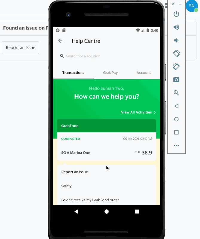
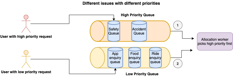
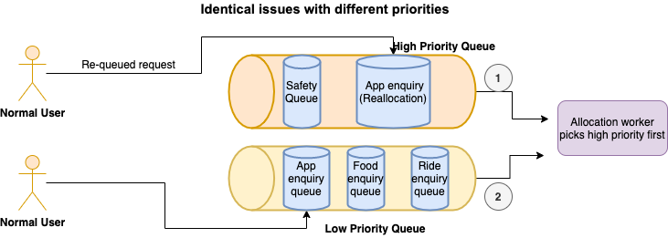

 ; changes to increase your revenue, simplify the application verification process, and make it easier for everyone to build with GitHub.


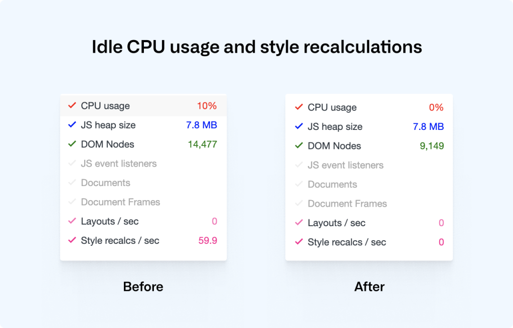

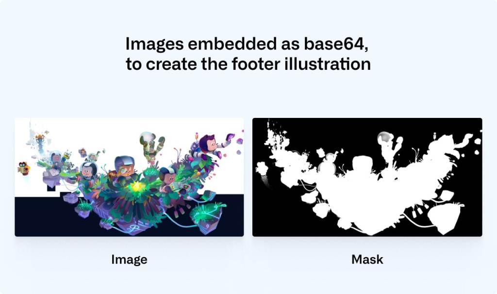
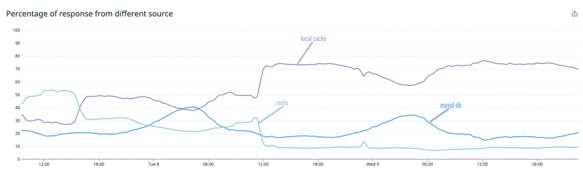
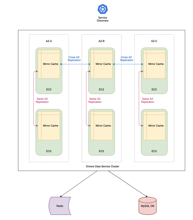
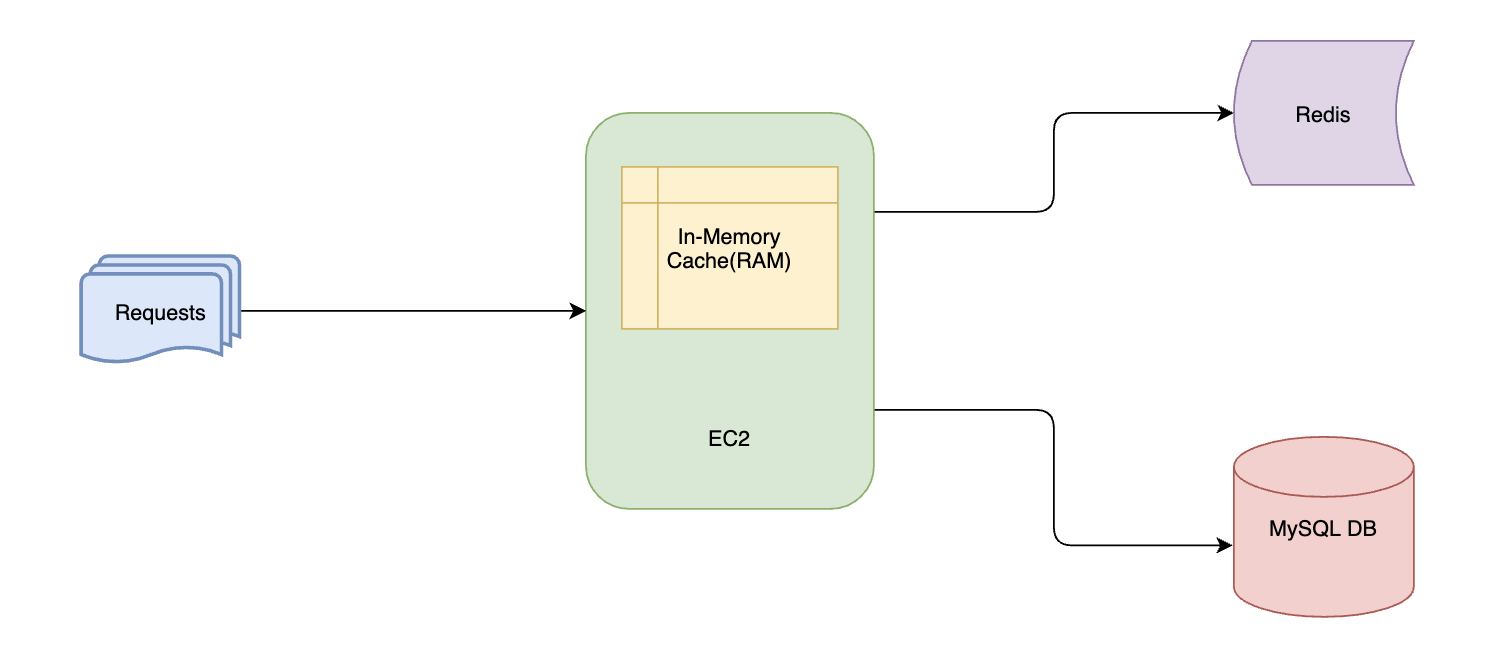
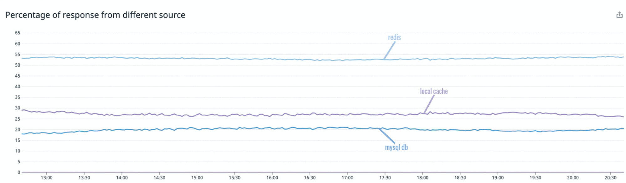
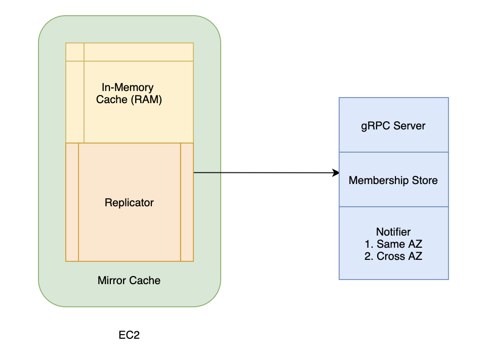
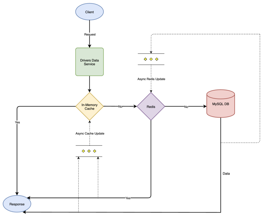
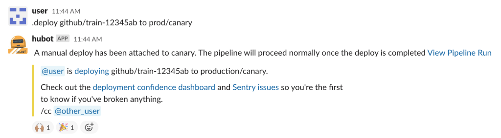
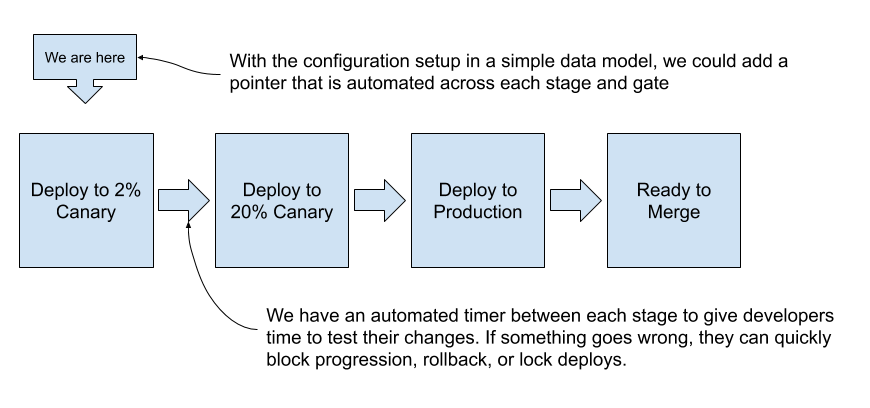
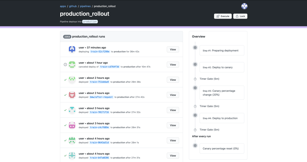
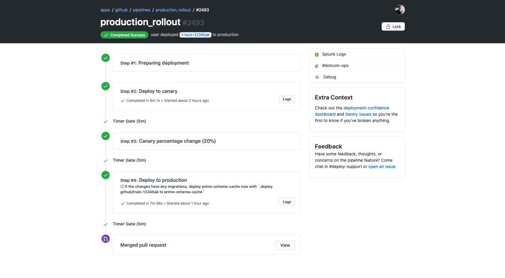
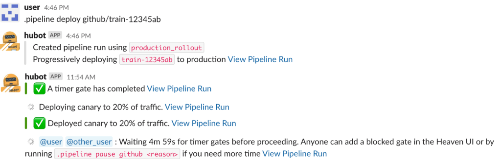
 or merge pull requests whilst lounging on the couch.


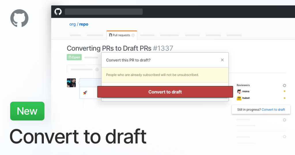


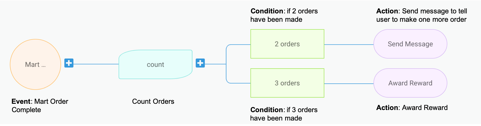
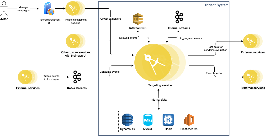
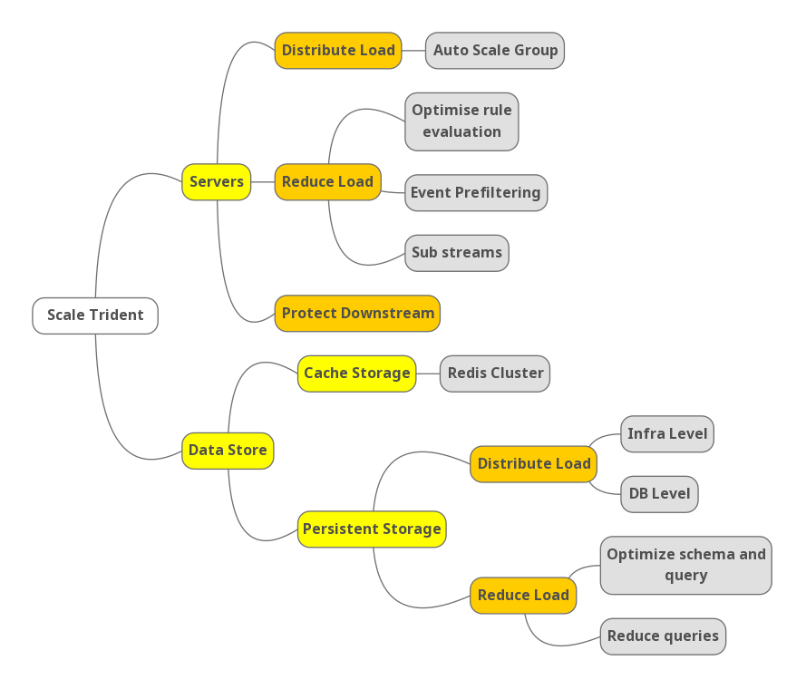
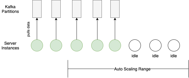
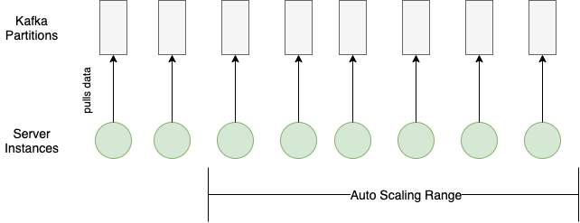
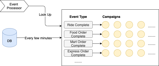
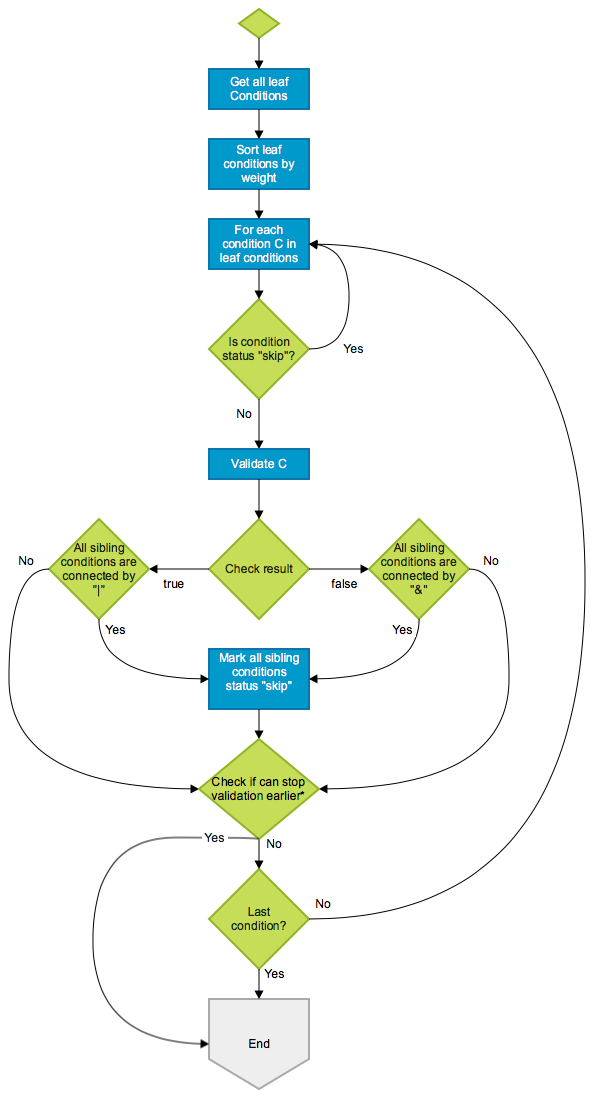
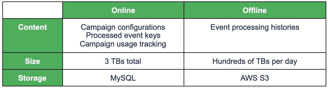
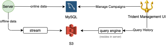
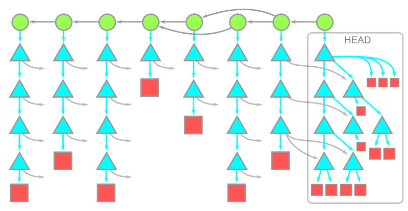
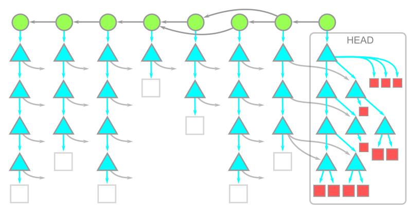
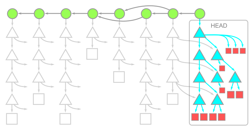
 Warning: While writing this article, we were putting treeless clones to the test beyond the typical limits. We noticed that repositories that contain submodules behave very poorly with treeless clones. Specifically, if you run
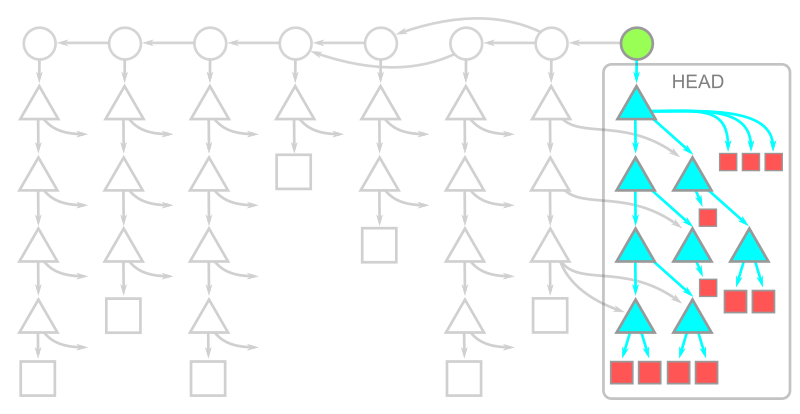
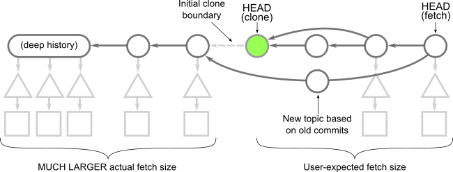
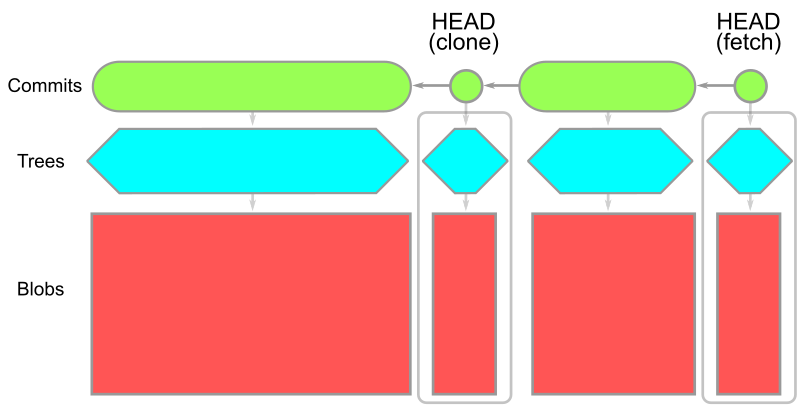


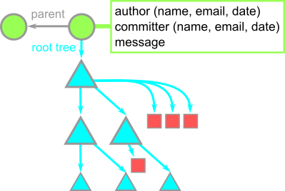
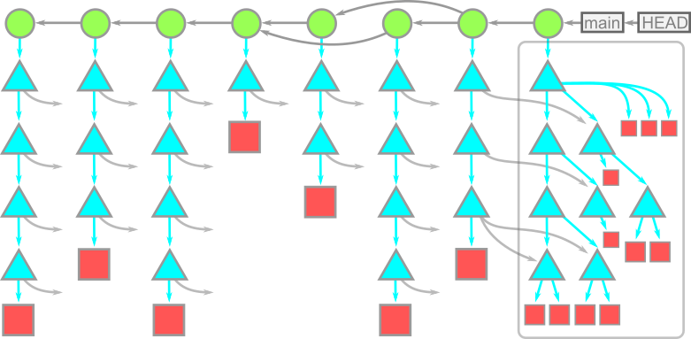
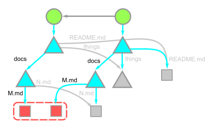
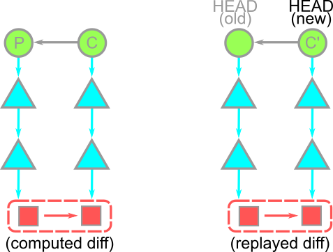
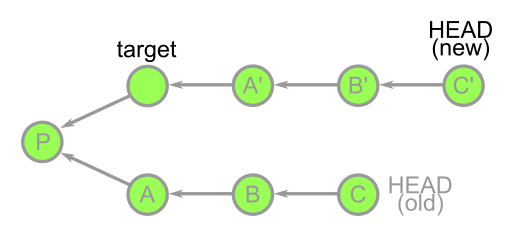
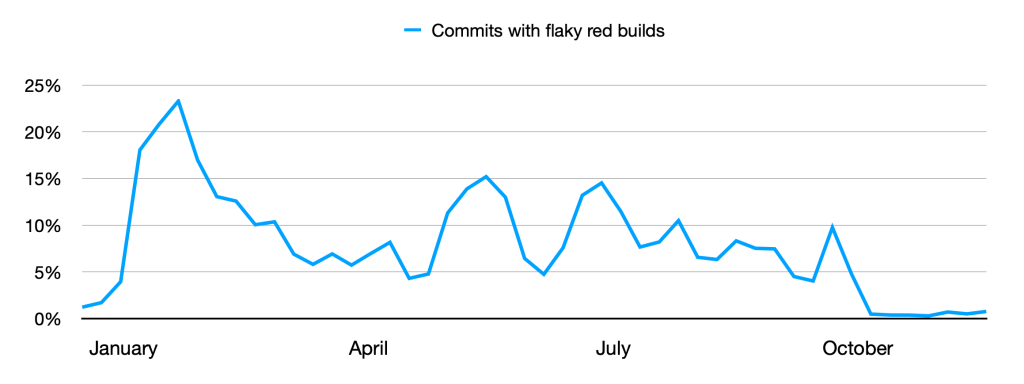

