Post Syndicated from The History Guy: History Deserves to Be Remembered original https://www.youtube.com/shorts/QQswjt1BE7E
Federate access to SageMaker Unified Studio with AWS IAM Identity Center and Okta
Post Syndicated from Raghavarao Sodabathina original https://aws.amazon.com/blogs/big-data/federate-access-to-sagemaker-unified-studio-with-aws-iam-identity-center-and-okta/
Many organizations are using an external identity provider to manage user identities. With an identity provider (IdP), you can manage your user identities outside of AWS and give these external user identities permissions to use AWS resources in your AWS accounts. External identity providers (IdP), such as Okta Universal Directory, can integrate with AWS IAM Identity Center to be the source of truth for Amazon SageMaker Unified Studio.
Amazon SageMaker Unified Studio supports a single sign-on (SSO) experience with AWS IAM Identity Center authentication. Users can access Amazon SageMaker Unified Studio with their existing corporate credentials. AWS IAM Identity Center enables administrators to connect their existing external identity providers and allows them to manage users and groups in their existing identity systems such as Okta which can then be synchronized with AWS IAM Identity Center using SCIM (System for Cross-domain Identity Management).
This post shows step-by-step guidance to setup workforce access to Amazon SageMaker Unified Studio using Okta as an external Identity provider with AWS IAM Identity Center.
Prerequisites
Before you start , make sure you have:
- An AWS account with AWS IAM Identity Center enabled . It is recommended to use an organization-level AWS IAM Identity Center instance for best practices and centralized identity management across your AWS organization.
- Okta account with users and a group
- A browser with network connectivity to Okta and Amazon SageMaker Unified Studio
Solution Overview
The steps in this post are structured into the following sections:
- Enable AWS IAM Identity Center
- Create an Amazon SageMaker domain
- Setup Okta users and groups
- Configure SAML in Okta for AWS IAM Identity Center
- Configure Okta as an identity provider in AWS IAM Identity Center
- Connect AWS IAM Identity Center to Okta
- Set up automatic provisioning of users and groups in AWS IAM Identity Center
- Complete Okta Configuration
- Configure Amazon SageMaker Unified Studio for SSO
- Test the setup
- Cleanup
Enable AWS IAM Identity Center
To enable AWS IAM Identity Center, follow the instructions in Enable IAM Identity Center in the AWS IAM Identity Center User Guide.
Create an Amazon SageMaker domain
- Sign into the AWS Management console and navigate to the Amazon SageMaker console. To create a new Amazon SageMaker Unified Studio domain follow the instructions in Create a Amazon SageMaker Unified Studio domain – manual setup
- From the Amazon SageMaker domain Summary page, copy the Domain ARN and save the value as shown Figure 1 for later use.
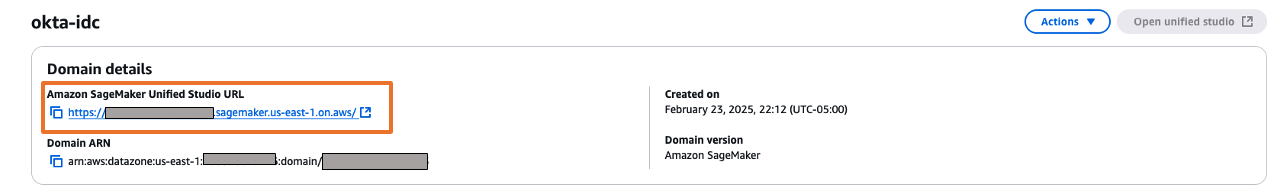
Figure 1: Amazon SageMaker Domain
Setup Okta users and groups
Step 1: Sign up for an Okta account
- Sign up for an Okta account, then choose the Sign up button to complete your account setup.
- If you already have an account with Okta, login to your Okta account.
Step 2: Create Groups in Okta
- Choose Directory in the left menu and choose Groups to proceed.
- Click on Add Group and enter name as unifiedstudio. Then choose the Save button.
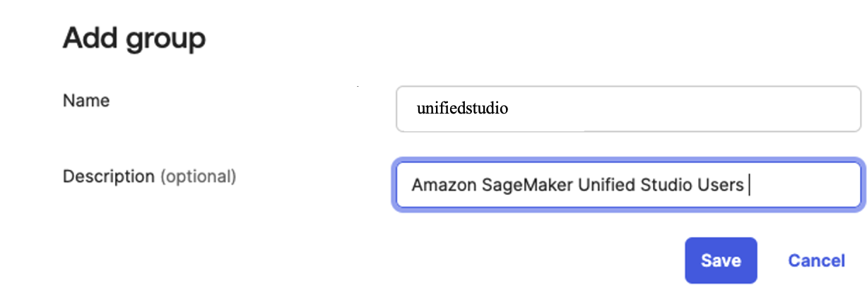
Figure 2. Creating a group in Okta
Step 3: Create users in Okta
- Choose People in left menu under Directory section and choose +Add Person.
- Provide First name, Last name, username (email ID), and primary email. Then select I will set password and choose first time password. Use the Save button to create your user.
- Add more users as needed.
Step 4: Assign Groups to users
- Choose Groups from the left menu, then choose the unifiedstudio group created in Step 2.
- Use Assign People to add users to the sagemaker group. Next, use + for each user you want to add.
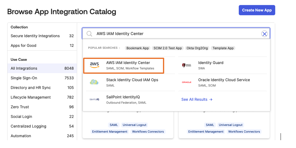
Configure SAML In Okta
- Login to your okta domain and choose Applications from the left menu. Choose Applications, then choose Browse App Catalog
- In the search box, enter AWS IAM Identity Center, then choose the app to add the AWS IAM Identity Center app and then, choose + Add Integration button.
The following image shows the SAML app integration setup:

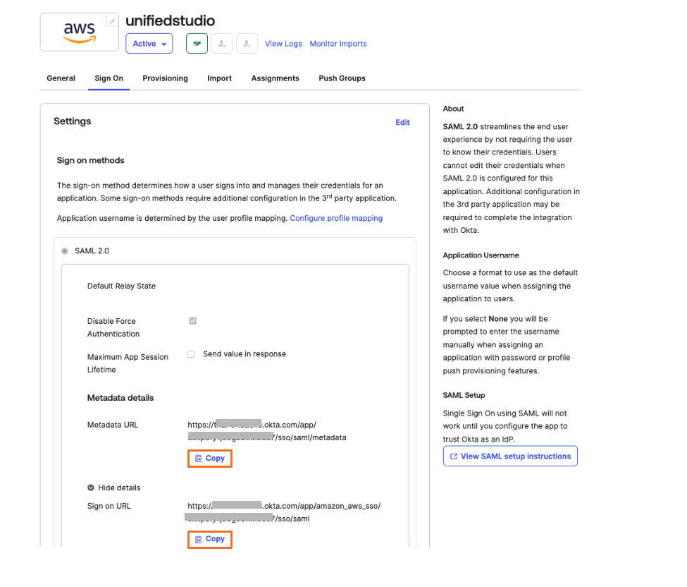
Figure 3. Creating a SAML app integration in Okta - For this example, we are creating an application called “unifiedstudio”. Under General Settings: Required enter the following
- Application label = Replace IAM Identity Center with unifiedstudio and then, choose Save
- Under Sign on menu. Copy Metadata URL under SAML 2.0 section and then, open Metadata URL in a new browser window to download the Okta identity provider metadata and save it as metadata.xml. You will use this for the SAML configuration in AWS IAM Identity Center to setup Okta as an Identity Provider.The following image shows where to find the metadata URL:

Figure 4: Downloading Okta identity provider metadata for SAML configuration - Choose More details and copy Sign on URL into text file; you will use this for the SAML configuration in Amazon SageMaker Unified Studio.
You are now ready to move to the AWS IAM Identity Center console to create an identity provider integration for your Okta instance.
Configure Okta as an identity provider in AWS IAM Identity Center
- Sign in to the AWS IAM Identity Center console as a user with administrative privileges
- In the left navigation menu, choose Settings and then, open the Identity source tab, choose Change Identity source from Actions dropdown as shown in Figure 5
 Figure 5: Selecting identity source in AWS IAM Identity Center
 - From Under Identity source, choose External Identity provider as shown in Figure 6

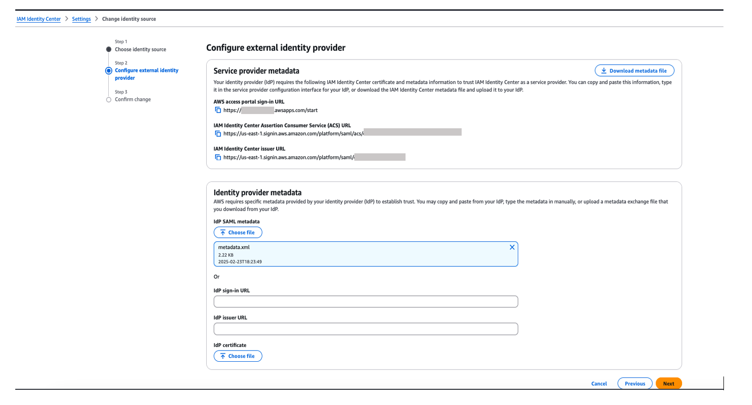
Figure 6: Choosing External Identity provider in AWS IAM Identity Center - You’ll need these configuration parameters for the next step. In Configure external identity provider section, under Service Provider metadata, do the following:
- Choose Download metadata file to download the AWS IAM Identity Center metadata file and save it on your system
- Copy these Service Provider metadata into a text file
- IAM Identity Center Assertion Consumer Service (ACS) URL
- IAM Identity Center issuer URL
- In Identity provider metadata section, under Idp SAML metadata, click on choose file and upload the metadata.xml file which you downloaded from okta in the previous step and then, choose Next as shown in Figure 7

Figure 7. Configuring okta as Identity Provider in AWS IAM Identity Center
- After you read the disclaimer and are ready to proceed, enter ACCEPT and then choose Change identity source to complete Okta as an Identity Provider in IAM Identity Center.
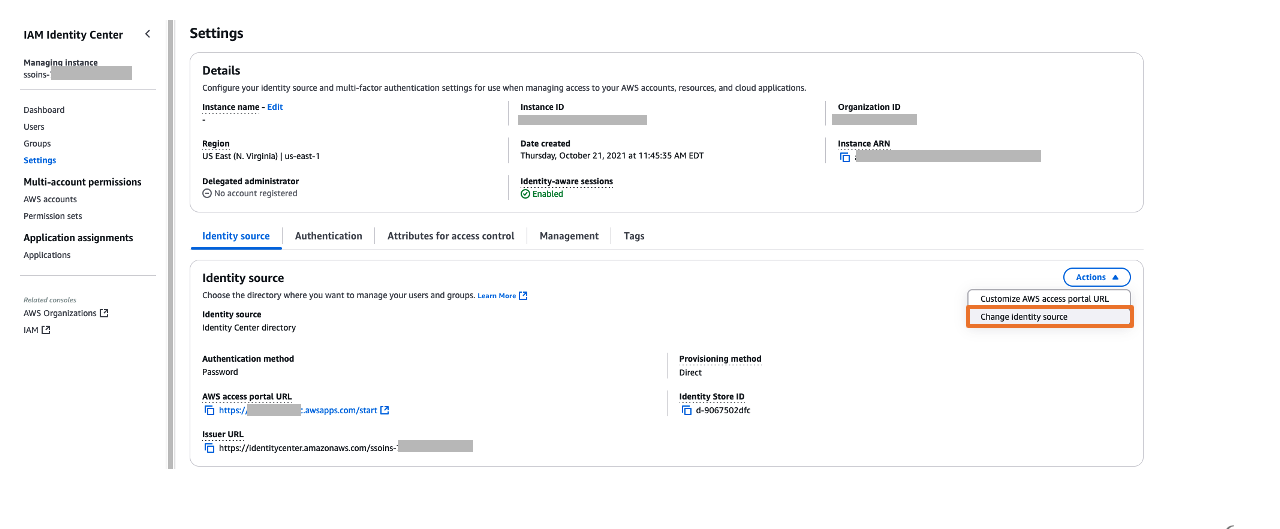 Figure 5: Selecting identity source in AWS IAM Identity Center
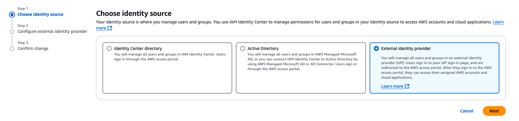
Connect AWS IAM Identity Center to Okta
- Sign into Okta and go to the admin console.
- In the left navigation pane, choose Applications, and then choose the Okta application called unifiedstudio which you created in the previous section
- In Sign On, choose Edit to complete SAML configuration. Under Advanced Sign-on Settings enter the following and then, choose Save to complete configuration as shown Figure 8.
- For the AWS SSO ACS URL, enter IAM Identity Center Assertion Consumer Service (ACS) URL
- For the AWS SSO issuer URL, enter IAM Identity Center issuer URL
- For the Application username format, choose Okta username from dropdown
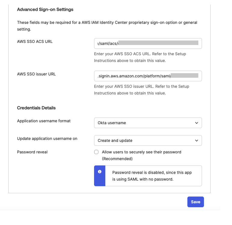 Figure 8. Configuring okta sign-on settings
Set up automatic provisioning of users and groups
In the AWS IAM Identity Center console, on the Settings page, locate the Automatic provisioning information box, and then choose Enable as shown in Figure 9. Copy these values to enable automatic provisioning.
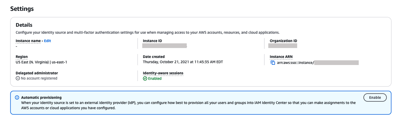
Figure 9. Enabling automatic provisioning in AWS IAM Identity Center
In the Inbound automatic provisioning dialog box, copy each of the values for the following options as shown in Figure 10 and then, choose Close
-
- SCIM endpoint
- Access token
You will use these values to configure provisioning in Okta in the next step.
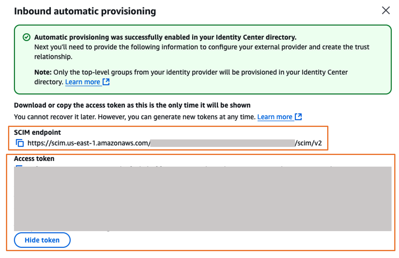 Figure 10. Automatic provisioning configuration parameters in AWS IAM Identity Center
Complete the Okta integration
- Sign into Okta and go to the admin console.
- In the left navigation pane, choose Applications, and then choose the Okta application called unifiedstudio which you created earlier.
- In Provisioning tab, choose Edit to complete auto provisioning between okta and AWS IAM Identity Center.
- Under Settings, choose Integration and then, choose Configure API integration and then, select Enable API integration to enable provisioning and enter the following using the SCIM provisioning values from AWS IAM Identity Center that you copied from the previous step as shown in Figure 11
For the Base URL, enter SCIM endpoint from IAM Identity Center
For the API Token, enter Access token from IAM Identity Center
For Import Groups, select Import groups option
And then, choose Test API Credentials to validate the SCIM provision and then, choose Save.

Figure 11: Automatic provisioning configuration in Okta
- Under Settings, choose Integration and then, choose Configure API integration and then, select Enable API integration to enable provisioning and enter the following using the SCIM provisioning values from AWS IAM Identity Center that you copied from the previous step as shown in Figure 11
- In the Provisioning tab, in the navigation pane under Settings, choose To App in the left navigation. Choose Edit, to Enable all options such as Create Users , Update User Attributes , Deactivate Users as shown in Figure 12 and then, choose Save.

Figure 12: Enabling Automatic provisioning configuration in Okta
- In the Assignments tab, choose Assign, and then Assign to Groups.
- Select the unifiedstudio group, choose Assign, and then, leave it to defaults on popup and then, choose Done to complete the Group assignment, as shown in Figure 13.
 Figure 13: Assigning unifiedstudio group to SAML application called unifiedstudio
 - In the Push Groups tab, under Push Groups drop-down list, select Find groups by name as shown in Figure 14.

Figure 14: Choosing okta groups to push them to AWS IAM Identity Center
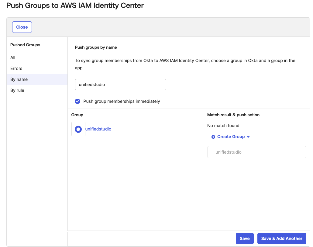
- Select the unifiedstudio group, leave Push group memberships immediately default option and then, choose Save as shown in Figure 15.

Figure 15: Pushing okta groups to AWS IAM Identity Center
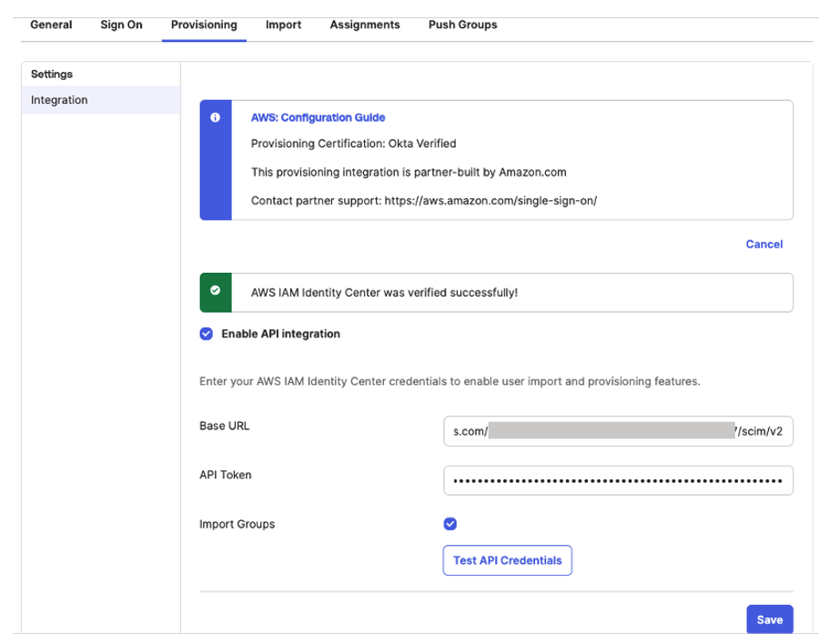
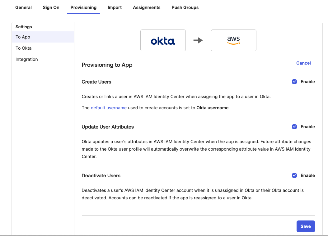
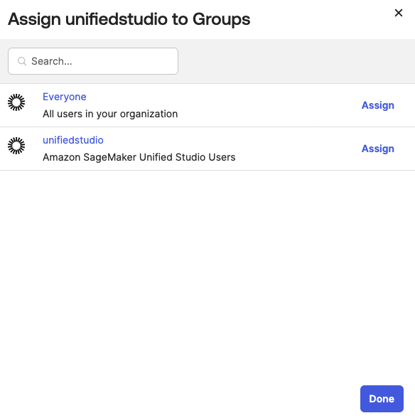 Figure 13: Assigning unifiedstudio group to SAML application called unifiedstudio
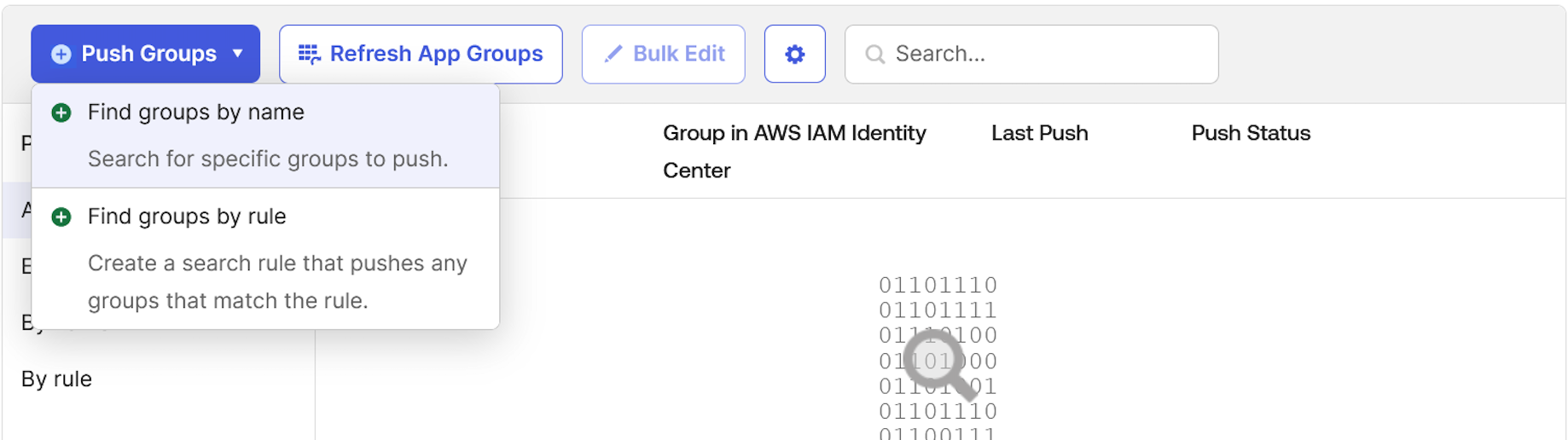
Return to AWS IAM Identity Center, and you should be able to see Okta group and Okta users in AWS IAM Identity Center groups and users as shown In Figure 16.
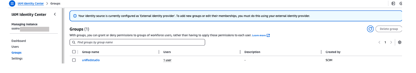
Figure 16: Okta user groups in AWS IAM Identity Center
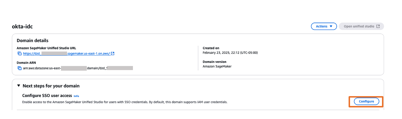
Configure SageMaker Unified Studio for SSO
In this step, you will configure SSO user access to Amazon SageMaker Unified Studio for your Amazon SageMaker platform domain.
- Navigate to the Amazon SageMaker management console.
- In the left navigation menu, select Domains.
- Choose the Domain from the list for which you want to configure SAML user access.
- On the domain’s details page, choose Configure next to the Configure SSO user access.

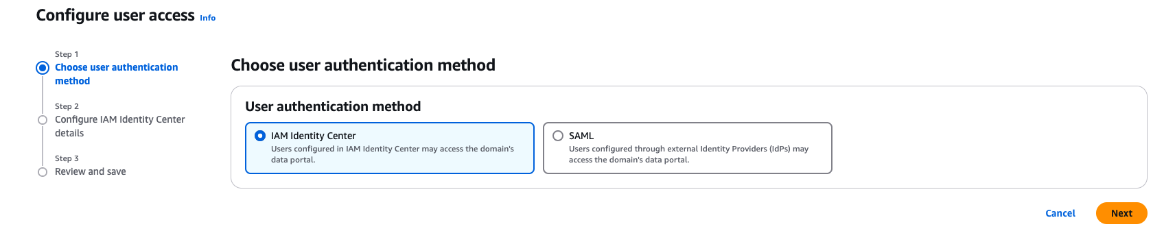
Figure 17: Amazon SageMaker Unified Studio SSO configuration - On the Choose user authentication method page, choose IAM Identity Center. With IAM Identity Center, users configured through external Identity Providers (IdPs) get to access the domain’s Amazon SageMaker Unified Studio. Choose Next.

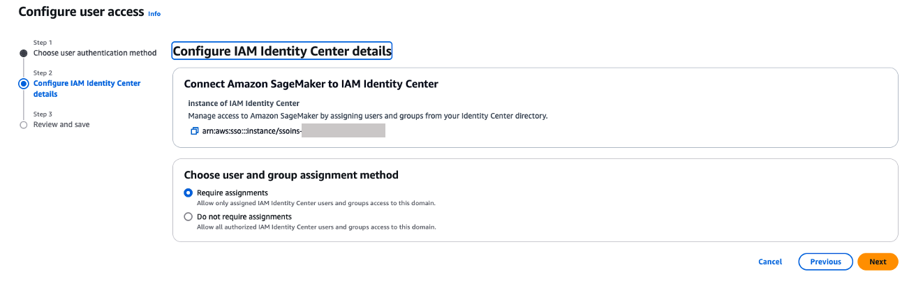
Figure 18: Choosing authentication - You can choose either Require assignments – which means you explicitly select users/groups that can access the domain or Do not require assignments – which allows all authorized Okta users and groups access to this domain.
- You have two options to configure how your users will access to Amazon SageMaker Unified studio with AWS IAM Identity Center federation with Okta
- Do not required Assignments – The access will be provided to Amazon SageMaker Unified Studio based on your Okta SAML application assignments either through Group assignments or Individual user assignments. For this example, when you choose Do not required assignments option, all the users within unifiedstudio Okta group will have access to Amazon SageMaker Unified Studio as we have assigned unifiedstudio Okta user group to unifiedstudio SAML application in Okta.
- Require Assignments – You need to add either Okta users or Okta group to Amazon SageMaker domain as shown in step 8. In step 8, you’ll add unifiedstudio Okta group into Amazon SageMaker domain so that all unifiedstudio Okta group users will get access to Amazon SageMaker Unified Studio. You can also provide an Individual Okta group users access to Amazon SageMaker unified studio through Amazon SageMaker domain console by adding SSO (okta user) user into the domain.
- Note that either an Individual user or group within Okta must be assigned to the AWS Identity center application (AWS IAM Identity Center from Okta application catalog. We renamed application label as unifiedstudio for this example) for both Do not require Assignments and Require Assignments options.

Figure 19. Amazon SageMaker Unified Studio SAML configuration
- You have two options to configure how your users will access to Amazon SageMaker Unified studio with AWS IAM Identity Center federation with Okta
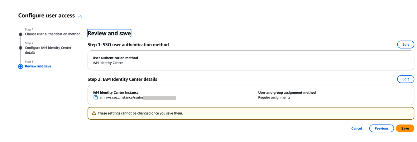
- On the Review and save page, review your choices and then choose Save. Note that these settings are permanent once saved.

Figure 20. Review and confirm SAML configuration
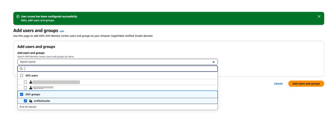
- If you’ve chosen to require assignments, use the Add users and groups to add SAML users and groups to your domain.

Figure 21. Adding okta group into Amazon Sagemaker domain
- Now, users will be able to access the Amazon SageMaker Unified Studio using the Domain URL with their SSO credentials.
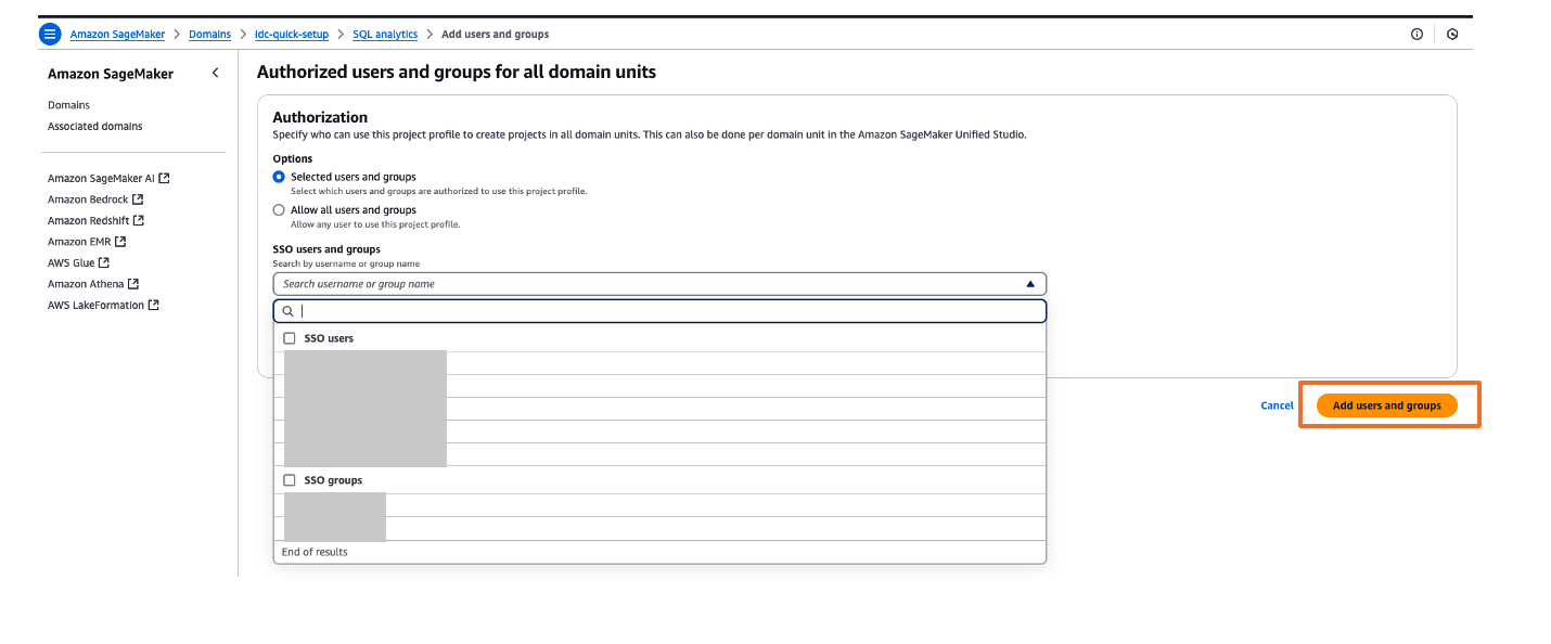
- You can explore different projects for your users and assign those projects based on your SAML user groups for fine-grained access controls. For example, you can create different SAML user groups based on their job function in Okta, assign those Okta groups to AWS IAM Identity Center app in Okta and then, assign those Okta SAML groups to respective project profiles in Amazon SageMaker Unified Studio. To perform project profiles assignments to respective groups, choose project profiles tab, click on respective project profiles like SQL analytics, choose Authorized users and groups tab and then, choose Add and pick SSO groups from drop down as shown in Figure 22. Finally choose Add users and groups to complete project profile assignment.

Figure 22. Assigning a project profile to okta group
Test the setup
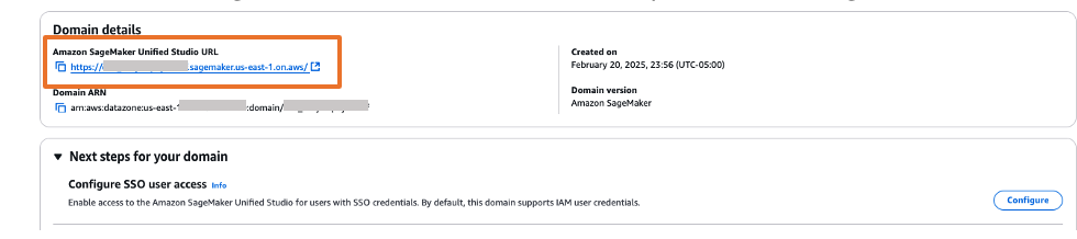
- The Amazon SageMaker Unified Studio URL can be found on the domain details page as shown in Figure 23. The first access to Amazon SageMaker Unified Studio URL redirects you to the Okta login screen.

Figure 23. Validating Okta user access with Amazon SageMaker Unified Studio
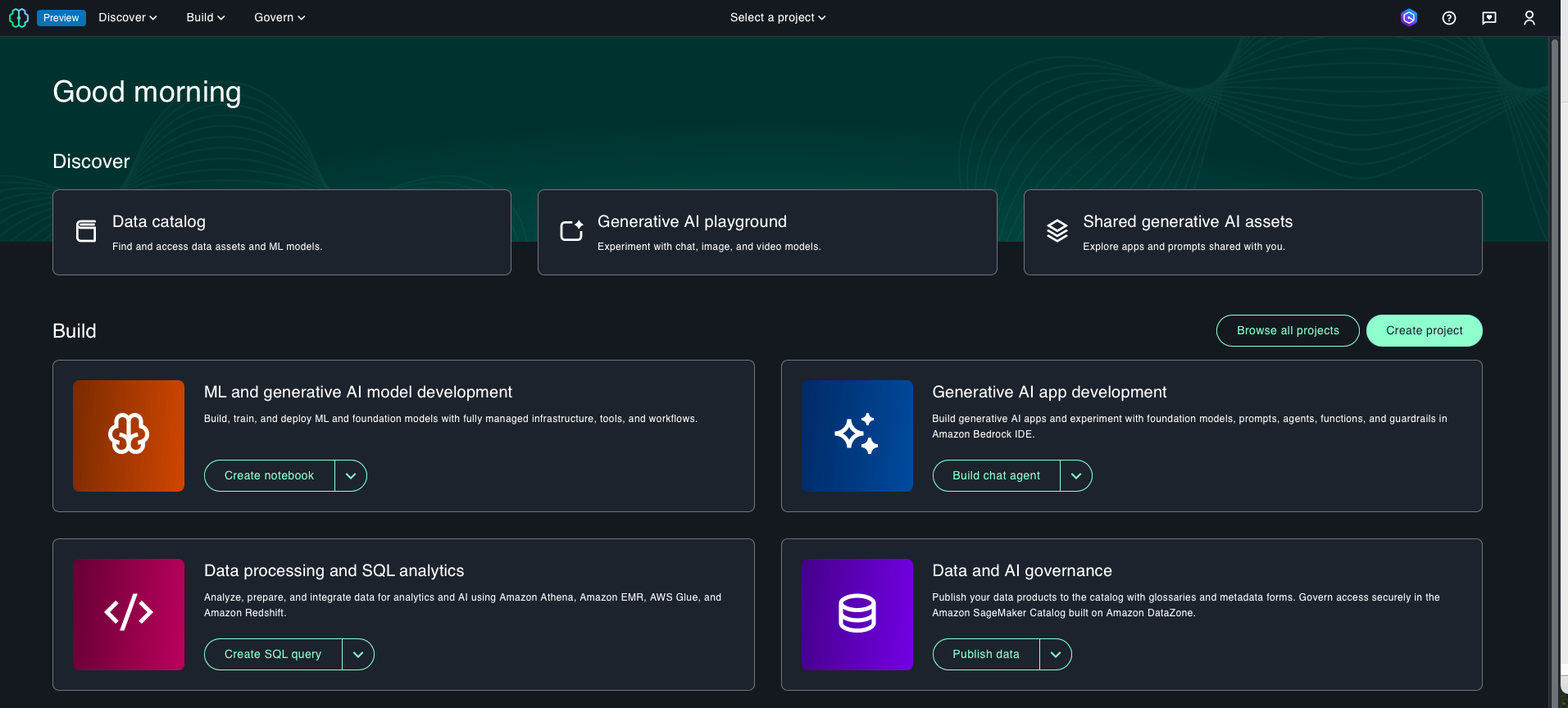
- Copy and paste the Amazon SageMaker Unified Studio URL in your browser and enter the user credentials.
- After successful login, you will be redirected to the Amazon SageMaker Unified Studio home page.


Figure 24. SAML authenticated Amazon SageMaker Unified Studio
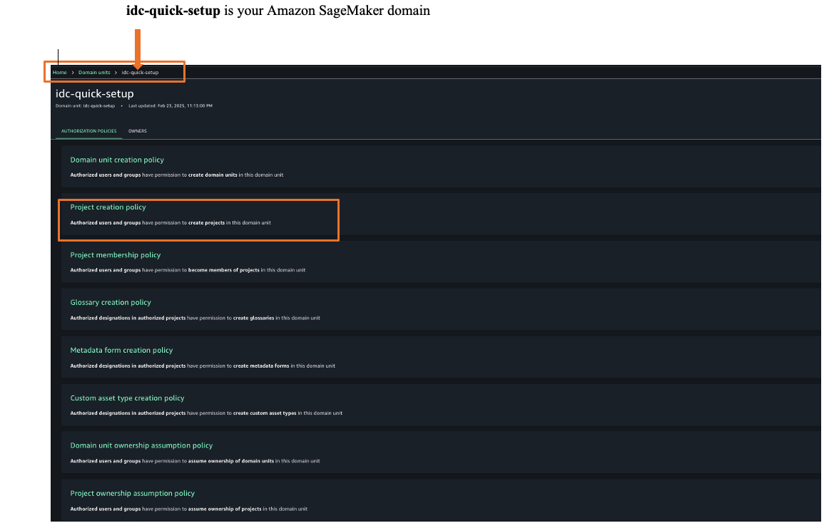
- Once logged into Amazon SageMaker Unified Studio, you can assign authorization policies based on your requirements. Choose Govern and then choose, Domain units and choose your SageMaker domain to select suitable authorization policies. For this example, we are choosing project creation policy as shown in Figure 25.

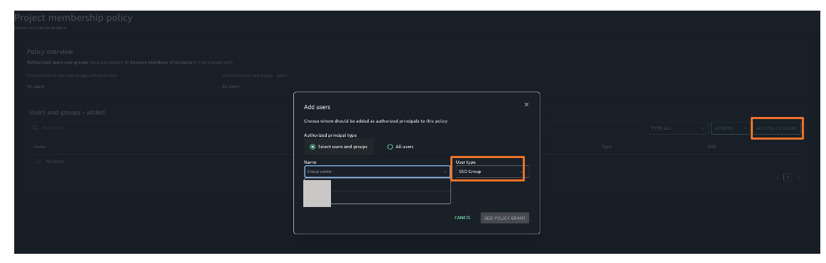
Figure 25. Amazon SageMaker unified studio authorization policies - Choose Project membership policy and then choose ADD POLICY GRANT option to assign user groups or users to respective project. For this example, we are choosing project membership policy as shown in Figure 26.

Figure 26. Amazon SageMaker unified studio authorization policies assignment
You’ve now successfully configured single sign-on for Amazon SageMaker Unified Studio using Okta credentials through AWS IAM Identity Center.
Clean up
To avoid ongoing charges, delete the resources you created:
- Deleting your Amazon SageMaker Unified Studio domain
- Deleting your Okta account (if needed)
Conclusion
In this post, we showed you how to set up Okta as an identity provider using SAML authentication for Amazon SageMaker Unified Studio access through AWS IAM Identity Center federation. This setup allows your users to access SageMaker Unified Studio with their existing corporate credentials, eliminating the need for separate AWS accounts.
Get started by checking the Amazon SageMaker Unified Studio Developer Guide, which provides guidance on how to build data and AI applications using Amazon SageMaker platform
About the authors
ORNL Discovery and Lux Powered by HPE and AMD Announced
Post Syndicated from Patrick Kennedy original https://www.servethehome.com/ornl-discovery-and-lux-powered-by-hpe-and-amd-announced/
ORNL announced the AMD-powered Discovery and Lux systems alongside HPE’s announcement of its new supercomputing portfolio
The post ORNL Discovery and Lux Powered by HPE and AMD Announced appeared first on ServeTheHome.
[$] BPF signing LSM hook change rejected
Post Syndicated from daroc original https://lwn.net/Articles/1042625/
BPF lets users load programs into a running kernel.
Even though BPF programs are checked by the verifier to
ensure that they stay inside certain limits, some users would still like to ensure
that only approved BPF programs are loaded. KP Singh’s
patches adding that capability to the kernel were accepted
in version 6.18, but not everyone is
satisfied with his implementation. Blaise Boscaccy, who has been working to get
a version of BPF code signing with better auditability
into the kernel for some time, posted
a patch set on top of Singh’s changes that alters the loading process to
not invoke security module hooks
until the entire loading process is complete.
The discussion on the patch
set is the continuation of a
long-running disagreement over
the interface for signed BPF programs.
Trump & Military Strikes #lastweektonight
Post Syndicated from LastWeekTonight original https://www.youtube.com/shorts/Mwc21oNdnaA
Qualcomm Announces New Integrated AI Racks with 768GB Cards and a 200MW AI Deal
Post Syndicated from Cliff Robinson original https://www.servethehome.com/qualcomm-announces-new-integrated-ai-racks-with-768gb-cards-and-a-200mw-ai-deal/
Qualcomm announced new integrated AI racks, with the Qualcomm AI200 sporting up to 768GB LPDDR cards, and a 200MW AI deployment
The post Qualcomm Announces New Integrated AI Racks with 768GB Cards and a 200MW AI Deal appeared first on ServeTheHome.
AWS Weekly Roundup: AWS RTB Fabric, AWS Customer Carbon Footprint Tool, AWS Secret-West Region, and more (October 27, 2025)
Post Syndicated from Micah Walter original https://aws.amazon.com/blogs/aws/aws-weekly-roundup-aws-rtb-fabric-aws-customer-carbon-footprint-tool-aws-secret-west-region-and-more-october-27-2025/
This week started with challenges for many using services in the the North Virginia (us-east-1) Region. On Monday, we experienced a service disruption affecting DynamoDB and several other services due to a DNS configuration problem. The issue has been fully resolved, and you can read the full details in our official summary. As someone who works closely with developers, I know how disruptive these incidents can be to your applications and your users. The teams are learning valuable lessons from this event that will help improve our services going forward.
Last week’s launches
On a brighter note, I’m excited to share some launches and updates from this past week that I think you’ll find interesting.
AWS RTB Fabric is now generally available — If you’re working in advertising technology, you’ll be interested in AWS RTB Fabric, a fully managed service for real-time bidding workloads. It connects AdTech partners like SSPs, DSPs, and publishers through a private, high-performance network that delivers single-digit millisecond latency—critical for those split-second ad auctions. The service reduces networking costs by up to 80% compared to standard cloud solutions with no upfront commitments, and includes three built-in modules to optimize traffic, improve bid efficiency, and increase bid response rates. AWS RTB Fabric is available in US East (N. Virginia), US West (Oregon), Asia Pacific (Singapore and Tokyo), and Europe (Frankfurt and Ireland).
Customer Carbon Footprint Tool now includes Scope 3 emissions data — Understanding the full environmental impact of your cloud usage just got more comprehensive. The AWS Customer Carbon Footprint Tool (CCFT) now covers all three industry-standard emission scopes as defined by the Greenhouse Gas Protocol. This update adds Scope 3 emissions—covering the lifecycle carbon impact from manufacturing servers, powering AWS facilities, and transporting equipment to data centers—plus Scope 1 natural gas and refrigerants. With historical data available back to January 2022, you can track your progress over time and make informed decisions about your cloud strategy to meet sustainability goals. Access the data through the CCFT dashboard or AWS Billing and Cost Management Data Exports.
Additional updates
I thought these projects, blog posts, and news items were also interesting:
AWS Secret-West Region is now available — AWS launched its second Secret Region in the western United States, capable of handling mission-critical workloads at the Secret U.S. security classification level. This new region provides enhanced performance for latency-sensitive workloads and offers multi-region resiliency with geographic separation for Intelligence Community and Department of Defense missions. The infrastructure features data centers and network architecture designed, built, accredited, and operated for security compliance with Intelligence Community Directive requirements.
Amazon CloudWatch now generates incident reports — CloudWatch investigations can now automatically generate comprehensive incident reports that include executive summaries, timeline of events, impact assessments, and actionable recommendations. The feature collects and correlates telemetry data along with investigation actions to help teams identify patterns and implement preventive measures through structured post-incident analysis.
Amazon Connect introduces threaded email views — Amazon Connect email now displays exchanges in a threaded format and automatically includes prior conversation context when agents compose responses. These enhancements make it easier for both agents and customers to maintain context and continuity across interactions, delivering a more natural and familiar email experience.
Amazon EC2 I8g instances expand to additional regions — Storage Optimized I8g instances are now available in Europe (London), Asia Pacific (Singapore), and Asia Pacific (Tokyo). Powered by AWS Graviton4 processors and third-generation AWS Nitro SSDs, these instances deliver up to 60% better compute performance and 65% better real-time storage performance per TB compared to previous generation I4g instances, with storage I/O latency reduced by up to 50%.
AWS Location Service adds enhanced map styling — Developers can now incorporate terrain visualization, contour lines, real-time traffic overlays, and transportation-specific routing details through the GetStyleDescriptor API. The new styling parameters enable tailored maps for specific applications—from outdoor navigation to logistics planning.
CloudWatch Synthetics introduces multi-check canaries — You can now bundle up to 10 different monitoring steps in a single canary using JSON configuration without custom scripts. The multi-check blueprints support HTTP endpoints with authentication, DNS validation, SSL certificate monitoring, and TCP port checks, making API monitoring more cost-effective.
Amazon S3 Tables now generates CloudTrail events — S3 Tables now logs AWS CloudTrail events for automatic maintenance operations, including compaction and snapshot expiration. This enables organizations to audit the maintenance activities that S3 Tables automatically performs to enhance query performance and reduce operational costs.
AWS Lambda increases asynchronous invocation payload size to 1 MB — Lambda has quadrupled the maximum payload size for asynchronous invocations from 256 KB to 1 MB across all AWS Commercial and GovCloud (US) Regions. This expansion streamlines architectures by allowing comprehensive data to be included in a single event, eliminating the need for complex data chunking or external storage solutions. Use cases now better supported include large language model prompts, detailed telemetry signals, complex ML output structures, and complete user profiles. The update applies to asynchronous invocations through the Lambda API or push-based events from services like S3, CloudWatch, SNS, EventBridge, and Step Functions. Pricing remains at 1 request charge for the first 256 KB, with 1 additional charge per 64 KB chunk thereafter.
Upcoming AWS events
Keep a look out and be sure to sign up for these upcoming events:
AWS re:Invent 2025 (December 1-5, 2025, Las Vegas) — AWS flagship annual conference offering collaborative innovation through peer-to-peer learning, expert-led discussions, and invaluable networking opportunities. Registration is now open.
Join the AWS Builder Center to learn, build, and connect with builders in the AWS community. Browse for upcoming in-person and virtual developer-focused events in your area.
That’s all for this week. Check back next Monday for another Weekly Roundup!
~ micah
Python Software Foundation withdraws security-related grant proposal
Post Syndicated from corbet original https://lwn.net/Articles/1043563/
The Python Software Foundation, earlier this year, successfully obtained a
$1.5 million grant from the US National Science Foundation “to
“. The actual
address structural vulnerabilities in Python and PyPI
grant came with some strings attached though, in the form of a requirement
not to pursue diversity, equity, and inclusion programs. So the Foundation
has withdrawn
the proposal rather than agree to terms that run counter to its own
mission.
We’re disappointed to have been put in the position where we had to
make this decision, because we believe our proposed project would
offer invaluable advances to the Python and greater open source
community, protecting millions of PyPI users from attempted
supply-chain attacks. The proposed project would create new tools
for automated proactive review of all packages uploaded to PyPI,
rather than the current process of reactive-only review.
Елегантната игра: Синхронизация и резонанс (първа част)
Post Syndicated from original https://www.toest.bg/elegantnata-igra-sinhronizatsiya-i-rezonans-purva-chast/

Миглена Николчина: Съществуват игри, които, по липса на по-добро хрумване в момента, бих определила като „елегантни“. Това са игри, които притежават следните три качества: липса на излишества, съзвучие между отделните компоненти, чар – все качества, които не изискват сложна игрова механика и биха могли да се постигнат с минимални технически средства. Ще дам пример с една игра от 1999 г. – „Дракан: Орденът на пламъка“ (Drakan: Order of the Flame), за съжаление, ненамираема днес. Визията, разказът, музиката са в съвършена хармония помежду си и с игровата механика. Голяма част от действието е полет и битки на момиче, което е свързано в „една душа“ с дракон – усещането за простор, волно реене, свобода при пределната простота на всички елементи е забележително и честно казано, мисля, че по-късни и много по-амбициозни игри все още не могат да се мерят с него. Такъв тип постижения са според мен изцяло артистични, при все че тази артистичност предполага и точно намерена мяра в съчетанието с игровата механика.


Кадри от „Дракан: Орденът на пламъка“
Навремето такъв тип съвършенство притежаваше българската анимация. Понякога се чудя защо този талант не го виждам – може би греша – транспозиран в сферата на видеоигрите. Питам ви обаче дали такъв вид „лудонаративен резонанс“ е възможен само в малките авторски игри („индита“), дали лудонаративният дисонанс няма своя особена елегантност и въобще как стои темата за формално съвършенство в рамката на дебатите около лудонаративния дисонанс?
Николай Генов: Понятието за „елегантна игра“ ми звучи особено сполучливо с оглед на дебатите, които спомена, защото то предполага не просто една механична комбинация на множество компоненти, а нещо повече – естетическата им синхронизация.
Първоначално – с възникването на изследователското поле – игрите се мислят в противоречие. Вече многократно сме се позовавали на Аарсет и лудолозите с техния теоретичен поход срещу наратологията, затова няма да се връщам към основите на този конфликт; посочвам го само за да изтъкна предположението, че поне оттук можем да проследим по-внимателно практиката да мислим компютърните игри „на парче“, като съставени от парчета. В най-общия случай, или в най-едър план, говорим за механика и разказ, но има редица други аспекти, които не получават достатъчно внимание.
През 2007 г. Клинт Хокинг – в свой блог пост – прави критически коментар на играта „Биошок“ и използва понятието „лудонаративен дисонанс“ оценъчно, с негативен знак; две от парчетата в „Биошок“ (BioShock), изглежда, не съвпадат и така възниква противоречие между „посланието на играта“ и да речем, практиката на нейното изиграване; между вложения смисъл и геймплея. От една страна, се говори за свободна воля, от друга, съществува разказвателна принуда, която противопоставя личния интерес на безкористността – решението да извлича безскрупулно АДАМ няма пряко отношение към революцията, към която протагонистът неизбежно се присъединява.


Кадри от „Биошок“
Аз не съм убеден, че по принцип лудонаративният дисонанс следва да се приема като недостатък на една игра. Напротив, смятам, че това е похват, който може да произвежда редица интересни ефекти, което сякаш постепенно се осъзнава като предимство и дори стратегия. А в последните десет години вече все по-често се говори и за обратния ход, за един огледален метод на произвеждане на ефекти – за лудонаративен резонанс, чиято крайна форма можем да впишем в твоята идея за „елегантна игра“.
Впрочем както лудонаративният дисонанс е натрупал редица противоречиви значения през годините, така и може да бъде сегментиран, разчленен на микросинхронизации, като например резонанс (или съвпадение, припокриване, съзвучие) между намерението и резултата, действието и историята, образа и пейзажа, случката и звука (и музиката), управлението и движението и т.н. По този начин ще имаме конкретни видове хармонизации, които ще можем да набелязваме и проследяваме при всяко отделно заглавие.
За да приключа, ще кажа, че компютърните игри в крайна сметка са динамични конструкции, плаващи плоскости, които втъкават и употребяват разнородни противоречия, разминавания и сближавания с цел да произведат действителни ефекти. Може би си струва да мислим, че те са онова „между“, което остава накрая, след като продуктът е вече готов.
Чавдар Парушев: Интересно, че мислейки си за игри с чар, добро съзвучие между отделните компоненти, формиращи усещане за добра мяра, се сещам и за две игри от 1999 г. Явно силна година на такива заглавия. Първата игра е „Човек сянка“ (Shadowman) – тя черпи елементи от западноафриканската религия вуду за целите на сюжета си. И по-конкретно мотива за общуване с мъртвите и особената пропускливост на границата между отсамното и отвъдното. За целите на игровата интрига тъкмо тази граница е застрашена и в необходимост от удържане и защитаване. Повече от 25 години по-късно още си спомням проиграването на първата мисия в играта. Безцелното лутане из игровото пространство в търсене на проход в скала, мистичен портал или някакъв друг физически вход към земята на мъртвите в играта. Не мога да кажа колко време съм се лутал, но такова нещо не намерих. Затова пък мен ме намери глутница кучета с достатъчно остри зъби, за да разрешат загадката, пращайки ме в земята на мъртвите по традиционния начин. Тази първа моя смърт в играта, необходима, за да може сюжетът да продължи, e вероятно първата ми собствена среща с лудонаративния резонанс, за който говорим.


Кадри от „Човек сянка“
Днес този елемент на вписване на игровата механика на многото животи и възможността да се започне отначало, изначално присъща на игрите и като сюжетен елемент, е нещо утвърдено и често използвано. За играенето на „Човек сянка“ този елемент беше освен нещо ново, също и органичен начин играта веднага да научи играча на едно от важните си правила – да търси в действия входове към иначе недостъпни пространства. Също да се връща назад и да опитва отново. Действия, без които играта не може да бъде изиграна докрай.
Друг пример за елегантно вписване на механиката на виртуалното безсмъртие на играча и неговия аватар предлага „Плейнскейп: Мъчение“ (Planescape: Torment). Главният персонаж, чийто контрол поема играчът, не просто не може да умре, но да разбере защо не може да умре, кой или какво му е дало това безсмъртие, е основен залог и двигател за разгръщането на цялата история на играта. Не можейки да умре, персонажът не може и да се събере в един-единствен живот, а е принуден да върви и да събира парчетата от пръснатите си предходни въплъщения, понякога постъпки, понякога хора, понякога парчета от собственото си тяло, постоянно и натрапчиво преследван от въпроса… какво може да промени природата на човек?


Кадри от „Плейнскейп: Мъчение“
Еньо Стоянов: Разбира се, темата за възможните дисонанси и резонанси на игрите е въпрос, засягащ идеята за тяхното единство и цялост. Каквото и единство да се предполага за тях, то никога не е просто предварително дадено, то се изработва в ход, процесуално, както при направата им от дизайнерите, така и по време на игра. Това ще рече, че опитът с игрите винаги непосредствено е опит с някаква част, а не с цяло, можем дори да кажем, че цялото се появява едва след отдръпване от играта. Но функцията на тези „парчета“, с които пряко взаимодействаме, е променлива, не е веднъж завинаги фиксирана за всички игри поначало. Нещо повече, те сами са композиция от други парчета.
Има игри, които „разказват“ само с механиката си. В „Братя: Приказка за двама синове“ (Brothers: Tale of Two Sons) темата за „братството“ и „синовния дълг“ е разгърната само чрез действията, достъпни на играча при управлението на двамата герои (например по-големият брат е по-силен, затова може да помага на по-малкия при пресичането на бездни или при изкатерване на стръмен терен и играта не продължава без оказване на подобна помощ).
В игрите от типа „отворен свят“ музиката допринася за добавяне на разказвателен оттенък към действията на играча и показваната му история. Когато постепенно героят на играча разкрива дигитално генерирания свят с навигацията си през него, обикновено звучи музика с идилична минорна мелодика, внушаваща почуда; щом обаче в околността на героя се прояви противник, музиката става отчетливо мажорна, дори маршова. И в двата случая извършваното действие (опознаване на света през навигация, въвличане в конфликт) и историята (търсене на приключения, борба с врагове) са „в резонанс“ със задействаната музикална тема и асоциираната с нея информация, която получава играчът.
Примерът с музиката подсказва и нещо повече – ролята на интерпретацията, която пресява опита с различни компоненти по време на игра. Музиката сама по-себе си не носи послание и смисъл, определени нейни форми са „полепнали“ със значения поради редовна употреба в специфичен смислов контекст. Дори при „Братя: Приказка за двама синове“ играта вече насочва интерпретативно към своята тема чрез заглавието си, преди да я разработи в нямата си механика. Всъщност при игрите има две интерпретативни инстанции и те могат непредвидимо да се съгласуват или да тръгнат в разходящи посоки – играта интерпретира механичните действия на играча с интерфейса по относително строго кодиран от дизайнерите начин във формата на онова, което му показва на дисплея. Играчът от своя страна също интерпретира показаното му в светлината на културни кодове, които привнася в този процес. Оттук игрите се оказват сложно отворени, незавършени и неподдаващи се на завършване, недопускащи затваряне във финално единство.
(Следва продължение.)
В рубриката „Игромислие“ публикуваме разговори, в които се срещат, съпоставят и противопоставят различни гледни точки към многоизмерния, многожанров феномен на видеоигрите – не толкова като електронен спорт, колкото като нов синтез на изкуствата и като ново поле на общуване и социалност.
Louvre Jewel Heist
Post Syndicated from Bruce Schneier original https://www.schneier.com/blog/archives/2025/10/louvre-jewel-heist.html
I assume I don’t have to explain last week’s Louvre jewel heist. I love a good caper, and have (like many others) eagerly followed the details. An electric ladder to a second-floor window, an angle grinder to get into the room and the display cases, security guards there more to protect patrons than valuables—seven minutes, in and out.
There were security lapses:
The Louvre, it turns out—at least certain nooks of the ancient former palace—is something like an anopticon: a place where no one is observed. The world now knows what the four thieves (two burglars and two accomplices) realized as recently as last week: The museum’s Apollo Gallery, which housed the stolen items, was monitored by a single outdoor camera angled away from its only exterior point of entry, a balcony. In other words, a free-roaming Roomba could have provided the world’s most famous museum with more information about the interior of this space. There is no surveillance footage of the break-in.
Professional jewelry thieves were not impressed with the four. Here’s Larry Lawton:
“I robbed 25, 30 jewelry stores—20 million, 18 million, something like that,” Mr. Lawton said. “Did you know that I never dropped a ring or an earring, no less, a crown worth 20 million?”
He thinks that they had a compatriot on the inside.
Museums, especially smaller ones, are good targets for theft because they rarely secure what they hold to its true value. They can’t; it would be prohibitively expensive. This makes them an attractive target.
We might find out soon. It looks like some people have been arrested
Not being out of the country—out of the EU—by now was sloppy. Leaving DNA evidence was sloppy. I can hope the criminals were sloppy enough not to have disassembled the jewelry by now, but I doubt it. They were probably taken apart within hours of the theft.
The whole thing is sad, really. Unlike stolen paintings, those jewels have no value in their original form. They need to be taken apart and sold in pieces. But then their value drops considerably—so the end result is that most of the worth of those items disappears. It would have been much better to pay the thieves not to rob the Louvre.
Rust Coreutils 0.3.0 released
Post Syndicated from jzb original https://lwn.net/Articles/1043390/
Version
0.3.0 of Rust Coreutils, part of the uutils project, has been
released. This release adds safe directory traversal for several
utilities, better error handling, and performance
improvements. The project has upgraded its test suite reference from
GNU coreutils 9.7 to 9.8, and added 16 new tests. It includes a fix
for the date bug
that affected automatic updates in Ubuntu 25.10.
Security updates for Monday
Post Syndicated from jzb original https://lwn.net/Articles/1043499/
Security updates have been issued by Debian (intel-microcode, openjdk-11, openjdk-17, openjdk-21, python-pip, request-tracker4, thunderbird, and tika), Fedora (cef, chromium, complyctl, cri-o1.31, cri-o1.32, cri-o1.33, cri-o1.34, docker-buildkit, docker-buildx, dovecot, fetchmail, gi-docgen, golang-github-facebook-time, insight, mbedtls, mingw-binutils, mingw-python3, mingw-qt5-qtsvg, mingw-qt6-qtsvg, moodle, openssl, perl-YAML-Syck, podman-tui, python-socketio, python-sqlparse, python3.10, python3.11, python3.12, python3.9, qt5-qtsvg, runc, samba, squid, sssd, suricata, valkey, wireshark, wordpress, and yarnpkg), Red Hat (libssh), SUSE (aaa_base, afterburn, bind, chromedriver, chrony, firefox, git, govulncheck-vulndb, grub2, ImageMagick, java-11-openjdk, java-17-openjdk, kernel, libssh, libunbound8, libxslt, micropython, mozilla-nss, netty, open-vm-tools, openbao, p7zip, podman, poppler, python-python-socketio, python-urllib3, ruby2.5, rust-keylime, vim, wireshark, and xen), and Ubuntu (linux-aws-6.14).
The tricky science of Internet measurement
Post Syndicated from Marwan Fayed original https://blog.cloudflare.com/tricky-internet-measurement/
Measurement is critical to our understanding not just of the world and the universe, but also the systems we design and deploy. The Internet is no exception but the challenges of measuring the Internet are unique.
The Internet is remarkably opaque, which is counter-intuitive given its open and multi-stakeholder model. It’s opaque because ultimately the Internet joins many networks and services that are each owned and operated by unrelated entities, and that rarely share or report about their systems. Every network may carry and forward what other systems produce, but each system is entirely independent — which, to be honest, is the magic of the Internet. It’s in this opaque-yet-critical context that Internet measurement must exist as a scientific practice, with all the associated rigor, repeatability, and reproduction.
Measurement as a scientific practice can be exciting — for what it gets right as well as wrong. The following statement encapsulates some of the subtleties:
“5 out of 6 scientists say that Russian Roulette is safe.”
The statement is absurd! Laugh as we might, the statement is also logical. It’s trivially easy to design an experiment that leads to the above statement. However, the only way this experiment could succeed is if the “actor” — that is, whoever conducts the experiment — ignores every aspect of measurement science that makes the practice credible, as follows.
-
Methodology: a cycle consisting of data curation, modeling, and validation. Here, the experiment (data curation) could only succeed if each participant is prevented from seeing others’ injuries. More importantly, no measurement is needed because the actor can calculate probabilities with available numbers, without the experiment!
-
Ethics: the way we measure can have undue, undesirable consequences. A bare minimum principle is do no harm.
-
Representation: clear and complete statements or visualizations should be at least informative and ideally actionable; otherwise, they can be misleading. Say each participant answered with yes to the question, “are you safe?” They are answering a different question than “is the game safe?”
In this blog we look at each of the above aspects of measurement, describe how they manifest in the Internet space, and relate them to examples from work that will be featured throughout the week. Let’s first start with some background.
High quality measurements help to identify, understand, even explain our experiences, environments, and systems. However, observation in isolation, without context, can be perilous. The following is a time series from an internal graph of HTTP requests from Lviv, Ukraine, leading up to the evening of 28 February 2022:

On that day, traffic from the region increased by 3-4X. For context, the Russian incursion into Ukraine began four days earlier. The world was watching events closely. Cloudflare was no exception, helping both to report and to mitigate network effects.
Upon observing that abnormal spike, we at Cloudflare could have mistakenly reported the increase as a potential DoS attack. However, there were counter-indications. First, no attack was flagged by the DoS defense and mitigation systems. In addition, the profile was atypical of attack traffic, which tends to be either single source from a single location or multiple sources from multiple locations. In this instance the increase came from multiple source networks but in a single location (Lviv).
Cloudflare had the tools to avoid erroneous reporting and later correctly reported that the increase was due to a mass of people converging in Lviv, the city with the last train station on the westward journey out of Ukraine. But — and this is important in a measurement context — nothing visible from Cloudflare’s perspective could provide an explanation. In the end, an employee saw a report on BBC about the massive movement of people in that part of Ukraine, which enabled us to better explain the traffic shift.
This example is an important reminder to always look for alternative explanations. It also shows how observations alone can lead to wrong conclusions, due to missing information or unrecognized biases. But good numbers without bias can be misunderstood, too.
In the measurement context there is a vocabulary of common words with specific meanings that are useful to know before diving into practice and examples.
These describe the “how.” In an active measurement, an actor initiates some action designed to trigger a response. The response may be data, such as latency returned from a ping or a DNS answer in response to a query. The response may be an observable change in a mechanism or system triggered by an action, such as well-crafted probe packets that prompt reactions from and expose middleboxes.
In a passive measurement, the actor only observes. No action is taken. As a result, no response is triggered; the system and its behaviour are unaltered. Logs are typically compiled from passive observations, and Cloudflare’s own are no exception. The vast majority of data shown in Cloudflare Radar derives from those logs.
Each has its trade-offs. Active measurements are targeted and can be controlled. They are also exceptionally difficult (and often costly) to scale and, as a result, are only able to observe the parts of a system where they are deployed. Conversely, passive measurements tend to be lighter weight, but only succeed if the observer is at the right place at the right time.
Effectively, the two methods complement each other, and that makes them most powerful when orchestrated so that the knowledge from one feeds into the other. For example, in our own prior attempts to understand performance across CDNs, we interrogated the (passive) request logs to get insights, which helped inform later (active) pings using RIPE’s Atlas that we used to confirm our insights and results. In the opposite direction, our efforts to (passively) detect and understand connection failures was informed by, and arguably only possible because of, a large body of (active) measurements in the research community to understand wide-scale connection tampering.
For more on the interplay between active and passive, you can read about the experience of a researcher who was equipped to dig deep into Cloudflare’s vast troves of data because of insights from prior active measurements in the research community.
It is possible to gain insights about something without directly observing it. Consider, for example, the capacity of a path, better known as the bandwidth. The common method to directly observe bandwidth is to launch a speed test. It’s a simple test, but it has two problems.
The first is that it works by consuming as much of the bandwidth as it can (which creates an ethical dilemma we later revisit). The second is that it actually measures throughput from a sender to a receiver, which is the available bandwidth (or, alternately, the residual capacity) of the bottleneck link. If two speed tests share a bottleneck then each might observe throughput that is ½ of the actual bandwidth. The evidence is in the numbers, as seen below, where observations of a speed test range from 69-85Mbps — that’s a +/- range of nearly 20% from the median, and far from a fixed value!

There is instead a 25+ year-old indirect alternative to speed tests called the packet pair, or packet train. It works by first transmitting pairs of packets with no delay between them and recording their transmission times, then recording their arrival times. The change between transmission and arrival times of the two packets gives an indication of the bottleneck bandwidth. Repeat the packet pair probes and, with some statistical analysis, a good estimate of the true bottleneck bandwidth emerges. Instead of directly observing bandwidth by pushing and counting bytes over time, the packet pair technique uses the time between two packets to indirectly calculate — or infer — the metric.

Measurements are most powerful when they lead to reasonable predictions. Sometimes the predictions confirm our understanding of the world and systems we deploy into it. Occasionally, the predictions reveal something new. Either way, predictive measurements emerge by following a simple pattern: curate data, construct a model based on the data, then validate the model with (ideally) different data. Together, these create a measurement lifecycle.

Ideally a measurement exercise encompasses the lifecycle from beginning to end, but there can be extremely valuable contributions and advances within each in isolation. Individual high-quality datasets are so difficult to curate that each can be a valid contribution. Similarly, with modeling techniques, or tools for validation. Measurement spans expert domains, and benefits from diverse skill sets.
Let’s look at each step in order, beginning with data curation.
The most common and familiar measurement exercise — often synonymous with measurement — is data gathering and curation. Data on its own can be fascinating and useful; Cloudflare Radar is clear evidence of that! Simple counting in many contexts can help us relate to and place our environments in context.
Data gathering and curation consumes more energy, time, and resources than modeling or validation. The explanation is implied by the cyclical measurement pattern: validation requires a preceding model, and models are constructed using data. No data, no model, no validation, no insight nor prediction nor learning. The quality of each step in the cycle depends on the quality of the previous step — high-quality data is the linchpin in measurement practices. The Large Hadron Collider and the James Webb Telescope are great examples of how much we can, and need, to do — they operate relentlessly in pursuit of high-quality data. Similar “always-on” tools in the Internet measurement community are much less glamorous, but no less important. CAIDA and RIPE’s Atlas are just two examples of longstanding projects that gather telemetry and curate datasets.
Make no mistake: High-quality data gathering and curation is hard.
Luckily, “high-quality” does not mean perfect; it does mean representative. For example, if we’re counting distance or time, the accuracy must reflect the true value. Large populations can be reasonably studied using much smaller numbers of samples. For example, our global assessment of connection tampering revealed valuable insights with a sample of 1 in 10,000 (or 0.0001%). The low sampling rate works at Cloudflare in part because of the immense diversity of Cloudflare’s customers, which attracts traffic for all kinds of content and purposes. Later this week, we’ll share in a blog post how imperfect signals used to find a sample of around 180,000 carrier-grade NATs in Cloudflare’s request logs are “good enough” to identify more than 12,000,000 others that cannot be directly observed.
Another important, and arguably counterintuitive, misconception is that more data naturally reveals more detail and answers to more questions. As Ram Sundaran writes in a guest post, sometimes there is so much noise that finding answers in large datasets can seem like a small miracle.
Models may be conceptual, and describe aspects of an environment or system. The most useful can be expressed as simple statements about our understanding or our assumptions. In effect, they encapsulate a hypothesis that can be tested. For example, we might believe or assume that an ISP or network will typically prefer a direct no-cost peering path to a CDN over transit network paths that incur a cost, even when the direct path is longer. This forms a model that can be validated.

Predictive models push beyond our boundaries of understanding to help identify, explain, or understand aspects of systems that are not obvious or directly observable, or are difficult to ascertain. Predictive models often use statistical techniques to, for example, identify underlying stochastic processes or to create machine learning classifiers. A more common use of the statistical tools is to characterize the curated data itself. Remarkably powerful models can be simple probability distributions with means, medians, variance, and confidence indicators.
One aspect of the Internet that attracted a lot of attention was how networks on the Internet choose to connect to other networks. Understanding how the Internet forms and grows is crucial for simulation, but also helps to predict ways in which networks might fail. The equation below on the left comes from the Barabási–Albert (B-A) model, an early model that assumes preferential connectivity or, in more familiar terms, “rich get richer.”
In its simplest version, a new network in the BA model chooses to connect to an existing network with a probability that is proportional to the number of connections of the existing networks. Later models did away with ‘intelligent’ selection mechanisms. The equation below on the right is based on the sizes of networks, a more general mechanism similar to the way celestial bodies form in the universe.

Sometimes knowing which tool to use and when is a skill in itself. One such example is throwing ML and AI at problems that are tractable with mechanisms that are simpler and far more transparent. This guest blog, for example, explains that ML was ruled out to understand anomalous TCP behaviour because TCP is tightly specified, which suggested that a full enumeration of various packet sequences was possible—and proved correct.
An understanding of the domain is often critical to our ability to construct accurate models. Machine learning, for example, is a useful tool to help make sense of large unstructured data, but can be remarkably powerful with some domain expertise. Our work featured later this week on detection of multi-user IPs provides one such example. In particular, we sought to detect carrier-grade NAT devices (CGNATs). They are unique among large-scale multiuser IPs because, unlike VPNs and proxies, users neither choose to use CGNATs nor are aware of their existence.
The ML models successfully identified multiuser IPs, but disambiguating CGNATs proved elusive until we applied domain knowledge. For example, CGNATs are typically deployed across a range of contiguous IPs (e.g. in a /24 block) and, as shown below, turns out to be a very important feature in the model.

The validation phase almost singularly determines the value of the whole measurement exercise, by testing the output of the model against data. If the model makes predictions that are reflected in the data, then the model has validity. Predictions that contrast or conflict with the validation data indicate that either the model is flawed or is biased by the curated data.
Validation is where great measurement can fall apart — primarily in one of two ways. First, just like in the initial data curation phase, validation data must be representative of the population. For example, it would be a mistake to curate data about traffic during the day, build a model about that data, and then validate using data about traffic at night. There is also no point in using QUIC data to validate measurements about, say, TCP (unless the measurement’s hypothesis is that they have attributes in common). Care must always be taken to ensure that measurement cannot be corrupted by the differences between validation and initial data.
Validation also risks being misleading when using the curated data, directly. Certainly this approach mitigates differences between datasets. However, the only conclusion that can be drawn when validating with the same data, is that the model reasonably describes the data —not whatever the data represents. Consider, for example, machine learning. At its core, machine learning is a measurement in so much as it follows the lifecycle: curate data, (feed it into a machine learning algorithm to) build a model, then validate the output against data. An early common practice in the machine learning community was to partition a single dataset into 70% for training and 30% for validation. This is a setup that leads to a higher likelihood of a positive evaluation of the model that is not warranted, and potentially misleading. The best case for an ML model trained on a dataset that amplifies or omits important characteristics is a model that reflects those biases — which becomes a potential source of algorithmic bias.
Naturally we have greater confidence in models that prove valid with unrelated data. The validation dataset can describe the same attributes from a different source, for example, models constructed from passive RTT log data and validated against active pings. Alternatively, models may be validated using entirely different data or signals, such as confirming connection tampering with distributions and header values that were ignored in the model’s construction.
The importance of ethics in network measurement is hard to overstate. It’s easy to perceive network measurement as risk-free, removed from and having little effect on humans—a perception far from truth. Recall the speed tests and the packet pair technique for bandwidth estimation described above. In a speed test, an actor estimates bandwidth by consuming all the available bottleneck capacity that may or may not be within the actor’s network. The cost of resource consumption might be borne by others, and certainly reduces the potential performance of the network for its users. The risks of that type of bandwidth measurement prompted the packet pair technique and its use of only a few pairs of packets and a little math to infer bandwidth—albeit with some orchestration between a sender and receiver.
Best practice in network measurement scrutinizes risks and effects before the measurement exercise. This might seem like a burden, but the ethical considerations often spark creativity and are the reasons that novel methodology emerge. Looking for alternatives to JavaScript injection is what prompted Cloudflare’s own efforts to estimate the performance of other CDNs using passive data. For more information, see “Ethical Considerations in Network Measurement Papers” published in the Communications of the ACM (2016).
Visualization and representation are invaluable at every stage of the measurement lifecycle. Representations should at least improve our understanding; ideally, they also make follow-up actions clear. Statements without context are poor representations. For example, “30% greater chance” sounds like a lot but has no value without a reference point—30% of 0.5% is likely less a concern than 30% of 20% chance.
One example of representation is Cloudflare’s “closeness” statement: Cloudflare is “approximately 50 ms from 95% of the Internet-connected population globally.” The statement encapsulates a “survey” of our logs: From among all connections from each IP address that connects to Cloudflare, half of the minimum-RTT is a “worst approximation” of the latency from the IP address to Cloudflare; in 95% of cases, the minRTT/2 is at or below 50ms.
Visualizations, meanwhile, can be so powerful as to lead to misleading conclusions — a notion that features prominently later this week in a blog post about routing resilience evaluations. One example on that subject appears below, with two bar charts that order individual US states by the number of interconnection facilities in each state, from most to least. On the left, states are ordered according to raw count facilities; the top-ranked state has more than 140 interconnection facilities. On the right, the raw counts are normalized (in this case divided by) the population of each state.

These representations demonstrate that our models are shaped, and can be misinformed, by how we evaluate data. In this case we have purposefully omitted the state names on the x-axis because they are a distraction. Instead, each bar is coloured to indicate whether it is above (green) or below (yellow) the median of facilities per person in the right-hand graph. What becomes immediately obvious is that the two states with the highest number of facilities fall below the median, i.e., they are in the bottom half of states when ordered by facilities per person.
Sometimes a visualization can be so powerful as to leave no doubt. The image below is a personal favourite, because it gives strong evidence that the data and models were correct. In this visualization, each column represents a single type of connection anomaly that we observed. Inside each column, the anomaly’s occurrence is divided proportionally into the country where the connection was initiated. As an example, look at the left-most column for SYN→∅ anomalies (a type of timeout). It shows that connections from China, India, Iran, and the United States dominated this specific anomaly type. Organizing the visualization this way put the data first, which helped mitigate any bias we might have had about explanations, underlying mechanisms, or locations.

By organizing the anomalies this way, the visualization immediately answered one question: “Are the failures expected behaviour?” If they were expected, or normal across the Internet, then the anomalies would appear in roughly similar proportions rather than so different. The visualization was a strong validation (but not the only one) of our approach and intuition—and opened up further avenues of investigation as a result.
Cloudflare continues to think deeply about new and novel ways to use available (passive) data, and welcomes ideas. Measurement helps us understand the Internet we all depend on, value, and love, and is a community-wide endeavour.
We encourage new entrants into the measurement space, and hope this blog serves as both an introduction to its challenges, and a map with which to evaluate measurement work published at Cloudflare or anywhere else.
Valgrind 3.26.0 released
Post Syndicated from jzb original https://lwn.net/Articles/1043391/
Version 3.26.0 of the Valgrind
memory-profiling and debugging framework has been released. Notable
changes include updated support for the Linux Test
Project (LTP) to version v20250930, many new Linux syscall
wrappers, and the license for Valgrind has been changed from GPLv2 to
GPLv3.
The Spaghetti Bowl: The Gridiron Goes to War
Post Syndicated from The History Guy: History Deserves to Be Remembered original https://www.youtube.com/watch?v=0GuBDLVrRxg
From .com to .anything: introducing Top-Level Domain (TLD) insights on Cloudflare Radar
Post Syndicated from André Jesus original https://blog.cloudflare.com/introducing-tld-insights-on-cloudflare-radar/
Readers of a certain age may remember the so-called “dot com boom” that took place in the early 2000’s. The boom’s “dot com” is what is known as a Top-Level Domain (TLD). Originally intended to organize domain names into a small set of categorical groupings, over the past 40+ years, the set of TLDs has expanded to include country code top-level domains (ccTLDs, like .us, .pt, and .cn), as well as additional generic top-level domains (gTLDs) beyond the initial seven, such as .biz, .shop, and .nyc. Internationalized TLDs, such as .сайт, .онлайн, .شبكة, .游戏, and brand TLDs, like .google and .nike have also been added. As of October 2025, over 1,400 entries can be found in ICANN’s list of all valid top-level domains, and a further expansion is expected to begin in April 2026.
Cloudflare Radar has long published domain ranking information, providing insights into popular and trending domains. And in February 2025, we added a number of DNS-related insights to Radar, based on analysis of traffic to our 1.1.1.1 Public DNS Resolver.
Building on this, today we are launching a new TLD page on Radar that, based on aggregated data from multiple Cloudflare services, provides insights into TLD popularity, activity, and security, along with links directly into Cloudflare Registrar to enable users to register domain names in supported TLDs.
Before today, Radar already offered insights into TLDs, though these were distributed across a couple of different pages and datasets.
In March 2024, when we launched the Email Security page, we introduced the “Most abused TLDs” metric. This chart highlights TLDs associated with the largest shares of malicious and spam email. The analysis is based on the sending domain’s TLD, extracted from the From: header in email messages, with data sourced from Cloudflare’s cloud email security service.

More recently, during 2025’s Birthday Week, we introduced Certificate Transparency (CT) insights on Radar, leveraging data from CT logs monitored by Cloudflare. One highlight is the Certificate Coverage section, which visualizes the distribution of pre-certificates across the top 10 TLDs. These insights give a different perspective on TLD activity, complementing email-based metrics by showing which domains are actively securing web traffic.

Today, we’re excited to announce the new TLD page on Radar. The landing page and the dedicated per-TLD pages provide TLD managers and site owners with a perspective on the relative popularity of TLDs they manage or may be considering domains in, as well as insights into TLD traffic volume and distribution.
Located under the DNS menu, the landing page introduces a ranking of top-level domains based on DNS Magnitude — a metric originally developed by nic.at to estimate a domain’s overall visibility on the Internet.
Instead of simply counting the total number of DNS queries, DNS Magnitude incorporates a sense of how many unique clients send queries to domains within the TLD. This approach gives a more accurate picture of a TLD’s reach, since a small number of sources can generate a large number of queries. Our ranking is based on queries observed at Cloudflare’s 1.1.1.1 resolver. We aggregate individual client IP addresses into subnets, referred to here as “networks”.
The magnitude value ranges from 0 to 10, with higher values (closer to 10) indicating that the TLD is queried by a broader range of networks. This reflects greater global visibility and, in some cases, a higher likelihood of name collision across different systems. According to ICANN, a name collision occurs when an attempt to resolve a name used in a private name space (such as under a non-delegated Top-Level Domain) results in a query to the public Domain Name System (DNS). When the administrative boundaries of private and public namespaces overlap, name resolution may yield unintended or harmful results. For example, if ICANN were to delegate .home, that could cause significant issues for hobbyists that use the (currently non-delegated) TLD within their local networks.
$Magnitude=\frac{ln(unique\ networks\ querying\ the\ TLD)}{ln(all\ unique\ networks)}*10$
The table displays a paginated ranking of the top 2,500 TLDs, along with several key attributes. Each entry includes the TLD itself — which links to a dedicated page for delegated TLDs — as well as its type:
-
gTLD (generic TLD): used for general purposes, such as
.comor.info. -
grTLD (generic restricted TLD): limited to specific communities or uses, such as
.name. -
ccTLD (country code TLD): assigned to individual countries or territories, such as
.ukor.jp. -
iTLD (infrastructure TLD): reserved for technical infrastructure, such as
.arpa. -
sTLD (sponsored TLD): operated by a sponsoring organization representing a defined community, such as
.eduor.gov.
The status column indicates whether the TLD is delegated, meaning it is officially assigned and active in the root zone of the DNS, or non-delegated, meaning it is not currently part of the public DNS. The table also shows the manager of each TLD — typically the organization or registry responsible for its operation — and the corresponding DNS magnitude value.
While the top 10 TLDs include stalwarts such as .com/.net/.org and ccTLDs that have been commercially repurposed, such as .io/.co/.tv, the TLD at the top of the list may be a bit surprising: .su.
This TLD was delegated for the Soviet Union back in 1990, but its use waned after the dissolution of the USSR, with constituent republics becoming independent and using their own dedicated ccTLDs. (ICANN reportedly plans to retire .su in 2030.) Looking at a single day’s worth of data, the .su TLD does not rank #1 by unique networks. However, over a longer period of time, such as seven days, it sees queries from more unique networks than other TLDs, placing it atop the magnitude list. Further analysis of the top hostnames observed within this TLD suggests that they are mostly associated with a popular online world-building game. Interestingly, over half of the queries for .su domains come from the United States, Germany, and Brazil.

The new TLD section also offers dedicated pages for individual TLDs. By clicking on a TLD in the DNS Magnitude table or searching for a TLD in the top search bar, users can access a page with detailed insights and information about that TLD. It’s important to note that while non-delegated TLDs are included in the DNS Magnitude ranking, TLD-specific pages are only available for delegated TLDs. The list of delegated TLDs, along with their type and manager, is sourced from the IANA’s Root Zone Database.
When a user enters an individual TLD page, they see two main cards. The first card provides general information about the TLD, including its type, manager, DNS magnitude value, DNSSEC support, and RDAP support. DNSSEC support is determined by checking whether the TLD has a Delegation Signer (DS) record in the root zone. We also parse the record to get the associated DNSSEC algorithm. RDAP support is indicated if the TLD is listed in the IANA RDAP bootstrap file. RDAP (Registration Data Access Protocol) is a new standard for querying domain contact and nameserver information for all registered domains.
The second card contains WHOIS data for the TLD, including its creation date, the date of the last update, and the list of nameservers. If the TLD is supported by Cloudflare Registrar, an additional card appears, giving users direct access to registration options. As of today, Cloudflare Registrar supports over 400 TLDs.

Below these cards, the page features the DNS query volume section, which presents insights based on queries to Cloudflare’s 1.1.1.1 resolver for domains under the TLD. This section includes a chart showing DNS queries over the selected time period, along with a donut chart breaking down queries by type, response code, and DNSSEC support. A choropleth map further illustrates the percentage of DNS queries by country, highlighting which regions generate the most queries for domains under the TLD.


Each individual TLD page also includes a Certificate Transparency section, offering visibility into TLS/SSL certificate issuance for the TLD. This section displays a line chart showing the total number of certificates issued over the selected period, as well as a donut chart depicting the distribution of certificate issuance among the top Certificate Authorities.

When we launched the DNS page earlier in 2025, we provided query volumes by TLDs, but this was limited to ccTLDs. Today, we’re extending that dataset to include all delegated TLDs. With these new insights, we’ve added the “Top-level domain distribution” section to the DNS page, featuring a line chart that shows the distribution of queries to 1.1.1.1 across the top 10 TLDs, alongside a table extending this ranking to the top 100. Not surprisingly, .com tops the ranking with more than 60% of queries, followed by .net, .arpa (an infrastructure TLD), and .org.

It is also worth noting that both Radar search and the API support both punycode (A-Label/ASCII-Label) and internationalized domain name (IDN) (U-Label/UNICODE-Label) representations of non-ASCII TLDs. For example, the U-Label representation of the South Korean TLD .kr is written as 한국 and the A-Label representation is xn--3e0b707e.
Because TLDs are a foundational component of the Domain Name System, it is critical that the associated name servers are highly performant. Based on billions of daily queries to these name servers, we plan to add insights into their performance to Radar’s TLD pages in 2026. These insights will provide TLD managers with an external perspective on query responsiveness, and will give developers and site owners a perspective on the potential impact of the performance of the associated TLD name servers as they look to register new domain names.
The underlying data for these new TLD pages is available via the API and can be interactively explored in more detail using Radar’s Data Explorer and AI Assistant. And as always, Radar and Data Assistant charts and graphs are downloadable for sharing, and embeddable for use in your own blog posts, websites, or dashboards.
If you share our TLD charts and graphs on social media, be sure to tag us: @CloudflareRadar (X), noc.social/@cloudflareradar (Mastodon), and radar.cloudflare.com (Bluesky). If you have questions or comments, or suggestions for data that you’d like to see us add to Radar, you can reach out to us on social media, or contact us via email.
Data at Cloudflare scale: some insights on measurement for 1,111 interns
Post Syndicated from Marwan Fayed original https://blog.cloudflare.com/experience-of-data-at-scale/
Cloudflare recently announced our goal to hire 1,111 interns in 2026 — that’s equivalent to about 25% of our full-time workforce. This means countless opportunities to develop and ship working code into production. It also creates novel opportunities to measure aspects of the Internet that are otherwise hard to observe — and more difficult still to understand.
Measurement is hard, even at Cloudflare, despite the vast amount of data generated by our traffic (much of it published via Cloudflare Radar). A common misconception we often hear is, “Cloudflare has so much data that it must have all the answers.” Having a huge amount of data is great — but it also means much more noise to filter out, and lots of additional work to rule out alternative explanations.
Ram Sundara Raman was an intern at Cloudflare in 2022 as he pursued his PhD. He’s now an assistant professor at University of California, Santa Cruz, and we’ve invited him back to share his insights about working with data at Cloudflare.
Ram’s project is a great example of how insights that researchers shared and brought from their university research lab can lay the groundwork for a valuable project at Cloudflare — in this case, detecting and explaining connection failures to customers. One tip for prospective interns: If you’re applying and thinking about data and measurement ideas to work on at Cloudflare, a good question to ponder is if, how, or why, your idea might matter to Cloudflare. We love hearing your ideas!
Without further ado, here’s Ram. We hope his insights are as informative and refreshing to future interns — and practitioners — as they are to us here at Cloudflare.
by Ram Sundara Raman, Assistant Professor of Computer Science and Engineering, UC Santa Cruz
Before joining Cloudflare as a research intern in the summer of 2022, I’d worked on multiple network security and privacy research problems as a PhD student at the University of Michigan. My previous experience involved active measurements, in which probes were carefully crafted and transmitted to detect and quantify security issues such as HTTPS interception and connection tampering. These attacks, performed by powerful network middleboxes between users and Internet servers, can block Internet content and services for numerous users in various regions, and can also reduce their security. For example, the HTTPS Interception Man-in-the-Middle Attack in Kazakhstan in 2019 was detected in 7-24% of all measurements we performed in the country.
Detecting such attacks is challenging. The underlying mechanisms are diverse, with both geographic and temporal variations — and they’re entirely opaque. Moreover, the Internet has no technical mechanisms to report to users when their traffic is being manipulated, and third party actors rarely, if ever, are transparent with affected users.
My active measurement work before Cloudflare helped resolve these challenges. Along with my PI and team at the University of Michigan, I helped develop Censored Planet, one of the largest active Internet censorship observatories, detecting connection tampering in more than 200 countries. However, active measurements face barriers on scale, resources, and real-world view. For instance, Censored Planet is only able to measure blocking and connection tampering for the 2,000 most popular websites, simply because of limits on time and resources.
While working on projects like Censored Planet, I’d often look at large network operators or cloud providers and think: “If only I had my hands on the data they collect, I could solve this problem so easily. They have a global view of real-world traffic from nearly every network, and probably enough resources and telemetry to scale analysis to that level of data. How hard could it be to use this data, for example, to detect when middleboxes interfere?”
As we learned through our research published at ACM SIGCOMM’23 — it can be very hard.
My perspectives on censorship evolved as a direct result of my experience at Cloudflare, which taught me that detection at scale is hard, even with large-scale data. The research I did during my internship helped reveal that network middleboxes block or otherwise interfere with certain connections not only in limited places, but also at various scales around the world.
In this research, we built upon insights gathered by the wider active measurement community, namely that middleboxes interfere with Internet TCP connections by dropping packets, or injecting RST packets to cause connections to abort. The same insights revealed that the patterns of packet drops and RSTs are deterministic — and, as a result, potentially detectable. Such is the flexibility of active measurement: craft a custom request, or ‘probe,’ that elicits a response from the environment. However, such a targeted approach would be difficult to scale and maintain, even for Cloudflare: What probes should be crafted? Where should they be sent? What motivation would Cloudflare have to even try, if the risk of missing so much is so high?
The goal of my internship was to see if we could instead flip the approach: to be passive instead of active. Everything Cloudflare does must be both scalable and sustainable. However, it was entirely uncertain whether a system restricted to passive observation could be constructed, even if the tampering events could be detected. The requirement was clear: Only observe and use data that comes to Cloudflare naturally. No mixing in other datasets, no running our own active measurements. Either would have made life easier: we could have controlled the variables, maybe even obtained ground truth that would help us confirm our observations. But where’s the fun in that? Besides, Cloudflare has all the data anyway… right?
Yes, maybe — if it is sampled appropriately, can be teased out reliably, and correctly interpreted.
Here’s a useful insight: I’ve often heard people say that finding middleboxes that tamper with Internet connections using active measurements is like finding a needle in a haystack — rare, finicky, and hard to pin down. When we started looking at this problem from the lens of Cloudflare’s passive dataset, we quickly realized we were still looking for the same needle — and in some ways, it was now even harder to find.
That’s because as a passive observer we lose the ability to choose where to look. Also, the haystack now stretches across continents, millions of users, and — I’m not exaggerating here — thousands of ways connections can be made and broken. Not only did we have to identify tampering from millions of real-world data points, we had to do it with data that was full of obstacles and pitfalls. It felt a lot like working with unseen traps and their tripwires.
There were multiple challenges that I only truly understood once faced with them. Let’s start with the obvious one: scale.
First, there was a glut of large-scale datasets, primarily associated with incoming connections to Cloudflare. For example, at the time of my internship, Cloudflare was serving more than 45 million HTTP requests per second globally, across more than 285 data centers. Cloudflare also gets TCP connections to its 1.1.1.1 DNS server. We also explored Network Error Logging (NEL) data, primarily from Firefox users. Usually, in measurement research, we’re dealing with the issue of too little scale. Here, we had the opposite problem: too much of a good thing. In practice, each of these datasets had their own independent sampling methods, making it all but impossible to utilize them all together. Moreover, datasets like NEL are biased since only some clients support it, and because only some websites enable it. After evaluating these biases, NEL did not make the final cut.
To manage the scale, we constructed special IPTABLES rules to log and store incoming TCP connections across all of Cloudflare’s points of presence — every server in each of 285 datacenters. However, due to the extremely large scale of the data, we had to limit ourselves to work with a uniformly random sample of one in every 10,000 connections. For each sample, we only logged the first 10 inbound packets of each connection. That meant we could not detect certain infrequent types of tampering, or any tampering that occurs later in a flow, after the first 10 packets.
Still, within those constraints, we managed to develop tampering signatures — distinctive packet patterns that reveal when middleboxes interfere. However, developing these signatures was anything but straightforward, due to the second tripwire: noisy data.
It’s difficult to imagine that we could have anticipated all the different sources of noise. For example, the resolution of time-keeping in event records was milliseconds, but many packets could arrive in a single millisecond, which meant we could not trust the ordering of logged packets. We eventually learned that some denial-of-service attack traffic, as well as port scans, can look eerily like tampering events, and certain “best practices” designed to help improve the Internet, such as Happy Eyeballs, became quirks that messed with our detection. We spent a lot of time analyzing these sources of noise and iterating on our signatures to understand them. We accepted events as tampering only if supported by other sources of evidence that we identified, including but not limited to inconsistent changes in the Time-To-Live (TTL) field in the IP header.
That brings me to our last tripwire: a lack of ground truth.
Without active, controlled experiments, it would have been extremely difficult for us to confirm when something we detected was indeed tampering, and not one of the thousand other phenomena on the Internet. Fortunately, thanks to the amazing work of many researchers in the censorship measurement space, we were able to recognize at least some known signals and patterns in the data, and these helped us confirm many cases of tampering.
There were plenty more tripwires. But the key realization for me was this: While providers have lots of data that can tell you things, it’s incredibly hard to know which thing, how much of it, and about what. Large infrastructure operators see a filtered, sampled, and often partial view of the Internet. For example,
-
Services like Cloudflare can see only which connections were affected and where the connections were initiated, but not who did the tampering;
-
It was sometimes possible to understand which domains were blocked, but not always, because the necessary packets can be dropped before they get to Cloudflare;
-
As a passive observer, it’s possible only to see users’ activity that is affected, not what could be affected.
For a company that handles a double-digit percentage of Internet websites and services, these were surprising — but understandable – limitations.
It may seem like the exercise is impossible, but it’s not. It’s just more challenging than I expected it to be. Despite all that, we found ways to extract meaning from chaos. For example, we carefully and painstakingly enumerated all common packet sequences Cloudflare observed, and extracted from them those that might indicate tampering, based on prior work. Moreover, we used signals like the TTL field mentioned above as supporting evidence that these packet signatures did indeed show tampering.
All of this adds up to a simple but important conclusion: large infrastructure providers are not omniscient. Having a global view can be powerful, but doesn’t automatically translate into easy observations. You can have all the data in the world and still struggle to tell the difference between a middlebox, a security filter, a confused IoT device, and even regular users closing tabs and browsers.
But that dichotomy is also the beauty of the problem space. Working with imperfect data forces us to be creative, to find patterns in the noise, and to design methods that work despite what’s missing. And no, before you ask, you can’t just throw machine learning at the problem, nor do you need to — even with all the noise, the protocols are tightly specified, meaning patterns can be enumerated easily but must still be debated manually.
Using our packet-level samples and 19 tampering signatures, we saw distinctive tampering behaviors across hundreds of networks, including being able to track large increases in tampering rates (Figure 1). And it worked because, despite the data’s limits, Cloudflare’s networks let us see the real-world effects of tampering. Also, thanks to the tireless efforts of Luke Valenta and the Cloudflare Radar team, the data from our project is continuously being published on Cloudflare Radar (Figure 2).

Figure 1: Increase in mach rates of our 19 tampering signatures during a period of nationwide protests in Iran in late-2022.

Figure 2: Data from our connection tampering research is available live on Radar.
In the future, though, I think solving challenges like these will require a combination of passive and active probing, using the scale of providers like Cloudflare together with targeted, controlled measurements to paint the full picture of Internet tampering. My team at UCSC’s RANDLab and the research group at Censored Planet continue to work on this problem, especially asking how we can automatically identify tampering when attacks happen or networks change.
While collaborations between academia and industry aren’t always straightforward, they hold strong potential to help build a better Internet. If you’re interested in an internship adventure like the one I described, apply today!
Making the Internet observable: the evolution of Cloudflare Radar
Post Syndicated from David Belson original https://blog.cloudflare.com/evolution-of-cloudflare-radar/
The Internet is constantly changing in ways that are difficult to see. How do we measure its health, spot new threats, and track the adoption of new technologies? When we launched Cloudflare Radar in 2020, our goal was to illuminate the Internet’s patterns, helping anyone understand what was happening from a security, performance, and usage perspective, based on aggregated data from Cloudflare services. From the start, Internet measurement, transparency, and resilience has been at the core of our mission.
The launch blog post noted, “There are three key components that we’re launching today: Radar Internet Insights, Radar Domain Insights and Radar IP Insights.” These components have remained at the core of Radar, and they have been continuously expanded and complemented by other data sets and capabilities to support that mission. By shining a brighter light on Internet security, routing, traffic disruptions, protocol adoption, DNS, and now AI, Cloudflare Radar has become an increasingly comprehensive source of information and insights. And despite our expanding scope, we’ve focused on maintaining Radar’s “easy access” by evolving our information architecture, making our search capabilities more powerful, and building everything on top of a powerful, publicly-accessible API.
Now more than ever, Internet observability matters. New protocols and use cases compete with new security threats. Connectivity is threatened not only by errant construction equipment, but also by governments practicing targeted content blocking. Cloudflare Radar is uniquely positioned to provide actionable visibility into these trends, threats, and events with local, network, and global level insights, spanning multiple data sets. Below, we explore some highlights of Radar’s evolution over the five years since its launch, looking at how Cloudflare Radar is building one of the industry’s most comprehensive views of what is happening on the Internet.
The Cloudflare Research team takes a practical approach to research, tackling projects that have the potential to make a big impact. A number of these projects have been in the security space, and for three of them, we’ve collaborated to bring associated data sets to Radar, highlighting the impact of these projects.
The 2025 launch of the Certificate Transparency (CT) section on Radar was the culmination of several months of collaborative work to expand visibility into key metrics for the Certificate Transparency ecosystem, enabling us to deprecate the original Merkle Town CT dashboard, which was launched in 2018. Digital certificates are the foundation of trust on the modern Internet, and Certificate Authorities (CAs) serve as trusted gatekeepers, issuing those certificates, with CT logs providing a public, auditable record of every certificate issued, making it possible to detect fraudulent or mis-issued certificates. The information available in the new CT section allows users to explore information about these certificates and CAs, as well as about the CT logs that capture information about every issued certificate.

In 2024, members of Cloudflare’s Research team collaborated with outside researchers to publish a paper titled “Global, Passive Detection of Connection Tampering”. Among the findings presented in the paper, it noted that globally, about 20% of all connections to Cloudflare close unexpectedly before any useful data exchange occurs. This unexpected closure is consistent with connection tampering by a third party, which may occur, for instance, when repressive governments seek to block access to websites or applications. Working with the Research team, we added visibility into TCP resets and timeouts to the Network Layer Security page on Radar. This graph, such as the example below for Turkmenistan, provides a perspective on potential connection tampering activity globally, and at a country level. Changes and trends visible in this graph can be used to corroborate reports of content blocking and other local restrictions on Internet connectivity.

The research team has been working on post-quantum encryption since 2017, racing improvements in quantum computing to help ensure that today’s encrypted data and communications are resistant to being decrypted in the future. They have led the drive to incorporate post-quantum encryption across Cloudflare’s infrastructure and services, and in 2023 we announced that it would be included in our delivery services, available to everyone and free of charge, forever. However, to take full advantage, support is needed on the client side as well, so to track that, we worked together to add a graph to Radar’s Adoption & Usage page that tracks the post-quantum encrypted share of HTTPS request traffic. Starting 2024 at under 3%, it has grown to just over 47%, thanks to major browsers and code libraries activating post-quantum support by default.

The rapid proliferation and growth of AI platforms since the launch of OpenAI’s ChatGPT in November 2022 has upended multiple industries. This is especially true for content creators. Over the last several decades, they generally allowed their sites to be crawled in exchange for the traffic that the search engines would send back to them — traffic that could be monetized in various ways. However, two developments have changed this dynamic. First, AI platforms began aggressively crawling these sites to vacuum up content to use for training their models (with no compensation to content creators). Second, search engines have evolved into answer engines, drastically reducing the amount of traffic they send back to sites. This has led content owners to demand solutions.
Among these solutions is providing customers with increased visibility into how frequently AI crawlers are scraping their content, and Radar has built on that to provide aggregated perspectives on this activity. Radar’s AI Insights page provides graphs based on crawling traffic, including traffic trends by bot and traffic trends by crawl purpose, both of which can be broken out by industry set as well. Customers can compare the traffic trends we show on the dashboard with trends across their industry.

One key insight is the crawl-to-refer ratio: a measure of how many HTML pages a crawler consumes in comparison to the number of page visits that they refer back to the crawled site. A view into these ratios by platform, and how they change over time, gives content creators insight into just how significant the reciprocal traffic imbalances are, and the impact of the ongoing transition of search engines into answer engines.

Over the three decades, the humble robots.txt file has served as something of a gatekeeper for websites, letting crawlers know if they are allowed to access content on the site, and if so, which content. Well-behaved crawlers read and parse the file, and adjust their crawling activity accordingly. Based on the robots.txt files found across Radar’s top 10,000 domains, Radar’s AI Insights page shows how many of these sites explicitly allow or disallow these AI crawlers to access content, and how complete that access/restriction is. With the ability to filter the data by domain category, this graph can provide site owners with visibility into how their peers may be dealing with these AI crawlers.

Routing is the process of selecting a path across one or more networks, and in the context of the Internet, routing selects the paths for Internet Protocol (IP) packets to travel from their origin to their destination. It is absolutely critical to the functioning of the Internet, but lots of things can go wrong, and when they do, they can take a whole network offline. (And depending on the network, a larger blast radius of sites, applications, and other service providers may be impacted.
Routing visibility provides insights into the health of a network, and its relationship to other networks. These insights can help identify or troubleshoot problems when they occur. Among the more significant things that can go wrong are route leaks and origin hijacks. Route leaks occur when a routing announcement propagates beyond its intended scope — that is, when the announcement reaches networks that it shouldn’t. An origin hijack occurs when an attacker creates fake announcements for a targeted prefix, falsely identifying an autonomous systems (AS) under their control as the origin of the prefix — in other words, the attacker claims that their network is responsible for a given set of IP addresses, which would cause traffic to those addresses to be routed to them.
In 2022 and 2023 respectively, we added route leak and origin hijack detection to Radar, providing network operators and other interested groups (such as researchers) with information to help identify which networks may be party to such events, whether as a leaker/hijacker, or a victim. And perhaps more importantly, in 2023 we also launched notifications for route leaks and origin hijacks, automatically notifying subscribers via email or webhook when such an event is detected, enabling them to take immediate action.

In 2025, we further improved this visibility by adding two additional capabilities. The first was real-time BGP route visibility, which illustrates how a given network prefix is connected to other networks — what is the route that packets take to get from that set of IP addresses to the large “tier 1” network providers? Network administrators can use this information when facing network outages, implementing new deployments, or investigating route leaks.

An AS-SET is a grouping of related networks, historically used for multiple purposes such as grouping together a list of downstream customers of a particular network provider. Our recently announced AS-SET monitoring enables network operators to monitor valid and invalid AS-SET memberships for their networks, which can help prevent misuse and issues like route leaks.

While Radar has been historically focused on providing clear, informative visualizations, we have also launched capabilities that enable users to get at the underlying data more directly, enabling them to use it in a more programmatic fashion. The most important one is the Radar API, launched in 2022. Requiring just an access token, users can get access to all the data shown on Radar, as well as some more advanced filters that provide more specific data, enabling them to incorporate Radar data into their own tools, websites, and applications. The example below shows a simple API call that returns the global distribution of human and bot traffic observed over the last seven days.
curl -X 'GET' \
'https://api.cloudflare.com/client/v4/radar/http/summary/bot_class?name=main&dateRange=1d' \
-H 'accept: application/json' \
-H 'Authorization: Bearer $TOKEN'
{
"success": true,
"errors": [],
"result": {
"main": {
"human": "72.520636",
"bot": "27.479364"
},
"meta": {
"dateRange": [
{
"startTime": "2025-10-19T19:00:00Z",
"endTime": "2025-10-20T19:00:00Z"
}
],
"confidenceInfo": {
"level": null,
"annotations": []
},
"normalization": "PERCENTAGE",
"lastUpdated": "2025-10-20T19:45:00Z",
"units": [
{
"name": "*",
"value": "requests"
}
]
}
}
}The Model Context Protocol is a standard way to make information available to large language models (LLMs). Somewhat similar to the way an application programming interface (API) works, MCP offers a documented, standardized way for a computer program to integrate services from an external source. It essentially allows AI programs to exceed their training, enabling them to incorporate new sources of information into their decision-making and content generation, and helps them connect to external tools. The Radar MCP server allows MCP clients to gain access to Radar data and tools, enabling exploration using natural language queries.
Radar’s URL Scanner has proven to be one of its most popular tools, scanning millions of sites since launching in 2023. It allows users to safely determine whether a site may contain malicious content, as well as providing information on technologies used and insights into the site’s headers, cookies, and links. In addition to being available on Radar, it is also accessible through the API and MCP server.
Finally, Radar’s user interface has seen a number of improvements over the last several years, in service of improved usability and a better user experience. As new data sets and capabilities are launched, they are added to the search bar, allowing users to search not only for countries and ASNs, but also IP address prefixes, certificate authorities, bot names, IP addresses, and more. Initially launching with just a few default date ranges (such as last 24 hours, last 7 days, etc.), we’ve expanded the number of default options, as well as enabling the user to select custom date ranges of up to one year in length. And because the Internet is global, Radar should be too. In 2024, we launched internationalized versions of Radar, marking availability of the site in 14 languages/dialects, including downloaded and embedded content.

This is a sampling of the updates and enhancements that we have made to Radar over the last five years in support of Internet measurement, transparency, and resilience. These individual data sets and tools combine to provide one of the most comprehensive views of the Internet available. And we’re not close to being done. We’ll continue to bring additional visibility to the unseen ways that the Internet is changing by adding more tools, data sets, and visualizations, to help users answer more questions in areas including AI, performance, adoption and usage, and security.
Visit radar.cloudflare.com to explore all the great data sets, capabilities, and tools for yourself, and to use the Radar API or MCP server to incorporate Radar data into your own tools, sites, and applications. Keep an eye on the Radar changelog feed, Radar release notes, and the Cloudflare blog for news about the latest changes and launches, and don’t hesitate to reach out to us with feedback, suggestions, and feature requests.
Internet measurement, resilience, and transparency: a week of stories from Cloudflare Research and friends
Post Syndicated from Mari Galicer original https://blog.cloudflare.com/internet-measurement-resilience-transparency-week/
The Cloudflare Research team spends our time investigating how we can apply new technologies to continue to help build a better Internet. We don’t just write papers – we put ideas into practice, and test our hypotheses in real time.
Our work is deeply collaborative by nature, working closely with academia, standards bodies like the IETF, the open-source community, and our own product and engineering teams. We believe in doing this research in the open so that others can learn from it, give us feedback, and work with us to make the next version of the Internet even better. That’s why this week we’re publishing a series of posts to make more of our research public – research that we think will help push forward a more measurable, resilient, and transparent Internet.
Internet Measurement will be one of the week’s major themes because our posts here coincide with the Association for Computing Machinery (ACM)’s annual Internet Measurement Conference, a venue for new work that measures and analyzes the behavior, performance, and evolution of the Internet and networked systems. Internet measurement is hard to get right, so we’re taking the opportunity to dive deeper into some of the foundational concepts and products that define how we do measurement at Cloudflare scale.
Each day this week we share new stories from our Research team and friends in our engineering groups elsewhere at Cloudflare. We will dive deep into Internet measurement data, establish new frameworks for Internet resilience, discuss cryptographic protocols for an increasingly automated web, and explore new advances in networking technologies.
We’re excited to showcase this work, so stay tuned this week for the posts to follow. Want a preview of what to expect? Read on for an outline of what we will cover this week.
We’ll start the week with a foundational look at what Internet measurement actually consists of, explaining the jargon behind the science and some of the fundamental tradeoffs one has to make when trying to do measurement well. A former Cloudflare intern will share how working with Cloudflare-scale data completely changed his perspective on detecting connection tampering. We’ll also dig into how Cloudflare Radar has evolved in the past few years, and take a deeper look at how our Internet speed test works!
Something that we take for granted, but notice when it fails: a network’s ability not just to stay online, but to withstand, adapt to, and rapidly recover from breakdowns – otherwise known as Internet Resilience. There are many factors that can cause Internet disruption, from cyberattack to natural disaster to government-directed shutdowns. We’ll go deeper into these disruptions in our quarterly Internet Disruption Summary, which details the length and impact of each outage as observed from Cloudflare’s network.
It’s easy to say Internet Resilience is the goal, but it can be harder to define what that actually means. In our blog “A Framework for Internet Resilience,” we do exactly that – establish a framework for how governments, infrastructure providers, and researchers can assess how resilient their infrastructure is, from first principles.
A resilient Internet is also immune to quantum compromise. Much has happened since we published our highly cited State of the Post-Quantum Internet, so we’ll share an updated view of progress of post-quantum deployment over the past year, as well as a deep dive into Merkle Tree Certificates, an experimental design with Chrome to make post-quantum certificates deployable at scale.
Cloudflare sees millions of connections and IP addresses per second – and characterizing them at scale isn’t easy. We’ll take a deeper look at what a connection actually means at Cloudflare: what server-side characteristics we observe and measure across our network, and what they tell us about the size and flow of data through the Internet.
Many products at Cloudflare aren’t possible without pushing the limits of network hardware and software to deliver improved performance, increased efficiency, or novel capabilities. That’s why we’re sharing a deep dive into how we bend the limits of our Linux networking stack to be economical with addressing space while maintaining performance.
All of this theory has real-world applications we’ll dive into: from detecting shared IP space (CGNAT), to defending against DDoS attacks, to improving the efficiency of our cache.
The rise of AI agents and AI crawlers is a turning point for infrastructure providers. For instance, traffic from many users is condensed into a few beefy datacenters, and request patterns appear to be more automated as LLMs orchestrate web browsers. Measuring the impact of this shift has become an interesting and complex problem.
This week, we’ll dive into how honest agents and website operators can work together to stay safe, private, and resilient. We’ll discuss new work being done in the IETF that builds upon Web Bot Auth – a protocol that allows automated HTTP clients like bots and agents to identify themselves to the rest of the Internet. In addition, in order to empower honest users, we’ll propose new cryptographic protocols that allow them through while protecting websites from DDoS, fraud, or scraping attacks. We will present real-world deployment considerations, as well as mechanisms to future-proof them in the face of the imminent post-quantum transition.
Expect blog posts this week that push the boundaries of emerging research in their respective fields, establish new frameworks and ideas, and bridge the gap between academic theory and real-world applications. We couldn’t be more excited to share them with you!
How does Cloudflare’s Speed Test really work?
Post Syndicated from Lai Yi Ohlsen original https://blog.cloudflare.com/how-does-cloudflares-speed-test-really-work/
Anyone can say their Internet service is fast, but how do you really know if it is? Just as we check our temperature to see if a fever has gone down or test the air to know its quality, users of the Internet run speed tests to answer: “How fast is my connection?” Since it is common to talk about Internet connectivity in terms of “speed,” you might think this is a straightforward concept to measure, but there are actually many different ways to do so. For Cloudflare’s Speed Test, we set out to measure your connection’s quality and what it realistically provides, rather than focusing on peak bandwidth. In this blog post we’ll discuss how Cloudflare thinks about measuring Internet quality, how our own Cloudflare speed test works, and our future plans for providing Internet measurement tools that help everyone build a better Internet.
Before diving into Cloudflare’s speed test, let’s take a moment to understand what a speed test actually is. There’s no one definition of what Internet “speed” means, but what people are typically referring to is the measurement of throughput or the rate at which data is sent between sender and receiver within a network. Throughput is typically expressed in mega or gigabits per second (Mbps or Gbps), which are units that end users are usually familiar with, due to how commercial Internet Service Providers (ISPs) often market their packages (500 Mbps, 1 Gbps, increasingly 10 Gbps and so on). In light of this popular association, speed tests are typically designed to send data until the maximum throughput of a connection is met.
Most speed tests are run from end user devices such as laptops, mobile phones and sometimes routers, but where the test sends data to, meaning where the server is in the network, differs from test to test. These variances can impact results dramatically. For example, consider a user in New York City running one speed test that sends data to New Jersey, while another connects to a server in Singapore. Even if both tests use the exact same methodology, their results will differ noticeably due to the distance they have to travel and the network links they have to cross to get there.
Server locations are one of many ways speed tests vary from one another. They may also differ in how the test decides to send more data, the number of TCP/UDP streams it opens to send data, which congestion control algorithm it uses, how it aggregates the samples it collects, etc. Each of these decisions influences what the end user sees as their final “speed”. It is also common for speed tests to measure latency, packet loss and sometimes latency variation (jitter), though as important as they are, and as we’ll discuss in more detail below, these metrics are not always intuitive for end users to understand.
Speed tests gained popularity in the early days of the Internet, when bandwidth was the primary obstacle to a quality end user experience. But as the Internet has progressed and its use cases have expanded, bandwidth has become less of a limitation and, in some geographies, almost plentiful. Now, other challenges that can degrade your video calls or gaming sessions, such as latency under load (bufferbloat) and packet loss, have become the industry focus as key metrics to optimize when improving Internet connectivity. Nevertheless, speed tests remain a valuable tool for assessing Internet quality, in part because of their popularity with end users. Speed tests are by far the most well-known kind of Internet measurement and for that reason, Cloudflare is proud to provide one.
When you visit Cloudflare’s Speed Test, results start appearing right away. That’s because as soon as the page loads, your browser begins sending data requests to Cloudflare’s Network Quality API and recording how long each exchange takes. The API runs on Cloudflare’s global network using Workers, leveraging our anycast architecture to automatically route you to the nearest data center.

Unlike many other speed test methodologies that focus on absolute maximum throughput, Cloudflare’s Speed Test doesn’t try to saturate your connection. Instead, it sends a series of data payloads of predefined sizes—what we call data blocks—to assess your connection’s quality under more realistic usage patterns. Each data block is transmitted a fixed number of times, and once the sequence completes, the detailed results are displayed in box-and-whisker plots to show the observed ranges and percentiles.
To generate each individual result, we record the time it takes to establish the connection and the time required for the data transfer to finish, subtracting any server “thinking time”. Establishing a connection involves exchanging individual packets back and forth and happens as quickly as network latency permits, while the data transfer time is limited by network bandwidth, congestion, server limits, and even the amount of data transferred—perhaps surprisingly, smaller transfers also have their throughput limited by network latency.
As throughput measurements run, the test also sends empty requests at regular intervals to measure loaded latency: the round-trip time (RTT) it takes for data to travel to Cloudflare’s network and back while your connection is busy. Loaded latency differs from idle latency, which measures RTT to Cloudflare’s network when no data is being transferred. Idle latency is recorded first, as soon as the page loads, and reflects the lowest expected latency. The test also measures loaded and idle jitter, the average variation between consecutive RTT measurements—reflecting network stability—and packet loss, the percentage of packets that fail to reach their destination when relayed through a WebRTC TURN server over a period of time.
Throughout the test, you can watch the aggregate results for each metric update in real time, but the final result isn’t calculated until all test sequences are complete. Once they are, the full set of measurements is used to compute an Aggregated Internet Measurement (AIM) score—a metric designed to translate your connection’s performance into end-user-friendly terms, such as how well it supports streaming, gaming, or video conferencing. The AIM score provides a convenient summary of overall performance, but in this deep dive, we’ll focus on what the detailed Cloudflare Speed Test results actually tell you—and what they don’t—about your Internet connection.
A defining feature of Cloudflare’s Speed Test is that it runs on Cloudflare’s own global network. Other speed test providers place their servers closer to end users or major exchange points to capture how the network performs under specific conditions. Cloudflare’s Speed Test, however—and any test built on our Network Quality API—measures performance in a context that mirrors what users actually do every day: accessing content delivered through Cloudflare’s network.
Additionally, since Cloudflare’s Speed Test does not strive to saturate a user’s connection, its download and upload tests do not technically measure maximum throughput, but rather the rate at which you can reliably expect to send various sizes of data. While this may seem like a small distinction, it means that Cloudflare’s Speed Test is not trying to show what your connection is capable of at its peak, but rather what it typically delivers—its quality.
Day to day, most users are not maximizing their available bandwidth. Video conferencing, streaming, web browsing, and even gaming all require minimal bandwidth and are much more sensitive to latency, jitter, and packet loss. In other words, achieving a high score on a throughput-saturating speed test—one that mirrors the service level you purchased from your ISP—does not necessarily equate to a high-quality online experience. The finer details of which metrics matter most for evaluating network quality depend on individual use cases. For example, a gamer might benefit more from lower latency (lower lag), while a remote worker may benefit more from lower jitter (smoother video conferencing). For the majority of modern use cases, throughput is just one of many metrics that contribute to a quality Internet connection
It’s also important to note that Cloudflare’s Speed Test runs primarily from an end-user device, within the browser. As a result, its measurements include potential bottlenecks beyond the access network—such as the browser itself, the local Wi-Fi network, and other factors. This means the results don’t solely reflect the performance of your ISP, but rather the combined performance of all components along the path to the content.
It’s common for end users to run speed tests to check whether they’re getting the Internet service they pay for. While that’s a perfectly reasonable question, there’s no standardized definition for how to answer it. This means that no speed test—including Cloudflare’s—is a definitive measure of ISP service. However, it is a helpful resource for assessing the quality of experience when accessing content delivered by Cloudflare’s vast global network.
In this section, we’ll interpret the results from two speed test examples: the first test scoring “Great” on all three network quality rubrics, and the second scoring a mere “Average”. In your own tests, you may get a consistent score, or you may get different scores for video streaming, online gaming and video chatting, depending on how well-balanced your Internet connection is over these three use cases.
From these scores we already get a high-level interpretation of the test results. You can expect consistently good quality from the “Great” connection and reasonable quality with occasional glitches from the “Average” connection – but to understand why, we must look at the numbers.

This test ran from a laptop connected over Wi-Fi inside a single-family home served by a 500 Mbps residential fiber connection, and we can already see that we can’t quite reach the contracted download speed, topping off at 406 Mbps. The culprit here is Wi-Fi, which is usually the bottleneck on high-speed connections, and a common cause of observable instability.
But here we can see that we’re probably in an area of the house with good reception and without significant activity from neighboring Wi-Fi networks (the two most common causes of poor Wi-Fi). We can tell from the relatively consistent shape of the download and upload graphs, and from the low jitter.
The latency is well within what’s expected in an urban area (and could be 2 milliseconds lower by switching to a wired connection), and the difference between the numbers at idle and the numbers while loaded (downloading or uploading) is relatively small. This means you can expect to attend a video call while your files synchronize to and from your cloud drive of choice in the background, without any glitches. Large differences between the idle and loaded numbers are a common indicator of a poor connection—if you observe differences approaching 100 milliseconds or more over a wired connection, your ISP is likely at fault.
Higher-bandwidth connections should display lower idle to loaded latency differences. The higher the bandwidth, the less likely it is to be fully utilized in practice. However, congestion further upstream in the network can drive these numbers up, especially if your ISP is oversubscribing its capacity.
You might be wondering why the download and upload graphs start slow and ramp up. This happens because data transfers progressively send more packets at once for each required acknowledgment, starting by one acknowledgment for each packet. The consequence is that small data transfers are limited in speed by latency—the longer it takes for a packet to reach its destination, the longer it takes the acknowledgment packet to make its way back to the sender, and the longer it takes for the next data packet to be sent.
If you’re technically inclined, you may enjoy learning about congestion control algorithms, but that topic alone can fill entire books. For now, you can see this effect in the charts for each download size: transfers smaller than 10 MB can’t utilize the full bandwidth of this connection.

If you’re left wondering if this means that your normal day-to-day web browsing, composed primarily of relatively small data transfers, is mostly unable to fully utilize the available bandwidth above a certain level, then you have successfully grasped one of the reasons why pure speed is no longer the main indicator of quality of experience in modern broadband connections.

The second test ran from the same laptop using a cellular 5G connection, and the results are very different. The speeds are much lower and inconsistent over time, the latency numbers are higher (especially under load), and the latency jitter is quite high.
From the download and upload speeds we can guess that we’re probably not in a densely populated area—in areas of dense 5G coverage you can expect higher speeds and lower latencies. On the other hand, in densely populated areas you can also expect more people to be using the network at the same time, driving speeds down and latencies up (due to congestion). From the detailed latency charts we can observe how irregular latencies are in this case, with some numbers above 100 milliseconds.

Connection quality and convenience are often at odds with each other. The convenience of being able to access the Internet from anywhere in your house, or from a park or the beach, comes with quality tradeoffs. The Cloudflare Speed Test reports allows you to better understand those tradeoffs, compare your results against your peers or other available providers, and make more informed choices.
Cloudflare provides its speed test to empower end users with greater insight into their connectivity and to help improve the Internet by offering transparency into how it performs. The engine that runs the test is open source, which means that anyone can use our speed test to facilitate their own research and can always verify how the results are produced. To enable researchers, policymakers, network operators, and other stakeholders to analyze Internet connectivity, all results from Cloudflare’s Speed Tests are published to Measurement Lab’s public Internet measurement dataset in BigQuery and are also accessible through Cloudflare’s Radar API. We share this data to advance open Internet research, but every result is anonymized to protect user privacy and is never used for commercial purposes.
Originally developed in 2020, Cloudflare’s speed test has become a go-to resource for measuring end user network quality. In particular, we receive a lot of positive feedback about its easy-to-understand user interface and the metrics that it reports alongside throughput.
But at Cloudflare, we are always improving – so here’s what we’re planning to make Cloudflare’s speed test even better.
Increased Measurement
We’re continuing to expand the reach and scalability of Cloudflare’s Network Quality API to make it easier for third parties to integrate and use. Our goal is to empower customers to measure their users’ connectivity by utilizing Cloudflare’s network. We’re already proud to partner with UNICEF, which uses Cloudflare’s Speed Test as part of its Giga project to connect every school in the world to the Internet, and with Orb, which enables end users to continuously monitor the quality of their Internet connections from any platform or device using Cloudflare’s Network Quality API as part of its diagnostic measurement suite. Throughout 2026, we plan to significantly increase the number of third parties using our Speed Test and Network Quality API to power their own measurement tools and initiatives.
Additional Capabilities
To make the Speed Test more valuable for third parties, we’re also developing new capabilities that enable more detailed performance analysis. This includes support for higher throughput measurements—which, while not the sole indicator of connection quality, remain important for diagnosing network performance, especially in enterprise or shared-office environments where multiple users share the same connection. These enhancements will help make our platform a more comprehensive tool for understanding and improving network health.
Improved Diagnostics
Many users turn to speed tests not only to verify that they’re getting the service they’ve paid for, but also to diagnose connectivity issues. We want to make that diagnostic process even more effective. Our goal is to expose richer metrics and more advanced functionality to help users answer key questions, such as: Where’s the bottleneck? Is it within my local network or my ISP’s? Does this issue occur only with specific applications? Is it unique to me, or are others in my region experiencing it too? By providing deeper insight into these questions, we aim to make Cloudflare’s Speed Test a more powerful tool for understanding and improving real-world Internet performance.
Try running a Cloudflare Speed Test to test your connectivity today by visiting speed.cloudflare.com.