Cloud storage was supposed to simplify infrastructure. Instead, it’s become one of the most unpredictable—and expensive—line items in IT budgets.
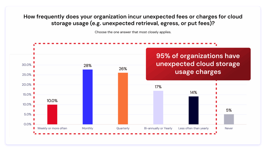
A new Dimensional Research report, commissioned by Backblaze, reveals that 95% of organizations experience unexpected cloud storage charges—costs that disrupt budgets, slow innovation, and limit flexibility.
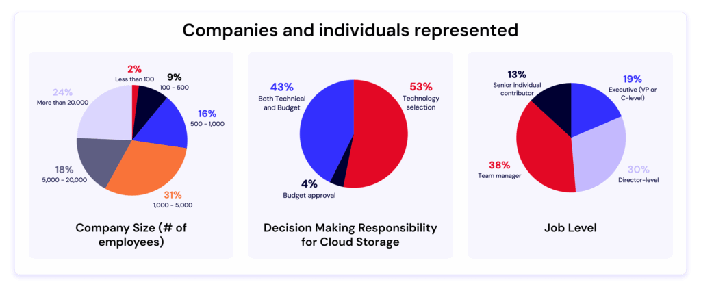
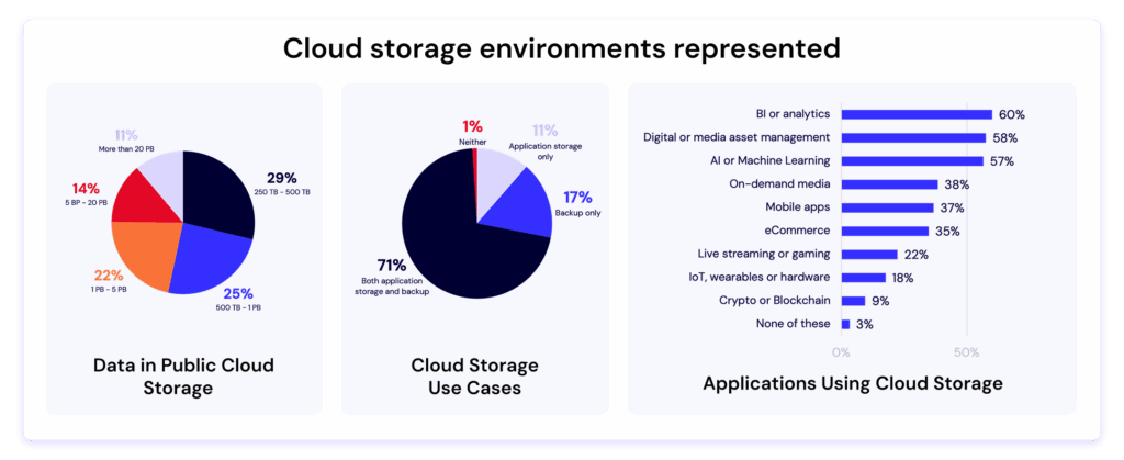
The 2025 study surveyed more than 400 IT decision makers responsible for managing at least 250TB of data in the public cloud. The findings make one thing clear: as AI, analytics, and data-intensive workloads expand, hidden costs and limited interoperability are forcing companies to rethink their cloud strategies.
The problem: Hidden fees are everywhere
According to the research, nearly every organization surveyed has been hit by surprise charges like retrieval, egress, or PUT fees.
95% of respondents reported unexpected costs for cloud storage usage.
Larger organizations—those with more than 5PB of data—were even more likely to experience frequent charges.
These hidden costs have become such a burden that 85% of companies are taking steps to manage them. The top tactics include:
Reducing the size of datasets stored in the cloud (56%)
Shortening storage duration policies (45%)
Cutting spending elsewhere in the tech stack (40%)
In short: IT teams are making trade-offs to avoid surprise costs—trade-offs that can limit innovation and reduce the value of their data
Egress costs are locking companies in
One of the most striking findings:
55% of respondents said that the cost of egressing and moving data is the biggest barrier to switching cloud storage providers.
That means many organizations feel trapped in their current solutions—not because the technology is best-in-class, but because moving their data would be too expensive.
This dynamic creates what’s often called a “walled garden” effect—where providers profit from data lock-in rather than delivering value through performance or innovation.
The result? Slower cloud adoption, limited agility, and higher total cost of ownership for IT teams trying to scale modern workloads.
Flexibility and interoperability are the new imperatives
If cost surprises weren’t enough, nearly all respondents (99%) said that limited flexibility and lack of interoperability are impacting their ability to deliver and scale.
In other words: even when data is stored safely, it’s often stuck—difficult to move, integrate, or use across tools and platforms.
This friction hits hardest at large enterprises and data-heavy organizations that depend on cross-cloud workflows, hybrid architectures, or AI pipelines that require moving large volumes of data frequently.
A turning point for cloud storage strategy
With 62% of respondents preferring to select best of breed providers vs. one-stop-shops, these findings highlight a growing shift:
IT teams are no longer choosing cloud providers solely based on performance or ecosystem.
They’re prioritizing predictability, transparency, and interoperability—the ability to move and use data freely, without hidden penalties.
Backblaze has long championed this model with open cloud storage that puts customers—not pricing structures—in control. Our egress fee transparency, S3 compatible APIs, and simple pricing are designed to eliminate the pain points identified in this report.As one respondent put it: “We need a cloud partner that helps us use our data, not pay to move it.”
What’s next: Join the conversation
The full report—The Hidden Cost of Cloud Object Storage—is now available for download. Inside, you’ll find all the data, charts, and insights from 400+ IT leaders across industries and company sizes.
And, to dive deeper into the findings, join us for an upcoming live webinar with experts from Dimensional Research and Backblaze. We’ll unpack the key trends, share real-world stories from IT leaders, and discuss how to build a more transparent, flexible cloud strategy.
About the research
The survey, conducted by Dimensional Research in May–June 2025, included responses from 403 qualified technology stakeholders responsible for cloud storage strategy and budgets. All participants represented companies with over 250TB of data stored in the public cloud.
Current artificial intelligence (AI) methods, especially machine learning (ML), rely heavily on data. To complement our work on AI literacy, we have been investigating what data science teaching resources and education research are currently available. Our goal is to work out what data science concepts should be taught in a data science curriculum for schools.
Read on to find out what resources and materials we have reviewed, and what concept themes we have identified.
What is data science? Why is teaching it important?
Data science is an interdisciplinary science of learning from large datasets, aided by modern computational tools and methods (Ow‑Yeong et al., 2023). We see data science skills as fundamental for using, creating, and thinking critically about:
Insights from data, generally
Data-driven computational tools and methods (such as machine learning) and their outputs and predictions, specifically
To navigate a world where decision making in many areas is influenced by data-driven insights and predictions, young people need to be taught about data science. Data science skills empower young people to become critical thinkers, discerning consumers, adaptable professionals, and informed citizens.
In some countries, such as India and Israel, data science education is an established school subject. It is taught as part of the curriculum in at least one of the primary, secondary, or post-16 age phases. Meanwhile in other countries, for example Canada, Germany, and Poland, data science is a very new school subject, or there are still only recommendations to develop it into a school subject.
While we are currently considering what a comprehensive data science curriculum should include, we already offer several resources to support you with your teaching about data science and data-driven technologies. You can find a list of these resources at the end of this blog. Now, however, I’ll give you an overview of our recent work to identify concepts for a data science curriculum that fits with our approach to AI literacy.
Data science education: What should we teach?
To answer the question ‘What should we teach about data science to learners aged 5 to 19?’, we undertook a grey literature review of data science teaching materials. A grey literature review is structured like an academic literature review and conducted with the same rigour. The difference is that a grey literature review also considers publications that have not been peer-reviewed, including reports, white papers, curriculum materials, and similar resources.
To orient our work, we combined four frameworks for data science and AI/ML education:
With these combined frameworks as our map, we reviewed 79 data science learning resources. The resources varied:
In quality in terms of clarity and teaching approach
In their focus, e.g. on maths, coding, or a specific field such as biology
In their perspective on data science, with some prioritising theory and others real-world applications
From among the 79 resources, we chose 9 that included clear learning outcomes, and that together covered a wide field of concepts. We examined these 9 in detail to extract 181 explicit and implicit data science concepts. Next, we grouped the concepts into themes, and finally we refined these themes by comparing them against the four frameworks listed above.
The themes we have identified for a data science curriculum are:
Fundamentals of data literacy: Key terms and definitions
Understanding bias in data
Ethical responsibility in data use
Data creation, curation, and transformation
Analysis and modelling: Maths and statistics fundamentals
ML principles
Deploying and maintaining ML applications
Software tools and programming
Data visualisation
Presenting findings effectively
This set of themes both fits with the frameworks by Olari and Romeike and Data Science 4 Everyone, and expands them by covering ML principles and programming approaches and calling out data bias and ethics.
What’s next for this work?
Through our grey literature review on data science education, we’ve:
Pinpointed a large set of candidate concepts that could be taught within a data science curriculum
Created a set of clear themes to structure our work going forward
Our next step is to shape these candidate concepts into a progression framework to describe their relationships and establish which concepts could be taught at each age or phase of schooling.
The literature review also gave us an overview of the pedagogical approaches and tools used for teaching data science concepts. These findings will become useful once we start designing learning activities.
You’ll hear more about how this work is going here on our blog and on our social channels. In the meantime, comment below to let us know what you think about the themes, or to tell us what you’d like to see in a data science curriculum for the learners you work with.
The report lists the data-related units within The Computing Curriculum materials, which we no longer update but continue to offer as free downloads. Updated classroom materials are available as part of the Computing materials we created for Oak National Academy in the UK for ages 5–11 and ages 12–19.
The Ada Computer Science platform offers learning materials on data and information, and on AI and ML, for ages 14–19.
You might also be interested in exploring the Experience AI programme, which offers everything teachers need to help students develop a foundational understanding of data-driven AI technologies, their social and ethical implications, and the role that AI can play in their lives.
Teacher training and development resources
Our free online course ‘Teach teens computing: Machine learning and AI‘ helps teachers understand and explain the types of problems that ML can help to solve, discuss how AI is changing the world, and think about the ethics of collecting data to train a ML model.
Teaching young people to understand data-driven AI technologies means teaching them thinking skills that are different to those needed to understand rule-based computer systems. You can read about these Computational Thinking 2.0 skills in our Quick Read PDF.
Interesting article about the arms race between AI systems that invent/design new biological pathogens, and AI systems that detect them before they’re created:
The team started with a basic test: use AI tools to design variants of the toxin ricin, then test them against the software that is used to screen DNA orders. The results of the test suggested there was a risk of dangerous protein variants slipping past existing screening software, so the situation was treated like the equivalent of a zero-day vulnerability.
[…]
Details of that original test are being made available today as part of a much larger analysis that extends the approach to a large range of toxic proteins. Starting with 72 toxins, the researchers used three open source AI packages to generate a total of about 75,000 potential protein variants.
And this is where things get a little complicated. Many of the AI-designed protein variants are going to end up being non-functional, either subtly or catastrophically failing to fold up into the correct configuration to create an active toxin.
[…]
In any case, DNA sequences encoding all 75,000 designs were fed into the software that screens DNA orders for potential threats. One thing that was very clear is that there were huge variations in the ability of the four screening programs to flag these variant designs as threatening. Two of them seemed to do a pretty good job, one was mixed, and another let most of them through. Three of the software packages were updated in response to this performance, which significantly improved their ability to pick out variants.
There was also a clear trend in all four screening packages: The closer the variant was to the original structurally, the more likely the package (both before and after the patches) was to be able to flag it as a threat. In all cases, there was also a cluster of variant designs that were unlikely to fold into a similar structure, and these generally weren’t flagged as threats.
The research is all preliminary, and there are a lot of ways in which the experiment diverges from reality. But I am not optimistic about this particular arms race. I think that the ability of AI systems to create something deadly will advance faster than the ability of AI systems to detect its components.
Светослав Драганов е режисьор, сценарист и продуцент, член на Европейската филмова академия и председател на Гилдия „Режисьори“ към СБФД. Преподава кино в Нов български университет. Автор е на документални и игрални филми, отличаващи се с човечност, наблюдателност и деликатно чувство за хумор, сред които „Живот почти прекрасен“ (2013) и „Смирен“ (2022). В работата му личи интерес към личните съдби, през които се отразяват по-големите обществени и исторически промени.
„Снежа и Франц“ е документален филм за любов, изкуство и свободата да живееш отвъд границите. Чрез богат архив от любителски филми, писма и фотографии Светослав Драганов разказва историята на една двойка – българката Снежа и австриеца Франц, чиято връзка прекосява време, разстояния и политически разделения. Филмът е нежно размишление върху паметта, избора и цената на независимостта. Той е част от по-широк проект, в който киното и визуалното изкуство се преплитат в обща любовна и художествена хроника.
Премиерата на „Снежа и Франц“ е на 3 ноември 2025 г. от 18:30 ч. в Дома на киното в София. Изложбата „Снежа и Франц“ в галерия „Райко Алексиев“ може да се види от 4 до 15 ноември, 17–20 ч.
Казвате, че от години сте мечтал да направите филм за леля си и чичо си. Какво се промени у Вас като човек и като режисьор, за да сте готов да разкажете тази история именно сега?
Винаги съм се възхищавал на чичо ми по някакъв начин. Като на човек, който все потегля към нови приключения. Особено като открих, че е снимал и филми в края на 90-те, началото на 2000-те години, когато едната ми братовчедка ги беше прехвърлила на VHS. После открих и други филми, които стояха в едно мазе. Най-интересното за мен се крие в тази еволюция, че аз всъщност винаги съм искал да направя филм за Франц. Постепенно фокусът се измести и към леля ми, към Снежа – тя е „обикновеният човек“, който седи и чака, докато Франц обикаля света.
Франц какви приключения е имал? С какво се е занимавал?
Той е бил наистина много спортен тип. От малък кара ски в Тирол. Почва да се занимава с катерене, прави експедиции, които стават все по-екстремни и по-екстремни. През 1967 г. семейството му пътува до Турция, отиват на море, и минават през България на връщане. Отбиват се в Слънчев бряг, където по онова време е имало и къмпинг. Леля ми тогава за първи път отива сама на море, при най-добрата си приятелка, която е в Несебър. Там в един ресторант се запознават с Франц. Те са танцували, а най-добрата приятелка – Юлия, е знаела немски и е превеждала, за да могат да си говорят.
Какво се случва след това?
Почват да си пишат. Той идва в България, пламва любов. Но след това Снежа е приета да учи в Москва, в текстилен институт за дизайн на дрехи. Тя заминава през 1968-ма за пет години. След това се връща и отново пламва епистоларната любов. Пишат си писма, всъщност тя ги пише пак с помощта на Юлия, която превежда. После двамата се събират, женят се и леля ми заминава за Австрия.
Имала ли е някакви проблеми да замине?
Тя е била с държавна поръчка и е трябвало да плати 6000 долара, за да може да замине за чужбина. Или да работи тук шест години, или да плати тези пари. Това са били вариантите. Леля ми работи почти една година и събират тази сума от приятели. Франц от своя страна идва до България със ски оборудване, щеки, обувки. Напълнил е догоре един ситроен, за да продава тук – тогава у нас е имало дефицит на такива неща. Даже веднъж му разбиват колата в София и го ограбват.
Желязната завеса като че ли е работила само за нас?
Да, тя е работила само за хората от Изтока. Ние не сме могли да пътуваме, но те са могли да идват и да оставят шилингите, марките, доларите си. Има един много интересен рекламен филм за Черноморието, в който се казва: „Заповядайте в България, тук валутният курс е перфектен. Харчете с кеф!“ След като се женят официално, леля ми вече също може да идва. Те даже са идвали заедно.
Франц разказвал ли Ви е за приключенията си?
Чичо ми почина през 1987-ма, а аз не говорех немски. Той беше чудо. Най-хубавите ми снимки от детството са негови, защото са цветни. Проявявал ги е, копирал ги е и ги е пращал по пощата. Това са много ценни спомени.
С какво се е занимавал той?
Намирал си е работа, която да му позволява да пътува. Живели са в Иран преди революцията, около 1977 г. Занимавал се е с почви, бил е микробиолог и е специализирал в това как неплодородната почва да се направи плодородна. После е работил и в Кабо Верде, където е изследвал как и защо вулканичната почва на тези острови е толкова плодородна. Бил е алпинист и катерач. Започва с алпинизъм – според мен заради Райнхолд Меснер, който е бил, а и сега е голяма поп звезда в Австрия и немскоезичния свят. Меснер издава книга за всяко пътешествие, появява се по медиите. В един момент чичо ми се отказва от алпинизма и почва да пътешества. Тогава и в Австрия има глад за хора, които да разказват на обикновения човек за местата, които са посетили. Та той е правил такива сказки. С леля ми са пътували, тя е събирала парите от билети за вход. А чичо ми се е подготвял, снимал е филми, имал е и диапозитиви, за да разказва за посетените места.
Има ли негови книги?
Да, има една издадена книга – „Памир 81“, самиздат. Това е книга за изкачването му на Исмаил Самани (7495 м), известен по онова време като връх Комунизъм, най-високия връх в бившия Съветски съюз. Книгата е много интересна, защото е и социологическа, не е само за катеренето. Това е дневник на пътешествието му плюс наблюденията му на света и живота там и в Москва.
Когато си намира работа в Кабо Верде за една година, той взема семейството си. Праща ги със самолет заедно с една от сестрите си, защото децата са малки. А той трябва с другата сестра да кара до Дакар със старата си кола „Опел Рекорд“. В един момент колата се чупи в Африка и те я качват на влак. Идеята е все пак колата да стигне до Дакар – важното е не те самите да се доберат дотам, а те заедно с колата. Когато пристигат, намират кой да я ремонтира, оправят я и продължават към океана. После остават в Кабо Верде. Това е най-хубавият период от съвместния им живот. Една година заедно, без той да мърда никъде, без да обикаля и да търси приключения. Рай. След като се връщат, леля ми и братовчедките ми остават във Виена, а той поема с лодка по Нигер.
Как фокусът Ви се премести от Франц към Снежа?
Фокусът ми се насочи и към двамата. Как леля ми се справя с неговите екстремни ситуации. Голяма част от филма е за смъртта му и как тя я преживява. Как трябва да се промени, да стане глава на семейството. И това е само върхът на айсберга.
Ако можеха сега да гледат филма заедно, какво мислите, че биха си казали един на друг след прожекцията?
Основният проблем при правенето на филма беше огромната травма на моите братовчедки. Те страшно много обичат баща си, с когото са прекарвали приказно време – играли са си, спортували са, правили са походи. Тези моменти са били много ценни за тях.След като той умира, им е отнето нещо безценно. И затова никак не искаха някой да се рови и да го показва. Трябваше много време да убеждавам тях и леля ми да влязат в тази история така, че да я споделят с външни хора.От друга страна, той е снимал непрекъснато, писал е, искал е да разкаже за тази част от живота си. Най-интересното е, че в книгата „Памир 81“ има включено писмо – „Едно кратко писмо по една дълга тема“. В него той обяснява, че не бяга от тях, че иска да намери себе си, но по някакъв начин, пътувайки, ги намира. Много е поетично и честно.Тези неща са го занимавали точно толкова, колкото самите пътешествия. Анализирал е как егото му и желанието му да пътува могат да наранят най-близките му хора. И как, наранявайки ги, да им обясни защо го прави. Имал е желанието да разкаже своята версия и истина.
Какво Ви казаха леля Ви и братовчедките Ви, след като гледаха филма?
Едната ми братовчедка участва във филма и това е много силен момент. Другите две казаха, че ако не им хареса филмът, няма да мога да ползвам кадрите с тях. Ние сме много близки и това е тяхно право. Беше страшно преживяване да им покажа филма. И впоследствие беше много хубаво, защото получих разрешението им. Дори сега, на премиерата, всички те ще дойдат в София. Леля ми, трите ми братовчедки, сестрите на Франц и други роднини.
Ще има ли събития освен филма?
Ще има изложба и за първи път в едно пространство – в галерия „Райко Алексиев“, ще бъдат изложени заедно Франц с неговите филми и Снежа с нейните текстилни релефи и текстилни абстрактни картини. След филма ще могат да се видят като допълнение нещата, които са показани на екрана, а и физически ще могат да се пипнат. След прожекцията ще отидем до галерията. Голяма част от работите са направени от Снежа след смъртта на Франц. Тя преработва цялата си травма и изобщо техните взаимоотношения в тези произведения. Георги Дончев, един от композиторите на филма, ще направи музикален пърформанс. Изложбата ще е вечерна, ще може да се гледа от 17 до 20 часа. Няма да бъде отворена през деня.
Как Снежа се е справяла в Австрия?
Като се е върнала от Москва, е работила в ЦНСМ – Центъра за нови стоки и мода. В Австрия забременява, ражда двете близначки, пътуват с Франц в Иран. В един момент решава да прави тези „текстилни релефи“, както ги наричат заедно с Франц. Той ѝ помага. Има някаква симбиоза между двамата. Чичо ми не е бил такъв тип – „ти стой вкъщи, аз ще пътувам“. Той иска да прави каквото иска, но по някакъв начин държи да ѝ даде и на нея възможността да прави каквото ѝ се иска. На леля ми винаги ѝ е било трудно да напише концептуалните си текстове, защото, когато правиш изкуство, трябва да опишеш какво искаш да кажеш с него. Тя е трябвало да го напише на немски, обаче немският ѝ не е бил толкова добър. Затова Франц е писал тези текстове. Много е тъжно, че точно когато нейната кариера на артист започва да върви нагоре, той… След смъртта му тя няколко години просто е в тотален стрес и скръб. Спира въобще да се занимава с изкуство. Най-истинските ѝ работи се появяват няколко години след смъртта му, когато отново почва да работи и да преработва и допълва тези произведения. Най-силните всъщност не ги е и продавала, прекалено лични са били. През 90-те години леля ми прави доста добра кариера в Австрия. Тя никога не е имала изложба в България. Сега ще е за първи път.
Имаше два варианта. Да го направя много артистичен, защото има страхотен и ефектен архив. Или да го направя така, че да разкажа тази история, както трябва да бъде разказана – коректно и човешки. Идеята ми беше да оставя пространство за хората, които участват, да не влагам толкова режисьорската си гледна точка. Да не играя много с естетически амбиции, а по-скоро да направя нещата етически акуратни.
Как реагират хората около Вас на филма?
Една позната го гледа и каза: „Снежа нещо не ми харесва.“ Тя очаквала в края на филма Снежа да се разбунтува, да отрече из основи тази любов. Леля ми всъщност вижда и тази перспектива, но пази това, което е било между тях двамата, иска то да остане ненакърнимо.
Светослав Драганов на снимачната площадка
А Вие ще тръгнете ли скоро към нови приключения и какви ще бъдат те?
Правя няколко филма. Скоро ще излезе филм, който продуцирам, за едно малко село близо до Дунава. Режисьорката Елена Стойчева отива там и селото се отваря за нея. Опитват се да я засмучат, да я направят кметица, да се ожени за местно момче. Много любопитен филм. Скоро ще излезе и филмът ми за Мария Статулова, с която много се сближихме покрай „Смирен“. Правя филм и за Babyface Clan, за групата и за цялото това поколение. Занимавам се и с нов игрален проект също. Продуцирам и дебютния филм на един колега, Лазар Иванов, млад режисьор – пак документален. Той е на 28 години и прави филм за баща си, а баща му е мой приятел от 90-те години, много интересна фигура от ъндърграунда. Дойде времето, когато децата ни откриват родителите си, които са малко странни хора.
Филмът „Снежа и Франц“ и едноименната изложба са създадени с подкрепата на: Cineaste Maudit production, Контраст филм, Right Solutions, Sonus, Програма „Творческа Европа МЕДИА“, ИА „Национален филмов център“, Филмов архив на града и провинцията Виена, БНТ, Столична община, Национален фонд „Култура“, Австрийски културен форум, хотел „Кооп“, КиноКлас, Дневник и винарна „Типченица“.
As Grab transitions to derive more valuable insights from our wealth of operational data, we are witnessing a steep increase in stream-processing applications. Over the past year, the number of Flink applications grew 2.5 times, driven by interest in real-time stream processing and the improved accessibility of developing such applications with Flink SQL. At this scale, it has become crucial for the internal Flink platform team to provide a cost-effective and self-service offering that supports users of diverse backgrounds.
Background: Flink at Grab
Flink at Grab is deployed in application mode, each pipeline has its own isolated resources for JobManager and TaskManager. Flink pipeline creators control both application logic and deployment configuration that affect throughput and performance, including OSS configurations:
Number of TaskManagers and task slots per TaskManager
CPU cores per TaskManager
Memory per TaskManager
As pipeline creation has become more accessible, users of different backgrounds (analyst, data scientist, engineers, etc.) often struggle to choose a set of configurations that work for their applications. Many go through a long process of trial and error and still end up over-provisioning their applications, leading to huge resource waste. Moreover, pipeline behavior changes over time due to changes in application logic or data pattern, invalidating previous efforts in tuning and causing users to repeat the exercise.
In this article, we focus on addressing the challenge of efficient CPU provisioning for TaskManagers, as CPU constraints are a common bottleneck in our clusters. Our solution specifically targets Flink applications sourcing data from our message bus system (eg. Kafka, Change Data Capture Streams, DynamoDB Streams) , which represents the majority of our use cases. These workloads offer significant opportunities for cost savings due to their clear seasonal patterns, making them an ideal starting point for optimising autoscaling strategies.
Limits of reactive autoscaling
Our initial reactive setup
Our first automated solution relied on Flink’s Adaptive Scheduler in Reactive Mode. In this mode, each Flink application is deployed as its own individual Flink cluster running a dedicated job. The cluster greedily uses all available TaskManagers and scales its job parallelism accordingly. Running on Kubernetes, the cluster relies on Horizon Pod Autoscaler (HPA) to scale the number of TaskManager pods based on metrics such as CPU usage or custom metrics such as the pipeline’s consumer latency. While this solution was helpful initially, we quickly observed multiple issues with it.
It is important to note that while the below issues can be solved by fine-tuning, it is a tedious trial and error effort that only works for specific applications, requiring users to repeat the process for every pipeline they own.
Restart spike: root cause of many issues
When autoscaling a Flink pipeline, the job restarts from the last checkpoint. This triggers an immediate spike in load, as the pipeline must reprocess records from the period between the last checkpoint and job restart, along with any new records that were backlogged at the source during the downtime. As a result, CPU usage and P99 consumer latency typically spikes after scaling events, for example, at 00:05 and 00:55, as shown in Figure 1. These spikes occur even though there is no change in source topic throughput. In this case, CPU usage surges from 0.5 cores to near provision limit of 2.5 cores, while consumer latency temporarily spiked from sub-second levels to as high as three minutes.
Figure 1: CPU usage and consumer latency spike after a pipeline restart.
Reactive spiral and fluctuation
Typically, HPA scales on metrics such as CPU usage, consumer latency, or backpressure crossing a defined threshold. The challenge arises if these thresholds are misconfigured. The HPA’s reactive nature, when combined with restart spikes, can become detrimental to your Flink application. It piles additional load onto a system that’s already degrading, further amplifying the problem.
Figure 2: A reactive scaling incident that demonstrates scaling fluctuations and restarts.
Figure 2 provides us a case study of reactive spiral and fluctuation, assuming we are having a pipeline that consumes a Kafka topic of 300 partitions:
07:00: As the source topic throughput increases, the P99 consumer latency rises due to insufficient processing power.
07:15: Reactive scaling is triggered, resulting in a scale out event. This is reflected in the increased TaskManager and task slot count. The pipeline continues to operate, as there is no increase in restart count.
07:30: As the P99 consumer latency remains high, reactive scaling continues to scale out incrementally. The records in rate by task rises rapidly as the pipeline reprocesses data from the checkpoint. During this period, the pipeline repeatedly restarts CPU usage drops significantly, and P99 consumer latency spikes to nearly one hour. This marks the onset of a spiral failure.
08:00: Reactive scaling reaches its upper limit of 300 slots, corresponding to the number of partitions in the source topic. This halts the spiral effect as it cannot scale out any further. Without disruption from autoscaling restart, the pipeline begins to process the backlog since the last successful checkpoint, as observed by the significant increase in records in rate by task. As the pipeline catches up, it eventually stabilizes, and the P99 consumer latency returns to normal levels.
08:30 – 10:15: The P99 consumer latency returns to normal levels, below the threshold. Reactive scaling triggers scale-in events despite the source topic throughput continuing to trend upward. During these scale-in events, P99 latency fluctuates, occasionally spiking up to 15 minutes. However, these fluctuations are not severe enough to prevent the repeated scale in process.
10:15: The P99 consumer latency rises again, triggering a scale-out event back to the upper limit of 300 slots.
11:15-11:45: Despite the source topic throughput maintaining an upward trend, the pipeline undergoes multiple scale-in events in quick succession, encounters latency issues due to reprocessing data from checkpoints, and scales out again shortly after. This is an example of fluctuation after scaling in, resulting in 6 restarts within a 30 minutes window.
Limited parallelism constraints
Even with HPA, we frequently encounter a bottleneck when trying to scale our applications’ throughput. This is primarily because some of our connectors, most notably the Kafka connector, don’t inherently support dynamic parallelism changes.
Kafka topics, by design, have a fixed number of partitions. This directly limits the number of parallel consumers we can run. Consequently, once we reach this maximum parallelism for our consumers, we often have to scale up resources, for example, increase memory/CPU per instance instead of scaling out (adding more instances).
Predictive Resource Advisor
Assumptions and hypothesis
To tackle the issue of reactive spirals and fluctuations, the new solution should have the following characteristics:
Vertical scaling: To tackle the issue of limited parallelism with our dependencies, we should be looking at vertical instead of horizontal scaling.
Predictive: Adjust CPU to scale up or down before demand spikes or dips occur, ensuring the system is prepared for changes in workload. This prevents artificial workload increases caused by processing backlogs on top of actual workload increase, further straining the system.
Deterministic: The CPU configuration must be precisely calculated based on the workload demand, ensuring predictable and consistent resource allocation. For a given workload, the calculated CPU value should remain the same every time, eliminating variability and uncertainty in scaling decisions.
Accurate: Determine the optimal CPU configuration required to handle workload demand in a single, precise calculation, avoiding the inefficiencies of multi-step, trial-and-error tuning.
Key observations
Our solution is conceptualized based on key observations of our Flink applications:
The CPU usage of Flink applications is primarily driven by the input load.
The input load of our Flink applications can be accurately forecasted using time-series forecasting techniques.
Time-based autoscaling that relies solely on historical CPU usage is not robust enough to adapt to evolving workloads. This approach also carries the risk of a negative self-amplifying feedback loop: each autoscaling restart causes a CPU usage spike (as illustrated in Figure 1), which, if anomalies are not properly handled, inflates subsequent CPU calculations.
Model formulation
We then formulate the relationship between CPU usage and input load using a regression model to provide a mathematical framework for predicting CPU requirements based on workload patterns, expressed as:
Ct = f(xt)
In this equation:
Ct represents the CPU required at a specific point in time.
xt represents the input workload at the corresponding point in time.
f() represents the regression function that maps the input load to the required CPU capacity.
Input load, represented by Kafka source topic throughput in our case, is chosen as the independent variable xt because it reflects true business demand and is entirely independent of Flink consumers. This metric is influenced solely by the business logic of upstream producers and remains unaffected by any changes or behaviors in the Flink consumer pipeline.
Proposed solution
Our predictive autoscaler operates through four key stages as shown in Figure 3.
Figure 3: The predictive autoscaling system operates through four key stages.
Stage 1: Workload forecast model
The workload forecast model is a time-series forecasting model trained on actual workload data, specifically source topic throughput from our Kafka cluster (1). This approach is particularly effective as our workload exhibits seasonal patterns. While historical data could be directly used as input for CPU prediction, time-series forecasting offers a more robust solution by enabling the model to account for organic traffic growth over time. Through periodic retraining, the model adapts to evolving workload trends, ensuring more accurate and reliable predictions for resource provisioning.
Stage 2: Resource prediction model
This follows the regression-based model Ct = f(xt) defined earlier. We use the same source topic throughput from our Kafka cluster (2a) as input feature xt, and the Flink application’s Kubernetes CPU usage metric (2b) as output label Ct for model training. To ensure clean and representative data for model training, we collect CPU usage metrics under conditions that simulate infinite resource availability. We include data exclusively from periods of continuous and stable operation, as determined by latency, uptime, and restart metrics (2b), eliminating biases caused by hardware limitations or disruptions.
Stage 3: Workload forecasting
To prepare for autoscaling, we forecast the workload for the future t-hour window (3) using our trained time-series forecast model.
Stage 4: Predict CPU usage
The forecasted workload (3) is fed into the resource prediction model to estimate the CPU usage required to handle that workload. The predicted value is then refined using custom safety feature adjustments to account for variability and ensure stability. This adjusted prediction is passed to the custom autoscaler controller, which evaluates the current CPU configuration of the TaskManager deployment. If the adjusted predicted value differs from the existing CPU configuration, the controller initiates vertical scaling to update the TaskManager deployment accordingly.
Proof of concept and results
Experiment setup
To validate our hypothesis, we present a deep dive into one of our experiments. This pipeline features complex business logic, aggregates from multiple Kafka sources, with a checkpoint interval of one minute and a maximum consumer latency of five minutes.
We set up an experimental pipeline with configurations identical to the production pipeline (the control). Both applications sourced data from the same Kafka topics but sank data to alternative topics to maintain isolation. The Predictive Resource Advisor was enabled on the experimental pipeline, while the control pipeline operated with fixed CPU provisioning.
Results
Figure 4 demonstrates a strong correlation between CPU usage (yellow, green) and the total Kafka topics throughput. The variable CPU provisioning (blue) for the experimental pipeline is calculated by our autoscaler models, which were trained exclusively on data collected from the experiment pipeline. The CPU usage trend of the experimental pipeline closely mirrors that of the control pipeline and remains aligned with the Kafka throughput trend. However, the experimental pipeline’s CPU provisioning is dynamically adjusted to more closely match its actual CPU usage, whereas the control pipeline maintains a static CPU allocation (purple). This illustrates the model’s effectiveness in dynamically adjusting CPU allocation to meet variable workload demands.
Figure 4: CPU usage closely correlates with source throughput for both the experimental and control pipelines.
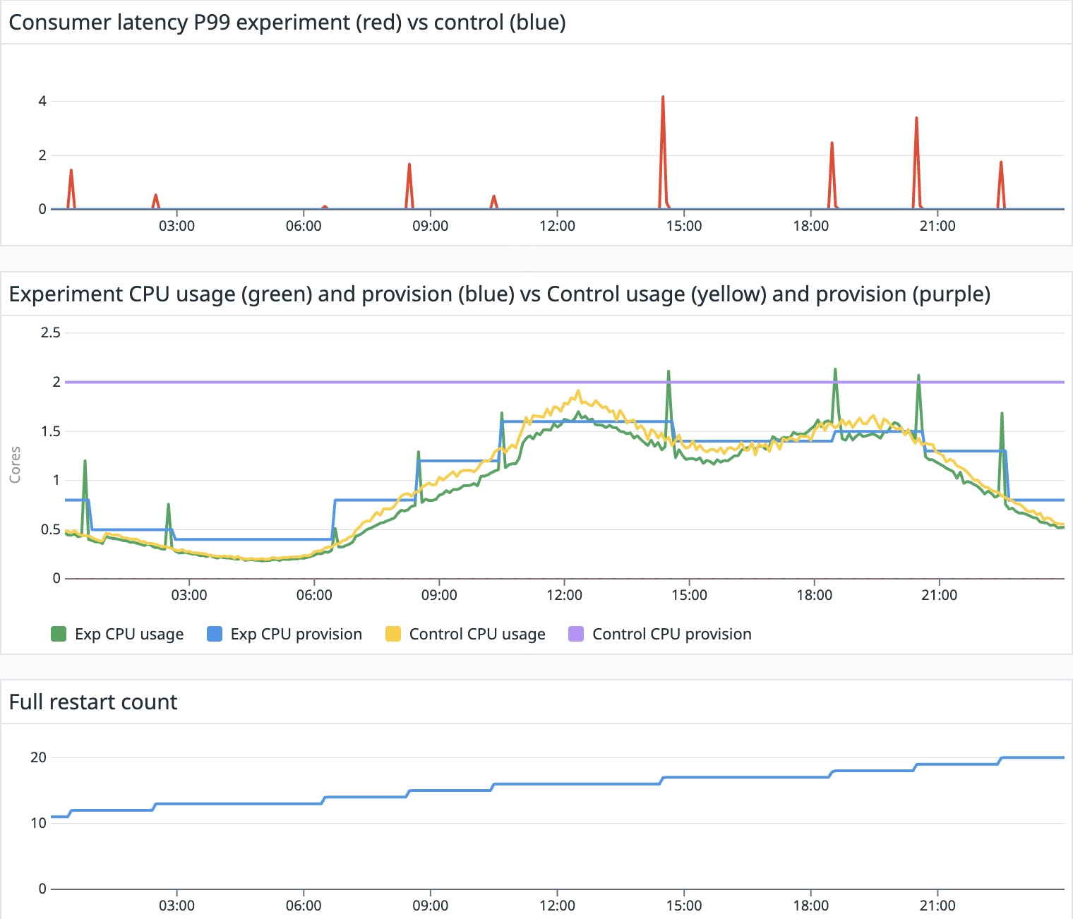
Without autoscaler enabled, the control pipeline experienced no disruptions and maintained latency (blue) consistently below one second, which is not visible in Figure 5. On the other hand, the experiment pipeline latency (red) experienced a highest recorded peak latency of just over four minutes during a single disruption window. Other latency spikes observed were comparable to or lower than the three minutes peak latency previously identified as part of the restart spike issue analysis. The varied durations and amplitudes of these spikes showed some correlation with the heavy Kafka topic throughput during those periods. Importantly, there were only nine autoscaling events throughout the day, resulting in nine restarts for the experiment pipeline.
Figure 5: Autoscaling impacts service-level agreement requirements through latency spikes during scaling events.
Outcome
The Predictive Resource Advisor solution has been successfully deployed across more than 50% of applicable production applications, specifically those consuming from Kafka topics and exhibiting seasonal workload patterns with some tolerance for disruptions. This implementation has delivered significant results across three key areas, stability, efficiency, and user experience.
Stability
With autoscaling becoming more predictable and controllable, our Flink applications experience fewer disruptions caused by autoscaling fluctuations. The machine learning and predictive capabilities of the solution also ensure that applications remain operational during periods of increased workload by automatically learning and adapting to organic growth trends and workload surges.
Efficiency
Applications powered by the Predictive Resource Advisor demonstrated significant improvements in CPU provisioning, aligning CPU configuration more closely with actual requirements, particularly during low traffic periods. As a result of this optimization, on average, these applications made approximately >35% savings in cloud infrastructure cost.
User experience
The solution has simplified the deployment process for users, allowing them to simply deploy Flink applications with default configurations. The Predictive Resource Advisor automatically collects data, trains autoscaling models, and applies configuration changes, thus eliminating the need for manual fine-tuning. This significantly enhances the user experience by streamlining pipeline maintenance and enabling self-service capabilities, such as effortless onboarding. It empowers users to explore and derive value from real-time features with minimal effort.
What’s next?
Our journey doesn’t stop here. We’re continuously working to enhance our predictive autoscaler, with the following key areas of focus:
Tackling memory configuration (Predictive Resource Advisor’s next frontier)
Memory is critical yet often misconfigured that can lead to unrecoverable failures for example, OOMKilled. Our next major goal for the Predictive Resource Advisor is to take on memory tuning, completely removing the burden of complex memory configuration from our users and further empowering them.
Enhancing model accuracy
To further improve the robustness of our predictions, we are actively exploring advanced techniques in input feature engineering and anomaly detection, especially for workloads exhibiting frequent bursting patterns. By refining these aspects, we aim to extend the applicability of our solution to a broader range of Flink applications, including those connected to diverse sources such as change data capture systems or batch-like, spiky workloads, such as the Flink applications powering our real-time data lake.
Streamlining model training
We’re developing a more efficient model training workflow. A particularly exciting avenue we’re investigating is the use of pretrained time-series forecasting models based on large language model architectures.
Grab is a leading superapp in Southeast Asia, operating across the deliveries, mobility and digital financial services sectors. Serving over 800 cities in eight Southeast Asian countries, Grab enables millions of people everyday to order food or groceries, send packages, hail a ride or taxi, pay for online purchases or access services such as lending and insurance, all through a single app. Grab was founded in 2012 with the mission to drive Southeast Asia forward by creating economic empowerment for everyone. Grab strives to serve a triple bottom line – we aim to simultaneously deliver financial performance for our shareholders and have a positive social impact, which includes economic empowerment for millions of people in the region, while mitigating our environmental footprint.
Powered by technology and driven by heart, our mission is to drive Southeast Asia forward by creating economic empowerment for everyone. If this mission speaks to you, join our team today!
Alejandro Colomar has announced the release of version 6.16 of the GNU/Linux man pages. This release includes new or rewritten man pages for fsconfig(), fsmount(), and fsopen(), as well as a number of newly documented interfaces in existing man pages. The release is also available as a PDF book.
ICANN’s Security and
Stability Advisory Committee (SSAC) has announced
a report
on “the critical role of Free and Open Source Software (FOSS)
within the Domain Name System (DNS)“. The report is aimed at
policymakers and examines recent cybersecurity regulations in the US,
UK, and EU as they apply to FOSS in the DNS system; it includes
findings and guidelines “to strengthen the FOSS ecosystem that is
critical to the secure and stable operation of the Internet“. From
the report’s summary:
This ecosystem depends on a global network of maintainers and
contributors who are often unpaid volunteers. While many are unpaid
volunteers, the DNS space is unique in also relying on a handful of
long-lived maintenance organizations. This creates a model based on
community collaboration rather than the commercial contracts that
define a traditional software supply chain, which introduces unique
risks related to financial sustainability for the maintenance
organizations and maintainer burnout for volunteers.
These unique characteristics mean that regulatory frameworks
designed for proprietary software may not be well-suited for FOSS and
therefore could have severe unintended consequences to the stability
of critical Internet infrastructure.
Thanks to SSAC member Maarten Aertsen for the tip.
A new class of attacks on Android phones, called “Pixnapping“, was announced on
October 13. It allows a malicious app to gather output rendered in a
victim app, pixel-by-pixel, by exploiting a GPU side-channel. Depending on
what the victim app displays, anything from sensitive email and chats to
two-factor authentication (2FA) codes could be captured—and shipped off to
an attacker’s site.
This is our first stable release based on Firefox ESR 140,
incorporating a year’s worth of changes that have been shipped
upstream in Firefox. As part of this process, we’ve also completed our
annual ESR transition audit, where we reviewed and addressed around
200 Bugzilla issues for changes in Firefox that may negatively affect
the privacy and security of Tor Browser users. Our final reports from
this audit are now available in the tor-browser-spec
repository on our GitLab instance.
This release inherits the vertical tabs feature, unified search
button, as well as other new features and usability improvements in
Firefox that have passed the Tor Project’s audit.
Debian’s ftpmaster
team has been responsible for allowing new packages to enter Debian,
removing old packages, and otherwise maintaining Debian’s package
archive for more than two decades. As of October 26, the team is
no more and its duties are being split between two new teams. The Archive
Operations Team will focus on the infrastructure required to
support the Debian
archives, and the DFSG, Licensing & New
Packages Team, which is responsible for reviewing packages
entering the new
queue. In time, this move could speed up processing of new
packages, as well as making the teams more sustainable, but only after
new members are recruited and trained. For now, the same folks are
doing the work but spread across two teams.
Greg Kroah-Hartman has announced the release of the 6.17.6, 6.12.56, 6.6.115, 6.1.158, 5.15.196, 5.10.246, and 5.4.301 stable kernels. As always, each
contains important fixes throughout the tree. Users of these kernels
are advised to upgrade.
Security updates have been issued by Debian (gimp, python-authlib, and xorg-server), Fedora (chromium and git-lfs), Mageia (poppler and tomcat), Red Hat (kernel, kernel-rt, redis, and redis:6), SUSE (fetchmail, grafana, ImageMagick, kernel-devel, libluajit-5_1-2, proxy-helm, python-Authlib, and xen), and Ubuntu (linux-intel-iotg, linux-intel-iotg-5.15 and squid, squid3).
Every interaction on the Internet—including loading a web page, streaming a video, or making an API call—starts with a connection. These fundamental logical connections consist of a stream of packets flowing back and forth between devices.
Various aspects of these network connections have captured the attention of researchers and practitioners for as long as the Internet has existed. The interest in connections even predates the label, as can be seen in the seminal 1991 paper, “Characteristics of wide-area TCP/IP conversations.” By any name, the Internet measurement community has been steeped in characterizations of Internet communication for decades, asking everything from “how long?” and “how big?” to “how often?” – and those are just to start.
Surprisingly, connection characteristics on the wider Internet are largely unavailable. While anyone can use tools (e.g., Wireshark) to capture data locally, it’s virtually impossible to measure connections globally because of access and scale. Moreover, network operators generally do not share the characteristics they observe — assuming that non-trivial time and energy is taken to observe them.
In this blog post, we move in another direction by sharing aggregate insights about connections established through our global CDN. We present characteristics of TCP connections—which account for about 70% of HTTP requests to Cloudflare—providing empirical insights that are difficult to obtain from client-side measurements alone.
Why connection characteristics matter
Characterizing system behavior helps us predict the impact of changes. In the context of networks, consider a new routing algorithm or transport protocol: how can you measure its effects? One option is to deploy the change directly on live networks, but this is risky. Unexpected consequences could disrupt users or other parts of the network, making a “deploy-first” approach potentially unsafe or ethically questionable.
A safer alternative to live deployment as a first step is simulation. Using simulation, a designer can get important insights about their scheme without having to build a full version. But simulating the whole Internet is challenging, as described by another highly seminal work, “Why we don’t know how to simulate the Internet”.
To run a useful simulation, we need it to behave like the real system we’re studying. That means generating synthetic data that mimics real-world behavior. Often, we do this by using statistical distributions — mathematical descriptions of how the real data behaves. But before we can create those distributions, we first need to characterize the data — to measure and understand its key properties. Only then can our simulation produce realistic results.
Unpacking the dataset
The value of any data depends on its collection mechanism. Every dataset has blind spots, biases, and limitations, and ignoring these can lead to misleading conclusions. By examining the finer details — how the data was gathered, what it represents, and what it excludes — we can better understand its reliability and make informed decisions about how to use it. Let’s take a closer look at our collected telemetry.
Dataset Overview. The data describes TCP connections, labeled Visitor to Cloudflare in the above diagram, which serve requests via HTTP 1.0, 1.1, and 2.0 that make up about 70% of all 84 million HTTP requests per second, on average, received at our global CDN servers.
Sampling. The passively collected snapshot of data is drawn from a uniformly sampled 1% of all TCP connections to Cloudflare between October 7 and October 15, 2025. Sampling takes place at each individual client-facing server to mitigate biases that may appear by sampling at the datacenter level.
Diversity. Unlike many large operators, whose traffic is primarily their own and dominated by a few services such as search, social media, or streaming video, the vast majority of Cloudflare’s workload comes from our customers, who choose to put Cloudflare in front of their websites to help protect, improve performance, and reduce costs. This diversity of customers brings a wide variety of web applications, services, and users from around the world. As a result, the connections we observe are shaped by a broad range of client devices and application-specific behaviors that are constantly evolving.
What we log. Each entry in the log consists of socket-level metadata captured via the Linux kernel’s TCP_INFO struct, alongside the SNI and the number of requests made during the connection. The logs exclude individual HTTP requests, transactions, and details. We restrict our use of the logs to connection metadata statistics such as duration and number of packets transmitted, as well as the number of HTTP requests processed.
Data capture. We have elected to represent ‘useful’ connections in our dataset that have been fully processed, by characterizing only those connections that close gracefully with a FIN packet. This excludes connections intercepted by attack mitigations, or that timeout, or that abort because of a RST packet.
Since a graceful close does not in itself indicate a ‘useful’ connection, we additionally require at least one successful HTTP request during the connection to filter out idle or non-HTTP connections from this analysis — interestingly, these make up 11% of all TCP connections to Cloudflare that close with a FIN packet.
Although networks are inherently dynamic and trends can change over time, the large-scale patterns we observe across our global infrastructure remain remarkably consistent over time. While our data offers a global view of connection characteristics, distributions can still vary according to regional traffic patterns.
In our visualizations we represent characteristics with cumulative distribution function (CDF) graphs, specifically their empirical equivalents. CDFs are particularly useful for gaining a macroscopic view of the distribution. They give a clear picture of both common and extreme cases in a single view. We use them in the illustrations below to make sense of large-scale patterns. To better interpret the distributions, we also employ log-scaled axes to account for the presence of extreme values common to networking data.
A long-standing question about Internet connections relates to “Elephants and Mice”; practitioners and researchers are entirely aware that most flows are small and some are huge, yet little data exists to inform the lines that divide them. This is where our presentation begins.
Packet Counts
Let’s start by taking a look at the distribution of the number of response packets sent in connections by Cloudflare servers back to the clients.
On the graph, the x-axis represents the number of response packets sent in log-scale, while the y-axis shows the cumulative fraction of connections below each packet count. The average response consists of roughly 240 packets, but the distribution is highly skewed. The median is 12 packets, which indicates that 50% of Internet connections consist of very few packets.Extending further tothe 90th percentile, connections carry only 107 packets.
This stark contrast highlights the heavy-tailed nature of Internet traffic: while a few connections transport massive amounts of data—like video streams or large file transfers—most interactions are tiny, delivering small web objects, microservice traffic, or API responses.
The above plot breaks down the packet count distribution by HTTP protocol version. For HTTP/1.X (both HTTP 1.0 and 1.1 combined) connections, the median response consists of just 10 packets, and 90% of connections carry fewer than 63 response packets. In contrast, HTTP/2 connections show larger responses, with a median of 16 packets and a 90th percentile of 170 packets. This difference likely reflects how HTTP/2 multiplexes multiple streams over a single connection, often consolidating more requests and responses into fewer connections, which increases the total number of packets exchanged per connection. HTTP/2 connections also have additional control-plane frames and flow-control messages that increase response packet counts.
Despite these differences, the combined view displays the same heavy-tailed pattern: a small fraction of connections carry enormous volumes of data (elephant flows), extending to millions of packets, while most remain lightweight (mice flows).
So far, we’ve focused on the total number of packets sent from our servers to clients, but another important dimension of connection behavior is the balance between packets sent and received, illustrated below.
The x-axis shows the ratio of packets sent by our servers to packets received from clients, visualized as a CDF. Across all connections, the median ratio is 0.91, meaning that in half of connections, clients send slightly more packets than the server responds with. This excess of client-side packets primarily reflects TLS handshake initiation (ClientHello), HTTP control request headers, and data acknowledgements (ACKs), causing the client to typically transmit more packets than the server returns with the content payload — particularly for low-volume connections that dominate the distribution.
The mean ratio is higher, at 1.28, due to a long tail of client-heavy connections, such as large downloads typical of CDN workloads. Most connections fall within a relatively narrow range: 10% of connections have a ratio below 0.67, and 90% are below 1.85. However, the long-tailed behavior highlights the diversity of Internet traffic: extreme values arise from both upload-heavy and download-heavy connections. The variance of 3.71 reflects these asymmetric flows, while the bulk of connections maintain a roughly balanced upload-to-download exchange.
Bytes sent
Another dimension to look at the data is using bytes sent by our servers to clients, which captures the actual volume of data delivered over each connection. This metric is derived from tcpi_bytes_sent, also covering (re)transmitted segment payloads while excluding the TCP header, as defined in linux/tcp.h and aligned with RFC 4898 (TCP Extended Statistics MIB).
The plots above break down bytes sent by HTTP protocol version. The x-axis represents the total bytes sent by our servers over each connection. The patterns are generally consistent with what we observed in the packet count distributions.
For HTTP/1.X, the median response delivers 4.8 KB, and 90% of connections send fewer than 51 KB. In contrast, HTTP/2 connections show slightly larger responses, with a median of 6 KB and a 90th percentile of 146 KB. The mean is much higher—224 KB for HTTP/1.x and 390 KB for HTTP/2—reflecting a small number of very large transfers. These long-tailed extreme flows can reach tens of gigabytes per connection, while some very lightweight connections carry minimal payloads: the minimum for HTTP/1.X is 115 bytes and for HTTP/2 it is 202 bytes.
By making use of the tcpi_bytes_received metric, we can now look at the ratio of bytes sent to bytes received per connection to better understand the balance of data exchange. This ratio captures how asymmetric each connection is — essentially, how much data our servers send compared to what they receive from clients. Across all connections, the median ratio is 3.78, meaning that in half of all cases, servers send nearly four times more data than they receive. The average is far higher at 81.06, showing a strong long tail driven by download-heavy flows. Again we see the heavy long-tailed distribution, a small fraction of extreme cases push the ratio into the millions, with more extreme values of data transfers towards clients.
Connection duration
While packet and byte counts capture how much data is exchanged, connection duration provides insight into how that exchange unfolds over time.
The CDF above shows the distribution of connection durations (lifetimes) in seconds. A reminder that the x-axis is log-scale. Across all connections, the median duration is just 4.7 seconds, meaning half of connections complete in under five seconds. The mean is much higher at 96 seconds, reflecting a small number of long-lived connections that skew the average. Most connections fall within a window of 0.1 seconds (10th percentile) to 300 seconds (90th percentile). We also observe some extremely long-lived connections lasting multiple days, possibly maintained via keep-alives for connection reuse without hitting our default idle timeout limits. These long-lived connections typically represent persistent sessions or multimedia traffic, while the majority of web traffic remains short, bursty, and transient.
Request counts
A single connection can carry multiple HTTP requests for web traffic. This reveals patterns about connection multiplexing.
The above shows the number of HTTP requests (in log-scale) that we see on a single connection, broken down by HTTP protocol version. Right away, we can see that for both HTTP/1.X (mean 3 requests) and HTTP/2 (mean 8 requests) connections, the median number of requests is just 1, reinforcing the prevalence of limited connection reuse. However, because HTTP/2 supports multiplexing multiple streams over a single connection, the 90th percentile rises to 10 requests, with occasional extreme cases carrying thousands of requests, which can be amplified due to connection coalescing. In contrast, HTTP/1.X connections have much lower request counts. This aligns with protocol design: HTTP/1.0 followed a “one request per connection” philosophy, while HTTP/1.1 introduced persistent connections — even combining both versions, it’s rare to see HTTP/1.X connections carrying more than two requests at the 90th percentile.
The prevalence of short-lived connections can be partly explained by automated clients or scripts that tend to open new connections rather than maintaining long-lived sessions. To explore this intuition, we split the data between traffic originating from data centers (likely automated) and typical user traffic (user-driven), using client ASNs as a proxy.
The plot above shows that non-DC (user-driven) traffic has slightly higher request counts per connection, consistent with browsers or apps fetching multiple resources over a single persistent connection, with a mean of 5 requests and a 90th percentile of 5 requests per connection. In contrast, DC-originated traffic has a mean of roughly 3 requests and a 90th percentile of 2, validating our expectation. Despite these differences, the median number of requests remains 1 for both groups highlighting that, regardless of origin of connections, most are genuinely brief.
Inferring path characteristics from connection-level data
Connection-level measurements can also provide insights into underlying path characteristics. Let’s examine this in more detail.
Path MTU
The maximum transmission unit (MTU) along the network path is often referred to as the Path MTU (PMTU). PMTU determines the largest packet size that can traverse a connection without fragmentation or packet drop, affecting throughput, efficiency, and latency. The Linux TCP stack on our servers tracks the largest segment size that can be sent without fragmentation along the path for a connection, as part of Path MTU discovery.
From that data we saw that the median (and the 90th percentile!) PMTU was 1500 bytes, which aligns with the typical Ethernet MTU and is considered standard for most Internet paths. Interestingly, the 10th percentile sits at 1,420 bytes, reflecting cases where paths include network links with slightly smaller MTUs—common in some VPNs, IPv6tov4 tunnels, or older networking equipment that impose stricter limits to avoid fragmentation. At the extreme, we have seen MTU as small as 552 bytes for IPv4 connections which relates to the minimum allowed PMTU value by the Linux kernel.
Initial congestion window
A key parameter in transport protocols is the congestion window (CWND), which is the number of packets that can be transmitted without waiting for an acknowledgement from the receiver. We call these packets or bytes “in-flight.” During a connection, the congestion window evolves dynamically throughout a connection.
However, the initial congestion window (ICWND) at the start of a data transfer can have an outsized impact, especially for short-lived connections, which dominate Internet traffic as we’ve seen above. If the ICWND is set too low, small and medium transfers take additional round-trip times to reach bottleneck bandwidth, slowing delivery. Conversely, if it’s too high, the sender risks overwhelming the network, causing unnecessary packet loss and retransmissions — potentially for all connections that share the bottleneck link.
A reasonable estimate of the ICWND can be taken as the congestion window size at the instant the TCP sender transitions out of slow start. This transition marks the point at which the sender shifts from exponential growth to congestion-avoidance, having inferred that further growth may risk congestion. The figure below shows the distribution of congestion window sizes at the moment slow start exits — as calculated by BBR. The median is roughly 464 KB, which corresponds to about 310 packets per connection with a typical 1,500-byte MTU, while extreme flows carry tens of megabytes in flight. This variance reflects the diversity of TCP connections and the dynamically evolving nature of the networks carrying traffic.
It’s important to emphasize that these values reflect a mix of network paths, including not only paths between Cloudflare and end users, but also between Cloudflare and neighboring datacenters, which are typically well provisioned and offer higher bandwidth.
Our initial inspection of the above distribution left us doubtful, because the values seem very high. We then realized the numbers are an artifact of behaviour specific to BBR, in which it sets the congestion window higher than its estimate of the path’s available capacity, bandwidth delay product (BDP). The inflated value is by design. To prove the hypothesis, we re-plot the distribution from above in the figure below alongside BBR’s estimate of BDP. The difference is clear between BBR’s congestion window of unacknowledged packets and its BDP estimate.
The above plot adds the computed BDP values in context with connection telemetry. The median BDP comes out to be roughly 77 KB, which is roughly 50 packets. If we compare this to the congestion window distribution taken from above, we see BDP estimations from recently closed connections are much more stable.
We are using these insights to help identify reasonable initial congestion window sizes and the circumstances for them. Our own experiments internally make clear that ICWND sizes can affect performance by as much as 30-40% for smaller connections. Such insights will potentially help to revisit efforts to find better initial congestion window values, which has been a default of 10 packets for more than a decade.
Deeper understanding, better performance
We observed that Internet connections are highly heterogeneous, confirming decades-long observations of strong heavy-tail characteristics consistent with “elephants and mice” phenomenon. Ratios of upload to download bytes are unsurprising for larger flows, but surprisingly small for short flows, highlighting the asymmetric nature of Internet traffic. Understanding these connection characteristics continues to inform ways to improve connection performance, reliability, and user experience.
We will continue to build on this work, and plan to publish connection-level statistics on Cloudflare Radar so that others can similarly benefit.
Our work on improving our network is ongoing, and we welcome researchers, academics, interns, and anyone interested in this space to reach out at [email protected]. By sharing knowledge and working together, we all can continue to make the Internet faster, safer, and more reliable for everyone.
The collective thoughts of the interwebz
Manage Consent
To provide the best experiences, we use technologies like cookies to store and/or access device information. Consenting to these technologies will allow us to process data such as browsing behavior or unique IDs on this site. Not consenting or withdrawing consent, may adversely affect certain features and functions.
Functional
Always active
The technical storage or access is strictly necessary for the legitimate purpose of enabling the use of a specific service explicitly requested by the subscriber or user, or for the sole purpose of carrying out the transmission of a communication over an electronic communications network.
Preferences
The technical storage or access is necessary for the legitimate purpose of storing preferences that are not requested by the subscriber or user.
Statistics
The technical storage or access that is used exclusively for statistical purposes.The technical storage or access that is used exclusively for anonymous statistical purposes. Without a subpoena, voluntary compliance on the part of your Internet Service Provider, or additional records from a third party, information stored or retrieved for this purpose alone cannot usually be used to identify you.
Marketing
The technical storage or access is required to create user profiles to send advertising, or to track the user on a website or across several websites for similar marketing purposes.